
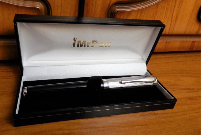
I have a soft spot for pens with shiny chrome caps. This one is particularly handsome and comes from Mr Pen, an online pen maker and seller, based in Ruislip, on the outskirts of North West London (web site: mrpen.co.uk).
Mr Pen is the trading name of P J Ford & Associates Ltd. As well as selling pens of many well-known brands, the firm also has its own brand, “Italix”, manufactured in England, Germany and the Far East. As the guarantee states, all Italix pens are hand finished in the UK. The nibs are ground in their own workshops in Ruislip.
As I grew up in Ickenham, less than two miles from Ruislip, it feels nice to deal with a local company, which provides a high quality personal service, even though Italix pens are now known the world over. The Italix Parson’s Essential is very well-regarded and was one of the first pens that I bought online, when my interest in fountain pens began to expand into the world of the internet.
Appearance and design.
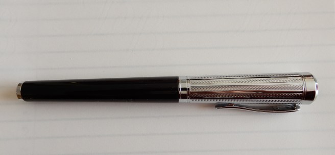
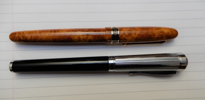
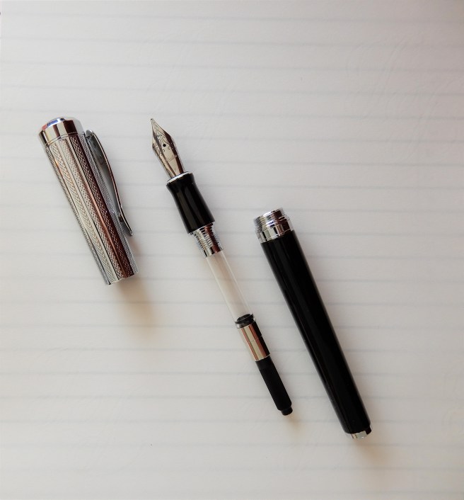
The Captain’s Commission, from the same stable as the Parson’s Essential, is a larger pen and quite heavy, with a brass barrel and cap. The barrel is finished in glossy black lacquer, whilst the cap has shiny chrome plating with a very attractive guilloche pattern and a black domed finial. A burgundy version is also available.
An unusual feature is that the pen when capped, tapers gently down from the top to the bottom, with the cap fitting perfectly flush with the barrel, to create a very smooth and elegant piece, rather suggestive of a silver topped walking cane. The pocket clip is firm and springy and should secure the pen in a jacket pocket, against the hazards of being pulled out accidently with other items (as I did recently with another pen, sending it scuttling across the floor of a busy airport terminal).
Uncapping the pen was a surprise. First, what looks like a cap band with the Italix name, is actually fixed to the barrel and so the cap separates above it. Secondly, there was an uncommonly smooth, cushioned feel to the uncapping. I think that this may be in part due to what appear to be, two rubber O rings on the inside of the cap. In any event, the cap unscrews very smoothly, although the cap needs about three and half full revolutions (or about five twists) before coming away from the threads. Some might have issues with this but I do not mind it at all. It adds to the feeling of handling a well made, good quality writing instrument. The cap does tighten with reassuring bite. However you do need to take care at first, not to put the cap on cross-threaded.
There seems to be no risk of inadvertently unscrewing the barrel when you think you are unscrewing the cap, as can happen with some pens. The threads to unscrew the section, are on the underside of the threads which unscrew the cap; so you would have to remove the cap first, otherwise you could not anchor the nib and section while unscrewing the barrel.
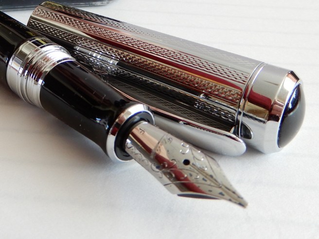
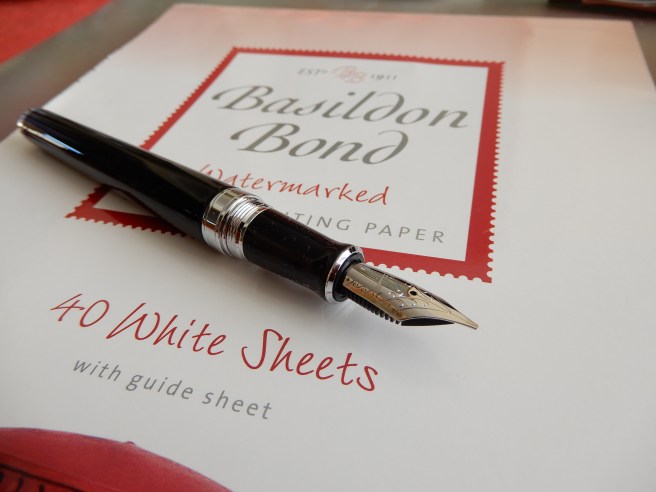
Beneath the cap, is an impressive, large (size six) nib with attractive scroll work and the Italix brand name.
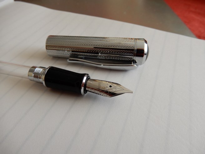
A Schmidt converter was included although the pen also takes standard international cartridges.
Nib and performance.
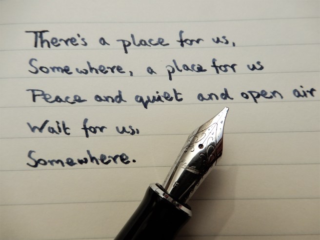
Mr Pen offers a huge choice of nib options, (I think, 27), mostly steel but with one gold option. I chose the steel Italic Fine, having a width of approximately 0.85mm. I hoped that this might suit me better than a 1.1mm stub, given that my handwriting is not large and I have to be careful to avoid filling in all the loops when I use a broader nib. I was a little apprehensive that an italic nib would have sharp edges and dig into paper unless handled very carefully, whereas cursive, or stub options have more rounded edges. An hour or so after putting in my order online, I telephoned Mr Pen and spoke to proprietor Peter Ford who gave me further advice about the nib choices. By this time, my order had already been packed and franked ready for dispatch! However, he offers a nib exchange within 30 days and so there is no need to worry if you do change your mind.
My pen arrived in the post the following day. I need not have worried about my nib choice. This was my first ever custom grind nib. The only previous experience that I had with italic nibs was on cheap calligraphy sets, where the nibs do have sharp edges that can dig into the paper unless held at a very precise and consistent angle.
There were no such problems with the Captain’s Commission. I flushed it first with water before filling with my usual Conway Stewart Tavy, blue-black ink. Putting pen to paper for the first time, was a delight and has been ever since. It was smooth from the word go, firm but with a decent flow which allowed me to write in my left-handed, overhand, slanting handwriting and still have a smooth writing experience, with suitable paper.
I mention this as being left handed and writing the way I do, sometimes means a drier writing experience, as the pen is doing more pushing upwards and sideways, than down strokes where more ink is released. To cater for this, I have also developed an “elbows in”, upright style of writing too, but find it harder to write neatly in this way.
Size and Weight (approximate).
The pen is 145mm long capped, 131mm when opened or 160mm when posted. It weighs around 53 grams in all (including converter and ink) or 28g uncapped. The cap weighs around 24.5 grams, by my scales.
The cap can be posted securely. (The rubber O rings inside the cap keep the cap from slipping off when posted and also protect the lacquer, I presume). However, in practice I would envisage the cap only being posted for ceremonial purposes or photo shoots. It adds a lot of weight to the back end and causes imbalance, unless you hold the pen quite high up. So in general, you have an uncapped pen of 131mm and 28 grams, which is very nice indeed.
Conclusions and value.
I have been using the pen for just a week now and have been thrilled with it. It looks stunning, feels weighty and substantial and writes among the best of steel nibs that I have experienced. I have had no hard starts. The writing experience will differ depending upon inks and papers chosen, as with any pen, but I have already found some winning combinations.
The cost (including the ground italic fine nib) with post and packaging and vat came to £57.22. My delight at the pen has been far in excess of what this price might warrant. For comparisons, there are many steel nibbed pens such as the Cross Bailey or Sheaffer 300 but none that I can readily think of, certainly at this price, which has the elegance and vast choice of ground nibs as the Captain’s Commission.

I grew up in Ealing, with frequent walks up Horsenden Hill, and many friends in Ruislip… how on Earth did I never hear of this shop?
That looks like a very enticing nib too.
Great post! Thank you!
LikeLike
Thank you Paul! Small world. I am now in Golders Green, so have not ventured as far away as you did!
I am not sure how long Mr Pen has been going in Ruislip but guess it may be for online business only. I would recommend taking a look at the Italix range, especially this one.
LikeLiked by 1 person
I am doing so as I type! 🙂
LikeLiked by 1 person
I’m a lefty overwiter too, and it exhausts me just to think of using a stub to write.
LikeLiked by 1 person
I know they didn’t have fountain pens in those days, but this pen reminds me of something from Georgian times. I love the style of that era: so elegant and angular. I always wished I could live in one of those really solid Georgian town houses.
LikeLiked by 1 person
Thank you! Yes, I know what you mean. Looking at the cap of this pen puts me in mind of top hats and frock coats and the sound of a horse and carriage in an elegant London square.
LikeLike
Great to have a local pen for once too.
LikeLiked by 1 person
Great review. Your photos make this look a much more appealing pen than the one on the Mr Pen website. I like the shape of the cap – it has shades of Graf von Faber Castell about it.
As a fellow lefty underwriter, I compliment you on your handwriting. It has a neatness that I can only aspire to!
LikeLiked by 1 person
Thank you for reading and for your kind words. The pen does have a certain presence and is better in real life than photographs. Yes, there is even a touch of GvF-C about it!
LikeLike
I just purchased the burgundy version of this pen from an eBay seller. I’m looking forward to trying it out.
LikeLiked by 1 person
I received my burgundy Italix Captains Commission FP with a medium nib. It appeared to have been only dip-tested upon arrival, so I did a quick and easy cleaning, let it dry out for 24 hours, and filled it with Diamine Monboddos Hat ink, a dark purple color. You are absolutely right in your review of this pen; it is a wonderful writer, very smooth with just the right amount of feedback. I paid only about $81.57 (with shipping) for it from an Ebay seller in Texas. I would never have known about this brand but for following reviews here, so thank you.
LikeLike
I’ve been using the burgundy version I recently purchased on eBay. It has a medium nib. It is as good as you described it. What a great value. I paid about $71 USD for it (before sales tax and shipping, which brought the total to about $82).
LikeLike