A cruise ship holiday offers a wonderful opportunity for the fountain pen enthusiast, to spend a little time away, in new surroundings with a few select pens for journaling on the trip.
Our recent one-week cruise departed from Southampton, with visits to La Rochelle in France, Bilboa in Spain and finally, St Peter Port, Guernsey. Being a novice at the modern cruise ship experience, I had not prepared myself much beyond planning which pens to bring. While my wife was happily picking out which evening dresses to pack, I was looking forward particularly to sitting in our balcony cabin, with notebook and pen, to “unpack” a few thoughts and impressions of our travels.
Choosing which pens to bring from the “currently inked” selection in my pen cups, was a challenge, but an enjoyable one. I settled on the following:
- Lamy AL-star, Pacific Blue (with Lamy turquoise ink cartridges);
- Lamy AL-star, Charged Green (with syringe-filled cartridge of Graf von Faber-Castell Moss Green ink);
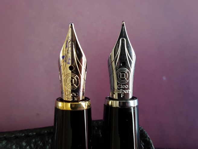
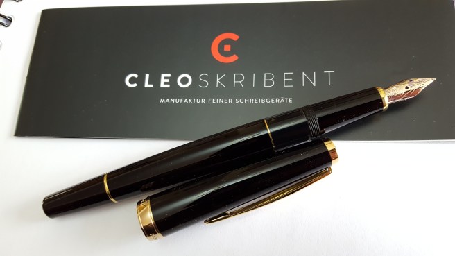
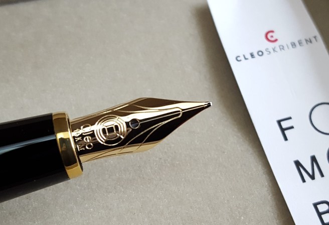
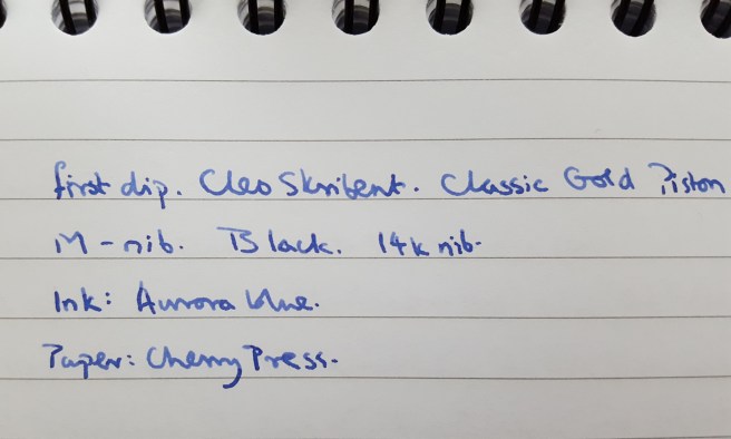
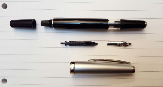
- Cleo Skribent, Classic Gold piston filler, with Graf von Faber-Castell Cobalt Blue ink); the ink colour reminds me of a Guernsey pullover;
- Cleo Skribent, Classic Metal piston filler, with Graf von Faber-Castell Moss Green ink);
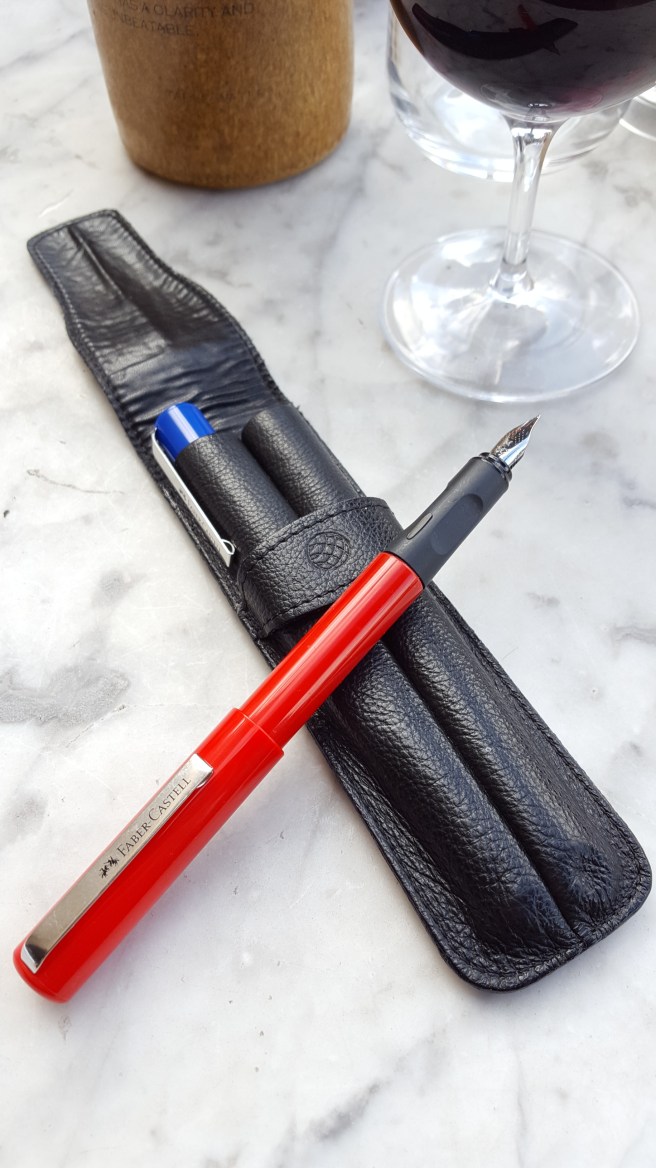
- Faber-Castell School pen, with blue ink cartridge. A light-weight and reliable shirt pocket pen for the hasty note.
Admittedly, any one of these would have been sufficient on its own to use for a week, but I enjoyed each of them in turn.
I had hoped that the shore excursions might afford an opportunity to stumble across a charming local pen shop and browse among some unfamiliar brands of fountain pens and inks. However, having chosen to join guided tours for our visits to La Rochelle and Bilbao, there was limited time available for shopping.
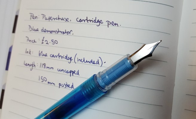
It was not until day six, when spending a day wandering on our own at St Peter Port, that I spotted the familiar “Paperchase” shop sign and found a stationery shop looking just like any of their other branches in London. Nevertheless, starved of pen shops for almost a week I was interested to check whether their stock was any different from ours at home.
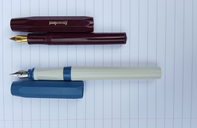
The glass cabinets displays of Cross, Kaweco and Parker pens and the hanging displays of Lamy Safaris and AL-stars were all very familiar. But then I had my first sighting of a Kaweco Perkeo, a recently released model, news of which had not yet reached me.
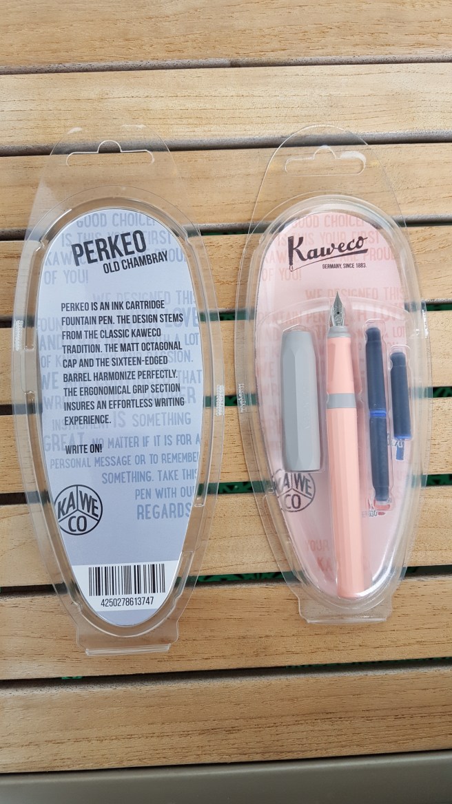
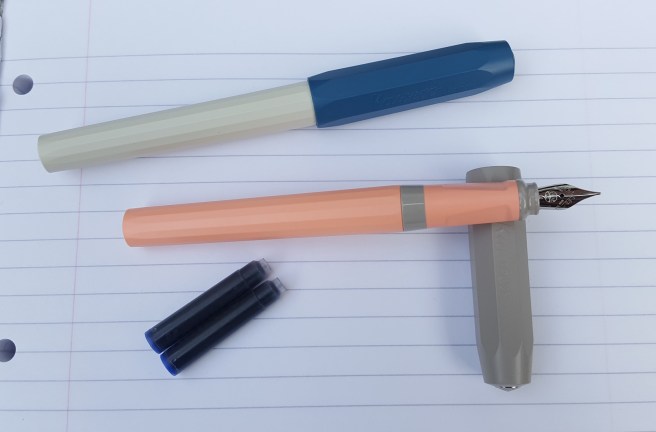
Displayed in a clear plastic clam-shell style pack, I first noticed the “Cotton Candy” version, with a contrasting taupe coloured cap. I understand that cotton candy is the spun sugar confection that in the UK is known as candy floss. To me however, the colour of this pen puts me more in mind of salmon which would be a truer although perhaps less appealing description.
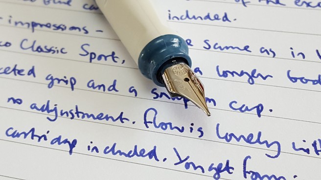
Beside this on the rack, there was another version called “Old Chambray” which denotes a blue-grey colour for the cap, with white barrel and section.
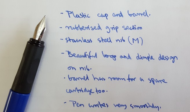
The pen has a stainless steel nib (made by Bock) familiar from the Kaweco Sport pocket pens. Indeed the pen is similar to the Kaweco Sport but larger all round and with a broader cap. The cap is eight sided whilst the barrel is sixteen sided. I have read that it is based upon another old Kaweco fountain pen.
The main and most obvious difference is the length, with the Perkeo having a length, opened and unposted, of about 128mm (or 160mm posted), whilst the Kaweco Sport measures just around 100mm opened and unposted, (or around 133mm posted, as it is intended to be used). Thus the Perkeo is almost as long unposted, as the Sport is posted. Other differences are that the Perkeo section has three flat surfaces, or facets, intended to improve correct grip and that the cap of the Perkeo is broader and shorter than on the Sport and snaps on rather than being threaded.
The packaging shows three cartridges included although there are in fact four, since you find one more in the barrel, plus a blank, dummy cartridge already fitted in the section.
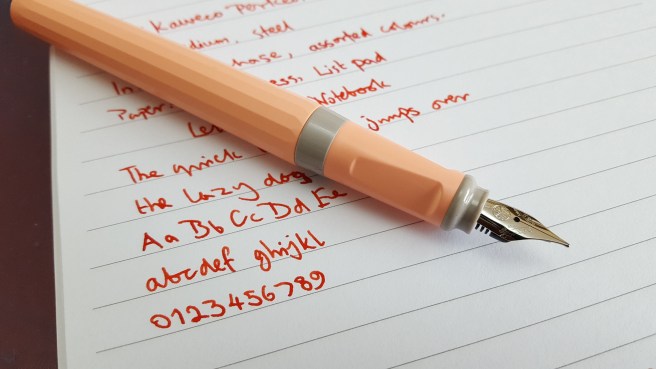
Deciding to buy one of each colour, I was keen to have a closer look at home and to ink them up. The nibs on both proved to be very smooth, with tines well-adjusted “out of the box” with a good ink flow thus giving a very pleasing, well lubricated writing experience. No complaints there.
I have since read online that there are two other colour options, namely “Indian Summer” which is yellow and black, or “Bad Taste” which is coral pink and black.
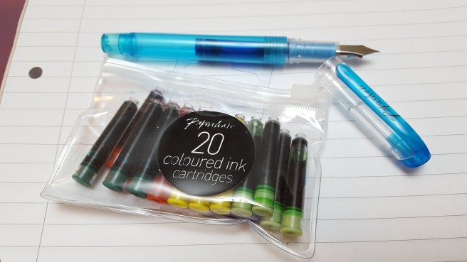
I inked the Old Chambray model with one of the supplied cartridges of Kaweco blue ink. This is an excellent ink, a rich, dark royal blue. As for the Cotton Candy model, as I have rather too many pens already inked with blue, I inserted a dark blood-orange cartridge from an old bag of standard international cartridges in assorted colours from Paperchase that I had at home. (At £2.50 for a bag of 50, these are great value and give your pens a low running cost for high mileage writing).
In summary my initial impressions are:-
Likes
- good length, comfortable to use posted or unposted;
- barrel has room for a spare cartridge;
- strong resin material; a tough pen to use and carry around every day, such as for school use;
- excellent stainless steel nib; smooth, optimum flow (wet but not overly so);
- four Kaweco ink cartridges included with the pen;
- firm snap on cap, with good inner cap fitted and an attractive metal Kaweco badge for the finial;
- reasonable price; similar to the Lamy Safari.
Dislikes
- three facets in the section; I would have preferred the section without these; however they are shorter than those on the Lamy Safari or AL-star and the pen barrel is sufficiently long, to avoid the facets and grip the pen higher up with thumb and forefinger over the contrasting coloured band at the end of the section and still have the barrel resting in the crook of your hand; or you may post the cap for even greater length;
- colours are a bit garish and weird, unlike the more standard colours available for the Safari;
- tough resin material and the snap-on cap (with no pocket clip) combine to give a functional but rather charmless, clunky, white board marker-pen feel.
Conclusions
Overall, this is a pen that writes very well, with a good quality German stainless steel nib. If you like the Kaweco Sport but wish it was a full sized pen that you could use unposted, then this may be the answer, being bigger and longer than the little Sport. For me, I would have preferred it without the facets on the grip section. As there are three of them they do narrow the grip and also do not quite coincide with the angle at which I like to hold the nib to the page. However I liked the pen despite this feature.
Finally, the irony of choosing a German pen as a souvenir from Guernsey, has not escaped me. Guernsey was occupied by Germany during the war and was not liberated until 9 May 1945, a date commemorated on several monuments around the pretty harbour area of St Peter Port. The pens will still remind me of a brief and pleasant visit to the island. I did also buy some Guernsey Cream Fudge.


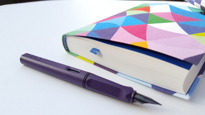
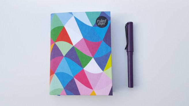
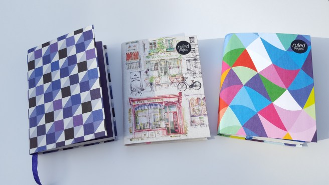
 My liking for notebooks goes back to childhood when it was a treat to visit Arthur Birds, our local independent stationer and book seller in Ickenham, a villagey suburb on the outskirts of London. Then, as now, I appreciated good quality and for a notebook, that included having stitched binding so that you could open the book flat without risk of the pages breaking loose.