In recognition of today being Fountain Pen Day, I thought to do a short post about one of the pens that I have with me today.
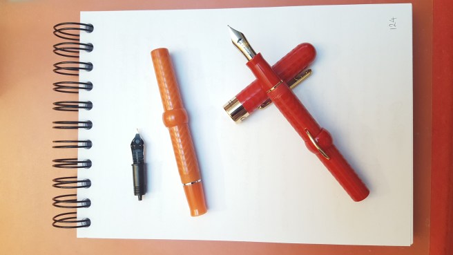
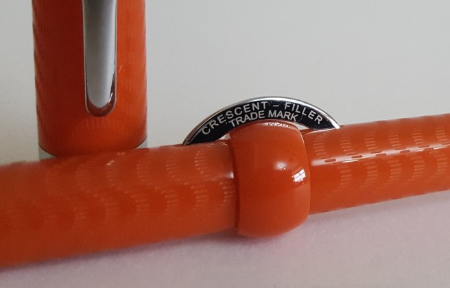
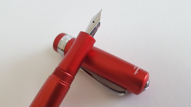
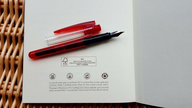
This is the Conklin Mark Twain Crescent Filler, red chase. This was one of my happy purchases from the London Pen Show last month.
I had long been interested in the Crescent Filler and enjoyed reading of its associations with Mark Twain. The current model is not quite the same as the one from the original Conklin pen company that he would have used. I did spot a vintage black Conklin crescent filler at the same pen show and noticed how much thinner it was than the modern one.
At a very attractive show price, I came away with two of these, one in orange (or coral chase) and one red chase.
Conklin Mark Twain Crescent Fillers, in coral chase and red chase finish.
The beauty of these pens is the lovely nostalgic feel of dipping into a bottle of ink, squeezing the crescent-shaped filler button slowly a few times and allowing the sack to fill, before locking the button again by twisting the collar back again.
The only downside is that you cannot see how much ink the pen has. There is no ink window. Also the barrel is glued to the section and so you cannot unscrew it to gauge the ink remaining. (Actually, on one of my models, the glue seal had been broken and so I was able to open it, but even then you cannot see through the dark rubber material of the ink bladder).
One thing to remember when washing these pens, is to avoid allowing water in to the barrel, through the slot where the crescent filler sits. This is because the bladder has a dusting of talcum powder to stop it sticking or rubbing on the filler bar.
If you do unscrew the barrel, then the metal filler bar can be removed. I was impressed at how long a bar there is, to press on the ink bladder and so this helps to get a good fill. To put it back again, with the crescent pushing out through the slot, you will need some tweezers. A Swiss army knife came in useful here.
Quite how much ink it draws up, I have not yet measured. However, I did find that, with a medium nib, I wrote 37 pages of an A5 size journal on the first fill, which I was very happy with. That was the coral chase model, with Diamine Oxblood ink.
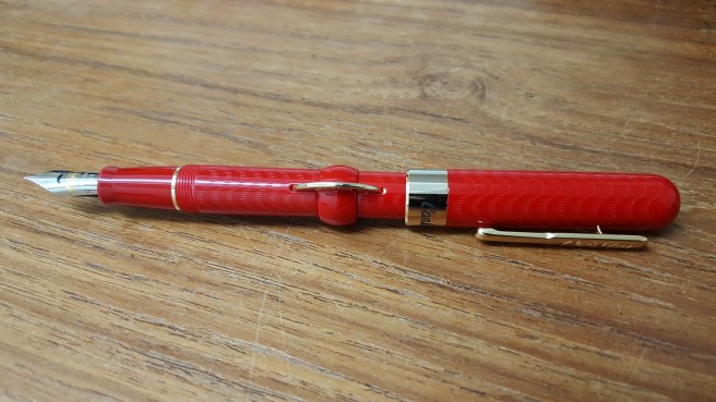
My red chase Crescent Filler, prior to nib swap with a Jinhao X450.
On the red model, this came with a Conklin Fine stainless steel nib. This turned out to be slightly catchy. On close inspection, it seems that the left tine was fractionally longer than the right so that in normal writing, on side strokes from left to right, the proud edge was snagging on the paper. I need to have a go at it with my handy micro-mesh kit, also bought at the same show.
Meanwhile however, I was delighted to read that the nibs of the crescent filler are easily swapped. The nib, feed and housing can simply be unscrewed from the section. Alternatively you can extract the nib and feed, which are friction fit, by pulling them out carefully, taking care to avoid damaging the fins of the feed, or distorting the nib itself.
Yesterday evening I swapped the nib with one from a Jinhao x450. I have not swapped the feeds, but just the nibs.
I now have the red crescent filler, with a lovely Chinese Jinhao x450 medium nib and filled with Aurora Blue-Black ink (same pen show as well), which I am enjoying.
Coincidentally, I had to visit the China Visa Application Service Centre in London today, to pick up my visa for a trip to China later this month, so it was good to have my red crescent Jinhao-nibbed Conklin for company.
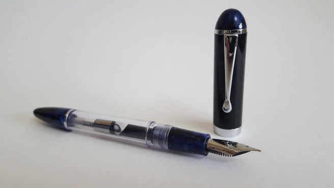
I had intended, before the month is out, to write a post or two about the pens that attached themselves to me at the London Pen Show on 1 October 2017. However, normal business has been interrupted by the arrival of the Lamy aion and so today I am instead writing about what is currently on my mind, which is this new beast.
Having come away from the pen show very happily, with five extra fountain pens, the last thing I needed was another pen. Furthermore, I have been using a Kaweco Dia2 a lot lately (which was not one of my pen show pens) and have found myself thinking how super-comfortable and enjoyable it is, such that further pen acquisitions are not necessary.
When the new Lamy aion first came to my attention, I took little interest. But after hearing more about it, I sought out some reviews and spent an entertaining evening in watching several YouTube reviews which sparked further interest.
The anticipation.
I had still not seen one in the flesh. My only concern was that it was an aluminium pen and that in general I am not a fan of metal grip sections. For that reason I had stayed away from the Lamy Studio. After assimilating multiple reviews, I found myself assured that the grip problem had been addressed and decided that the aion was a must have item.
I will not recite what has been said, on Lamy’s official web site and in several online reviews. Suffice it to say that this is a new design, by Jasper Morrison, a modern and un-flashy cartridge-converter pen with strong leanings towards minimalism. Promotional videos showed immaculate, sparsely furnished offices with architects’ drawing boards and angle-poise lighting, into which the modern, minimalist aion blends effortlessly.
Whilst this is good aspirational stuff, I could not help thinking that if my aion is to find itself in a crowded pen cup (or silo of pen cups) with currently well over twenty other inked fountain pens then this is not proper minimalism. But never mind that.
After a few days mulling it all over, I went ahead and ordered one, in black, with a fine nib. I chose to order through The Writing Desk, as their price included the Z27 converter and they test the nibs before despatch.
Waiting for the pen was exciting. I enjoyed thinking what ink to put in and settled on a safe Waterman Serenity blue to start with.
First impressions.
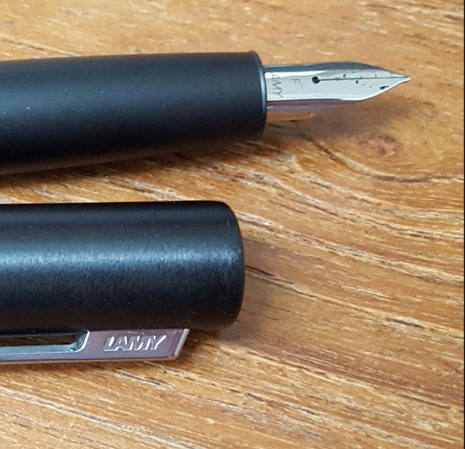
First impressions when it arrived were good. It is a stealthy matte black finish, and feels very robust and a nice weight (32g capped or 22g uncapped). The finish of the cap and barrel is slightly textured, like a very fine grade of micro-mesh. Lamy’s description is “Brushed and blasted surfaces are refined with a brilliant silk-matt anodic coating finish.” (Anodised, means coated electrolytically with a protective or decorative, oxide surface). I particularly like the length, a generous 137mm opened and unposted. It is a comfortable length to use unposted, even for my fairly large hands. I also very much liked the sprung pocket clip; just press the top of the clip and it opens to allow you to slip the pen in or out of a jacket pocket one handed. My Lamy logo clip does this too.
The nib is a slightly different shape from the usual Safari Z50 nibs. The outside edges have a different contour, the shoulders being more rounded, yet the the new nibs are still interchangeable with them.
Lamy aion with new shaped nib
There are similarities with the Lamy Studio, in the shape of the section. Also, the plainness of the design, an air of undertstatedness, reflects the much admired Lamy 2000 of 1966.
The cap snaps on and off firmly. I think it is secured by the flange at the nib-end of the section, clipping into slots in the inner cap. When capped, the pen can rotate in the cap and there is just a little movement of the pen which can be wobbled from side to side in the cap, but not such as to be a problem. With cap removed, the section blends almost seamlessly into the barrel, with no threads, no step, no slightly tickly cap-fitting lugs. You can hardly see the join, except for the difference in texture.
So, what of the section? Again, it is aluminium. It looks stunning. But what is it like to hold? It has some texture to it but different from the cap and barrel and less grippable. Personally I would have preferred it to have at least the same amount of roughness as the barrel. But I am not a designer, just a user.
The writing experience.
Here, I have had differing experiences. As we know, a pen is held between finger and thumb and rests on your second finger under the section. The nib must be held to the paper at the optimum angle (finding the sweet spot for your nib) and then held consistently as you write. We rely upon being able to anchor the pen with finger and thumb to stop it from slipping and rotating left or right away from the sweet spot.
So, if your thumb cannot get a grip on the barrel or section where it is placed, the pen will slither around. Writing becomes frustrating. You will need frequently to release your grip (such as it is), rotate the pen back to where you want it, and then grip again.
In my case, (remembering that I have had the pen for only a few days) I have found marked differences in how I get on with the pen. This is all down to the moistness of the skin, which seems to vary at different times of the day. If your skin is dry then this pen is hard to hold steady. It feels a bit like the inside of a Teflon saucepan.
But when your skin has a slight amount of moisture, (and it only needs a very little to make all the difference) then the pen can be held steady and writes like a dream. It is nicely weighted towards the front end. The nib needs no pressure at all. The pen writes effortlessly under its own weight and you just guide it along.
I should mention that I tried Serenity blue ink at first but later flushed this out, gave the pen a good rinse and then refilled with Conway Stewart Tavy, by Diamine which is a nice blue black, that I like. I have noticed that sometimes ink starvation occurs a couple of paragraphs in which is just due to the ink staying at the far end of the converter and this is easily remedied by a light shake and then all is well.
Note the slight difference in finish between the barrel and the secion
I think the pen likes to be held with a light touch. I keep having to stop myself from gripping it too tightly. Once you learn to let go a little and let the pen do its thing, then it is a joy to use. But it all depends on the degree of moisture in the finger and thumb!
If all this sounds too much trouble then it is wise to get some hands-on experience of the pen before buying. Or some moisturiser.
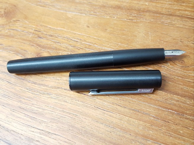
As a final thought, after just a couple of days use, when picking up my super-comfy, perfectly sized Kaweco Dia2, I felt that the latter was a little narrow in the grip. So how the aion feels will also depend on what you are used to. Here they are together.
This was my fourth time, attending the annual London Writing Equipment Show (LWES). It was held on 1 October 2017, at the Holiday Inn, Coram Street, near Russell Square. Knowing broadly what to expect, I had been much looking forward to it.
Oh my, what a treat for the fountain pen obsessed enthusiast! The venue comprises one large main function room at the hotel, plus the adjacent corridors, all filled with lines of tables, covered with enticing displays of fountain pens old and new, inks, spare parts, accessories and other paraphernalia. There is something for everyone, whatever your level of interest in this addictive hobby.
This year, for me there was an added bonus, of finding several familiar new friends from the recent Pelikan Hub, just over a week earlier. It was good to see them again and to have a chat and share the excitement.
It was very warm inside and rather too crowded, until it thinned out in the afternoon. It is a good idea to find a coat rack and leave your jacket somewhere. I had brought along some cash but not quite a big enough bag, as it turned out, for the purchases I made. I had not come with any firm ideas of what to look at. Last year I bought a vintage Parker 51 from Graham Jasper’s table. I had a vague plan to pick up another, but did not in the end. I had also planned to have another look at the Conid Bulkfillers, the Belgian made, precision-engineered masterpieces that I eye up every year, although I still came short of buying one.
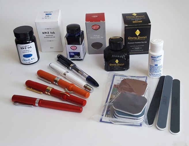
Thus browsing, with an eager eye and an open mind, I managed to limit myself to just five new pens, (all new, but all stainless steel nibbed, modestly priced pieces), three bottles of ink and a craft box of assorted grades of micro-mesh for those occasional attempts at nib adjustments.
My day’s shopping: Kaweco Allrounder, Conklin Mark Twain crescent fillers in red and coral, TWSBI Classic and a mystery pen. Plus three bottles of ink and a micro-mesh kit.
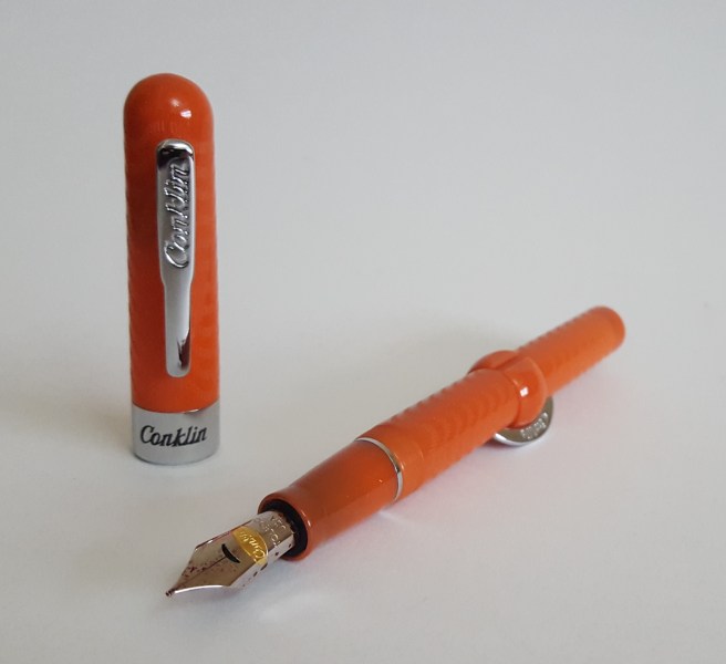
My first catch was the Conklin Mark Twain Crescent Filler. I had been attracted to these from seeing them online, but thought them to be rather over-priced for a stainless steel nib pen. However, at a very attractive price at the Show, I picked up both a Red Chase and a Coral Chase model, with fine and medium nibs, respectively.
Next, and still before reaching the main hall, I lingered at the Kawecos. I have been using a Kaweco Dia 2 in recent months, which I have been delighted with and find super comfortable. At the Show, I saw the Kaweco Student and the Kaweco Allrounder, for the first time in the flesh. I was drawn to the Allrounder in a vibrant red aluminium (I think) body. It takes the same nib and feed unit as the Dia 2 or Al-Sport. I bought the pen with an Extra Fine nib, plus a Fine as a spare. These nib units are only about £8.00 and can often be fantastic, if well made.
Kaweco Allrounder, with Extra Fine nib.
Next I bought a spare bottle of ink, the Conway Stewart Tavy, by Diamine. I bought a bottle of this two shows ago and have used it a lot, as an attractive blue black. It is sometimes out of stock on web-sites and so I was pleased to get a spare.
A few tables on, I met the gentleman selling Aurora pens and inks, who remembered me from previous years. It was wonderful to see these stunning beauties on display, including the Optima in what I presume was the burgundy auroloide resin, a grail pen for the wish list although surprisingly light to pick up. However I did buy a bottle of Aurora Blue Black ink, only available since April which I had been keen to try.
I had a look at the Onoto pens. Again, very desirable, but quite an expensive outlay for an unplanned purchase.
Now – the main hall! It can be a bit overwhelming, the sight of so many pens and people all in one place. A prominent display of Pelikans with a giant plastic Souveran model, indicates Niche Pens’ table, with a good range of Pelikan pens to handle, including the M120 and the entry level Pelikano. Next there were Noodlers and TWSBIs. At the vast vintage Parker table, (Graham Jasper) I was impressed to see an open, 80-pen case display of Parker Duofolds, grouped with about six of each colour. Another grail pen.
Several tables had nostalgic fountain pen branded signage of a bygone era and I regret not taking some photos of these lovely displays.
Another pen purchase, was an unbranded, large clear demonstrator pen with a black cap, displayed in gift box with a syringe included for eye-dropper filling, as an alternative option to the included converter. There were several colours and I chose one with nice blue end-cap, section and strikingly bullet-shaped barrel end. The nib looked to be a very smart, stainless steel Medium with some scroll work but with an empty space where you might normally expect to see the words Iridium Point, Germany. This I call my mystery pen. I also found a stack of Micro-mesh craft kits and added that to my stash, thinking it would be useful to have the means to do some very rudimentary nib-smoothing if the need arose.
A mystery pen. No noticeable branding on nib, pen or packaging. But it is a beauty!
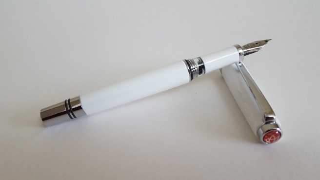
Several fascinating laps later, I was nearly ready to go but paused again at the TWSBI’s. It was at this same show in 2014 that I bought my first TWSBI, a clear Vac 700 that I love and use regularly at work. I have since added a Diamond 580 and an Eco. Now, someone next to me was trying the TWSBI Classic in a cute Robin egg blue. I had not handled one before and rather liked the faceted cap and barrel, the shiny metal piston knob and the small clear ink window (picture your favourite ink here!). I bought one, in white. Not exactly an Aurora but it has an ink window. They also had a few KWZ inks for sale (of which I have read great reviews) and I bought a 60ml bottle of Azure #4.
Oh, go on then. A TWSBI Classic, new model with postable cap. Now inked with Sailor kiwa-guro.
Having a New Pen Day x 5 was rather indulgent, admittedly. I therefore decided to ink only one more pen a day, throughout the week, to prolong the enjoyment. And it has been enjoyable. Each one has been a success and I am thrilled with my purchases.
Conklin Mark Twain Crescent Filler. Currently inked with Diamine Oxblood and going nicely.
On 22 September 2017, in cities around the world, the annual Pelikan Hub event took place. This is an occasion for fans of Pelikan fountain pens and inks to gather and meet each other. Anyone who wishes to attend, can register. A Hub Master is then nominated for each city, who books a venue and notifies those in his or her group of where it will take place. The Hub Master also receives gifts donated by Pelikan, to distribute on the night. It is a wonderful idea and I know of no other fountain pen company that does this.
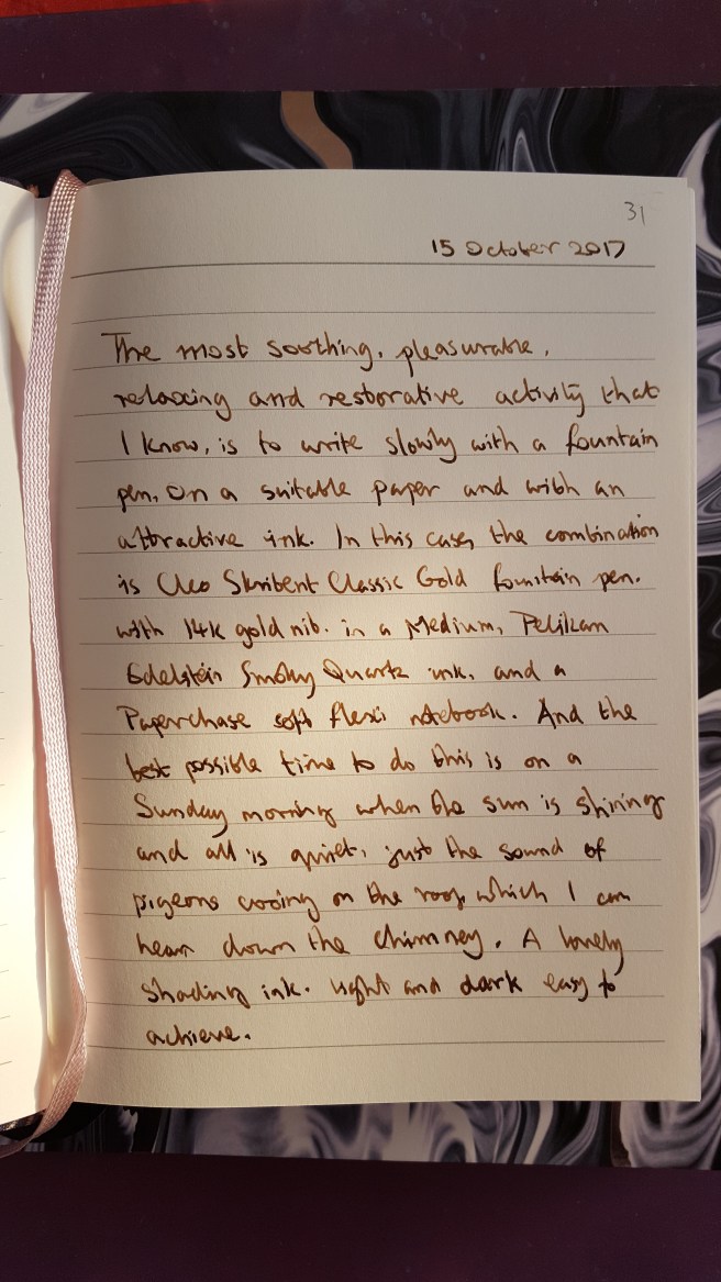
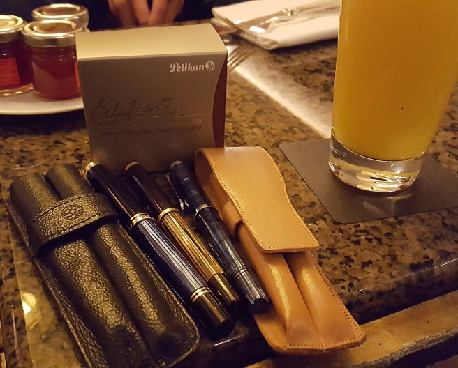
Here in London, our Hub Master, Naresh had arranged for our group to meet at the Hyatt Regency London – The Churchill, in Portman Square, close to Oxford Street. The spacious public bar area on the ground floor was comfortable and relaxing. Naresh welcomed us and gave out the Pelikan gifts as people arrived. I was delighted to receive a bottle of Pelikan Edelstein Smoky Quartz ink, a very useful, generous and unexpected present.
Our group spread out around a few tables around a fireplace. Then, getting straight down to business, people got out the pens that they had brought along. Soon the table was sporting an impressive array of pens, pen cases and pen rolls and journals of various sizes.
I am a newcomer to Pelikan pens, buying my first in April 2016, the M205 blue demonstrator with a broad nib, which I love. I went on to buy an M800 in blue and black in November (which I use every day) and then, earlier this year, at auction, a vintage M400 tortoise from the 1950’s. These, my modest “flock” of Pelikans, I brought to the hub.
My flock: the M800, M400 vintage tortoise and M205 blue demonstrator.
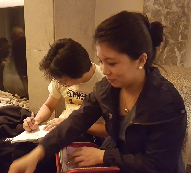
Many at our table had brought along very impressive pens. I was able to handle an M600 (claimed by some to be the ideal size Pelikan) and some limited editions. Our table included Katherine, visiting from San Francisco and Jonathan, a member of Fountain Pen Network – Philippines. Marisa was a member of the London UK Fountain Pen Club and encouraged others to come to their monthly gatherings.
I was struck afterwards by how quickly and easily, people had started talking about their pens, passing them around, inviting others to try them. Little or no introductions were needed. We all had a common interest. It was unusual and refreshing, with the same absence of formality as a child starting a conversation in a school playground.
A few slightly guilty conversations took place on the subject of how many pens one had. Someone was asked “When did you last buy a pen?” and replied “Yesterday!”
Trying other people’s vintage pens was an education. The feel of the softer, flexy nibs gives a very different writing experience. Everyone was very knowledgeable and discerning in their choices of pens and nibs.
The joy of trying each other’s pens.
Soon, fascinating conversations were taking place on all sides. A gentleman at our table was telling us about his gorgeous Pelikan M800 Renaissance Brown and was planning to buy only one more pen this year, the Pelikan Ocean Swirl. Another of the group had planned not to buy any pens in September. There was much to learn about pens and their interesting owners.
As well as sharing stories and experiences of their Pelikan pens, some other beautiful pens were produced and I was able to try a Nakaya Piccolo, a Pilot vanishing point (or Capless) and a Conid bulkfiller.
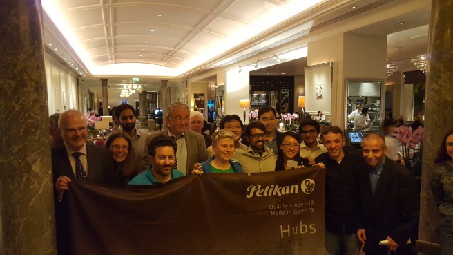
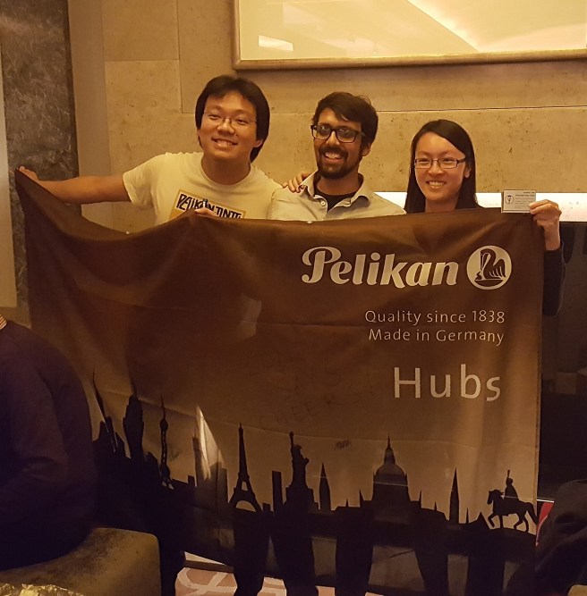
The time flew by and all too soon it was time to leave. I left wanting more! Before dispersing, a few group photos were taken around the Pelikan Hubs banner. Similar photos can now be seen on social media from cities all round the world and it is rather nice and special to think that fellow fountain pen enhusiasts were sharing their stories on the same day, in so many countries and cities.
Pelikan Hubs 2017 London UK.
I picked up a lot from talking to people and had a wonderful evening. Thanks to Naresh our Hub Master for arranging the venue, to the Hyatt Regency Hotel for their hospitality and to Pelikan for instigating this marvelous event – and for the beautiful ink.
I could not wait to try the ink when I got home. I have put it in two pens. I am thrilled with the unusual colour and its attractive shading. Many of our group – me included – plan to visit the London Pen Show on 1 October 2017 and look forward to meeting again then.
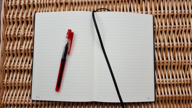
Buying a new journal is a wonderful thing. There is the anticipation of unwrapping it and opening its crisp new pages, trying out the paper and putting it into service, with all the potential enjoyment that this offers.
While prowling the aisles at Paperchase recently, I picked up this Paperchase NOTO journal. Available in different colours and sizes, I first saw a smaller, black covered version, unwrapped for display. The nicest thing about it is the leather-look cover, which does look very much like leather with its mottled tones and grain. It feels like leather too, soft and pleasant to the touch.
I decided to get the larger one, in brown, which appeared to be A5 (although not exactly), with an elastic loop closure, a ribbon page marker and 224 ruled pages.
This was sealed in shrink-wrap and so the only other visible indication of its specifications was on a paper insert saying “specially handmade for Paperchase in Italy using recycled paper” and bearing a symbol of ruled lines and then the price sticker on the back: “LRG JOURNAL NOTO BROWN 120 PAGE”, made in Italy, and the price. On Paperchase’s own website, where you can order online, the description includes the statement, “Being made in Italy especially for Paperchase, it has natural quality and style”.
As a veteran of notebook purchases, I now have a three-point routine on getting my new notebook home. First, is to number the pages. I find this inexplicably soothing and satisfying. There were 224, not 120. Second, is to try various fountain pen and ink combinations, starting from the back pages. This gives you a good sense of the type of paper that you are dealing with and its limitations, as you check for bleed through, absorbancy (or woolliness and feathering) and show through. It also overcomes first page nerves.
The third thing, (which I have now learned from purchasing this notebook) is to check the line spacing properly, preferably before you buy. I am a wide line person. Given the choice when buying a pad of file paper, of wide or narrow line spacing, I pick the wide.
Paperchase NOTO journal with Tesco cartridge/converter pen
I had not before measured what line spacing I liked and at what point the narrowness veers towards irritation and annoyance. However a simple and accurate check can be made by counting the rows in your new notebook, measuring the total height of those rows and then dividing the total height by the number of rows.
In the case of the Paperchase NOTO (large), you have 26 rows in which to write, measuring 182mm in total, which gives a row height of 7mm.
I noticed that this was somewhat narrower than the spacing on the paper insert behind the shrink wrap would suggest, which I later measured as 44mm / 5 = 8.8mm. I also noticed that the page lines do not quite go to the edge of the paper, but stop with a margin of 9mm. Ha! This means that you cannot see the ends of the printed lines when looking at the closed notebook sideways on, which might have given you an idea of whether the line spacing is suitable or not, when the book is sealed in shrink wrap.
This led me to get out a pile of different notebooks and journals that I had used, of varying line widths, to find my preferred row height. What I learned from this exercise, is that most of these had a line width of 8.00mm or above. The widest (another Paperchase A5 journal with bonded leather cover) actually gave a very generous 10mm. The worst, was a Ryman A5 diary which I had very nearly given up on after a few days’ use, having a stingey line width of just 5.8mm. This annoyed me every day for a year. On some days I wrote on alternate lines.
A difference between 8mm and 7mm might not sound much, but it is a drop of 12.5%.
Coming back to the NOTO, it does feel well made, with proper stitched binding. The pages measure 142mm x 210mm, (which I think is just slightly narrower than A5, but the same height). The paper is of a cream or ivory colour. The weight in gsm is not given but it is reasonably thick and not flimsy. It is a recycled paper, acid free, chlorine free and pH neutral.
I do like the appearance and feel of the leather-look cover. It remains to be seen how this will wear over time if carried around.
Having bought it specifically to use with fountain pens, I was eager to try some. Whilst the paper looks and feels smooth and pleasant, it did seem a little on the absorbant and fibrous side, leading to a slightly wide and woolly line. Some feathering can be seen, especially if examined under a loupe. I have used other Paperchase notebooks with crisper results. Waterman Tender Purple ink in a Platinum 3776 Century, produced a particularly high level of bleed through. Conway Stewart Tavy, by Diamine, (my current favourite blue black) in a Kaweco Dia 2, also suffered bleed through, such that the other side of the page was border-line unusable. On the other hand, Waterman Audacious Red ink which I currently have in a Cross Century II, a Lamy Vista and Noodlers Ahab, fared well although you can produce bleed through if you try, by adding some pressure for a wetter line.
Bleed through, worst from Waterman Tender Purple ink in a broad nibbed Platinum 3776 Century.
For black inks, I remembered my Sailor Kiwa-guro black pigment ink. I tried this first in a Platinum Preppy 0.5mm (medium nib). The ink performed well with this paper with no bleed through, minimal show through and with less feathering than with the other inks, thus giving a crisper edge to the lines. However the 0.5 nib was perhaps too wide for my smallish handwriting and for the 7mm line width.
The best match that I have found so far, is the same Sailor Kiwa-guro black ink but in a finer nib. I used a cheap, £2.00 cartridge pen from Tesco, a clear and red plastic demonstrator yet which has a nib that I particularly enjoy, unmarked but I would guess a medium/fine with a pleasant feedback. I use this with a converter. I have often marveled at how good this pen is, defying its modest cost.
Sailor Kiwa-guro black pigment ink used with a Tesco cartridge-converter pen. Performed particularly well on this recycled paper.
Since buying the NOTO journal, I have looked for reviews online. An old one from 9 April 2010 on FPN by ImolaS3, compared a variety of notebooks then available in the UK and concluded that the Paperchase NOTO was the best by far. I wonder whether the paper might perhaps have been different then from my example with its recycyled paper, since my experience was rather mixed, until I discovered a winning combination of pen and ink to pair with it.
In summary, I think this is a good-looking journal, in a practical, portable size. The 7mm line width is slightly narrower than my ideal row height but this is a matter of personal preference. The key issue is whether the paper will work for you. But if you are prepared to experiment a little to find which pen and ink combinations suit the paper, then you will be fine.
End page. Acid free, Chlorine free, ph Neutral and Selected recycled fibres.
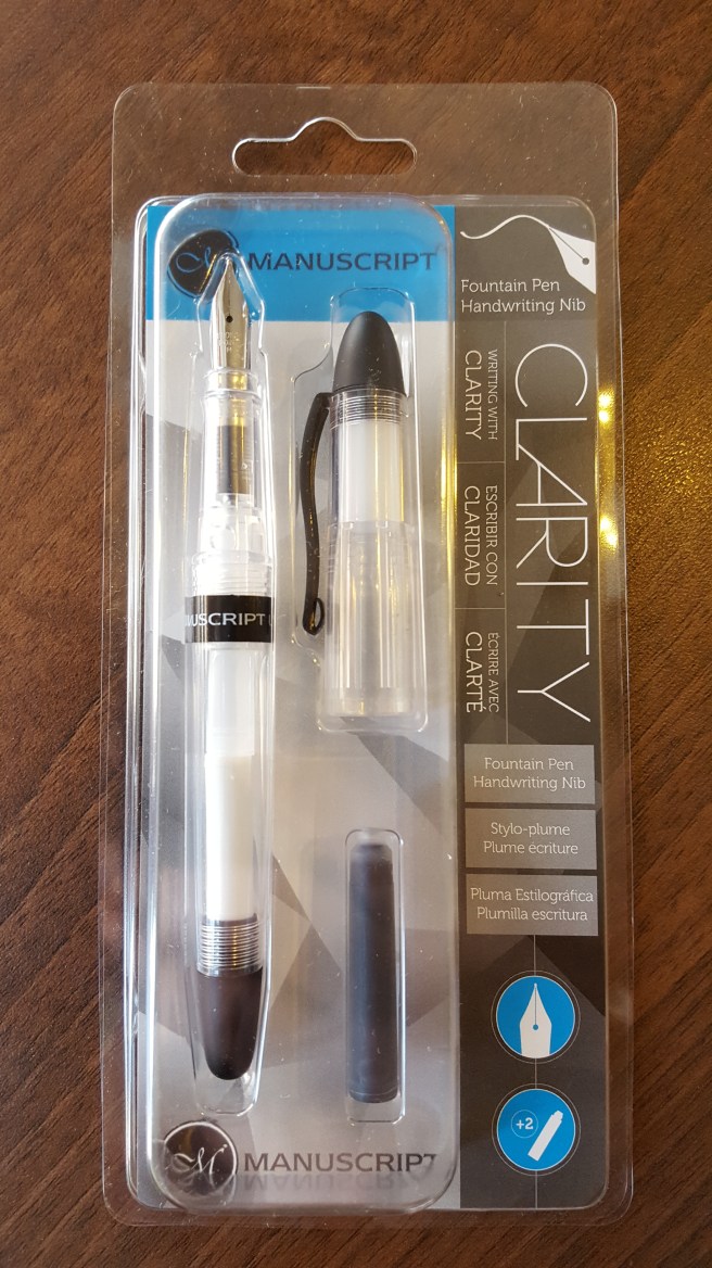
On a recent visit to our local Ryman stationer, this new cartridge pen from Manuscript, called the Clarity, caught my eye.
This is a clear demonstrator, taking standard international cartridges. The cap, section and barrel are of a clear plastic but with matching end caps in black, a sturdy metal clip finished in matte black and a black centre band bearing the words Manuscript UK, in capital letters. Yes, it is rather unusual to find a mainstream fountain pen that is made here in the UK.
It was displayed in a clear plastic clam shell type box hanging on a peg. I did not see any other colour options. Having purchased one, I took it to a nearby coffee shop to try. Here I was glad to find that the packaging could be opened without the need of scissors or sharp knife.
The pen is really very pleasing. The classic cigar shape, tapering towards the rounded ends, is attractive and comfortable. The body material appears reasonably durable although the cap would not withstand being stepped on.
I pushed in one of the supplied cartridges and the ink started to flow within a couple of strokes, which I always like.
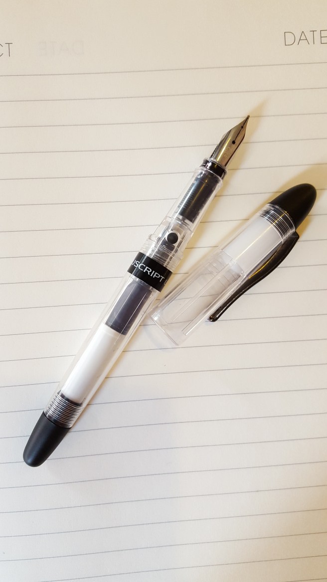
You get a “proper” stainless steel nib, with Iridium point, in a Medium width. The tines were aligned and the nib slit tapered nicely from the breather hole to the tip. So far so good.
The pen measures 140mm capped, 125mm uncapped, or 155mm posted which is how I prefer to use it. It is very light at 14g capped or posted (including two cartridges), or just 8g unposted.
The writing experience was very pleasant, on the wet side but not a gusher, but smooth and with good lubrication of the nib. Having very often had the opposite experience of finding new pens to be very dry and stingey, this was a welcome result.
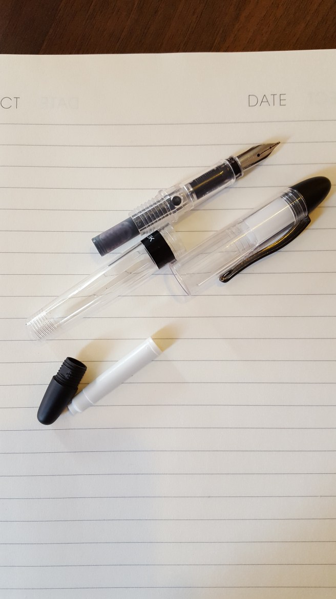
The cap is a snap on one, which feels firm and secure, although the cap does still rotate freely. There is an opaque, white inner cap, which serves well in keeping the nib from drying out. If you cap the pen and rotate it in the cap, you can observe the inner cap turning as well, although it does not unscrew so this does not seem to be a problem.
I found that the barrel end cap is threaded and can be unscrewed. This allows you to replace the spare cartridge without having to uncap the pen and then unscrew the barrel. The time saving is negligible but I rather liked this feature.
To my mind, Manuscript are a brand associated with calligraphy pen sets, whereas this model is sold as a handwriting pen with a single, standard medium nib. I have bought a few Manuscript pens in recent years in the sub-£10.00 price range but this one seems more attractive, comfortable and pleasurable to use.
In summary, my likes:-
UK made (yay!);
Useful size, shape and weight;
Firm metal pocket clip;
Firm snap-on cap;
Cap can be posted securely to give a decent length but still light-weight pen;
Demonstrator design, gives clear view of feed and cartridges, but there are also two round port-hole windows in the section, just above the feed, to observe your cartridge;
Pleasant nib, particularly at this price level; Good ink flow;
Although I have not yet tried, the nib and feed look to be friction fit. The feed also has its fins pointing inwards (up towards the nib side) rather than away from the nib, which reduces risk of damage if gripping the nib and feed to remove them for cleaning or adjustment;
The barrel end cap unscrews, a marginal benefit but added gadgety likability!
Dislikes:-
Very little really. The clear plastic parts do have a lot of striations in the moulding, which can look like cracks at first glance but it is reassuring to find that they are repeated and form a pattern.
Overall, at £9.99 this seems to be good value and with many benefits above some lower priced models.
What is it about the combination of electric blue and chrome which makes it so captivating and (to me) irresistible?
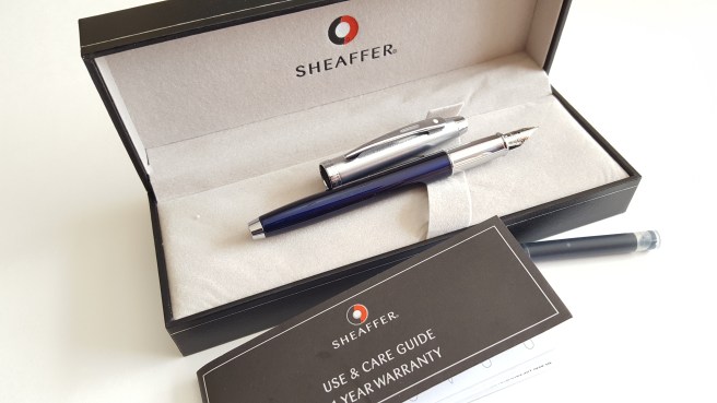
This year marks the 225th anniversary of WH Smith, the high street book shop, newsagent and stationer chain that is a familiar sight in our towns and cities. Our local branch, at Brent Cross shopping centre, North London has reinvigorated its fountain pen display cabinets. This was a welcome find, when I visited recently. I enjoy looking around for anything new. This time I was rewarded with their dedicated self contained glass display cabinet showing a range of fountain pens from Parker, Cross, Waterman and Sheaffer each arranged in a fan shape although closer inspection revealed that the brands were intermixed.
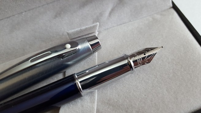
It was there that I spotted what I now know to be the Sheaffer 100, in translucent blue, with polished chrome section and a brushed stainless steel cap, featuring the trademark Sheaffer white dot. The pen, with cap posted, looked stunning with its vibrant blue barrel and contrasting silver coloured section and cap. The nib, with its decorative scroll work, harks back to the glory days of Sheaffer when they were made in Fort Madison, Iowa.
Sheaffer 100 Translucent blue and chrome
The pen looked to be good value, particularly in comparison with some of the other offerings on display with similar specification. With its striking good looks, needless to say, I succumbed to buying another pen.
The pen comes in a decently made and typical, black gift box with a removable padded tray, underneath which is a Use and Care Guide and 1 year warranty leaflet. Whilst this is for a Sheaffer pen, the name on the back of the leaflet nowadays reads A.T.Cross Company. You also get two Sheaffer Skrip cartridges, one blue and one black but no converter.
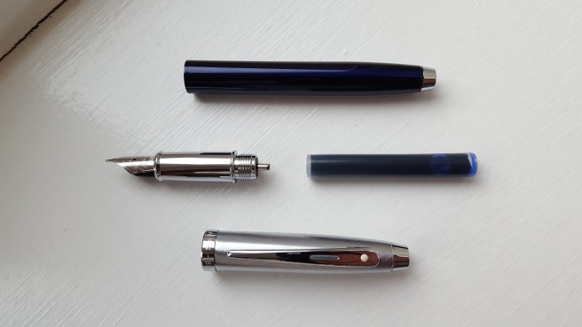
A feature of this pen is the shiny grip section. But there we have a contradiction in terms. Shiny sections are difficult for me to grip. I know this. I have a Cross Aventura with the same issue. The section looks pretty and photogenic but slips around in my hand.
Why is this important? We look at writing samples to see how nibs perform, how wide the line is, how dry or wet the ink flow is, whether it skips and so on. But there is another factor at work here. Is the pen comfortable to hold? And part of feeling comfortable with a pen, means being able to hold it securely and confidently so that you can exercise sufficient control of the pen as you write. At the same time, you do not want to be overly aware of how you are holding the pen, which you will be if you are gripping too tight as your hand will tell you after a little while.
A pen which cannot be gripped securely will manifest itself in shaky and erratic writing. Happiness does not shine through.
In the case of the Sheaffer 100, I have been writing with it for a few weeks now and have become accustomed to holding the pen just above the join of the section and the barrel. In this way, I can hold the blue barrel between finger and thumb, whilst the cool and shiny section rests on my second finger. This works for me. It feels slightly higher than I would normally hold a pen, but not too much higher like chopsticks.
Holding the pen further back from the nib also means that you still need sufficient length for the back of the pen to rest in the crook of your hand. The pen unposted measures 120mm (4 3/4 inches) but happily, the cap posts securely (if you give it a firm push) and brings the pen up to 149mm (about 5 7/8ths inches) which is a very comfortable length, for me. The pen weighs 28g capped or posted. Uncapped it is 18g, with the cap weighing 10g. I like to use it posted and this is not too heavy.
As for the writing experience, I tried the pen first with the supplied blue Sheaffer Skrip cartridge. The medium nib wrote a nice wet line, on the fine side of medium. The nib looks very attractive. However, seen under a loupe, the tipping on my nib looked just a little off, with the nib slit at the tip being not quite perpendicular when viewed head on, but leaning towards a 1 o’clock to 7 o’clock line. I decided to leave it to wear in naturally and I think it will wear smooth as I use the pen.
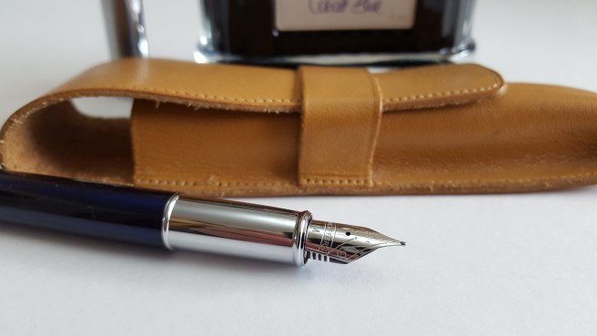
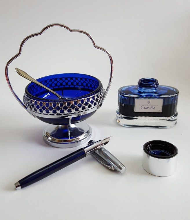
Whilst having a lovely ink flow, the blue Skrip did bleed through quite badly on a particular Paperchase notebook that was using such that when I finished the first cartridge I syringe-filled it with Graf von Faber-Castell Cobalt blue, which I am using now and without the bleedthrough.
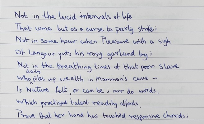
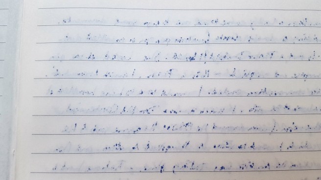
Sheaffer 100 with Medium stainless steel nib and Graf von Faber-Castell Cobalt blue ink on Rhodia 90gsm paper. Words by William Wordsworth.
I have adapted to holding the pen a little higher than I might otherwise, in view of the slippy no-go area of chrome section. But it is good to adapt and be comfortable with using different pens, rather like being able to drive different types of car.
If I had not liked the look of the pen I would not have persevered with it but I am fond of Sheaffers and it has been worth the effort.
Paperchase, Inky Swirls Open Spine notebook, with Cleo Skribent Classic Metal, piston filler.
For the notebook enthusiast, Paperchase has a lot to offer. For those unfamiliar with the name, Paperchase is a chain of high street stationery shops here in the UK, selling pens, greeting cards, novelty gifts and stationery supplies as well as numerous styles of notebooks. The shops are bright and attractive although the displays of fountain pens in spot-lit glass-shelved cabinets, are very uniform from branch to branch. You will never see a fountain pen displayed at an angle of other than 90 or 180 degrees on the shelf and equidistant from its neighbour. Not that this a bad thing particularly. I enjoy browsing and shopping there. They also have a loyalty card offering various special offers and benefits.
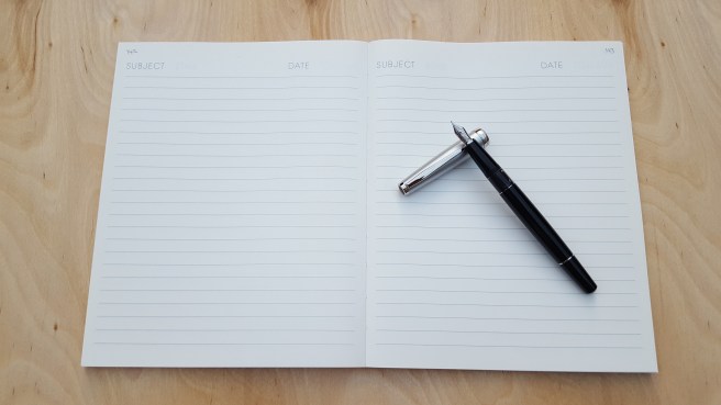
On a recent visit, I noticed a new type of notebook. Available with a choice of cover design, (I chose the Inky Swirls), this measures 216mm x 172mm (8.5 inches x 6.8 inches). It contains 288 pages, of cream (not quite white) paper, with headings “SUBJECT” and “DATE” at the top of each page. Lines are ruled, in a reasonably wide format that I like, giving 22 rows per page (not including your header and footer area).
What sets this note book apart however, is that the pages are sewn AND the notebook does not have a covered spine! At first glance, it looks like a book from which the spine has come off. Instead, you look directly upon the neat row of batches of sewn pages.
The unusual exposed binding of the open spine notebook
The colourful front and back cardboard covers are attached, with dark grey end papers. The notebook is nicely bound, but the absence of a spine looks a bit odd at first.
The great advantage though, is that the notebook will open and lay flat easily at any page. This is quite unusual.
Notebook opens flat with ease.
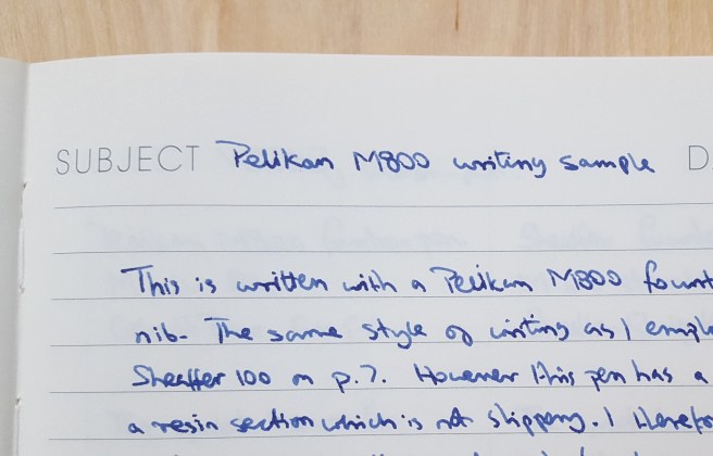
At home I paginated my notebook (surprisingly relaxing, thanks for asking) and then tried out a few different fountain pens on the last page to see how the paper behaved. I found it very smooth and pleasant to write on. However, the ink did bleed through the paper with most of the pen and ink combinations that I tried, to the extent that you might use only one side of each sheet, if you are fountain pen user. There were some combinations that fared better. My Cleo Skribent Classic with fine stainless steel nib (currently inked with Cross black) writes a very fine line and did not bleed through. Also My Pelikan M800, medium nib, with Graf von Faber-Castell Cobalt Blue did quite well at avoiding bleedthrough, (unless you let the nib linger too long in one spot). On the other hand, a very wet Sheaffer 100 with a Sheaffer Skrip blue cartridge, bled like a stuck pig.
The back of a page, demonstrating bleedthrough from a Sheaffer 100 inked with Sheaffer Skrip blue cartridge.
In the UK we have a saying, that there is no such thing as bad weather, just bad clothes. This set me thinking that perhaps there may be no such thing as not fountain pen friendly; you just need to find the right friend.
For example, I have been reading a very cheap penguin paperback edition of William Wordsworth Selected Poems. The yellowed, coarse paper is of the type that you would probably not even consider writing on with a fountain pen. Ironically, some of the most beautiful poetry in the English language, printed on some of the worst paper. However with a bit of trial and error I found that the ultra fine Cleo Skribent Classic with Cross black is also able to write on this without undue feathering, bleed or showthrough. It is satisfying to find combinations which cater to a paper’s strengths or weaknesses.
The Cleo Skribent Classic with stainless steel fine nib. There was no bleedthrough with Cross Black ink.
I am fond of the cheap edition of Wordsworth’s poems. I don’t mind that the cover gets creased and dog-eared. And I don’t need to feel too worried about scribbling in it. In a way, the Paperchase open spine notebook looks a little like a book that has been pre-loved and worn. I rather like it.
The Pelikan M800 likes this notebook. No bleedthrough, with Graf von Faber-Castell, Cobalt Blue.
Today marks the second anniversary since my father in law, Chiu Fa Chan passed away on 29 July 2015. He was in his 90th year. He had been fit and active, but died after a short stay in hospital from complications following an operation.
As a young man, growing up in China, he went to sea, working on cargo ships and travelling the South China Seas. He rose to second officer. Later, in China he was to become a respected lecturer in navigation. He was still in touch with some of his former students from decades ago, now all elderly. He enjoyed a reunion with a group of them when he last visited China.
For the last twenty years of his life, he and his wife lived in London, not far from my wife and I.
He knew of my interest in fountain pens and I would sometimes show him my new acquisitions. He once told me the story, that with his very first month’s pay at sea, when going ashore at Singapore, he had bought himself a new Parker 51. Unfortunately the story had a sad ending as it went missing from his cabin not long afterwards. I don’t think he bought another one.
Last year at the London Pen Show, I bought a Parker 51 Aerometric in cedar blue which bears the markings Made in USA, 9, which I think dates from 1949 and so would be a similar age to dad’s pen if we still had it.
People often remember what they bought with their first earnings. In my case, after some temping work in my college holidays in the late 1970’s , I bought a portable typewriter and a book Teach Yourself Typewriting and laboriously set about learning to touch-type, (up to a point), little knowing that I would be spending such large chunks of my working and leisure hours at a keyboard in the years to come.
This morning my wife, her mum and I visited the peaceful gardens of the Golders Green Crematorium, North West London to see dad’s memorial stone and leave some colourful flowers, which my wife had brought from his own garden.