
What is it about the combination of electric blue and chrome which makes it so captivating and (to me) irresistible?
This year marks the 225th anniversary of WH Smith, the high street book shop, newsagent and stationer chain that is a familiar sight in our towns and cities. Our local branch, at Brent Cross shopping centre, North London has reinvigorated its fountain pen display cabinets. This was a welcome find, when I visited recently. I enjoy looking around for anything new. This time I was rewarded with their dedicated self contained glass display cabinet showing a range of fountain pens from Parker, Cross, Waterman and Sheaffer each arranged in a fan shape although closer inspection revealed that the brands were intermixed.
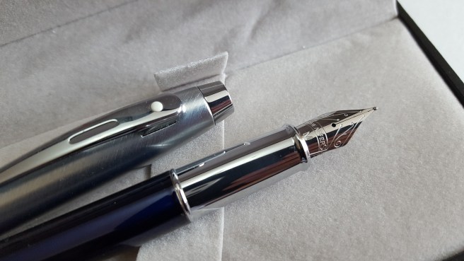
It was there that I spotted what I now know to be the Sheaffer 100, in translucent blue, with polished chrome section and a brushed stainless steel cap, featuring the trademark Sheaffer white dot. The pen, with cap posted, looked stunning with its vibrant blue barrel and contrasting silver coloured section and cap. The nib, with its decorative scroll work, harks back to the glory days of Sheaffer when they were made in Fort Madison, Iowa.
The pen looked to be good value, particularly in comparison with some of the other offerings on display with similar specification. With its striking good looks, needless to say, I succumbed to buying another pen.
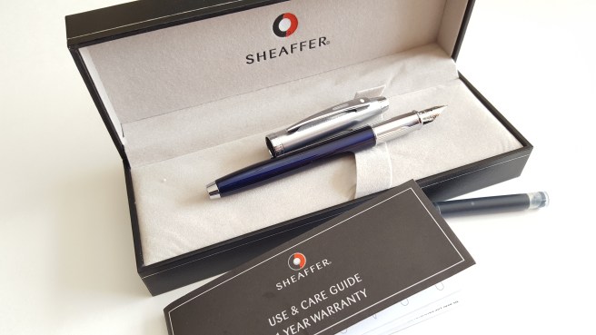
The pen comes in a decently made and typical, black gift box with a removable padded tray, underneath which is a Use and Care Guide and 1 year warranty leaflet. Whilst this is for a Sheaffer pen, the name on the back of the leaflet nowadays reads A.T.Cross Company. You also get two Sheaffer Skrip cartridges, one blue and one black but no converter.
A feature of this pen is the shiny grip section. But there we have a contradiction in terms. Shiny sections are difficult for me to grip. I know this. I have a Cross Aventura with the same issue. The section looks pretty and photogenic but slips around in my hand.
Why is this important? We look at writing samples to see how nibs perform, how wide the line is, how dry or wet the ink flow is, whether it skips and so on. But there is another factor at work here. Is the pen comfortable to hold? And part of feeling comfortable with a pen, means being able to hold it securely and confidently so that you can exercise sufficient control of the pen as you write. At the same time, you do not want to be overly aware of how you are holding the pen, which you will be if you are gripping too tight as your hand will tell you after a little while.
A pen which cannot be gripped securely will manifest itself in shaky and erratic writing. Happiness does not shine through.
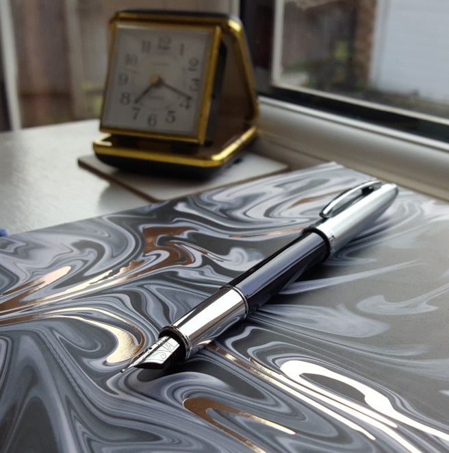
In the case of the Sheaffer 100, I have been writing with it for a few weeks now and have become accustomed to holding the pen just above the join of the section and the barrel. In this way, I can hold the blue barrel between finger and thumb, whilst the cool and shiny section rests on my second finger. This works for me. It feels slightly higher than I would normally hold a pen, but not too much higher like chopsticks.
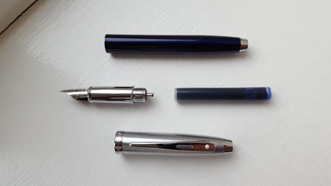
Holding the pen further back from the nib also means that you still need sufficient length for the back of the pen to rest in the crook of your hand. The pen unposted measures 120mm (4 3/4 inches) but happily, the cap posts securely (if you give it a firm push) and brings the pen up to 149mm (about 5 7/8ths inches) which is a very comfortable length, for me. The pen weighs 28g capped or posted. Uncapped it is 18g, with the cap weighing 10g. I like to use it posted and this is not too heavy.
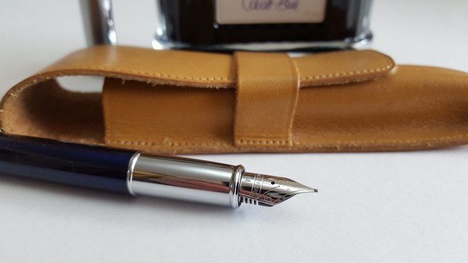
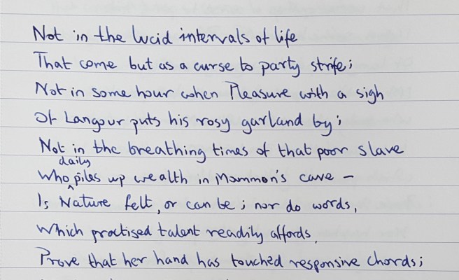
As for the writing experience, I tried the pen first with the supplied blue Sheaffer Skrip cartridge. The medium nib wrote a nice wet line, on the fine side of medium. The nib looks very attractive. However, seen under a loupe, the tipping on my nib looked just a little off, with the nib slit at the tip being not quite perpendicular when viewed head on, but leaning towards a 1 o’clock to 7 o’clock line. I decided to leave it to wear in naturally and I think it will wear smooth as I use the pen.
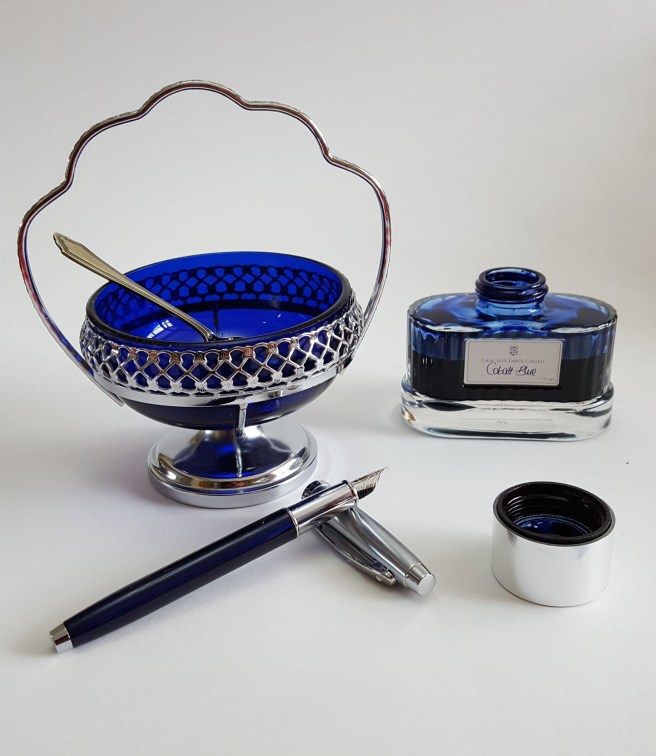
Whilst having a lovely ink flow, the blue Skrip did bleed through quite badly on a particular Paperchase notebook that was using such that when I finished the first cartridge I syringe-filled it with Graf von Faber-Castell Cobalt blue, which I am using now and without the bleedthrough.
I have adapted to holding the pen a little higher than I might otherwise, in view of the slippy no-go area of chrome section. But it is good to adapt and be comfortable with using different pens, rather like being able to drive different types of car.
If I had not liked the look of the pen I would not have persevered with it but I am fond of Sheaffers and it has been worth the effort.

I have the black steel combination of this butiful funtain pen. It is very handy autograph, especially in the posted mode
LikeLiked by 1 person