Here in London, our Autumn pen show took place on 13 October. As always, I had a wonderful day, meeting dozens of friends and acquaintances in the fountain pen community, both punters like myself, and dealers. Unfortunately, I failed completely to take any photos but am sure that others will have this covered.
This year, the show seemed bigger and better than ever. My wife and I did not arrive until mid-morning, when the show was in full swing, but it was clear that there were many more sellers than in recent years, including many from overseas, such that two large halls at the Novotel, Hammersmith were filled, with rows of tables, crowds of enthusiasts and a happy buzz of buying and selling. From what I heard, there was a long queue for the early-bird admission, for those eager for a first bite at the cherry.
Also, this show was different for me as I now find myself drawn increasingly to vintage pens rather than modern (although not entirely). I recently enrolled for the Pen Repair course, starting in November and available to WES (Writing Equipment Society) members. In preparation for this we had been advised to gather a few examples of certain pens to practice upon in the classes. My wife was better at keeping me on track to steer me towards the vintage tables, whereas left to my unaccompanied state, I have a tendency to be distracted and excited by every table.
The browsing was soon interrupted by a most enjoyable lunch with many from our pen club, at the nearby pub and restaurant, Latymers, where we gathered to refuel and see each others’ acquisitions.
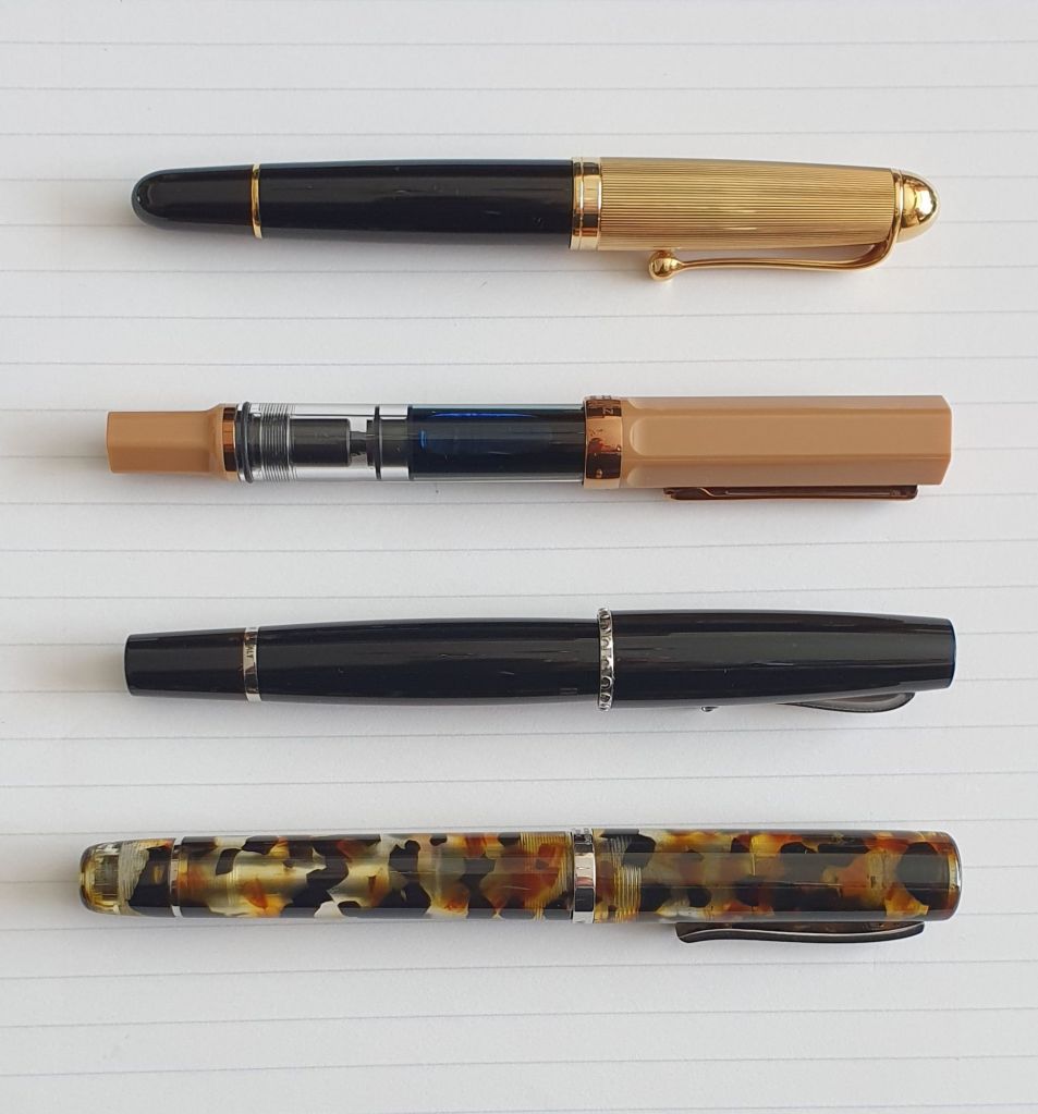
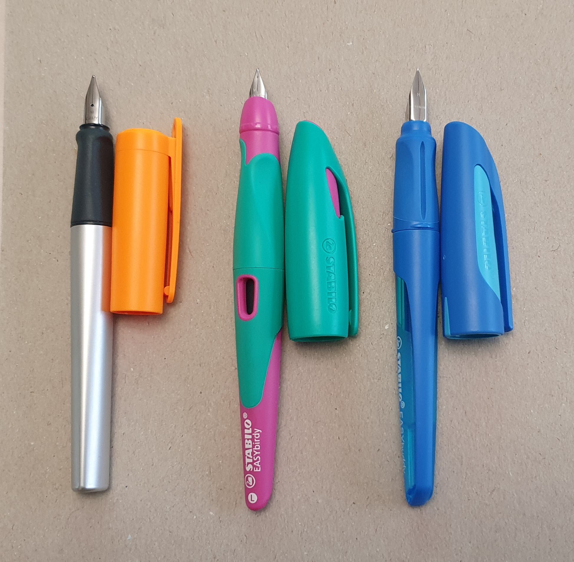
We returned to the show after lunch. Despite spending less time in the show than I would have liked, I still came away with eight pens. However, for my first time at a pen show, these were all vintage pens. I bought no modern pens, notebooks or inks, not that I needed any!
Such was the fervour of my shopping spree that it was not until I got home that I could take stock of what I had bought, from whom, and what I had spent. The final tally was that my eight pens had cost a total of exactly £300.00, off-set by another pen which I sold for £100.00, to leave a net outlay of £200.00. I was content with that. Also, none of the pens had cost more than £60.00.
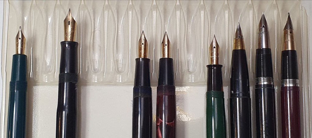
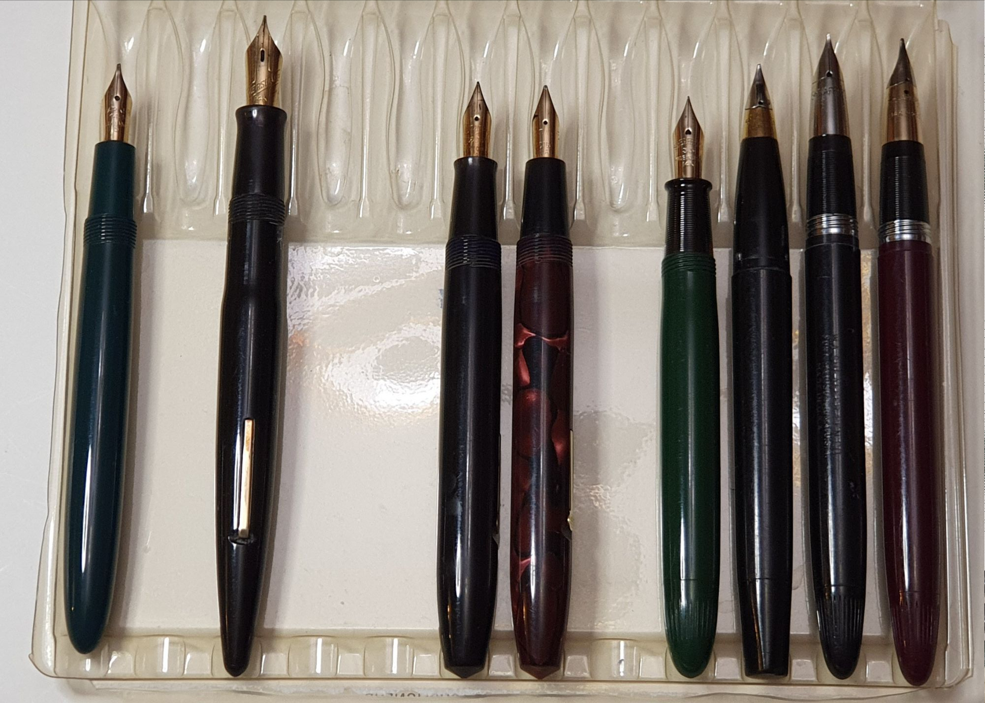
So without further ado, here are my purchases:
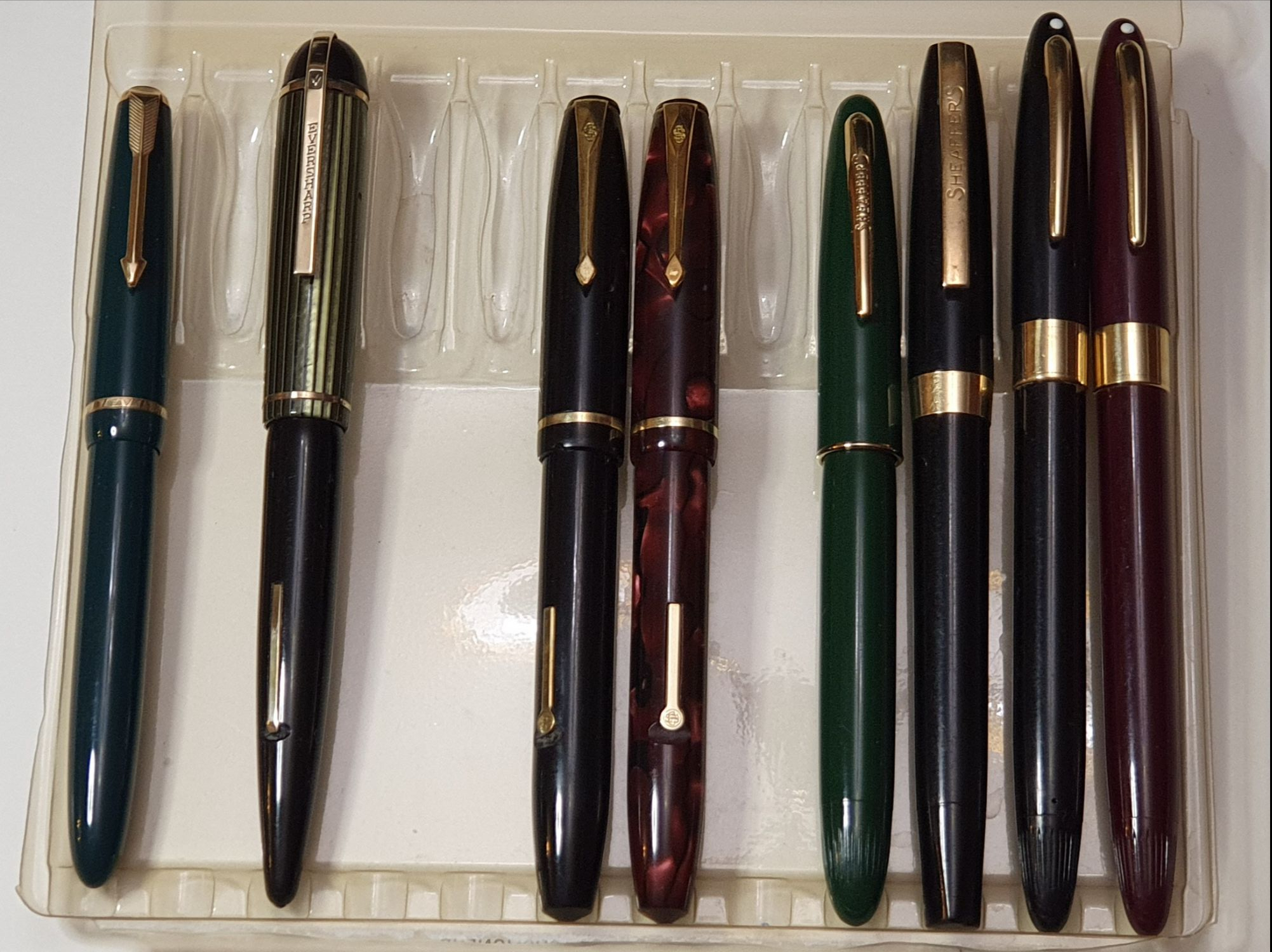
- Parker Slimfold, green; 14k gold No. 5 nib;
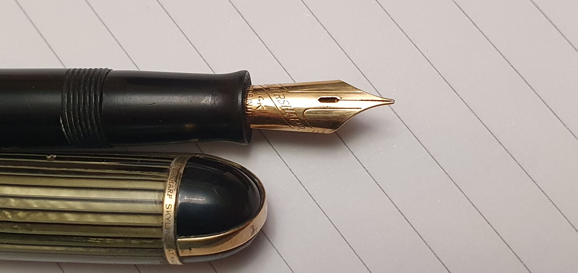
- Eversharp Skyline, green and black: 14k gold nib; (very excited with this one);
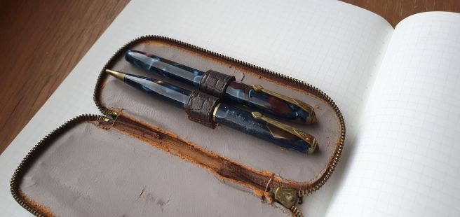
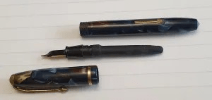
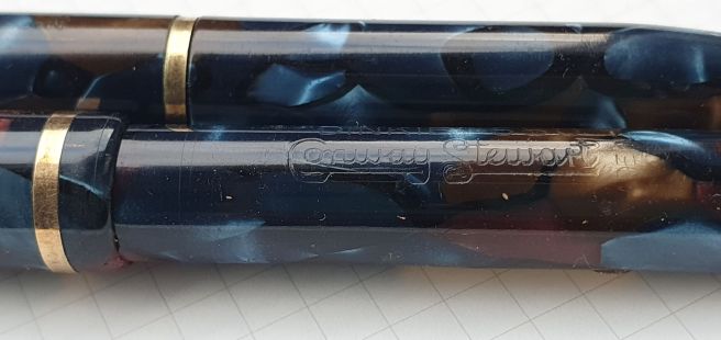
- Conway Stewart 15, black; 14k gold No 1A nib;
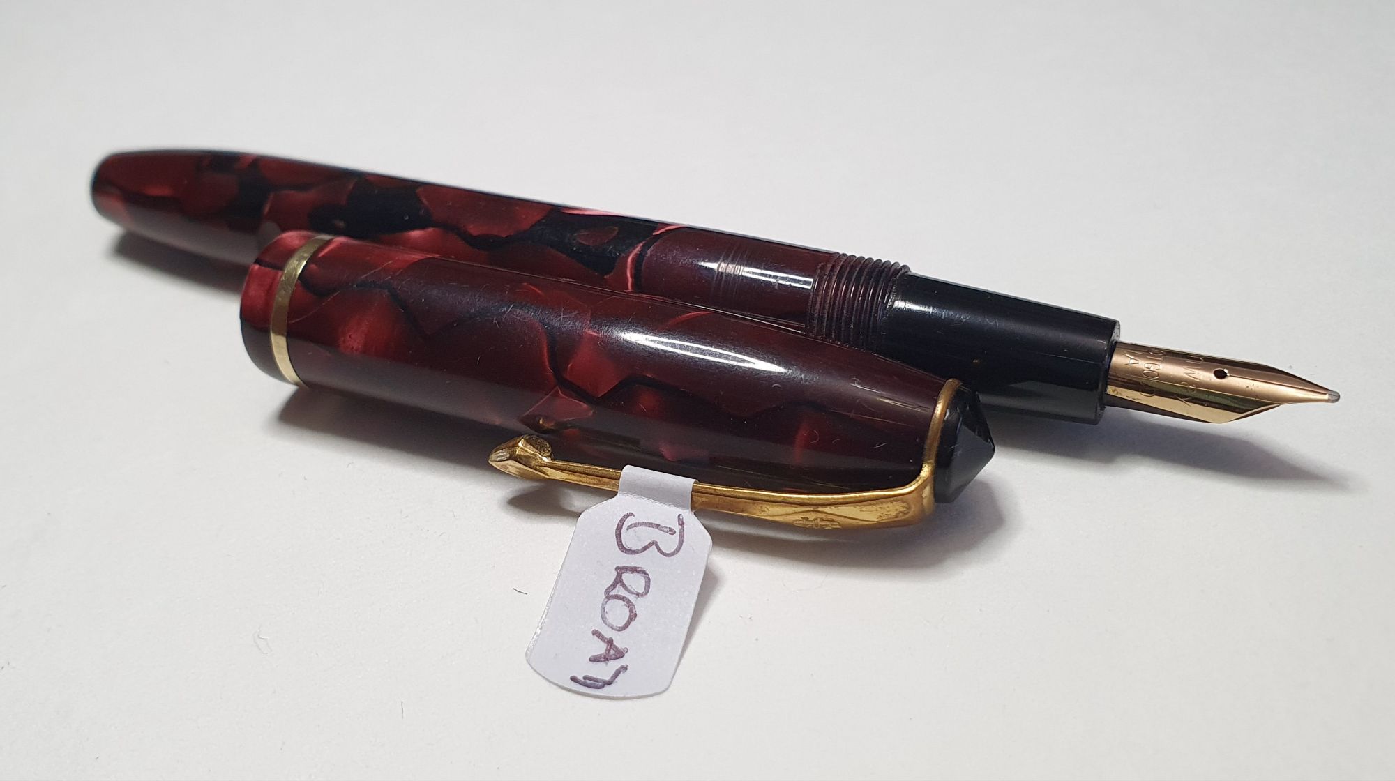
- “Conway 15”, marbled red; 14k gold No 1A nib;
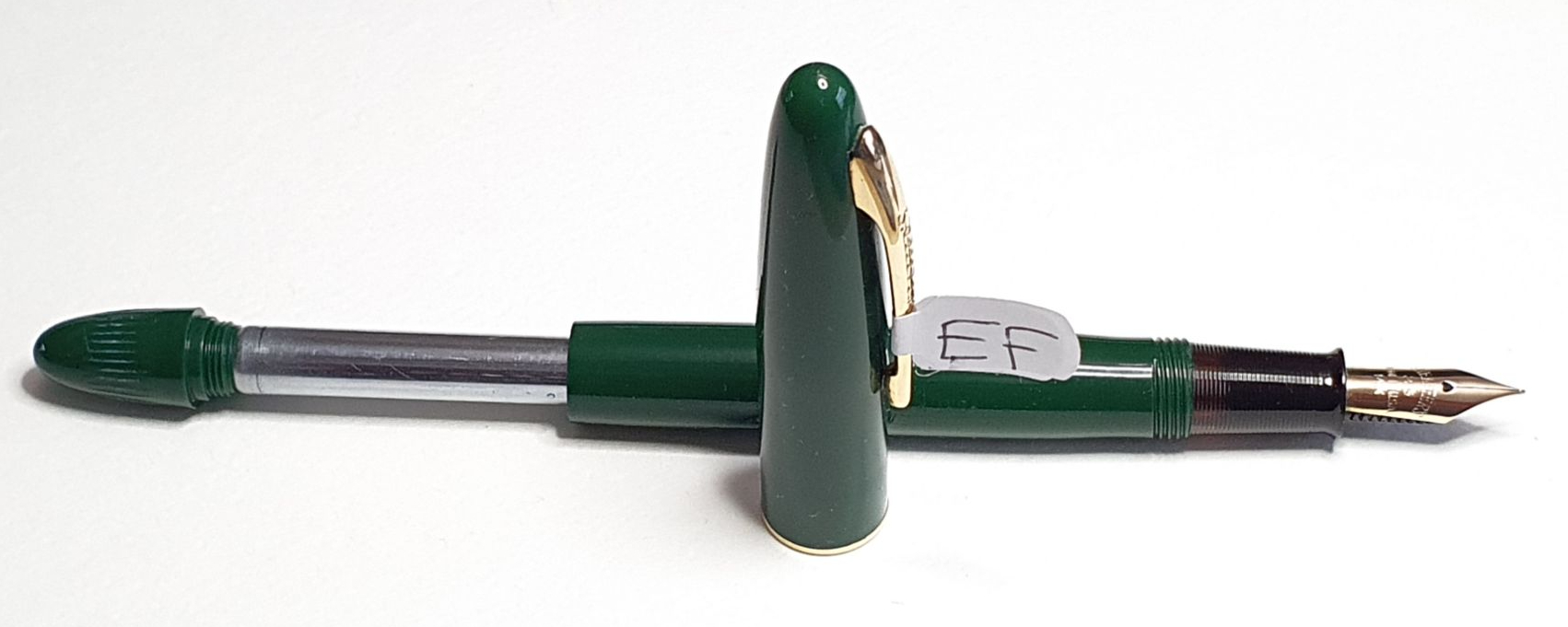
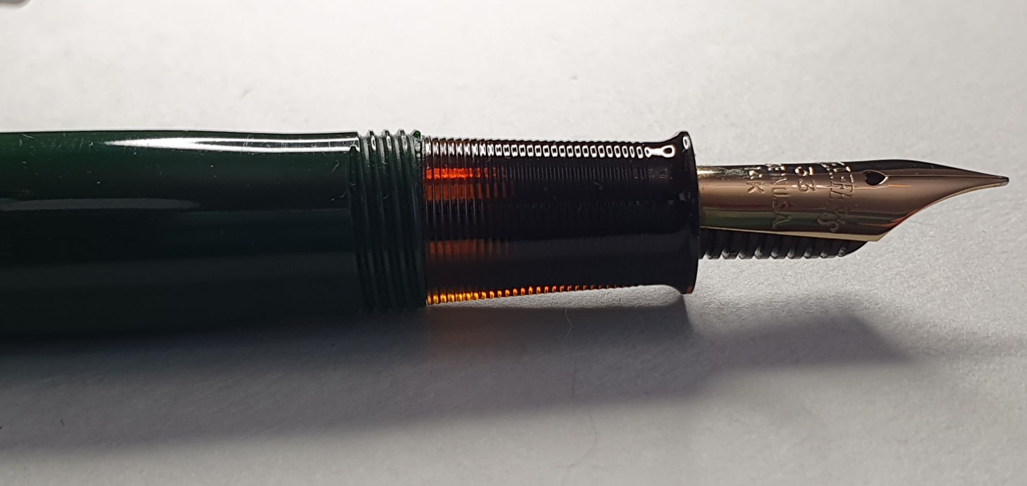
- Sheaffer Craftsman Touchdown filler, green; 14k gold No. 33 nib;
- Sheaffer, black, (model not yet identified) Touchdown filler; two-tone steel nib; made in Australia;
- Sheaffer
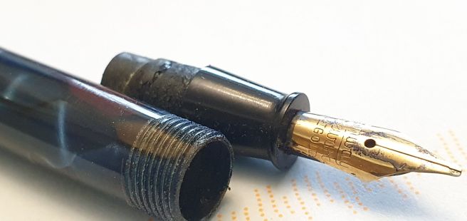
ClipperStatesmen, Snorkel filler, black, stainless steel nib (needing repair), made in USA; (see update) - Sheaffer
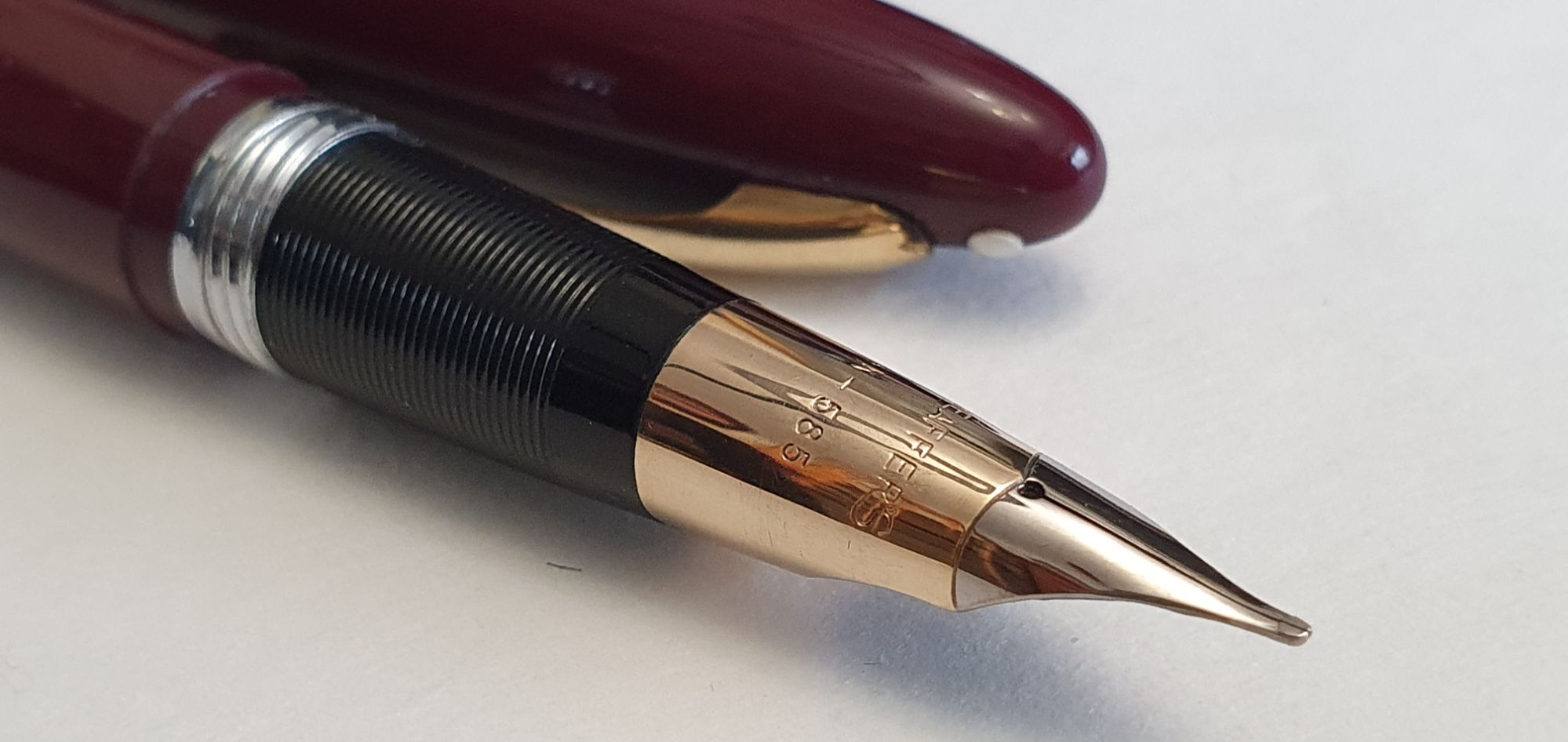
ClipperValiant, Snorkel filler, Burgundy, 14k two tone nib, made in USA. (see update)
I spent a happy evening, inking and testing half of these. The remainder, minus the one that is for repair, I inked and tested the following day. There are a variety of nib widths. The Parker has the usual squeeze bar filler. The rest are all lever fillers, Touchdowns or Snorkels.
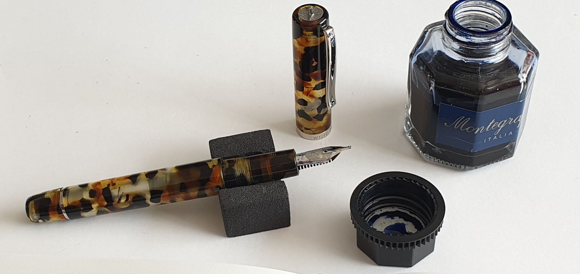
The Eversharp Skyline is the first that I have owned. The seller, Heritage Collectables, had several to choose from but the green striped cap was calling to me! It writes with a lovely smooth effortless flow.
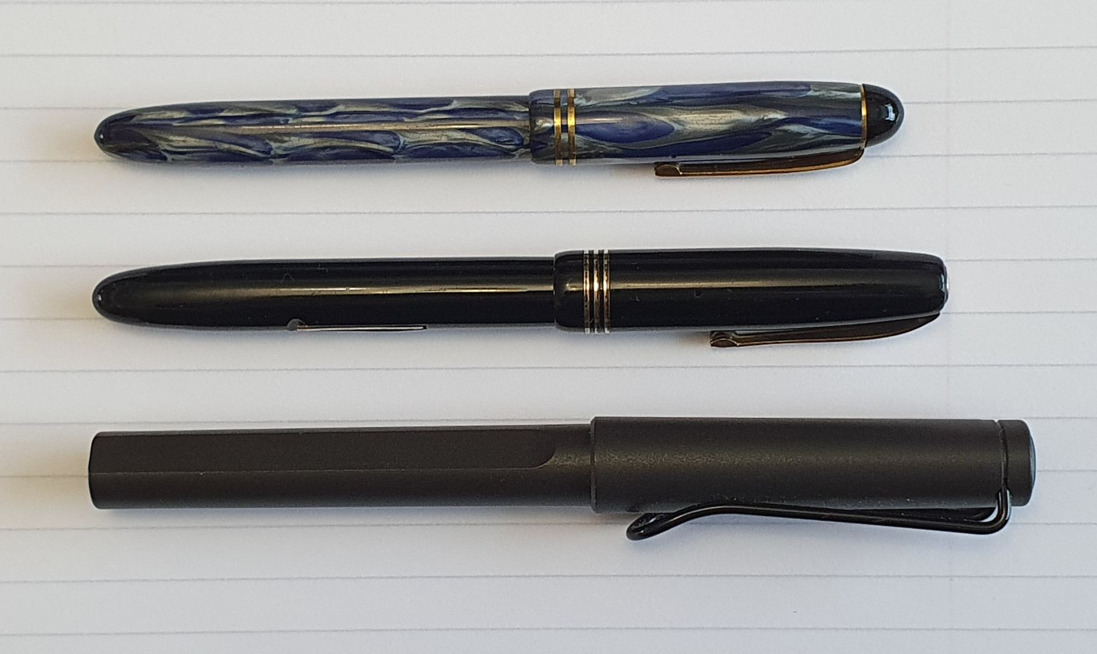
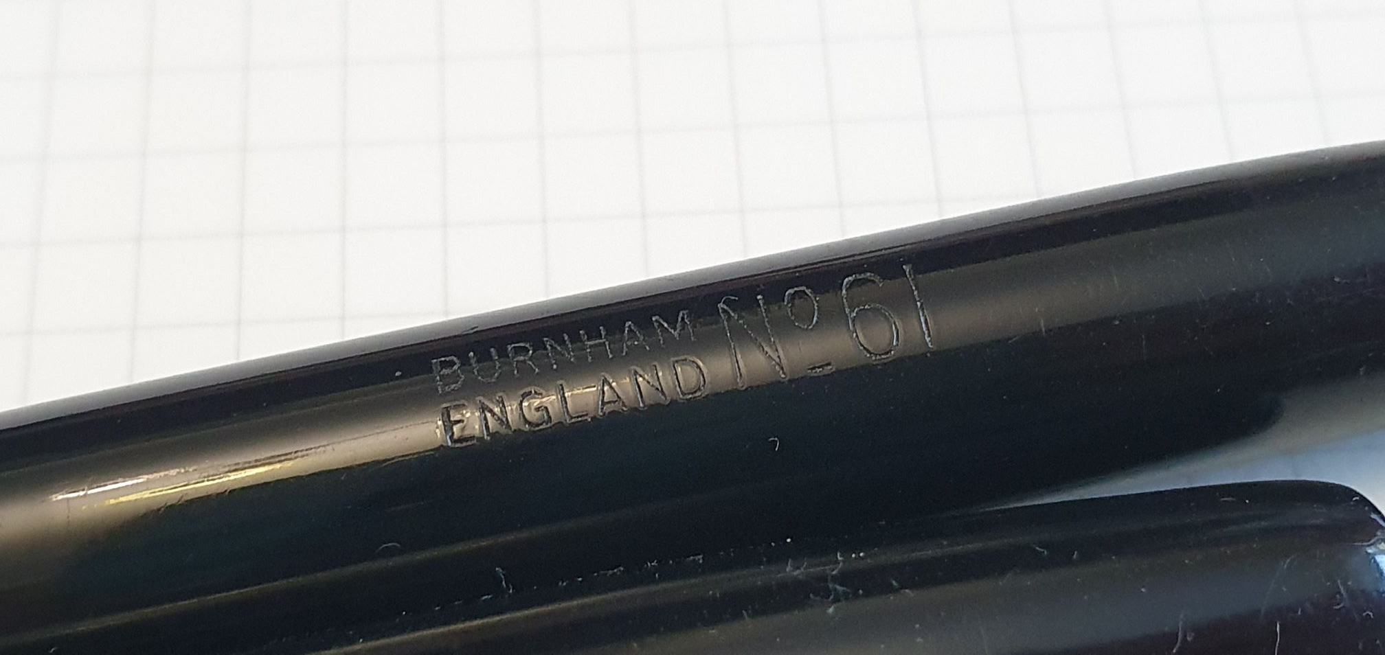
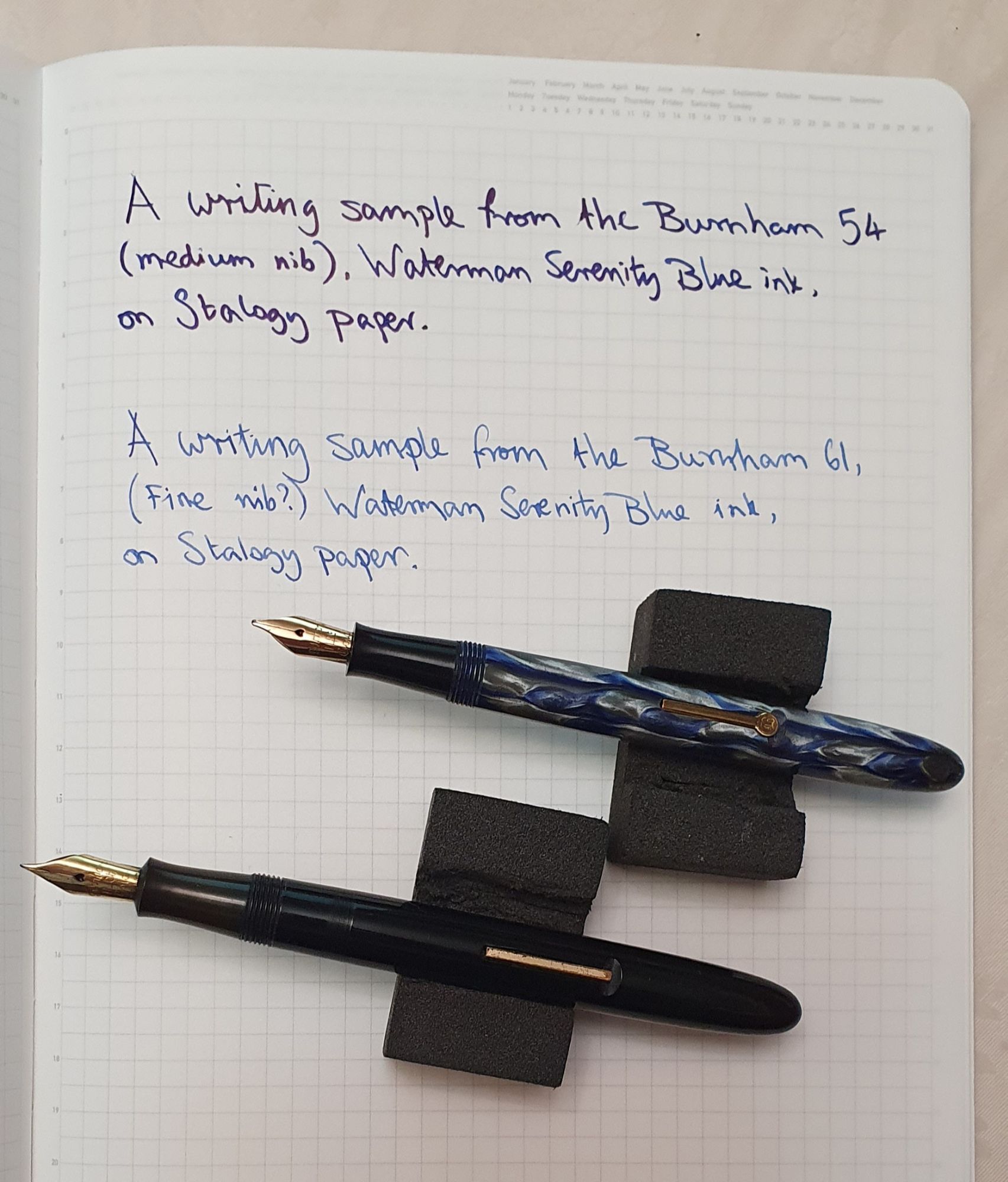
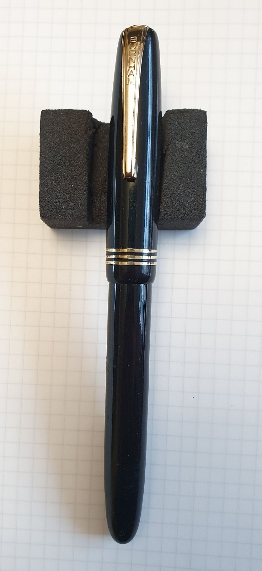
I did not appreciate until I got home that my two Conway Stewarts were both 15s, although the red one is marked “Conway” and the black one “Conway Stewart.” One is a fine and the other broad and I am delighted with them both. (A recent eBay purchase, a black lever fill Burnham 61, which is very similar in size to the Conway Stewart 15, was a surprise success and now one of my favourite pens).
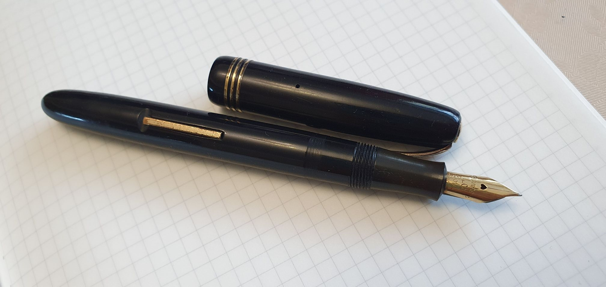
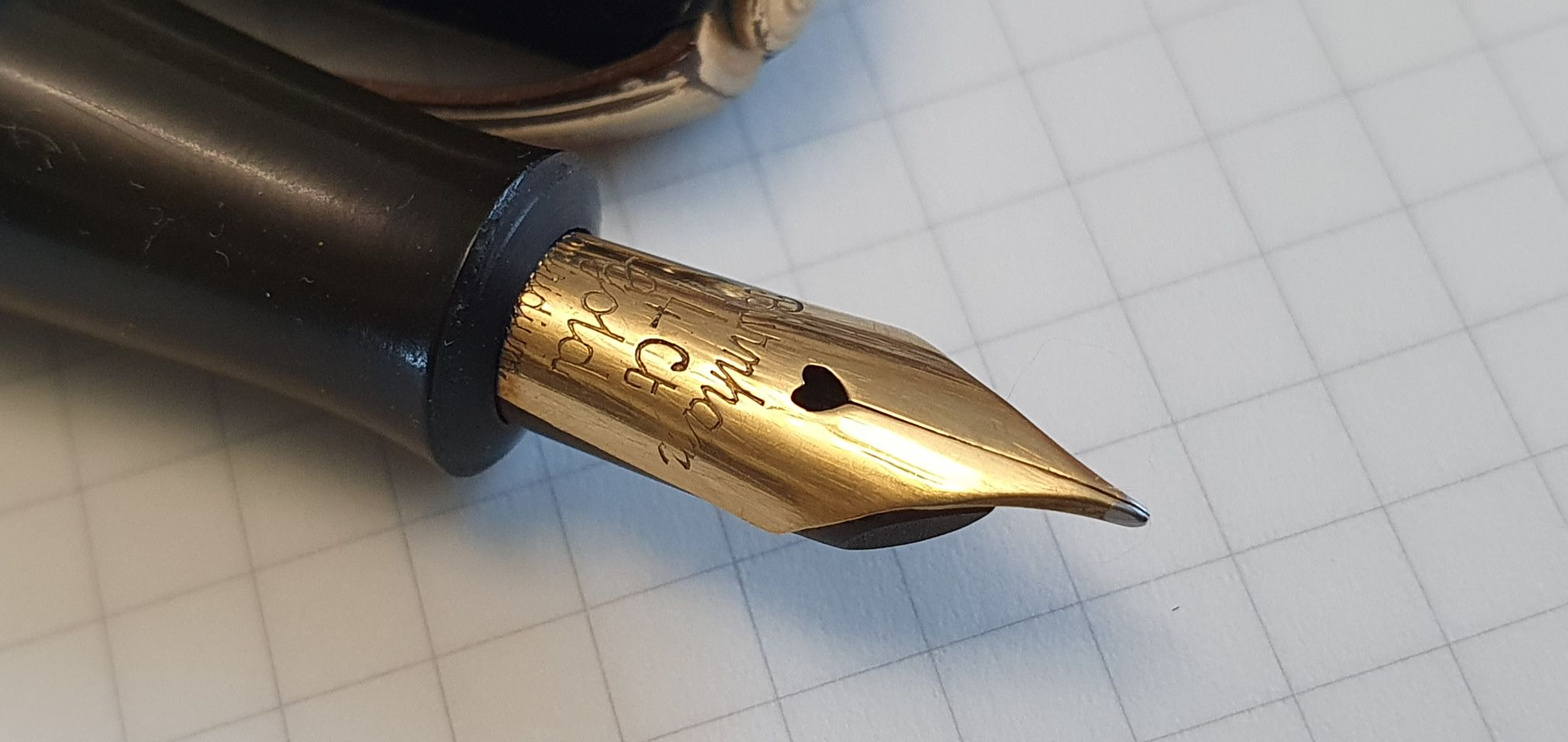
Of the four Sheaffers, the smaller, green Sheaffer is, I believe, a Craftsman, Touchdown filler and has a dreamy, 14k gold EF nib. I am always thrilled at how enjoyable these vintage pens can be, for so little outlay.
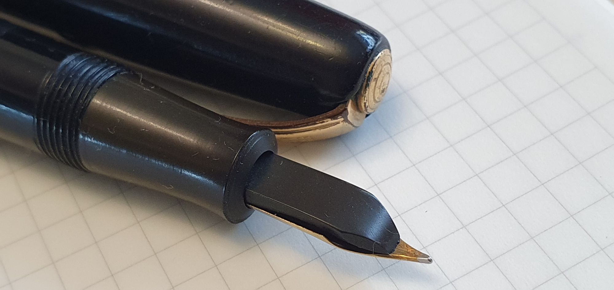
There is a black, steel nibbed Sheaffer from Australia, a Touchdown filler but a model that I have not yet identified. It was rescued from a bin of jumbled pens, each only £20.00 yet seems to be working well and with a decent smooth nib, but having a loose clip.
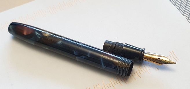
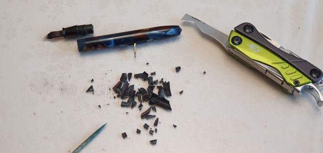
Finally, there are the two Sheaffer Snorkels, which I think are the Clipper model but I am not yet certain. Of these, the Burgundy model is functioning well, whereas the black one needs attention and was purchased cheaply to practice upon.
Update edit, 14 October 2024: I have since learned that there were some 13 different named versions of the Sheaffer Snorkel filler, which can be identified according to whether or not there is a white dot on the cap, whether the nib is open or a “Triumph” style, conical nib, whether the nib is made of Gold or a Palladium/Silver alloy (sometimes marked PdAg), and whether the cap is of plastic or metal. From this, I now think that my Burgundy snorkel is the Valiant, whilst the black snorkel is a Statesman, but I may be wrong! The nib of my black snorkel is a Triumph style, monotone silver-coloured but the imprint consists only of SHEAFFER’S, with no hallmark.
I have not yet got used to knowingly buying pens for repair, but am looking forward to learning new skills and gaining confidence on the coming Pen Repair course. Even just enrolling for the course has improved my confidence! I have worked on four pens recently with my newly-acquired tools. I did not manage to buy many pens for repairs at the show, although a few dealers did have some. I may need to resort to eBay for more to practice on.
Word went around at the show that from next Autumn, the London Pen Show will be held over two days instead of one and this is a good sign for the future of the hobby and its wonderful community.