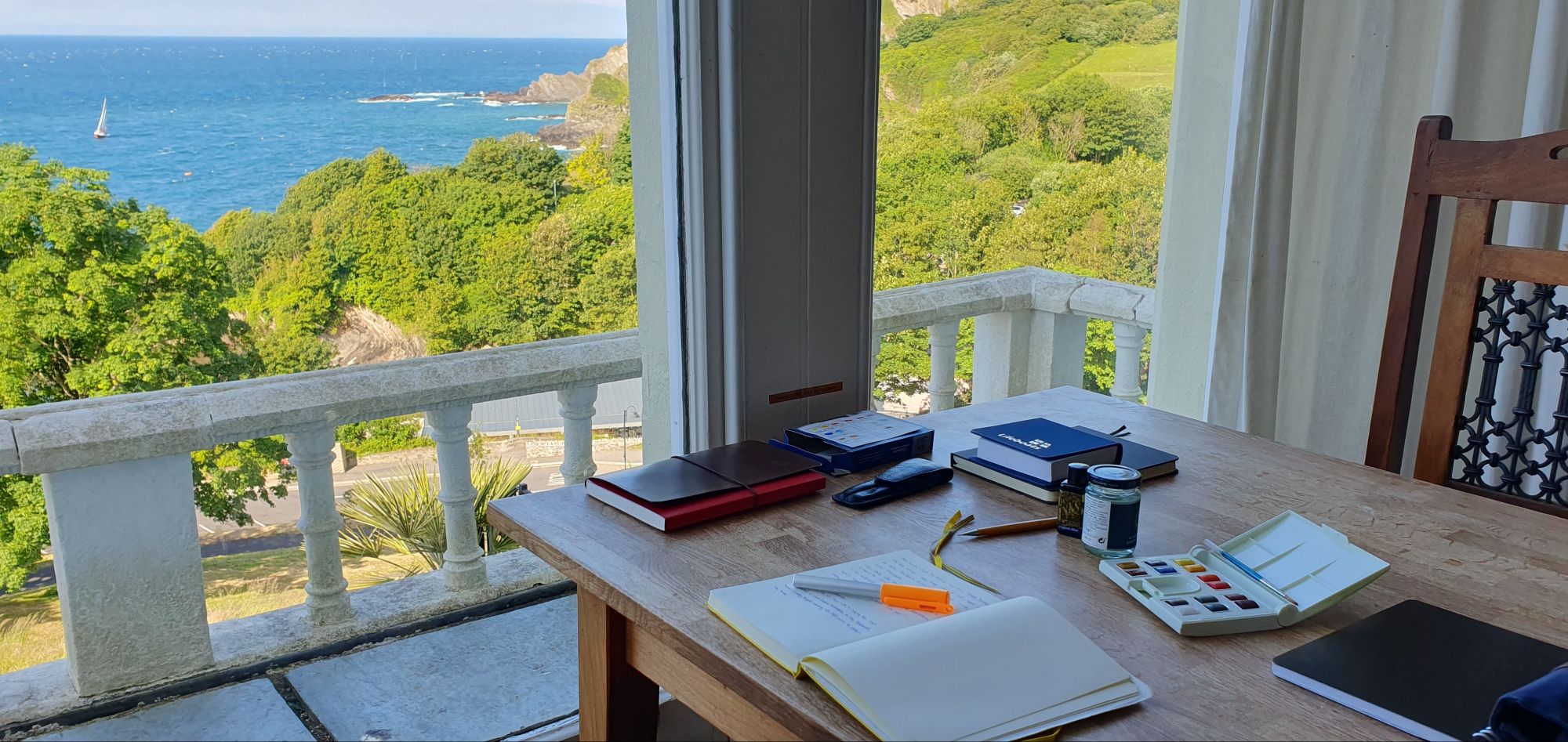
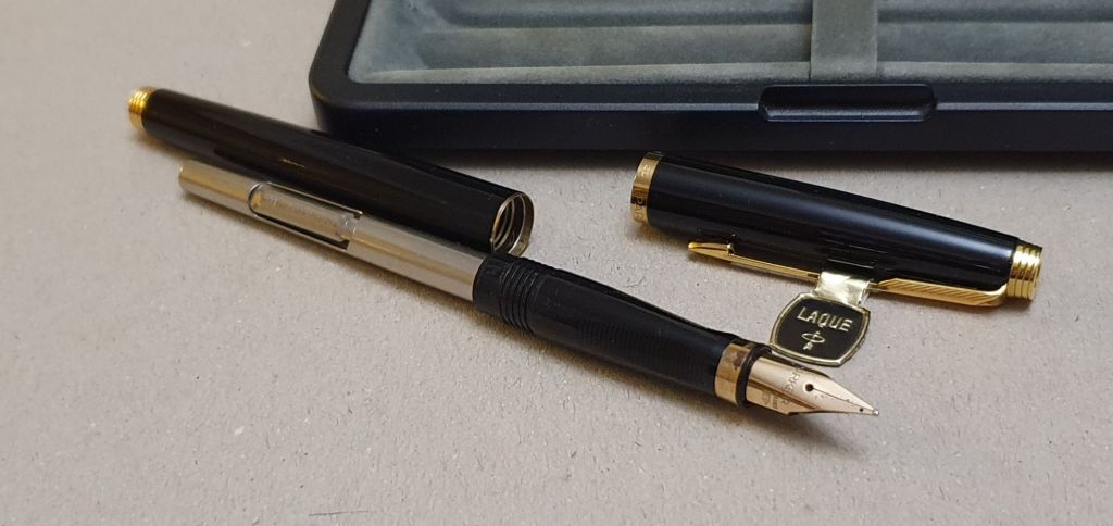
Last Sunday I enjoyed a day at the Birmingham Pen Show, held in the Birmingham Conference and Events Centre, “the BCEC” in Hill Street, a short walk from the main train stations. It was good to see so many of the familiar vendors whom I know from the London Pen Shows.
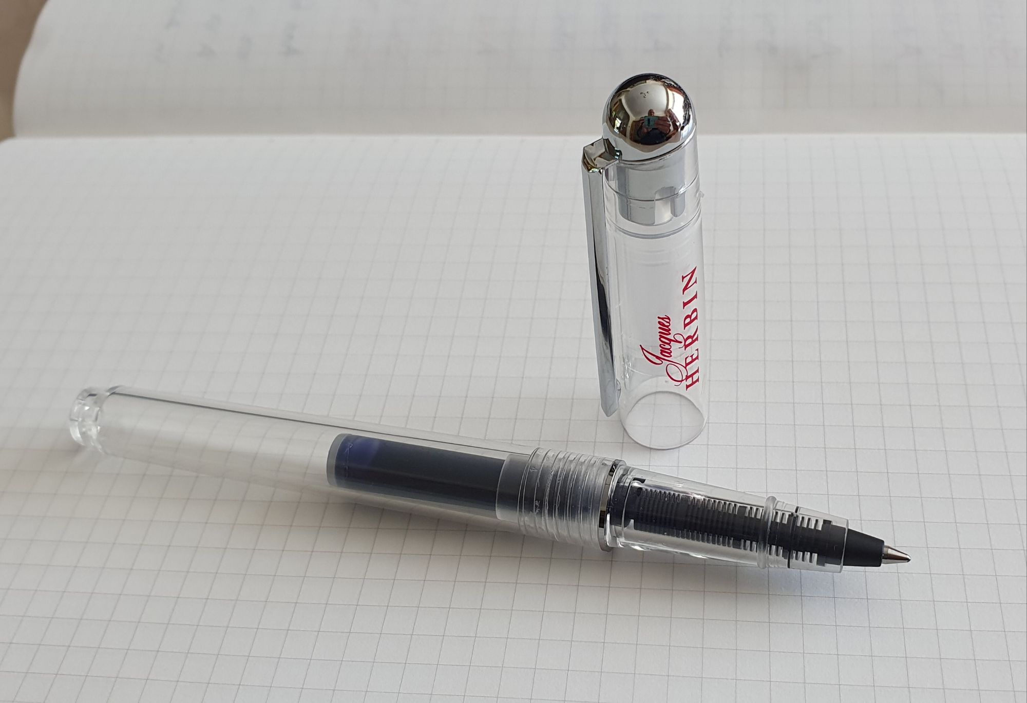
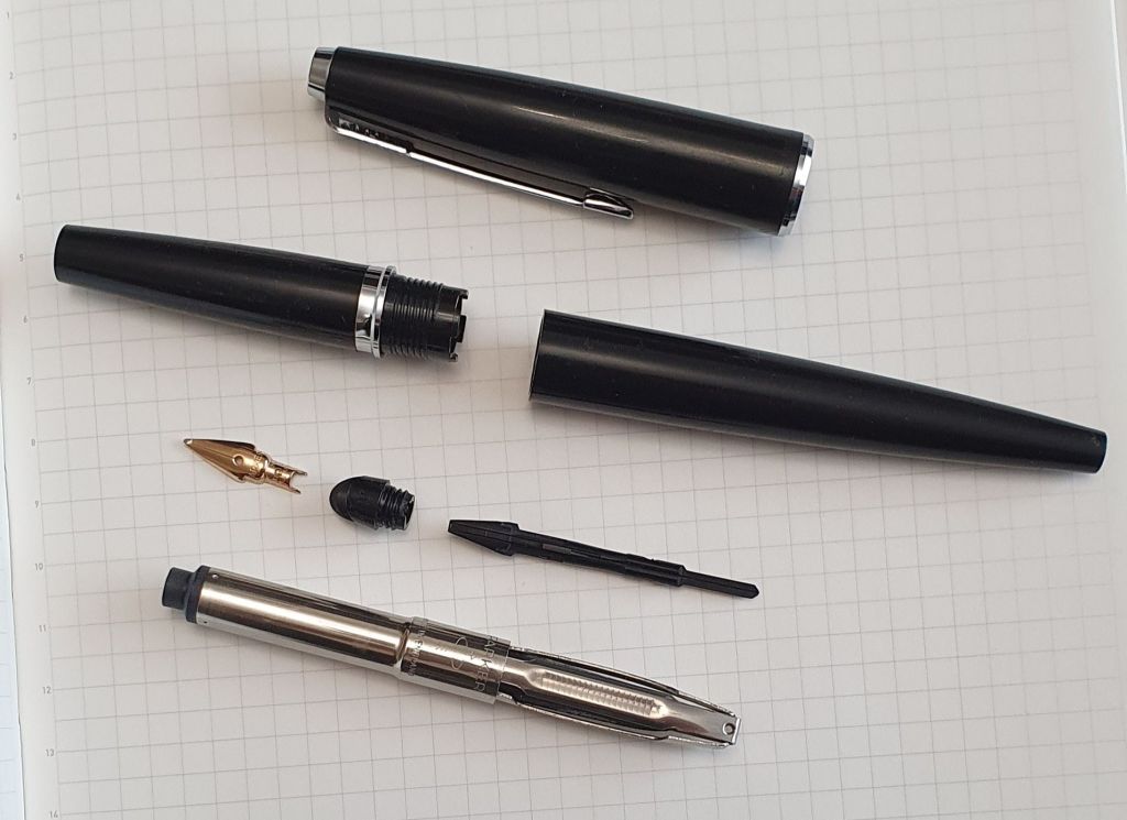
Before entering the main hall, I visited Michael Owen’s table, representing Writech. He asked me whether I had seen his retractable fountain pens. I had not! He had one on the table to try as well as a stand with examples of the pen in a range of pastel colours.

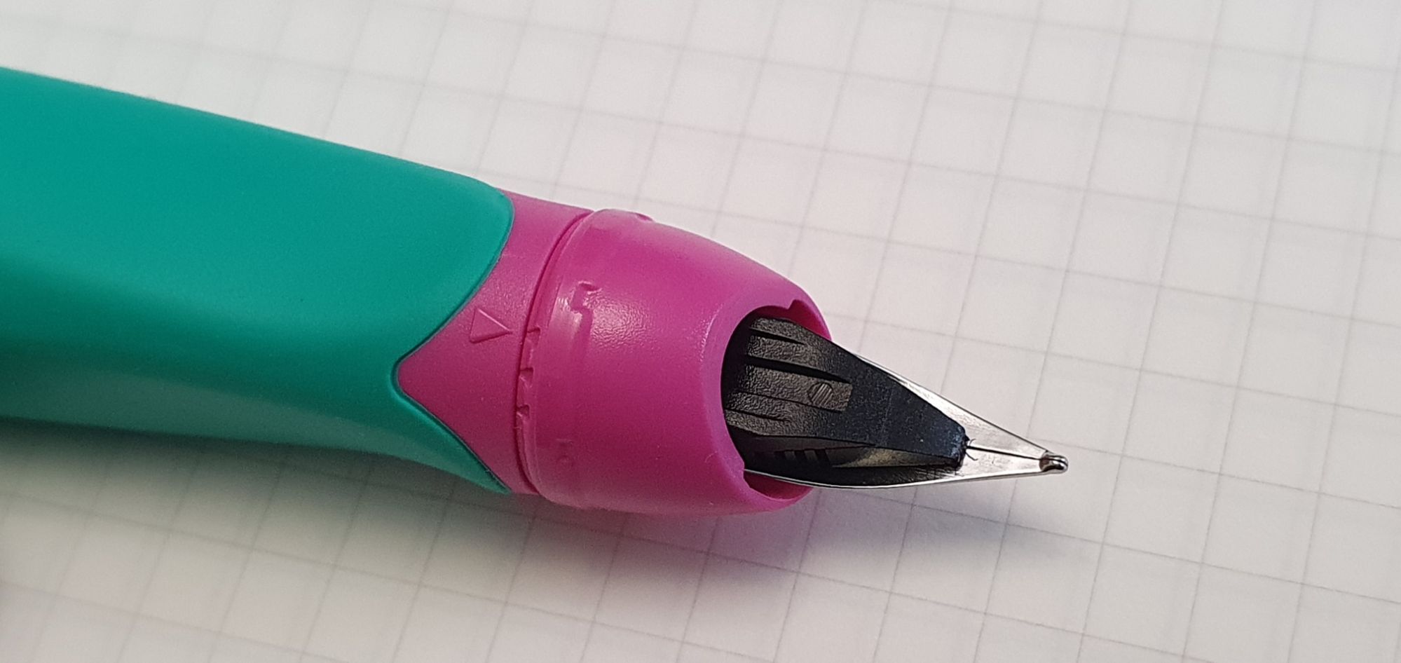
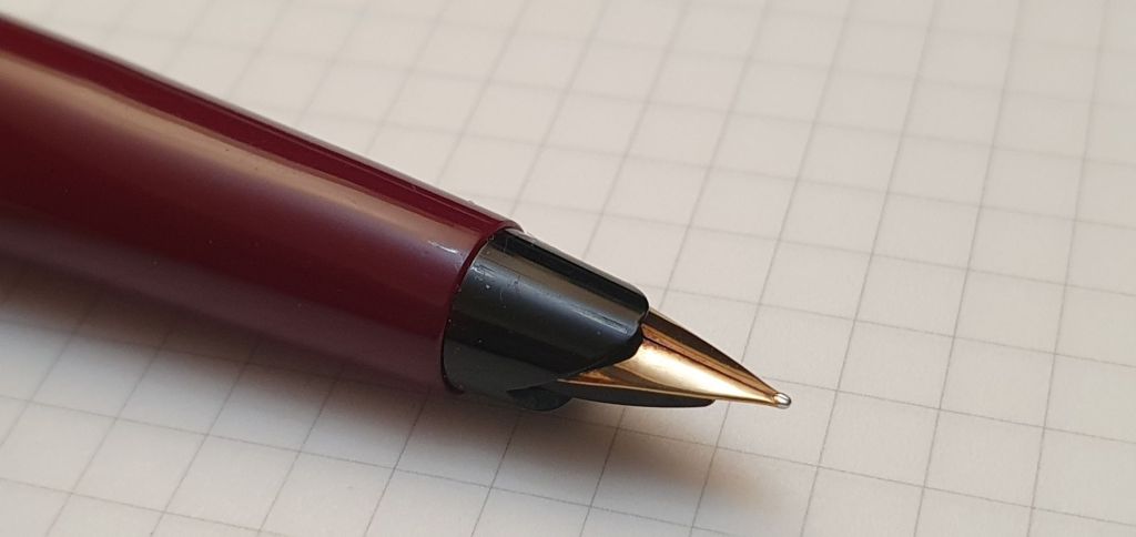
I picked up the pen and clicked open the nib. Actually, the clicking mechanism is almost silent, whether extending or retracting the nib, a boon for anyone using the pen in a meeting or quiet public environment, or sitting next to one!
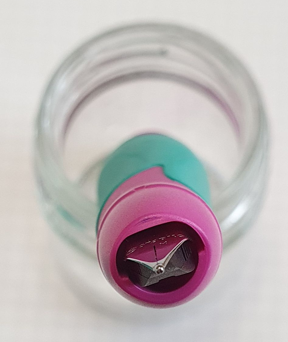
When the knock is pressed, a little round plastic hatch door opens and out comes the nib, just like a ball pen. But unlike a ball pen, a door seals off the nib to stop the ink from drying out or evaporating away, whilst not in use.

This is not new of course, Pilot having brought out the Capless in 1963, for the Tokyo Olympics of 1964. These have been followed by the Lamy Dialogue and, more recently, the Platinum Curidas.
Designing a fountain pen without a cap does present a challenge, to keep the nib from drying out between uses. The Curidas did this by means of a hatch door which opened onto the underside of the pen protected by two plastic protrusions, supposedly out of the way, but many found that the protrusions interfered with their grip. My own issue as a lefty, using the Curidas was that the pocket clip was at the nib-end of the pen and restricted my grip, since I wished to rotate the pen inwards. The clip could be detached, but this left a large protruding plastic “keel” which still got in the way, leading me to file mine off.
In the case of the Pilot Capless, or Vanishing Point, the pocket clip is also at the nib end as you write. If I held it in my natural, lefty-overwriter style, the nib would be turned inwards, and my thumb would be resting on the pocket clip, rather than the barrel.
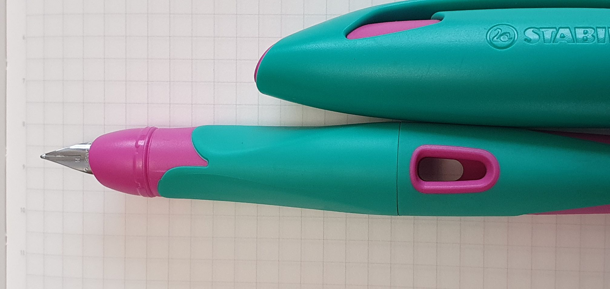
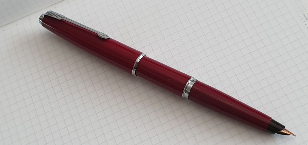
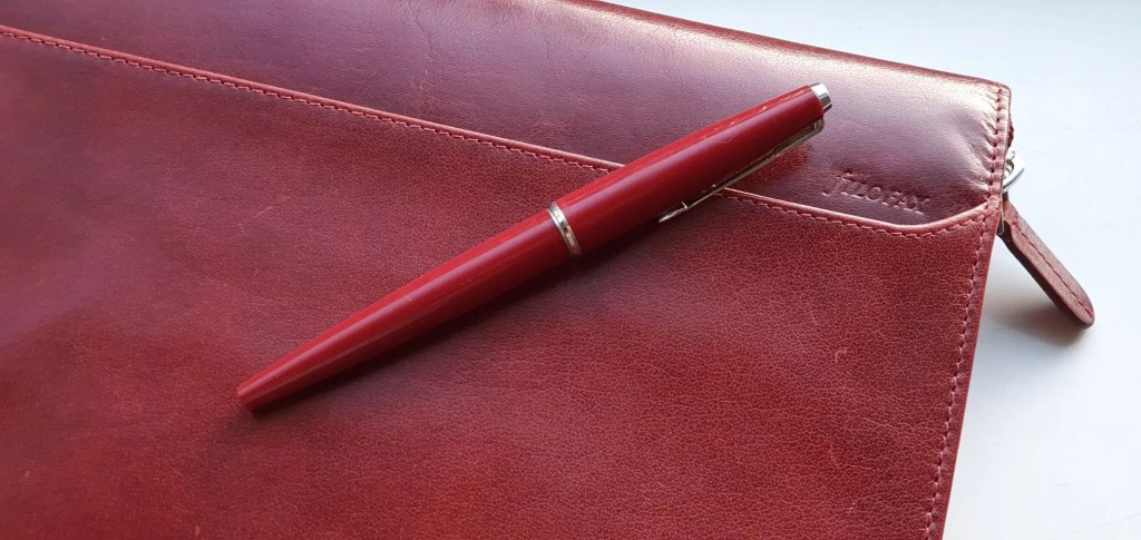
The Writech avoids these problems completely. The pocket clip is at the back, or “knock” end of the pen, so the pen looks a lot more normal when in use, as the clip is where it would be on a ball pen, or a fountain pen with cap posted.

However, the hatch door stowage is not quite so elegant. In a brave move, the hatch has been designed to stay open beside the nib in full view whilst the nib is out. This does look strange and is rather jarring at first and will, I expect, be the divisive, Marmite (love it or hate it) issue.
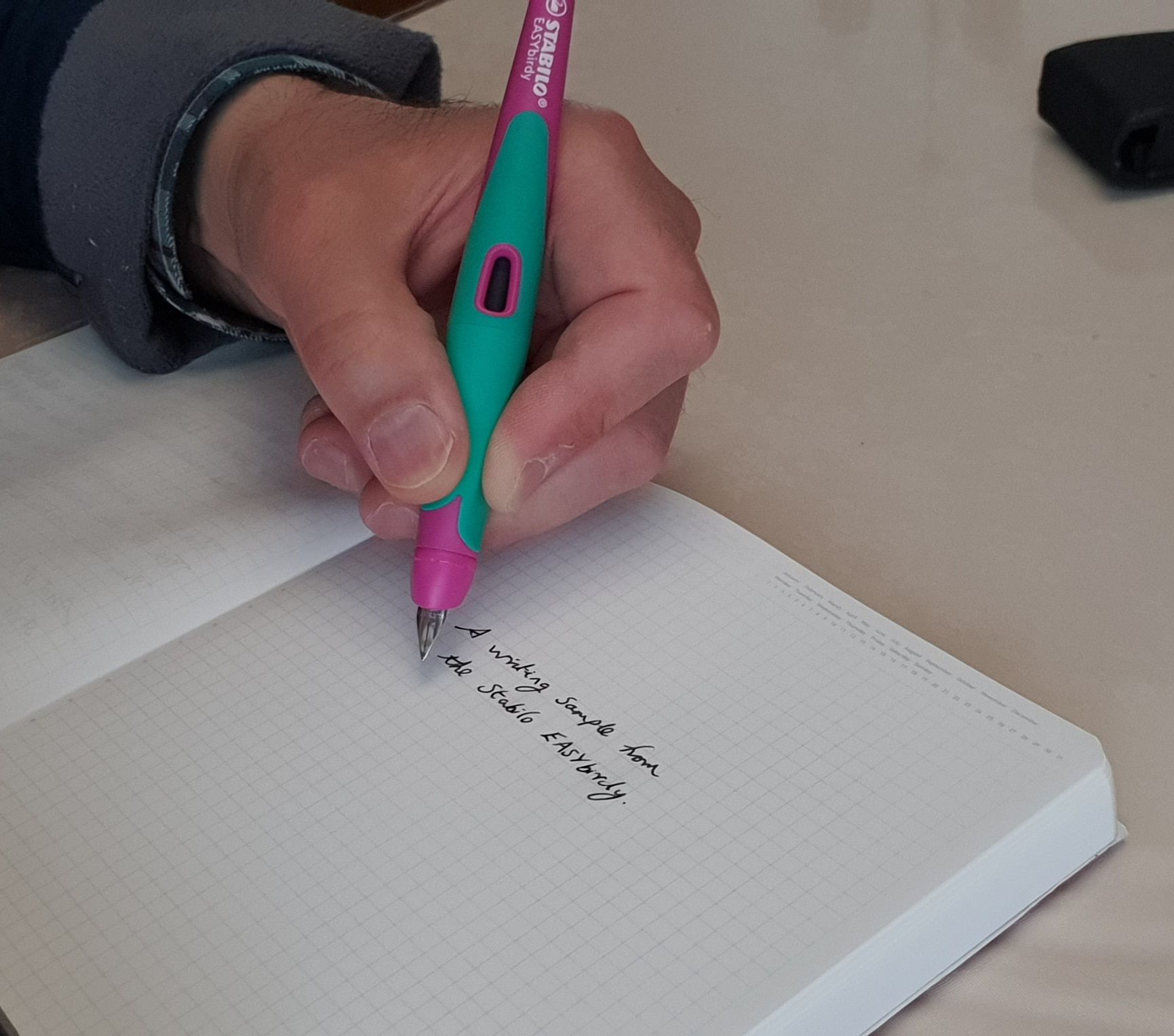
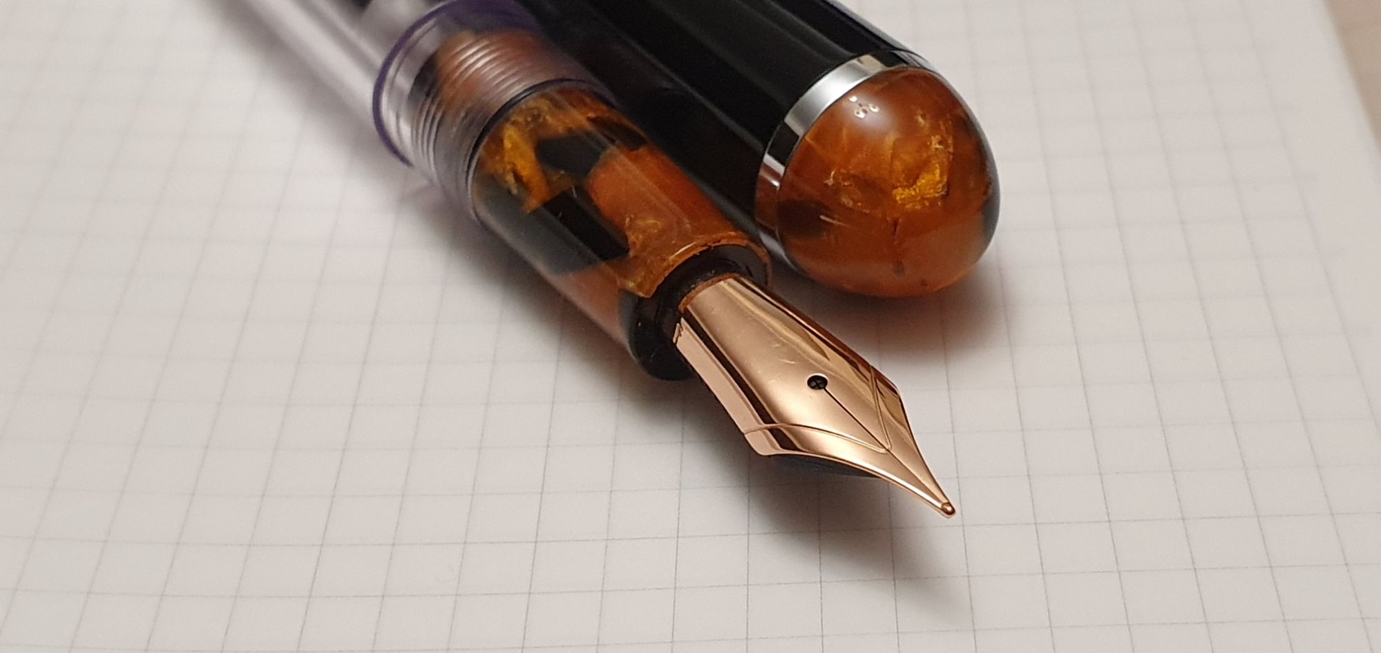
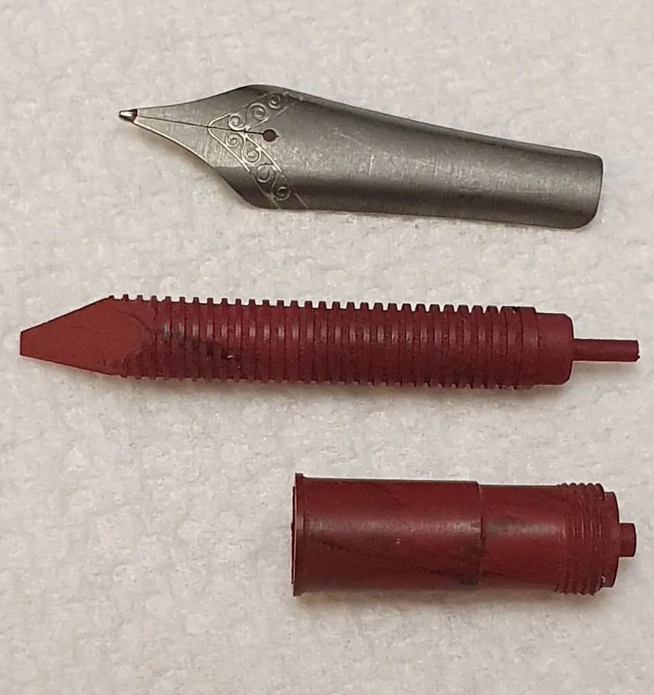
The steel nib is available as a Fine only. Initial impressions are very favourable. The tiny unmarked nib, with a slit but no breather hole, writes very smoothly and with an excellent steady flow.

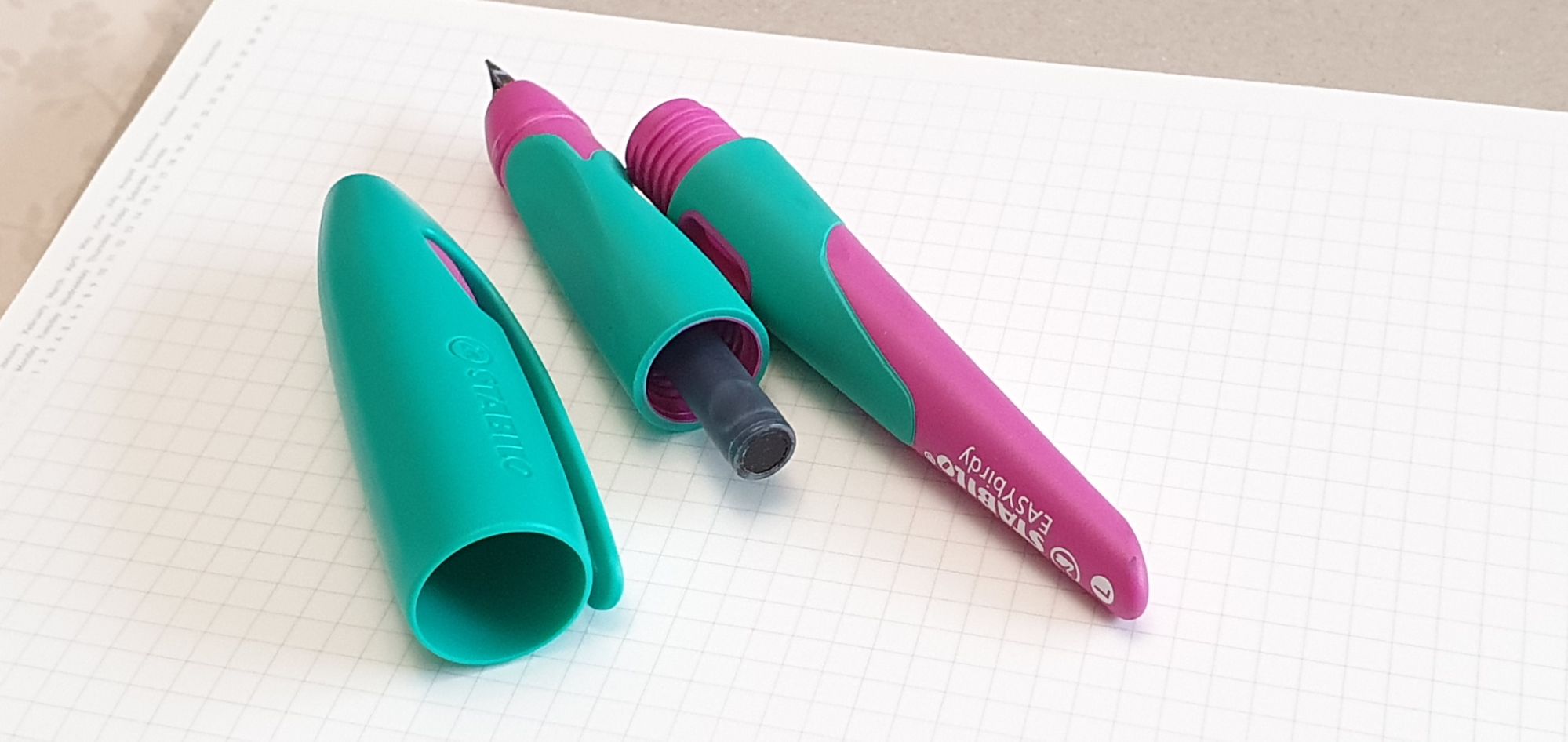
Filling the pen is a breeze. Simply unscrew the barrel, place a Writech cartridge in the section and push until it clicks being careful to keep your fingers out of the way as the nib will pop out at the other end. I found that the easiest way to insert a cartridge was to stand the cartridge upright on a table, and then push the section down on top of it.

I was sufficiently impressed with the pen, to buy two of them. Michael was selling these at £12.99 each, or £15.00 to include an extra box of cartridges which is remarkably good value compared to any other retractable nib fountain pen.

One pack of 5 cartridges is supplied in the clear plastic clam-shell box with the pen. Unscrewing the pen for the first time, an empty cartridge is attached to show where it goes, but can also be kept to syringe-fill with the ink of your choice.
The packs of cartridges were available only in black or “Erasable Blue”. I have tried only the black ink. I am not sure whether the blue ink can be rubbed out (as with a Pilot Frixion) or whether the ink is washable. I will experiment with this on my next fill.
In conclusion, I have been using the pen for a week now. It is convenient and fun to use and I rather like seeing the hatch door flip open as the nib pops out, like a cuckoo clock. Above all the pen is comfortable to hold, writes very well and costs less than a Lamy Safari.
Likes:
- Comfortable to use; cylindrical barrel and no protrusions in the grip area; (there are two very slight indentations, too small to call facets and barely there, for an ergonomic grip);
- Nib extending and retracting mechanism works well;
- Smooth, fine nib:
- The airtight seal also works well, in keeping the nib ready to write; (Michael had tested this over several weeks);
- The nib does not grip the feed, and so there should be less danger of the feeds cracking, as happened with some early Curidas pens;
- Simple design and ease of filling;
- At £12.99, these are great value, a lot of fun and write well.
Dislikes:
- Not everyone will like the round hatch door open on the right, beside the nib;
- The pen uses only Writech proprietary cartridges, a more expensive and limited option than standard international cartridges, (which might be how the company hopes to make money) but to be fair, the Pilot Capless, Lamy Dialogue and Platinum Curidas all used proprietary cartridges; Michael mentioned that an adaptor may be available later.
- Although I love having the pocket clip at the back, mine does not quite align with the nib. It would be unpleasant to hold if the barrel threads stopped with the clip on the underside of the pen as you write;
- The pocket clip requires that the pen be carried nib downward, contrary to conventional wisdom; I have not yet dared try carrying it upside down, preferring to carry it in a pen case, nib up, or stand it in a pen cup, nib up;
- Although the black ink cartridge ink flows well, I found that it feathers on the paper of my Stalogy notebook, which is usually fountain pen friendly. However, on the laid paper of a Semi-Kolon A5 journal, there was no noticeable feathering;
- I have not yet tried cleaning the pen but it might be best to use an open-backed cartridge to push open the nib hatch and flush the section, nib and feed;
- As yet the pen does not have a distinctive name, (unlike the Capless/Vanishing Point, Dialogue or Curidas). Its model number “W-784” does not yet look as though it is intended for customer use.
I have had the pen for only one week and need more time to test for hard starts after a period of non use and also to simulate carrying the pen nib down in a shirt or jacket pocket on a warm day whilst running for a bus. Subject to my remaining on good terms with the pen, I will also try out its erasable blue ink cartridges.