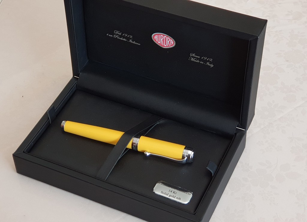
It has been four years since I wrote a post The Visconti Rembrandt v The Pineider Avatar fountain pen (8 September 2018). At the time, I had owned the Rembrandt for less than a week. I think my comments then were fair and still hold good. As to which one of those two pens you prefer, that is subjective and each has its merits.
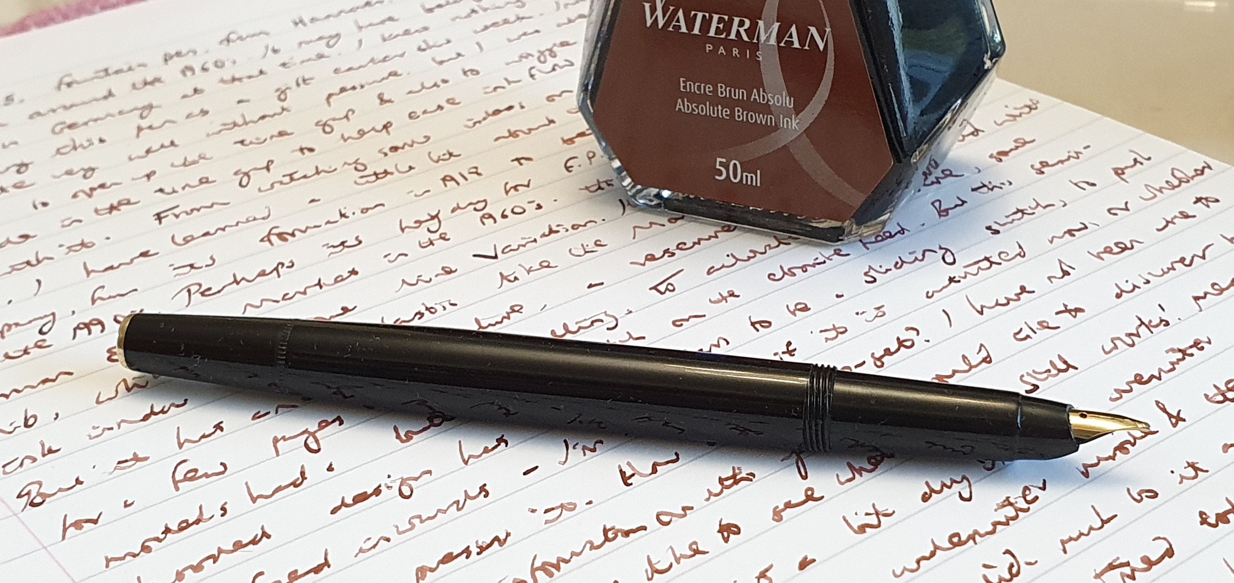
It has been my habit for decades, to write a daily entry in my diary. Currently I use an A5 page-a-day diary from Rymans. This year, it was my intention to use a different pen and ink combination each month. I started out with a Cleo Skribent Classic Gold in January but was enjoying it so much that I continued with it for February too. Then, forcing myself to have a change, I started March with the Visconti Rembrandt. I am still using it now. By the end of August, I had been using the Rembrandt almost every day for six months, barring a few days when I went away and took other pens for holiday journaling.
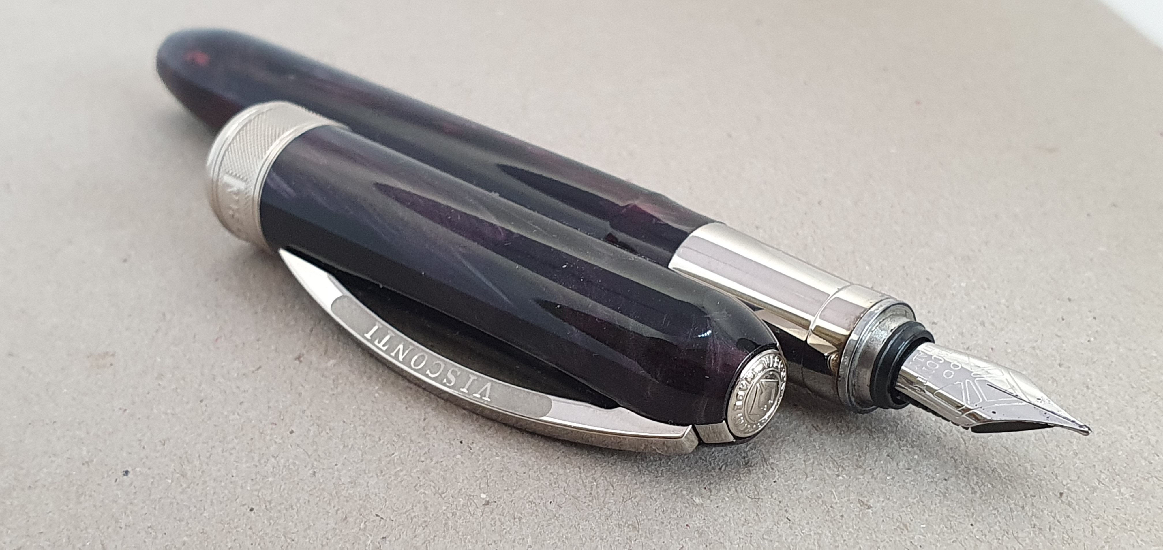
My Visconti Rembrandt Twilight, at four years old.
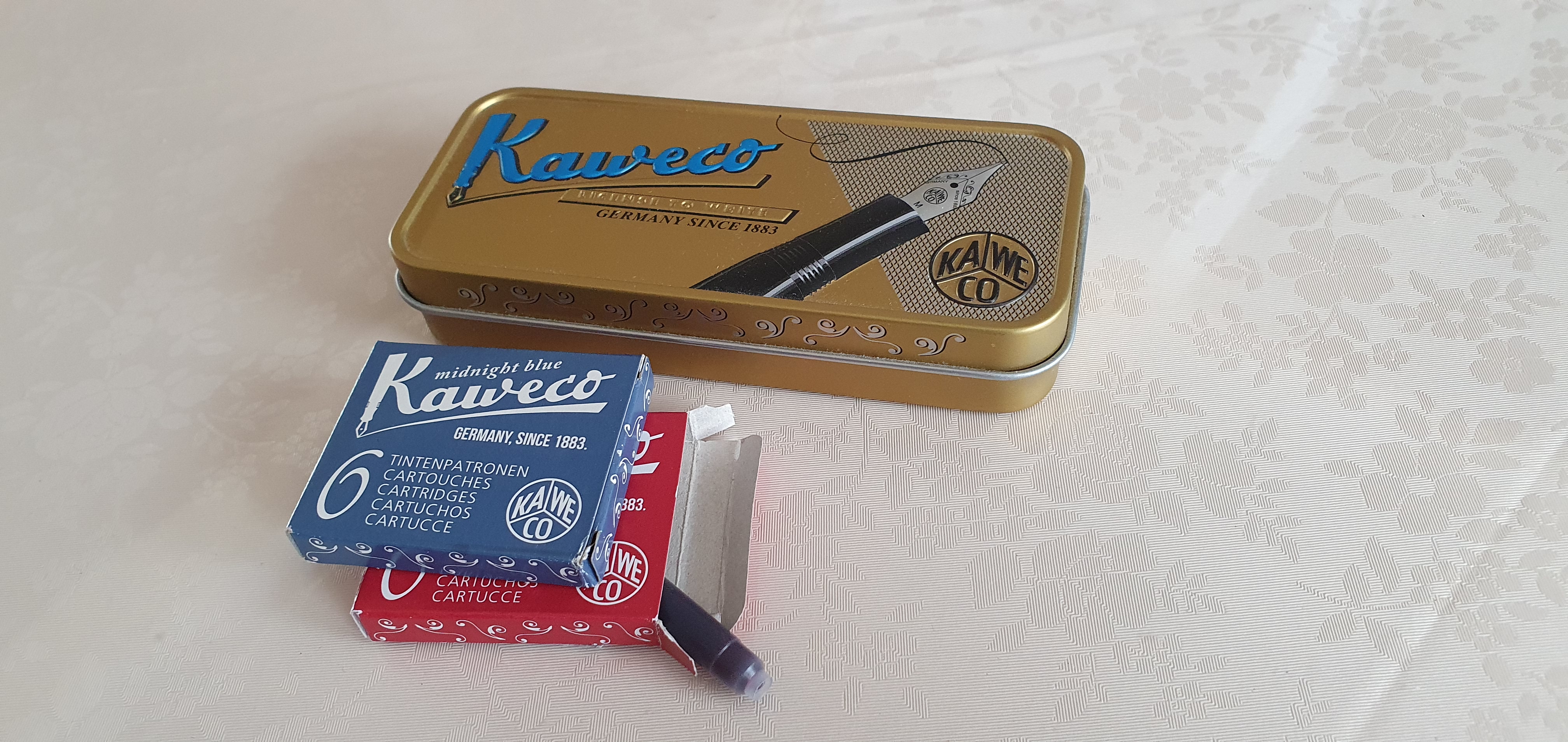
As for ink, I have been using it with Kaweco blue cartridges. I had a stash of these, acquired on buying Kaweco pens, particularly the Perkeo of which I have several. With each purchase, there would be four new Kaweco blue cartridges, with the Kaweco name along the side. I particularly liked this ink and kept these cartridges in a Kaweco tin, separate from my hoard of generic blue standard international cartridges.
This adorable Kaweco tin lives on my desk and held my stash of Kaweco blue cartridges.
Since 9 February 2022, I have filled the Rembrandt eight times with these cartridges and am down to my last one. I plan to switch to Kaweco midnight blue next, as I have a box waiting. I will never get through all my ink, but it feels satisfying to have used up these Kaweco blues, at least.
Whilst using a standard international cartridge, the Rembrandt has space to carry a spare. The spare cartridge does rattle around though, and to stop this I cut a small cube of rubber from an eraser and dropped it into the back of the barrel. Be careful with this however: too large a piece and it will jam inside and you will not be able to get it out again unless you break it up with a cocktail stick.
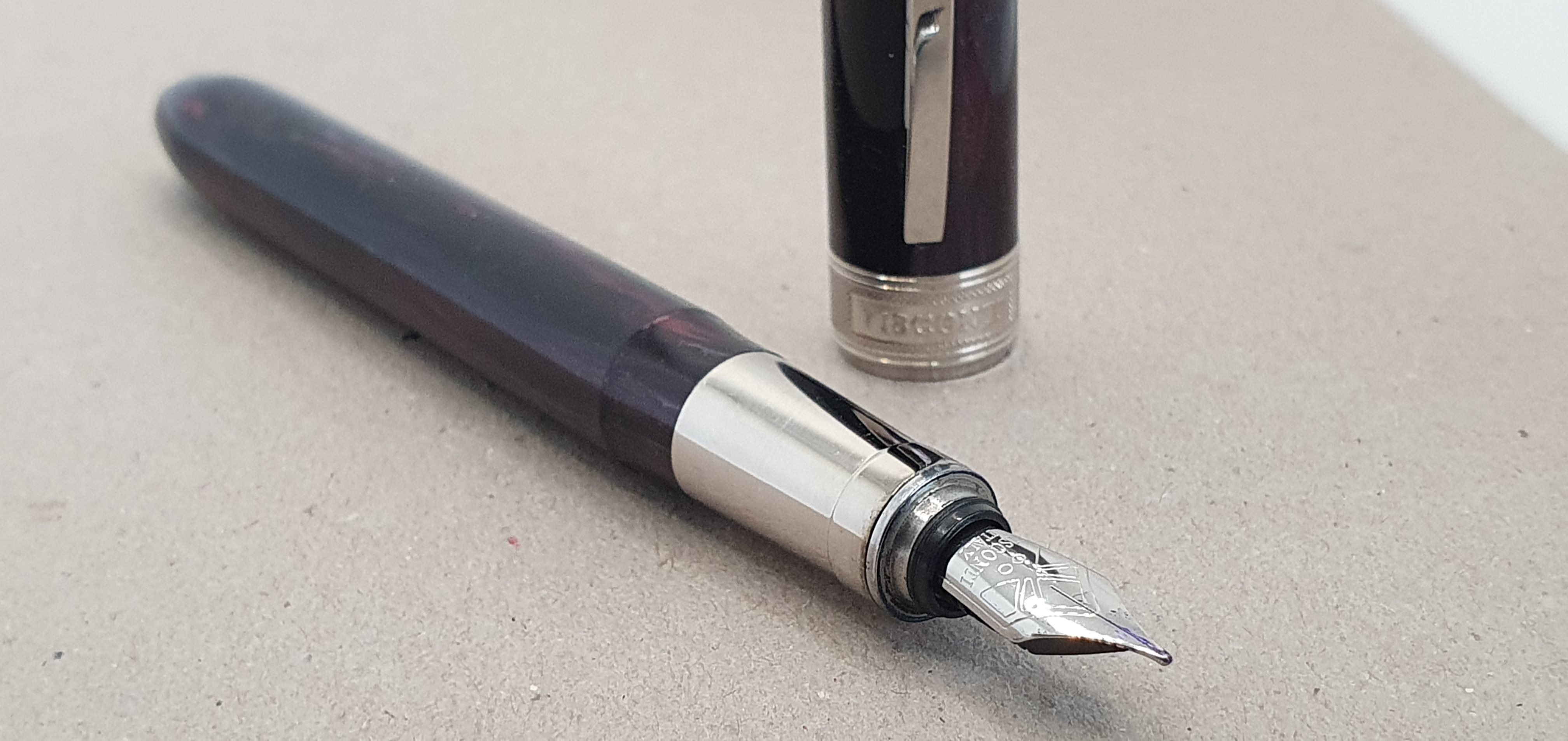
I should mention the chrome section of the Rembrandt. Generally, I am not a fan of slippery metal sections. For this reason I have avoided the Lamy Studio (apart from the brushed steel version with the black rubberised grip section). But in all fairness, the Rembrandt’s shiny plated metal section has not been a problem for me at all. My grip on the pen does not slip. I do not have trouble controlling the nib or stopping it from rotating left or right. I think that this may be partly because the section and the nib are both relatively short and when I hold the pen, my thumb still rests on the purple barrel, serving to anchor the pen and stop it from rotating in my hands.
The shiny plated business-end of the Rembrandt.
When I first got the pen, I preferred using it with the cap posted, but my habit has changed and I now use it unposted. If I had been put off buying the Rembrandt because of its metal section, then I would have missed out. The magnetic cap fastening still works well and is quick and convenient. It makes for a grip area free of any sharp step or screw threads.
Above, all, the pen writes really well. I get no hard starts. I did adjust the nib slightly when it first arrived, to ease open the gap between the tines to improve flow to my taste, but having done this in the first few days, the pen has written smoothly and effortlessly ever since and works well with the Kaweco blue cartridges.
As for the Pineider Avatar in its vibrant Lipstick Red, I still have it and it is a beauty. It has the “Wow factor” which the Rembrandt lacks and got the best admiring looks at our London pen club. Yet the Rembrandt has proved itself a solid performer over time and deserves credit for that.
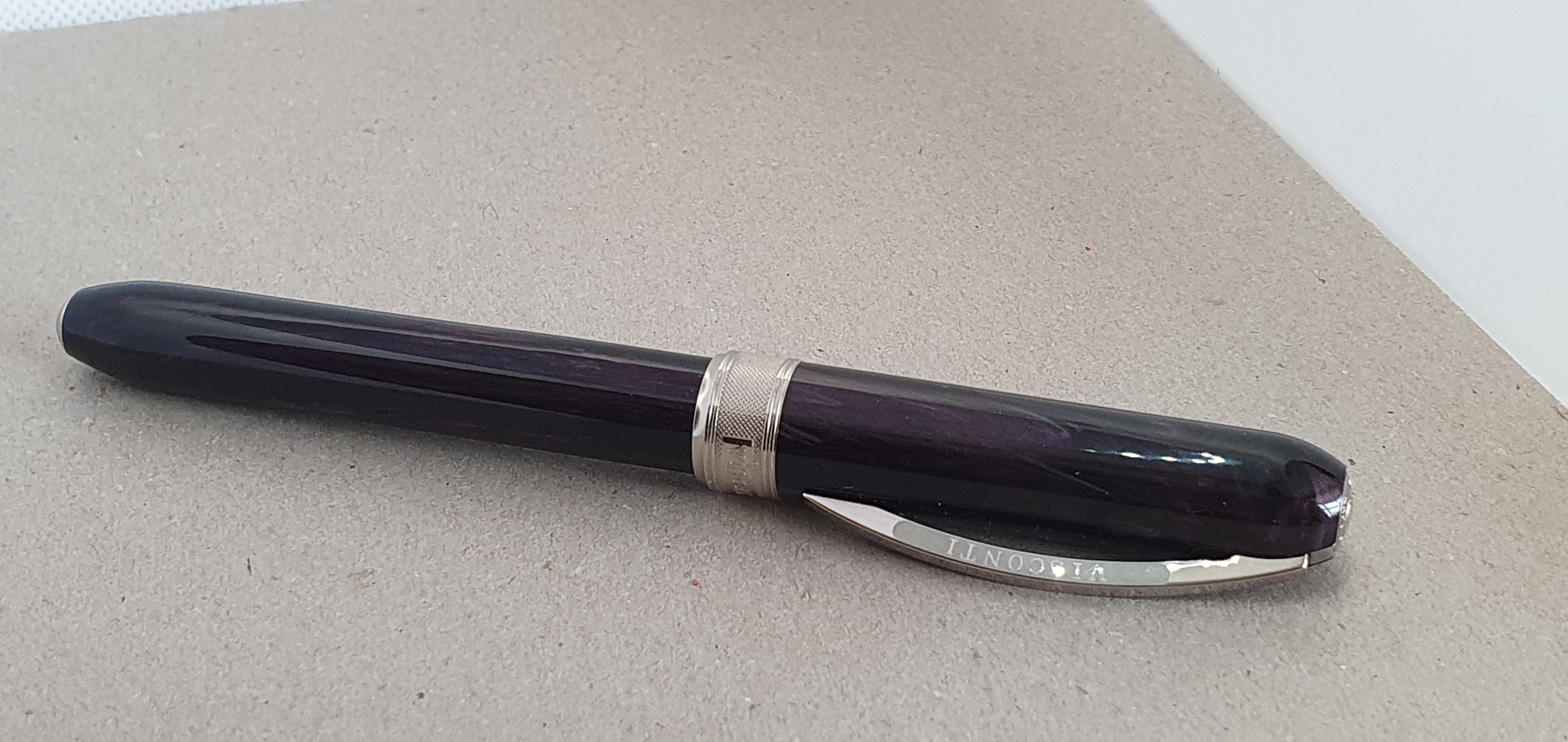
It is hard to show that it is actually purple, with subtle “brush strokes” of lighter colours in the material.
Like many others in this hobby with a passion for fountain pens, I have suffered from Gear Acquisition Syndrome and now find myself with an embarrassing number of pens, unused notebooks and bottles of ink. From time to time I need to remind myself of what I have “in stock.”
When my late Godfather (“Uncle Brian”) died, his wife Mary offered me his almost full bottle of ink. It was Cross Blue. I gladly took it to finish and have been getting through it in the pen that I use at work, a Cross Bailey Light. It is now on its tenth fill, since last December.
Unlike Uncle Brian, I have two drawers full of bottled inks in various colours and will never get through it unless I decide to paint the walls with it. Of course it is nice to have a good selection of different inks to play with and most inks keep well for years. (One exception is registrar’s blue black iron gall ink, which once opened, is best used within 18 months or so, before it starts to lose its darkening ability).
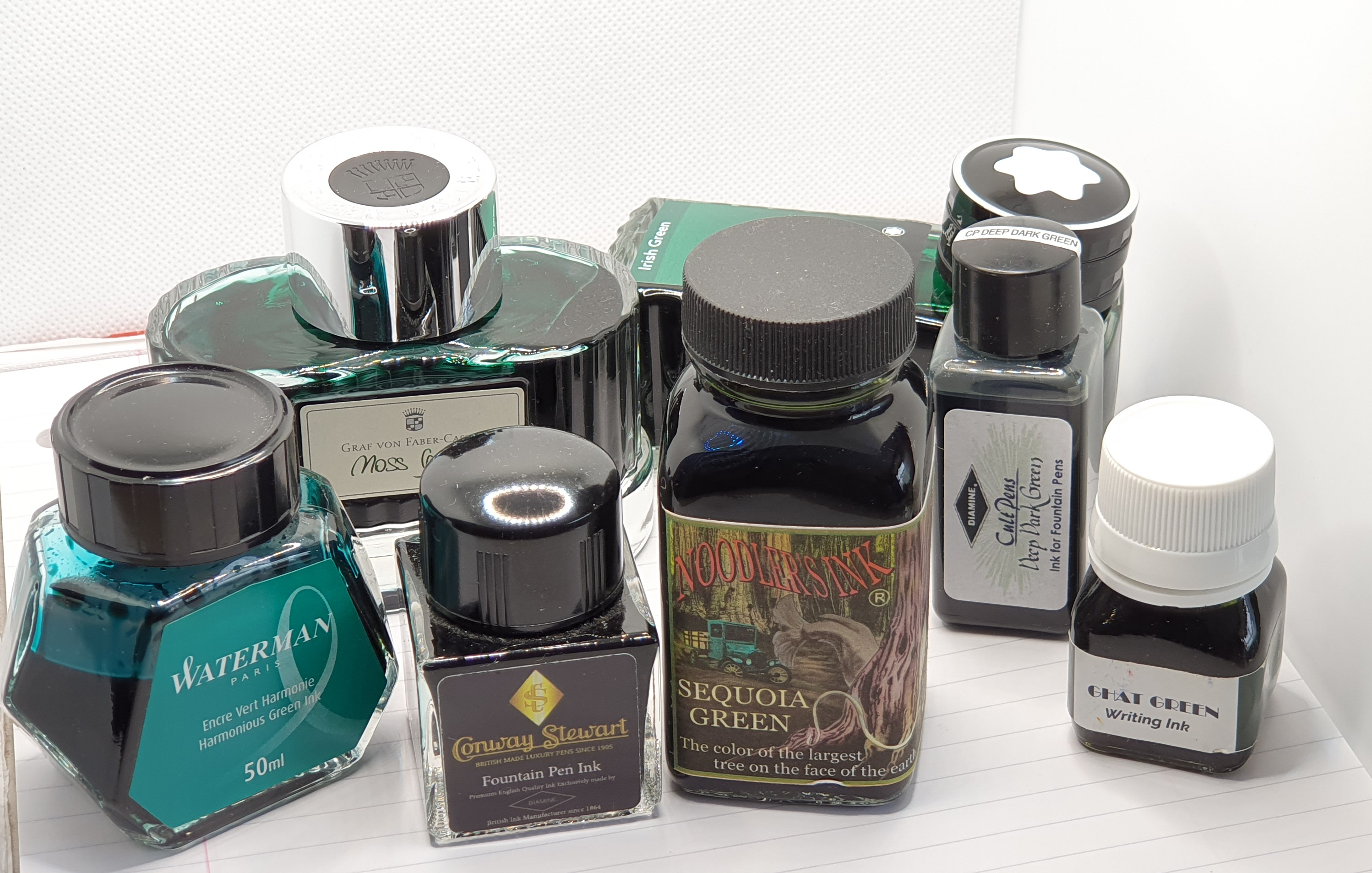
I may at last be reaching the age where my desire not to fill my house with extra possessions, can sometimes outweigh the attraction of the thing itself. As I try to to use and enjoy what I have, it can help to break this down into smaller goals. Green inks are a category of inks that I have relatively few of. I can count my bottles on the fingers of, well, two hands.
The Green Team, from my ink stash
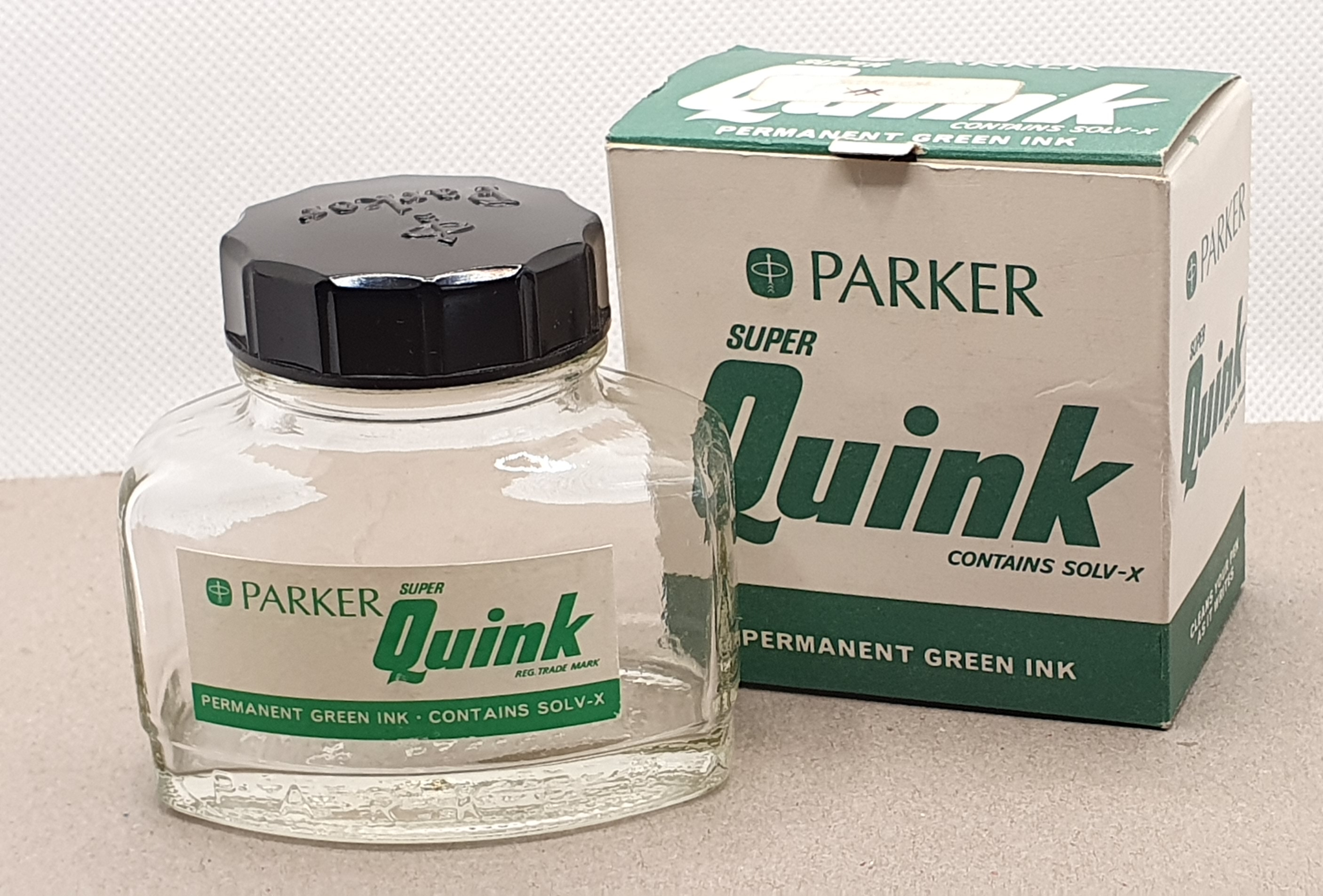
The only one of these that I have finished, and which was for many years my only green ink, was a bottle of Parker Quink. I still have the classic bottle and its cardboard box. Sadly these bottled inks are sold in plastic blister packs now. My bottle has a faded price label and I can still see that it came from WHSmiths.
I did eventually finish this but had had it for so long that I could not part with the bottle.
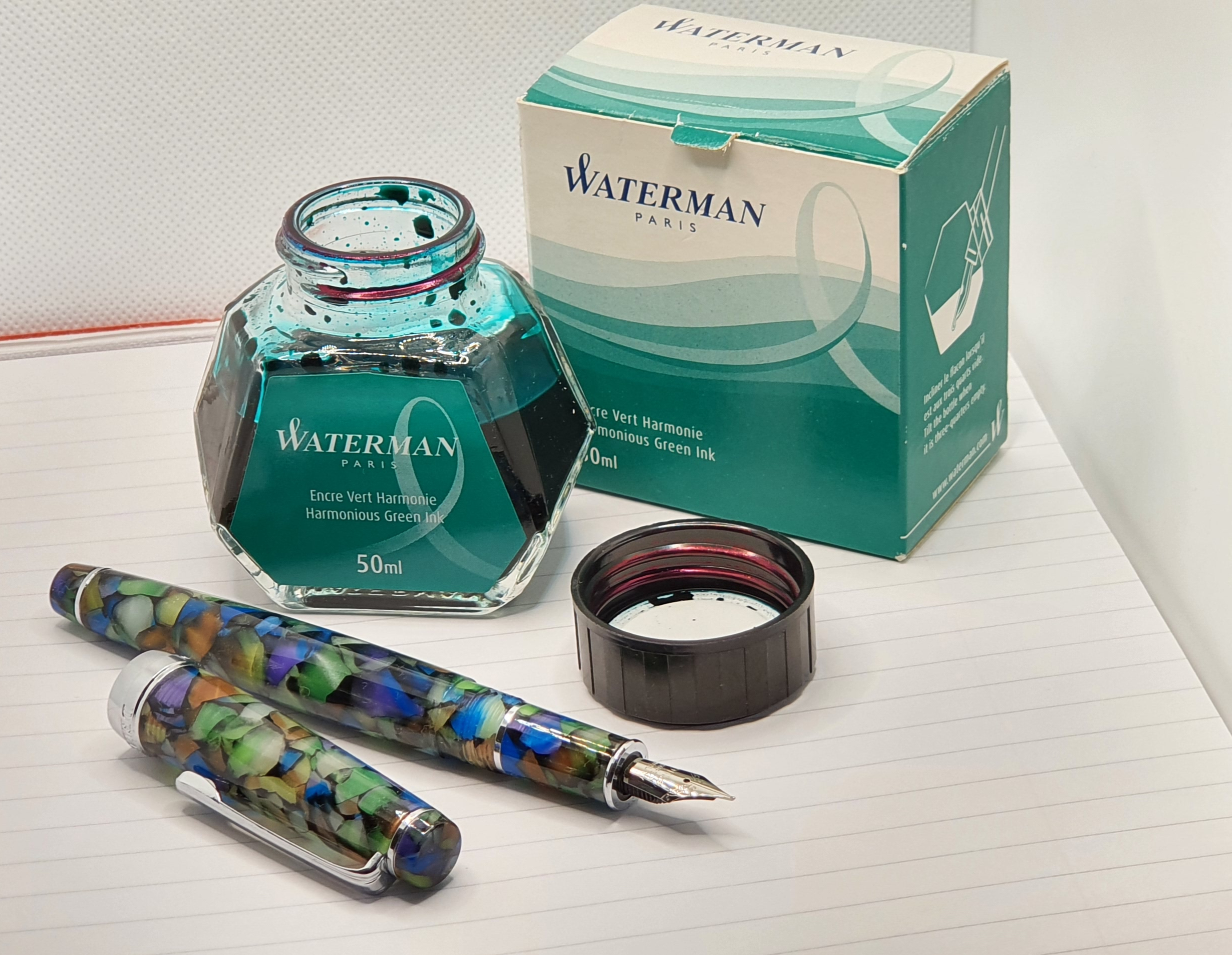
A modern equivalent, for a good day-to-day green ink might be Waterman’s Harmonious Green. Nowadays, I like to write the date of purchase inside the box lid. Mine bears the date 26 September 2015 and I bought it in the Burlington Arcade, off Piccadilly in London. It is still a good two thirds full. However I am now using it regularly in my Delike New Moon, fude nib pen. It is a good combination for the marbled green acrylic pen. It is an inexpensive ink for an inexpensive pen.
My Delike New Moon, fude nib pen with its current pairing of Waterman Harmonious Green.
I have some more up-market green inks: Montblanc Irish Green and, probably my favourite, Graf von Faber-Castell Moss Green in its attractive heavy bottle.
I have a 30ml plastic bottle of Diamine’s Deep Dark Green, which I bought at the same time as their Deep Dark Blue and Deep Dark Red. I used the Deed Dark Blue by far the most and finished the bottle, often using it in a TWSBI Vac 700 or Diamond 580.
Some less common greens are my Noodler’s Sequoia: a brim-full glass bottle containing 3oz of this green-black ink. Unfortunately, although I was very taken with the colour, I found it all but unusable for a lefty-overwriter as it is so slow-drying and smudges long after I would expect it to be dry.
Seven bottles. That is still a lot of writing.
At the London Pen Show one year, I picked up a cute little bottle of Conway Stewart green ink, made by Diamine. I do not know the name of the colour but think it was of the same series as Conway Stewart Tavy, which is a nice blue black. However I bought it more for the bottle, nice for travelling, than the ink.
Finally, I have a bottle of Krishna Inks Ghat Green, which is an attractive khaki green-gold. I did not use it much at first as I suspected it of causing unsightly and disturbing nib crud on my Montegrappa Fortuna’s steel nib. But I later gave it another chance, in my Sailor Pro-Gear with a 21k gold nib and have had no problems with it at all.
If you want to get through ink faster, using a pen with broad, stub or music nib will help. Or you could use it for drawing. For some years I could not settle to using a green ink as I would soon have the urge to flush it out and refill with a blue. But I now appreciate a green ink from time to time and it is well worth having at least one green-inked pen! I heard it said that there is, or was, a convention in the Royal Navy, of different colour inks being used by different ranks of officer. I have not been able to verify that. I do remember that green was the colour of correspondence from Rolex, if you got a typed letter from them in the 1960’s. It also makes a good colour for amending and editing typed drafts, rather than red.
A green ink can look attractive, particularly on cream coloured paper and paired with the right pen and can make a refreshing change from the usual blues. I don’t know when I will next finish a bottle or whether I will ever own just one bottle but I am at least trying not to buy more.
If you were to ask a group of watch enthusiasts to name the most iconic, recognisable watches of the last 100 years, they might include a Rolex GMT Master, an Omega Speedmaster, a Casio G Shock and maybe even a Fitbit. Try the same exercise with camera enthusiasts and you might hear the Leica M3, Hasselblad 500CM, a Rolleiflex, Nikon F and Olympus OM1. The debate will be endless.
Take a group of fountain pen fans – a random selection from a pen show perhaps. Again, everyone will have a different answer. Some likely contenders might be the Parker 51, Pilot Capless, Montblanc Meisterstuck 146, Cross Townsend and a Pelikan M800. Also there is the Onoto Magna, an Aurora 88, and a Visconti Homo Sapiens. I suspect that there is a good chance that a Lamy 2000 and a Lamy Safari will be mentioned.
This week, I have had a lot of love for Lamy. A generous pen friend in Australia had very kindly sent me a Lamy 2000 fountain pen, with an Oblique Broad nib, knowing of my new-found liking for oblique nibs. This began by accident on my purchasing a Moonman S5 demonstrator pen online, with three nibs included. I went on to buy an Aurora Optima with OB nib and then an Aurora Talentum with OM nib. Both are wonderful. My friend had passed on to me, all the way from Australia, a Geha 715 with OB nib, a vintage Montblanc 34 with OB or OBB nib (fabulous to write with) and a Montblanc Carrera with a steel OB nib and the Lamy 2000 OB: each very different.
However the Lamy 2000’s OB nib was a very different experience from, say the Aurora. The Aurora’s nib, although broad, is not very “thick”, or deep, and so allows for fine cross strokes. The Lamy 2000 nib (at least, the way I held it), had a writing surface which was both broad and deep. Perhaps it needed holding more upright. But for me the effect was not pretty and it was necessary to write larger to avoid loops being filled.
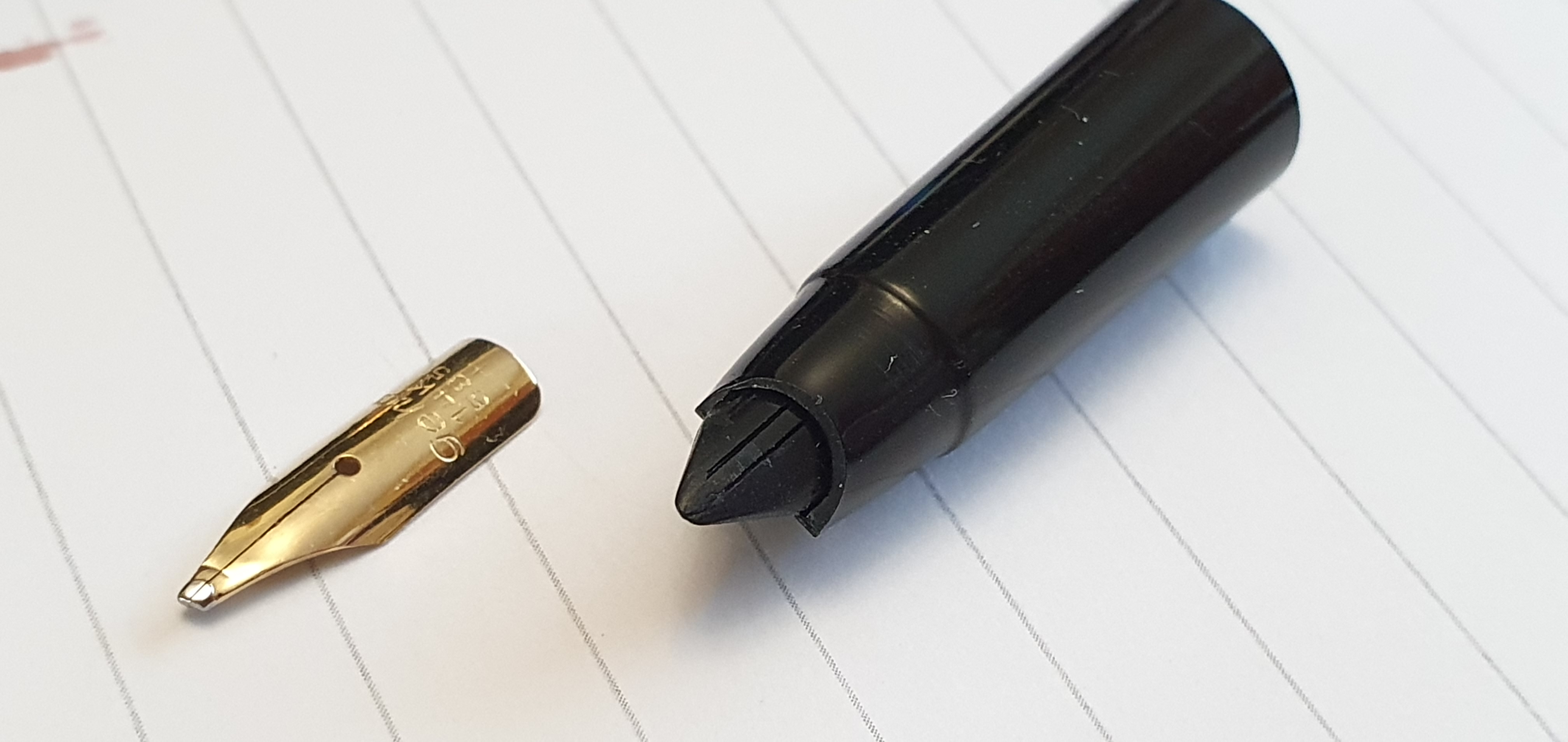
Oblique Broad nib.
I emailed Lamy customer services in Germany to explain my predicament and to ask whether they would allow me to send the Lamy 2000 back for a nib swap. I soon received a friendly reply, that they would be happy to swap the nib, provided that the existing one was reusable. I sent my pen in, and waited eagerly for the reply. There were a few anxious days when the tracking information showed that my pen had been waylaid in Customs, on the way to Heidelberg. This prompted me to email them again. I had followed their advice on completing the Customs Declaration form and so hoped that there should be no duty to pay. Happily, I got a reply to reassure me that they now had my pen and would return it to me within a few days.
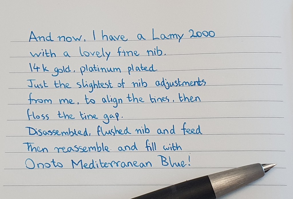
Last Thursday, after just over a month, the Lamy arrived back. It was well protected in a polythene sleeve, in a white envelope, in a cardboard box with a surprisingly copious 12 pages of documents but stating that the pen had been repaired free of charge, the nib exchanged for a Fine, the ink flow checked and the surface refurbished.
I was thrilled to have the pen back and with a fine nib this time. The tipping material is long and narrow. I gave the nib a little flossing and a rinse and checked the tines were level.
Fine nib.
For its inaugural inking, I filled the pen with Onoto Mediterranean Blue (which might be called a cerulean blue perhaps) in contrast to my usual royal blues. The writing experience was a joy – all the more so for the month’s wait. At last, I have a Lamy 2000 which writes effortlessly and without squeaking. The fine nib has a good flow, just a little softness and some pleasant feedback.
Writing sample with fine nib. Onoto Mediterranean Blue. Semikolon Grand Voyage laid paper journal.
The pen is well travelled, having gone from Germany to Australia, to the UK, then to Germany and back to the UK again. My own journey with the Lamy 2000 has also been a long one. I bought my first in May 2014, but struggled to get along with the M nib. I later exchanged the nib for a B which I found much better although not until after some rather risky do-it-yourself tine-gap widening.
I have wanted to like the Lamy 2000 fountain pen for a very long time – not because it is fashionable to do so, but for its many unique merits. Over the years and after all I have heard and read, I had come to the view that if I were to buy another, that the fine nib was the one to have. Now thanks to a generous friend and an impressive customer service from Lamy, I have one. It feels great.
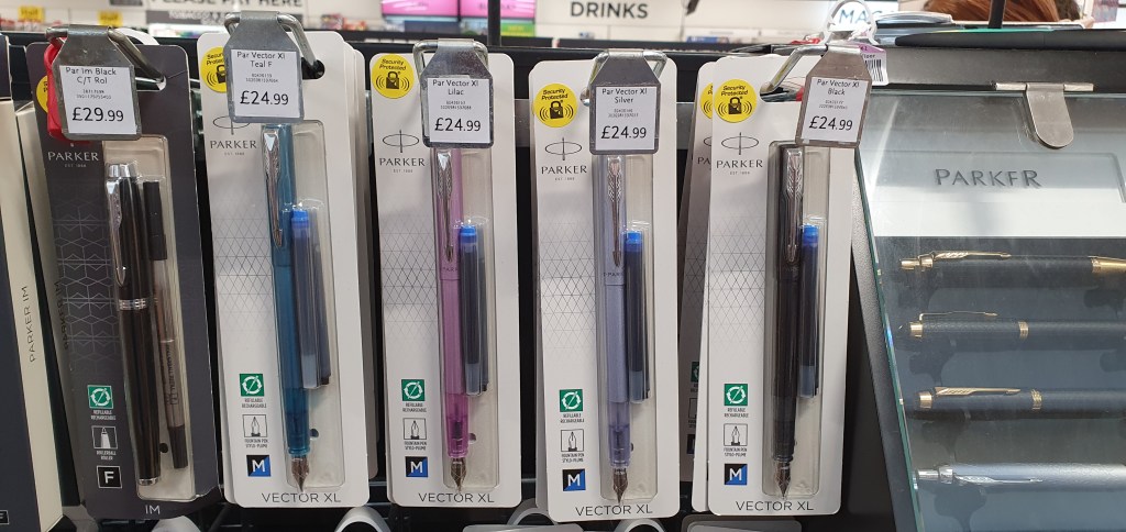
A few weeks ago I first noticed a new Parker pen called the Vector XL, in my local WH Smith at London’s Brent Cross shopping centre, in a range of colours. I did not buy one immediately, but whilst on holiday recently, checked out branches of WH Smith in other towns that we visited, to see whether they had them. I did not succeed in finding one until back home in London again.
Parker’s new offering: the Vector XL.
I have always had a soft spot for Parker fountain pens, ever since I was a young child. I know that they are now made in China and for several years my attention has been diverted by numerous brands from Germany, Italy, Japan, USA, and other countries, brands that I would have had little or no awareness of as a child, However there is still a certain nostalgia in revisiting Parker, the brand I idolised in my younger days.
With that background, and being curious to try this new release, I took the plunge and bought one. There were four colours to chose from. Teal, Lilac, black or Silver-Blue. I narrowed these down to Teal and Silver Blue and sought advice from a nearby member of staff who was refilling the shelves. His response was to pick the Silver Blue saying “It matches your shirt”, which indeed it did. He then added “I’m not the person to ask – I go for black everything” which was evidenced by his attire of black trousers and tee shirt. I was coming down in favour of the Silver Blue as well, as looking a little more adult than the Teal perhaps.
Parker Vector XL fountain pens in four colours.
I was aware that the pen was available for about a third less from Cult Pens, but opted for the bricks and mortar buying experience, although this was fairly impersonal at a self-service checkout till.
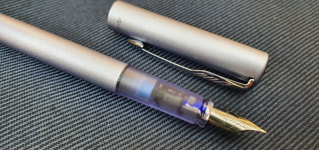
Sitting down outside the shop I opened the blister pack. The pen felt quite nice, with a matte, metallic finish. The cap finial contains a shiny metal disc, featuring the Parker logo. There is a Parker arrow clip. There is no cap ring but the name Parker stands out more legibly against the Silver Blue background than on the Teal.
Silver Blue version, uncapped
The cap snaps on and off firmly. The section is of a matching but transparent coloured plastic through which you can see the base of the nib and the nozzle for the cartridge. Once you insert a cartridge, you can see the first centimetre of it through the section. Crucially for me, the section feels comfortable and just slightly textured.
Transparent section, after inking.
The pen comes with a black and a blue cartridge of Parker Quink ink. I popped in the blue one, omitting the flushing stage as I was still in the shopping centre. Immediately, I could see ink seeping down through the feed and within a few shakes the pen was writing.
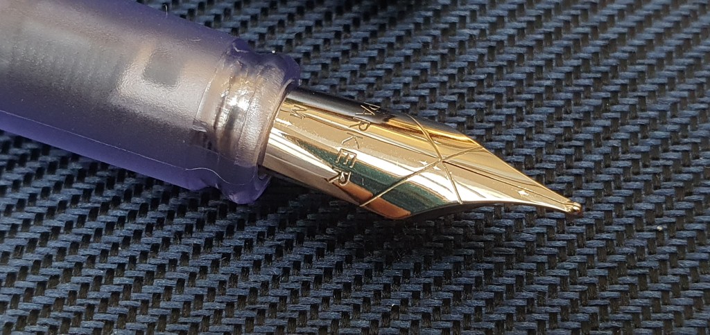
Initial impressions were favourable! The large, traditional shaped nib seemed an improvement on the old Vector and I preferred the girth of the XL model. There is no breather hole. The nib does have a large blob of tipping which is not flattened on the face (as it would be on a Montblanc at twenty times the price). From the naked eye, the nib looked to be in good order and it wrote smoothly and well. For a medium nib, the line is perhaps closer to a broad and may be too wide for some users but I was very happy with it. There was some line width variation between the down strokes and the cross strokes. Also a fine line was possible when “reverse writing” – using the opposite side of the nib.
Steel nib, Medium with a generous tip.
Likes:
Attractive and robust aluminium finish;
The grip section is reasonably comfortable and not too slippery and not faceted. It feels nicer than the black plastic used on the otherwise very similar Waterman Allure;
The coloured, transparent section adds interest and is unusual for a Parker; it will also serve as an ink window;
Smooth, rounded nib, good for under or over-writing, with good ink flow right “out of the box”;
Decent length: 12.5cm uncapped, long enough to use unposted. The cap does post securely if you want it to, but makes the pen 16cm long and a bit unwieldy;
There may (I hope) be a production date code on the moulded plastic barrel threads (rather than the barrel itself): mine says “U” which I think would denote 2021, if this is pursuant to Parker’s “QUALITYPEN” system of identifying the year. There is also a figure 5, but this may just be a part number.
The XL size is to be welcomed: the original Vector felt too slim.
Parker Vector XL alongside an original Vector (left) and a Waterman Allure (right).
Dislikes:
For its price, there seems little to criticise. There is no converter included, although you get two cartridges. My only concern, and something which I had anticipated, is that the cap is not airtight (you can blow air through it), which I think is an anti-choking safety feature but I wonder whether this will lead to ink evaporation and hard starts. It is early days and I will watch for this;
Parker’s proprietary cartridges can be a bit pricey (e.g. £4.99 for a pack of 5 in some places – particularly annoying if ink evaporates from the cap, which I hope it won’t), although you can refill the cartridges or use a converter.
All in all I am very happy with this, as a convenient and robust, low cost every day carry pen to use when out and about.
This medium nib writes more like a broad.
Edit: 24 July 2022: When I wrote this post a month ago, expressed a concern that the pen might suffer from ink evaporation and hard starts as the cap seemed not to be airtight. Well I am happy to report that a month on, the pen does not appear to have lost any significant or noticeable amount of ink due to evaporation and has not suffered from hard starts either. And this includes a week in which London has seen record-breaking temperatures, reaching 39 degrees.
This is good news for anyone who is thinking of buying one of these pens, who might have been worried about potential hard starts. As the pen is metal bodied, yet very light, and writes smoothly and reliably it makes a good pen to carry in a shirt pocket when out and about.
For our mid-summer break this year my wife, mother-in-law and I spent a week in the woods. This was not camping, but staying in one of the comfortable, self-catering cabins on a site run by Forest Holidays.
Whereas last year we had chosen a location near Winchester, Hampshire, as recounted in my post Travelling with ink: Blackwood Forest, this time we chose the Forest of Dean, Gloucestshire, and also went for a full seven days rather than three. It proved to be a good choice and we had also picked a week of warm sunny weather.
With the happy prospect of having some time to write, I enjoyed picking the line-up for a week away. After much deliberation (or dithering) I settled upon the yellow Aurora Talentum (my most recent pen purchase), a vintage Montblanc 34, Esterbrook Estie, Delike New Moon, and a Duke 552 bamboo barrel pen. Also I brought the Lamy 2000 multi-pen, a Sailor multi-pen/pencil and finally a Pentel 120 A3 0.7mm pencil, making eight writing implements in all.
The 8 writing implements for the trip.
To write on, or in, I brought a fresh Leuchtturm A5 notebook for daily journal writing, another A5 notebook for everything else, one A4 notebook (good for planning and drafting) and finally a small Silvine pocket notebook – which is always handy for jotting down addresses, phone numbers, directions or any notes made while out and about.
The fountain pens were inked with various colours but I decided to bring only one bottle of ink, Pelikan 4001 Konigsblau and so if any of them needed refilling, it would be royal blue or nothing. In the event, I did refill the Talentum mid-week. Whilst I like the Konigsblau, I did notice that the pen seemed to write a little drier and with less lubrication than with the Montblanc Royal Blue that it had started with. But it is useful to have a drier ink sometimes, to compensate for pens that might otherwise write very wet.
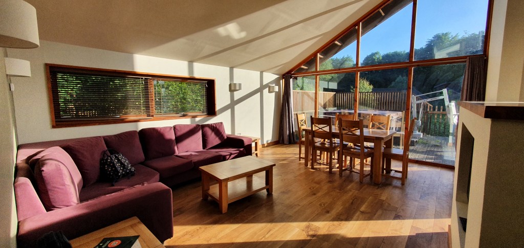
Our cabin was very spacious and slept six people, (as my sister and her family were to join us for part of the week). The open plan sitting/dining room had a large oak table with floor-to-ceiling windows and was a lovely bright place to sit, especially in the early morning when the room was cool. It did become very warm in the afternoons but we were generally out then.
The living area. There is a hot tub (with a chair lift) outside.
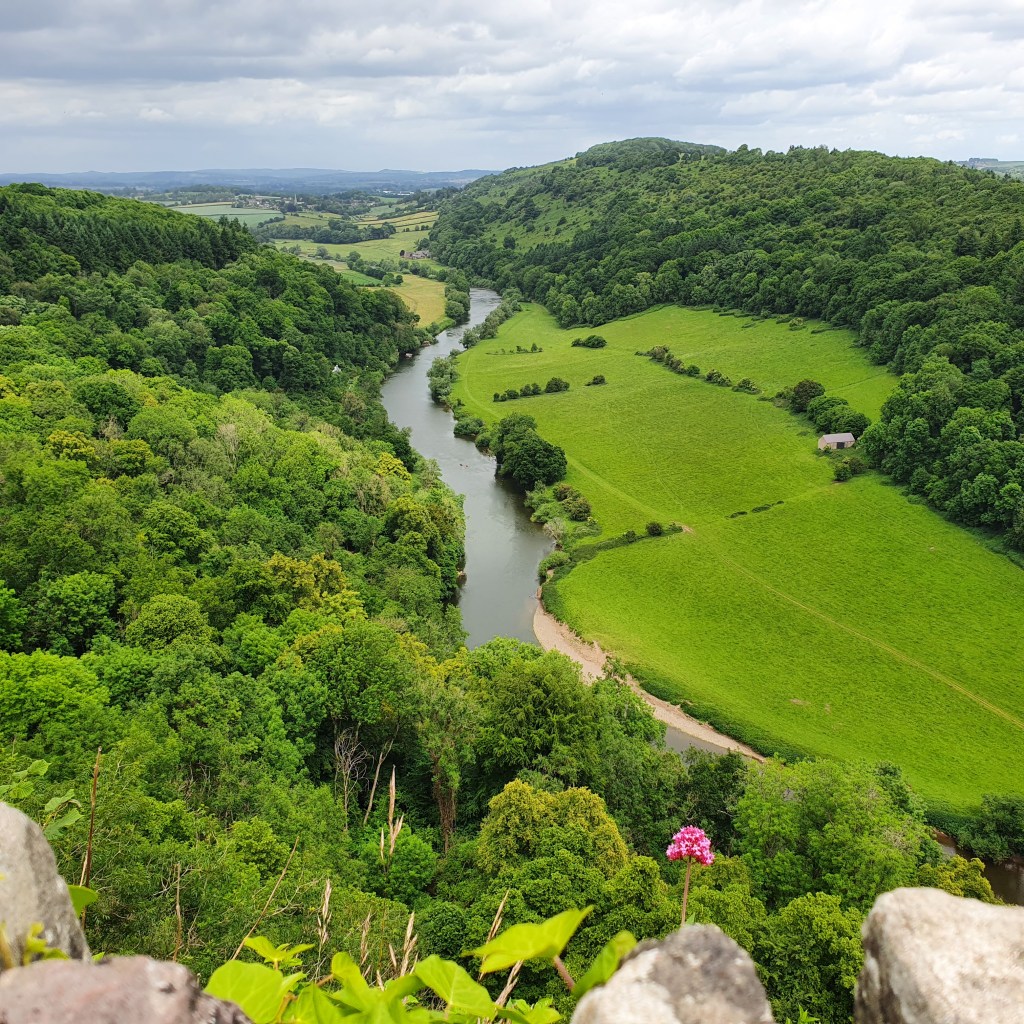
From our base, it was about a two-mile walk, through tranquil forest paths, to the stunning views from Symonds Yat rock, looking down on a beautiful section of the Wye Valley.
The Wye Valley, at Symonds Yat.
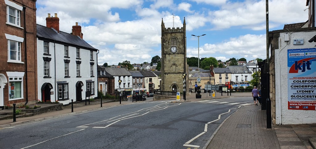
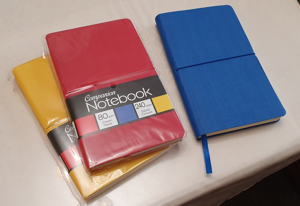
Our nearest small town was Coleford. Here in a local newsagents, I was pleased to find some A5 notebooks called Companion, with nicely textured soft covers in bright colours, and 240 pages of unlined, 80gsm cream paper. I knew of these from purchasing one in blue last year in a post office in Surrey. It turned out to be very pleasing and I wished I had picked up the other colours (red and yellow). Here was the chance to rectify that oversight.
Coleford town centre.
For a larger town, we were about 20 minutes drive from Ross-on-Wye. Whenever visiting another town and exploring the shops I do keep one eye open for any fountain pen shops. It is rare to find one of course, although Ross-on-Wye has a WH Smiths. I had a cursory look at the Fountain Pen section, in particular to see whether they had the newish Parker Vector XL, which I had seen recently in London – not that I would necessarily have bought one, but just as a bit of research. I was not to find one all week.
New notebooks to add to the stash.
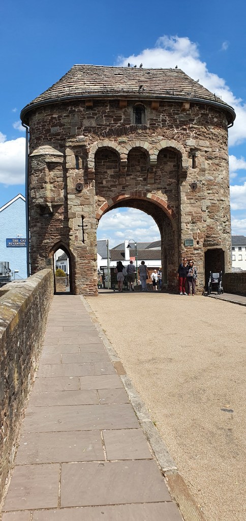
A similar distance drive took us to Monmouth, another pretty and colourful high street, and lined with bunting for the Queen’s platinum jubilee, and with some attractive side streets and river views and plenty of history, although not the best choice for fountain pen shopping.
Monmouth’s famous medieval gate tower, on the Monnow Bridge.
A bit further afield, along scenic country roads, we also spent a day in Ledbury, Herefordshire. This is a very attractive town, famed for its half-timbered buildings and historic market building and some nice independent shops for books and clothes, but I did not find any specialist fountain pen shops in evidence.
Ledbury’s market building.
On our last full day, we visited Tintern Abbey, the impressive ruins of a Cistercian monastery beside the Wye River with wooded hillsides making a picture postcard backdrop. Once there, it seemed silly not to drive on for the short distance to visit Chepstow.
A view inside Tintern Abbey
Here, I did find a shop called First Stop Stationery, with displays of Lamy, Schreiber and other pens and a large glass display cabinet for the more expensive pens. On closer inspection, these were from Cross, Parker, Waterman, Sheaffer, Lamy, Pilot, Faber-Castell and possibly some others. Some notable examples were the Waterman Carene, Faber-Castell Ondorro, several pilot Vanishing Points, a smart Lamy Accent in the glossy black with ringed section and even the newly revived Parker 51 gold nib version which I had not previously seen in the flesh although I was not sufficiently tempted to buy one. I did at least buy some Parker cartridges in blue black.
A row of houses on Castle Terrace, Chepstow.
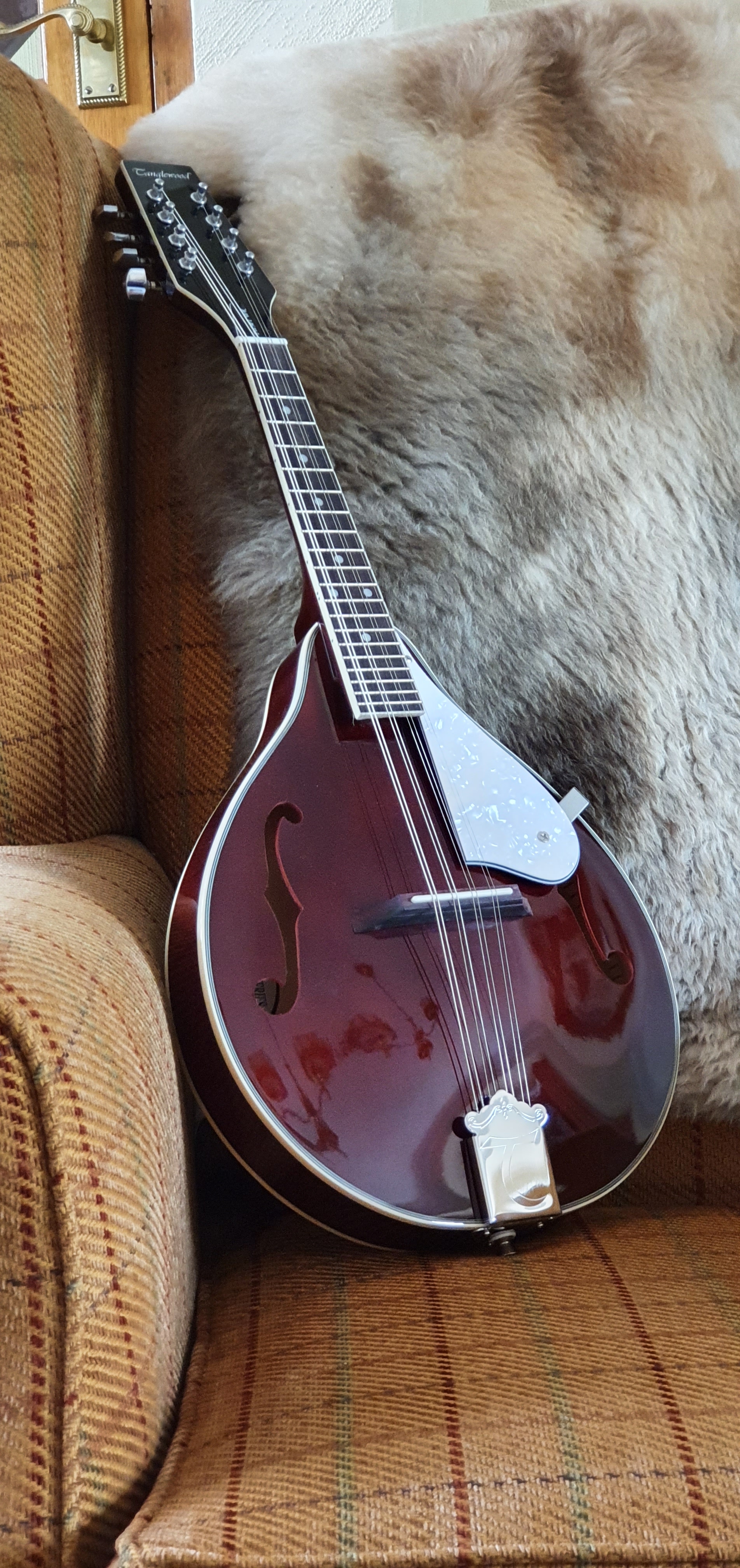
In our final hours of retail therapy, we headed back up to Ross-on-Wye where I had spotted a mandolin a few days earlier, in the window of River Music, in Broad Street. It was still there. I had felt in need of a mandolin, having accidently broken my old one recently when falling off a stool, whilst passing items up to the attic. It had fallen down the stairs, in its soft gig-bag but the neck was broken in two and I adjudged it to be a write-off.
The music shop had a display of ukuleles and a banjolele but it was the Tanglewood mandolin in “Wine red” that tempted me. I am very much a beginner and can play only a few chords, but recently have been captivated watching musicians such as Sierra Hull, Josh Turner, Sam Bush and Chris Thile and whilst they are all in another league, there is a lot of fun to be had from making music, trying to improve and getting to know your way around the fingerboard.
The shop owner told me how he had lowered the action on this instrument, by paring off some wood from the base of the bridge so that the strings sat closer to the neck. He had done a good job, making it much nicer to play, but without overdoing it so that the strings buzzed on the frets. This was a real bonus, rather like buying a fountain pen when the nib has been expertly tuned. At a similar price to an Esterbrook Estie, you get a lot for your money, (although he had me at “Wine red”). And so it was to come home to London with me.
A Tanglewood mandolin in Wine red.
It is probably just as well that there were not more fountain pens shops in this lovely part of the world and I am glad not to have purchased any more. But when a mandolin calls you, somehow nothing else will do.
This pen has been in my thoughts a lot in its first week with me. Here is the story so far.
The decision to buy.
There were several factors that prompted me to shell out on another Aurora fountain pen, overcoming the voice of reason that tells me that I am very contented with the pens I own and do not need any more. The main ones were:
I enjoy my Aurora Optima with Oblique Broad nib and was curious to try to an Oblique Medium;
The Talentum features the same gold nib and ebonite feed units as the Aurora 88 or Optima, but in a less costly body and with a cartridge converter system instead of a piston, making it good value. The price compares favourably to some other large pens which cost significantly more but do not come with a gold nib.
I was attracted to the bold yellow body, like a classic Parker Duofold in Mandarin Yellow from the 1920’s. Or at least, an upgrade from my favourite colour Lamy Safari.
The prices on Iguanasell seemed favourable and I had ordered through them for two previous Auroras.
Size and colour comparison with the Lamy Safari.
The unboxing.
The package arrived very swiftly and conveniently via FedEx, at 08.15am before I had left for work. It arrived in the same large presentation box as the 88 or the Optima, which surprised me given that it is a much less costly pen. There is a shiny black, lidded carboard box with a fold down front flap. Inside this is the gift box, which may be of wood, covered with a black faux-leather material and with the Aurora name and logo on the top. There is a padded black tray for the pen, which can be lifted out to reveal the Instruction manual and a box containing two cartridges. The converter was already in the pen. It is a special box to have but once you have bought too many pens, such boxes become a bit of a storage problem and I would be quite happy to dispense with this packaging.
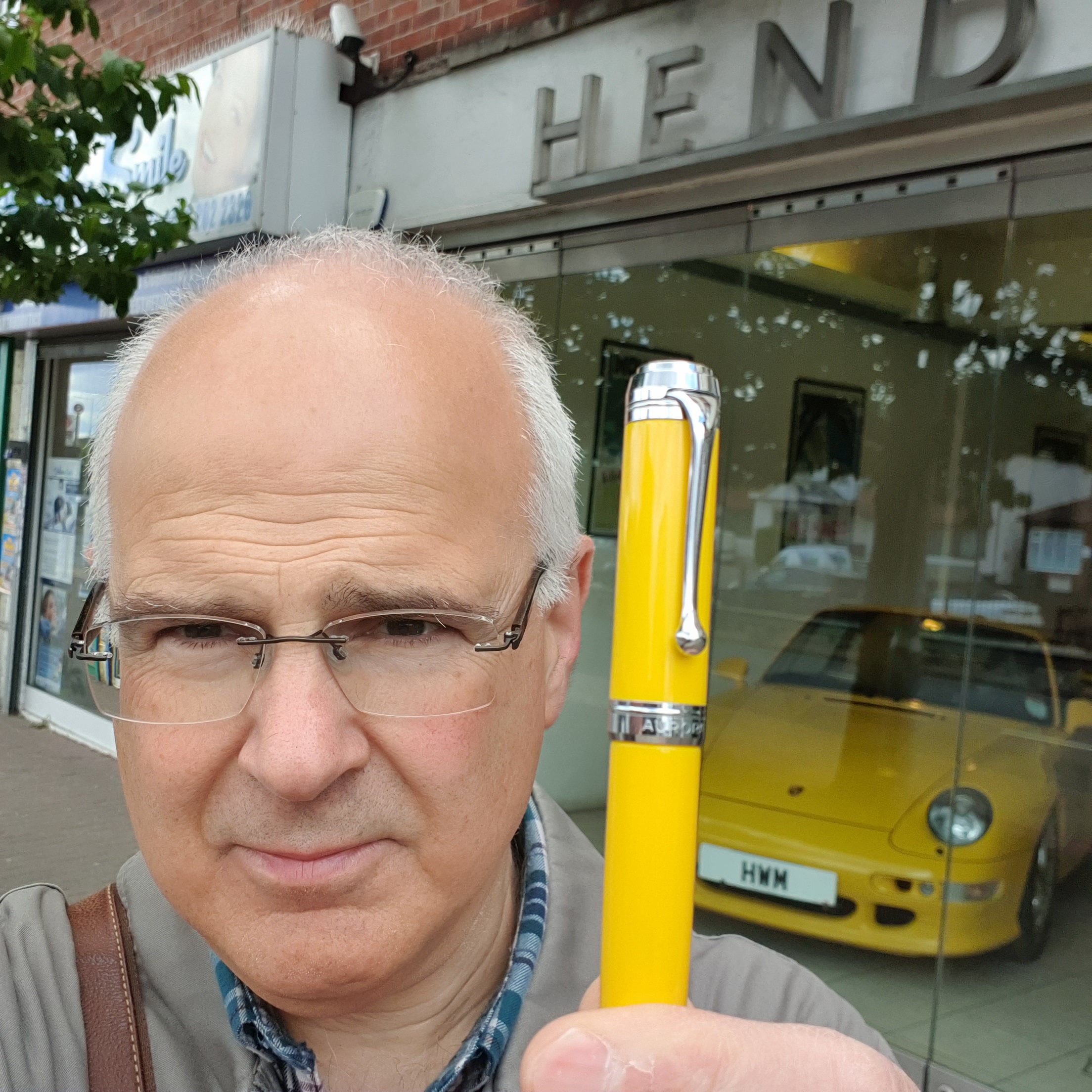
Aurora Talentum fountain pen.
Obviously the first thing you notice is that the pen is very yellow! The chrome trims on the clip, cap finial and end of the barrel look good against the yellow. The fit and finish are all very impressive.
Oblique Medium 14k gold nib, rhodium plated
The Oblique Medium nib.
I was keen to see how this compared to my Oblique Broad on my red Optima. The answer is, that the difference is very small. I placed the two oblique nibs up against each other and whilst the OM was a tad narrower, there was not much in it. Perhaps I should have chosen the Oblique Fine instead.
I then tried dipping the pen. I noticed a little bit of “railroading” where you have two lines with a gap in between. I thought perhaps, on examining the nib’s writing edge, there might be a very slight prominence at one end as the edge looked to be very slightly crescent-shaped, like a gently curved bay, rather than an exactly straight edge. However, it really was so slight that I thought it would wear in with normal use and I decided against smoothing it.
However, a bigger issue, once I had filled the pen for the first time, was that it seemed to skip or hard start, and quite a lot. Under the loupe, the nib looked right, with a visible tine gap until coming together at the tip. I deduced that the tines were perhaps a little two tightly together and in need of spreading a little, to increase the ink flow. Then again, it could have been a problem of air not getting up to the ink reservoir, rather than ink not getting down.
I wrote for several pages of A4, and at each hard start, I would draw some capital O’s. Looking back on these pages now, these O’s were occurring after every three or four lines. I also noticed that if I kept writing without a pause, the pen would keep up but if I held the nib poised in mid-air for more than 5 seconds, it would hard start on me.
My first fill had been with Waterman Absolute Brown. I then switched to my familiar Conway Stewart Tavy, by Diamine, which is a blue black that flows well. I tried again for several pages, and on different types of paper. There were still lots of frustrating skips.
A good-sized converter is included.
A few days into my new pen, a difficult decision had to be made, of whether to try to return it or else to take the plunge, and try to rectify it myself – knowing that this may or may not succeed and that it would then be past the point of no return.
The way I write.
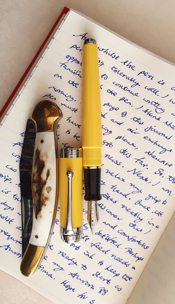
To be fair, I am left handed and generally use an “overwriter” style, with my hand above the line I am writing on and the nib pointing towards me. Instead of hooking my wrist, I rotate the paper 90 degrees to the left, keeping my wrist straight. In writing in this way, I use a very light touch on the nib and cannot apply pressure while the nib is pushing forwards, rather than doing downstrokes. So I need a pen with a generous ink flow, to keep the nib lubricated and the writing from being too pale.
Writing example. (The penknife makes the Talentum look small but was only there as a roll-stop).
I do also sometimes use an “underwriter” style, with my left arm tucked into my side and the nib pointing away from me, in a more “normal” fashion and immediately notice how much smoother and wetter pens are for the lucky people who write in this way!
I recalled how in the past, I had managed to transform the nib on my Aurora 88 by opening up the tines very slightly, with brass shims and the blade of a craft knife. Sometimes you can manage to remedy a nib problem in a few minutes. I therefore resolved to have a session on the Talentum and to try to increase the flow and hopefully reduce the skips and hard starts.
With a few tentative goes at this, I was able to ease the tine gap a little and to feel the brass shims moving more loosely between the tines. I stopped frequently to examine the nib under the loupe and was careful not to overdo things. I had bought the Talentum to compare the slightly narrower OM line to my existing OB nib, and so it would defeat the object if I simply made the nib broader – or worse still, ruined it and stopped it from writing at all.
Getting some daylight between the tines.
I also changed the ink again, this time to Montblanc Royal Blue, a good rich blue which lubricates well.
The outcome.
The good news, is that by day 5 of my ownership, I was writing happily with the pen. I filled a page of an A5 journal without drama. I liked the line from the pen very much, being crisp and with pronounced line width variation between cross strokes and forward strokes.
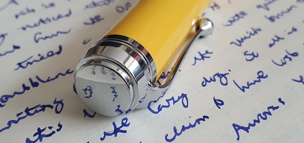
The chrome finial and pocket clip are very pleasing.
Conclusions.
In the course of all this, I was also reading blogs and threads on Fountain Pen Network. I came across a thread about Aurora nibs where I learned that ebonite feeds do take a few days to absorb ink. My understanding is that ebonite, a vulcanized rubber, partly absorbs some ink which helps ink to flow through the nib. Perhaps my repeated flushing and ink changing had hindered this absorption process.
I was also reminded by reading a recent post from Gary, on the Scribo Write Here Tropea with 1.4mm stub nib, that you do need to write slower with a stub nib and not expect skip-free performance if writing at a fast pace. Also, this being an oblique nib, it does take some careful positioning to hold the pen at the “sweet spot” for best writing performance. Finding this takes a bit of practice until it is familiar. The moral of this “tale of the Talentum” is not to be too hasty to adjust a nib before spending ample time to allow the nib to settle down and to get used to writing with it.
Size and weight.
The Talentum is big pen, by usual standards. It measures around 135mm capped, 132mm uncapped, which is long enough to use comfortably without posting, or 160mm if you do want to post it. The weight is substantial without being burdensome, at 30.5g with ink and converter, or 20g uncapped in writing mode. The cap alone weights around 11g.
Final thoughts.
I have been interested in the Talentum for a few years now. My Aurora 88 and Aurora Optima are among my favourite special pens and so it was probably inevitable that I would succumb to the temptation to add a Talentum at some point. I had great service from Iguanasell and did not trouble them to seek a return of the pen. A little nib adjustment, although risky, has improved its performance for my style of writing. I like the effect on my handwriting.
This week has been special too, in celebrating the Queen’s Platinum Jubilee, marking 70 years’ reign since 1952. And in a less publicised milestone, this post is my 200th since starting this blog in 2016. Thank you for still reading.
Recently I was the happy recipient of another unexpected gift of pens, from my friend in Melbourne. As you can imagine, for a fountain pen enthusiast, it is exciting to receive such a package and to discover its contents.
One of them was this Geha 715, a vintage German piston-filler dating from around the 1960’s. My friend had bought it on ebay.
Geha 715 fountain pen.
This name was new to me. I have since read that Geha was founded in 1918 by two brothers, Heinrich and Conrad Hartmann. The name was a contraction of Gebruder-Hartmann, – Hartmann Brothers. Based in Hannover, the firm initially dealt in stationery and office supplies and began making pens in 1950. They made fountain pens for the student market until ultimately the company was bought by Pelikan in around 1990.
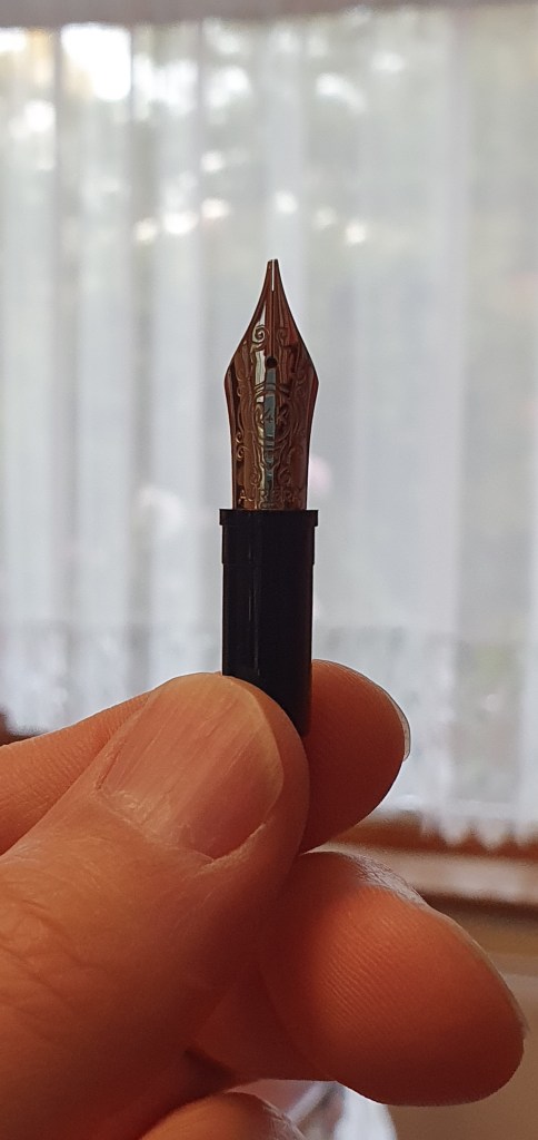
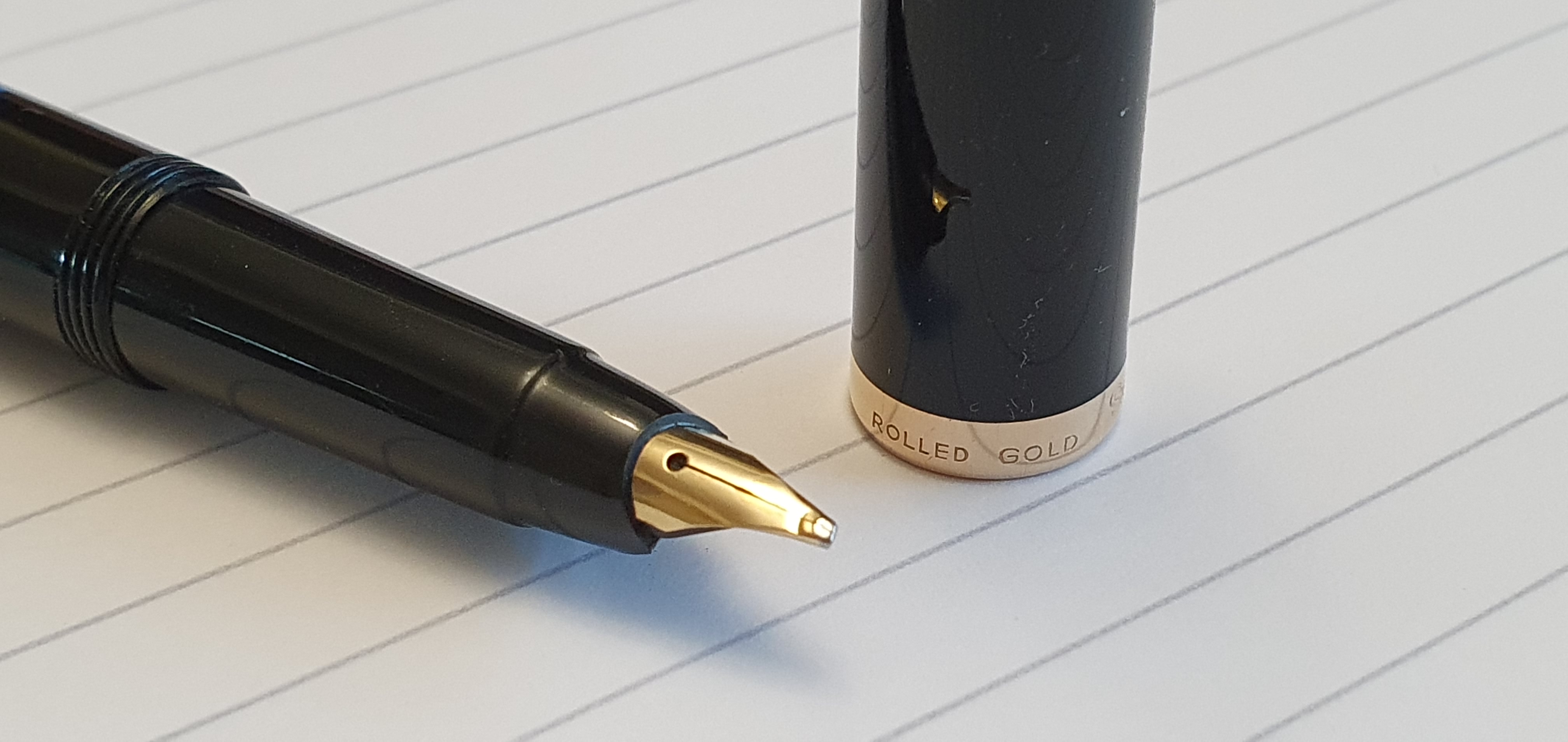
This particular model, the 715, is in a classic black resin with gold coloured trim. The model name Geha 715 is engraved in the side of the cap. The cap finial is a plain gold-coloured flat disc. There is a functional gold coloured pocket clip and a single cap-ring engraved with “Geha, Made in Germany, Rolled gold.”
Rolled Gold cap ring.
The cap unscrews, in one full turn. This reveals a gold coloured, semi-hooded nib. To my delight, this one has an Oblique Broad nib. My friend sent it to me, knowing of my liking for such nibs.
Geha 715 engraved on the cap.
There is an ink window in blue plastic. The barrel then tapers gracefully up to the piston turning knob and another gold coloured disc at the base.
The pen is on the slim side, but comfortable to hold and can be used with or without the cap being posted. Unposted, it is already 123mm long, but the cap posts deeply and firmly to increase the length to about 147mm, which feels very comfortable.
I flushed the pen, and tried the piston. It felt a bit stiff to lower the plunger, but smooth and easy when raising the plunger again.
The nib looks like gold, but my friend tells me it is steel. There are no visible markings on the exposed part of the nib. I presume that both nib and cap ring are plated in rolled gold. The nib shows no sign of any rust or staining, although a slight kink just behind the tipping suggests that the pen may have been dropped at some point and the nib straightened out again.
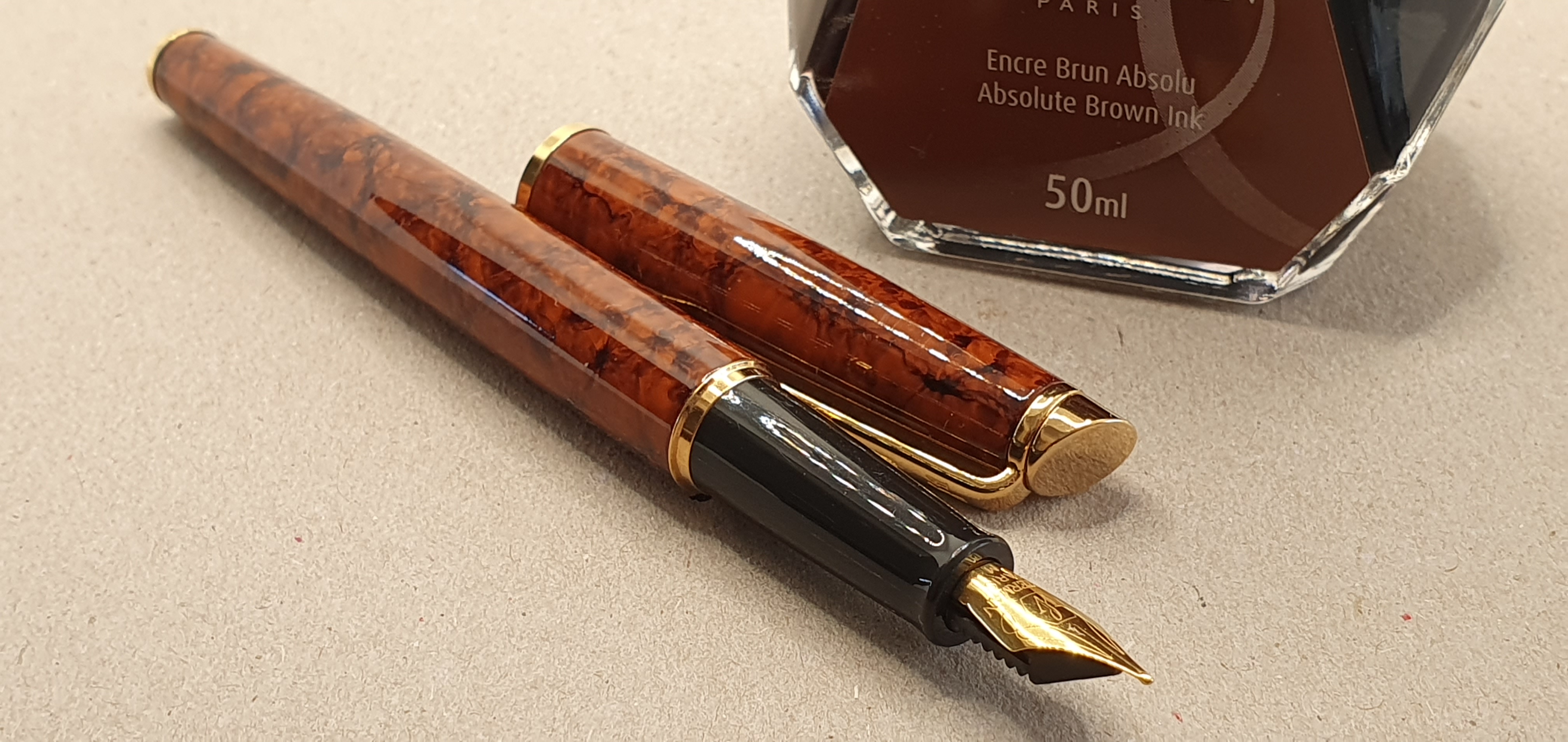
I inked it up with Waterman Absolute Brown ink. Initially the pen wrote rather dry and pale and needed pressure on the nib to keep ink flowing. I decided to try flossing the tines. I then tried widening the tine gap just marginally by bending the tip upwards, before trying again to widen the tine gap by means of inserting the blade of a craft knife in the gap and wriggling it very gently from side to side, until the pen wrote smoothly and with only minimal downward pressure.
Trying the Oblique Broad nib with some Waterman Absolute Brown.
Looking online, I found some Youtube videos on other Geha models, by The Pen Collector. I also learned that the Geha pens had a special feature – an ink reserve, which could be released by pressing a button on the underside of the feed. On some pens, this was a small round button, but on the 715, there is a shiny rod like the hull of a boat, which can be slid inwards towards the section.
The button to release the ink reserve
Having succeeded in sliding the button in, I then had an anxious few minutes worrying how to slide it back again. However it transpires that the button resets itself when the piston is next lowered. As you turn the piston knob to lower the piston down before re-filling, the piston can be lowered further, pushing against some resistance, to push the ink reserve tube back down into the section again.
It is arguable whether an ink reserve is necessary when you have a piston filler with an ink window. It seems to have been a gimmick. But I admit that I would have loved this as a school boy, like having a secret gadget in your pencil case. The idea was that if you were taken by surprise at running out of ink in your main tank, you could activate the reserve, releasing enough ink for another two or three pages of writing, which might get you to the end of your exam without having to re-fill! No doubt my 1960’s self would have pushed the ink reserve button in with my finger nail, getting inky fingers in the process, but I have just read in another Geha review, that the instruction manual suggested using your pen cap for this task. Of course.
Size comparison: from left to right – Montblanc 12, Montblanc 34 and Geha 715
All in all, it is a gorgeous pen. Although produced as a school pen, the black resin body remains just as smart and glossy as on my Montblancs of this era. It is nice to think that it may have belonged to a school boy, or girl, in 1960’s Germany and I wonder at the pen’s unknown history before it found me.
Update: 21 May 2022
Following a suggestion by Gasquolet in the comments to the above post, I learned that the section unscrews, just before the cap threads. This exposed a rather delicate looking feed, protruding from the section, with a small collar piece at the top. I lifted off the collar, pushed the delicate feed channel out through the front, and was then able to pull the nib out. Sure enough the nib is gold. It is clearly marked Geha 14k 585, but you do not see any markings when the nib is in situ.
Disassembling.
I took the opportunity to do a little more flossing of the nib with a fine brass shim, before putting everything back together. Some care is needed to re-align the tines, after pushing the nib back into the section.
Geha 14k gold nib. This one is an oblique broad although not marked as such.
I also applied a little grease to the threads for the section. This might have been the first time that the section had ever been unscrewed and the nib removed in the pen’s 60 year life, for all I know.
Nib extracted from the grip section.
I refilled the pen with Pelikan Edelstein Smoky Quartz and tried some writing samples.
Writing samples. The nib needs a little pressure and is clearly wetter when in underwriting mode.
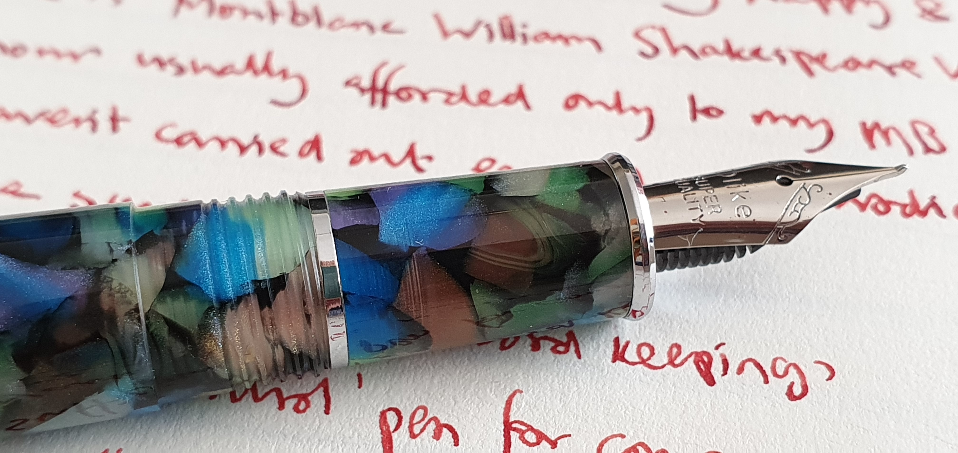
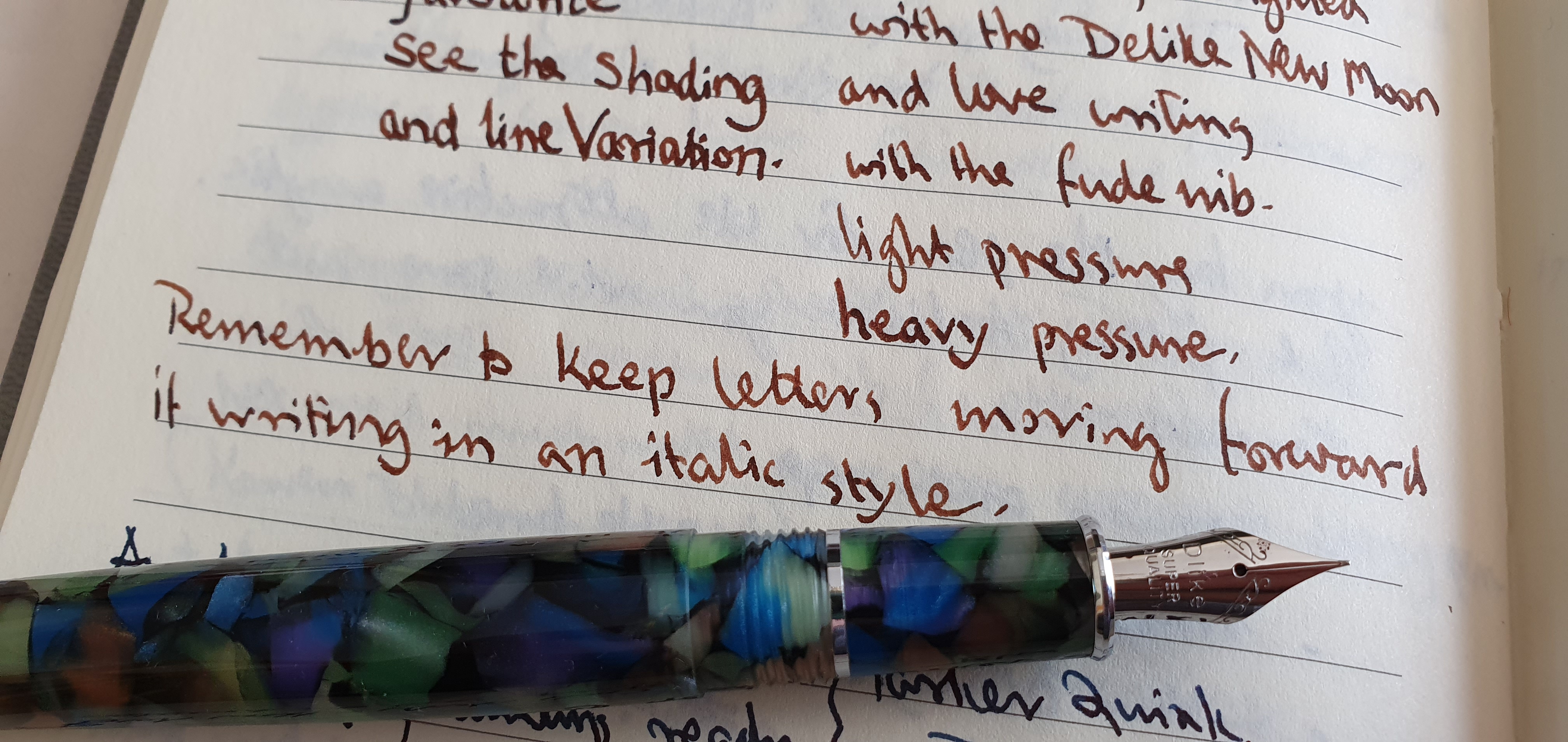
Over the last couple of months I have been much enjoying the Delike New Moon fude nib fountain pen. I am on my second, after giving the first one away.
The fine fude nib on the Delike New Moon.
The main reason why I enjoy this inexpensive pen so much, comes down to writing pleasure from the nib and the way it compliments my handwriting. The fine fude stainless steel nib, (with its upturned tip), writes very smoothly and provides some subtle line width variation in my usual style (whether underwriting or overwriting). Also it has the versatility of providing several different line widths when required, simply by changing the way I hold the pen.
Looking back over the pages of my notebooks for the past few weeks, where I often write a few lines of nonsense just for the pleasure of putting pen to paper from any of the dozen or so currently inked pens in the pen cups, I noticed that the Delike had produced a more interesting line: my handwriting seemed to look more attractive from this pen, than from many others.
My writing looking neater and more legible than usual.
Nothing is ever perfect. Recently I noticed that my Delike had taken to hardstarting: not writing immediately when I picked up the pen after an interval of a few hours. I keep my currently inked pens upright in pen cups and write something with most of them fairly frequently. But I started to notice that if the Delike was left overnight in the pen cup, it might hesitate to start the next day. The nib would be dry. I might get a word or two out of it, but some letters would be incomplete (skipping) and then the nib would run dry completely. I would hold the pen nib down and give it a few shakes. After a few bouts of shaking, ink would flow, dark and wet again, and the nib would feel super-smooth and lubricated. I would be cooking on gas and all would be forgiven and forgotten.
This was not due to ink starvation, which is sometimes caused by surface tension causing ink to remain at the back end of the cartridge or converter, when it should flow to the nib. The Delike’s converter includes a little coil of metal as an ink agitator which slides up and down to combat that.
At first I thought that the problem was one of ink evaporation. This can occur when the cap does not create an airtight seal around the nib. Some pens are brilliant at avoiding this, such as some Platinums with their slip and seal sprung inner caps, or the Esterbrook Estie which also has a sprung inner cap. My Aurora 88 and Aurora Optima both have ebonite feeds which, together with well designed caps, mean hard starts do not happen.
To see if your cap is airtight, a crude test is to place your mouth over the rim and try to blow: if air escapes it is not airtight. If your cheeks puff out and nothing happens, then it is. The Delike cap passed this test.
This led me to think that the hardstarting may not be due to ink evaporation but instead have another cause, that the ink drained away from the nib and/or feed overnight, back into the cartridge or converter. This would simply be due to gravity, whilst the pen is left upright in the pen cup. If that is the cause, then an easy solution is not to stand the pen in a pen cup but leave it horizontal.
This week I have been testing my theory on the Delike. Does this work? It is early days but I am cautiously optimistic that the problem may have been solved. I have not been very (or at all) scientific in my method. I have only one Delike New Moon pen, not a whole bunch of them to put into two groups, to leave some horizontal while another, control group stays upright. I also try only one ink at a time. Temperatures may make a big difference if evaporation is at play. However, I shall continue to monitor how this goes.
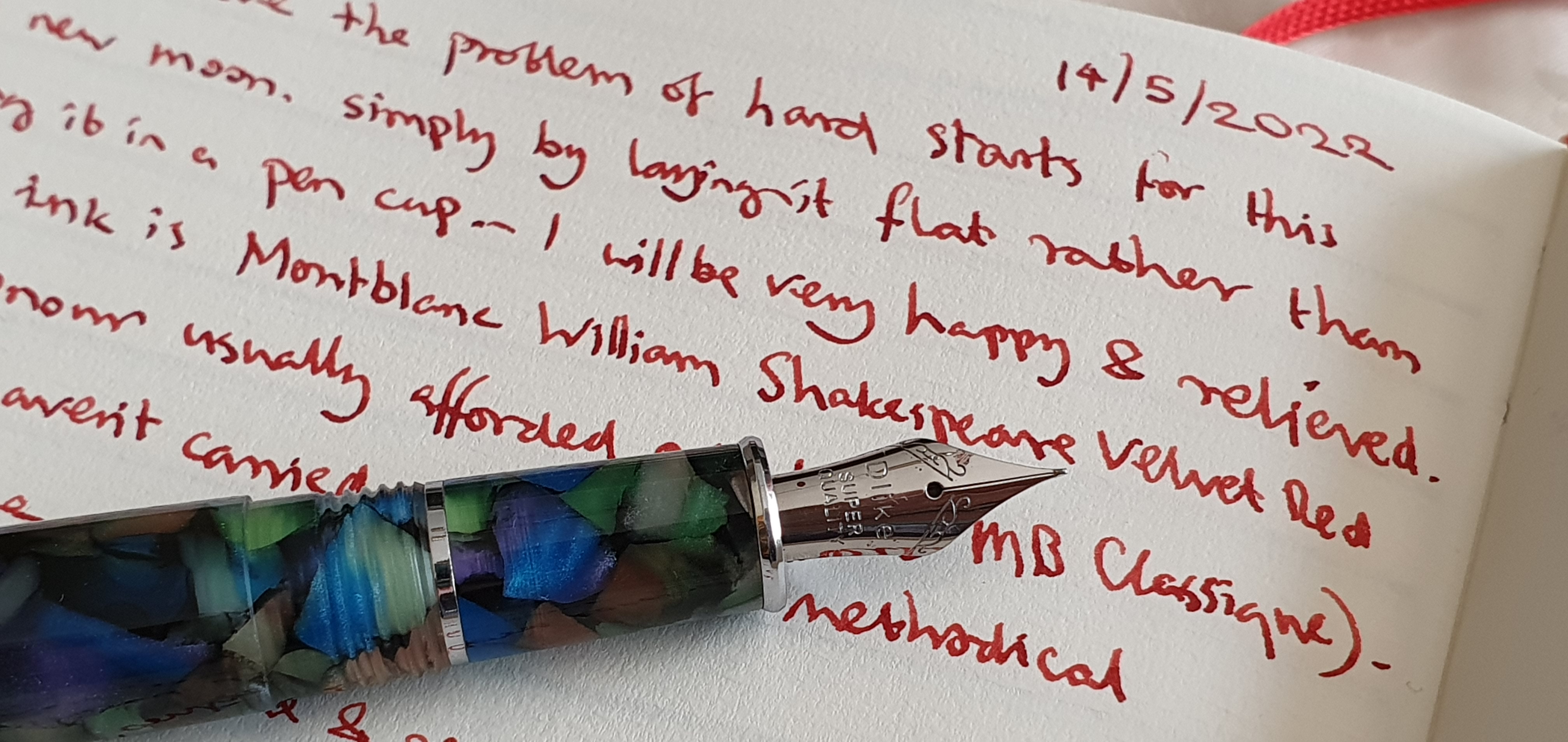
As for inks tried, I am on my seventh, having inked my first New Moon with Pilot Iroshizuku Tsuki-yo, Pelikan Edelstein Smoky Quartz, Montlanc Toffee Brown, and Parker Quink Blue Black: my second New Moon has had Waterman Serenity Blue, Robert Oster Aqua and currently Montlanc William Shakespeare Velvet Red. A fill with the gorgeous Velvet Red is a luxury usually only afforded to my Montblanc Classique and so I hope that the pen behaves itself. So far so good.
With Montblanc William Shakespeare Velvet Red, on Semikolon journal paper.
Here it has been an extraordinary week for new arrivals. I have just totted up that, of about 13 fountain pens acquired so far this year, six arrived in the last week.
I have been feeling very satisfied with my pen accumulation and had resolved to try not to buy more pens this year, (or inks or note books for that matter). Indeed it is very nice to be able to reduce the number sometimes. Four of the pens that I bought early this year, have been gifted to others, which gives joy to both parties.
But in case this sounds boastful, the pens that I gave away were all modestly-priced (but in my opinion, very presentable) pens, namely two Online Campus Fluffy Cat editions, one Cross Bailey Light (of which I am a big fan) and one Delike New Moon, the latter being a spontaneous give-away for which I immediately bought myself a replacement.
Compare this then, with my good penfriend and penefactor in Australia, who sent me an unexpected package containing three vintage Montblanc pens and a Waterman, knowing that I had been feeling under pressure at work lately.
Some of these pens will be given their own early thoughts reviews in due course, but for now here is a look at the recently incoming!
Speedball 1.1mm calligraphy pen.
This was a spontaneous purchase, which came about whilst browsing in a large art supplies store called Great Art, Kingsland Road, in London’s trendy Shoreditch. Speedball is a new name to me but an American brand established in 1899. I saw some of their dip pens hanging up on the shelves, and then found their Calligraphy pen sets, available in either 1.1, 1.5 or 1.9mm stubs. I have a hard time resisting a cheap calligraphy pen, as this purchase shows. Also it was reduced from £11.99 to £8.99. I chose the 1.1, thinking it would be good for letter writing. It came with two standard cartridges, of black ink. I couldn’t wait to try it out and even popped a cartridge in whilst waiting for the train home.
A Speedball, calligraphy pen with 1.1mm stub.
Ink soon started to flow, and the nib looked to be well set up, and ground to a comfortable writing angle, and with corners that were not too sharp. The pen is rather plasticky, with two gaping holes as ink windows in the barrel. The section is of plastic, and has four “ribs” to aid grip. One annoyance was that with one of the supplied cartridges installed, the section would no longer screw back fully into the barrel but left a tiny gap. It transpired that the cartridge nozzle was just slightly longer than usual. I ditched the cartridge and popped in a cartridge of Graf von Faber-Castell Cobalt Blue, and suddenly all was well and the section screwed in all the way.
Also the name of a cocktail of drugs, I was horrified to learn on Googling.
Delike New Moon, fude nib pen.
This pen has been a revelation, a surprise discovery of the year so far. Having given mine away I ordered a replacement and more photos of this can be seen in my previous post.
Majohn P135, fude nib pen.
Whilst ordering the replacement Delike New Moon on Amazon, I came across this interesting pen. It had a fude nib, (similar to the Delike New Moon’s nib) but was in a blue barrel with a shiny metal end piece, and a hefty metal cap, deeply engraved with some shapes. The design was very suggestive of the Montblanc 146 “the Little Prince” edition which features references to the well loved book by Antoine de Saint-Exupéry. Let’s say the P135 is a “homage” to that.
Majohn P135 fountain pen.
The pen is more weighty than the Delike New Moon. I have not used it very much yet (mainly because the Delike New Moon is so good). It is just a little on the short side unposted, whilst posting the metal cap makes it back heavy. The nib tines were not completely level and there was a slight prominence on one side with a sharp leading inside edge to the tipping which caused it to feel scratchy in cross-strokes. It can probably be improved easily by a little smoothing on the micromesh pads.
Another homage pen.
Montblanc 34.
And now here is a proper Montblanc! This was in a wondrous package, which arrived out of the blue from my friend in Melbourne, who knows of my new-found liking for oblique nibs. This one has a juicy oblique double broad in 14k gold, and is a piston filler, with a screw cap and a blue plastic ink window. It may date from the 1960’s and yet seems to be in great condition. I have inked it with Pelikan 4001 Konigsblau and it promises to be a great letter writer.
Montblanc 34, piston filler with an OBB nib.
Montblanc Carrera.
As well as the Montblanc 34, I was given a Montblanc Carrera fountain pen, with a matching ball point and a new Montblanc refill! This model was unknown to me but I am told they were “cheap” school pens, at the time, with stainless steel nibs but which are now sought after on ebay. It has a brushed steel barrel, a metal cap which has a smart gun-metal finish, a distinctive pocket clip with holes in it (as I imagine an accelerator pedal on a feisty Italian sports car) and the Montblanc white star emblem on the finial. This one is a cartridge converter pen. I have popped in a cartridge of a dark orange in from Paperchase. It writes well for me, in my lefty-overwriter mode although you need to find and keep it at the best angle, or sweet spot for smooth writing.
Montblanc Carrera with steel OB nib.
The matching ball pen is very nice to have and is unusual for Montblanc in having a clicky action rather than twist action. I have never owned a Montblanc ball pen before. The metal grip section is slippy and also tapers towards the tip, whilst the top part of the pen is of black plastic. The blue refill writes super smoothly and needs barely any pressure. Again, it has the Montblanc emblem on the push button, which is very cool.
With matching ball pen.
Waterman Hemisphere, Havana brown.
Finally, I was given this Hemisphere, which my friend tells me is a pre-2010 model and slightly wider than the current Hemisphere models. The mottled brown lacquered barrel and gold coloured trim look very elegant and vintagey. It has a steel nib, a medium which writes very well. Early impressions are very favourable and I can see myself enjoying this one too. I plan to ink it up with some Waterman Absolute Brown.
Waterman Hemisphere.
And so, my pen cups runneth over. I feel extremely fortunate. Many of these pens would be enough for anyone and would last a lifetime, but having them all to pick from, is an abundance of riches.
My previous post was about my Delike New Moon, a fude nib fountain pen that I had bought on Amazon not long ago. That pen was a great success and I enjoyed using it.
I no longer have it, as I gave it away to a young lady who was serving me in the phone shop, helping me to renew my mobile phone contract. Fountain pens came up in the discussion as I mentioned that I probably used the phone more for Instagram and the internet and other functions such as photographing pens, than I did for making phone calls. She immediately lit up and told me that she liked to use a fountain pen too. I showed her the couple of pens that I had with me, one of which was the New Moon with its unusual fude nib. After I had talked about the pen so enthusiastically, it seemed a good idea to give it to her and I knew that I could easily replace it.
Writing sample – all from one Delike New Moon with fude nib.
The best endorsement I can give for the New Moon is to say that once I no longer had one, I immediately ordered another one. I would not say that about all of my pens.
The delivery time from China was estimated at about six to eight weeks but as before, the pen arrived about a month earlier than expected. I was glad to see that my second New Moon’s nib was also set up perfectly and wrote every bit as wonderfully as the first one. The acrylic body of the pen, with its random patches of green, brown, purple and turquoise was of course different as each one is unique but the overall look was the same.
My second Delike New Moon pen.
I have only these two New Moon purchases to go on but have been delighted with them both. As a lefty overwriter, I have a number of pens which work well for me in overwriter mode, and others that write better in an underwriter style, but the New Moon is equally at home whichever way I write with it. You also have the option of producing several different line widths, all from one nib which is very useful but also a lot of fun. For its modest cost it represents great value. I shall try to hold on to this one.