
Here it has been an extraordinary week for new arrivals. I have just totted up that, of about 13 fountain pens acquired so far this year, six arrived in the last week.
I have been feeling very satisfied with my pen accumulation and had resolved to try not to buy more pens this year, (or inks or note books for that matter). Indeed it is very nice to be able to reduce the number sometimes. Four of the pens that I bought early this year, have been gifted to others, which gives joy to both parties.
But in case this sounds boastful, the pens that I gave away were all modestly-priced (but in my opinion, very presentable) pens, namely two Online Campus Fluffy Cat editions, one Cross Bailey Light (of which I am a big fan) and one Delike New Moon, the latter being a spontaneous give-away for which I immediately bought myself a replacement.
Compare this then, with my good penfriend and penefactor in Australia, who sent me an unexpected package containing three vintage Montblanc pens and a Waterman, knowing that I had been feeling under pressure at work lately.
Some of these pens will be given their own early thoughts reviews in due course, but for now here is a look at the recently incoming!
Speedball 1.1mm calligraphy pen.
This was a spontaneous purchase, which came about whilst browsing in a large art supplies store called Great Art, Kingsland Road, in London’s trendy Shoreditch. Speedball is a new name to me but an American brand established in 1899. I saw some of their dip pens hanging up on the shelves, and then found their Calligraphy pen sets, available in either 1.1, 1.5 or 1.9mm stubs. I have a hard time resisting a cheap calligraphy pen, as this purchase shows. Also it was reduced from £11.99 to £8.99. I chose the 1.1, thinking it would be good for letter writing. It came with two standard cartridges, of black ink. I couldn’t wait to try it out and even popped a cartridge in whilst waiting for the train home.

Ink soon started to flow, and the nib looked to be well set up, and ground to a comfortable writing angle, and with corners that were not too sharp. The pen is rather plasticky, with two gaping holes as ink windows in the barrel. The section is of plastic, and has four “ribs” to aid grip. One annoyance was that with one of the supplied cartridges installed, the section would no longer screw back fully into the barrel but left a tiny gap. It transpired that the cartridge nozzle was just slightly longer than usual. I ditched the cartridge and popped in a cartridge of Graf von Faber-Castell Cobalt Blue, and suddenly all was well and the section screwed in all the way.

Delike New Moon, fude nib pen.
This pen has been a revelation, a surprise discovery of the year so far. Having given mine away I ordered a replacement and more photos of this can be seen in my previous post.
Majohn P135, fude nib pen.
Whilst ordering the replacement Delike New Moon on Amazon, I came across this interesting pen. It had a fude nib, (similar to the Delike New Moon’s nib) but was in a blue barrel with a shiny metal end piece, and a hefty metal cap, deeply engraved with some shapes. The design was very suggestive of the Montblanc 146 “the Little Prince” edition which features references to the well loved book by Antoine de Saint-Exupéry. Let’s say the P135 is a “homage” to that.
The pen is more weighty than the Delike New Moon. I have not used it very much yet (mainly because the Delike New Moon is so good). It is just a little on the short side unposted, whilst posting the metal cap makes it back heavy. The nib tines were not completely level and there was a slight prominence on one side with a sharp leading inside edge to the tipping which caused it to feel scratchy in cross-strokes. It can probably be improved easily by a little smoothing on the micromesh pads.

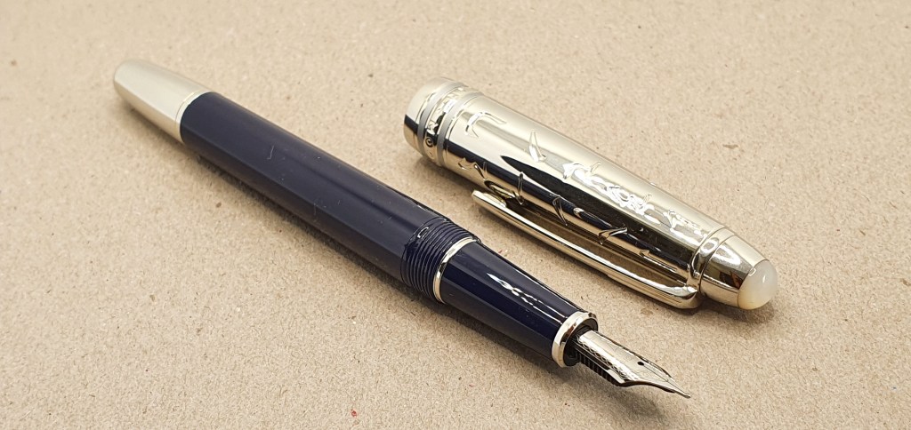
Montblanc 34.
And now here is a proper Montblanc! This was in a wondrous package, which arrived out of the blue from my friend in Melbourne, who knows of my new-found liking for oblique nibs. This one has a juicy oblique double broad in 14k gold, and is a piston filler, with a screw cap and a blue plastic ink window. It may date from the 1960’s and yet seems to be in great condition. I have inked it with Pelikan 4001 Konigsblau and it promises to be a great letter writer.

Montblanc Carrera.
As well as the Montblanc 34, I was given a Montblanc Carrera fountain pen, with a matching ball point and a new Montblanc refill! This model was unknown to me but I am told they were “cheap” school pens, at the time, with stainless steel nibs but which are now sought after on ebay. It has a brushed steel barrel, a metal cap which has a smart gun-metal finish, a distinctive pocket clip with holes in it (as I imagine an accelerator pedal on a feisty Italian sports car) and the Montblanc white star emblem on the finial. This one is a cartridge converter pen. I have popped in a cartridge of a dark orange in from Paperchase. It writes well for me, in my lefty-overwriter mode although you need to find and keep it at the best angle, or sweet spot for smooth writing.

The matching ball pen is very nice to have and is unusual for Montblanc in having a clicky action rather than twist action. I have never owned a Montblanc ball pen before. The metal grip section is slippy and also tapers towards the tip, whilst the top part of the pen is of black plastic. The blue refill writes super smoothly and needs barely any pressure. Again, it has the Montblanc emblem on the push button, which is very cool.

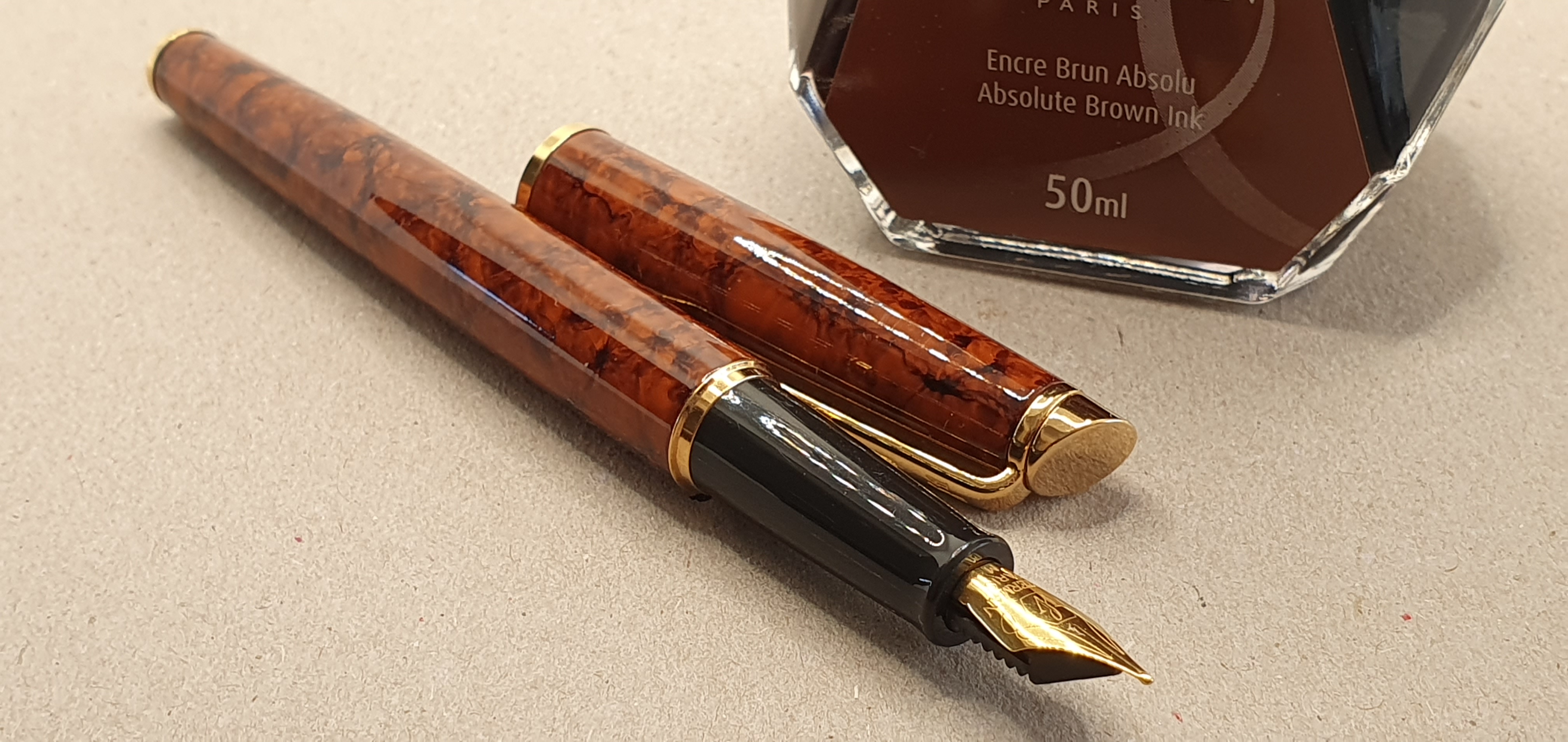
Waterman Hemisphere, Havana brown.
Finally, I was given this Hemisphere, which my friend tells me is a pre-2010 model and slightly wider than the current Hemisphere models. The mottled brown lacquered barrel and gold coloured trim look very elegant and vintagey. It has a steel nib, a medium which writes very well. Early impressions are very favourable and I can see myself enjoying this one too. I plan to ink it up with some Waterman Absolute Brown.
And so, my pen cups runneth over. I feel extremely fortunate. Many of these pens would be enough for anyone and would last a lifetime, but having them all to pick from, is an abundance of riches.


Great joy to all concerned Rupert! Many thanks for continuing your writing!
Work and recovery from some minor surgery, have meant that I rely on you and a shortlist of online material quite a bit these days!! Very appreciative of your efforts!
LikeLike
Thank you Paul! Wishing you a speedy recovery. I am always grateful to hear that people are still reading. Having the blog is a therapeutic outlet sometimes and I am glad to have it.
LikeLiked by 1 person
I enjoyed your little comment about the Speedball with reference to drug culture – I’m sure I’m not alone in finding any fountain-pen related post rather like a cocktail of drugs! The vintage Montblancs look interesting and oh, how lovely to see a Waterman Hemisphere. My blue Hemisphere is pre-2010 whilst my Rose Cuivre version is post-2010, both are super writers for which I have a great affection. Hope the work pressures start to ease soon.
LikeLiked by 2 people
Thank you Pamela. It is probably fair to say that stationery, and fountain pens in particular can be addictive. That is not necessarily a bad thing unless it impacts on your life to the extent that it takes up a disproportionate amount of your money and time and squeezes out time for other things. This does sound a bit druggie. Perhaps I should stop giving pens to people after all 🙂
LikeLike
Absolutely not! 🤣🤣😂😂
LikeLiked by 1 person
I have several Hemispheres, all pre2010. One of my favorite pens. Enjoy
LikeLiked by 1 person
Thanks Danny. I used a Waterman Expert for many years in the 1990’s but have not had much experience of the Hemisphere. I am glad to be able to give this one a try.
LikeLiked by 1 person
I also have an Expert, which I also have a good experience. BTW Stephen King writes his novels with Hemispheres.
LikeLiked by 2 people
Anyone found that Moleskine paper quality has got worse? I notice it bleeds more than it used to. What equivalent notebooks are more fountain pen-friendly?
LikeLike