My haul from the London Pen Show 2017.

This was my fourth time, attending the annual London Writing Equipment Show (LWES).  It was held on 1 October 2017, at the Holiday Inn, Coram Street, near Russell Square. Knowing broadly what to expect, I had been much looking forward to it.

Oh my, what a treat for the fountain pen obsessed  enthusiast! The venue comprises one large main function room at the hotel, plus the adjacent corridors, all filled with lines of tables, covered with enticing displays of fountain pens old and new, inks, spare parts, accessories and other paraphernalia. There is something for everyone, whatever your level of interest in this addictive hobby.

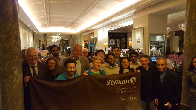
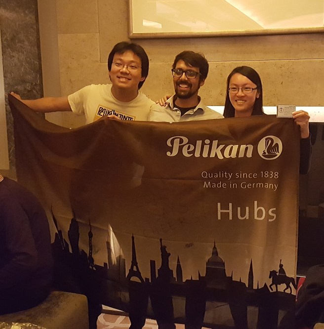
This year, for me there was an added bonus, of finding several familiar new friends from the recent Pelikan Hub, just over a week earlier. It was good to see them again and to have a chat and share the excitement.

It was very warm inside and rather too crowded, until it thinned out in the afternoon. It is a good idea to find a coat rack and leave your jacket somewhere. I had brought along some cash but not quite a big enough bag, as it turned out, for the purchases I made. I had not come with any firm ideas of what to look at. Last year I bought a vintage Parker 51 from Graham Jasper’s table. I had a vague plan to pick up another, but did not in the end. I had also planned to have another look at the Conid Bulkfillers, the Belgian made, precision-engineered masterpieces that I eye up every year, although I still came short of buying one.

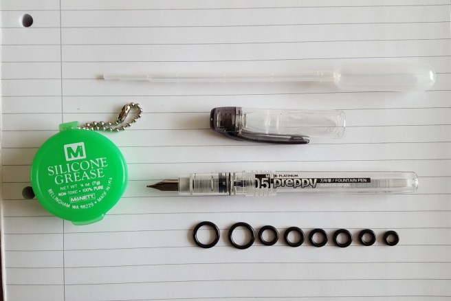
Thus browsing, with an eager eye and an open mind, I managed to limit myself to just five new pens, (all new, but all stainless steel nibbed, modestly priced pieces), three bottles of ink and a craft box of assorted grades of micro-mesh for those occasional attempts at nib adjustments.

20171007_095206
My day’s shopping: Kaweco Allrounder, Conklin Mark Twain crescent fillers in red and coral, TWSBI Classic and a mystery pen. Plus three bottles of ink and a micro-mesh kit.

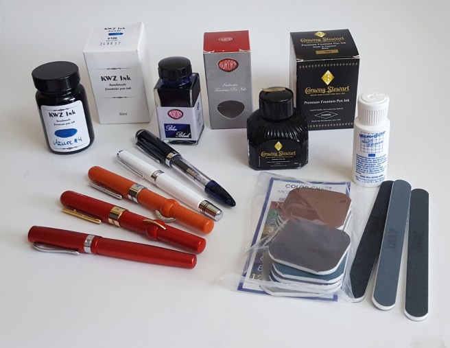
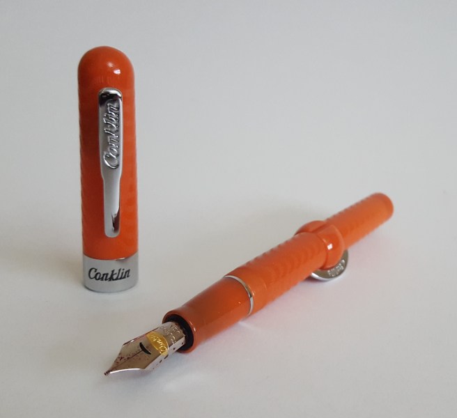
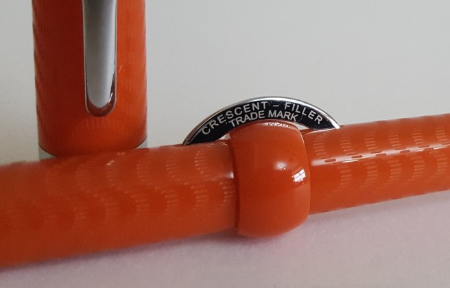
My first catch was the Conklin Mark Twain Crescent Filler. I had been attracted to these from seeing them online, but thought them to be rather over-priced for a stainless steel nib pen. However, at a very attractive price at the Show, I picked up both a Red Chase and a Coral Chase model, with fine and medium nibs, respectively.

20171007_100824

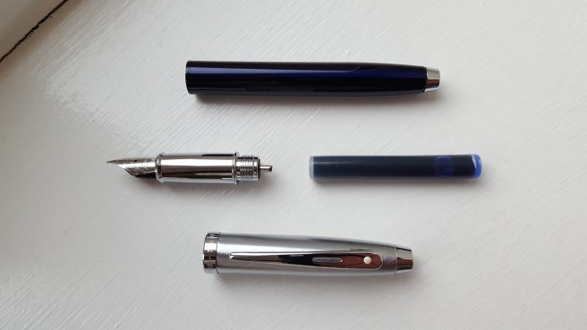
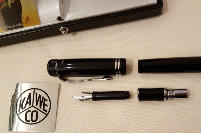
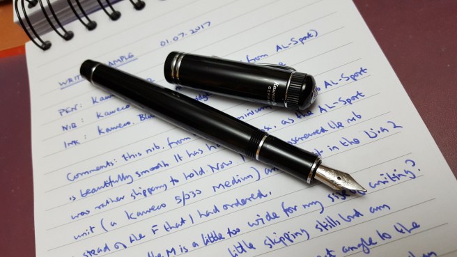
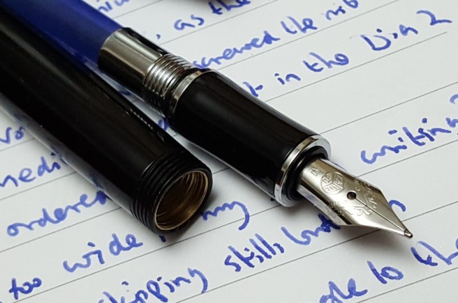
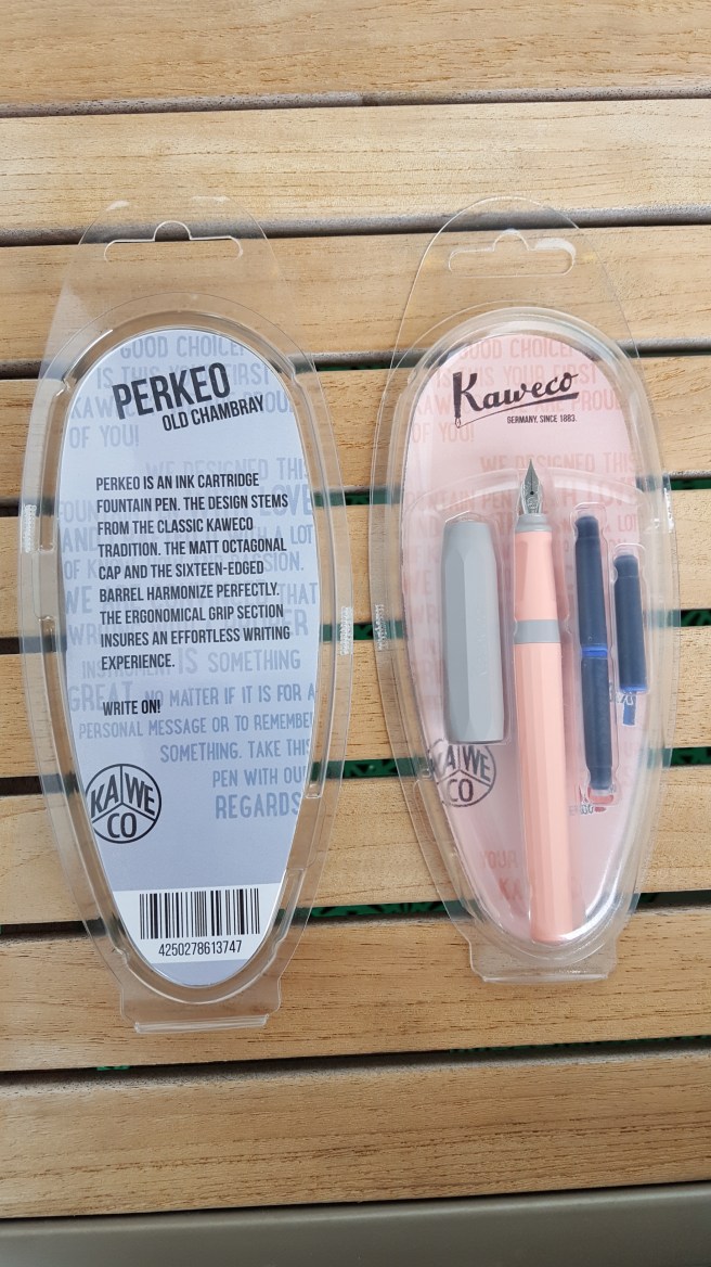
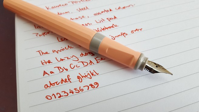
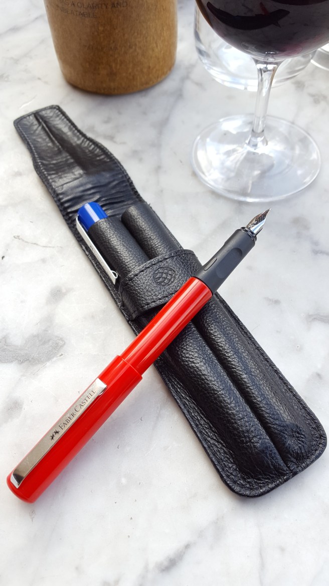
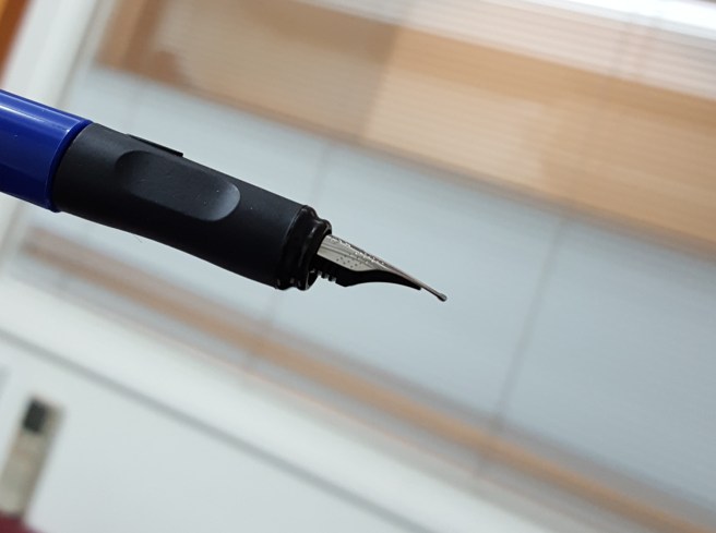
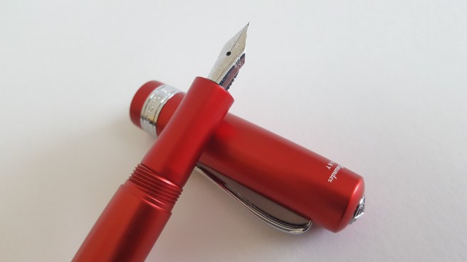
Next, and still before reaching the main hall, I lingered at the Kawecos. I have been using a Kaweco Dia 2 in recent months, which I have been delighted with and find super comfortable. At the Show, I saw the Kaweco Student and the Kaweco Allrounder, for the first time in the flesh. I was drawn to the Allrounder in a vibrant red aluminium (I think) body. It takes the same nib and feed unit as the Dia 2 or Al-Sport. I bought the pen with an Extra Fine nib, plus a Fine as a spare. These nib units are only about £8.00 and can often be fantastic, if well made.

20171007_095559
Kaweco Allrounder, with Extra Fine nib.

Next I bought a spare bottle of ink, the Conway Stewart Tavy, by Diamine. I bought a bottle of this two shows ago and have used it a lot, as an attractive blue black. It is sometimes out of stock on web-sites and so I was pleased to get a spare.

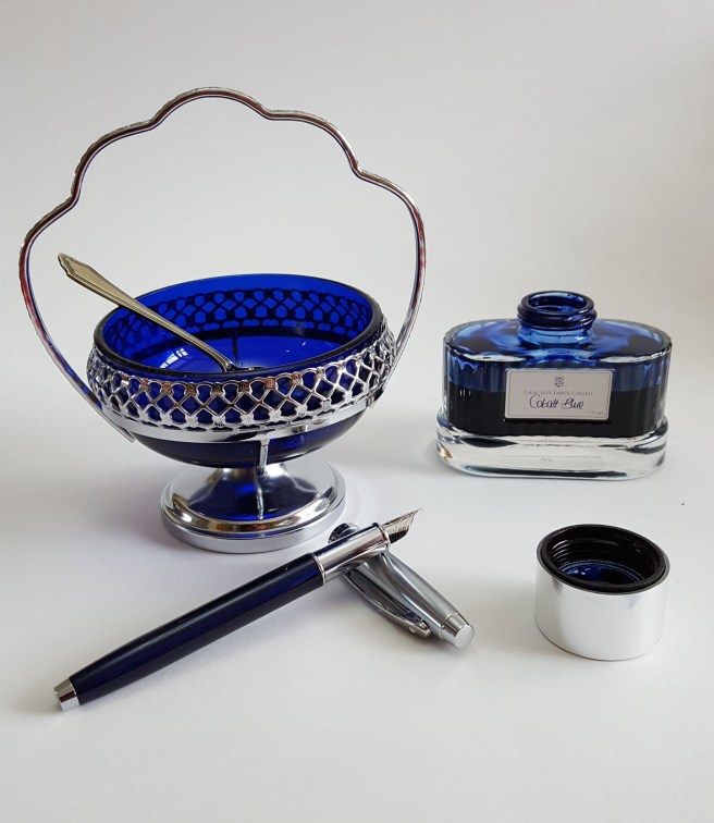
A few tables on, I met the gentleman selling Aurora pens and inks, who remembered me from previous years. It was wonderful to see these stunning beauties on display, including the Optima in what I presume was the burgundy auroloide resin, a grail pen for the wish list although surprisingly light to pick up. However I did buy a bottle of Aurora Blue Black ink, only available since April which I had been keen to try.

I had a look at the Onoto pens. Again, very desirable, but quite an expensive outlay for an unplanned purchase.

Now – the main hall! It can be a bit overwhelming, the sight of so many pens and people all in one place. A prominent display of Pelikans with a giant plastic Souveran model, indicates Niche Pens’ table, with a good range of Pelikan pens to handle, including the M120 and the entry level Pelikano.  Next there were Noodlers and TWSBIs. At the vast vintage Parker table, (Graham Jasper) I was impressed to see an open, 80-pen case display of Parker Duofolds, grouped with about six of each colour. Another grail pen.

Several tables had nostalgic fountain pen branded signage of a bygone era and I regret not taking some photos of these lovely displays.

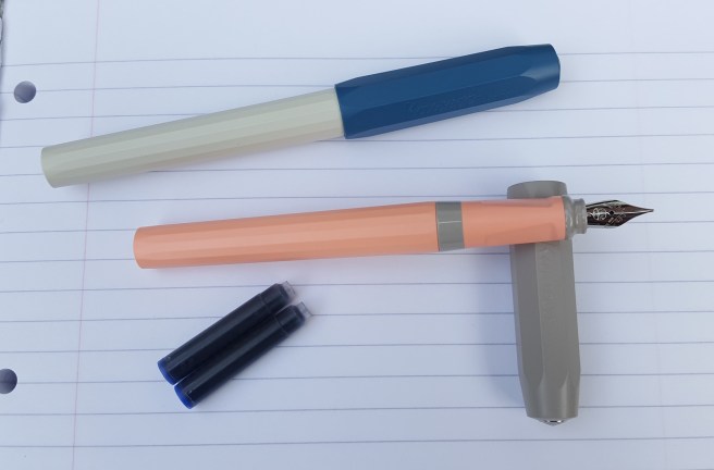
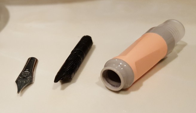
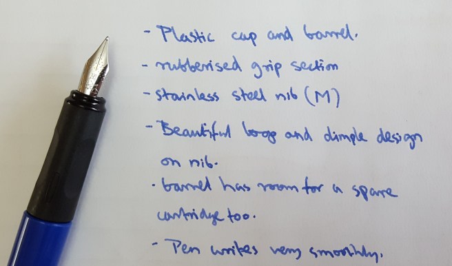
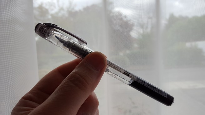
Another pen purchase, was an unbranded, large clear demonstrator pen with a black cap, displayed in gift box with a syringe included for eye-dropper filling, as an alternative option to the included converter. There were several colours and I chose one with nice blue end-cap, section and strikingly bullet-shaped barrel end. The nib looked to be a very smart, stainless steel Medium with some scroll work but with an empty space where you might normally expect to see the words Iridium Point, Germany. This I call my mystery pen. I also found a stack of Micro-mesh craft kits and added that to my stash, thinking it would be useful to have the means to do some very rudimentary nib-smoothing if the need arose.

20171007_100417_001
A mystery pen. No noticeable branding on nib, pen or packaging. But it is a beauty!

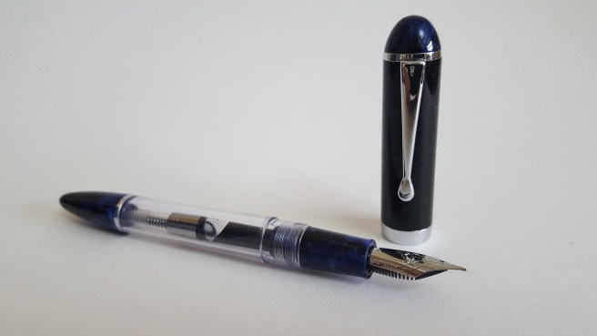
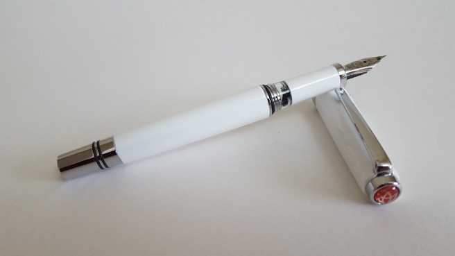
Several fascinating laps later, I was nearly ready to go but paused again at the TWSBI’s. It was at this same show in 2014 that I bought my first TWSBI, a clear Vac 700 that I love and use regularly at work.  I have since added a Diamond 580 and an Eco. Now, someone next to me was trying the TWSBI Classic in a cute Robin egg blue. I had not handled one before and rather liked the faceted cap and barrel, the shiny metal piston knob and the small clear ink window (picture your favourite ink here!). I bought one, in white. Not exactly an Aurora but it has an ink window. They also had a few KWZ inks for sale (of which I have read great reviews) and I bought a 60ml bottle of Azure #4.

20171007_095723
Oh, go on then. A TWSBI Classic, new model with postable cap. Now inked with Sailor kiwa-guro.

Having a New Pen Day x 5 was rather indulgent, admittedly. I therefore decided to ink only one more pen a day, throughout the week, to prolong the enjoyment. And it has been enjoyable. Each one has been a success and I am thrilled with my purchases.

20171007_100613
Conklin Mark Twain Crescent Filler. Currently inked with Diamine Oxblood and going nicely.

My first Pelikan Hub, London UK, 2017.

On 22 September 2017, in cities around the world, the annual Pelikan Hub event took place. This is an occasion for fans of Pelikan fountain pens and inks to gather and meet each other. Anyone who wishes to attend, can register. A Hub Master is then nominated for each city, who books a venue and notifies those in his or her group of where it will take place. The Hub Master also receives gifts donated by Pelikan, to distribute on the night. It is a wonderful idea and I know of no other fountain pen company that does this.

Here in London, our Hub Master, Naresh had arranged for our group to meet at the Hyatt Regency London – The Churchill, in Portman Square, close to Oxford Street. The spacious public bar area on the ground floor was comfortable and relaxing. Naresh welcomed us and gave out the Pelikan gifts as people arrived. I was delighted to receive a bottle of Pelikan Edelstein Smoky Quartz ink, a very useful, generous and unexpected present.

Our group spread out around a few tables around a fireplace. Then, getting straight down to business, people got out the pens that they had brought along. Soon the table was sporting an impressive array of pens, pen cases and pen rolls and journals of various sizes.

I am a newcomer to Pelikan pens, buying my first in April 2016, the M205 blue demonstrator with a broad nib, which I love. I went on to buy an M800 in blue and black in November (which I use every day) and then, earlier this year, at auction, a vintage M400 tortoise from the 1950’s. These, my modest “flock” of Pelikans, I brought to the hub.

20170922_223634
My flock: the M800, M400 vintage tortoise and M205 blue demonstrator.

Many at our table had brought along very impressive pens. I was able to handle an M600 (claimed by some to be the ideal size Pelikan) and some limited editions. Our table included Katherine, visiting from San Francisco and Jonathan, a member of Fountain Pen Network – Philippines. Marisa was a member of the London UK Fountain Pen Club and encouraged others to come to their monthly gatherings.

I was struck afterwards by how quickly and easily, people had started talking about their pens, passing them around, inviting others to try them. Little or no introductions were needed. We all had a common interest. It was unusual and refreshing, with the same absence of formality as a child starting a conversation in a school playground.

A few slightly guilty conversations took place on the subject of how many pens one had. Someone was asked “When did you last buy a pen?” and replied “Yesterday!”

Trying other people’s vintage pens was an education. The feel of the softer, flexy nibs gives a very different writing experience. Everyone was very knowledgeable and discerning in their choices of pens and nibs.

20170922_223710
The joy of trying each other’s pens.

Soon, fascinating conversations were taking place on all sides. A gentleman at our table was telling us about his gorgeous Pelikan M800 Renaissance Brown and was planning to buy only one more pen this year, the Pelikan Ocean Swirl. Another of the group had planned not to buy any pens in September. There was much to learn about pens and their interesting owners.

As well as sharing stories and experiences of their Pelikan pens, some other beautiful pens were produced and I was able to try a Nakaya Piccolo, a Pilot vanishing point (or Capless) and a Conid bulkfiller.

The time flew by and all too soon it was time to leave. I left wanting more! Before dispersing, a few group photos were taken around the Pelikan Hubs banner. Similar photos can now be seen on social media from cities all round the world and it is rather nice and special to think that fellow fountain pen enhusiasts were sharing their stories on the same day, in so many countries and cities.

20170922_194253_001
Pelikan Hubs 2017 London UK.

I picked up a lot from talking to people and had a wonderful evening. Thanks to Naresh our Hub Master for arranging the venue, to the Hyatt Regency Hotel for their hospitality and to Pelikan for instigating this marvelous event – and for the beautiful ink.

I could not wait to try the ink when I got home. I have put it in two pens. I am thrilled with the unusual colour and its attractive shading. Many of our group – me included – plan to visit the London Pen Show on 1 October 2017 and look forward to meeting again then.

20170922_223554

A quick look at the Manuscript Clarity fountain pen

On a recent visit to our local Ryman stationer, this new cartridge pen from Manuscript, called the Clarity, caught my eye.

20170820_143721

This is a clear demonstrator, taking standard international cartridges. The cap, section and barrel are of a clear plastic but with matching end caps in black, a sturdy metal clip finished in matte black and a black centre band bearing the words Manuscript UK, in capital letters. Yes, it is rather unusual to find a mainstream fountain pen that is made here in the UK.

It was displayed in a clear plastic clam shell type box hanging on a peg. I did not see any other colour options. Having purchased one, I took it to a nearby coffee shop to try. Here I was glad to find that the packaging could be opened without the need of scissors or sharp knife.

The pen is really very pleasing. The classic cigar shape, tapering towards the rounded ends, is attractive and comfortable. The body material appears reasonably durable although the cap would not withstand being stepped on.

20170820_152452

I pushed in one of the supplied cartridges and the ink started to flow within a couple of strokes, which I always like.

You get a “proper” stainless steel nib, with Iridium point, in a Medium width. The tines were aligned and the nib slit tapered nicely from the breather hole to the tip. So far so good.

The pen measures 140mm capped, 125mm uncapped, or 155mm posted which is how I prefer to use it. It is very light at 14g capped or posted (including two cartridges), or just 8g unposted.

The writing experience was very pleasant, on the wet side but not a gusher, but smooth and with good lubrication of the nib. Having very often had the opposite experience of finding new pens to be very dry and stingey, this was a welcome result.

The cap is a snap on one, which feels firm and secure, although the cap does still rotate freely. There is an opaque, white inner cap, which serves well in keeping the nib from drying out. If you cap the pen and rotate it in the cap, you can observe the inner cap turning as well, although it does not unscrew so this does not seem to be a problem.

I found that the barrel end cap is threaded and can be unscrewed. This allows you to replace the spare cartridge without having to uncap the pen and then unscrew the barrel. The time saving is negligible but I rather liked this feature.

20170820_152741

To my mind, Manuscript are a brand associated with calligraphy pen sets, whereas this model is sold as a handwriting pen with a single, standard medium nib. I have bought a few Manuscript pens in recent years in the sub-£10.00 price range but this one seems more attractive, comfortable and pleasurable to use.

In summary, my likes:-

  • UK made (yay!);
  • Useful size, shape and weight;
  • Firm metal pocket clip;
  • Firm snap-on cap;
  • Cap can be posted securely to give a decent length but still light-weight pen;
  • Demonstrator design, gives clear view of feed and cartridges, but there are also two round port-hole windows in the section, just above the feed, to observe your cartridge;
  • Pleasant nib, particularly at this price level; Good ink flow;
  • Although I have not yet tried, the nib and feed look to be friction fit. The feed also has its fins pointing inwards (up towards the nib side) rather than away from the nib, which reduces risk of damage if gripping the nib and feed to remove them for cleaning or adjustment;
  • The barrel end cap unscrews, a marginal benefit but added gadgety likability!

Dislikes:-

Very little really. The clear plastic parts do have a lot of striations in the moulding, which can look like cracks at first glance but it is reassuring to find that they are repeated and form a pattern.

Overall, at £9.99 this seems to be good value and with many benefits above some lower priced models.

20170820_152519

A look at the Sheaffer 100 Translucent blue and chrome fountain pen

What is it about the combination of electric blue and chrome which makes it so captivating and (to me) irresistible?

20170812_105952_001

This year marks the 225th anniversary of WH Smith, the high street  book shop, newsagent and stationer chain that is a familiar sight in our towns and cities. Our local branch, at Brent Cross shopping centre, North London has reinvigorated its fountain pen display cabinets. This was a welcome find, when I visited recently. I enjoy looking around for anything new. This time I was rewarded with their dedicated self contained glass display cabinet showing a range of fountain pens from Parker, Cross, Waterman and Sheaffer each arranged in a fan shape although closer inspection revealed that the brands were intermixed.

It was there that I spotted what I now know to be the Sheaffer 100, in translucent blue, with polished chrome section and a brushed stainless steel cap, featuring the trademark Sheaffer white dot. The pen, with cap posted, looked stunning with its vibrant blue barrel and contrasting silver coloured section and cap. The nib, with its decorative scroll work, harks back to the glory days of Sheaffer when they were made in Fort Madison, Iowa.

20170812_210401
Sheaffer 100 Translucent blue and chrome

The pen looked to be good value, particularly in comparison with some of the other offerings on display with similar specification. With its striking good looks, needless to say, I succumbed to buying another pen.

The pen comes in a decently made and typical, black gift box with a removable padded tray, underneath which is a Use and Care Guide and 1 year warranty leaflet. Whilst this is for a Sheaffer pen, the name on the back of the leaflet nowadays reads A.T.Cross Company. You also get two Sheaffer Skrip cartridges, one blue and one black but no converter.

20170812_105901

A feature of this pen is the shiny grip section. But there we have a contradiction in terms. Shiny sections are difficult for me to grip. I know this. I have a Cross Aventura with the same issue. The section looks pretty and photogenic but slips around in my hand.

Why is this important? We look at writing samples to see how nibs perform, how wide the line is, how dry or wet the ink flow is, whether it skips and so on. But there is another factor at work here. Is the pen comfortable to hold? And part of feeling comfortable with a pen, means being able to hold it securely and confidently so that you can exercise sufficient control of the pen as you write. At the same time, you do not want to be overly aware of how you are holding the pen, which you will be if you are gripping too tight as your hand will tell you after a little while.

20170812_110848

A pen which cannot be gripped securely will manifest itself in shaky and erratic writing. Happiness does not shine through.

In the case of the Sheaffer 100, I have been writing with it for a few weeks now and have become accustomed to holding the pen just above the join of the section and the barrel. In this way, I can hold the blue barrel between finger and thumb, whilst the cool and shiny section rests on my second finger. This works for me. It feels slightly higher than I would normally hold a pen, but not too much higher like chopsticks.

20170722_202419

Holding the pen further back from the nib also means that you still need sufficient length for the back of the pen to rest in the crook of your hand. The pen unposted measures 120mm (4 3/4 inches) but happily, the cap posts securely (if you give it a firm push) and brings the pen up to 149mm (about 5 7/8ths inches) which is a very comfortable length, for me. The pen weighs 28g capped or posted. Uncapped it is 18g, with the cap weighing 10g.  I like to use it posted and this is not too heavy.

As for the writing experience, I tried the pen first with the supplied blue Sheaffer Skrip cartridge. The medium nib wrote a nice wet line, on the fine side of medium. The nib looks very attractive. However, seen under a loupe, the tipping on my nib looked just a little off, with the nib slit at the tip being not quite perpendicular when viewed head on, but leaning towards a 1 o’clock to 7 o’clock line. I decided to leave it to wear in naturally and I think it will wear smooth as I use the pen.

Whilst having a lovely ink flow, the blue Skrip did bleed through quite badly on a particular Paperchase notebook that was using such that when I finished the first cartridge I syringe-filled it with Graf von Faber-Castell Cobalt blue, which I am using now and without the bleedthrough.

20170816_091039
Sheaffer 100 with Medium stainless steel nib and Graf von Faber-Castell Cobalt blue ink on Rhodia 90gsm paper. Words by William Wordsworth.

I have adapted to holding the pen a little higher than I might otherwise, in view of the slippy no-go area of chrome section. But it is good to adapt and be comfortable with using different pens, rather like being able to drive different types of car.

If I had not liked the look of the pen I would not have persevered with it but I am fond of Sheaffers and it has been worth the effort.

20170812_111635
My grandmother had a sugar bowl like this one.


Kaweco Dia 2 fountain pen review.

I know well the pleasure of receiving a new fountain pen. There is an element of risk as sometimes the pen might not live up to expectations and the initial excitement can turn to disappointment.

The Kaweco Dia 2 had been on my wish list for over a year. Eventually I succumbed. This was in part triggered by my recent experience of the new Kaweco Perkeo. I fully appreciate that the Perkeo is an inexpensive, entry level pen. I do not like to be negative about it and would feel awful if anything I wrote caused anyone who had just received a Perkeo, to like it any the less.

I liked the nib of the Perkeo and it certainly has a place as a robust, reliable, decent quality writing tool. But I came to realise, as I looked again at favourable reviews of the Kaweco Dia 2, that the various aspects of the Perkeo that I liked less were all remedied in the Dia 2 and that perhaps this was the pen for me.

I did not have the opportunity of handling a Dia 2 before buying, as I do not know anyone nearby who owns one and they are not found in the shops here. Paperchase do sell Kawecos but these seem to be limited to the Sport models including some aluminium and brass versions, (and now the Perkeo too).

I ordered my Dia 2 from Cult Pens and enjoyed their excellent service as usual. I received the pen on a Friday evening, with the happy prospect of a weekend ahead to get acquainted with it.

To get to the point, the pen is simply gorgeous. I have seldom been so thrilled with a new pen (and I have bought a few).

Admittedly, a fountain pen, like a wristwatch, is a personal thing and what appeals to one person does not appeal to everyone. But as someone who appreciates nice quality design, features and materials in a fountain pen, I found lots of detail to enjoy in the Dia 2 and very little to dislike. It seems to embody an excellent compromise, of being not too heavy, not too light, not too large, not too small, not too cheap and (dare I say) not 2 dia.

The pen is based on a classic design from the 1930’s. What immediately impresses, is the glossy black finish, with contrasting chrome coloured fittings, the classic subtle beauty of the shape, the gentle curves to the cap and barrel and the section where the pen rests comfortably on your finger as you write. Also the elegant knurled end caps and metal Kaweco badge at each end.

My pen arrived in a smallish black, hinged box with a push-button catch and a cushioned white satin interior, like a jewellery case. This was in a cardboard sleeve, with the Kaweco logo and slogan “License to write, Germany since 1883”. However I have heard the pen is sometimes packaged in the Kaweco tin instead (which I am familiar with, from purchasing a Kaweco Al-Sport).

20170723_232118

The Dia 2 is a black, cartridge-converter fountain pen, taking standard international cartridges with a stainless steel nib. There is a 14k gold nib unit available. There is an option of the chrome coloured fittings, or gold coloured at a little extra cost. In the hand, the pen feels reassuringly solid, beautifully balanced and particularly tactile. It wants to be picked up.

The pen measures (approximately) 133mm capped, 124mm open (not counting the raised badge at the end of the barrel) and 158mm posted. I weighed it at 28g (including two cartridges on board) of which around 18g is the pen unposted and 10g is the cap.

For me, this puts the length as being adequate to use unposted, although it is a little shorter unposted than the generous 130mm of a Lamy Safari or AL-Star, or the 135mm of my Cleo Skribent Classic. However, I do prefer to use the Dia 2 posted. It still feels nicely balanced this way, is not too long or back heavy and has the advantage that you can put it down on a desk without it rolling off.

The stainless steel nib is part of a unit, which unscrews from the section when you want to clean it or swap nibs (rather like a Pelikan). Spare nib and feed units are very affordable, and available from Cult Pens in EF, F, M, B and BB widths. Currently these are priced at £8.40 each except for the Extra Fine or Double Broad which are £10.49. There is also a 14k gold option for £99.00, (all widths) if you want extra luxury.

20170706_000336_001

I have been genuinely delighted with my Dia 2. I ordered mine with a Fine nib, in stainless steel. I tried this for a day or two but found mine a little skippy and not as effortless as it should be. Perhaps it just needed tweaking or running in but I was impatient. I then swapped this with the medium nib unit from my Kaweco Al-Sport, the shiny aluminium one, that looks stunning but which I find slippery to hold. With the medium nib installed, the Dia 2 came into its own and wrote superbly.

Nothing is perfect but, being reasonable and taking account of the moderate price tag, I cannot really think of many improvements that could be made. To summarise likes and dislikes:

Likes:

  • Aesthetically very pleasing; a classic, 30’s design;
  • Combination of metal and acrylic materials for beauty and strength;
  • Nice design flourishes, such as the knurled end caps, the metal Kaweco badge at both ends, the sweeping curve of the pocket clip and the very subtle tapering curves on cap, barrel and section;
  • The inscription in white lettering, “Kaweco Dia GERMANY” at the back of the black cap, rather than on any of the rings;
  • Good quality yet very affordable Bock stainless steel nib, in an easy-to-change, screw in unit;
  • Commendable performance for an inexpensive nib. Pleasant feedback. No skips or hard starts. (I am using Caran d’Ache blue cartridges in mine);
  • Comfort. The gentle curve at the middle of the section, makes for a comfortable and natural way to rest the pen on your finger as you write; the weighty section balances the pen nicely when the cap is posted;
  • Screw-on cap with minimal turns, with a good secure bite at the end; it is not going to uncap itself in your pocket or bag;
  • The cap threads are not sharp and there is no step down from barrel to section;
  • Removing the barrel, reveals nice metal threads on both the section and the interior of the barrel, for durability;
  • There is an O-ring at the base of the threads, on the section, which is a nice touch, preventing the barrel from coming unscrewed in a pocket;
  • The cartridge is inserted into a deep, chrome collar (about 15mm long, including the screw threads), unlike some pens where the cartridge can wobble from side to side;
  • The barrel can carry a spare cartridge – a benefit if you are out and about;
  • There is a spring inside the barrel, which compresses when you have two cartridges on board, so that the spare does not rattle;
  • I loved the box that mine came in, with its push-button clasp.

Dislikes:

  • The pocket clip is very tight. If you clip it in a pocket, it is not going to fall out, which is a good thing, but it takes a bit of practice to find a way to release it; I tend to put my thumb-nail under the end of the clip to pull it away from the cap, before trying to pull the pen out of a pocket;
  • I have read a criticism that the nib size looks a little bit too small for the pen; personally, I do not have any problem with this;
  • Also I have read comments that for the price, it should be a piston filler, like a Pelikan M200 for example. Well, that would make it a different pen altogether. Personally I like it just as it is. I have a hoard of standard international cartridges at home and am glad of having an enjoyable pen in which to use them.
  • Again, other reviewers have said that the cap does not post deeply enough for them. I think a lot of engineering design has gone into the cap and inner cap. If it had been made wider, to post deeper, then this might have thrown up other problems. As it is , it does cover about 27mm of the barrel when posted and is not perched precariously on the tip of the barrel. I have no problem with it. I enjoy using the pen posted, it does not make for an uncomfortable, back-heavy pen and the overall posted length is not too long, in my opinion. It does post securely;
  • I have read that some converters do not fit, (due to the spring inside the barrel) but a Kaweco converter (not included with the pen) costs only £2.99 from Cult Pens. Interestingly, if you do not tighten the nib and feed unit enough, and then refit the barrel, with cartridge and a spare on board, you will have the disconcerting experience of seeing the nib unscrew itself as the barrel goes on! Simply tighten the nib and feed a bit more, to resolve this.

Conclusion.

I have been using the Dia 2 at work now for several weeks, for taking notes on pads of file paper. It is a joy to look at and to hold. For a work pen, the ability to start immediately if left uncapped for a while, is appreciated.

If we were playing the “If you could only keep one pen” game, then currently this Kaweco Dia 2 would be a contender. It has very quickly become a daily companion for me. I cannot imagine getting bored of the classy design. For anyone looking for a well designed, well made cartridge converter pen that is smart and attractive enough to treasure but which does not cost a fortune, this is well worth considering.

20170706_000636

Kaweco Perkeo, a brief update.

Following my recent post A peek at the Perkeo; first impressions of the new Kaweco cartridge pen. I wished to add a few comments after my first week of ownership.

The good news and the main message to take away, is that the performance of the Bock, stainless steel medium nibs on both of the pens that I bought is quite superb, with a lovely smooth writing experience far beyond what you might expect at this price level. Yes, perhaps the size 5 nib is a little more firm than a larger, size 6 might have been but overall I am delighted with it.

My biggest gripe had been with the faceted grip section. After all it is probably targeted by its price tag as being a beginner’s pen or close to it. But having medium to large hands myself, I have very quickly found that I automatically grip the pen higher up the body than the facets (save for the third facet on the underside, where the pen conveniently rests on my second finger) and so the facets were not an issue for me in practice. Within a few days of use, I barely noticed them.

On the downside, I have received one comment from a work colleague, who saw my Old Chambray coloured Perkeo on my desk, and said that it looked like an insulin pen. Admittedly, the colour scheme, size, shape and material of this pen do give it a slightly clinical look.

20170624_164734

This week I did try removing the nib and feed. I had expected them to unscrew, as a unit (as on the Kaweco Al sport). However this is not the case. The nib and feed of the Perkeo are friction fit and push directly into the coloured section.

20170701_010554

As I tried in vain the unscrew them, I was simply rotating them in the section.

There is no flattened edge of the circular opening, to give any guide to locating the nib and feed. To replace them you just seat the nib on top of the feed, align them with a centre line between two facets and then push them home.

For the benefit of anyone new to the art of nib removal, (a noble and relaxing pass-time which I whole-heartedly recommend) then there are few rules which I have gleaned online and from experience:

  • take care to grip the nib and feed together firmly, between thumb and the first joint of your finger (with thumb over the nib) using some grippy material or else a tissue or cloth;
  • for nib and feeds which are friction-fit (as with the Perkeo), grip firmly and then pull in a straight line, taking care not to bend or distort the nib or damage the delicate fins on the feed;
  • if doing this over a basin, do have the plug in place, in case the small nib or feed drop down the plug hole;
  • once removed, it is very easy and satisfying to rinse the nib and feed and the section in water and dry them, before reassembling;
  • the nib can be examined under a magnifying glass or loupe to check that the tines are aligned and adjustments can be made (very gently and by hand) before reassembling;
  • for nib units which unscrew, (such as the Kaweco Al-sport, or Pelikan M series, for example) then grip the nib and feed as described above but rotate the barrel, not the nib, to unscrew;
  • It is good practice to clean a nib and feed from time to time, particularly before changing inks. A short cut, rather than removing the nib and feed, is to leave the entire nib section to soak in water overnight and then rinse under a tap or use a rubber squeezy blower to squirt water through it, until it runs clear.

Coming back to the Perkeo, since there is no set position to align the nib and feed in the section, this means that you are free to align them how you wish, in relation to the facets. You can offset the nib if you wish.  There is no need to feel that you are forced to have the nib centred between two facets. With trial and error, if the centred nib does not conform to your preferred grip, you can customise your pen – rather than feeling that you have to adjust your grip to suit the pen.

In conclusion, I think that the Perkeo is a pen that I shall use and enjoy, for its excellent stainless steel nib and writing performance, if not for its looks.


A peek at the Perkeo; first impressions of the new Kaweco cartridge pen.

A cruise ship holiday offers a wonderful opportunity for the fountain pen enthusiast, to spend a little time away, in new surroundings with a few select pens for journaling on the trip.

Our recent one-week cruise departed from Southampton, with visits to La Rochelle in France, Bilboa in Spain and finally, St Peter Port, Guernsey.  Being a novice at the modern cruise ship experience, I had not prepared myself much beyond planning which pens to bring.  While my wife was happily picking out which evening dresses to pack, I was looking forward particularly to sitting in our balcony cabin, with notebook and pen, to “unpack” a few thoughts and impressions of our travels.

Choosing which pens to bring from the “currently inked” selection in my pen cups, was a challenge, but an enjoyable one. I settled on the following:

  1. Lamy AL-star, Pacific Blue (with Lamy turquoise ink cartridges);
  2. Lamy AL-star, Charged Green (with syringe-filled cartridge of Graf von Faber-Castell Moss Green ink);
  3. Cleo Skribent, Classic Gold piston filler, with Graf von Faber-Castell Cobalt Blue ink); the ink colour reminds me of a Guernsey pullover;
  4. Cleo Skribent, Classic Metal piston filler, with Graf von Faber-Castell Moss Green ink);
  5. Faber-Castell School pen, with blue ink cartridge. A light-weight and reliable shirt pocket pen for the hasty note.

Admittedly, any one of these would have been sufficient on its own to use for a week, but I enjoyed each of them in turn.

I had hoped that the shore excursions might afford an opportunity to stumble across a charming local pen shop and browse among some unfamiliar brands of fountain pens and inks. However, having chosen to join guided tours for our visits to La Rochelle and Bilbao, there was limited time available for shopping.

It was not until day six, when spending a day wandering on our own at St Peter Port, that I spotted the familiar “Paperchase” shop sign and found a stationery shop looking just like any of their other branches in London. Nevertheless, starved of pen shops for almost a week I was interested to check whether their stock was any different from ours at home.

The glass cabinets displays of Cross, Kaweco and Parker pens and the hanging displays of Lamy Safaris and AL-stars were all very familiar. But then I had my first sighting of a Kaweco Perkeo, a recently released model, news of which had not yet reached me.

20170622_191405

Displayed in a clear plastic clam-shell style pack, I first noticed the “Cotton Candy” version, with a contrasting taupe coloured cap. I understand that cotton candy is the spun sugar confection that in the UK is known as candy floss. To me however, the colour of this pen puts me more in mind of salmon which would be a truer although perhaps less appealing description.

Beside this on the rack, there was another version called “Old Chambray” which denotes a blue-grey colour for the cap, with white barrel and section.

The pen has a stainless steel nib (made by Bock) familiar from the Kaweco Sport pocket pens. Indeed the pen is similar to the Kaweco Sport but larger all round and with a broader cap. The cap is eight sided whilst the barrel is sixteen sided. I have read that it is based upon another old Kaweco fountain pen.

20170624_165002

The main and most obvious difference is the length, with the Perkeo having a length, opened and unposted, of about 128mm (or 160mm posted), whilst the Kaweco Sport measures just around 100mm opened and unposted, (or around 133mm posted, as it is intended to be used). Thus the Perkeo is almost as long unposted, as the Sport is posted. Other differences are that the Perkeo section has three flat surfaces, or facets, intended to improve correct grip and that the cap of the Perkeo is broader and shorter than on the Sport and snaps on rather than being threaded.

The packaging shows three cartridges included although there are in fact four, since you find one more in the barrel, plus a blank, dummy cartridge already fitted in the section.

Deciding to buy one of each colour, I was keen to have a closer look at home and to ink them up. The nibs on both proved to be very smooth, with tines well-adjusted “out of the box” with a good ink flow thus giving a very pleasing, well lubricated writing experience. No complaints there.

20170624_164734

I have since read online that there are two other colour options, namely “Indian Summer” which is yellow and black, or “Bad Taste” which is coral pink and black.

I inked the Old Chambray model with one of the supplied cartridges of Kaweco blue ink. This is an excellent ink, a rich, dark royal blue. As for the Cotton Candy model, as I have rather too many pens already inked with blue, I inserted a dark blood-orange cartridge from an old bag of standard international cartridges in assorted colours from Paperchase that I had at home. (At £2.50 for a bag of 50, these are great value and give your pens a low running cost for high mileage writing).

20170623_190046

In summary my initial impressions are:-

Likes

  • good length, comfortable to use posted or unposted;
  • barrel has room for a spare cartridge;
  • strong resin material; a tough pen to use and carry around every day, such as for school use;
  • excellent stainless steel nib; smooth, optimum flow (wet but not overly so);
  • four Kaweco ink cartridges included with the pen;
  • firm snap on cap, with good inner cap fitted and an attractive metal Kaweco badge for the finial;
  • reasonable price; similar to the Lamy Safari.

Dislikes

  • three facets in the section; I would have preferred the section without these; however they are shorter than those on the Lamy Safari or AL-star and the pen barrel is sufficiently long, to avoid the facets and grip the pen higher up with thumb and forefinger over the contrasting coloured band at the end of the section and still have the barrel resting in the crook of your hand; or you may post the cap for even greater length;
  • colours are a bit garish and weird, unlike the more standard colours available for the Safari;
  • tough resin material and the snap-on cap (with no pocket clip) combine to give a functional but rather charmless, clunky, white board marker-pen feel.

Conclusions

Overall, this is a pen that writes very well, with a good quality German stainless steel nib. If you like the Kaweco Sport but wish it was a full sized pen that you could use unposted, then this may be the answer, being bigger and longer than the little Sport. For me, I would have preferred it without the facets on the grip section. As there are three of them they do narrow the grip and also do not quite coincide with the angle at which I like to hold the nib to the page. However I liked the pen despite this feature.

Finally, the irony of choosing a German pen as a souvenir from Guernsey, has not escaped me. Guernsey was occupied by Germany during the war and was not liberated until 9 May 1945, a date commemorated on several monuments around the pretty harbour area of St Peter Port.  The pens will still remind me of a brief and pleasant visit to the island. I did also buy some Guernsey Cream Fudge.

20170623_180803


Faber-Castell School fountain pen; initial impressions.


Whenever I get the chance to travel, one of the joys is to visit the stationery shops and supermarkets to see whether they have anything different from the familiar range of fountain pens found in our local WH Smith, Rymans or Paperchase.

The hope is that I will discover a nice new pen, from a well known and respected brand, which writes like a dream, targeted at school students and costs very little.

Last week, without even travelling, I was browsing in a local Waterstones book store and was distracted by the sign for Stationery.  There, among the greeting cards and notebooks, on a revolving stand, was a Faber-Castell Schulfüller School pen, for just £4.99, in a blister pack with a box of 6 Faber-Castell cartridges.

20170510_210610

This looked to be a good find. The design was a basic, bright coloured plastic barrel and cap, a black rubberised section with two flat grip surfaces left and right of centre, (like a Lamy Safari), and an attractive-looking stainless steel nib. With 6 cartridges included, it was a no-brainer and it just remained for me to decide whether to go for blue or red. I chose blue. There was only one of each colour left on the rack and it seemed greedy to take them both.

On closer inspection, the packaging declared that the pen featured a tough stainless steel nib with iridium tip, a rubberised grip zone and was for right and left handers and had a tough plastic barrel with metal clip. The ink cartridges were made in Germany and the fountain pen made in Slovenia.

On first inking the pen, using one of the supplied cartridges, I was delighted when the pen wrote immediately with no shaking, squeezing or coaxing, very smoothly and with good flow. The Royal Blue ink is very pleasant having some shading when a little added pressure is applied to the nib.

20170513_173216

I will not go overboard in describing what is a very simple and inexpensive pen. It measures around 133mm capped , 122mm opened and a very comfortable 150mm with cap posted. It takes standard international cartridges. A very useful feature is that there is room to carry a spare cartridge in the barrel so that you are unlikely to run out in a day.  The barrel does not have an ink window. It does have some air vents at the base of the barrel as an anti-choking feature and so this is not suitable for converting to eye-dropper. You could however use a converter, for bottled ink although none is included.

For such an inexpensive pen, there is a lot to like. I was disproportionately pleased for my modest £4.99 outlay. I particularly liked the following:

Likes

  • Respected, long-established German brand;
  • Attractive stainless steel Medium nib, with dimple pattern (similar to the Faber-Castell emotion and Ambition range) and jousting knights logo;
  • Writes smoothly with good flow and lubrication; nib is firm but can provide a little line variation with some pressure;
  • Comfortable to hold either posted or unposted; light-weight cap posts well, without upsetting balance;
  • Barrel has space for a spare cartridge;
  • Secure, snap-on cap has a springy, metal pocket clip with Faber-Castell name in black letters (the correct way up for left handers like me, when posted);
  • A white plastic inner cap to stop the nib from drying out;
  • Good, practical and simple design; does not look like a child’s pen;
  • Excellent value.

Dislikes

I could not find much to dislike, especially for the low price. I did notice that the nib and feed seem to point downwards, (like the droop-nose design of the Concorde when taking off and landing). In a photograph on a mobile phone camera, the distortion made this even more pronounced. It is not a concern as the pen writes very well. However I was curious to see whether this was just a one-off or whether this was by design. This was all the excuse I needed, to go back to buy the red one.

20170514_193131

Well, the red one had the same nib droop as the blue. I was not quite so fortunate with the nib of the red pen at first, as the tines were not quite aligned, viewed with a loupe and there was a little bit of scratchiness in side strokes. This was easily remedied by a little gentle bending of tines until they were level. Thereafter the pen wrote smoothly, like my blue one.

I decided to put a red cartridge in the red pen. I had a bag of 50 standard international cartridges in assorted colours from Paperchase which had cost just £2.00, although they might be a bit more now.

I have not experienced any hard starts with either of the pens (although, admittedly, both have been in quite frequent use so far) and I think they make ideal pens for carrying around without worrying too much. In conclusion, these are very enjoyable pens to use and would make great gifts, if you can bear to part with them.

20170514_170535

Cleo Skribent Classic Gold, Piston fountain pen; first impressions.

Cleo Skribent is a German manufacturer of writing instruments, based at Bad Wilsnack, which is between Berlin and Hamburg. It was founded immediately after the Second World War, from small beginnings in a backyard car park. The first collection of writing instruments was called Cleopatra, which later became Cleo. Today, it is one of the few remaining companies to manufacture exclusively in Germany.

Readers of this blog may recall my review in February 2017 of the Cleo Skribent Classic Metal piston fountain pen, (click here: Cleo Skribent Classic Metal Piston fountain pen) a sleek, black resin pen with a brushed metal cap and a stainless steel nib. My fine nib model continues to be a delight.

So, what do you do when you find a pen that is near perfect for you? Do you stop looking for pens? No, it turns out you buy another one the same. Well, not quite the same. The differences (a.k.a. justifications) this time are (1) that it has a 14k gold nib; (2) the nib is a Medium; (3) it is all black resin, with gold coloured fittings and (4) lighter than the metal cap version.  So, totally different. Yet retaining the design and feel which I loved in the metal cap version.

20170429_114103

Once again I bought through Cult Pens, one of the handful of UK dealers of Cleo Skribent instruments. The company is much less well known here than Mont Blanc, Pelikan, Lamy or Faber Castell, but prides itself in making high quality writing instruments, with emphasis on quality rather than quantity and (as their booklet says) “instead of fully automatic machines, we employ people who understand their craft.”

Cult Pens refers to this model as being astonishingly light, for fatigue-free writing and ease of handling. Newly filled with ink, mine weighs around 19g capped, or 12g uncapped. It measures 145mm capped or 135mm uncapped, which I have found to be a comfortable length to use un-posted. However, you could post the resin cap, quite deeply and securely to add some weight without making the pen back heavy, but just bear in mind that it grips on the blind cap (not the barrel) and so be careful not to rotate the cap whilst posted in case you over-tighten and damage the blind cap.

The body and cap are of a beautiful, glossy black resin. I opted for the version with gold coloured fittings. There is also a version with palladium fittings which costs less, (why,  I do not know, as the pen is otherwise identical, with both having a 14k gold nib). I am not particularly averse to mixing my metals, when it comes to pen finishes. It is purely cosmetic, I know, but on this occasion, I decided on the gold coloured furniture as being indicative of the gold nib within.

20170430_194633

The nib is the heart of a pen. I have been delighted with the Fine stainless steel nib in my metal capped version, which is superbly set up, being responsive to the slightest touch and having a marvelous feed back. A joy to use.

I had read in reviews that their gold nibs were even better, with some flex. So when mine arrived, I was eager to examine it and give it a try. First, under the x7 loupe, the gold nib had everything that you look and hope for in a new nib. It looked to be set up perfectly, with the nib slit narrowing just so, the tipping material being even and the tines level. Admittedly I have only two Cleo Skribent pens to go on, but I believe the brochure and can imagine that they take care in sending out well finished products, which as we know, is not always the case these days.

20170429_105936

Whilst waiting for the pen to arrive (which was not very long, less than 24 hours) I enjoyed pondering what ink to use. I tend to use blues mostly for work. I love to see the blue ink on scanned signed documents on my computer screen. I narrowed it down to Waterman Serenity Blue, Caran d’Ache Idyllic Blue or Aurora Blue and went for the latter.

At first, dipping the pen, the writing experience was so smooth and pleasant and so pleased was I at the Medium nib width for this gold nib, that I happily continued writing for a full page on the first dip. I then inked it properly with the piston filler, one of life’s simple pleasures. I was using a spiral-bound pad of smooth, white, lined paper from Cherry Press, an independent stationer and print shop in Chipping Campden, in the Cotswolds. This showed off the blue ink beautifully. The ink flow, on this paper, is pretty much ideal being neither too wet nor too dry. The nib does have a little bit of flex, to allow for some line variation but it is certainly not too soft. As a left hander, I fare better with a firm nib.

20170430_171520

To summarise what I like about this pen (at the risk of sounding too gushing):-

  • Attractive, long and sleek design;
  • Handsome, glossy black resin body;
  • Piston filler, with blind cap covering the turning knob;
  • Large clear ink window;
  • Large ink capacity;
  • Superb 14k gold nib;
  • “Reverse writing” also smooth, for extra fine writing or drawing;
  • Nib and feed are friction fit and can be removed if desired for cleaning;
  • Comfortable length to use unposted (but can post cap if desired);
  • Good value for a high quality pen, in comparison with well-known German brands;
  • Lifetime warranty.

What about dislikes? Well, I have not found any major failings. Rather, I would mention the following points:-

  • Remember that this is a screw-cap pen; do not forget (as I did at first) and try to pull the cap off or hand it to someone who might do so, as this will exert force on the glued joints around the clear ink window. (The cap threads are located on the nib-side of the ink window);
  • Be careful not to inadvertently over-tighten the blind cap by posting the cap and then rotating it;
  • The piston mechanism works well but feels less smooth in operation than my Pelikans; it is too soon to say how this will perform in the long term, but there is a lifetime warranty;
  • The glossy black body does show up dust, as I have tried to demonstrate on my photos 🙂

Although I have no affiliation with Cleo Skribent, or Cult Pens, I am pleased to recommend them both.

20170429_113553


Converting a Platinum Preppy to eyedropper.

20170414_145541

If you had asked me about this a few years ago, I would not have known what you were talking about. It is one of those things that I picked up from the internet. Sensing that it seemed to be one of the rites of passage of fountain pen enthusiasts, I gave it a try today for the first time.

For the benefit of other newbies, we are talking about taking a fountain pen that is a typical cartridge/converter type filler and instead removing the cartridge or converter and filling the barrel directly with ink. The benefit, supposedly, is that you have a greatly increased ink capacity and do not need to fill the pen as often.

In order for a pen to be suitable, it needs to have a plastic barrel and plastic threads and for there to be no metal parts which might otherwise corrode from sustained contact with ink. Also the barrel must have no hole at the end, for obvious reasons.

The Platinum Preppy meets all these criteria and is a good choice. It is a very inexpensive pen, (mine was £2.79 from Cult Pens) but with a good nib available in a range of widths. The clear demonstrator barrels also mean that you can enjoy the sight of your ink sloshing around inside.

On the other hand, arguments against filling the barrel with ink are that there is a risk of greater mess if anything goes wrong. Perhaps if you were going travelling and did not want to take a bottle of ink, then having an eyedroppered Preppy would keep you writing for a good while but travelling with such a pen would be a worry. So you might want to keep your eyedropper for use at home or at work. But then given that you are likely to have a ready supply of ink on hand at home and work, it seems that there is not much of a case for an eyedroppered pen either for travelling or for home/work use. Maybe it would suit students who write large amounts of lecture notes every day, provided the pen is carried with care.

For the benefit of anyone who wants to try it, there are just a few items that you will need, as well as a suitable pen and some bottled ink, as follows:

  1. Pure silicone grease, to put in the threads.
  2. An O ring, to prevent leakage.
  3. A pipette, or syringe to transfer ink from a bottle to the barrel of your pen.

Gathering all of these items takes a little bit of hunting. I had heard that Silicone grease could be purchased from dive shops and as luck would have it, we have a dive shop in my corner of London.  The O rings can be bought in packs from the plumbing section of DIY stores. And the pipette I spotted in an art supply shop in a pack of ten.

The operation is very simple. You take an O ring,  stretch it over the threads and roll it down until it is seated at the end. I tried one of the large ones to start with, but then found that the smaller one will stretch over the threads making the rubber slightly narrower so I went with that size instead. You then take just a small amount of the pure silicone grease on your finger and smear it into the threads. Then, using the pipette, draw up some of your chosen ink and release it into the barrel.

According to an instruction video from Brian Goulet that I have just re-watched,  it is recommended that you keep the pen at least half full of ink. Also, I read on an information sheet that came with a Noodler’s Ahab pen (another good candidate for eyedropper conversion) that air in the chamber may expand from the heat of your hand and that refilling is required when the pen is down to two thirds air, in order to inhibit excessive flow.

20170414_150249

I have a Preppy with a medium (0.5) nib which writes very nicely. I had been using it recently with Sailor Kiwa-guro, permanent black ink in a cartridge which I filled with a syringe. I now planned to use this ink in the pen as an eyedropper.

On my first attempt this afternoon I had a few little issues. First I nearly forgot that the Preppy has a push on cap and I automatically started to “unscrew” the cap a few turns before realising that I was undoing the barrel and was perilously close to pouring permanent black ink all over myself. Secondly I then noticed that despite my generous application of silicone grease, ink had still worked its way part of the way down the clear plastic threads. Thirdly, the O ring was still rather too fat and so it protruded just where I grip the pen, although it did a good job of ensuring the barrel was secured pretty well. You do not want to overtighten the barrel as there would then be a risk of cracking the pen. Fourthly when I tried writing with the pen, I had a few wet blobs of ink suddenly appear on the paper.

I wondered whether this might possibly be due to a build up of air pressure as you screw the barrel onto the section, but then read the Noodlers’ advice about keeping the ink level up. I had filled the pen only half way up the barrel but went back and topped it up with some more ink until it was about three quarters full and I hope that this solves the problem.

It is rather too early to see how this is going to work out. I am very impressed with the Sailor Kiwa-guro ink and like to keep one pen inked with this, as it so useful for writing cheques or addressing envelopes. I know it is said to be fountain pen friendly, but I still feel a bit wary of having it in more than one pen at a time with the risk that it might get left to dry in the feed. I had washed it out of my Lamy AL-star and decided to use it in the Preppy instead. I like the way it moves around in the Preppy, without leaving much trace on the barrel. And unlike cartridge ink, the eyedropper method means that you do not get ink staying at the wrong end of a cartridge and causing ink starvation.

I am not sure yet whether I am going to keep the Preppy eyedroppered or go back to using cartridges. But at least it is another milestone in the fountain pen journey, to mark off the list.