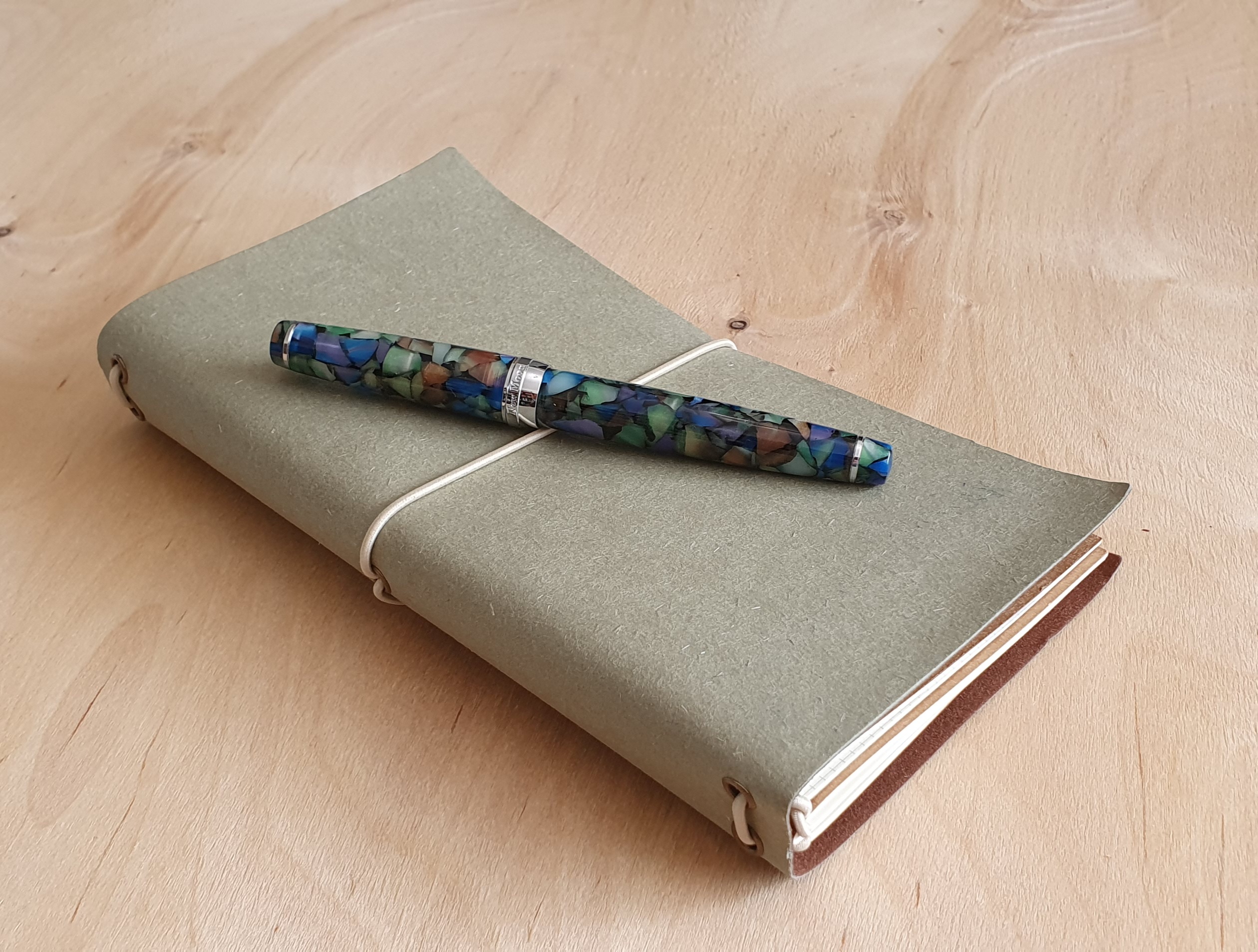
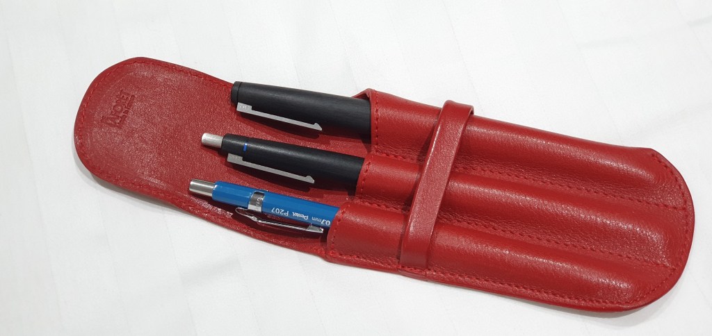
I do not buy an expensive pen so often now. This has been only my third in 2022, the others being my Esterbrook Estie and then an Aurora Talentum, both of which proved successful purchases.
Purchase backstory
I first saw a Tibaldi N.60 in the flesh, whilst browsing in Selfridges some months ago. They had the Ruby red edition on display. It was a little too pricey for an impulse buy, and felt too similar in specification to my marbled red Leonardo Momento Zero. But the memory of it stayed with me. I read some reviews online which further whetted my appetite. I found that the pen was also available in Emerald green, Amber yellow, Samarkand blue or Rich black, with Palladium trim.
And then came the tempting Iguanasell summer sales. I had already bought three Aurora fountain pens online from Iguanasell. Their keen prices and fast service are hard to resist and receiving the parcel from FedEx is exciting. It was whilst scrolling through their sale pens, that I spotted the Tibaldi N.60, but not in any of the versions I knew of: this was called Retro Zest green and featured an 18k gold plated nib and trim, instead of the Palladium. I was immediately taken with this edition. In the photos the cap looked a lighter green than the body. After a few days I eventually and inevitably caved in and pulled the trigger. I opted for a medium nib.
The history
Tibaldi was founded in Italy in 1916 by Guiseppi Tibaldi, being amongst Italy’s earliest pen manufacturers. I believe it continued in business until 1965. I found images of a vintage Tibaldi online, which my pen closely resembles, save that the original was made of celluloid, had a solid gold nib and was a piston filler. Like many pen companies, for example Esterbrook, the company brand was later reborn. The headquarters was moved from Florence to Bassana del Grappa in 2004, which readers may recognise as the home of Montegrappa fountain pens. I gather that Tibaldi shares the same management as Montegrappa, in the Aquila family. Other models in the Tibaldi line are the Bononia, the Infrangible and the Perfecta.
Unboxing
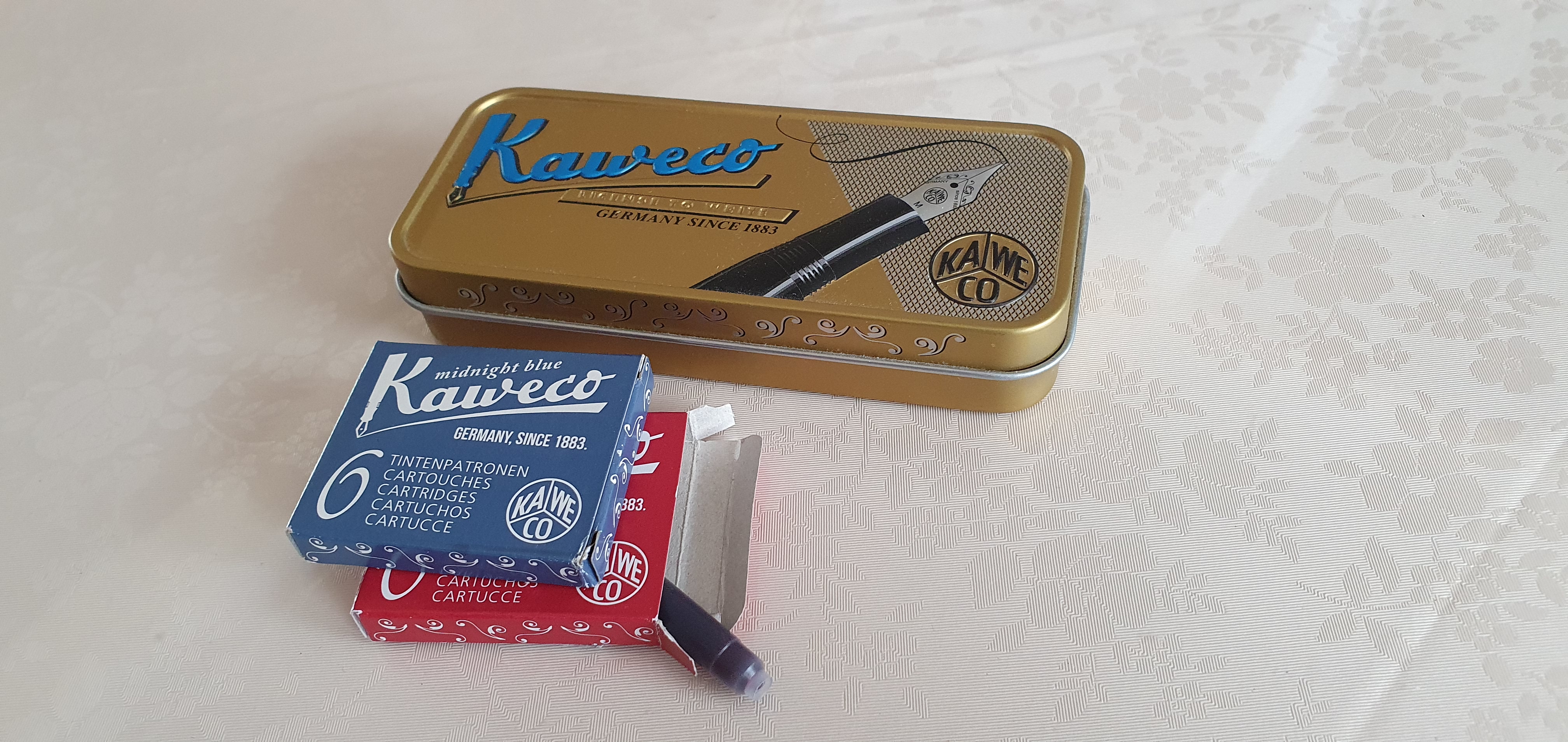
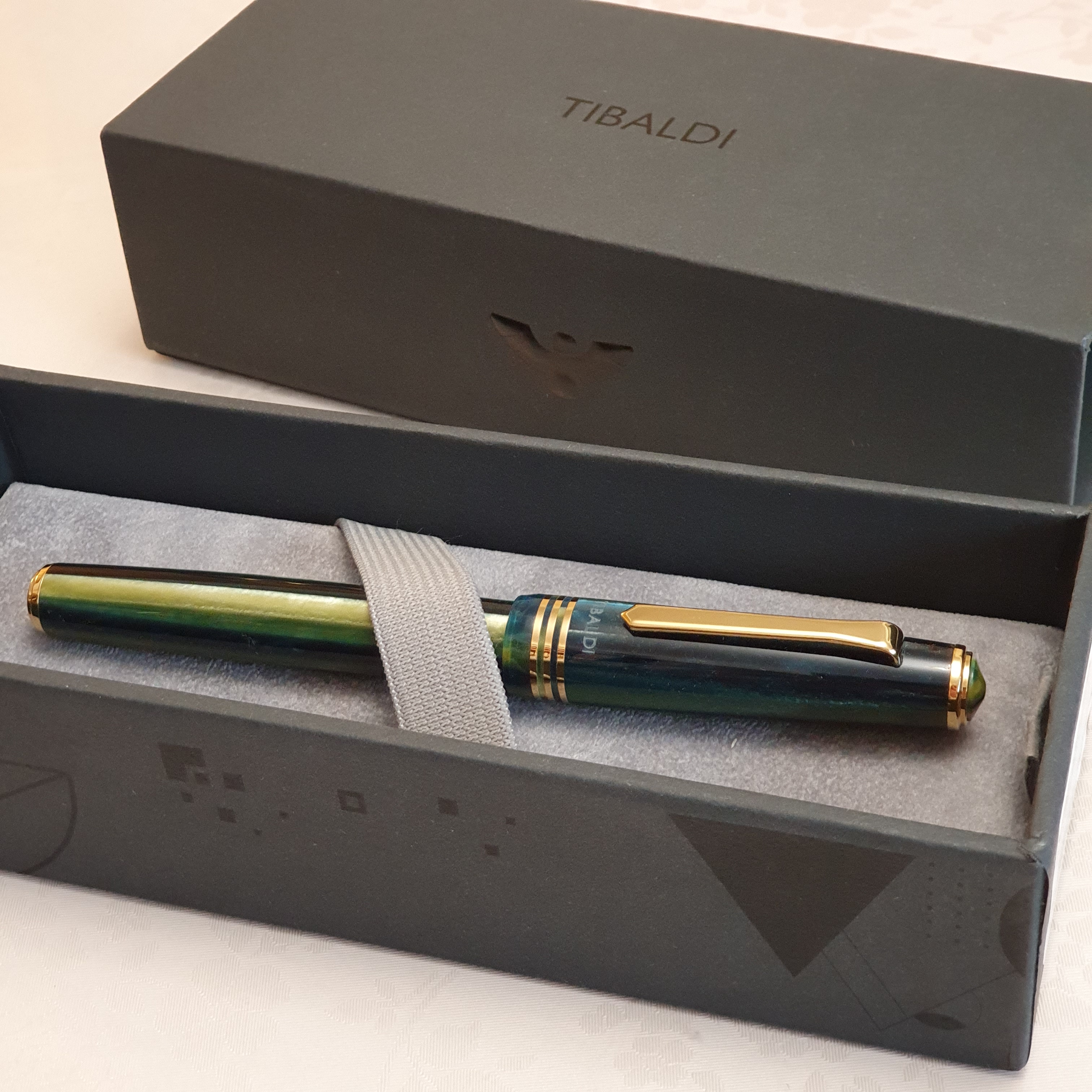
The pen comes in a simple but sturdy black cardboard box, with a tray sliding out from an outer black sleeve, all within an orange paper outer sleeve. The pen cushion lifts out, to reveal a 2 year warranty card and a sealed pack containing two Tibaldi branded cartridges.
Description
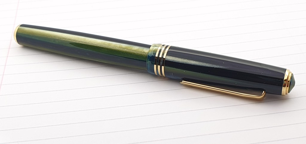
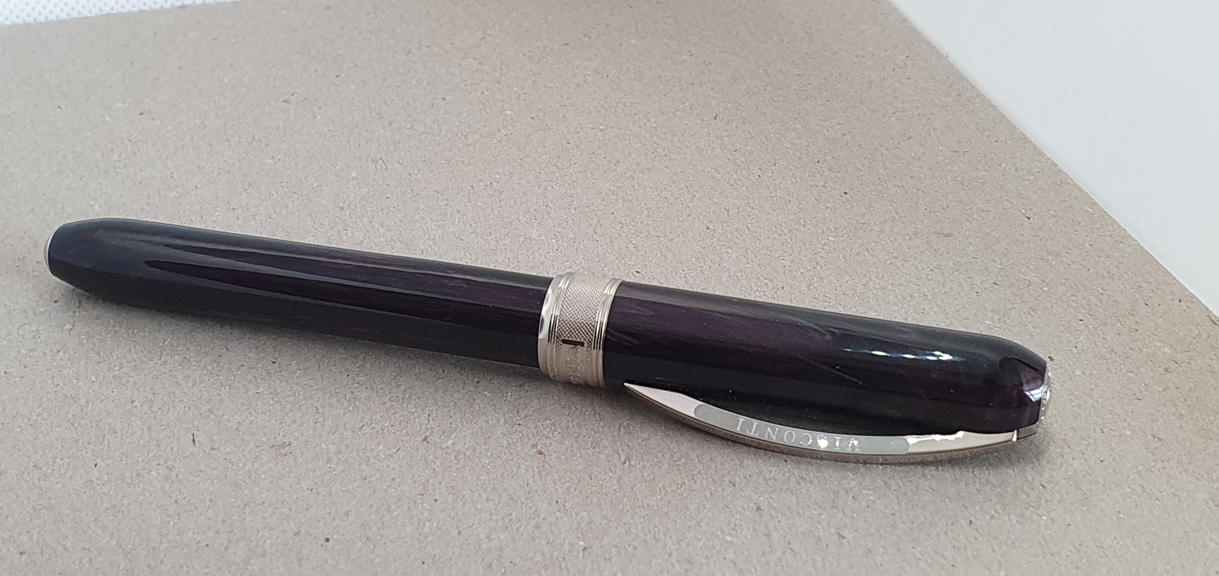
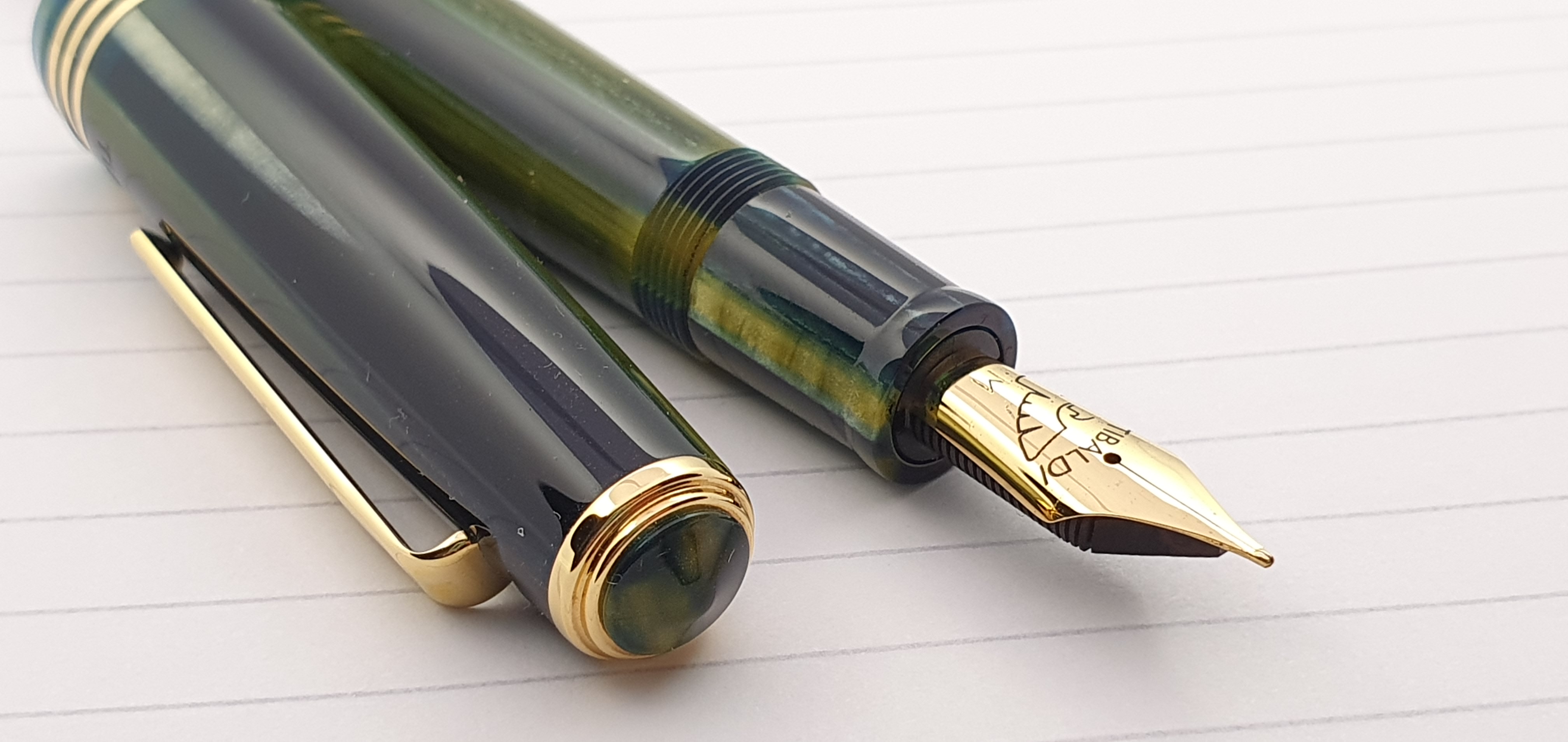
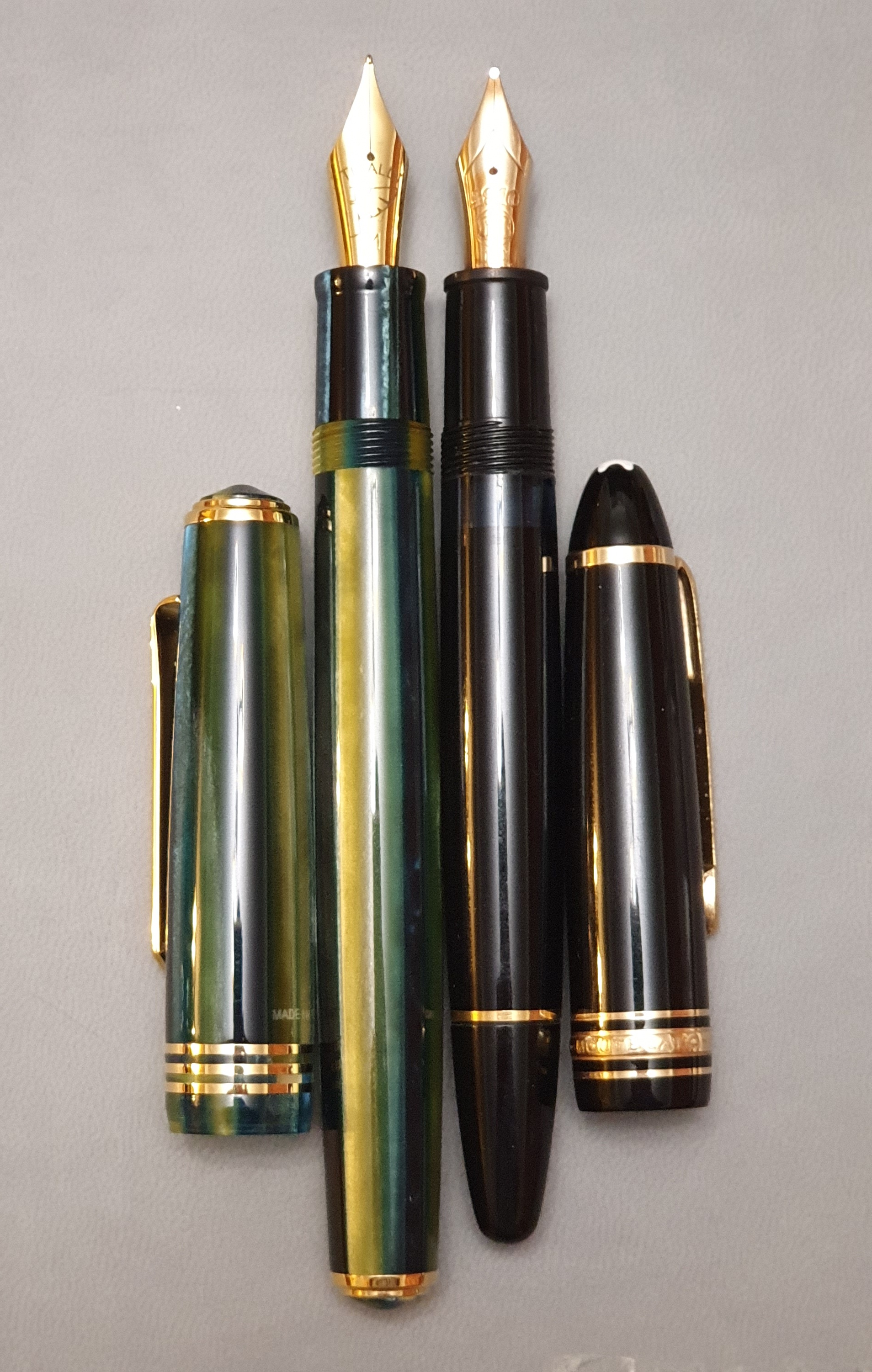
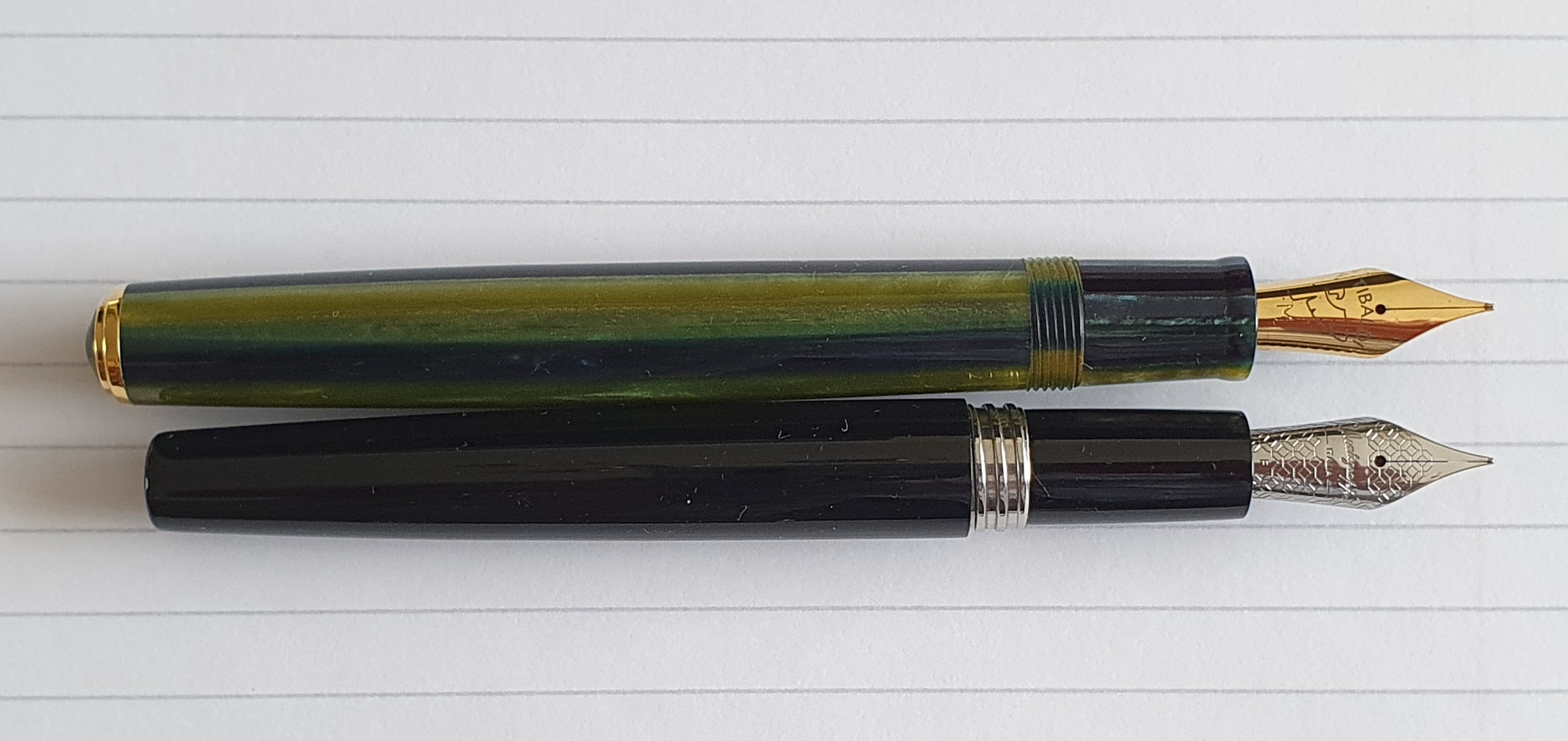
The Retro Zest green material was far more spectacular in real life than in the photos. On my model, the cap was not a lighter green than the barrel, but there are stripes of light and dark tones, from a very light green-gold to a dark green that is almost black. The colours look stunning as you rotate the pen in your hands. The pen body has the appearance of being faceted, yet is not and is entirely rounded and polished.
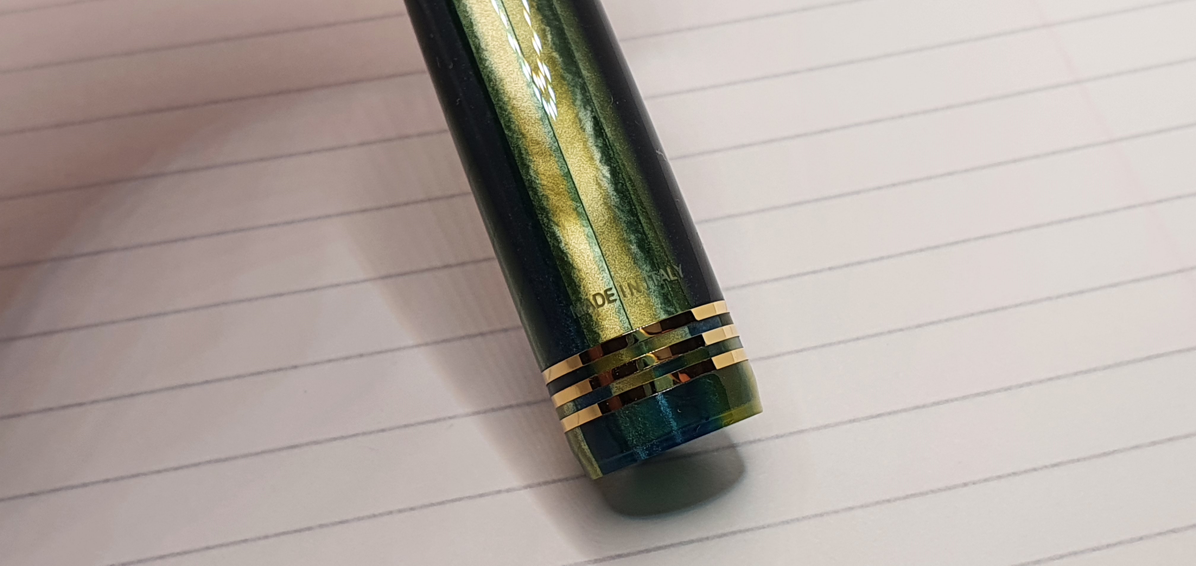
It is a large pen. There is a distinctive, pointed finial in the same green acrylic material as the body, surrounded by a gold trim ring; a very stiff, tie-shaped pocket clip; three gold plated cap bands; Tibaldi on the front and Made in Italy on the back. The cap unscrews in one full rotation.
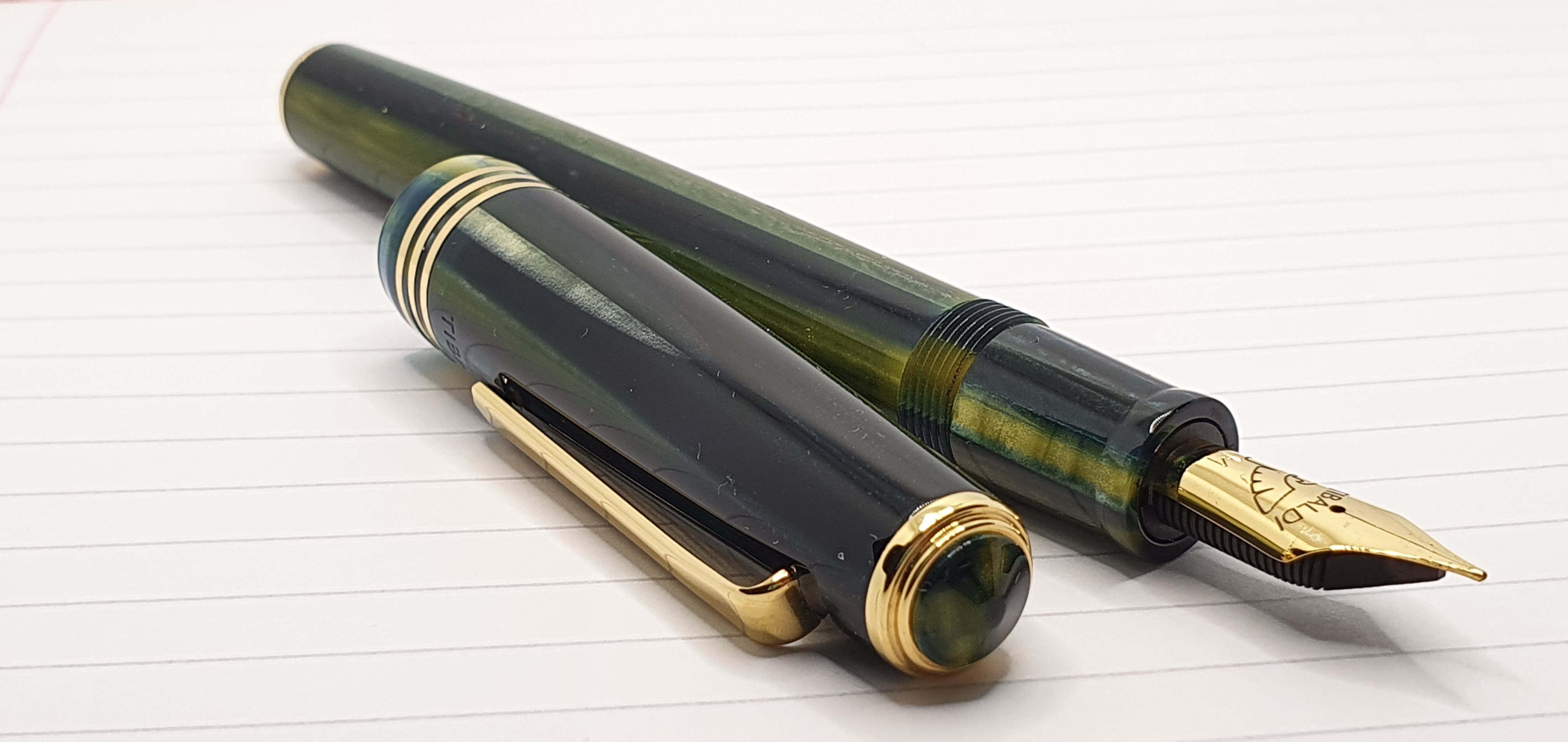
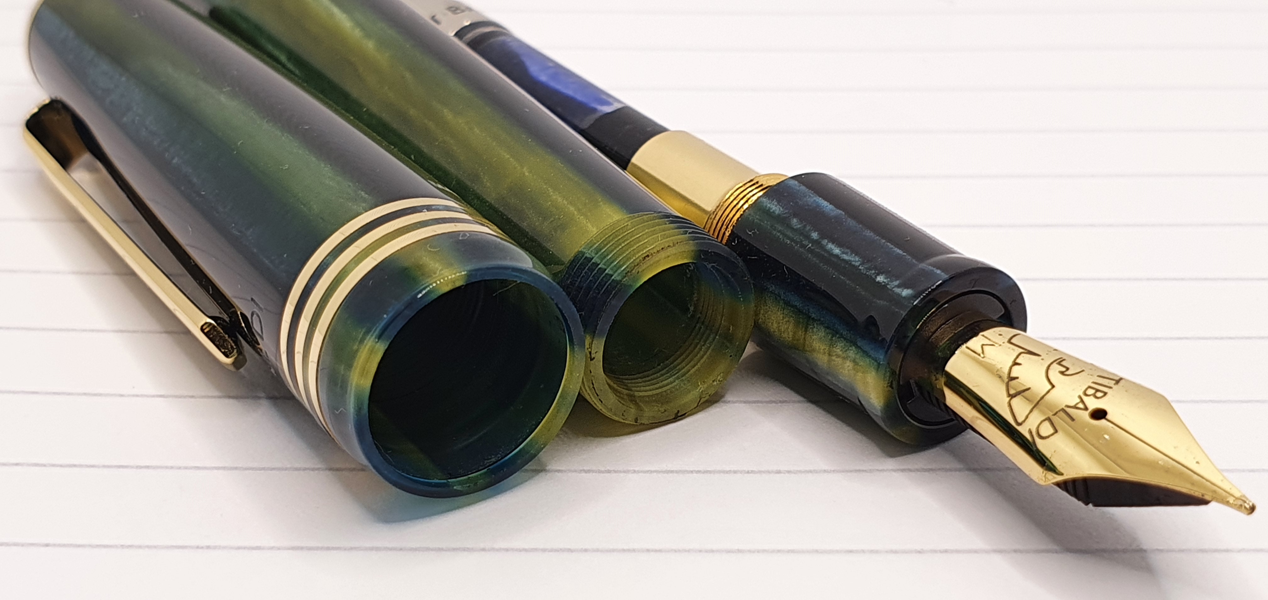
The section is of the same coloured material as the cap and barrel on this edition, whereas on the other colours mentioned earlier there is a black section. The section is rather short, before meeting the cap threads on the barrel but these are not sharp or uncomfortable if you grip the pen there. The section and barrel are very girthy however at around 12mm at its widest point.
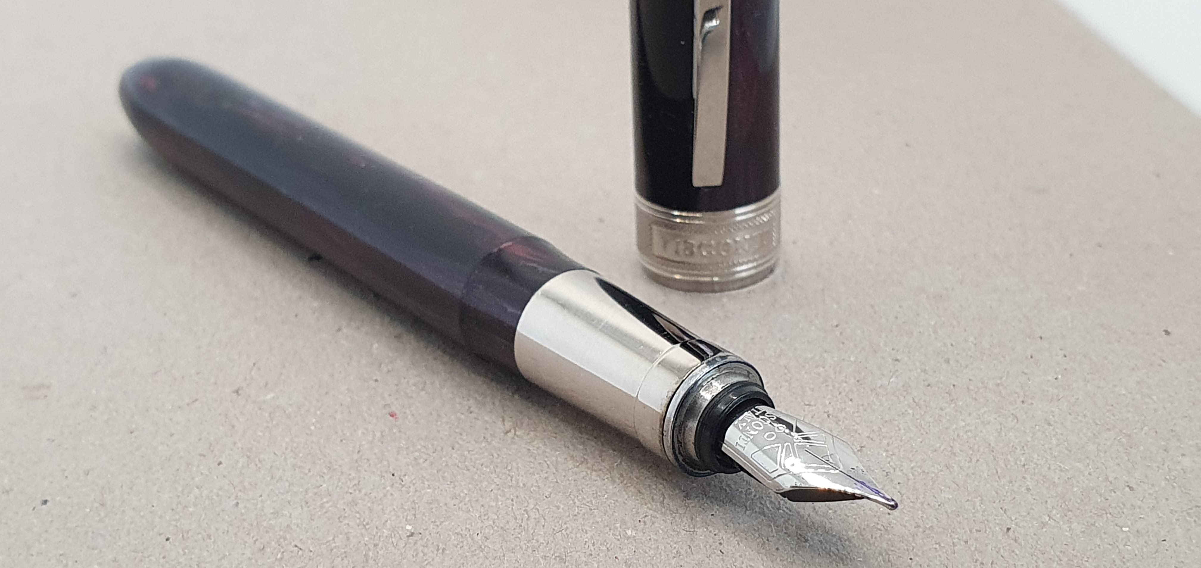
The barrel unscrews and there is a gold-plated metal mount for a cartridge or converter. A Tibaldi branded converter is supplied, which is screw fit, a feature which I always enjoy. The other end of the barrel ends with another finial with a green acrylic “jewel” matching that on the cap.
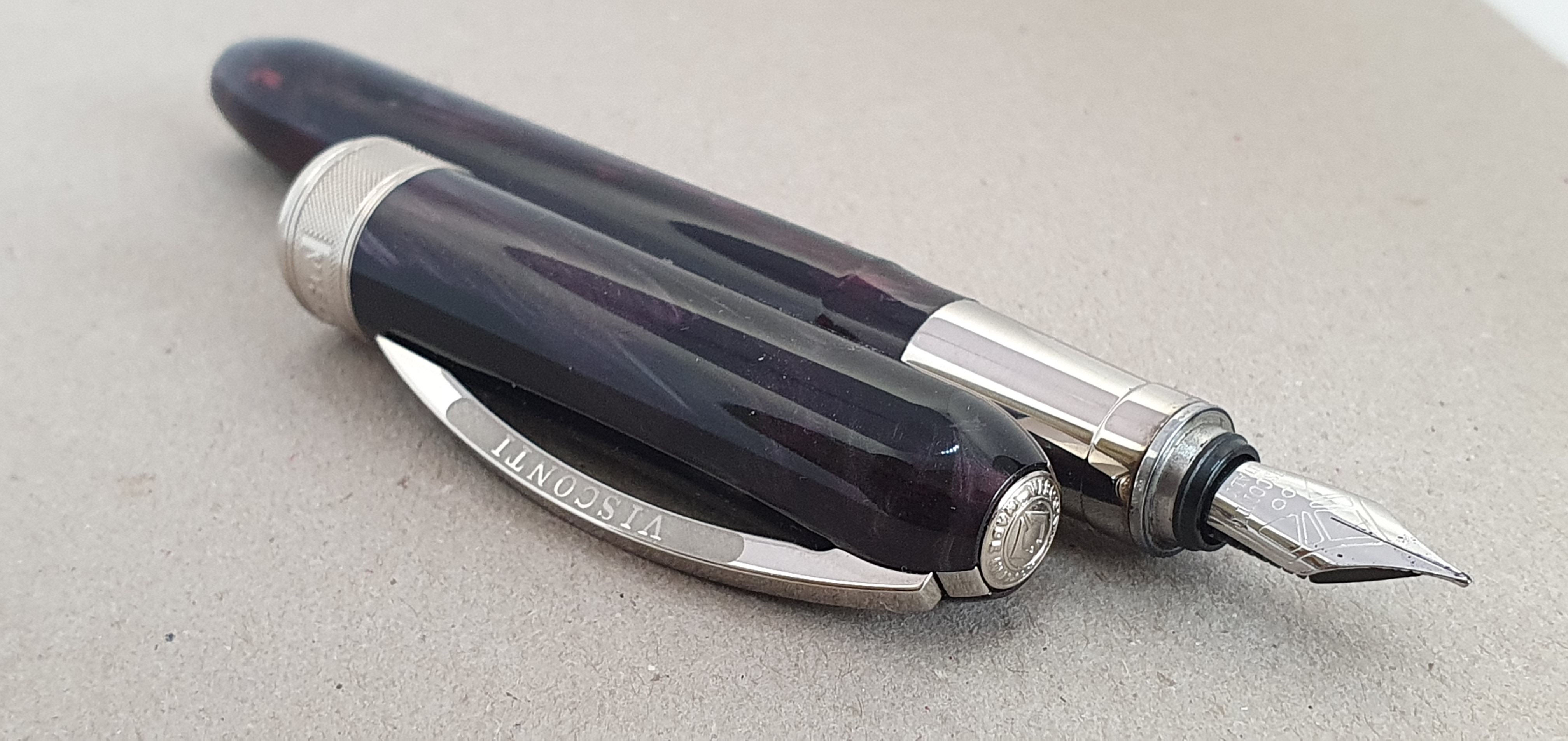
Nib and feed
The stainless steel nib is gold plated and has the name Tibaldi, the bird’s wing logo and an M for medium. A particularly welcome feature at this price point, is the ebonite feed rather than plastic. This is semi-porous and partly absorbs ink, helping the flow of ink between nib and feed and also helps to ensure that the nib stays ready to write, even if the pen is unused for a few days.
On my model, the nib was smooth and wrote right out of the box. It is a very firm nib. My early trials with the nib found it to be rather on the dry side. This may suit the majority of right-handed under-writers but I prefer a slightly wetter nib for greater lubrication and a darker line even when writing without any downward pressure, this being my usual lefty over-writer syle. I therefore set about easing the tines apart just minimally, first with brass shims and then with a gentle wiggle of a craft knife. This had the desired effect and I am now enjoying good flow and effortless writing.
Size and Weight
The pen measures 148mm end to end, including the raised finials. Uncapped it remains a generous 132mm which is plenty long enough to use unposted. The cap can be posted but brings the length to 173mm. It weighs aground 27.5g, 17g uncapped and 10g for the cap alone.
Likes and dislikes
On the plus side, the colour and finish of this pen’s material has a big appeal for me. To a casual glance in poor light it might look like a black or very dark green, but on closer inspection as you turn the pen in the hand the polished feel and the strips of different shades of green reveal themselves having the appearance of an exotic vintage celluloid of pens of old. The pen is of a generous length and girth, without being unduly heavy. The ebonite feed (as found on my Aurora Talentum, Optima, and 88) is a rare delight in a steel nibbed pen at this price. Having a steel nib keeps the cost down.
On the negative side, the section is short. Some may find it too wide. The pocket clip is very stiff which means it grips securely but is not so easy to use. I would have liked to see “Tibaldi Model 60, Made in Italy” engraved on the barrel, in the manner of an Aurora Optima or Parker Duofold but I am probably asking too much now. Finally, one could argue that the pen is pretending to be something it is not, with a body which looks like celluloid and a nib which looks like gold. I do not see it that way and think that even without comparison to the pre-1965 model which it resembles, the pen stands up well in its own right for a modern, safe and convenient equivalent.
I recently saw a review by SBRE Brown of the Tibaldi N.60 in Emerald green. His only complaint was that the grip section was black, not of the same colour as the rest of the body. That is not an issue on the Retro Zest edition.
Conclusions
It is sometimes said (at least, in fountain pen circles) that if you find a pen you like and in a finish that you like, then buy it! Tibaldi pens are not very easy to find in the UK. Cult Pens sells them, including the N.60 but not currently the Retro Zest edition. Iguanasell has served me well now on several occasions even including a surprise free gift with this order and I would recommend them.
Perhaps some comparables below £200.00 might be an Edison Collier, a Conklin All American, Leonardo Momento Zero or a Montegrappa Fortuna. In terms of size and girth, the N.60 could be a good test of whether you will get along with such a large pen, before splashing out on a Pelikan M1000 or Montblanc 149.
Some final thoughts. This has been a momentous and sombre week in the UK: HM Queen Elizabeth II died on 8 September 2022 at the age of 96, after serving as monarch for over 70 years and just two days after greeting our new Prime Minister Liz Truss and inviting her to form a new government. The Queen was of my parents’ generation and hugely loved and respected. She had been the Queen for all of my life and so there is a sense of loss here. The N.60 was the last pen I bought whilst our Queen was alive. We are in period of mourning, which I will record in my journal. We have a new King and a new Prime Minister. Amidst all this change the N.60 Retro Zest is a good tool for such reflections and an echo of another age.