Left handed writers have a disadvantage when using fountain pens, compared to right handers. Typically, there will be less ink flow when the nib is “pushed” along the line, as opposed to being “pulled” along, writing from left to right. Less ink flow means less lubrication and a less smooth writing experience.
Secondly, if the lefty writes with a hooked wrist, there is a likelihood of smudging the wet ink as his hand passes over it.
There are two main styles of writing for the lefty: these I call “underwriting”, by which I mean writing with the pen under the line, with the back of the pen pointing towards the body, or “overwriting” where the hand is above the line, and the back of the pen is pointing away from the body. Many overwriters hook their wrists. As a lefty myself, I am most comfortable when using the overwriter style although I have my own particular method which I developed as a child and still use. Instead of hooking my left wrist, I rotate the paper about 45 degrees left (or anti-clockwise), adjusting the paper rather than my wrist.
One of the joys of using a fountain pen is the ability to produce lines of varying width. We have all seen beautiful copperplate calligraphy with attractive fine and broad strokes, adding character to the writing, such as a thickening in the tail of a lower case letter “y”.
One way ito achieve line variation is to use a flexy nib, where the tines widen as you apply pressure. However this is not suitable for a lefty overwriter as you can apply pressure to the nib only when pulling it back, not when pushing it forward.
The other way to achieve line variation, and which is more practical for us lefties, is to use a stub nib which will produce a broad line up or down, or a fine line left or right, assuming it is held at a consistent angle.
The opposite effect is achieved by using a nib with an “architect” grind, which produces a fine line in the down stroke, and a broad line in the cross stroke. Such nibs are not usually available with a new pen and so require some specialist work by a nibmeister.
However, a similar effect to the architect grind, can be readily enjoyed by using a “bent nib” where the tip is bent upwards to create a flattened, elongated writing area, again producing a fine line in the down stroke or a broad line in the cross stroke.
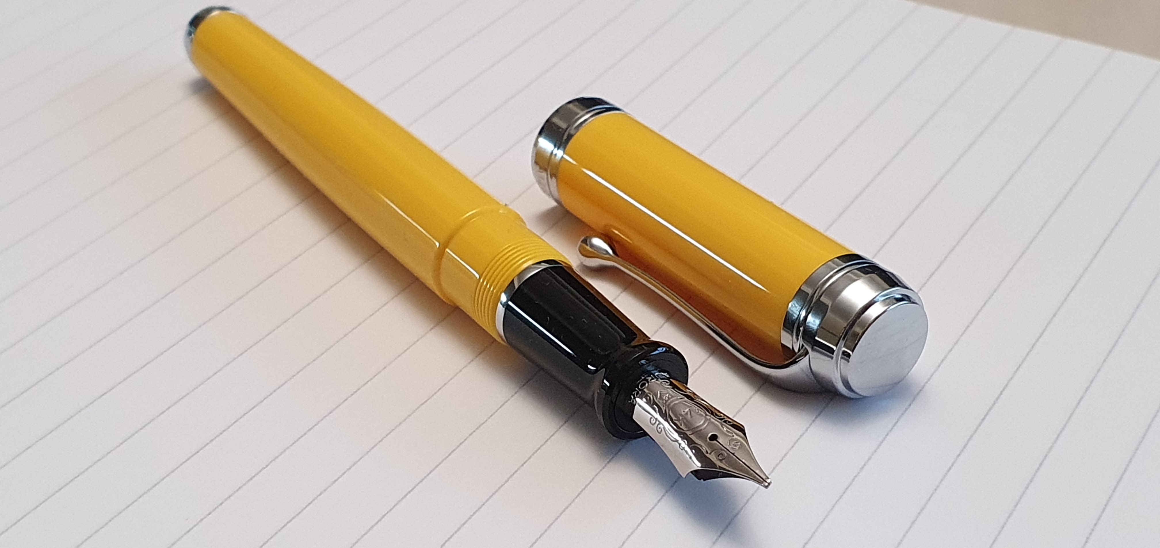
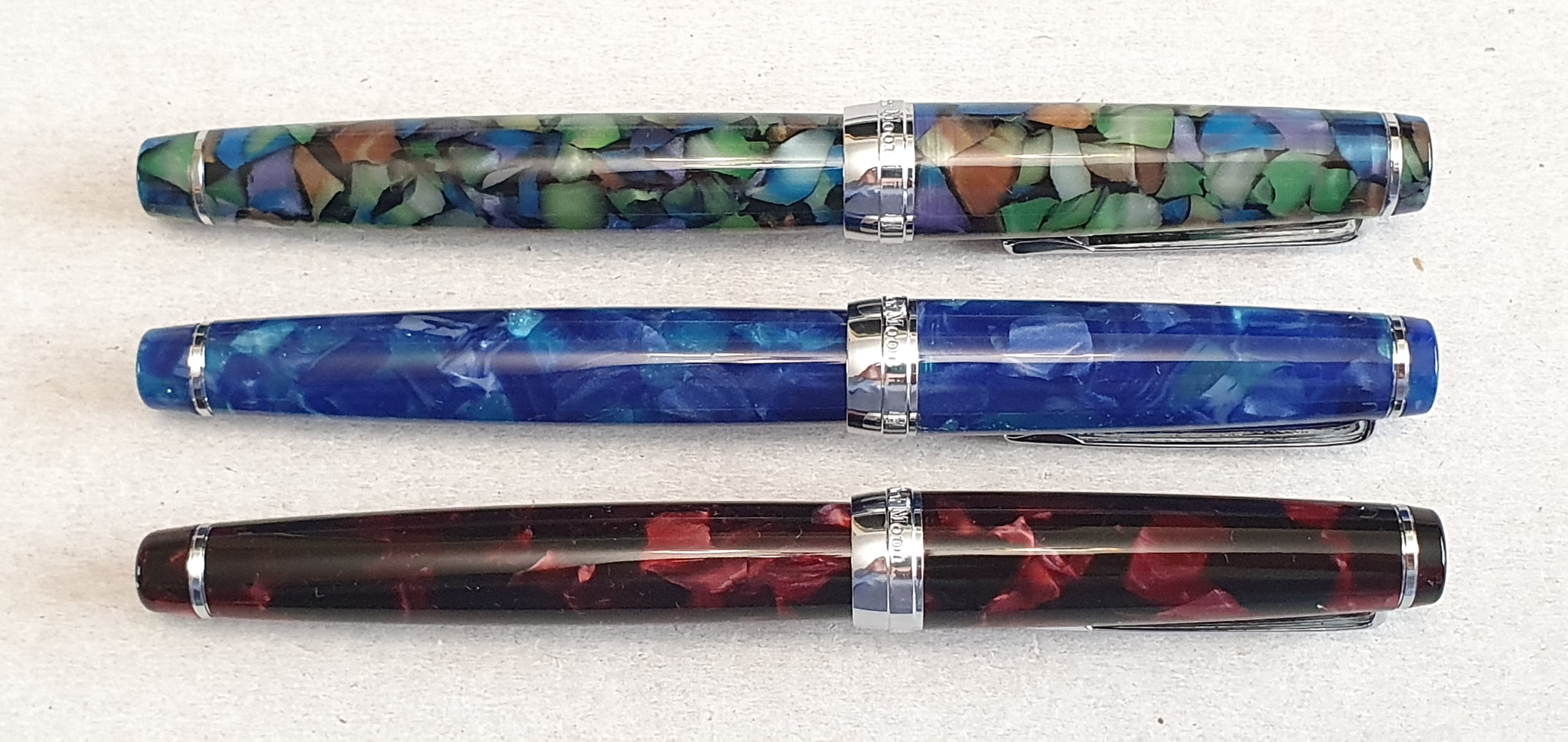
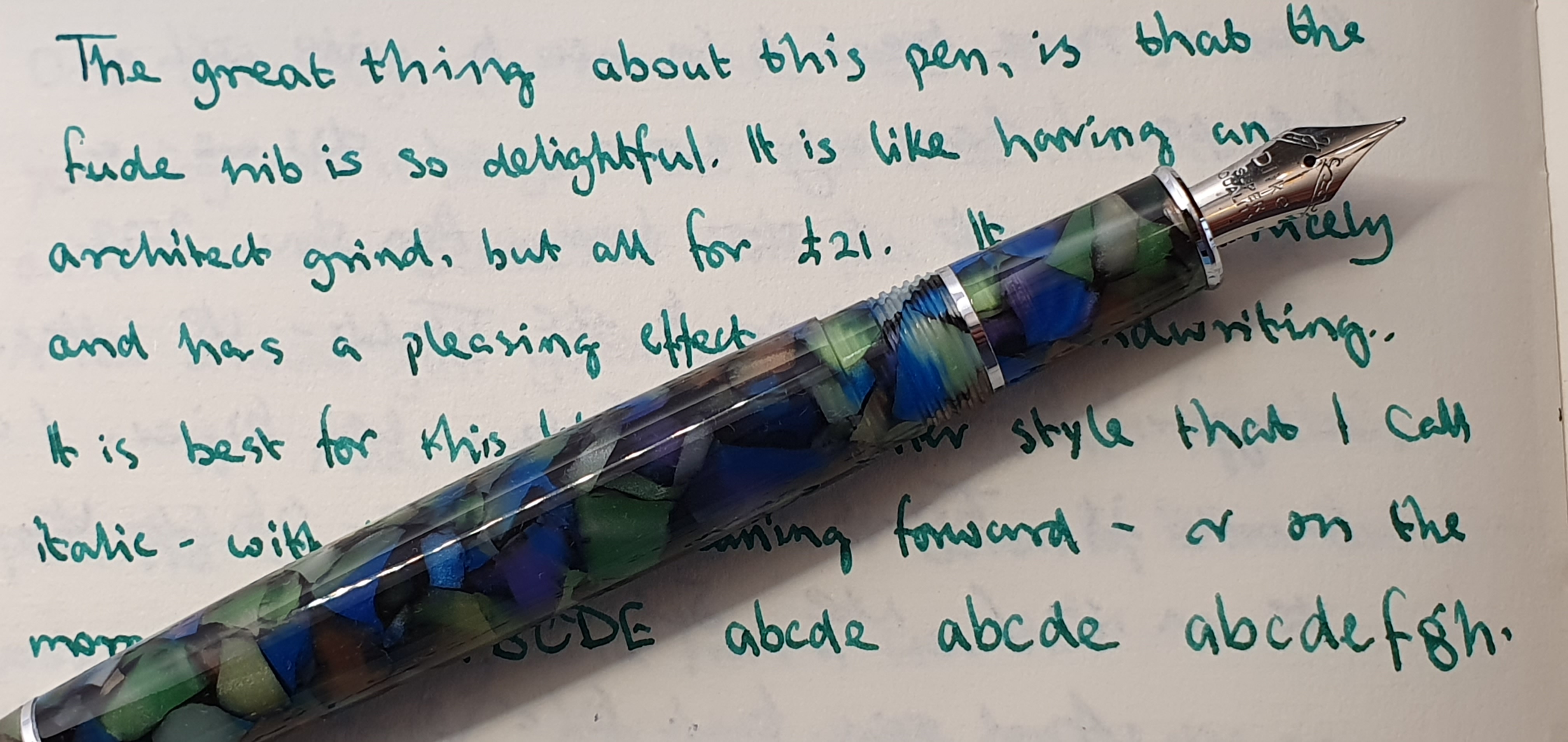
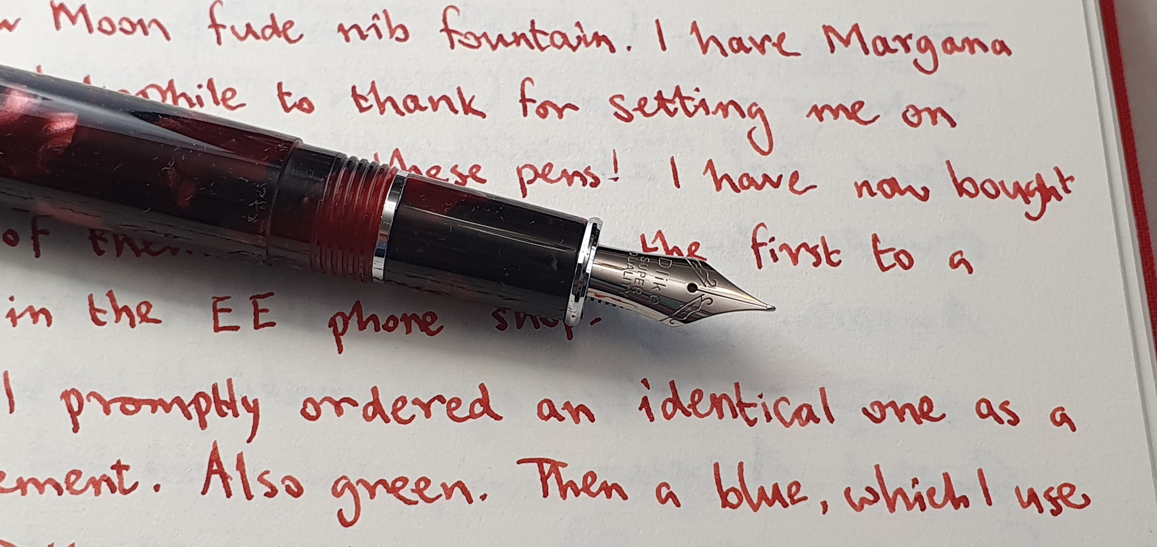
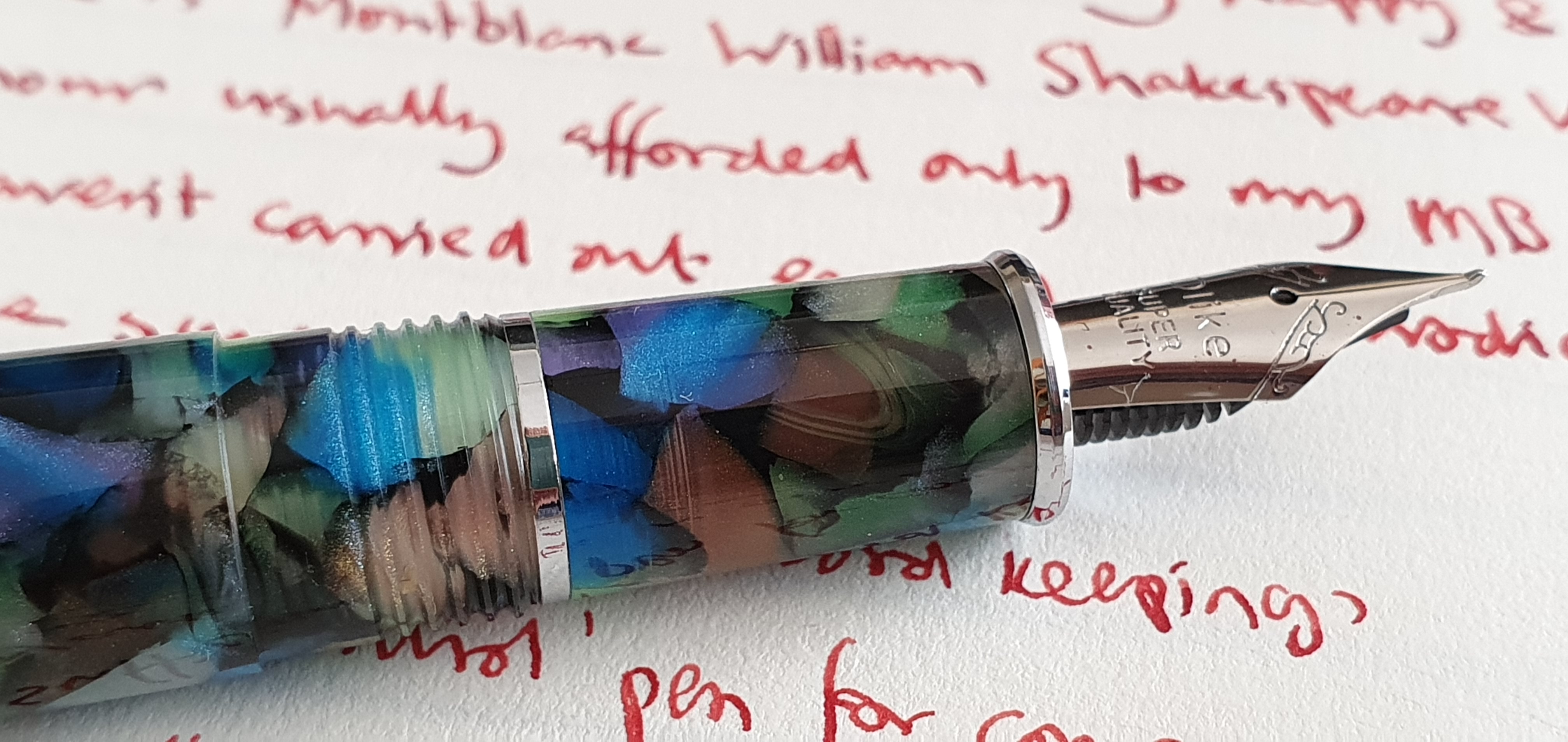
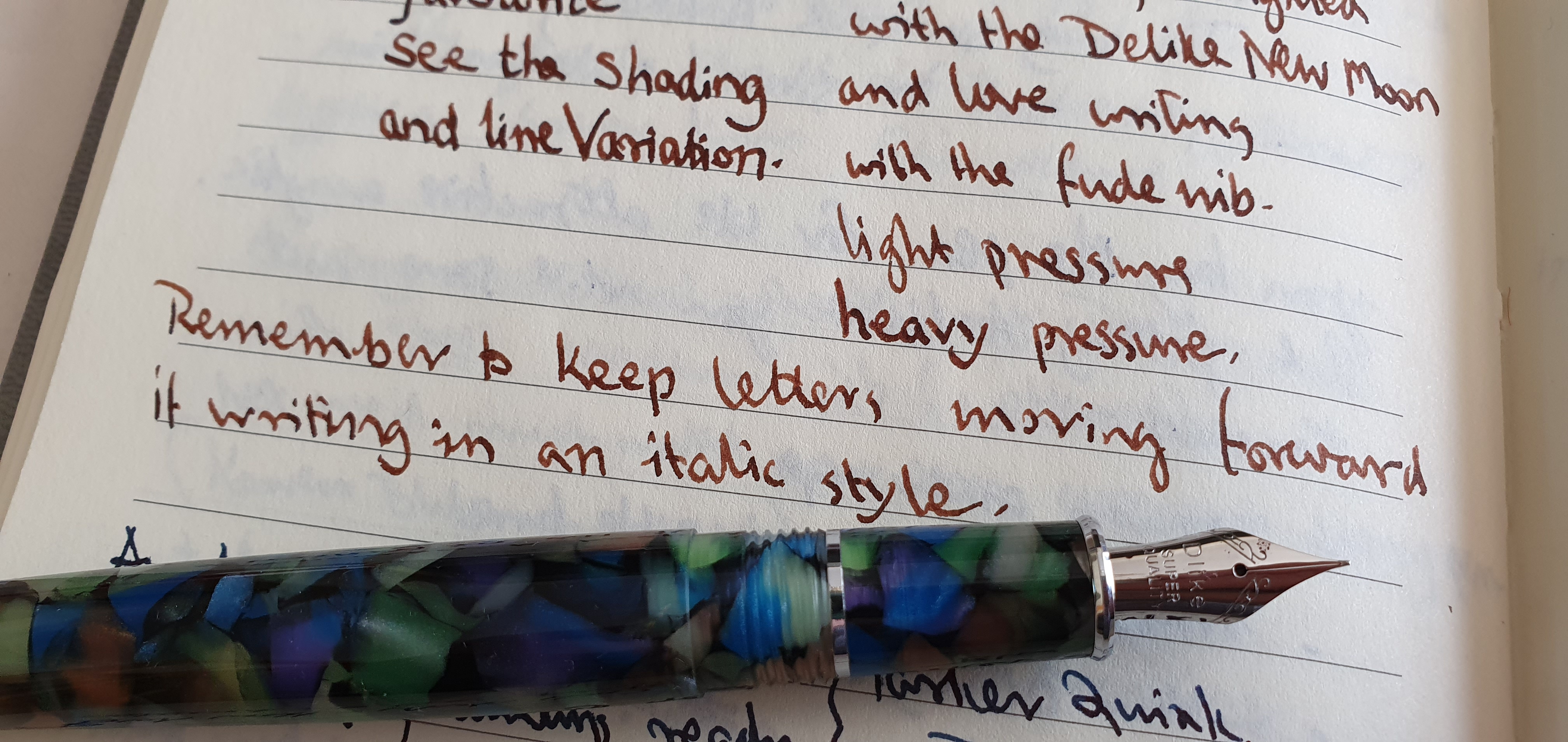
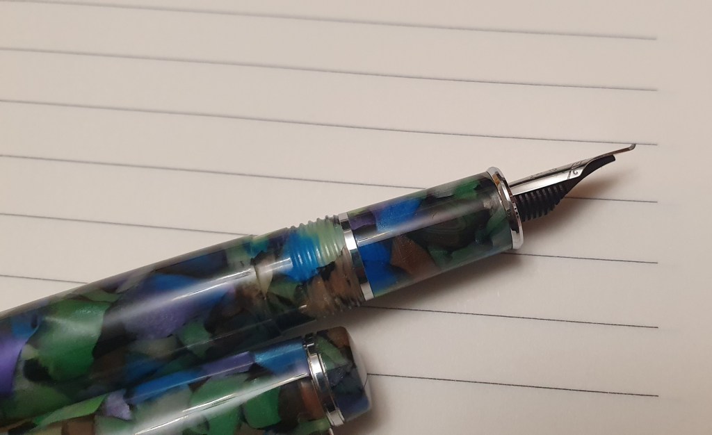
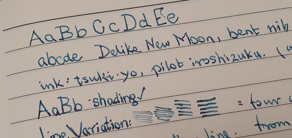
Today I want to highlight two of the fountain pens that I particularly enjoy using at the moment. The first is the Delike New Moon, an inexpensive Chinese pen bought on Amazon and described as having a “bent” nib. I now have three of these, in different colours. I like the effect that the bent nib has on my handwriting when I use the underwriter style, giving narrow down strokes and broad cross strokes although the difference is subtle.
The nib is very versatile, being capable of four distinct line widths. Held normally, it writes a medium line. Hold it more vertically, and it will produce a fine line, or lay it back at a lower angle than normal and apply a little pressure and you will get a broad line. Turn the nib over and “reverse writing” will give an extra fine line, when needed.
But here is an interesting thing: the bent nib produces fine down strokes and broad cross strokes, when used in the underwriter style. But if used in the overwriter style, the fine and the broad strokes are switched. Take the capital A for example and see how the fine and broad lines are reversed, in these two writing styles.
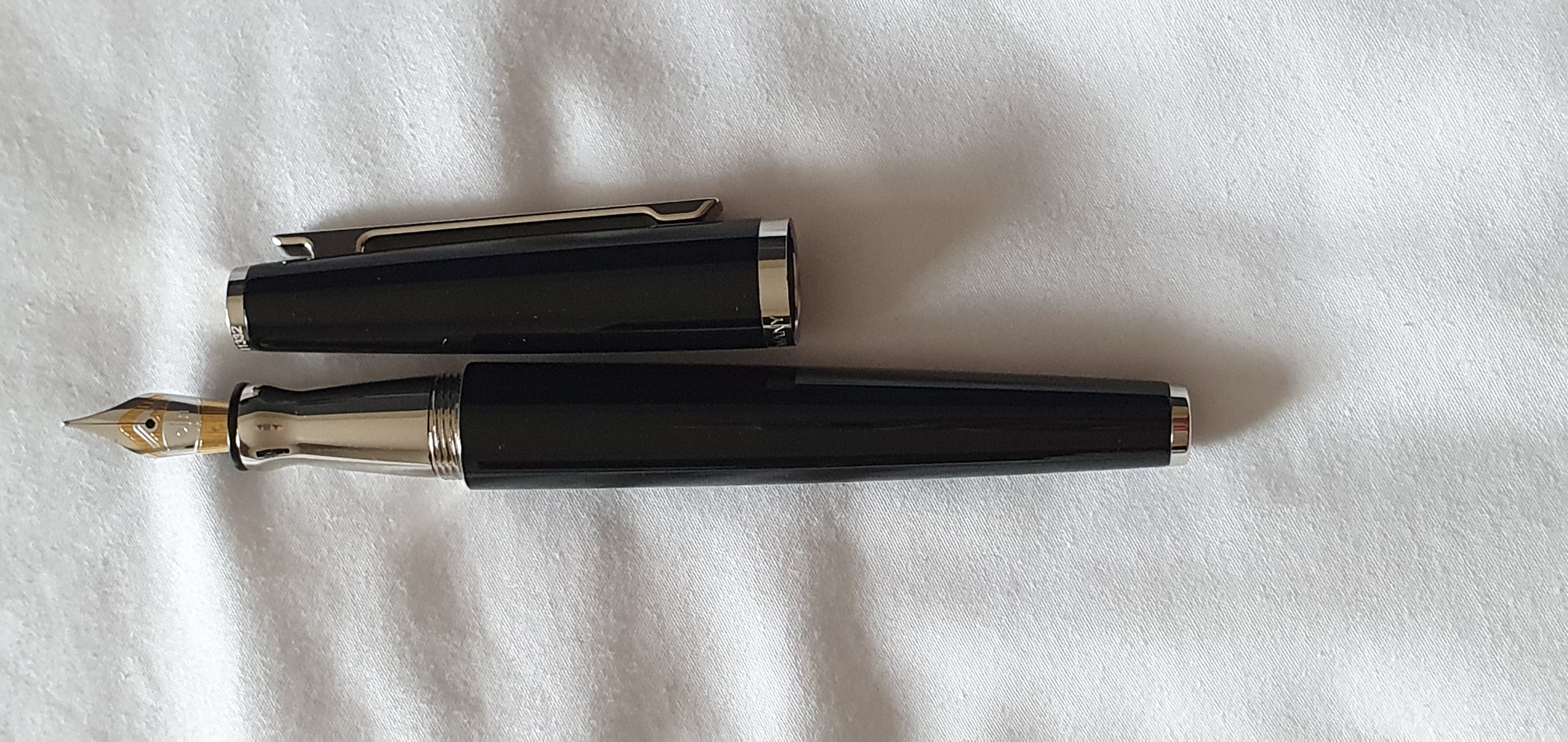
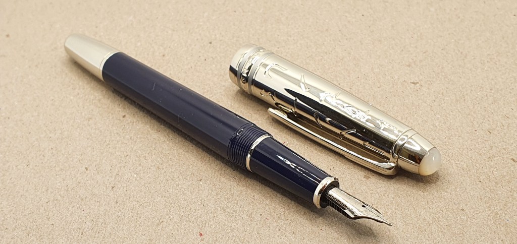
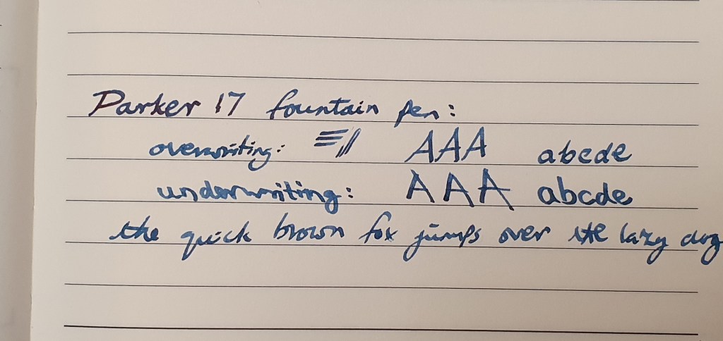
The other pen that I am much enjoying, is the vintage Parker 17, with an oblique broad nib, bought at the London Pen Show in March this year. Ironically, at £30.00 it was one of the least expensive of the seven pens that I bought myself that day yet probably has the best effect on my handwriting.
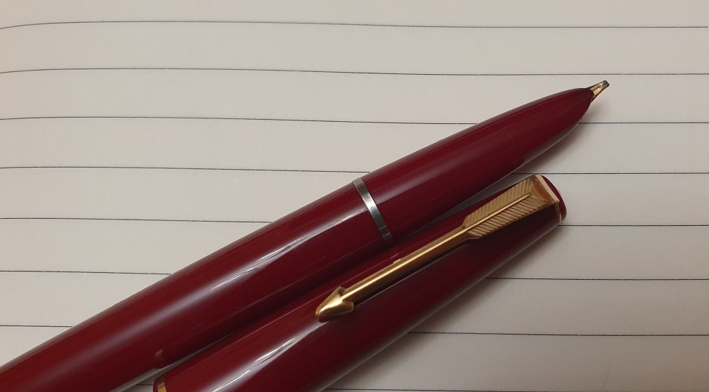
As opposed to the bent nib pen, the Parker’s oblique nib produces broad down strokes and fine cross strokes, used in an underwriter style, and the opposite if used, (as I prefer) in the overwriter style.
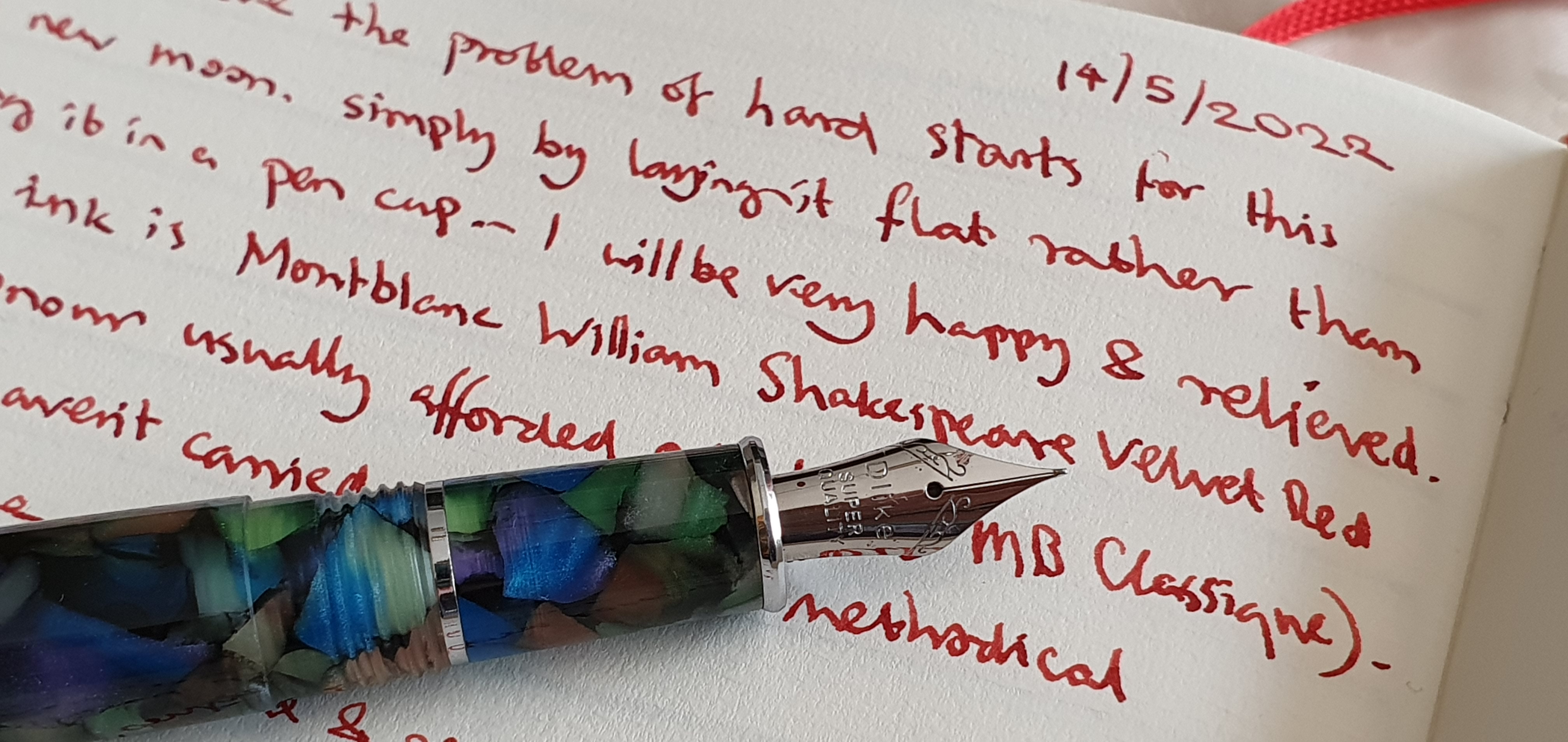
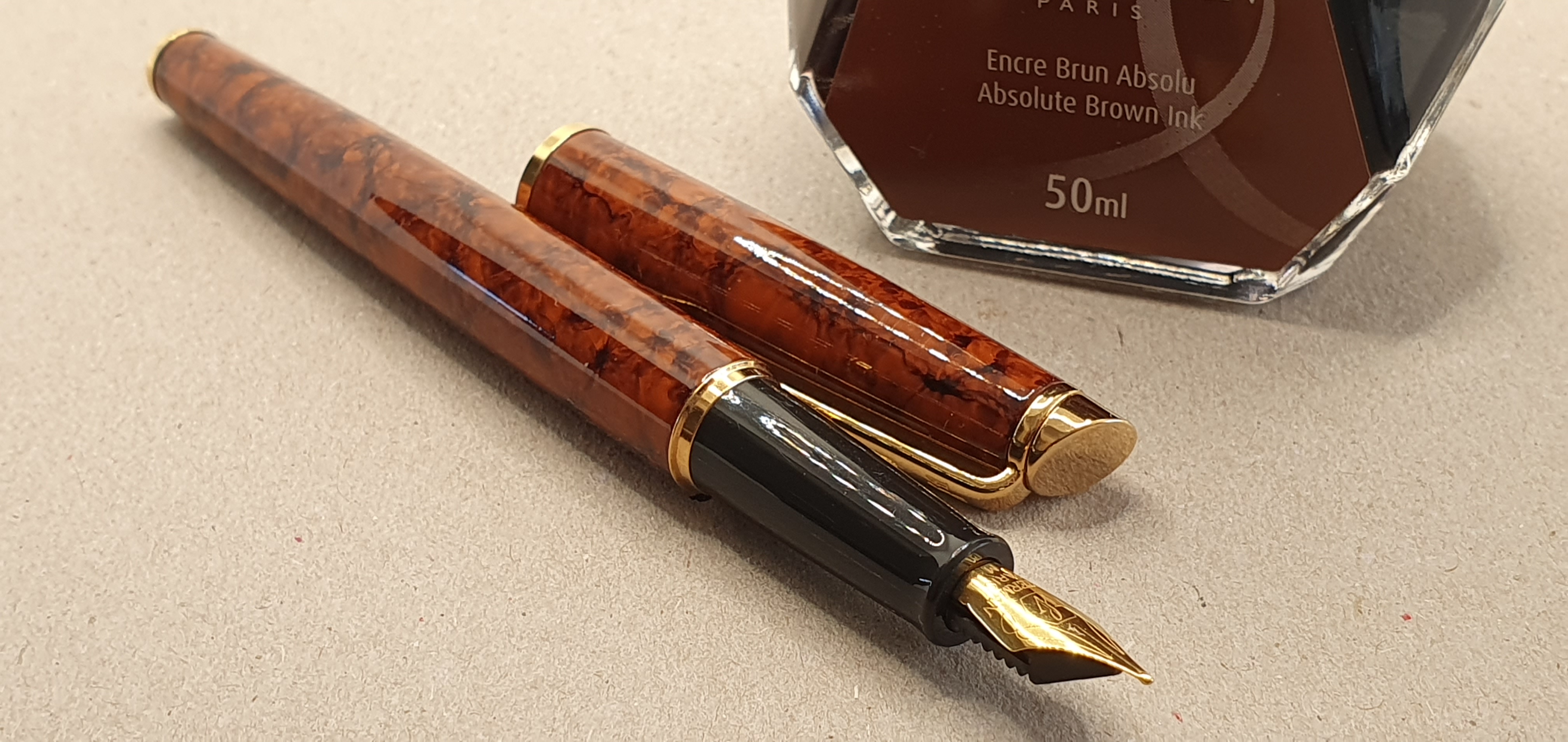
Currently, of the nine inked fountain pens in my ink cups, these are two that I reach for the most and provide the most enjoyment, out of all proportion to their modest cost. The Delike New Moon is inked with Pilot Iroshizuku Tsuki-yo, whilst the Parker 1 7 is inked exclusively with Quink Blue black. Both are very pleasing combinations. The Parker 17 with its oblique nib was a very lucky find at the pen show as medium nibs were much more common. There was a crack to the shell, just above the nib to which I applied some superglue. It does not leak and the pen writes wonderfully. The crack is still visible but in a way the pen is all the more endearing for this, rather like a Japanese Kintsugi bowl.
As well as the line variation, I also enjoy the shading from the Quink blue black ink. I need to write a bit slower with the Parker, to keep it from skipping but slowing down helps me to keep my writing more tidy and legible and reduces mistakes.
In a hobby where there can be temptations to spend ever increasing sums of money for one’s next best pen, it is worth remembering that the simple joys of line variation and shading, particular to fountain pen use and helping your handwriting to look its best, can all be had without breaking the bank.