21 plus 5 Pen Questions.

I have enjoyed reading people’s replies to these questions, posed by the Well
Appointed Desk with the supplementary five questions added by The Gentleman
Stationer. Answering these is rather like being interviewed by an imaginary
friend, on one’s chosen subject. So, here goes with my answers. I have used the
English spelling of “favourite.” Also, these replies are correct at
the time of going to press, but should be taken with a pinch of salt as I
reserve the right to change my opinions on a daily basis.

1: What is the pen they’ll have to pry out of your cold dead hands?

In the sense of what pen I would not part with, I suppose
for sentimental reasons it would be one of my Sheaffer No Nonsense pens, that I
used through college over 40 years ago. Either that or my blue Waterman Expert
which I used for many years in my first job after qualifying as a solicitor.

2: What’s your guilty pleasure pen?

My Montblanc Meisterstuck 145 Classique, with platinum plated trim. This is
because it remains the most expensive pen that I have ever bought and was an
impulse buy whilst drifting around our local shopping centre.

3: What’s the pen you wish existed?

A Lamy Safari without the facets.

4: What pen would you give to a new enthusiast?

Perhaps a Cross Bailey Light.  I would include a cartridge converter to enjoy the vast
choice of bottled inks and because Cross proprietary cartridges are expensive.

5: What pen do you want to get along with but it just never clicked?

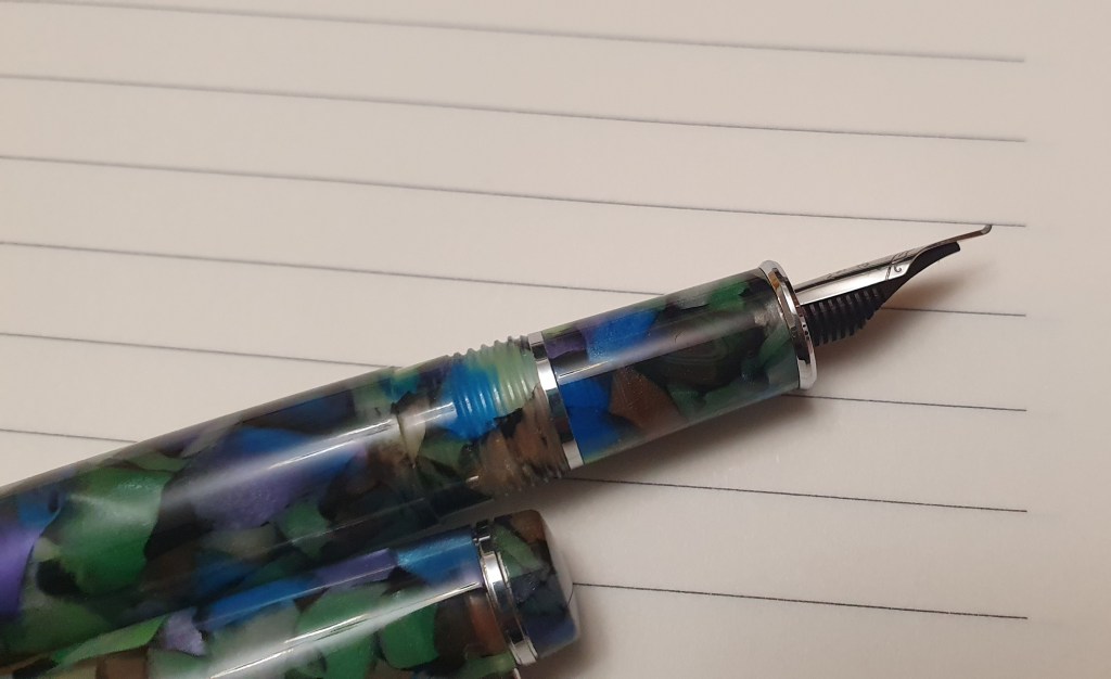
The Pilot Capless, or Vanishing Point. Obviously, there is a joke coming
here as the pen did click, but I could not use it in overwriter style because
the pocket clip was exactly where I wanted to place my thumb. Eventually, being
unable to remove the clip in the proper manner, I resorted to bending it and
breaking it off. This then left a sharp edge. I tried to round this off
smoothly with a file, but scratched off the matt black finish on the pen. I
then bought a Dremel, with the idea of grinding the sharp edges or even
grinding off the remaining piece of the clip – but have not dared take the
Dremel out of the box yet.

6: What pen do you only keep only because its pretty?

This is a difficult one. I think I will instead say what is my prettiest
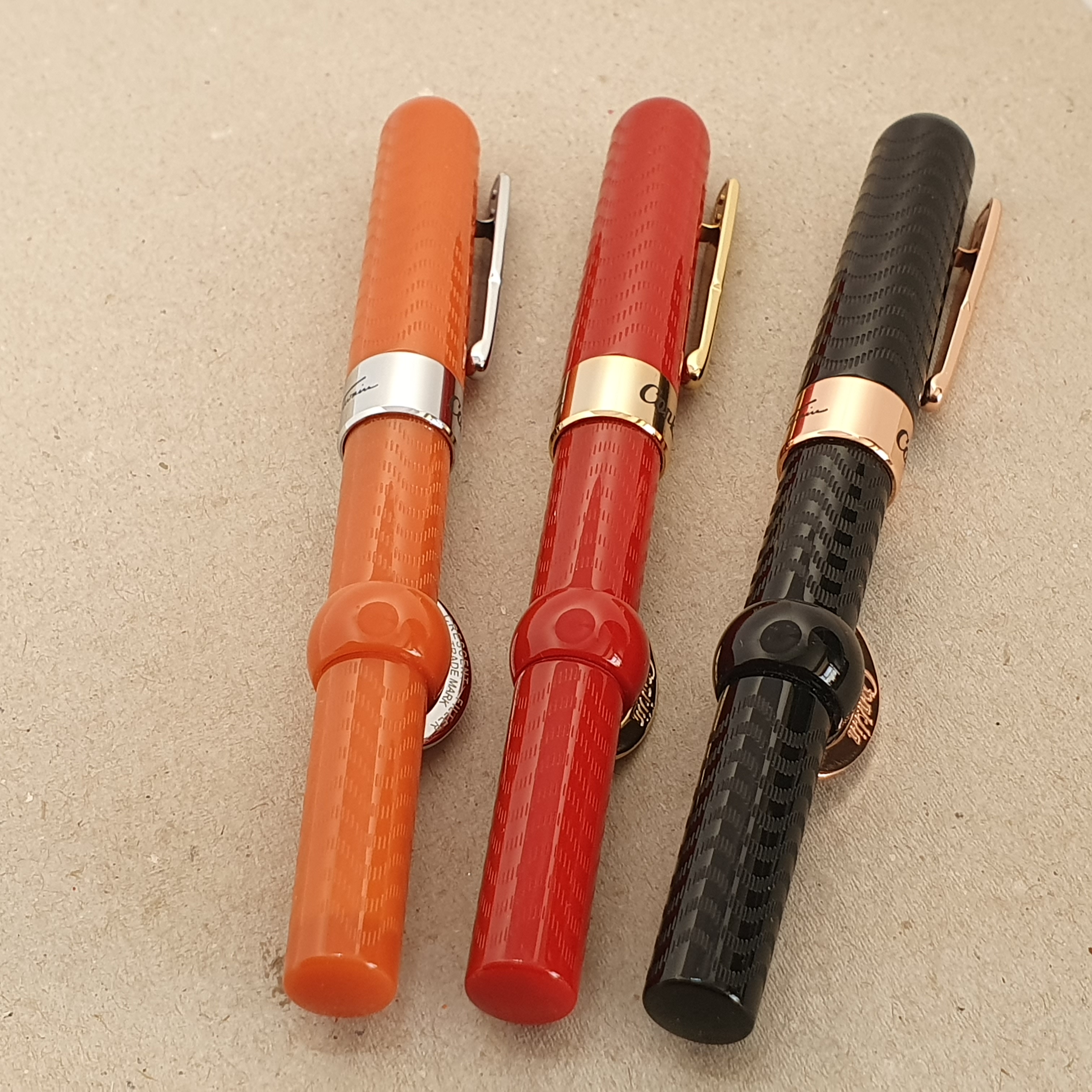
pen, which is the Pineider Avatar in Lipstick Red, which wowed everybody at our
pen club. Apart from the glossy red body, the shiny plated section and the
large sweeping curves of the nib are very photogenic.

7: What pen (or stationery product) did you buy because everyone
else did?

This was not a bad thing. The most recent example would be the Jinhao X159, with its number 8 nib. These are great value and I went on to buy four of them in different colours.

8: What pen (or stationery product) is over your head or just
baffles you?

Fortunately, expensive pens such as the Visconti Medici or London Fog etc
and various special editions do not appeal to me. I can enjoy a blissful guilt-
free writing experience for far less outlay.

9: What pen (or stationery product) surprised you?

Again, to give a recent example, the Otto Hutt design 06 surprised me, first
because I did not expect it to be comfortable to hold with its shiny plated
section (platinum plating) and the step down from barrel to section, and
secondly because I was blown away by how softly and smoothly it wrote when I
dip-tested it in the shop. I thought that it must be a gold nib but it is not.
Other nice surprises with this pen are the short cap threads (only half a turn)
and the serial number on the finial.

10: What pen doesn’t really work for you but you keep it because
it’s a collectible?

A Sailor, numbered limited edition with a Zoom nib. I bought it at a local
auction and enjoyed cleaning it up and trying out the nib but never put it into
regular use.

11: What is your favourite sparkly pen (or ink)?

I do not own any sparkly pens or inks. If I were to buy a sparkly pen, my
first choice would be a Benu Euphoria having tried one at a pen club meet just
yesterday.

12: Which nib do you love – but hate the pen?

I would not say “hate”, as I have bought many of them, but I am
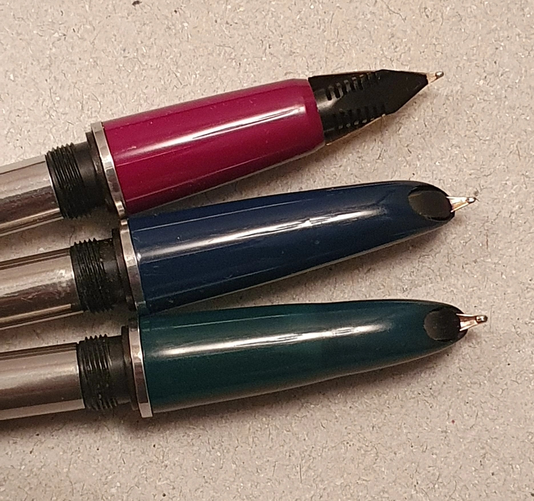
not a fan of the faceted sections of the Lamy Safari and Al-Star although the
steel nibs are very functional and occasionally delightful.

13: What pen (or stationery product) gives you the willies?

I have avoided the Visconti Home Sapiens bronze age, volcanic lava pen.
Although this sounds a great concept, I do not like the idea of the material
being porous and absorbing perspiration or of being easily stained. The only pen that I have really hated, was a cheap Maped, bought in a department store in China. I hated it because the cap was so tight to pull off that I strained my thumb which tooks weeks to recover.

14: What’s your favourite pen for long form writing?

Currently, the Esterbrook Estie, Nouveau Bleu, with gold trim and a broad
nib and Waterman Serenity Blue ink. The pen is a good size for me and very
comfortable.

15: What pen (or stationery product) do you love in theory but not
in practice?

I like the idea of a leather notebook cover, such as the Midori Traveler’s
Notebook. I tried one from another brand but it immediately became obvious that
the pockets for credit cards etc caused lumps and bumps which you
could feel when writing in a notebook. Also the pen loop got in the way whilst
writing. Instead I now use a very simple stiff leather cover with no
pockets or pen loop. Although a bit narrower than A5 size, I use it to protect
an A5 notebook when in my bag. I put the notebook in, spine outwards, and close
the cover with the elastic loop.

16: What pen (or stationery product) would you never let someone
else use?

I don’t mind letting other fountain pen users try my pens. There is a risk with
others, that they may try to pull off a cap which is a screw on, or that they
may drop the pen or spring the nib.  

17: What pen (or stationery product) would you never use for
yourself?

I avoid glitter inks as I have no use for them and would fear clogging of
the pen’s nib and feed. Also, I have not been tempted to try Noodler’s Bay
State Blue due to its notorious staining.

18: What pen (or stationery product) could you NOT bring yourself to
buy?

I have mostly avoided buying any pens that cost more than £400.00. The exception was the Montblanc Classique mentioned earlier although with a 10% discount it was only just over that figure.

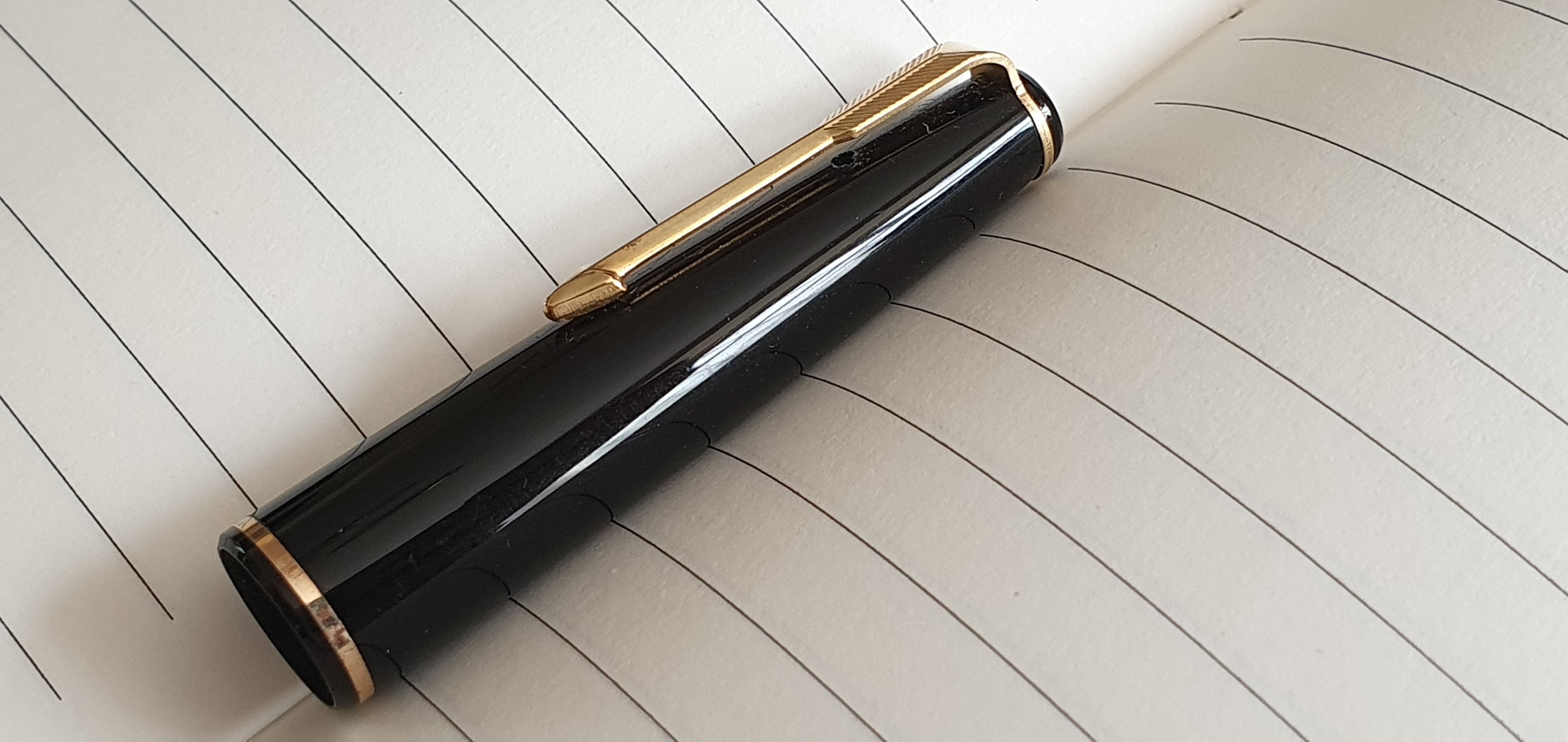
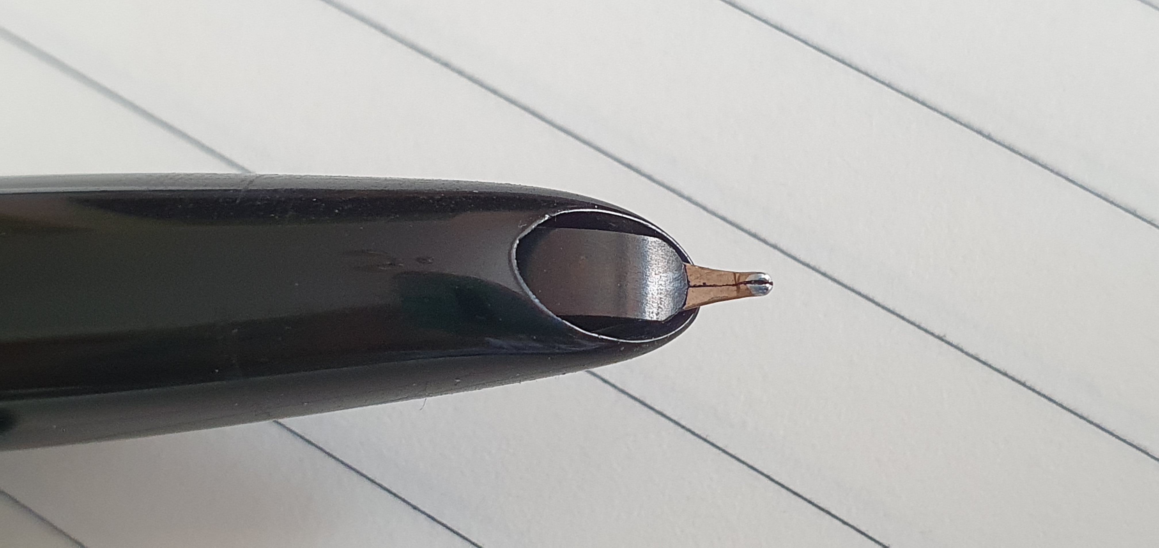
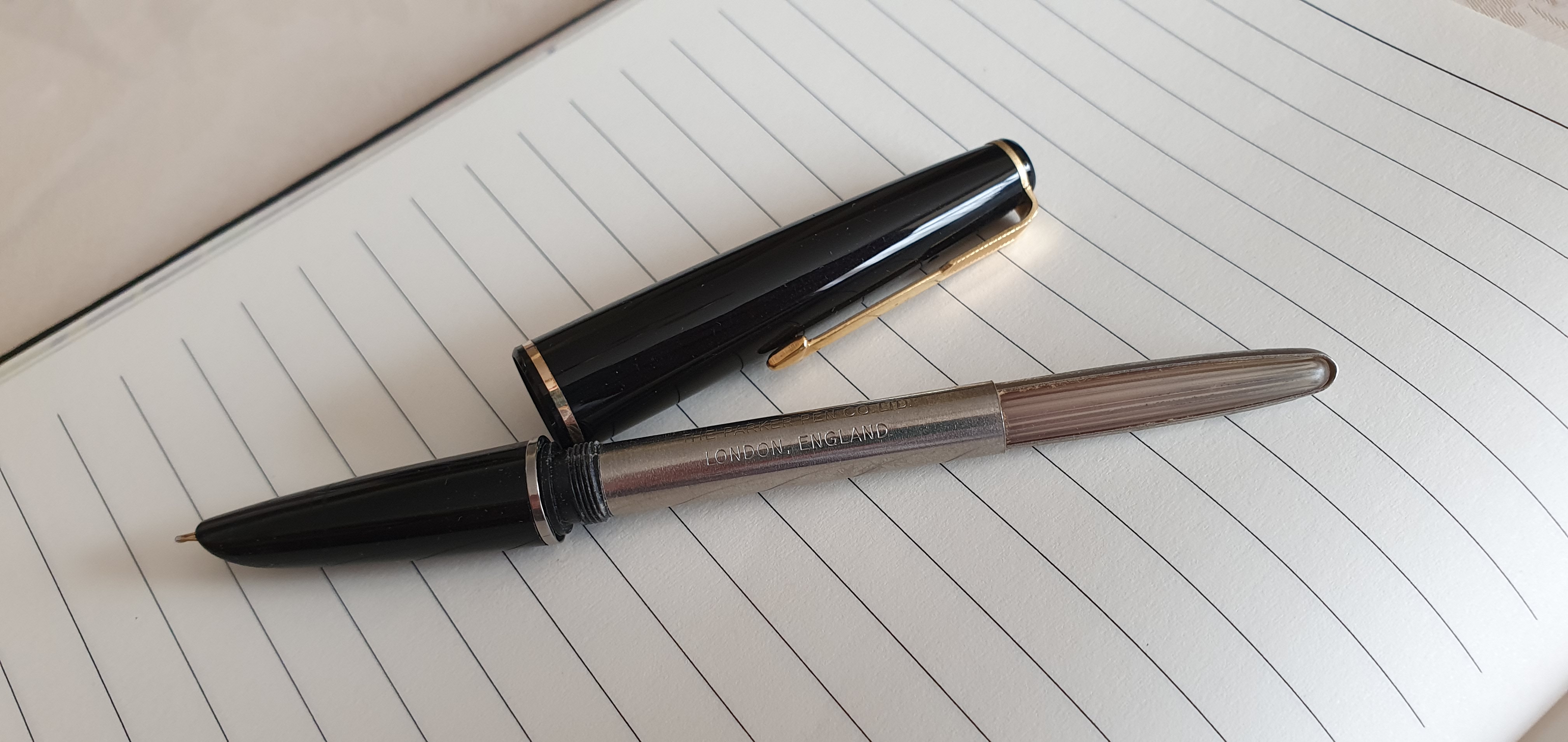
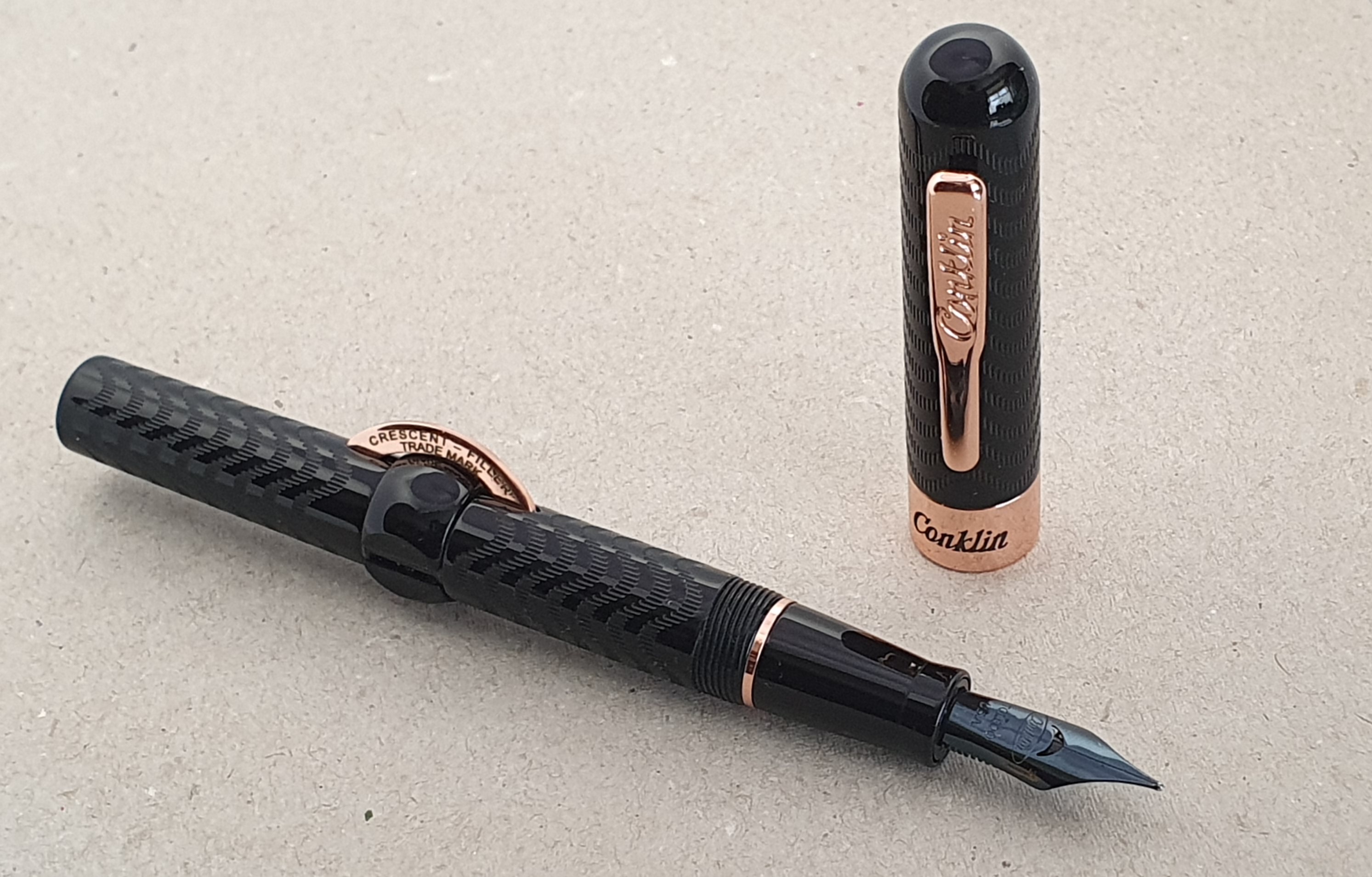
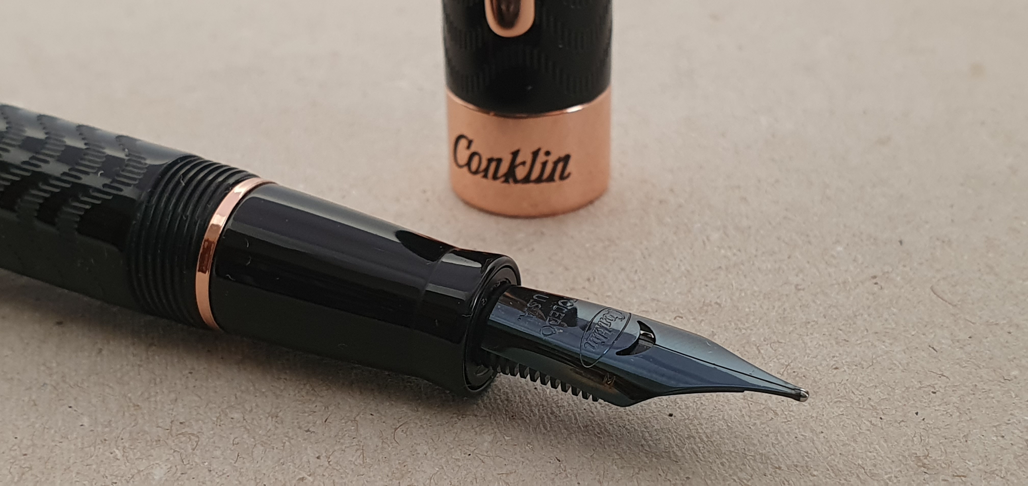
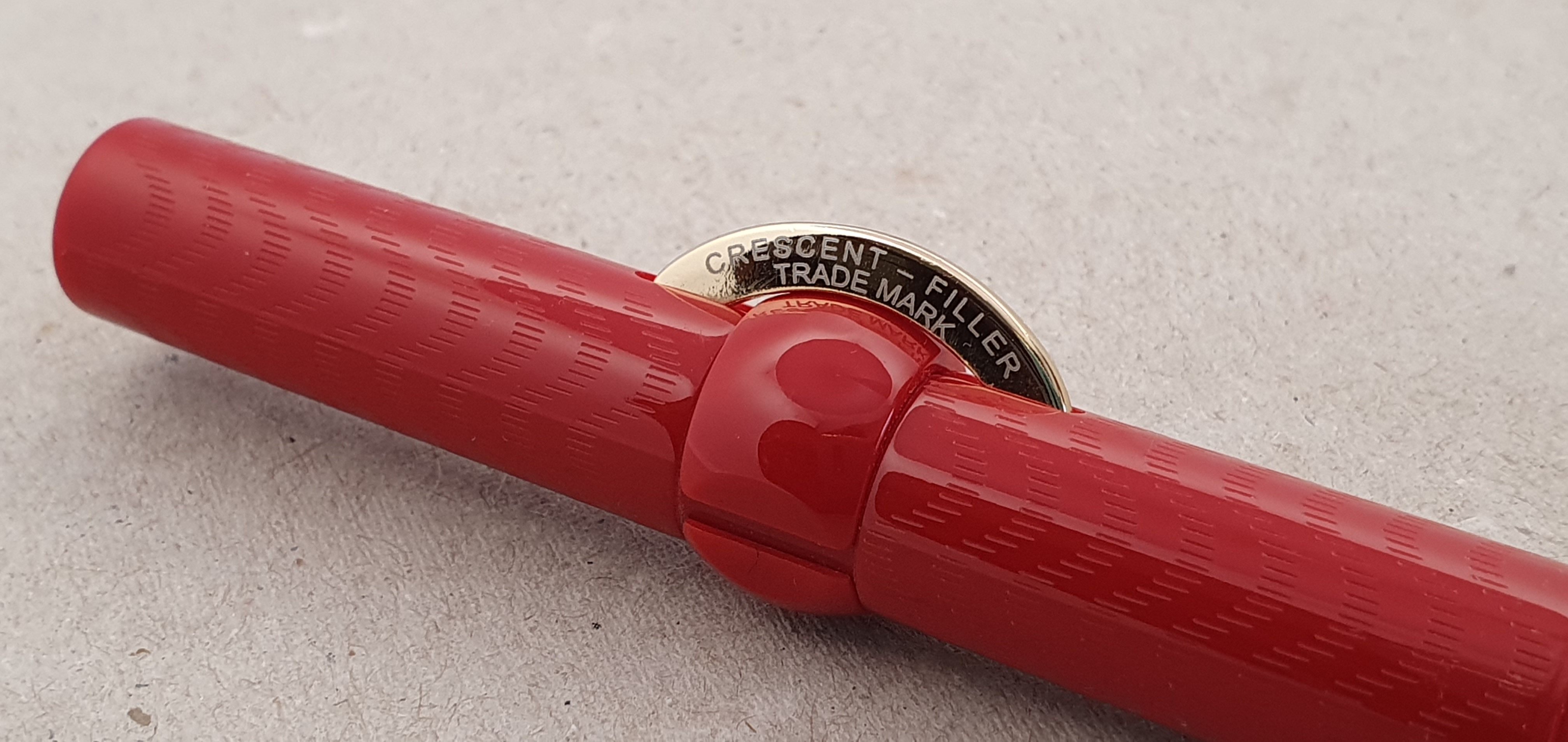
19: What’s your favourite vintage pen?

A few years ago, I would have answered my Pelikan 400 tortoise as it was the only vintage pen that I owned. Since then I have been given some lovely 1960’s Montblancs. In particular I love the Montblanc 34, a piston filler with a gold oblique nib, a blue ink
window and a screw cap. Also, in recent months I have become a big fan of the
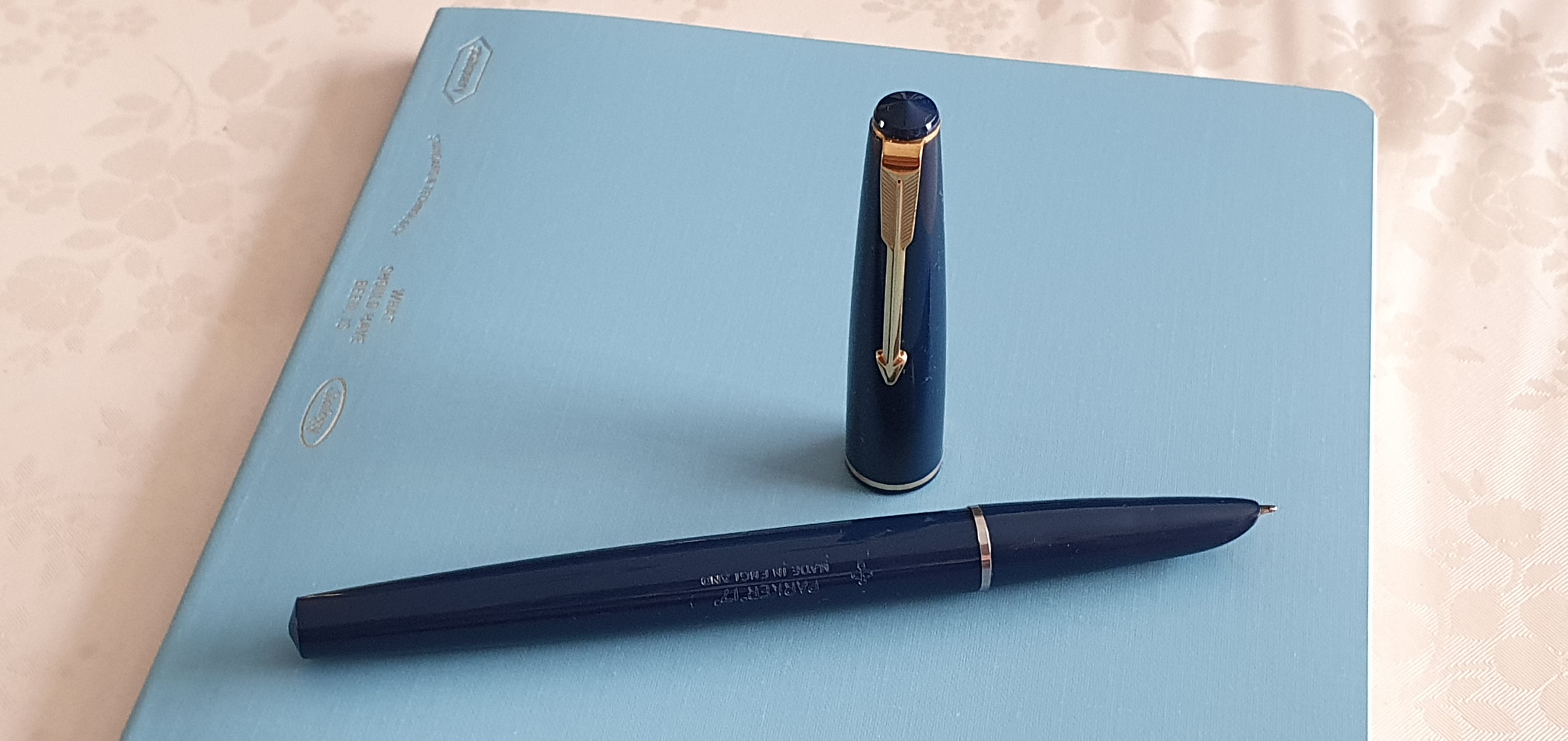
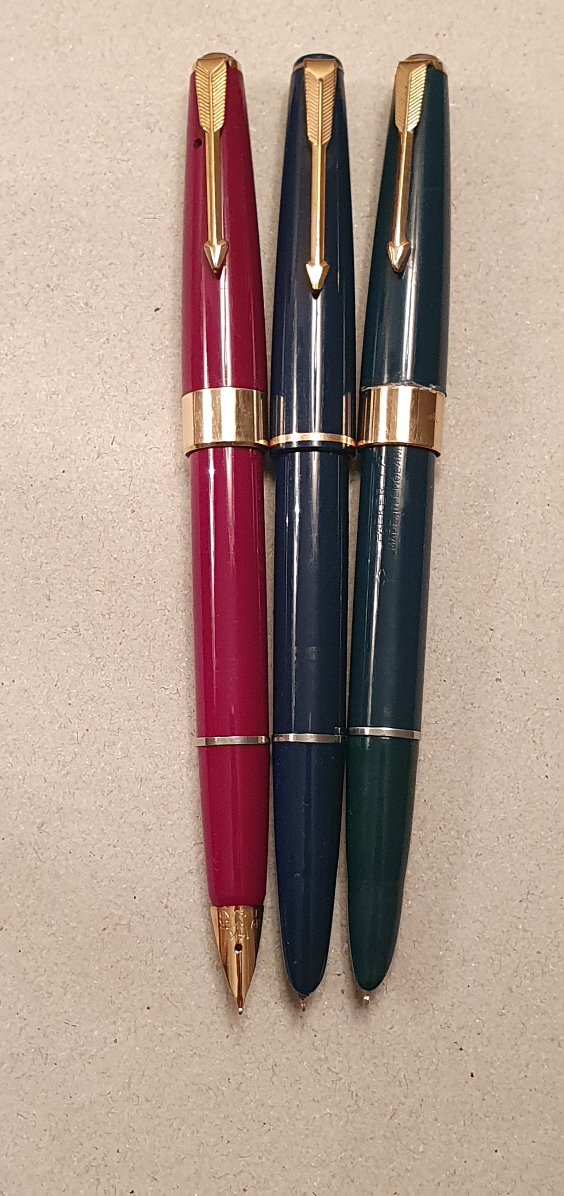
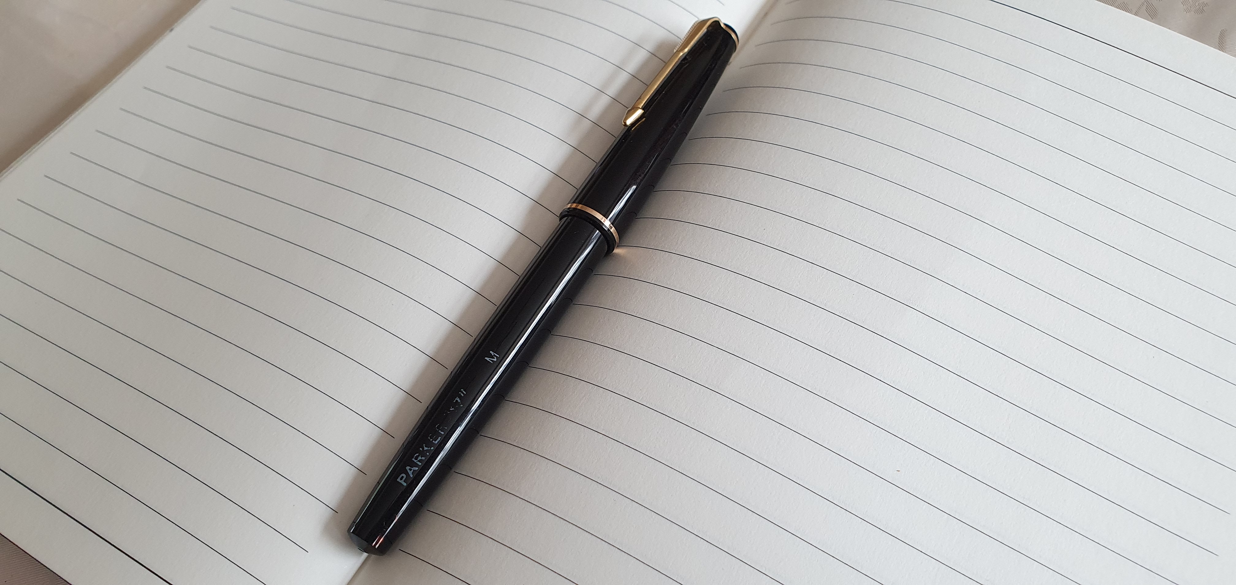
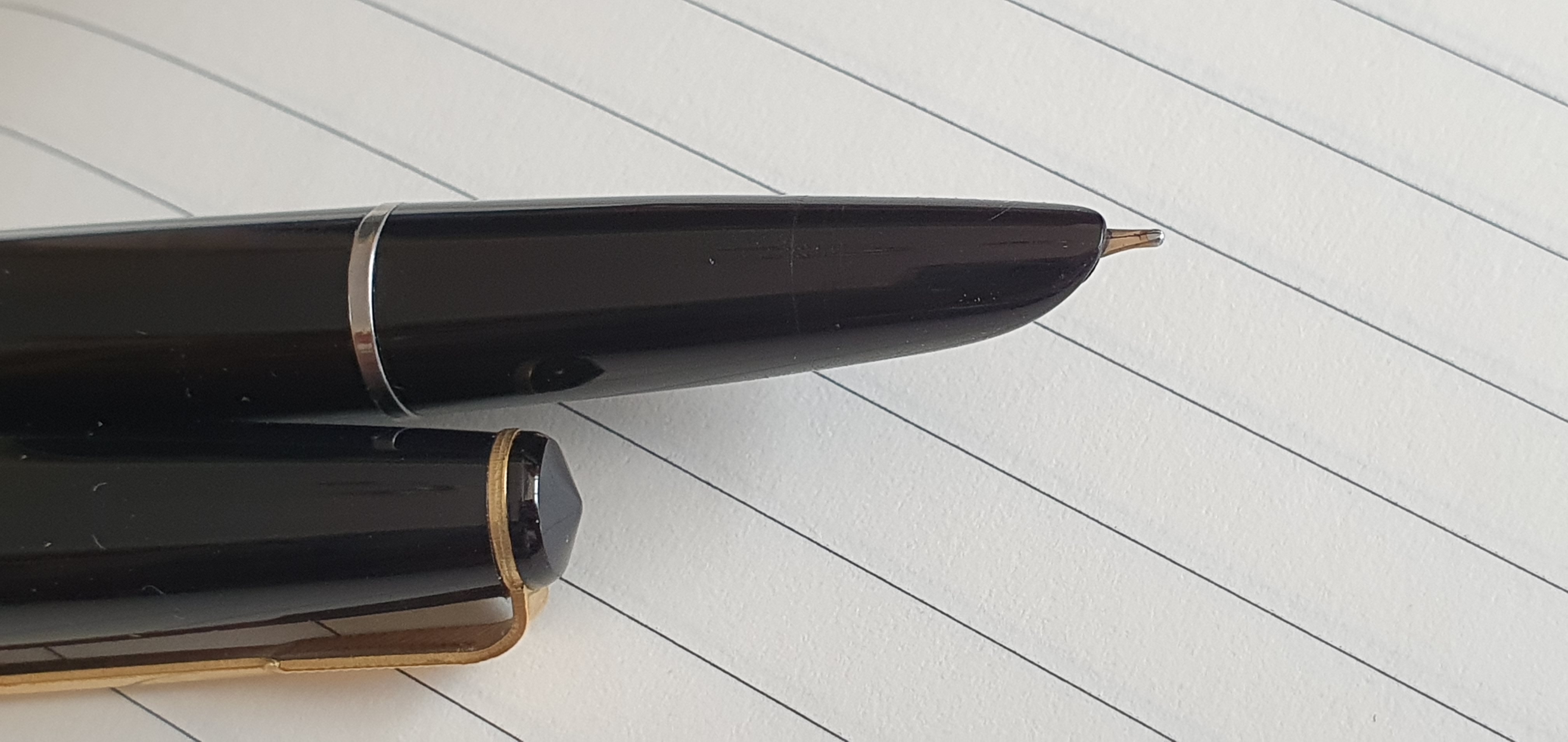
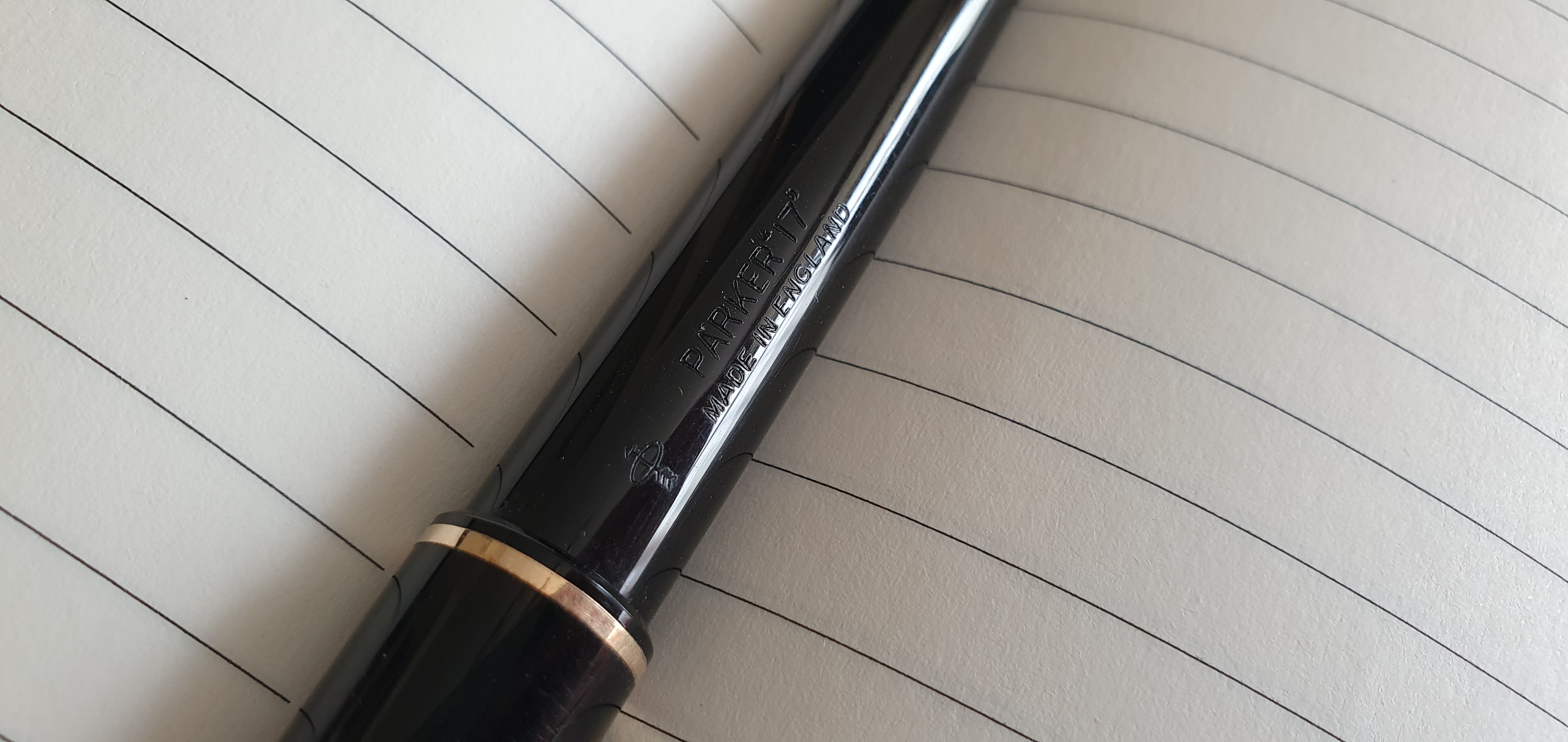
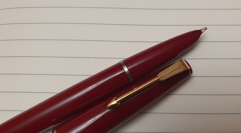
Parker 17 range (and bought three more on ebay this last weekend). I also
bought a vintage Parker 51 recently because it had an oblique nib and this is arguably
one of the best fountain pens of all time.

20: What is your favourite EDC/pocket pen?

My favourite pocket pen is the Kaweco Sport. I have several but like the burgundy with gold trim version best.

21: What’s the pen (or stationery product) that got away?

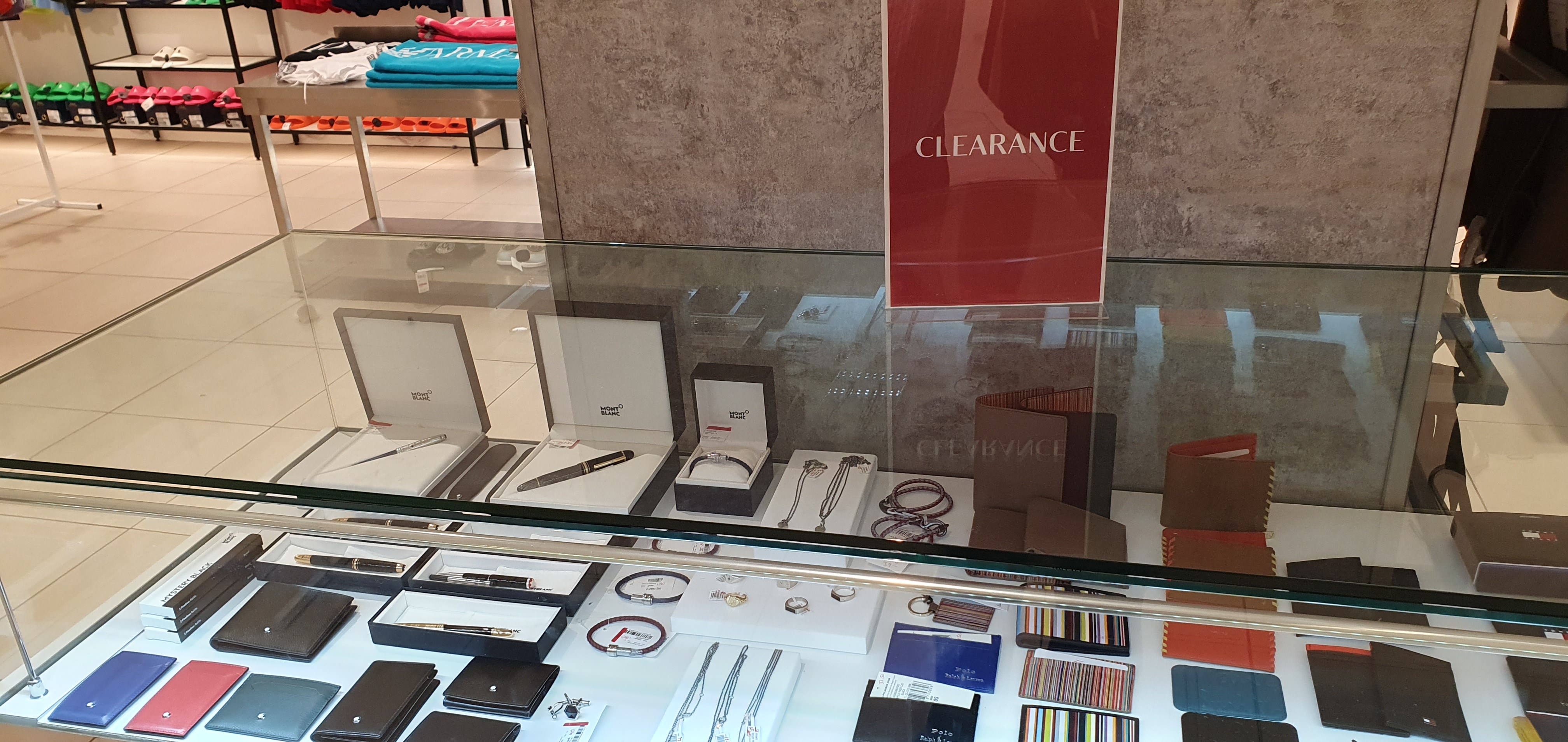
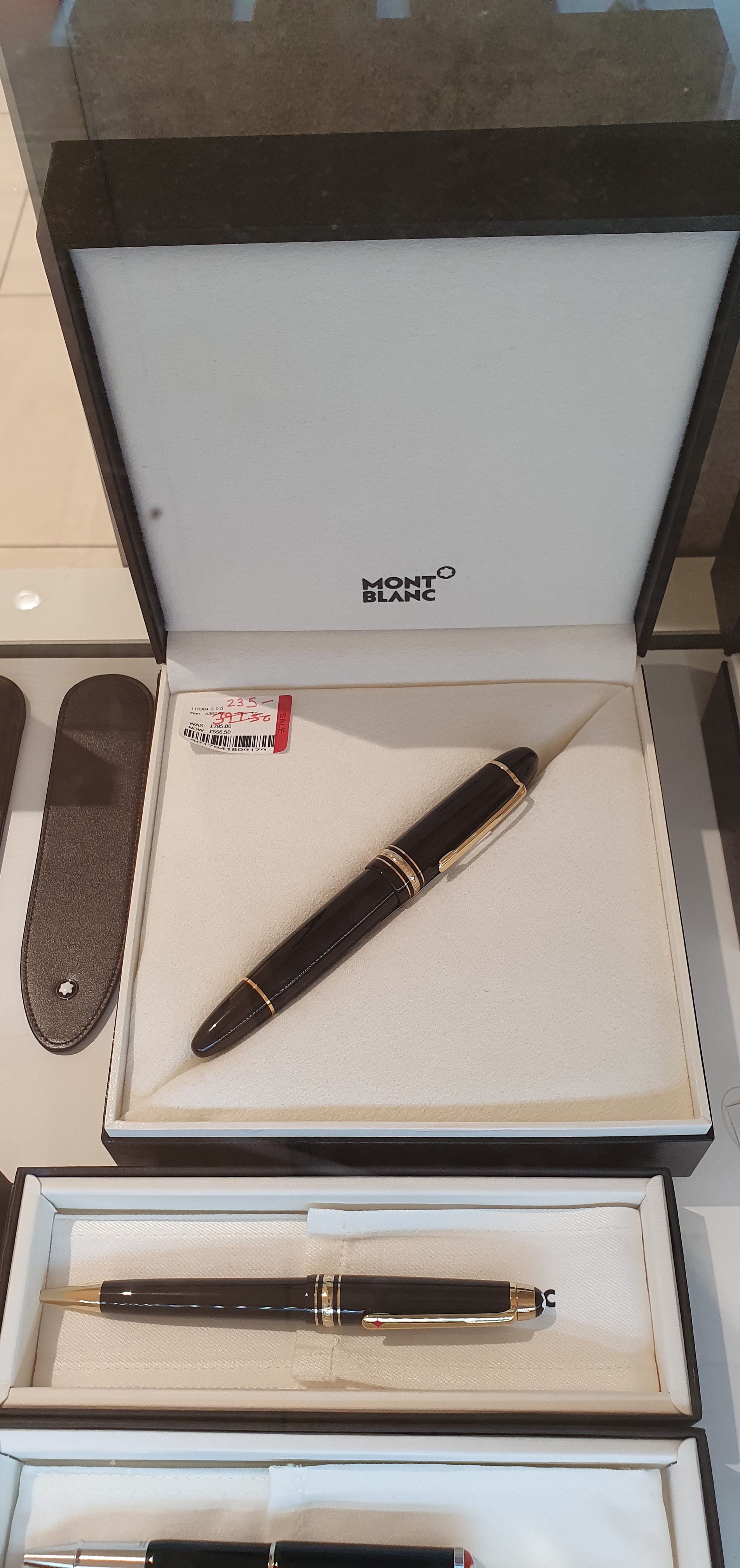
That is an easy one. I recently passed up an opportunity to buy a new Montblanc 149 which was reduced for clearance to £235, but needed some work to repair a sprung nib. The full story was recounted in my previous post.

(1): Why do pens and stationery continue to play such an important role
in your life, especially in an age when everything is supposed to be going
paperless and digital?

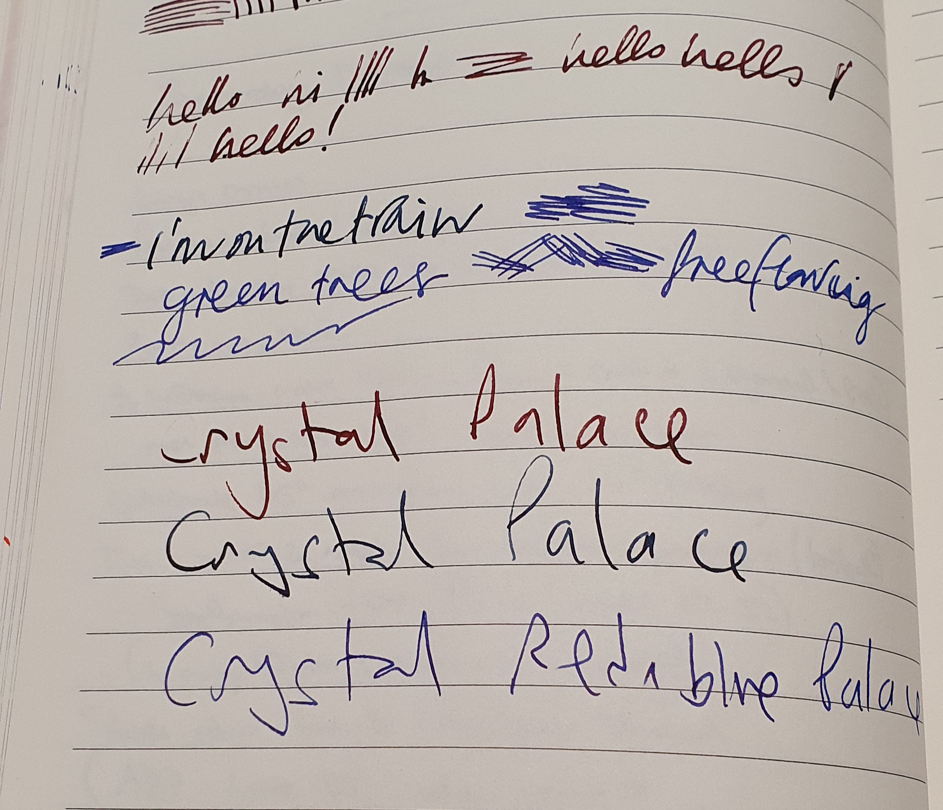
I find great enjoyment in writing with a fountain pen. First, writing is a good way to organise and record your thoughts,to journal and to write letters. You could say that any writing tool would meet this requirement but a fountain pen just feels nicer, forcing you to slow down and the line looks nicer on the page. Secondly, there is the exquisite and
unique pleasure of the feel of a fountain pen nib on paper and of seeing fresh
ink on the page. Writing more slowly is a key factor in improving the neatness
and legibility of handwriting. Practising one’s penmanship, trying different combinations of pens, inks and papers is a continuing source of relaxation and entertainment for me.    

(2): What do you view as the key benefit of writing by hand?

I have touched on this in the previous answer. I suppose the “key” benefit is that it is uniquely personal.

(3): What is your favourite thing about the pen/stationery hobby?

There are so many: trying out different pens, inks and paper or notebooks;
collecting pens; tinkering with pens; writing and receiving letters; keeping a
diary; pride of ownership; friendships made both online and in real life. But
if I had to name just one thing, it comes down to the joy of writing with a
fountain pen, which any enthusiast will know.

(4): What is your least favourite thing about the pen/stationery
hobby?

For me, it is the addictive natureof Instagram and the “screen time” spent, although I have learned a great deal about the hobby from the internet, from blogs, from watching YouTube videos, such as Stephen Brown and his helpful “disassembly line” posts, and from looking at the web sites of pen dealers such as Cult Pens, Write Here, The Writing Desk,
Iguanasell and of course Amazon and ebay .

(5): If you could choose one combination of stationery items to use
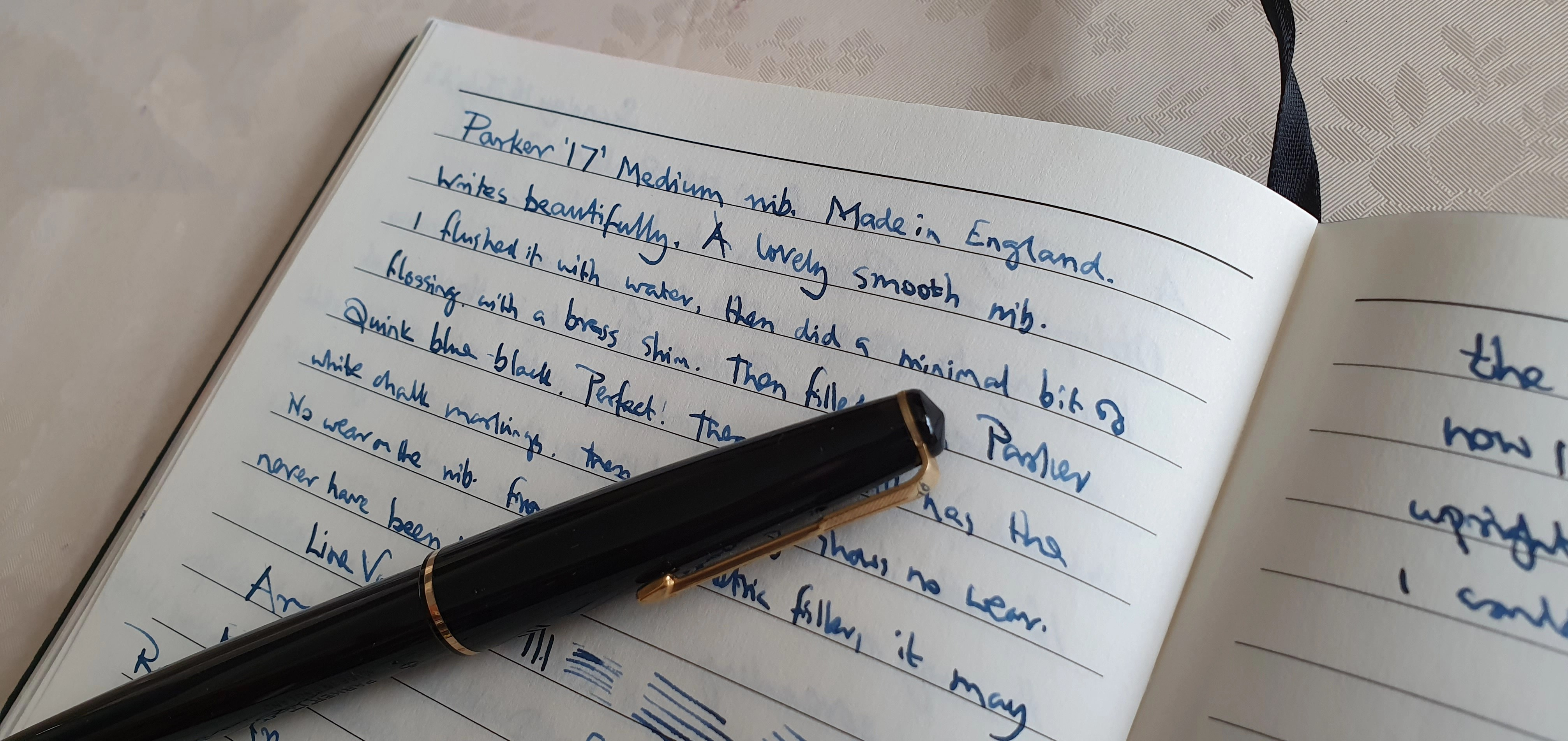
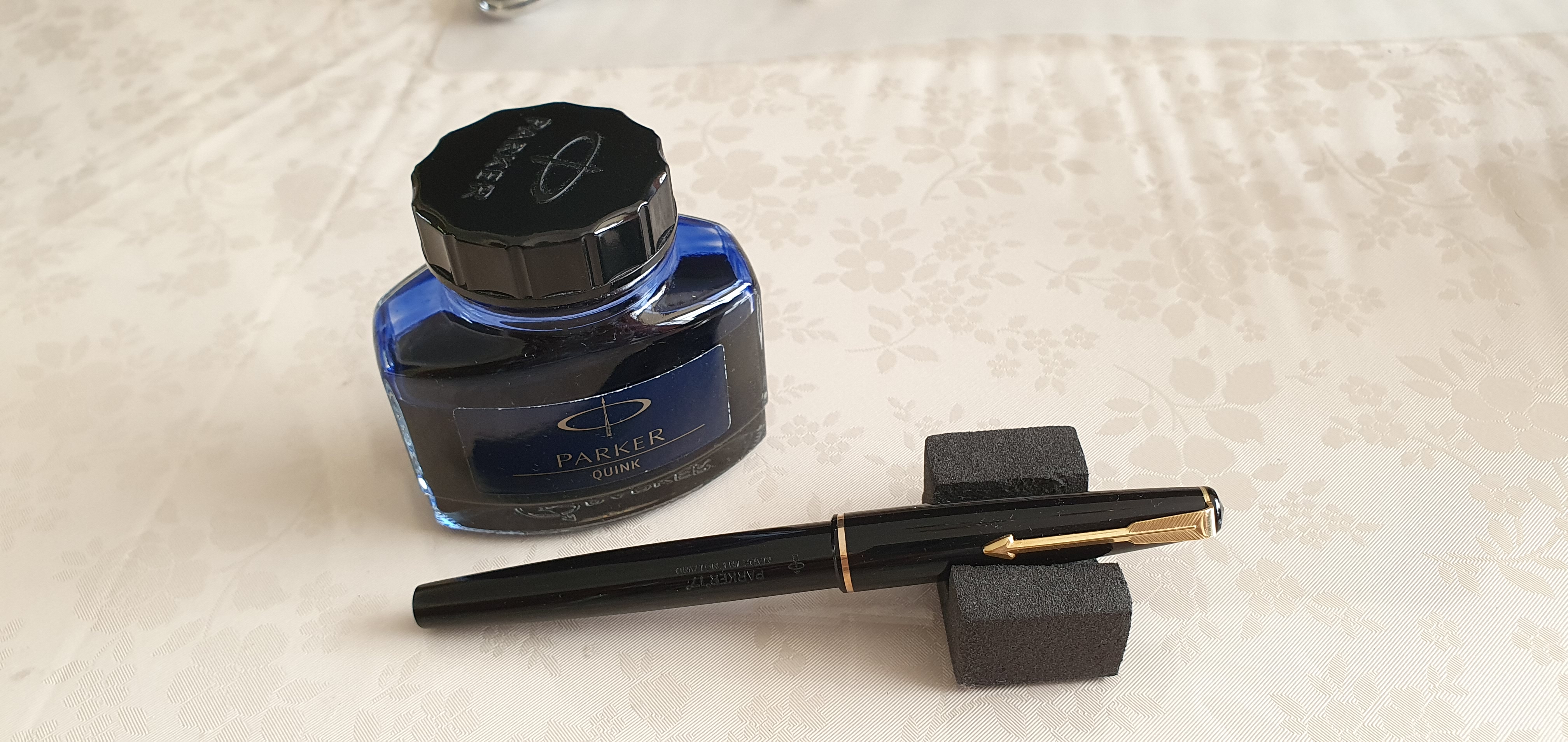
for the rest of your life, exclusively, what would those be and why?

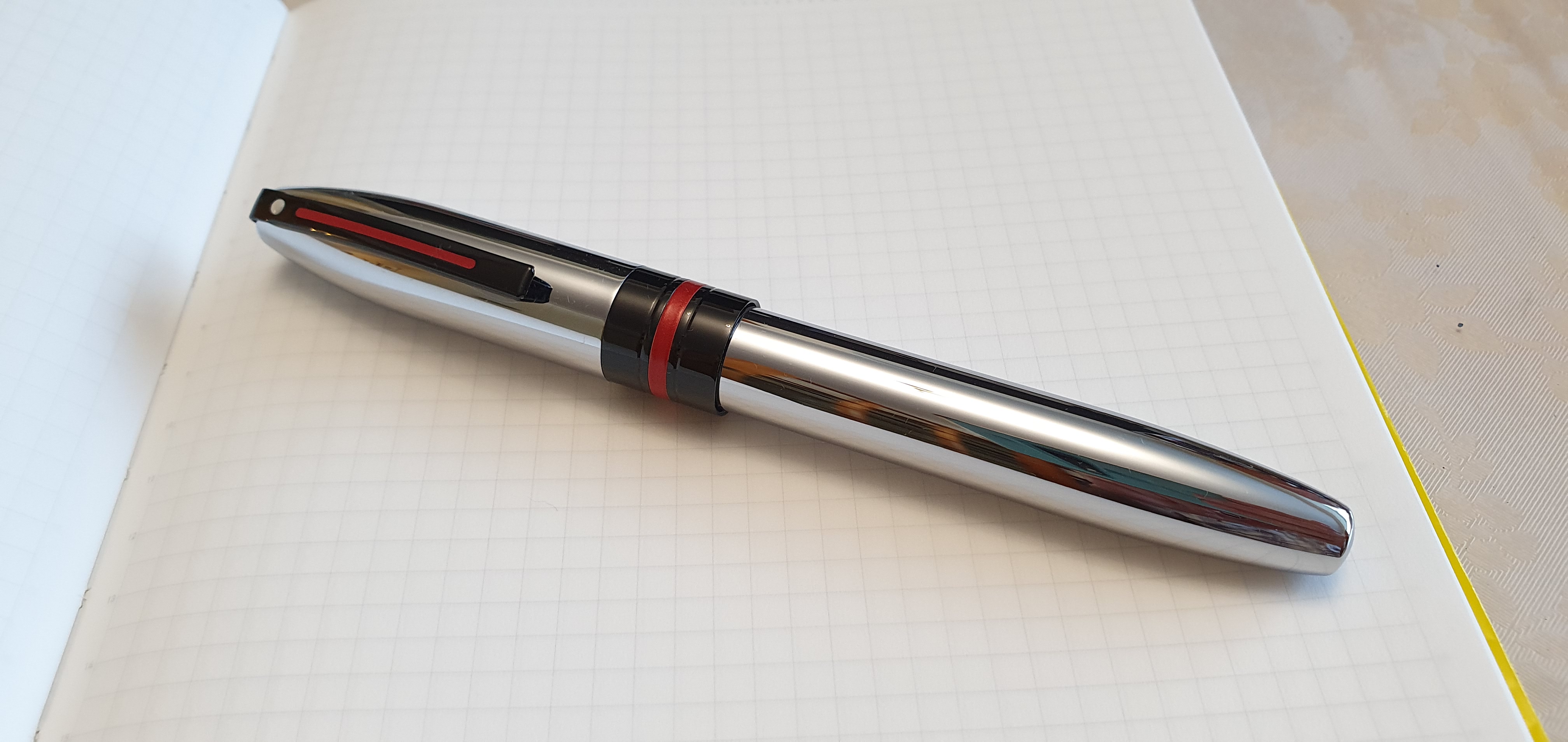
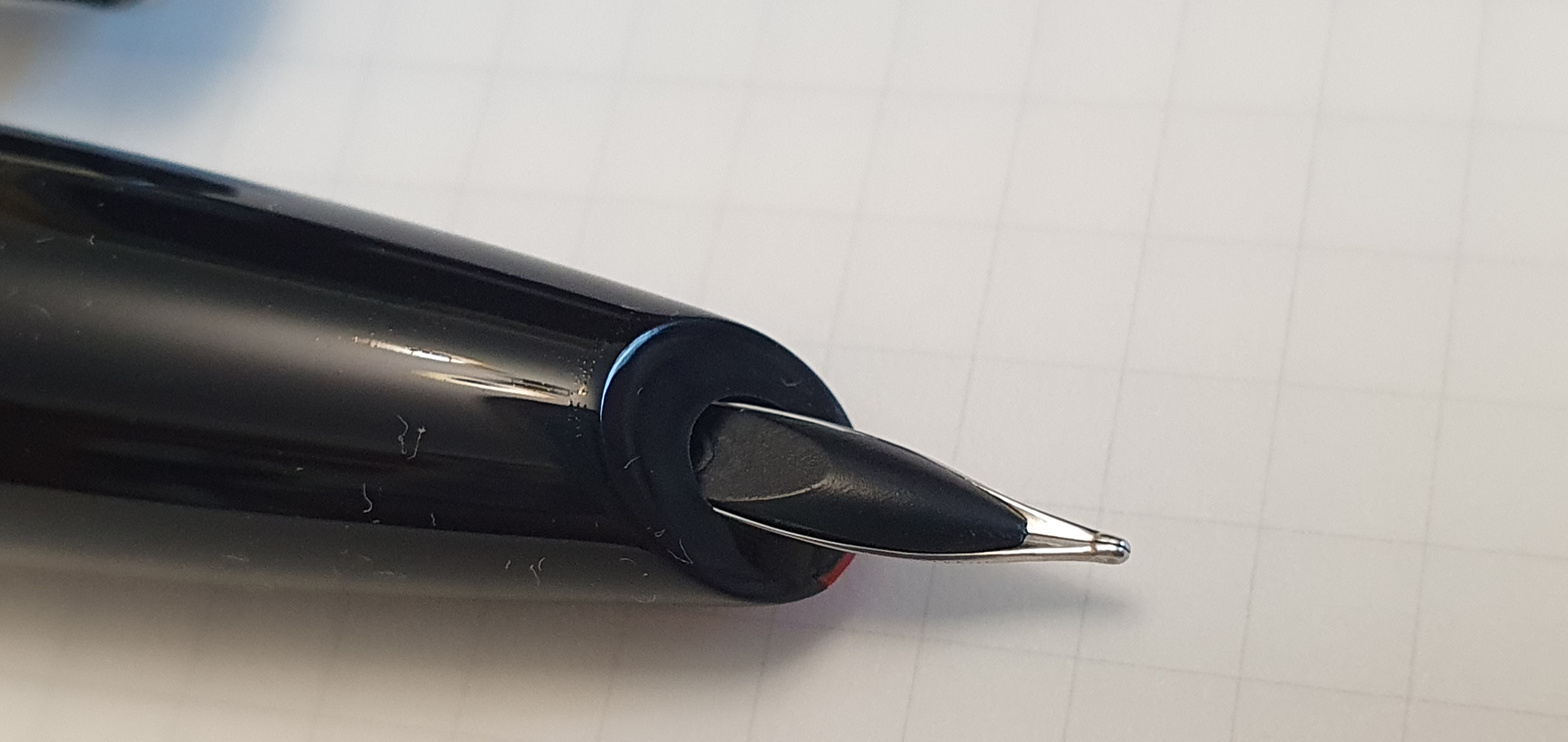
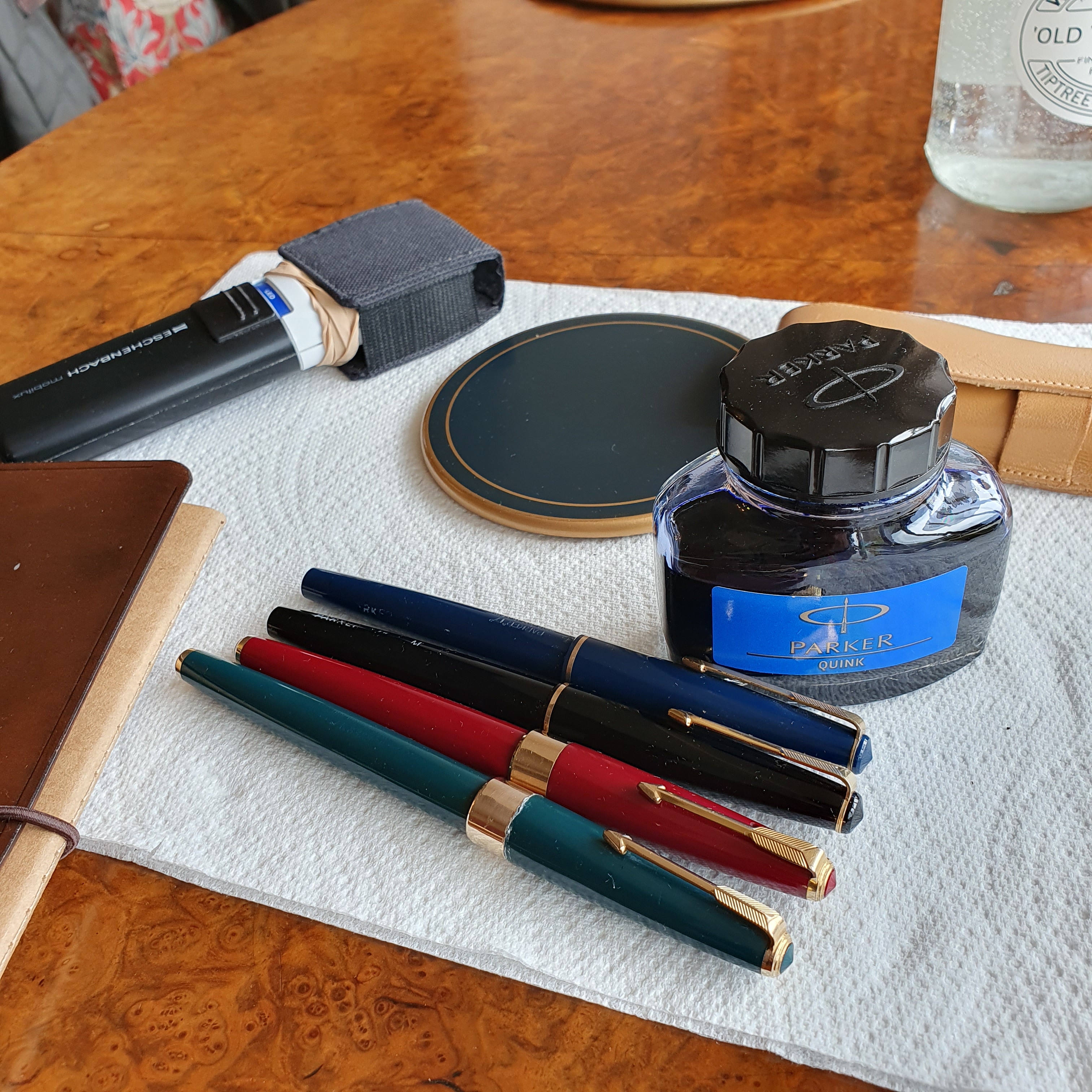
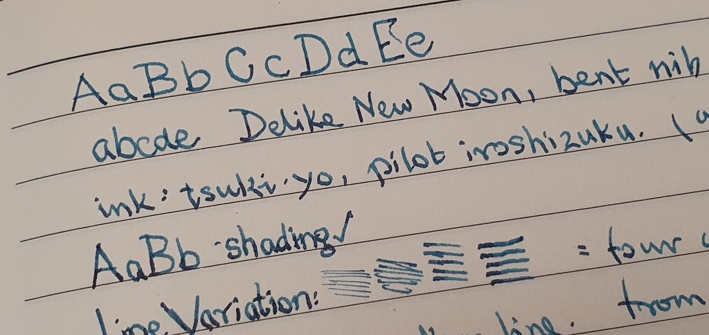
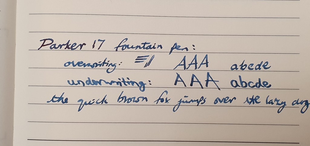
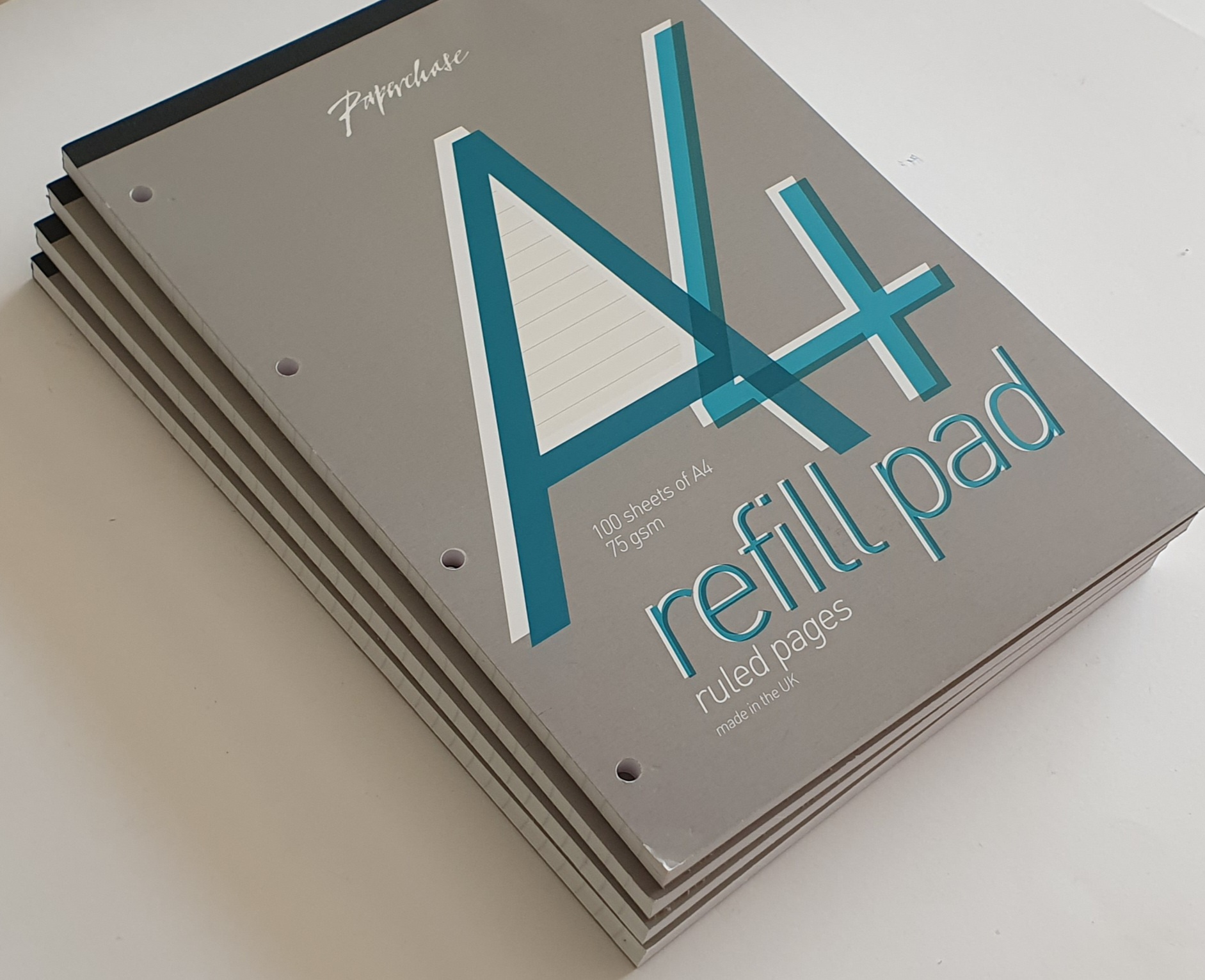
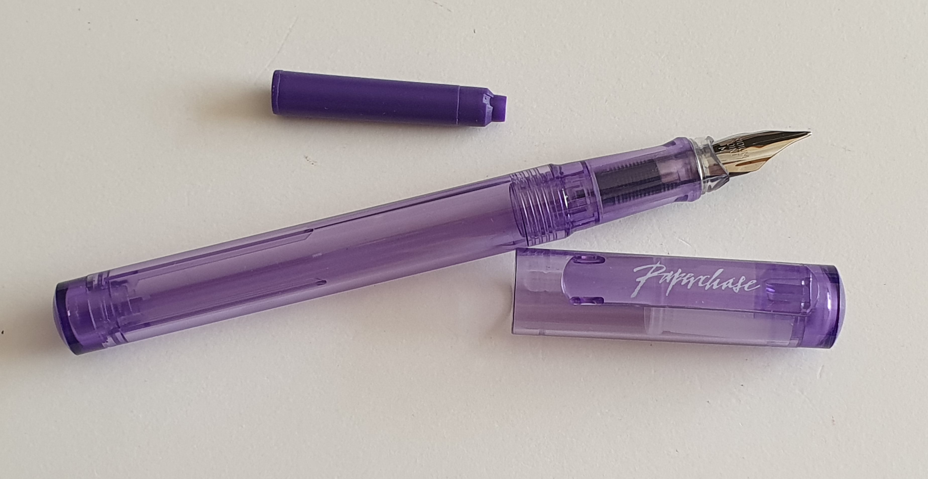
There have been so many. It would need to be a simple and reliable pen, one that is comfortable, that I would not get bored of. Most recently I struck the stationery jackpot by finding a near perfect combination of Parker 17 (black with gold trim, cap posted, medium 14k gold nib), Parker Quink blue black ink and a simple £4.00 notebook from Flying Tiger. However, there is some bias here as this was one of my most recent pen
purchases.

Taking a step back, I might pick the Cross Bailey Light. I have almost all the colours but like the royal blue one best. I would use Waterman Serenity Blue. The pen has a firm nib. The snap cap is quick and easy. It writes smoothly and with good flow. I can write without
thinking about the pen. As for paper, I would be happy with the Flying Tiger
notebook mentioned above as the paper texture was wonderful, but on buying two
more of them recently I found that the paper had changed and was no longer
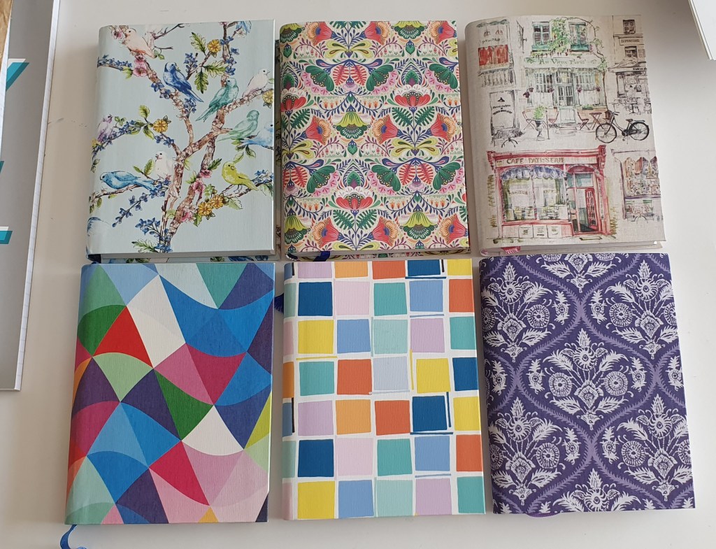
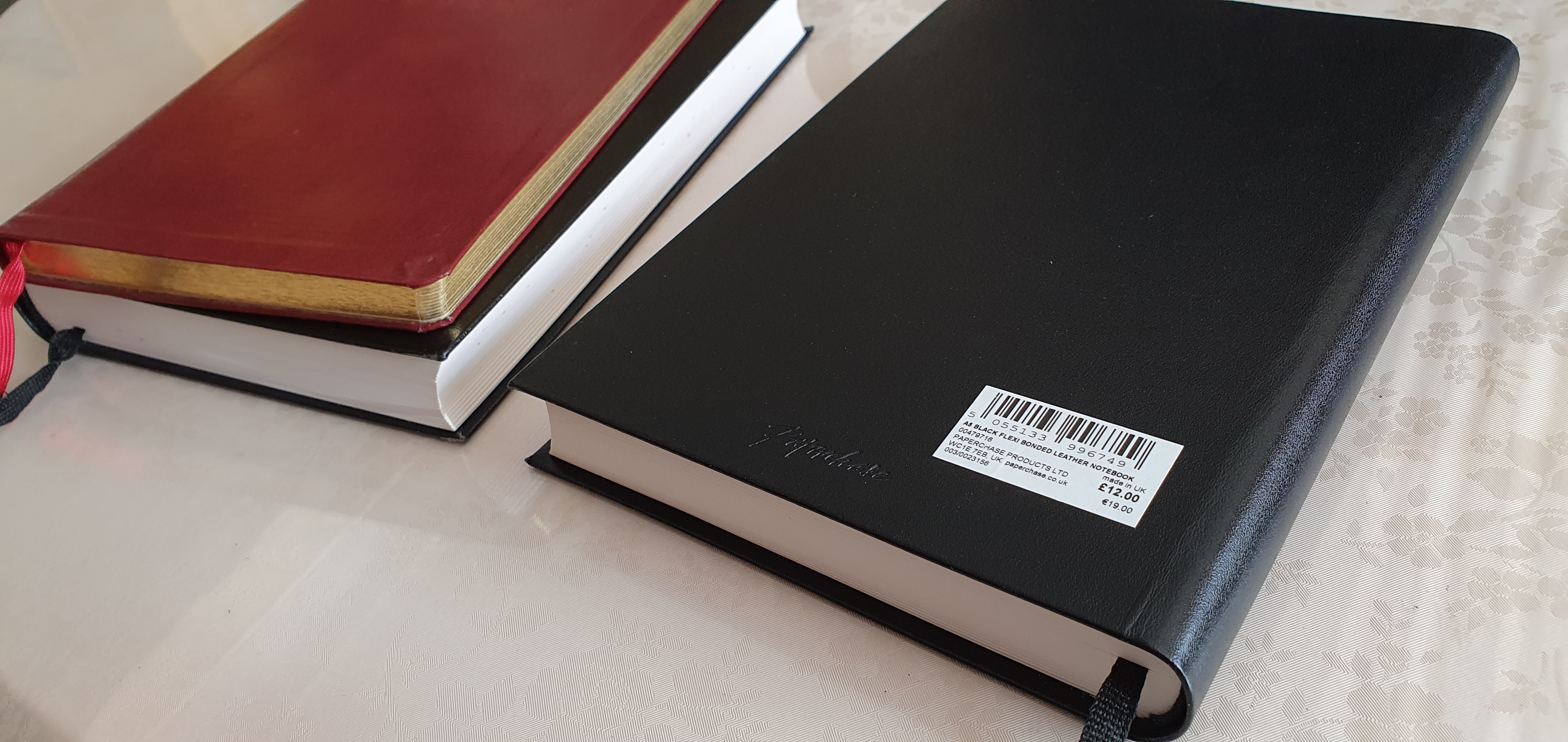
fountain pen friendly. The ink spread slightly and bled through.  My most frequently bought notebooks are the A5 hardback journals from Leuchturm although I need the dotted or plain paper as the ruled lines are too narrow for my liking. The A5 size is ideal for me, not too large to carry. Hard covers protect the paper and are useful if you are writing on your lap in a comfy chair, without a table.

That was a longer answer than I intended. Thanks for reading!

Update 1 August 2023: Apologies to anyone who received the earlier version of this post. I had trouble with the formatting and the questions were not shown as new paragraphs. This appeared only after publishing the post and I did not have time to improve it until several hours later, when I removed the old post and published this one.

Secondly, here are some links to a few other sets of replies in case you missed them:

  1. #21PenQuestions (via The Well-Appointed Desk)
  2. #21PenQuestions – Laura’s Answers (via the Well-Appointed Desk)
  3. #21PenQuestions – Jesi’s Answers (via the Well-Appointed Desk)
  4. #21 Pen Questions from The Gentleman Stationer (via The Gentleman Stationer)
  5. #5 More Pen Questions: What I really wanted to answer (Via The Gentleman Stationer)
  6. 21 + 5 Pen Questions (via Weirdoforest Pens)
  7. 21+5 Questions Answered to Celebrate 8 Years of Writing at Large (via Writing at Large)
  8. 21 Pen Questions (via Rachel’s Reflections)

On how I did not buy a Montblanc Meisterstuck 149.

Although I have bought my fair share of costly fountain pens over the years, I still feel that one of my attributes, or my “super-power” amongst the fountain pen community, is the ability to enjoy some inexpensive pens, just as much as expensive ones. This is a benefit for which I am most grateful.

In theory, this should enable me to save a lot of money. In practice however, I am still tempted when I come across a more “luxury” pen, especially if it is on a special offer.

Recently, I found myself thinking that I was as happy as can be using the vintage Parker 17, with Parker Quink blue black ink picked up on ebay for a modest £12.00 plus post and packing, with a notebook costing £4.00 from Flying Tiger. So, I should have the courage of my convictions, stand by my principles and act on them. Yet, within the last week or so I have been tempted three times: first by a Parker Sonnet Cisele, (reduced for Clearance in the John Lewis sale, from £366.00 to £183.00), then by a Cross Townsend Medalist, (with 23k gold-plated nib) reduced from £175.00 to £87.50 in Daniels of Windsor and then finally, by a Montblanc 149, black with gold trim, reduced from £795.00 down to (wait for it…) £235.00.

Montblanc 149, back row, second on the left.

Having withstood the test of the Parker and the Cross, the Montblanc offer pushed me to my limits. I was very surprised to see in Fenwicks, Brent Cross, a glass display counter of Montblanc pens and a few of their leather goods in a glass display cabinet marked “CLEARANCE.” This was extraordinary and I had never seen them discounted before.

A 149 for £235!

I summoned a sales assistant to unlock the cabinet for me. I first wished to check that it was a fountain pen and not a rollerball. The good news was that it was the fountain pen; the bad news was that the nib had been sprung and this was the reason for such a large discount. I recalled having seen the pen and posting a picture of it on Instagram, back in November 2021.

My photo from November 2021.

I do not have a Montblanc 149. I have often admired them in Selfridges and elsewhere but had never been tempted to pay full price for one. I had to make a decision. The pen would not write in this condition and would need some nib work. I wondered whether this might be a simple fix, just turning the nib over and flexing it downwards against my thumb-nail, just bouncing it back down very gently until the tines came together and then getting the tipping aligned. Gold is soft and can be bent quite easily but there is a risk of ruining it. Montblanc offer a nib exchange within 6 weeks of purchase but the nib must be in mint condition. Most likely, I would need to get a nibmeister to work on it, possibly at a pen show or else send it away. I wondered how long this would take and what it would cost. However, the discounted price allowed an ample margin to cover nib work, or even replacement and still be well under list price (which has now risen to around £855 I believe).

I did not buy the pen immediately but decided to think it over. I did some research online into Montblanc nib servicing or replacement. I also looked at various Montblanc nib-removal wrenches on ebay.

That evening, I posted a photo of the pen clearance display on Instagram. Three of my friends helpfully chimed in with encouraging comments. Jon wrote “I am sure that it could be fixed at a forthcoming pen show….”. Anthony wrote “That is an irresistible bargain!” and Allie added “You could have it repaired. I am not helping am I?” (laughing face emoji).

I gave myself a night to sleep on it. Do I like a challenge? Does it excite me or do I shrink from it? There is potential for satisfaction and a sense of achievement. But why take the risk? Does the potential benefit outweigh the risk? And how badly do I really want a 149 anyway? I have some Jinhao X159 fountain pens of similar dimensions and the wide girth is not my ideal choice. On the other hand, the pen needed rescuing. If I did not buy it, who would? Do it for the pen, and support the economy and a bricks and mortar shop! Be brave and do something wonderful! All of these thoughts and more were swirling around my head.

Come the following morning, I was leaning towards liberating the pen, and decided at least to go and have another look at it – assuming it was still there. I did not rush to get there at opening time, but gave it an hour and half or so, figuring that if someone else had bought it, the decision would have been made for me.

Back in Fenwicks, the pen was still there in the locked display counter. However, a gentleman was also eying the pen and the other Montblancs, for which the prices were not visible. I knew from my previous visit that these were the Montblanc “Around the World in Eighty Days” edition fountain pens, in 146 (Le Grand) and 145 (Classique) sizes and both were reduced to about half list price and was able to tell him this before the assistant came to open the cabinet for us.

It transpired that this gentleman, who I now know to be Edmond, had seen my post and driven over to look at the pen (if I had not already bought it) and that he was also interested in a cute Montblanc Baby rollerball, which he had also spotted in the photograph.

We both examined the 149 at length and he thought it worth a punt. He proposed to buy it, if I did not do so, but felt that I should have first choice in the matter, it having been my spot. It fell to me to make my mind up. It was undoubtedly a very tempting offer. However, I eventually concluded that I could happily go either way on it and, feeling magnanimous and a gentleman, I announced that I would like him to have it, whereupon he shook my hand and declared that he would buy me a coffee and a pastry.

It was his intention to buy the 149, plus the Le Grand and the Baby rollerball and asked whether a further 10% discount might be available if he bought all three. We were told that this would be up to the manager, who was in a a meeting but would be back in 15 minutes or so. Meanwhile, the assistant put the pens aside for him and we went for our coffee upstairs in Cafe Nero. We had a most enjoyable natter, finding that we had many other interests in common including photography, cameras and watches, as well as fountain pens.

Returning to the pen counter, the manager was now back. No, he was not willing to give any further discount which was a little disappointing. Nevertheless, Edmond went ahead with his purchase of the three Montblancs anyway. I congratulated him and wished him enjoyment with his new acquisitions and we parted on excellent terms.

Later, having time to reflect, I was happy with my decision and also that the 149 had gone to suitable owner who would ensure that the nib received the care and attention that it needed. I meanwhile continue to enjoy my budget priced Parker 17 and a warm and fuzzy feeling of goodwill.

New pen day: another Parker 17 arrives.

Occasionally, everything goes right with a pen purchase. One evening last week, whilst browsing Parker pens on ebay, I came across a Parker 17 in black with gold trim, for sale at the very reasonable price of £12.00 plus post and packing. The description read “Parker 17 Aerometric/Reservoir Fountain Pen. Black & Gold. VGC/Desk.”

Parker 17. White markings still present.

Readers may recall that I have a burgundy Parker 17 with an oblique nib, bought at the London Pen Show in March 2023. I could not resist buying another, this time in black and with a medium nib.

The seller despatched the pen the very next morning by Royal Mail and it was delivered at 8.20am today. Any worries that I might have had about it being damaged in transit were soon dispelled. It was expertly packed in a cutaway between two blocks of foam polystyrene and secured with brown tape, snuggly inside a cardboard outer box. It could not have been better protected.

THIS is how to protect a pen.

I read on Parkerpens.net, an informative site run by Swedish pen collector Tony Fischier, that the Parker 17 was introduced in 1962 and the hooded nib versions in 1964. The line was discontinued in 1972. Accordingly any Parker 17 that you see now, must be at least 50 years old.

Hooded nibs on the Parker 17 began from 1964.

Examining the pen, initial impressions were very favourable and kept getting better. The glossy black cap and barrel with gold trim, looked classically handsome. Aside from a few minor scratches, there were no cracks or chips. The white chalk or crayon markings on the barrel reading PARKER “17” M, (which easily wear off) were still intact, suggesting that the pen had been handled very little. Also, the engravings on the barrel, PARKER “17” MADE IN ENGLAND, with the Parker symbol, looked as fresh as if they had been made yesterday.

Often these engravings are so worn as to be barely legible. This one is like new.

Removing the pull-off cap, the hooded nib looked in great shape and showed no signs of wear. There were slight traces of ink and paper fibres between the tines and I gave the nib a rinse in water and flossed the tines lightly with a fine brass shim. The nib needed no adjustment. There was the desired gap between the tines, narrowing down to the tipping material which was rounded and symmetrical and the tines were in perfect alignment. All good so far.

Small but perfectly formed.

The aerometric filler (which all Parker 17s have) was clean, with no ink stains and I wondered whether the pen had ever been inked (although it had at least been dipped). The metal housing of the sac looked like new, with no corrosion. Flushing the pen in water, the sac drew up a progressively good fill with about ten squeezes of the bar.

Aerometric filler, looking as good as new.

Cleaned and dried, I was ready to ink it up with Parker Quink blue black. I am glad to say that the pen wrote beautifully, with a good medium line, smooth and with no scratchiness. Indeed it was like new. There is just a little skipping sometimes if the nib is not quite held at the sweet spot. I expect this to resolve as the nib gradually wears in. Applying a little pressure opened the tines at the tip and produced a broader and wetter line. Quink blue black is a good shading ink. I found that I could use both underwriter and overwriter styles although the pen performed best in the underwriter, upright style. (The opposite is true with my burgundy version with its oblique nib). It measures 123mm uncapped and 143mm with the cap posted which I prefer.

Trying out the medium nib on the Parker 17 with Quink blue black ink. Notebook from Flying Tiger, 8mm row height. Bliss.

All in all, I could not be more pleased with this purchase.

Happiness in a bottle.

Two fun nibs for lefties.

Left handed writers have a disadvantage when using fountain pens, compared to right handers. Typically, there will be less ink flow when the nib is “pushed” along the line, as opposed to being “pulled” along, writing from left to right. Less ink flow means less lubrication and a less smooth writing experience.

Secondly, if the lefty writes with a hooked wrist, there is a likelihood of smudging the wet ink as his hand passes over it.

There are two main styles of writing for the lefty: these I call “underwriting”, by which I mean writing with the pen under the line, with the back of the pen pointing towards the body, or “overwriting” where the hand is above the line, and the back of the pen is pointing away from the body. Many overwriters hook their wrists. As a lefty myself, I am most comfortable when using the overwriter style although I have my own particular method which I developed as a child and still use. Instead of hooking my left wrist, I rotate the paper about 45 degrees left (or anti-clockwise), adjusting the paper rather than my wrist.

One of the joys of using a fountain pen is the ability to produce lines of varying width. We have all seen beautiful copperplate calligraphy with attractive fine and broad strokes, adding character to the writing, such as a thickening in the tail of a lower case letter “y”.

One way ito achieve line variation is to use a flexy nib, where the tines widen as you apply pressure. However this is not suitable for a lefty overwriter as you can apply pressure to the nib only when pulling it back, not when pushing it forward.

The other way to achieve line variation, and which is more practical for us lefties, is to use a stub nib which will produce a broad line up or down, or a fine line left or right, assuming it is held at a consistent angle.

The opposite effect is achieved by using a nib with an “architect” grind, which produces a fine line in the down stroke, and a broad line in the cross stroke. Such nibs are not usually available with a new pen and so require some specialist work by a nibmeister.

However, a similar effect to the architect grind, can be readily enjoyed by using a “bent nib” where the tip is bent upwards to create a flattened, elongated writing area, again producing a fine line in the down stroke or a broad line in the cross stroke.

Today I want to highlight two of the fountain pens that I particularly enjoy using at the moment. The first is the Delike New Moon, an inexpensive Chinese pen bought on Amazon and described as having a “bent” nib. I now have three of these, in different colours. I like the effect that the bent nib has on my handwriting when I use the underwriter style, giving narrow down strokes and broad cross strokes although the difference is subtle.

The upturned “bent” nib of the Delike New Moon.

The nib is very versatile, being capable of four distinct line widths. Held normally, it writes a medium line. Hold it more vertically, and it will produce a fine line, or lay it back at a lower angle than normal and apply a little pressure and you will get a broad line. Turn the nib over and “reverse writing” will give an extra fine line, when needed.

But here is an interesting thing: the bent nib produces fine down strokes and broad cross strokes, when used in the underwriter style. But if used in the overwriter style, the fine and the broad strokes are switched. Take the capital A for example and see how the fine and broad lines are reversed, in these two writing styles.

Subtle line variation from the New Moon, in underwriter mode. Pilot tsuki-yo.

The other pen that I am much enjoying, is the vintage Parker 17, with an oblique broad nib, bought at the London Pen Show in March this year. Ironically, at £30.00 it was one of the least expensive of the seven pens that I bought myself that day yet probably has the best effect on my handwriting.

Parker 17, with Oblique nib.

As opposed to the bent nib pen, the Parker’s oblique nib produces broad down strokes and fine cross strokes, used in an underwriter style, and the opposite if used, (as I prefer) in the overwriter style.

Writing samples from the Parker 17. Quink blue black. Note how the thick and thin sides of the A are reversed, in the overwriter and underwriter styles.

Currently, of the nine inked fountain pens in my ink cups, these are two that I reach for the most and provide the most enjoyment, out of all proportion to their modest cost. The Delike New Moon is inked with Pilot Iroshizuku Tsuki-yo, whilst the Parker 1 7 is inked exclusively with Quink Blue black. Both are very pleasing combinations. The Parker 17 with its oblique nib was a very lucky find at the pen show as medium nibs were much more common. There was a crack to the shell, just above the nib to which I applied some superglue. It does not leak and the pen writes wonderfully. The crack is still visible but in a way the pen is all the more endearing for this, rather like a Japanese Kintsugi bowl.

As well as the line variation, I also enjoy the shading from the Quink blue black ink. I need to write a bit slower with the Parker, to keep it from skipping but slowing down helps me to keep my writing more tidy and legible and reduces mistakes.

In a hobby where there can be temptations to spend ever increasing sums of money for one’s next best pen, it is worth remembering that the simple joys of line variation and shading, particular to fountain pen use and helping your handwriting to look its best, can all be had without breaking the bank.

Goodbye to Paperchase.

In recent weeks we have witnessed the disappearance of another well-loved chain of shops from our high streets and shopping malls. Now the UK’s Paperchase stationery stores have closed.

This means the loss of 106 stores, 28 concession stands (in shops such as Next and Selfridges) and the loss of some 820 jobs. As well as being a familiar presence in the shopping centres, there were Paperchase shops at some railway stations too.

At the eleventh hour, the supermarket giant Tesco stepped in and acquired the Paperchase brand. It remains to be seen what they will do with it. The Paperchase shops are gone. If you click on Paperchase’s web site, you are now diverted to Tesco and greeted with a message that Paperchase online and UK Paperchase stores are now closed and that “we look forward to bringing this well loved brand to Tesco.”

Paperchase was founded in 1968 and grew to be a familiar sight, along with stationers Rymans and WHSmiths. The branches were not all identical but were bright and inviting to browse in, featuring a large selection of greeting cards, shelves offering numerous styles of notebooks in all shapes and sizes, tables of toys and novelty products appealing to children, loads of stationery accessories, pots of colourful pens and, in some stores, displays of fountain pens in glass cabinets. These might included Parker, Cross and Kaweco and a few others although generally none too expensive for an impulse buy.

The Paperchase logo on the back of a journal.

Over the years, I visited Paperchase a lot. If my wife and I came across a Paperchase we would pop in for a look round and often buy something.

Today, looking around my writing space (aka the dining room) I rounded up just some of the products that had come from Paperchase, for a team photo. These ranged from packets of standard international cartridges in a variety pack (I seem to remember that they had once cost £2.50 for a bag of 50), through literally dozens of notebooks, pads of writing paper and file paper, to a few memorable pen purchases.

A quick round up of just some of my Paperchase purchases over the years.

If you chose a fountain pen from the display cabinet, the staff often struggled to locate the box. My favourite Paperchase story (told here before) is of once buying a handsome Cross Century II fountain pen in black with a chrome cap, at the price marked on the display. Several months later, I was in the same shop and saw the matching Cross ball pen and asked to buy it. This time, they were unable to find the box and its code in order to sell it. Eventually, it transpired that it could be sold only as part of a set with the fountain pen. After proving that I had bought the fountain pen already, they agreed that the ball pen was mine too!

Loose cartridges from my first variety pack. I have a lot of pinks left.

I remember where I was when I bought my first Kaweco Perkeo: it was the Paperchase shop in St Peter Port, Guernsey. The pen was a success and I later stocked up on about five more, in various colours. This pre-dated my same behaviour with the Cross Bailey Light, although those were not from Paperchase.

However, my greatest dependence on Paperchase, was for notebooks and journals. I remember discovering the little chunky black A6 journals with a staggering 600 pages of squared, fountain pen friendly paper. I bought a couple of those and was sorry when on a later visit, they seemed to have ceased selling them. But then I later found them back in stock again a year or two later, I binged on another three! They were great, such as for jotting down trivia when watching tv or listening to music online. They would last for ages.

One of my favourite Paperchase products. Actually 600 pages.

Paperchase had a wide choice of journals. Some had paper that was not fountain pen friendly. I liked the A6 flexi-covered books, nicely stitched, with 320 pages of either lined paper (8mm line spacing) or plain paper, both of which were great for fountain pens. They were usually £8.00 each and occasionally reduced in a sale. I tended to buy more than I needed (an understatement).

Paperchase A6 journals, of various designs.

For larger, A5 journals, Paperchase once sold journals with bonded black leather covers, with 384 pages of smooth, lined paper, with a generous 10mm row height. I used these for more lasting projects, such as memories of my school days and would enjoy writing in these with various fountain pens and inks.

A few of the more luxurious, bonded leather covered journals.

Paperchase also had an online service, although I did not use it as I was well served with branches in London. But I did make use of their loyalty card. If presented when making a purchase, you would be given an offer with your receipt, for a discount on your next purchase, subject to various conditions. I once bought some pads of file paper, only to be told that there was nothing to pay as it was all covered by accrued benefits. I was very fond of their pads of file paper, which I use at home and at work. Not only was the paper of good quality but also, the pages could be torn off the pad easily without ripping the paper, unlike some I have used.

Paperchase pads of white A4 file paper. They also had yellow paper.

The final months of Paperchase’s departure have been sad to see. I visited the branch in Windsor and bought a few more pads of file paper. The staff had just heard the news of the closures and did not know what the future held for them.

I was at the O2 Centre in Swiss Cottage when I saw the massive black-on-yellow posters in the shop window, announcing the closing down sale. I went in to look round, but most of the stock had gone. What was left was all discounted and it was unclear what the final price would be. I picked up a few small items, such as Lamy ball pen M16 refill, marked at £3.75 but which came to only fifty pence when rung on the till. Similarly, a clear plastic ruler was only a few pence.

One of Paperchase’s occasional, own-brand cartridge pens.

On visiting Bracknell recently, and also Southampton, the Paperchase stores were dark with their shutters down. I almost took a photo of the sad looking shop fronts, but it seemed like gloating.

I have been sorry to see Paperchase go. I will miss them. I read that the company had suffered years of plummeting sales and soaring costs and was a victim of the Covid lockdowns and the growing shift to online shopping.

But we had many good years. I will wait to see what becomes of Tesco’s involvement. If some of the better notebooks and journals can be offered through Tesco’s many stores, this will be some consolation.

Travelling with ink: April snippets.

An Easter at Easthampstead Park.

I recently enjoyed a nice Easter break at the Easthampstead Park hotel, near Wokingham. It was little more than an hour’s drive from home, but still felt like a holiday. The hotel is a stunning 1860’s mock Jacobean mansion, and for many years belonged to successive generations of the Marquess of Downshire, whose estates also included Hillsborough Castle in Ireland. Eventually, it was sold to the local council and then a few years ago to the Active hotel group.

Easthampstead Park Hotel, Wokingham.

As with any holiday, part of the enjoyment is deciding which pens to bring. I am always torn between going minimal and just bringing one pen, or else going the other way and bringing too many. Even though it was just a one night stay, I ended up bringing three of the new pens bought at the London Pen Show in March, plus a Jinhao X159. Three of these went into my new Orom pen case in Elk leather, and the fourth in my shirt pocket.

Believe it or not, this was the stationery that I felt necessary for a one night hotel break.

Whilst I could not resist the desire to bring all these, I did in fact use only one pen for holiday journaling, namely the Aurora Duo-Cart. This was bought from Kirit Dal at the recent London Pen Show, who, after seeing my pen show haul blog post, kindly got in touch and offered to send me a proprietary converter for the pen. A few days later, I was thrilled to receive the converter in the post – a lovely metal squeeze bar type, which seems appropriate for the vintage inspired Duo-Cart model. He also enclosed a box of Aurora cartridges which was very kind.

Before driving home, my wife and I visited Bracknell, a Berkshire town not far from the hotel. Although only an hour from home, it was the first time we had been and we had a saunter around the pedestrian shopping centre, a nice mix of shops, some inside the mall and some outdoors. Although well-prepared with my pen stash, I found myself wondering what options there would be to a traveller who found himself in Bracknell, and (for some reason) in urgent need of purchasing a fountain pen! From our brief visit, it seemed that there were various options although somewhat limited. Someone desiring a fountain pen from the Italian or Japanese brands might be out of luck. However there was a selection of Montblanc pens in Fenwicks’ department store. For Cross, Lamy and Parker you have a Rymans. There were also Parker and Lamy in WHSmiths. Sadly the Paperchase store, as with all their branches, has recently closed.

Just before leaving I did come across a fountain pen, in the shop window of F Hinds, jewellers, which I had not seen before. It was a Sheaffer, in polished chrome and from its size and shape I wondered whether it might be one of the recent Sheaffer Legacy models. I went inside to investigate. They also had a few Cross and Parker fountain pens. The Sheaffer model that had caught my eye, labelled at £85.00, turned out to have a very tiny steel semi hooded nib, not the inlaid nib that I had rather hoped for. The nib looked more like the one on the Sheaffer Taranis. It looked rather odd but strangely appealing, and certainly felt comfortable to hold, with its generous girth and decent weight. But with the help of my wife at my side, I was able to resist buying it. I later found online that this model is called the Sheaffer Icon, in lustrous chrome and found a favourable review of it on The Pen Addict blog.

Sheaffer Icon, Lustrous Chrome. (Photo from F.Hinds’ website).
In Costa coffee shop. This is my writing face apparently. Aurora Duo-Cart.

The Quiet coach.

I am not very good at confrontations. Nor am I very good at conversation, which may be a result of spending most of my working life in rooms on my own.

Travelling back by train from Southampton to London, I was looking forward to reading my God-daughter’s book “Tomorrow Perhaps the future”. I had travelled down to see off my wife and mother-in-law for their cruise ship holiday and was travelling back alone.

Seeing that I’d boarded a “Quiet coach” on the train, (where passengers can escape from overhearing other people’s loud mobile phone conversations etc) I settled into a corner seat with a table. However the remaining three seats were promptly taken by three men in buoyant mood from watching a football match, whose manner seemed unnecessarily rowdy and boisterous for conversation across a table. Fearing that I might be subjected to this for the next hour, I politely mentioned that this was a quiet coach. The man turned to me as if I was mad and told me that I was “very silly,” travelling on a train from Southampton on a match day and expecting the train to be quiet.

To be fair I had not thought this through. Perhaps I expected these three football supporters to just say “oh, sorry” and talk in hushed tones for the trip as if in a library, whilst I read my book in peace. Instead they bellowed “Does that mean we can’t talk?” and asked “what are you going to do, confiscate our phones? “No, that won’t be necessary” I answered, sounding even more ridiculous, before adding apologetically “clearly I am out-numbered, my mistake.”

What could have been an awkward and uncomfortable journey then turned out to be delightful and memorable one. Introductions were made. Whilst one of them went to find the facilities, another, Tim next to me explained that they were keen supporters of Crystal Palace, a London team although he had travelled from Manchester to see the match against Southampton. The third man told me that he had been to every game, and had collected every match programme, for decades. Clearly they were lifelong football fanatics and took great enjoyment in travelling to follow their team.

Tim then asked what turned me on. I hesitated, saying that they would find this ridiculous, before saying that I was a fountain pen collector. Tim immediately recalled his school days with inkwells in the desks, for dip pens. That would be back in the 1960’s. He asked whether I had any fountain pens with me. Funnily enough I had with me a pen case with a Montegrappa, a Cleo Skribent and a Waterman (representing Italy, Germany and France, in football parlance). I got these out, bracing myself for further ridicule, but none came. He took interest in each pen. I talked about the issues for fountain pen users, of being left handed. I got out a notebook to demonstrate the pens and explain the style that I had adopted of writing away from me, turning the paper 90 degrees left, rather than hooking my wrist, to avoid smudging.

One of the men opposite returned to his seat. He asked what I did, to which I replied that I was a lawyer working in residential property. This prompted a bitter tale of his own experience of using a solicitor for a property sale, in which he had complaints about perceived delays being the fault of the lawyers. But soon after this the train reached his stop.

Tim remained while the two friends opposite got off. A young woman boarded and took the window seat opposite me.

To my embarrassment, Tim then asked the newcomer “Are you into fountain pens?” She took out her ear buds and he repeated the question. “No, not really, I mostly use biros” she replied. Tim (who was clearly good at starting conversations) then filled her in, with our conversation thus far. We established that her name was Hannah and that she was an illustrator and author of children’s books. She had written a series of children’s detective books. She was also left handed.

Tim and Hannah each try my pens: Cleo Skribent (Diamine Deep Dark Red); Monte Grappa (Diamine Tavy blue black) and Waterman Embleme, (Serenity Blue). They both liked the Waterman best.

I mentioned that my God daughter Sarah Watling had recently had a second book published and showed it to her. The book concerns a number of women writers and outsiders, who were drawn to the Spanish Civil War. Tim was familiar with George Orwell’s Homage to Catalonia and was well versed in this part of Spain’s history.

We also got on to talking about the Titanic and coincidentally I had just visited an exhibition about the ship whilst in Southampton and had noticed that the anniversary of the sinking was just a day ago 14 April 1912. Tim was clearly well read about the Titanic too. Many of the crew who perished in the disaster had come from Southampton.

The journey to London flew by in pleasant conversation between us three random strangers on the train. As London approached, Hannah put on her woolly hat, coat and back pack. Tim shook my hand and we parted as friends. On the platform Hannah disappeared into the crowd and we each went to our separate lives.

After such encounters I am often left feeling that I have not been a very good ambassador for the fountain pen hobby and community. Although one cannot rehearse such conversations it was enriching to meet both Tim and Hannah.

Early thoughts on the Conklin Mark Twain crescent filler fountain pen.

This pen was part of my haul from the London Pen Show in March 2023. I do already have a pair of these, also bought at a pen show several years ago, one in red and one in a dark orange, (which might be called coral) but was newly tempted by this handsome black chase edition with rose gold colour trim and a stealthy black-coated nib.

Conklin Mark Twain crescent filler, black chase and rose gold colour trim.

The pen is based upon the original, designed by Roy Conklin between around 1897-1901 and featuring a quick and easy filling system. Advertisements at the time claimed that the pen “fills itself in four seconds.” Whereas the original was made of ebonite, the modern one is of some sort of plastic or resin, but has a pleasing, glossy finish and an attractive wave pattern on the barrel and cap for decoration and texture, like the original.

The cap features a sprung metal clip: you press the top end inwards to raise the clip, making it easy to slip the pen into a pocket one-handed. There is a broad metal cap band, with Conklin on the front and a facsimile of Mark Twain’s signature on the back.

The cap unscrews, in about one and half turns. The nib is a size 6 steel one, with a distinctive crescent shaped breather hole and an imprint of the Conklin logo and Toledo, USA. Mine has an M for medium.

Stealthy black nib. Not-so-stealthy rose gold trim.

The nib and feed housing can be unscrewed from the section, for ease of cleaning. I found the nib on one of my older pens to be rather rough but it was interchangeable with one from a Jinhao X450. Separate replacement nib units from Conklin are also available (for example from Cult Pens at £28.00).

On this new black pen, the nib has a glossy black coating. Mine is a gusher. Whereas I do generally like a wetter nib for lefty overwriting, this one was leaving such a volume of ink on the paper that I needed to try to narrow the tine gap slightly by gently bending the tip downwards. This has helped and I may yet try using a drier ink, such as Pelikan 4001 Konigsblau at my next fill.

There is a single rose-gold coloured ring separating the section from the barrel. However the barrel does not unscrew, or at least I do not think it is meant to, and I have not tried to force it. It is not necessary to remove the barrel to fill the pen.

Beneath the barrel, there is a large ink sac, or reservoir. To fill the pen, you simply twist the locking ring to align a gap in the ring with the crescent-shaped filler button. Dip the nib in your ink bottle. You can then press this button causing a long flat metal bar inside the barrel to deflate the reservoir, creating a vacuum which then draws up ink as the sac regains its shape. After a few presses, when you cease to hear bubbles, you have a good fill. Twist the locking ring back again, to prevent unintended ink ejection and you are all set. The pen holds a mass of ink.

Mark Twain (1835 – 1910) was an early fan of the Conklin’s crescent filler pen, for its ease of filling and also for the added benefit of it not rolling off a table.

This won’t roll anywhere.

Size and weight.

When capped, the pen measures about 140mm. Uncapped it is around 129mm. The cap can be posted, but it then becomes very long at around 166mm and the pen is plenty long enough without posting. It weighs about 30g, comprised as to 19g for the pen and 11g for the cap. I find the size and weight to be very comfortable. The only issue in terms of comfort is to ensure that the crescent filler button is roughly in line with the nib and not facing too far one way or the other so as to be in your way as you hold the pen.

Some do’s and don’ts.

On my coral-coloured pen, I found that the barrel was not securely glued to the section and I was able to remove it. The rubber sac stays attached to the section. There are metal threads inside the barrel. If you do remove it, you can then remove the crescent filler. However you should apply some talcum powder to the sac before reassembling. I later re-visited this pen to find that the barrel was stuck and would not unscrew. When I forced it, I found that the sac had become stuck to the inside of the barrel and that by unscrewing the barrel, I had torn it from the section. I have still got the bits.

My Conklin crescent filler family.

Another thing to avoid is immersing the pen in water. If flushing the pen, be careful to keep the crescent filler clear of the water as you do not want water getting in the barrel through the openings.

One handy tip when capping the pen, given that the cap threads have four entry points, is to work out how best to align the cap clip with the crescent filler button. To do this, insert the pen loosely into the cap, with the nib in line with the pocket clip. Then turn the pen left (anti-clockwise), and listen for the clicks. You can then find by trial and error whether you need 1, 2, 3 or 4 clicks to the left, before turning the pen the other way to screw the cap on. Once learned you have perfect alignment every time.

Conclusions.

I was fortunate to find this pen greatly discounted at a pen show. A more usual price would be closer to £200.00 and I do think that at full price a well-tuned nib is in order. If not in gold, then at least a really delightful steel nib (such as one finds on a Diplomat, Onoto or Otto Hutt, for example) would be appreciated. As it is, all three nibs on my crescent filler pens needed some attention.

However, I love the filling system which is very convenient and satisfying. Also I find the girth, length and weight of the pen to be ideal. Having owned this pen for a month now, I can report that it has not suffered from hard starts and has performed well. And so with that one caveat that a nib might need a little fine-tuning, I think the pen is good to have, as a modern reminder of an important piece of history in fountain pen development.

Cap and crescent filler alignment achieved.

My Parker “17” fountain pen family.

I shall always have an affection for Parker fountain pens. The brand was my first introduction to a higher quality, grown-up’s pen when I went to my new school in 1970. Previously I had used Platignum or Osmiroid pens at junior school.

I used Parker pens throughout my seven years at secondary school. Since then I have tried many different Parker models, most recently the new version Vector XL, which I quite like but which lacks the character of the vintage models.

Happily, vintage Parker pens are in plentiful supply at pen shows. One sees numerous trays of Parker 51 pens in their various finishes, which can be found at prices from about £50 upwards depending upon the model and condition. But in the crowded setting of a pen show, it may be difficult to pick out which one to buy, if you are faced with several trays of almost identical models. To check their condition, to have a quick look at the nib, the state of the barrel and the “Lustraloy” cap and the aerometric filler, one by one, whilst being careful not to mix up their caps, and then to remember which one you liked best, is a challenge.

Parker “17” Lady, green with gold trim. Broad nib.

Somehow there seems less pressure, to go down a rung or two, and look at the lower priced pens, sometimes grouped together by price. And so it was, at the London Pen Show in October 2022 that I picked up a Parker “17” Lady, for a very modest sum of £10.00.

On closer inspection at home, this particular example was damaged in several places, with a chip near the cap finial and cracks to the grip section, which I had not really noticed properly until I had filled the pen and found ink on my fingers. It was a pity, as the broad nib was silky smooth. Still, it was only £10.00. I could not bring myself to throw it away but thought perhaps the nib and reservoir (attached together) might be reusable as a spare in another body.

Parker “17” Lady, blue with gold trim. Broad nib.

At the London Pen Show in March 2023, I hoped to pick up another Parker “17” Lady. Sure enough I spotted a blue one in a box, at £20.00. The condition this time looked like new and the barrel even had the original white markings, in chalk or white crayon, which read “17” LADY B 25/ -. These rub off very easily, suggesting that this pen had been handled very little in the past 50 years. I bought it eagerly.

It appears that this pen has been largely untouched in 50 plus years.

Parker “17”, Burgundy with gold trim. Oblique broad nib.

A little while later, on another pass of the tables, another Parker caught my eye, this time a Burgundy red model which was also a Parker “17” but not a Lady, and with a tag indicating that it had an italic nib. This one was £40.00. Using my loupe, I saw that the nib appeared to be a left foot oblique, and looked in good shape but there was a crack to the section just above the nib. I suppose this is a weak point and prone to cracking if too much pressure is applied to the nib. I hoped that the section might be reparable or replaceable. I was still keen to give the pen a chance and a deal was agreed at £30.00.

Thus I have in the last six months bought three Parker “17”s, at £10.00, £20.00 and £30.00. See how this hobby escalates?

My three Parker “17” fountain pens. The two on the left are the Ladies.

Reading up on the Parker history, I learned that the Parker “17” range of pens were made from 1962 to 1972. They have the aerometric, squeeze bar filling system and so were true fountain pens, before the introduction of the Parker 45 which was a cartridge-converter pen. For more information on the Parker 17 range and the rest of the Parker family, visit Parkerpens.net.

After the pen show, when I was able to try out my purchases, I found that the blue Lady did not want to write, neither when first dipped nor when filled from a bottle. The aerometric filler was working fine and so I could not understand why no ink would come out of the nib when the pen touched paper. After a couple of days, I tried flossing the nib with brass shims. This seemed to do the trick: the problems was simply that the tines were too tightly together. I tried to ease the tines apart very slightly and then smoothed them on Micromeshe pads. The pen now writes smoothly, with a good broad line.

As for the Burgundy model, after cleaning the pen a bit, I could see that the crack to the hood over the nib was likely to be a problem and I could foresee leaks occurring. I found some Loctite glue and dripped some of the clear liquid onto the hood, to allow it to run down into the crack and waited a few hours for it to set hard. This worked. I filled the pen and there have been no leaks, after several weeks of occasional use. In hindsight, I wish I had had the patience to try out the pen before applying the glue, and also wished that I had been a bit more thorough in cleaning the crack before gluing it, but you live and learn.

Notwithstanding my rather amateur repair efforts, the real success story is how well the pen writes for me as a lefty overwriter and the pleasing effect that it has upon my usual writing style. The nib does tend to dry out and is a hard-starter. Also it needs to be held at a certain angle to the paper and quite upright, like a ball-point. But once it gets going and you find the sweet spot, it is worth the wait. For these reasons it may be better suited to longer, continuous letter writing or journaling sessions, rather than for intermittent notes.

The Parker “17” in Burgundy red with an oblique broad nib.

At the last pen show, spending several hundred pounds, I got some great bargains and some wonderful pens and have no regrets. However, if I am honest with myself, it is the 50 year-old Burgundy red Parker with its oblique nib that is the best suited to my writing style and the most complimentary to my handwriting. It is a salutary reminder that in buying a fountain pen, perhaps the most important question is whether the nib will suit your writing style. If not, you will need to adapt your style to suit the pen.

Arguably for the £60.00 spent on my three Parker 17’s, I could have bought a Parker 51. Three 17’s do make 51. But, I have already enjoyed more than £60.00 value in my new Parker 17 family. If I do venture towards a Parker 51, I shall know that an oblique broad is the nib for me.

They were available in black too.

Early thoughts on the Aurora Duo Cart fountain pen.

For the past three weeks, I have been getting acquainted with the pens I bought at the London Pen Show, some old and some new. Coming home with seven pens for myself (the eighth was to be a gift), I have enjoyed inking the new arrivals and trying them all out.

One of the these was the Aurora Duo Cart. I had been interested in this model for a few years since first learning of it, possibly through the favourable review by Anthony on UK FountainPens in 2019. More information can be found on another positive review also in 2019 by The Gentleman Stationer.

I am a late comer to this pen. I had pondered buying one online a few times, but it was spotting one for sale on Kirit Dal’s tables at the recent pen show, one of his test samples being sold off at half price, that finally made me buy.

Aurora Duo Cart fountain pen.

This is a cartridge-converter pen, in black resin with a shiny metal cap and a distinctive hooded steel nib. It was introduced a few years ago and is part of Aurora’s current range but has its origins in the Aurora 88 designed in 1947 by Marcello Nizzoli. I do not have such a pen to compare but have read that it was 145mm long when uncapped, had an 18k gold nib and was a plunger filler with some form of ink window. It was therefore longer than the modern Duo Cart but the subtle contours of the grip section and the hooded nib look very similar.

Hooded nib.

According to Aurora’s web site, the Duo Cart collection was inspired by the 1950’s and reinterprets the style of that period, with its tapered shape typical of those years. I understand that the name Duo Cart was taken from another vintage Aurora model, which carried two ink cartridges. The current Duo Cart is sold at 165 euros with the silver coloured nib and cap, or 190 euros for the version with a gold coloured nib and cap.

An eye-catching flat base with metal disc.

For me, the beauty of the Duo Cart lies in its profile, the gentle tapering of the section towards the hooded nib, the curvature of the hood itself with its striking parabola of resin, partly covering the nib and then, viewed from the side, the curved cutaway and the curved plastic feed. The tapering is matched at the opposite end in a truncated bullet-shape barrel with a shiny metal disc inset at the base. The pen looks and feels good in the hand and looks good on a table.

Attractive curves.

The metal cap has a flat top, a straight, guilloche design, and a springy pocket clip. The cap bears the name Aurora and the words “Made in Italy” in capital letters in a style also redolent of the 1950’s.

The cap is friction fit but fits very snuggly and securely, and makes a little pop as it is removed. As the cap material is so thin, the cap and barrel are almost flush when the the pen is capped.

The nib.

The steel nib has no visible markings but is a medium. The tipping, when viewed head on, is rounded making for a rather small sweet spot and a line that is on the fine side for a medium. It feels firm and this, together with the absence of a flattened (or stubby) surface for contact with the paper, means that there is little line variation between down strokes and cross strokes. Mine was set up well but I also flossed and smoothed the nib just a little, to try to improve ink flow and lubrication.

Filling.

The barrel unscrews on plastic threads. The barrel is of resin but inside the barrel, a brass liner can be seen. The pen takes Aurora’s proprietary cartridges. These can be rather difficult to come by in the UK. My pen, having been a rep’s sample, came without box, papers or any cartridge or converter. I did have some Aurora cartridges at home, which had come with the purchase of an Aurora Talentum, so I inserted one of these. I could syringe-fill these until I find some new ones. However, the good news is that the Aurora cartridge fitting is compatible with Parker Quink cartridges. This means that Parker converters may also be used although this also depends on their girth. I have a selection of Parker converters gathered over the years. One of the squeeze bar models did not fit. Although the coupling was compatible, the barrel would not go over the wide girth of the converter.

A selection of Parker converters. The second on the left was too wide for the barrel.

Size and weight.

The Duo Cart is a smallish pen, at around 134mm long when capped. Uncapped it is just 119mm long. With cap posted the length is 140mm, but the cap does not feel very secure. I have been cautious of pushing the cap on to the barrel too hard. However I have quickly got into the habit of using the pen unposted. It weighs about 25g, or about 14g uncapped and 11g for the cap alone.

Concluding thoughts.

I am very taken by the vintage styling of the pen, with its modern materials. I enjoy holding and writing with it. It works best in my lefty-underwriter style. I am also glad to be able to use it with Parker cartridges or converters. I would like the pen even more if I had better handwriting and a more conventional writing style. As a person who is predominantly a lefty over-writer, I have found in recent years that oblique nibs are a benefit for me. It is not the most forgiving of pens to use as the nib has a narrow sweet-spot. I think this will improve with use.

That said, I am glad to have bought the Duo Cart. Rather like the classic Citroen DS, it is refreshingly different.

Some lefty overwriting with the Aurora Duo Cart.

Edit: 26 March 2023: For an in-depth account of the vintage Aurora 88 family, please see the post on Matspens Vintage Aurora 88 Family Ultra Review.

London Spring Pen Show, 2023: my haul.

Last Sunday found me at the Novotel, Hammersmith, for the twice-yearly London pen show. This time I went alone, my wife having changed her mind about attending, but sending me off with the cheery instruction “Don’t go mad.”

As always, I had a great day. The atmosphere was relaxed and enjoyable in the bright and spacious halls. The hotel’s bar/restaurant area is on hand for those wishing to take a break although I prefer to make the most of the time browsing the tables.

John Twiss and Vincent Coates’ (The Turners Workshop) table.

I soon found several friends and familiar faces such as Dave, and Gary from the pen club and Jon of Pensharing who attended this time as a visitor, without his Pensharing table.

My first task was to buy another Onoto Scholar so I made a bee-line for the Onoto table. These were again offered at an attractive show discount. Buying one requires decisions as to pen colour, whether gold or silver colour trim, nib grade and lastly the colour for the included leather single pen pouch. Without too much deliberation, I went with Black, Silver, Fine, Black. These were put in a smart Onoto box with an additional pen sleeve, custodian’s welcome card and a polishing cloth, making a wonderful, presentable package, which is what this will be.

The Onoto Scholar.

Next I visited John Hall’s “Write Here” table. His newsletter the previous day had teased of some attractive show offers, including on Montegrappa and Cleo Skribent and I was keen to see what these were. To my delight, John had a Montegrappa “Monte Grappa”. Longer term readers may recall that I have some history with this model having bought one in Harrods but promptly returned it in a bout of buyer’s remorse. I had never quite got over this “break-up” and had often looked longingly for online offers to own one once again, but without success. Imagine my delight then, when John showed me one in a smart glossy black, with 14k gold medium nib at an irresistible less-than-half-price discount. I bought it in a flash.

A Monte Grappa is back in my life!

I asked John whether he had any Cleo Skribent pens with him. He directed me to the other end of his tables. I do already have two models from this lesser known German brand, which I liked very much save for the fact that they were piston fillers and that the pistons had grown stiff and could not be re-greased. Over the years I had tried in vain to introduce some silicone grease into the reservoir, as you can with a Lamy 2000 using a tooth pick. However the barrel of the Cleo Skribent Classic, piston filler does not unscrew and the piston cannot be removed from the other end either, as far as I know. This is a pity as it is a comfortable and elegant pen and the nibs are very pleasant (and are friction fit, easily removable).

I had long been interested in getting another Classic, but cartridge-converter version. These look just the same as the piston fillers but without an ink window. My preference was for the Bordeaux red, to complement my two black models.

A Cleo Skribent Classic, Palladium trim, with 14k gold nib. Cartridge-converter fill.

Again, my luck was in! John had a selection of Cleo Skribent Classics, including one Bordeaux red cartridge-converter model, fitted with a 14k broad nib. Perfect! (I already have a steel fine and a gold medium). This was for sale with over one third off the full price. Yes please! John had a number of Classics in white and with stainless steel nibs also greatly discounted. I was unable to resist picking up one of these with a medium nib. I figured that I could later give it the gold nib from my old black piston filler model.

Always a pleasure to deal with John Hall.

One of my objectives for this pen show was to find another Parker 17 Lady. I had bought one at a previous show, in green but had gone a little too cheap and picked it from the “everything £10.00” box. Although its nib was soft and smooth, the body of the pen had a number of cracks to the cap, barrel and section making it unusable.

This time, browsing through the trays and tubs of vintage pens at various price points, I spotted another Parker 17 Lady, this time in blue, in a box at £20.00. Examining this, I could not believe my eyes as it appeared to be new, with the model and nib description still clearly visible stamped in white ink on the barrel. Seeing no cracks this time, I bought this little beauty.

Parker 17 Lady
It appears that this pen has been largely untouched in 50 plus years.

I also spotted a larger Parker in dark red with hooded nib, also a “Parker 17” but not a Lady this time. It appeared to have an oblique broad nib. Unfortunately I could see a crack to the shell immediately over the nib, which was stained with old ink. I could foresee this one leaking, which was a shame as I was very tempted by the nib. However, I was offered it for £30.00 instead of £40.00 and at this price I thought it well worth taking a chance.

Parker 17.

Another bargain of the day, was a Conklin Mark Twain Crescent filler, in black chase finish, with rose gold colour plating on the clip, cap ring and crescent filler. The nib was a stealthy black coated medium, rather at odds with the rose gold bling but handsome none the less. The black chasing was much like the original ebonite model produced in 1903 as used by Mark Twain. These are good fun and I have had a couple of them in the past. The nib housings are also interchangeable with the Jinhao X450.

A Conklin Mark Twain Crescent Filler, black and rose gold.

My final fountain purchase was made at Kirit Dal’s Aurora table. He had trays of his sample pens, now generously discounted to around half normal price. This was all the encouragement I needed to take another look at the Aurora Duo-Cart, a steel nib pen with an unusual semi-hooded nib and a metal cap. It is a modern pen but looks very similar in style to the Aurora 88 designed in 1947 by Marcello Nizzoli – an Italian architect, designer and artist who was the chief designer for Olivetti for many years, designing their portable typewriters in 1950. I had been rather intrigued by the Duo-Cart but had not tried one before and seeing one at half price was too good to miss.

Aurora Duo-Cart.

I had a very happy day, seeing many friends, browsing the tables and making some purchases. If not exactly a frenzy, I was certainly on a roll. Several times, I lost count of how many pens I had bought and had to stand still and peer into my tote bag and count the boxes, which I had packed upright so that I could more easily count the ends.

Aside from the pen-purchases, I also picked up another A5 Semikolon journal, a rather luxurious leather 3-pen case at Vince Coates’ table, and a large book entitled Fountain Pens History and Design, full of interesting information and photographs published in 1998.

My non-fountain pen purchases

Epilogue.

After all these new arrivals, it was fun to examine them all at home. Being too many to play with in one evening, I have been inspecting them all week! Oddly enough, it was the least expensive of these, the Parker 17 Lady, which I was the most eager to try out. A tiny pen, it is dainty and elegant when posted. The aerometric filler looked surprisingly clean for a pen which could be around 50 years old. I dipped the pen and tried to write: nothing! I dipped again: again nothing. I then filled the pen with Waterman Serenity blue and although I got a good fill with about five presses of the bar, still the nib refused to write. I wondered whether this was why the pen had remained in such remarkably new condition. I put it aside whilst I played with some of others.

A few days later, it occurred to me that the nib could be suffering from “baby’s bottom” and might benefit from a little smoothing on the Micromesh pads. This I tried but again, although filled with ink, the pen would not write a word.

Next I tried tackling the tines, sliding a fine brass shim between the tines at the tip and then sliding it up and down until the nib’s grip on the brass could be felt to be weakening slightly. This time, the pen then began to write, and very smoothly at that. It was still necessary to go at a measured pace and not to write too fast. The Lady will not be rushed.

As for the larger red Parker 17, I flushed the nib and tried to clean the cracked area of dried ink. Then, rather impatiently and before even trying to fill the pen, I dropped superglue on the shell to allow it to run down through the split in the shell and hopefully bind up the crack and prevent leaks. I left it a few hours to harden. The pen does now write, with a lovely line as you would expect from a vintage oblique broad but is a bit of a slow starter.

The Montegrappa, predictably, feels lovely in the hand. The medium nib writes well with just a little softness. I filled it with Diamine Tavy, blue black. Whilst I try multiple inks in some pens, with this pairing I feel like I have got it right first time. However, I did have a slight scare on Friday night when I tried to write something and found the nib to be dry. I had written only around 4 – 5 pages since filling it. I worried that perhaps the piston on this mystery filler was at fault. But, it transpired that on filling the pen, I had then wound the piston down again emptying the ink silently back into the bottle, thinking I was filling it. A newbie error! I now know that you must turn Clockwise to fill the pen. It is easy to forget, when the piston knob does not rise or fall but stays in the same place.

The Conklin is fun to fill and to use. The Aurora Duo-Cart needed a little tine-easing and might benefit from a little more.

The cast of my pen show, prepare to take a bow.

In conclusion, I did rather blow my annual pen budget in a day, but arguably it makes sense to do this early on and so have the rest of the year to enjoy the pens. There was a theme to my purchases in that many were “classic”, vintagey designs and/or pens that I own or have owned before. I don’t think I went mad, as every purchase was eminently well reasoned and justifiable. And that is the case for the Defence.