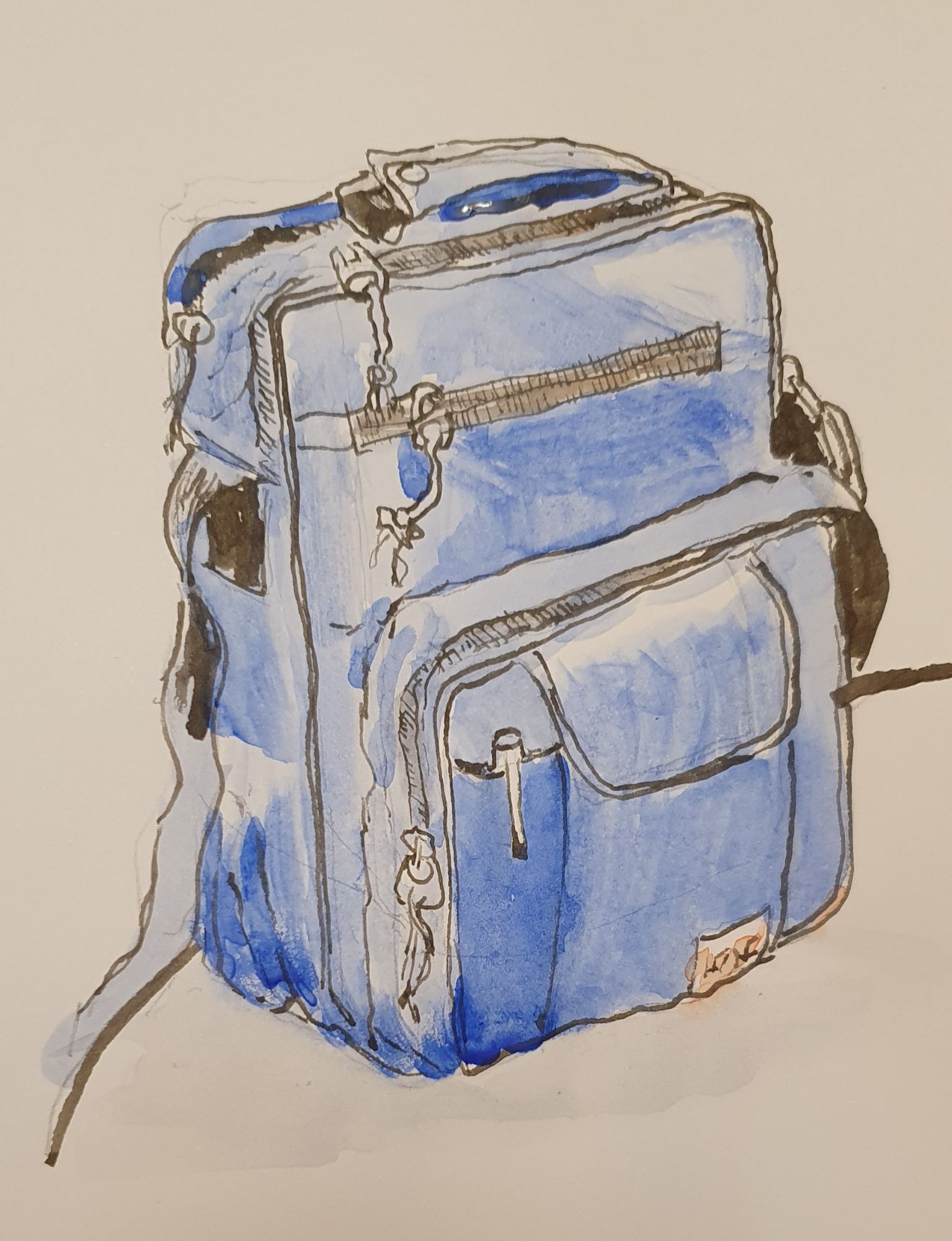
Inky pursuits is my series of occasional posts, gathering together some of my recent pen-related shenanigans which might not otherwise be blog-worthy stories on their own.
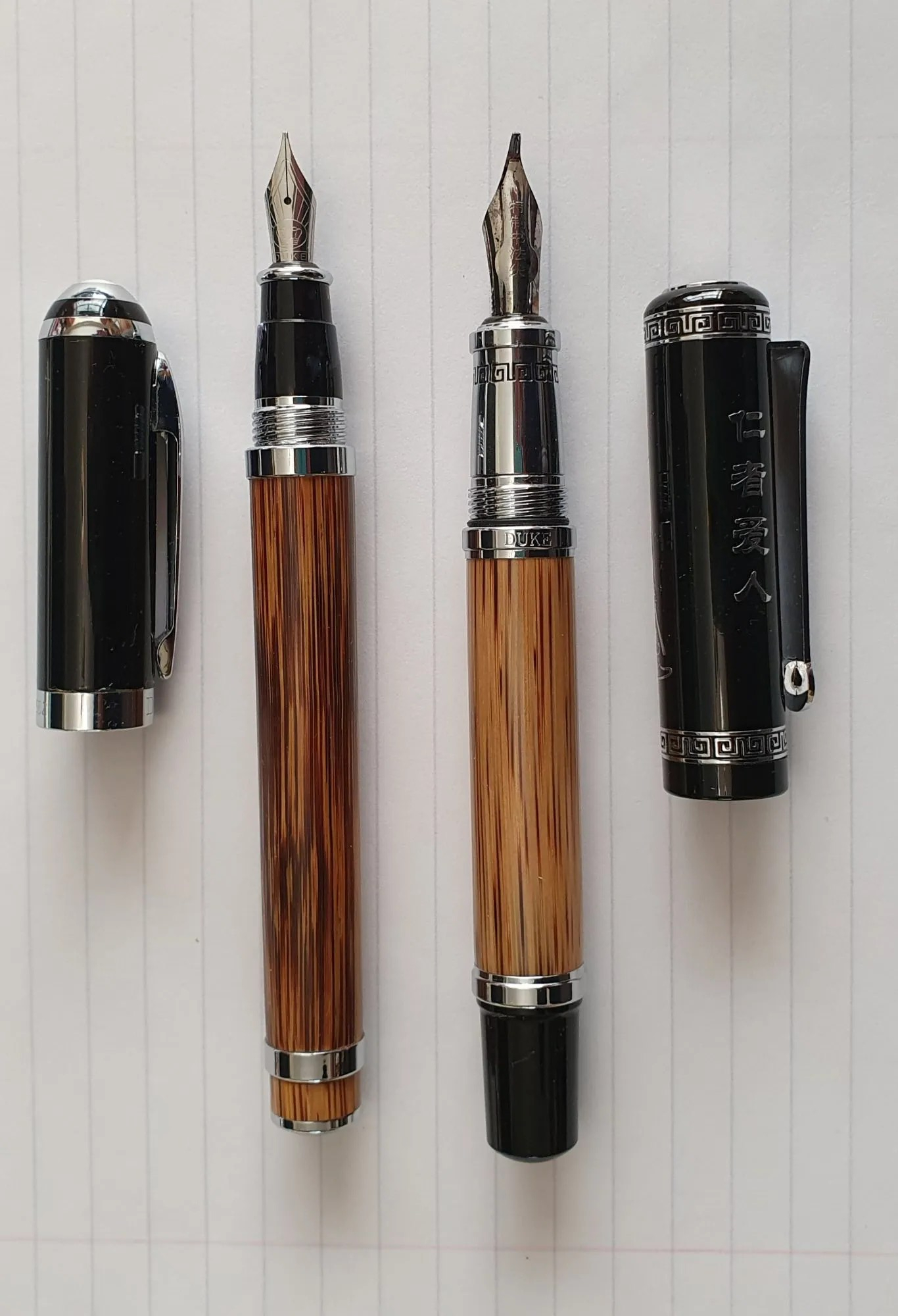
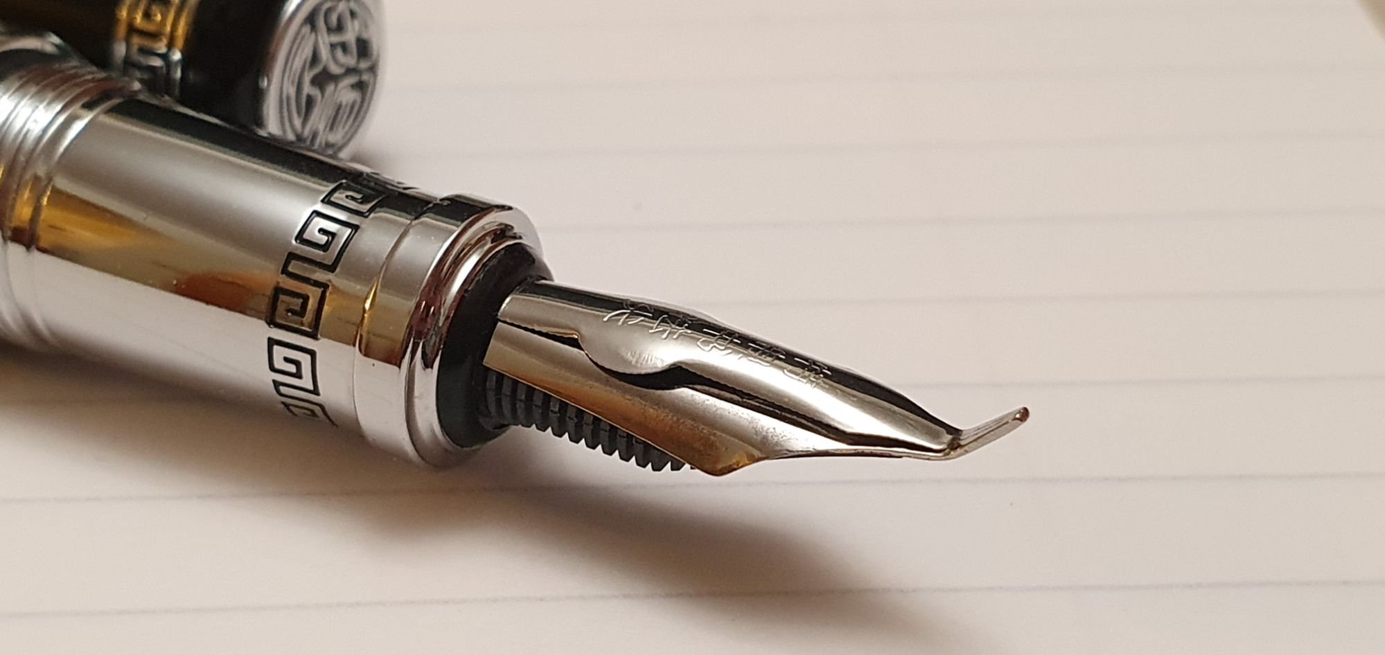
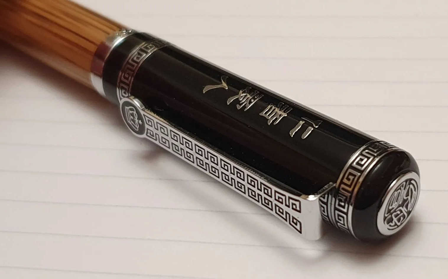
Duke 551 Confucius update.
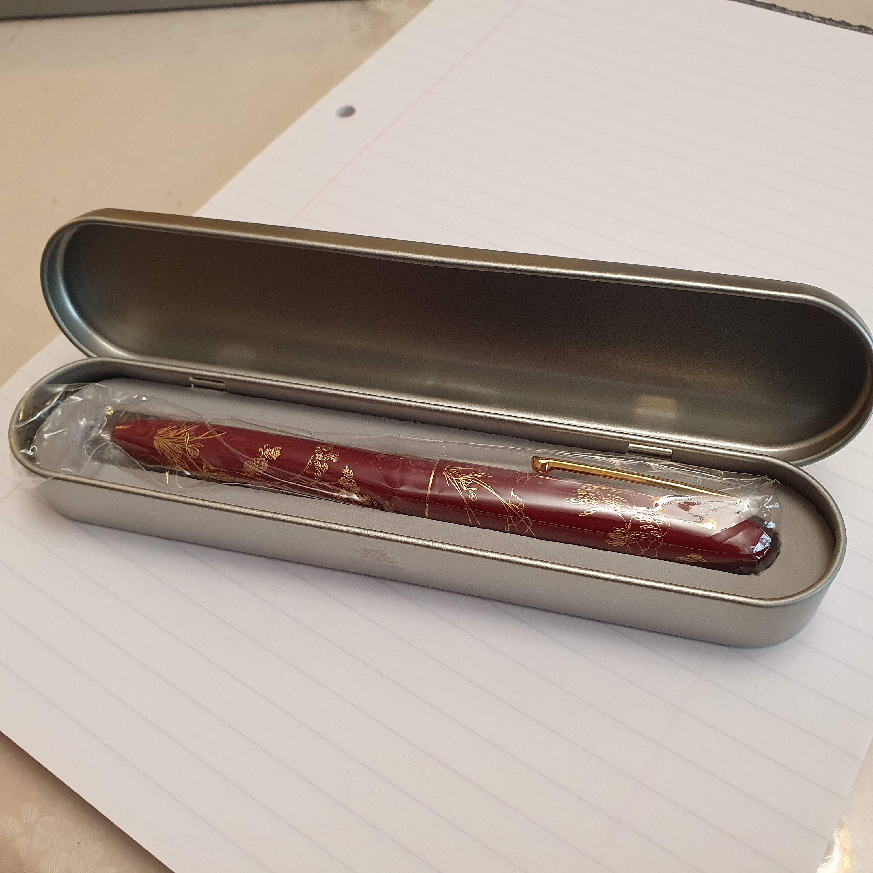
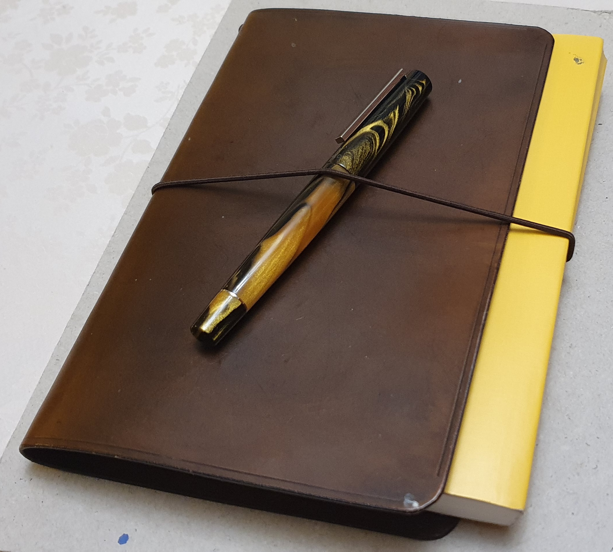
This was my only new fountain pen acquisition in an otherwise dry January. I am enjoying it immensely although it takes a bit of getting used to. The size and weight are like nothing else in my pen cup. I love the look and feel of the natural bamboo wood of its barrel. I read in the Amazon description that this is Golden Silk Bamboo, whereas the Duke 552 is said to use Golden Stripe Bamboo which looks darker and more exotic.
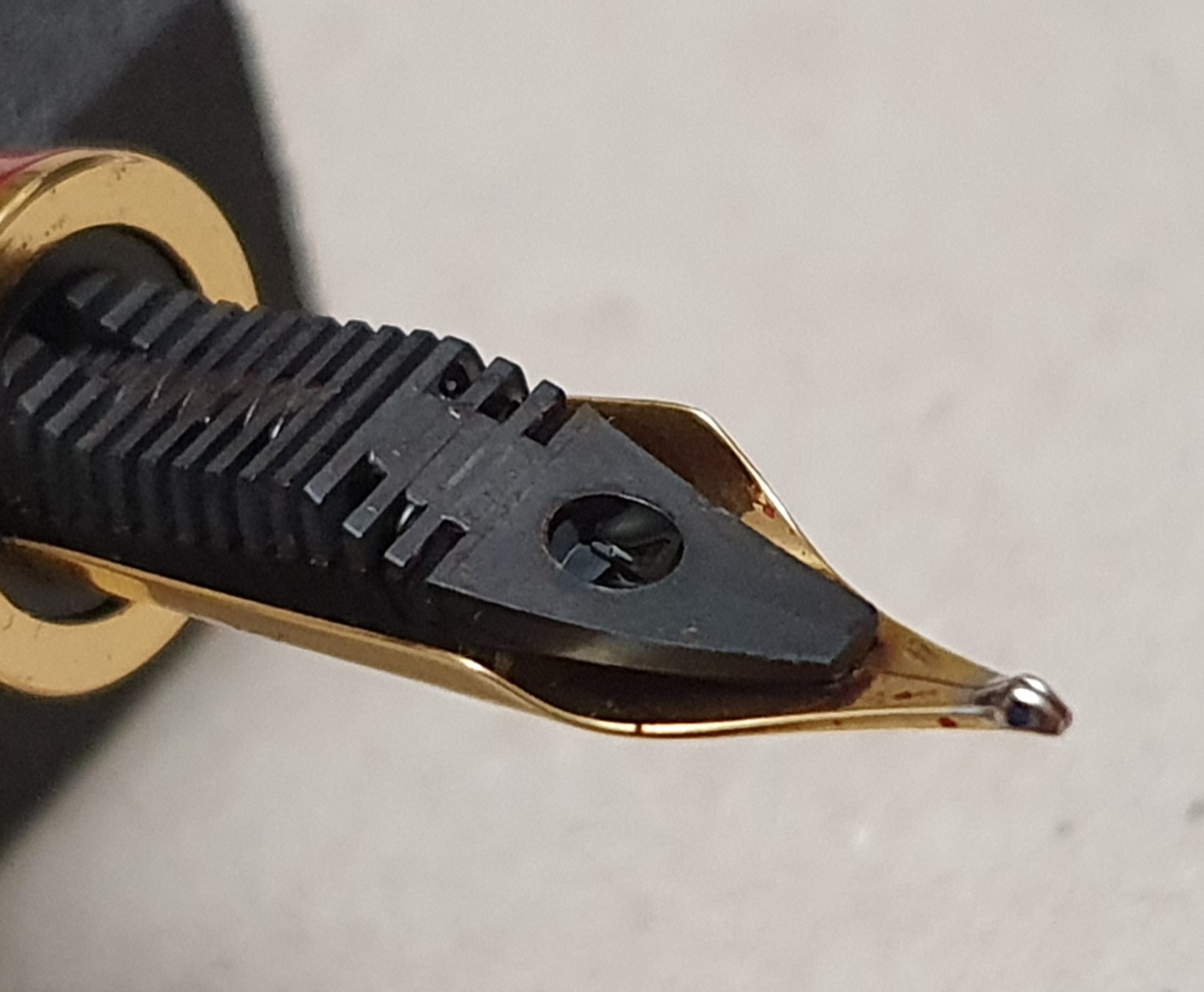
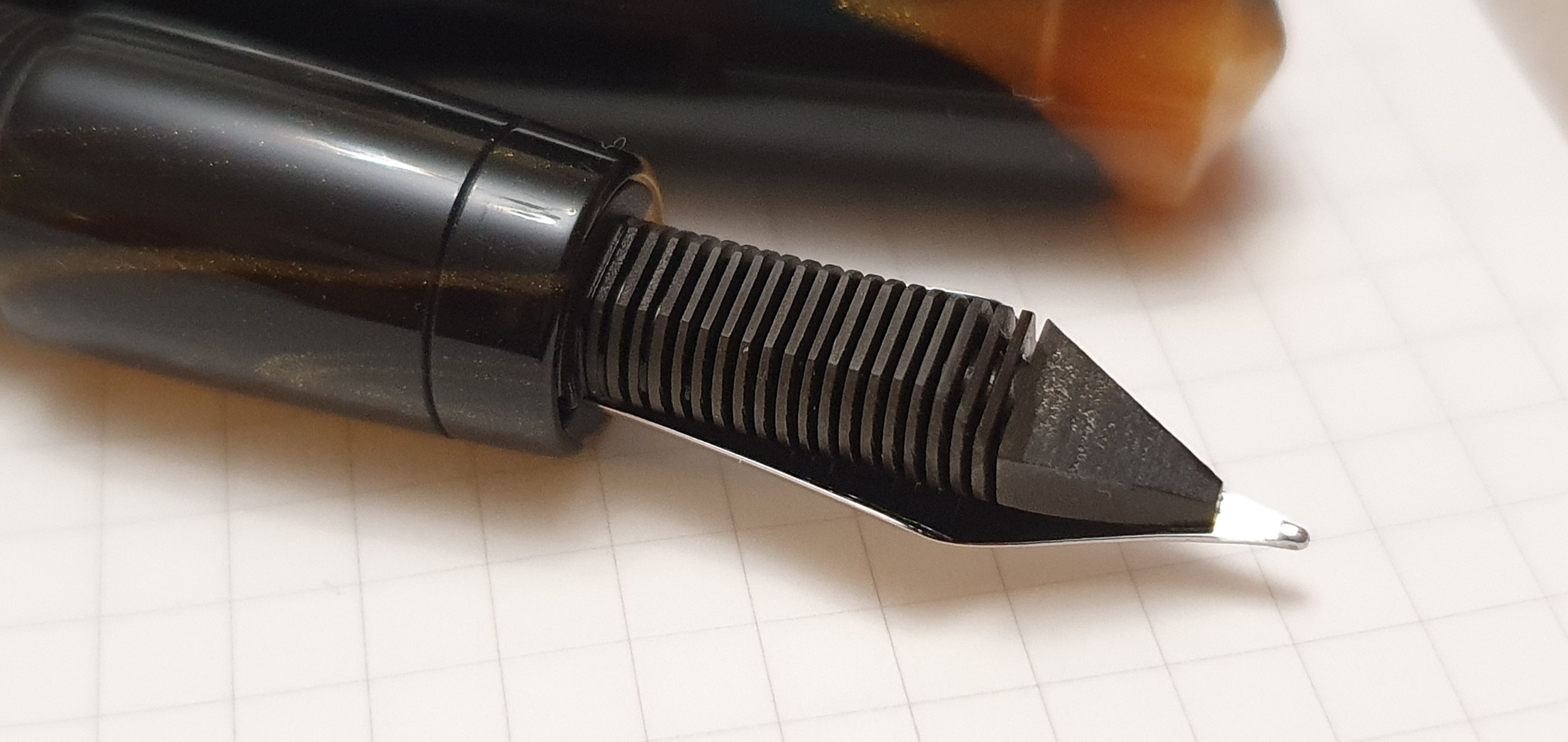
I need to correct one statement made in my recent early thoughts post on the 551, where I said “It is not a zoom nib and there is not an easy way to get a medium width line between these two extremes.” With a little experimenting, I found that by lowering the angle at which I hold the pen it is actually very simple to get progressively broader lines, until you end up with the entire flat part of the nib on the paper, giving a line about 4mm thick. It can fill a row, in my Stalogy 4mm grid paper journal. Also, the twin slits/three tines nib ensures that the flow keeps up with demand: even when repeatedly laying down lines of the maximum width.

Montegrappa Blue Black ink.
The pen drew much interest when I brought it along to our January pen club meet. I was asked about the ink in it, Montegrappa Blue Black. I had bought a bottle in Selfridges in 2018, when buying my Montegrappa Fortuna:(that was a good day!). I had not used the ink much, feeling that the colour was a bit light, and preferring my Diamine Tavy blue black. Now, six years on, I find myself liking the Montegrappa ink more and am glad to have kept it. Unfortunately, it appears no longer available as I have not been able to find any online. However there will no doubt be many close equivalents from other brands.

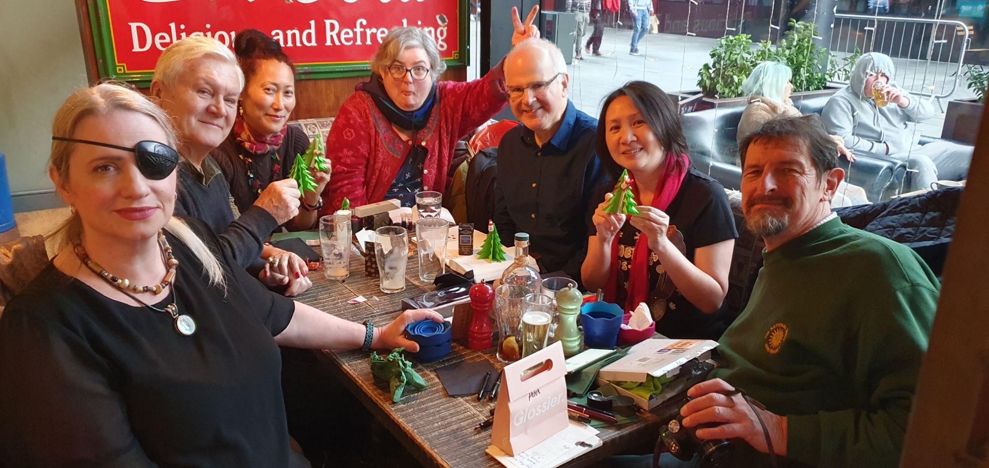
The London Fountaineers pen club.
As mentioned, we had a monthly meet up recently. As always, I got to try lots of different pens and inks. Looking back at my notebook, one of the stand-out pens for me was a Pilot Custom 743 with a number 15 size “SU” (stub) nib, in 14k gold. It was Bryan’s pen and was inked with Yama-budo (I think: I didn’t write that down) and felt absolutely lovely, being very narrow for a stub, and highly enjoyable for ordinary writing.
Having said that, I am still very pleased with my new Pilot Custom Heritage 912 with its number 10 size Waverly nib. As a reliable pen, with a fine nib, loaded with a blue black ink (Pilot) with some water-resistance and a nib that copes with all types of paper and writing styles, it is a very useful tool.
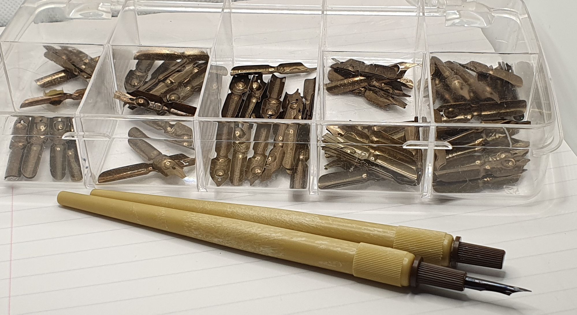
One of my pen club friends, a former calligrapher, gave me a huge stash of William Mitchell dip nibs, all left-foot obliques but in a variety of widths. There must have been over a hundred of them. She also gave me a couple of mapping pens – very fine dip pens, with the nib fixed in a plastic housing which can be removed from the holder and put back the opposite way around, for ease of carrying. I had never seen one before. They will be great to include with a travel kit. I am most grateful!
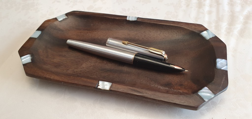
One of the ladies, Kim, brought along an old Parker 45 that she had been given, that was hard-starting and blobbing. I disassembled the nib and feed and was able to replace them in better alignment, which I hope was all it needed. The pen filled ok, with her Waterman Mysterious blue. I was able to give her the good news that her nib, which she had thought was steel, was actually 14k gold and that the “X” on the underside of the housing signified “extra fine”.
Inkcoming.
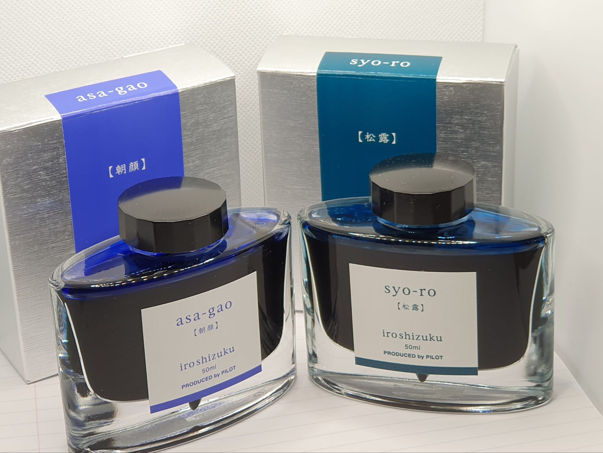
Whilst in Central London to accompany my wife on some errands recently, we made a short detour to the lovely Choosing Keeping, where I bought two bottles of Pilot Iroshizuku ink, in syo-ro and asa-gao, both of which had been on my radar for some time. I also picked up a couple of boxes of Kaweco cartridges (Ruby Red and Smokey Grey), this being one of the few places in know of in London where you can buy such things. Ruby Red lives permanently in my Online Campus Fluffy Cat pen.
Mark Twain goes Titanium.
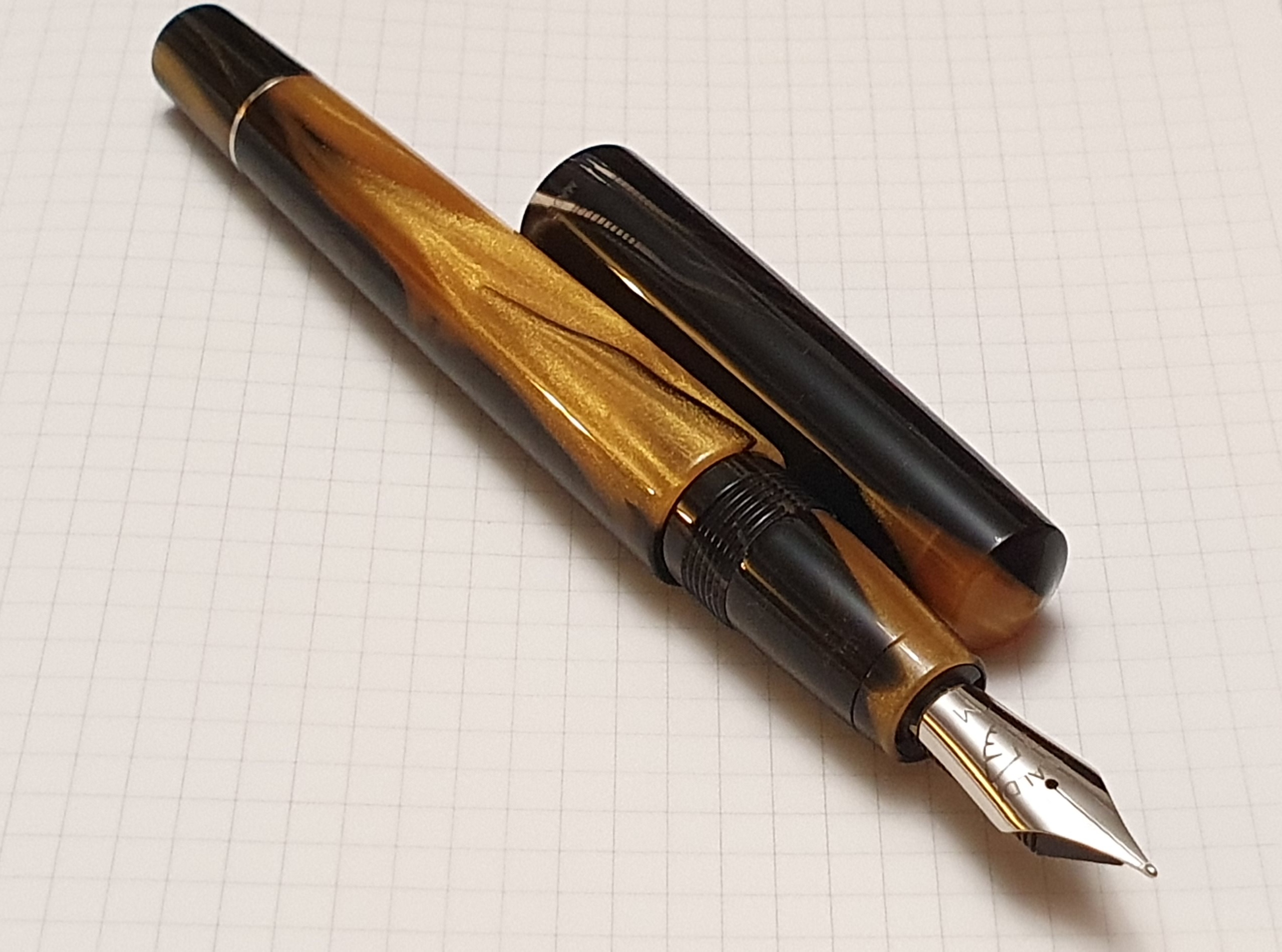
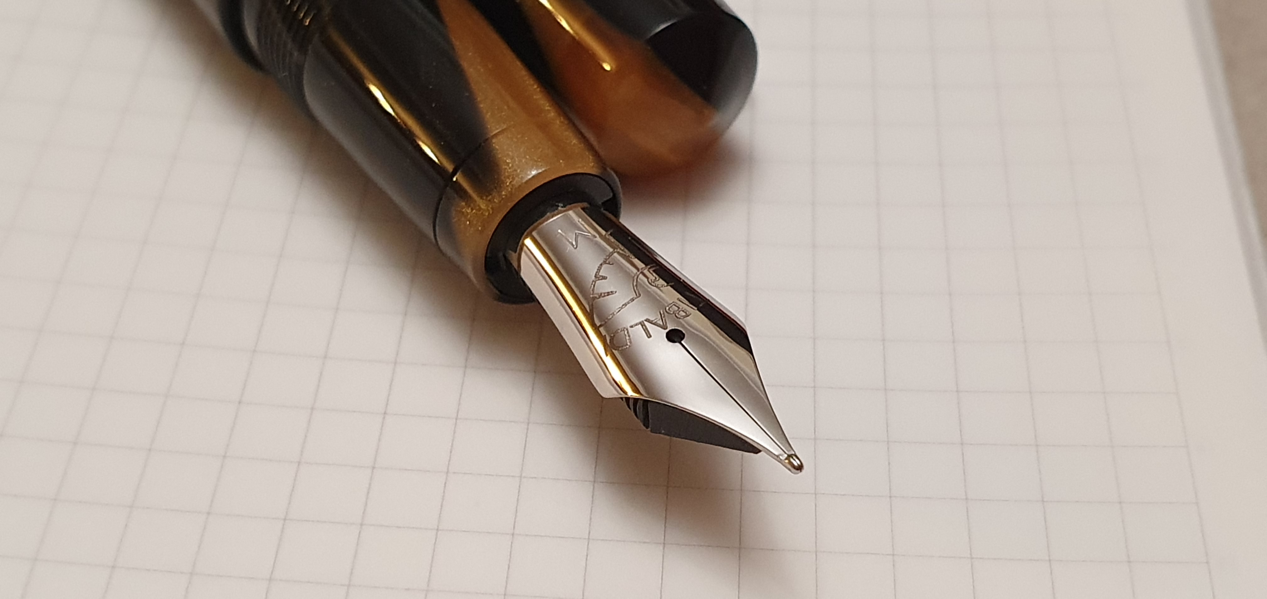
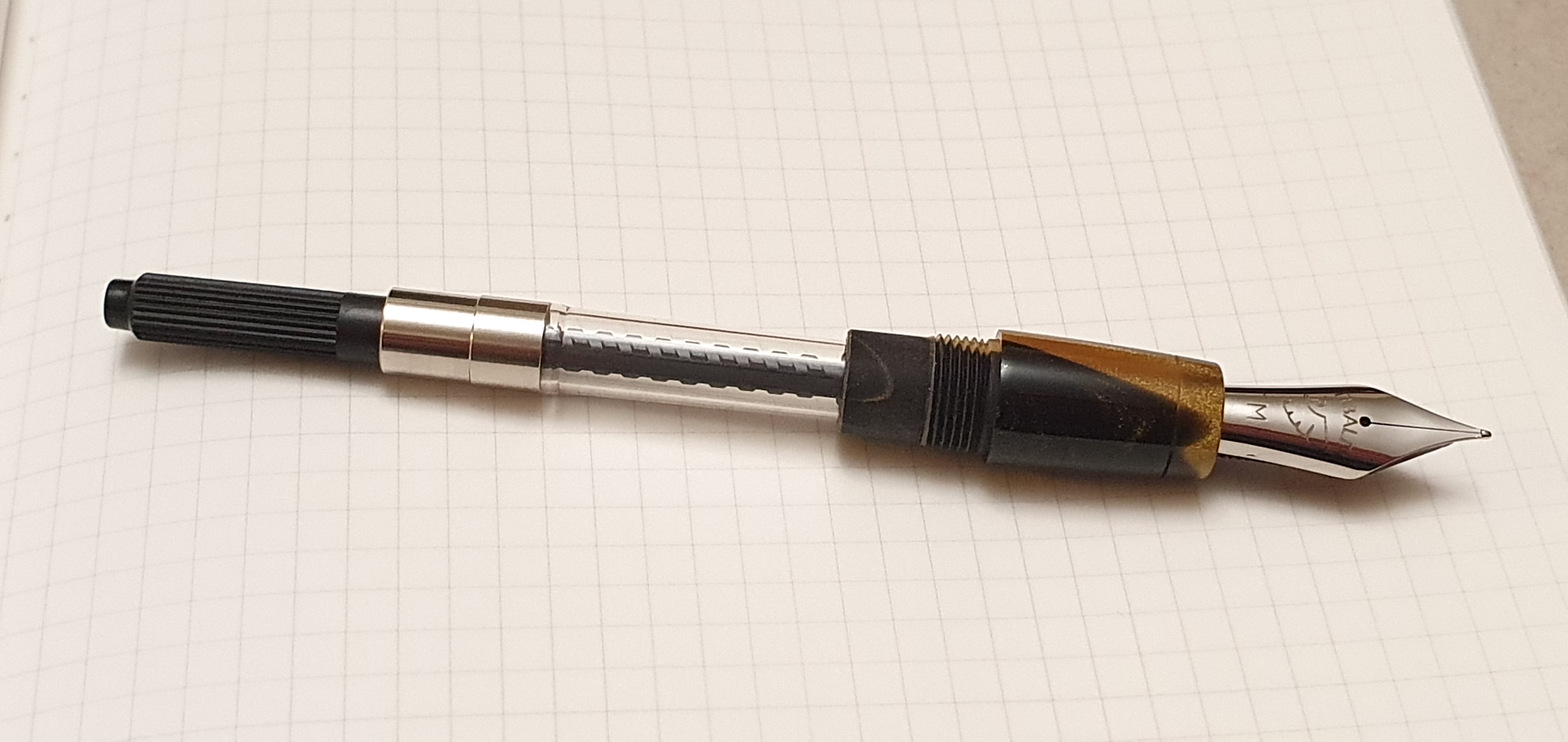
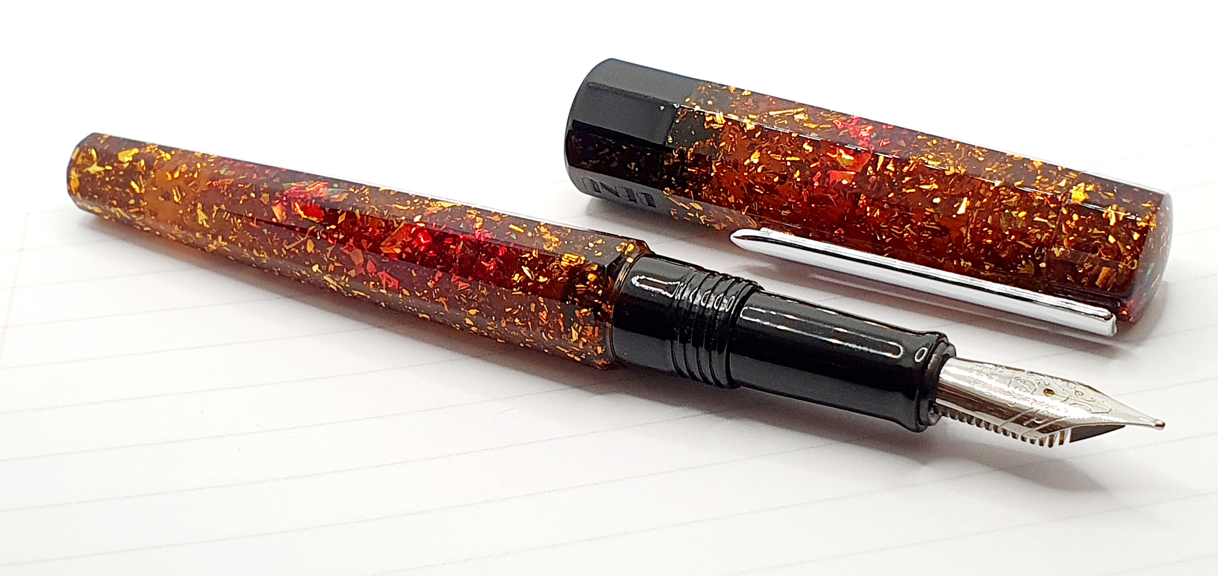
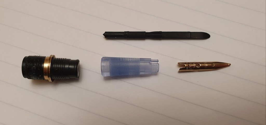
In March 2023 at the London spring pen show, I bought a Conklin Mark Twain Crescent Filler, in black with rose gold fittings and a black-coated nib. Unfortunately the nib proved rather too wet for my liking and I did not succeed in adjusting it much. At a recent pen show, I had bought a Titanium nib set in an ebonite housing and feed. The housing was not compatible with the Conklin unfortunately and I could not find any other pen that it would fit and so it sat idle.
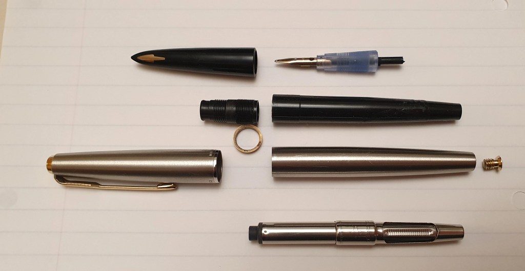
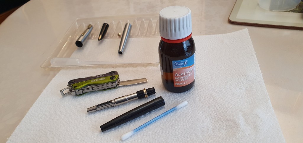
That is, until last week. I decided (just around midnight when I should be going to bed) that I could extract the Titanium nib from its housing and swap it into the Conklin. Removing the two nibs to carry out the transplant, proved harder than I had expected as they were both VERY tight in their housings. I had to resort to gripping the housings with pliers (copiously wrapped in kitchen towel) and at last they came out.
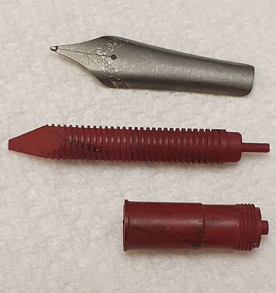
I was rewarded with a much improved writing experience with the Conklin. I filled it with Parker Quink Black. I am using it as my journaling pen for February. The only slight issue is that the shoulders of the nib just touch the sides when I screw the cap on. However this is only slight and the nib seems un-affected. I could try bending the shoulders in but fear that it would risk distorting the tines or ruining the nib’s symmetry and so I will leave it alone.

All in all, the year finds me with a deep sense of gratitude, for the joy of this hobby and the friendships that it brings. Recently, I cleaned two large batches of pens and reduced my currently inked number to twelve. Right now, I want for nothing more in my pen collection and so a dry February looks on the cards. I cannot make any promises when the pen show comes to town in March, but it is good to keep an open mind.