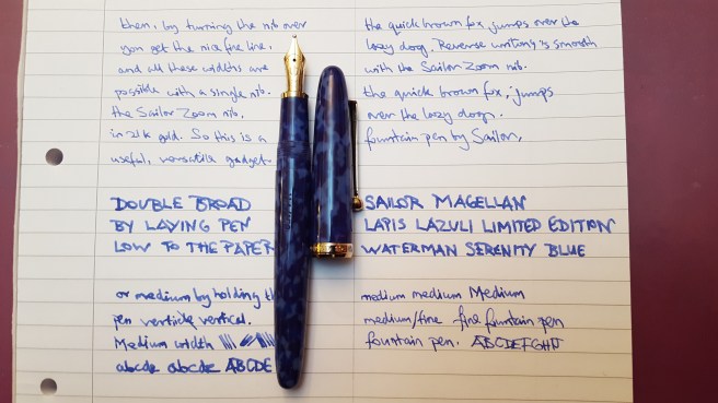
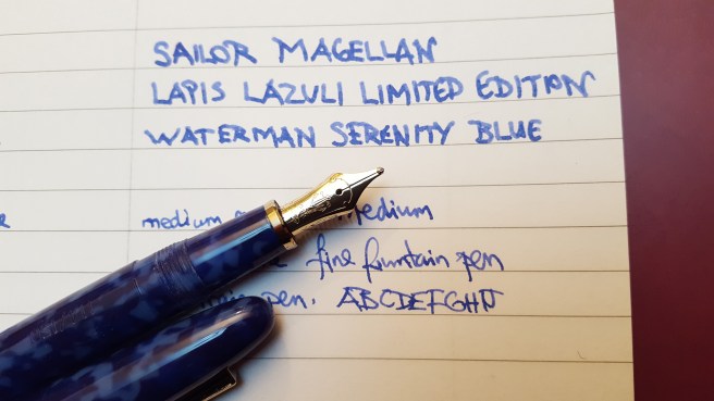
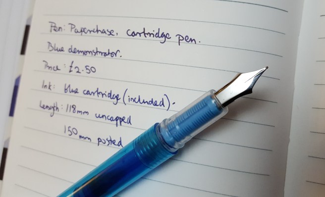
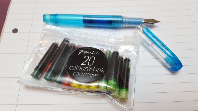
Today I was asked to put together some notes about an unexploded bomb which had remained in the family for over 40 years before moving to a museum.
It seemed impossible to tell the story without saying a little about my late father, who died in 1983. It is not about fountain pens but there is a little about collecting things. And so here is an abridged version.
The story of dad’s bomb.
My late father was born in Ealing in 1929, and grew up in Hangar Lane, West London. He was ten years old when the Second World War broke out in 1939 and remained with his parents throughout the war.
From the 1950’s until 1974 (when made redundant) he worked for Ultra Electronics, in Perivale as a general and electrical maintenance engineer. He then moved to a similar position at EMI in Ruislip. He had left school with minimal qualifications but was very practical and experienced at making and fixing equipment.
One of his main hobbies was target shooting. He had a firearms licence and always kept a variety of pistols and rifles, which he would shoot at Bisley or our local gun club, often bringing me with him from a young age. He also had a few old muzzle-loading flintlocks and percussion cap pistols and one which he had built himself. He enjoyed casting his own bullets in lead, in his garage. He also built a small cannon on a wooden carriage, which he fired in the garden at midnight every new year’s eve to see the new year in.
He collected old incendiary bombs and tall, brass anti-tank shell cases, which, along with his cannons and large jagged pieces of shrapnel, were arranged on the floor around our TV set.
Against this background, the largest item in his collection was an unexploded German 500 pound bomb. As I recall, he got this in the mid 1970’s from an industrial estate, possibly near Perivale or Kew, West London where, probably since the war, it had served as a speed limit bollard, standing upright by the roadside, with its base set in a car tyre filled with cement. It was painted white with the speed restriction painted in black figures, for vehicles entering the estate.
I remember going in the car with him, to collect it. I have a vague recollection of him telling me that he had heard the bomb fall during the war. I suppose if you heard a bomb falling, you would wait for the explosion and if none came, you would be curious to find where it had landed.
I cannot recall now how he knew it was there or why it was being disposed of. Perhaps the site was being redeveloped and he might well have simply asked whether he could have it. I believe we went there in his grey Vauxhall Cresta Deluxe, a 1966 model, which he had bought second hand with part of his redundancy money and so it would have been around 1974 or shortly after. The bomb went in the large boot of the car. I imagine we left the plinth behind.
At home, he set about cleaning it up, at the back of the garden, near his bonfire patch behind the garage. He was confident that it was safe. The cylindrical metal detonator device had been removed. He had read several books about the various types of detonators and tense stories of bomb disposal work, on UXB’s (unexploded bombs).
Originally there would have been metal tail fins on the bomb but these had long since gone. He was able to access the inside of the bomb case, through its base. It was largely empty, the explosives having been removed but there were vestiges of this (TNT perhaps) around the inside, which he chipped away and which came out in thick, rusty brown clumps. These, he assured me, were quite safe and he chucked them on his bonfire, where they fizzled and spat a little.
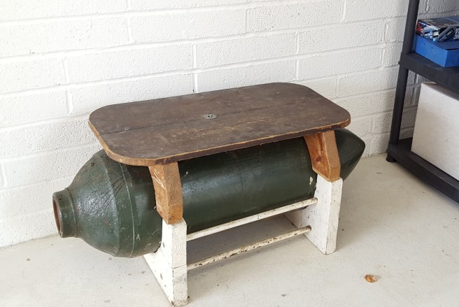
Once satisfied that he had got the inside as clean as he could, he gave it a new coat of paint, in British Racing Green. He then made a sturdy wooden cradle for it and a bench seat at the top (pictured). For the next 15 years or so, it remained in our house in Ickenham, either as a seat around the dining table or latterly, in the hallway beneath the coat pegs. We enjoyed having it. It was a rather different and eccentric, to have a 500 pound bomb in the house.
Dad died in 1983. The bomb stayed in the house until my mother moved some six years later and since then has been in the wider family, in the custody of my aunt until she also moved house in 2016 and then my cousin. Now, having survived for over 70 years in these various unexpected roles, it will be great for the bomb to move to a museum.


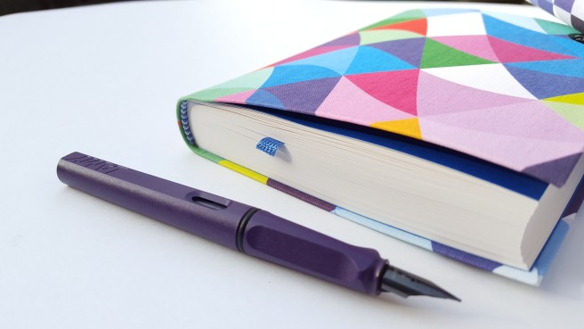
 My liking for notebooks goes back to childhood when it was a treat to visit Arthur Birds, our local independent stationer and book seller in Ickenham, a villagey suburb on the outskirts of London. Then, as now, I appreciated good quality and for a notebook, that included having stitched binding so that you could open the book flat without risk of the pages breaking loose.