If you had asked me about this a few years ago, I would not have known what you were talking about. It is one of those things that I picked up from the internet. Sensing that it seemed to be one of the rites of passage of fountain pen enthusiasts, I gave it a try today for the first time.
For the benefit of other newbies, we are talking about taking a fountain pen that is a typical cartridge/converter type filler and instead removing the cartridge or converter and filling the barrel directly with ink. The benefit, supposedly, is that you have a greatly increased ink capacity and do not need to fill the pen as often.
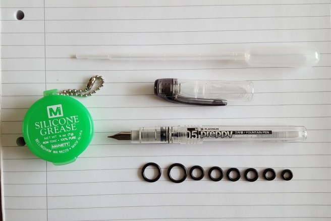
In order for a pen to be suitable, it needs to have a plastic barrel and plastic threads and for there to be no metal parts which might otherwise corrode from sustained contact with ink. Also the barrel must have no hole at the end, for obvious reasons.
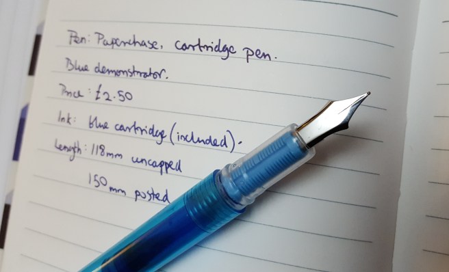
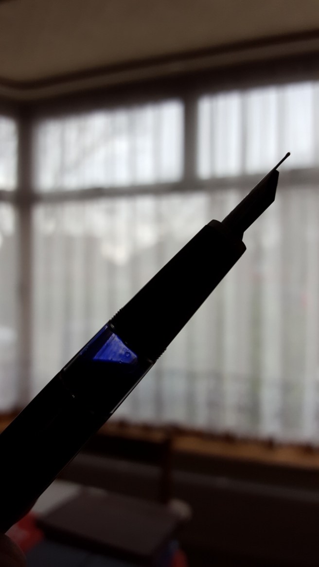
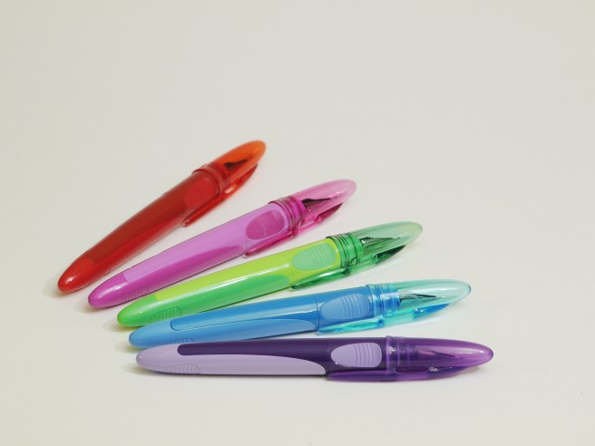
The Platinum Preppy meets all these criteria and is a good choice. It is a very inexpensive pen, (mine was £2.79 from Cult Pens) but with a good nib available in a range of widths. The clear demonstrator barrels also mean that you can enjoy the sight of your ink sloshing around inside.
On the other hand, arguments against filling the barrel with ink are that there is a risk of greater mess if anything goes wrong. Perhaps if you were going travelling and did not want to take a bottle of ink, then having an eyedroppered Preppy would keep you writing for a good while but travelling with such a pen would be a worry. So you might want to keep your eyedropper for use at home or at work. But then given that you are likely to have a ready supply of ink on hand at home and work, it seems that there is not much of a case for an eyedroppered pen either for travelling or for home/work use. Maybe it would suit students who write large amounts of lecture notes every day, provided the pen is carried with care.
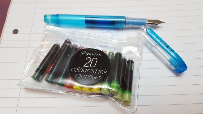
For the benefit of anyone who wants to try it, there are just a few items that you will need, as well as a suitable pen and some bottled ink, as follows:
- Pure silicone grease, to put in the threads.
- An O ring, to prevent leakage.
- A pipette, or syringe to transfer ink from a bottle to the barrel of your pen.
Gathering all of these items takes a little bit of hunting. I had heard that Silicone grease could be purchased from dive shops and as luck would have it, we have a dive shop in my corner of London. The O rings can be bought in packs from the plumbing section of DIY stores. And the pipette I spotted in an art supply shop in a pack of ten.
The operation is very simple. You take an O ring, stretch it over the threads and roll it down until it is seated at the end. I tried one of the large ones to start with, but then found that the smaller one will stretch over the threads making the rubber slightly narrower so I went with that size instead. You then take just a small amount of the pure silicone grease on your finger and smear it into the threads. Then, using the pipette, draw up some of your chosen ink and release it into the barrel.
According to an instruction video from Brian Goulet that I have just re-watched, it is recommended that you keep the pen at least half full of ink. Also, I read on an information sheet that came with a Noodler’s Ahab pen (another good candidate for eyedropper conversion) that air in the chamber may expand from the heat of your hand and that refilling is required when the pen is down to two thirds air, in order to inhibit excessive flow.
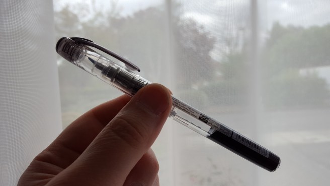
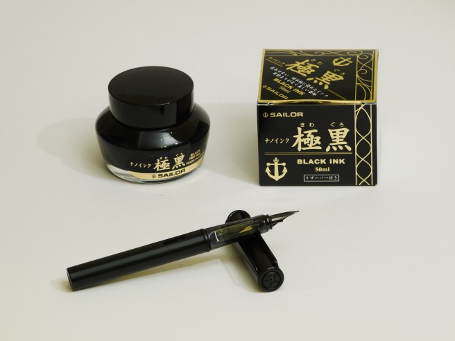
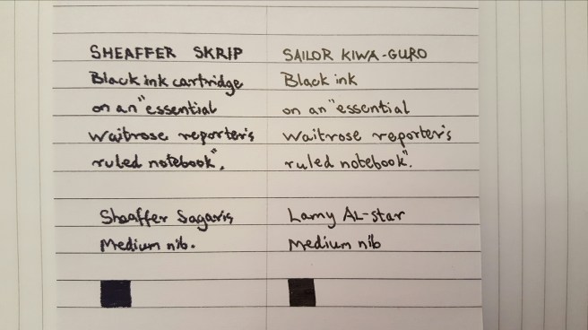
I have a Preppy with a medium (0.5) nib which writes very nicely. I had been using it recently with Sailor Kiwa-guro, permanent black ink in a cartridge which I filled with a syringe. I now planned to use this ink in the pen as an eyedropper.
On my first attempt this afternoon I had a few little issues. First I nearly forgot that the Preppy has a push on cap and I automatically started to “unscrew” the cap a few turns before realising that I was undoing the barrel and was perilously close to pouring permanent black ink all over myself. Secondly I then noticed that despite my generous application of silicone grease, ink had still worked its way part of the way down the clear plastic threads. Thirdly, the O ring was still rather too fat and so it protruded just where I grip the pen, although it did a good job of ensuring the barrel was secured pretty well. You do not want to overtighten the barrel as there would then be a risk of cracking the pen. Fourthly when I tried writing with the pen, I had a few wet blobs of ink suddenly appear on the paper.
I wondered whether this might possibly be due to a build up of air pressure as you screw the barrel onto the section, but then read the Noodlers’ advice about keeping the ink level up. I had filled the pen only half way up the barrel but went back and topped it up with some more ink until it was about three quarters full and I hope that this solves the problem.
It is rather too early to see how this is going to work out. I am very impressed with the Sailor Kiwa-guro ink and like to keep one pen inked with this, as it so useful for writing cheques or addressing envelopes. I know it is said to be fountain pen friendly, but I still feel a bit wary of having it in more than one pen at a time with the risk that it might get left to dry in the feed. I had washed it out of my Lamy AL-star and decided to use it in the Preppy instead. I like the way it moves around in the Preppy, without leaving much trace on the barrel. And unlike cartridge ink, the eyedropper method means that you do not get ink staying at the wrong end of a cartridge and causing ink starvation.
I am not sure yet whether I am going to keep the Preppy eyedroppered or go back to using cartridges. But at least it is another milestone in the fountain pen journey, to mark off the list.