
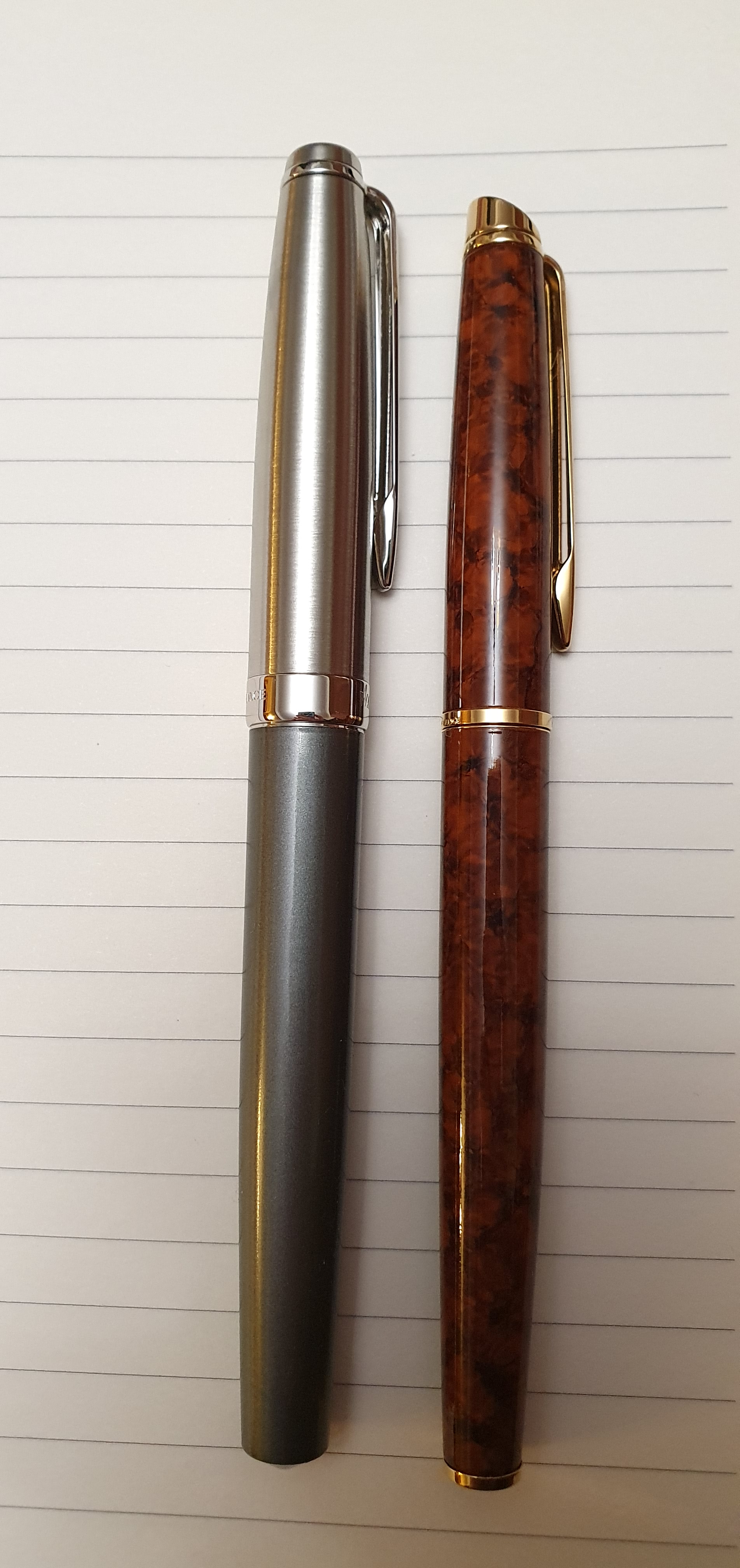
This is a current but not new model in Waterman’s range. It is one of their lesser spotted models, at least here in the UK. I remember first seeing them online a few years ago and that they were available in a choice of black, red, white or blue. There were also grey and a gold coloured “Deluxe” versions with a more lustrous finish.
I did not buy one at the time, but having spotted a Deluxe grey one online last weekend at a very attractive price, I went for it. It has been with me for only five days and is still within the honeymoon period but I shall try to give a balanced opinion.

Unboxing.
The pen came in a small and simple cardboard box, with a white protective outer box. Inside is a pen tray where the pen is gripped by an elastic band under a white sash. The tray lifts out and underneath is a sheet with filling instructions and an international 3 year warranty. One Waterman blue cartridge was included but no converter. Full marks for the presentable packaging which can be kept or recycled.

Description.
This is a smart, elegant pen with a plastic barrel and a brushed stainless steel cap. The cap finial is flat and plain. The pocket clip is firm and functional with a gap down the middle and the Waterman logo at the top. The glossy polished cap band reads Waterman Paris on the front and France on the back.
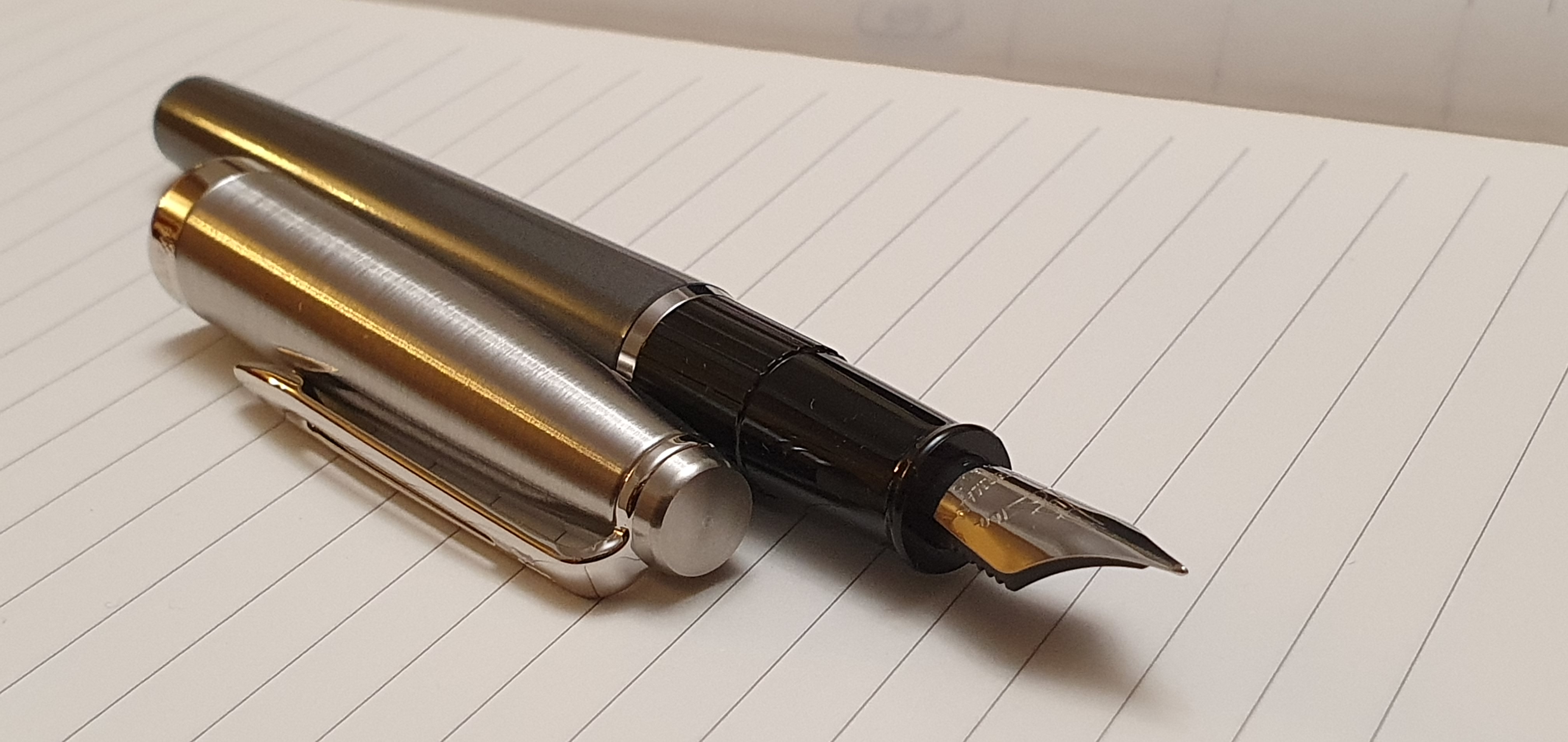
The cap and barrel are almost flush and the transition is smooth and tactile. The barrel tapers gently and ends in a shallow conical point.
The snap cap closes tightly with a reassuring click. It could be carried in a jacket pocket, with confidence that the pen will not drop out of the cap.
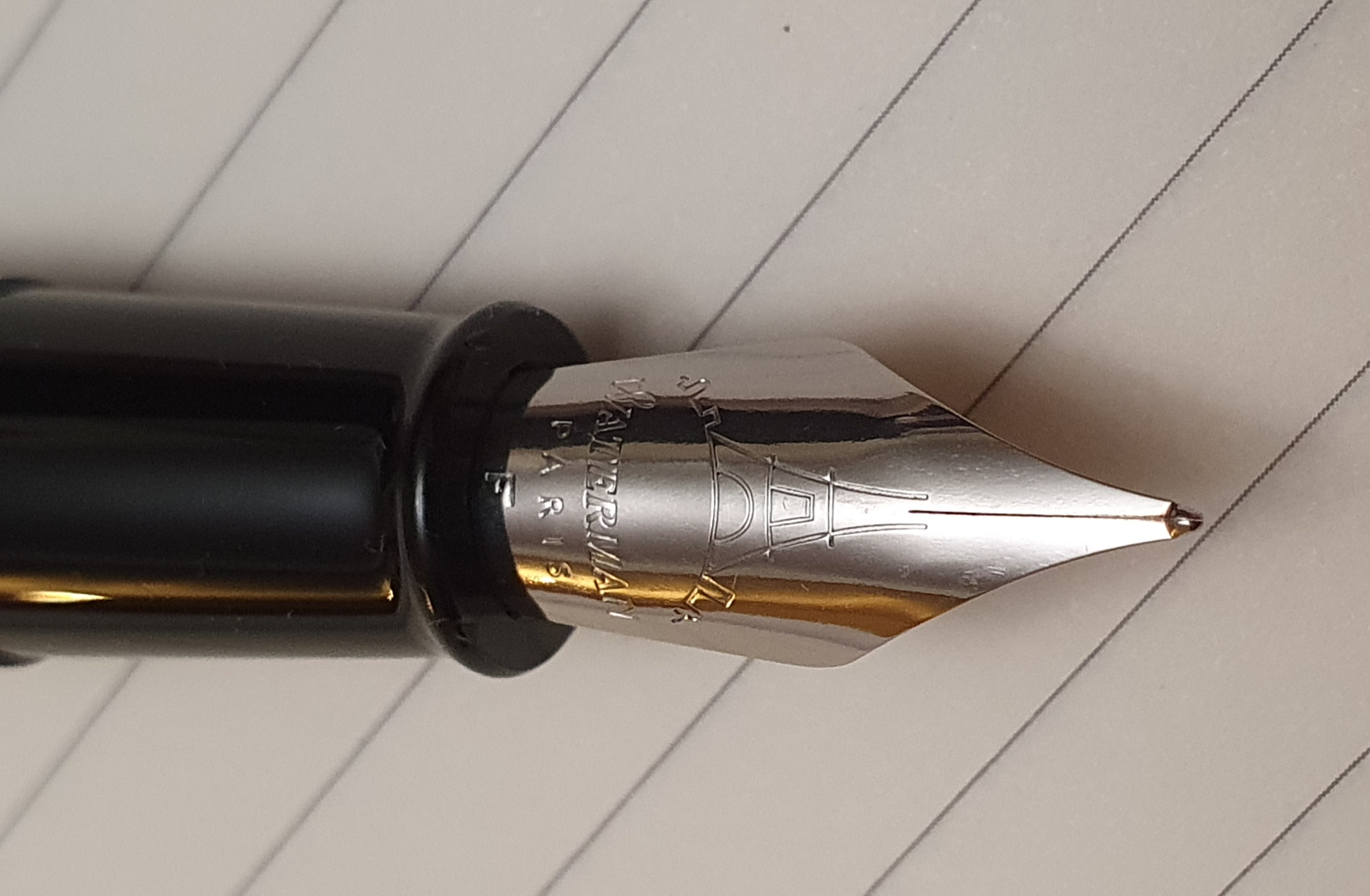
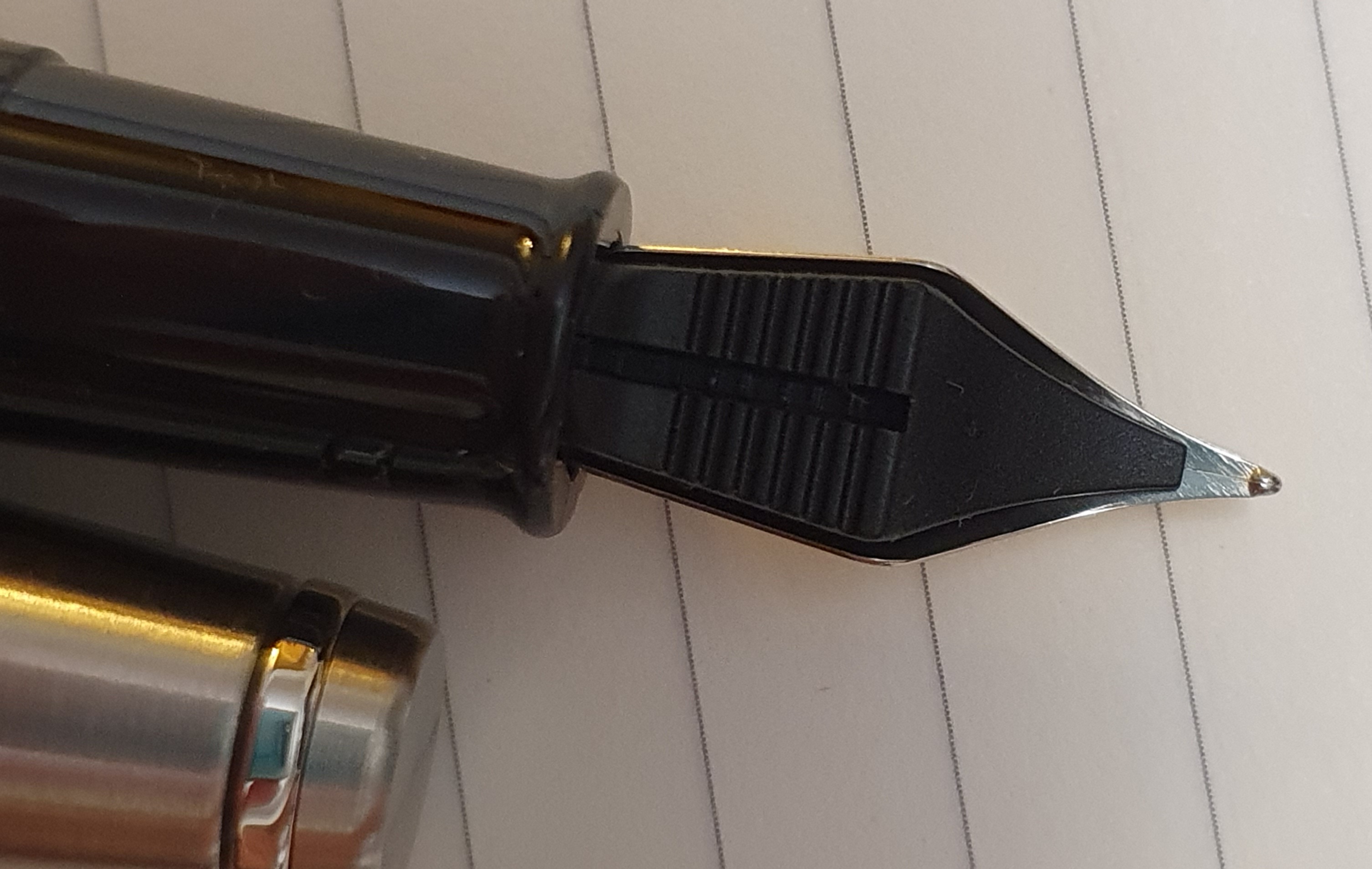
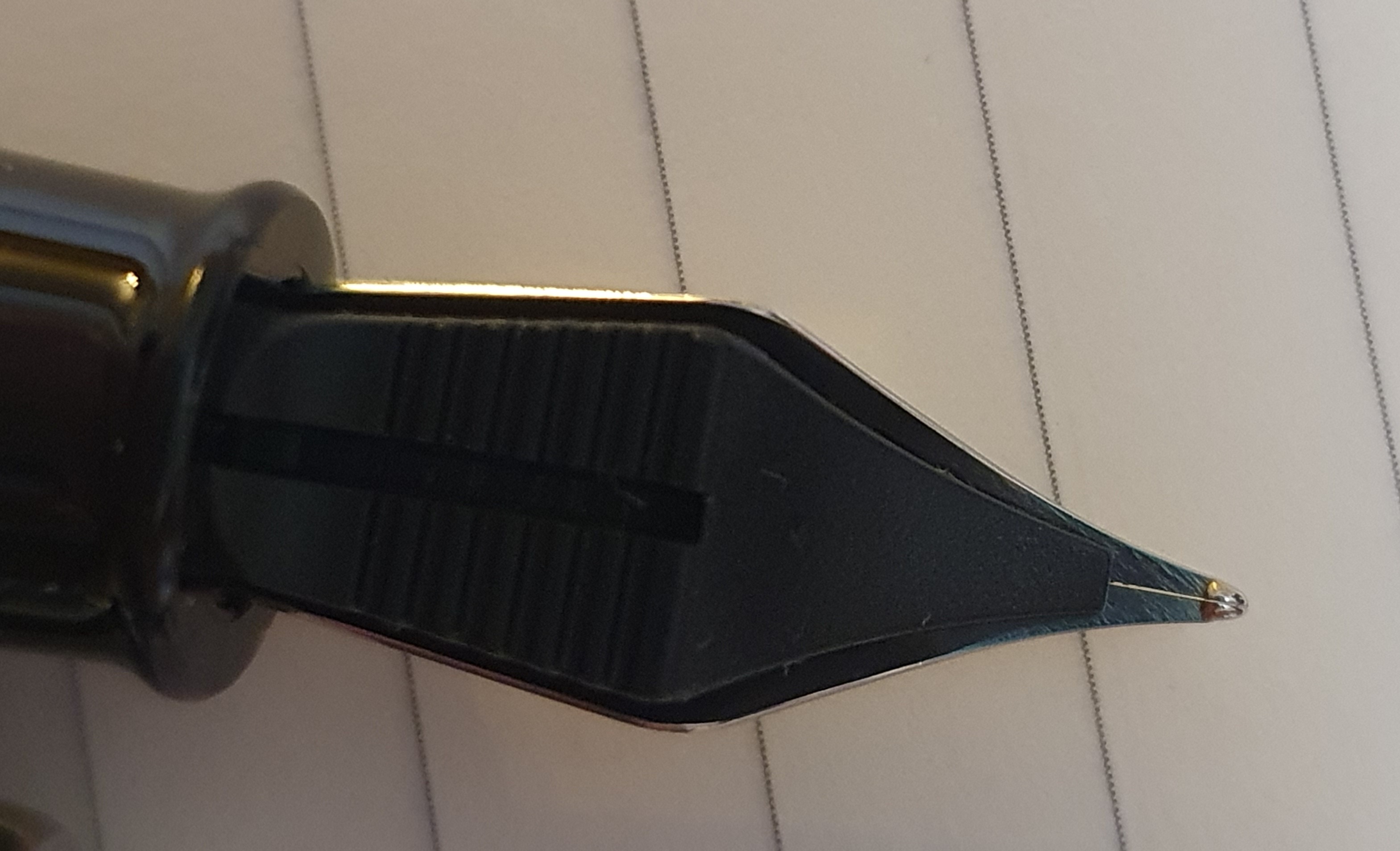
Removing the cap, you have a stainless steel nib, featuring an Eiffel Tower image and Waterman, Paris, and the nib grade, “F” in my case. There is a black plastic grip section, ridged at the top end and smooth at the lower end with a lip which serves to stop your fingers sliding onto the nib and to secure the pen in the cap. The plastic grip section design is the same as that which was used on the Waterman Phileas and also the Kultur and so is well tried and tested.
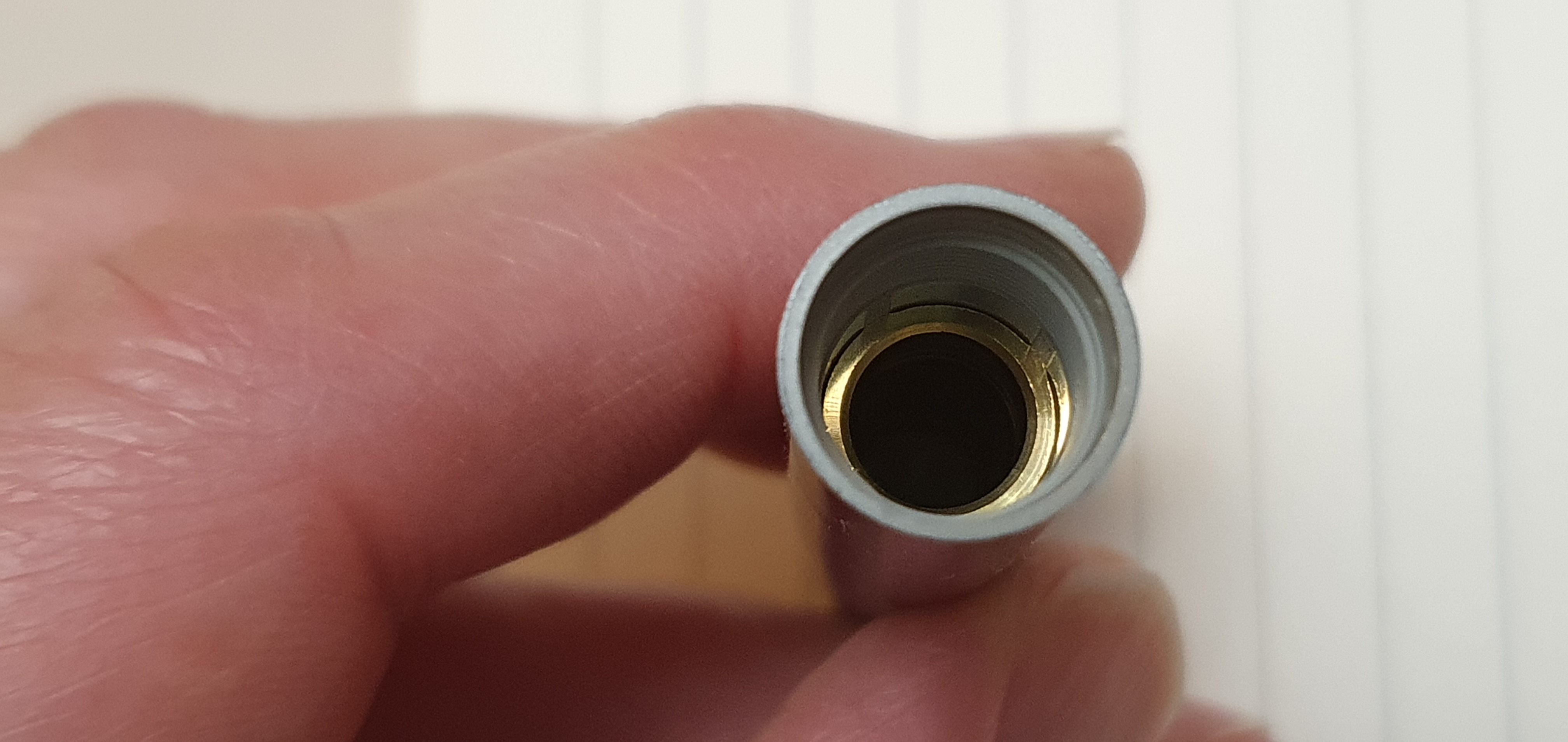
Beneath the barrel, which unscrews on plastic threads, there is a plastic collar in which to insert a Waterman cartridge.
Inside the barrel, a brass liner can be seen, which is a very nice feature and adds a little more heft and strength to the pen. There is still room to fit a Waterman converter in the pen if you prefer.
The nib.
According to Waterman’s web site, the Emblème has the largest nib in the Waterman range. It is engraved with a unique Eiffel Tower design. There is no breather hole. The tines were even and level. The tipping was smooth and symmetrical. It might have been an ideal set-up for the majority of users with an “underwriting” style, but my personal preference is to have a very slight gap between the tines at the tip, so that ink flows as soon as the nib touches paper, without needing any pressure. This is preferable for an “overwriting” style. I therefore spent a few minutes in flexing the tines up and down a little just enough to get daylight between the tines at the tip. Having checked that the tines were still level, I then smoothed the tipping, with the very minimum of wear, on Micro-mesh pads.
Writing performance.
The result, once I had tweaked the nib to my preference, was that it wrote wonderfully: smooth and effortless with a fine line and good flow. I was very happy with this outcome.
Size and weight (approximate).
Closed, the pen is 141mm long: uncapped, about 125mm, and posted 152mm. It can be posted quite deeply but I did not like to push the cap on to the back of the barrel too firmly for fear of damaging either the barrel or the inner cap. The result was that the cap when posted soon worked loose. In fact I prefer to use this pen unposted.
It weighs 26.5g in all, as to 15g uncapped and 11.5g for the cap alone.
Likes and dislikes.
I very much like the overall smart look of the pen. I have always liked pens with metal caps, with a Parker 51 vibe. It also makes me happy to think that the nib would be protected in its cap if the pen were to be accidentally dropped or stepped upon. Also I like the Eiffel Tower engraving. The section is of a good width and can be gripped comfortably. The brass liner in the barrel is very nice benefit. You are buying into the Waterman heritage and reputation and even the name harks back to the early Waterman Emblem Pen model, dating from around the 1930’s.

There is not much that I dislike. The featureless cap finial is perhaps a missed opportunity. A coloured jewel insert to match the barrel would have been lovely but given its modest price there is nothing wrong with the simple steel disc as it is. The same might be said for the barrel finial: a metal finial would look nice but then you are not paying for a Waterman Carène here. For the price I have no complaints.
Conclusions.
The pen, at the price I paid, is great value, costing about the same in the UK as a Cross Bailey Light or a Lamy AL-Star. The full price should be around double that. I am delighted with mine and am very glad to have bought it. Whilst at work during the week, I looked forward to coming home to my Waterman Emblème. Perhaps here I am allowing myself to be overly biased in this honeymoon period but honestly my heart did a little leap whenever I thought of it. I have enjoyed letter-writing with it and have written plenty of paragraphs just for the simple and inexplicable pleasure of writing with a smooth, fine, wet nib.

that looks like a very fine pen! the finish is very pretty.
i have a question, is the nib size like a parker F or is it different? both brands are french, if i’m not wrong.
LikeLiked by 1 person
Yes I would say that a fine nib whether from Parker or from Waterman will be about the same width. Parker was founded in USA whereas Waterman are French. It is when you look at Japanese nibs that their nib grades may be narrower than western ones. So a broad nib from Sailor may equate to a medium nib from a western brand.
LikeLike
Interesting. The Emblème had blipped on my radar before now, but not to a sufficiently compelling level. I’m glad to read that it has a metal insert in the barrel which I’m sure must help with the balance of the pen. At full price, you’re more than halfway to a Hémisphère which would always be my preference. At the price you paid, how does the Emblème compare to the Allure?
LikeLiked by 1 person
Personally I prefer the whole look, feel and the writing experience of the Emblème to the Allure. I prefer the more contoured shape, the acrylic and steel (rather than aluminium) and the wider less slippery grip section. I got on better with the nib than I did with the Allure’s nib. The Emblème was much reduced in price and so I got a good bargain.
LikeLiked by 1 person
That’s really good to hear. Considering the retail price, I felt it had to be a significant improvement on the Allure, but you never can tell. I keep my Allure at work where it is great for jotting occasional notes and never gives me any trouble, starting without any hesitation even if it hasn’t been used for a couple of days.
LikeLiked by 1 person
I just love your “Whilst at work during the week, I looked forward to coming home to my Waterman Emblème.” That’s the language of a true fountain pen lover.
The picture together with the Phileas and the Kultur nicely confirmed my suspicion as I was reading your review: it looks like the Emblème is the modern reincarnation of the other two, only sturdier and with a more classical cap. Could you say anything about its writing properties in comparison with the Kultur? (I have a Kultur myself and wonder whether my collection demands the addition of an Emblème.)
LikeLike
Thank you. Yes, the nib, the feed, the grip section and the shape of the barrel are all the same for the Emblème as for the Kultur but with superior materials and build – such as the brass liner in the barrel. As for the writing properties, I was fortunate to succeed in tuning the nib of the Emblème to my liking. The nib of the Kultur looks the same size and shape and so should also be capable of pleasurable writing, but much depends on how it is set up and, if not already to your liking, whether you are able to adjust it. At the end of the day, it is just a piece of metal but you may need a loupe and some Micro-mesh and a bit of courage to tweak it a bit!
LikeLike
Another ancestor of this pen is the L’Etalon model, with a similar if not functionally interchangeable section and an 18k gold nib of the same size and shape. It is regrettable that Waterman discontinued making this pen, which is not only beautiful, but also a marvelous writer.
LikeLiked by 1 person
Thank you. I was not familiar with the Waterman L’Etalon but have looked at some photos online and they look impressive. As you say, it is a pity they are no longer made.
LikeLike