It is probably safe to say that blue is my preferred colour when it comes to fountain pens. A quick glance at my pen cups shows blue pens to be the most prevalent. And looking back at my pen buying over the past few decades, I have generally gone for a blue, if there was a choice.

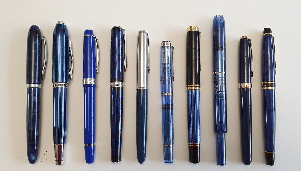
The pens above, from left to right are:
- (1) Campo Marzio Accropolis;
- (2) Cross Peerless 125;
- (3) Cross Bailey Light;
- (4) Diplomat Excellence A Plus;
- (5) Parker 51 aerometric;
- (6) Pelikan M205, blue demonstrator;
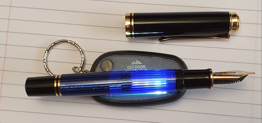
- (7) Pelikan M800;
- (8) Platinum Curidas, Abyss Blue;
- (9) Sheaffer Prelude, cobalt blue with rose gold trim;
- (10)Waterman Expert, (1990’s).
I have had no regrets about choosing blue for any of the above. The Cross Peerless, in quartz blue, is possibly the most handsome pen that I own, along with my Aurora 88 (black and gold) and the Pelikan M800. Nevertheless I remain tempted by the Peerless in titanium grey, imagining how nice this would be with a burgundy or dark red ink.
It is not just fountain pens in blue that I prefer, but inks too. Whilst I have accumulated a stash of ink of many colours, blues are by far the most numerous and of these, I tend to fall back on the same favourites time and time again, including Waterman Serenity Blue, Montblanc Royal Blue, or Graf von Faber-Castell Cobalt Blue. When I want a blue black, I usually reach for the Diamine Conway Stewart Tavy.
I have a fair number of other colours too. I sometimes feel like trying a turquoise, but usually seem to go off it before the end of a fill. But flushing a pen does not always have to mean jettisoning the remaining ink, when there is an option to use it in a mix.
Occasionally I experiment with new (to me) colours to broaden my horizons. This year I have been enjoying one pen and ink combination per calendar month for my A5 page a day diary. In April, it was a Moonman S5 filled with Diamine Scribble Purple – which looked, to my eyes, rather less “Deep Purple” and more “Black Sabbath.” I was looking forward to the May changeover However, rather than ditch the remaining Scribble Purple, I simply added some Robert Oster Fire and Ice, plus a little Serenity Blue, and found that I had made myself a very acceptable blue black. I was happier with this than with either the Scribble Purple or the Fire and Ice on their own.
One of the many things that I love about the Moonman S5 is its ability to receive top-ups of ink from half-spent cartridges or converters in pens that I want to clean, or ink samples, into its clear demonstrator eye-dropper barrel. The see-through acrylic lets you keep an eye on the reservoir for any signs of inks clashing.

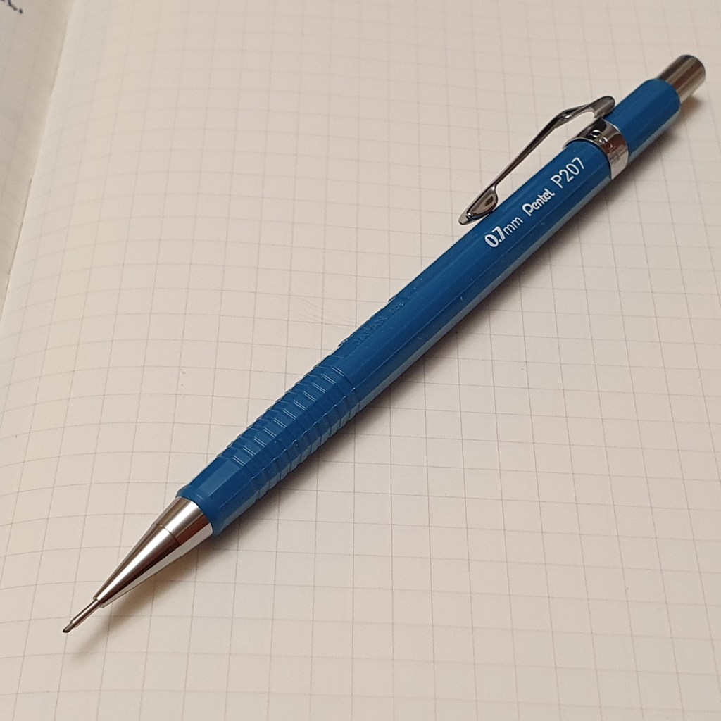
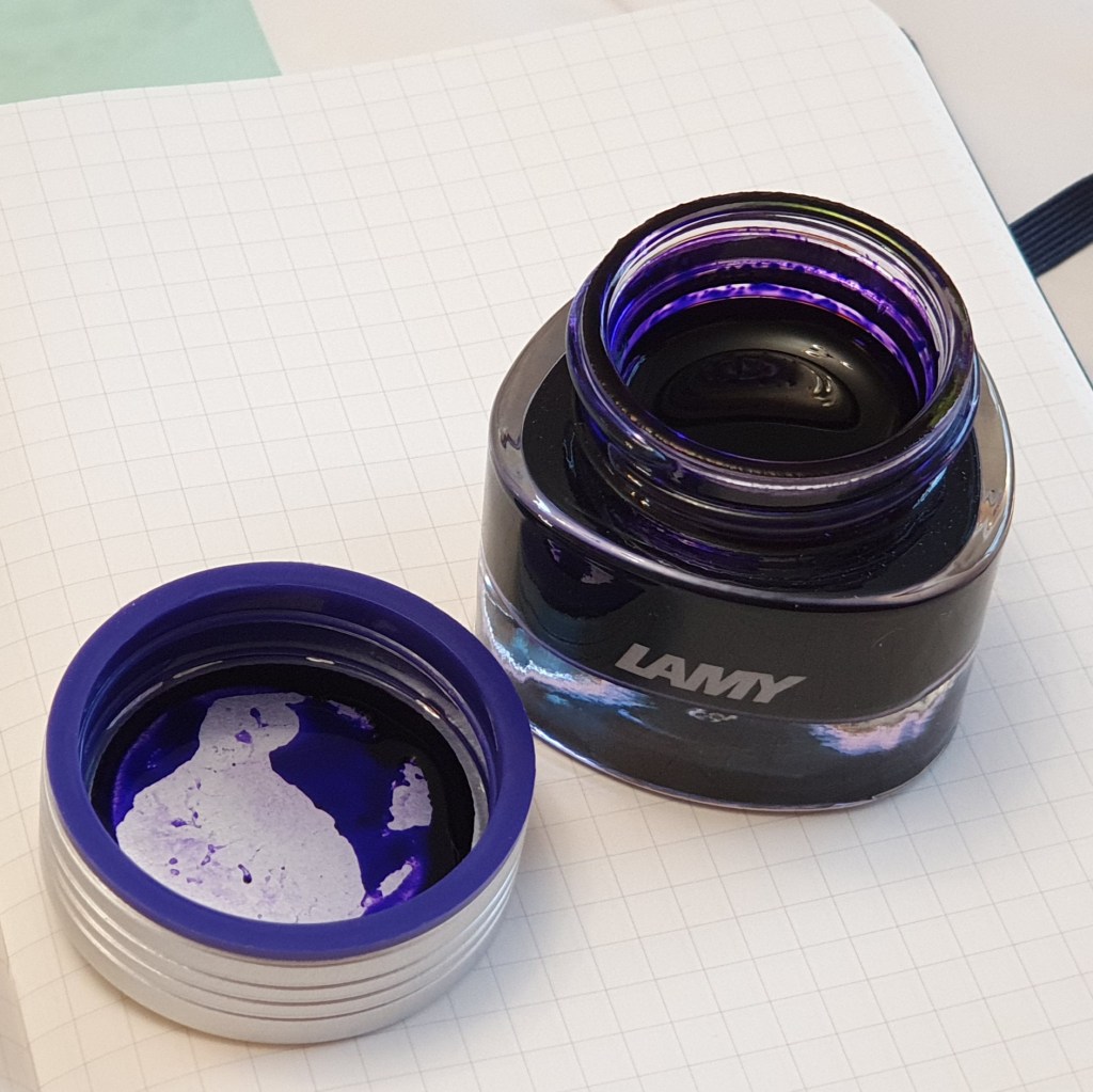
Recently, visiting a delightful stationery shop in Eton, I found a display of the Lamy Crystal range of inks, which I had not tried before and bought a bottle of Lamy Azurite, which looked promising as a vibrant rich blue, although I had not done my homework and had not appreciated that it also has purple leanings. I also bought the classic, Pentel P207 (0.7mm) mechanical pencil, which is a pleasing blue. I think my blue credentials are clear!

I suppose that we all learn more about ourselves as we get older. One conclusion for myself is that I would not mind too much if I had to restrict myself to a royal blue ink, in a blue pen. I just never tire of that.


My preference in fountain pen colors are black with silver accents and blue with gold accents. My ink color preferences are black, blue, and blue/black. I also have a Sheaffer Prelude (cobalt blue with rose gold trim). It is a beautiful pen. The majority of my fountain pens are Sheaffers: No Nonsense, Preludes, and School. My inks are mostly Sheaffer Skrip inks.
LikeLiked by 1 person
Thank you for your comments. These are good choices and there is a lot to be said for keeping to inks that you like and know well.
LikeLike