This fountain pen was one of my lucky finds at the London Pen Show, in October 2017. Unfortunately I cannot tell you what it is called, since the pen, the nib and the packaging are devoid of any branding. I have been calling it “my Mystery pen”. I hope that someone reading this might recognise the make or model and let me know by commenting on this post. Meanwhile, if you want one, all I can suggest is that you come to the London UK Pen Show next time and hopefully the seller might be there again. I hope so, as I would like to buy another one.
Construction and appearance
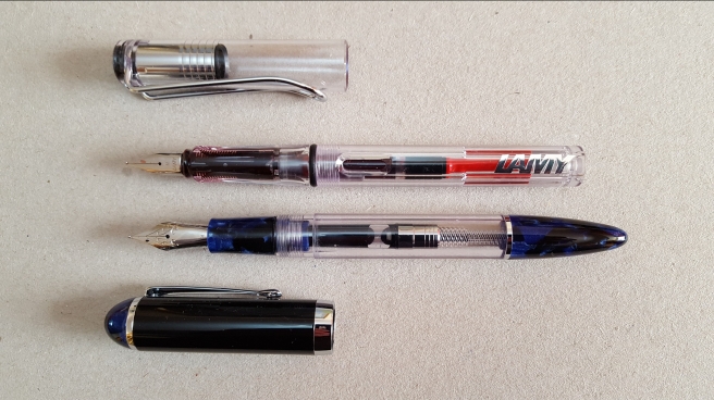
This is a large, cartridge/converter/eye-dropper pen, with a suitably large stainless steel nib, in a plastic body. It has a clear demonstrator barrel, with a distinctive bullet shaped end cap in an attractive, marbled blue and black. The grip section is of the same blue and black pattern. The cap is black, but with a rounded finial also in the blue and black. Other colours were available.

The cap screws on and off in two twists. There is a sprung inner-cap (like on a Platinum 3776 Century) and so as you cap and uncap the pen, you feel the resistance of the spring inside.
There is a sturdy, metal pocket clip, a shiny chrome cap band (no branding) and one chrome ring separating the clear part of the barrel from the end cap. Presumably, there was intended to be some branding on the cap band.
The packaging consisted of a black cardboard tray, with a foam insert with cutaways for the pen and a syringe for eye-dropper filling, in a black cardboard sleeve. There was a page of instructions for each of the filling options, but again with no brand name or address.

The syringe did have a brand name, Terumo, which seems to be a medical supplier and nothing to do with pens.
Nib and filling mechanism
The nib is stainless steel, and looks like a size 6. There is some scroll work on it and the letter M for medium, but a smooth empty space in the middle, where presumably a brand name was to be inserted.
The plastic feed and the nib are friction fit and can be pulled out for cleaning or adjustment.
The pen came with a converter but also accepts standard international cartridges, or can be eye-dropper filled.

Size and weight
The beauty of this pen is its generous size making for a very comfortable writing experience and no need to post the cap. Sizes and weights are approximate.
Length closed: 151mm (6″)
Length open: 140mm (5 1/2″)
Length posted: 174mm (6 9/10″)
Weight closed/posted: 25g
Weight uncapped: 15g
Weight of cap only: 10g.
My favourite figure above is the length open, 140mm. What a treat. I am happy with 130mm (a Lamy Safari) but this is even nicer, even allowing for tapering of the end cap.
Likes and Dislikes
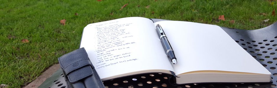
Since I bought the pen, it has remained inked, mostly with Graf von Faber-Castell Cobalt Blue but more recently with Conway Stewart Tavy, by Diamine. There is such a lot to like about this pen and here are a few points, in no particular order:
- nib writes smoothly with no effort at all (I even wrote “dreamtouch” in my ink journal, in a nod to the vastly more expensive Visconti);
- very comfortable to hold and grip, leading to neater writing;
- a great size for me, especially that 140mm unposted length;
- sprung inner cap. I have not had any problems of hard starts;
- screw cap, rather than push on;
- excellent value; I paid £30.00 for it.
- a good low-cost way to test whether you like this size of pen, before buying a more costly one.
- Smooth and tactile.
As for dislikes, there are none to speak of, really. I just wish I knew who made it and what model it is.

Conclusion
As you can tell, I am very pleased with this pen. I enjoy writing with it. I have so far used it only with the supplied converter and have not tried to eye-dropper it. I imagine it would hold a vast amount of ink. I have no real need to do that. Using the pen, especially with the lovely Cobalt ink, I noticed that my usually rushed handwriting looked a little more tidy and legible (what I might call the Pelikan effect), from slowing down and writing a little more carefully and deliberately. And that has got to be a good thing. I will be on the look-out for one or two more of these in other colours, if I get the chance.


Looks comfy!
LikeLiked by 1 person
Thank you! Yes, indeed it is. And a comfy price too.
LikeLike
Not knowing what such a nice pen is, and who it was made by, would really frustrate me! And the blue patterning really appeals to me. Good luck with finding out more about it, please keep us posted!
LikeLike
Thank you! I am kicking myself for not asking the vendor at the time, what brand it is. I chose it for its obvious attributes and was not concerned about the make. You sort of assume it will be on the pen somewhere. I will let you know if I ever find out! I guess it might be made for the gift market for firms to rebrand them as their own.
LikeLiked by 1 person
Ah yes, hadn’t thought of that. Well, whoever received such a gift would count themselves lucky!
LikeLiked by 1 person
It’s a handsome pen! I like the bigger finial on the end of the barrel, it would look great eyedroppered.
LikeLiked by 1 person
Thank you. I have not been brave enough to try eye-droppering this one. My only such experience was with a Platinum Preppy. But I must give it a try and take some photos one day.
LikeLike
As long as you grease the threads it should be just fine. Something like Diamine China Blue would look perfect in this one.
LikeLiked by 1 person
The tongue under the nib is maximum found in Sheaffer pen. As you have M mark on nib is also very much in Sheaffer pen
Possibly specially made to some medical company as compliment at the request of such company might not have engraved pen name.
LikeLiked by 1 person
Thank you Mohammed. This post was written several years ago and I have since learned that the pen is the Wancher Crystal. I have two of them now.
LikeLike