My new approach to notebooks.

I have always enjoyed buying a new notebook. Like many fountain pen enthusiasts, I have a several notebooks on the go as well as a stash of new ones of various types waiting to be used.

My used notebooks could be divided into two broad categories: those which I have used for a specific purpose and would want to keep, or those which I have just filled for the joy of writing, consisting mostly of pen and ink samples or note taking.

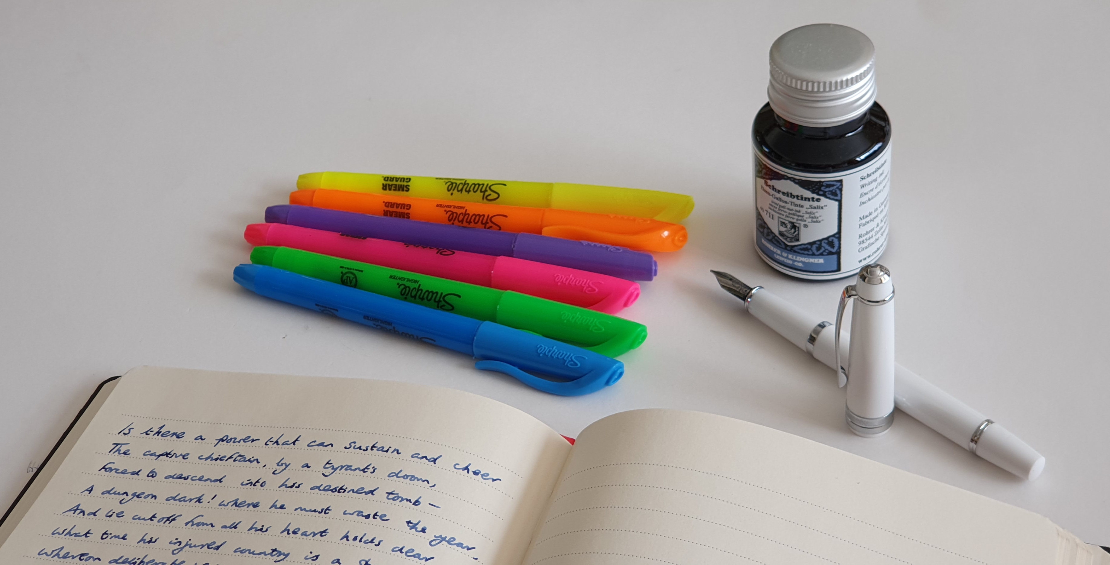
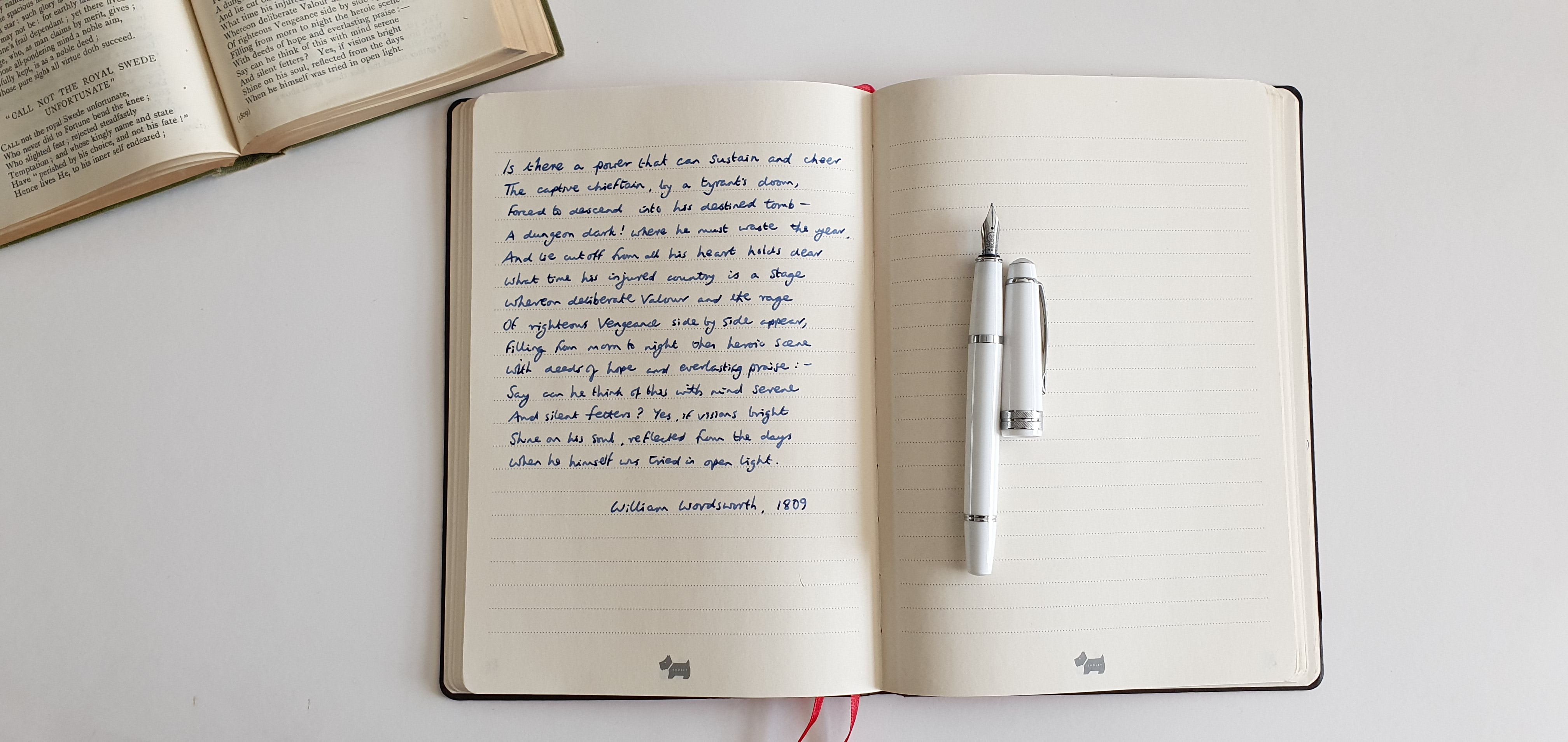
When I buy a new notebook, I often paginate it first, except of course for those when this task has been done for you, such as the Leuchtturm A5 or Taroko Design Breeze. Next I try out my currently inked pens on the last page. This has two purposes. First, it is a useful exercise to see which inks are suited to the paper and write without bleedthrough, feathering or excessive amounts of show through. I can also see how different nibs feel on the paper. It is about establishing the right tools for the job.

Secondly, it breaks the ice of starting a new book, without having to dive straight into the blank first page and risk spoiling it.

However, I have found that on some occasions I have started a notebook at the back and continued happily, with random pen and ink samples all the way to the front of the book!

It occurred to me that my stash of old notebooks from the last few years, even if they contain little writing of any significance, are at least an accumulation of pen and ink tests which I have not followed through in any methodical, let alone scientific manner.

Many hundreds of hours have been whiled away, in picking up a pen from my pen cups and writing a few lines or paragraphs, purely for relaxation and the momentary enjoyment of feeling the nib glide along the paper.

Paper types in notebooks are very variable. If you use only the best, such as Tomoe River, there may be no need to test for bleedthrough as this will not be an issue, nor will there be a feeling of draggy resistance from an overly coated surface. For other types of untried notebooks, it is useful to find out which inks can be used and which are best avoided – unless you are happy to write on one side only.

Although I do try out pens and inks and try to keep a mental note of the outcomes, I have not recorded the findings in a consistent way. Perhaps there are just too many variables of pens, nibs and inks and papers that I have accumulated.

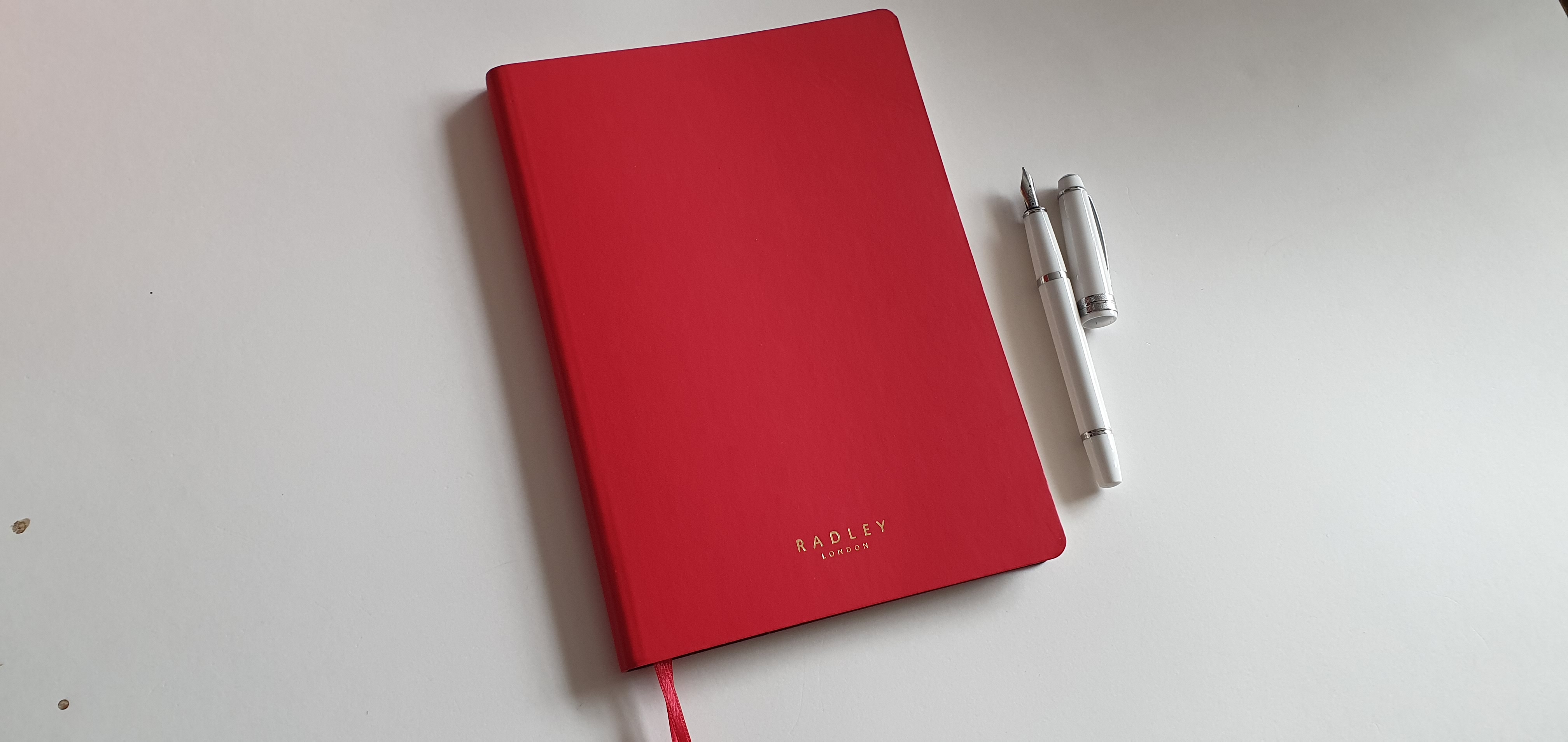
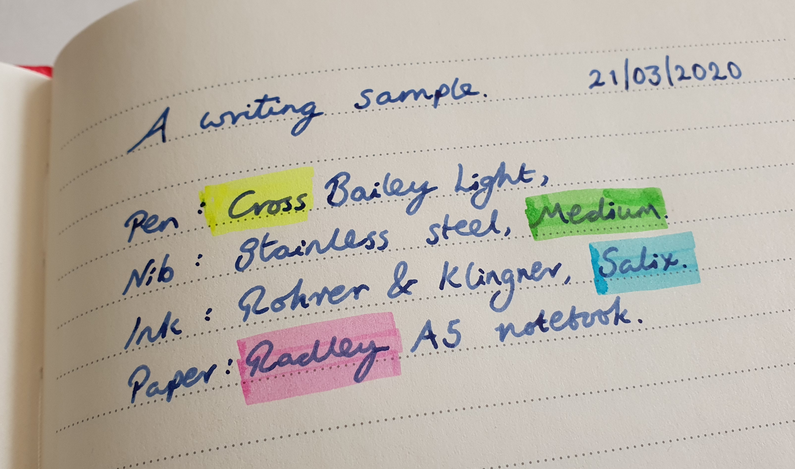
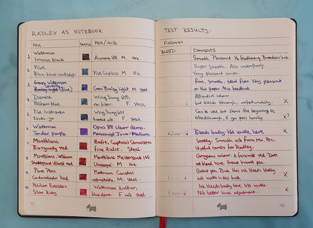
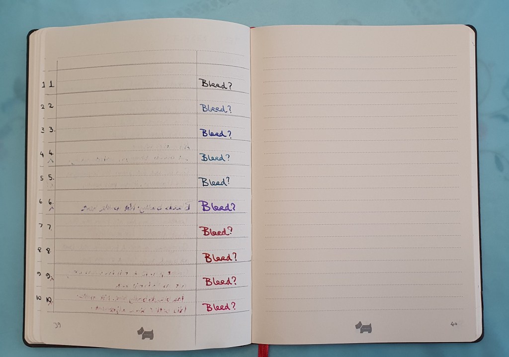
However today I decided to try a slightly new format for recording my little experiments. Starting with a Radley A5 notebook, I set up a double page spread, with one side with columns for the ink and the pen: the facing page to show the degree of showthrough and bleedthrough (if any) – written from the other side of that page – and a column for comments, such as my subjective impressions of the sensation of the nib on the paper, the feedback and so on and whether the combination is successful. There is one constant in the test, namely the paper of that particular notebook.

A selection of my currently inked, now paired with findings on the facing page. The column for bleedthrough is written from the other side.

I do not want to turn a relaxing enjoyable hobby into an onerous project of recording a vast combination of variables and test results. But on the other hand it seems useful to me to record the simplest of conclusions, to avoid having to repeat the same tests and reinvent the wheel. Once we settle on a favourite type of notebook and stick to it, we can also pick a palette of coloured inks to use in it.

The third page of the pen and ink test – the column to demonstrate bleedthrough.

In conclusion, some preliminary lessons for the Radley notebook are to avoid Waterman Tender Purple, Pure Pens Cadwaladr Red and Pelikan Edelstein Star Ruby due to bleedthrough. Good choices are Waterman Serenity Blue, Pilot Blue Black and Montblanc Velvet Red. In the case of the Radley, I have three more bought in a sale and so it is well worth knowing which inks it prefers.

Radley A5 notebook. A mini review.

As fountain pen users know, finding another dream combination of pen, ink and paper is one of life’s pleasures. And we could all use some of those now.

A month ago, whilst spending a weekend away in Cambridge my wife was browsing the sales in Radley, the handbag shop, when I came across a display of A5 notebooks. These were reduced from a rather ambitious £28.00, to £6.00 and so I cheerfully added a couple to our purchases.

It turned out that the notebook was remarkably good and I wished I had bought a few more to keep in stock. Many reading this post may not have access to a Radley shop, but nevertheless I hope some comments about my approach to notebooks may be of interest.

Description.

This is an A5, soft cover journal, with 160 ruled pages (80 sheets). The pages provide 21 rows at 8mm line spacing, which I find ideal. The lines are dotted, in grey, on a cream paper and so not obtrusive. Each page features the little Radley dog logo at the foot of the page, which is not in the way.

Radley A5, 160 page notebook. With Cross Bailey Light fountain pen.

The cover is a vibrant red with rounded corners and a pleasing texture that feels like leather but is not. “Radley, London” is stamped elegantly in gold letters on the front. The cover can be flexed although it offers some support and protection. Of particular benefit, the pages are stitched, so that the book can be opened flat without risk of pages popping out. There are two page markers, in matching red ribbon. However there is no elastic band or expandable pocket that you would find with a Leuchtturm notebook.

Neatly sewn pages with lined, cream paper.

Paper quality.

Trying a different notebook can be a risk, if you intend to use a fountain pen. Those first few strokes will tell you whether the paper is “fountain pen friendly” or not. Does the ink bleed through? Is there feathering? Is there show-through at levels which mean you can use only one side of the paper? How does the pen feel on the paper surface? Is it too rough, or too smooth, or is there a squeaky coating and feeling of resistance?

Happily, I was delighted with the paper in all of these respects. I tried first with my recently bought Platinum Curidas, with a Japanese medium nib and Platinum blue black ink. The paper surface felt silky smooth. There was no feathering, no bleed through and although some show-through, this was perfectly acceptable. The nib is on the fine side for a medium.

The one point to note however, was that the line width was slightly wider on the Radley paper, than with the same nib on my customary Leuchtturm journal paper. This implies that the paper is perhaps more absorbent, or less or differently coated than Leuchtturm. Yet when I looked with the loupe, there was no feathering to give the tell-tale woolly edges as if writing on blotting paper.

Saturday morning activity.

I do enjoy buying a new notebook. For the last few years I have been using Leuchtturm journals a lot, which are paginated and available with plain paper, ruled (rather too narrow for me) or dotted or square grid. For unpaginated notebooks, I often paginate them, measure the line spacing, and test out the paper on the back page with a variety of inks and pens from my “currently inked” pen cups to see what works and what does not.

I tried the Radley notebook paper with various other pen and ink combinations. There was no bleedthrough with Waterman Serenity blue. Monblack Irish Green did bleed through quite badly in places where pressure was applied. Some roller-ball pens also did not do so well: the Uniball Air micro black ink did bleed through, whereas the Uniball Signo 307 retractable gel pen did not.

Rohrer & Klingner, Salix iron gall blue black ink.

So, what was that dream team combination that I mentioned? I recently discovered Rohrer & Klingner’s Salix, an iron gall blue black ink, sold in London at Choosing Keeping, in Covent Garden. I have been using it at work recently, in one of my Cross Bailey Light cartridge pens. (Ahem, confession: I bought six of these pens, a few months ago as soon as I heard about them!)

The Cross Bailey Light is a fairly humble entry level Cross cartridge- converter fountain pen with a steel medium nib. I have been careful to check the nibs on all those I bought and they have all been smooth, wet writers. This works particularly nicely with Rohrer & Klingner’s Salix ink, a classic blue-black which darkens as it oxidises, as the blue turns to a grey-blue black.

Random poem selection, from William Wordworth. Cross Bailey Light with Rohrer & Klingner Salix, iron gall blue black in.

The Salix ink is also water resistant, a useful quality when addressing envelopes but also giving some protection against spills or other liquid related incidents.

A water resistant ink will often perform well on papers which at first do not seem fountain pen friendly due to bleedthrough and so it is worth trying this before giving up on the notebook for fountain pen use. Another advantage of R&K Salix is that you can go over it with a highlighter pen, which is great for study notes. It also flows well, looks nice and gives a lovely shading and performs well on the Radley notebook paper.

Discovering that you can go over R&K Salix ink with a Sharpie highlighter, without smudging.

Finally, I went back to the Cambridge Radley shop another day but they were out of these notebooks. But then I later came across another Radley store in London’s O2 Arena shopping centre (a brand outlet mall) where, not only did they have plenty in stock but they were discounted even further to £4.00. Let’s just say I bought a reasonable number.