Early thoughts on the Otto Hutt Design 06 fountain pen.

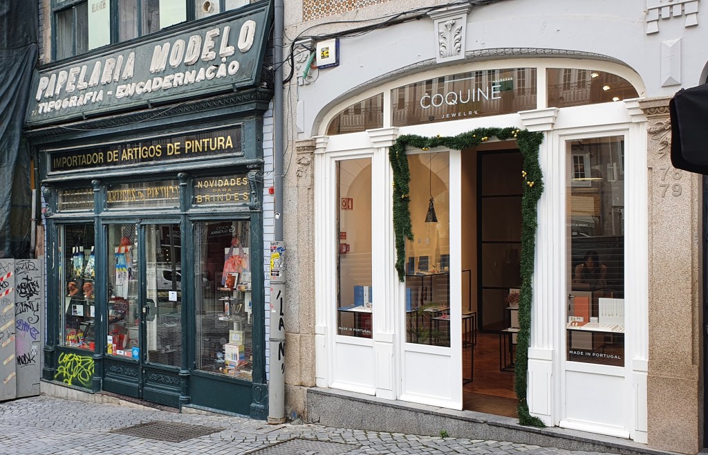
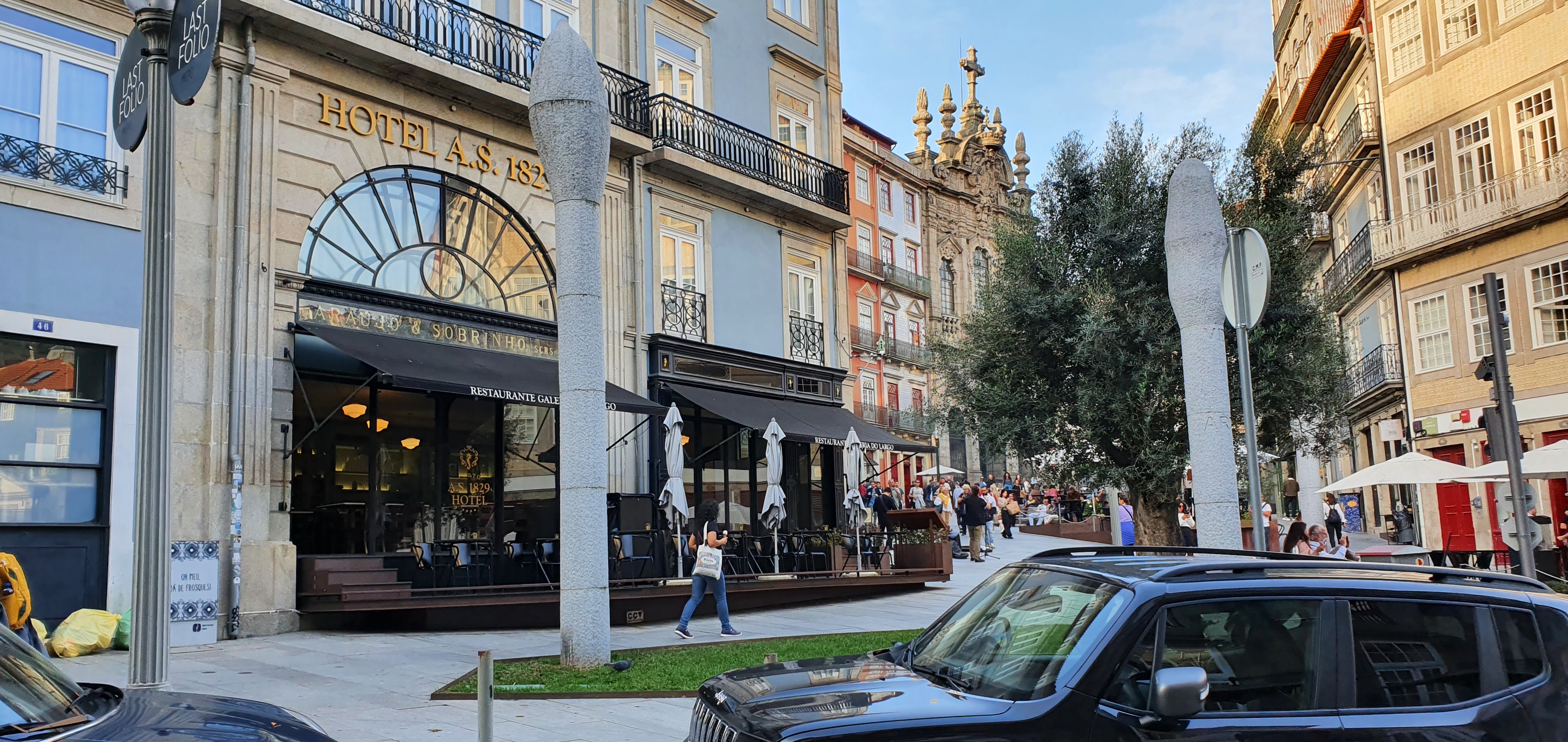
My relationship with the Otto Hutt Design 06 fountain pen had the best possible start. I bought the pen whilst on a short break in the beautiful city of Porto, in one of the most delightful pen shops I have ever seen, namely Araujo & Sobrinho founded in 1829. So, being abroad, in holiday mood AND being in a pen shop, I was very open to the possibility of finding a new fountain pen to take home.

The Otto Hutt Design 06 fountain pen, glossy black lacquer version.

The brand Otto Hutt, of Germany, was unfamiliar to me. I had heard the name and seen a few reviews of their pens online, notably from Anthony of UK Fountain pens, but had not seen any of their pens in the flesh. I had not come across them in any shops in London although I have since learned that they are available from the online seller Cult Pens. Another excellent review can be found on The Gentleman Stationer.

At the time of my visit, the shop had two glass display cabinets featuring Otto Hutt pens. First, an eye-catching display in the counter as you enter the shop, contained the Otto Hutt Design 08, a stylish metal pen with a grooved barrel and a distinctive black grip section with with rather sharp-looking backward pointing ridges. These looked grippy, if rather uncomfortable, rather like a sharper take on the Lamy Imporium. Next to this was an Otto Hutt Design 07, which I learned is made from sterling silver and a little more conventional in shape than the Design 08.

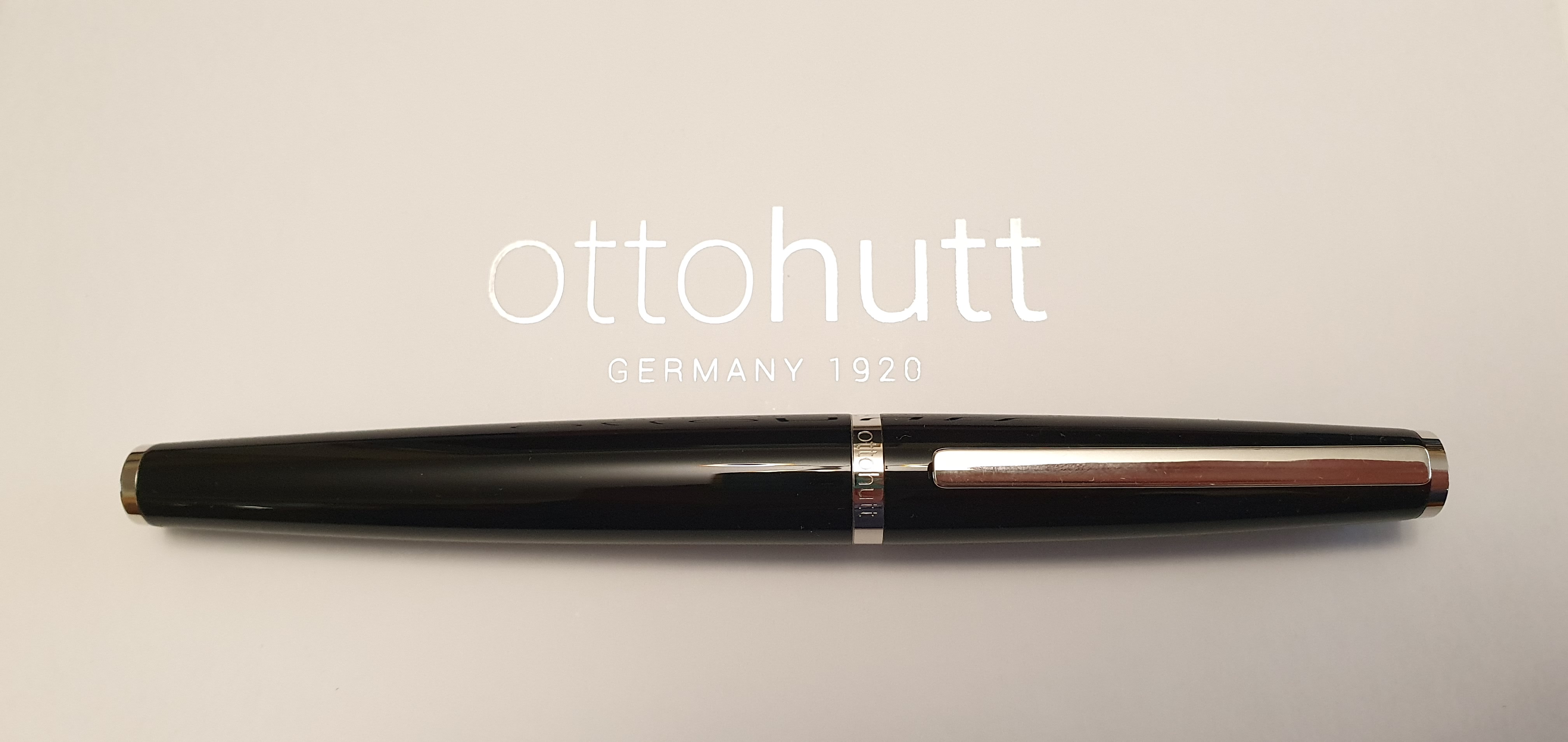
Next I spotted a range of Otto Hutt pens in various colours, and which I now know to the be the Design 06. I must admit that at first sight, I was not tempted by these by reason of the polished metal grip section and secondly, the step down from barrel to section. I have found that metal sections can be slippery making it difficult to control the pen without it rotating left or right in your hand. Also a step can be sharp and uncomfortable under your fingers. I had a good browse around the shop and its attractive displays but left without buying anything.

The cap ring of the Otto Hutt Design 06.

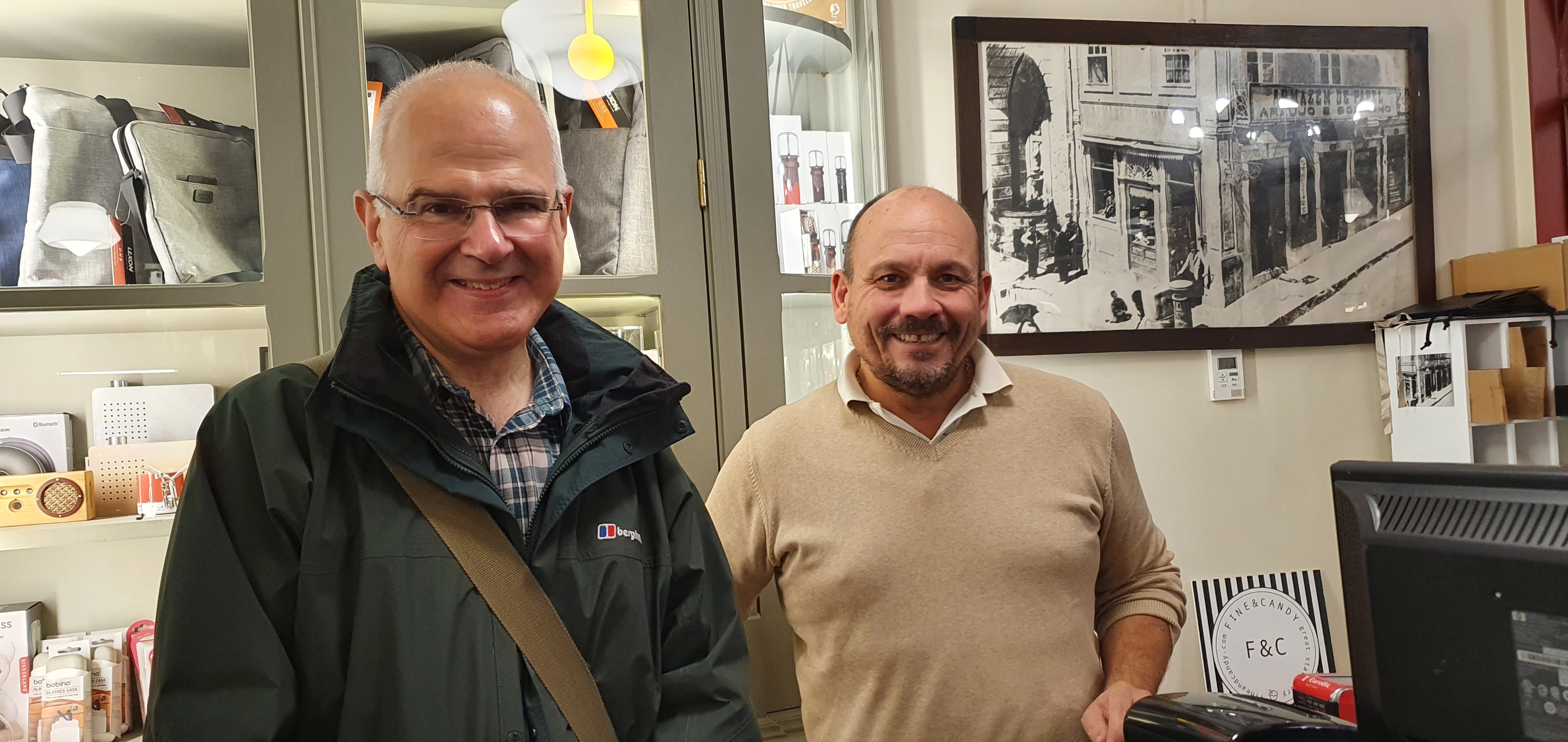
However, I returned a few days later, being the last day of our mini-break in Porto. This time I met Miguel Araujo the proprietor who kindly allowed me to take a few photos in the shop, which I included in my recent post Travelling with ink: Porto, Portugal. I then asked to take a closer look at the Otto Hutt Design 06, perhaps hoping to convince myself of its unsuitability.

A series of revelations ensued. First, whilst the polished metal section is undoubtedly slippy if you were to grip it there, I found that I naturally held the pen with the section resting on my second finger, my first finger over the cap threads (which are not sharp) and, crucially, with my thumb on the lacquered metal barrel, which was not slippery and which allowed me to anchor the pen and prevent it from turning inwards or outwards. Held in this way, unposted, and with its centre of gravity being located towards the front end, it actually felt strangely comfortable. I say “strangely” as it felt different from my other pens and with it cradled in my hand it almost felt like an extension of my body (if my hand had been designed as a writing tool).

Uncapped. A step down from the barrel to the shiny metal section.

The step down from barrel to cap threads and section, which looks quite pronounced and sharp, was not a problem for me in practice. As I said, my thumb rested on the barrel and my first and second figures were on the section and so my grip was formed either side of the step.

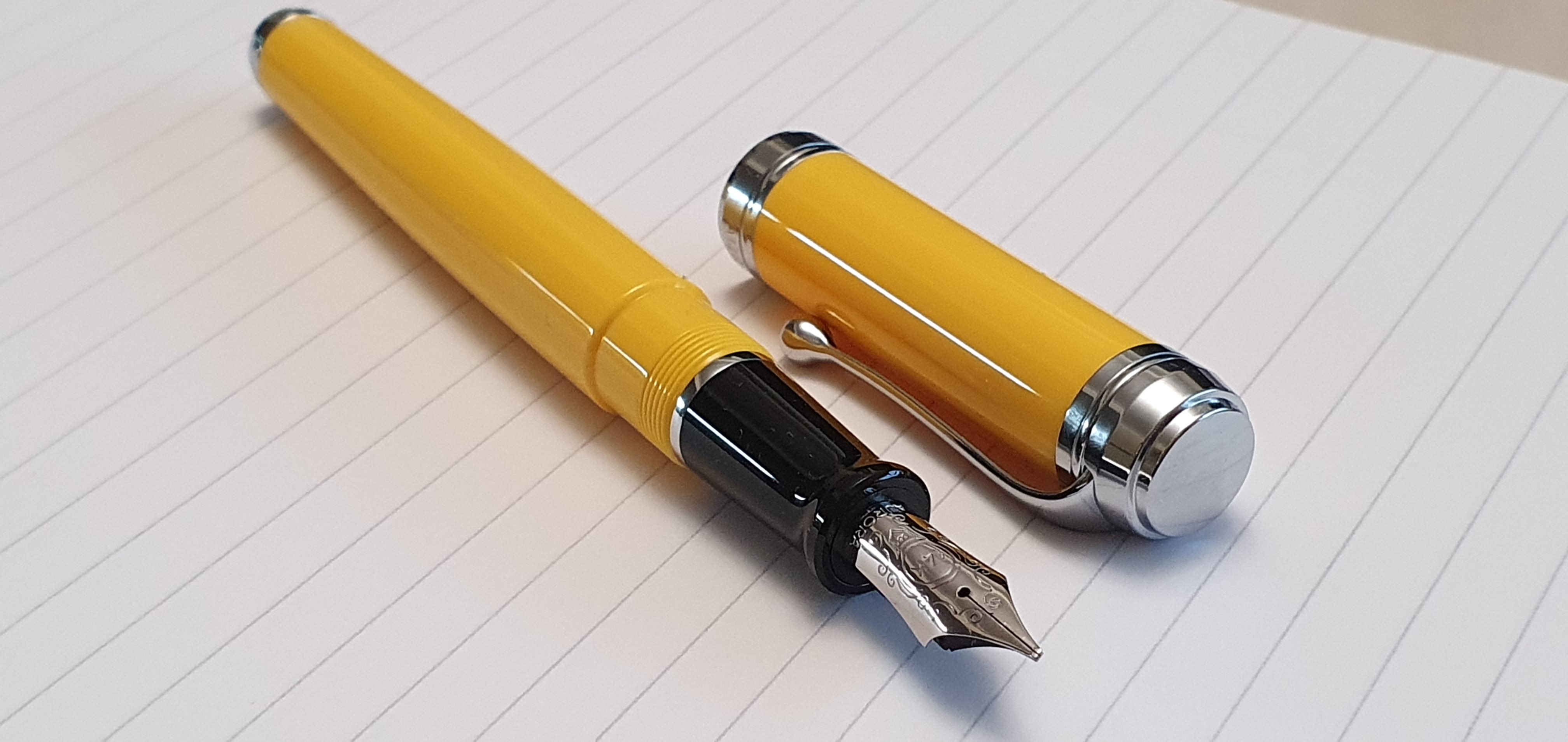
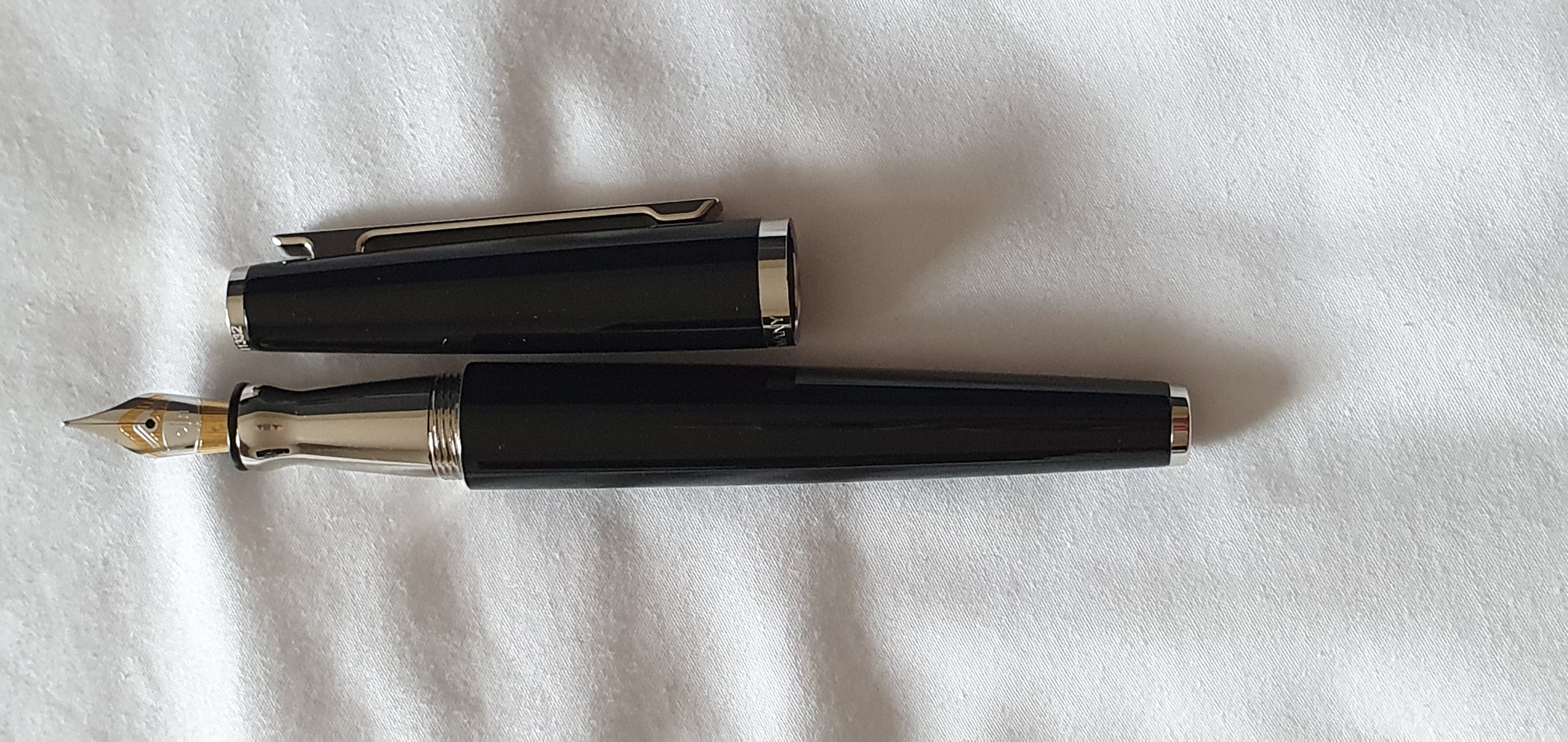
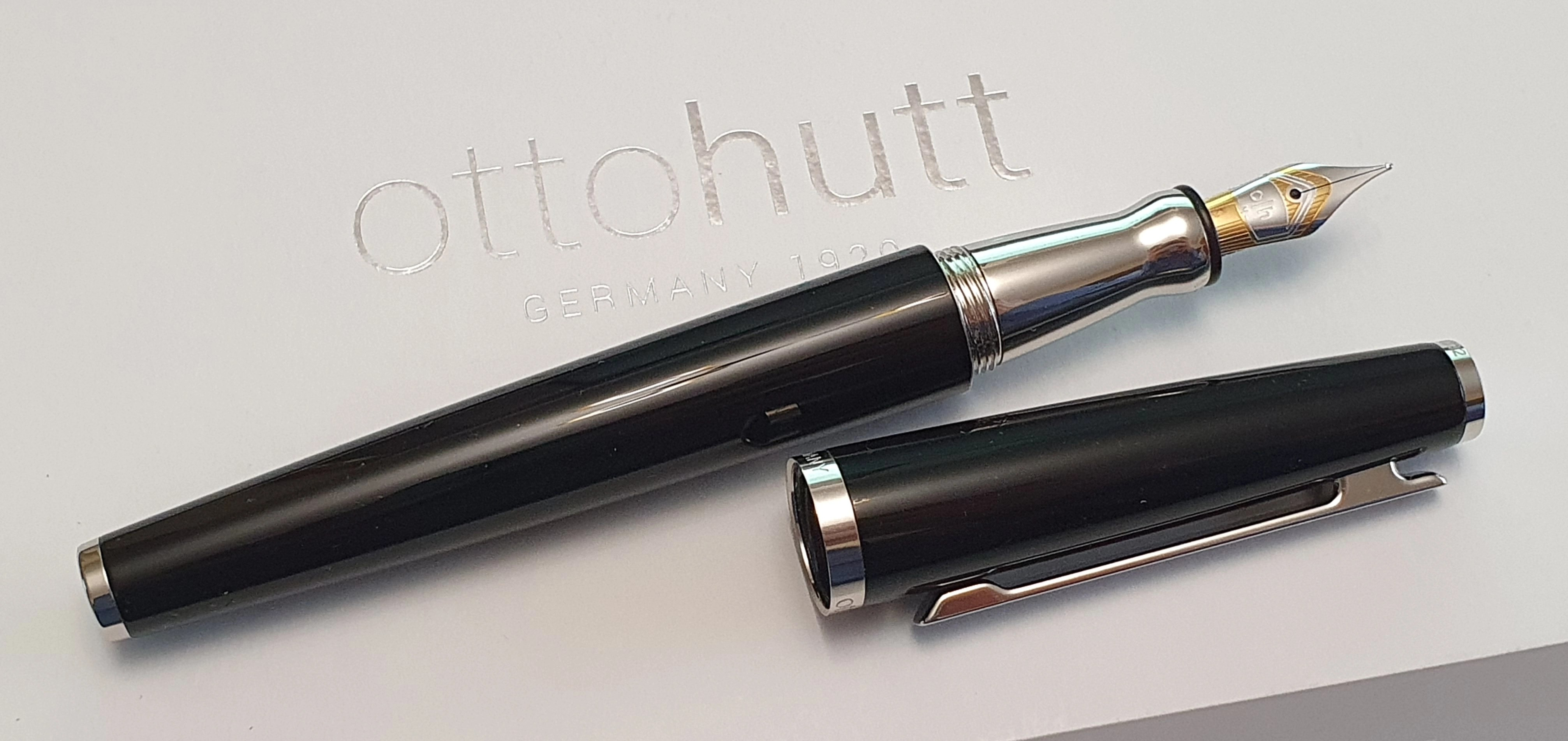
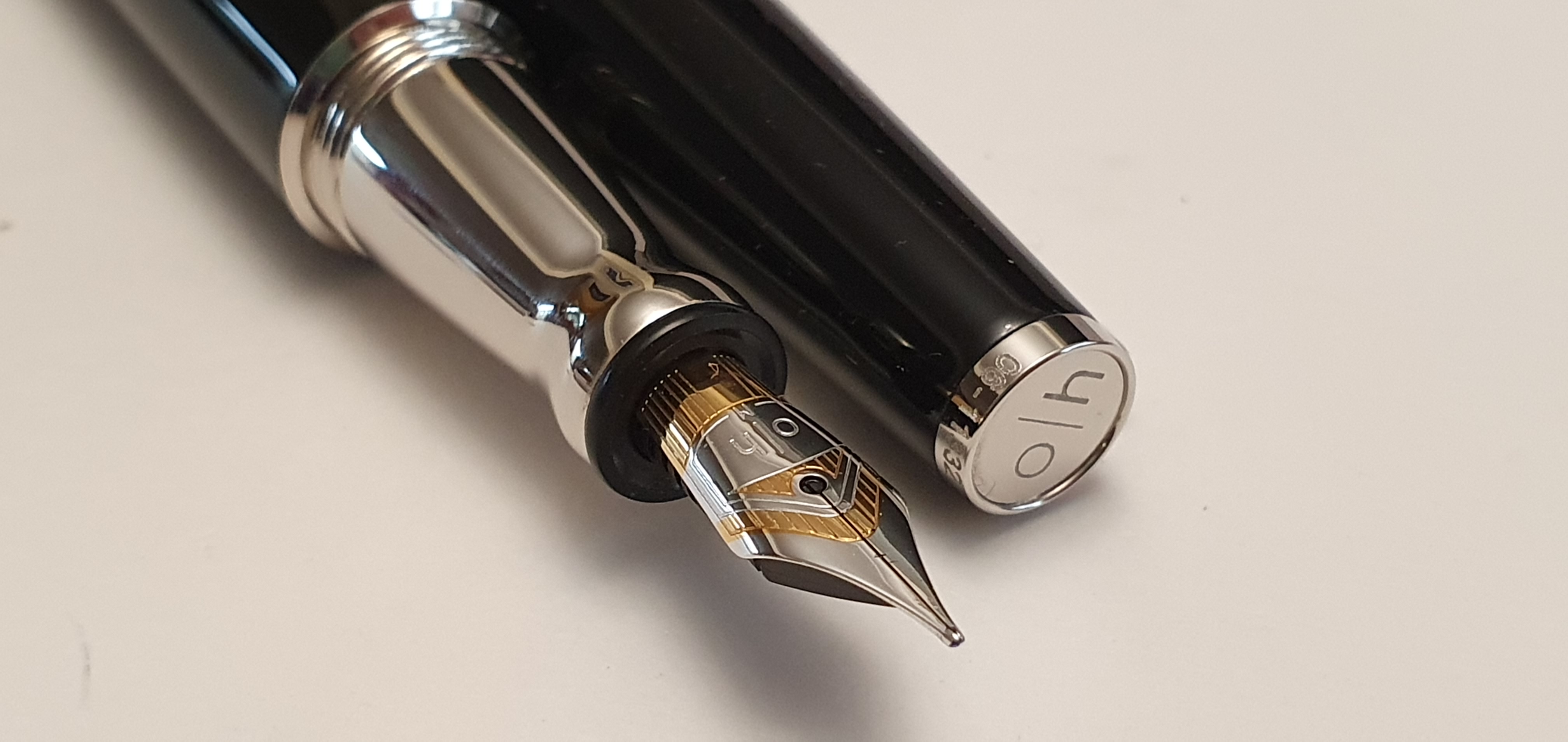
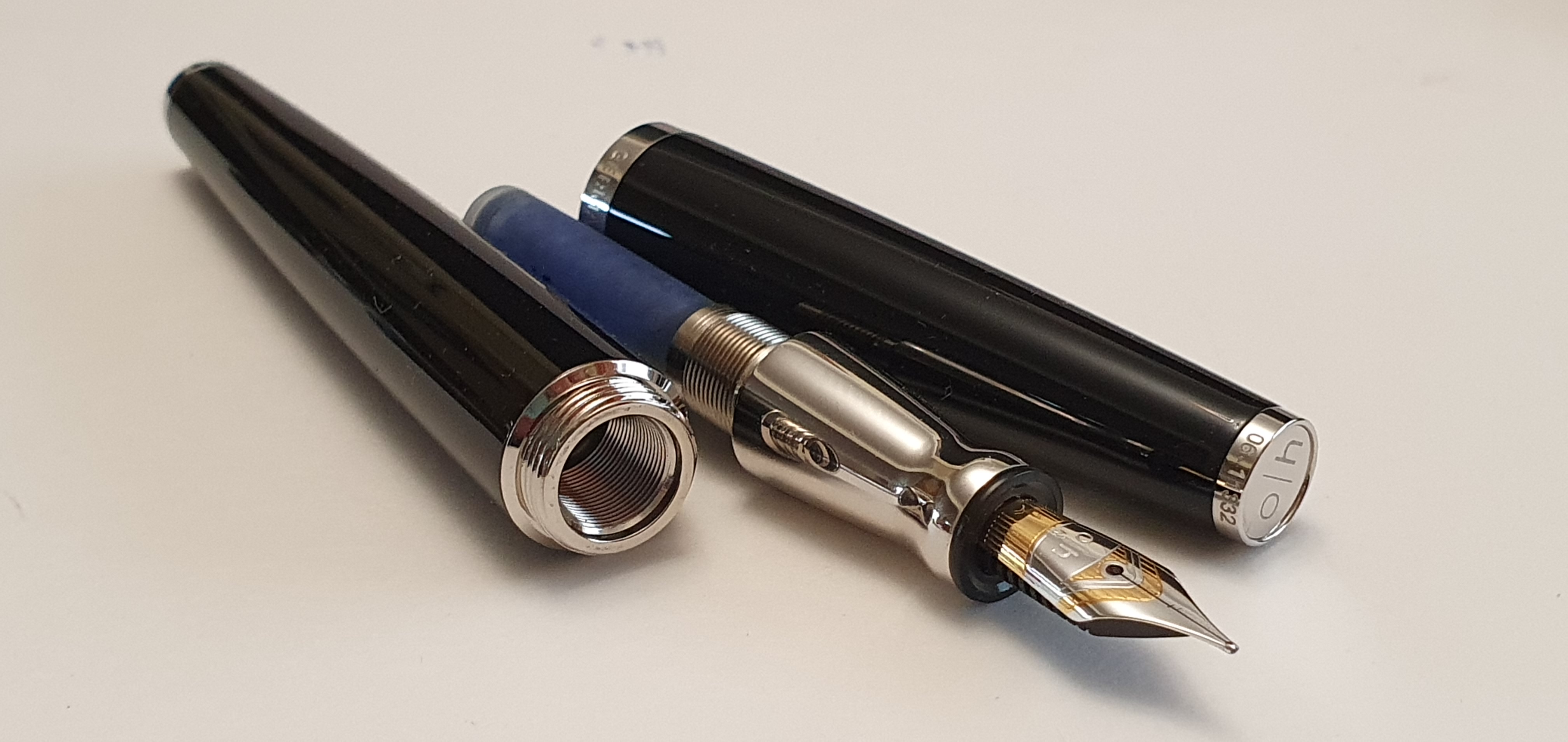
The next revelation occurred when I asked to try the pen. Miguel produced a bottle of ink and some paper. I tentatively dipped the nib, and put pen to paper. There was literally a “Wow” moment as soon as I wrote and noticed the soft springiness of the nib, such as is sometimes found in gold nibs. Yet the Otto Hutt Design 06’s nib is stainless steel. Aside from the softness of the nib, it was also beautifully tuned to write smoothly and with an optimal flow. The bi-colour nib with its imprint also happens to be very pretty.

Cartridge or converter fill.

As you can imagine, I was thrilled with the pen and was keen to buy that very one. Miguel cleaned the nib for me, found the box and the converter, and gave me an Otto Hutt catalogue plus a post card with an old black and white photograph of the shop and a tote bag in which to take it all back to my hotel.

The unboxing. The polishing cloth is a nice bonus.

Having used the pen for almost two months I am pleased to say that I remain just as pleased with it as I was on that first day, if not more so. I have used it so far only with Graf von Faber-Castell cartridges in Cobalt Blue.

Size and Weight

The Design 06 is a medium-sized pen. It measures 139mm capped, 122mm uncapped and 156mm posted. It weighs around 47g in total, comprised as to 32g uncapped and 15g for the cap alone. Personally, I prefer to use it unposted and in this mode it feels nicely front-weighted. However the cap does post, quite deeply and securely if desired, making the pen quite long and shifting the centre of gravity back a bit.

Likes

There is a great deal that I like about the pen. As I write this at home, I have ten fountain pens in my ink cups, plus a further three Delike New Moon pens at hand with inks to match their colours. Of my currently inked pens, the Otto Hutt is the only lacquered metal pen and so its heft does make it stand out from the rest. Here is what I like about it:

  • The nib is the main attraction, being soft, smooth, with a pretty imprint and bi-metal, shiny plated finish. It is a medium but writes a line which is on the fine side of medium.
  • The smooth, flush body, from barrel to cap (achieved at the expense of having the step down from barrel to section mentioned earlier);
  • The stylish, disc finial bearing the initals o|h;
  • Having a serial number, laser etched around the finial, mine being 06-11332;
  • The long, straight, pocket clip, which pivots when the top is pressed;
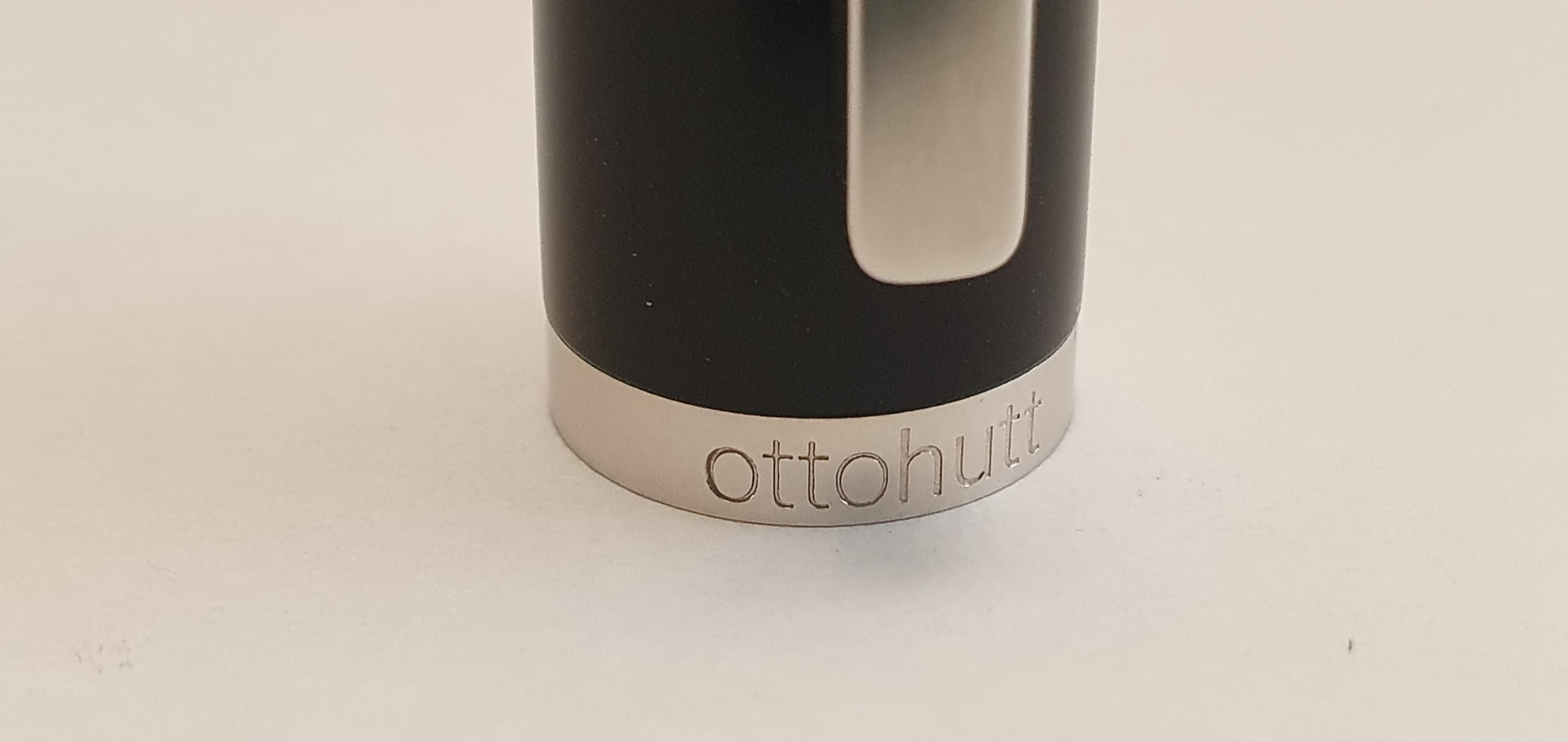
  • The stylish cap ring, with “ottohutt” on the front and “GERMANY” on the back.
  • The shiny metal barrel ferrule.
  • The surprisingly quick cap threads, needing literally only a half a rotation to remove or replace the cap;
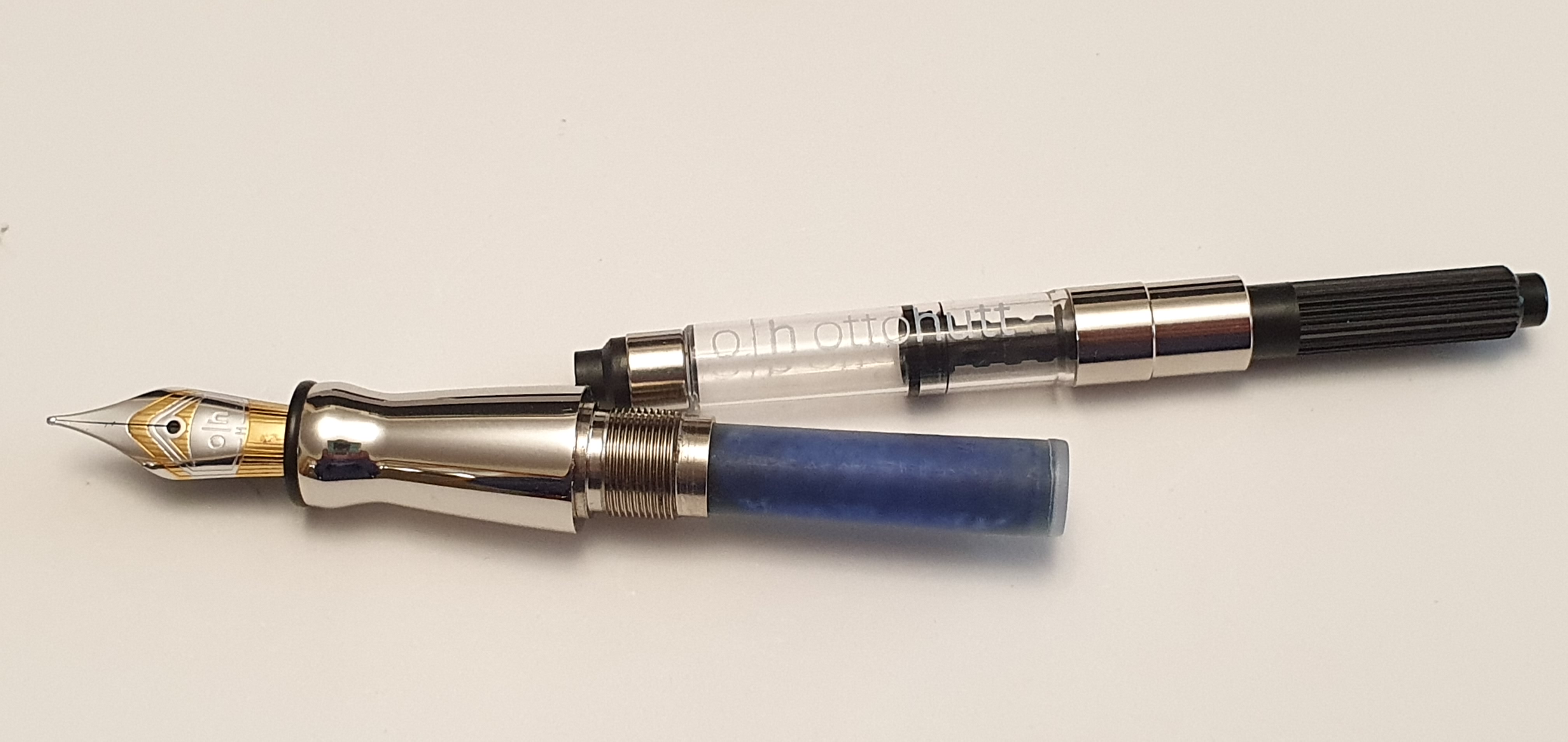
  • The ability to use standard international cartridges, with room for a spare in the barrel.
  • It is, in my humble opinion, great value for a top-quality, steel nibbed fountain with a nib that is amongst the best that I have used. I paid 145 Euros for mine.
  • The clean and smart look of the polished metal section, next to the glossy black of the barrel; the hardwear components, according to the catalogue, are plated with platinum in the black version, whilst some other colours feature rose gold plating. Whilst I tend to avoid metal sections, who doesn’t like platinum?
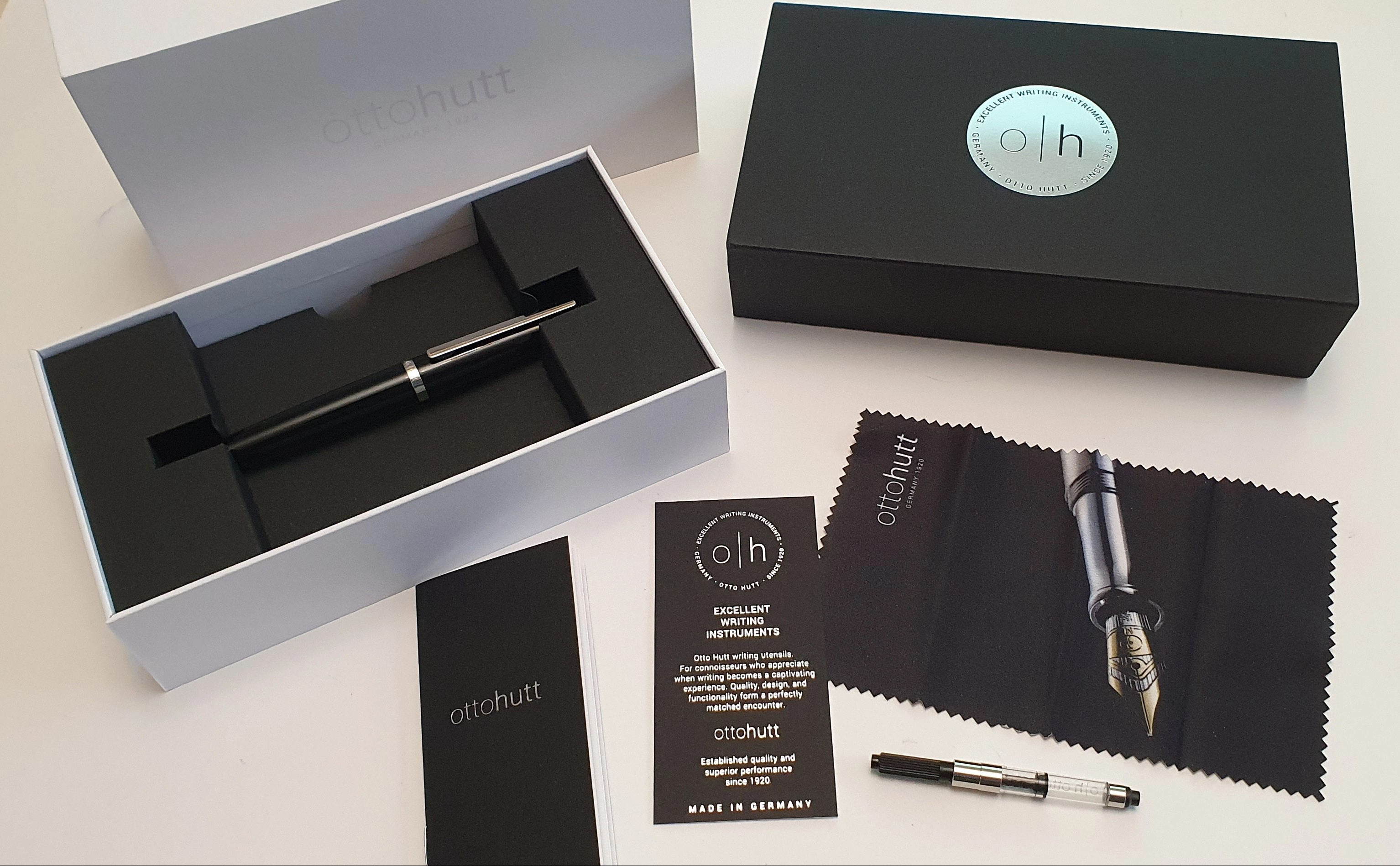
  • The pen comes in a white cardboard box, (a bit like a mobile phone) with a black outer sleeve. Inside you find, in cardboard inserts, the cartridge converter, a cleaning cloth (a rare luxury) and the user guide and card to note your serial number and date of purchase. The packaging is ideal and makes a good impression but could be easily recycled or used for other things.
  • Overall, the pen is tactile, stylish and attractive, whilst also subtle.
VERY long threads for the barrel. Serial number on the finial!

Dislikes

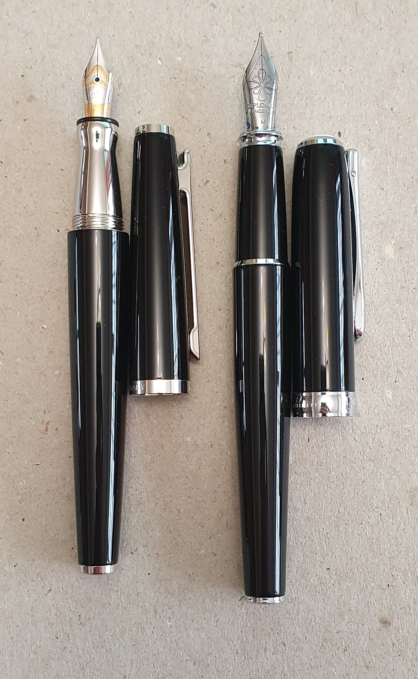
In two months of ownership, I have genuinely not found anything to dislike about the Design 06. One could perhaps wish that it was slightly longer and/or that the grip section was not of shiny metal plating or tapered the way that it is. But if you take away those features, you would be left with a pen like the Diplomat Excellence, clearly a great pen and one of my favourites but which can look slightly plain next to the Design 06.

Size comparison with the Diplomat Excellence (right)

I would like to visit Pforzheim one day, the city in south west Germany from which the Otto Hutt business had its origins in 1920. Some history can be read in the Otto Hutt website and Pforzheim was famed as the Golden City and jewellery capital of Germany. The city was the target of a notorious and controversial bombing raid by RAF Bomber Command during World War II on 23 February 1945 in which much of the city was destroyed with huge loss of life. When the city was rebuilt, the rubble from the destruction was formed into a hill, or Wallberg, to create a scenic memorial and viewpoint. Today, Otto Hutt is located at the nearby municipality of Konigsbach-Stein.

When asked to name a German fountain pen maker, I suspect that most people here would first think of Montblanc or Lamy or Faber-Castell. Otto Hutt is a much less well-known name here but its distinctive Bauhaus-inspired designs and quality workmanship are deserving of greater attention. Certainly if you are fortunate enough to find yourself in a pen shop which sells Otto Hutt fountain pens, it is well worth taking a close look at one. You may be pleasantly surprised and smitten, as I was.

An attractive sweeping taper to each end and the cap fits perfectly flush with the barrel.

2022: Some of my fountain pen highlights.

As another year end approaches, it is time for a round-up. Against the background of a tumultuous year in national and world events, I had a busy year and took comfort in my fountain pens, whilst trying to curb my temptation to buy more.

In 2022, I had 24 fountain pens incoming. These included five that I bought and gifted, and coincidentally, another five that were given to me. This leaves 14 fountain pens bought for myself over the year. My total spend on these came to around £976.00.

My biggest single purchase was an Aurora Talentum in yellow, with a 14k gold, oblique medium nib. I am delighted with it and consider it one of the best value gold nib pens on the market. Aside from a vintage Parker 17 Lady, a £10.00 impulse buy at a pen show, the Talentum was the only pen that I bought with a gold nib.

Aurora Talentum, with oblique medium 14k gold nib, rhodium plated

I notice that a theme of my 2022 pen purchases, has been in relatively high-end steel nib pens. These included a Tibaldi N.60, an Esterbrook Estie Nouveau bleu, an Onoto Scholar and an Otto Hut Design 06. In each case, the pen was the first and only model that I have of each brand.

Esterbrook Estie, Aurora Talentum, Tibaldi N.60 and Onoto Scholar.

Another theme to note is that I bought myself three Delike New Moon fountain pens, with fude (bent) nibs, in green, blue and finally red acrylic. I am very taken with these. They are inexpensive cartridge-converter fillers, with screw caps and steel nibs, in attractive finishes and with a very versatile smooth nib. This can be used to produce a line from broad to extra fine, depending upon how you hold the pen. I have them filled with matching inks and enjoy them a lot.

Delike New Moon fude nib fountain pens. Great value.

Receiving a surprise parcel in the post with a gift of pens from a friend overseas, is always a thrill. A friend in Australia sent me five fountain pens, namely a Geha 715, Montblanc Carrera, a Montblanc 34, a Lamy 2000 and an old version Waterman Hemisphere in tobacco brown. There were also two Montblanc ballpoint pens (a matching ball pen for the Carrera, plus a Meisterstuck ball pen, both with new refills). It was exciting to try them all out. The Geha 715 was a German, black resin, piston fill pen which had an ink reserve feature, activated by sliding a switch in the feed, under the nib. The Carrera was a steel nib pen, mine being a cartridge converter version. Aside from the Waterman, the others all had oblique nibs, which I have found to be suited to my lefty overwriter hand-writing style.

Some gifts from Australia! Montblanc 34; Montblanc Carrera fountain pen and ballpoint pen; Waterman Hemisphere.

The Lamy 2000 was new and had an oblique broad nib. Unfortunately I found that this one did not suit me. Held at my usual writing angle, it produced too broad a line for me, both in down strokes and cross strokes. Perhaps looking back I needed to adjust my angle of grip for this particular nib to use it properly. However, I asked Lamy whether they would agree to exchange this nib for a Fine. They kindly agreed and I sent the pen to Germany.

I wrote a blog post at the time about sending the Lamy 2000 back for a nib swap. An extraordinary thing then happened and this post received over 14,000 views in the first month. My blog received it’s highest ever numbers of daily and monthly views.

I attended both the London Spring and Autumn Pen Shows, in March and October. These were most enjoyable and it was good to see so many friends particularly as we had not resumed the London pen club meets since Covid restrictions were lifted.

It was at the Spring pen show that I bought my Esterbrook Estie. I had seen a lot of buzz about these online and was a late-comer to the party. Then at the Autumn pen show, I bought my Onoto Scholar, in navy blue with gold plated trim. The bicolour steel, number 7 medium nib is a joy to use and is the same as the standard steel nib that you would receive on an Onoto Magna, a pen costing more than twice the price of a Scholar, although there is an option to upgrade to a gold nib.

My final pen purchase of the year came in November whilst on a short break in Portugal. I found a wonderful, long-established fountain pen shop called Araujo & Sobrinho and enjoyed meeting the proprietor and buying an Otto Hutt Design 06, in black lacquer with silver colour trim. I am thrilled with it. I hope to give it a blog post to itself soon.

Otto Hutt Design 06 fountain pen.

At home, my pen cups typically have around a dozen pens currently inked. At my office, I limit my work fountain pens to two. A Cross Bailey Light, royal blue model has been in constant use with bottled Cross Blue ink all year, which I am using up for my late Godfather Brian. My other work pen is a Moonman S5 eyedropper, with oblique broad nib. This gets only occasional use and as a result has not needed refilling all year.

I have continued to use fountain pens for my daily A5 page-a-day journal. I cherish the ten minutes or so, spent recalling and summarising the previous day. I think my intention was to change pen each month. In the event, I used the Cleo Skribent Classic Gold for both January and February. I then switched to the Visconti Rembrandt from March right through to September inclusive. In October, I used the Esterbrook Estie. Then for November and December it was the Onoto Scholar. When travelling, I take a different notebook for holiday journaling.

With the year almost over, I am very content with my accumulated pens and ink stash. I have ample to last me out! Also, I am equally well stocked for new notebooks, of all shapes and sizes. My resolution for 2023 will be to remember to use the pens, inks and notebooks I have and not keep buying more. I always say that.

One of my resolutions last year was to walk 1,500 miles, an average of 125 miles per month. Mostly, this consists of walking to and from my office. Ultimately, my pedometer app has counted about 1,200 miles, a slightly disappointing 80% of my annual target. Still, as with my stationery hopes, it is good to leave some room for improvement in the future. A Happy New Year to all.

Onoto Scholar. An exquisite steel nib.

Travelling with ink: Porto, Portugal.

A recent trip with my wife to the city of Porto, was a most welcome break and my first time out of the UK in three years. It was also an opportunity to bring a few pens and notebooks and to discover pen shops in the area.

I considered bringing only one fountain pen, but as usual ended up with several. These were my new Onoto Scholar and two Delike New Moon fude nib pens, which I enjoy. I also brought a Lamy 2000 multi-pen and a Pentel 0.7mm mechanical pencil. For notebooks, I had a Leuchtterm A5 as my holiday journal, another cheap A5 book for random writings and a traveller-style notebook and cover from Flying Tiger Copenhagen.

I had learned from FPN of a pen shop in Porto called Araujo & Sobrinho, founded in 1829 and still belonging to the Araujo family, now in its fifth generation. As luck would have it, this shop was just 100 yards from our hotel.

At the Douro River, Porto.

It is wonderful to explore the city, on foot. It is built on hills each side of the River Douro and famous for the production of Port. Fronting the south side of river, there are a dozen or so Port wine companies. We visited one of these, Sandeman, for a memorable tour of their cellars, finishing with a tasting of three types of their Ports.

Sandeman’s premises and visitor centre, Porto.
Our knowledgeable tour guide at Sandeman.

In an indoor market I found a man making and selling leather notebook covers, branded Sango Handmade Creations. My wife bought me an A5 cover in stiff, dark brown leather with an elastic loop closure and containing one Moleskine notebook. It appealed to me as the notebook is held only by an elastic loop and does not need its covers to be slid into a raised leather pouches which cause an uneven writing surface. However the cover is very stiff and needs effort to keep it open flat, as it wants to slam shut. I expect that with use, and some leather softener on the spine, this will ease.

My new Sango Handmade Creations notebook cover and a pen case. On a mosaic floor of the Bolsa Palace.

As well as the ubiquitous confeitaria pastry shops, I learned to look out for shops called papelaria, Portuguese for stationer. I enjoyed browsing one called Papelaria Peninsular where I bought a couple of Pentel EnerGel 0.7 gel pens, in brown and navy blue.

Papelaria Peninsular. An attractive stationers with print shop at the back.

I came across another, Papelaria Modelo but it was closed for lunch and I could only savour the attractive window including some Kaweco pens and inks.

Papelaria Modelo.

A book shop called Livraria Lello is a popular tourist attraction, claiming to be The Most Beautiful Bookstore in the World. So popular has this become, that it is necessary to book a visit, which has to be done online and to pay a fee of five euros and then wait in a long queue to be admitted. I learned only several days later that you can recover the ticket price against the price of book purchase. The features of the shop, which was very crowded, include a stained glass roof, and curved wooden, red-painted staircases to the galleried first floor. There was currently a display of The Little Prince, with two books from the first 1943 print run inside a mirrored infinity box (to represent the enduring appeal of the book). Also, there was a display of books by the late Nobel prize winning writer José Saramago. A display case included his passport and also a fountain pen that he had used.

Inside Livraria Lello.
A pen used by José Saramago.

It was well worth visiting Clerigos Church and to climb its tower, to see the panoramic views of the city. Just wandering the streets, particularly at the weekend with many buskers and other street entertainers performing, makes for a relaxing holiday atmosphere. One of my favourite performers was a couple dancing to music and it took a moment to realise that the lady was a mannequin whose shoes were attached to her partner’s.

A view of roof tops in Porto.
A dancing “couple” in Porto. She blew me a kiss.

And so to Araujo & Sobrinho. On our first day, we had lunched opposite and, having found the shop location, thought that it may now be a hotel restaurant. But on entering from the front, I spotted a passage leading behind the dining area, where there was a Caran d’Ache sign. There is a pen shop! We had a browse around, assisted by a young man who was working there but unrelated to the family owners. I was keen to return for another look and to take a few photos. This did not materialise until our last morning before our flight home.

Araujo & Sobrinho, at the lower end of Rua das Flores.
The pen shop is more evident from the side entrance.
The inviting interior.
I asked whether Canetas was a Portuguese brand. No, it means “pen.”

On this second visit, I was delighted to meet Mr Miguel Araujo, who kindly allowed me to take some photos of his very attractive shop. Glass cabinets contained displays including Parker, Pilot, Namiki and Caran d’Ache pens. There was a large selection of mechanical pencils, notebooks, Traveler Notebook refills, and inks. For the first time in a bricks and mortar shop, I saw displays of pens from Otto Hutt of Germany, seldom found in the UK. These included a Design 08 with its distinctive guilloche patterned body and black grip section, and the Design 07 in sterling silver.

The author with Mr Miguel Araujo (right).
Notebooks and a display of old large size ink bottles.

I asked to take a look at a black lacquered fountain pen with a shiny plated section (Platinum plating) which I now know to be the Otto Hutt Design 06. I wanted to feel whether the grip would be a problem, either due to the shiny metal plating or the step down from barrel to section to accommodate the flush-fitting screw cap. Rather to my surprise, the pen fits the hand very comfortably and neither of these points was an issue. Miguel dipped the pen in some ink for me to try. Here I was blown away by how smooth and soft the nib was. It is a steel nib but has the soft feel of a gold one. And so, the Design 06 was to come home with me! It was a treat to enjoy a personal and attentive buying experience. Miguel carefully cleaned the nib, put the pen in its box, which also included a converter and gave me a souvenir post card of the shop and an Otto Hutt catalogue, all in an Araujo & Sobrinho tote bag.

One of the Otto Hutt display cases in the shop. My pen, third from the front!
Hard to resist, once you have experienced writing with it.

I caught up with writing some notes in my Flying Tiger notebook on the two hour flight home, now with my new Otto Hutt fountain pen. And on the coach back to London, I was interested to re-read an old review of the pen by Anthony on UKFountain Pens, and was pleased to discover that my opinions very much echoed his from two years ago.

I can strongly recommend a visit to Porto. And if you go, do not miss Araujo & Sobrinho to support this lovely long-established shop for many more years to come.

Goodbye, Porto.