Early thoughts on the Faber-Castell Ondoro, Smoked Oak fountain pen.

Faber-Castell is a well respected maker of pencils, pens and art supplies with a history dating back to 1761. For fountain pen enthusiasts, their nibs are among the best in the business.

None of this was on my mind as I breezed into Harrods one evening, for a quick browse around their Fountain Pen arcade on the lower ground floor, prior to taking my seat for a concert at the nearby Royal Albert Hall. I was off to see Sir Mark Elder conducting the BBC Symphony Orchestra, massed choirs and four soloists, in a rare performance of Delius’ “A Mass of Life”, as part of the BBC Proms. I say “rare” because the piece had not been performed at the Proms for 37 years.

As always on my also-rare visits to Harrods, it was a triumph to locate the pen department. Once there, I enjoyed making a round or two of the displays, including Montegrappa, Chopard, ST Dupont, Caran d’Ache, Graf von Faber-Castell and of course Montblanc. There were notebooks and stationery from Smithson and Moleskine.

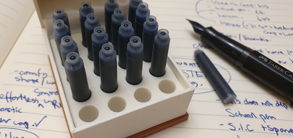
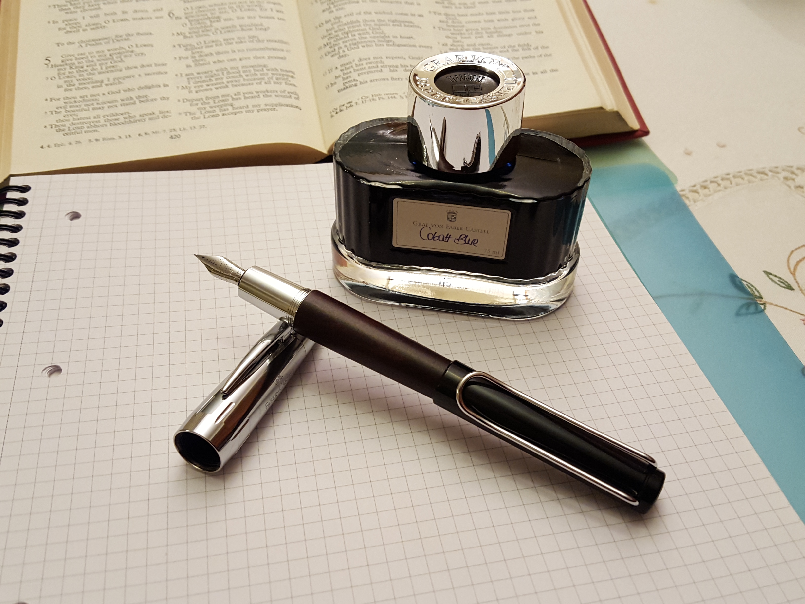
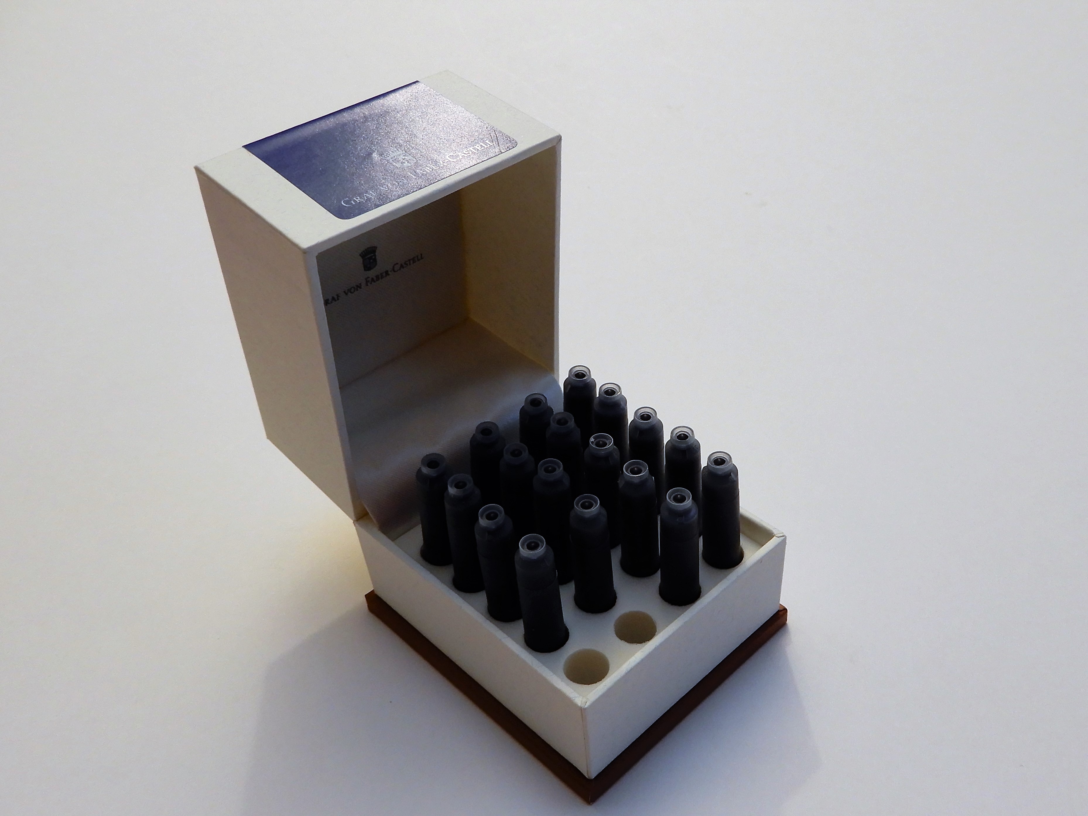
At the Graf von Faber-Castell counter, I spoke to the helpful assistant, Melvyn and chose a bottle of Cobalt Blue ink. I have almost finished my first bottle and this is probably my favourite “posh” ink. The rich dark blue ink, the attractive 75ml heavy glass bottle and packaging are all luxurious.

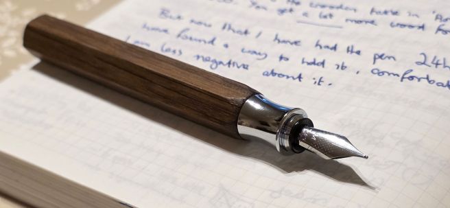
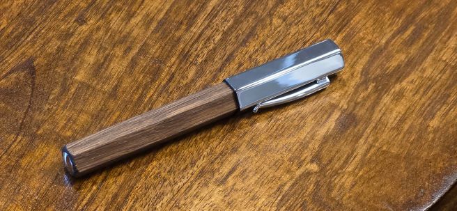
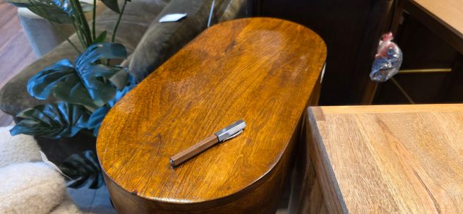
I then asked to take a closer look at the Faber-Castell Ondoro, in wood with a metal cap. I recalled seeing the pen some years ago with an orange barrel, but was not aware of this wood version. I enquired as to what the wood was and after consulting the catalogue, Melvyn informed me that it was “Smoked Oak”. It is an appealing, mid-brown with a dark grain. I have not yet discovered the significance of the “Smoked” in the title. I wondered whether it might perhaps be a process whereby the wood is heated, altering its enzyme constituents in a way which “ages”, dries and hardens the wood as Yamaha does for certain guitars in its range, to emulate the tone of a vintage guitar. However this was just a fantasy conjecture on my part. Presumably the oak is not smoked to improve its flavour like bacon or mackerel. Is it smoked just to give it a charred look? I am yet to find out.

Faber-Castell Ondoro, Smoked Oak fountain pen.

Edit: Since publishing this post, a Google search revealed that Smoked Oak is a term for oak that has been exposed to ammonia fumes, in a sealed environment, for a number of hours. The fumes react with the tannins in the wood, causing it to darken. The longer the exposure, the darker the wood, until black. The process also enhances the natural grain.

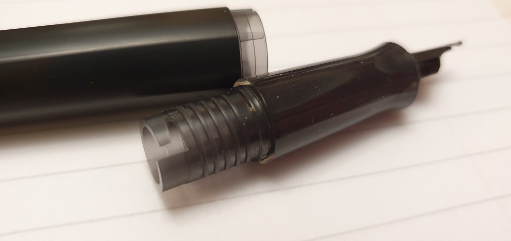
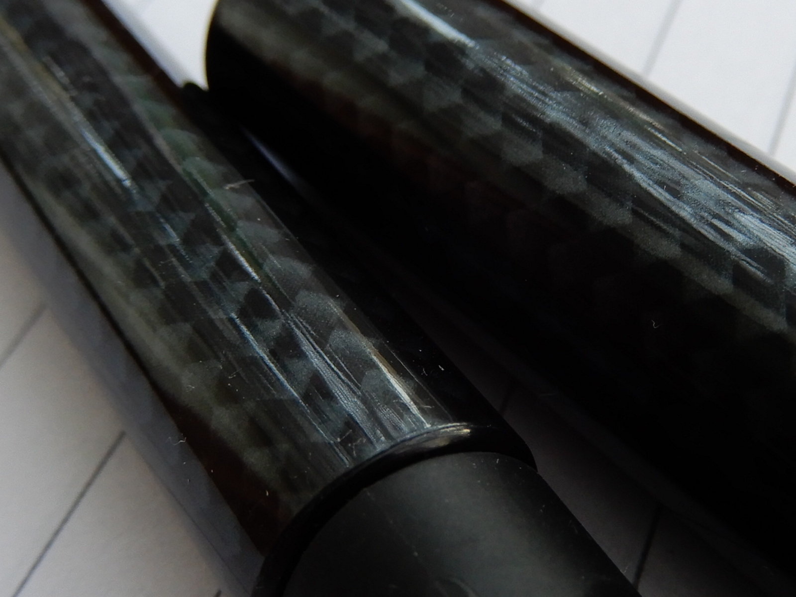
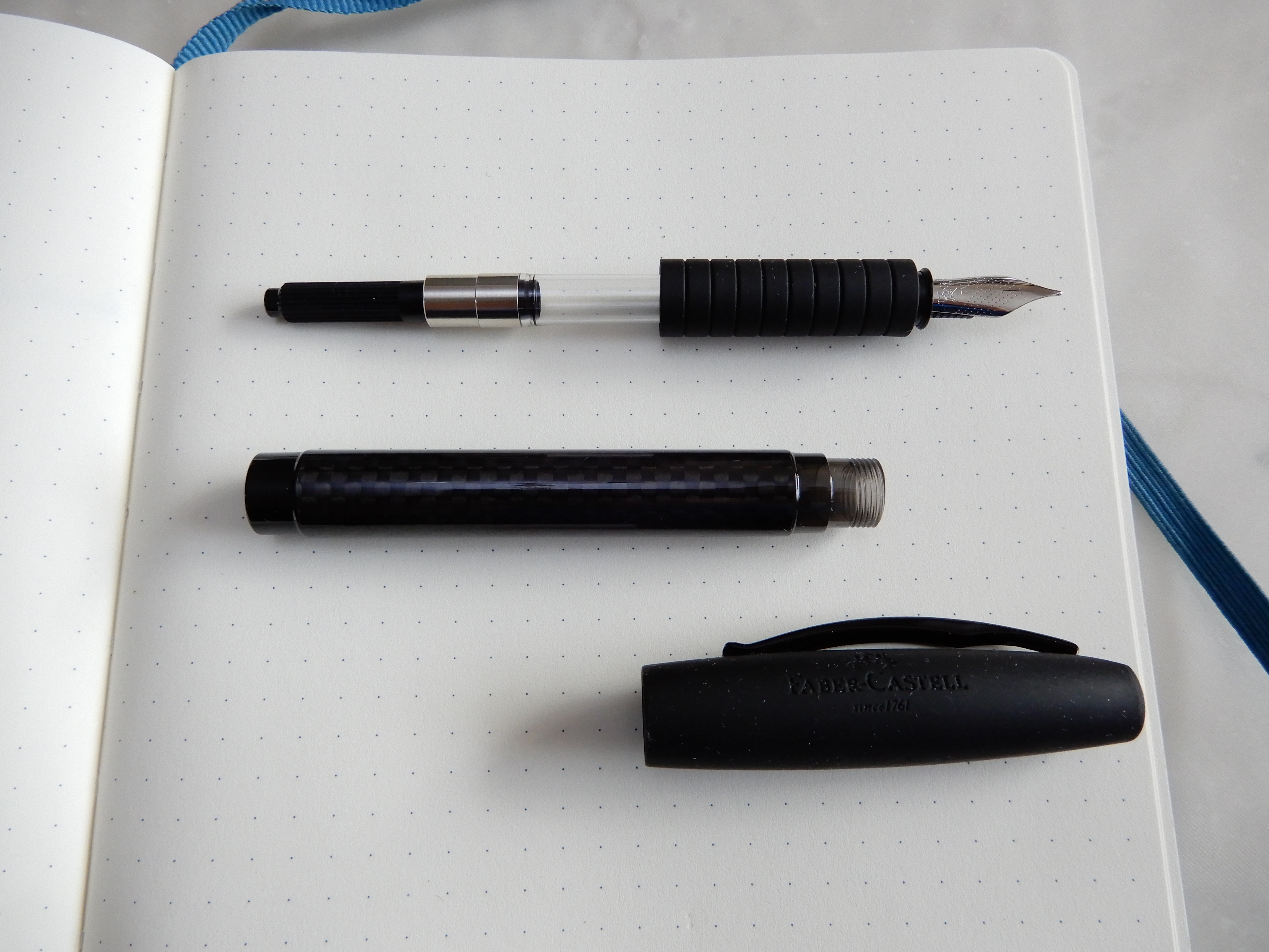
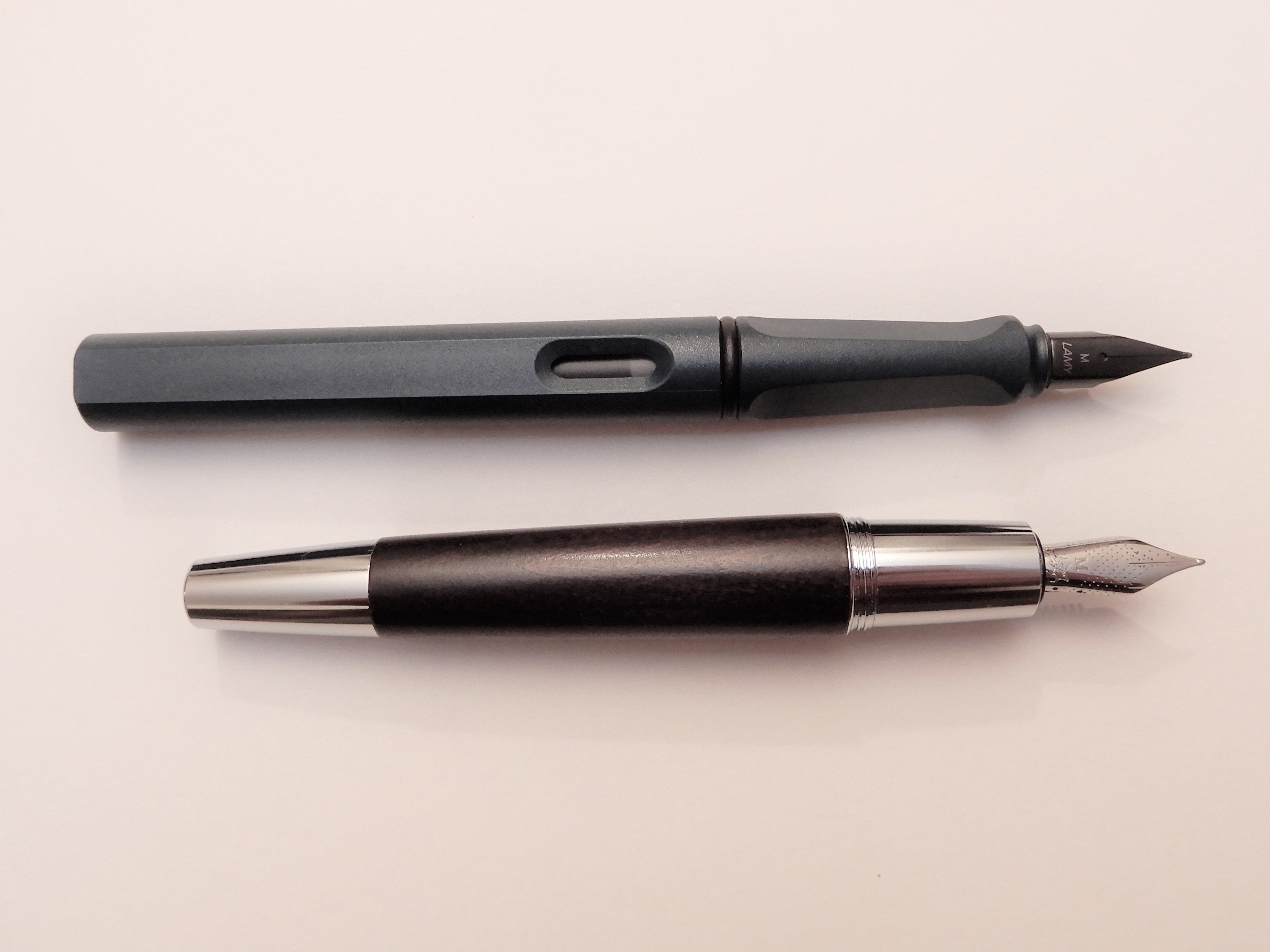
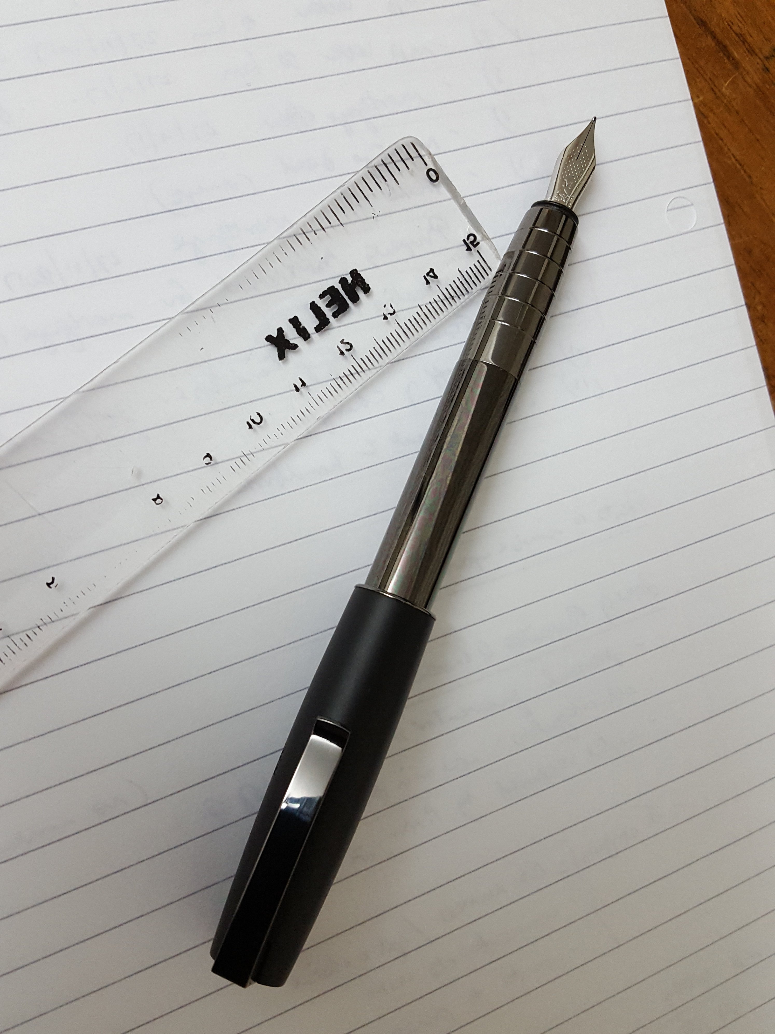
The Ondoro features a hexagonal cap and barrel. It is not very long, but is chunky. Aside from the hexagonal form, another striking feature is the hour-glass shaped grip section. This is a short section and so, if you use a pinch grip around the section, your grip will be close to the paper.

Posted and showing the dimpled nib and the hourglass section.

At first, I was undecided how best to hold the pen. A pinch grip around the section is a bit too low and too crowded for me. But if you hold it higher up, at the barrel, you have the issue of gripping around the faceted sides, which may or may not conform to your preferred way of holding a pen. Then there is the option of posting the cap. It does post securely but adds considerable weight and alters the balance such that you would want to hold the pen much higher up.

Finding my grip.

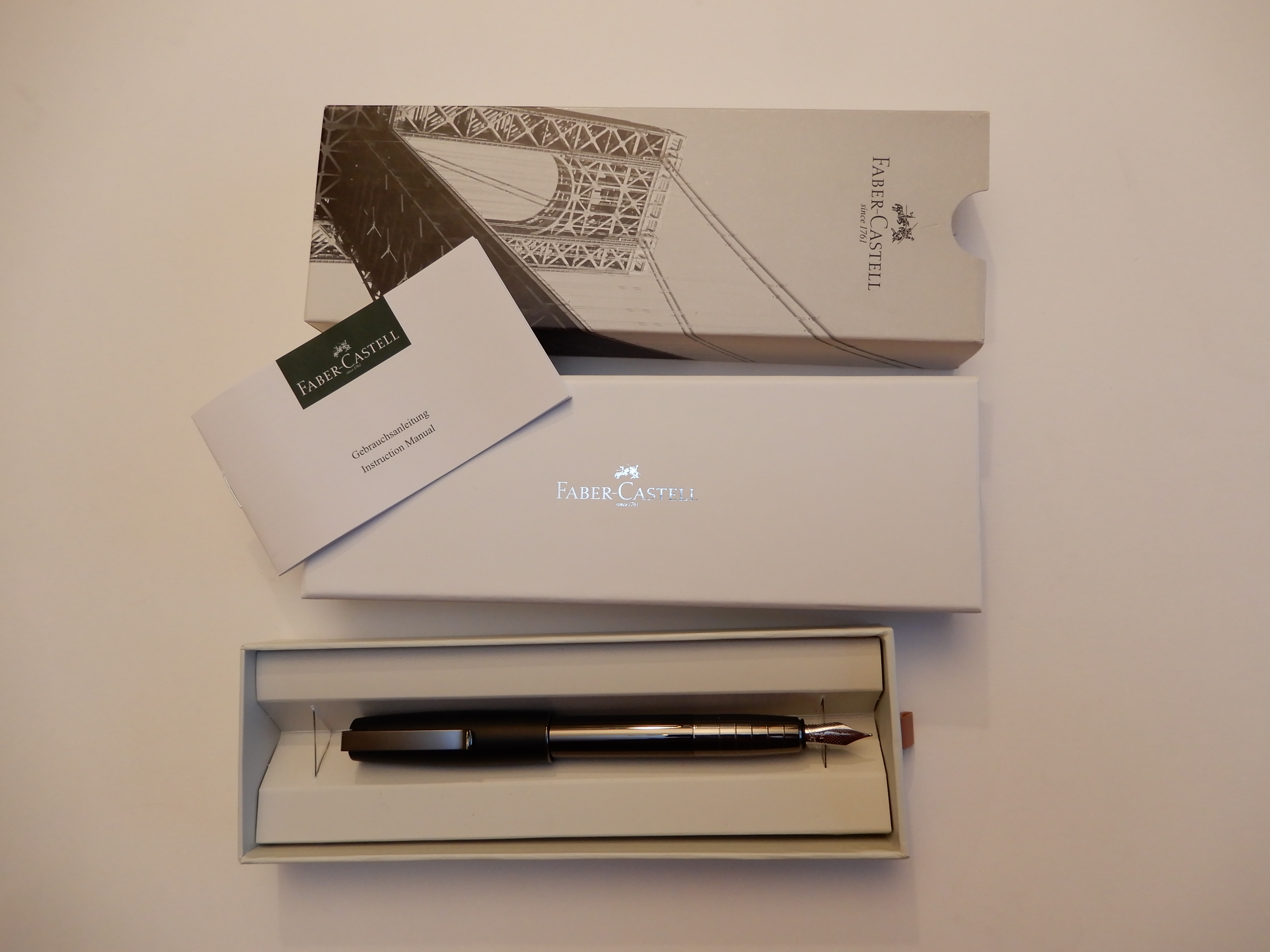
At £165.00, the pen looked to be a bargain compared to most of the others on display and might have been the most affordable pen in the showroom. I was drawn to the Oak material which may develop a lovely patina eventually. I was also mindful that I had enjoyed good experiences with steel nibs from Faber-Castell in the past with pens such as the eMotion, Grip and Loom. I was sufficiently intrigued by the pen to include it with my impulse purchase of the Cobalt Blue ink and I left with a smart Faber-Castell shopping bag and a smile on my face.

Later at the Royal Albert Hall, before arriving I had switched the pen and ink to my shoulder bag. At the entrance, halting for the security check, a torch was shone into my bag and the man pointed to the box and said “What’s in there?” “It is fountain pen ink” I replied. I got the impression that he did not get that answer very often.

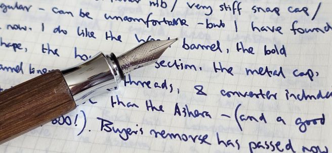
I had the opportunity to fill the pen during the interval. The performance (both the concert and the pen) was excellent. It was necessary to crouch down and put the ink bottle on the floor of the Hall by my seat, as even I was not stupid enough to open an ink bottle in my lap. Once filled, I could take my seat again and test the pen in a small pocket notebook. The nib appeared to be perfectly tuned, right out of the box and wrote smoothly and well, as I have learned to expect from Faber-Castell.

Highly reflective cap.

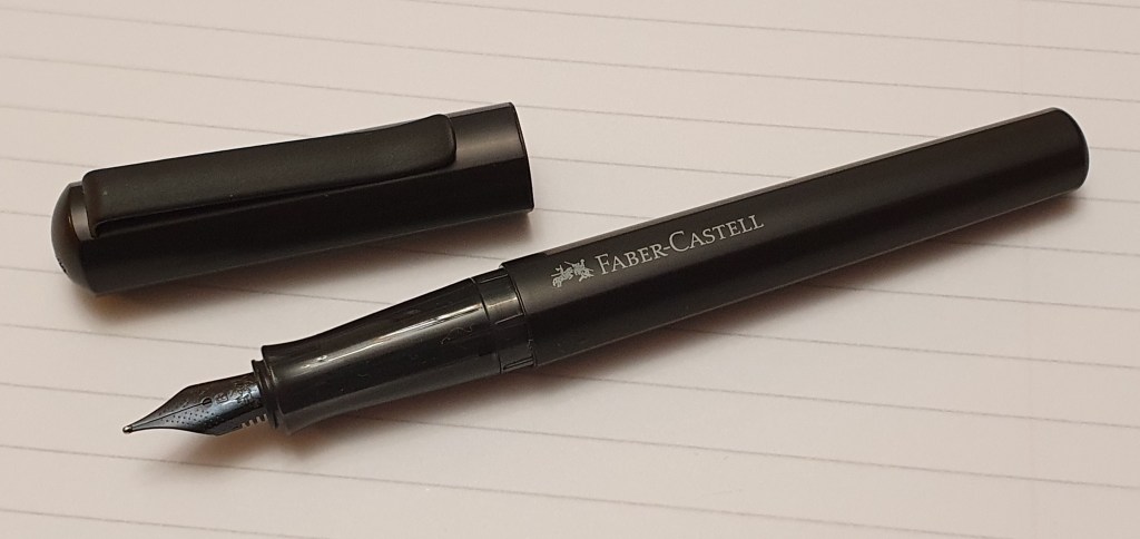
However, within a fairly short time, I began to suffer from an attack of BR or Buyer’s Remorse. This was triggered by the realisation that the pen was lumpy and angular and unusual to grip. I soon discovered that I could have bought the pen and the ink considerably cheaper online. Then thoughts began to crowd in, that I had not needed the pen, that it was arguably not as comfortable, or as good value, as my recently purchased Asvine J16 – a titanium bodied piston filler pen made, we generously assume, as an homage to the Montblanc Meisterstuch 146.

The following day, the BR only got worse, exacerbated by a visit to a home furnishings superstore where I made the realisation that, if it was Oak that I was after, I could buy an attractive table for a modest sum of £99.00.

You get more wood in a table.

However, after a few days, I was over the worst of the BR. I realised that it is not helpful, thinking about a fountain pen’s value in comparison to other household items. Even comparing pens from different brands and countries, it is a mistake to think that we should acquire a new pen “at cost.” As for comparing values in recent pen purchases, of course some appear better value than others and it sometimes helps to combine the cost of a few pen purchases and then average their cost.

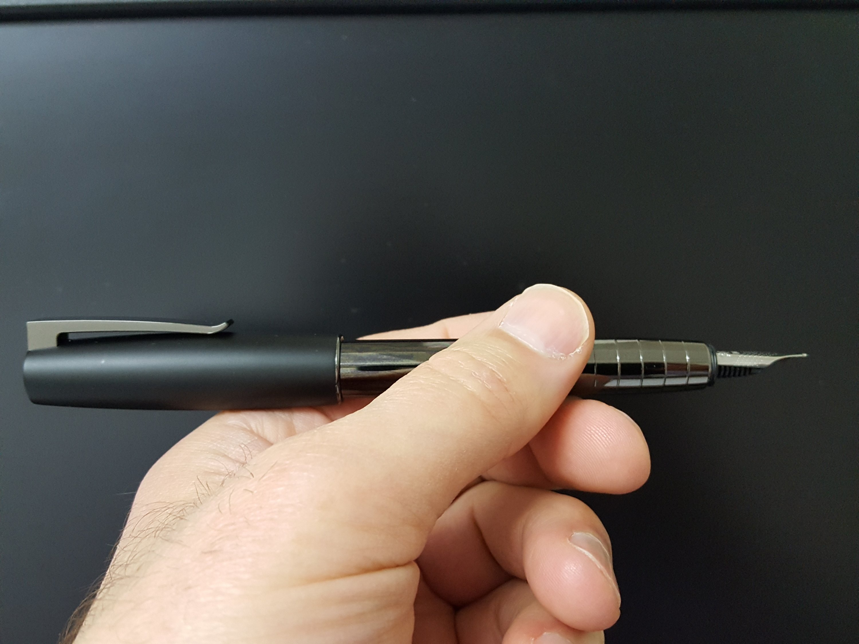
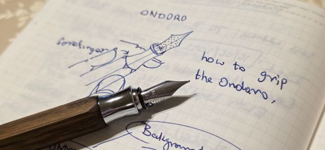
Happily, I soon grew to fully enjoy the Ondoro once again. The key to this, in my case, was finding a comfortable grip. I found this by resting the section on my second finger, and then gripping the pen between thumb and forefinger a little higher up at the bottom of the barrel. I found that I could hold the pen with the nib at the “sweetspot” (rotated inwards slightly) if I held the pen at the facets, leaving one facet in between.

Some writing with the Ondoro and Cobalt Blue ink on Stalogy paper.

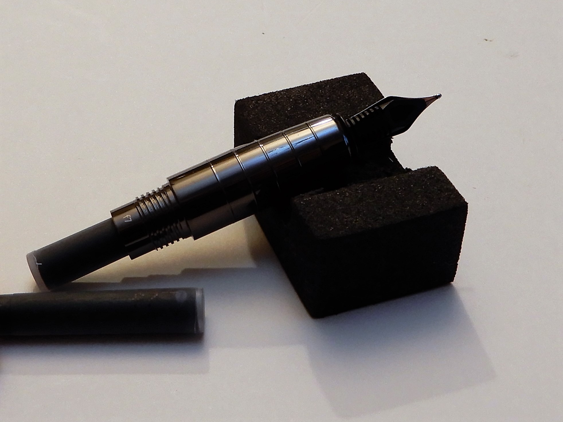
On my pen, and I don’t know whether they are all like this, when the barrel is screwed on to the section tightly, the nib aligns with a ridge between two facets, not a facet itself. I could hold the pen comfortably with the nib rotated inwards (I am a lefty). Once found, the grip is actually very pleasant and a bit addictive!

It is normal to have both likes and dislikes about the design of a pen. A few of mine are as follows. Let’s hope the likes outweigh the dislikes:-

Likes:

  • Bold and unusual, attractive design;
  • Facets: the hexagonal barrel with flat sides, is like an oversized pencil; also prevents rolling:
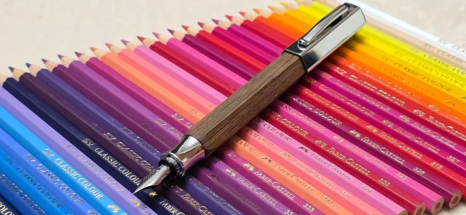
  • The use of wood, as a warm and natural material – with a satin finish which may develop an attractive patina in use; I love having a piece of Oak in my hands;
  • Short, chunky proportions;
  • Weighty metal cap – with shiny plated finish contrasting with the satin finish of the wood;
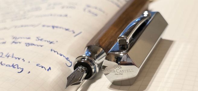
  • Subtle imprint of name and logo on the top of the cap, with the words “since 1761” imparting a sense of history:
  • Comfortable hour-glass section on which to rest the pen;
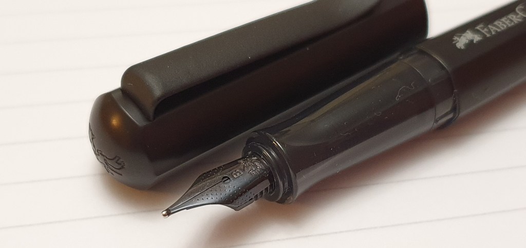
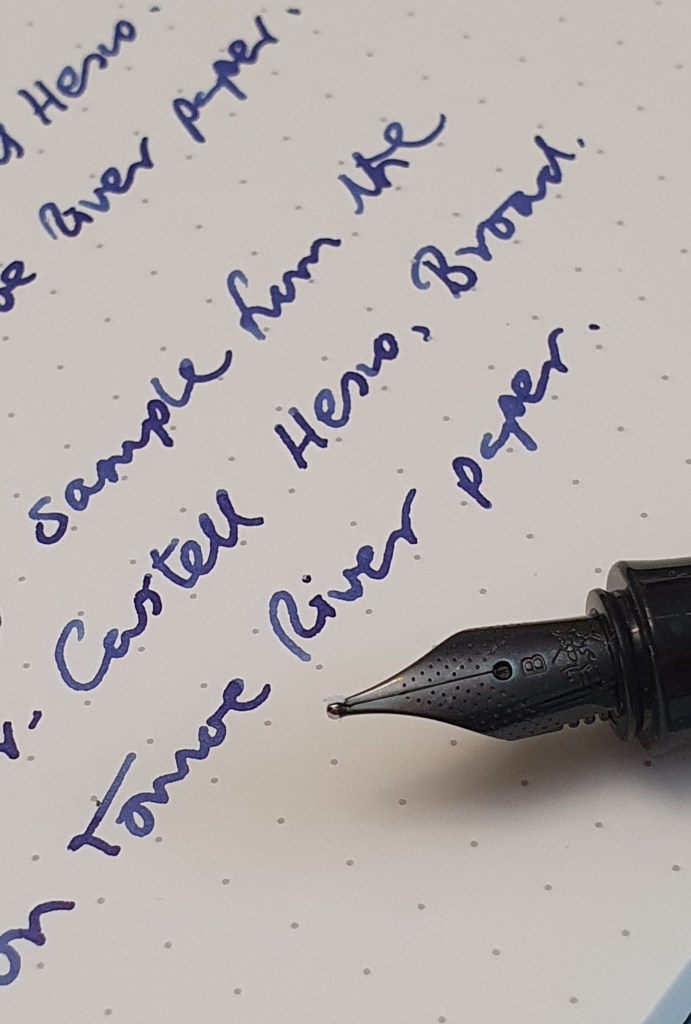
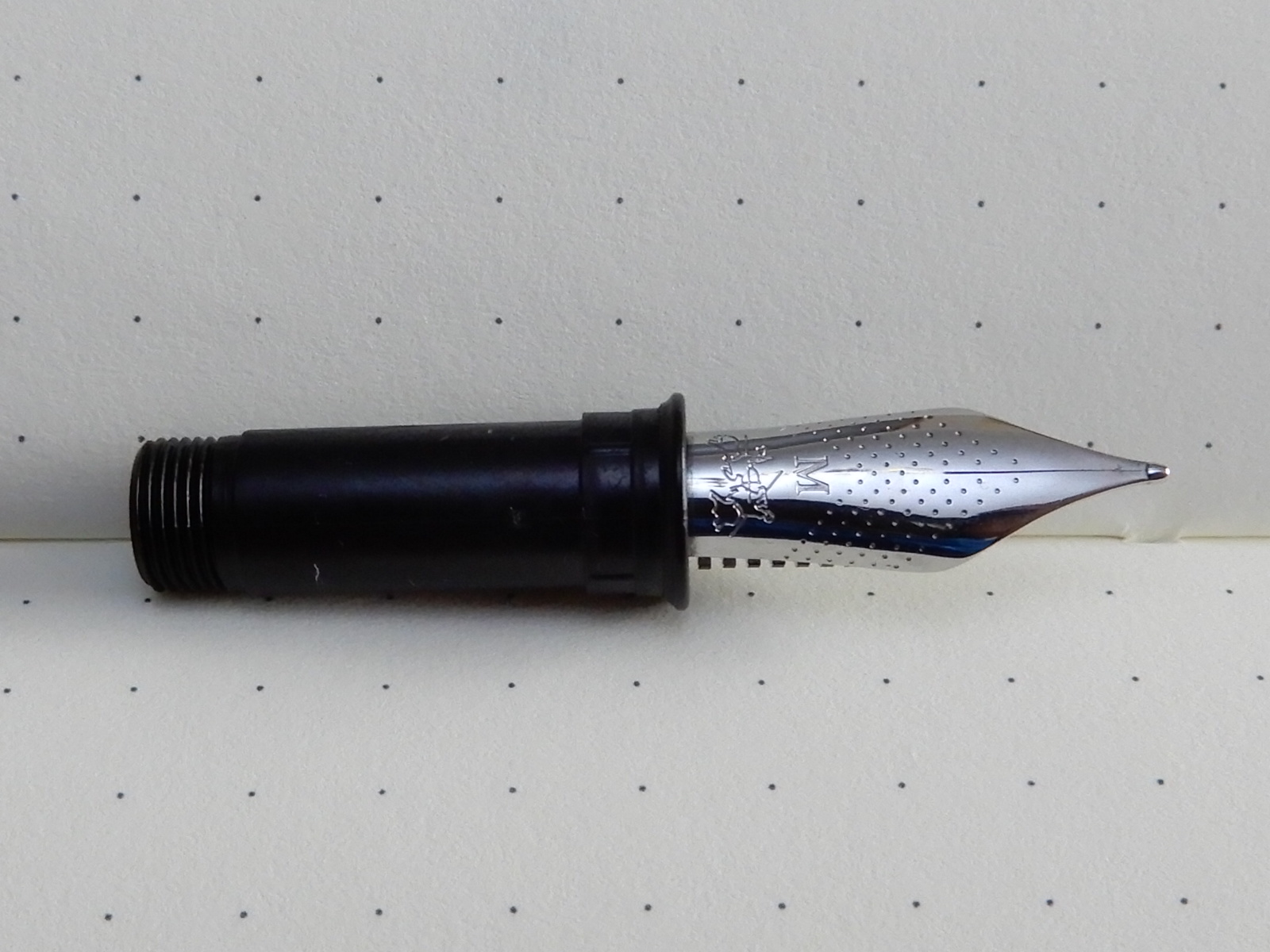
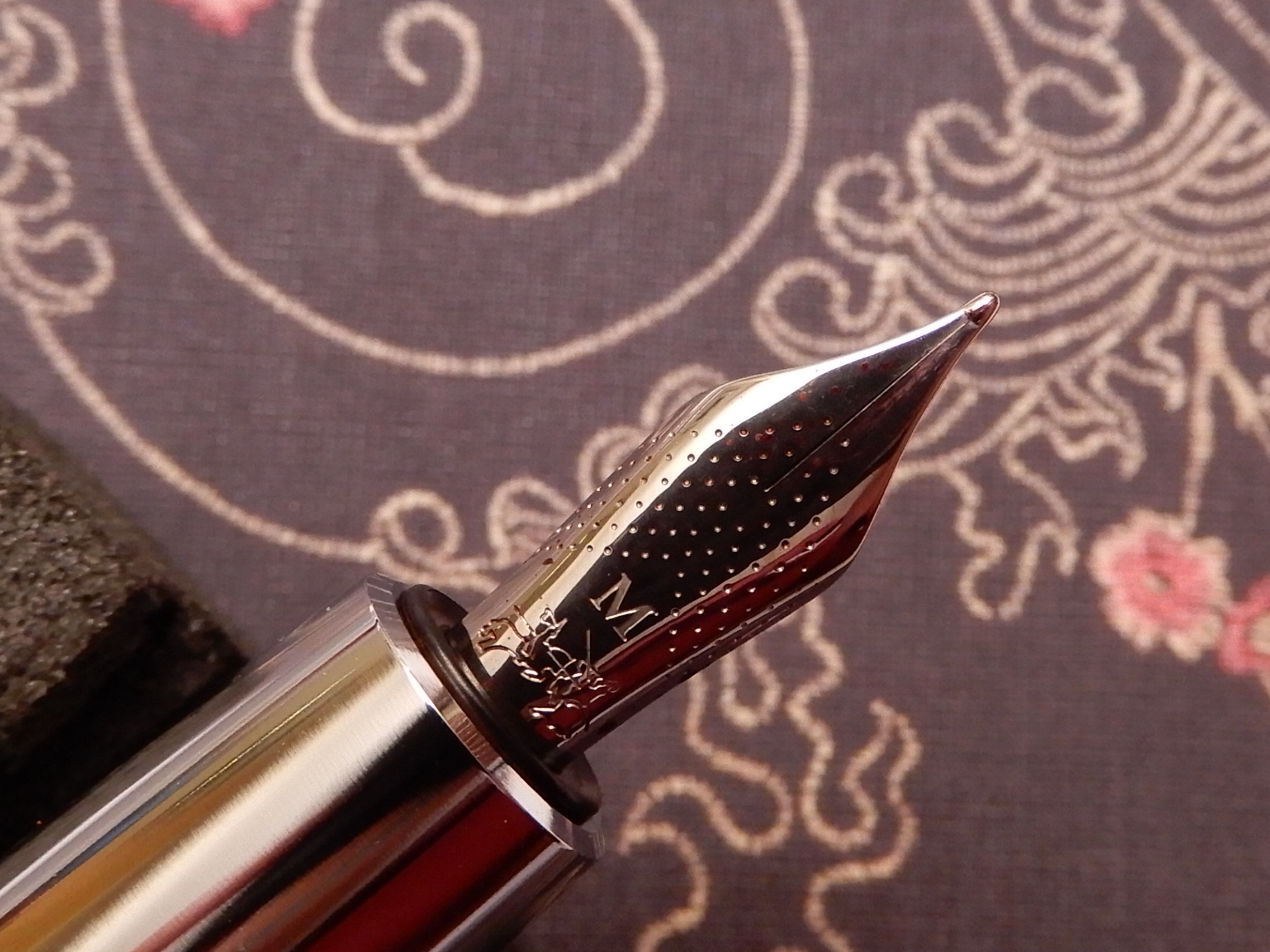
  • Well-tuned steel medium nib writes smoothly and with excellent flow:
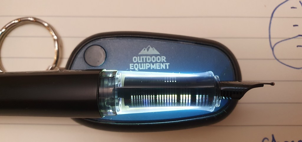
  • A Faber-Castell branded, Schmidt converter is included;
  • Fit and finish are excellent: brass liner and threads to barrel; metal threads on the section; plastic liner to cap;
  • Slightly domed metal barrel finial, protects the wood when pen is standing:
  • Cap can be posted (although making the pen back-weighted and heavy);
  • The tough, short and stocky feel of the pen make it well-suited for an EDC pen.

Dislikes:

  • Facets: Unless held around the section, gripping the pen at the barrel has a risk that the facets may not necessarily fall where you would wish to grip the pen. You may instead encounter a sharp ridge between two facets, or else have your grip dictated by the position of the facets, rather than by the best rotation of the nib to the “sweetspot.”
  • On my pen (and again this may not be same for all), the snap cap is very tight and it needs considerable force to uncap the pen: however this may ease eventually with use; meanwhile, if using the pen intermittently, the pen could be “soft-capped”, to reduce ink evaporation;
  • If posting the pen, the hexagonal cap has to align with the facets and, on my model, this means that the sprung pocket clip will either be to the left or the right of the nib’s centre line and not in line with it – a slight annoyance.

Weights and measurements.

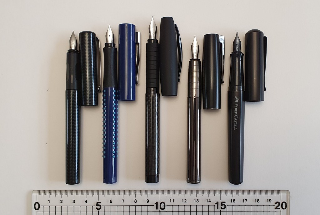
The pen looks and feels, chunky, solid and dense! Capped, it measures around 127mm and uncapped, 123mm. Posted, it is around 157mm. The width of the barrel across opposite facets, is about 12mm. It weighs 44.5g capped, or 27g uncapped and 17.5g for the cap alone. Using the pen uncapped, the weight is very comfortable.

Conclusion.

I am fond of Faber-Castell’s steel-nibbed fountain pens such as the Grip, the Basic, the Essentio and Ambition and have in the past enjoyed the writing experience, particularly with a Faber-Castell Loom, in gunmetal grey, a long-term EDC. I recall the excitement of once buying a Faber-Castell eMotion in Fortnum & Mason, and then heading to the men’s room to ink the pen (with Waterman’s Harmonious Green) and on to the British Museum to write with it. Perhaps I was hoping to recreate that new Faber-Castell feeling with my Ondoro purchase.

This time, the purchase was followed by a wobble and a couple of days of regret, but having come through this, and having spent some time experimenting with different grips, I can now report that I am enjoying the pen and that my bond with it is perhaps stronger as a result of this emotional roller-coaster ride.

Naturally, it sometimes pays to shop around before buying. Also it is best to handle a pen before buying to check that it will be comfortable or whether you will need (and be able) to adapt to it and so there are advantages to buying from a bricks and mortar shop, if you have one. Also, it is human nature to forget to be sensible once in a while.

A gripping challenge, but worthwhile.

Early thoughts on the Faber-Castell Hexo fountain pen.

A friend overseas alerted me to this new model. After taking a look on Cult Pens, I was eager to order one, in black. I had not yet seen one in the flesh.

Faber-Castell Hexo, matt black.

I have been a fan of Faber-Castell’s entry level pens for several years. I found their “school pen” for sale in a Waterstones book shop at about £4.95 (including a box of blue cartridges) and bought a pair, in red and blue. A reader informed me that there was also a black carbon fibre-effect version, which sounded exciting and I eventually tracked one down in a hypermarket in Dubai. These wrote well but all featured nibs which drooped downwards, perhaps to improve resistance to being sprung by over-eager young hands. Also the grip sections were rubber and faceted.

I have also enjoyed the Faber-Castell Loom, in the shiny gunmetal finish which proved a good choice for a work and every day carry pen – convenient, reliable, robust and with space for a spare cartridge in the barrel. In recent years I have also used an Essentio (also called the Basic) and the Grip – good value at around £18.00 now. All of these had medium nibs.

The Hexo seems to slot into the line-up, somewhere between the Grip and the Essentio and Loom. Cult Pens’ current price for the Hexo is £31.50 which is a little less than the RRP. That puts the price slightly higher than the Lamy AL-Star, which looks a close competitor.

Two aluminium stealth pens: the Lamy AL-Star and the Faber-Castell Hexo.

The Hexo looked to be a worthwhile addition, sporting a hexagonal body in matt black anodised aluminium and a nice girthy grip section in plastic. Other options were silver or rose gold.

It arrived in a small, simple green cardboard box. The sticker calls it the Hexo 2019 Fountain Pen. It is made in Slovenia.

Construction and appearance.

The cap is a snap-on one and is firm but not overly so. The cap finial has the Faber-Castell logo of jousting knights, although not very easy to see unless you have a magnifying glass and have the logo the right way up.

There is a very sturdy metal pocket clip which grips well but at the expense of being a little hard to operate. You may need to lift the clip before sliding it over a pocket.

The barrel features the Faber-Castell name in white with the logo again. This aligns with the nib. As there is only one entrance to the barrel threads, the name is always in line with the nib, albeit upside down if you are left handed like me.

The cap facets always align with the barrel facets. If you do try to push the cap on with the facets not aligned, the cap and barrel repel each other like opposing magnets. This is due to raised ridges inside the cap, which I had taken to be for decoration at first.

Ridges on the barrel (left) find the gaps inside the crenellated cap to ensure that facets align.

The cap closes almost flush with the barrel and to a snug fit, with no wobble. Examined very closely there are mold lines down the length of the plastic section, at front and back but not prominent enough to be a problem. Also, a tiny gap can be seen between the barrel and section when tightened, but only apparent when inspected under a loupe.

The grip section is very pleasing: no rubber, no facets, just a gentle taper towards the nib and flared out at the end to provide a comfortable finger rest.

Removing the barrel, the threads look to be of a soft grey molded plastic. However, it turns out that these and the grip section are translucent although it takes a bright light source from behind to see through this.

The effect of a bright light behind the section.

The threaded collar, where the cartridge or converter goes, has an unusual cutaway. I think this may be part of a locking mechanism, as you feel a definite click at the end, when you screw the barrel back onto the section. If you use standard international short cartridges, there is room for a spare in the barrel, very useful if you are out and about. It fits in snugly without rattling but does not get stuck inside.

The unusual cutaway in the section threads.

The nib.

The nib is steel with a stealthy black plating. I chose a broad for a change, hoping for stellar smoothness. I flushed the nib and feed first and dried them, then inserted a cartridge of Graf von Faber-Castell Cobalt Blue. The pen wrote well once the ink started to flow, which needed a squeeze of the cartridge. However, for a broad, it was not particularly wide and not much wider than a typical medium. It looked to be well set up and wrote smoothly, with just a slight roughness in side strokes from right to left which I take to be nothing that writing-in will not solve. The tines and tipping material looked level. Judging by the writing experience at the sweet spot, the nib is of the buttery smooth variety, not a feedbacky one.

The dimpled and black-coated nib. Also, a glimpse of the cap finial logo.

Size and weight.

Being made mainly of aluminium, the pen is light. It weighed in at 20g (including two cartridges on board) comprised as to 13g for the pen uncapped and a further 7g for the cap alone. It measures 134mm when closed, 122mm open and 151mm posted.

Some size comparisons from Faber-Castell’s range: from left to right:- School pen, the Grip, the Essentio (Basic), the Loom and the Hexo.

The writing experience.

The broad nib writes well, although on the medium side. Out of the box it was not quite perfect but has the potential to be a smooth writer. I look forward to putting some mileage on it to run in to my writing angle. Some smoothing with micromesh would do the job quicker, which I may yet try, but there is a risk of taking too much off the tipping.

Writing sample on Tomoe River. Cobalt Blue ink.

Finding an optimum writing experience depends not just on the pen and nib, but on having a smooth, lubricating ink and a compatible, smooth paper that does not cause drag. Tested on Tomoe River paper, the nib does provide effortless writing. On some less suitable papers, there is a feeling of friction which becomes wearing once you are aware of it.

Likes and dislikes.

My favourite feature of the pen is its comfortable large section. I prefer plastic to the Grip’s rubber, gently faceted section. But as well as this, we have the stealthy black finish, the lightweight hexagonal body, the aligning cap and barrel facets, the barrel lock and a host of other boxes ticked: plastic inner cap, a good fitting cap which posts deeply and securely and a strong pocket clip. And that Faber-Castell smoothness in the nib.

I do not have any real dislikes. It is tempting to say that the nib was not quite perfect out of the box, but like a pair of shoes, steel nibs often require a little wearing in. The nib is perhaps a little narrower than expected for a broad. But overall, for its price, I am happy enough with the pen.

Conclusions.

This pen has a lot going for it. It is an attractive and interesting shape, whilst at the same time being plain and unflashy. There are a few surprises: the automatically aligning facets; the clicking lock at the end of the barrel threads; the section which looks black but turns clear with a light behind it. Best of all, it has a comfortably wide grip section which is not rubbery or faceted and a typically smooth Faber-Castell steel nib. Lightweight yet robust, with a capacity for a spare cartridge up the spout, it meets all my requirements for an EDC pen.

The stealthy Hexo in use, with a box of cartridges.

Another look at the Faber-Castell School pen.

Almost two years ago now, in May 2017, I wrote a post: Faber-Castell School fountain pen; initial impressions. I was quite taken with these inexpensive pens and had bought one each in blue and red. Then, as now, I like to visit stationery shops when travelling to see if there are any bargains.

A reader, Mike Jurist commented that the pen was also available in carbon black and that he had been using one as his everyday fountain pen for three months, and loved it. That sounded awesome and I kept a lookout for the carbon black version for months but with no success. I had bought my red and blue in a Waterstones book shop, from a revolving rack and so I continued to give these racks a spin whenever I found myself in one.

And then at last, while in Dubai earlier this year and having a browse in a gigantic Carrefour supermarket in The Mall of the Emirates, I spotted the elusive black version for the first time! I put a couple in my basket. The price was similar to what I had paid before, around £4.00 each, including a box of six royal blue cartridges.

The elusive Faber-Castell school pen, in carbon black.

Essentially the pen is the same as the one I described in my earlier post. But this one is not just a plain black plastic, but a rather nice carbon-fibre effect.

Obviously the pen is crying out to be filled with black ink. At home I inked it up with a black WH Smith cartridge – continuing with the theme of budget ink for a budget pen. The nib was smooth and wrote well.

A pleasing carbon-fibre effect for under a fiver.

My only complaint is that the nib has a very pronounced droop, which is unusual and disconcerting and makes for a rather firm writing experience. This was the same on both of the carbon black pens that I bought and was in keeping with the nibs of my older red and blue models.

Three examples, all with pronounced nib droop.

Despite this, they represent good value and perform well, in terms of nib smoothness and ink flow.

However for a step up, if you do not like the angled-down nib, there is the Faber-Castell Grip, which is a little larger all round and with a distinctive barrel featuring rows of raised coloured dots, which make for an interesting and unusual texture. These can be found for around £15.00 but for the level nib and the slightly larger dimensions and a few other improvements, this too is a great bargain.

A comparison of the Faber-Castell school pen (top) and the Faber-Castell Grip.
But just look at the carbon-fibre finish!

Some silly mistakes with the Faber-Castell Basic (black carbon) and how to avoid them.

Whilst at Victoria Station recently, with ten minutes to spare before my train was due to leave, I popped in to WH Smiths to have a browse around their stationery section. There I made the happy discovery that they sell Faber-Castell fountain pens.

I bought a Faber-Castell Loom earlier this year and have been using it as my every day carry. It is my most successful of the Faber-Castells that I have tried. I found the Emotion too short for me and too heavy; the Ambition (black resin version) also too short and too slippery, or too back-heavy if posted. However, their steel nibs had all been excellent. Even on their £5.00 plastic school pens, the nibs were very enjoyable.

I spotted a pen which looked similar to my Loom, but with a slightly different shaped cap and which had a shiny, black carbon-fibre look to the barrel. Also, the long, cylindrical section was of grippy black rubber. There was even a smoky grey ink window. I now know this to be the Faber-Castell Basic, black carbon version.

DSCN3126
Faber-Castell Loom (above) and Faber-Castell Basic, (below).

I asked to have a look at it and was immediately impressed by the length of the pen when uncapped, (about 134mm) which was considerably longer than my Loom, which I took out of my pocket, to compare. The familiar stainless steel nib looked in good shape and I decided to buy it. The sales assistant apologised that it did not have a cartridge with it but that did not bother me. A new Faber-Castell, like my Loom but longer! What could possibly go wrong?

Later inspecting my purchase, I unscrewed the barrel and found a spent blue cartridge inserted in the pen. Either someone had been testing the pen rather too extensively in the store, or it had had a previous owner and was a return. Never mind, the nib looked promising and I was not bothered about having to clean it first.

At home that evening, I flushed the pen. I planned to fill it with Graf von Faber-Castell Garnet Red. It is important to remove all traces of blue ink from the nib and feed first, otherwise you lose that lovely deep orangey-red colour in the Garnet, and instead it turns to a burgundy. (Ask me how I know this).

So after flushing the section several times I unscrewed the nib and feed unit from the section and patiently left it to soak in a jar of water overnight.

RSCN3112
The screw-fit nib unit for the Faber-Castell Basic

The next day, when screwing the nib unit back into the grip, (having carefully flushed it again, dried it and applied a little silicone grease on the threads) I realised that I had forgotten what it was supposed to look like. Or rather, I did not realise that I had forgotten and went on screwing it in, expecting to get the unit to fit flush into the grip, right up to the start of the nib, like the Loom. (DO NOT DO THIS!) Needless to say, it did not want to go in any further.

Next I got out a standard international converter. None was supplied with the pen, but I had a few different brands. The first I tried, did not grip onto the coupling at all. The next one, (actually a screw-fit converter, from a Conklin Duragraph) gripped nicely so I gleefully filled it with my Garnet Red ink.

DSCN3115
The wrong size converter. (This is NOT a Faber-Castell converter).

Next, on trying to replace the barrel, I found that it was a very tight fit over the converter, although it did just fit, so I screwed the barrel into place. (DO NOT DO THIS EITHER!) I then tried unscrewing the barrel again and was alarmed to find that, in unscrewing the barrel, the metal collar of the converter had unscrewed and was now firmly wedged inside the barrel.

The only way to retrieve this was to offer the converter back into the barrel (losing the ink first), screw it back into its collar, and pull. This operation, thankfully, was a success. I also learned how to disassemble, clean and re-grease a Conklin Duragraph converter in the process.

I found a different converter to use, this time checking not only that it would grip on the coupling, but also that the barrel would fit over it without touching the sides, before filling. I inserted a Kaweco converter (not the mini one but from a Dia 2) which worked fine.

So I filled the pen, replaced the barrel and thought that all would be well. However, the next discovery was that the cap had become an uncomfortably snug fit, when capping and uncapping the pen. Closer inspection revealed the apparent cause of this to be that the rubber grip had several stress cracks at the nib end and the rubber had actually flared out very slightly and was rubbing on the inside of the cap. This probably happened when I had been trying to screw the nib unit too deeply into the grip.

DSCN3133
Damaged rubber grip section, cracked and slightly flared.

Conclusion.

I think the Basic will be great pen, once I have obtained a replacement rubber grip. However it is not fool proof. I have since enjoyed watching old reviews of the pen by Stephen Brown and Brian Goulet who both spoke very highly of it. As a veteran of over 200 pen purchases, I had become sloppy and made a series of mistakes. Did you spot them all?

Notes to self:-

  • Do not rush a fountain pen purchase, if you have a train to catch;
  • Inspect the pen properly before purchase, including under the barrel;
  • Before removing a nib, perhaps take a photo as a record of how it looked before;
  • Do not use force when screwing a nib and feed back into a section;
  • Before filling a converter, (if it did not come with the pen) check that the barrel will fit over it.
  • If the barrel is going to be a tight fit over the converter, use a converter that fits properly.
  • You are only as good as your last pen purchase.

I hope that Faber-Castell will not mind sending me a replacement rubber grip and I can then start to use and enjoy the pen, with a fresh start.

A look at the Faber-Castell E-motion fountain pen.

On a day of beautiful autumn sunshine in September 2015, I went into central London to look in a few pen shops. I bought a bottle of Waterman Harmonious Green ink at Pen Friend in the Burlington Arcade, before going into Fortnum & Mason to visit their fountain pen department.

As I hovered over the displays, the sales assistant Robert asked “What’s caught your eye?” I had found the Faber-Castells and was rather taken with the  striking looks of the E-motion, with its combination of natural wood and shiny metal.  A delivery had just come in and he went to find one in the dark Pearwood finish. I preferred this to the lighter brown version or the all black “stealth” model. After trying the pen on a pad of Graf von Faber-Castell paper, I bought one. It was rather an impulsive buy and at £87.99 was one of the more expensive pens that I had bought.

DSCN1613
Faber-Castell E-motion fountain pen.

I was delighted with my choice. Before leaving the shop, with my pen and a much appreciated complimentary Graf von Faber-Castell note pad, in a distinctive Fortnum and Mason carrier bag, I went to ink the pen with my new Harmonious Green, then went to the Royal Academy across the road, to try it out.

20150926_134711
First inking. Waterman Harmonious Green.

In the years that followed, it has been a pen for which I have mixed emotions. I have bought four more Faber-Castell fountain pens (an Ambition, two school pens and a Loom) and have always found their stainless steel nibs, even on the entry-level school pens, to be very pleasing. The Ambition, E-motion and Loom share the same nib unit. Today I will look back at the E-motion, my first foray into Faber-Castell fountain pens.

Construction and Appearance

This is a metal pen, rather short and tapering at each end, with a large, heavy, shiny polished metal cap. There is a smooth, curved pocket clip, which is sprung and can be operated one-handed.  The cap is tastefully embellished with the Faber-Castell name and logo and the words “since 1761”.

RSCN1607
Cap detail.

Removing the screw cap, in two short twists, you have the nib and section in shiny steel. There is also a tapered finial (perhaps nugget or lump of metal would be a better description) in shiny polished steel at the end of the barrel. The main part of the barrel is very attractively finished with a layer of dark brown Pearwood, with its beautiful, natural dark wood grain and patina. There is no discernible join around the wood and so I suppose it to be a carefully drilled tube of wood, slid over the metal barrel, before the end finial is put in place. Correct me if I am wrong.

The barrel unscrews to reveal metal threads on both the section and inside of the barrel. Everything fits together very well and gives an impression of sturdiness and good quality. A converter was included with my pen but it also takes standard international cartridges.

DSCN1642
With Faber-Castell converter.

The Nib

This is stainless steel, in an attractive shape and finish. There is no breather hole, but the nib features a pattern of dimples, which are subtle yet catch the light sometimes in a most pleasing way. My nib is a medium, but writes on the fine side of medium, which suits me. I later discovered that the nib and feed unit can be easily unscrewed from the section and that the nibs are interchangeable with those of the Ambition or Loom.

RSCN1617
That nib though. 🙂

Dimensions and weights

Length closed: 138mm

Length opened: 117mm

Length posted: 148mm

Weight capped or posted: 53g

Weight uncapped: 31g

Weight of cap: 22g.

DSCN1622 (2)
Faber-Castell E-motion, below a Lamy Safari, (the standard unit of pen measurement).

Handling and performance

The pen writes very well. The tines were level, the tipping material was symmetrical, and the ink flow on all the papers I tried, was just right, neither too dry nor too wet. The nib gives a smooth writing experience, but not overly so; there is enough tooth for the pen to cope with smoother paper and to give a pleasant degree of feedback. Of all the stainless steel nibs that I have used, I would say that these have been consistently among the best. It also provides good “cap-off” time, remaining ready to write even if the pen is left uncapped for a few minutes.

On the downside, for my hands, the pen is just too short to use comfortably unposted. If I were to use it unposted, I would try to grip it low down around the section, but this does not work for me because the shiny metal section is slippery to hold and cannot be gripped steadily.

The cap can be posted (although it needs a hard push and a twist – with a worry of cracking the inner cap or marking the lovely wood covered barrel) and whilst this solves the length problem, this makes for a very heavy pen. You are carrying the full 53 grams as you write.

Conclusion

I do like to be flexible and accommodating to my pens, to allow for their idiosyncrasies and to celebrate their diversity. In the case of the E-motion, I found that the best way to use it was to post a light weight cap from another pen. This means the pen is probably confined to home use, but I have used this method to good effect on at least three pens now  (the E-motion, the Faber-Castell Ambition and the Bic Easy-Click). You might have to rummage around to find the best match of size, weight (and even colour if you are lucky) and try several tops before you find the best fit.

DSCN1623 (2)
Not you Scary. I said try several tops.

It is a good idea to keep some pen tops when roller balls or marker pens such as the Sharpie run out, for this very reason. For the E-motion or the Bic Easy-Click, the Lamy Safari caps work well.  For the Faber-Castell Ambition, I use a Sharpie cap. Obviously it looks unfashionable and eccentric, but it is better than leaving the pen unfilled and unfulfilled.

I find that when I post a Safari cap on the E-motion, I naturally grip the pen higher up and around the warm wooden barrel with only my second finger used as a rest for the metal section. Consequently there is no issue of the section being slippery to hold. And the pen is not too heavy or too short, although still on the heavy side. Length with a Safari cap posted is a comfortable 152mm and the Safari cap weighs just 8.5g as opposed to the E-motion’s hefty 22g.

20150927_232235
E-motion with a cap from a Safari posted. It posts well to add length without adding much weight.

So this, for me, was the way to deal with my E-motions. YMMV. It is an attractive and good quality pen and it is worth persevering to make use of the excellent nib.


A look at the Faber-Castell Loom fountain pen.

If you are trying to resist the temptation to buy more fountain pens for a while, then drifting into Selfridges on London’s Oxford Street and heading for their new pen department, is probably not going to help.

The pen department has moved, from the ground floor to the lower ground floor, near Dolly’s cafe (for afternoon teas). There is a Mont Blanc area and then, next to it, another section with a generous area of brightly lit and enticing glass counters and wall displays, for all the other fountain pen brands that they stock.

As I was not looking for anything in particular, I made the customary lap of the cabinets, admiring but resisting the expensive offerings, but then hesitated at the display of Faber-Castells. These looked particularly good value, after a circuit of all the other brands. I asked to see the Loom fountain pen which I had not handled before. On a previous visit a year or two ago, I had looked at a Loom but at that time, they had only the roller ball version.

Now, there were numerous Loom fountain pens to chose from. Typically, these have a grey coloured metal barrel and section, with a coloured plastic cap in a range of colours. The section is reasonably wide but tapers towards the nib and has five raised rings, to aid grip.

In addition to several models like this, I saw one with a shiny silver chrome barrel and glossy black cap and another, with shiny gunmetal grey barrel and section, and matte black cap. It was this latter model that I was to go for.

20180108_115828862486705.jpg
Faber-Castell Loom, shiny gunmetal version.

I was particularly interested to try holding the pen and to see whether the metal section was slippy or whether the raised rings solved that.

What I found was that the standard, silver coloured metal sections are still a bit on the slippery side for me. However, the shiny gunmetal version was not slippery at all. It seems to have some sort of thin plastic coating over the barrel and section. If you press on it hard with your thumb and then try to slide your thumb on the section, it judders along and squeaks, as it overcomes the surface resistance.

The shiny gunmetal version cost a little more than the others, (£45.00 as opposed to £37.50, I think) but seemed the better option to me, both in aesthetics and handling. I have learned since, that there is also a matte gunmetal version which I have seen online only. I also bought a box of 20 Graf von Faber-Castell cartridges in Cobalt Blue because (a) I love this ink and (b) I loved the orderly ranks of five rows of four cartridges in this handy dispenser, like a box of bullets, and which can be used again.

DSCN1522
A box of 20 cartridges to go with your gunmetal pen.

The pen comes in a decent, white cardboard gift box with a slide out tray in a sleeve and also a cardboard outer sleeve. It comes with one royal blue cartridge plus a dummy cartridge, (showing that there is room for a spare in the barrel) but no converter. There is also a little instruction manual which is now date stamped, 6 January 2018, Selfridges, London. Naturally you pay a bit more than with online-only dealers, but you get personal service, an opportunity to handle the pen (and try it if you wish) and a memorable buying experience.

DSCN1530
Faber-Castell Loom with gift box

Examining it more closely at home, the shiny gunmetal finish is interesting, as it appears to have under the plastic coating, an oily finish of patches of dark red and dark green which reflect the light, like a gun that has just been oiled, except that the surface does not feel oily and on the contrary, can be gripped very well.

20180108_111509167645840.jpg
Loom posted, trying to show the oil-like reflections under the coating.

The pull-off cap is very stiff. (Lips pursed, eye-brows furrowed, elbows a quiver, “Pop” – there it goes!) and also snaps closed with a reassuring click. This stiffness of the cap, so far, is my only negative about the pen but I find that it can be “soft-capped” if in use for extended but intermittent note taking and which I now do. Also the nib and feed are much better than most, at remaining ready to perform, even when left uncapped for several minutes. The pocket clip is, I think, metal but plastic-coated and is hinged, although it lacks the ability to be opened one handed by pressing down at the top.

Unscrewing the relatively weighty metal section, I discovered a tiny code “f7” on mine. I have not yet been able to find any information about these codes but I am guessing it is a production date code, the 7 being for 2017. I think this because each of my 20 Cobalt Blue cartridges also has f7 stamped on them, in black. Also, I looked again at a Faber-Castell Ambition that I bought two years ago and discovered that it also had a stamp near the threads for the barrel, reading “d4” and so I guess that would indicate a manufacturing date in 2014. If anyone has any further information about these codes I would be interested to hear. I do like a production date code. Next best thing to a serial number.

DSCN1527
Loom section, showing code f7.

In use, the metal barrel and section initially feel cold to the touch but swiftly warm up. The cap posts quite deeply and securely, making for an extremely comfortable and nicely balanced pen. At 120mm opened and unposted, it could be used without posting but my preference is to post the cap, bringing the length to around 155mm. Weights are 33g in all (including two cartridges), or 26.5g uncapped. The cap alone weighs 6.5g.

The best thing about this pen though, is the Faber-Castell stainless steel nib. This is a traditional shape, but with an attractive dimpled pattern and no breather hole. There is the Faber-Castell logo of jousting knights (although you need a magnifying glass to make this out) and an M for medium. Mine performed perfectly, glassy smooth and with ideal ink flow, straight out of the box. This has also been my experience with the same medium nibs of the Faber-Castell e-motion and Ambition. Some reviewers find the nib to be too smooth, so that it runs away with you. I do not think this is a fault but you do need to slow down, particularly if you are used to writing with a ball pen. It is not a feedbacky nib and so it might skip on very smooth papers.

DSCN1510
Loom uncapped.

Incidentally, the nib and feed are within a black plastic collar and the whole nib unit can be easily unscrewed from the section. You may then extract the nib and feed from the collar, which are friction fit, if you ever need to. I refer to SBRE Brown’s useful Disassembly Line videos which demonstrate this process. When replacing, take care to a line up the nib and feed correctly with the air replacement channel.

DSCN1523
Disassembled. The additional nib and Faber-Castell converter were from previous purchases.

Using the pen extensively at work and at home this week I found that the weight, balance and feel of the pen in the hand were so comfortable, that I soon stopped being aware that I was holding a new pen and was aware only of what I was writing. It is rather like having a very comfortable new pair of shoes.

I used up the supplied royal blue cartridge first, rather impatient to get on to my Cobalt Blue cartridges. The Cobalt Blue is one of my all time favourite inks, being a rich dark blue but without being blue-black.

So, the New Year pen fast has been broken. But I have no regrets and am delighted with this pen, which I personally find more comfortable than both my Faber-Castell e-motion or Ambition. At this price level, other comparables for a metal-bodied, stainless steel nib cartridge converter pen would include a Lamy Aion, a new model Parker IM, or Sheaffer Sagaris, but which all use their own proprietary cartridges. But for handling and nib performance, I would recommend the shiny gunmetal Loom.

Faber-Castell School fountain pen; initial impressions.


Whenever I get the chance to travel, one of the joys is to visit the stationery shops and supermarkets to see whether they have anything different from the familiar range of fountain pens found in our local WH Smith, Rymans or Paperchase.

The hope is that I will discover a nice new pen, from a well known and respected brand, which writes like a dream, targeted at school students and costs very little.

Last week, without even travelling, I was browsing in a local Waterstones book store and was distracted by the sign for Stationery.  There, among the greeting cards and notebooks, on a revolving stand, was a Faber-Castell Schulfüller School pen, for just £4.99, in a blister pack with a box of 6 Faber-Castell cartridges.

20170510_210610

This looked to be a good find. The design was a basic, bright coloured plastic barrel and cap, a black rubberised section with two flat grip surfaces left and right of centre, (like a Lamy Safari), and an attractive-looking stainless steel nib. With 6 cartridges included, it was a no-brainer and it just remained for me to decide whether to go for blue or red. I chose blue. There was only one of each colour left on the rack and it seemed greedy to take them both.

On closer inspection, the packaging declared that the pen featured a tough stainless steel nib with iridium tip, a rubberised grip zone and was for right and left handers and had a tough plastic barrel with metal clip. The ink cartridges were made in Germany and the fountain pen made in Slovenia.

On first inking the pen, using one of the supplied cartridges, I was delighted when the pen wrote immediately with no shaking, squeezing or coaxing, very smoothly and with good flow. The Royal Blue ink is very pleasant having some shading when a little added pressure is applied to the nib.

20170513_173216

I will not go overboard in describing what is a very simple and inexpensive pen. It measures around 133mm capped , 122mm opened and a very comfortable 150mm with cap posted. It takes standard international cartridges. A very useful feature is that there is room to carry a spare cartridge in the barrel so that you are unlikely to run out in a day.  The barrel does not have an ink window. It does have some air vents at the base of the barrel as an anti-choking feature and so this is not suitable for converting to eye-dropper. You could however use a converter, for bottled ink although none is included.

For such an inexpensive pen, there is a lot to like. I was disproportionately pleased for my modest £4.99 outlay. I particularly liked the following:

Likes

  • Respected, long-established German brand;
  • Attractive stainless steel Medium nib, with dimple pattern (similar to the Faber-Castell emotion and Ambition range) and jousting knights logo;
  • Writes smoothly with good flow and lubrication; nib is firm but can provide a little line variation with some pressure;
  • Comfortable to hold either posted or unposted; light-weight cap posts well, without upsetting balance;
  • Barrel has space for a spare cartridge;
  • Secure, snap-on cap has a springy, metal pocket clip with Faber-Castell name in black letters (the correct way up for left handers like me, when posted);
  • A white plastic inner cap to stop the nib from drying out;
  • Good, practical and simple design; does not look like a child’s pen;
  • Excellent value.

Dislikes

I could not find much to dislike, especially for the low price. I did notice that the nib and feed seem to point downwards, (like the droop-nose design of the Concorde when taking off and landing). In a photograph on a mobile phone camera, the distortion made this even more pronounced. It is not a concern as the pen writes very well. However I was curious to see whether this was just a one-off or whether this was by design. This was all the excuse I needed, to go back to buy the red one.

20170514_193131

Well, the red one had the same nib droop as the blue. I was not quite so fortunate with the nib of the red pen at first, as the tines were not quite aligned, viewed with a loupe and there was a little bit of scratchiness in side strokes. This was easily remedied by a little gentle bending of tines until they were level. Thereafter the pen wrote smoothly, like my blue one.

I decided to put a red cartridge in the red pen. I had a bag of 50 standard international cartridges in assorted colours from Paperchase which had cost just £2.00, although they might be a bit more now.

I have not experienced any hard starts with either of the pens (although, admittedly, both have been in quite frequent use so far) and I think they make ideal pens for carrying around without worrying too much. In conclusion, these are very enjoyable pens to use and would make great gifts, if you can bear to part with them.

20170514_170535