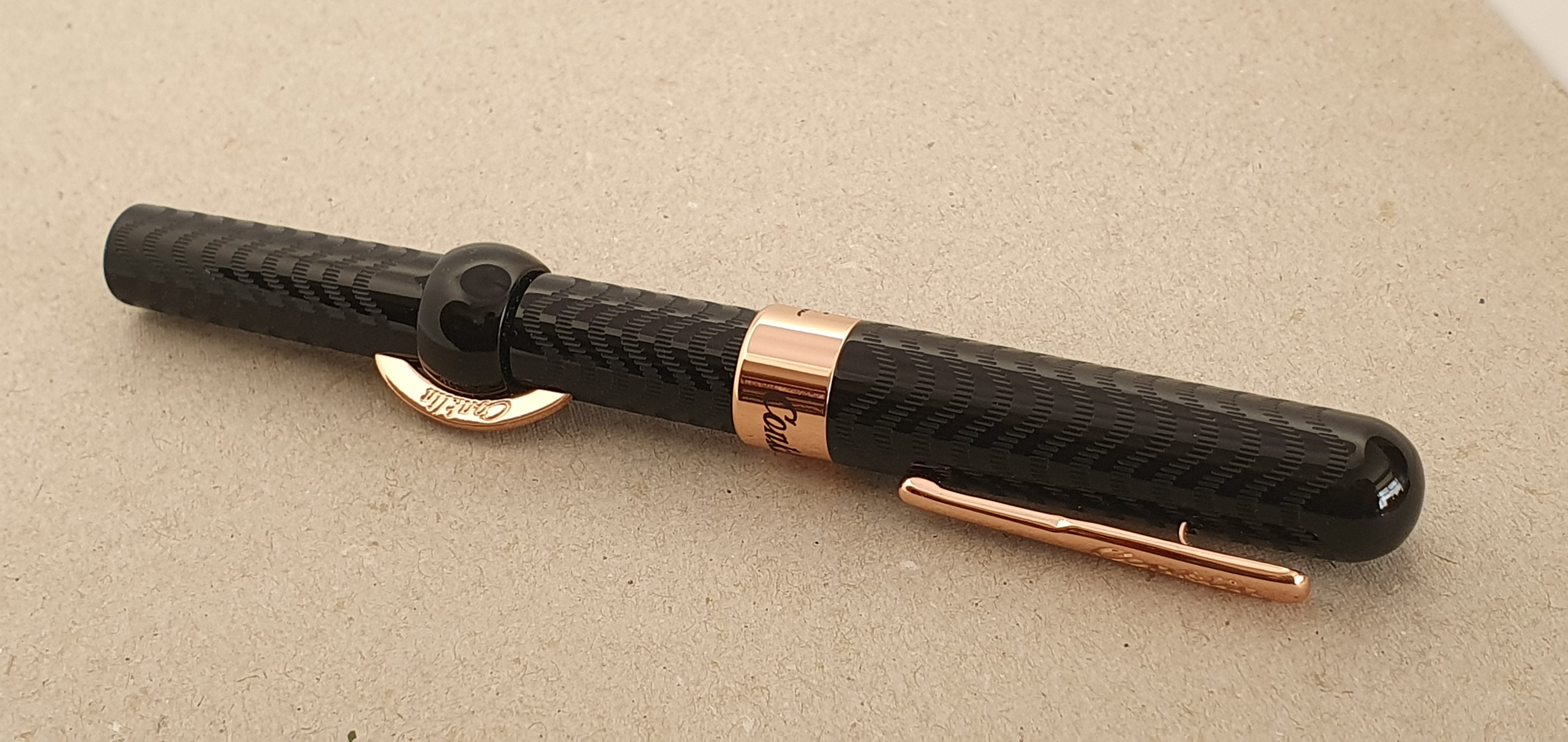
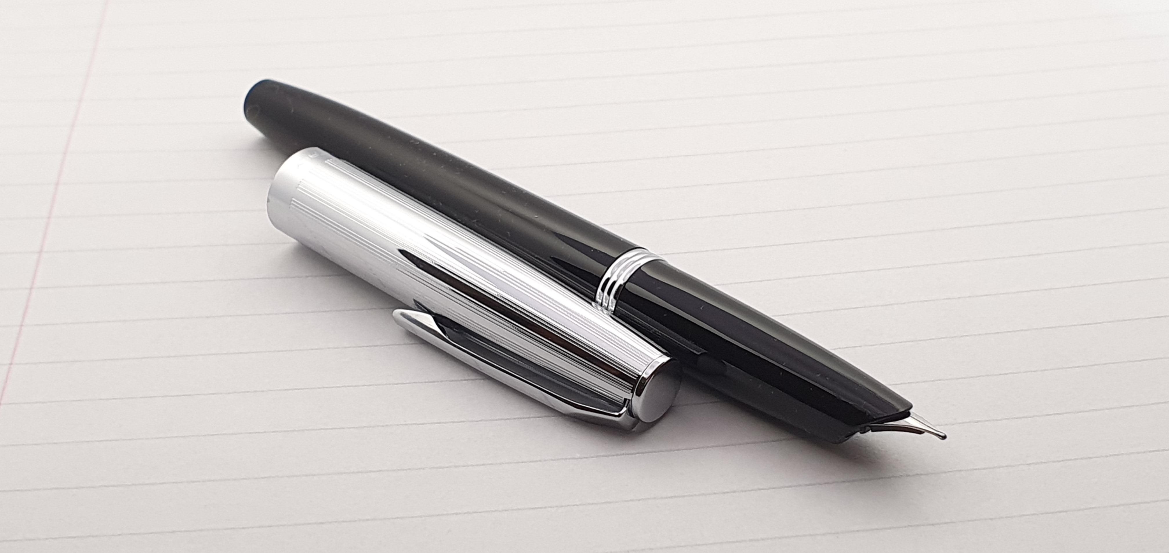
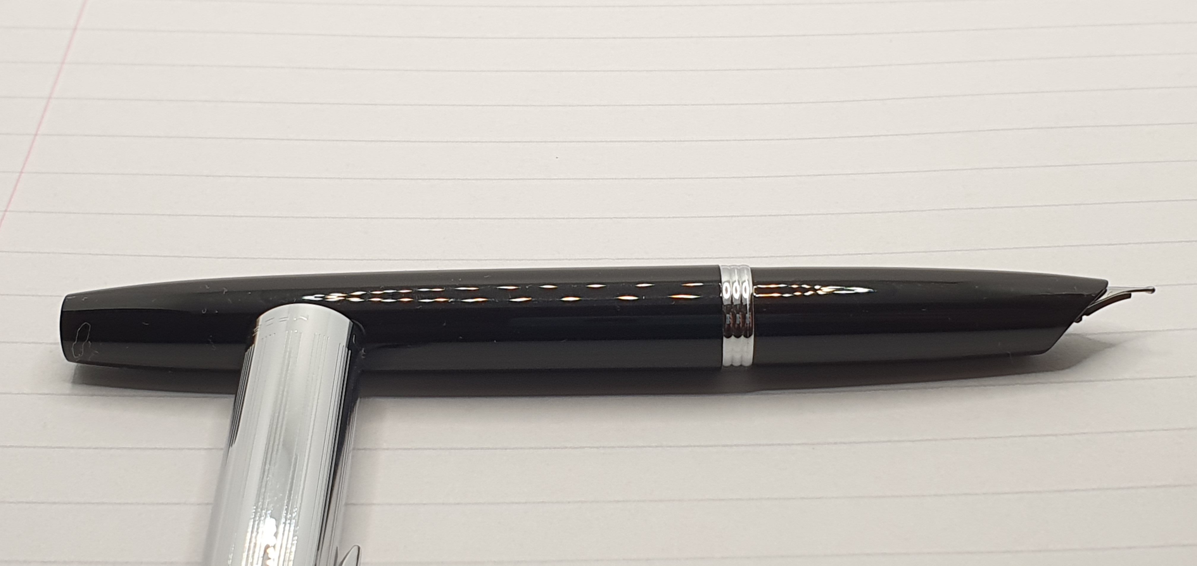
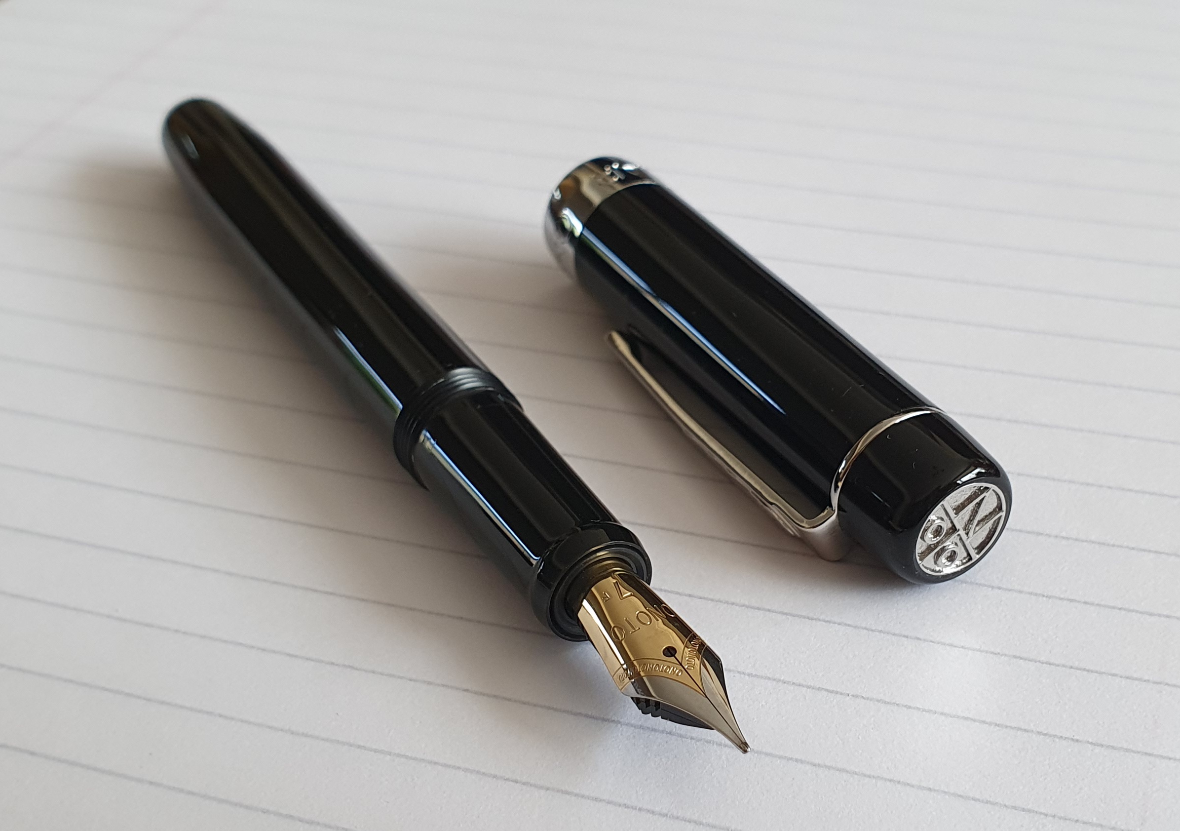
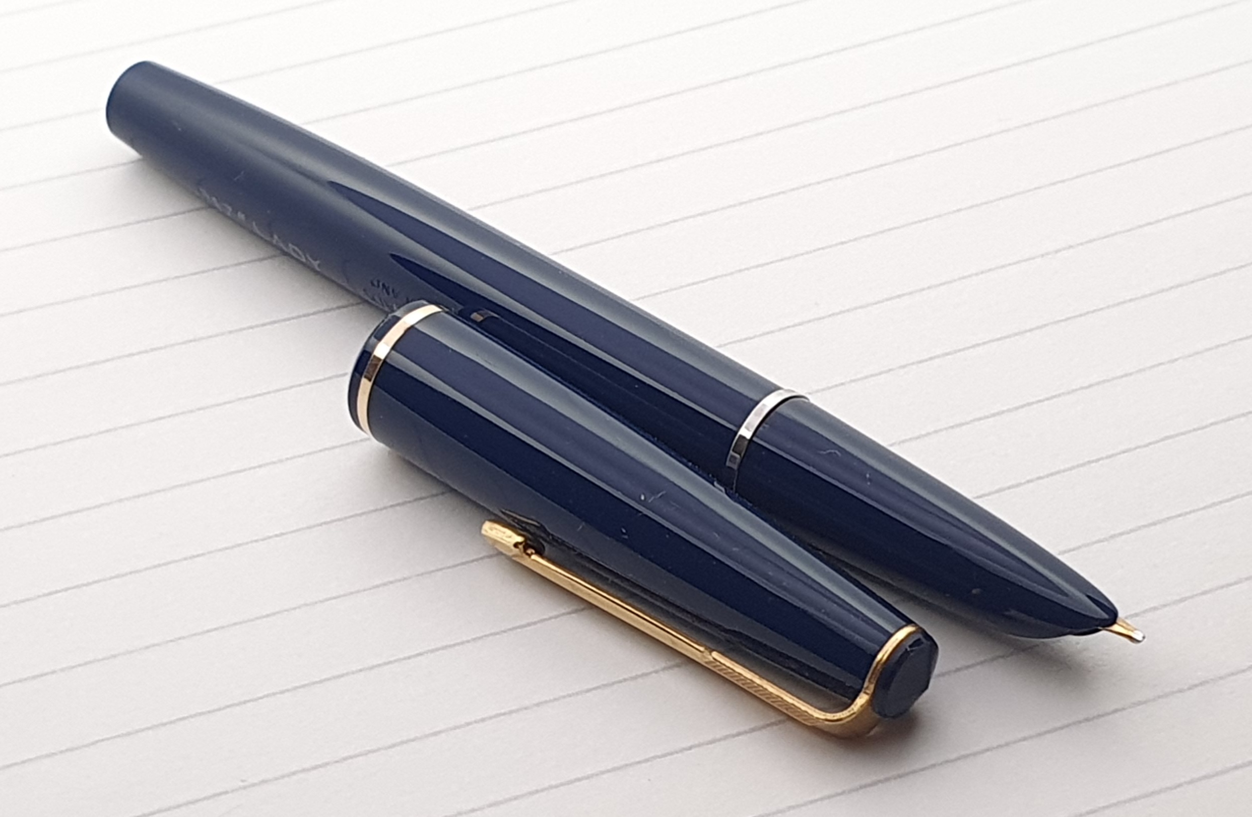
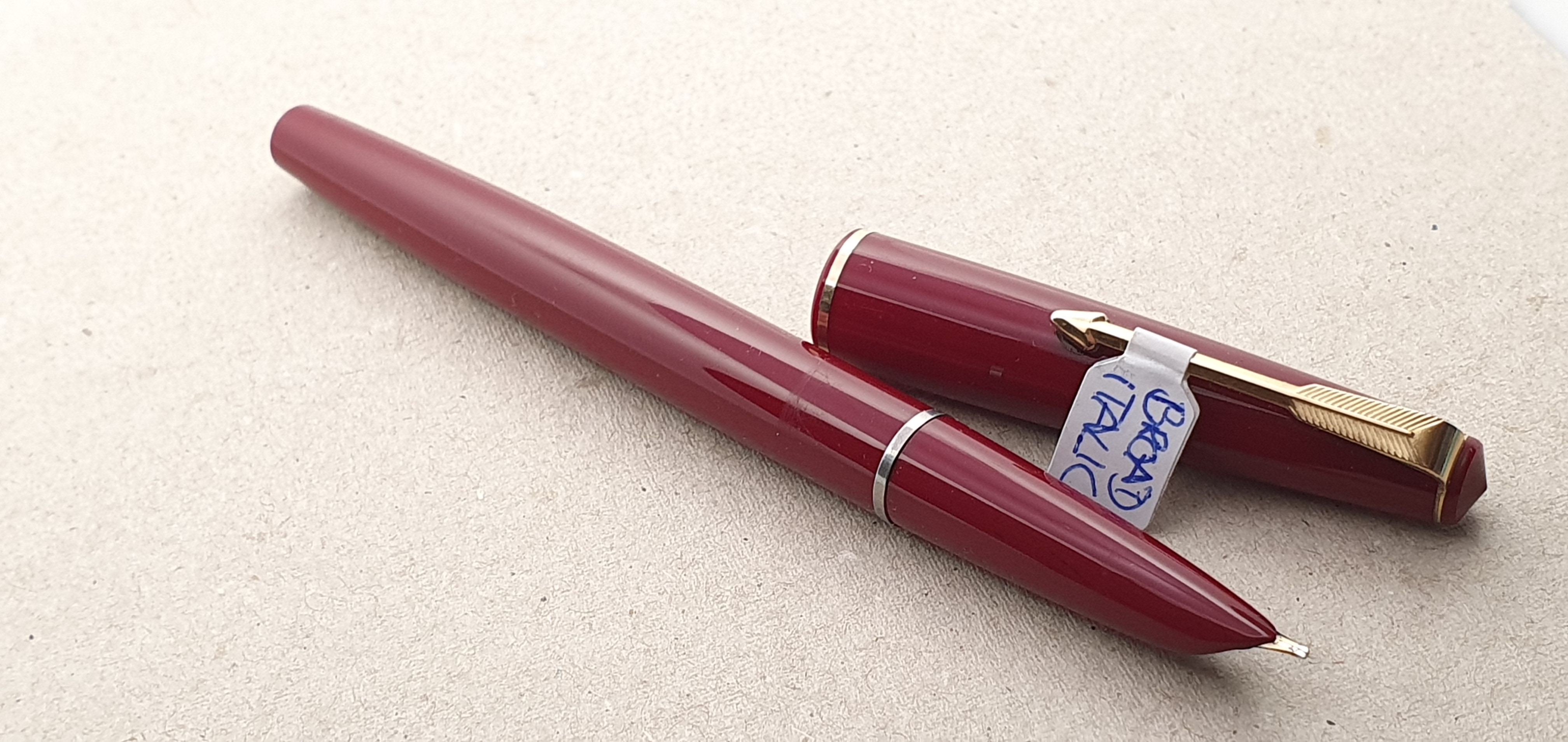
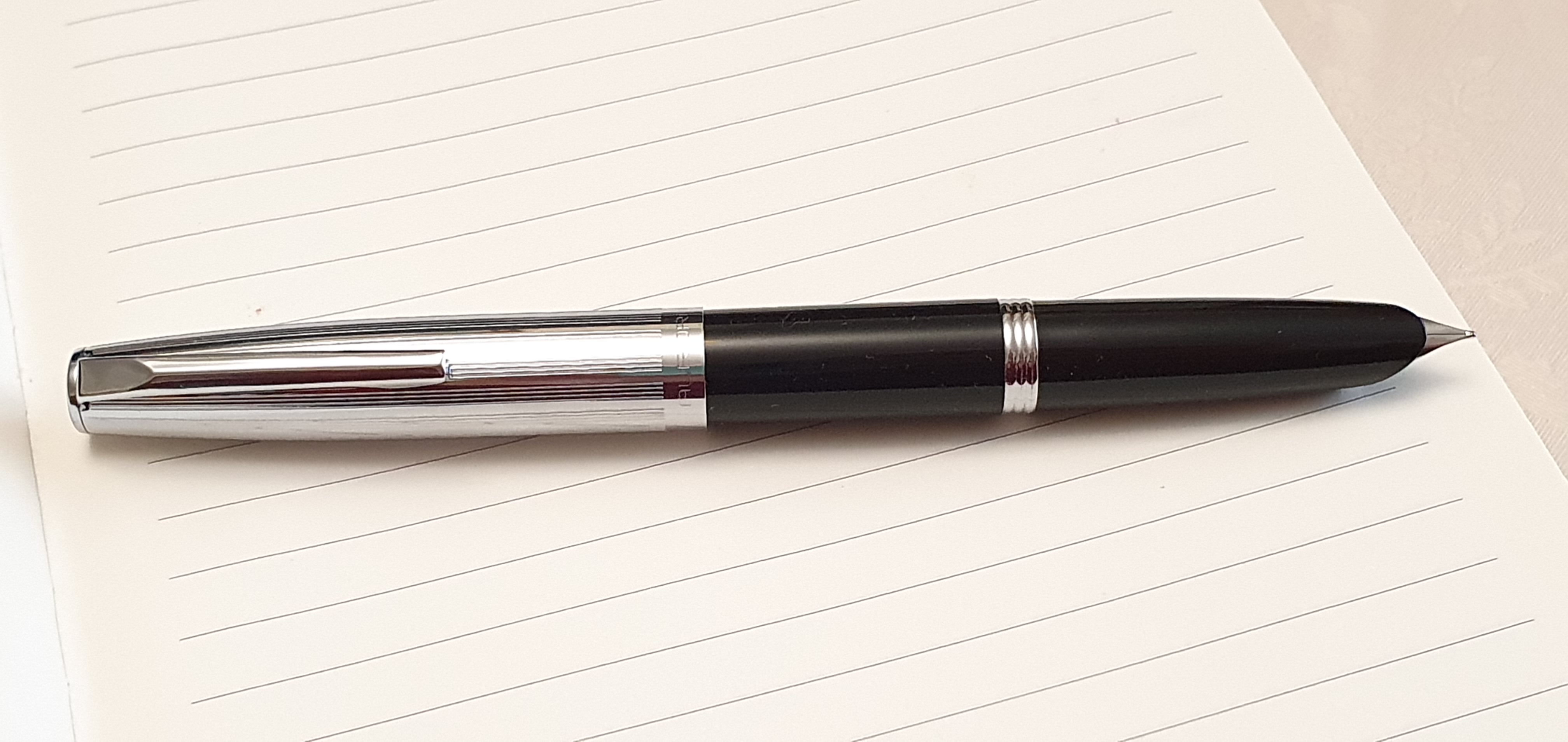
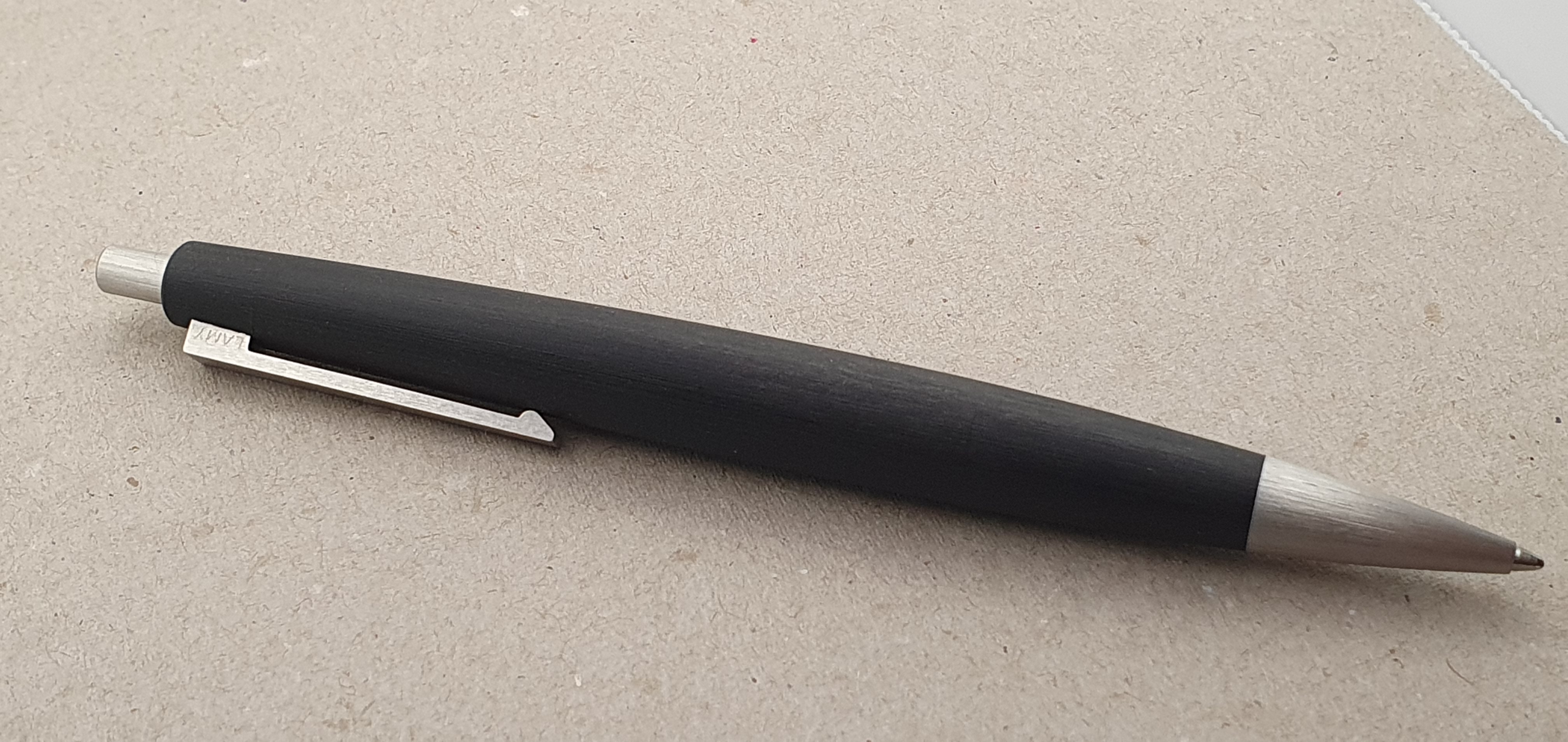
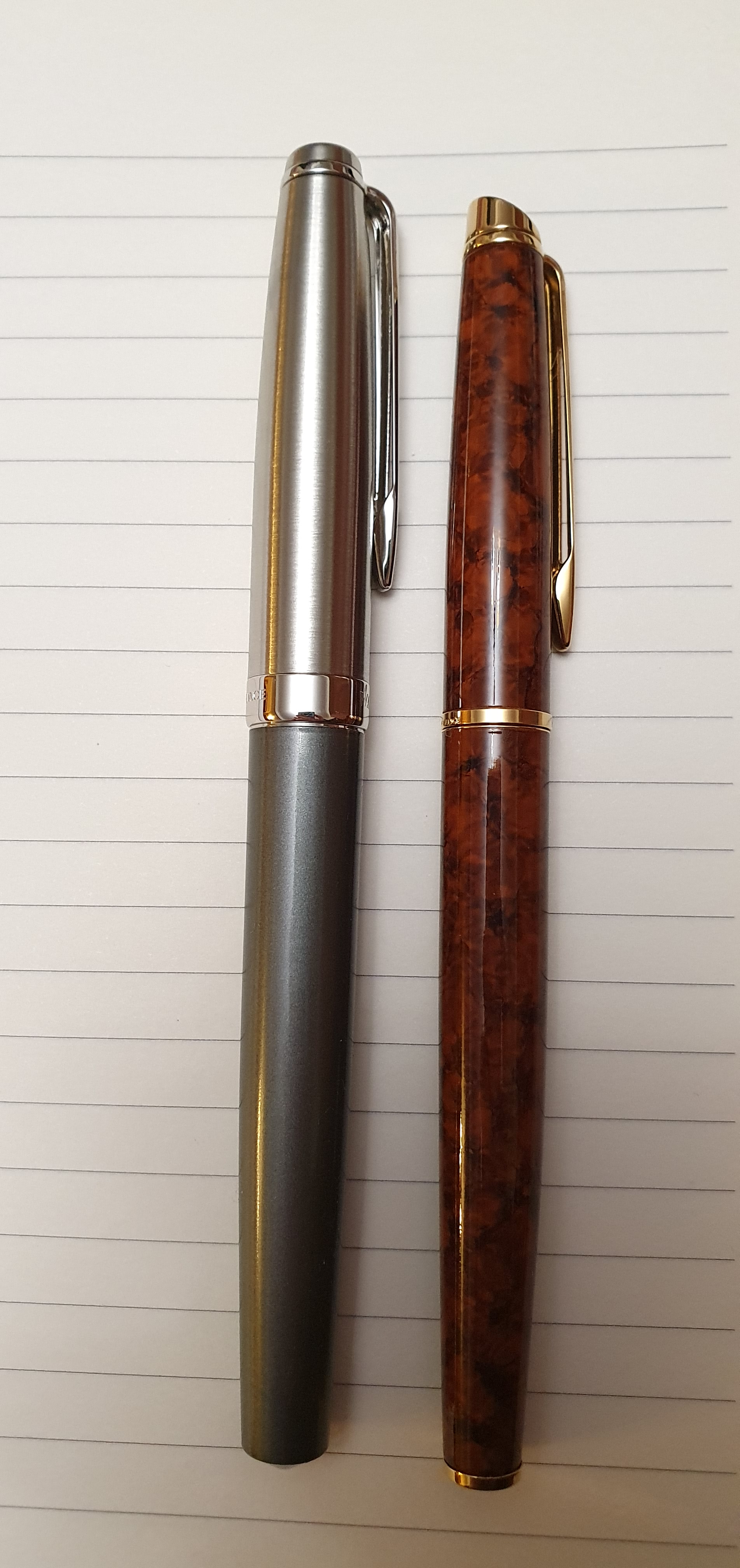
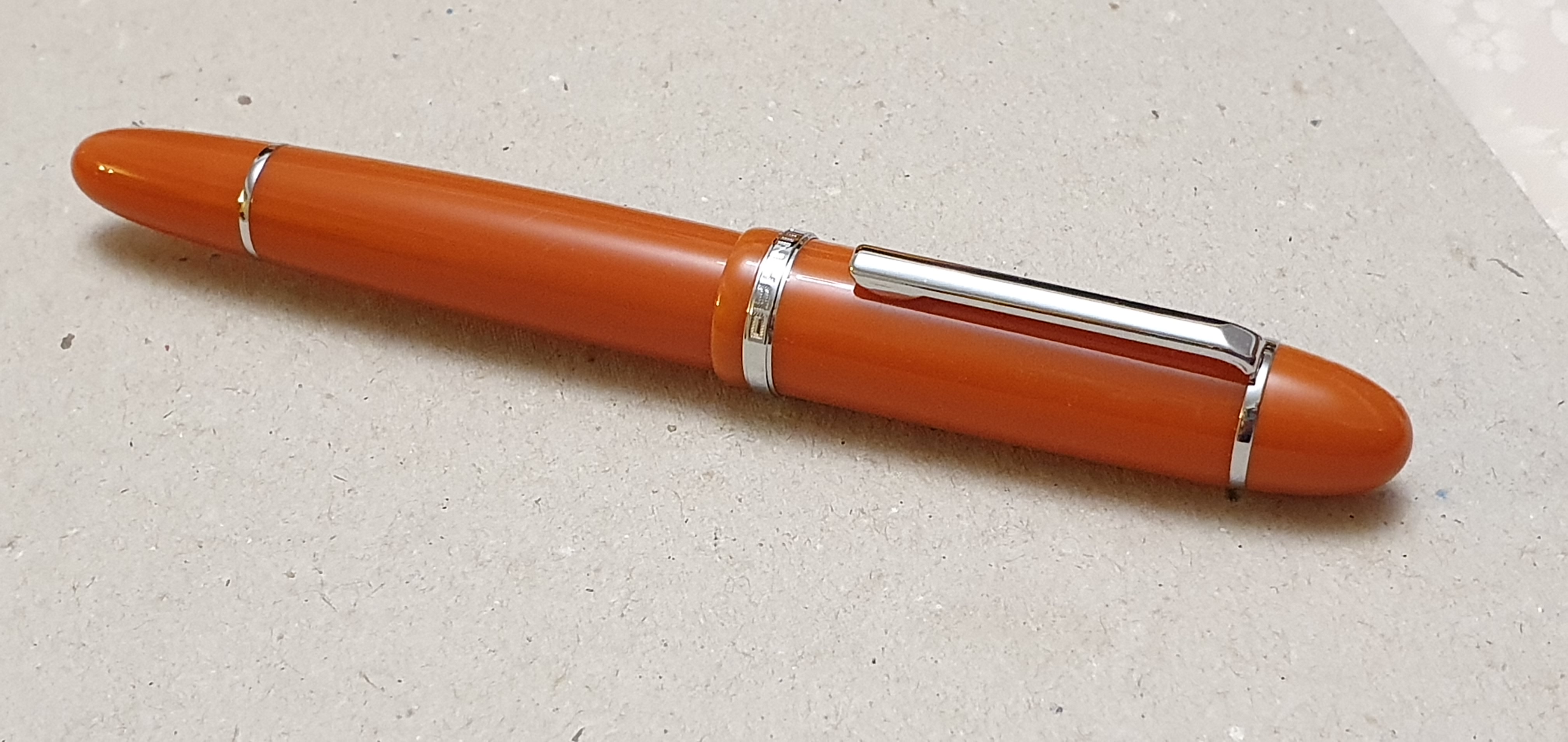
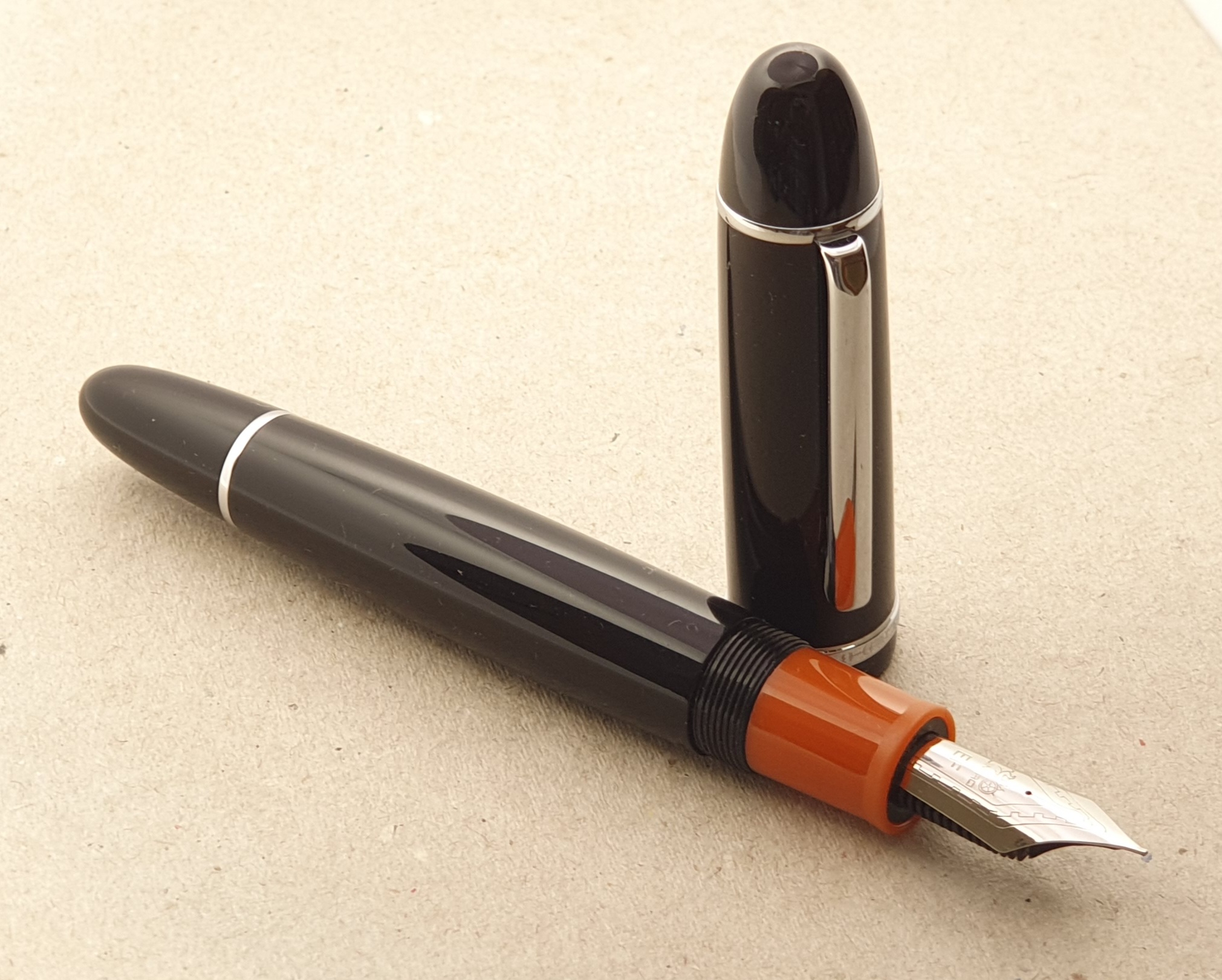
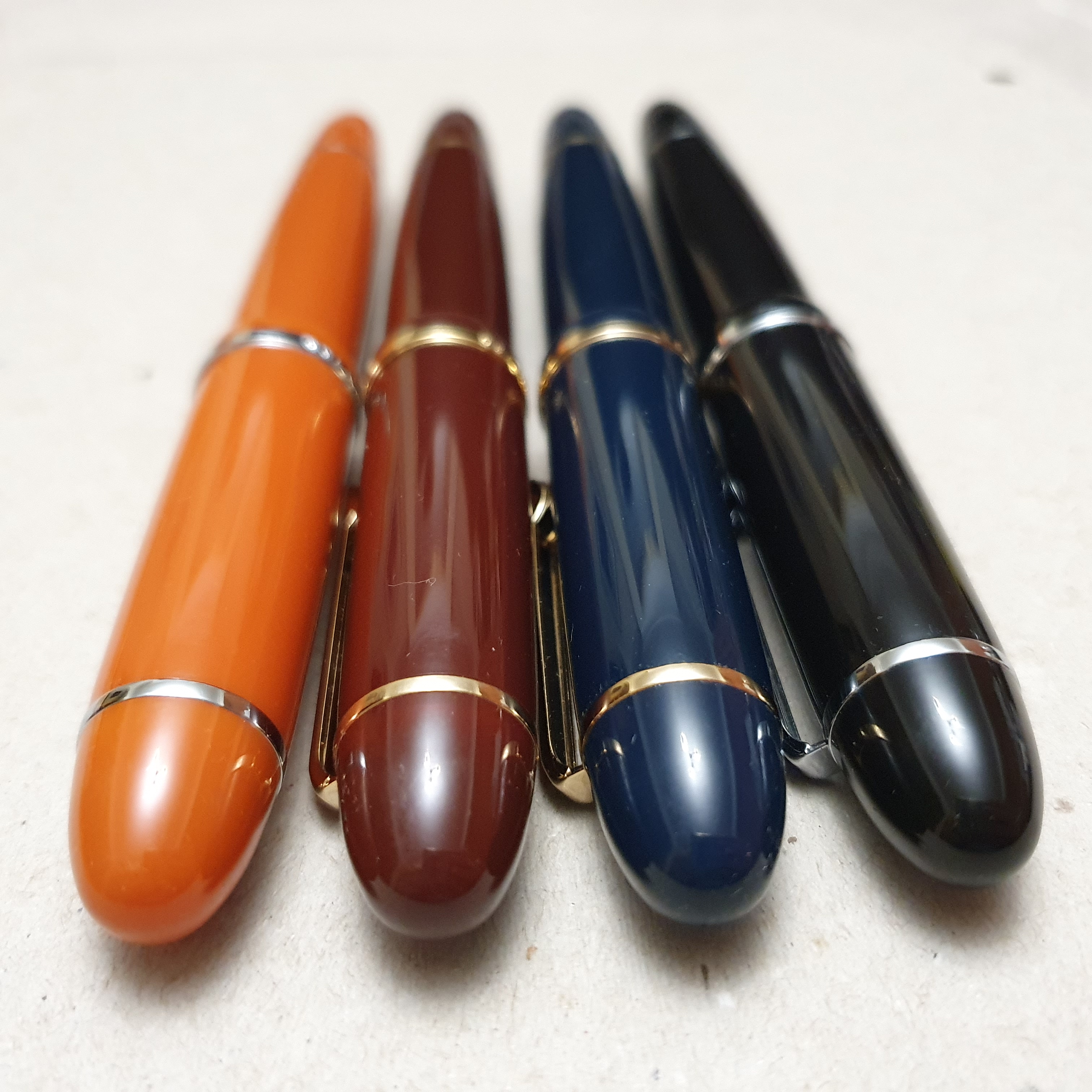
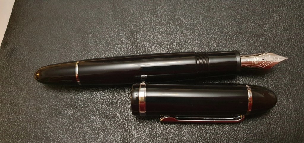
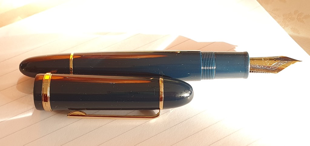
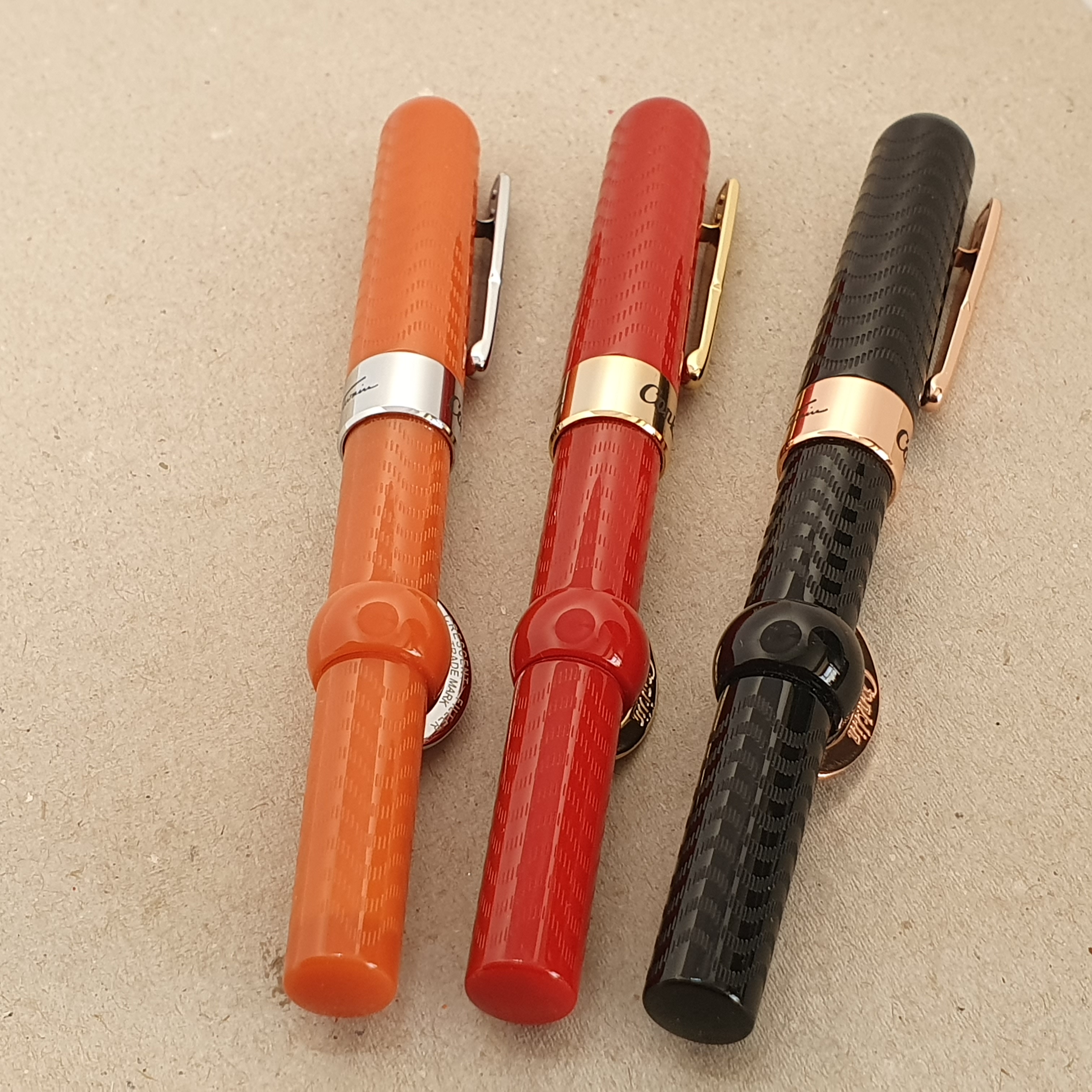
This pen was part of my haul from the London Pen Show in March 2023. I do already have a pair of these, also bought at a pen show several years ago, one in red and one in a dark orange, (which might be called coral) but was newly tempted by this handsome black chase edition with rose gold colour trim and a stealthy black-coated nib.
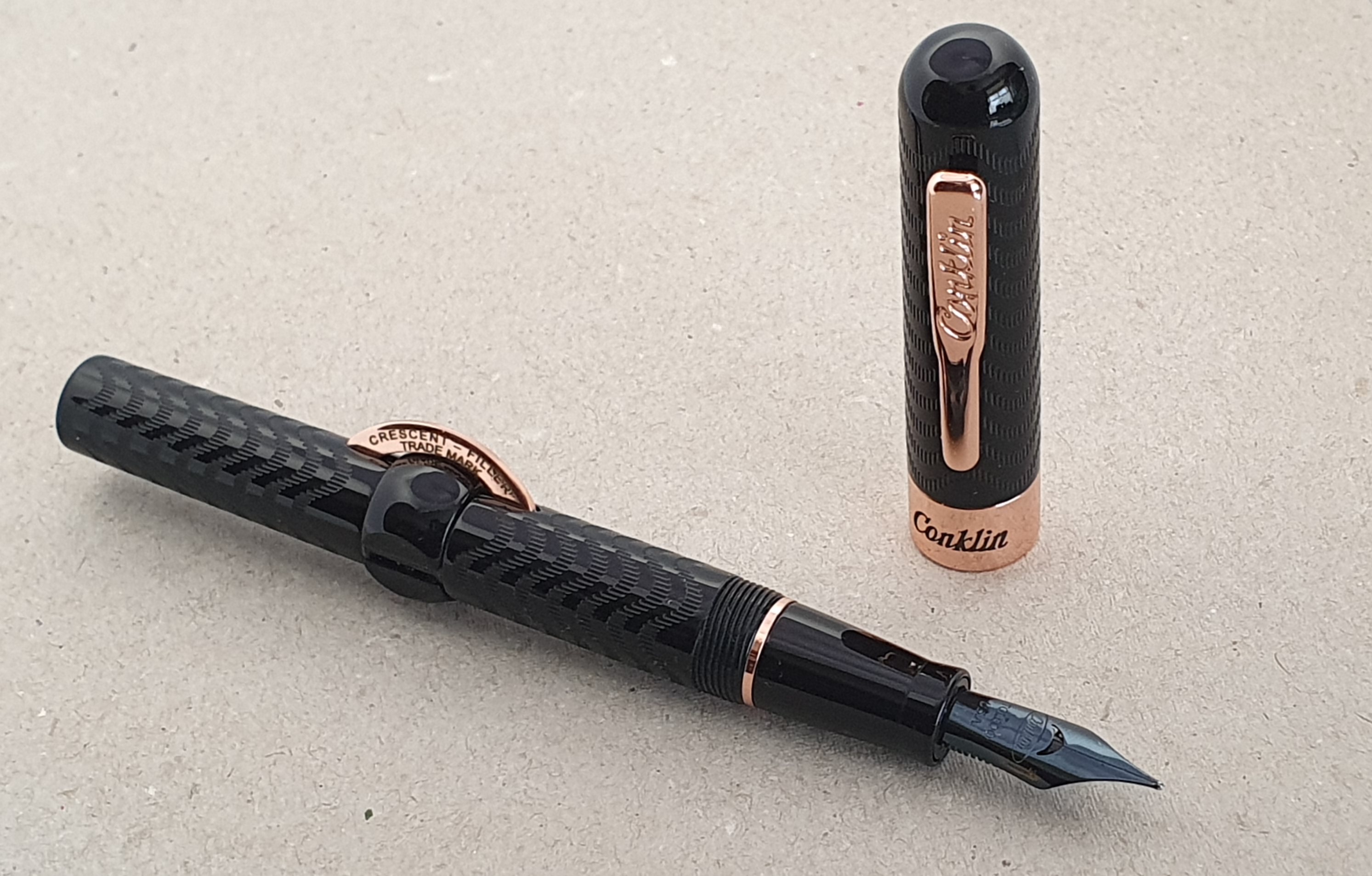
The pen is based upon the original, designed by Roy Conklin between around 1897-1901 and featuring a quick and easy filling system. Advertisements at the time claimed that the pen “fills itself in four seconds.” Whereas the original was made of ebonite, the modern one is of some sort of plastic or resin, but has a pleasing, glossy finish and an attractive wave pattern on the barrel and cap for decoration and texture, like the original.
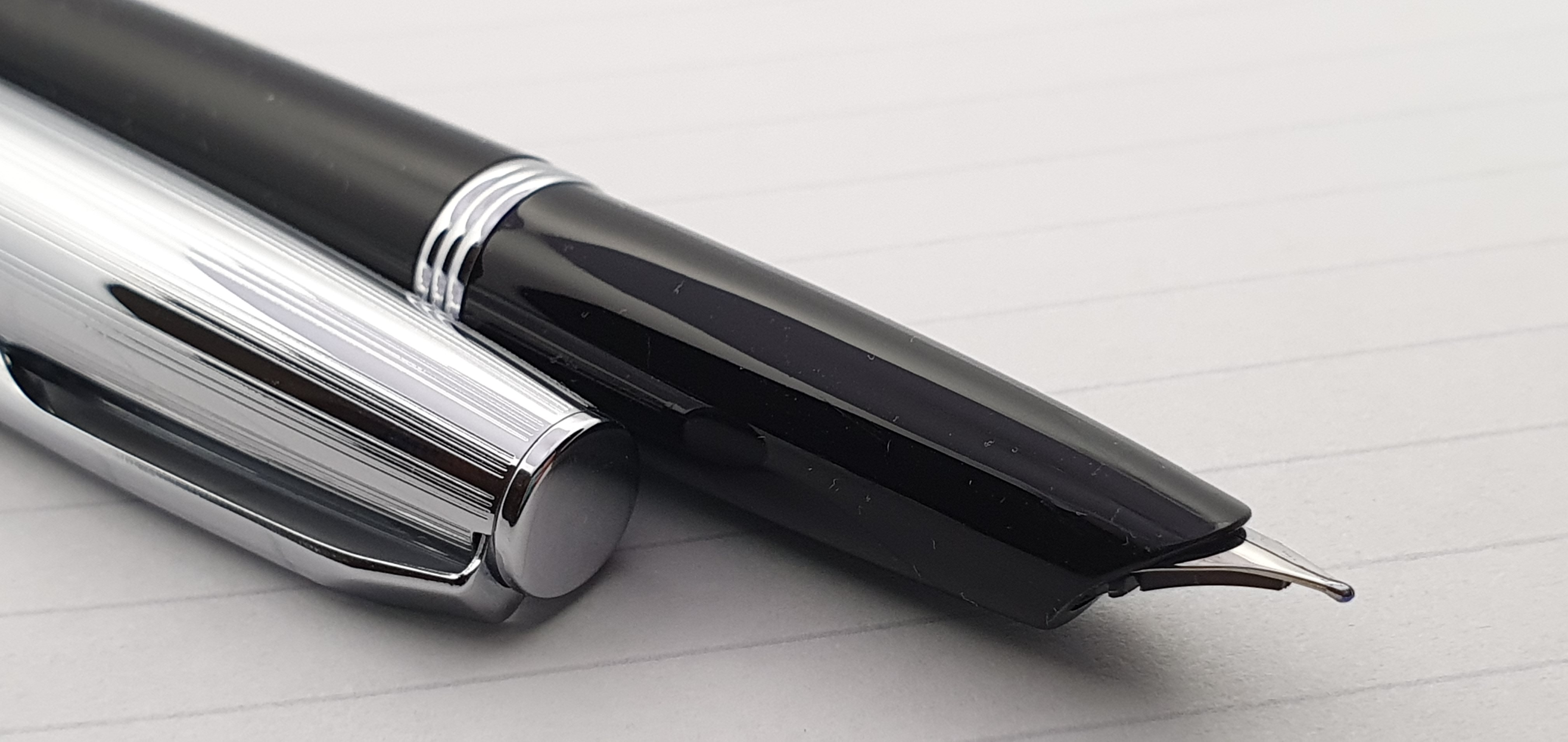
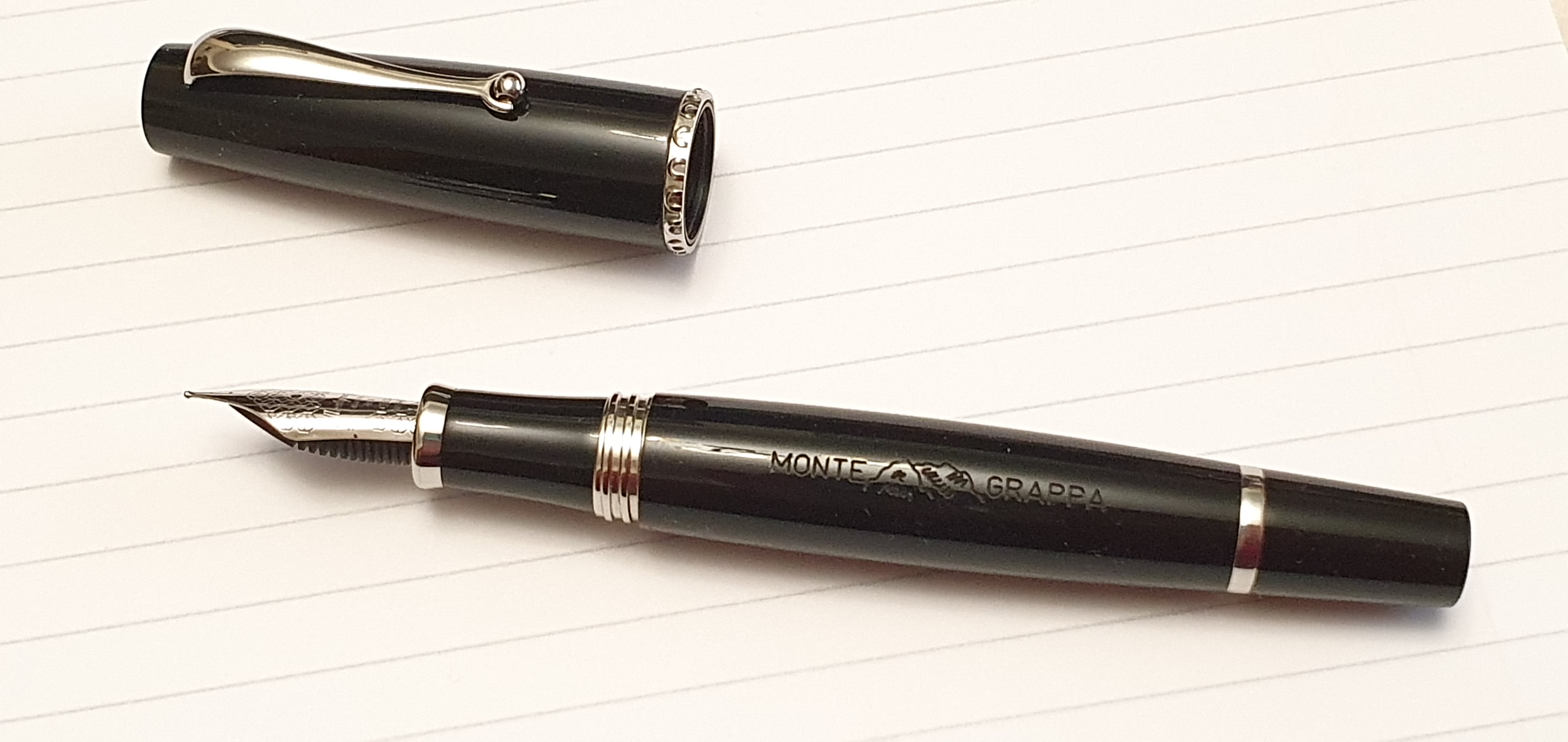
The cap features a sprung metal clip: you press the top end inwards to raise the clip, making it easy to slip the pen into a pocket one-handed. There is a broad metal cap band, with Conklin on the front and a facsimile of Mark Twain’s signature on the back.
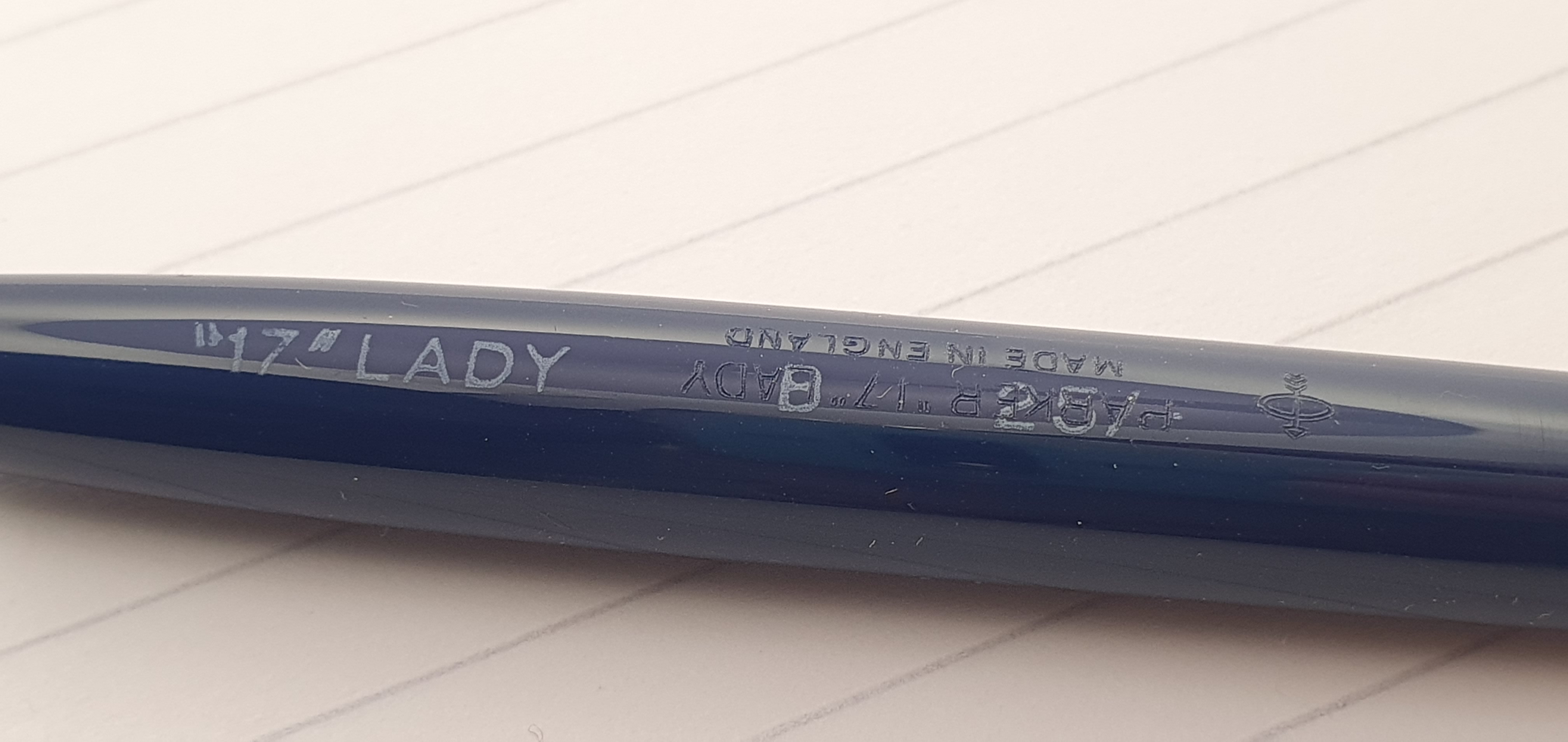
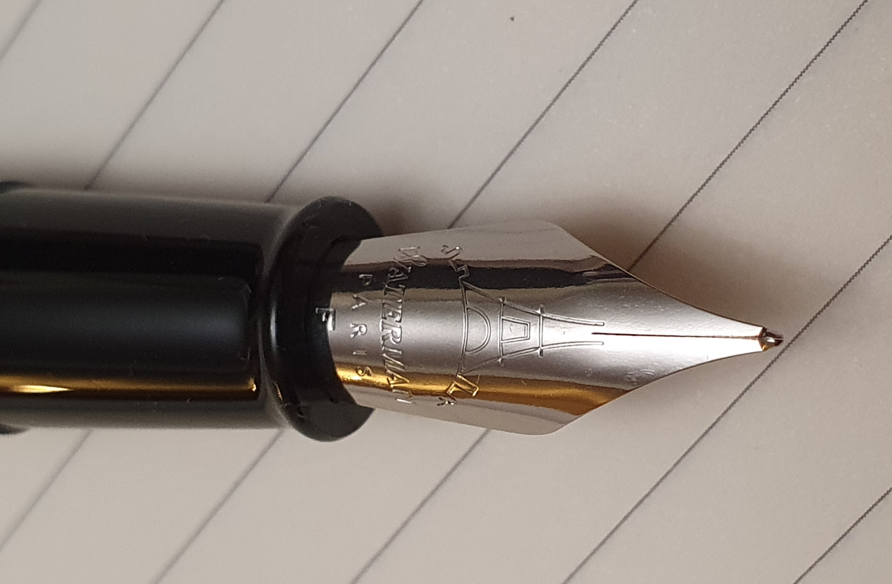
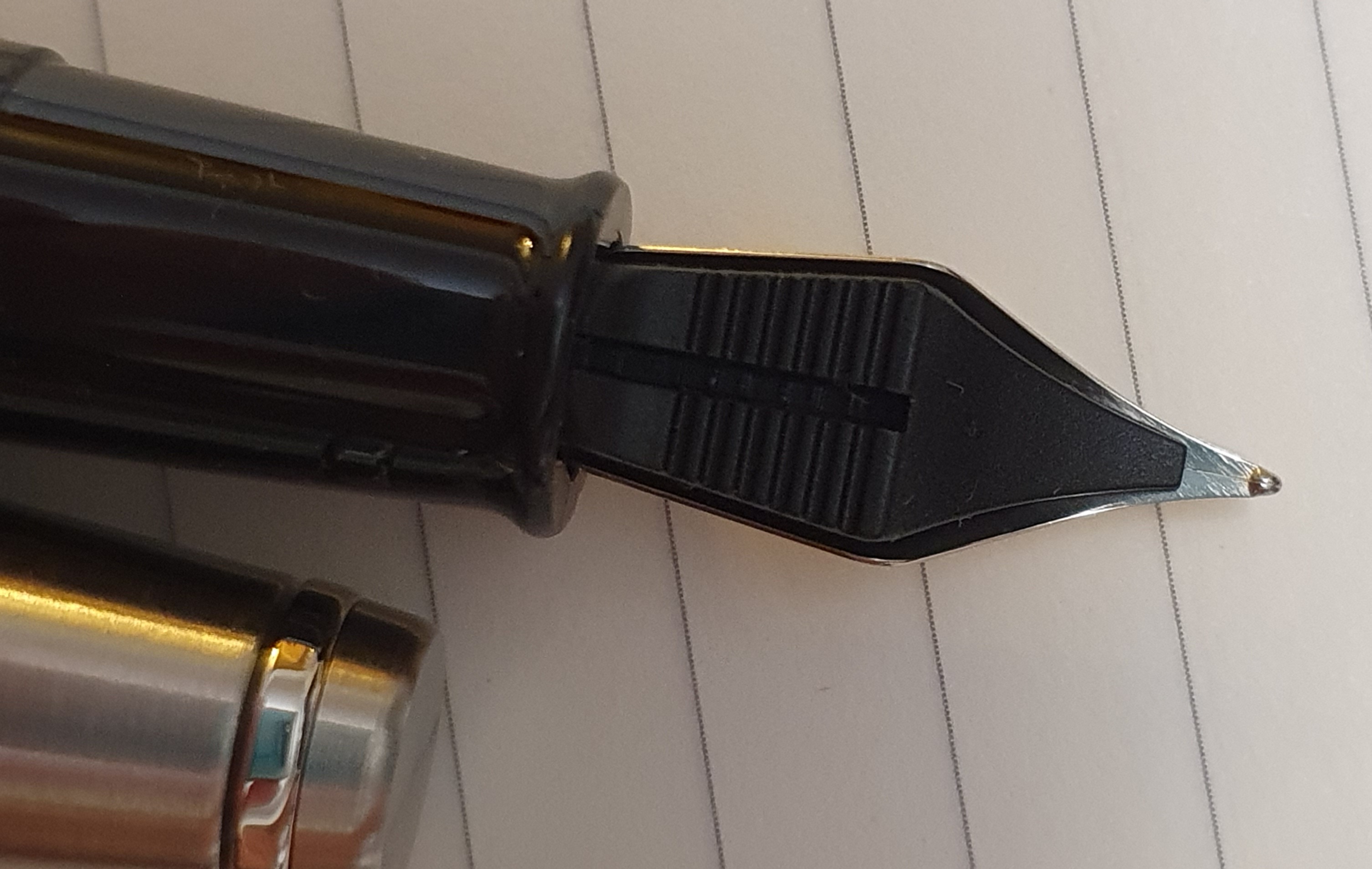
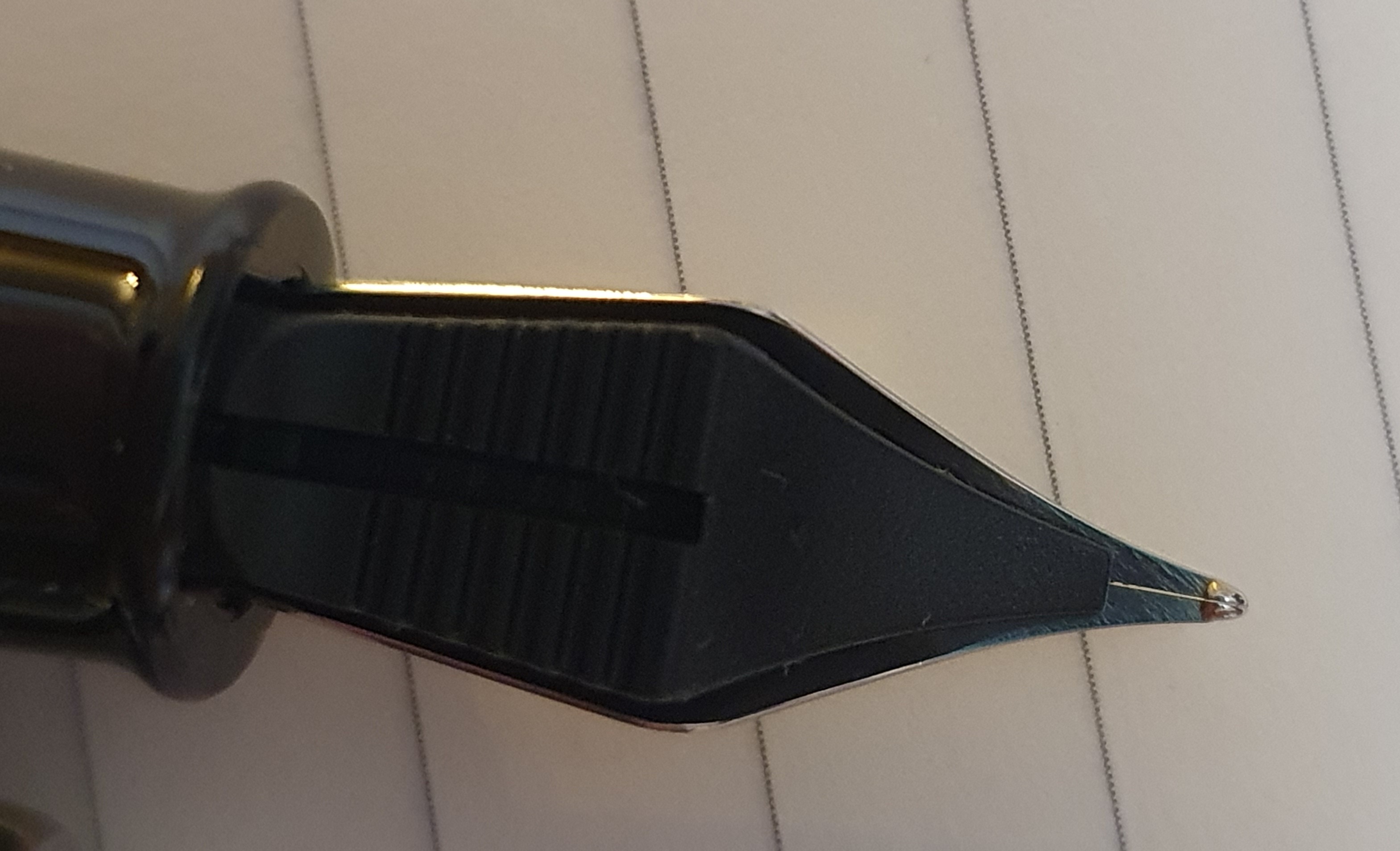
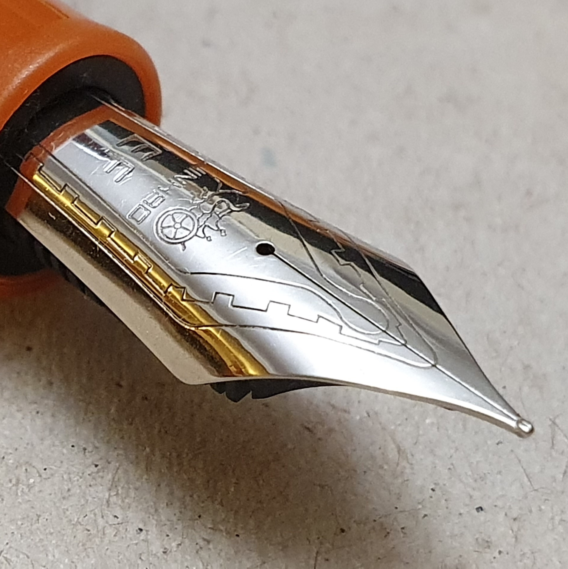
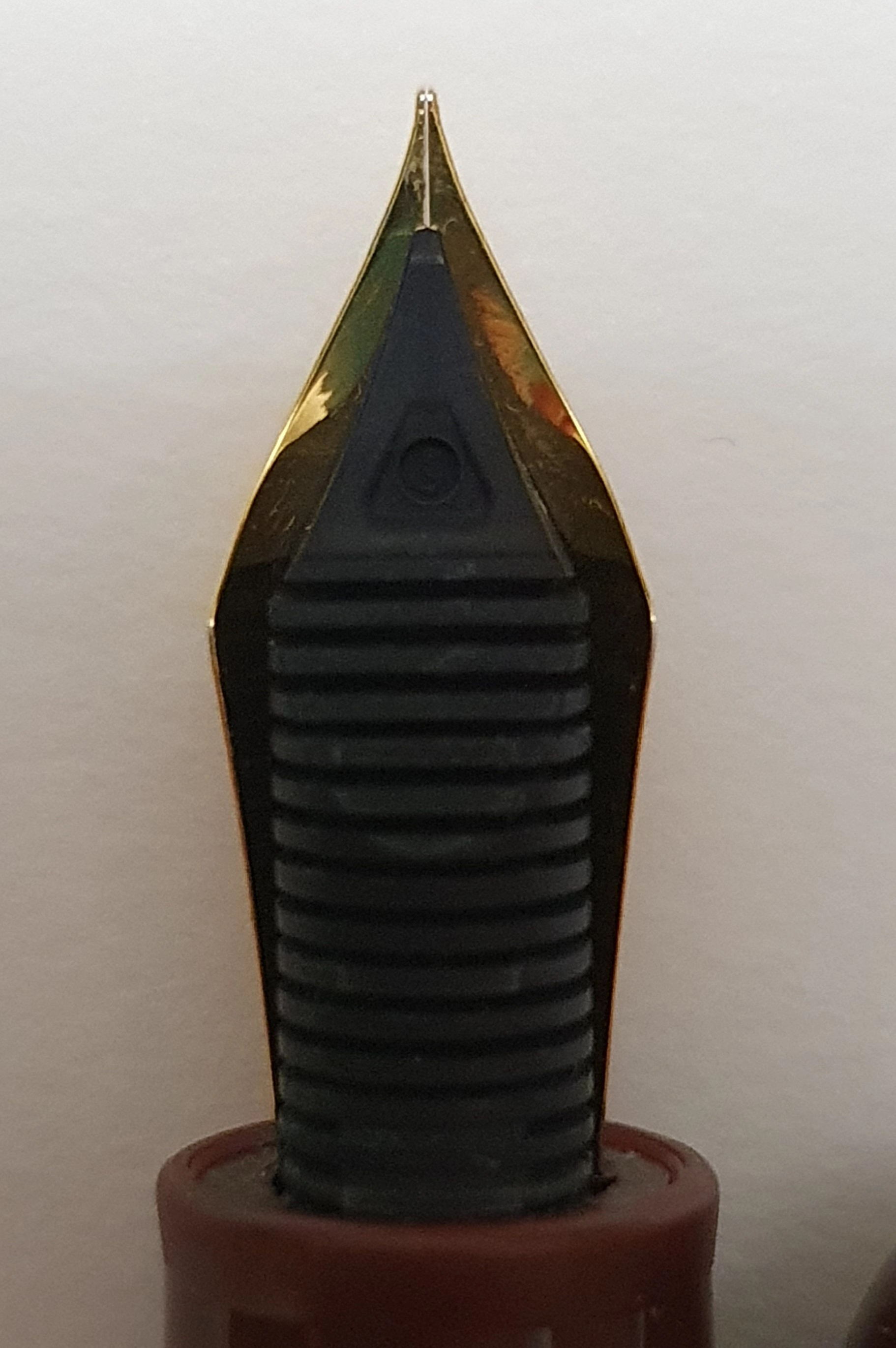
The cap unscrews, in about one and half turns. The nib is a size 6 steel one, with a distinctive crescent shaped breather hole and an imprint of the Conklin logo and Toledo, USA. Mine has an M for medium.
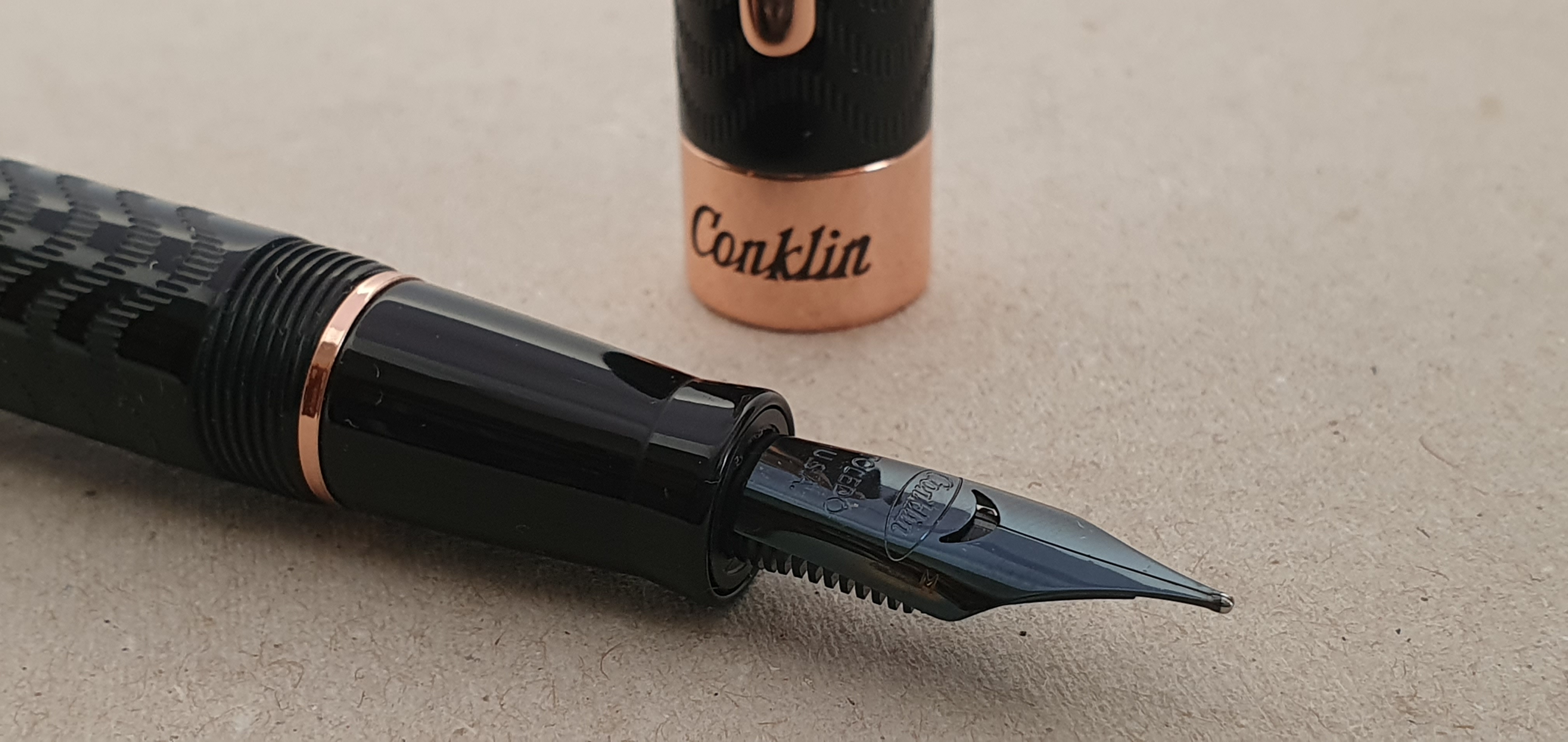
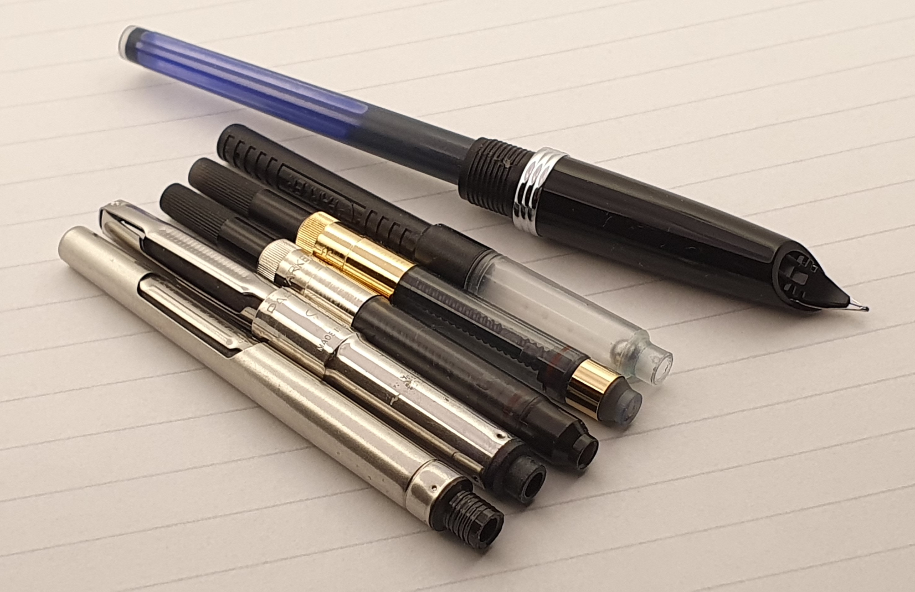
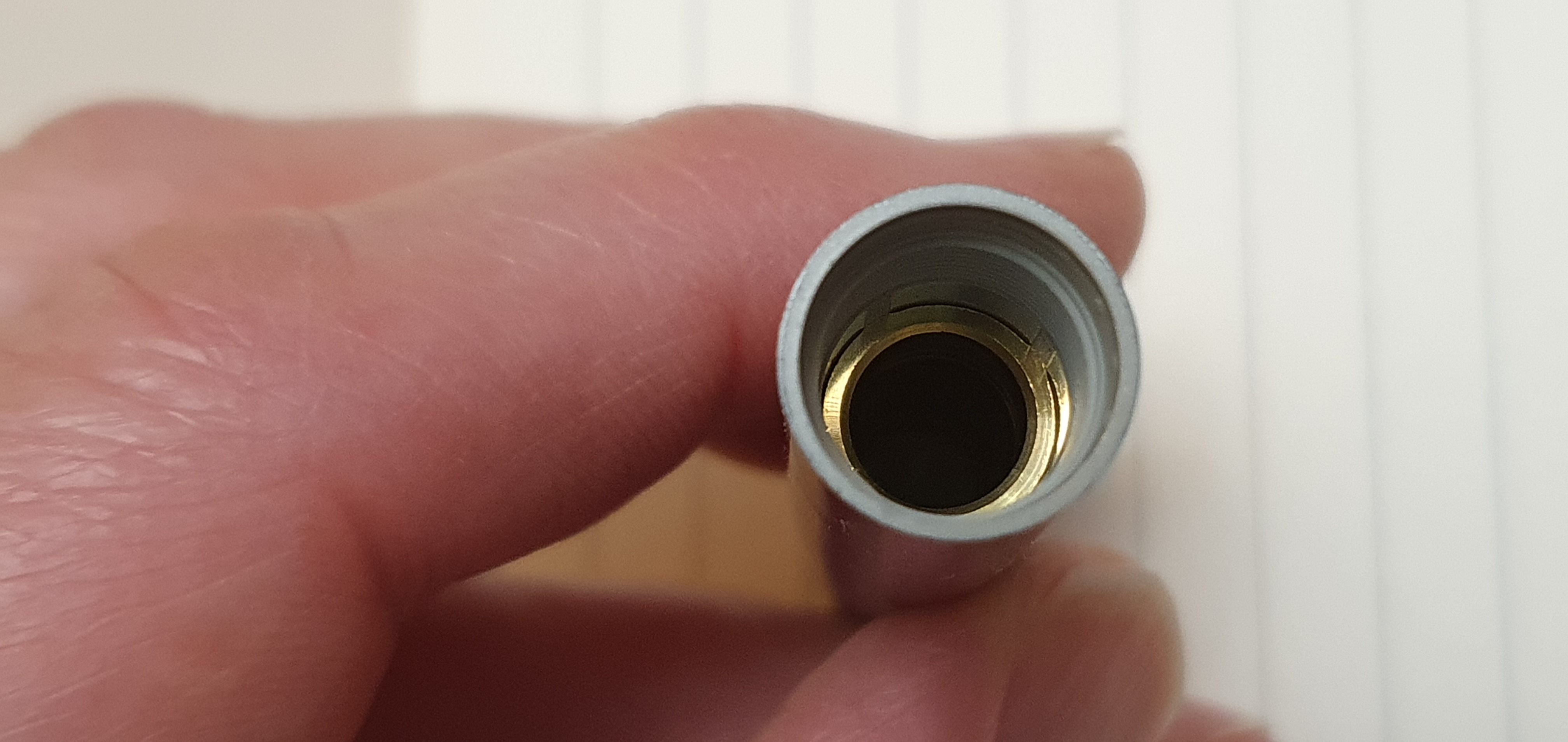
The nib and feed housing can be unscrewed from the section, for ease of cleaning. I found the nib on one of my older pens to be rather rough but it was interchangeable with one from a Jinhao X450. Separate replacement nib units from Conklin are also available (for example from Cult Pens at £28.00).
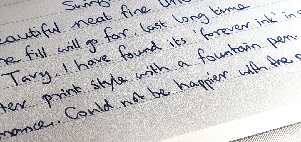
On this new black pen, the nib has a glossy black coating. Mine is a gusher. Whereas I do generally like a wetter nib for lefty overwriting, this one was leaving such a volume of ink on the paper that I needed to try to narrow the tine gap slightly by gently bending the tip downwards. This has helped and I may yet try using a drier ink, such as Pelikan 4001 Konigsblau at my next fill.
There is a single rose-gold coloured ring separating the section from the barrel. However the barrel does not unscrew, or at least I do not think it is meant to, and I have not tried to force it. It is not necessary to remove the barrel to fill the pen.
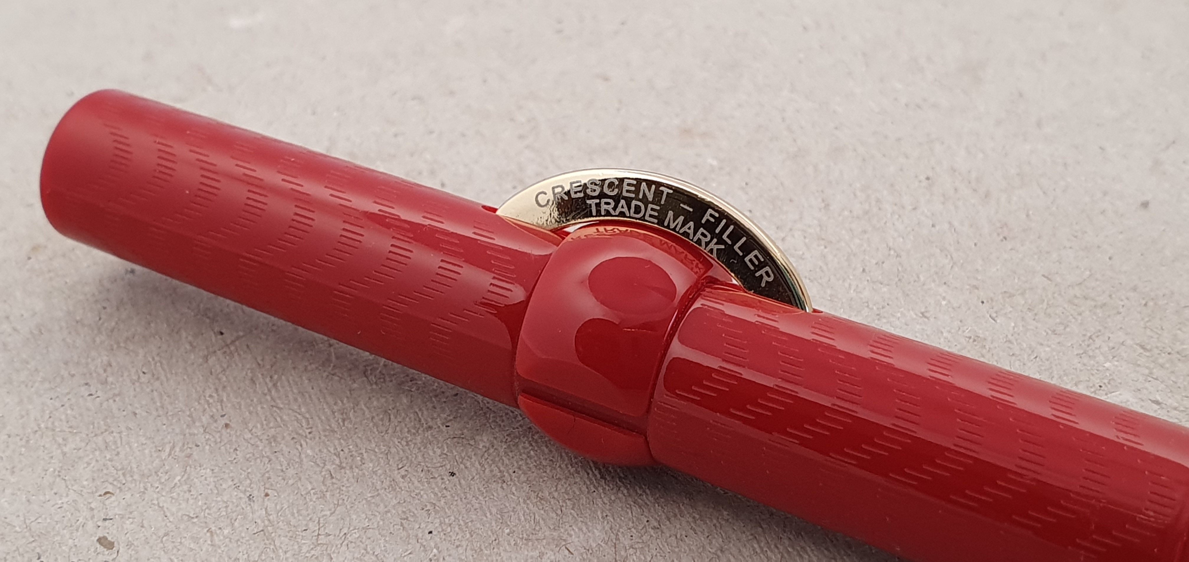
Beneath the barrel, there is a large ink sac, or reservoir. To fill the pen, you simply twist the locking ring to align a gap in the ring with the crescent-shaped filler button. Dip the nib in your ink bottle. You can then press this button causing a long flat metal bar inside the barrel to deflate the reservoir, creating a vacuum which then draws up ink as the sac regains its shape. After a few presses, when you cease to hear bubbles, you have a good fill. Twist the locking ring back again, to prevent unintended ink ejection and you are all set. The pen holds a mass of ink.
Mark Twain (1835 – 1910) was an early fan of the Conklin’s crescent filler pen, for its ease of filling and also for the added benefit of it not rolling off a table.
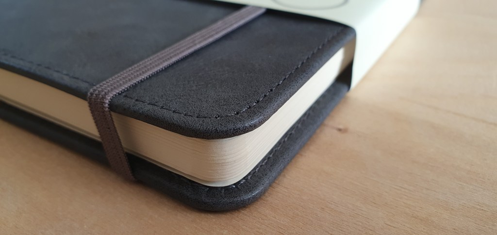
Size and weight.
When capped, the pen measures about 140mm. Uncapped it is around 129mm. The cap can be posted, but it then becomes very long at around 166mm and the pen is plenty long enough without posting. It weighs about 30g, comprised as to 19g for the pen and 11g for the cap. I find the size and weight to be very comfortable. The only issue in terms of comfort is to ensure that the crescent filler button is roughly in line with the nib and not facing too far one way or the other so as to be in your way as you hold the pen.
Some do’s and don’ts.
On my coral-coloured pen, I found that the barrel was not securely glued to the section and I was able to remove it. The rubber sac stays attached to the section. There are metal threads inside the barrel. If you do remove it, you can then remove the crescent filler. However you should apply some talcum powder to the sac before reassembling. I later re-visited this pen to find that the barrel was stuck and would not unscrew. When I forced it, I found that the sac had become stuck to the inside of the barrel and that by unscrewing the barrel, I had torn it from the section. I have still got the bits.
Another thing to avoid is immersing the pen in water. If flushing the pen, be careful to keep the crescent filler clear of the water as you do not want water getting in the barrel through the openings.
One handy tip when capping the pen, given that the cap threads have four entry points, is to work out how best to align the cap clip with the crescent filler button. To do this, insert the pen loosely into the cap, with the nib in line with the pocket clip. Then turn the pen left (anti-clockwise), and listen for the clicks. You can then find by trial and error whether you need 1, 2, 3 or 4 clicks to the left, before turning the pen the other way to screw the cap on. Once learned you have perfect alignment every time.
Conclusions.
I was fortunate to find this pen greatly discounted at a pen show. A more usual price would be closer to £200.00 and I do think that at full price a well-tuned nib is in order. If not in gold, then at least a really delightful steel nib (such as one finds on a Diplomat, Onoto or Otto Hutt, for example) would be appreciated. As it is, all three nibs on my crescent filler pens needed some attention.
However, I love the filling system which is very convenient and satisfying. Also I find the girth, length and weight of the pen to be ideal. Having owned this pen for a month now, I can report that it has not suffered from hard starts and has performed well. And so with that one caveat that a nib might need a little fine-tuning, I think the pen is good to have, as a modern reminder of an important piece of history in fountain pen development.