Recently I have been taking stock of my fountain pen accumulation. This involved getting them all together and listing them on a spreadsheet, a sure sign of having too many pens.
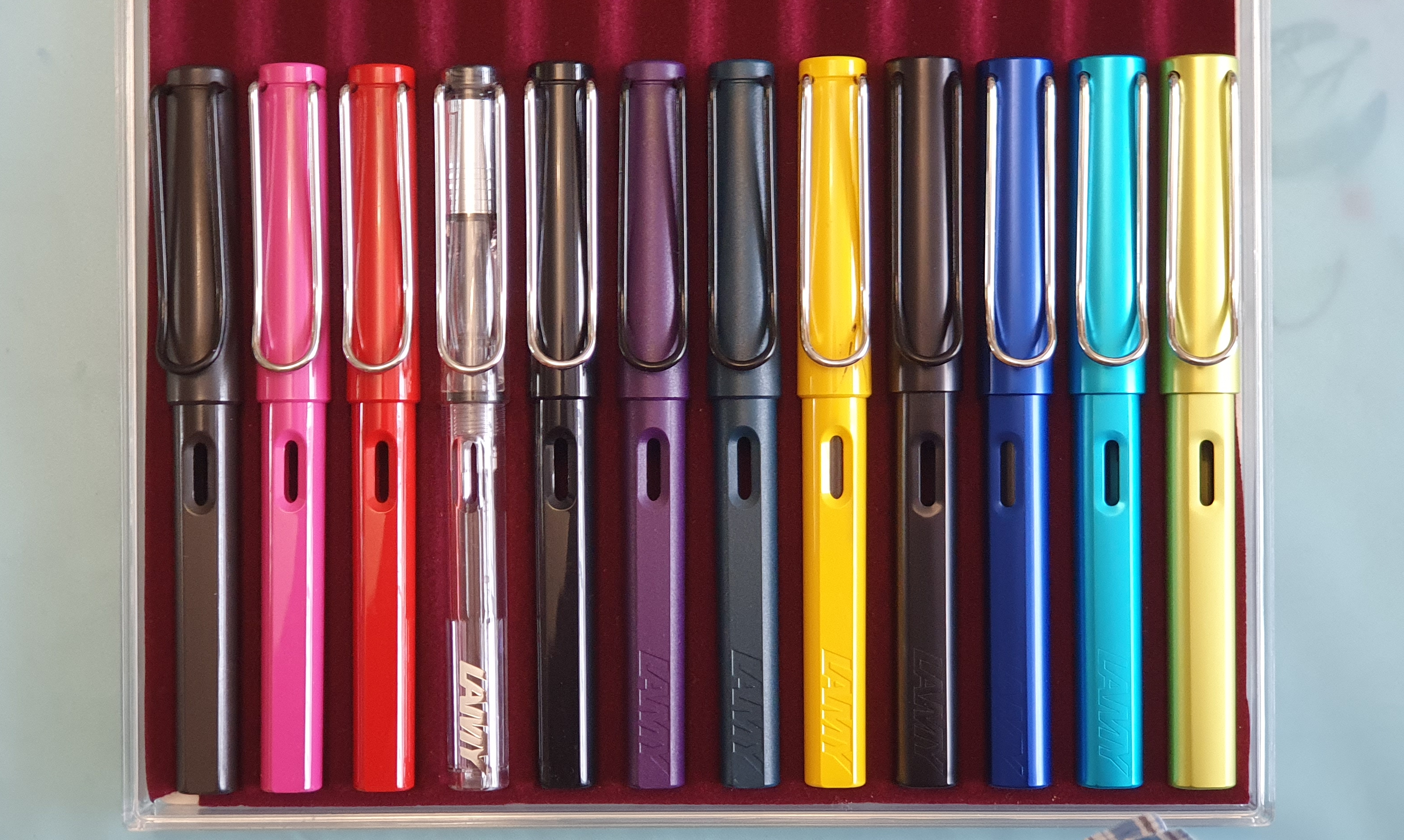
They included twelve Lamy Safaris and AL-stars. I am not even a particular fan of these pens. What was I thinking?
My Lamy Safari, Vista and AL-star fountain pens.
But then as I looked, their stories came back to me, one by one. The charcoal Safari was my first. It was an impulse buy in Rymans in Golders Green when my wife had sent me to buy Sellotape. She was busy making a photo display for our church. I used that pen a lot.
Then the pink one was bought in Marlow, a pretty town on the River Thames. We had gone for a day trip with Joey, a Chinese student who was visiting us at the time. I tried unsuccessfully to enthuse her in fountain pens.
I bought the red one in a traditional fountain pen shop on another day trip, to Oxford. An aunt had sent me a cheque for my birthday to buy myself something pen-related. A Safari seemed just the thing. The helpful lady in the shop offered me a choice of nib too, in silver or black. I chose black. (At the moment, this nib has been borrowed by my Lamy Studio, whose own nib was ruined when it fell off a table).
The Lamy Vista, (Safari demonstrator version) was bought in the summer of 2014. I remember showing it to my brother when we met up to see the Eagles at London’s O2 Arena, in the final stages of the History tour. It was one of the most fabulous concerts I had ever seen, more poignant now as it included the late Glenn Frey, who passed away in 2016. My brother and his partner had generously bought me the ticket as a surprise.
I remember buying the black Safari in Harrods’ stationery department, from a pen cup rather than in the usual blister pack. It was probably my intention to use this with black ink. A black pen always looks smart.
I was thrilled to find the limited edition Dark Lilac Safari, when eventually it appeared in our local shops. I had been waiting for it to arrive. This was a great colour and so was the matching ink.
Similarly, the limited edition Petrol was a thrilling find, when it arrived in our shops quite some time after news of the colour had first appeared on the internet. I much enjoyed the matching ink colour, a dark teal with lovely shading.
The yellow Safari is still my favourite of the Safari colours. I was on the way home from Hampstead after an annual cardio check-up at the hospital. I popped in to have a look around Rymans and treated myself to the Safari “for being good.”
Turning to my AL-stars, the black was my first. I remember being excited to discover that an aluminium version existed and enjoying the touch of the cool aluminium body. I had this pen with me during a short stay in Tetbury, in the Cotswolds in May 2013 where we had been for a wedding. I found a stationery shop there with a display in the window of the same black AL-star as mine. Naturally I took a photograph of it.
“Snap!” A window display in Tetbury, 2013.
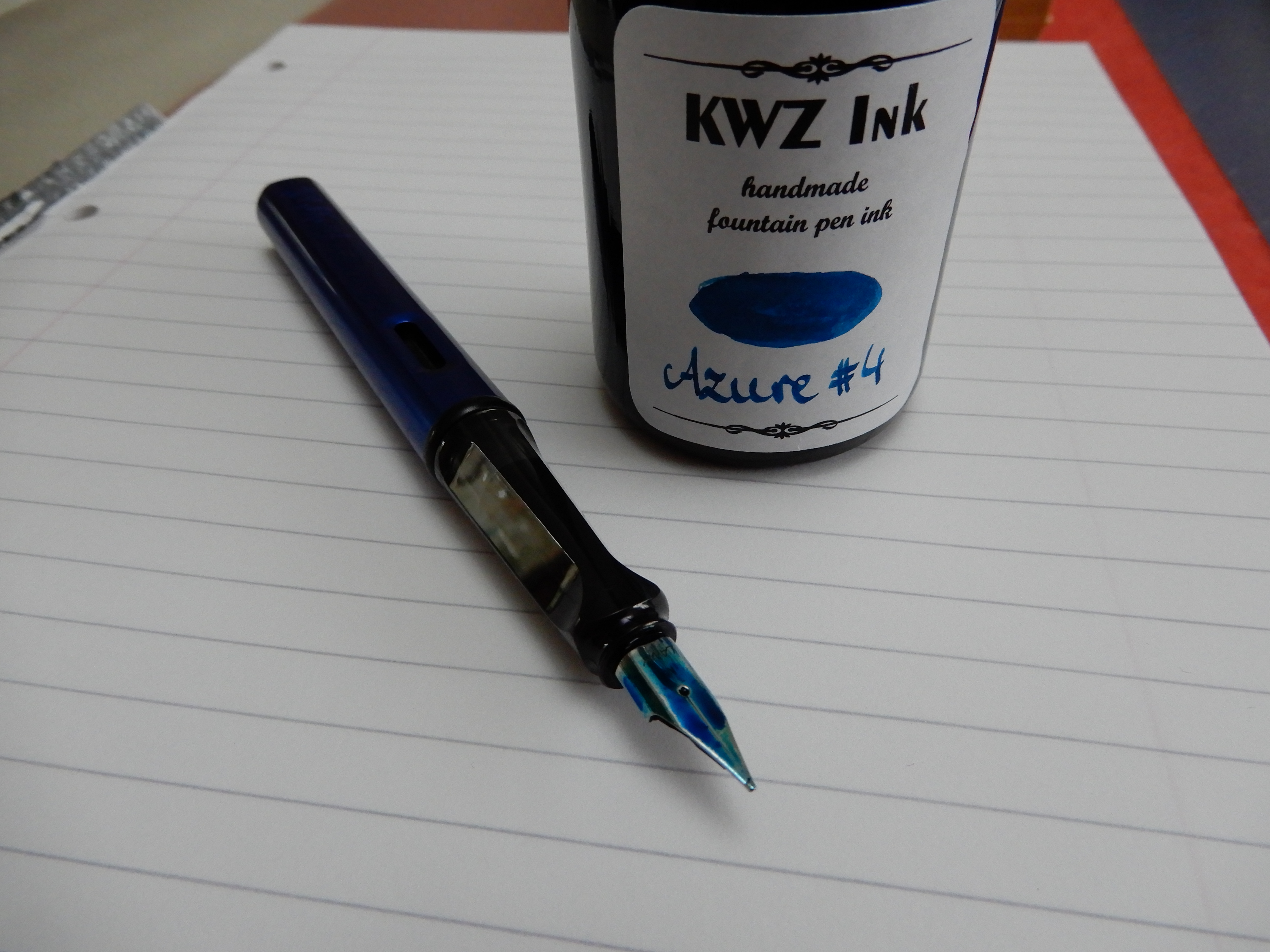
The Ocean blue AL-star was bought in Rymans Golders Green and has been featured in this blog before (here). The nib was particularly smooth.
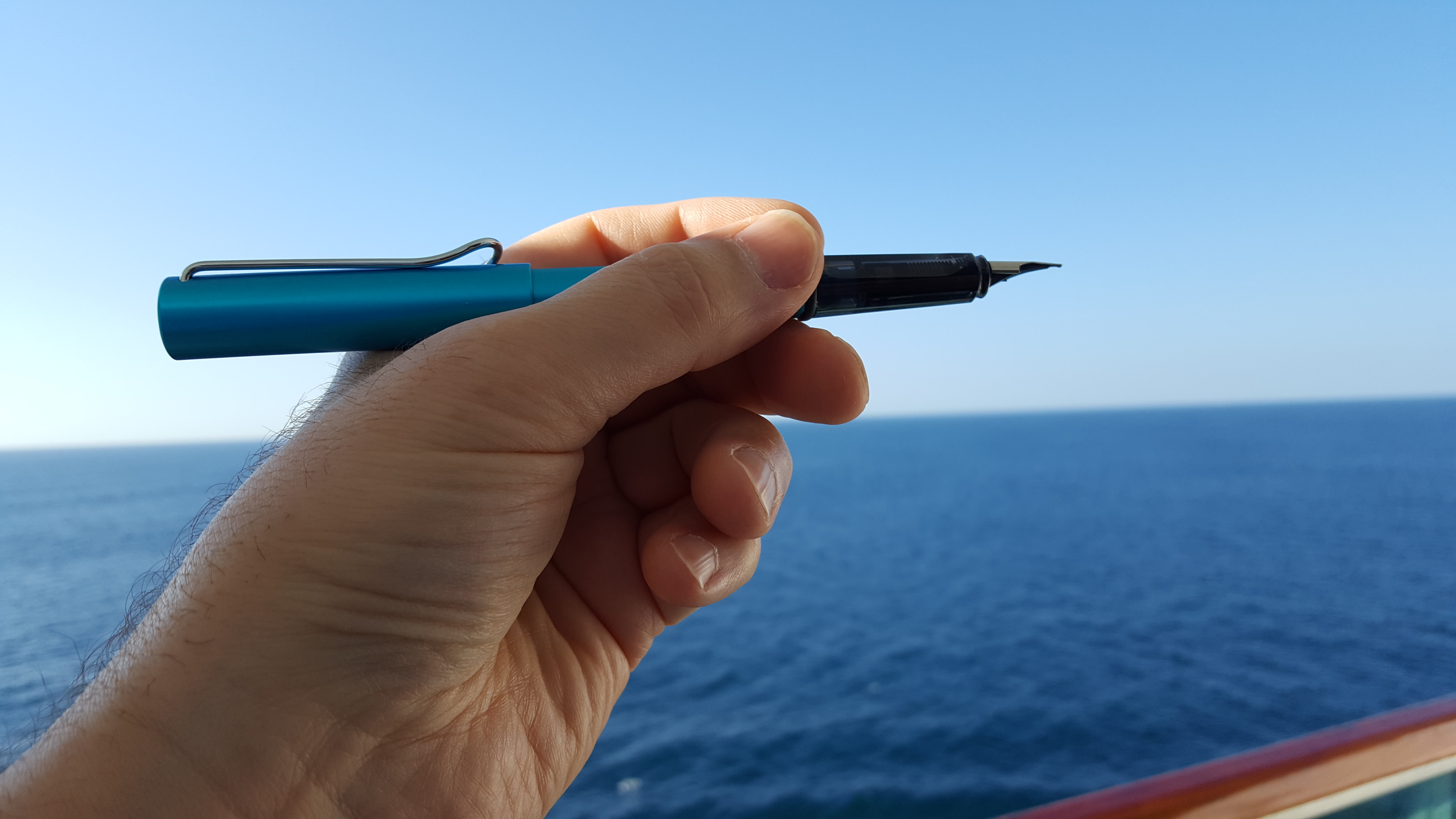
The colour name is not to be confused with the lighter, Pacific blue version, which I ordered from Cult Pens and which came with a pack of cartridges in the lovely bright Lamy turquoise.
Being artistic on a cruise with the Pacific blue AL-star.
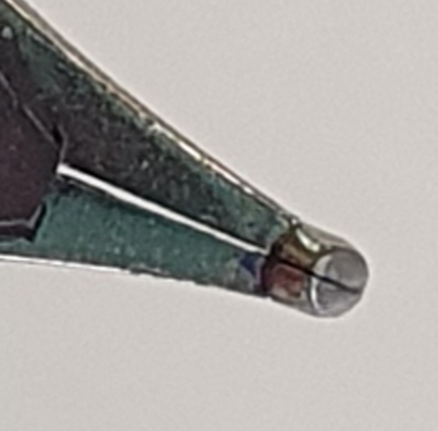
Finally, the rather unusual colour called Charged Green was another impulse buy, probably because the price was reduced. It was not a colour that appealed to me really but I decided to give it a go. However the accompanying cartridges were too light a shade to be useful.
Lamy AL-star in charged green.
I did not set out to be a pen collector. I think the fact that I passed up all the other colours of the Safari and AL-star and the LX models too, proves that I am not a collector. But as I get older, I am realising that it is not so much the merits of a pen in our ownership that make it important to us, but the associations that the pen has for us. I have shared mine here, not because they are particularly significant but to prompt you to reflect on what associations your pens have for you. Whether we see ourselves as collectors of pens or not, we are traveling through life collecting memories.
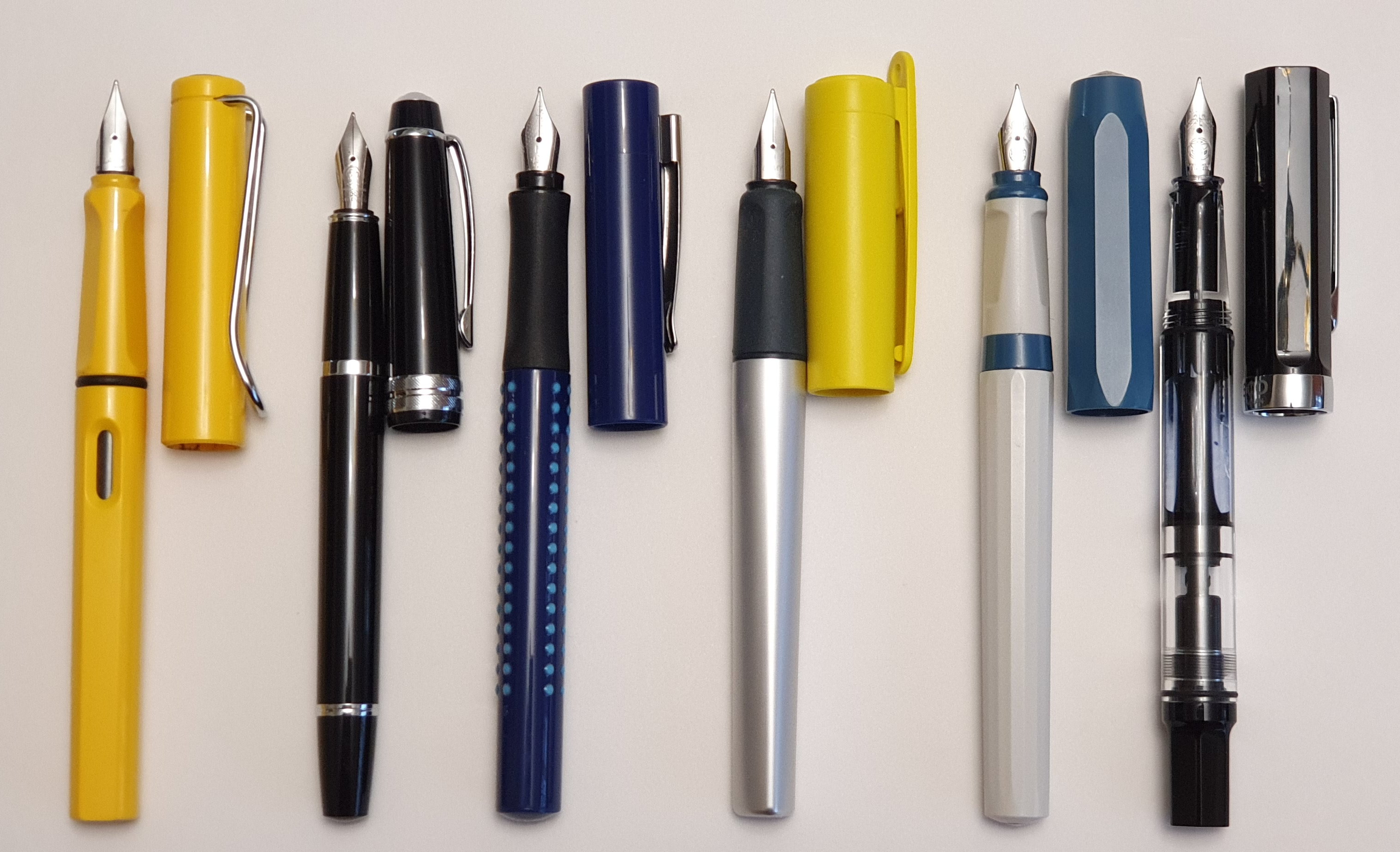
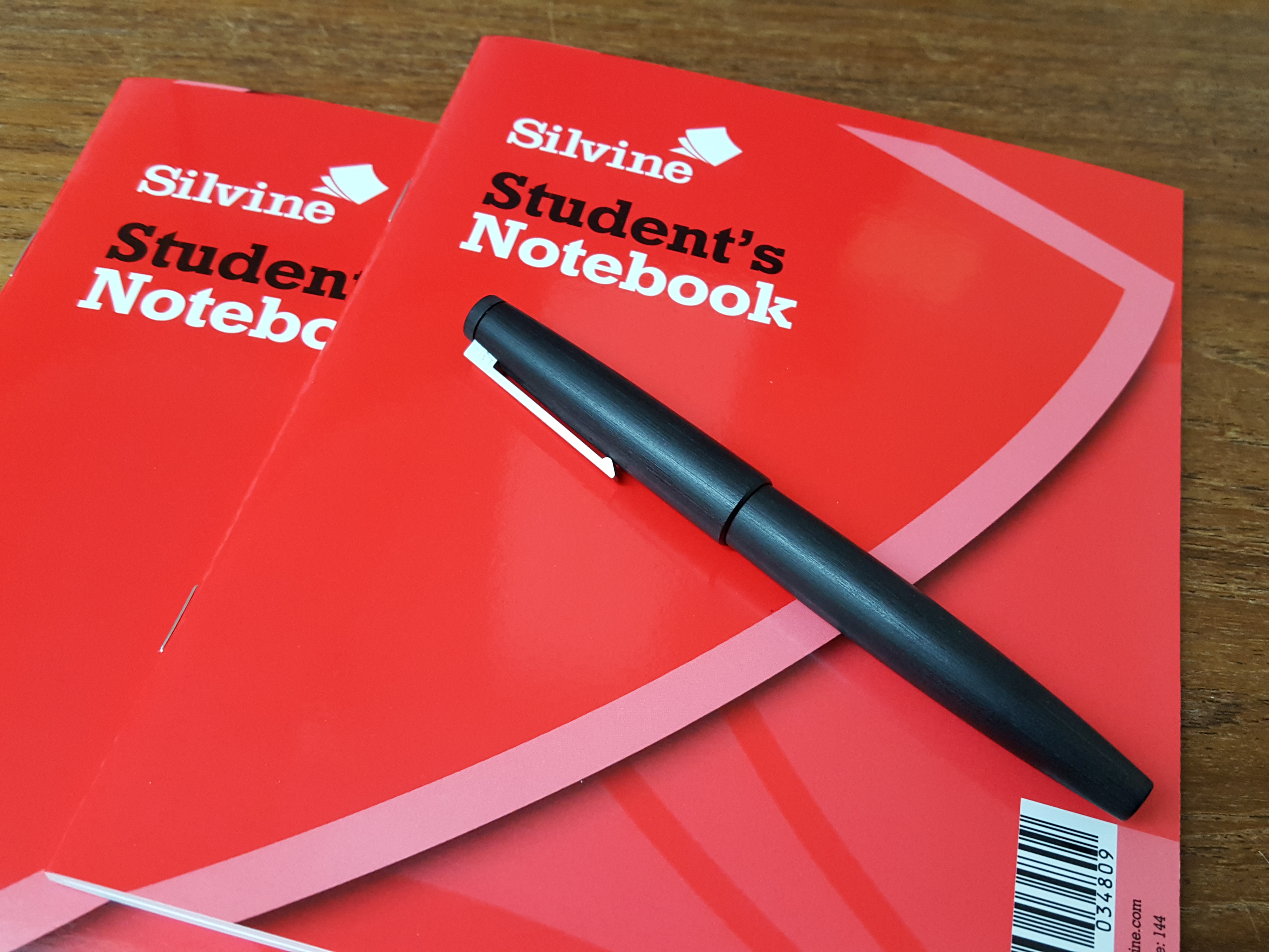
Recently I was asked in an email, what fountain pen I would recommend for a beginner. She mentioned that she had traditional taste, enjoyed good quality and style and wished to start with a cheaper pen, costing no more than say 20 to 30 euros. She wished to use it with a Leuchtturm 1917 notebook. “Is it possible to get a good quality pen for that price?”, she asked.
Happily, the answer to the last question is yes. There are numerous fountain pens on the market in this price bracket, from a wide range of brands and with a host of different attributes.
Ideally, before making recommendations, I would find out a little more such as her previous experience of fountain pens, how she holds her pens, her writing size and style, whether she has any preferences as between brands, materials (plastic or metal), filling systems and the pen’s size and weight, and so on.
In the absence of such information to narrow down the field, I made a number of assumptions and the following can be general advice only and is based upon my own experience, likes and dislikes.
From the mention of the Leuchtturm notebook, I assume that the pen may be used for journaling but may also be enjoyed for letter writing, occasional notes and other general tasks: in short, a general purpose pen.
Also, the suggestion of “starting with a cheaper pen”, implies that she wishes to try an entry-level pen first and then later progress to the next level. This is sensible to ensure that she likes using a fountain pen before investing too much money and secondly, to spend some time with a beginner’s pen and so appreciate the improvements when moving on.
A beginner’s pen will have a stainless steel nib. I suggest a medium nib to start with (assuming average sized handwriting). As for filling systems, the pens in the following selection are almost all cartridge-converter pens. That is, they are filled by inserting a plastic cartridge of ink but can also be adapted for filling from a bottle, by inserting a “converter,” typically an ink reservoir with a twist mechanism for drawing up ink.
Cartridges are quick, clean and convenient for refilling on the go. The downside is that it is generally more expensive to buy ink in cartridges, (especially if the pen accepts only its own branded cartridges, as with Lamy and Cross for example). There is also the plastic waste. Bottled ink gives the benefit of being available from a variety of brands and in a huge number of colours.
The one other filling system represented in my list, is the piston filler (TWSBI Eco) which draws ink directly into the barrel and can be filled only from a bottle.
If possible, it is best to visit a shop to see the pen before buying but this is not always practical, not least because of the current lockdown and so buying online may be the only option.
With all these caveats in mind, here is my personal selection, in no particular order, with a few thoughts on each:-
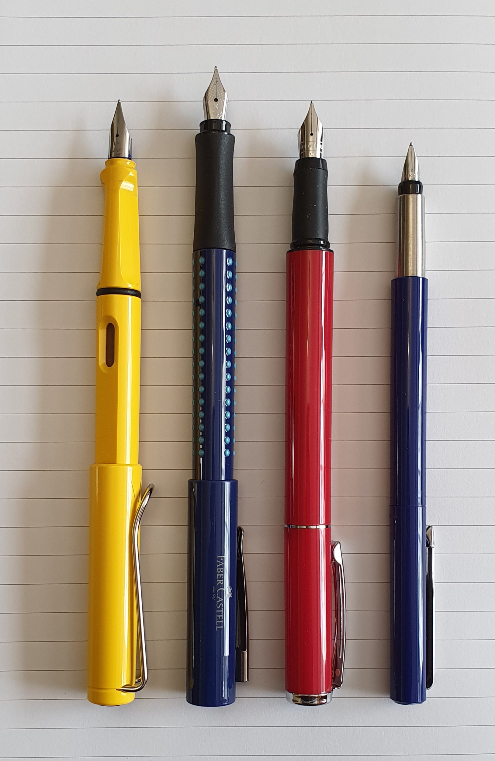
Lamy Safari
Lamy Safari. This is still the best colour in my view.
Perhaps the most obvious choice, the Lamy Safari is widely available, in a range of colours with new special edition colours coming out every year. These are tough, plastic pens with quick, snap-on caps and are a decent size even for larger hands. Thanks to state of the art engineering, good quality control and testing, the nibs are well finished and write smoothly, straight out of the box. Replacement nibs are available in various widths and are easy and inexpensive to replace. The pens cost around £18.00 in the UK
The downside for some is that the grip section has two facets, pushing you to adopt a symmetrical grip between finger and thumb, centred above the nib which is not so comfortable if you prefer to rotate your nib inwards as you write (as I do). This puts some pen enthusiasts off, although most whom I know, probably own or have owned at least one. Also you are restricted to Lamy cartridges. A Lamy converter can be bought separately.
An aluminium version of the pen, in a range of colours, is available at around £25.00.
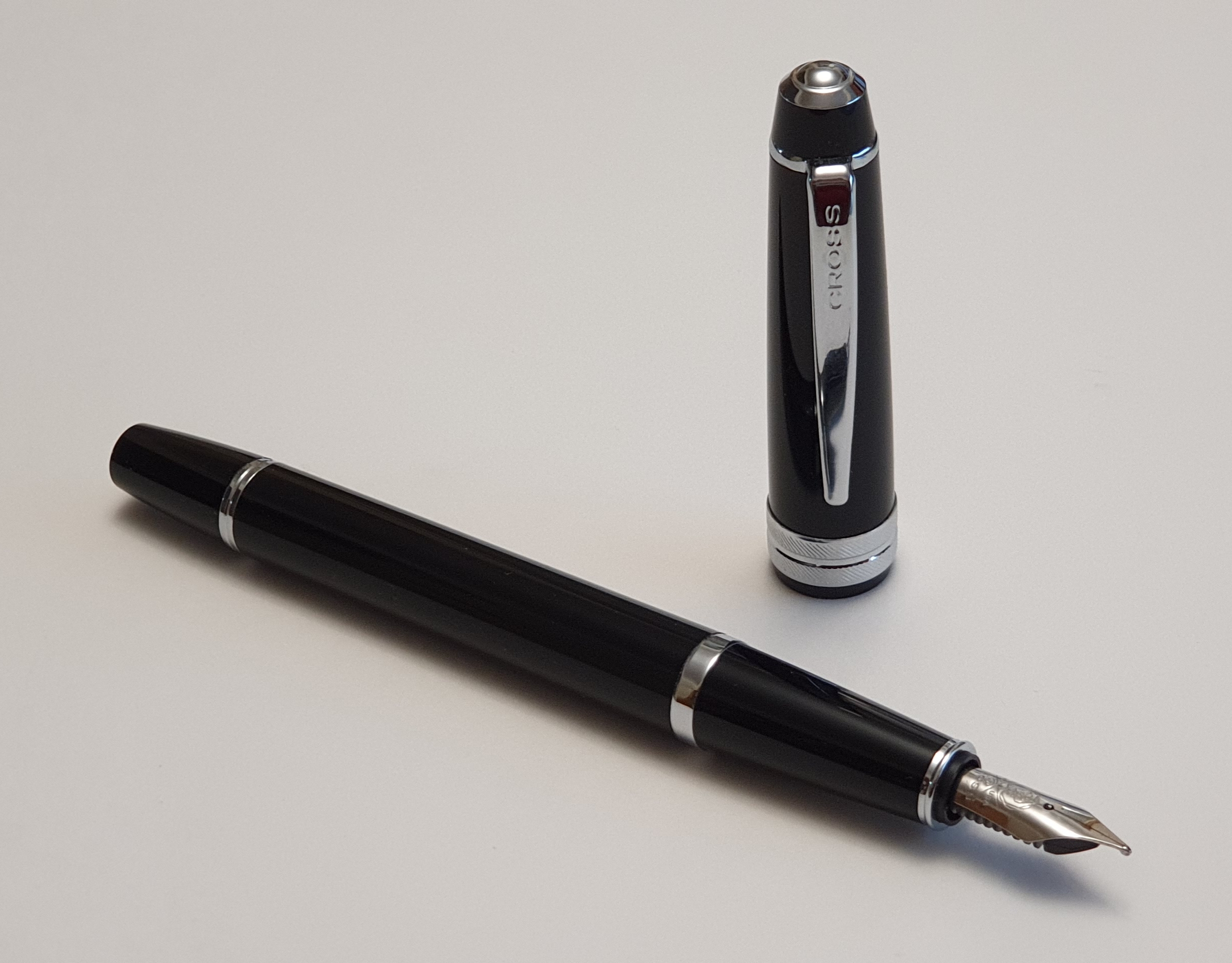
Cross Bailey Light
Cross Bailey Light
This new pen from Cross appeared in 2019, as a plastic version of the popular, heavier lacquered metal Cross Bailey. This is a cartridge-converter pen, taking Cross proprietary cartridges or else a Cross converter (the push-fit version, model 8751). It is a simple, traditional style pen of a good, medium size and proportions. The plastic cap can be “posted” (pushed on the back of the pen) for added length and weight. This looks a more adult pen than the Safari, having no facets on the grip. The pens are sold in sealed packs, with medium nibs. These offer a firm writing experience, good for note-taking and faster writing. Personally I try to pick out pens with nib tines with a slight glimpse of daylight between them, which mean good ink flow and effortless fast writing.
The downside is that Cross cartridges are rather expensive. But with the pen costing £20.00 in the UK plus a converter for £7.00, you are still under £30.00 in our currency. I am a big fan of these pens finding them very comfortable and reliable.
Faber-Castell Grip
Faber-Castell Grip. Interesting raised bobbles on the barrel.
This is another fairly traditional syle pen, perhaps rather under-rated here and certainly less prevalent in the shops than Lamy and Cross brands. However, this pen has a delightful smooth, steel nib. If bought online, from Cult Pens for example, there is a choice of nib in extra fine, fine, medium and broad widths. I have only tried the medium nibs but imagine that a broad would be silky smooth. The pen features a rubber ergonomic grip with subtle, smooth edged facets for your thumb and forefinger to rest on. At around £15.00 these are excellent value. They also have the advantage of accepting standard international cartridges, which are readily available from numerous brands and in a vast array of colours.
For the price there is little to say against this pen. It is a good size, light in weight and the cap can be posted if desired but this makes it rather too long at 17.5cm.
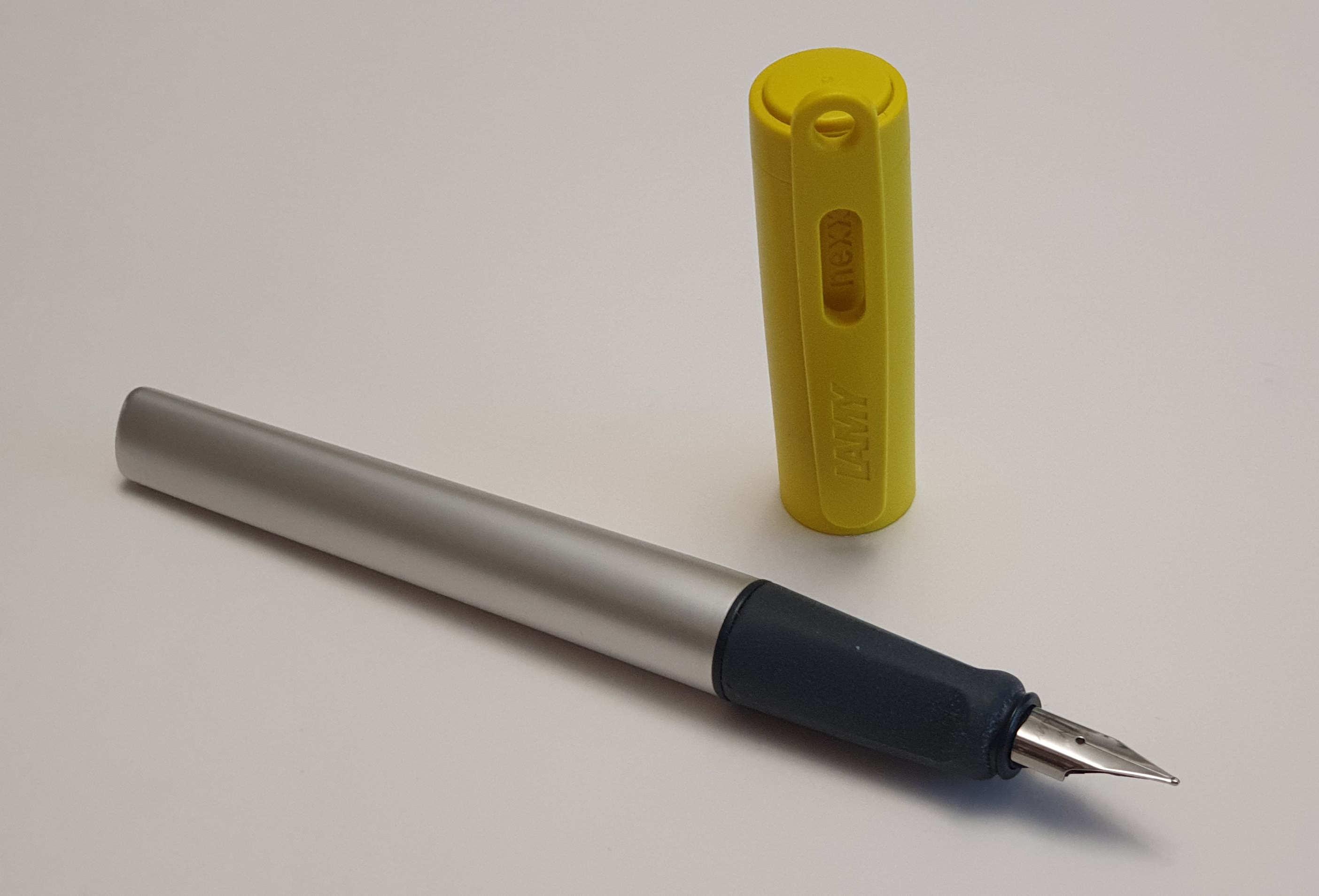
Lamy Nexx
Lamy Nexx
The Nexx seems to be rather overlooked here, being over-shadowed by the ubiquitous Safari. However, it is a tough workhorse pen. It has the same nib as the Safari and AL-Star, but features a wider, rubber grip and an aluminium barrel which blends gradually from being cylindrical to a rounded triangular shape at the end. It has a tough plastic cap in a variety of bold colours. Again, like the Safari, it will need Lamy cartridges or the appropriate Lamy converter. The price here is around £19.00, similar to a Safari.
The downside of this pen for me is that the rubber grip makes it slightly harder to make small adjustments to the angle of rotation of the pen as you write: you need to lift the pen off your fingers before you can twist it in your hands. Secondly, there is an unusual clash of materials, as between the plastic cap, rubber grip section and aluminium barrel. This, plus the unusual shape of the barrel makes for an interesting tactile experience. Personally, I am not keen on rubber grips or triangular barrels and yet inexplicably, taken as a whole I am impressed by the pen. I have had mine for only a few months. It could not be described as traditional in style.
Kaweco Perkeo
Kaweco Perkeo
The Perkeo is another cartridge-converter pen, in a range of colour options and an All Black in tough plastic and multi faceted cap and barrel. The grip does have some facets for your finger positions but it is not rubber and these are less obtrusive than on the Lamy Safari. Personally I grip the pen higher than the facets and so they do not interfere with my grip. The pen is a good size, whether posted or not. I enjoy the Kaweco nibs which are slightly softer than the Lamy Safari nibs. The pens are sold in clear plastic packs with either a medium or fine nib. I have bought quite a few of these in both widths. The medium nibs are great for general use but I also like the fine nib version to use with black ink which is very precise with a pleasant feedback. The pens cost around £16.00 here. They take standard international cartridges and are supplied with four blue cartridges of the lovely vibrant Kaweco blue.
The downside perhaps is that the pen is not traditional in style and looks like a whiteboard marker pen. There is no pocket clip. Also, the build quality can be a bit variable and some people have had complaints with the nibs. Aside from such quality control issues I think they are great value and provided you get a good one, the writing experience can be delightful.
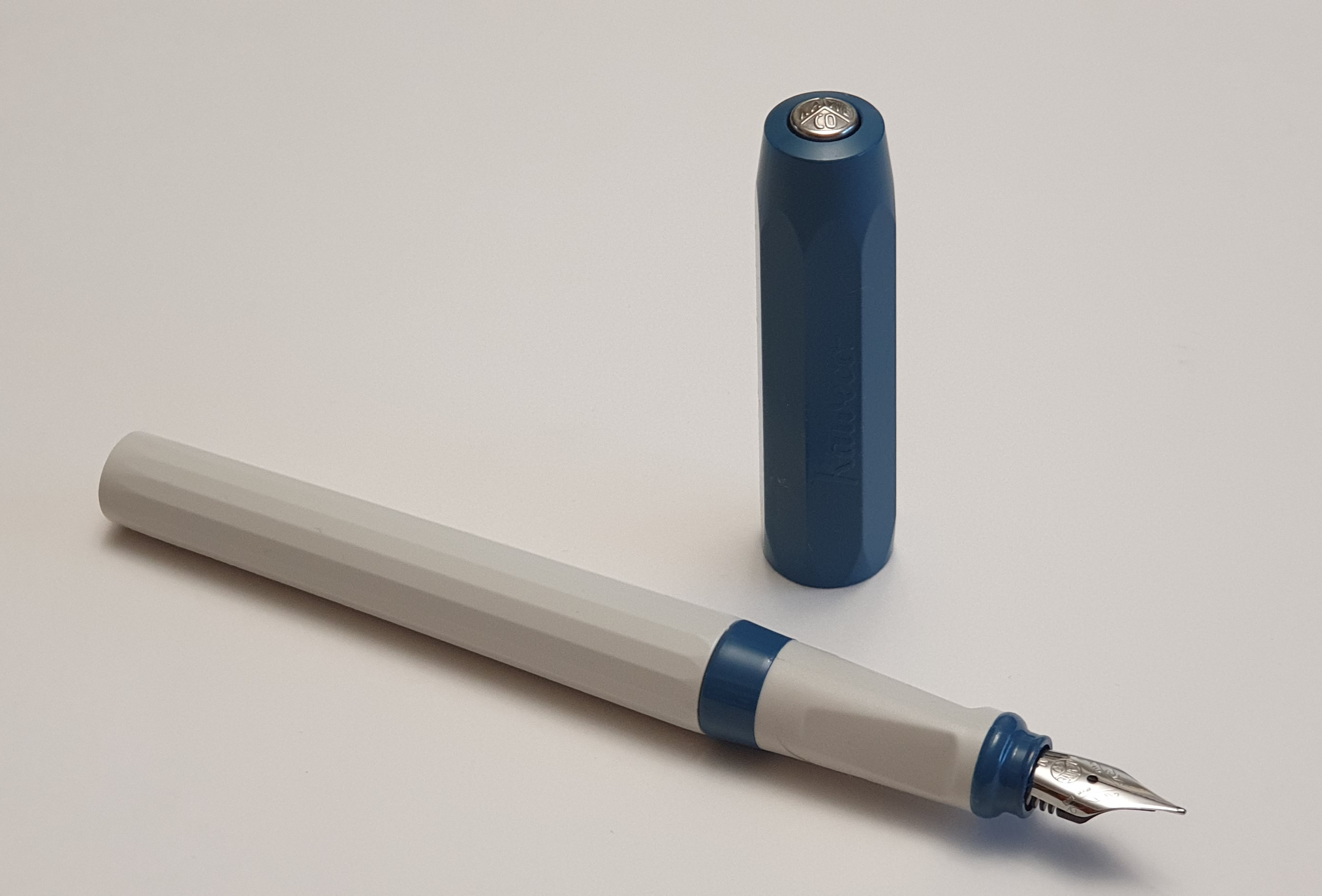
TWSBI Eco
TWSBI Eco. Still with a little ink inside.
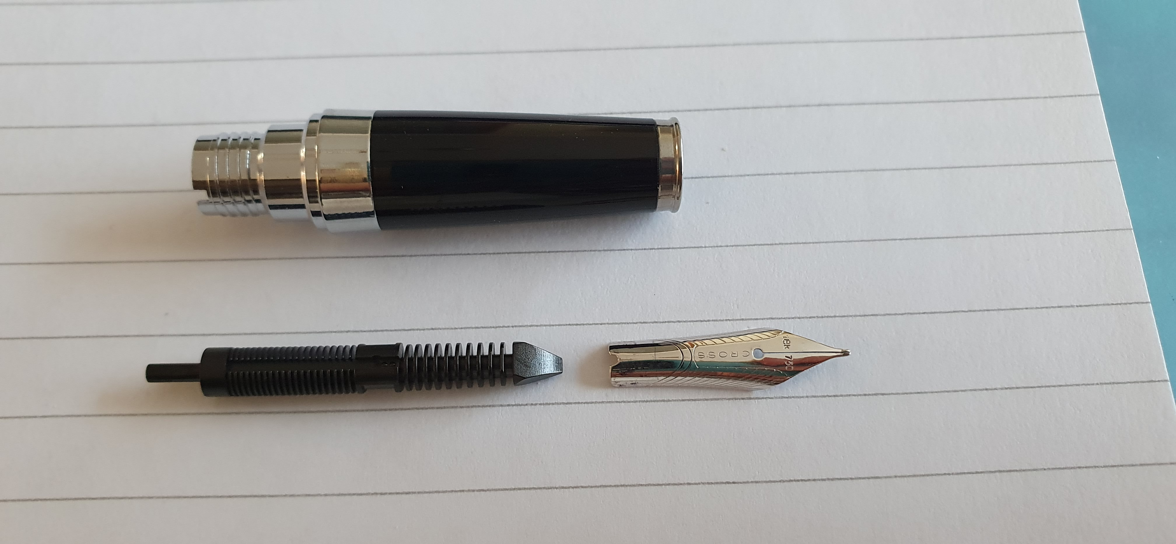
My final suggestion is different from all the above in that it is a “piston filler” (bottle only) pen, which means a much larger ink capacity than any cartridge. Secondly, it is a “demonstrator” pen meaning that it is made of a clear plastic so that you can see the nib and feed and filling mechanism. Once filled, you can also see the ink sloshing around. Nibs are available in a range of widths. The pens start from around £28.00 here increasing for some of the different colour options. It is also the only pen in this selection with a screw on cap.
TWSBI pens are appreciated by enthusiasts, not only for their quality and value but also because they can be disassembled for cleaning. TWSBI supplies its pens with a wrench to unscrew the piston. The nib and feed can be pulled out and are “friction fit” for ease of changing, cleaning or maintenance, although none of this is strictly necessary if you prefer not to tinker with it. TWSBI even supplies each pen with a small container of silicone grease to lubricate the piston.
Conclusion
There are numerous other pens that I could have included but have left out to keep the list managable. As it is, I have already stretched the brief rather beyond the traditional. Any pen enthusiast would have his own opinions and this is clearly subjective and tastes differ.
I have not included Parker pens at this price level. A Parker Vector is well within the budget but rather too slender in my view and not one of my favourites. Many people might recommend the Pilot Metropolitan as a starter pen, also within budget, but I do not find them very comfortable and the nibs are very fine. Then there are Chinese pens such as the Wing Sung 601 or the Wing Sung 699, both well inside this price range and of traditional design but although great value, I think that they are not everyone’s idea of a beginner’s pen.
My own preference, would be for the Cross Bailey Light with medium nib and converter which is a good, traditional pen of quality and style. Although having said that, everybody should have at least one Lamy Safari, preferably yellow.
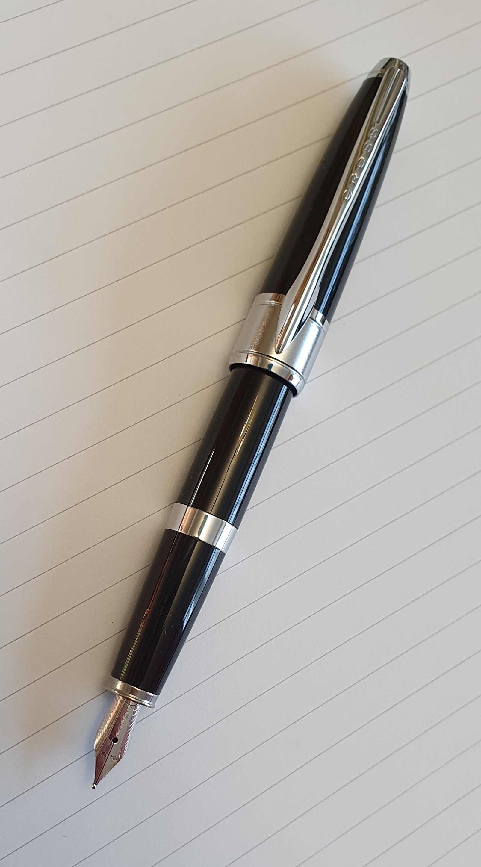
I have done quite well over the past three months at resisting temptation to buy another fountain pen. However I cheated slightly and opened one from my small stockpile of pens bought long ago as possible gifts or for a rainy day. This one I bought in October 2017 in a sale, reduced from around £18.00 to £9.00.
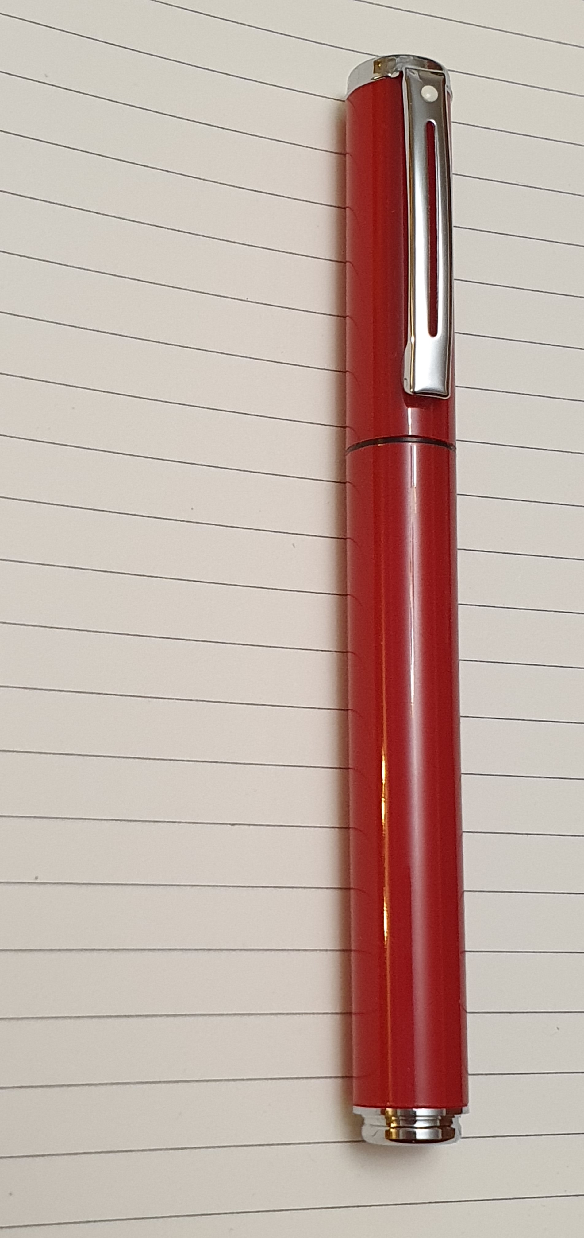
This is the Sheaffer Pop, Glossy Red, or Sheaffer 9207 according to a sticker on the blister pack. It does not say “Pop” anywhere on the packaging or on the pen, but this is the name on the company’s website, Sheaffer.com. It is available in a range of colours including some Star Wars themed designs.
Sheaffer Pop fountain pen.
Thus we are dealing with an entry level type of pen, presumably targeted mainly at school students and so it is not appropriate to be overly detailed or critical in a review. I am fond of Sheaffer fountain pens and like their steel nibs which are generally well finished. Nowadays the packaging also bears the name A.T. Cross Company and this model was made in China.
Construction and design.
This is a plastic pen, light weight and with a uniform diameter cylindrical barrel and cap, which snaps shut firmly to be completely flush with the barrel. The cap features a strong metal pocket clip with a cutaway and the easily recognised Sheaffer white dot.
Owing to the flush cap, the walls of which are quite thick, there is a significant step down to the section. This has a black rubber sleeve grip, which is soft and grippy to rest on your finger. Personally, I hold the pen with my thumb on the barrel and my first and second finger at the section. The cap can be posted if desired, where it sits very securely perched on the back of the pen and again, flush with the barrel. The downside is that the pen is then very long, although the cap is not heavy and so does not make the pen back heavy.
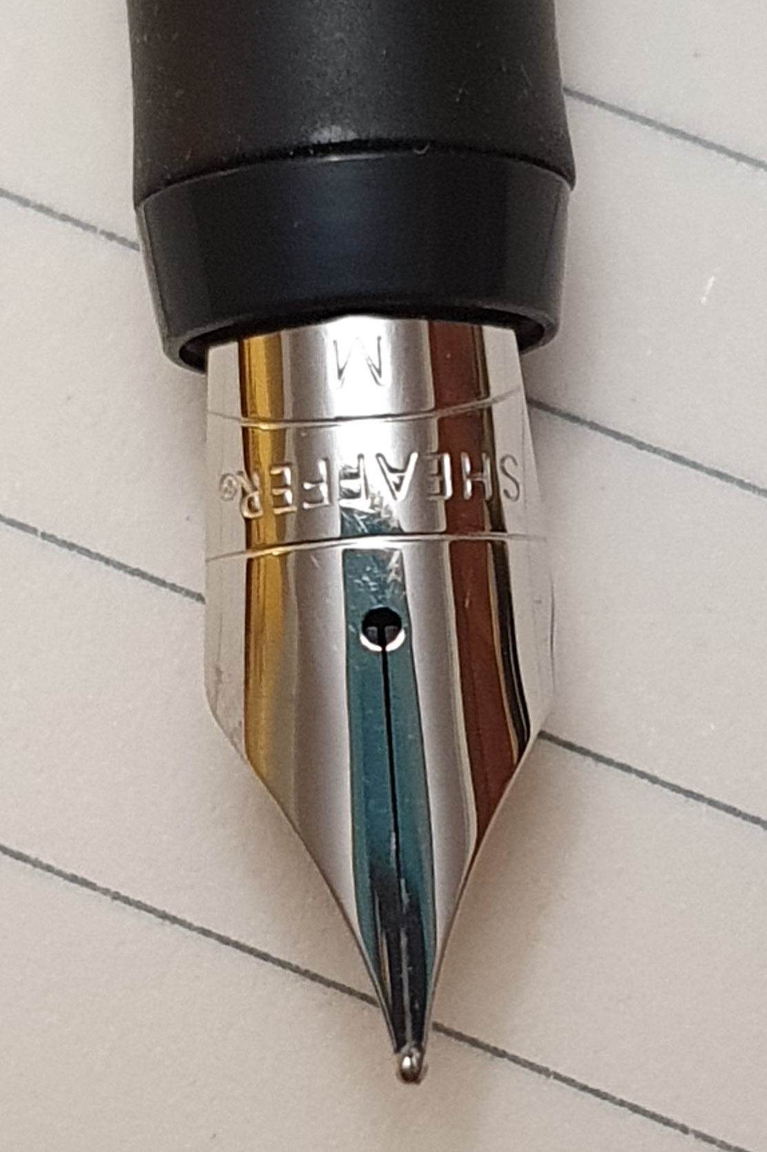
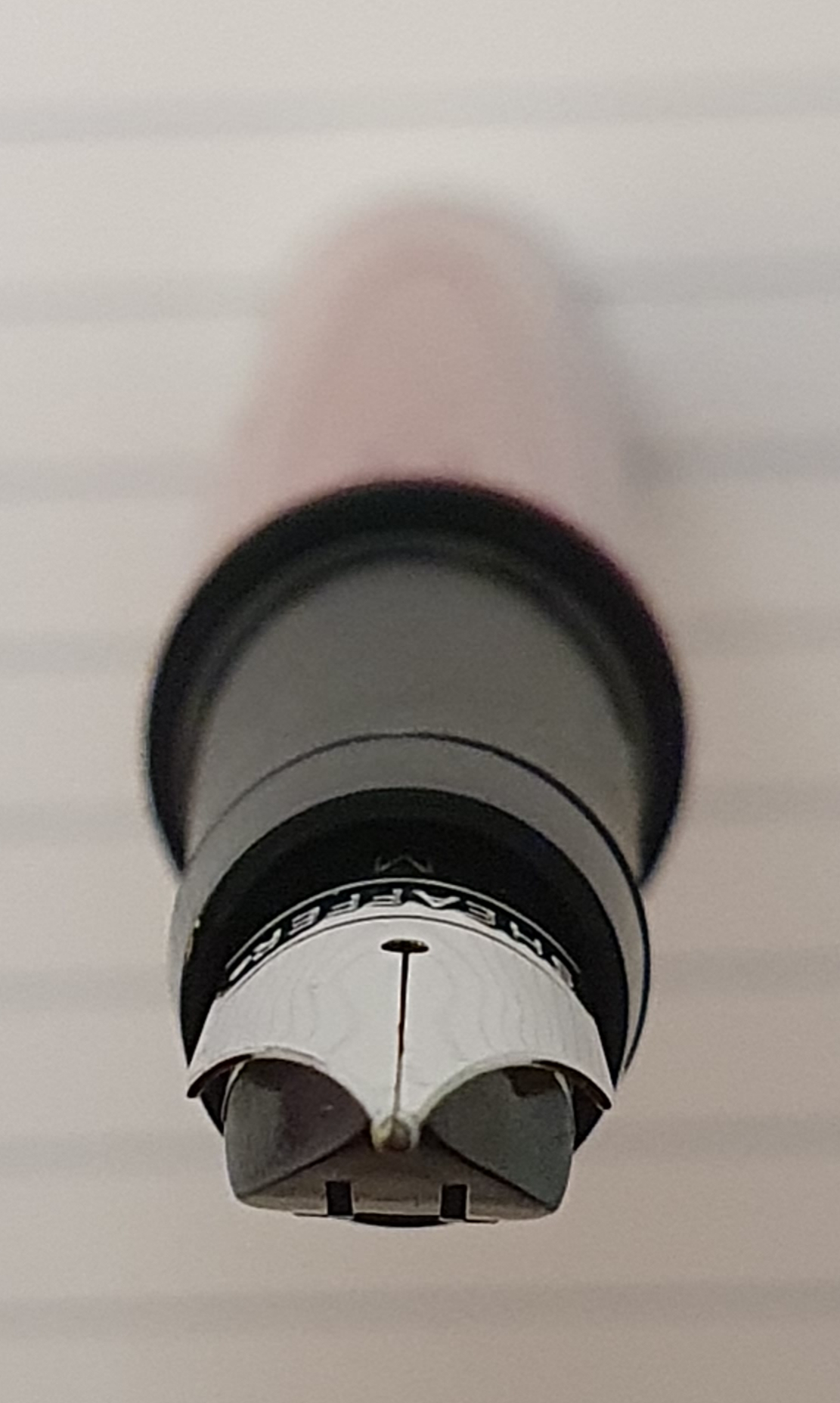
The nib.
The stainless steel, medium nib was set up nicely and wrote, straight out of the box. I was delighted to see that the tines and tipping were even, with a glimpse of daylight between them signalling a good ink flow.
A simple but attractive nib, a stainless steel medium.Nicely set-up steel nib and plastic feed with a slender gap between the tines.
Filling and writing performance.
This is a cartridge converter pen, taking the proprietary Sheaffer Skrip ink cartridges, one black cartridge being included. A Sheaffer converter can be bought separately.
The medium nib on mine is firm and writes without any fuss, in all directions with no skips and no hard starts as yet. The nib writes smoothly and will improve after a few weeks once it has worn in to my angle of writing. The line is perhaps better described as a medium – fine. Ink flow from the supplied black cartridge is good, requiring no pressure. However, the black ink does have a tendency to bleed through on some papers and this might be a reason to get a converter and have a wider choice of inks.
Size and weight.
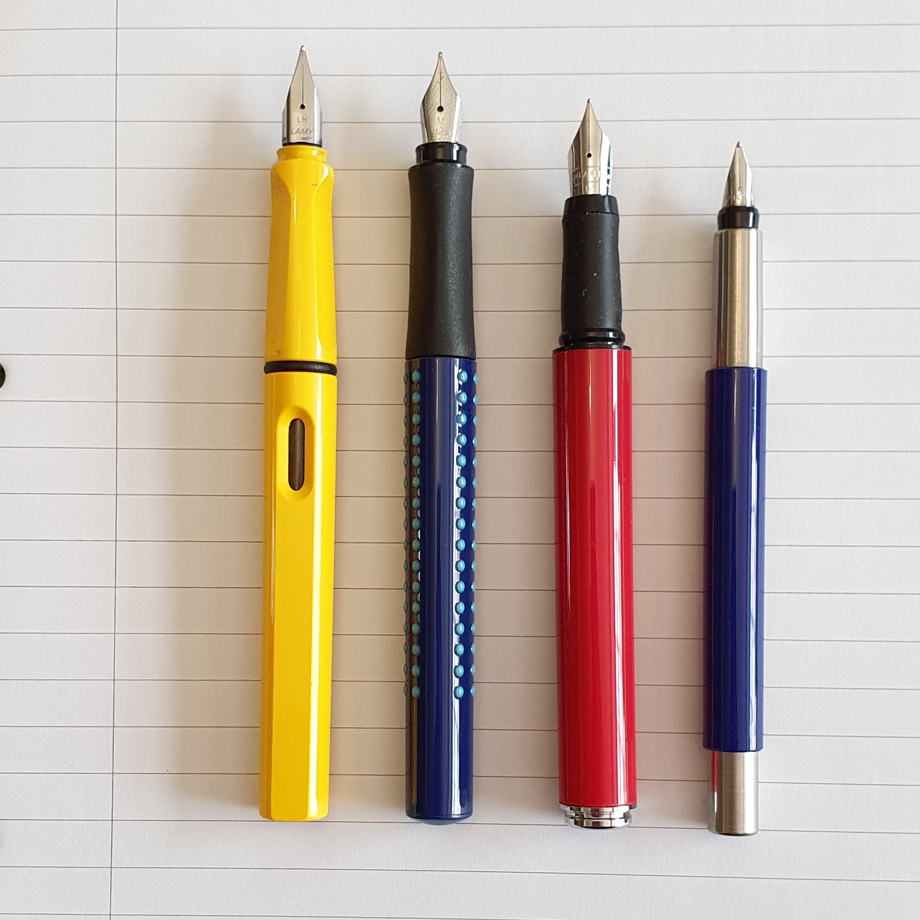
The Pop measures (approximately) 127mm closed, 121mm open and 166mm posted. It weighs approximately 16.5g in all of which around 5.0g is the cap.
Size comparison of the Sheaffer Pop with a few likely competitors, the Lamy Safari, Faber-Castell Grip and the Parker Vector.And here again, posted.
Likes and dislikes.
To get the negative stuff out of the way first, the possible issues I noticed with this pen are as follows:-
Dislikes:-
Very stiff snap cap. Also very stiff on posting; needs to be handled with care;
Significant step down from barrel to grip section although not sharp, could be an issue for some;
Rubber sleeve on the grip section can rotate (although it does not do so whilst writing); section needs to be squeezed tight when unscrewing the barrel, otherwise the grip will just rotate without the section unscrewing;
The cap makes a loud pop, especially when being removed after posting; could become irritating or embarrassing in quiet surroundings;
Plastic cap appears thick walled but could eventually crack;
No inner cap present, although I have not yet experienced any hard starts.
Likes:-
Nib performs well;
Comfortable wide girth of around 12-13mm, similar to a Montblanc 146; much larger than a Parker Vector;
Soft rubber grip;
Very secure snap cap. Good for an every day carry;
Simple design with attractive cylindrical shape and metal fittings.
Step down from barrel to grip section. The projecting ring, or flange for the snap cap is also here and reduces the drop.
Conclusions.
I have been pleasantly surprised by this inexpensive pen. There are certain design elements which have both positive and negative impacts: the flush cap and barrel means a significant step down from barrel to section; the very secure capping (with no rattle, wobble or play at all when the pen is capped or when the cap is posted) makes for a safe every day carry and perhaps avoids nib dry out, but the downside is a very stiff and noisy cap to remove (especially after posting).
Overall however, aside from the stiff cap, I like the pen and am much happier with this girth than that of the Parker Vector. I imagine that competition between brands is fierce at this price level. Having bought mine at half price, I got a bargain here.
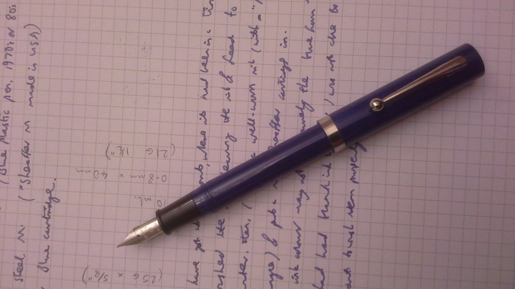
Looking back at the fountain pens which have been particularly significant for me, there is probably none more so than the basic Sheaffer No Nonsense. Certainly, these got the heaviest usage. These are the pens that I used as a law student at Bristol Polytechnic (as it was then called, but now the University of the West of England), from 1977-80.
A Sheaffer No Nonsense fountain pen from the 1970’s.
I would buy these from a local WH Smiths. They were sold on hanging card blister packs. I cannot recall the price back then but it might have been around £7.00. There were a few different nib options including Fine, Medium and Italic but I mostly went for the Medium nib. They took Sheaffer Skrip cartridges. A Sheaffer converter could be used, of the push button or press bar type, if you had one, but the cartridges were easier, to refill mid lecture. Just unscrew the barrel, remove the empty cartridge, drop a new one into the barrel and then screw the section back on; the pen did the rest.
Looking back on my first term at Bristol, the amount of information that we were expected to take in, assimilate and learn, was daunting and stressful. Typically a college day included two hours of lectures, always in the same lecture theatre with its banked rows of orange, folding seats, each with a small, fold-out tray from the arm rest, rather like the aisle seats in a passenger plane. These were barely big enough to support an A4 pad of notepaper, let alone the printed handouts of course material to refer to. Being left handed, I remember the dilemmas of whether to take notes by annotating the printed handouts, (which were of varying degrees of detail) or by writing on my A4 pad and, more fundamentally, whether to write in lefty-underwriter style (with my elbow tucked in) or my faster, neater more usual, lefty-overwriter style, which meant rotating the notepad 90 degrees anticlockwise.
I decided on the latter, overwriter style on A4 paper and also settled on black ink. In a typical lecture, I would write six pages full of notes in an hour. A reliable and comfortable pen was essential. The No Nonsense pens, with their firm, steel nibs, were well suited to this regime. The feeds were plastic although looking at them now, I have one which is of a different shape and might be ebonite. Some of the fins have broken off.
The usual feed.A different feed on my white No Nonsense, now with a few of the fins broken.
Over the months, the nibs would wear down, so that the rounded pellet of tipping material would develop a circular, flat foot. By then, the writing experience would be super smooth for my writing angle but if you strayed away from this sweet spot, you would encounter a sharpened edge which would be scratchy. Eventually, when the nib was worn and getting too scratchy and when I fancied a change, I would replace the pen. Well, I say “replace” but I just bought a new one and never disposed of the old ones. I still have them all.
A well-worn nib.
Aside from using the pens for lectures, study notes and essays, it was also my practice to write up my diary each night, using small, page-a-day diaries from Boots. These were chunky little volumes, about the size of a pack of playing cards, with a page of plain, thin, fountain pen-friendly paper for each day. I would use reverse writing, (writing with the opposite side of the nib) to get an extra fine line and would, with very tiny writing, manage about 28 lines to a page. Back then I did not know that this was called “reverse writing”, SBRE Brown being not yet born.
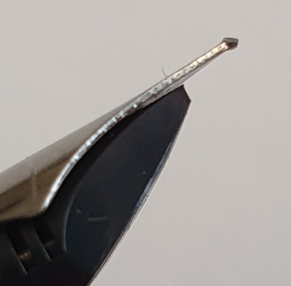
I do not think I had a strong magnifying glass at that time, let alone the ability to take macro photos of pen nibs, and with a mobile phone! But looking now more closely at some of those No Nonsense nibs, there is wear on both sides of the nib so that the tip is almost like a sharp chisel.
Nib tipping wear from both normal and reverse writing. Apologies for the fluff.
The Sheaffer No Nonsense was available in various colours but I tended to buy blue, black or white. I also found some metal bodied versions, supposedly superior and bought a couple of these although I actually preferred the normal, plastic ones.
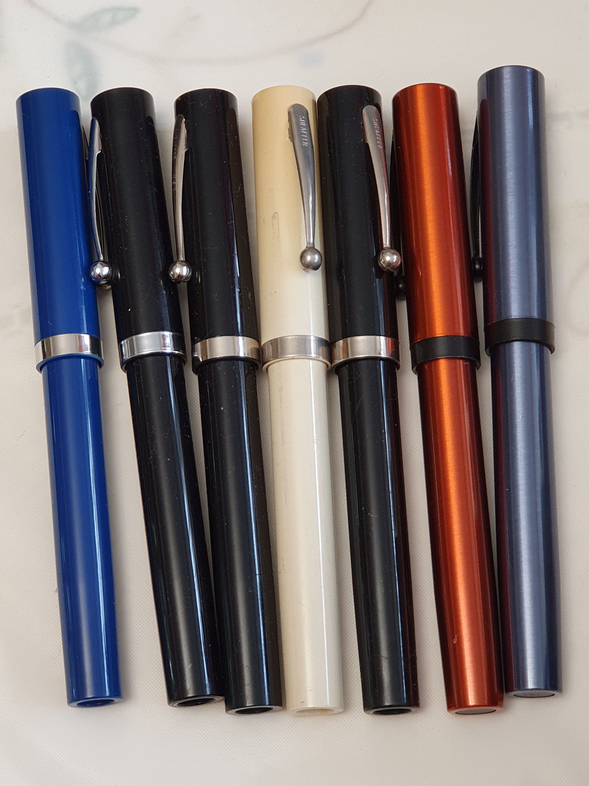
Rooting through a tin of old, long-since retired pens, I assembled my No Nonsense pens for a group photo:
My No Nonsense pens: the college years. The two on the right are the metal ones.
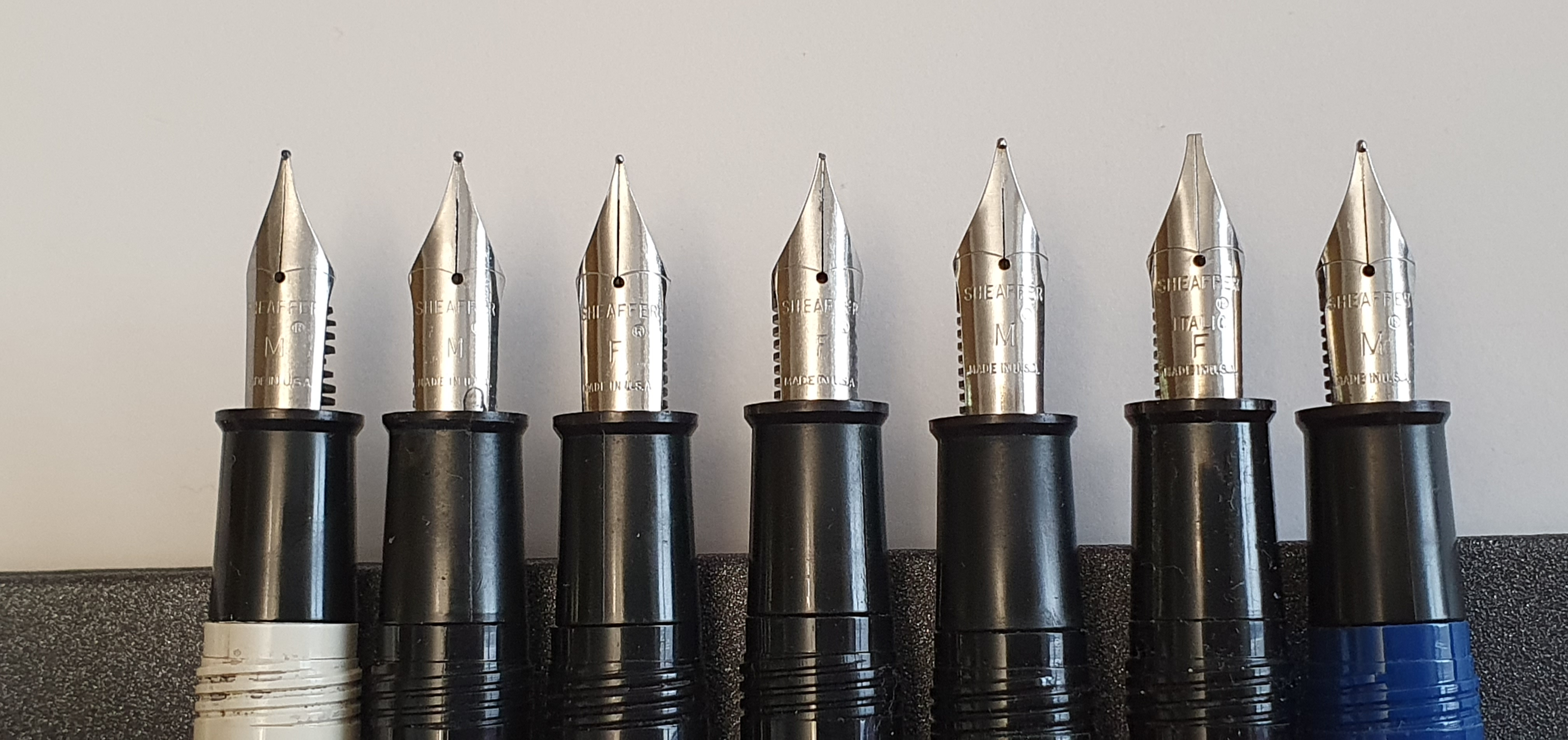
And here, in a never-before-seen-together group shot, are the nibs that got me through college:
My magnificent seven No Nonsense pens. Note the absence of any corrosion or staining, despite being some 40 years old.
The pens, as the name suggests, were no frills, basic, workhorse tools. They were of a good size, 121mm opened and 151mm posted. Being plastic they were very light, but solid. The caps featured a sturdy metal pocket clip with a round ball at the end which would serve very well although I carried mine in a pencil case. The brand Sheaffer was imprinted in the pocket clip. There was no Sheaffer white dot, for reasons unknown to me as I do not think that this would have added much to the cost. There was a chrome cap band, devoid of any text. The cap unscrewed on plastic threads, in one full rotation.
The steel nibs were imprinted with the name Sheaffer, the registered trade mark circled R, the nib grade and Made in USA. I suppose that this meant in Fort Madison, Iowa which I understand closed in 2008. There is a Sheaffer Pen Museum there now, with displays of their many ranges of fountain pens, desk pen sets, advertising posters and memorabilia as well as some fascinating old machines from the former factory and a gift shop. I have not been but enjoyed an amateur video of a trip to the museum on YouTube.
The No Nonsense pens are still produced as calligraphy sets although last time I bought one it was disappointingly plasticky, with a snap cap, soft grip section and a huge open ink window in the barrel.
Some years after college, I bought myself a Sheaffer Connaisseur, which seemed to be an upmarket version of the No Nonsense with an 18k gold nib. It sounds good on paper but I never really took to it for some reason.
Not long ago I inked up one of my No Nonsense pens, the blue plastic one with a super-smooth nib. It is still very usable and still remembers my writing angle. But I think it has deserved its retirement now.
There are several reasons for my writing about this pen today:
I have been looking through my accumulation and rediscovering pens which are like old friends.
I added an Index of Pen Posts to the blog menu recently and noticed that this is a worthy pen not covered before.
I thought that it was coming up to ten years since I bought the pen, although it turns out to be nine.
Background
I bought this pen at Rymans, our local stationers in May 2011. It cost £22.99 normally but there was a discount of £6.00, which was a bonus. I had some previous experience with other versions from the Frontier range. I used the plastic barrelled ones for registering weddings at our church, a duty that I had taken on a few years earlier. I had liked it, as a plain and simple but respectable pen, for use with iron gall ink.
Parker Frontier, in stainless steel with gold coloured nib and clip.
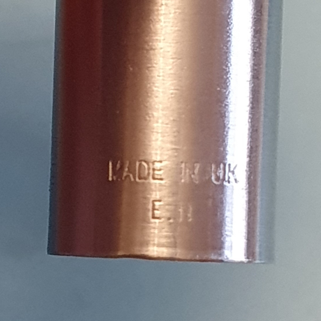
The story of the Parker Pen Company is a long one and dates back to 1888. This particular pen bears the production date code E which denotes the year 2008, (using the “QUALITYPEN” system with Q being a year ending with zero). The cap also states that it was made in the UK which would be from the Newhaven site, which was to close in 2011.
Make and Model name shown here…and the place and date of production.
Thus at the time of manufacturing this particular pen in 2008, Parker had a history of 120 years. Apparently, this milestone was celebrated with a souvenir DVD of the company’s history, a copy of which was given to all the employees at the Newhaven site along with a twin set of a Parker Frontier fountain pen and ball pen. The Parker film (about 51 minutes long) on 120 years of Parker, can be viewed on YouTube. It is somewhat dated now but gives an interesting insight into the company’s origins in Janesville, Wisconsin, the introduction of the Duofold, the vacumatic and the Parker 51, the management buyout, visits by dignitaries including Margaret Thatcher and culminating in the production of 40 million pens a year.
The Frontier was to fill a place in the market at the lower end of the Parker range, sitting above the Vector but below the Sonnet. I remember reading a number of reviews of the pen on Amazon at the time. I was very happy with mine and it became my main pen, for several years.
Construction and design
My model has the brushed stainless steel barrel and cap with a gold coloured pocket clip and cap finial. Some people do not like “mixing their metals” but I liked the gold and silver colours together, (a feature which Cross calls “the medalist”). Parker did also make a version with all-silver coloured fittings which was the model that SBRE Brown owned and reviewed and with which he wrote his final exams in high school.
There is no cap ring. The rim of the cap is quite sharp but sits almost flush with the barrel when the pen is capped. It also posts deeply and securely. The length is around 131mm capped, 123mm uncapped and 149mm posted. Despite the steel body, it weighs only around 22g in all, or 14g uncapped.
The barrel seems to be made from a single piece of steel and has no seams, and has a rounded end like a bullet. When capped the pen feels very robust and protected, encased in steel.
The nib is stainless steel but on my version, has a gold colour plating or coating, matching the arrow clip and bears the name Parker and logo. The nib grade can be seen on the feed as M for medium.
Nicely finished nib.
The black grip section is slightly tapered with no facets but features a non-slip surface. This is not a rubber grip, but a thin skin giving a slightly sticky feel. This does eventually blister unfortunately.
Nib and feed unscrewed. Grip section showing blistering of the non-slip coating.
The pen takes Parker proprietary cartridges or a Parker converter although not included with the pen.
With Parker Quink cartridge.
I enjoyed mine and used it a lot. The nib wrote very smoothly with good flow, showing how good a steel nib can be when set up correctly. The nib and feed can be unscrewed for cleaning or maintenance.
Likes and dislikes
This seems a fairly straight-forward pen but one which presumably benefited from Parker’s 120 years’ experience of nib and feed design. It looks smart, is sturdy and durable (apart from the covering on the section) and is comfortable to hold. Being able to unscrew the nib and feed is a nice feature. Above all, it writes smoothly and well with good flow. Mine is currently inked with Waterman Serenity Blue.
Writing sample, with Serenity Blue on Radley notebook paper. Extract from John Milton.
On the downside, the tendency of the non-slip coating to wear and blister eventually leaves unsightly gaps. I would prefer a grip section without the rubbery layer, such as on the Sonnet or Duofold.
Conclusions
This pen has seen a fair amount of use. Later, I was to move on to a Parker Sonnet, in burgundy. That also had a steel nib which performed similarly but a more luxurious body.
I went through my secondary school days using Parker pens and grew up believing that a Parker pen was special. After my Sonnet, as I began to discover the fountain pen online community, online pen dealers, YouTube reviewers, and pen shows, my pen accumulating gathered pace. It escalated for a good five years or so. However it is nice to revisit our beginnings once in a while to keep a sense of perspective. Anyone can buy a new pen but to have one for nine years, takes a little longer.
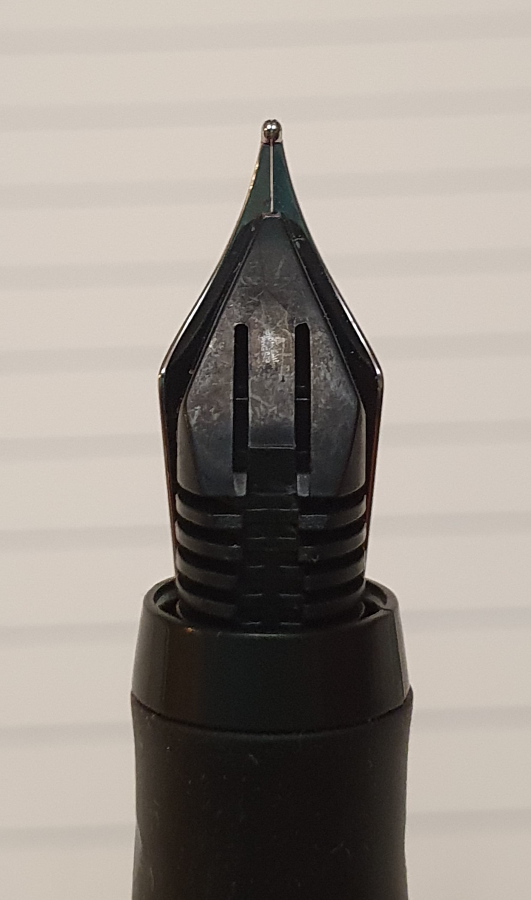
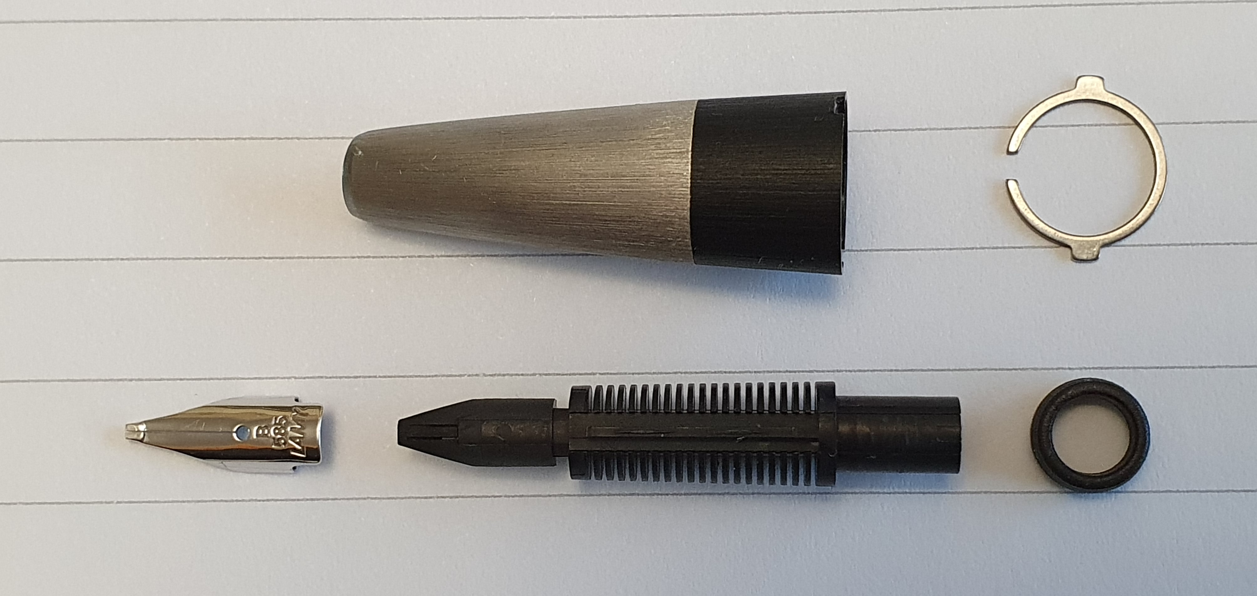
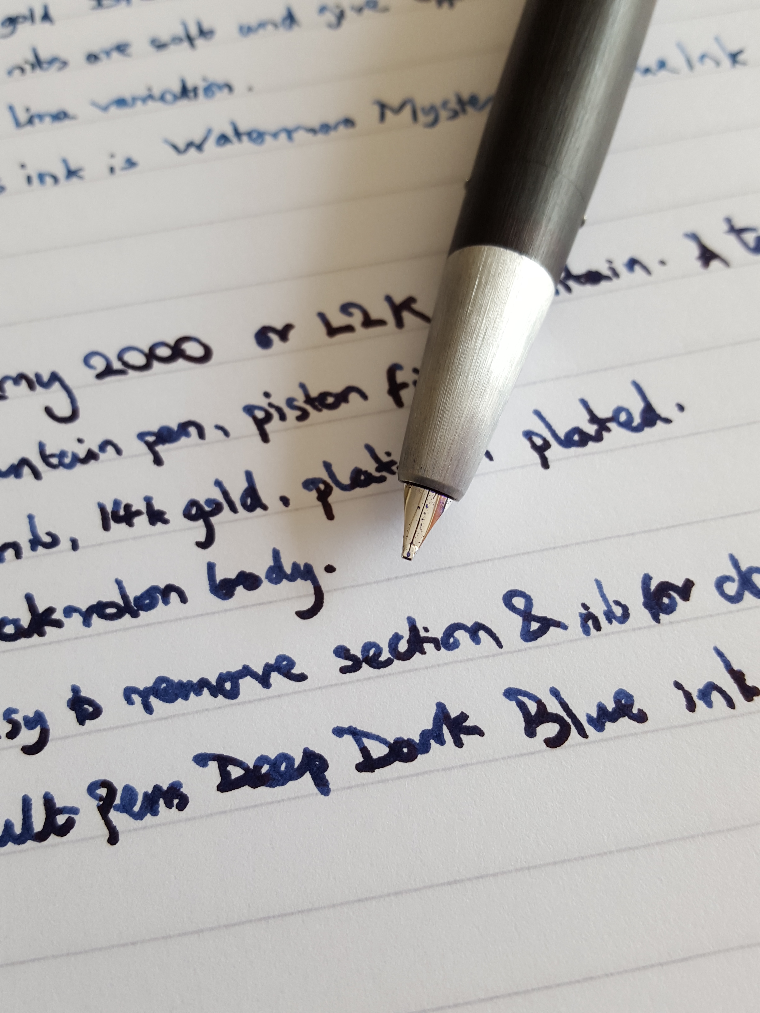
After writing up my history with the Lamy 2000 recently, (My Lamy 2000 fountain pen and I), I made a fairly simple do-it-yourself adjustment to the nib to increase the flow. Mine has a broad nib. Being left-handed and writing in an “overwriter” style, I need a slightly wetter flow.
This involved carefully bending the small nib upwards very slightly to widen the gap between the tines. The result was a wetter flow, better lubrication and a generally far happier and less frustrating writing experience. No longer was it necessary to maintain pressure on the nib to write. The gap between the tines is now clearly visible when viewed under a loupe, although in profile, any upward bend of the nib is barely evident.
Lamy 2000 Broad nib, 14k gold and platinum plated. Now with tines a little wider than before.
I happily wrote more than 12 pages of A4 paper before getting through one fill of Waterman Serenity Blue ink, which gives you an idea of the wetness of the nib. If anything it was perhaps a little too much on the wet side.
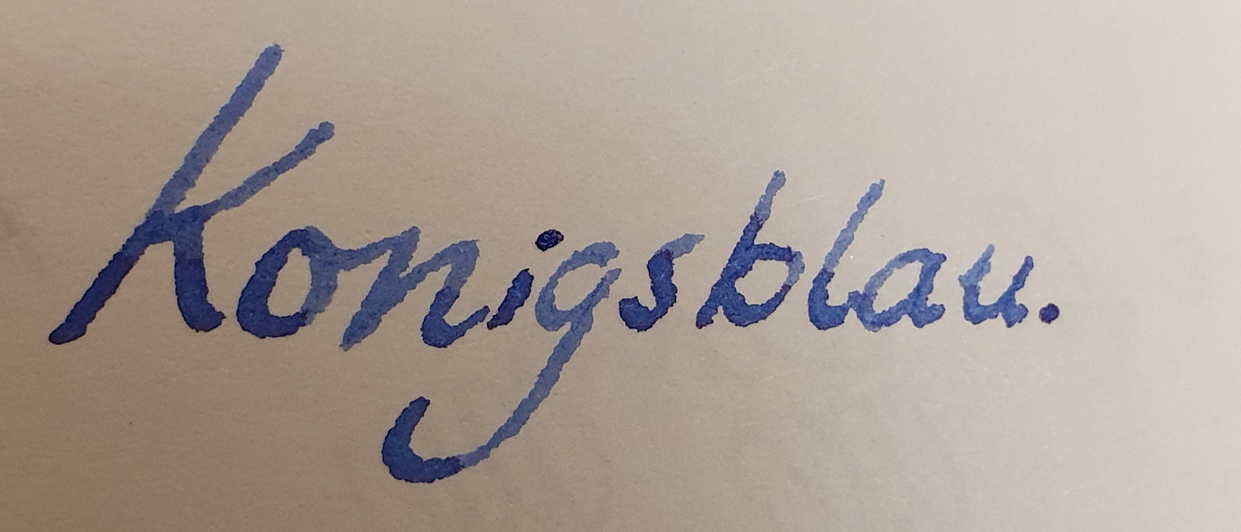
I found that trying to close the gap is more difficult than opening it. Instead, it occurred to me to try a drier ink and I recalled that Pelikan 4001 Royal Blue (“Konigsblau”) is such an ink.
Showing front section, nib and feed, disassembled for cleaning.
Once again, the Lamy 2000 went upstairs for a bath. It is an easy and enjoyable pen to clean. For the benefit of anyone unfamiliar with this, my routine is as follows:-
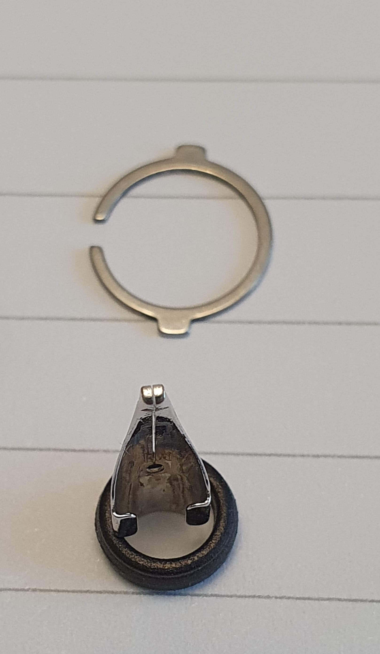
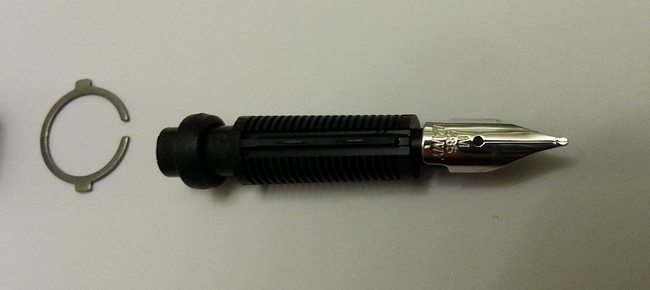
Unscrew the section from the barrel. Lift off the metal horse-shoe shaped ring which sits in a recess at this join, which is the clip to hold the cap on. Do not lose it or let it go down the plug hole.
Then, holding the nib between finger and thumb (above and below the nib, not at the sides), gently push the nib inwards, so that the entire nib and feed unit comes out through the back of the section; note that there is a thick rubber washer towards the back of the feed, which you must also be careful not to lose.
The nib and feed unit can then be rinsed in water to remove all traces of the last used ink. If desired the nib can be slid off the feed, as this simply clips over the sides, just like a Lamy Safari nib. Be extra careful not to lose this either, as it is quite small and fiddly on its own.
Wash the ink reservoir by drawing water up and down a few times until this runs clear. If desired, to lubricate the piston, (although I do not do this every time), introduce a tiny amount of silicone grease to the inside walls of the reservoir, with a toothpick or similar implement and wind the piston up and down a few times to spread the grease. Thank you, to an old Goulet Pens video for this advice.
The small bits – cap locking ring, the nib and feed washer. The washer makes a handy support for nib photos.
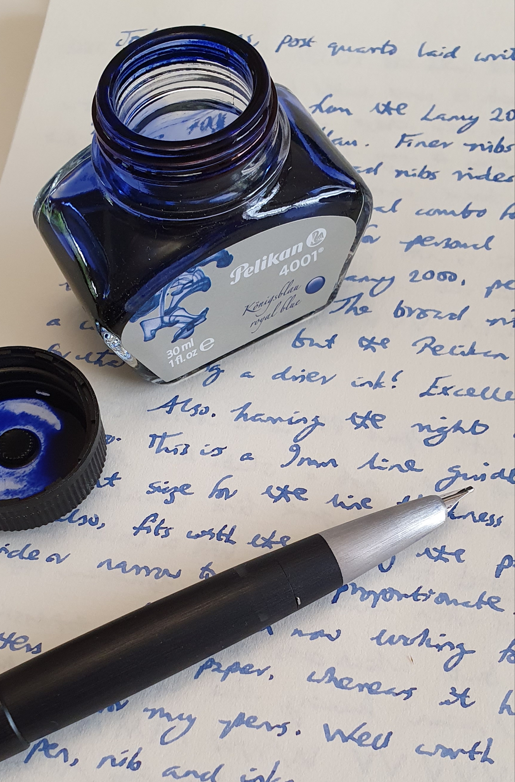
I filled the pen with Pelikan 4001 Konigsblau and, low and behold, the flow now seems to be spot on for me. It is still sufficiently wet to give great flow and lubrication, for effortless writing with minimal pressure, but the flow is not excessive.
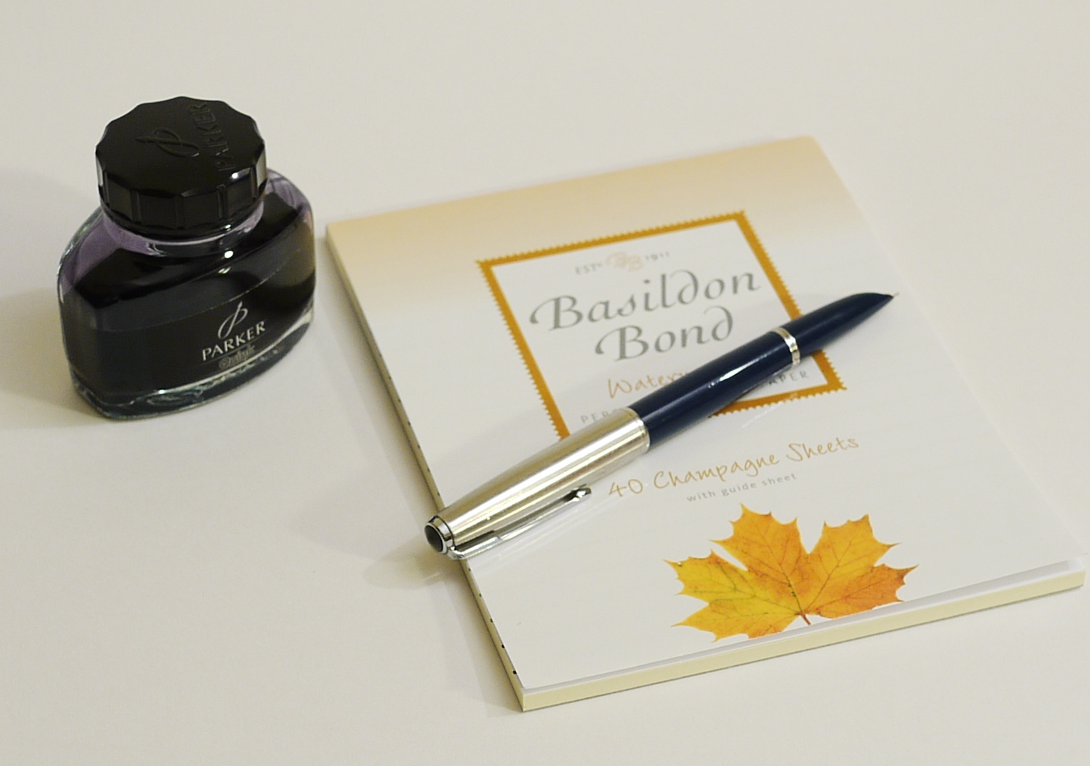
Writing sample, Lamy 2000 with Pelikan 4001 Konigsblau on Basildon Bond letter writing paper.
The Konigsblau is an ink that I have not used very much before. I have had two bottles of it hanging around for a long time. I had never really liked the shade of blue all that much as it seemed to me rather pale and lacking the vibrance of say Waterman Serenity Blue or Montblanc Royal Blue. And yet now, in a wetter pen with a broad nib, this Pelikan ink comes into its own. It does seem paler than Serenity Blue but gives an elegant look, with some subtle shading. With the stubby broad nibbed Lamy, you benefit from this shading and also a degree of line width variation.
I could easily have given up on the Lamy or left it dormant as I had not got on with it for so long. Similarly, the Pelikan ink had been little used and was always passed over when I wanted a royal blue, as I would pick another from Waterman, Montblanc, Aurora, or Caran d’Ache from my ink drawer.
I am now using and enjoying my Lamy 2000 more than at any time since I bought it almost six years ago. The conclusion is that not only pens, but inks too, can enjoy a renaissance if we give them (or ourselves) another chance.
Writing sample on John Lewis Script, Post quarto laid writing pad, Ivory, 100gsm.
During this period of lockdown, I have been looking back over my fountain pen accumulation. This now spans a period of some 50 years. A number of my pen purchases have been part of a recurring pattern, of wanting a new special, or “best” pen, as a trusty companion for life that would be a step up from what I had at the time.
This would generally be a black pen with a gold nib. Hence, certain milestone purchases have been a Parker 75 Laque, a Sheaffer Connoisseur, a Cross Apogee, a Lamy 2000, a Pelikan M800 (in this case, blue stripe with black cap) a Montblanc Meisterstuck 145 Classique and an Aurora 88 (black with a gold plated cap).
With hindsight, it is obvious that none of these signalled the end of my journey of pen buying. Rather, they were like waymarks along the path, some leading to dead ends and others to a seemingly endless onward journey. Sometimes, when you are on a walk up a hill, it is useful to meet someone who is coming down who can tell you how far it is to the top and what you will find when you get there.
I recently got out my Cross Apogee. I remember buying it, in around 2006 or 2007 with a slightly dizzy excitement at spending as much as £100.00 (which is what it cost then, rather more now). The pen looked very handsome in the glass topped counter of the department store.
Cross Apogee fountain pen.
This Apogee is a metal bodied pen, with a gleaming black laquer finish. It is supposedly superior to the Bailey, as it has an 18k gold nib. There is a sprung metal pocket clip, with a sharp point, like an arrowhead. The cap is snap-on, secured by a raised rim at the base of the section. The broad cap ring, reads on the back, “CROSS, EST 1846”
The pen is comfortable to hold, by virtue of the wide girth and the absence of any cap threads or step between barrel and section. Uncapped, the pen measures around 127mm. The cap can be posted deeply and securely, to increase the length to 144mm. It weighs around 44g capped, or 26g uncapped.
Posted.
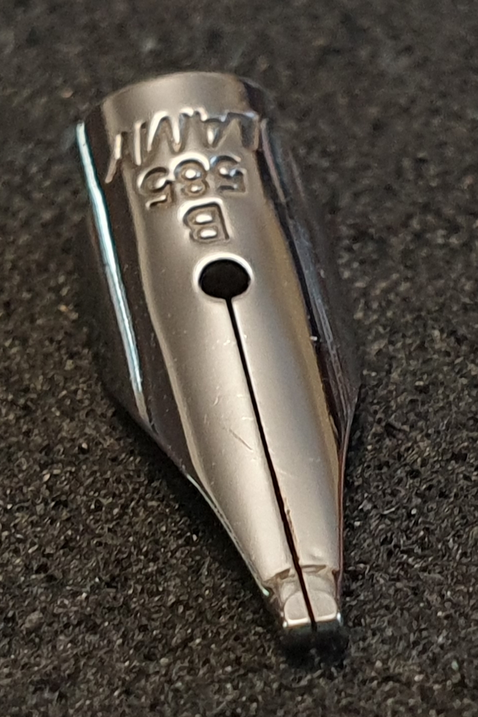
The barrel tapers to finish in a shiny plated metal finial. Removing the barrel, the cartridge or converter metal housing is imprinted with a date code, in my case 0805, being manufactured in August 2005. I particularly enjoy having a date on my pens. The Apogee takes Cross proprietary cartridges, or else the screw-in converters.
Showing the 0805 production date code.
The nib is attractively decorated with CROSS, 18k 750 and with lines running down each side, perhaps to suggest the vanes of a feather, which ties in with the arrowhead style of the pocket clip. The nib grade of M for medium is found on one side of the nib, rather like on a Sailor or a Pilot nib.
18k gold nib, medium. Silver-coloured plating. The M is on the other side.
In the event, I did not take to this pen, which was disappointing. First, I recall being troubled about the degree of lateral wobble in the pocket clip. I appreciated that it was designed to rock up and down but the side to side movement was, I felt, possibly a defect. However this issue does not bother me at all now.
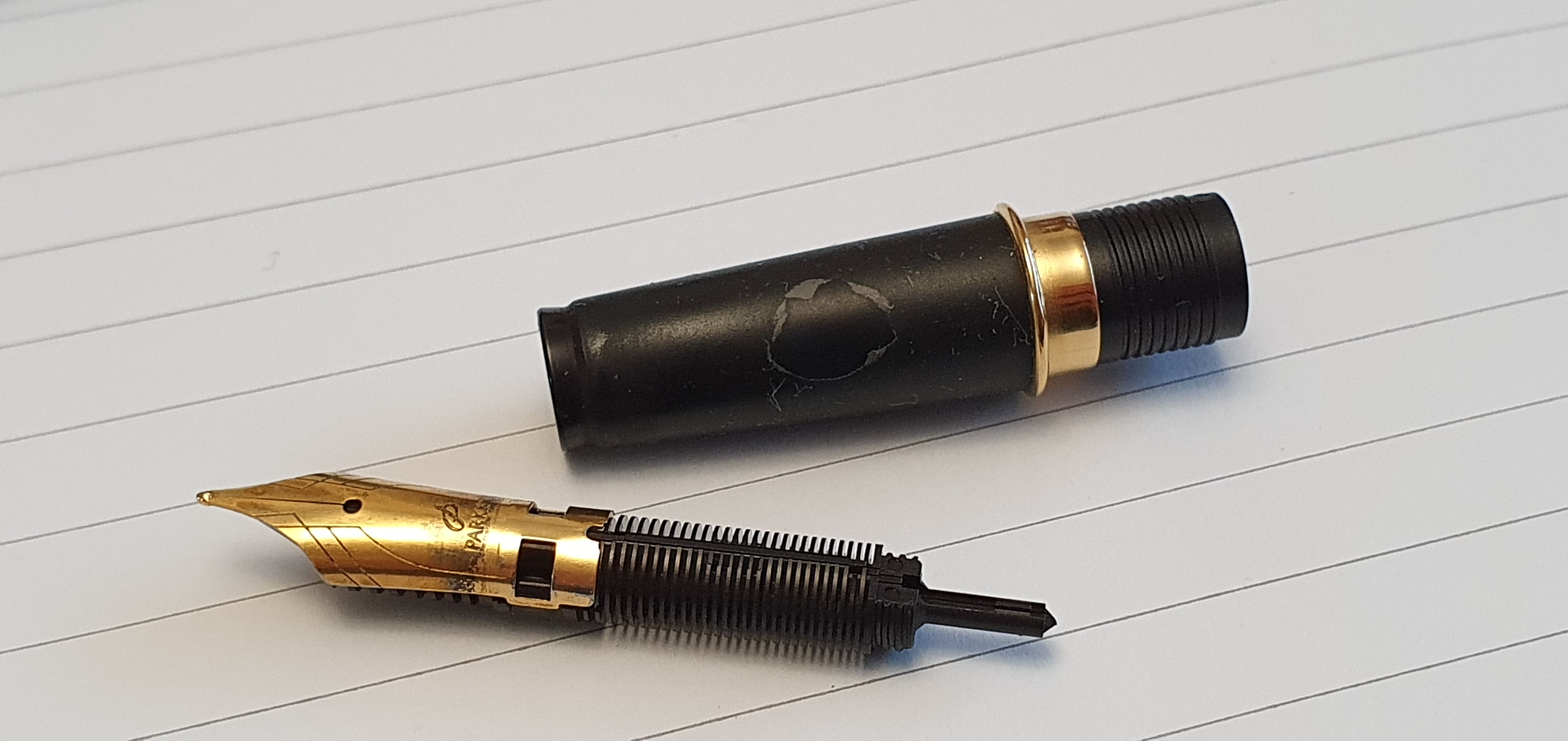
The greater problem was one of ink flow. Once filled from a bottle, it seemed that the pen might not always make it to the end of a page of A4 paper without suffering from ink starvation. I never discovered the reason for this. I lost patience with the pen and put it away. Getting it out again a few years ago, armed with a little more experience in nib-wrangling, I examined the nib and feed under a loupe but all looked normal to me and I could not work out why it would not keep writing. The nib and feed are friction fit.
Friction-fit nib and feed, removed.
Recently, (after some success in tuning the nib of my Lamy 2000 to my liking) I got out the Apogee and cleaned the nib and feed. Under a loupe, all certainly looked well. The nib has a tiny gap between the tines, right down to the tipping which usually indicates a good flow. I filled it with the nicely behaved Waterman Serenity blue. The pen did keep going for a full page of A4, but then after being stood for just a few minutes in a pen cup, it exhibited hard-starts. I tried inking it with Pelikan Edelstein Smoky Quartz, an “Extra Soft Ink” to see if this might help. Trying again for the full-page-of-A4 test, the pen kept going but after then standing the capped pen upright in a pen cup for 20 minutes, it hard-started again and needed several good shakes. This pen does not like to be stood up. It seems that the ink all drains away from the nib. My inexpensive Cross Bailey Light pens never have this problem.
I looked on Amazon and read some of the varied reviews of the Apogee. It seemed that others had also encountered problems with ink flow on this pen. If any readers know the reason for this and how to solve it, I would be interested to hear from them in the comments below please!
It is not realistic to expect that every pen we buy will be fantastic. For anyone wanting a high end Cross pen, I would recommend perhaps trying a Townsend over the Apogee. Also, although quite a bit more expensive, there is the flagship Peerless, of which I have read good reports, although I have not owned one.
I can conclude, at least for me, that the Cross Apogee was not to be the pen purchase of a lifetime. As to where my pen journey leads, I am beginning to suspect that it will eventually bring me back to where I first started, with a simple pen that works well, like a Cross Bailey Light, for example. This has become my office pen over recent months and which I have found more dependable than the costly Apogee.
Having time at home now, I have enjoyed looking back through the many pen photos stored on my computer and my list of previous posts in this blog. I was surprised to find that I had not yet written about the Lamy 2000.
This is probably because I never really got on with it all that well. Perhaps, it was from a feeling of “If you have nothing nice to say, it’s better to say nothing at all.” Well, it’s not that bad. There are lots of features that I like about it, except that mine never wrote as effortlessly and enjoyably as I had hoped for.
The classic, understated Lamy 2000 fountain pen.
I remember buying my Lamy 2000, in May of 2014. It was in a lovely pen shop in Brighton, called Websters, sadly not there any more. After having a good look around the display cases and having bought a couple of bottles of Watermans ink and a Lamy Logo fountain pen, I had strong urge to take home a Lamy 2000. At £175.00 it may have then been my most expensive pen purchase to date and requiring of spousal approval, which was duly sought and granted.
The pen came with a medium nib. There were no other options at the point of sale. The packaging was simple and modest. I admired the pen in the train on our way home to London that evening and was excited to try it out.
The medium nib that my pen came with, in 2014
I should add here, that the brushed metal Lamy Logo fountain pen that I also bought that day, with its Safari-style steel nib, proved to be buttery smooth. At almost six times the price, I had high hopes for the gold nibbed Lamy 2000.
Unfortunately writing with the 2000 was frustrating. The medium nib was smooth but dry and needed constant effort to write. Over the following weeks, I tried several different inks, flushed the nib and feed numerous times and tried different papers. I wrote pages and pages and drew spoked wheels to see in what direction the driest lines were occurring. Being a lefty overwriter, I need a wetter nib as the pen does more pushing forwards and sideways and not many downstrokes to recharge the nib.
Disassembled for cleaning. Over the years I probably enjoyed cleaning the pen more than writing with it.
I did not want to take a chance on adjusting the gold nib myself. To cut a long story short, I eventually gave up on the pen and put it away. I had others that wrote better.
However, some six months later, something prompted me to get in touch with Lamy and I sent them an email to ask if anything could be done. They replied and invited me to send the pen back to them in Germany, which I did, with a note requesting an adjustment to my nib, or else a replacement nib, perhaps a broad.
To their great credit, notwithstanding the passage of several months since purchase, Lamy returned my pen a few days later, free of charge with a new nib. And this time it was a stubby broad.
A new broad nib brings new hope.
Once again I went through the process of filling the pen, trying it on different papers and writing pages and pages. It was better than before! I liked the line produced by the broad nib. Yet, it still suffered from the problem of needing pressure to make it write, to get ink to flow but of course this pressure caused friction and resistance as the pen moved across the paper. All in all it was hard work and not enjoyable. What’s more, the nib literally squeaked on the paper.
Enjoying the Cult Pens Deep Dark Blue ink.
From time to time over the years I would get it out again, thinking that a different ink would make the difference. But always I would end up flushing the ink and putting the pen away again and so for almost six years the pen has been unfulfilled and largely unused. Yet, even now as I write this, I am tempted to give it another try. Maybe it just needs the nib tweaked to open up the tines more. How hard can that be? Whereas in the past I was not brave enough to try it, I think I may have reached the “past caring” point at which I am prepared to take the risk. And if all else fails, I could get it done by an experienced nibmeister.
I know that so many enthusiasts speak highly of their L2K’s and I want a part of that enjoyment. I do admire the minimalist, understated design; the barely visible seam where the piston knob meets the barrel; the clever mechanism for the push-on cap; the free-floating nib which can be so easily removed for cleaning; the unique finish of the Makrolon body and the clean juxtaposition with the brushed stainless steel section and the subtle, platinum coated gold nib. I also know that I am not alone and that others have found the pen hard to use.
Yet, the design wins me over every time and makes me want to give it another chance. We will see how this turns out.
Who can resist this unique design?
Update, 9 April 2020:
The exercise of writing this post had the effect of focusing my mind on the problem with my nib. This morning, I awoke with a resolve to try to adjust the nib myself, with some very simple tine spreading.
I examined the nib again under the loupe to remind myself of the problem. I then pushed the nib downwards against my thumb nail, in a few very gentle, controlled presses, and examined the nib again. Within moments, the tines had opened up. I thought that I might have overdone it and flipped the pen over and tried pushing again to close the gap. I found that it was easier to open the gap than to close it.
I tried dipping the pen in ink and wrote a few lines. All indications were that it was still writing smoothly, with the tines level, but that the wetness would be increased. I then filled the pen properly, with Waterman Serenity Blue and enjoyed writing for a page or so of A4. I tried a few different notebooks and found marked differences in absorbency between different types of paper.
Trying the effect of opening up the tines a little. Much wetter now, but without being too wet.
The nib and feed kept up without problems for a full page. The nib still squeaks and needs careful handling to keep to the sweet spot. But it is now wetter and better lubricated than before and this will be a much needed improvement for my style of writing.
After a few brave moments of opening up the gap between the tines.
Not so much a review today, but rather an excuse to air some photos of this lovely pen, that would otherwise remain buried in my computer.
The Visconti Van Gogh Starry Night.
Last summer seems a long time ago now, in the care-free days before the coronavirus pandemic. Now, at home in partial lockdown, I took the opportunity to look back through my hundreds of pen photos to try to tidy up the folders a bit.
It was at a meet up of the London fountain pen club, last June, that I acquired this pen. Its provenance is that it belonged to Penultimate Dave, the pen collector, prolific Instagrammer and YouTube pen reviewer formerly known as Visconti Dave. He was offering this pen and a few others from his collection, for sale. I did not have a Van Gogh. I had admired them in Selfridges and thought that the Starry Night was the one to have but had not stretched to buying one. This was the perfect time to rectify that.
The Van Gogh pens come in a variety of colours, each based upon the palette of a different famous painting, named on the cap ring. Hence, Starry Night is predominantly a rich dark blue, with splashes of yellow and whisps of white. Each pen is unique as the distribution of colours comes out slightly differently. There are over a dozen different paintings to choose from and some enthusiasts collect the whole set.
Beautiful swirls of rich dark blue, yellow and white, set off by silver coloured furniture.
The pen has a sprung metal pocket clip, (bow shaped, like the arches of the Ponte Vecchio in Florence) and a removable magnetic metal cap finial that can be replaced with a jeweled one or with your initials, although I have not done so.
The Visconti curved and laser etched pocket clip.
The cap and barrel are multi faceted. The cap snaps shut by means of a magnet inside the cap and so there are no cap threads to interfere with your grip. Nor is there any significant step from the barrel to the section, where you might grip the pen and so it is smooth to hold. Fun fact: the magnetic cap can be used to pick up spent staples from your desk.
The faceted cap and barrel. A Leuchtturm A5 plain paper journal, with pencil lines ruled by me. My notebook, my rules.
The grip section is metal with shiny plating. This looks attractive, and photogenic, particularly in contrast to the dark blue swirls of the barrel. It also gives the pen some heft at the front end. The down side, for some, is that it makes for rather a slippy surface to grip but I hold the pen just above this and am therefore able to anchor the pen with my thumb and forefinger on the barrel to keep the nib at the sweet spot. I find the pen very comfortable and balanced whether unposted (for short notes) or posted, for longer writing sessions.
Weighty metal section but slippery to hold.
The nib is steel, (mine is a fine), plated and with some fancy scroll work, rather more elaborate than on my Visconti Rembrandt. It is firm nib but beautifully smooth and with good flow and lubrication. I should add that it was not quite as wet when I first got it. After using it for a few days I decided to open up the tines just a little to improve flow (which I had also done on my Visconti Rembrandt, to good effect), to better suit my lefty-overwriter style.
Gorgeous scroll work on this steel nib, now with a hint of light between the tines.
I employed a trick learned from an SBRE Brown video, whereby you place your thumb on the middle of the nib, place the tip of the nib on the nail of your other thumb, then push downwards on the nib, very carefully, but just enough to start bending the tines upwards away from the feed. As you do this, it has the effect of widening the gap between the tines and increasing ink flow. You should go very carefully when bending this, or any nib. The aim is only to open up the tines a fraction and not to leave the nib looking like a ski jump. Check the results constantly with a loupe and by writing with the pen and do not overdo it. Also, as Stephen Brown said, “You will get ink on your fingers, but that is ok because you’re helping your pen.”
The pen takes standard international cartridges, or a converter. There are metal threads on the inside of the barrel.
Metal to metal for the barrel threads.
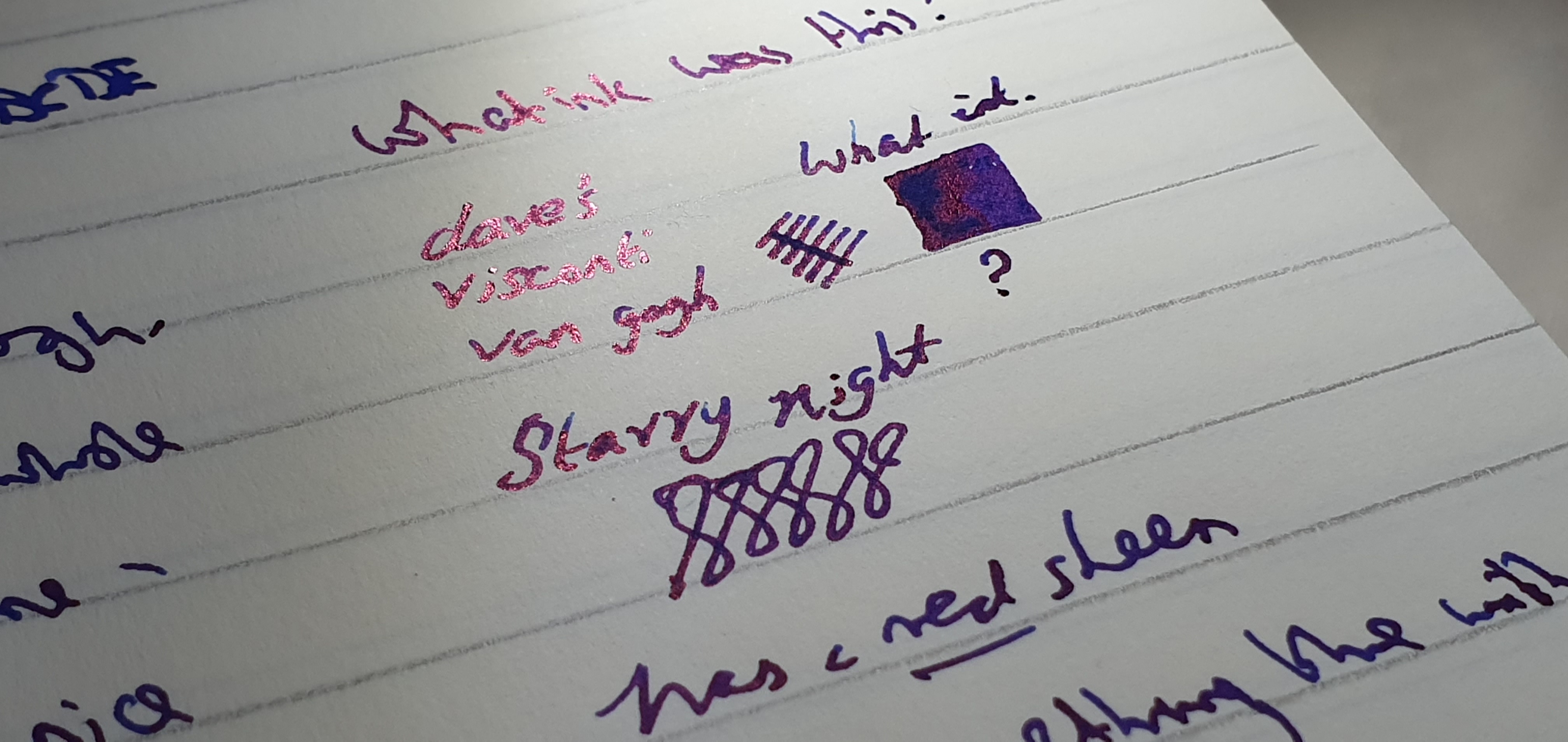
When I received the pen, Dave had it inked with a dark blue ink with an amazing red sheen. Once this was exhausted, I flushed it and refilled it with Waterman Serenity blue, which I like to use when getting to know a new pen and also to chase away any residue from more persistent inks. (This is another trick I have learned, this time from Laura of Fountain Pen Follies).
Penultimate Dave’s sheeny ink. I forgot to note down what it was.
Looking back at my notebook from that time, I filled about twelve pages with the Van Gogh, in conversation with myself (Van Gogh would approve) as to how the pen wrote and whether or not to tamper with the nib. I felt that my Rembrandt was smoother, but then that was a medium nib, not a fine.
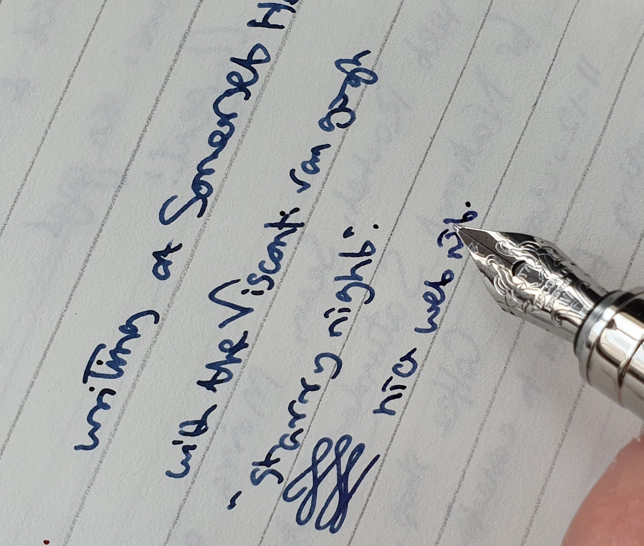
Enjoying the Visconti nib on Leuchtturm paper.
Later that summer, I travelled to northern Italy for a holiday on Lake Garda. I brought the Van Gogh with me. I thought it would like that. I paired it with Graf von Faber-Castell Cobalt blue cartridges. In the event, I did not use it all that much as I got distracted by another pen that I bought on holiday. This is often the way of things when you keep buying more pens.
Recently I inked it up, with Conway Stewart Tavy, by Diamine which is an old favourite blue black. This suits it very well. After this I tried the pen on a handful of different notebooks. It was particularly enjoyable on a thick, 100gsm paper from an A4 wire-bound notepad called Concord, premium writing paper.
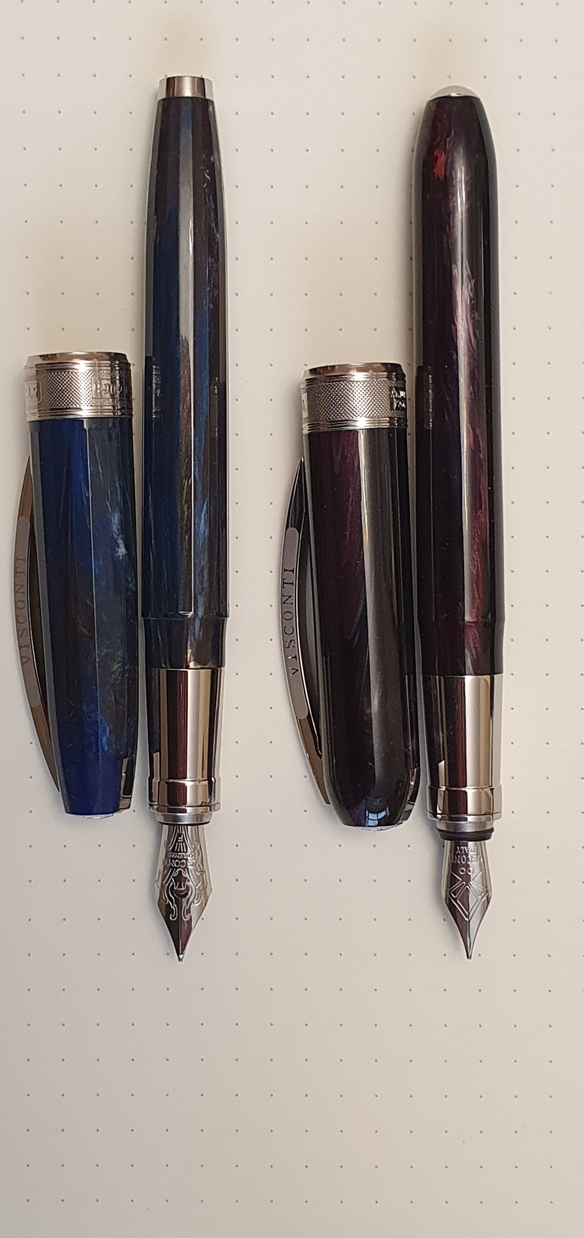
The Van Gogh feels rather superior to the Rembrandt, as is reflected in the higher price tag. It is faceted, whereas the Rembrandt is not but otherwise the size and features are very similar. They compliment each other well. Both are probably regarded as near entry level Viscontis, in comparison to the various Homo Sapiens, Divinas and Opera Masters of the Visconti catalogue, none of which I own. But they are still very commendable pens in their own right with Italian flair and lofty artistic associations, albeit that the nib might need tweaking.
Visconti Van Gogh (left) beside a Visconti Rembrandt for comparison.
Back in early January, I found myself in a party situation at a flat in London overlooking the River Thames, near Tower Bridge. It so happened that my wife was unable to make it and I went alone.
Like the hosts, many of the guests had six-year old children and so the general ambience was on the noisy side.
Seeing me on my own at one point, a young woman about half my age engaged me in conversation. Her name was Esther. Breaking the ice, she asked me if I had any hobbies. Caught off guard, I ‘fessed up to having a guilty pleasure, which was collecting fountain pens. I didn’t go into the distinction between collecting and accumulating but spared her this detail.
“Are those the pens with a separate capsule for the ink, that you puncture?” asked Esther, grimacing at the memory from her school days. “Yes, cartridges” I said, nerdishly adding that people generally refer to cartridge pens as fountain pens although technically a fountain pen is one which does not have a cartridge but has its own system of filling from an ink bottle, such as a piston, or lever or vac filling plunger.
“What is the attraction?” she asked. I tried to explain about finding the ideal combinations of pen, nib, ink and paper and the joy of effortless writing with no downward pressure and letting the words flow, with glistening wet ink and a comfortable pen. I babbled on about the joys of going back to analogue, like wearing a mechanical wristwatch instead of a battery one.
“So what do you write with these pens?” I said that I liked to keep a journal, a habit that I had continued for decades and also to write travelogues and to write letters. Also, I liked to write up memories. For example I had enjoyed reflecting on memories of my parents, listing key words as writing prompts and then going back to write up these memories in notebooks.
A vintage Parker 51 and bottle of Quink.
“But isn’t it easier to amend, edit and correct on a computer?” she asked, quite reasonably. Fair comment. “Yes it is” I replied. I said that perhaps writing with a pen made you more careful, rather like taking photographs on film, especially if you are shooting on medium format and have only 12 frames on a roll which makes you a better photographer. I thought back to letter writing sessions at boarding school when picking up a fountain pen and starting to write seemed to help ideas flow.
“What’s your favourite pen?” I said that many addicts would answer “My next one” which is only partly a joke. It seems that no matter how many fountain pens you have, you are always after the next one, a sign of obsession. I did then try to answer, but said it was difficult to say which was the favourite. I could perhaps try to list the favourite from each brand that I own, to narrow it down. I told Esther that lately I had discovered a pen called the Cross Bailey Light, which was inexpensive, comfortable and wrote well and had gone on to buy six of these, one in each of the available colours.
“Perhaps what you need to do is think which you like best and want to keep and then give all the rest to someone who will sell them for you on ebay.” I think I may have blacked out for a moment at this point as my mind digested this trauma. I might have said in my defence that most of my pens were not expensive ones and so it was not worth selling them. What’s more, I was rather attached to them (which is a bit silly if they are not being used regularly).
“What does your wife think about all this?” I had the answer to this one. “She thinks I am storing up problems for her for when I die.” I know that she is bothered about matching up pens with their boxes in the event of my untimely demise.
The moral of this little tale is that it can be difficult to describe and justify your hobby to a normal person. How do you explain that after a stressful day, you take pleasure in picking up a fountain pen and putting pen to paper, or even just thinking about which inks to try next in a certain pen? When fountain pen enthusiasts are together, all of this goes without saying.
The reality is that taking a disproportionate amount of pleasure from a pen, or any other day-to-day object is a bit of escapism. It is something that we do to make the bad stuff go away, to find happiness and which is cheaper than therapy.
On reflection, I did not handle the conversation with this charming young woman as well as I might. It is shameful that even on my chosen subject, when unprepared I led myself down a one way street, rather than perhaps winning another convert to join the pen club. Next time, I’ll say “I enjoy fountain pens. Now tell me about your hobbies, which no doubt will be far more interesting.” Another drink anyone?