Early thoughts on the Cross Bailey Light fountain pen.

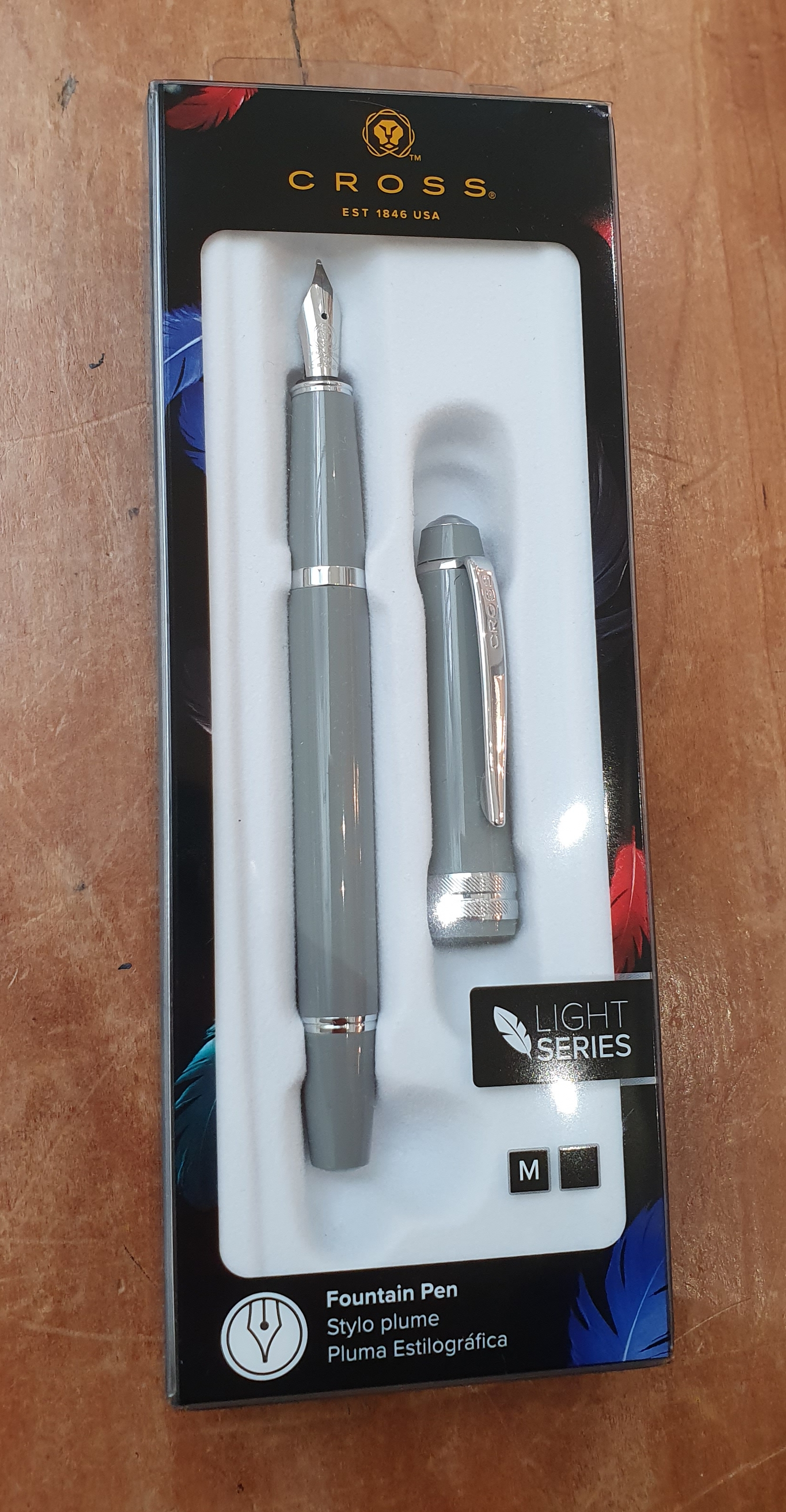
I am always on the look-out for anything new in fountain pens on the high street. Today in John Lewis Brent Cross, my friendly pen-pusher showed me a new Cross pen and took a few off the rack in different colours.

This is a new version of the familiar Cross Bailey, but in plastic, rather than lacquered metal, to save weight and costs. It is £20.00 as opposed to about £50 for the full fat version.

Cross Bailey Light, in plastic.

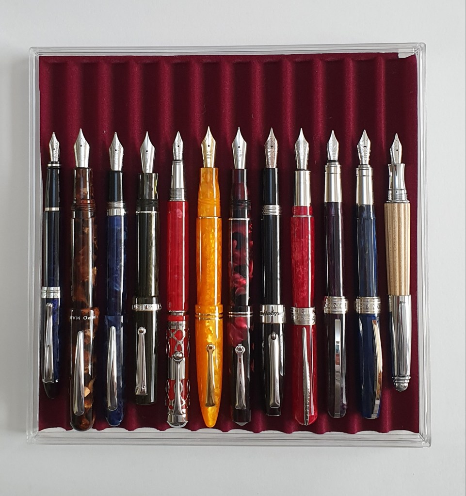
I do not need any more fountain pens, particularly cartridge-converter pens, with medium, steel nibs. I have got that covered in my accumulation. Nevertheless, I was intrigued and excited at the prospect of a Cross pen for £20.00, with lifetime guarantee. I was also feeling a little virtuous having flushed and cleaned three of my eighteen currently inked pens in my pen cups earlier this morning.

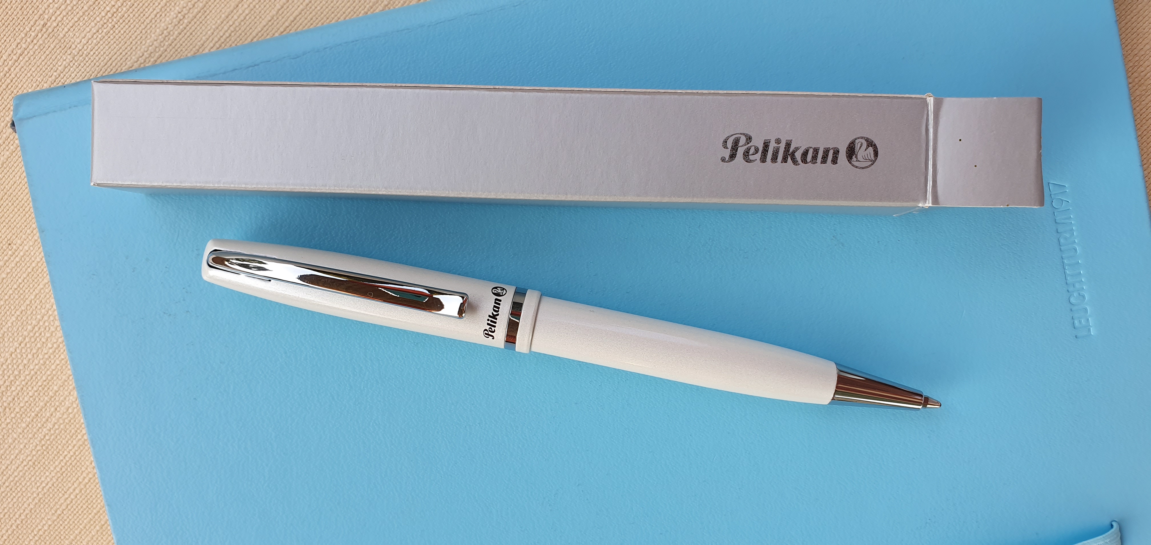
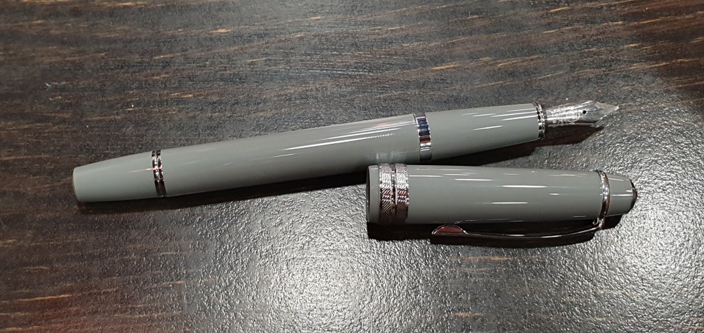
The store had these in grey, white, turquoise and pink. I gather that there are also black and blue versions available. I liked the grey best and bought one. It is a lovely classic, battleship grey and a nice neutral colour which would suit a range of ink colours.

Bailey Light uncapped.

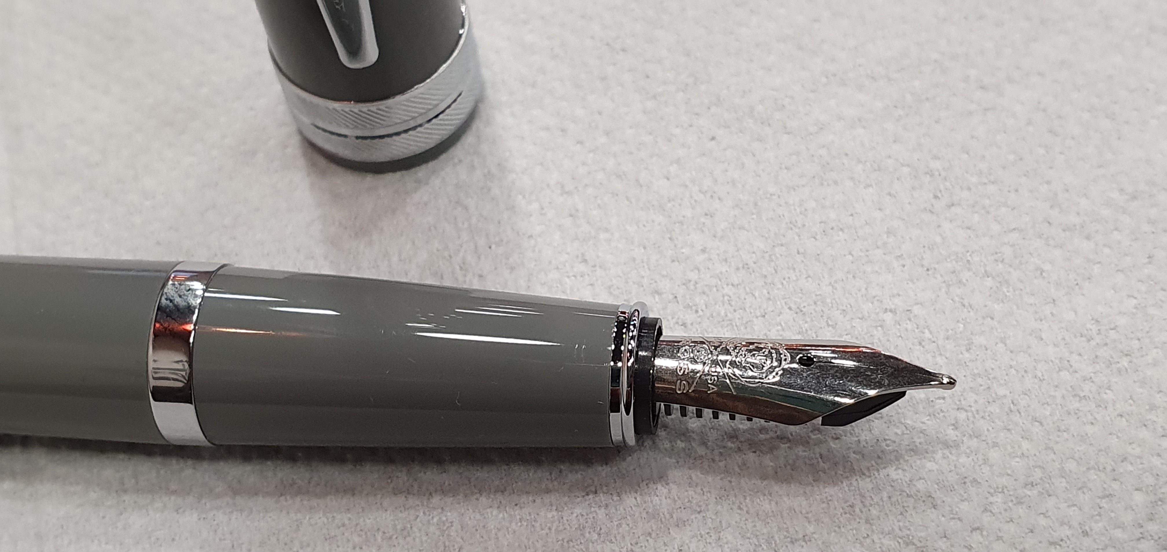
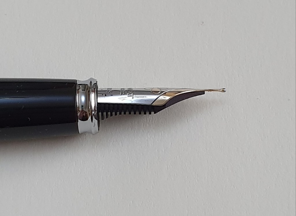
Leaving the shop, I couldn’t wait to open the packaging, have a closer look at the pen and ink it up. The nib looked to be in good shape. I have had mixed experiences with Cross steel nibs. Sometimes they are great, with even tines, and a good well-lubricated smooth ink flow; but at other times, you get a dry one and it can be hard to work on these stiff, steel nibs to improve flow. Another issue that I have had with Cross Baileys, is the stiffness of the caps. I have a shiny chrome Medalist, which was all but unusable because of the slipperiness of the finish and the difficulty in pulling the cap off.

Happily, today’s experience was entirely satisfactory. First impressions are that the pen appears to be the same size as a standard Bailey. There are no obvious shortcuts on the furnishings and you have a metal cap finial and a strong metal pocket clip. There is a wide cap band, for decoration and strength. The cap pulls off easily, with a sensible amount of force.

With cap removed, there are three metals rings on the pen. Particularly welcome in the Bailey, is the wide barrel and wide grip section, compared to, say the Cross Century II. There are no cap threads and no step from barrel to section.

Bailey standard and Bailey Light (below)

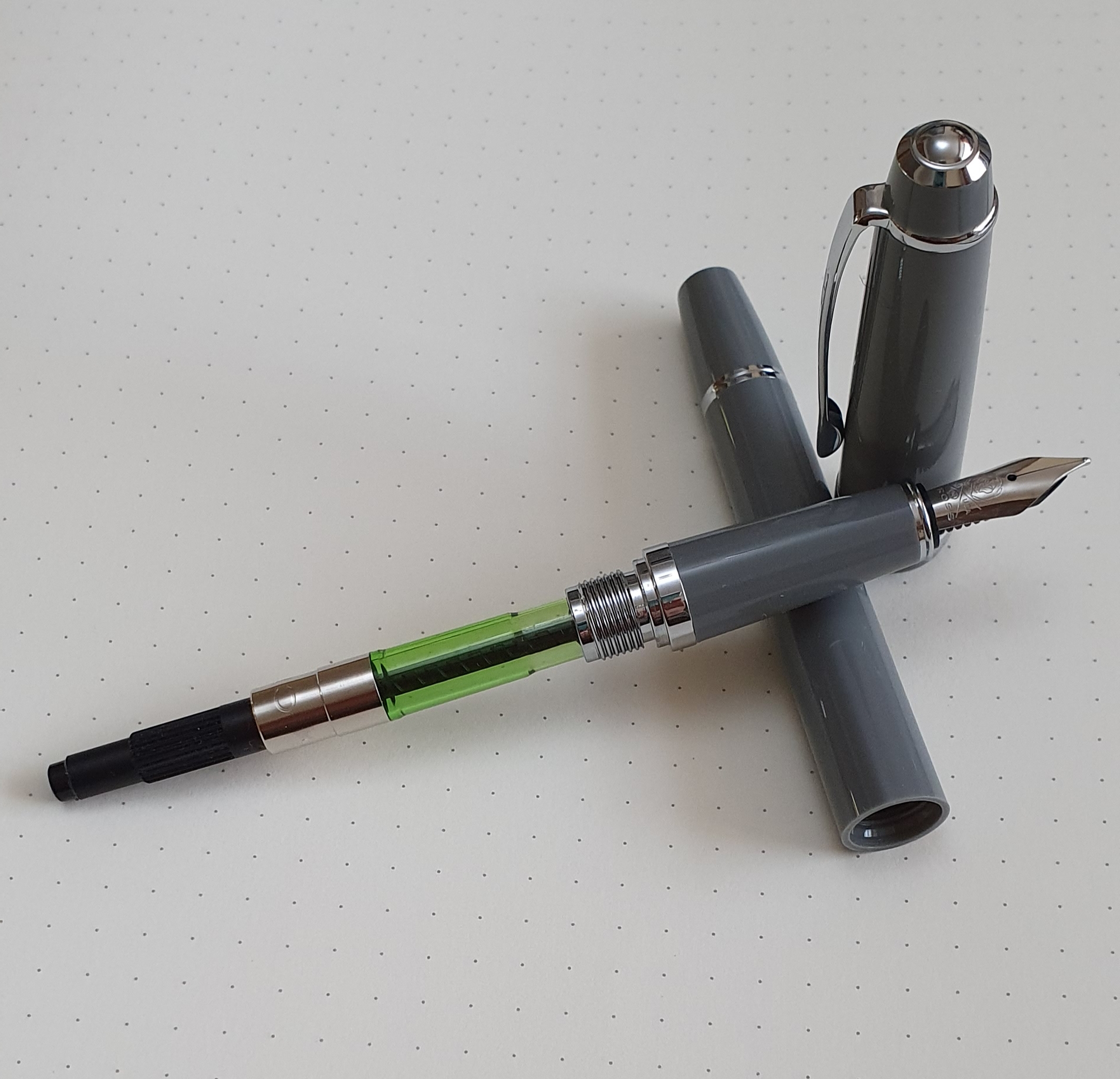
Unscrewing the barrel, there was one Cross black cartridge included. The pen will require Cross’s proprietary cartridges or a Cross converter (not included). I found that the Bailey Light accepts the non-threaded converter (whereas the standard Bailey is threaded, to take Cross’s screw-in converters but accepts both types). Another difference from the standard Bailey, is that the Light has no production date code, a slight disappointment but hardly a problem. My standard Bailey is dated 0315 and the slippery Medalist, 1014.

Bailey Light, with a non-threaded converter (not included in price).

Inserting the supplied black cartridge, I am glad to report that the pen soon started up and wrote smoothly, out of the box. A pleasant relief.

Size and weight.

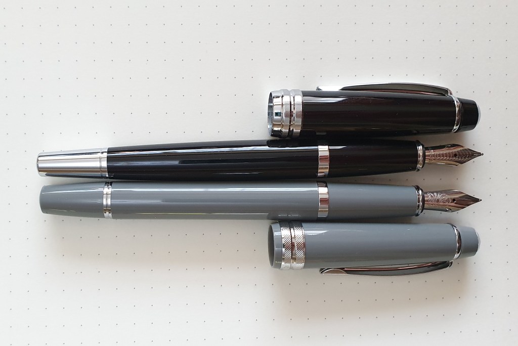
The Bailey Light measures around 137mm closed, or 125mm open. Posted, it is around 152mm. The pen weighs a total of around 20g, comprised as to 13g for the uncapped pen and 7g for the cap.

Comparing the standard Bailey, at 30.5g, the Light is about one third lighter. The dimensions, capped or uncapped are about the same except that, when the cap is posted, the standard Bailey is 142mm and the Light is a centimetre longer, at 152mm.

Likes and dislikes.

Accepting that I have owned this pen for only a few hours, I am favourably impressed with it so far. I like the classic, vintagey grey colour. I like that it is a good sized pen and so comfortable in the hand. No annoying facets (Ah-hem, Lamy Safari). It is long enough for a quick note unposted but generally I prefer to use it posted. The cap posts deeply and securely. Being so light, but having a strong pocket clip, it is an ideal shirt pocket pen. The lifetime guarantee is a good thing, a sign that Cross is confident in its product. I don’t envisage having to make any claims under this and for £20.00 it would probably not be worth it, but it is nice to have.

The cap shuts snuggly, with minimal wobble. It looks to have some sort of inner cap or lining at the far end but I have not had the pen long enough to test for hard starts.

My only minor negatives are the absence of a production date code and the fact that threaded converters do not fit.

I prefer the feel of this pen to my old Cross Aventura, which had a shiny chrome section. I think I may find myself using it more than the standard Bailey, as a lightweight, pocket pen.

At the moment I am using the black cartridge and I have a few of these in stock but am looking forward to perhaps pairing the grey pen with a nice Burgundy, green or brown ink. At a pound a gram, I think this pen represents excellent value.

Comfortable, stepless, threadless, facetless section.

Travelling with ink: pen shopping in Menorca.

It is nice to travel and to be on holiday. Having a passion for fountain pens gives the trip an extra dimension.

I have just spent a very enjoyable family holiday in Menorca. Leaving behind the rain and relentless political news in the UK, we stayed in a hotel with a sea view, in the small town of Es Castell, situated on the harbour which serves the capital, Mao (or Mahon).

As usual, part of the preparation for me is choosing which fountain pens to bring. This time I settled on the superb Aurora 88 (freshly filled with Conway Stewart Tavy, blue black ink by Diamine) and my Montblanc Meisterstuck 145 Classique, (now on its third foreign trip of the year) as a reserve. After buying the Classique in January, it took me a couple of months to settle upon an ink. I tried several before discovering Montblanc William Shakespeare Velvet Red, which both looks and sounds wonderful! For some holiday journaling I took a Leuchtturm A5 hardback notebook. At 18 rows per page, at say 10 words per line, I was interested to see how many pages I could write on one fill of the Aurora. Its so-called medium nib and Ebonite feed, delivers a fine line with a beautifully consistent flow and the pen is very comfortable.

Es Castell proved to be a very peaceful town, with a grid of residential streets and its own harbour, lined with shops and restaurants. I discovered a couple of local stationery and newsagent shops. In one, I bought an inexpensive but satisfying mechanical pencil and box of spare 2B leads, in the unusual size of 1.3mm.

A “Plus + 1.3” mechanical pencil and small nameless illuminated magnifying glass, with five LEDs on the back.

Another shop had a glass fronted display of pens featuring a giant sized Waterman and a vintage (possibly 1960’s) gold Parker pen and a pen pot of other assorted used pens. However it seemed that these were for ornament only and not for sale.

Enticing Waterman display. A stationery shop in Es Castell, Menorca.

Before visiting the capital city of Mao, I had searched Google for fountain pen shops and had discovered a couple listed. On foot, having been dropped off at the main square, it was not so easy to find my chosen shop using Google Maps, but my wife, who is more accustomed to using this while on foot, took over the navigator role and we set off, in the opposite direction from most tourists who were heading for the pedestrian shopping streets leading to the waterfront. However we succeeded in finding “Clips Papeleria” at 16, Carrer de Sant Esteve, on a corner of a quiet residential street. This was a general stationery shop but did have a glass cabinet of Inoxcrom fountain pens, a Spanish brand. Not having one of these yet, or indeed any Spanish fountain pens, I was keen to try one.

Clips Papeleria, Mahon.

I handled a couple of these before settling on a third model, in a pretty mauve metal finish with a shiny chrome section. I have not yet identified the model name. I was not sure about the chrome section at first, expecting it to be slippery, which it was and also of a rather odd shape with a wide part nearest the barrel but then tapering down to a narrower area near the nib. However, in the hand it was quite usable as the chrome section rested comfortably on my second finger, whilst my thumb held the barrel, the texture of which was not slippery, to keep the pen from turning. I preferred the mauve version to the grey. I think it was about 30 euros and so made a pleasing souvenir.

Inoxcrom, steel nib cartridge – converter fountain pen.

A few minutes later in the centre of the city I came across an art supplies shop which had a few fountain pens for sale, including one Pilot Metropolitan in orange with a purple wave design on the barrel and found myself buying this as well, with visions of pairing it with a nice orange ink.

Inoxcrom pen with Pilot Metropolitan.

On another day, in another city, of Cuitadella, with its delightful old part centred around the cathedral and harbour, I spotted another stationery / art supplies shop but with little by way of fountain pens.

A typical street scene in Cuitadella

However, after a few relaxing days at various beaches and exploring the wonderful island in our rented car, I settled into a happy contentment, realising that the pens that I was carrying with me were more than adequate for my needs and better than any that I was likely to find on the island.

A Menorca beach scene.

Besides, there were also other items to enjoy in the shops apart from pens. For instance, the ubiquitous simple Menorcan sandals called Avarcas, with rubber sole and leather uppers, originally worn by the rural population but now popular with tourists and available in a wide range of colours. They seemed to be unisex, save only that the men’s were in larger sizes and in more conservative colours.

Not many fountain pens but plenty of Menorcan sandals for sale.

My holiday haul also included a portable, rechargeable LED light, pumping out 500 lumens, which I found in a yachting supplies shop. Well, you never know when you might need one.

Equipment wise, I was very satisfied with the performance of my trusty old Tilley sun hat, Karrimor Spectre Supercool 20 litre ruck sack, Nikon 10×30 binoculars and indeed the Opel Corsa that we hired for a few days. It was good to be using these and my pens, rather than reviewing them.

As for my Aurora, I much enjoyed keeping my journal each day, in our room with its view of the sea. I was expecting to know by now how many A5 pages it would write on one fill of the pen, but after 52 pages, it is still going strong and looks from the ink window to be still over one third full!

Aurora 88 in a beach cafe, Sant Tomas, Menorca. With Montblanc Classique.

Update on 26.10.2019. I have since identified the Inoxcrom fountain pen. It is the Inoxcrom Mistral. I also learned that the company has its origins in Barcelona from 1946. Their steel nibs were given a shiny finish by applying a thin layer of galvanised chrome. The words Inoxidable and Chrome were then combined to give the name Inoxcrom. An online catalogue, product list and company history is on http://www.inoxcrom.es.

A Pelikan Hub round-up, London 2019

I was excited in the summer, when online registration opened for the Pelikan Hub. The date of 20 September 2019 was entered in the diary and the event was eagerly anticipated.

This was my third time attending, although this year we had a new Hubmaster and venue. I gather that around 40 registered for the London hub and that finding a suitable venue to accommodate that number of people, in London on a Friday night, for no charge, was challenging.

Signing in.

We were to meet in The Euston Flyer, a pub and restaurant on the Euston Road not far from King’s Cross station, who could have us from 7.30pm to allow time for the after-work crowd to disperse.

I still arrived well before the allotted time. I was pleased to find a friend from last year’s hub, Roger, who had travelled from Leicester. He had grown up around Pelikan products, as his father had been an importer of their pens. Last year he brought along some unusual vintage memorabilia, including Pelikan tape measures to show us. This year he brought along his impressive collection of vintage pens from The Wyvern Pen Company, a former pen manufacturer from his home city of Leicester. We sat at a table outside, enjoying the last of the daylight before darkness descended and the air grew cool.

The pens out, amidst the condiments.

It is always a joy to talk to people who are passionate about their subject. Perhaps we who attend a regular pen club meet up, may take this for granted but having conversations with other pen enthusiasts about each other’s pens and sharing knowledge, opinions and experiences is very enjoyable. For many who attend the Pelikan Hub, the event might be the only such opportunity in the year.

For anyone whose brain was frazzled from a week of work stresses and in need of a calm and soothing place, The Euston Flyer at 7.30pm on a Friday night is not that place. The din of countless rowdy conversations in large echoey surroundings, was a bit too much for some. However, I enjoyed a plate of fish and chips and a beer and began to feel human again.

More pen talk. The gentleman on the far left had a huge number of pens in his shirt pocket.

As the regulars thinned out, conversation became easier and we were able to spread to other tables. Of the 40 or so registered, I can now recall talking to almost half of them during the evening, several of whom were our pen club members. The consequence of this is that I took very few photographs.

The pub interior, now quieter as it grew late.

In preparation for the evening, it seemed appropriate to gather up my entire flock of eight Pelikan pens which conveniently filled a pen wrap. I had surprised myself in finding that I had this many. These include my blue stripe M800, a vintage tortoise 400 bought at auction and a blue demonstrator 205 which has known only Waterman Serenity blue and has one of the smoothest steel broad nibs I have ever encountered.

I have never owned an M1000 although I am always impressed when I try one. Heather from our pen club had her pen case of Pelikan pens, inviting us to try any. She had the classic green stripe M1000, inked with a Jade green ink and a supposedly “Fine” nib which for the M1000, typically writes like a bouncy medium or even a broad. Once again I was very enamoured with the comfort of the M1000 and could easily see one of these in my future, (perhaps to thank Pelikan for the free Pelikan Edelstein Star Ruby ink, the pad of writing paper and in-house magazine that all participants reeceived).

Philip, whom I had met at a previous hub and at the London pen show and once or twice at our pen club, had quite a few high-end Pelikans including the Renaissance Brown and Stone Garden M800 and the vibrant orange M600.

Sharing a meal and a common interest in fountain pens.

As well as bringing my Pelikans, I had also gathered up a second pen wrap of currently inked pens to show off. I enjoyed showing people my Montblanc Heritage 1912 and seeing their surprise on uncapping the pen to find it apparently nib-less. The German engineering, on twisting out the retractable nib, never fails to impress. Its soft broad stubby nib is also unlike any other pen that I own.

I always enjoy seeing my pens in other people’s hands. The Montblanc Heritage 1912.

My other current pride and joy is my Aurora 88, in black resin with a gold plated cap which I also flaunted shamelessly to very favourable reactions.

Now it is almost over for another year. Thank you, to Pelikan for facilitating this unique event for fountain pen enthusiasts all over the world and for your generous gifts. Thank you to Daniel our hubmaster, assisted by Dylan. Now it remains only to enjoy all the photographs from hub events in other cities and countries that appear on Instagram and other social media.

A few of the London Pelikan Hub class of 2019

An evening with The Other Favorites.

This week I had the pleasure of seeing The Other Favorites play a gig in London, as part of their current USA, Europe and UK tour. So as an off-topic warning, this post is not about fountain pens but is to tell you about this remarkable duo, for the benefit of any yet to discover them.

The stage is set. Bush Hall, Shepherd’s Bush, London 20 August 2019.

The Other Favorites are the American folk and bluegrass guitar duo, Josh Turner and Carson McKee. Currently both based in New York, they were friends in school and have been putting out music videos on YouTube since 2007. These, even the very early ones, show an astonishingly high standard of musicianship and include a wide range of pop and rock classic covers as well as some of their original songs.

I first stumbled across them on YouTube, about five months ago, where I had been watching finger-style guitarists Jerry Reed and Chet Atkins, Tommy Emmanuel and Richard Smith. Josh Turner, not to be confused with the country/gospel singer of the same name, has to date produced over 300 videos and attracted some 77 million views.

As happens with YouTube, it keeps plying me with more of their videos to watch. I have watched well over a hundred, many of them several times over.

Of course, there are plenty of good guitarists out there but what I find unique about Josh is his versatility. He is a multi-instrumentalist playing various types of guitars (folk, classical, electric, gypsy-jazz), banjo, mandolin, a lute, electric bass, drums and keyboard.

Secondly, he seems equally at home in a wide range of musical styles, from folk, pop, bluegrass, classic rock, Latin pop, jazz and swing, plus classical music for guitar. His videos feature many other musicians and singers too. And he has a very pleasant singing voice and a wide vocal range, such as on a cover of The Beach Boys’ Auld Lang Syne, where he sings all the parts. Other good examples of his video work are David Bowie’s Starman and Pink Floyd’s See Emily Play, on which he plays almost all the parts.

Combine all this virtuosity with a high technical ability at performing, recording, mixing, editing and producing and his natural ease and likeability on camera and you have a rare combination of talent and ability.

Carson McKee too has a great singing voice and is a superb acoustic rhythm guitar player and occasionally can be found on percussion. Josh and Carson’s voices blend really well together and their harmonies sometimes put me in mind of The Everley Brothers among others.

In May I discovered that The Other Favorites were playing in London, on 20 August at Bush Hall in Shepherd’s Bush. I jumped on the tickets and was greatly looking forward to seeing them live, as I continued catching up on the videos. They are currently touring with Reina del Cid, a 31 year old American singer-songwriter guitar player and Toni Lindgren, guitarist who also have a huge following on YouTube for their regular videos on Sundays, called “Sunday Mornings with Reina del Cid.”

The concert did not disappoint. Bush Hall is a former dance hall dating from 1904 and made an ideal, intimate venue. I am guessing that the audience was of about 300. Sound levels were just right and I was sitting about six rows back, close enough to see their facial expressions.

Carson McKee, Reina del Cid, Josh Turner and Toni Lindgren

The show began with a set of nine songs from Reina del Cid and Toni Lindgren, joined on stage by Josh Turner for one song, to play electric bass, on Woolf. This was her song about Virginia Woolf of whom she was a big fan having read all her books and diaries.

Next Josh and Carson took to the stage. Their first song, “Angelina”, put down a marker of just what a high standard of guitar work we were in for. This was followed by “Solid Ground” memorable in their video for being recorded at the coast with surf crashing on the rocks right behind them. Next, Carson introduced “The ballad of John McCrae”, a murder ballad that he had written, explaining that the tradition for such songs had come to the States from the UK and that the juxtaposition of dark lyrics with jaunty melodies “tickled his funny bone”.

They then played another original, one of their earliest songs made together in 2007 called “Flawed recording”, the tune and lyrics of which stay with you.

Next they shifted gear to give a blistering performance of Richard Thompson’s “Vincent Black Lightning 1952” equalling in my view, Richard Thompson’s own rendition when I saw him in London a year or so ago.

Then they played another of their originals, “The Levee”, another one which is enjoyable to watch on their videos on guitar and banjo with great playing and vocal harmonies.

Carson had learned to play guitar from his father and jammed at family get togethers with his father and uncles. Bob Dylan had been a big influence. They then played one of their favourite Dylan songs “Don’t think twice it’s alright”.

This was followed by a beautifully pure vocal harmony for the Irish song “The Parting Glass” with no instruments. Then, in another change of pace they followed this with a rousing performance of Johnny Cash’s “Folsom Prison Blues”, another of their covers which is a must-see on YouTube, for Carson’s spirited vocal delivery, Josh’s guitar solo and for the way they fall about laughing at the end.

At this point, they were joined on stage for the rest of the evening by Reina del Cid and Toni Lindgren to play as a foursome, adding two more acoustic guitars and female vocals which was a joy to behold. They sang “Morse Code”, a rather delicate and sad song that Reina and Josh had also recorded together for a YouTube video.

Josh released his first solo album, in April 2019 called As Good a Place as Any, with all songs written, produced, mixed and mastered by himself, at home. (Just pause, and take that in). The next piece was “Nineteen and Aimless” which is the first track on his album.

The foursome then played Patsy Cline’s “Tennessee Waltz” followed by “The Weight” by The Band – making good use of the four voices for the cumulative rising harmonies in the chorus.

It was then almost time to end. They were brought back on stage to enthusiastic applause for an encore and played “Dooley”, which can also be seen on their videos followed by “Stuck in the middle with you” from Stealers Wheel.

It was a very impressive show. Given that they were well into an extensive tour, the show still seemed fresh and intimate and they were genuinely glad of their supporters here in London. I got to meet them all at the merch desk!

If you missed them this time, then Josh hopes to tour another show later in the year when he will perform the entirety of Paul Simon’s Graceland album. And meanwhile there are plentiful videos to catch up on as well as his solo album which can be heard on his web site.

Edit.25 August 2019: for a handy list of songs they played with links to each song in their videos, visit setlist.fm and see their Paris show of 18 August which had much the same content.

Some early thoughts on the Aurora 88 fountain pen.

The origins of this, my latest pen purchase, probably go back a few years to when I first started to hear about Aurora pens, particularly the Optima, in other people’s blogs. It was not a brand that I had come across before. I also met an Aurora rep at the London pen show and picked up a couple of glossy catalogues of their then current collection of writing instruments. I learned that their gold nibs were all made in-house by their own craftsmen and women which is rare and admirable.

14k gold nib, Medium.

And then whilst visiting Italy on holiday in June, I found a pen shop selling Auroras, in the centre of Brescia. There I handled an Aurora Talentum in black resin, which was a good sized pen and felt very comfortable. However, my wife helped me to resist the urge to buy it on the spot.

Back story: the buying journey.

Back home I found myself browsing the internet for Aurora pens and I looked at several different Talentum models and watched a few reviews. I was pondering over which colour to go for and which nib.

And then came a summer sale on Iguanasell. It so happened that the Talentum models were not reduced but I found the Aurora 88, a well regarded and much longer-established model than the Talentum, dating back to the late 1940’s, with a generous discount of 35%. I particularly liked the black resin version with gold plated cap.

I shared this information with my wife, hoping that it would be a mere formality to obtain her approval that such a large saving represented good stewardship of our joint financial resources. However, she was not so enthusiastic as I and made a compelling argument that I had “so many pens” and did not have time to use them all. True. But it is an Aurora 88, with a gold plated cap! It is a piston filler, with a 14k gold nib, an Ebonite feed, an ink window and everything. And a hidden ink reserve! On paper, its size and weight called to me that this was an ideal pen that might have been designed with my preferences in mind.

However, by the next day, her position had softened to “Oh well, it’s up to you” which I took as a yes. I then leapt on the Iguanasell website again. The discount offer was available only whilst the pen remained in stock. It was still there. Free shipping from Spain and despatched within 24 hours. I deliberated briefly over which nib to chose and went for a Medium. Click. Proceed to Checkout!

The following day I received an email from Iguanasell that my order had been shipped and providing a tracking reference. There followed an anxious wait. First, I worried whether the Aurora nib, known for its feedback which is not to everyone’s taste, would suit me. I had not had an opportunity to test it out. What if it does not write as well as my Faber-Castell Grip? Secondly, over the coming three days I was a bit perturbed that the tracking reference (34 digits long!) gave the status “not yet received” by the couriers. This went on for three working days. Some doubts began to creep in about the veracity of Iquanasell’s fast delivery claims.

But then on the fourth day, the doorbell rang at 7.30am. I hurtled down to get the door, scattering furniture in my haste. It was the next door neighbour who had taken in the parcel for me, the previous day.

The unboxing.

I enjoyed peeling back the layers to get to my new toy. Inside the white polythene outer packaging, was a large brown cardboard box. Inside this, padded with bubble wrap, was the large glossy black cardboard Aurora box with the Aurora logo and my pen model details on the end, “88 BIG” (yes please!), “Gold plated cap and resin barrel.”

Inside this, was the actual gift box, a handsome black leatherette type with creamy coloured padded interior. And there was my pen, gleaming black resin and a luxurious gold plated cap with subtle guilloche design. Though I say so myself it looked absolutely gorgeous.

Aurora 88 (large) in black resin with gold plated cap.

Picking it up, it was lighter than expected. (It weighs 27g; around 15.5g uncapped plus 11.5g for the cap). I unscrewed the cap, (about one and a quarter turns) to reveal the 14kt gold nib. This looked to be superbly finished. There was a glimpse of daylight between the tines until the tipping material, which was generous, symmetrical and even. Looking head on, the tines were perfectly level. However I did note that the tipping was narrow where it met the paper. Turning it over, I got my first sight of the Ebonite feed.

Ebonite feed. This pen ticks all my boxes.

I got out a bottle of Aurora Blue and a Leuchtturm note book. The pent up anticipation in that first dip was immense. It wrote, smoothly and effortlessly. No skips. The pleasure and relief was all the more intense for having been anxious for a few days. No toothiness or drag as I had feared. However the line was more fine than I had expected, although I was perfectly happy with it. I enjoy having pens with all sorts of nibs. Perhaps, had I known that the medium would be this fine, I might have chosen a broad but I like it as it is. It does mean that with my usual style and size of writing, there is less filling in of my loops and this helps with neatness and legibility. The nib is sufficiently wet for my lefty-overwriting as well as underwriting styles.

I then tried the piston, which was smooth and easy. It took about 10 twists to lower the piston fully. I then filled the pen, following the recommendation in the supplied instruction booklet, to release about 4 drops at the end before turning the pen nib upwards and tightening the piston knob.

My new bundle of joy.

As you can imagine I greatly enjoyed trying the new pen and writing a few pages in my notebook. It is about 130mm long when uncapped but I still preferred to post it. The cap is light and does not upset balance when posted. The cap threads are plastic and so should not mark the barrel, but this would not bother me anyway. The grip, when the pen is posted feels very natural and comfortable with my thumb over the ink window. It is so comfortable that you want to go on and on writing. And it looks so classy and elegant. It is a good generous size, without being huge and without being too heavy either.

There is also a smaller version of Aurora 88 which has similar styling but no ink window and is a cartridge-converter pen. I have since seen from YouTube reviews, that the Aurora 88 range was first introduced in about 1947. I have a lot to learn about Aurora and its history. It celebrates its centenary this year and so this seems like another good excuse to join the club of happy Aurora users.

So how does it write? What about the Aurora feedback? Well, mine writes very nicely indeed. Straight out of the box. On Leuchtturm paper, it feels smooth and well lubricated but not a gusher. I would say that the flow is spot on. I have now covered about fifteen pages and so any saturation in the feed from filling will have settled down. The sensation of nib on paper is very pleasant and pencil-like, neither too glassy smooth nor toothy and draggy. Together with the comfort and ergonomics of the pen, it makes you want to write more.

First inking with Aurora Blue.

It is also a design classic. Parker had its 51, Montblanc its 146 and Lamy its 2000. I learned from a video by Grandmia pens that the Aurora 88 was introduced as a competitor to the Parker 51.

I looked for the Aurora 88 in my old Aurora catalogue. At first I could not find it in the index, in the list of the Collezioni Prestigio, the prestige collections. And then I spotted the name Ottantotto, which I now know is Italian for Eighty Eight.

My wife likes the pen too. And I gave my whole-hearted support and encouragement to her purchase of some summer dresses in the sales and would never dream of saying “You have so many dresses.” What sort of a husband would say that?

My Italian fountain pen line-up.

If you were to ask me about my experience of Italian fountain pens, I could tell you a bit about the ones that I own. In real life however, as fountain pen enthusiasts know, such a question never comes up around the office water cooler. Perhaps just as well. So I will resort to giving my response here.

A quick scroll through my pen accumulation database today, identified 12 fountain pens of Italian origin. This surprised me. I had not realised that I had so many.

I remember once watching a reviewer on YouTube, make a sweeping generalisation that Italian pens were a bit like Italian cars, by which he meant that they were flashy looking and fantastic when they worked but perhaps not the most reliable. This is probably unfair to both pen and car.

For my part, within the last four years or so, I have amassed this small sample. It is fair to say that these are all in the lower echelons of the price range. Of my twelve only one has a gold nib. This is the Aurora Ipsilon blue lacquer, with a 14k gold nib, rhodium plated. And that has not been my favourite of the bunch.

From left to right: 1. Aurora Ipsilon blue lacquer; 2. Campo Marzio Ambassador; 3. Campo Marzio Acropolis; 4. Delta Fantasia Vintage; 5. La Kaligrafica; 6. Leonardo Furore; 7. Leonardo Momento Zero; 8. Montegrappa Fortuna; 9. Pineider Avatar, lipstick red; 10. Visconti Rembrandt twilight; 11. Visconti Van Gogh Starry Night and 12. Vittorio Martini Col Disore.

Here again, capped:-

If I were to see this tray of pens at a pen show, the one to jump out at me the most would be the orange one: the Leonardo Officina Italiana, Furore “Arancio”. It is the brightest, the longest, the most flamboyant and also one of the most enjoyable to use. Oh, and the serial number of mine is number 001.

So here is a brief run down of my thoughts on these:

Aurora Ipsilon, blue lacquer.

This is the lacquered metal and gold nibbed version. It is on the small side but posts deeply and with a secure click. I enjoyed buying it whilst visiting Verona but for some reason did not take to it and it has not had much use. The black and blue marbled finish is nice. The fine nib, I recall, was not the most enjoyable.

Campo Marzio Ambassador.

Campo Marzio hails from Rome. They have a small but delightful shop in Piccadilly and sell their own range of fountain pens from around £20 up to £80. They are colourful, good value, standard international cartridge or converter pens with steel nibs. The Ambassador was, when I bought it, at the higher end of their price range. I enjoyed being able to swap out the number 6 nibs easily. It was a big comfortable pen, posted well but could have done with being just slightly longer to be as comfortable un-posted. I think it was the first Italian pen that I had owned. I have a suspicion that it may share a common heritage with the Conklin All American as they seem to have very similar dimensions.

Campo Marzio Ambassador.

Campo Marzio Acropolis.

I later added this blue marbled resin Acropolis, which was similar to the Ambassador but a bit slimmer and with a black section and with metal cap threads on the barrel. My only gripe was that the cap did not post as well as I would have liked. I was afraid of pushing it on too hard and cracking it.

Delta Fantasia Vintage.

This was bought at the London Pen Show and is my only celluloid pen. The steel nib keeps the cost down. It has a lovely swirly dark green finish and I have since learned how to cap the pen such that the patterns of the cap and barrel align. Hold it with nib facing you; place the cap on; turn cap two clicks “the wrong way” and then screw it down. Hey presto. The benefits of attending a pen club. It is a beautiful pen and the steel medium nib works well.

La Kaligrafica.

This is included for completeness but is not one to dwell on. It has a vibrant red acrylic body, some metal lattice work on the cap and a medium Iridium point, Germany, nib. It was a spontaneous and inexpensive purchase on holiday last year. Cap does not post securely. Too short without posting.

Leonardo Officina Italiana, Momento Zero.

This is an excellent pen and excellent value. New on the scene a year or two ago, I found mine for sale by Izods at the London Pen Show. Mine had some slight teething trouble, a tiny crack in the section, which Leonardos, via Roy of Izods promptly replaced for me, sending me a complete front section with nib and feed. The replacement section had no such problem although this time, the nib tines tended to click together a little. Another issue which I and others have noted, is that the converter rattles against the barrel unless you put some tape around it. But the size of the pen and the colours are great.

Leonardo Officina Italiana, Furore.

This is a very similar pen to the Momento Zero, but with bullet shaped ends. I love mine. I took to using it with Waterman Tender Purple ink. The pen really stands out in the pen cup, for its size and orangeness.

Montegrappa Fortuna.

This is standard black resin version. It is big, girthy, comfortable and posts nicely. I felt at first that the shiny plated threads were a bit of a distraction when you hold the pen, but I think with use you forget this or position your fingers to avoid the threads. The nib is smooth although very firm but that makes for a good pen for fast note-taking. It is a little pricey for a steel nib pen, but similar in price I suppose, to the Visconti Van Gogh.

Montegrappa Fortuna, meets Waterman Audacious Red.

Pineider Avatar, Lipstick Red.

Aah. Seldom have I enjoyed buying a new pen so much. I bought mine in Harrods, although they were no longer selling Pineider pens the last time I was there. I loved the vibrant red, mottled velvet-like pattern in the glossy red cap and barrel, the magnetic cap closure, the elegant clip, the Florence sky line on the cap ring and above all, the smooth soft nib. Everyone who tried it said it felt like a gold nib. I enjoyed basking in its reflected glory at our pen club meet ups.

The Pineider Avator, in lipstick red. And one of the nicest pen boxes I have ever received, with some welcome free Pineider stationery.

Visconti Rembrandt, Twilight.

This was my first Visconti, (if I do not count a Homo Sapiens Elegance Oversize, which I bought and promptly returned as the nib was unacceptably dry and too expensive to adjust myself). The Visconti Rembrandt also wrote on the dry side but I was able to adjust the nib by using a simple technique learned from SBRE Brown’s videos, whereby you put your thumb on the middle of the nib and then push the nib down against a hard surface, (such as your other thumbnail) and so bend the tines upwards very slightly, opening up the tine spacing. This made a great improvement and now it writes beautifully.

Visconti Van Gogh, Starry Night.

I had fancied getting a Van Gogh to go with my Rembrandt, (you get the picture?). This one was was being sold by my friend Penultimate Dave at our June pen club meet. When I had seen the full range in a shop in Cardiff once, the Starry Night was my favourite. I may have had to do the same trick with this Fine nib but now it writes superbly, smooth and wet.

Visconti Van Gogh, Starry Night.
The faceted cap and body, in the palette of Van Gogh’s Starry Night.

Vittorio Martini (established 1866), the Col Disore.

This was spotted in the window of a stationery shop in Sirmione, on Lake Garda, for 56 euros. I was attracted by the unusual fluted Maple wood barrel, which I felt looked a bit like the Diplomat Aero. It was a holiday purchase and a nice souvenir. I used it throughout my stay in Italy, with a black cartridge and the cap posted. However, with more comfortable and better-performing pens at my disposal, I have not used it so much since then but it is well made and it is nice to have a shiny, chrome, screw-on cap at this modest price.

Maple wood and chrome.
Vittorio Martini Col Disore fountain pen, next to Daniel’s Diplomat Aero at our July pen meet.

So that has been my experience of owning Italian pens, so far. I still have the urge one day to acquire a superior Montegrappa something, in blue celluloid and sterling silver. And the Aurora Talentum is still on my wish list, notwithstanding the lacklustre experience with the Ipsilon. The Italian allure lives on.

Finally, this has been my 100th post and it seems a fitting milestone at which to say a big Thank you for reading, liking, commenting and following this blog.

Travelling with ink: Lake Garda revisited.

I have just spent a very enjoyable week’s holiday at Lake Garda, the largest of the Italian lakes. Some readers may remember that I wrote last July about my first visit there and my experiences of scouting for pen shops in the area, Travelling with ink: pen shopping in Lake Garda.

This year, my wife and I stayed in Sirmione, a town in a spectacular location at the tip of a peninsula, at the southern end of the lake. For me, a holiday begins with the happy task of deciding what fountain pens to bring, as I contemplate writing my journal whilst abroad. This time, I chose a Visconti van Gogh Starry night as it was my most recent acquisition (bought from a friend at our pen club), plus a Montblanc Meisterstuck 145 Classique, simply because I rather liked the idea of adopting this as my foreign travel pen, having brought it with me to Dubai in February. For ink, I had Graf von Faber-Castell Cobalt blue cartridges for the van Gogh, whilst the Classique was loaded with Montblanc William Shakespeare Velvet red.

As for the notebook, I almost brought a Silvine exercise book but could not face being without a Leuchtturm A5 journal, as I prefer the paper. The book is worth the extra weight. Also the hard covers make it more convenient for writing on your knee if necessary.

I had almost forgotten just how beautiful this area is. Tired from the busyness of work and a ridiculously early start for the 6 o’clock flight I was unprepared to find myself in the Italian summer heat, dazzling sunshine and 360 degree beauty on reaching the lake shore towns.

The castle at Sirmione, Lake Garda.

Later, on exploring Sirmione, I was pleased to find the stationery shop Cartoleria Benzoni in the centre of the touristy area, where I had bought a pen last year. I enjoyed the shop window displays and one fountain pen in particular caught my eye.

This was an attractive pen in metal and Maple wood, the barrel being fluted, similar to a Diplomat Aero. I noted from the window display that there were threads for the shiny chrome cap. It had a steel nib, was a cartridge converter pen and at 56 euros, was a pleasing holiday purchase. I learned later that the brand, Vittorio Martini was established in 1866 in Bologna and that this model is the Col Disore. As it turned out, I used the pen for most of the week, until the supplied black cartridge finished.

Vittorio Martini, Col Disore fountain pen.

I had learned from my experience here in 2018 that there were not many pen shops in the towns around the lake and that for higher priced brands, you need to visit one of the cities. We were located about mid way between Verona and Brescia. Having visited Verona last time, we decided to venture off to Brescia for a day.

It was well worth the visit. Much quieter than Verona, the city has many beautiful piazzas, churches, an old and a new cathedral, (literally side by side) and a splendidly elegant loggia, offering shade and a welcome cool breeze as you explore the many excellent shops.

I was pleased to discover F.Apollonio, a long established stationery and pen shop where I was shown a glass counter full of interesting pens, old and new. I skimmed over the modern Parker pens, but asked to see some of the older ones, which the young lady told me were from previous collections. I handled two lovely Parker Duofold pin-stripe pens, one blue, one green, marked at 850 euros. The nibs looked gorgeous. I also saw a row of unusual Parkers, which I had not come across before. She informed me that these were the Parker Ellipse. I read later that they were produced only for a short time, from 2000 to 2002 and so are rather rare. These were priced at around 400 euros. Finally, I saw an Omas, a piston filler in a faceted dark green celluloid. I do not know the name. This too was outside my holiday budget! But the lady was happy to show all these to me and glad of an appreciative audience. She told me that the shop also sells online.

F. Apollonio stationery shop, Brescia.

After a look around the cathedrals, I spotted another pen shop, called Rossi. Here I picked up a couple of Pelikan school pens (in rather garish colour schemes) at 8 euros each and a box of cartridges. I then asked to see one of the Aurora fountain pens in the display case, which had a black barrel and gleaming chrome cap. It was an Ipsilon, steel nib version at 100 euros. Sensing my interest, things swiftly escalated and the lady showed me a similar model but in silver and with a gold nib. Next she produced an Aurora Talentum in black with chromium (or perhaps rhodium) plated fittings and a 14 gold nib. This was significantly larger than the Ipsilons and felt very comfortable in the hand, having a much broader grip section. The screw cap could be posted too if desired although the pen was a good length unposted. My resistance was weakening by then and I came very close to parting with 320 euros to take this home with me. However, my wife reminded me that I had a lot of good pens already, including the van Gogh bought just a few weeks earlier. True enough. This was over my limit for an impulse buy with no research and had not even been on my radar or found its way to my wish list. And so I walked away bravely, with my two Pelikan school pens. The reckless have more fun.

Rossi stationery shop, Brescia.

My only other pen purchase of the week was another Pelikan, but a ball point pen which I spotted while scouring the back shelves of a newsagents’ in a place called Colombare. This was a twist-action model in a very pretty pearlescent finish and is called the Jazz Elegance (as opposed to the Jazz Classic and the Jazz Velvet). My wife and I had one each.

Pelikan Jazz Elegance, ball pen.

Returning home, it was good to find my pen cups and the twenty or so currently inked pens that I had not taken with me. A final exercise after a holiday is to try them all out to see which “hard start” after a week’s rest. Most did commendably well, except for a couple which had barely any ink remaining.

I have not forgotten the Aurora Talentum but it will first have to take its place on my wish list. I have to admit that my wife is of course right, that I do indeed have a lot of excellent pens already and it is a joy to rediscover them after a short break away.

Lake Garda. 370 square kilometres.

Taking stock: a few thoughts on the pen collecting journey.

I have been reflecting a bit lately, on the state of my fountain pen collection (or accumulation) and journey and whether the process follows a common pattern. Am I on the same path that others have trod and if so, where does it lead? This has been prompted by thoughtful posts that I have read recently, from Inkophile My Wishlist And The Desire To Acquire and from UK fountain pens Going on a diet (recalibrating to smaller, cheaper pens).

I keep a simple database of my pens, using an app called Memento, with a few details including the make, model, date purchased and price paid. I also add a record of inks used and a few other general notes. I usually have the list sorted by date of purchase so that I can easily see the most recently added. But the list can easily be re-ordered alphabetically or by price paid.

Going by price paid, I looked back at my list, currently sporting 225 pens, and was struck by how few I had bought costing more than £100.00. There were only around 20. And most of those cost between £100.00 and £200.00. There were only four costing me more than £200.00, namely a Parker Duofold International, Delta Fantasia Vintage, Pelikan M800 and a Montblanc Classique. I do have some other superb pens including Pilots and Montblancs which I have not included as they were received as gifts.

This means that I have a large number of cheap and modestly priced pens, including the ubiquitous offerings from Cross, Lamy, Parker, Sheaffer and Waterman, quite a few duplicates plus a good number of Chinese pens. Perhaps all these should not count, on my list. Yet the Wing Sung 601 is one of my favourite pens and cost only around £11.

A coming significant birthday means that I have now had an interest in fountain pens for 50 years. This has been spurred on in recent years by the internet thanks to YouTube video reviews, blogs and internet shopping. It is ironic that when I was a ten year old, a fountain pen was a necessary tool whereas now as an adult the pen has become a toy. I still use my pens every day but no-one needs 200. Does there come a stage in life when the desire to have less belongings takes over from the desire to have more?

I did not set out to become a fountain pen collector. I do not see myself as a collector. I have not tried to buy rare pens as collector’s items or gone about filling in gaps. Rather, for many of the relatively more expensive pens that I bought over the decades, the aim was for it to be a new “best” pen, a special lifelong companion. This can be said particularly of pens which were, at the time, the most expensive that I had bought, such as Parker 75, a Sheaffer Connoisseur or the Pelikan M800. The aim was to have a pen that would be long lasting, reliable, of good quality and something to enjoy owning and to take pride in. Not all pens fit this category of course and others, such as Lamy Safaris, were bought to give unflashy service at work. Although I do not know why I have them in so many colours.

A by-product of this mentality, if you keep repeating the process of trying new and promising pens without also selling or giving away the old ones, is that you build up an accumulation of pens, many of which may be no longer used.

Those with sufficient will power and determination to outweigh the sentimental attachment, carefully prune their accumulations as they go along. I have neglected this. Others may reach a stage of realising that they have too many pens that they are not using or likely to use and feel a desire to move them on. I have been extremely fortunate to have received some of my most valuable pens in this way. So is this a natural step, of going from increasing the accumulation, to reducing it? I read in an Instagram Q&A from SBRE Brown this weekend, that he once had around 300 pens but has now reduced his number to about 20.

For a fountain pen enthusiast, buying a new pen is exciting and enjoyable and let’s face it, addictive. But there comes a point when you realise, perhaps later than you should in my case, that having increased your number of pens, the result of adding more may be to dilute the use and enjoyment that you have from your existing ones and to be counterproductive. Also, with experience we should become better armed at identifying what we like and do not like, resisting temptation and distinguishing “need” versus “want”.

Perhaps a beautiful pen is like a beautiful landscape view: we do not need to see every one there is. The uplifting effect of one is enough.

It seems obvious but thought should be given when buying a pen, as to what it offers that your existing pens do not and whether it will really be any better. But manufacturers design pens to be attractive and to sell and make profits. I do not think we should beat ourselves up too much if we succumb to the appeal.

What we find comfortable to spend on this hobby will differ from person to person. The question of whether a pen represents good value is complicated and difficult to gauge objectively. It may depend partly upon the amount of use it gets. Whether a pen is good value and whether you have good value from it, are different things.

A pen wish-list is a useful tool. If a pen takes my fancy, (say, the Diplomat Aero or the Lamy Imporium, for current examples), it is a good exercise to add it to the list and compare its appeal against others already on the list. Also, leaving a pen parked on the wish-list for a while helps to weed out those which are just fleeting fantasies or to be overtaken by later desires. It is better to go off a pen while it is still on the wish-list, than when you have bought it. How many times have we bought an exciting new pen, only to have our heads turned by something else, within weeks of its arrival? Which is my favourite pen? My next one.

A good fountain pen is a wonderful thing. The act of writing in itself is pleasurable, to see and feel the nib gliding effortlessly over the paper and leaving a line of glistening fresh ink in its wake. And then there is the satisfaction of using the pen for developing, organising, expressing and recording our thoughts – perhaps not well enough in today’s piece.

At the end of the day, is it all rather frivolous to have a passion for fountain pens? At times, when the stresses of life become unpleasant, it might seem so. But happily at those same times, there is a real benefit to be had from having a hobby which provides relaxation and enjoyment. It is then that the thought of getting out a particular pen and pairing it with a particular ink, can have restorative benefits. Now, I wonder, how would Robert Oster Aqua go with my orange Leonardo Furore? And if this keeps us going in times of adversity, then it is priceless.

Pineider Avatar, Lipstick Red. An object of desire.

Another look at the Faber-Castell School pen.

Almost two years ago now, in May 2017, I wrote a post: Faber-Castell School fountain pen; initial impressions. I was quite taken with these inexpensive pens and had bought one each in blue and red. Then, as now, I like to visit stationery shops when travelling to see if there are any bargains.

A reader, Mike Jurist commented that the pen was also available in carbon black and that he had been using one as his everyday fountain pen for three months, and loved it. That sounded awesome and I kept a lookout for the carbon black version for months but with no success. I had bought my red and blue in a Waterstones book shop, from a revolving rack and so I continued to give these racks a spin whenever I found myself in one.

And then at last, while in Dubai earlier this year and having a browse in a gigantic Carrefour supermarket in The Mall of the Emirates, I spotted the elusive black version for the first time! I put a couple in my basket. The price was similar to what I had paid before, around £4.00 each, including a box of six royal blue cartridges.

The elusive Faber-Castell school pen, in carbon black.

Essentially the pen is the same as the one I described in my earlier post. But this one is not just a plain black plastic, but a rather nice carbon-fibre effect.

Obviously the pen is crying out to be filled with black ink. At home I inked it up with a black WH Smith cartridge – continuing with the theme of budget ink for a budget pen. The nib was smooth and wrote well.

A pleasing carbon-fibre effect for under a fiver.

My only complaint is that the nib has a very pronounced droop, which is unusual and disconcerting and makes for a rather firm writing experience. This was the same on both of the carbon black pens that I bought and was in keeping with the nibs of my older red and blue models.

Three examples, all with pronounced nib droop.

Despite this, they represent good value and perform well, in terms of nib smoothness and ink flow.

However for a step up, if you do not like the angled-down nib, there is the Faber-Castell Grip, which is a little larger all round and with a distinctive barrel featuring rows of raised coloured dots, which make for an interesting and unusual texture. These can be found for around £15.00 but for the level nib and the slightly larger dimensions and a few other improvements, this too is a great bargain.

A comparison of the Faber-Castell school pen (top) and the Faber-Castell Grip.
But just look at the carbon-fibre finish!

A look at the Diplomat Excellence A2 fountain pen.

I am getting better at not buying more pens. I am not saying I have given up completely, but I am trying to think more carefully about whether I would really use that new pen and whether it would be any better or different from those I already own. But one that I did buy recently was the Diplomat Excellence.

A pen club friend asked me today to send him a writing sample from this pen. I took a few pictures and then thought that a brief review on here might not be amiss.

Diplomat Excellence A2 Marrakesh

I bought my Diplomat Excellence at the London spring pen show, in March 2019. The rational was that I already had its smaller brother, the Diplomat Esteem, (which I reviewed here) which I use at work to enliven my notes and calculations, (currently with Garnet red ink) and which I have always felt is a remarkably good pen, with a superb steel nib. But whilst the Esteem is a medium sized pen, I had always hankered to get the larger Excellence, for its broader girth.

The opportunity came when I found that John Twiss was selling the Excellence at the pen show. What’s more, he had some with 14k gold nibs, which I had not seen before.

Packaging.

The pen comes in a white cardboard box, inside which is a black cardboard tray with an aluminium sliding cover. When you slide this off, a white card flap is raised to reveal the pen on a soft padded white cushion with the black petal logo of Diplomat.

The flap reads “Diplomat, since 1922” and can be slotted into the box either behind the cushion with the text face down, to be read when raised (like a shop display) or in front of the cushion to have the text face up.

Unboxing.

Appearance and Construction.

The Excellence is a metal bodied pen, in lacquer finish. The model I chose is the Excellence A2, Marrakesh with chrome fittings. “Marrakesh” denotes the metallic mid-brown colouring (actually a more complex mix of sparkly gold and orange if viewed with a loupe) whilst “A2” I think may identify it as having the push on cap (rather than screw on, available on some models) and a sprung pocket clip.

The finial has the distinctive Diplomat logo, easy to spot in a pen cup. The silver coloured cap ring has the text DIPLOMAT, SINCE 1922 and on the reverse “made in germany” in lower case.

Cap finial. Tough metal barrel threads.

At the other end of the barrel, there is a silver coloured foot piece for the pen to rest on in a pen cup with a lip to secure the cap when posted.

The section is of tapering black plastic. At the nib end, there is a chrome ring which secures the cap with a satisfying click. Having a push on cap of course means instant access and no rough threads where you hold the pen. The cap is designed to fit flush with the barrel, (apart from a slightly bulging chrome cap ring) and to allow for this, there is a slight step down from barrel to section, but it is minimal and smooth.

Removing the barrel, on long metal threads (complete with rubber O ring), there is the supplied Diplomat converter.

The nib and feed.

This is a bi-colour, size 6 nib, in 14k gold but partly plated, and with the Diplomat petal logo picked out in gold. There is no breather hole. The nib is stamped with Diplomat, since 1922, 14k – 585, F. The nib has a little bit of spring to it but is not as soft as you might expect from a gold nib.

Size 6 nib in 14k gold.

The black plastic feed is of slim profile, with a slight wave shape and quite thick, sturdy fins. On my model, the nib was well finished with nice level tines.

Give the feed a wave.

Filling type.

It is a cartridge-converter pen, supplied with a Diplomat converter but also accepting standard international cartridges.

Diplomat converter, Note the O ring on the section threads.

Size and weight.

This is a large pen, although not over-size. But it is also heavy. Closed, it measures approximately 138mm; uncapped 129mm and posted, 153mm.

The whole pen weighs around 47g, comprised as to 29g uncapped and 18g for the cap alone. (For comparison, my metal Waterman Carene weighs around 33g, with the body at 23g and cap at 10g, and so the Excellence is about 42% heavier). Nevertheless, I still use the Excellence posted, as I just seem to find a better angle of pen to paper that way.

Likes and Dislikes.

I already liked the Diplomat Esteem and was expecting the Excellence to be much the same but bigger and better. In fact it is not quite that simple. The pen is certainly bigger and heavier and feels very dense and solid in the hand. The nib too is bigger than on the Esteem. Yet I did not find the Excellence’s gold Fine nib to be so joyously soft as the Esteem’s steel Medium nib, which surprised me. But it is a great nib, responsive and reliable and pleasant to use. Here are some Likes:-

  • robust and reassuringly solid; the pen feels indestructible;
  • wide comfortable girth with no cap threads;
  • large nib, smooth and responsive and with a pleasant feed-back;
  • rubber O ring on the section threads, to stop barrel working loose or to stop leaks;
  • attractive gift box;
  • mine was great value at £150.00.
Writing sample, with Conway Stewart Tavy, by Diamine.

Dislikes:

As with the Esteem, I found very little to say here. I was a bit un-wowed by the brown finish but this is due to personal preference and not a valid criticism. There are other colours and finishes available.

Compared to the mottled amber coloured finish of my Waterman Carene, the Marrakesh colour is slightly dull. It is a heavy pen, particularly if like me you post your caps. But apart from this I cannot find any fault with it.

Conclusion.

I have been using the Excellence daily, for seven weeks now, and enjoy picking it up for my daily journal ritual. I am glad to have bought it. My local John Lewis used to sell them but they are hard to find in shops now. They are available on Cult Pens. It writes well, feels comfortable and is very solidly built.

It seems a common opinion in fountain pen circles, that Diplomat pens are under-rated. For anyone wanting a great quality, good-sized, metal bodied pen and who will not mind the weight, this one gets my recommendation.

Marrakesh and Tavy on Leuchtturm.