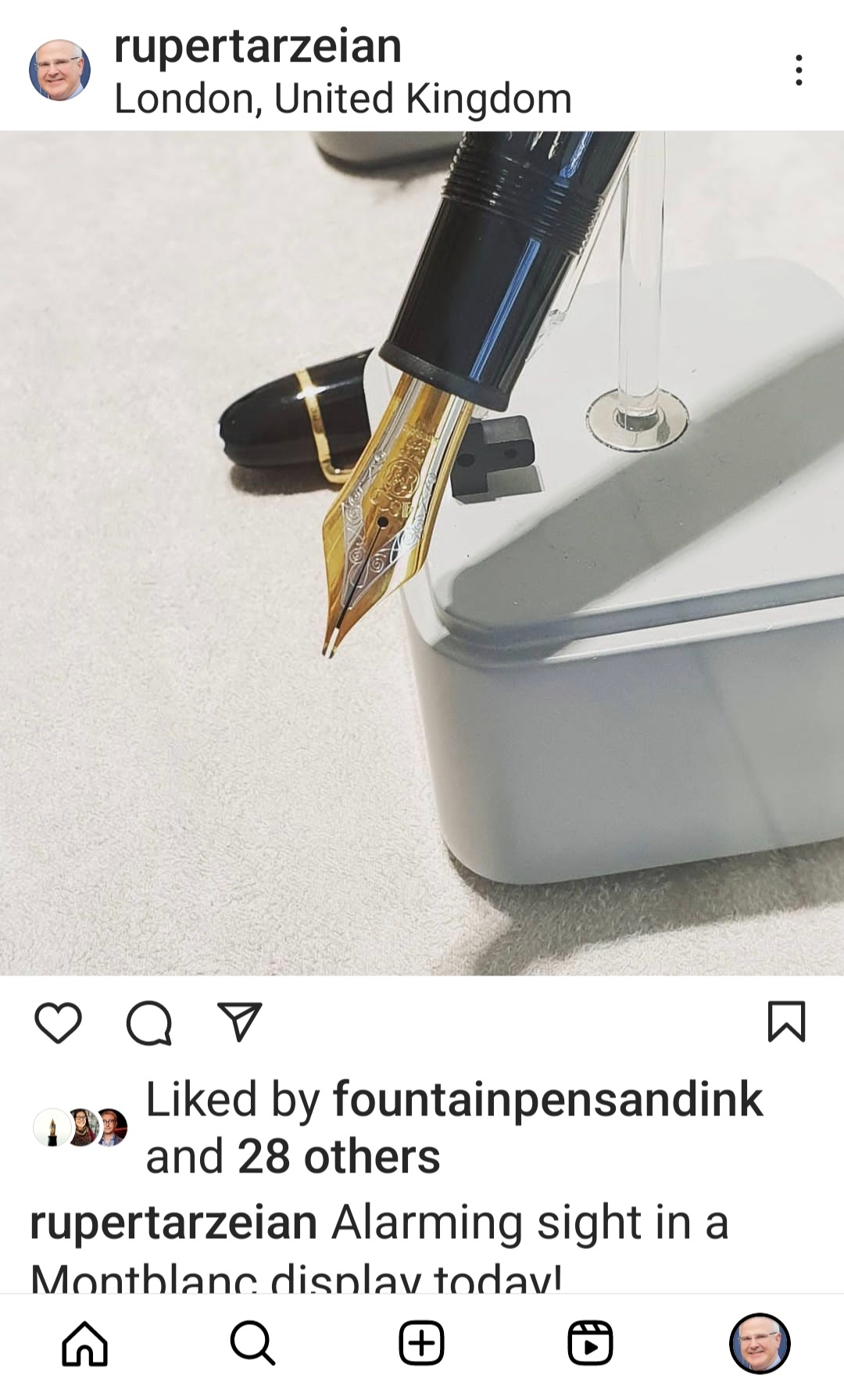
In my recent post about my pen show haul, I mentioned my Benu Euphoria Bourbon and the fact that it deserved a post of its own. Well, here it is.
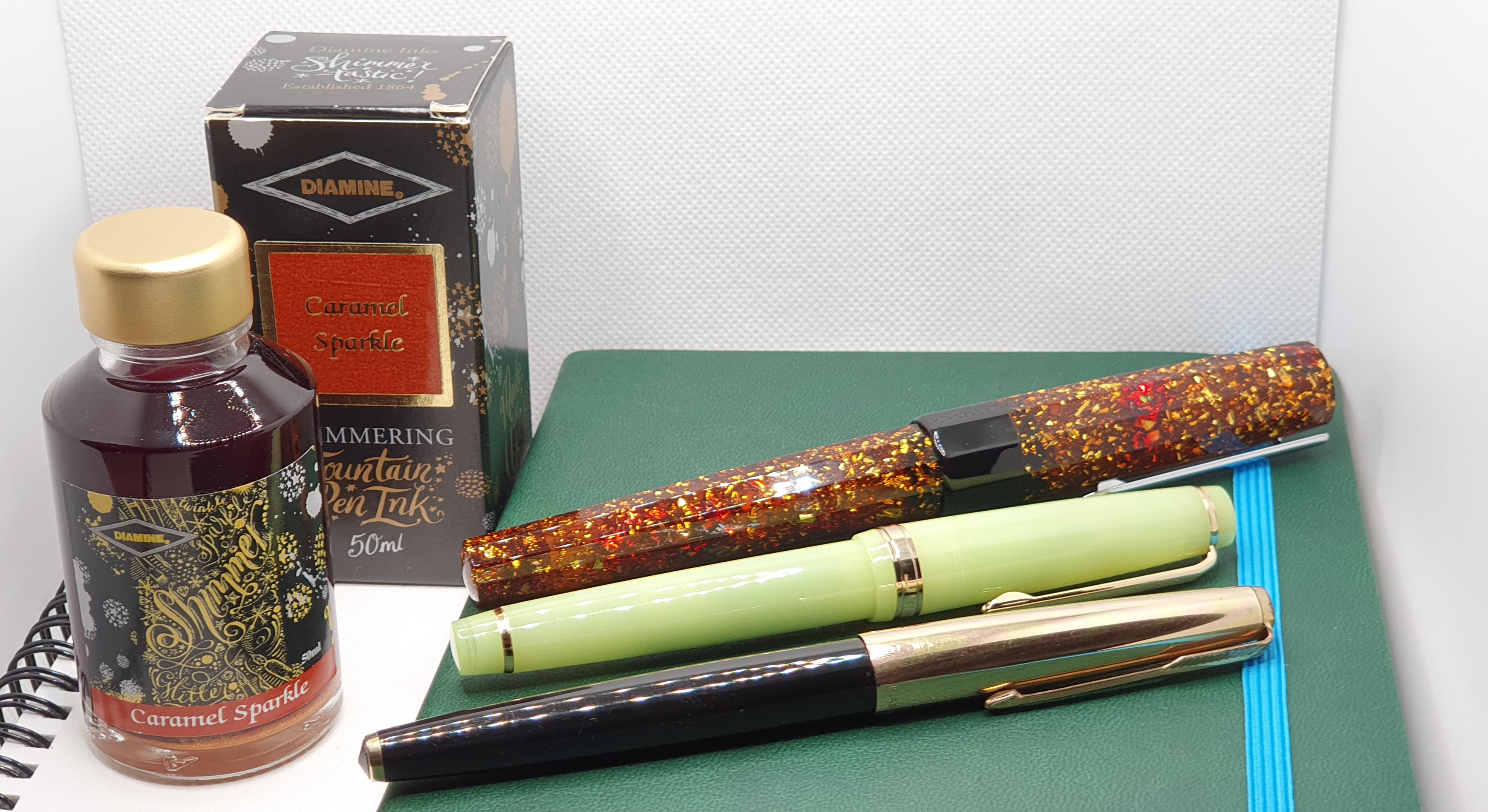
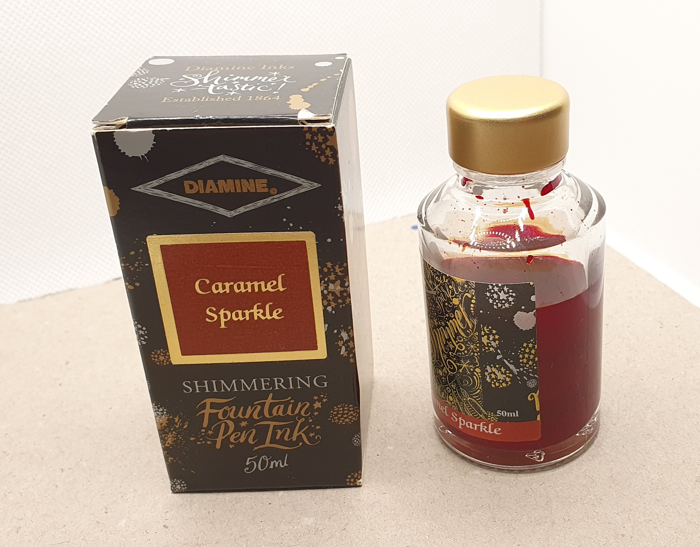
I first laid eyes on this pen at the London Pen Show in October 2023, on Derek Bambrough’s Stonecott Fine Writing table. The pen just calls to be picked up and looked at. Also on the same table were inks from Diamine’s Shimmering Fountain Pen Inks range, including Caramel Sparkle and it did not take me long to imagine them together.
All of this surprised me, because I was not previously drawn to fountain pens that are sparkly, nor had I any urge to use glittering inks. I thought that I would have no use for them and that they would clog my pens. As recently as 31 July 2023 in my post on the 21 plus 5 pen questions, I had been dismissive of sparkly pens and inks, although mentioning that if I were to buy a sparkly pen, it would be a Benu Euphoria. This name-dropping suggested a knowledge of sparkly pens which was a little disingenuous, as I had been shown a Benu only the day before, at a pen club meet.
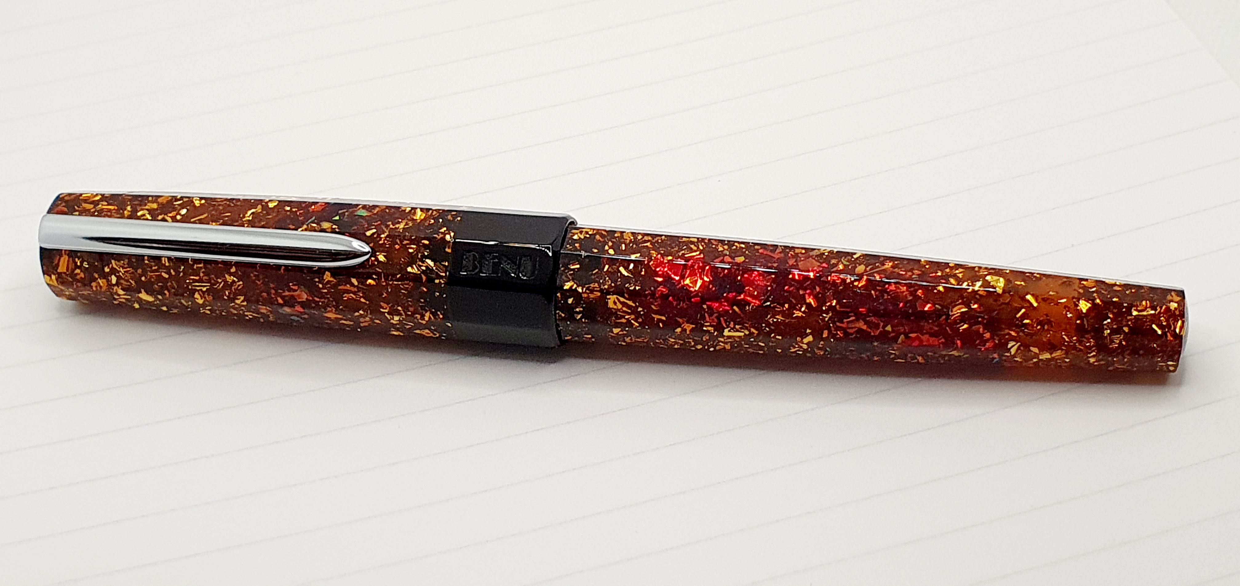
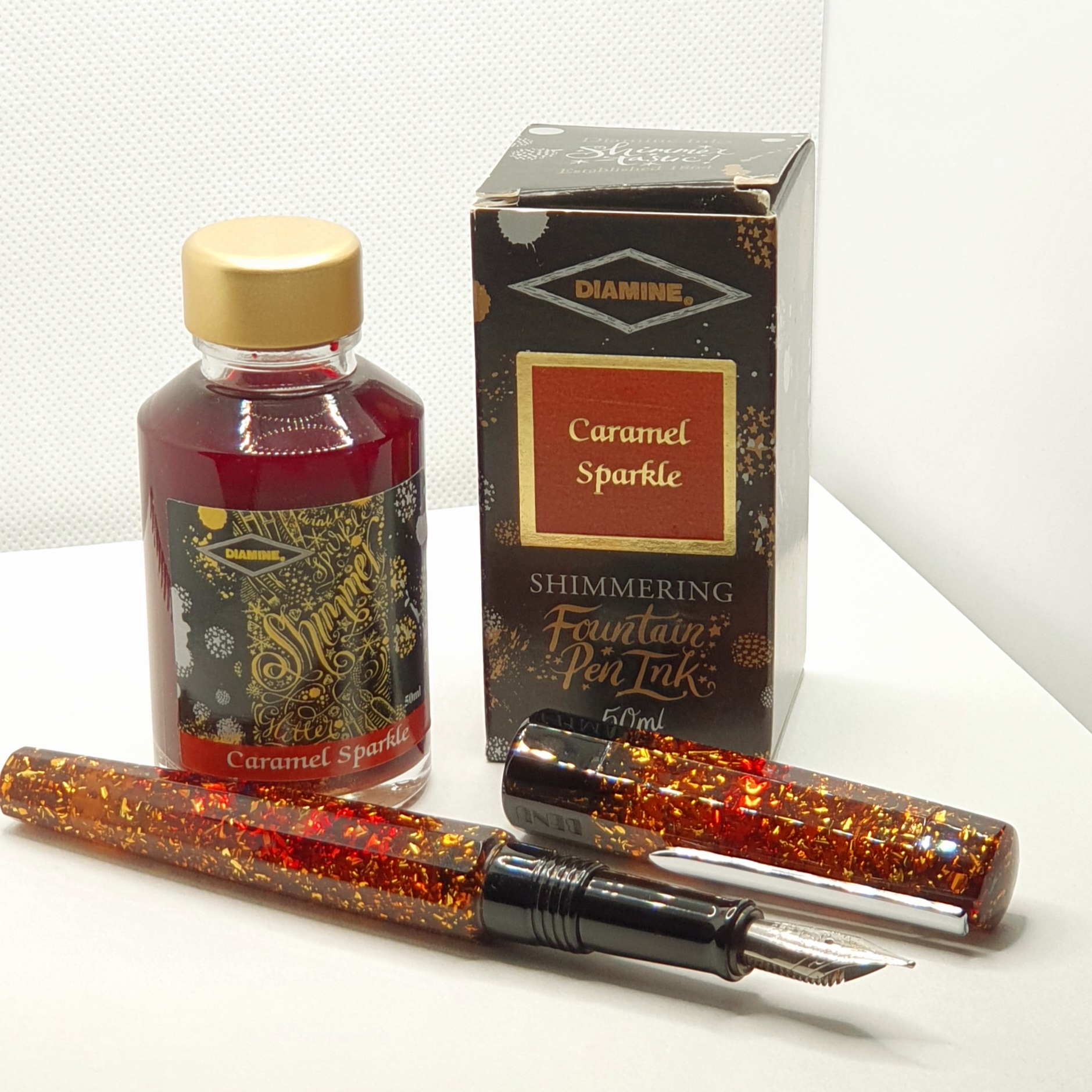
I later read on Cult Pens’ site, that Benu was created in 2016 and that the Euphoria range celebrates life and things that bring us joy. This particular model celebrates Bourbon, a whisky (or whiskey in the USA) distilled from maize and rye and named, according to The Concise Oxford Dictionary, after Bourbon County in Kentucky where it was first made. I have not found any suggestion that the pen celebrates the Bourbon chocolate biscuit, named after the French or Spanish House of Bourbon. Details of this pen range as well as some special editions and the other lines can be seen at http://www.benupen.com.

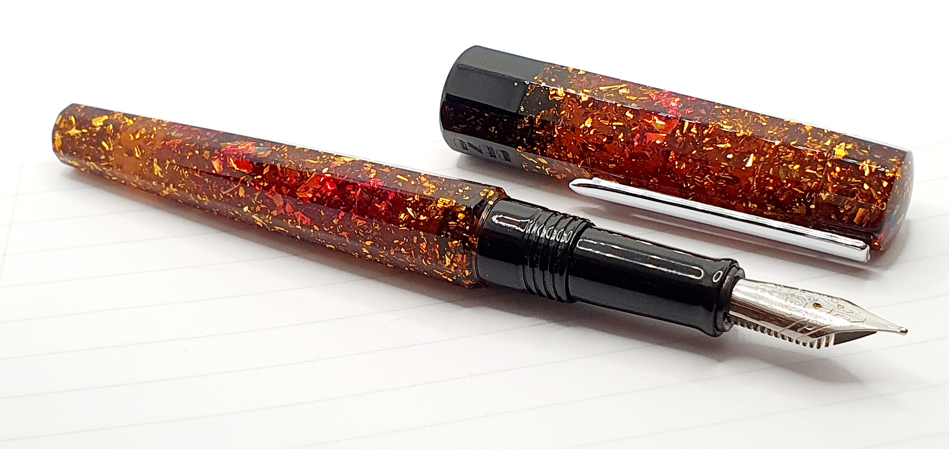
Handling this pen at the pen show, the material did not suggest whiskey to me, but rather a woodland carpeted with sun-lit autumn leaves. As you turn the pen in the hand, areas of red appear, like pools of blood at a crime scene. Not exactly a joyful image I agree, and I do not mean to spoil the pen for anyone, but I thought of Armenia and its troubled history. Benu pens are hand-made in Yerevan, Armenia. I found the pen both poignant and beautiful and, having some Armenian ancestry myself, of course I had to buy it. And a bottle of Caramel Sparkle.
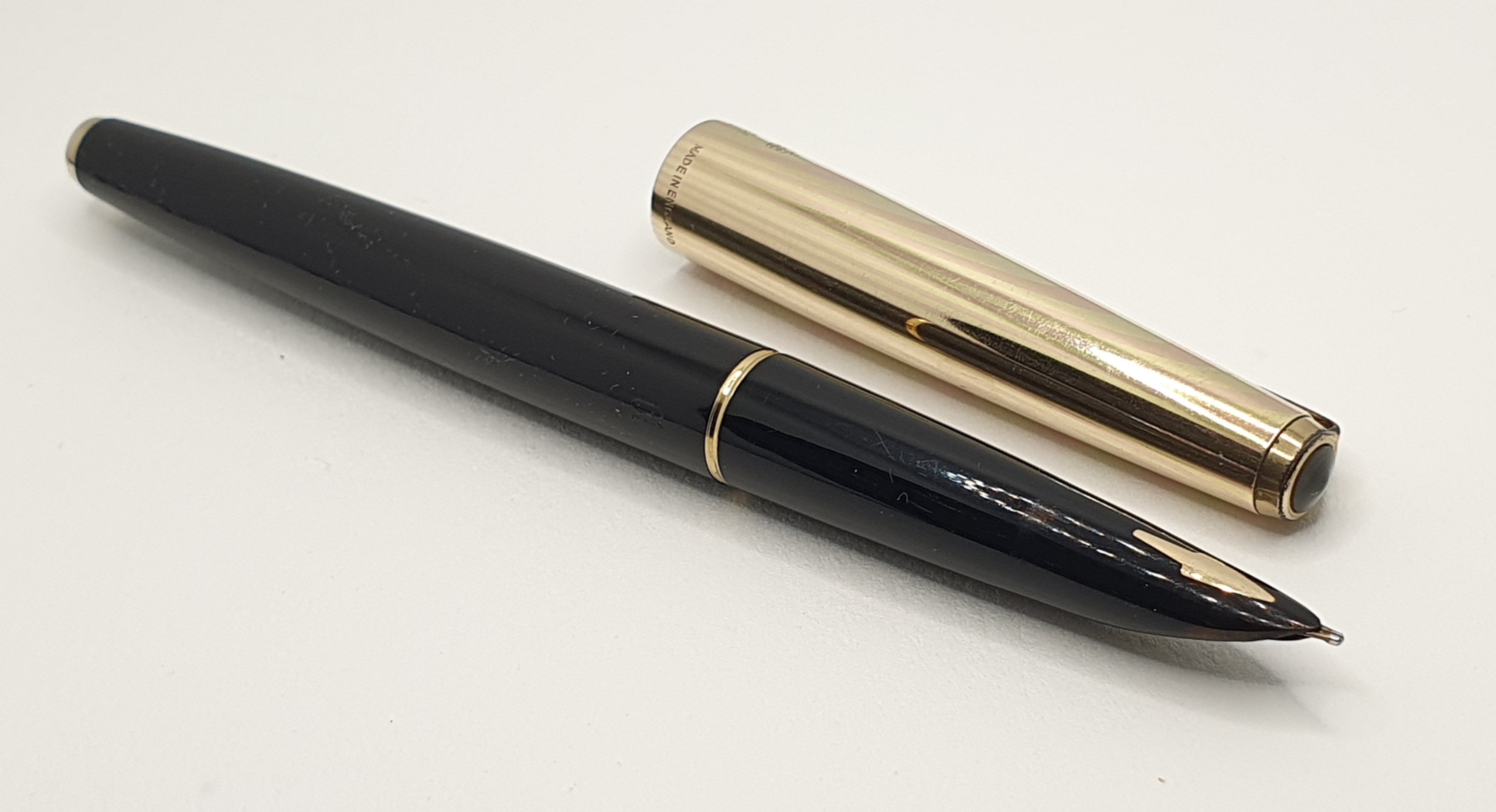
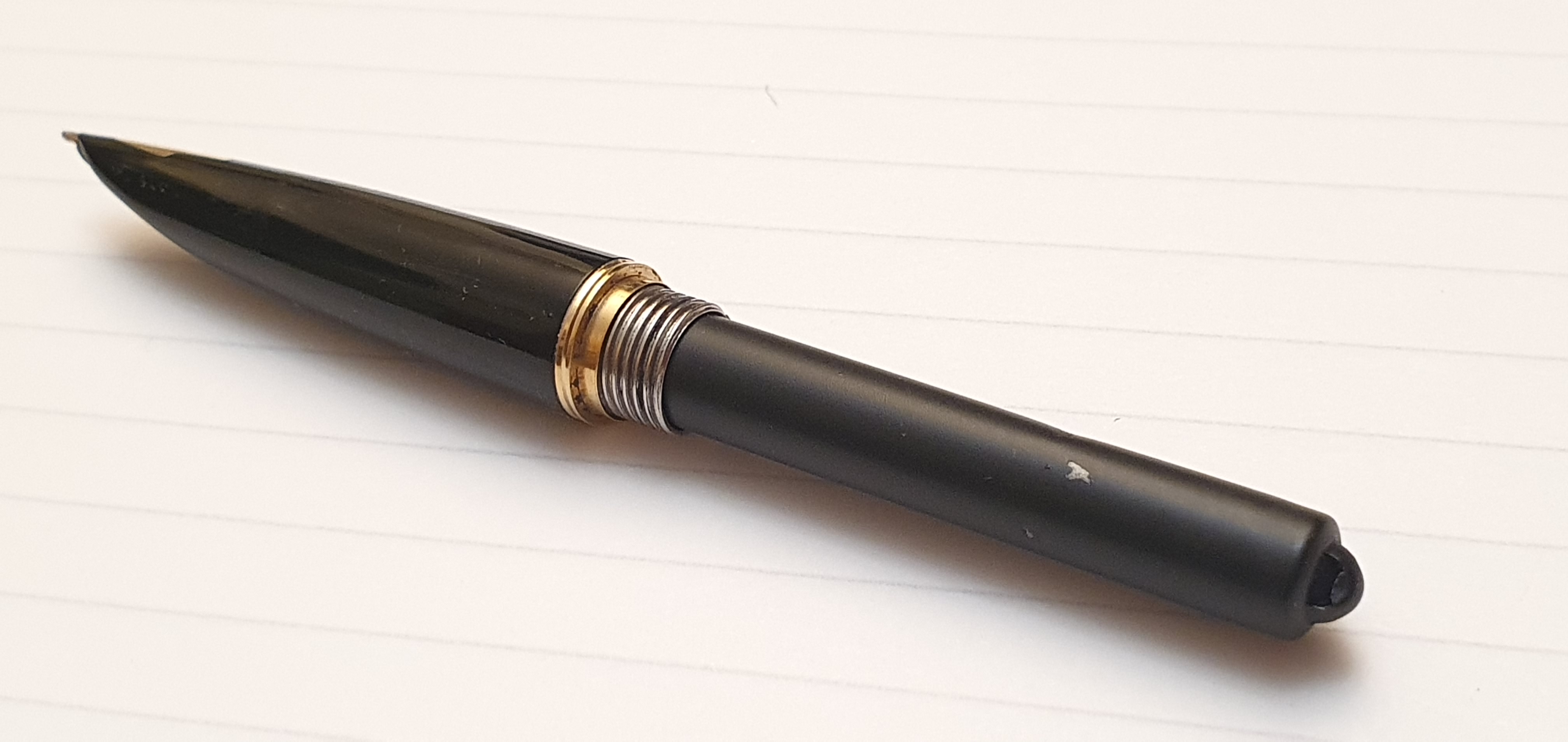
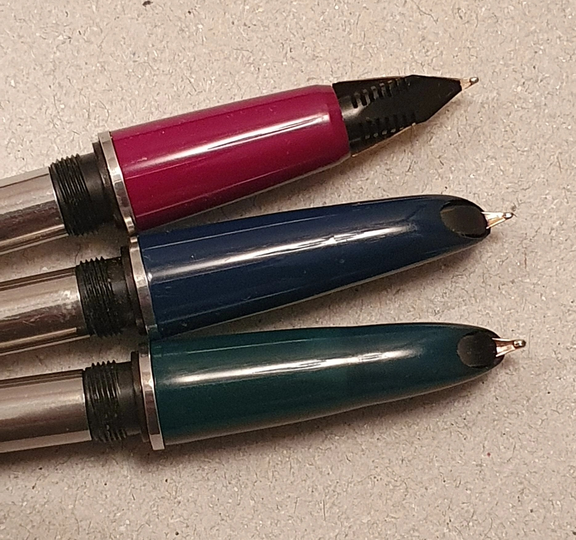
The pen appears to be made of a transparent acrylic, generously infused with fragments of glitter which catch the light and give the pen its richly golden-brown depth, with areas of red in the cap and the barrel. It was really the patches of red that sold it for me. The grip section and cap threads are black, as is the broad cap band, on which the name BENU appears. The pen is faceted (although not the grip section) with ten polished sides. The facets of the cap align perfectly with those of the barrel, which is both impressive and very pleasing.
There is no separate finial at either end, just slightly convex or domed acrylic ends which, like the rest of the pen, are beautifully smooth and polished.
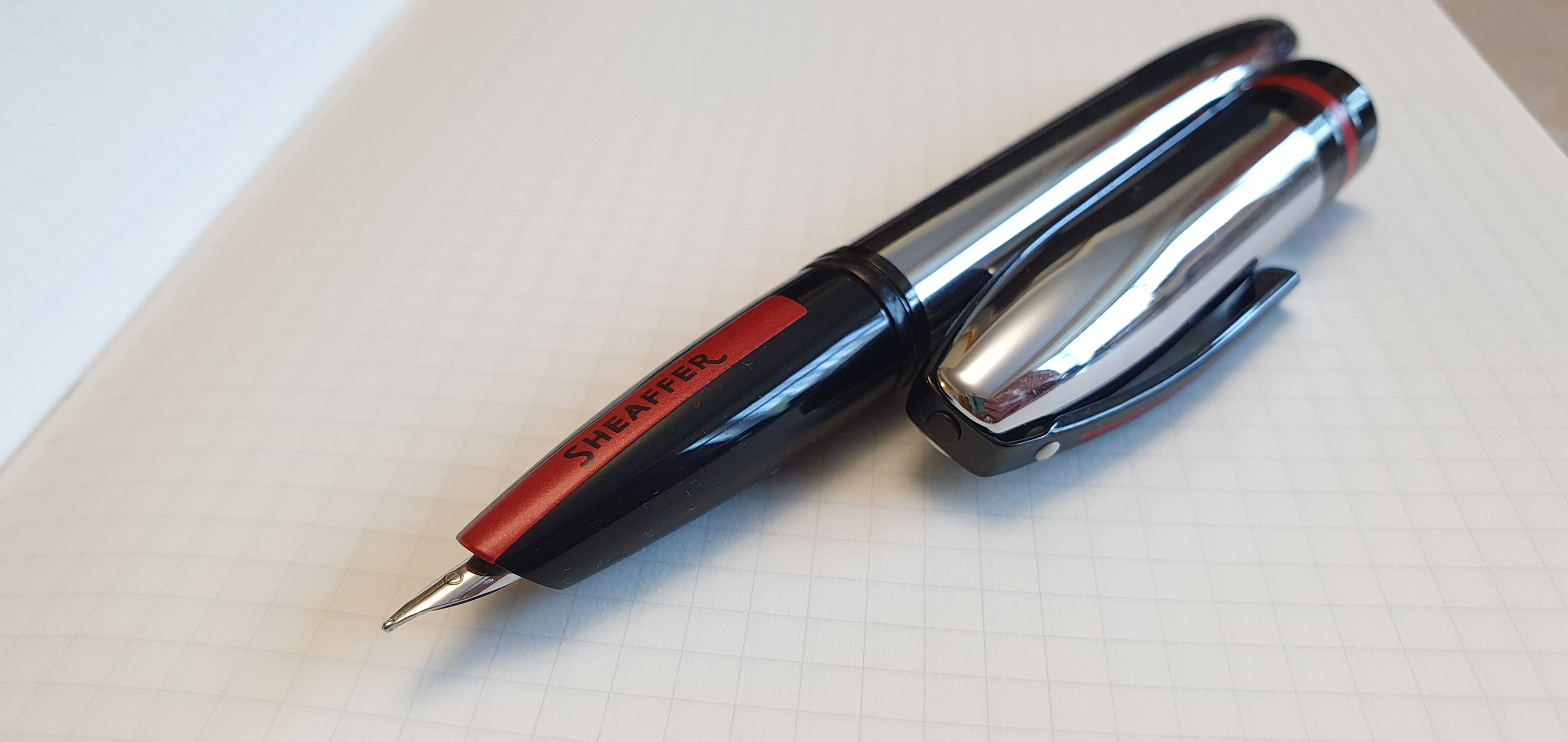
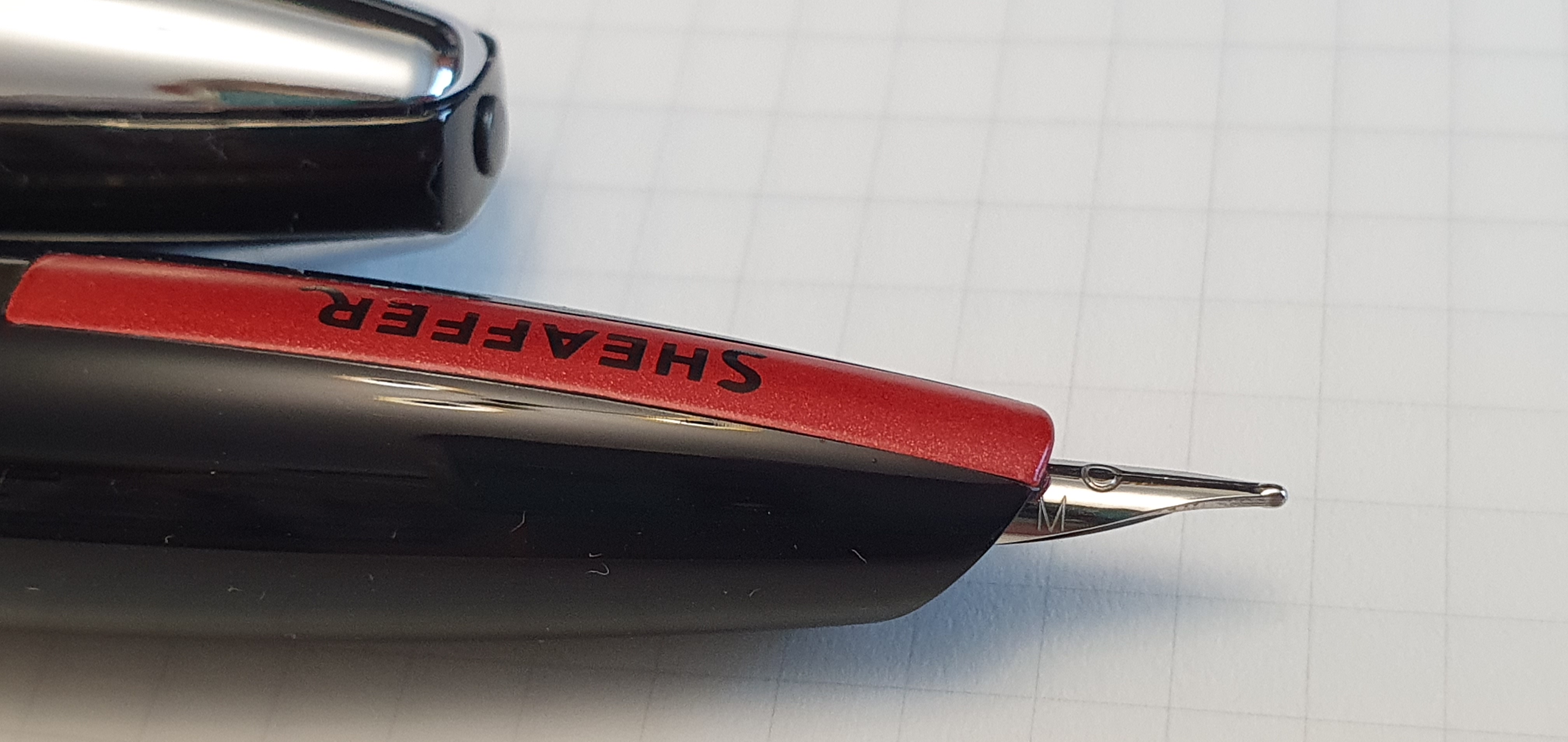
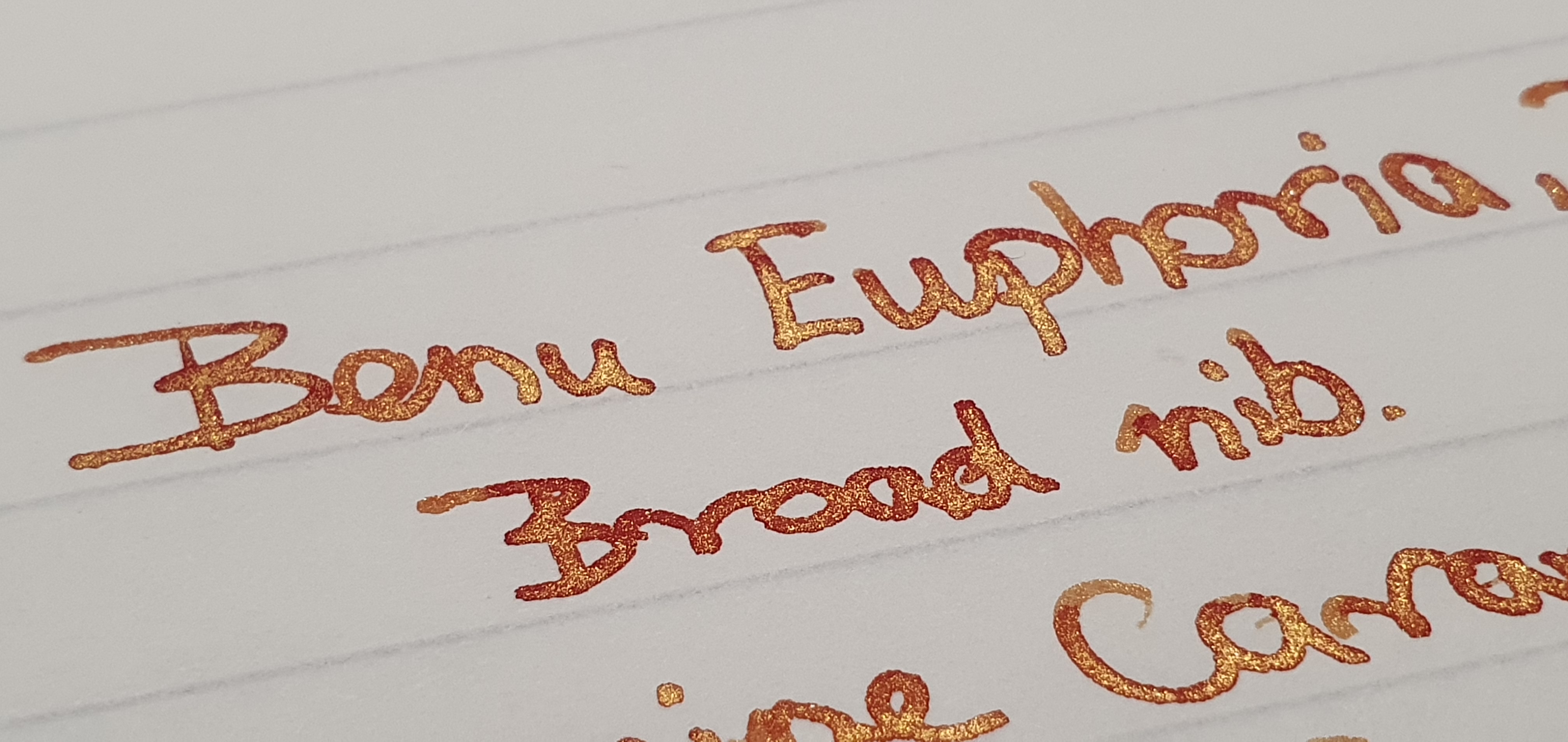
The nib is a number 6 sized Schmidt, in stainless steel. Mine is a Broad, marked with an ornate “B” in the centre of the imprint. It writes beautifully smooth and wet but not too wet. The pocket clip is also stainless steel and sprung, to lift when the top end is squeezed, to enable the clip to slide easily over a pocket.

Uncapped, the pen is a very good length, around 137mm, being well above my preferred minimum of 130mm. The grip area is also of a good length offering plenty of space for different grips. If, like me, you grip the pen quite high up, then you may find your thumb resting on the cap threads but these are heavy duty and not sharp. Further up the section, there is a step where the coloured material begins which allows the cap to be more flush with the barrel, although not completely. The cap takes about two and half rotations to remove although I had not even noticed this before now. The cap can also be posted although the pen becomes ridiculously long and back-weighted.
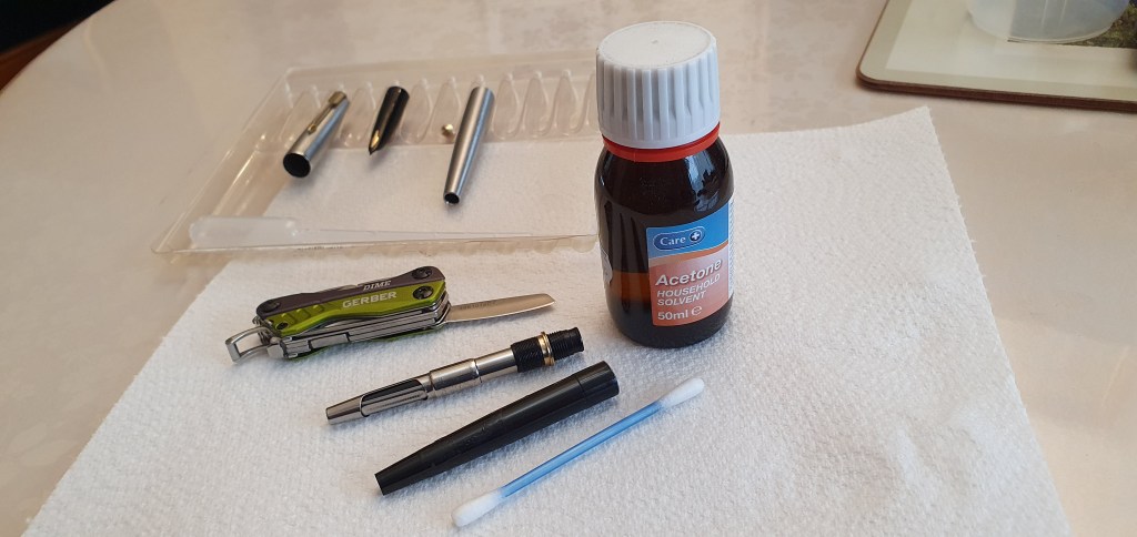
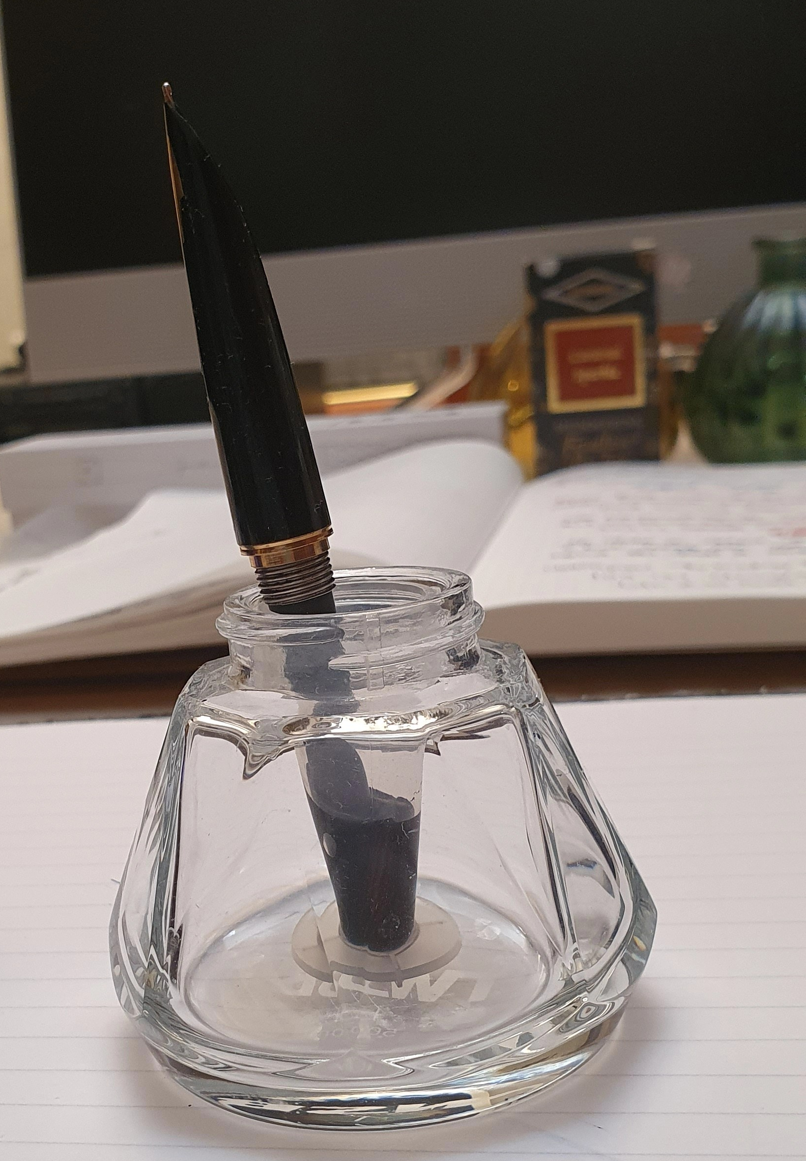
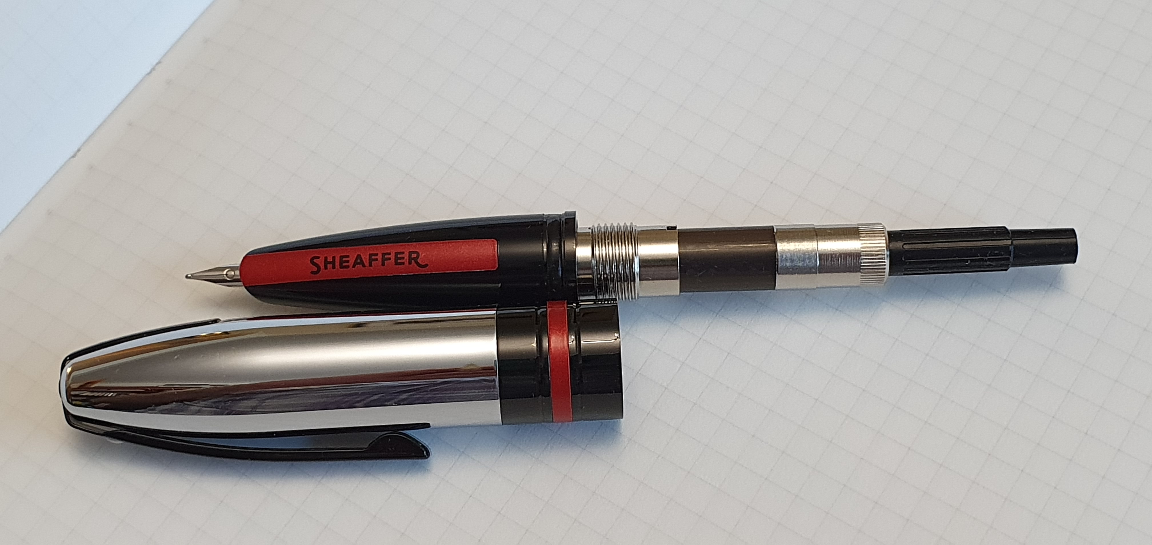
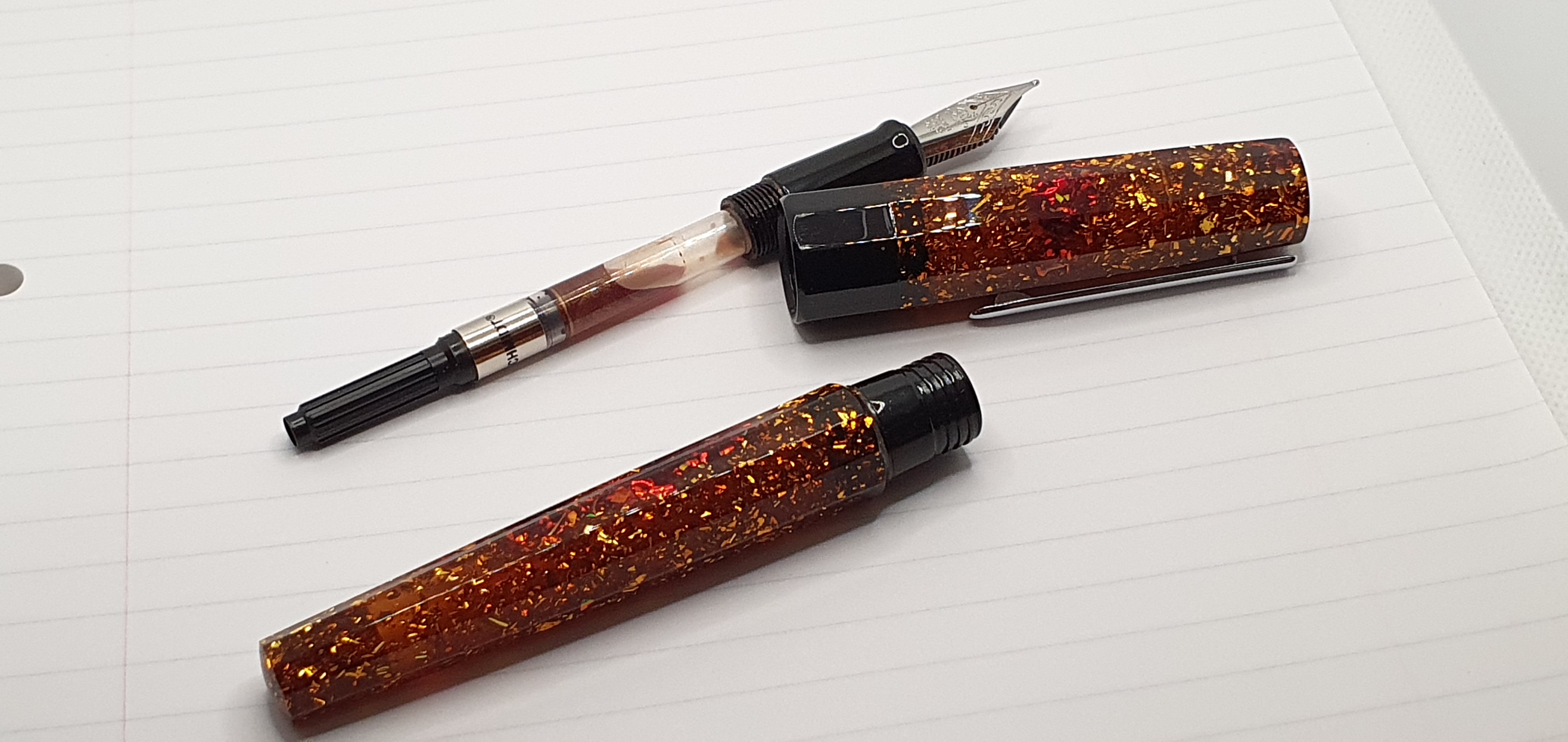
The pen came with a Schmidt converter but can also take standard international cartridges and could be eye-droppered, although I have not tried.
Naturally, I was eager to try out the pen and also the Caramel Sparkle ink. I was delighted with both! The ink makes for an excellent combination with the Bourbon. The ink is a joy in itself. Gold glitter settles at the bottom of the bottle like sediment in a wine and the bottle needs shaking before filling the pen. Then it is entertaining just to watch the glittery ink swirling in the bottle. At our recent pen club meet, the ink drew much interest and I gave samples to five of our group.
I have not had any trouble with ink clogging the pen or causing hard starts. I give the pen a little shake before writing to wake up the glitter although I am not sure that this is necessary. The ink is a lovely golden brown and dries with a gold sheen. It is marvellous to watch fresh ink on paper via an illuminated loupe, as the tiny glitter particles swim around like pond life, until the ink dries and the sheen appears.
I am very glad to have found this pen and to have made the purchase. Coincidentally, like Benu, this blog also started in 2016. As I write this, on 5 November, it is the seventh blogiversary. I take this opportunity to thank everyone for reading, liking and commenting over the years. I love the interaction that the blog brings, in this wonderful, global community. Special thanks also to those who have been kind enough often to include my blog in their own weekly lists of links, notably The Gentleman Stationer in his Sunday Reading posts, the Pen Addict in Sunday’s Misfill posts and The Well-Appointed Desk in their Link-Love posts. Recognition from these far larger blogs across the pond, is very gratifying.
Today’s post is my 248th of this blog. The blog has drawn 546,000 views to date and the number of new subscribers has roughly kept pace with the number of posts. Am I losing interest in the pen hobby, after seven years? Not at all. As my latest venture into sparkling pens and inks shows, I am still discovering new things.