Early thoughts on the Delike New Moon bent nib fude pen.

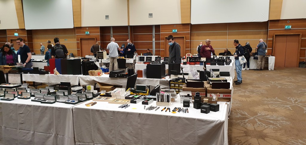
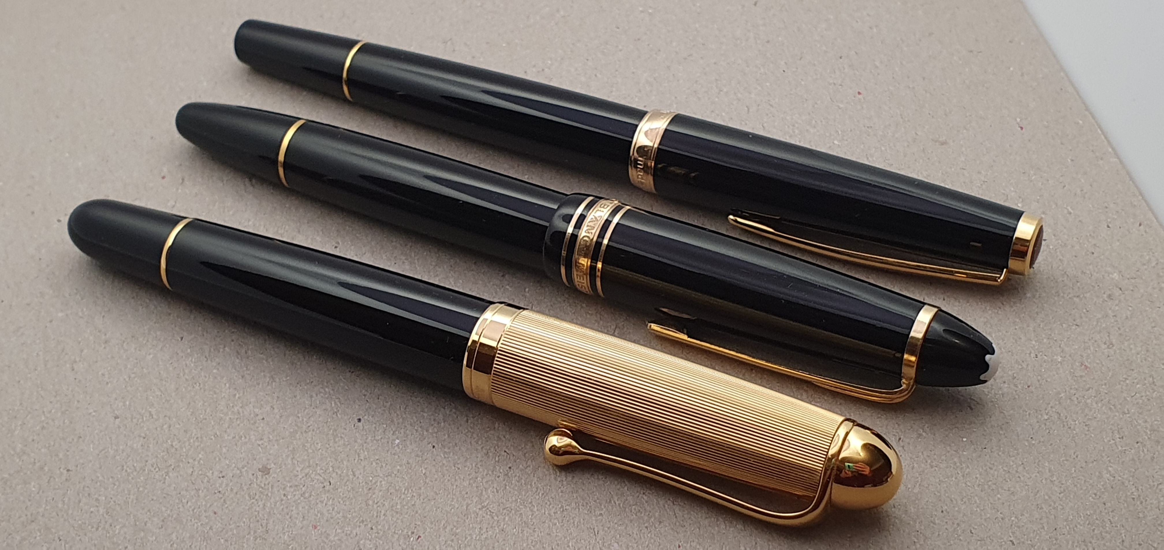
This pen came to my attention through reading a post on Margana’s “An Inkophile’s Blog” on 9 February 2022, entitled 20 Refills Without Cleaning My Pen. I was impressed, also in that she had found a relatively modest fountain pen that she liked using so much that she had used it every day for 6 months and written 200 pages with it.

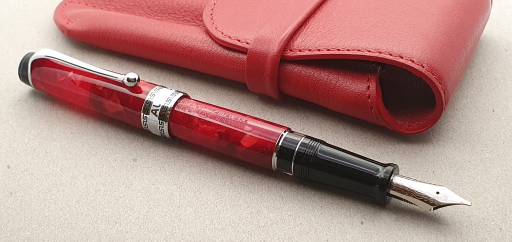
I tracked down the pen in question on Amazon and ordered one immediately, such was the persuasive force of reading Margana’s blog post. It took a bit of searching on the web site, as the pen seems to be attributed to Majohn, Langxivi and Delike. I have not worked out quite what the connection is between brands. Also the pen is available in a few different colours and with either a “bent” nib or a regular one. I particularly wanted to try the bent nib version and went for the marbled green colour, with silver trim. The seller was JianHang Office and the price, £21.49 plus £3.00 postage from China.

I was delighted when it arrived, considerably earlier than estimated and just as my wife and I were about to depart for a weekend hotel break in Old Windsor.

Delike New Moon bent nib fountain pen.

Description.

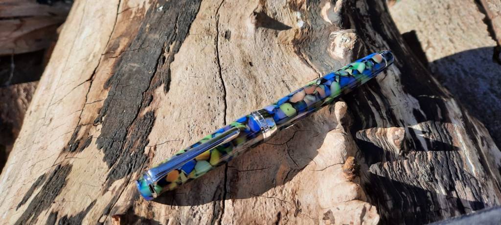
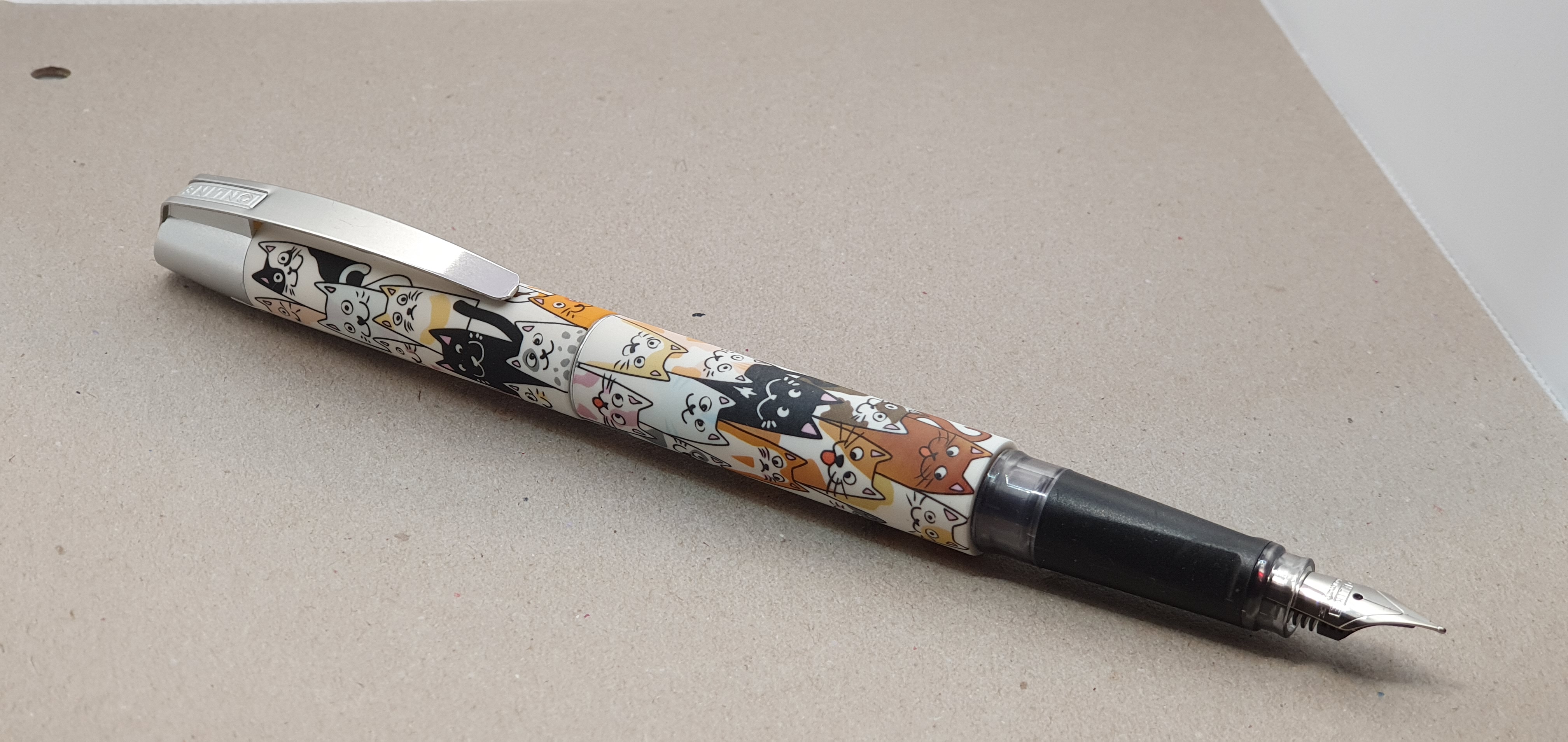
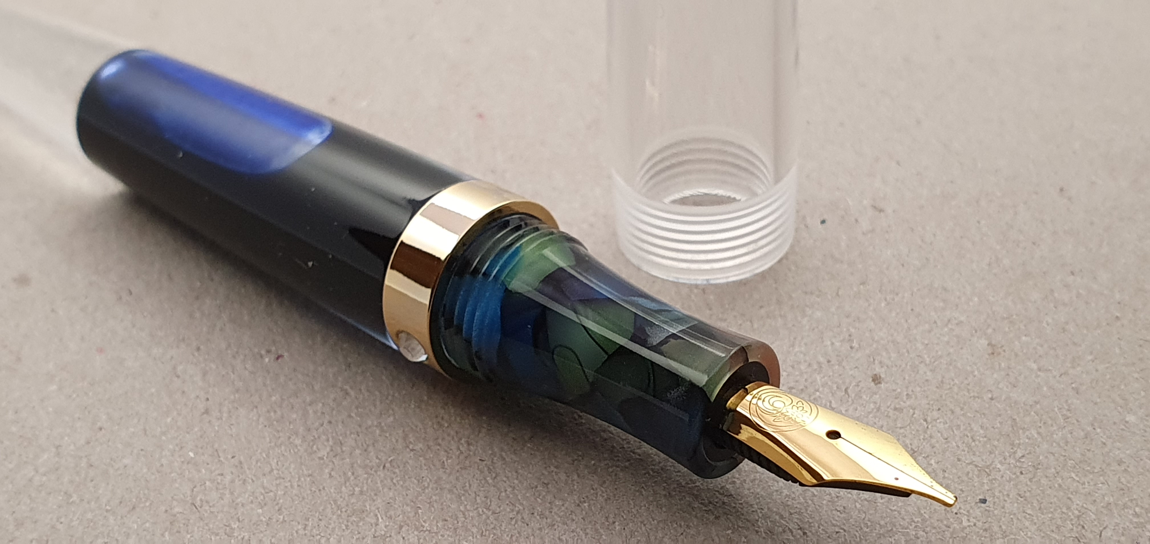
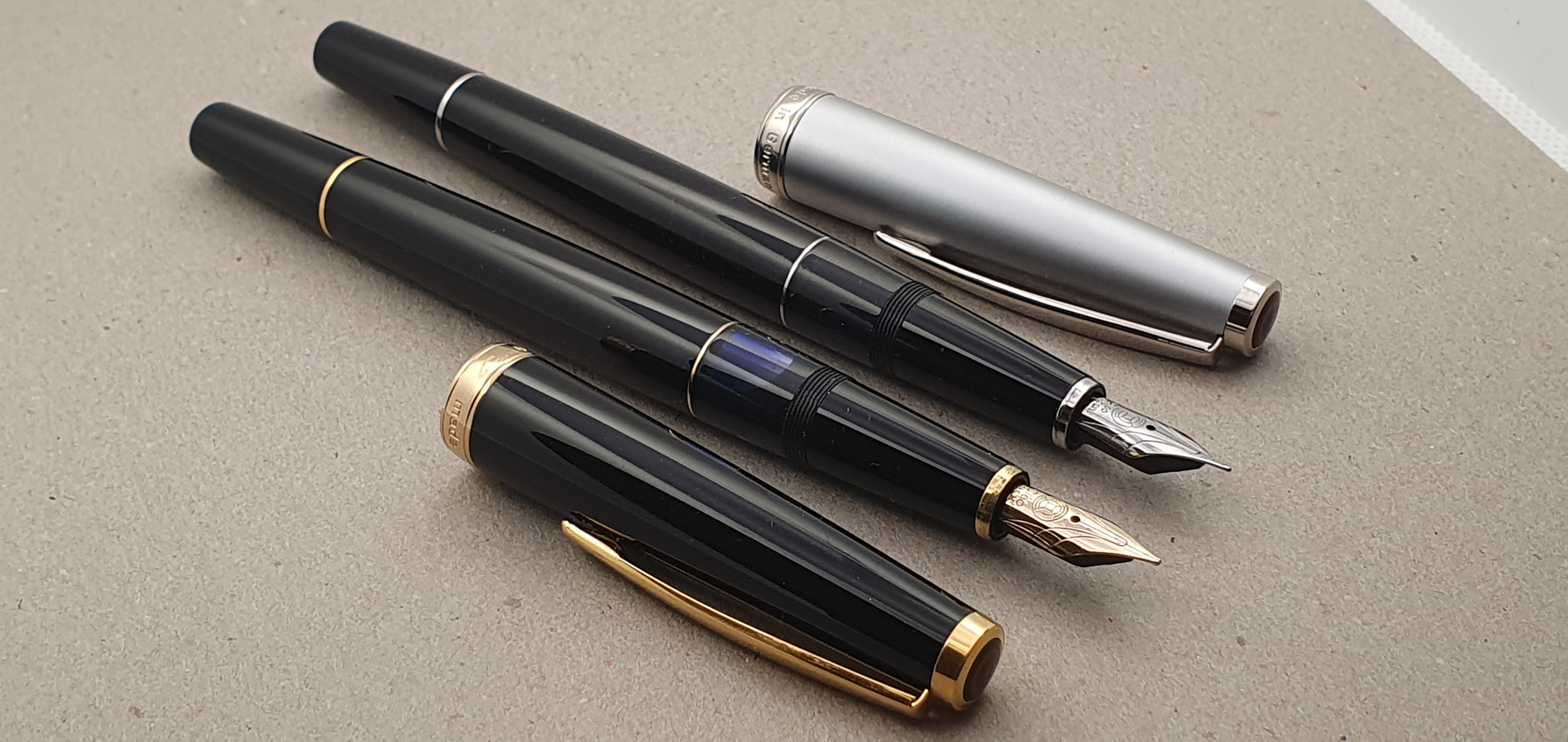
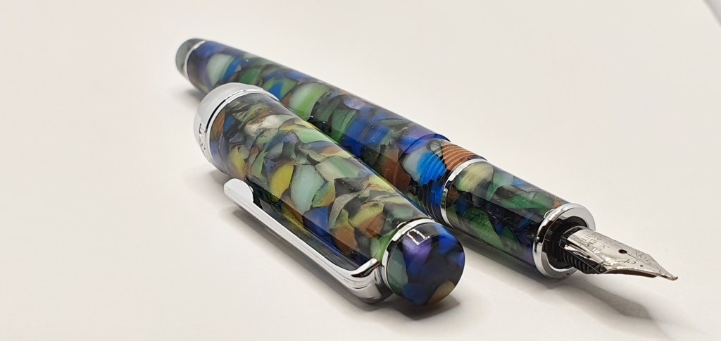
This is an acrylic pen, in a striking green marbled effect with flakes including blue, brown and purple which come to life in good light. There is an acrylic finial, a silver coloured ring for the sturdy, very stiff, metal pocket clip, a cap band which reads DELIKE New Moon and another silver coloured decorative ring near the end of the tapered barrel.

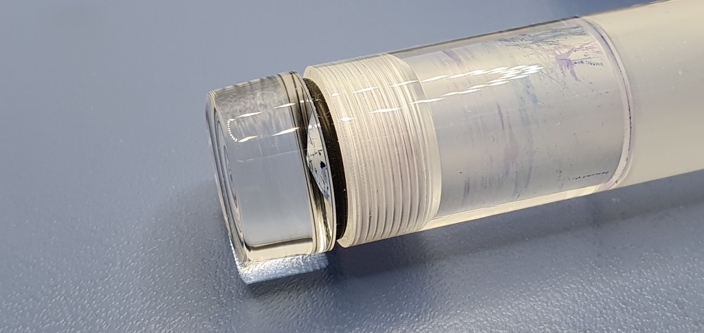
The cap unscrews, needing just over three full rotations, to reveal a section in the same marbled acrylic pattern and that bent nib and metal ring at each end of the section.

Good fit and finish throughout.

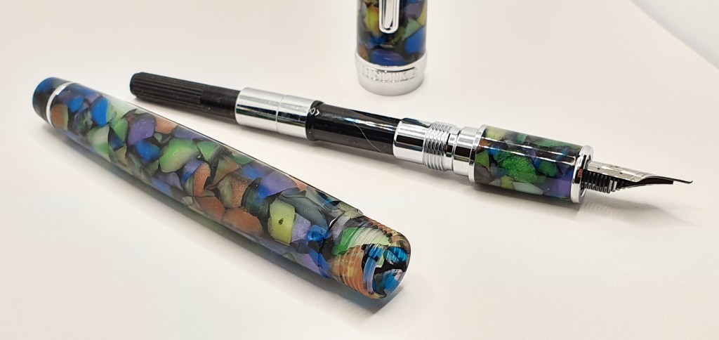
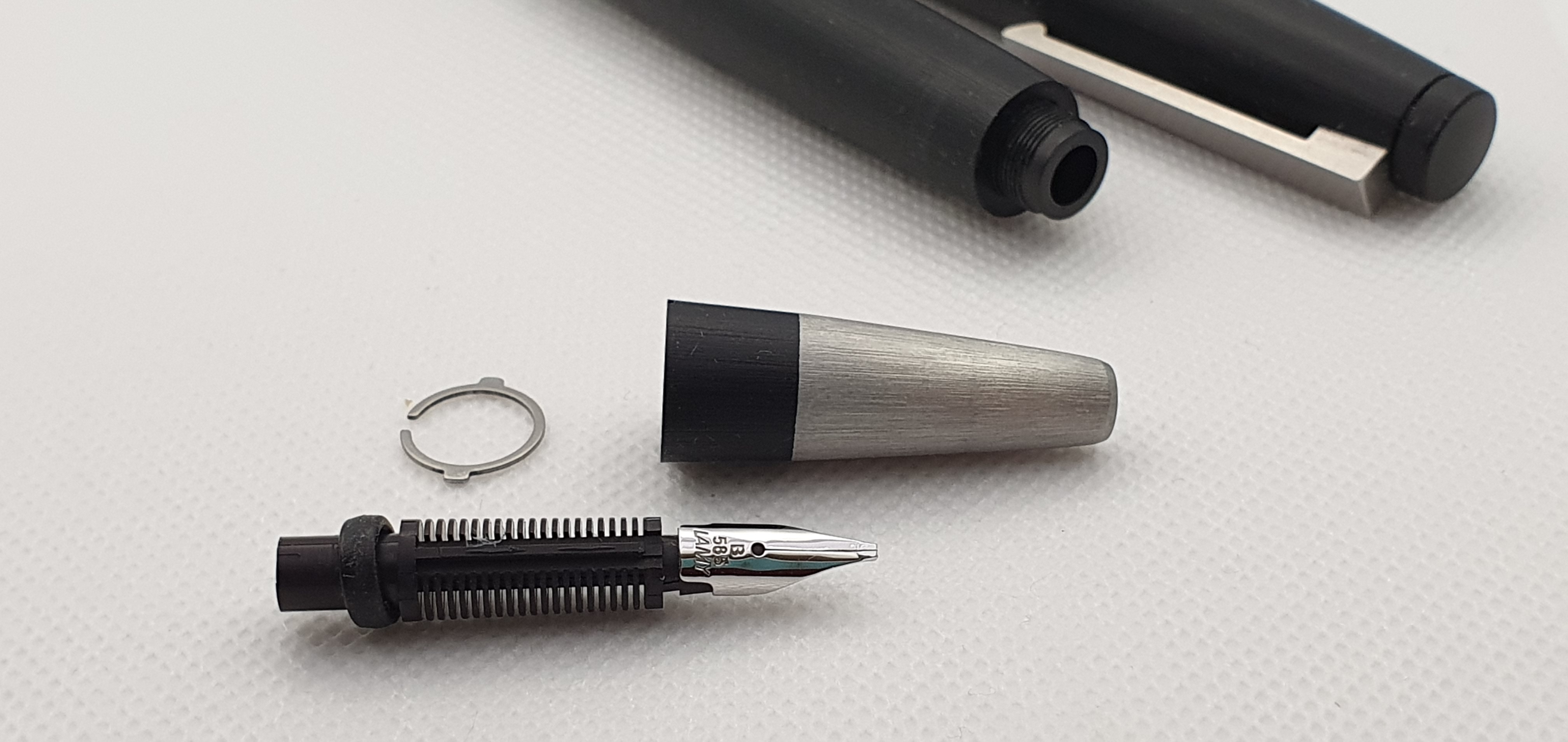
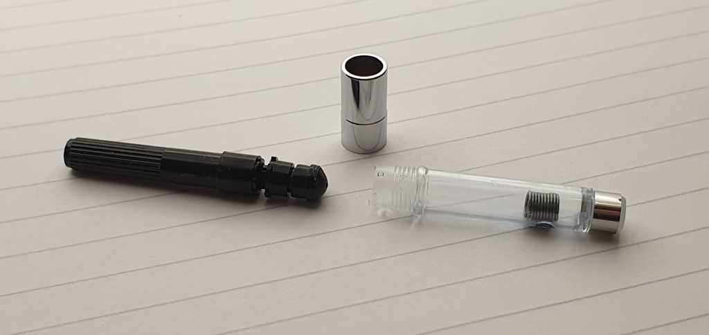
Under the barrel, a cartridge-converter was included. I was impressed that the converter included a metal collar which could be unscrewed to disassemble the converter, should you wish to clean and grease the plunger. It also contained a small metal coil agitator, which avoids the annoying problem of ink starvation, whereby ink clings to the far end of the reservoir. The pen also came with a small soft black velvety pouch. For a pen of this price, the materials and finish all seemed to be of a very pleasing quality.

Converter, disassembled.

Size and Weight.

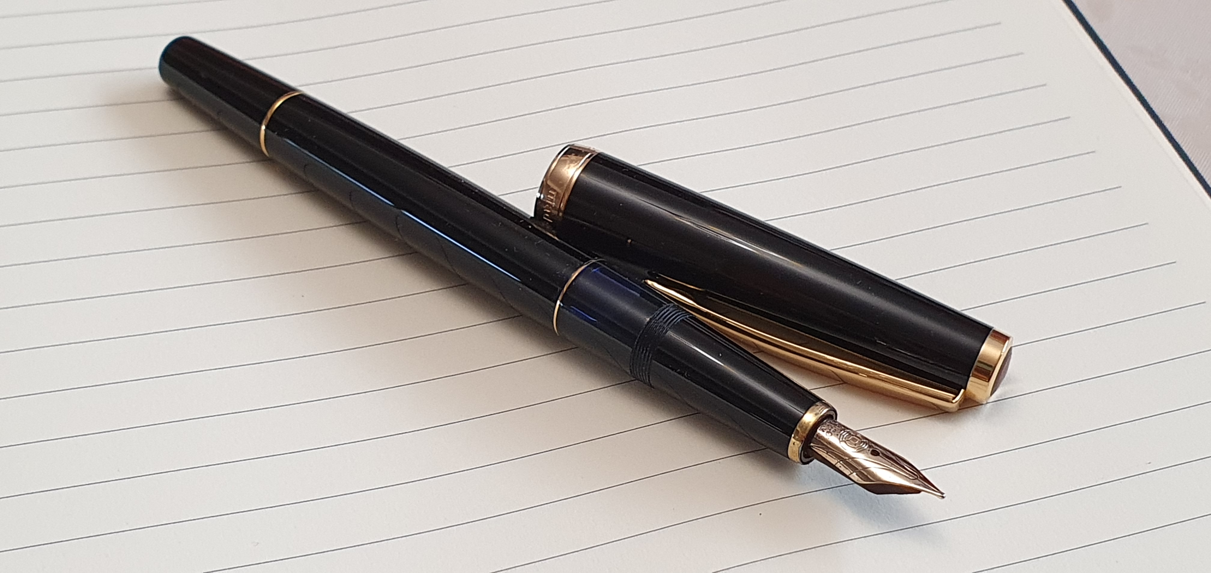
I measured the pen to be approximately 133mm closed, 120mm open or 157mm posted. The cap can be posted securely (with a little twist to grip the barrel) and I prefer to use it posted, as I then grip it higher up and the pen lays more comfortably in the hand. I would call it a small to medium sized pen.

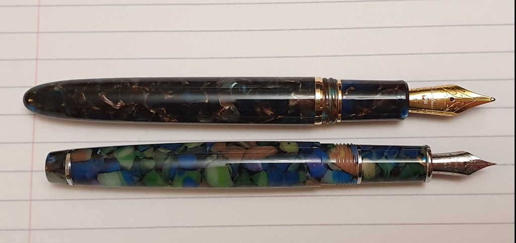
It weighs around 22g including the converter, comprised as to 15g uncapped and 7g for the cap alone. For comparison, a Esterbrook Estie which is larger, weighs around 26g.

Delike New Moon shown below an Esterbrook Estie standard. (Both need good light to show off the colours).

The nib and writing performance.

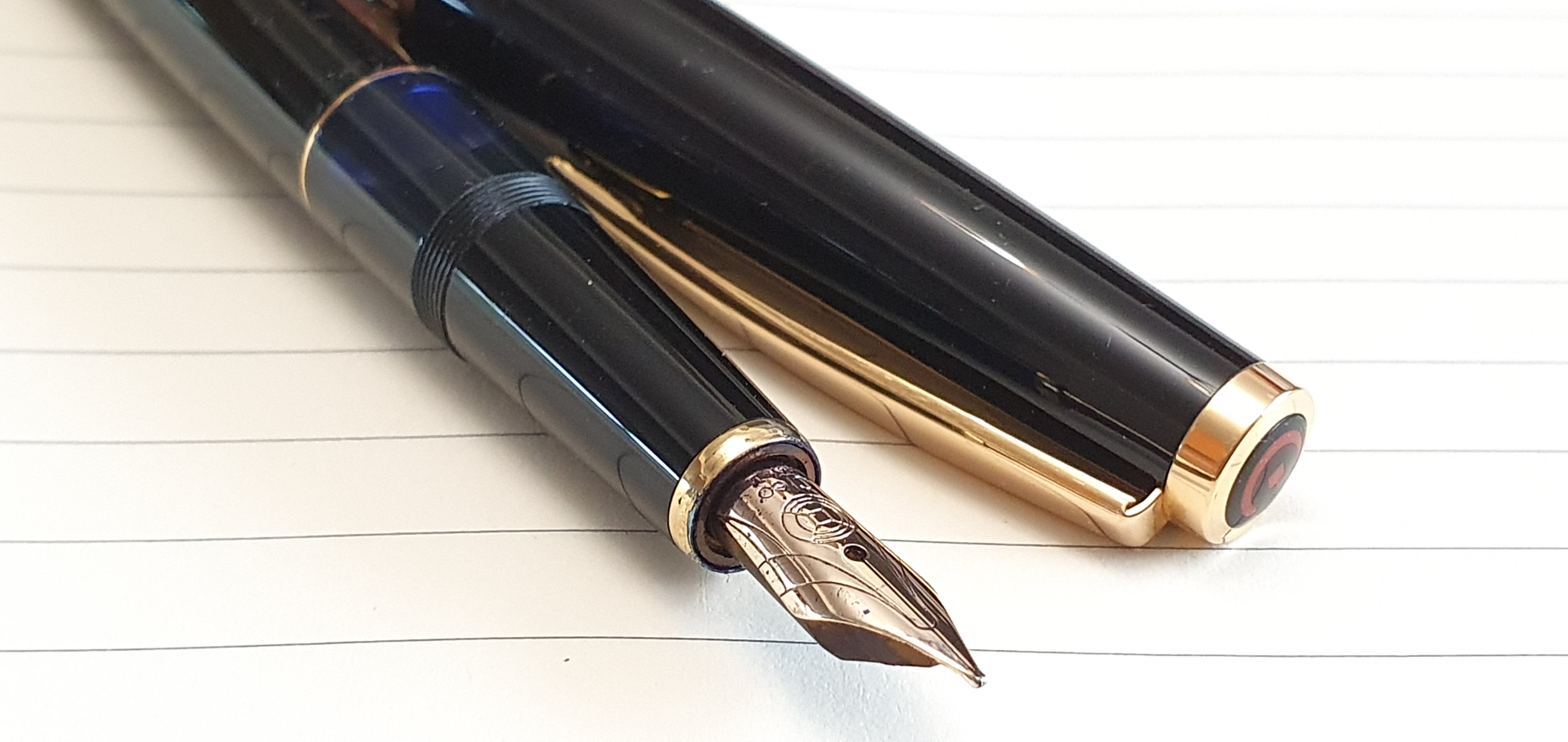
I had not used a deliberately bent nib before and was excited to see what it could do. The silver coloured nib has a little decorative scroll work and the text “Dlike” (sic) “SUPER QUALITY, EF”.

The upturned “bent” nib.

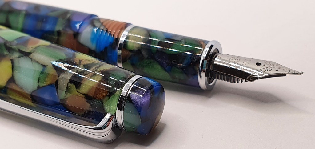
The magic is in the up-turned tip of the nib. Angled upwards, and very smooth and rounded, it presents a flat surface to write with. The effect of this on paper depends how you hold your pen. Used in the conventional “underwriter” style, the nib will give you narrow down strokes, and broad cross strokes. This is rather like the effect of an architect-grind nib and is the opposite of a more common stub nib which would give broad down strokes and narrow cross strokes.

Then again, if you are a lefty and an overwriter, (like me most of the time) the effect is different as you get broad ascenders and descenders, and narrower lines when you make strokes such as to cross your T’s.

Whichever way you hold your pen in relation to the paper, you have the options to have the pen lay back in the crook of your hand finding a sweet spot where the bent nib writes smoothly and lays a broad line from side to side, or more vertically, where the line becomes a medium or a fine. There is also a third option, which is to flip the pen over and use “reverse writing”, using the tip of the upturned nib to give an extra fine line. I easily found three distinct line widths available.

Also, by varying the amount of pressure on the nib, I found that a little heavier pressure could be applied (except with reverse writing) to produce a darker line, assuming that you have a nice shading ink. I am using Montblanc toffee brown at the moment which shades well. Looking back over my notebook, I find that I had, after experimenting with different line widths and shading, written “all of this with ONE pen! Easy line variation all from ONE nib! Just experiment – to find out how to get the BEST out of it. Be familiar with your tools. Know how to USE them.” (The capital letters were where I was pushing the nib a bit to get bolder darker lines. I could not put it down. Later I wrote “Just how much fun is it possible to have from one nib?”

Writing samples: experimenting with the variety of line widths.

Conclusions.

All in all, the nib is very versatile and is a huge amount of fun. Certainly, more fun than I had any right to expect for the price. The quality too seemed excellent and I could not fault the nib at all.

Occasionally, in this fountain pen hobby, we can lay out a large sum of money for a pen which disappoints. But occasionally the opposite occurs and the resulting joy should rightfully be recognised and celebrated.

A New Moon in the wild.

Some long term thoughts on the Cleo Skribent Classic Gold fountain pen.

One of my fun projects of 2021 was to watch every episode of the Columbo detective series, starring the late Peter Falk. There were 69 in all, including two pilots. Such an endeavour lends itself to a double-page spread in a bullet journal, with columns for Series and Episode numbers, episode Titles and a column for any comments on guest stars or plot. It was satisfying to tick them off each week as we made our way through whichever episodes were showing on “5USA”. Spanning decades, they were first aired from 1971 and the last episode was shown in 2003. I have now seen all but one.

Another project was to listen to every one of Elton John’s albums, from those on Spotify. Like many of us, I have enjoyed his music right from the beginning, although not all to my taste. I have seen him live three times: Hammersmith Odeon at Christmas 1974, Highclere Castle in June 2000 and once at Earl’s Court, some time in between. His albums are another bullet journal spread. This is a challenge that I can leave for a while and keep coming back to. I was well aware that I had never heard many of his albums, or had heard only the odd track from them, so I wanted to work systematically through the entire back catalogue. This takes time. It does not do to listen to an album only once. To enjoy and appreciate an album, I need to play it several times and let it get under my skin, otherwise I will have little or no recollection of it.

At the moment, I have got up to The Road to El Dorado, an album of songs from the animated film in 2000. This film and the soundtrack album escaped me completely at the time. There are several great, stand-out tracks which I am greatly enjoying. I have probably played the album over six times and still have no desire to move on.

This brings me to the Cleo Skribent Classic Gold fountain pen. I posted a couple of reviews of my Cleo Skribent fountain pens when I bought them, in 2017 which are listed in my Index of Pen Posts or can be seen from here: Cleo Skribent Classic Gold, Piston fountain pen; first impressions and Cleo Skribent Classic Metal, Piston fountain pen review (about the steel nib version). In the following years, I continued down a path of trying lots of different pens and bought dozens every year. The Cleo Skribent Classic Gold rather got side-lined. However last autumn I tuned the 14k gold nib a little bit, to increase flow and lubrication. It just took a few minutes to open up the tine gap very slightly.

Cleo Skribent Classic Gold, piston filler fountain pen, being useful again.

I then started to enjoy the pen all over again. I used it for the month of December 2021 for my journal, for which I had been switching pen and ink combinations every month. I had intended to start a different pen in January. However, nearly half way through February I still have no desire to change pens. I do have a dozen inked but it is the Cleo Skribent Classic Gold that I reach for each morning for my diary. I also enjoy it for notes and letter writing. It is now on its third fill with Waterman Serenity blue ink since November.

Looking back at my first impressions review five years ago, I was not then aware of whether the nib could be easily removed. I since learned that the nib and feed are friction fit and can be pulled out together quite easily for a more thorough clean or if changing inks, rather than just relying on the piston to flush the nib and feed.

I still love the features that appealed to me then. It is a long, elegant pen, extremely comfortable to hold with a smooth gold nib which has a very pleasing degree of softness on the paper. The glossy black resin of the body looks to me just as “precious” as that found on other more famous, German black fountain pens.

14k gold nib, medium. Small but perfectly formed.

I commented in 2017 that the piston seemed less smooth than in my other pens but that it was too soon to tell how this would stand up over time. Well, the piston is stiff in places. I would very much like to be able to introduce some silicone grease to the inside walls of the ink reservoir, to ease the piston plunger on its travels. I do not think it possible to remove the piston mechanism to grease it outside the pen. (If I am mistaken on this, I will be very pleased to hear from anyone who can put me right).

My only real criticism of the pen is that it does not seem possible to grease the piston. With a Lamy 2000 for instance, you can unscrew the section from the barrel and introduce a little grease to the barrel using a cocktail stick or tooth pick – a useful tip that I saw on a Brian Goulet video. Not so with the Cleo. The barrel does not separate from the section. Even with the nib and feed removed, I have been unable to poke anything through the opening and bend to reach the barrel sides.

Ultimately, if the plunger does become too stiff I fear that the piston shaft could break. I assume that it is plastic, as the pen is so light. Hopefully, being inked regularly with a well behaved ink like Serenity blue will be good for the pen and keep the piston working. That said, it has not happened yet and the pen does have a lifetime warranty. Also, it was not hugely expensive at £129.00 and even if the piston mechanism fails, the nib, feed and cap could all be salvaged.

But the message of today’s post is that, as with an Elton John album, it is ok to get stuck on enjoying one pen. A good fountain pen is like a wonderful view: uplifting and good for the soul, but you do not need to see every one there is.

Black and gold. Never out of fashion.

My Aurora Ipsilon fountain pen and I.

In recent years I have become a fan of Aurora fountain pens. Certainly my black and gold Aurora 88 with its medium nib and my red Aurora Optima with an oblique broad, are among the most prized in my accumulation. But neither of these was the first Aurora that I had bought. That honour goes to the Ipsilon.

Aurora Ipsilon, marbled blue lacquer.

It is true to say that I did not immediately take to the Ipsilon. The buying experience was memorable and hard to beat. My wife and I were on holiday in Italy in July 2018 staying near Lake Garda and took a bus for a day’s visit to Verona. There I found a delightful fountain pen shop called Manella, in the via Guiseppe Mazzini – a pedestrian thoroughfare in a shopping district and thronged with tourists like myself heading from the stunning Roman amphitheatre, towards the Case di Giulietta, to visit Juliet’s famous balcony from Shakespeare’s Romeo and Juliet.

The shop was easily spotted by its vintage Pelikan pen sign. Unfortunately it was closed for the day (or so I thought) and I contented myself with looking at the displays in the window and peering into the shady depths of the shop within.

Some hours later, on passing the small shop again, I was thrilled to discover that it was now open and went inside. I asked to see a red Aurora Ipsilon which had caught my eye in the window. The genial proprietor seemed pleased to have a keen customer and I was eager not to leave empty handed! He told me that he had a larger selection in his other shop close by and so locked up this one and took me to see it, in an arcade literally just around a corner but off the beaten track. It was much less cramped and had displays of leather goods as well as pens.

As for the Ipsilon, he recommended a superior version being of lacquered metal and which had a14k gold nib. He showed me a new edition, in a marbled dark blue and black lacquer and with a fine nib, which seemed to tick all the boxes as a suitable souvenir from Italy. I added a Pelikano to my purchases and the proprietor kindly included an orange ball point pen for my wife. Genius.

Aurora nibs are handmade in Turin.

The Ipsilon comes in various different versions. From an old catalogue, I see that the metal lacquered model was also available in a marbled tortoise or grey finish. It is a cartridge converter pen, taking the Aurora proprietary cartridges. A useful tip is that Parker Quink cartridges also fit and are easier to come by. It has a snap on cap, which also posts securely with a polite click, to make a very comfortable package. The pen measures about 137mm closed, 118mm open (slightly short for my preference) but a decent 148mm with cap posted. It weighs about 31 grams, being 19g when uncapped and 12g for the cap alone.

Well matched with Parker Quink blue black cartridges.

After such auspicious beginnings, you would think that I would be delighted with my new Italian fountain pen. However, perhaps for a combination of reasons, I did not bond with it sufficiently in those important early weeks after purchase. On close inspection of the nib under a powerful loupe, I noticed some mystery parallel lines or scratches across the face of the nib. Perhaps it had been held in pliers during or after the plating process. These were only cosmetic and not visible to the naked eye. Secondly I had an unfortunate experience with the included converter, which seemed to be leaking and made a mess. With hindsight, I should have been more systematic in my diagnosis of this problem but I was further put off the pen. Thirdly, and perhaps the biggest issue was that the fine nib was rather on the dry side for my liking. And so, rather embarrassingly, I put the pen away and hardly looked at it for three years.

Fast forwarding to last autumn, by which time I was enjoying my Aurora 88 and Optima, I got out the Ipsilon again. I have been revisiting lesser-used pens and tweaking the nibs with brass shims in some instances, now that I have gathered a little experience and confidence in this area. Often it is a very quick and easy fix to just open up the tine gap very minimally, to improve ink flow, lubrication and smoothness which makes a big difference to your experience with a pen.

I also bought a pack of Parker Quink blue black cartridges (reduced in a sale at WH Smiths) which fit perfectly, removing the risk of leaky converters. The colour is an ideal match for the pen. And the mystery striations on the nib plating no longer bother me at all. There are bigger things to worry about in life.

The net result is that I now have an enjoyable and reliable pen and a trio of Auroras, with fine, medium and oblique broad nibs. It is currently filled and always starts up immediately. The moral of this little tale is not to overlook the bonding phase when you have a precious new fountain pen arrival. But even if you do, all is not lost and you and your pen may still achieve fulfilment at a later stage.

The Aurora Ipsilon, 88 and Optima.

Early thoughts on the Online Campus Fluffy Cats fountain pen.

Well, I made it to 7 January 2022 before buying any pens this year. So much for resolve. To be fair, I did say in my last post “I always start the year with good intentions to buy less pens…”, not no pens.

So, what made me cave in so easily? Allow me to introduce the Online Campus, a school pen from Germany, in the “Fluffy Cat” design.

Online Campus Fluffy Cats fountain pen.

I was first aware of these a couple of years ago. A visiting pen friend showed me his Online College that he was carrying and, when I commented on how nice it was to write with, and how flattering it was to my rather awkward lefty-overwriter hand writing, he said I could keep it and gave it to me on the spot. It had an 0.8mm stub nib and a pink design featuring melons and pineapples. He told me of his other Online “Fluffy Cats” pen, which he claimed to be one of his favourite pens. Coming from someone who had spent years acquiring pens such as Pelikans, Pilots, Lamys and Montblancs of much greater cost, this carried some weight.

I had not seen a Fluffy Cats version for sale, until idly scrolling through Amazon’s offerings last weekend when, to my surprise, I found an Online Campus in a Fluffy Cats version, with a Medium nib, for £14.99. Also I had not tried an Online Campus, but enjoyed the College and the Bachelor, both of which were fitted with the 0.8mm stub nib. I was keen to try the standard Medium nib which I had heard is also very good.

I ordered two, to make the delivery more worthwhile and for the option of having a second one to use in a different location, or with a different ink, or to give away.

Unboxing.

They arrived within 24 hours, in a brown cardboard envelope, with the two pens loose inside. There was no other packaging at all. There was no paperwork but the pens each had a sticker on the cap, with the address of Online Schreibgerate, a bar code and a symbol to indicate that the nib was a Medium. They each came with one Online long blue cartridge, (with a standard international cartridge fitting at one end and a cheeky Lamy fit at the other!) but no converter this time.

Fluffy Cats

First impressions were favourable. The body of the pen features ten rows of cute, cartoon cats, with various colours and expressions which remind me of the extended family of five feral cats that inhabit our garden, and which we feed every day.

I also noticed that the Campus pen feels slightly bigger and heavier than the College, that the pocket clip is stainless steel instead of plastic and that the body of the pen has a “soft touch”, slightly rubbery feel.

The two ends of the pen are plastic but painted silver to look like metal.

The flush cap snaps on and off firmly with a pop and a click. It is very light and is designed to post where it remains completely flush with the barrel. This makes for a very ample length without upsetting balance.

With cap posted

As most of my currently inked pens are filled with blue or blue black inks, I decided to try the Campus with a cartridge of Kaweco ruby red. It pops in to the section nicely with room for a second cartridge in the barrel, if you use the short variety. The section also features the clear plastic ink window which lets you see the cartridge and ink inside.

Inked with Kaweco ruby red plus a spare.

Size and weight.

Closed, the Campus measures 141mm; uncapped it is 123mm and posted it is a very lengthy 173mm. The barrel is about 13mm at its widest, and the grip section tapers from 11mm down to 9mm nearest the nib.

The complete pen, uninked, weighs 13g or just 8g uncapped and about 5g for the cap alone. This total weight compares with the Online College at 10g.

Nib and writing performance.

The stainless steel nib, with iridium tip, is a Medium. The selling description stated it to be “right handed” although the tipping looks symmetrical to me, as far as I can tell. I do not know if there is a left handed version or how it would differ. The nib has a slight springiness to it and is not a nail. You can get a little line variation from it if you push it a bit. But the main message is that it writes perfectly. Straight out of the box (except that there was no box). There is no nib work required and the pen is ready for use right away, (which may come as a surprise to people used to buying faulty pens at forty times this price!). I was delighted with the smoothness and the degree of ink flow, even for this lefty-overwriter who needs nibs a little wetter sometimes.

Stainless steel medium nib, iridium tip.

I do not yet know whether this Fluffy Cat version is a reissue of a previously popular design. I thought that they had been discontinued. I could not find a Fluffy Cat version in a brief check of the company’s web site today (Online-pen.com). It may be that they are still made after all, or have been reintroduced or it may be that Amazon had some new old stock. Whichever it is, I am glad to have it and now find myself looking forward to getting home to write with my Fluffy Cats.

The real thing. (Photo: Ling Arzeian)

Postscript:

Here is a size comparison photo, of the Online Bachelor, College and Campus pens:

Online Bachelor (top), Online College (middle) and Online Campus (bottom).

The new year diary, 2022.

For me and many others, today has been the last day of the Christmas and New Year holidays and I return to my work routine tomorrow.

As readers of this blog may recall, I like to keep a diary, or journal, and to have about ten minutes each morning to sit with a fountain pen, to reflect upon and write up (and increasingly these days, try to remember!) the events of the day before. I prefer to do it when the day is past, when I have slept on it. My brain is then fresh and has had a chance to find some order in the previous day’s events. The diary is my record of what I did, not what I am going to do. It is a handy repository for films watched, books read, excursions enjoyed and so on.

An A5 page a day works well for me.

For working days, I have found that a balloon diagram is often best. A central balloon labelled “WORK” leads out to balloons each representing a different matter that I worked on. I can then easily insert bullet points next to each balloon, for lists of tasks or occurrences on each client (or “account” in the States). This is a process which my wife describes as “doing your bubbles.” It helps me to prioritise for the day ahead.

For the past few years I have used an A5 Page-a-day format. This year, I bought a Ryman Soft Cover Diary, page a day, which is a chunky and pleasing book, with a hardback cover that has the feel of leather. According to the paper insert, it features 80 gsm cream paper, a ribbon page marker, and expandable pocket, a pen loop and an elasticated closure. I have found this to be fountain pen friendly. This means not only that most inks do not bleed or feather, but also that the paper surface is nice to write on, not glossy and draggy and also that the colours show quite well. I have noticed that with some other papers, some ink colours loose their vibrancy, as though the paper has sucked all the joy out of them.

Equally important to me, is the fact that the lined pages feature a reasonably generous row height of 7.9mm, giving 23 rows per A5 page. And you still get a full page each day on Saturdays and Sundays.

My 2022 diary – a Ryman A5 page a day.

I used the same format diary last year and so much of my post The new year diary, 2021 still applies, except that this year I chose a navy blue one and the price has risen a bit, to about £12.00 I think.

In 2021 I decided to use a different pen after each month. I enjoyed that, and thought to do the same again in 2022. But then I used the same pen for January 2022 that I used for December 2021, for “continuity”. And then by the 2 January 2022, I had a new idea of picking a single pen to use for all my writing needs for a day, or even a week to see how that goes and that meant I already changed pens on 2 January. Another possibility is to change after each two page spread, as I did for the Marcus Aurelius project. In short, I have not yet decided.

I am not very good at sticking to resolutions, such as giving up chocolate. I have not set myself any particular goals or challenges for 2022 as far as the fountain pen hobby goes. I always start the year with good intentions to buy less fountain pens and to make more use of those I have. This applies now more than ever and I feel very fortunate to have accumulated a vast array of good pens, of which I can see 13 are currently inked, as I sit here. I have the urge after Christmas to simplify life and there is a certain satisfaction to be had from using the least expensive tool for the job. For example, over the holidays the pen I have reached for most, has been an Online Bachelor, a cheap plastic clear demonstrator but with a joyous 0.8mm stub nib which I like very much, currently filled with Rohrer and Klingner Salix, a blue-black iron gall ink. Another resolution is to write more and to empty some bottles of ink, such as the aforementioned Salix. I was inspired recently by Margana at Inkophile who kept a record of repeat fills of her pens and was able to tell me that one was on its 18th consecutive fill of Pilot Iroshizuku Syo-ro. The lesson was that once you find an ink you like, use it!

I realise that it is more effective to have goals that are achievable and measurable. This year, rather than say “I plan to do more walking”, I set myself a challenge to walk 1,500 miles in 2022. I have been using a pedometer app to count steps since August and found that I had 500 miles on the clock after 4 months. I would like to keep that up if I can, as I felt the benefits particularly when walking uphill. My job is a sedentary one and fitting in about 4 miles walking a day, is quite a challenge. But having a target now feels purposeful and every time I venture out on foot I can bank some miles and feed my ever-hungry app.

In my last year’s new diary post, I ended with the following words: “Flicking through the blank pages of my next year’s diary it is hard to imagine what I might be doing in the months to come. Let’s all hope for better times ahead.” I think that still applies. Wishing everyone a happy and healthy New Year 2022.

2021: Some of my fountain pen highlights.

It is time for a look back over my last 12 months as a fountain pen enthusiast (a euphemism for addict, perhaps). It has been rather solitary without the monthly social contact of the London pen club meets. However, with letter writing, a couple of pen shows and the constant online interaction of social media, it hasn’t felt lonely. Anyhow, using and tinkering with pens and stationery are good activities to pursue on your own.

The acquisitions.

First, the reckoning. I still keep a tally of pens acquired with their dates and cost, although I had not reviewed 2021’s figures until now. I see that I had a total of 25 pens incoming. My total spend on these amounted to £1,026, which does not seem too excessive, as hobbies or addictions go. However, a large chunk of this was on my Aurora Optima, at £396 from Iguanasell. If you deduct this, the remaining £630 was for 24 pens, an average of only £26 each. This is a bit misleading as I have not included the value of a few pens received as gifts, but it gives you a rough picture.

None of these was part of a plan. They were pens that I spotted online, or at pen shows or whilst browsing the shops during the summer sales.

The Aurora Optima was my most significant purchase. The rationale was that I am delighted with my Aurora 88, also from Iguanasell. I was keen to try an Optima, with an oblique broad having found these to be well suited to my writing style from buying a Moonman S5 demonstrator. Also, the price looked favourable, although at the limits of my comfort zone. (I have never spent more than £450 on a pen). It was a bit of a risk, buying a pen with a specialist nib unseen, but it was excellent and I enjoy using it very much and have been encouraged by good feedback about my writing, from my correspondents.

Aurora Optima with oblique broad nib.

A few of the other arrivals this year have included three Diplomat Excellences, two more of the Moonman S5 (they are so good!), two more Cross Bailey Lights (I could not resist the green and the burgundy versions with gold coloured trim); two steel nibbed Sailors: a blue demo Procolor 500 and a sparkly dark red Shikiori, which seems to be its successor. Both of these have fine nibs which, in Sailor terms, means an extra fine.

A handsome Cross Bailey Light.

I bought two Narwhal Schuylkills – one being the 365, limited edition red swirl ebonite version released to celebrate the company’s first year of trading and the other being a blue marlin, both from Stonecott Fine Writing Supplies Ltd.

Finally, I ended the year with the purchase of a pair of Online Bachelors, a lightweight comfortable plastic demonstrator, cartridge converter pen but, unusually, fitted with a 0.8mm stub which I greatly enjoy and just reviewed in my previous post. I have had these only a few days but am happy with them both.

A few of the highlights.

Aside from these fairly regular but low-dosage New Pen Days, I enjoyed completing the challenge of copying out the book Meditations, by Marcus Aurelius. This combined reading some philosophy with practising my handwriting. The idea was to write in a print-style, typewriter font and to use a different pen and ink combination for each two page spread. The whole idea was brazenly copied from Kimberly of @allthehobbies on Instagram whose own immaculate pages (as well as her “currently inked”posts) are most inspiring. I did this over a period of about seven months.

I attended the London Spring Pen Show (postponed until July) and Autumn Pen Show in October. Both took place at the Novotel in Hammersmith. The spacious, airy venue proved a big improvement on the previous events held at Holiday Inn, near Russell Square in recent years. It was good to see so many pen club friends again. Seven of my pen purchases came from these two events. Also, not included in the total, was a new titanium nib unit with an ebonite feed in Jowo fit housing, also purchased at the show. They were available in Jowo or Bock fittings and in a selection of widths. Mine went in an Opus 88 clear demonstrator and gives the pen a whole new character. The nib was just a tad longer than the original and I needed to make a little more space in the cap. This proved easy without major surgery, as the finial unscrews and I just added an O ring.

London Pen Show, Novotel, Hammersmith.

Aside from the pen show, I picked up a few bargains in the summer sales, at Rymans. These included a Sheaffer Prelude ball pen in Cobalt blue and rose gold, to match my fountain pen. This was a great find, reduced from £50 to £10. In John Lewis I snapped up another Sheaffer Prelude fountain pen, but in the brushed copper and black finish. And equally fortuitous was a Diplomat Traveller fountain pen, a rare find in our shops at the best of times, but reduced in Rymans to just £5.00. I sent one to a friend overseas who was so taken by it that he gave away several of his pens of much higher value, to another pen friend: a nice example of the “pay it forward” principle.

When out and about or exploring new places, it is nice to come home with a new notebook or pen, or both. Finding a new yellow Lamy Safari reduced in a sale was enough to see me pick one up with an accompanying Leuchtturm A5 journal.

Leuchtturm journals. Still my favourite.

The urge to buy a new notebook can be so irresistible sometimes that I buy one even when I know that most inks will bleed through the paper or that the line spacing is narrower than I would like. One such purchase was an Agenzio journal from Paperchase. I was attracted to the unusual size, being between A4 and A5. It was neatly bound, with 240 pages of lined paper with 33 rows per page. I enjoyed testing it out with various inks. I also found that one way to compensate for narrow line spaces (these were 6.9mm), is to rule the page into two columns. Somehow the rows look bigger then.

Trying out a new Agenzio notebook from Paperchase.

As for the blog, I have enjoyed putting out posts, although only 31 this year. The blog is now five years old and has received some 225,000 views. Occasionally my posts are picked up and linked by Fountain Pen Quest or the Pen Addict which greatly increases the number of views and lets me feel that “I have made it in America!” Thank you to Ray and to Brad for your support and to all who follow, like and comment on my posts.

This year I bought a new lightbox, a simple 9 inch box with two rings of bright LEDs in the top and powered by a USB cable. It is great to have a quick and convenient means of photographing pens in good light, at any time of the day or year.

With social gatherings and overseas travel largely on hold this year, I have spent a lot of time at home. I find it very relaxing to tinker with some fountain pens, filling or cleaning them, trying them with different inks on different papers and occasionally, attempting a little bit of nib adjustment. Most recently I tackled a pair of Cleo Skribent piston fillers, beautiful resin pens that I had not used very much in recent years on account of them both writing rather drier than I would like. Now, armed with a few simple tools, (a powerful loupe, a set of brass shims, some micromesh pads and a craft knife) I eased the tines apart just a fraction, which made a world of difference in improved ink flow and lubrication. These pens are both now back in circulation. This is a good argument for hanging on to your pens: you might improve them one day.

A pair of Cleo Skribent Classic fountain pens.

I have enjoyed keeping my journal for another year. My habit is to write this each morning after breakfast and before leaving for work. I hate to miss it. This year I decided to pick a different fountain pen for each month. I think I will do this again next year.

Favourite pens of 2021.

As mentioned my most significant purchase of the year by far, was the Aurora Optima, which has proved a success with its oblique broad nib. But, cost aside, I have somehow been just as pleased with my new Diplomat Excellence fountain pens from the London Pen Show, or even the Moonman S5 or Cross Bailey Light. I know that they are all in different leagues. But when you find great combinations of pen, ink and paper and the ink is flowing well, the fact that the pens might be of different classes seems to melt away.

Conclusions.

I have not made any new plans for the hobby for 2022. As for resolutions, I do not need any more pens although it would be unrealistic to expect that I will not be tempted enough to buy some. I would like to buy less and use more. My aim is to continue finding enjoyment and relaxation and a bit of escapism in the hobby. It has been another challenging year. Who knows what the next year will bring? Everyone needs some way to unwind from the day-to-day stresses of life and work. As long as I can still find this in my pen cups I shall continue to do so and wish the same to you. Thanks for reading and a Happy New Year to all.

Early thoughts on the Online Bachelor, clear demonstrator, 0.8mm calligraphy pen.

Ever since August 2019, when I was first given an Online College fountain pen, I have been on the look-out for another with the same 0.8mm stub nib. It is a great nib size for me. I am told that these German pens are readily available for around ten euros from the Müller chain of drugstores in Germany but hard to find in the UK.

The Online Bachelor, with 0.8mm stub nib.

I reviewed my Online College pen here. The Bachelor which I just found on Amazon for a modest £11.66 is a similar pen, and mine is the clear plastic demonstrator version. That price included a Schmidt converter, usually about £3.99 on its own.

I ordered two of them, just in case one of them had a poor nib. Alternatively, if both were satisfactory, I could use them with different inks or maybe given one away. I worried a little in case the nibs turned out to be too sharp sided, as inexpensive italic, calligraphy nibs can often be. These produce crisp edges to your letters if handled carefully but can be challenging for cursive writing, when the corners of the nib can dig into the paper.

I need not have worried: when they arrived by post from Germany four days later, both nibs looked in great shape, with even tines and with a narrow tine gap visible under the loupe, which promised a nice easy ink flow. They were also smooth and nicely rounded.

0.8mm stub nib.

I particularly like the 0.8mm stub nib, which is unusual and gives a finer line than a 1.1 or 1.4 stub, but still allows for a bolder and more characterful line than a round-tipped broad nib. It is good for scanning, if you plan to send your handwritten letters by email. You get some lovely line variation between the down strokes and the cross strokes.

The pens arrive with stickers on the cap and on the barrel, identifying the nib as the 0.8mm, with a bar code and address for Online Schreibgeräte at Moosweg 8, D-92318, Neumarkt. I have not yet removed these.

Aside from the nib, this is a plastic pen. The cap and pocket clip all seem to be molded as a single piece. The clip is quite flexy, and would probably work even on thicker fabric like a coat pocket. There is a gap down the middle of the clip and I have only now spotted that the name ONLINE is visible through the gap. With plastic innards and an apparently sealed barrel, it looks as though it could be eye-droppered, which is an exciting prospect although I have not tried it.

The cap sits flush with the barrel when closed. I had a brief scare when I thought that the patterned rows of dimples might actually be holes, so that the cap would not be airtight, but they are just decorative dimples, a pattern echoed in the black rubber grip section. The cap pulls off with some force required but is very secure when capped. The section is of a black, rubbery finish, pleasant to the touch and not sticky. There are two slight facets for a symmetrical grip, but they are not too pronounced or sharp ridged and so can be ignored if you wish to hold the pen differently.

Between the rubber grip area and the step up to the barrel, is an ink window. This is probably of more use in the opaque barrelled versions but since this pen is a demonstrator, you can see the entire cartridge or converter through the barrel.

Schmidt converter included. Otherwise takes standard international cartridges.

At the back end of barrel, there is a step down to a narrower area enabling the cap to be posted, securely and flush with the barrel. This makes the length about 162mm. Unposted, it is about 126mm.

I filled up the first of my two pens with Waterman Serenity blue. It wrote nicely, the nib having a little bit of give but best of all, having an effortless flow, lubricating the nib well without being overly wet. I tried the pen on a Rymans journal, then some file paper and finally on my smooth Basildon Bond letter writing paper which it liked best of all: so much so that I went on writing for two full pages just to practice my handwriting.

First efforts with the newly inked Online Bachelor.

The main key to this, in my case, is to make a conscious effort to slow down. Try to write at a steady and even pace, not in bursts. (Imagine practising with a metronome, like a musician). Try to keep the letters rounded, of even height and evenly spaced. Try to keep on the lines. Try to keep the ascenders and descenders parallel and the tail loops consistent (mine never are). I remember the advice when I was learning to touch-type, that you should type at a steady speed, rather than speeding up and slowing down. It is easier said than done but fun to practice and you soon start to see the benefits. When people say that a fountain pen will help improve your handwriting, it will – provided that you remember to do all the above!

Enjoying the flow. Serenity Blue on Basildon Bond paper.

I have since inked up the second Bachelor with Rohrer and Klingner Salix, the blue-black iron gall ink which is a useful ink to have in a pen, plus it needs using up.

That will probably be my last new pen purchase of the year. Having risen to the dizzy heights of an Aurora Optima in the summer, it is good to return to basics with some well chosen cheap pens and to see what we can accomplish together. A Merry Christmas to all.

Meet the twins, Salix and Serenity.

The thrifty ink-miser’s flush.

Sunday evenings are a good time for cleaning some fountain pens. Here, my pen cup occupancy had gradually risen to 18 currently inked. Cleaning a few is a quick and easy way of bringing the numbers down but usually at the cost of jettisoning some good ink.

Some of the current occupants of my pen cup: Aurora 88, Montblanc Meisterstuck 146 and a Cleo Skribent Classic gold.

“Deciding who goes and who stays” sounds like a line from Strictly Come Dancing when the judges are introduced. However in this case the decision is down to me. I selected four pens: a Lamy 2000 and an Italix Captain’s Commission, both inked with Onoto’s Mediterranean Blue which were ready for a change. Then there were the Diplomat Excellence and a Cleo Skribent, both of which I had two of on the go, and both with Waterman Serenity Blue.

The cleaning ritual.

I noticed that my Moonman S5 eyedropper pen was low on ink, last inked with Serenity Blue with a little Robert Oster Fire & Ice, which had produced a nice silky-smooth rich blue. This gave a pleasing effect on the page, from the smooth, oblique broad nib. Sometimes with luck an experimental mixing of inks produces an attractive blend, which is greater than the sum of the parts.

The Lamy 2000 gets an early bath. Careful not to lose the metal horse-shoe clip or the rubber O ring on the back of the feed.

It occurred to me that rather than dump the remaining ink from my four candidates for cleaning, I would instead empty it into the Moonman. This has the happy consequence of (a) topping up the Moonman for a good few months of use, (b) producing a new and unique colour blend, (c) allowing four pens to be cleaned and (d) making space in the pen cups and (e) not wasting ink.

For this exercise, I usually stand the Moonman in an old Aurora ink bottle. The pen has a flat end to the barrel and so will stand up on a flat surface on its own, but could easily be knocked over.

The Moonman S5. An ink bucket with a wonderful OB nib.

Of course there is always a risk that the mixed inks will not play together nicely and instead form a goo. I have not had this occur so far but if the worst comes to the worst, you just clean the pen and start again.

Newly filled Moonman S5

I love Waterman’s Serenity Blue: a well behaved, easy to clean, royal blue. If I had to be limited to only one ink, that would probably be my choice. I do sometimes have the urge to ink up a pen with a turquoise ink but for some reason, I soon tire of it and find myself not using the pen very much, until eventually I cave in and flush. Perhaps we all have this tendency with certain colours.

Tonight’s new blend. Tomoe River paper.

I had nothing against the Serenity Blue in my Diplomat Excellence, but fancied a change to a blue black. Same with the Cleo Skribent.

My other Cleo Skribent. This one remains inked and is my journaling pen for December.

Having told myself recently that I would not buy any more pens for a while, I recently found myself ordering an Online Bachelor calligraphy pen, when I saw that the supplied nib is the excellent 0.8mm stub. The pen is a clear demonstrator, cartridge-converter pen, rather like the Online College pens and comes with a converter. It is due to arrive in a few days and so I needed to make some space in the pen cup for the new arrival. Fingers crossed it will be a successful addition.

Inky pursuits: November 2021 round-up.

It has been a quiet month for the blog, but leafing back through my current notebook reminds me that there has been no shortage of stationery-related activity. So here are a few glimpses into what has been happening.

The 5th of November 2021 marked the fifth anniversary of this blog. I spent the day at a school reunion lunch in Reading, where I enjoyed catching up with several of my near contemporaries, some of whom I had not seen in 44 years. It was quite extraordinary: it seemed like no time at all since we were all at school together and now suddenly the topic of conversation is retirement. I think about my old school often and being back in its familiar buildings brought back so many memories.

Perhaps another sign of my advancing years, is that I do appreciate a good magnifying glass. Recently, I bought myself a new jumbo-sized illuminated magnifier, with a huge main lens of more than 13cm diameter. It is a x2 lens, with a small area of x4 inset at the 9 o’clock position. There is even a x10 loupe inset in the handle which is useful occasionally, although it needs to be held very close to the eye. The main lens is comfortable and enjoyable to use. Being a plastic lens, it is not too heavy and unbalanced. The sight of my writing emerging in glossy-wet Serenity Blue ink on my Leuchtturm journal paper, enlarged and under the three bright LEDs, always lifts my spirits.

Fancii illuminated reading glass

In a stationery shop not far from home, I came across some Pentel mechanical pencils recently that I had not seen before. I am a big fan of the P200 series, using them daily at home and in the office, but had not seen their cheaper “120 A3” series. Available in the same four lead sizes, 0.3, 0.5, 0.7 and 0.9mm as the P200, you still get a sturdy metal nose cone, but with a comfortable grippy rubber section. I bought a couple of them and have been enjoying them a lot.

Pentel 120 A3 mechanical pencils. About half the price of the P200 series.

As for most of us, there has been little in the way of travel this year, but we did recently spend a weekend in Reigate, visiting my Godmother, “aunty” Mary, (not my real aunt) and then staying over at the Reigate Manor Hotel to make a weekend break of it. Even such a modest trip provided an excuse to plan a few pens to bring.

Ready for an overnighter: Opus 88, Waterman Expert, Lamy 2000 multipen, Pentel mechanical pencil and a Diplomat Excellence.

I have written before about my late Godfather, uncle Brian, whose old Montblanc Mary once showed me on a previous visit. This time, she gave me Brian’s last bottle of Cross royal blue ink to use up, with the date 1-3-10 written inside the box lid. Mary hates waste and I shall try to use it wisely.

My late Godfather’s last bottle of ink.

Later exploring Reigate’s town centre, I found a stationery shop with an attractive glass display counter of brightly lit fountain pens. These included a good selection of Sheaffer and Cross pens. I was almost tempted to support them by purchasing another Sheaffer 300 or a Sagaris as there were some attractive versions on display, but I already have almost identical models and managed to stop myself.

I did however succumb to purchasing a Companion notebook in the post-office, (as you can never have too many notebooks) with 240 pages of 80gsm paper. The texture of the cover was particularly pleasing and they were available in red, blue or yellow. I got a blue one but later kicked myself for not getting the red and yellow as well. The paper turned out to be very pleasant to write on with ink, although a bit prone to bleed through and so you need to chose your inks carefully. I am still yet to beat my Leuchtturm notebooks as the best all rounder, from what is readily available on the High Street. I use the Companion notebook with a humble Bic Easy-Clic cartridge pen, (which never hard starts!) as a bedside jotter.

An A5 (ish) journal with plain paper and an elastic closure, seen here with a Bic Easy-Clic cartridge pen.

Then, having a Sunday morning free in Surrey, with lovely autumn sunshine, we decided to drive to Box Hill in the Surrey Hills, and walk up to enjoy the view. Box Hill is immortalised in the Richard Thompson song “1952 Vincent Black Lightning” and is a favourite spot for bikers. We found ourselves in the Ryka’s Cafe Car Park, full of motorcyles, while their owners stood or sat around at the picnic tables, chatting in their leathers. I was reminded of happy times spent in the London Fountain Pen Club meets, but guessed that my latest pen and ink combination might not have been of much interest to these leather-clad gents (and a few ladies). Each to his own. I wrote in my notebook “We do not choose our addictions.” I am not a biker, to say the least, but if I was, then a Triumph Thruxton that I spotted in the car park stood out from the crowd.

Triumph Thruxton. (Not my bike!)

Now the Black Friday feeding frenzy has subsided. I can report that I did not buy anything this time despite some attractive fountain pen bargains being there to tempt us. I was quite tempted by some of the Auroras on Iguanasell’s Black Friday offers, but am already as happy as can be with my Aurora 88 (Medium) and Aurora Optima (Oblique Broad), and buying any more would just mean using these two less.

Finally, this past weekend I found myself in just the right frame of mind to attempt some nib adjustments. I find that, for me, this needs a delicate balance of boldness and caution, of recklessness and restraint, of caring versus not caring. Just as I had transformed my Aurora 88 by easing the tine gap slightly with a craft knife blade, I tried the same technique with a pair of Cleo Skribents, taking a bit of a risk but going carefully. I was thrilled at the success in improving the flow a little and enjoyed inking both of these pens with Waterman Serenity Blue and bringing them back into circulation. I then had a fruitful afternoon of letter writing. Much as I would have enjoyed being at Sunday’s Birmingham Pen Show, I would undoubtedly have returned with yet more new pens. As it was, my Cleo Skribents were rejuvenated and there was satisfaction in using what I have. My aunty Mary would have approved.

Cleo Skribent Classics, piston fillers, one with a14k gold medium nib, the other a steel fine.
Families enjoying the Surrey Hills on a Sunday morning.

Inky Pursuits: October 2021 round-up.

Whilst work has been quite busy recently, it has been particularly good to have my stationery hobby as a backdrop for some much needed R & R. This has also been eventful, including some unexpected gifts and a satisfying bit of pen-tinkery. It is time for another round-up.

Frogmore Paper Mill, Hemel Hempstead.

This working paper mill is home to two Fourdrinier paper machines, over a hundred years old. Named after the brothers Henry and Sealy Fourdrinier, the world’s first successful machine for making a continuous reel of paper was operated at the mill in 1803. My wife visited their museum and gift shop and brought me back an A4 sample pad of their various heritage papers that are made there, of various colours, weights and textures, some quite fibrous. It occurred to me that they would make good backgrounds for some pen photography with my lightbox. (See photo of Opus 88 nib and cap further below as an example). I hope to visit there myself in a little while. The shop is open only on weekdays.

Sailor multi-pen.

A new gadget. “Now pay attention 007.”

Another surprise was this lovely Japanese Sailor multi-pen in metal, featuring artwork by Katsushika Hokusai (1760 – 1849), his famous images of Mt Fuji and waves off the coast of Kanagawa, depicted in silver and gold colour against a matt black background. The pen comprises a black and a red ballpoint refill plus a 0.5mm mechanical pencil, each selected by a twist of the barrel. I do love a gadget and operating this one is very enjoyable. The pen ball-point refills are D1. It has a pencil eraser under the finial cone. But what is so touching is the fact that it was an unexpected gift picked out for me at the Tokyo National Museum, by Yoshino, a charming Japanese music student in London, whose parents have been friends of our family for many years. As a Japanese gift, this is as authentic as it gets!

Sailor multi-pen (black and red ball points and pencil).

Agenzio Notebook, Paperchase.

I am aware that I have a tendency to buy stationery items for myself as a souvenir of an enjoyable day out. There was my Lamy 2000 fountain pen for example, which will forever remind me of a day trip to Brighton in May 2014. Recently my wife and I spent a happy day in Henley, enjoying a walk along the riverside in the autumn sunshine, a pub lunch at The Angel and then a browse around the shops.

I found a branch of Paperchase, and was drawn to an enticing and colourful display of new notebooks. The slightly odd thing is that I have found their Agenzio notebook paper to be not fountain pen friendly and to have a line width spacing a little narrower than I prefer. Yet despite knowing this I found myself purchasing one, half-eager for a challenge of finding an ink which it would like. Sometimes you can get away with using iron gall or permanent inks. Then, paying for the notebook, the young lady on the till informed me that if you buy two, you get 20% off the total price. So I chose a second one, in a different colour and with plain paper rather than ruled.

Agenzio hard cover notebook.

It is not all bad. The ruled version gives you 240 pages of very smooth and pleasant Champagne paper, with 33 rows to a page and with a row height of 6.9mm. The book is nicely bound with a stiff card cover, rounded corners, a single ribbon bookmark, an expandable pocket in the back cover, and an elastic closure. The binding is neatly sewn and the book opens flat, without risk of pages popping out. Interestingly, the pages are about 7″ wide by 10″ long, making the book a handy compromise between the usual A5 and A4 sizes:-

Agenzio notebook in blue, sandwiched between A4 and A5 notebooks.

The paper is pleasant to write on but (and I knew to expect this) almost every pen and ink combination I have tried so far, results in bleed-through, the line width, whilst roomier than some, is rather restricting for wider nibs. Also the book smells of glue.

Nevertheless I had an enjoyable time testing out the back sheet with my currently inked and then numbering the pages in pencil (yes there were the correct 240 pages). It IS pleasant to write on and with some trial and error you can find a combination of tools to use with it. For example my Sailor Procolor 500 with a fine steel nib and Noodler’s Bulletproof black does not bleed through, and you can even highlight over this if you are careful and do not overdo it.

A new notebook. Yes please. Homeward Bound as Paul Simon might say.

Update on the Opus 88 fitted with titanium nib.

Readers will recall that I bought a size 6, fine, Jowo-fit nib in titanium with an ebonite feed and housing, at the London Pen Show earlier this month. It is very enjoyable to use. I have had it in my Opus 88 Demonstrator, eye-dropper pen, whose original Broad nib was super smooth, great for laid papers but proved a little bland and lacking feedback. The titanium nib has injected a new lease of life into the pen which I was not using much. It is feedbacky, fine and wet, with just a little bounce but pretty firm, as I like. It never skips or hard-starts. Paired with the large Opus it is a wonderful pen, perhaps a poor-man’s Conid bulkfiller, but a great long-haul writing tool.

Opus 88 now fitted with titanium nib and ebonite feed.

The only issue which stood in the way of my total happiness, was that the titanium nib, when seated as deep as it would go into the section, still managed to touch the end of the cap in the final twists of the four-and-a-quarter turns to cap the pen (not for the impatient). I could see the tip of the nib actually writing a little arc of ink on the inside of the clear acrylic cap.

Titanium nib. Tell-tale ink arc inside cap. Also, heritage paper background from Frogmore Paper Mill!

Obviously I did not want to risk damage to the nib but was always a bit worried when capping the pen. I thought that it would be good to drill out the acrylic cap, just by about half a millimetre to get a little more headroom for my new nib. This would be a precision job. Alternatively I thought that it may be possible to grind the inside acrylic of the cap, with a Dremel or similar electric tool (if I had one, which I don’t). But then a breakthrough came unexpectedly late last night when I realised that the cap finial may be removable. There appeared to be screw threads there. I tried to unscrew it. At first it would not budge but when I tried again with some grippy material, it began to move and I was soon able to get it off. Inside the acrylic finial, I could more clearly see and reach the conical recess at the end. It looked to be quite simple to grind this deeper, very minimally, to accommodate a longer nib.

But in the absence of the right tools, I decided to try adding an O ring between the finial and the rest of cap, just to make it sit a little higher. This worked well, although I did not have an O ring of the ideal size but it does the job for now. I removed the pocket clip whilst I was at it, since I do not use it and the O ring alone still gave the necessary added height clearance. So now I can screw the cap on safe in the knowledge that it will not crush my nib.

An O ring below the cap finial gives a bit more clearance for a long nib.

Throughout the year I have been changing fountain pens each month for my daily journal. In October I used a white, Cross Bailey Light with Noodler’s Bulletproof black. It writes well but I found some flow issues and the pen has needed to have the feed re-charged with the converter, then all is well again. Next month I may switch to the Opus with its titanium and ebonite goodness.

Fine titanium nib writing sample.

Handbound letter.

This week I received a letter from a good friend in Sweden. To my surprise and delight it was carefully hand-sewn into a card stock cover to make a little booklet. I learned that it was written on Clairfontaine 120gsm paper, with a Sailor Pro Gear Realo with Naginata Togi nib and Rohrer & Klingner Salix iron gall blue black ink. Together with the news that the letter brought of my friend and his family, this was a wonderful and thoughtful piece of mail to receive.

An impressive hand-sewn letter. Being a doctor must help.

This reminds me that I am a little behind in replying to my correspondence. I will relish an opportunity to sit with a fountain pen of my choice, for an hour or so when the energy and inspiration levels are both favourable.

My current dream-team: Opus 88, titanium fine nib, ebonite feed, Cobalt Blue ink and a Leuchtturm journal.