Currently inked, 27 September 2025.

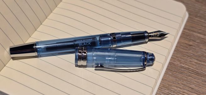
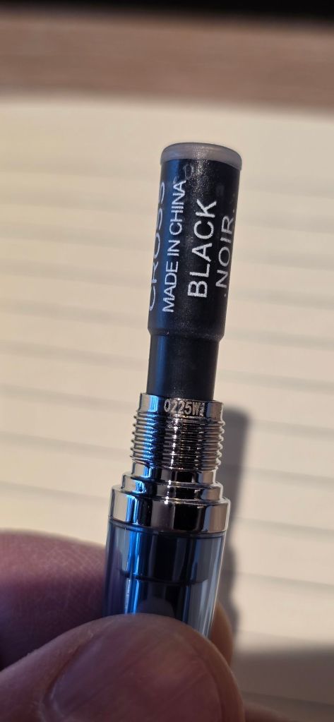
Early today, as the September morning sunshine streamed into my dining room, I sat at the table and made a list of all the fountain pens in my pen cups, and their respective inks.

In the absence of a system, my currently inked pens had grown to 28. Making a list of these seemed a good first step towards taking back some control. I have since flushed and cleaned three of those pens, which had been inked for a very long time. It is only a start but it feels like a win.

Here is the list, warts and all, complete with mistakes and corrections, smudges and diffuse sunlight.

Currently inked, 27 September 2025.

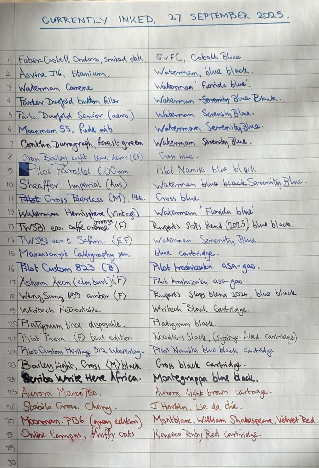
Looking back at my list of posts on this blog, I had to go back over five years to find the last time I made a Currently Inked post, in August 2020 (unless I have missed any). But reading that old post again today, I was struck by the fact that my pen cups are still “allowed to develop organically” (to put it politely), which is to say, without any strategy, rules or plan. One obvious consequence of this is that the list immediately shows my preference for blue inks. Today’s list includes two reds and two browns but very little other variety. And no greens at all, just like in August 2020!

I thought it might be helpful to share this, if only as an example of how a pen cup might lay bare the absence of method when pens are inked on a whim. There must be a great many ways in which to manage a pen collection/accumulation in a way which rotates the pens on a regular basis. I wonder how many of us have a successful system to do this, to ensure that our pen cups also have a representative selection of our ink stash, at any given time (so that we at least have one green in use for example), as well as a few different grades of nib.

Instead of such a system, my pen cups always contain a few recently acquired pens, which I am playing with and getting used to as well as some old favourites, and a mix of modern and vintage. Then there are some costly pens which I feel need to be kept in circulation to justify their cost.

Of course, we would have a faster turnover of pens in the pen cups if (a) we wrote more and (b) had less pens in use at a time. I do not like to flush pens when they are still partly full, but I have found a solution to this: I jettison the ink (unless it is black) into an ink bottle, which contains the dregs from my unfinished fills for the year. Last year’s crop produced a full 50ml bottle which I called “Slops Blend blue black, 2024”. I am using that ink daily, in my Wing Sung 699 for my diary and have been using that combination all year. It is actually a very pleasing and unique blue black! Another bottle, Slops Blend 2025, is coming along. I know that this goes against all the usual advice about not mixing inks but I have been fortunate so far. My blends have not resulted in any obvious clashes. An advantage of using predominantly blue and blue black inks, is that they can result in creating a nice new shade at the end of a year.

To impose a system on the pen cups would require (1) a list of all the pens and (2) a list of one’s ink collection to be included, and (3) a table of pairings of pens and inks alongside a calendar to show when they due for changeover.

This would sound less daunting the smaller the number of pens we keep inked at any given time. But then, if we have just a handful of pens on the go at once, although they will get more concentrated use, it will take a long time to get round an entire lifetime’s accumulation of pens.

If all this sounds like too much work for a hobby which is meant to be fun, then we (I mean I) can go on as before, just filling or flushing a few pens here and there when the mood strikes me, or when I want to use a particular ink or a particular pen.
Recently, I inked up my Waterman Carene for the first time in a long while, simply because someone in my pen club had expressed an interest in trying one. I inked it with a cartridge of “Waterman Florida Blue” which goes to show how old the cartridges were, since Waterman’s Royal Blue ink has been called Serenity Blue for many years now. Half the ink had evaporated from the cartridge, but it still wrote beautifully. I had forgotten what a good pen it is.

Whilst it may be too much work to impose a strict rotation on the use of our pens and inks, the making of a “Currently Inked” list regularly does at least give us an opportunity to take stock. It is probably a good idea to be a bit more intentional about what is inked and why and for how long. Trying to keep the number from growing too high is also sensible.

Of course this would not be an issue if we had only one or two pens and a couple of inks. Having to think how to make good use of all our pens is the price we pay for allowing ourselves to accumulate too many of them. And it is with this thought that I shall try to be mindful and sensible at our coming London Pen Show.

The Cross Bailey Light gets a demonstrator.

The purpose of this short post is to share the news that one of my favourite modern entry level fountain pens is now available in a new set of demonstrator editions.

At least, this was news to me, when I came across a display of them in a delightful stationery shop in Hitchin, Hertfordshire. I could not resist buying one. The assistant told me that she had only just put them out on display that morning and I was the first customer to buy one!

Cross Bailey Light Translucent, blue.

I am referring to the Cross Bailey Light. I first discovered these pens in our John Lewis department store back in October 2019 and then at the modest price of £20.00, for the fountain pen and two cartridges. The set did not include a proprietary, Cross converter which would therefore need to be bought separately but the pen takes their non-threaded (push-in) type. This adds appreciably to the cost, if you do not wish to use their rather pricey cartridges. Over the years, I have accumulated several more of these pens in their various colours. My favourite remains the royal blue edition which for a long time was my work pen and lived on my office desk, inked with Cross Blue. In 2023 I was away from work for a few months and missed this pen very much, as well as my colleagues of course.

Extra Fine nib only.

Until recently I was aware only of the pen being available in a range of opaque colours. It came as a surprise then, to see a glass cabinet showing a clear demonstrator version, as well as blue, pink and green demonstrator editions too.

As I have reviewed the Cross Bailey Light before, I will mention only the points of difference:

  1. Whilst there were several chrome highlights on the opaque editions, the demonstrators now get a smart, chrome ferrule to the barrel.
  2. As far as I know, the demonstrator versions are available only with an extra fine nib (marked XF on the nib).
  3. Having a see-through cap, barrel and section is a popular feature with many brands, for example from TWSBI, Pelikan, Platinum, and Lamy, to Aurora and Conid to name a few, but I think this may be a new departure for Cross. A clear barrel is the ultimate ink window. The clear cap shows the inner cap and, in particular, the way in which it clicks onto the ferrule when the cap is posted. Another benefit is that it will now be obvious if a spare cartridge is lodged in the back end of the barrel. I was asked several times in comments, why the barrel will not fit over a converter on a new Cross Bailey Light and this has invariably been the reason.
  4. A small change, but one which pleased me very much is that the demonstrator versions now include a production date code. Mine read 0225W which I take to be February 2025. I do not know what the W signifies. (I have been informed in the past by one reader that the digits on a Cross pen are not a date code – but the majority of my Cross pens do have numbers which would fit with their likely date of manufacture: perhaps there are some exceptions). The ink cartridges are dated too, which is helpful when deciding in what order to use them up.

As usual for Cross pens, it has a lifetime guarantee.

On their website, Cross call these new versions the “Cross Bailey Light Translucent” and the four colours are translucent clear, navy blue, green and pink sapphire. It comes in a simple cardboard gift box, in a cardboard outer sleeve (an improvement on the old plastic packaging).

Initially I tried the included Cross Black cartridge, but was a little disappointed that this ink feathered in the two notebooks that I had with me, a Stalogy and a Ryman A6. When I got home, I transferred the cartridge to a different Cross pen, and instead filled my new pen with Cross Blue, from a bottle, with a Cross converter – a much preferred option.

The obvious ink choice.

I was delighted with the “XF” nib which appeared to be perfectly set up, right out of the box. Despite owning numerous Cross Bailey Light pens now, mine had all been Medium nibs and so this extra fine is a refreshing change. The nib is firm and has a downward slope to it which worries some people but this is quite standard.

A perfectly tuned nib, right out of the box

I remain a big fan of the Cross Bailey Light. I recommend them to beginners as an affordable and professional looking alternative to the popular suggestion of a Lamy Safari, as the Cross pen does not have a faceted grip section and is, in my opinion, extremely comfortable and convenient to use, as well as looking smart and traditional.

A production date code? Or not?

Searching online, I found that the new versions are available on Cult Pens and Pure Pens although I bought mine for £29.00 at The Art and Stationery Store, 88-89 Bancroft, Hitchin, Hertfordshire.

“the art and stationery store”, Hitchin. (image from Google Maps)

Further thoughts and update on the Faber-Castell Ondoro, Smoked Oak fountain pen.

In my previous post on this pen, I covered the buying experience and the brief passing phase of buyer’s remorse before coming to accept and enjoy the pen. I had owned it for not quite a week.

Now, at still only two weeks in, I feel it necessary to say more about the issues I have with the pen and to correct a few misconceptions. Although mine was an impulse buy, I would recommend trying the pen before buying if possible and also to read the many online reviews – from which I now see that this model has been around for over 10 years.

To recap, the potential issue arises from a combination of two design factors, namely the short grip section and the faceted barrel. If you do not wish to grip the pen around the metal, hourglass shaped section but higher up, then your fingers meet the facets. These are fine if they correspond with where you wish to rest your fingers: but if they do not, then you are instead holding a sharp ridge between two facets, which is uncomfortable and unsteady.

At the time of my first post, I explained that on my pen, when the barrel was fully tightened, the facets stopped with a ridge in the centre, or “12 o’clock position” (if viewing the nib head on).

Nib aligned with a ridge between two facets.

Of course, we want to hold our pens comfortably and in such a way that the tipping of the nib touches the paper at the smoothest angle, to write well without scratchiness or skipping – “the sweet spot.” Depending on an individual’s writing style, – whether they be left or right handed, whether an under-writer, over-writer or side-writer, facets may or may not be helpful.

The big news that I wish to share, is that the wood barrel sleeve is not attached to the metal inner barrel (which I presume is brass) and can be adjusted. At least, I am speaking for my own pen only and have not examined any other samples. Thus if the facets are not where you need them, simply twist the barrel firmly a little way beyond its tightest point. You do not need to move it far. You may line up the nib with the flat surface, or a sharp ridge, or perhaps half way between these points as a compromise.

I discovered this by accident when I noticed that after capping and uncapping the pen for a few days, the barrel ferrule was sinking down inside the barrel.

Barrel ferrule, retreating into the wood sleeve.

When I unscrewed the barrel, I found that the metal barrel liner, was beginning to protrude.

Barrel liner, pulled forwards by the act of uncapping the over-tight cap.

Having discovered that the barrel sleeve could move over its liner, I tried pushing the liner out further (using an empty plastic cartridge and pushing the barrel down against a hard surface):-

More of the barrel liner exposed.

The good news: You can therefore twist the wood barrel sleeve to adjust the position of the facets in relation to the nib, if you need to. For example, if a flat facet at the 12 o’clock position suits you best, just twist a few degrees and you are there. It is a bit like the feature of the Parker 75 which allowed you to rotate the nib for the optimum writing – a solution to the problem caused by adding facets to the grip section.

Barrel turned to align nib with a facet.

If you like the nib aligned with a facet, this also has the added bonus of enabling you to cap the pen with the pocket clip aligned to the nib or to post the cap thus aligned, (although writing with this cap posted will make the pen unbalanced).

The bad news: the barrel is not meant to move on the liner and moving it will soon make it loose. Two new problems are caused by solving the facet issue: (1) when you uncap the pen, the nib section and barrel liner, are pulled forward out of the barrel sleeve and (2) when you go to unscrew the section, instead of unscrewing, the barrel liner rotates in its sleeve.

Experimenting with nib-to-facet angles, I found myself suffering FOMO: this was made more complicated by having more than one writing style – whether under or over writing. “Am I missing out on a smoother writing experience, if only the barrel were turned a few more degrees?” The angle for one writing style was not the same as for the other. Imagine the distraction and stress of having this thought if you were taking an exam.

Already after only a few days of experimenting, my barrel was getting looser and I noticed a gap between the section and the barrel appearing, each time I pulled off the cap. It is a pity that there is not a screw, or a hex nut we can tighten in the barrel liner, to arrest this movement. I have stuck a little Sellotape on the barrel liner to try to make it a tighter fit.

In conclusion, I do actually like the pen. Theoretically having a facet against your finger, should give a steadier grip than if the only points of contact were rounded edges of a tube. The facets certainly look bold and attractive – especially as they are echoed in the metal cap. (Incidentally, the cap is made of metal, although the metal is thin and it has a plastic liner).

When I bought the pen, I was on my way to see a concert of music by Frederick Delius. The piece, a cantata entitled “A Mass of Life” is quite a difficult listen – a huge, powerful, exuberant, out-pouring of passion – which probably needs to be heard more times than I have yet given it, to enjoy and appreciate it properly. Meanwhile, you might think “Why bother with this, when there is more readily satisfying, melodious and recognisably-structured music available?” Perhaps there is an analogy here with the Ondoro: it is a challenge but there is nothing quite like it and it is worth the effort of persevering. Or perhaps I am just making excuses for a flawed pen or one that was not suitable for my particular grip?

The nib is excellent. When it is writing smoothly, I can happily write or doodle with it. I sometimes think that a writing sample reveals more about the comfort of a pen: how neatly can I write with it? If the writing is shaky and rushed, it suggests we cannot wait to put the pen down. If it is neat, then it shows the writer to be relaxed, comfortable and at peace with the pen!

If I were to give up on the pen, then at least the nib unit can be transferred to the Faber-Castell Essentio, a cylindrical and facetless aluminium pen that I bought last year. But it has not come to that yet!

Ondoro beneath a Faber-Castell Basic and the aluminium Essentio.

The pen does make a nice companion for my Ashera fountain pen, hand finished in multi-lacquered elm burl wood. The Ondoro is not lacquered and polished but its wood is faceted and is Smoked Oak (not just stained to look like it) – a chemical process which I imagine adds a bit to the cost. It is not correct to say that the wood is untreated.

The Oak and the Elm: the Faber-Castell Ondoro next to an Ashera Aeon fountain pen.

The Ondoro might not be my favourite pen – at least not today. But I am using it every day which is a good sign.