
Recently I had a rare treat. A pen friend in Australia asked if I would do him a favour and take delivery of a pen for him, that he was to order from Izods. He gave me free rein to open it, to test it out and use it as much as I wished and even to review it. To add to the fun, he did not tell me what pen it was.
The pen duly arrived, lavishly wrapped by Roy of Izods and was in fact a Graf von Faber-Castell Classic Anello (the version with inlaid metal rings along the barrel) in Ebony.

Description.
This is a luxury pen, priced towards the bracket at which stationery becomes jewellery, but with a great deal of attention to detail and no compromises in the exquisite 18k gold nib, for a wonderful writing performance.
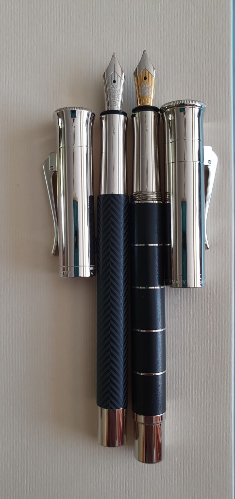
Graf von Faber-Castell (“Graf”) is the luxury arm of Faber-Castell. This is a slender but weighty pen, with the distinctive highly polished cap with a flared top, which reminds me of the funnel of Stephenson’s Rocket, of 1829, contrasting with the warm texture of the black Ebony segments in the barrel, with four platinum rings.

The cap has a sturdy hinged and sprung pocket clip, above which is the brand’s coat of arms. The name Graf von Faber-Castell appears on the rim and “Germany” on the other side.
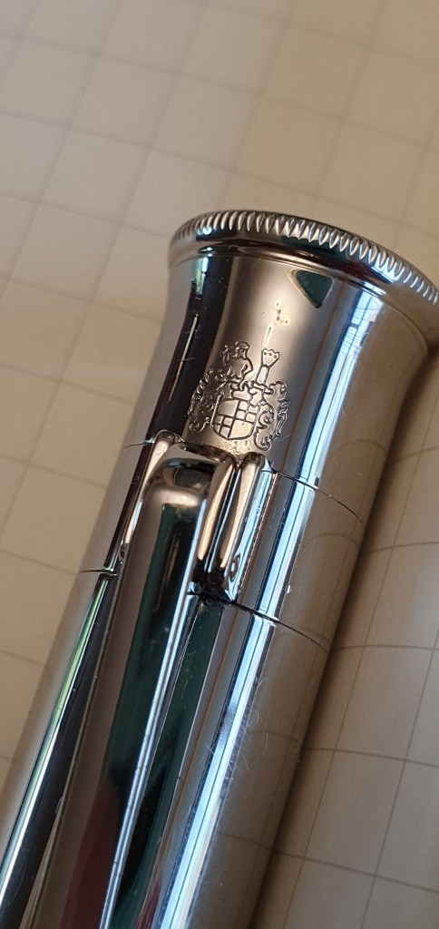
The cap unscrews, in three-quarter’s of a turn. The cap feels very secure with no wobble and no fear of coming undone by itself.
The section is long and slender, tapering gently towards the nib but then flaring out again, creating a natural curve on which to rest the pen on your second finger as you write.
At the other end, there is a shiny plated metal knob, shaped to allow the cap to be posted. However, posting is not advisable as the pen becomes very back heavy and about 175mm long.
The nib.
This is a stunning piece of work, in bi-colour 18k gold, the front part and the coat of arms picked out in silver coloured plating against the gold background. This one is a Medium nib. Although I take it that this is a pre-owned pen, the nib looked perfectly set up and with a generous amount of tipping and no signs of wear.
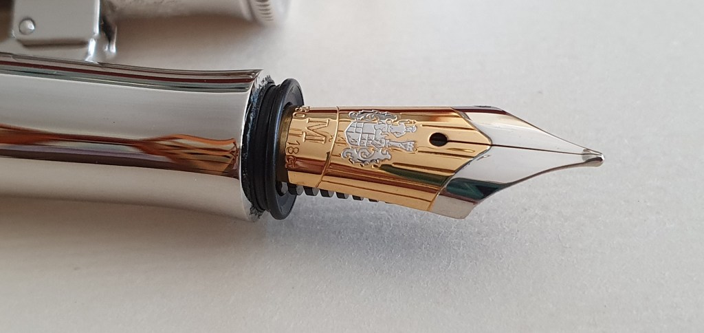
According to Graf’s official web-site this is a handmade nib, run in by hand and with a manufacturing process that involves over one hundred steps. This is a polite way of saying “Please don’t drop it, you ham-fisted oaf.”
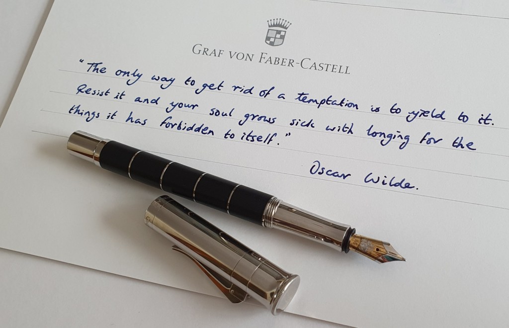
I was thrilled to dip-test the pen. I reached for my customary Waterman Serenity blue, and spent a very happy few minutes enjoying this smooth and springy nib, on a variety of different papers. The wetness from this initial test and the degree of feedback seemed spot on to me. I later filled the pen with Graf’s Cobalt Blue, probably my favourite dark blue and the pair seemed made for each other.
Filling.
This is a cartridge-converter pen, taking either standard international cartridges (look no further than Graf’s Cobalt Blue!) or a converter. The pen arrived with a Faber-Castell branded converter, which worked well and drew up a decent amount of ink.
The section unscrews from the barrel on very long screw threads, which are metal to metal. These will be hard-wearing but I noticed the occasional tendency to come loose, whereupon the section just needs tightening again.
On the rim of the cartridge-converter holder, I found the markings “031011 PT” which I presume to be the date of production in 2011. For comparison, my Graf Guilloche has the markings “010717” here. Even Graf’s ink cartridges have a date mark which I think is a very nice feature.

Size and weight (approx.)
The Classic measures 138mm closed, 130mm open and 175mm if you try posting. The whole pen weighs about 41g comprised as to 27g for the pen uncapped and 14 for the cap.
Likes and dislikes.
This pen is hard to beat for sheer elegance and sophistication. The flared cap with its smooth, secure, precision fitting threads works perfectly. I have not noticed any hard starts, after intervals of over 24 hours. The pocket clip has a good amount of movement and is reasonably tight although personally I would carry the pen in a pen case rather than a jacket pocket. The contrast of materials and textures from the almost black Ebony wood and polished furniture is very pleasing. But although this is clearly a luxury item, it is no less a fountain pen and the nib should delight any pen fan.
On the negative side, the grip section is slim, tapering and slippery. Personally I like to hold pens quite high up and for this pen, I have found a grip where the section rests on my second finger, my first finger is at the threads and my thumb anchors the pen at the wooden barrel, which is not slippery. Fortunately the 130mm length uncapped still allows the pen to sit just about comfortably in the web of my hand although I sometimes find myself holding the pen slightly more upright like a ball point pen.
Comparison with the Graf Guilloche.
I have a black Guilloche, with a Broad nib. Although they share a similar style, the Classic is superior in having extra weight, length, and girth, a threaded cap and a bicolour nib.
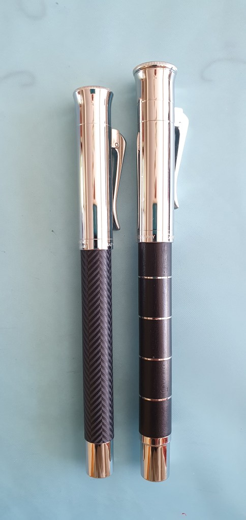
However, it appears to me that the nibs are the same size and that the only noticeable difference is that the Classic’s nib is bi-colour. Fun fact: the nib and sections of the Guilloche and the Classic are interchangeable and so if you have a different nib in your Guilloche, you can simply screw the Guilloche’s entire nib, section and converter, into your Classic Anello body.

Conclusion.
The Classic is a lovely pen. I am sure that my friend will be happy with his purchase (when eventually he can collect it). I know that as a long term user of pens with plated metal sections this is not an issue for him.
For me, whilst I appreciate the pen’s artistry and quality, the grip would take a bit of getting used to and whilst I am able to use the pen, I do not yet find it the most comfortable. But I anticipate that with time I would get more used to that, particularly whilst swept away by the superb nib which sings along the page. But to do that would mean to bond with the pen, of which in this instance, I am its temporary custodian.
For further reading, see Graf’s official web site. It seems from this that currently there are four versions of the Classic Anello fountain pen, namely the Rose Gold, Grenadilla, Ivory and Black. There is currently no mention of Ebony or Pernambucco. See also the excellent reviews of versions in other woods by UK fountain pens and The Gentleman Stationer.

The ebony version was dropped about 2.5 years ago. I was very fortunate to pick one up for the 50th birthday present for myself though I had to buy it a few months early and think I got one of the last around.
The pen can take a reasonable bashing – you reminded me that I had mine attached to the Midori Traveller Journal I just throw in to my work bag (forgot that in my last post) and so it would be bashed around a little in the bag without any problems or marks.
On the nib 0 it is also the same as on the Intuitions with the exception of the wooden versions of Platino variant, which have a size 6 nib instead. The acrylic Platinos (as I have) still have the same #5.
LikeLiked by 2 people
Thank you for this helpful further information. That explains why the Ebony version of the Classic Anello is not on the web site now. It is good when pens have their production date etched on them.
LikeLike
mind asking you about the ebony version (wooden) and is it the classic or the intuition fluted is a different version. I don’t know which pen have the #6 nib on and would love to also get acquainted if the ebony is wood plz
LikeLike
I really like the look of the Graf von Faber-Castell pens, and they are one of the few brands in the luxury arena that I really lust after. I’m with you 100% on the Graf von Faber-Castell Cobalt Blue ink. I’m also enjoying their Electric Pink at the moment.
LikeLiked by 1 person
Thankyou. I recently found that Cobalt Blue does not bleed through the paper in Moleskine notebooks, which is handy. I also like their Garnet Red and Moss Green very much too.
LikeLike