2023: some of my fountain pen highlights.

I usually start this exercise by looking at how many pens I acquired over the year and how much I spent on the hobby. 2023 saw me acquire 39 fountain pens, of which four were gifts for others, so 35 for me. The total spent was £1,676.19: not too terrible.

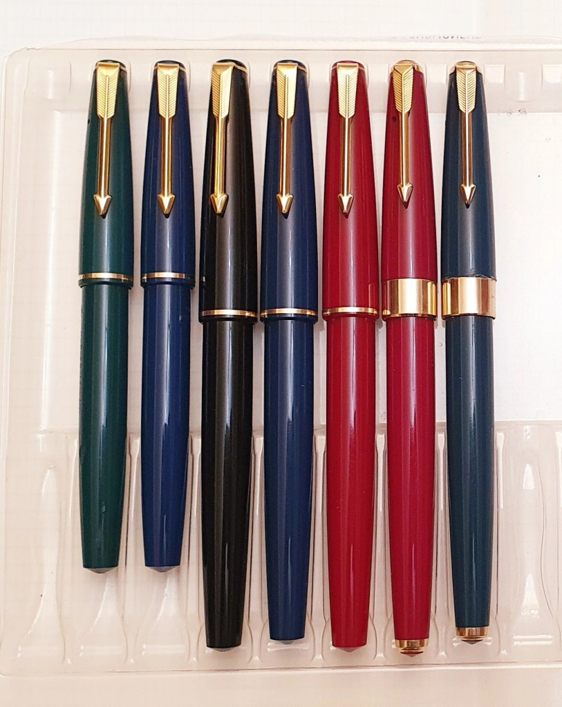
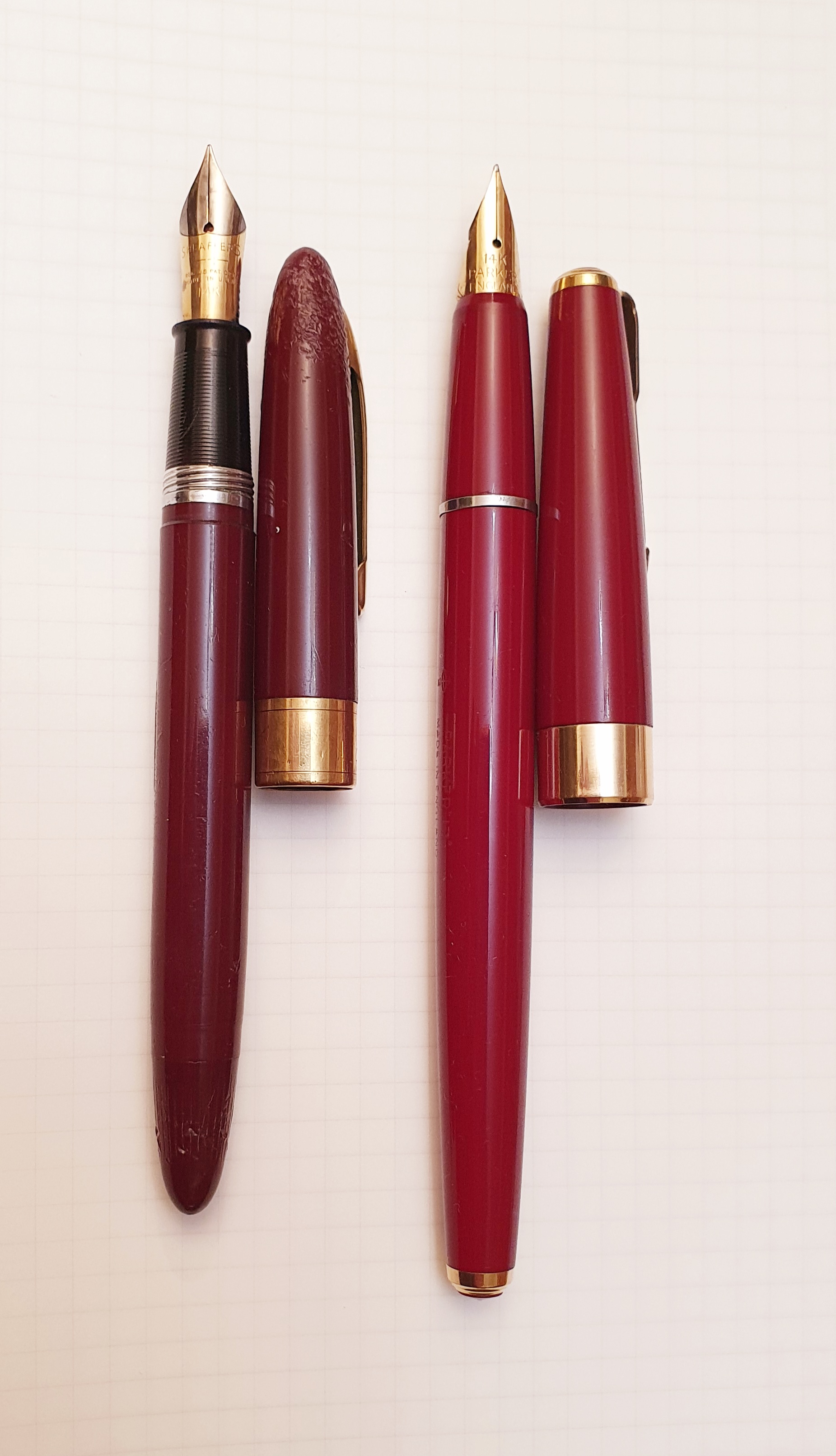
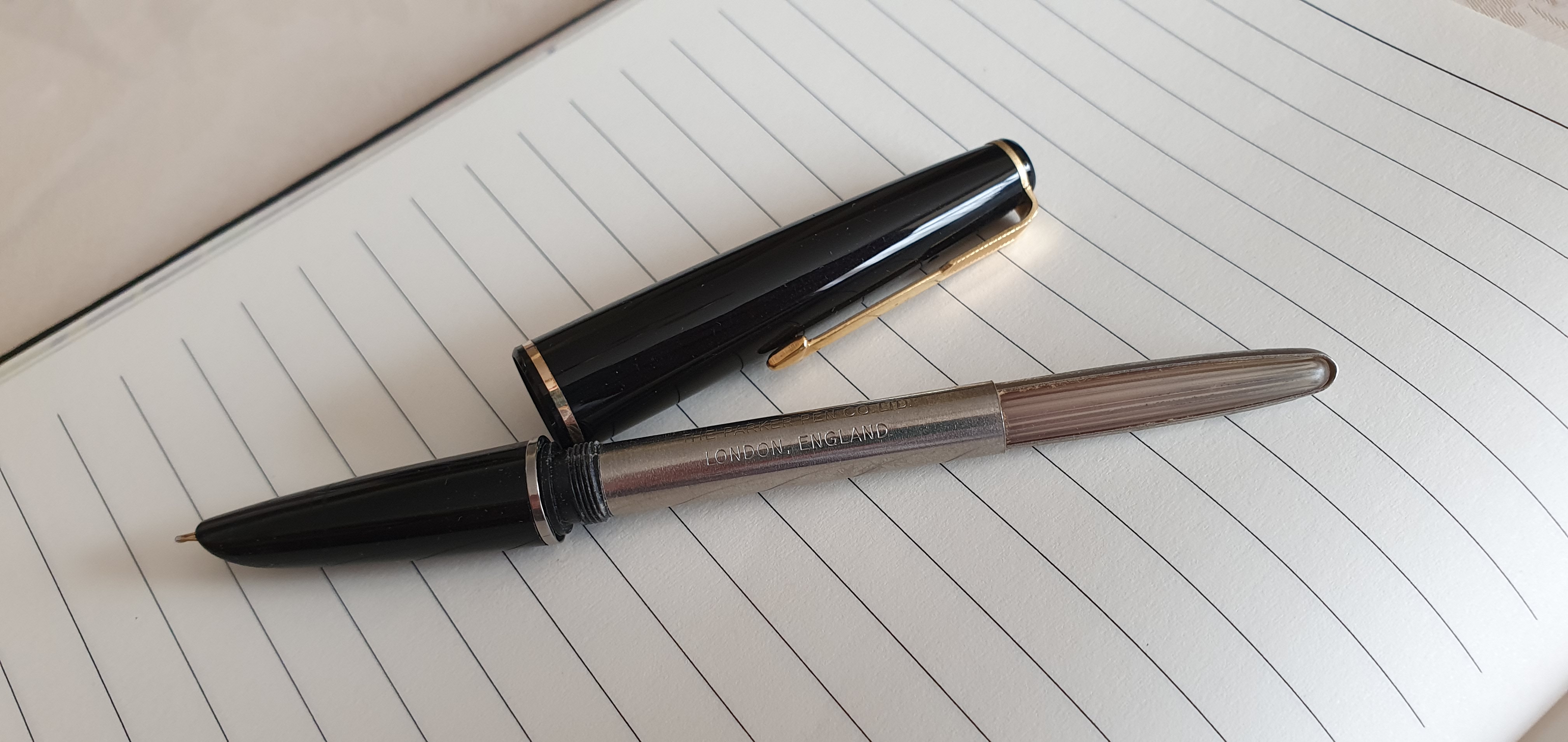
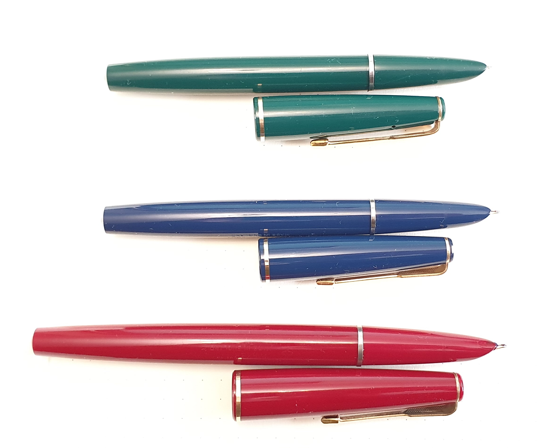
A strong theme throughout the year was vintage Parkers, mostly bought on eBay plus a small number at the London Pen Shows.

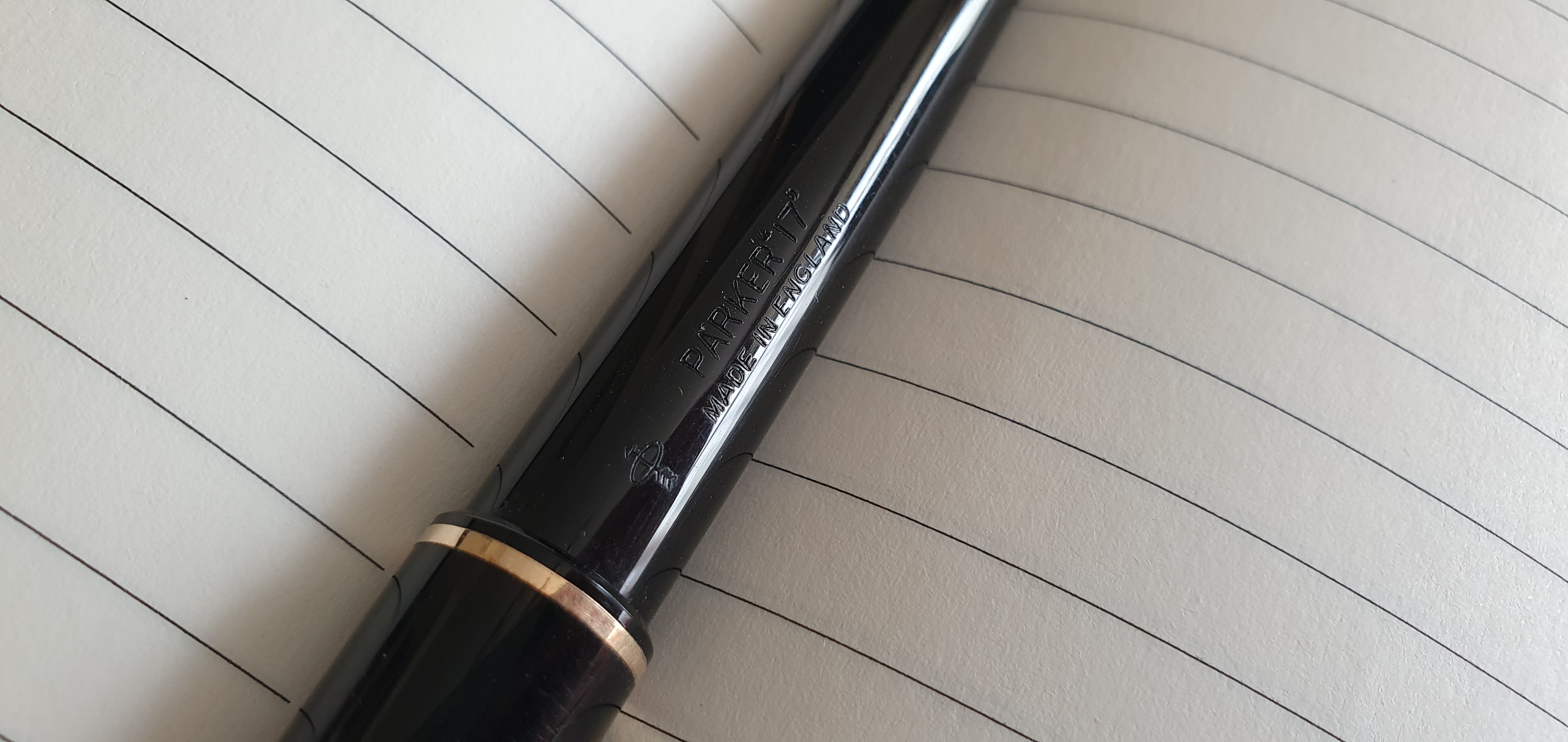
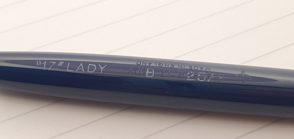
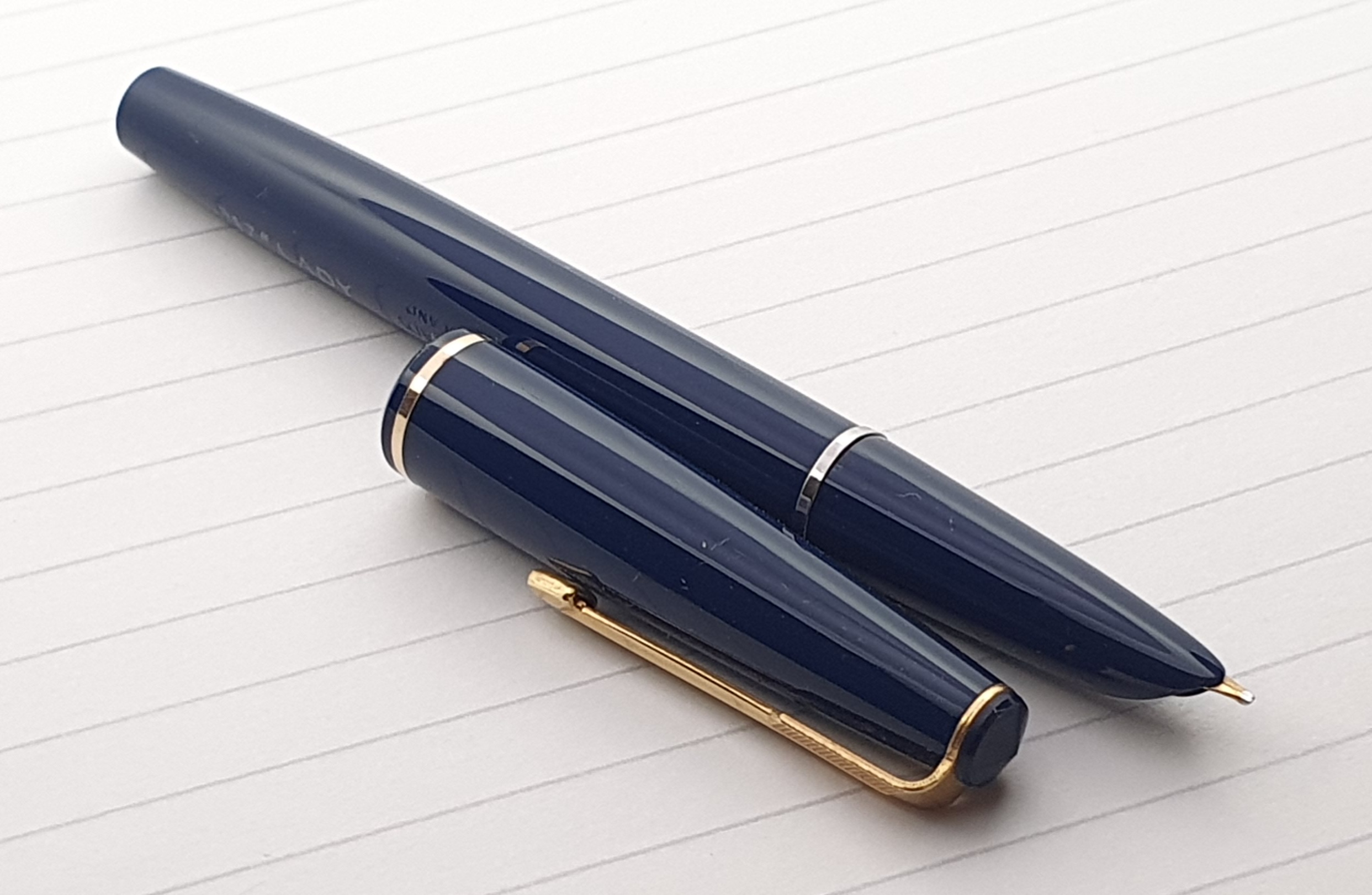
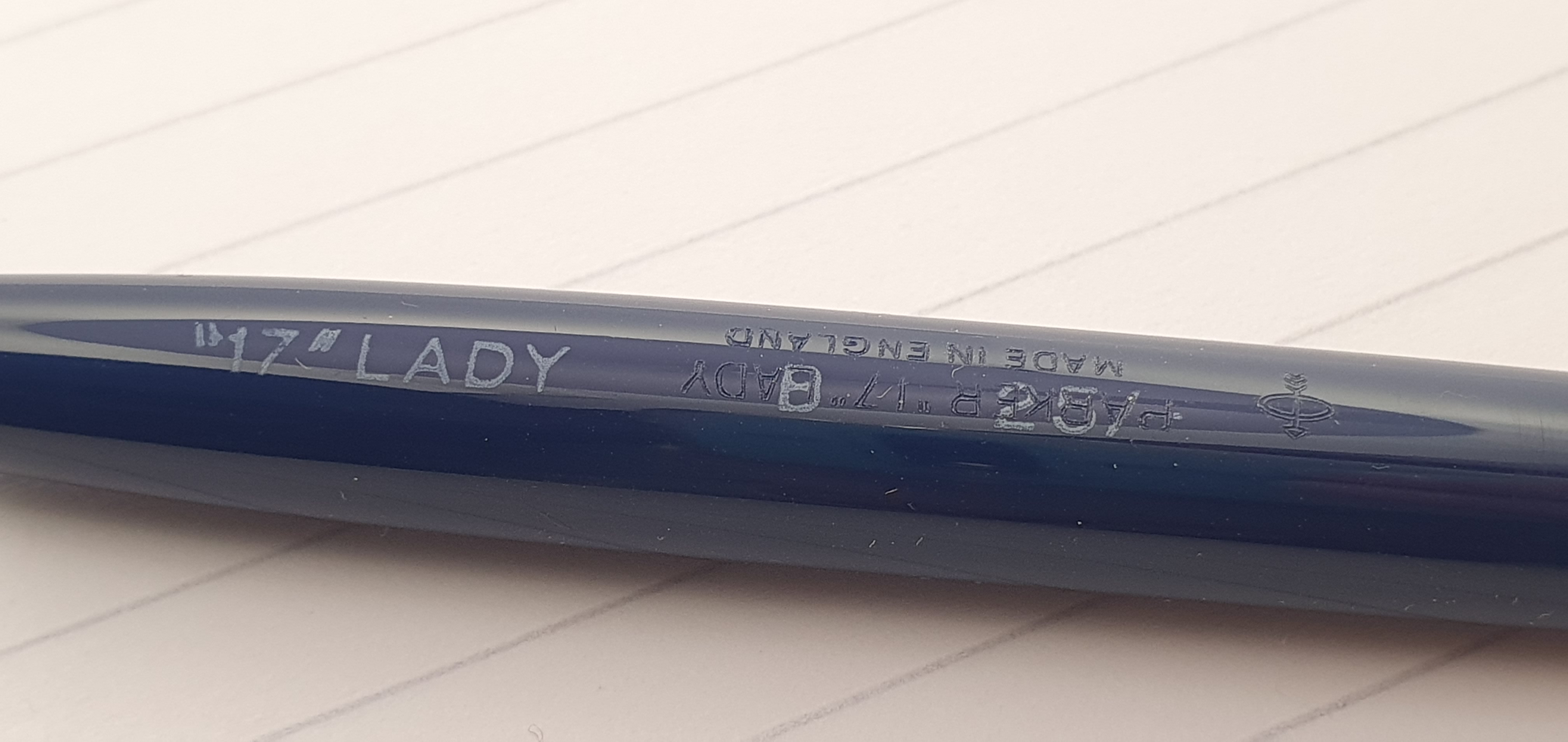
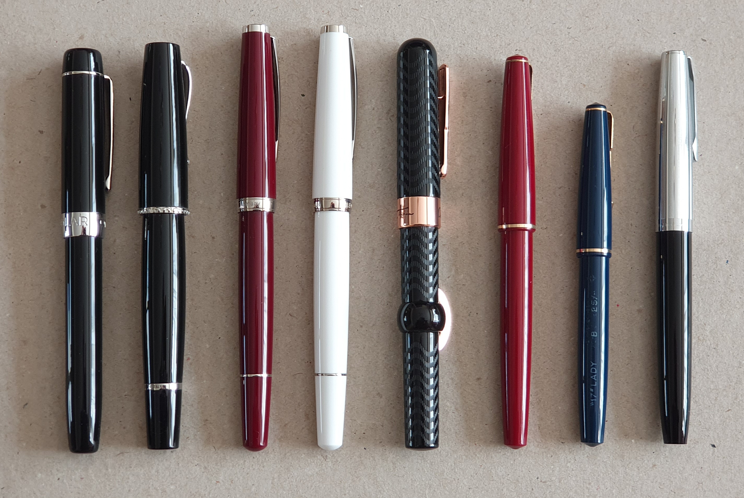
Always late to the party, this was really the first year in which I started looking for and buying vintage pens on eBay. Of the pens acquired in 2023, 15 were vintage Parkers and the remaining 24 a mix of other brands. I would search a make and model, say “Parker 17 fountain pen,” for example. This might find several hundred listings, which I would whittle down by filtering the results to UK only and then sorting them in order of auctions ending soonest.

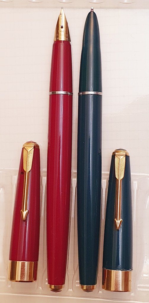
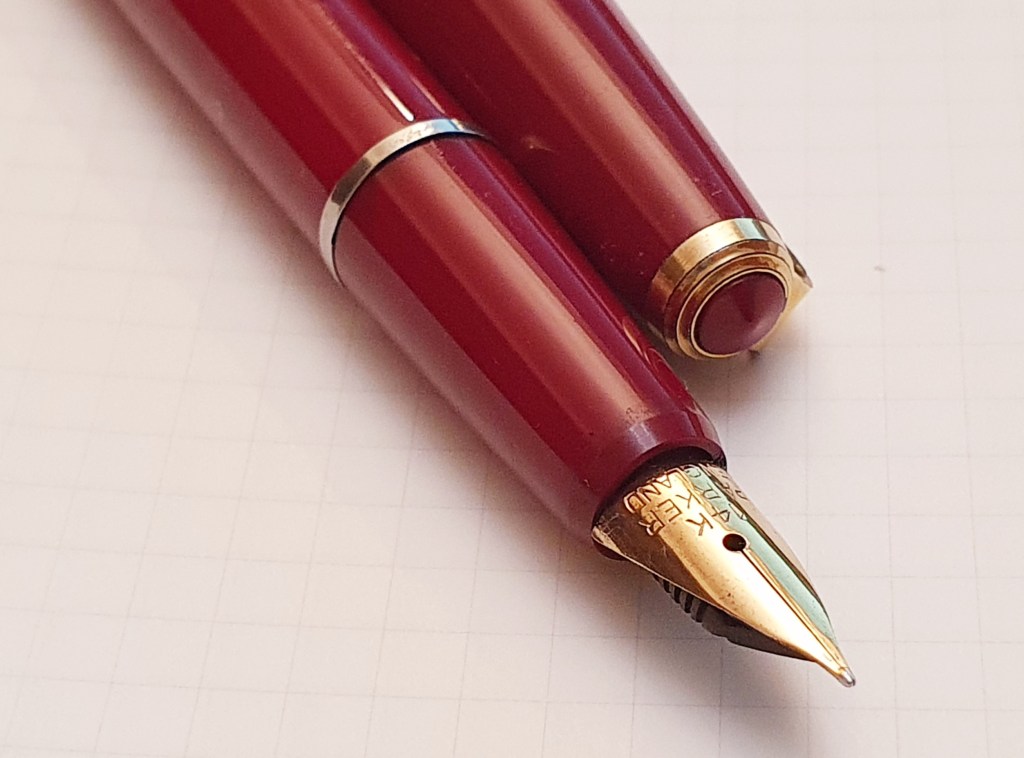
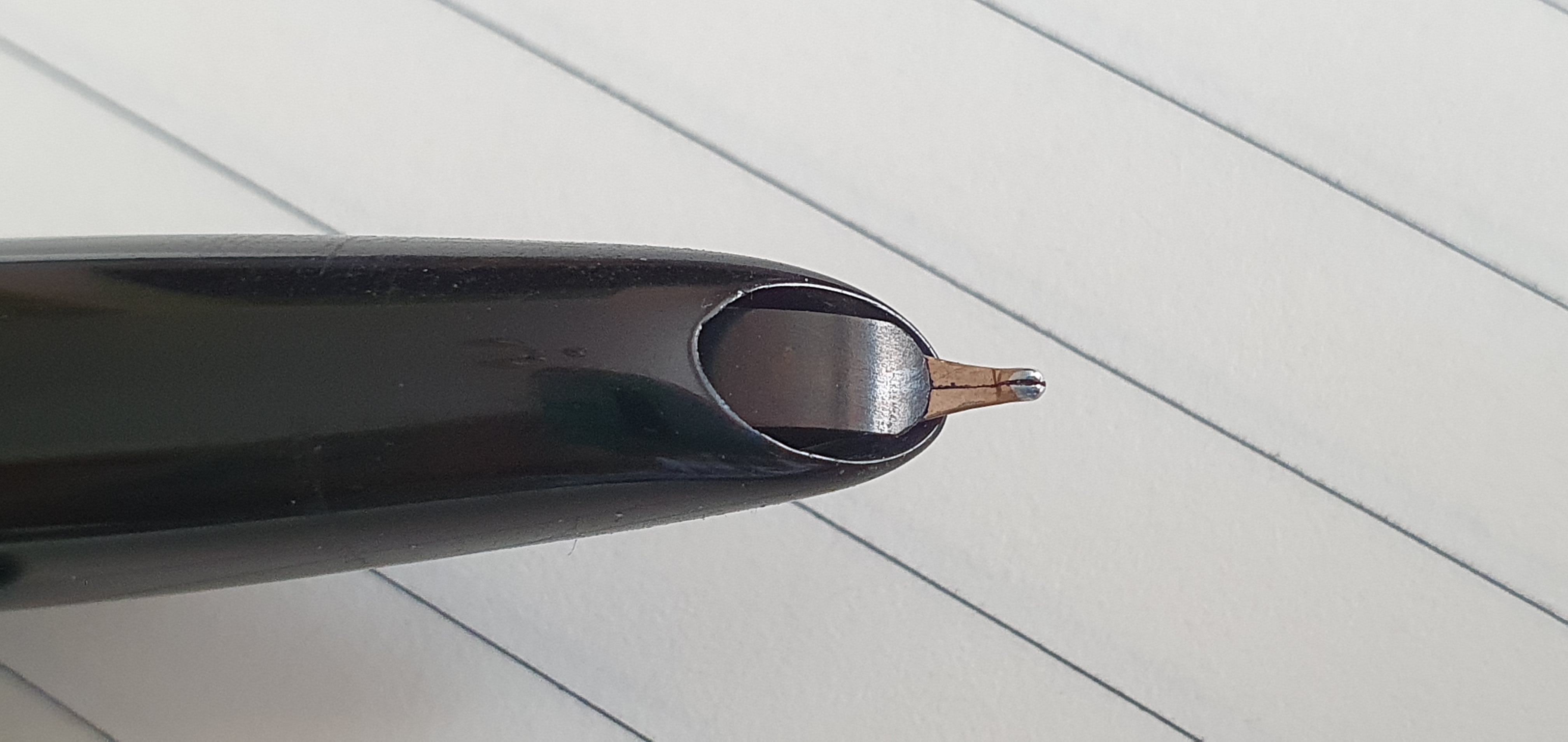
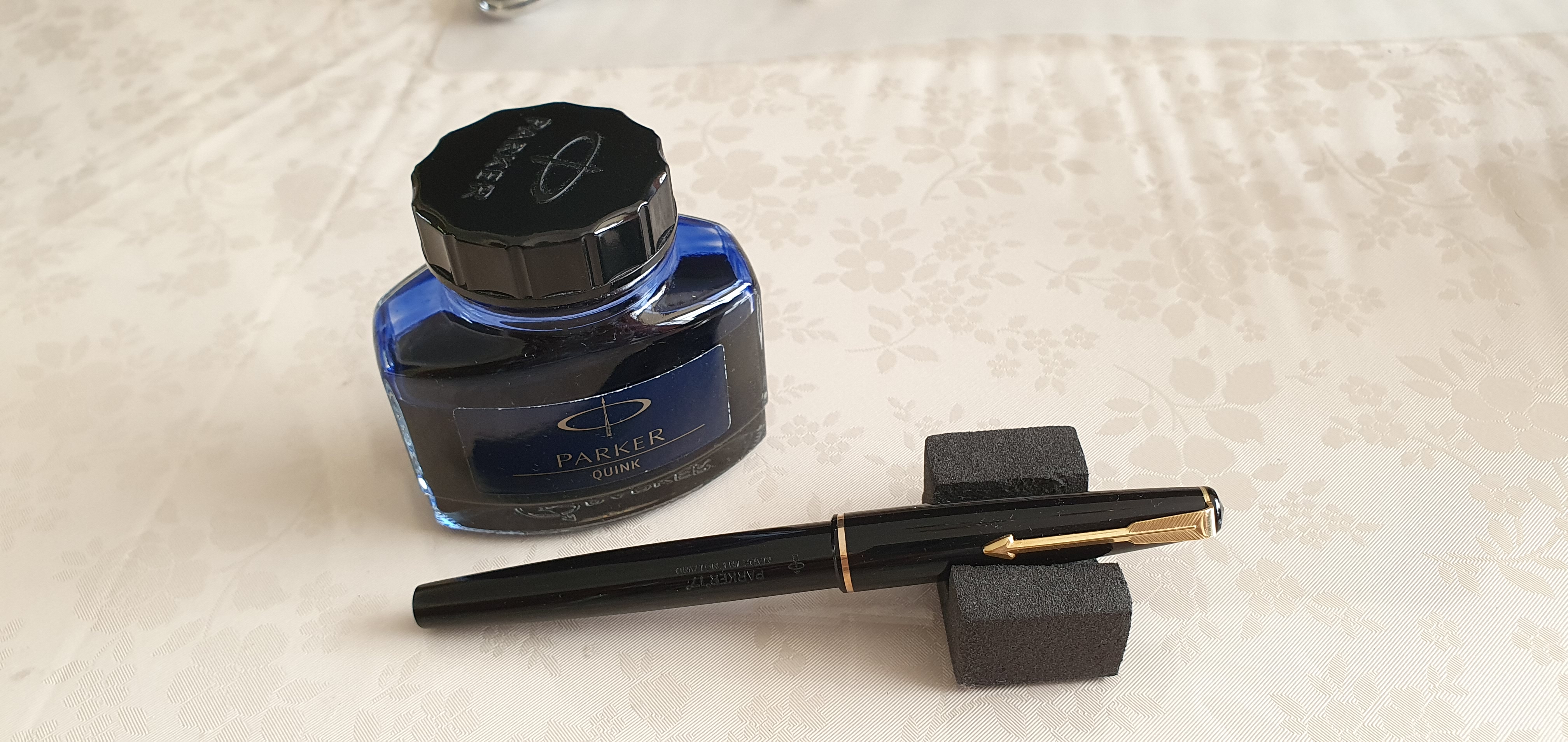
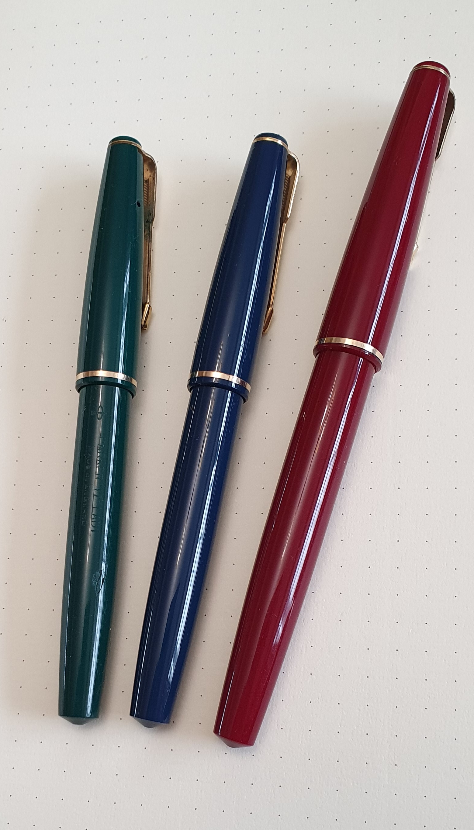
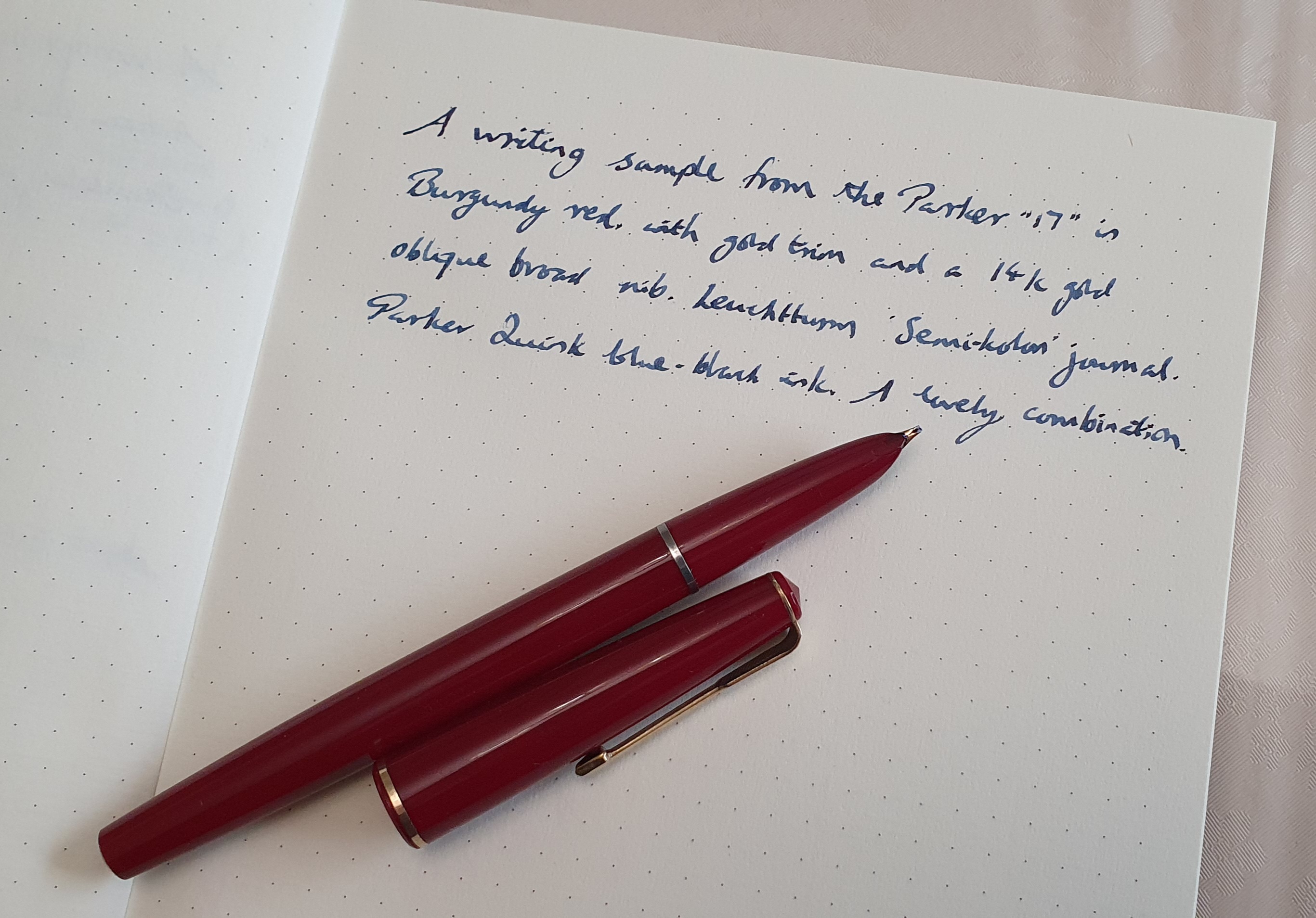
Occasionally, a special item would come up, such as a Burgundy red Parker 17 Super Duofold with the early “beak” nib, which I would set my heart on winning. In the days leading up to the auction, I repeatedly checked how the bids were going and always stopped to look at the close-up photographs, particularly of the nib, front and back. Happily I was successful and that pen is now mine.

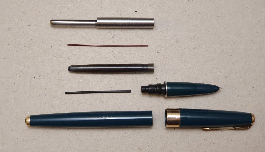
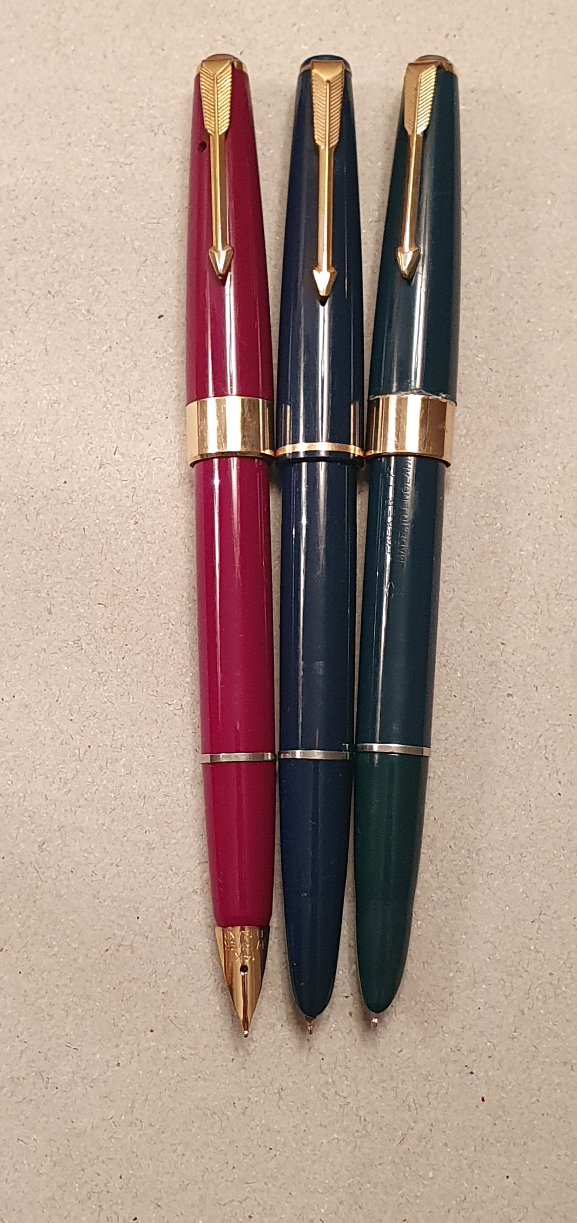
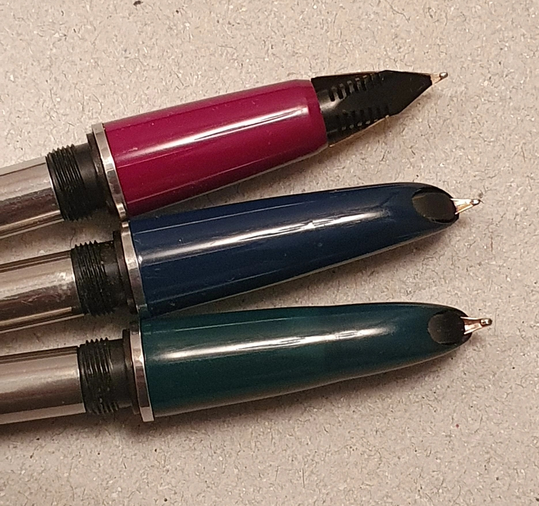
After buying a number of Parker 17s, with their 14 carat gold hooded nibs and hooped squeeze-bar fillers, I moved on to the Parker 61. Again with so many for sale I decided to be choosy and ignored any with the inlaid arrow missing from the section. By the end of the year, I had acquired four Parker 61s. Two were the early, capillary fillers, with one of these being the “Heirloom” (with two-tone rolled gold cap also called the rainbow cap). Two were cartridge or converter fillers; one was a Flighter; one was Made in USA and the others all Made in England; so, a good cross-section.

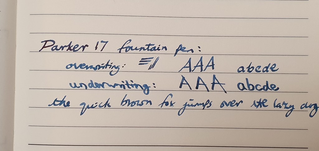
I was thrilled when a Parker 51 with an oblique nib came up and again when I found a Parker 45 with an oblique medium nib. Both are great for me to use in lefty-overwriter mode.

Some of my 2023 vintage Parker finds.

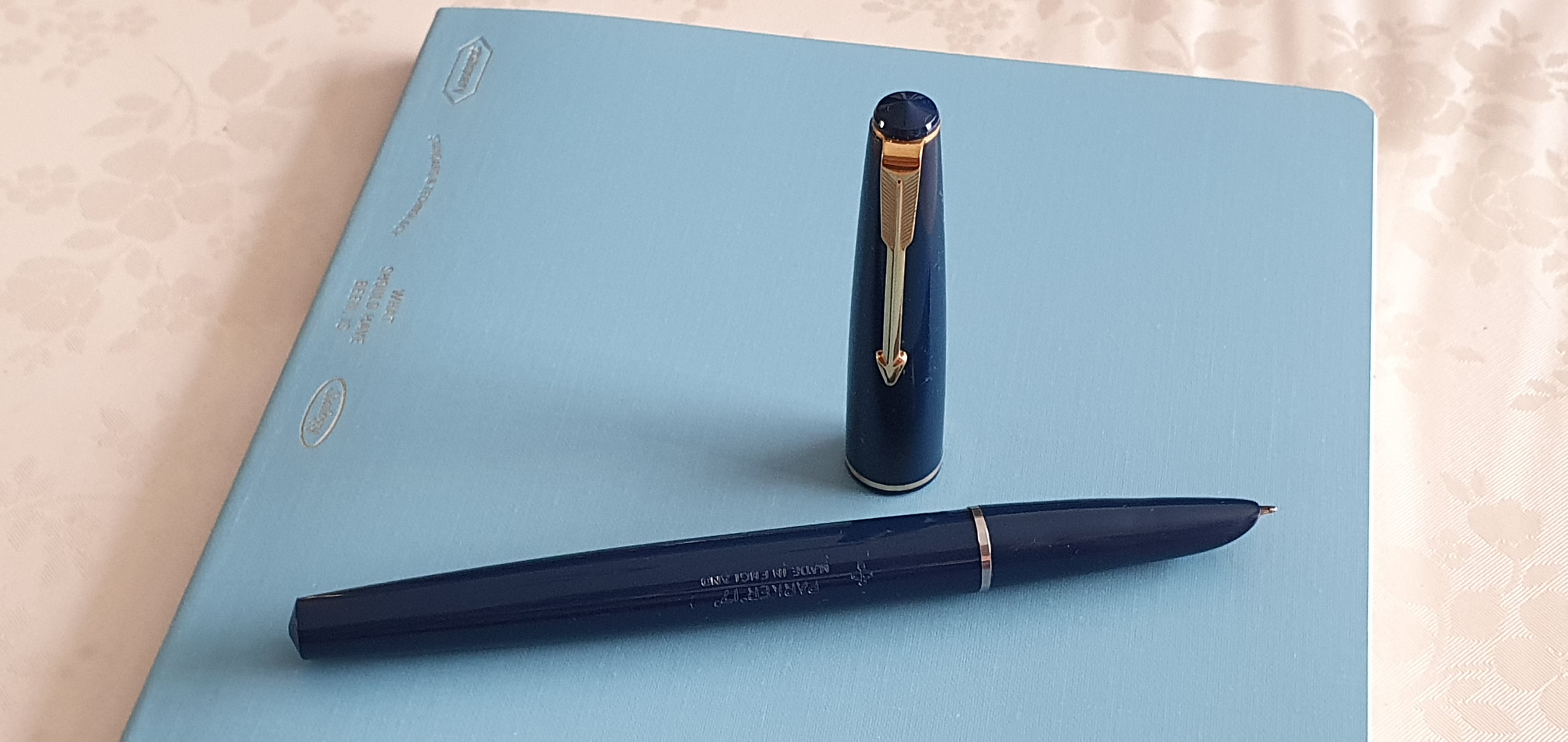
Eventually, my wife expressed concern that my buying of Parkers on eBay was getting “out of control,” and that temptations would be never-ending, since hundreds more pens come on the market every day. True. We agreed that a recent, lovely teal Parker 61 would be my last. 

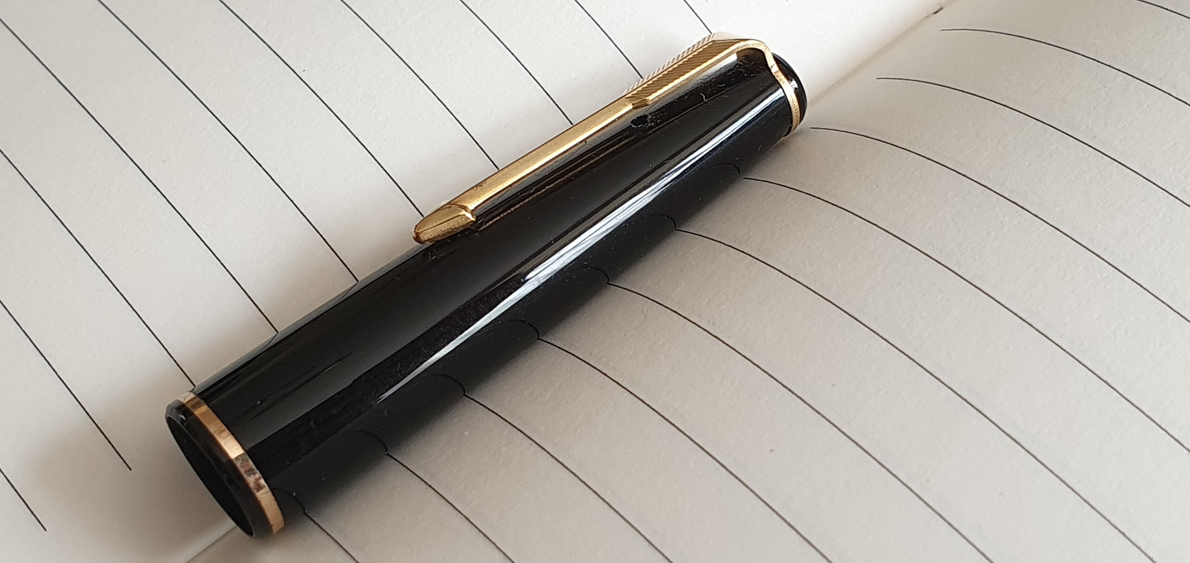
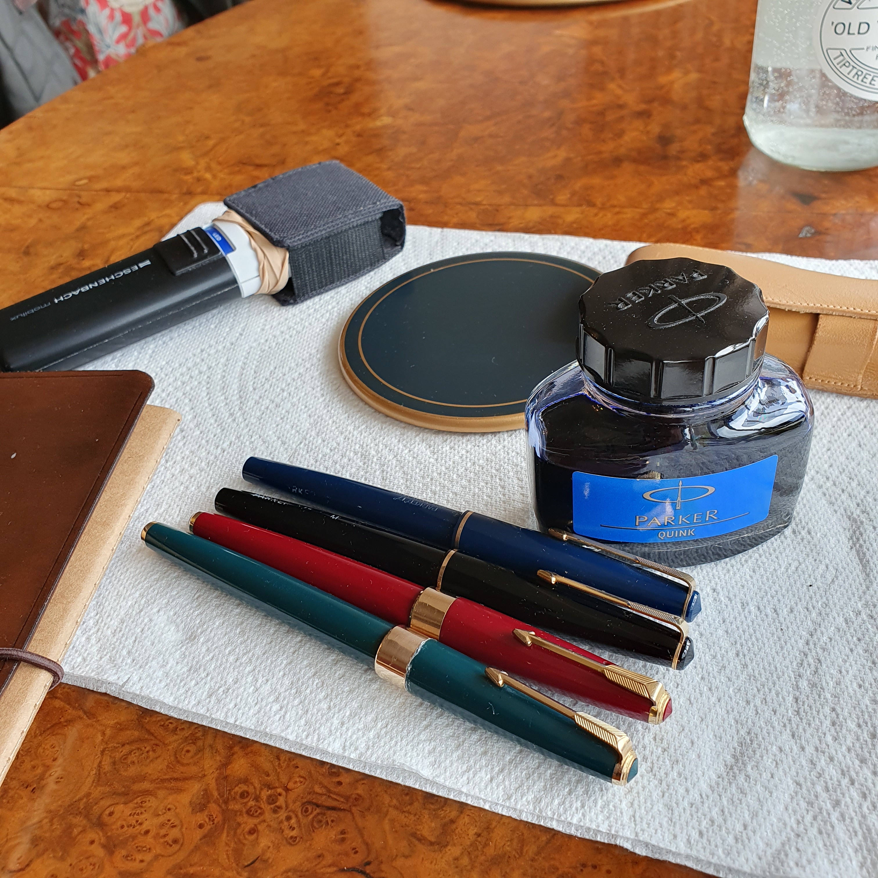
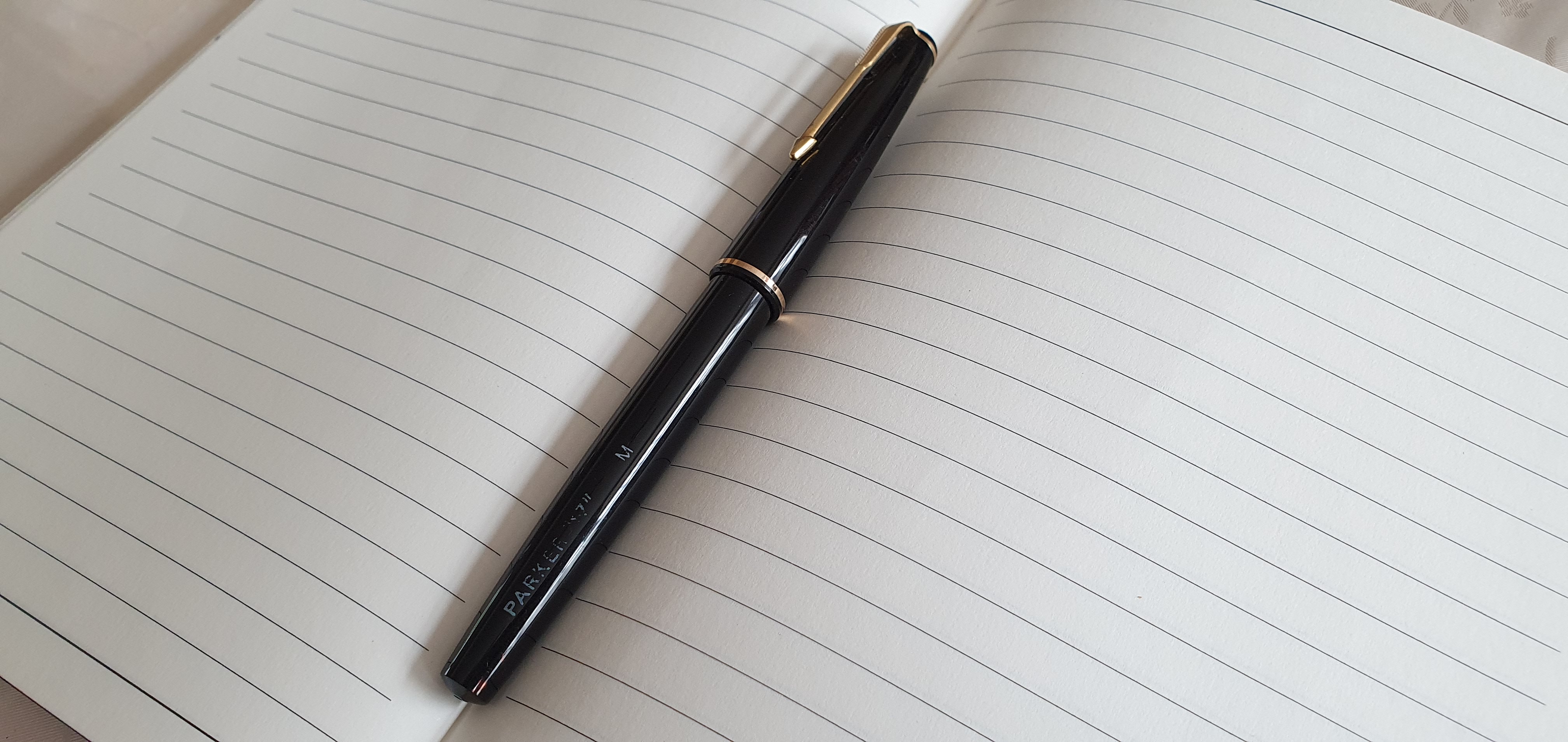
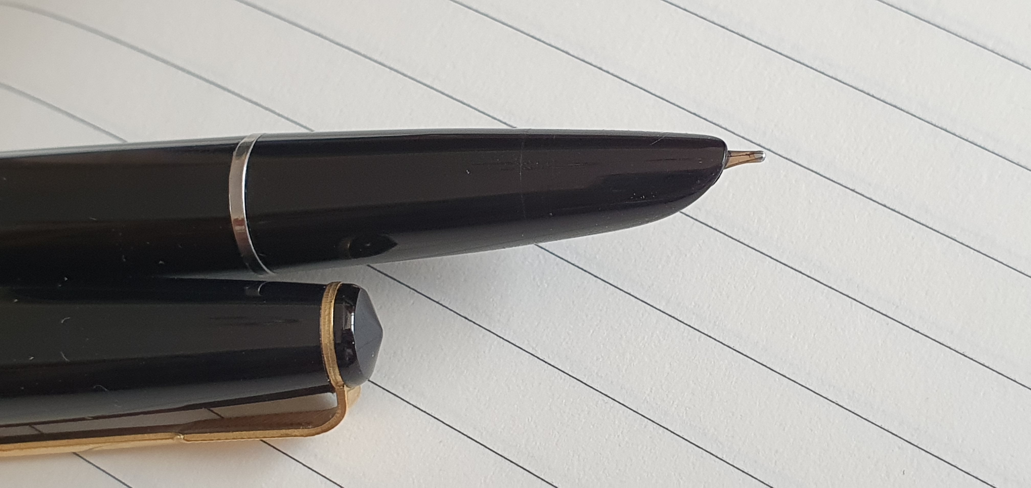
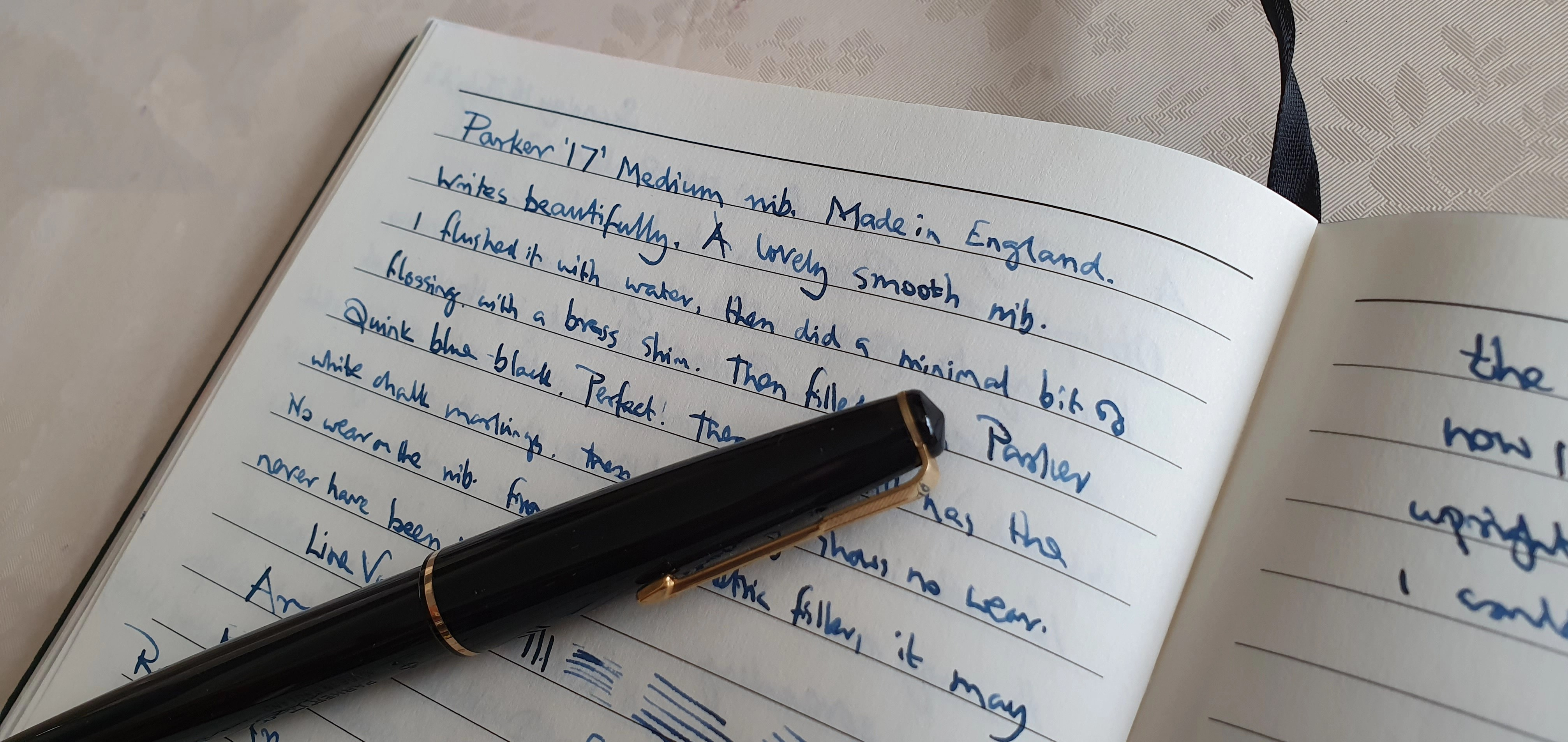
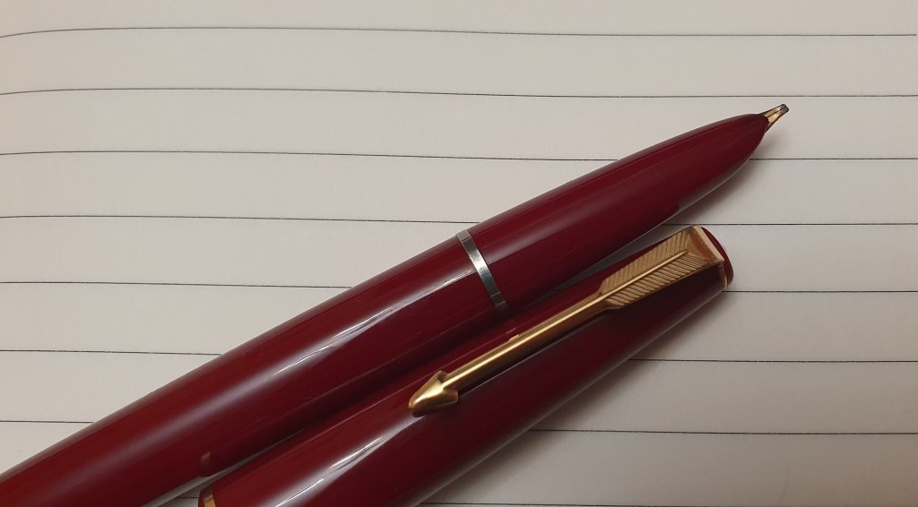
It was about this time that I happened to spot a black Parker 45, with a 14 carat gold Medium nib, in great condition. I zoomed in on the close-up nib photos and made screenshots of them. It was only £24.99 “buy now or best offer”. I held out bravely for a few days but then received a thoughtful notification from eBay that the seller had dropped the price to £19.99! This was too much to bear. I knew from the photos that the pen would write like a dream. A vintage Parker, with a pristine gold nib at less than the price of a new Parker Jotter or Lamy Safari. I could not not buy it. Then a solution came to me: I would buy the pen, but as a gift for someone else!

The pen duly arrived. As it was to be a gift, I had to check it first, flush it and test it out. The nib was as wonderful as I had imagined and needed only a light flossing with a brass shim and a rinse. I separated the nib and feed to clean and photograph them. The sac puffed out air bubbles into the water and all looked well. I dried the pen and filled it with Waterman Serenity Blue. It was a joy to write with. Ink flow was ideal, once I had ejected about three or four drops of ink.

I decided to “test” the pen over a few days. Big mistake. This pen was exceptionally enjoyable and I bonded with it. With Serenity Blue, it wrote like my Pelikan M800. There was no way I could part with it. Instead, I gave the intended recipient a lovely new fountain pen of equivalent price.

Of the remaining brands represented in my 2023 acquisitions, these included a flurry of Jinhaos, first the X159 and later the 9019 and 82 models. After trying these, the most enduringly successful seem to be the blue demonstrator version 9019 with an EF nib and filled with Diamine Tavy blue black and the 82 in Caribbean Sea Blue with gold trim, F nib and the same ink. Both start immediately after long intervals and write smoothly with good flow.

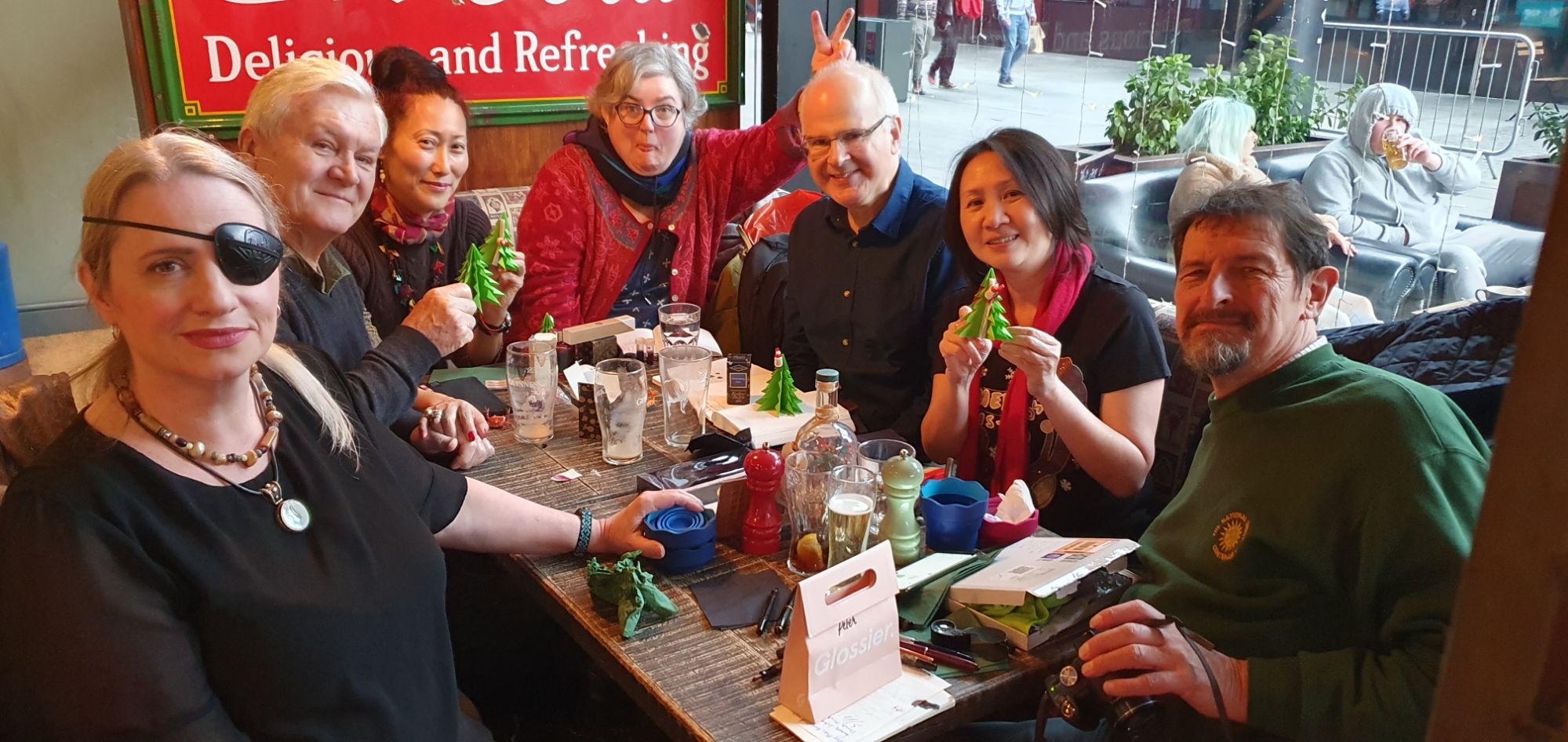
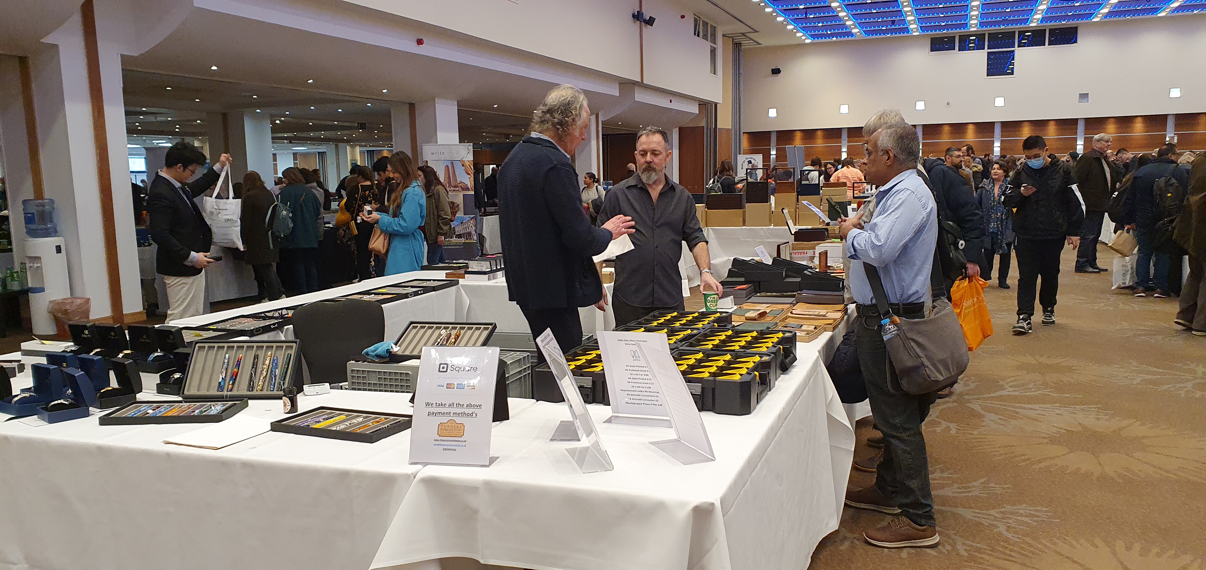
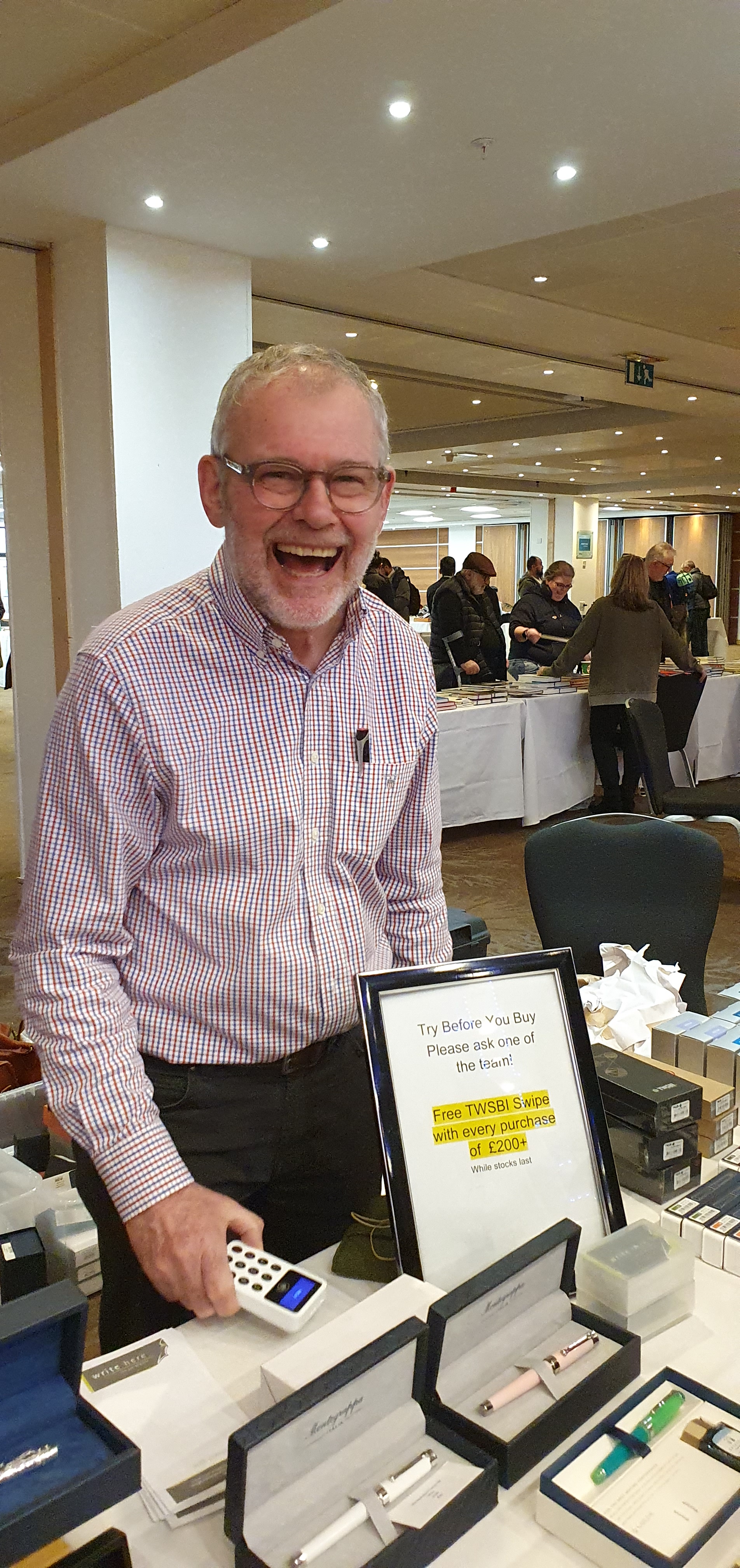
I greatly enjoyed the London Pen Shows in March and October. These are always joyous days, running into numerous friends from the online fountain pen community and talking to the sellers. Some of my favourite buys of 2023 were:

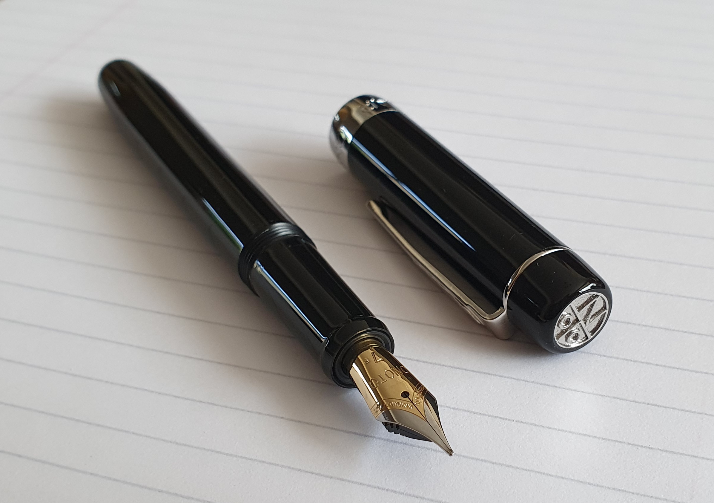
  • Montegrappa “Monte Grappa”, in black with 14 carat gold M nib: possibly John Hall’s last one as Write Here of Shrewsbury was to end links with this brand;
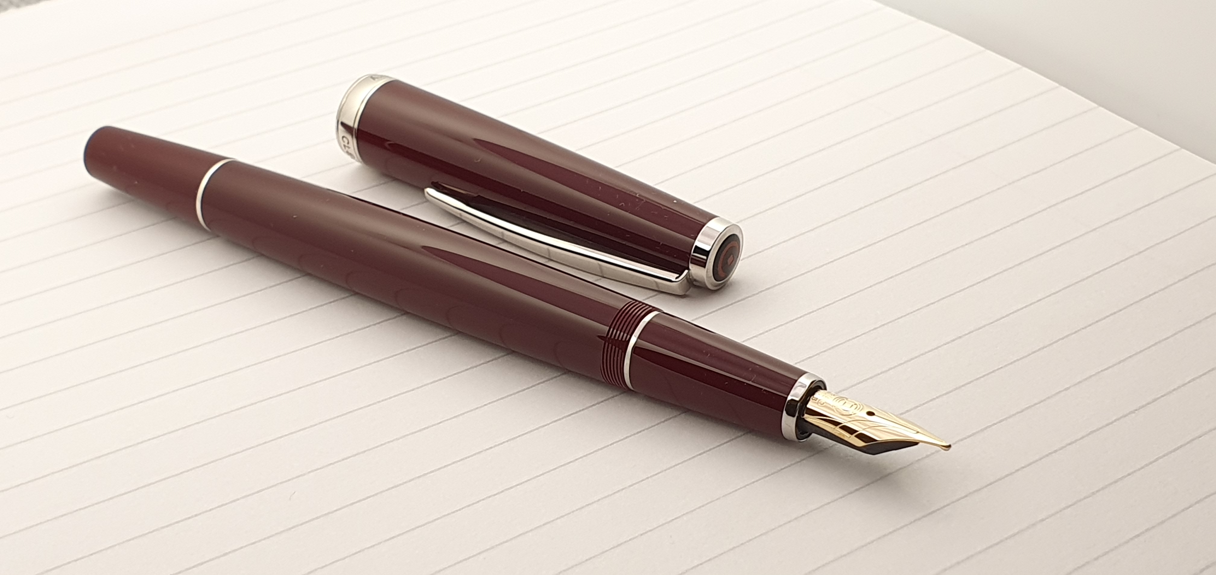
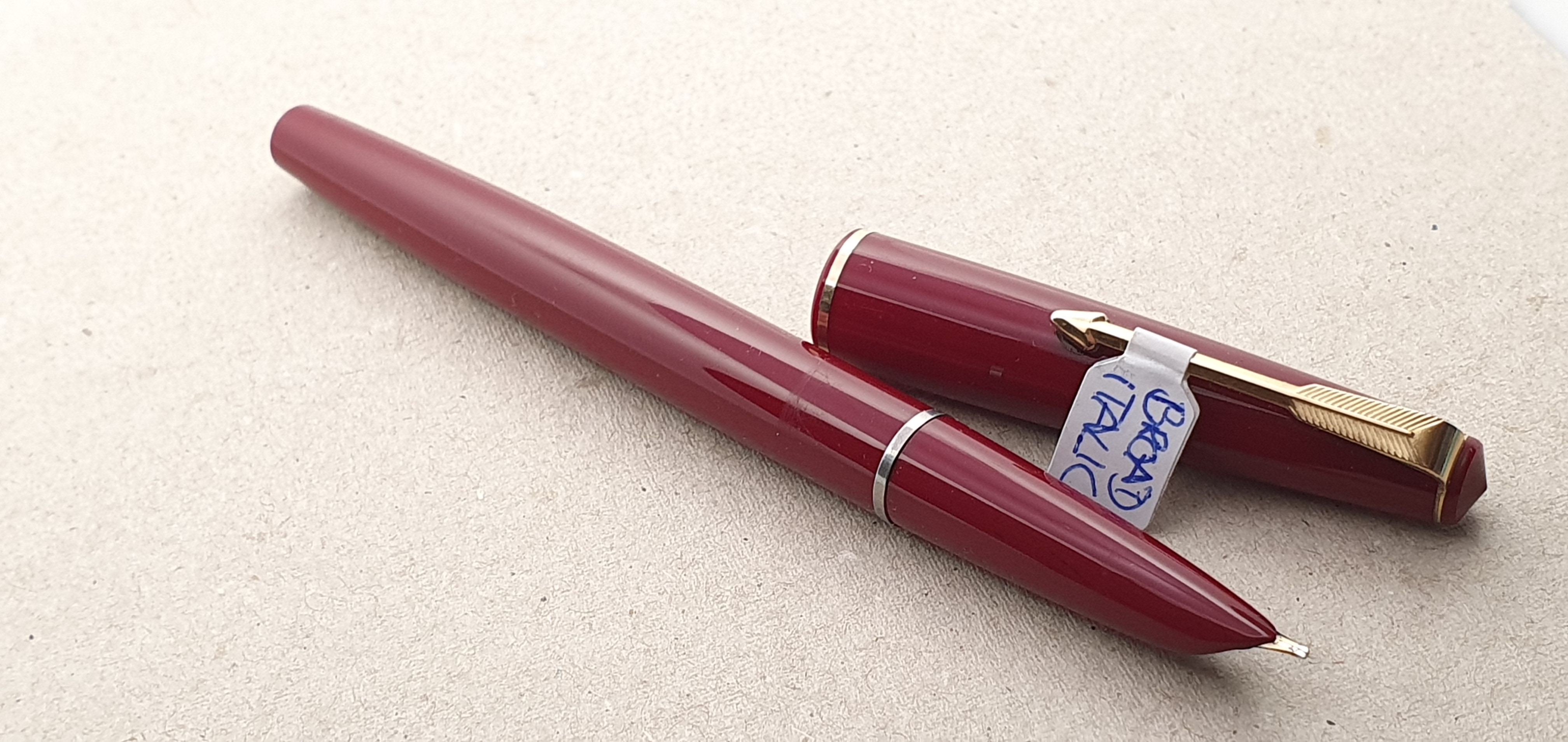
  • A Cleo Skribent Classic, cartridge-converter filler version in Burgundy red with 14k Broad nib (also purchased from John Hall);
  • An Aurora Duo-Cart, sold by Kirit Dal from his ex-samples tray at a generous discount; he kindly sent me a branded Aurora converter for it afterwards and a box of cartridges.
  • A Benu Euphoria Bourbon, with a broad nib, from Stonecott Fine Writing Supplies Ltd: the perfect vehicle for Diamine’s Caramel Sparkle ink.

My last and quite possibly most special fountain pen arrival of the year was a gift from my aforementioned wife, bought whilst on her trip to Hong Kong in November. It is the Pilot Custom Heritage 912 with a 14 carat gold Waverly (upturned) nib. I use it every day and it is a wonderful pen, with an element of Unobtainium about it, since they are not readily available in the UK. The WA nib is great for me as a lefty who uses both over and under-writer styles.

I have enjoyed attending our monthly pen club meets, (The London Fountaineers) whenever I can. Also, there have been daily interactions with a host of fellow enthusiasts online, via WordPress and Instagram and in correspondence from the UK and beyond.

As I do every year (and usually fail), I will endeavour once again to buy less pens, ink and notebooks and to make more use of what I already have. Thank you for reading and I wish everyone a Happy New Year.

Some of The London Fountaineers at our Christmas meet. I am the one with the bunny ears.

“Two Supes.”

Since discovering the Parker 17 range less than a year ago, I have accumulated seven of them. Two are small, Parker 17 Lady fountain pens. Of the five full size models, three are standard models and two are Supers, or Parker 17 Super Duofolds, to give them their full title.

My Parker 17 fountain pens. The two on the right are the Super Duofolds.

These Super Duofolds are distinguished by their wide gold cap band and decorative metal ring (called a tassie) at the end of the barrel. Otherwise, they are the same. All have the fixed squeeze-bar filling system known as the aerometric filler, although more basic than in the Parker 51 which is more enclosed and may also be larger capacity.

My red Parker 17 Super Duofold is the early model which was made from 1962 to 1964 only. This has an open nib, known as the beak nib, in an unconventional triangular shape. After that year, production switched to hooded nibs for the remaining run of the 17 range, ending in 1972.

Left: Early model with open nib. Right: Later model with hooded nib.

I had read good reports of these early, beak nibs and was keen to get my hands on one. When I saw this one for sale in an eBay auction I set my heart on winning it. The seller provided a series of good close up photographs. I looked at these many times in the days leading up to the auction, particularly the images of the nib, front and back. It looked in tip-top condition. It also occurred to me that the pen had some similarities to an old Sheaffer that my late mother had used, at least in its burgundy colour and wide gold cap band.

Parker 17 “Beak nib” (1962 – 1964 only).
And again.

After a tense finish to the auction, the pen was mine! The final price was £59.00 and I appreciate that you can buy a Parker 51 for that, but the early version Parker 17 commands a higher price than the later ones due to its rarity.

The package arrived just in time for me to bring on a weekend away, where I enjoyed cleaning it and trying it out with Parker Quink Royal Blue. The only visible markings on the nib are “14K, PARKER, ENGLAND.” It may be that there is more to see if the nib is removed but I have not done so. The nib writes beautifully. I would guess it to be a Fine. It is very smooth, fairly firm and has an ideal flow, all making for a very enjoyable writing experience, especially on my Stalogy notebook paper.

On close examination of the pen body with a loupe, I did find two hairline cracks, one on each side of the cap. These are not noticeable unless you look hard for them and do not affect the pen’s performance. I could run a little glue along these to seal them but there does not seem to be any real need. Crucially, I have not experienced any hard starts. The nib does not dry out, even though there is a round air hole in the cap, through which the nib can be directly seen. There is no inner cap. I am delighted with this purchase.

My green Parker 17 Super Duofold was another recent eBay purchase. On arrival, this did seem a problem pen. The slip cap was very stiff. There appeared to be a residue of adhesive above the cap band. Uncapping the pen, the grip section appeared slightly misshapen, as if deformed by having the cap pushed on too far or maybe, just by being capped tightly and left for years in a warm place. It could also be some chemical degrading of the plastic: I don’t know. It is some 50 years old, after all. But the pen filled normally and wrote with a buttery smooth feel. This nib could be a Broad or a Medium.

Unfortunately I found that the main issue with this pen was that, once the ink in the feed had been exhausted, it would dry up and stop. Ink was not getting to the feed. I suspected that this may be due to a blockage stopping air getting into the sac. I tried flushing and refilling the pen several times and changed inks but the problem persisted. Eventually, after a week or two, I disassembled the pen. Using a hairdryer, I warmed the section to soften the shellac to unscrew the section. However I was not able to remove it and suspected that it might have been glued with something stronger. Perhaps I should have persisted with my hairdryer to make sure.

Instead, I found that I had loosened the shellac holding the sac cover and, beneath this, the ink sac. I removed them both. This revealed the breather tube, which I pulled out of the section. But as well as this, there was something else in the sac: a loose, plastic rod. I gather that this is an ink agitator, to break any surface tension which may stop ink moving. It seemed a bit too long and I trimmed a bit off.

Parker 17 Super Duofold partly disassembled. The rod near the top is the ink agitator.

At this point, an ultrasonic cleaning bath would have been useful. As I do not have one, I washed the nib section by hand, also jetting some water through it with a syringe and then left it to soak in a jar of water for a few days.

Then, after reassembling the pen, I filled it with Waterman Serenity Blue, probably my favourite ink and a sort of “Pen-icillin” for pens. I was not holding out much hope that my efforts had solved the ink/air-flow problem but I began to write, in a Stalogy A5 notebook. Once again, the writing experience was super-smooth and silky. But this time, it kept going! I carried on writing for five pages, just to make sure. The problem of ink starvation had been resolved.

I am very happy with all my Parker 17’s. I gave a blue one to my niece recently, but promptly replaced it with an identical model from eBay, although every nib feels slightly different. I love the look, feel and writing experience, as well as the affordability of these pens.

A Parker 17 and a Stalogy A5 Editors Series half year notebook. Lovely paper!

Finally, for the benefit of anyone reading who was not around for 1980’s British tv comedy, the title of this post was a reference to the famed “Two Soups” sketch, starring Julie Walters and written by Victoria Wood, well worth a Google if you have three minutes to spare. I appreciate that this may be unfamiliar to many, but the pun seemed too good to waste.

My mum’s old Sheaffer (left) and the Parker 17 with a fine nib, that she would have liked.

On pens and pensions.

I have mentioned before that I have a long-standing affection for Parker pens, which I can trace back to childhood well over 50 years ago. I can still recall a time when I became aware that a Parker ball point pen cost perhaps ten times the price of a disposable Bic Crystal. I associated seeing a Parker arrow pocket clip with wealth and thinking that anyone carrying more than one Parker pen must be very rich. My French teacher even had a Parker ball pen just for red ink, which seemed very decadent. On receiving my first Parker fountain pen, I had the idea that the 14k gold nib could eventually be sold to support me in retirement or if I fell upon hard times.

Parker 17 cap.

Now as I approach retirement age, I have long been aware that my understanding of relative values was somewhat distorted. It turns out that a Parker pen nib won’t go very far in covering one’s living expenses, after all. Learning this is one of life’s hard lessons.

Yet I still have my life-long interest in fountain pens. If my fountain pen journey were likened to a stationery-themed board game of Snakes and Ladders, then you now find me lingering on the Vintage Parker Pens square. A glance of my currently inked pens, of which there are 14, shows that five of these are vintage Parkers, all acquired in recent months as eBay purchases. Oh, and there is one other Parker 17 currently in bits, with the section soaking in a jar of water.

My fountain pen hobby continues to give me a huge amount of enjoyment. How can a value be put on this? In the BBC news, the newsreaders’ first question to their special correspondent is often an open question to quantify the unquantifiable: “So, how worried should we be about…” or “How much of a problem is this?”

As I am now at the age when retirement looms, I am getting to grips with my personal pension plans. The fund value of one of these in particular, has fallen by many thousands of pounds over the last couple of years, which is a depressing thought. But whilst a vintage gold nib will not fund my retirement, I have noticed that the enjoyment of the hobby does go a long way towards compensating for such financial losses, which gives a sense of worth to the hobby. I am constantly grateful for just how much pleasure I get, for relatively little expense, in wonderful combinations of pens, inks and paper. Perhaps my childish sense of relative values was not so far off, after all.

A Parker 17 and a Stalogy A5 notebook.

Travelling with ink: Audley, near Stoke-on-Trent.

We recently enjoyed a relaxing long weekend break, on a farm. Our accommodation was annexed to the impressive Georgian farmhouse, facing a delightful courtyard. This is a working dairy farm, with 240 acres of land and 400 cows.

Our cottage was annexed to this farmhouse.

During July, I had an outbreak of Parker Pen Purchasing on eBay. The first of these was a Parker 17, in black with a medium nib, which I wrote about earlier. This was followed by a Parker 51 also black, but with an oblique nib which I was very keen to buy. Next, there were two more Parker 17 fountain pens, each for sale by auction. There were no competing bids and I got both 17’s at their opening prices of £16.99 each, plus p&p.

The final purchase was rather more dramatic. I had seen a Parker 17, burgundy red fountain pen, with the open, “beak” nib, made only from 1962 to 1964 and harder to come by. I read that these command a higher price than the later, hooded nib models but had heard good reports of the nibs.

The auction was still several days away. For most of this time, mine was the highest bid but I made a maximum bid, of £59.90. In the tense final few seconds, I watched my screen helplessly as a flurry of increased bids were placed. I was successful! Afterwards, I found that another bidder had offered £58.00 with just four seconds remaining: eBay then bid one pound higher for me automatically, so it was a close shave.

Three more Parker 17 fountain pens. I am hooked on these.

These last three Parker 17s arrived just as we were setting off for our break, so I was able to bring them with me to clean and try out, with a bottle of Parker Quink Royal Blue.

Pen Time on the farm.

It was wonderful to get away and have a change of scene. We were in a rural area with views of fields and trees. Our comfortable cottage had vintage furniture, a large kitchen with an electric AGA and a lounge/dining room which included a grand piano, which I enjoyed playing.

Having a full sized, concert grand was a bonus!

There was time to inspect my three new Parker 17’s. The blue one was a basic, standard model with a medium nib and wrote very nicely, with a pleasing bit of feedback. The green one was the Parker 17 Super Duofold, which featured a wider gold coloured cap-band and a ring on the end of the barrel. However this one had a few issues. The cap-band appeared to have been glued but with glue residue around the edge, on the cap. Also the cap was unusually tight. The grip section was misshapen, as if it had been forced into a cap that was too small. The pen filled normally and the nib was glassy smooth and felt like a broad.

The four colour options of the Parker 17.
The nibs turned out to be Fine, Medium and Broad.

However, the pen would write only for a paragraph or so before drying up and suffering “ink starvation.” A check inside showed that the ink had not got stuck at the back of the sac and so it was not obvious why ink flow had stopped. I suspect that it may be an issue with the air replacement to the sac, rather like trying to pour from a carton of milk with only one opening.

Talking of milk, we were invited to watch the cows being milked in the afternoon. This was a highly informative and memorable experience. The owner had farmed here for 53 years, taking over from his father who came in 1930. These days, the milking process is highly computerised with the milk piped to a large holding tank. The milkman comes to collect, every day including Christmas Day. The milk from this farm, goes to make cheese. Whilst being milked, the cows eat from a hopper of grain, which is automatically piped into the milking sheds from a big silo outside. Each cow is identified on the computer system, which monitors how much milk they yield and how much grain to give them. We were shown the harvester, which cuts grass for silage, the cows’ winter feed. It was quite an education for us city dwellers.

The view from our bedroom window.

We explored the nearby city of Stoke-on-Trent. We browsed the shops and bought some clothes and shoes and enjoyed a meal. There was little in the way of fountain pen action, aside from a WHSmiths with Lamy and Parker pens for the “back to school” season. Looking at these, I felt that my vintage Parker 17s with their 14k gold nibs were a better buy.

Returning home, I found that my Quink bottle had leaked. It was only around the cap and had not done any harm except that I got it all over my fingers. Fortunately it was Washable blue, but I might not chose Quink bottles for travel next time.

The Parker 17 with beak nib (1962-1964 only).

New pen day: another Parker 17 arrives.

Occasionally, everything goes right with a pen purchase. One evening last week, whilst browsing Parker pens on ebay, I came across a Parker 17 in black with gold trim, for sale at the very reasonable price of £12.00 plus post and packing. The description read “Parker 17 Aerometric/Reservoir Fountain Pen. Black & Gold. VGC/Desk.”

Parker 17. White markings still present.

Readers may recall that I have a burgundy Parker 17 with an oblique nib, bought at the London Pen Show in March 2023. I could not resist buying another, this time in black and with a medium nib.

The seller despatched the pen the very next morning by Royal Mail and it was delivered at 8.20am today. Any worries that I might have had about it being damaged in transit were soon dispelled. It was expertly packed in a cutaway between two blocks of foam polystyrene and secured with brown tape, snuggly inside a cardboard outer box. It could not have been better protected.

THIS is how to protect a pen.

I read on Parkerpens.net, an informative site run by Swedish pen collector Tony Fischier, that the Parker 17 was introduced in 1962 and the hooded nib versions in 1964. The line was discontinued in 1972. Accordingly any Parker 17 that you see now, must be at least 50 years old.

Hooded nibs on the Parker 17 began from 1964.

Examining the pen, initial impressions were very favourable and kept getting better. The glossy black cap and barrel with gold trim, looked classically handsome. Aside from a few minor scratches, there were no cracks or chips. The white chalk or crayon markings on the barrel reading PARKER “17” M, (which easily wear off) were still intact, suggesting that the pen had been handled very little. Also, the engravings on the barrel, PARKER “17” MADE IN ENGLAND, with the Parker symbol, looked as fresh as if they had been made yesterday.

Often these engravings are so worn as to be barely legible. This one is like new.

Removing the pull-off cap, the hooded nib looked in great shape and showed no signs of wear. There were slight traces of ink and paper fibres between the tines and I gave the nib a rinse in water and flossed the tines lightly with a fine brass shim. The nib needed no adjustment. There was the desired gap between the tines, narrowing down to the tipping material which was rounded and symmetrical and the tines were in perfect alignment. All good so far.

Small but perfectly formed.

The aerometric filler (which all Parker 17s have) was clean, with no ink stains and I wondered whether the pen had ever been inked (although it had at least been dipped). The metal housing of the sac looked like new, with no corrosion. Flushing the pen in water, the sac drew up a progressively good fill with about ten squeezes of the bar.

Aerometric filler, looking as good as new.

Cleaned and dried, I was ready to ink it up with Parker Quink blue black. I am glad to say that the pen wrote beautifully, with a good medium line, smooth and with no scratchiness. Indeed it was like new. There is just a little skipping sometimes if the nib is not quite held at the sweet spot. I expect this to resolve as the nib gradually wears in. Applying a little pressure opened the tines at the tip and produced a broader and wetter line. Quink blue black is a good shading ink. I found that I could use both underwriter and overwriter styles although the pen performed best in the underwriter, upright style. (The opposite is true with my burgundy version with its oblique nib). It measures 123mm uncapped and 143mm with the cap posted which I prefer.

Trying out the medium nib on the Parker 17 with Quink blue black ink. Notebook from Flying Tiger, 8mm row height. Bliss.

All in all, I could not be more pleased with this purchase.

Happiness in a bottle.

Two fun nibs for lefties.

Left handed writers have a disadvantage when using fountain pens, compared to right handers. Typically, there will be less ink flow when the nib is “pushed” along the line, as opposed to being “pulled” along, writing from left to right. Less ink flow means less lubrication and a less smooth writing experience.

Secondly, if the lefty writes with a hooked wrist, there is a likelihood of smudging the wet ink as his hand passes over it.

There are two main styles of writing for the lefty: these I call “underwriting”, by which I mean writing with the pen under the line, with the back of the pen pointing towards the body, or “overwriting” where the hand is above the line, and the back of the pen is pointing away from the body. Many overwriters hook their wrists. As a lefty myself, I am most comfortable when using the overwriter style although I have my own particular method which I developed as a child and still use. Instead of hooking my left wrist, I rotate the paper about 45 degrees left (or anti-clockwise), adjusting the paper rather than my wrist.

One of the joys of using a fountain pen is the ability to produce lines of varying width. We have all seen beautiful copperplate calligraphy with attractive fine and broad strokes, adding character to the writing, such as a thickening in the tail of a lower case letter “y”.

One way ito achieve line variation is to use a flexy nib, where the tines widen as you apply pressure. However this is not suitable for a lefty overwriter as you can apply pressure to the nib only when pulling it back, not when pushing it forward.

The other way to achieve line variation, and which is more practical for us lefties, is to use a stub nib which will produce a broad line up or down, or a fine line left or right, assuming it is held at a consistent angle.

The opposite effect is achieved by using a nib with an “architect” grind, which produces a fine line in the down stroke, and a broad line in the cross stroke. Such nibs are not usually available with a new pen and so require some specialist work by a nibmeister.

However, a similar effect to the architect grind, can be readily enjoyed by using a “bent nib” where the tip is bent upwards to create a flattened, elongated writing area, again producing a fine line in the down stroke or a broad line in the cross stroke.

Today I want to highlight two of the fountain pens that I particularly enjoy using at the moment. The first is the Delike New Moon, an inexpensive Chinese pen bought on Amazon and described as having a “bent” nib. I now have three of these, in different colours. I like the effect that the bent nib has on my handwriting when I use the underwriter style, giving narrow down strokes and broad cross strokes although the difference is subtle.

The upturned “bent” nib of the Delike New Moon.

The nib is very versatile, being capable of four distinct line widths. Held normally, it writes a medium line. Hold it more vertically, and it will produce a fine line, or lay it back at a lower angle than normal and apply a little pressure and you will get a broad line. Turn the nib over and “reverse writing” will give an extra fine line, when needed.

But here is an interesting thing: the bent nib produces fine down strokes and broad cross strokes, when used in the underwriter style. But if used in the overwriter style, the fine and the broad strokes are switched. Take the capital A for example and see how the fine and broad lines are reversed, in these two writing styles.

Subtle line variation from the New Moon, in underwriter mode. Pilot tsuki-yo.

The other pen that I am much enjoying, is the vintage Parker 17, with an oblique broad nib, bought at the London Pen Show in March this year. Ironically, at £30.00 it was one of the least expensive of the seven pens that I bought myself that day yet probably has the best effect on my handwriting.

Parker 17, with Oblique nib.

As opposed to the bent nib pen, the Parker’s oblique nib produces broad down strokes and fine cross strokes, used in an underwriter style, and the opposite if used, (as I prefer) in the overwriter style.

Writing samples from the Parker 17. Quink blue black. Note how the thick and thin sides of the A are reversed, in the overwriter and underwriter styles.

Currently, of the nine inked fountain pens in my ink cups, these are two that I reach for the most and provide the most enjoyment, out of all proportion to their modest cost. The Delike New Moon is inked with Pilot Iroshizuku Tsuki-yo, whilst the Parker 1 7 is inked exclusively with Quink Blue black. Both are very pleasing combinations. The Parker 17 with its oblique nib was a very lucky find at the pen show as medium nibs were much more common. There was a crack to the shell, just above the nib to which I applied some superglue. It does not leak and the pen writes wonderfully. The crack is still visible but in a way the pen is all the more endearing for this, rather like a Japanese Kintsugi bowl.

As well as the line variation, I also enjoy the shading from the Quink blue black ink. I need to write a bit slower with the Parker, to keep it from skipping but slowing down helps me to keep my writing more tidy and legible and reduces mistakes.

In a hobby where there can be temptations to spend ever increasing sums of money for one’s next best pen, it is worth remembering that the simple joys of line variation and shading, particular to fountain pen use and helping your handwriting to look its best, can all be had without breaking the bank.

My Parker “17” fountain pen family.

I shall always have an affection for Parker fountain pens. The brand was my first introduction to a higher quality, grown-up’s pen when I went to my new school in 1970. Previously I had used Platignum or Osmiroid pens at junior school.

I used Parker pens throughout my seven years at secondary school. Since then I have tried many different Parker models, most recently the new version Vector XL, which I quite like but which lacks the character of the vintage models.

Happily, vintage Parker pens are in plentiful supply at pen shows. One sees numerous trays of Parker 51 pens in their various finishes, which can be found at prices from about £50 upwards depending upon the model and condition. But in the crowded setting of a pen show, it may be difficult to pick out which one to buy, if you are faced with several trays of almost identical models. To check their condition, to have a quick look at the nib, the state of the barrel and the “Lustraloy” cap and the aerometric filler, one by one, whilst being careful not to mix up their caps, and then to remember which one you liked best, is a challenge.

Parker “17” Lady, green with gold trim. Broad nib.

Somehow there seems less pressure, to go down a rung or two, and look at the lower priced pens, sometimes grouped together by price. And so it was, at the London Pen Show in October 2022 that I picked up a Parker “17” Lady, for a very modest sum of £10.00.

On closer inspection at home, this particular example was damaged in several places, with a chip near the cap finial and cracks to the grip section, which I had not really noticed properly until I had filled the pen and found ink on my fingers. It was a pity, as the broad nib was silky smooth. Still, it was only £10.00. I could not bring myself to throw it away but thought perhaps the nib and reservoir (attached together) might be reusable as a spare in another body.

Parker “17” Lady, blue with gold trim. Broad nib.

At the London Pen Show in March 2023, I hoped to pick up another Parker “17” Lady. Sure enough I spotted a blue one in a box, at £20.00. The condition this time looked like new and the barrel even had the original white markings, in chalk or white crayon, which read “17” LADY B 25/ -. These rub off very easily, suggesting that this pen had been handled very little in the past 50 years. I bought it eagerly.

It appears that this pen has been largely untouched in 50 plus years.

Parker “17”, Burgundy with gold trim. Oblique broad nib.

A little while later, on another pass of the tables, another Parker caught my eye, this time a Burgundy red model which was also a Parker “17” but not a Lady, and with a tag indicating that it had an italic nib. This one was £40.00. Using my loupe, I saw that the nib appeared to be a left foot oblique, and looked in good shape but there was a crack to the section just above the nib. I suppose this is a weak point and prone to cracking if too much pressure is applied to the nib. I hoped that the section might be reparable or replaceable. I was still keen to give the pen a chance and a deal was agreed at £30.00.

Thus I have in the last six months bought three Parker “17”s, at £10.00, £20.00 and £30.00. See how this hobby escalates?

My three Parker “17” fountain pens. The two on the left are the Ladies.

Reading up on the Parker history, I learned that the Parker “17” range of pens were made from 1962 to 1972. They have the aerometric, squeeze bar filling system and so were true fountain pens, before the introduction of the Parker 45 which was a cartridge-converter pen. For more information on the Parker 17 range and the rest of the Parker family, visit Parkerpens.net.

After the pen show, when I was able to try out my purchases, I found that the blue Lady did not want to write, neither when first dipped nor when filled from a bottle. The aerometric filler was working fine and so I could not understand why no ink would come out of the nib when the pen touched paper. After a couple of days, I tried flossing the nib with brass shims. This seemed to do the trick: the problems was simply that the tines were too tightly together. I tried to ease the tines apart very slightly and then smoothed them on Micromeshe pads. The pen now writes smoothly, with a good broad line.

As for the Burgundy model, after cleaning the pen a bit, I could see that the crack to the hood over the nib was likely to be a problem and I could foresee leaks occurring. I found some Loctite glue and dripped some of the clear liquid onto the hood, to allow it to run down into the crack and waited a few hours for it to set hard. This worked. I filled the pen and there have been no leaks, after several weeks of occasional use. In hindsight, I wish I had had the patience to try out the pen before applying the glue, and also wished that I had been a bit more thorough in cleaning the crack before gluing it, but you live and learn.

Notwithstanding my rather amateur repair efforts, the real success story is how well the pen writes for me as a lefty overwriter and the pleasing effect that it has upon my usual writing style. The nib does tend to dry out and is a hard-starter. Also it needs to be held at a certain angle to the paper and quite upright, like a ball-point. But once it gets going and you find the sweet spot, it is worth the wait. For these reasons it may be better suited to longer, continuous letter writing or journaling sessions, rather than for intermittent notes.

The Parker “17” in Burgundy red with an oblique broad nib.

At the last pen show, spending several hundred pounds, I got some great bargains and some wonderful pens and have no regrets. However, if I am honest with myself, it is the 50 year-old Burgundy red Parker with its oblique nib that is the best suited to my writing style and the most complimentary to my handwriting. It is a salutary reminder that in buying a fountain pen, perhaps the most important question is whether the nib will suit your writing style. If not, you will need to adapt your style to suit the pen.

Arguably for the £60.00 spent on my three Parker 17’s, I could have bought a Parker 51. Three 17’s do make 51. But, I have already enjoyed more than £60.00 value in my new Parker 17 family. If I do venture towards a Parker 51, I shall know that an oblique broad is the nib for me.

They were available in black too.

London Spring Pen Show, 2023: my haul.

Last Sunday found me at the Novotel, Hammersmith, for the twice-yearly London pen show. This time I went alone, my wife having changed her mind about attending, but sending me off with the cheery instruction “Don’t go mad.”

As always, I had a great day. The atmosphere was relaxed and enjoyable in the bright and spacious halls. The hotel’s bar/restaurant area is on hand for those wishing to take a break although I prefer to make the most of the time browsing the tables.

John Twiss and Vincent Coates’ (The Turners Workshop) table.

I soon found several friends and familiar faces such as Dave, and Gary from the pen club and Jon of Pensharing who attended this time as a visitor, without his Pensharing table.

My first task was to buy another Onoto Scholar so I made a bee-line for the Onoto table. These were again offered at an attractive show discount. Buying one requires decisions as to pen colour, whether gold or silver colour trim, nib grade and lastly the colour for the included leather single pen pouch. Without too much deliberation, I went with Black, Silver, Fine, Black. These were put in a smart Onoto box with an additional pen sleeve, custodian’s welcome card and a polishing cloth, making a wonderful, presentable package, which is what this will be.

The Onoto Scholar.

Next I visited John Hall’s “Write Here” table. His newsletter the previous day had teased of some attractive show offers, including on Montegrappa and Cleo Skribent and I was keen to see what these were. To my delight, John had a Montegrappa “Monte Grappa”. Longer term readers may recall that I have some history with this model having bought one in Harrods but promptly returned it in a bout of buyer’s remorse. I had never quite got over this “break-up” and had often looked longingly for online offers to own one once again, but without success. Imagine my delight then, when John showed me one in a smart glossy black, with 14k gold medium nib at an irresistible less-than-half-price discount. I bought it in a flash.

A Monte Grappa is back in my life!

I asked John whether he had any Cleo Skribent pens with him. He directed me to the other end of his tables. I do already have two models from this lesser known German brand, which I liked very much save for the fact that they were piston fillers and that the pistons had grown stiff and could not be re-greased. Over the years I had tried in vain to introduce some silicone grease into the reservoir, as you can with a Lamy 2000 using a tooth pick. However the barrel of the Cleo Skribent Classic, piston filler does not unscrew and the piston cannot be removed from the other end either, as far as I know. This is a pity as it is a comfortable and elegant pen and the nibs are very pleasant (and are friction fit, easily removable).

I had long been interested in getting another Classic, but cartridge-converter version. These look just the same as the piston fillers but without an ink window. My preference was for the Bordeaux red, to complement my two black models.

A Cleo Skribent Classic, Palladium trim, with 14k gold nib. Cartridge-converter fill.

Again, my luck was in! John had a selection of Cleo Skribent Classics, including one Bordeaux red cartridge-converter model, fitted with a 14k broad nib. Perfect! (I already have a steel fine and a gold medium). This was for sale with over one third off the full price. Yes please! John had a number of Classics in white and with stainless steel nibs also greatly discounted. I was unable to resist picking up one of these with a medium nib. I figured that I could later give it the gold nib from my old black piston filler model.

Always a pleasure to deal with John Hall.

One of my objectives for this pen show was to find another Parker 17 Lady. I had bought one at a previous show, in green but had gone a little too cheap and picked it from the “everything £10.00” box. Although its nib was soft and smooth, the body of the pen had a number of cracks to the cap, barrel and section making it unusable.

This time, browsing through the trays and tubs of vintage pens at various price points, I spotted another Parker 17 Lady, this time in blue, in a box at £20.00. Examining this, I could not believe my eyes as it appeared to be new, with the model and nib description still clearly visible stamped in white ink on the barrel. Seeing no cracks this time, I bought this little beauty.

Parker 17 Lady
It appears that this pen has been largely untouched in 50 plus years.

I also spotted a larger Parker in dark red with hooded nib, also a “Parker 17” but not a Lady this time. It appeared to have an oblique broad nib. Unfortunately I could see a crack to the shell immediately over the nib, which was stained with old ink. I could foresee this one leaking, which was a shame as I was very tempted by the nib. However, I was offered it for £30.00 instead of £40.00 and at this price I thought it well worth taking a chance.

Parker 17.

Another bargain of the day, was a Conklin Mark Twain Crescent filler, in black chase finish, with rose gold colour plating on the clip, cap ring and crescent filler. The nib was a stealthy black coated medium, rather at odds with the rose gold bling but handsome none the less. The black chasing was much like the original ebonite model produced in 1903 as used by Mark Twain. These are good fun and I have had a couple of them in the past. The nib housings are also interchangeable with the Jinhao X450.

A Conklin Mark Twain Crescent Filler, black and rose gold.

My final fountain purchase was made at Kirit Dal’s Aurora table. He had trays of his sample pens, now generously discounted to around half normal price. This was all the encouragement I needed to take another look at the Aurora Duo-Cart, a steel nib pen with an unusual semi-hooded nib and a metal cap. It is a modern pen but looks very similar in style to the Aurora 88 designed in 1947 by Marcello Nizzoli – an Italian architect, designer and artist who was the chief designer for Olivetti for many years, designing their portable typewriters in 1950. I had been rather intrigued by the Duo-Cart but had not tried one before and seeing one at half price was too good to miss.

Aurora Duo-Cart.

I had a very happy day, seeing many friends, browsing the tables and making some purchases. If not exactly a frenzy, I was certainly on a roll. Several times, I lost count of how many pens I had bought and had to stand still and peer into my tote bag and count the boxes, which I had packed upright so that I could more easily count the ends.

Aside from the pen-purchases, I also picked up another A5 Semikolon journal, a rather luxurious leather 3-pen case at Vince Coates’ table, and a large book entitled Fountain Pens History and Design, full of interesting information and photographs published in 1998.

My non-fountain pen purchases

Epilogue.

After all these new arrivals, it was fun to examine them all at home. Being too many to play with in one evening, I have been inspecting them all week! Oddly enough, it was the least expensive of these, the Parker 17 Lady, which I was the most eager to try out. A tiny pen, it is dainty and elegant when posted. The aerometric filler looked surprisingly clean for a pen which could be around 50 years old. I dipped the pen and tried to write: nothing! I dipped again: again nothing. I then filled the pen with Waterman Serenity blue and although I got a good fill with about five presses of the bar, still the nib refused to write. I wondered whether this was why the pen had remained in such remarkably new condition. I put it aside whilst I played with some of others.

A few days later, it occurred to me that the nib could be suffering from “baby’s bottom” and might benefit from a little smoothing on the Micromesh pads. This I tried but again, although filled with ink, the pen would not write a word.

Next I tried tackling the tines, sliding a fine brass shim between the tines at the tip and then sliding it up and down until the nib’s grip on the brass could be felt to be weakening slightly. This time, the pen then began to write, and very smoothly at that. It was still necessary to go at a measured pace and not to write too fast. The Lady will not be rushed.

As for the larger red Parker 17, I flushed the nib and tried to clean the cracked area of dried ink. Then, rather impatiently and before even trying to fill the pen, I dropped superglue on the shell to allow it to run down through the split in the shell and hopefully bind up the crack and prevent leaks. I left it a few hours to harden. The pen does now write, with a lovely line as you would expect from a vintage oblique broad but is a bit of a slow starter.

The Montegrappa, predictably, feels lovely in the hand. The medium nib writes well with just a little softness. I filled it with Diamine Tavy, blue black. Whilst I try multiple inks in some pens, with this pairing I feel like I have got it right first time. However, I did have a slight scare on Friday night when I tried to write something and found the nib to be dry. I had written only around 4 – 5 pages since filling it. I worried that perhaps the piston on this mystery filler was at fault. But, it transpired that on filling the pen, I had then wound the piston down again emptying the ink silently back into the bottle, thinking I was filling it. A newbie error! I now know that you must turn Clockwise to fill the pen. It is easy to forget, when the piston knob does not rise or fall but stays in the same place.

The Conklin is fun to fill and to use. The Aurora Duo-Cart needed a little tine-easing and might benefit from a little more.

The cast of my pen show, prepare to take a bow.

In conclusion, I did rather blow my annual pen budget in a day, but arguably it makes sense to do this early on and so have the rest of the year to enjoy the pens. There was a theme to my purchases in that many were “classic”, vintagey designs and/or pens that I own or have owned before. I don’t think I went mad, as every purchase was eminently well reasoned and justifiable. And that is the case for the Defence.