
My number of currently inked fountain pens stands at 17, which is about average for me. But what is a bit unusual at the moment is that three are the same. They are my Delike New Moons.

I have already written an Early thoughts and a More thoughts post on this model, in March and April this year so there is little more to say. At that time I had bought one, loved it, given it away and bought a replacement. That was my marbled green acrylic version. Since then, I added the marbled blue and then, just recently, the marbled red.

What is so good about these inexpensive pens? Well, the fact that they are inexpensive is one benefit. They are well made, they have screw caps, they have attractive colours (which includes the grip section), three shiny plated metal bling rings on the uncapped pen, plus two more on the cap, they are uncomplicated, comfortable and come with a converter which has a spring coil ink agitator. But what makes them so enjoyable, and versatile, is the fine “bent nib”.

On all four of the Delike New Moons that I have purchased, the nibs have been faultless, out of the box. They all write smoothly, with a good flow and all have that capability of writing four distinct line widths, depending upon how you hold the pen.

I have never been proud of my handwriting. I am no calligrapher and have not studied or been trained in those skills. On my fountain pen “journey” I have owned countless standard nibs, of fine, medium or broad tips (mostly mediums) which are easy to use, practical and forgiving, but which do little to produce a line which can be distinguished, one pen from the next.

And then this year I discovered the fude nib: a tip which bends upwards giving a flat area to write with. If the pen is held in a conventional way (an under-writer style) this will produce a narrow down stroke and a wide cross stroke and various widths in between. This is the opposite effect of a stub nib. It is how I imagine an “architect grind” nib might be.
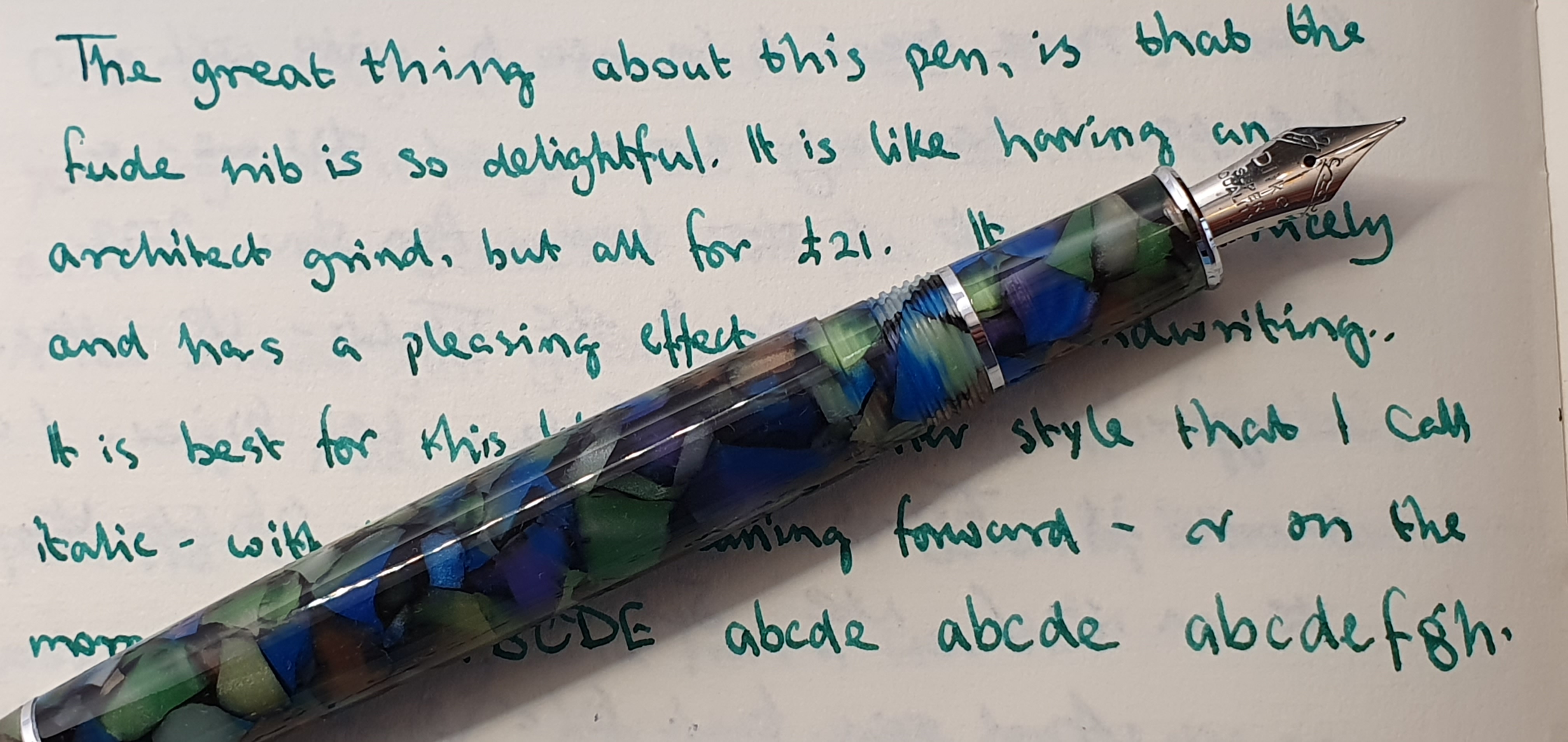
Flicking back through the pages of my notebooks, for once I like how my writing looks with these pens. I can use them in my lefty, over-writing style which feels the most natural to me, either with the pen laying back in my hand to give a medium line, or held more vertical like a ball point, which then produces a finer line. But I tend to prefer to use the pen in my under-writer style. This slows me down and I form each letter and word more carefully and deliberately. I delight in the line variation such as in the two sides of the capital A.
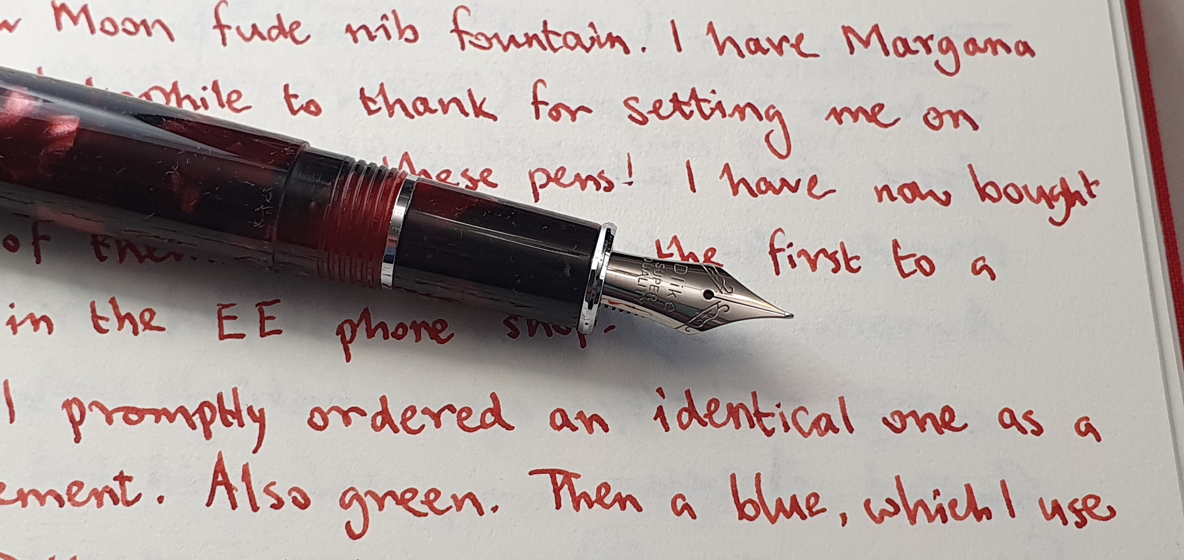
As you might have guessed, I now have these three pens inked with a matching ink. The green has Waterman Harmonious Green, from a bottle that I have had since 2015. The newer, blue pen is filled with Diamine Pelham Blue, a very pleasing shade from the generous flow of this nib. My latest New Moon addition, the marbled red one, is now filled with Montblanc William Shakespeare Velvet Red, which is possibly my GOAT red ink.

I expect a lot from my pens. Not only must they look good and feel good. They must write and behave well. They must (most of them) be good value. They must be enjoyable to use – by which I mean that the act of putting pen to paper is a pleasure, but also that the resulting script is expressive, neat, attractive, legible and satisfying. And as if that were not enough, I depend upon my pens for their role in maintaining my mental health, as a source of relaxation and unwinding to counter the stresses and strains of daily life. Writing with pen and paper lifts my spirits.

I realise that this is a lot to ask of a pen, particularly one that you find on Amazon and which costs under £25.00 including shipping. But when you find one (whatever yours might be), buying three of them does not sound so silly after all.
