Further thoughts and update on the Faber-Castell Ondoro, Smoked Oak fountain pen.

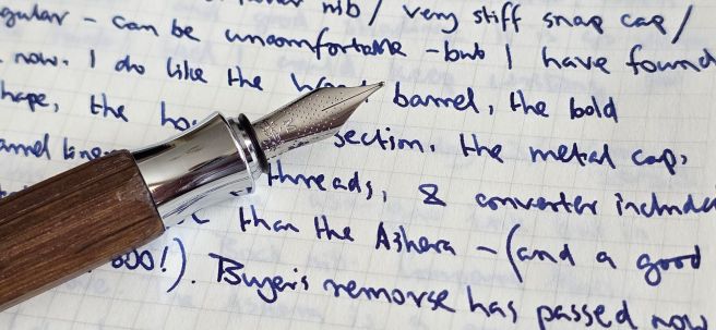
In my previous post on this pen, I covered the buying experience and the brief passing phase of buyer’s remorse before coming to accept and enjoy the pen. I had owned it for not quite a week.

Now, at still only two weeks in, I feel it necessary to say more about the issues I have with the pen and to correct a few misconceptions. Although mine was an impulse buy, I would recommend trying the pen before buying if possible and also to read the many online reviews – from which I now see that this model has been around for over 10 years.

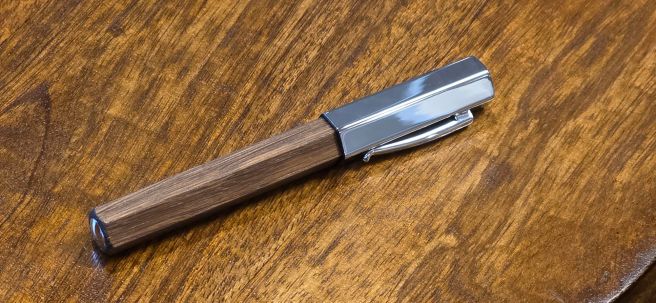
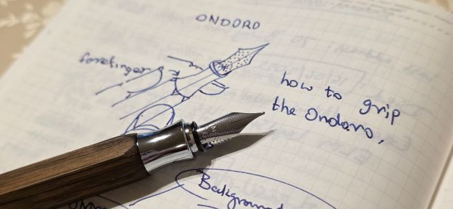
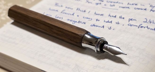
To recap, the potential issue arises from a combination of two design factors, namely the short grip section and the faceted barrel. If you do not wish to grip the pen around the metal, hourglass shaped section but higher up, then your fingers meet the facets. These are fine if they correspond with where you wish to rest your fingers: but if they do not, then you are instead holding a sharp ridge between two facets, which is uncomfortable and unsteady.

At the time of my first post, I explained that on my pen, when the barrel was fully tightened, the facets stopped with a ridge in the centre, or “12 o’clock position” (if viewing the nib head on).

Nib aligned with a ridge between two facets.

Of course, we want to hold our pens comfortably and in such a way that the tipping of the nib touches the paper at the smoothest angle, to write well without scratchiness or skipping – “the sweet spot.” Depending on an individual’s writing style, – whether they be left or right handed, whether an under-writer, over-writer or side-writer, facets may or may not be helpful.

The big news that I wish to share, is that the wood barrel sleeve is not attached to the metal inner barrel (which I presume is brass) and can be adjusted. At least, I am speaking for my own pen only and have not examined any other samples. Thus if the facets are not where you need them, simply twist the barrel firmly a little way beyond its tightest point. You do not need to move it far. You may line up the nib with the flat surface, or a sharp ridge, or perhaps half way between these points as a compromise.

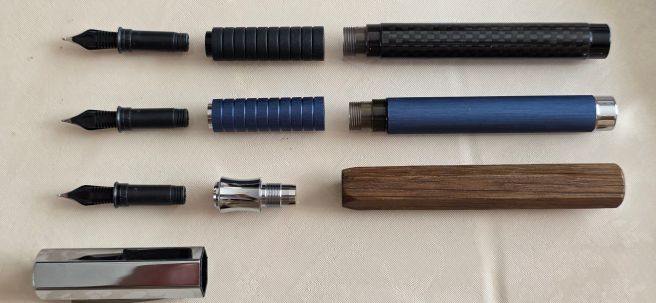
I discovered this by accident when I noticed that after capping and uncapping the pen for a few days, the barrel ferrule was sinking down inside the barrel.

Barrel ferrule, retreating into the wood sleeve.

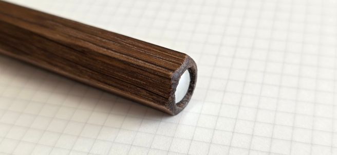
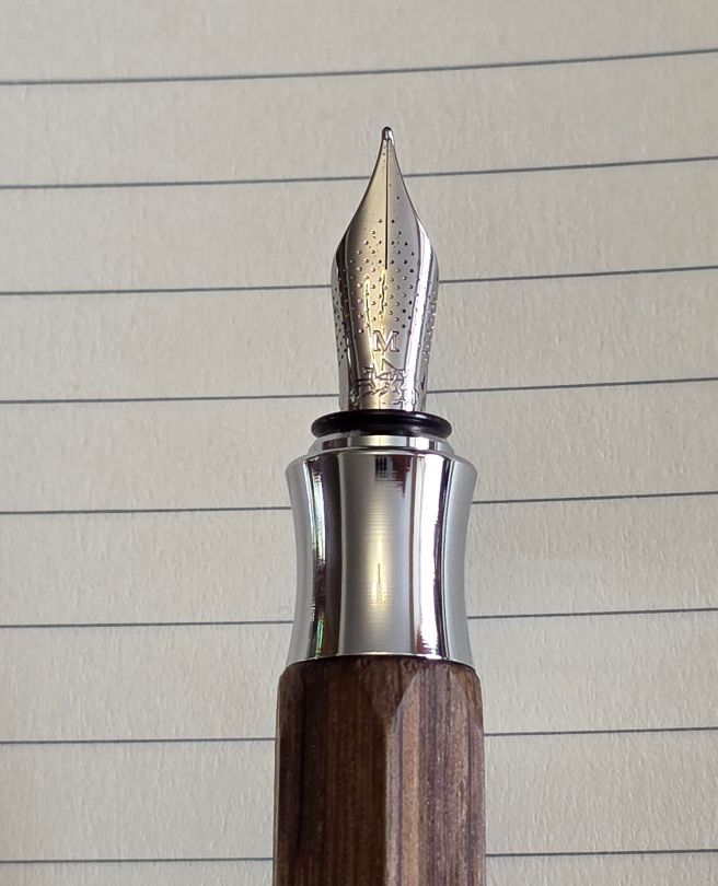
When I unscrewed the barrel, I found that the metal barrel liner, was beginning to protrude.

Barrel liner, pulled forwards by the act of uncapping the over-tight cap.

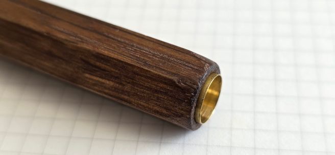
Having discovered that the barrel sleeve could move over its liner, I tried pushing the liner out further (using an empty plastic cartridge and pushing the barrel down against a hard surface):-

More of the barrel liner exposed.

The good news: You can therefore twist the wood barrel sleeve to adjust the position of the facets in relation to the nib, if you need to. For example, if a flat facet at the 12 o’clock position suits you best, just twist a few degrees and you are there. It is a bit like the feature of the Parker 75 which allowed you to rotate the nib for the optimum writing – a solution to the problem caused by adding facets to the grip section.

Barrel turned to align nib with a facet.

If you like the nib aligned with a facet, this also has the added bonus of enabling you to cap the pen with the pocket clip aligned to the nib or to post the cap thus aligned, (although writing with this cap posted will make the pen unbalanced).

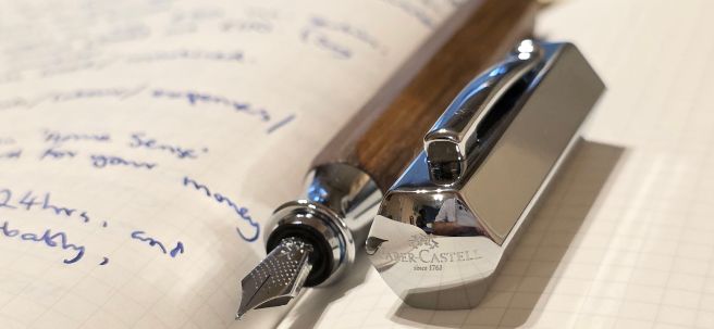
The bad news: the barrel is not meant to move on the liner and moving it will soon make it loose. Two new problems are caused by solving the facet issue: (1) when you uncap the pen, the nib section and barrel liner, are pulled forward out of the barrel sleeve and (2) when you go to unscrew the section, instead of unscrewing, the barrel liner rotates in its sleeve.

Experimenting with nib-to-facet angles, I found myself suffering FOMO: this was made more complicated by having more than one writing style – whether under or over writing. “Am I missing out on a smoother writing experience, if only the barrel were turned a few more degrees?” The angle for one writing style was not the same as for the other. Imagine the distraction and stress of having this thought if you were taking an exam.

Already after only a few days of experimenting, my barrel was getting looser and I noticed a gap between the section and the barrel appearing, each time I pulled off the cap. It is a pity that there is not a screw, or a hex nut we can tighten in the barrel liner, to arrest this movement. I have stuck a little Sellotape on the barrel liner to try to make it a tighter fit.

In conclusion, I do actually like the pen. Theoretically having a facet against your finger, should give a steadier grip than if the only points of contact were rounded edges of a tube. The facets certainly look bold and attractive – especially as they are echoed in the metal cap. (Incidentally, the cap is made of metal, although the metal is thin and it has a plastic liner).

When I bought the pen, I was on my way to see a concert of music by Frederick Delius. The piece, a cantata entitled “A Mass of Life” is quite a difficult listen – a huge, powerful, exuberant, out-pouring of passion – which probably needs to be heard more times than I have yet given it, to enjoy and appreciate it properly. Meanwhile, you might think “Why bother with this, when there is more readily satisfying, melodious and recognisably-structured music available?” Perhaps there is an analogy here with the Ondoro: it is a challenge but there is nothing quite like it and it is worth the effort of persevering. Or perhaps I am just making excuses for a flawed pen or one that was not suitable for my particular grip?

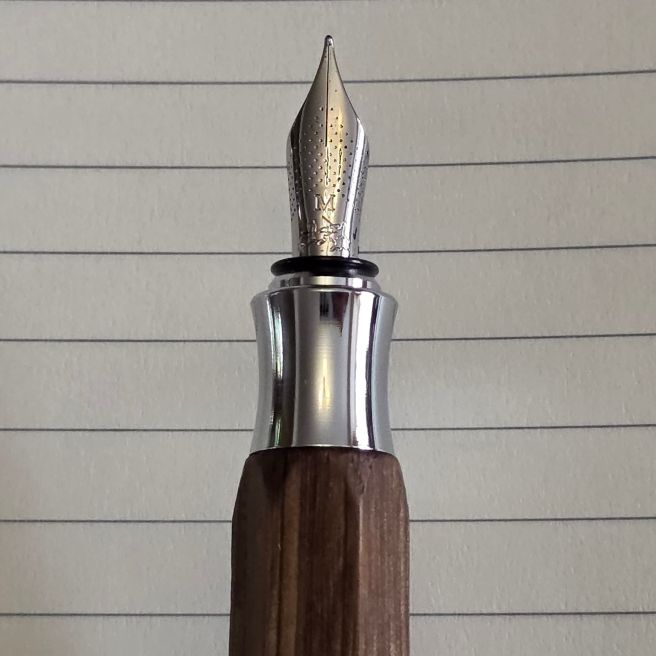
The nib is excellent. When it is writing smoothly, I can happily write or doodle with it. I sometimes think that a writing sample reveals more about the comfort of a pen: how neatly can I write with it? If the writing is shaky and rushed, it suggests we cannot wait to put the pen down. If it is neat, then it shows the writer to be relaxed, comfortable and at peace with the pen!

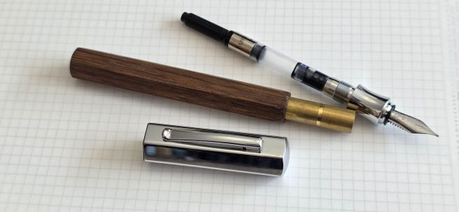
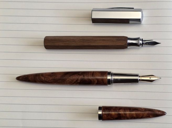
If I were to give up on the pen, then at least the nib unit can be transferred to the Faber-Castell Essentio, a cylindrical and facetless aluminium pen that I bought last year. But it has not come to that yet!

Ondoro beneath a Faber-Castell Basic and the aluminium Essentio.

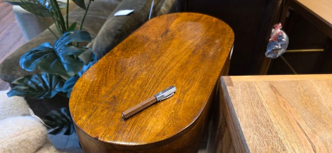
The pen does make a nice companion for my Ashera fountain pen, hand finished in multi-lacquered elm burl wood. The Ondoro is not lacquered and polished but its wood is faceted and is Smoked Oak (not just stained to look like it) – a chemical process which I imagine adds a bit to the cost. It is not correct to say that the wood is untreated.

The Oak and the Elm: the Faber-Castell Ondoro next to an Ashera Aeon fountain pen.

The Ondoro might not be my favourite pen – at least not today. But I am using it every day which is a good sign.

Early thoughts on the Faber-Castell Ondoro, Smoked Oak fountain pen.

Faber-Castell is a well respected maker of pencils, pens and art supplies with a history dating back to 1761. For fountain pen enthusiasts, their nibs are among the best in the business.

None of this was on my mind as I breezed into Harrods one evening, for a quick browse around their Fountain Pen arcade on the lower ground floor, prior to taking my seat for a concert at the nearby Royal Albert Hall. I was off to see Sir Mark Elder conducting the BBC Symphony Orchestra, massed choirs and four soloists, in a rare performance of Delius’ “A Mass of Life”, as part of the BBC Proms. I say “rare” because the piece had not been performed at the Proms for 37 years.

As always on my also-rare visits to Harrods, it was a triumph to locate the pen department. Once there, I enjoyed making a round or two of the displays, including Montegrappa, Chopard, ST Dupont, Caran d’Ache, Graf von Faber-Castell and of course Montblanc. There were notebooks and stationery from Smithson and Moleskine.

At the Graf von Faber-Castell counter, I spoke to the helpful assistant, Melvyn and chose a bottle of Cobalt Blue ink. I have almost finished my first bottle and this is probably my favourite “posh” ink. The rich dark blue ink, the attractive 75ml heavy glass bottle and packaging are all luxurious.

I then asked to take a closer look at the Faber-Castell Ondoro, in wood with a metal cap. I recalled seeing the pen some years ago with an orange barrel, but was not aware of this wood version. I enquired as to what the wood was and after consulting the catalogue, Melvyn informed me that it was “Smoked Oak”. It is an appealing, mid-brown with a dark grain. I have not yet discovered the significance of the “Smoked” in the title. I wondered whether it might perhaps be a process whereby the wood is heated, altering its enzyme constituents in a way which “ages”, dries and hardens the wood as Yamaha does for certain guitars in its range, to emulate the tone of a vintage guitar. However this was just a fantasy conjecture on my part. Presumably the oak is not smoked to improve its flavour like bacon or mackerel. Is it smoked just to give it a charred look? I am yet to find out.

Faber-Castell Ondoro, Smoked Oak fountain pen.

Edit: Since publishing this post, a Google search revealed that Smoked Oak is a term for oak that has been exposed to ammonia fumes, in a sealed environment, for a number of hours. The fumes react with the tannins in the wood, causing it to darken. The longer the exposure, the darker the wood, until black. The process also enhances the natural grain.

The Ondoro features a hexagonal cap and barrel. It is not very long, but is chunky. Aside from the hexagonal form, another striking feature is the hour-glass shaped grip section. This is a short section and so, if you use a pinch grip around the section, your grip will be close to the paper.

Posted and showing the dimpled nib and the hourglass section.

At first, I was undecided how best to hold the pen. A pinch grip around the section is a bit too low and too crowded for me. But if you hold it higher up, at the barrel, you have the issue of gripping around the faceted sides, which may or may not conform to your preferred way of holding a pen. Then there is the option of posting the cap. It does post securely but adds considerable weight and alters the balance such that you would want to hold the pen much higher up.

Finding my grip.

At £165.00, the pen looked to be a bargain compared to most of the others on display and might have been the most affordable pen in the showroom. I was drawn to the Oak material which may develop a lovely patina eventually. I was also mindful that I had enjoyed good experiences with steel nibs from Faber-Castell in the past with pens such as the eMotion, Grip and Loom. I was sufficiently intrigued by the pen to include it with my impulse purchase of the Cobalt Blue ink and I left with a smart Faber-Castell shopping bag and a smile on my face.

Later at the Royal Albert Hall, before arriving I had switched the pen and ink to my shoulder bag. At the entrance, halting for the security check, a torch was shone into my bag and the man pointed to the box and said “What’s in there?” “It is fountain pen ink” I replied. I got the impression that he did not get that answer very often.

I had the opportunity to fill the pen during the interval. The performance (both the concert and the pen) was excellent. It was necessary to crouch down and put the ink bottle on the floor of the Hall by my seat, as even I was not stupid enough to open an ink bottle in my lap. Once filled, I could take my seat again and test the pen in a small pocket notebook. The nib appeared to be perfectly tuned, right out of the box and wrote smoothly and well, as I have learned to expect from Faber-Castell.

Highly reflective cap.

However, within a fairly short time, I began to suffer from an attack of BR or Buyer’s Remorse. This was triggered by the realisation that the pen was lumpy and angular and unusual to grip. I soon discovered that I could have bought the pen and the ink considerably cheaper online. Then thoughts began to crowd in, that I had not needed the pen, that it was arguably not as comfortable, or as good value, as my recently purchased Asvine J16 – a titanium bodied piston filler pen made, we generously assume, as an homage to the Montblanc Meisterstuch 146.

The following day, the BR only got worse, exacerbated by a visit to a home furnishings superstore where I made the realisation that, if it was Oak that I was after, I could buy an attractive table for a modest sum of £99.00.

You get more wood in a table.

However, after a few days, I was over the worst of the BR. I realised that it is not helpful, thinking about a fountain pen’s value in comparison to other household items. Even comparing pens from different brands and countries, it is a mistake to think that we should acquire a new pen “at cost.” As for comparing values in recent pen purchases, of course some appear better value than others and it sometimes helps to combine the cost of a few pen purchases and then average their cost.

Happily, I soon grew to fully enjoy the Ondoro once again. The key to this, in my case, was finding a comfortable grip. I found this by resting the section on my second finger, and then gripping the pen between thumb and forefinger a little higher up at the bottom of the barrel. I found that I could hold the pen with the nib at the “sweetspot” (rotated inwards slightly) if I held the pen at the facets, leaving one facet in between.

Some writing with the Ondoro and Cobalt Blue ink on Stalogy paper.

On my pen, and I don’t know whether they are all like this, when the barrel is screwed on to the section tightly, the nib aligns with a ridge between two facets, not a facet itself. I could hold the pen comfortably with the nib rotated inwards (I am a lefty). Once found, the grip is actually very pleasant and a bit addictive!

It is normal to have both likes and dislikes about the design of a pen. A few of mine are as follows. Let’s hope the likes outweigh the dislikes:-

Likes:

  • Bold and unusual, attractive design;
  • Facets: the hexagonal barrel with flat sides, is like an oversized pencil; also prevents rolling:
  • The use of wood, as a warm and natural material – with a satin finish which may develop an attractive patina in use; I love having a piece of Oak in my hands;
  • Short, chunky proportions;
  • Weighty metal cap – with shiny plated finish contrasting with the satin finish of the wood;
  • Subtle imprint of name and logo on the top of the cap, with the words “since 1761” imparting a sense of history:
  • Comfortable hour-glass section on which to rest the pen;
  • Well-tuned steel medium nib writes smoothly and with excellent flow:
  • A Faber-Castell branded, Schmidt converter is included;
  • Fit and finish are excellent: brass liner and threads to barrel; metal threads on the section; plastic liner to cap;
  • Slightly domed metal barrel finial, protects the wood when pen is standing:
  • Cap can be posted (although making the pen back-weighted and heavy);
  • The tough, short and stocky feel of the pen make it well-suited for an EDC pen.

Dislikes:

  • Facets: Unless held around the section, gripping the pen at the barrel has a risk that the facets may not necessarily fall where you would wish to grip the pen. You may instead encounter a sharp ridge between two facets, or else have your grip dictated by the position of the facets, rather than by the best rotation of the nib to the “sweetspot.”
  • On my pen (and again this may not be same for all), the snap cap is very tight and it needs considerable force to uncap the pen: however this may ease eventually with use; meanwhile, if using the pen intermittently, the pen could be “soft-capped”, to reduce ink evaporation;
  • If posting the pen, the hexagonal cap has to align with the facets and, on my model, this means that the sprung pocket clip will either be to the left or the right of the nib’s centre line and not in line with it – a slight annoyance.

Weights and measurements.

The pen looks and feels, chunky, solid and dense! Capped, it measures around 127mm and uncapped, 123mm. Posted, it is around 157mm. The width of the barrel across opposite facets, is about 12mm. It weighs 44.5g capped, or 27g uncapped and 17.5g for the cap alone. Using the pen uncapped, the weight is very comfortable.

Conclusion.

I am fond of Faber-Castell’s steel-nibbed fountain pens such as the Grip, the Basic, the Essentio and Ambition and have in the past enjoyed the writing experience, particularly with a Faber-Castell Loom, in gunmetal grey, a long-term EDC. I recall the excitement of once buying a Faber-Castell eMotion in Fortnum & Mason, and then heading to the men’s room to ink the pen (with Waterman’s Harmonious Green) and on to the British Museum to write with it. Perhaps I was hoping to recreate that new Faber-Castell feeling with my Ondoro purchase.

This time, the purchase was followed by a wobble and a couple of days of regret, but having come through this, and having spent some time experimenting with different grips, I can now report that I am enjoying the pen and that my bond with it is perhaps stronger as a result of this emotional roller-coaster ride.

Naturally, it sometimes pays to shop around before buying. Also it is best to handle a pen before buying to check that it will be comfortable or whether you will need (and be able) to adapt to it and so there are advantages to buying from a bricks and mortar shop, if you have one. Also, it is human nature to forget to be sensible once in a while.

A gripping challenge, but worthwhile.