I am lucky to belong to a fountain pen club that meets once a month in the convivial surroundings of a pub in London’s Spitalfields market. This is where I can spend three hours thinking and talking about pens in the company of equally enthusiastic pen people.
At our latest meet, as my notebook reminds me, I had enjoyed trying out a variety of fountain pens, including Bryan’s Pilot Custom Urushi, a Hakase ebony, and a special Platinum 3776 in briarwood and then a few of Peter’s vintage Kingswood pens with Swan nibs. I then picked up one of Baran’s pens in what appeared to my untrained eye to be an urushi lacquer with intricate gold maki-e artwork on the cap and barrel. The large gold-coloured nib featured a rabbit imprint and a rather long tip, rather like photos of a custom architect grind, that I had seen on Instagram, on Marc Bacus’ @nibgrinder site.
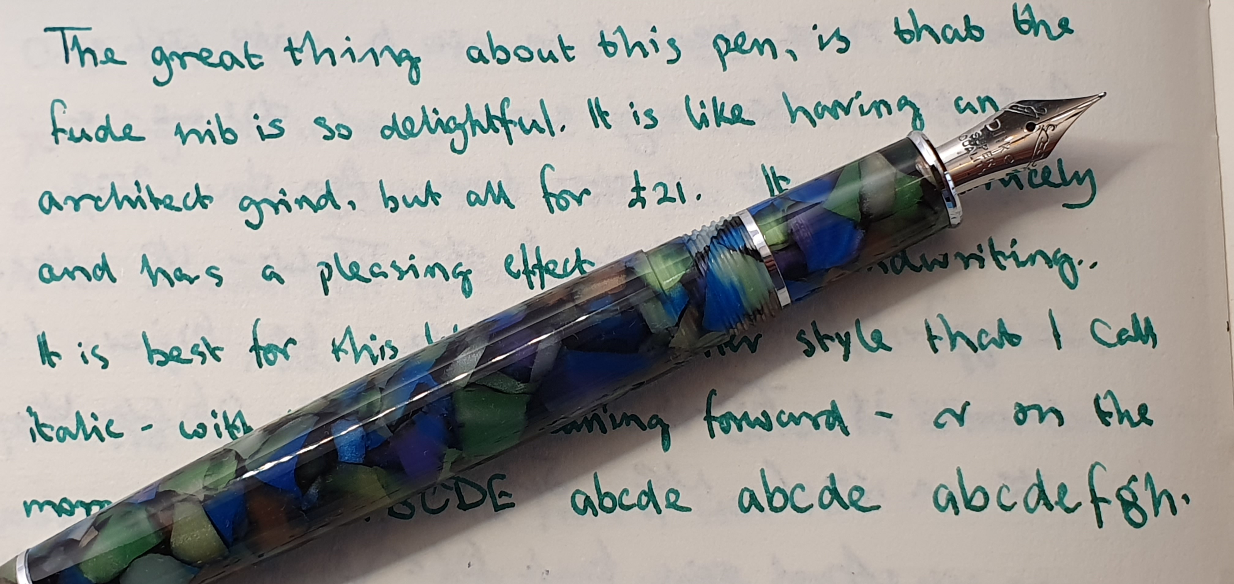
When I put pen to paper, the sensation was of a deliciously smooth nib, producing a bold line with some subtle line variation. I asked him whether this was a custom grind. “No” he replied and went on to confirm that this was a factory nib and that he had not done anything to it, other than perhaps a little smoothing. To my surprise, the pen in my hands that I had thought cost hundreds of pounds, was a Chinese Hongdian model N23, or “Year of the Rabbit” edition, costing around £40.00 on Amazon. I made a mental note to look into this!

As the afternoon progressed, I was able to try many more interesting pens that were circulating the tables. I reciprocated, handing around my recently acquired Tibaldi Infrangible Black Gold, and a Parker 61 Heirloom, capillary filler with one of the smoothest hooded nibs I have ever known.
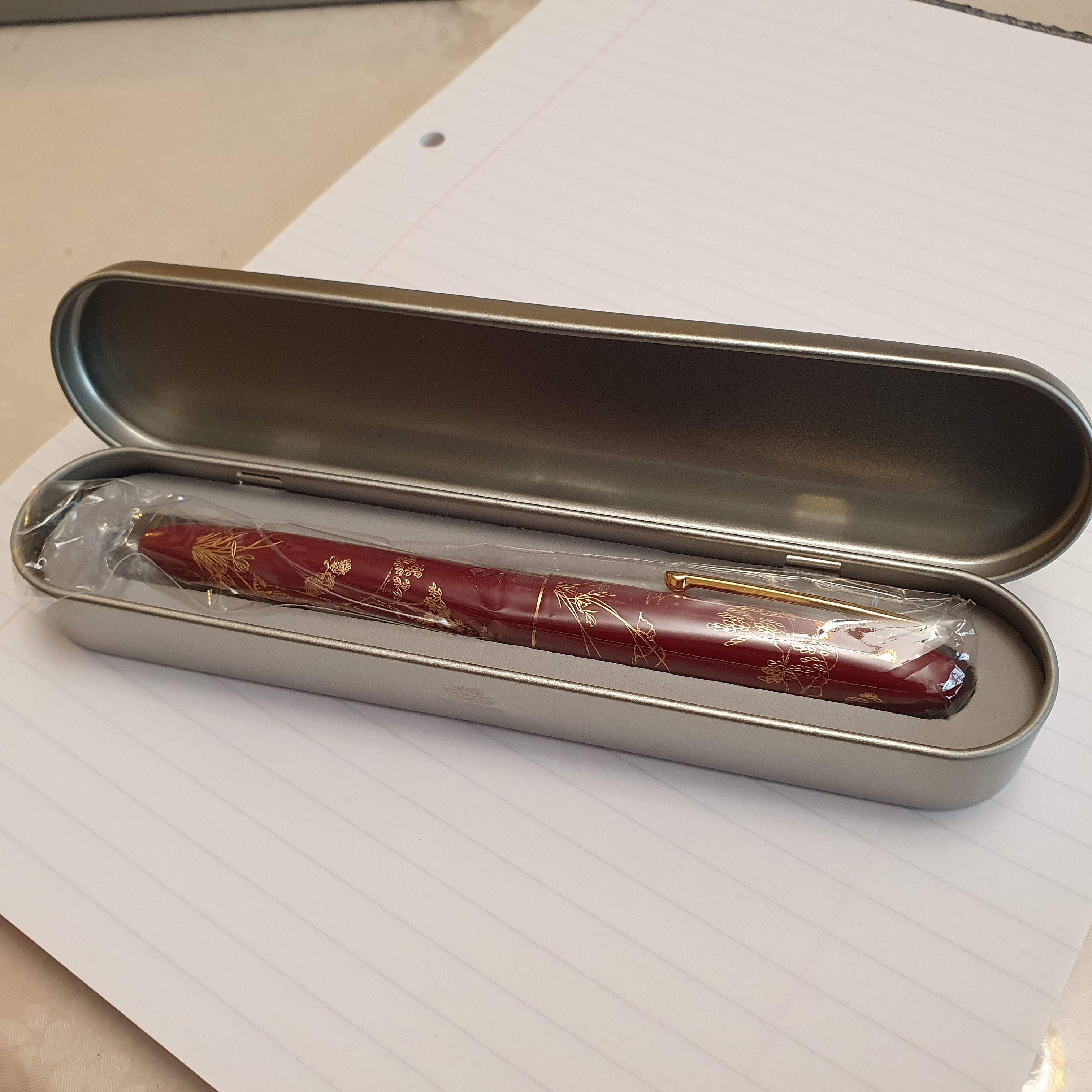
Back home that evening I looked for the Hongdian N23 rabbit pen. I found that it was available in four colours, red, black, blue and white. The red and the black versions featured gold coloured engraving, whilst on the blue and the white versions, it was in silver colour. Also there was a choice of an extra fine nib or the nib that Baran’s pen had, which they called a “long knife” nib. I opted for the red version with long knife nib. As luck would have it, there was a 20% discount on for Amazon Prime members and the pen would arrive the next day.
Unboxing.
The pen comes in a grey cardboard outer box, inside which is a metal box, with the pen nestling in a foam surround and in a polythene sleeve. Having more time to inspect it closely, the quality of finish looked and felt good. The pen is of metal construction, but coated in a rich Burgundy piano lacquer and the artwork, which appears to be engraved or applied in gold, includes a rabbit on both barrel and cap, plus trees and foliage and distant hills in the style of a Chinese brush and ink painting.
Construction.
The pen has rounded ends and a screw cap. There is a gold coloured pocket clip which looked as if it might be sprung but is not, and is extremely stiff, functioning better as a roll-stop. The cap unscrews in one and a half rotations. There is a comfortable grip section, ending at the nib with a flat-fronted ring. The nib and the ring are, I think, gold plated although the nib is not marked as such, at least not on the part of the nib which is exposed. Whilst the ring looks nice I suspect that it may reflect sunlight into a halo around my writing, which is a first world problem I have sometimes with my Pelikan M800.

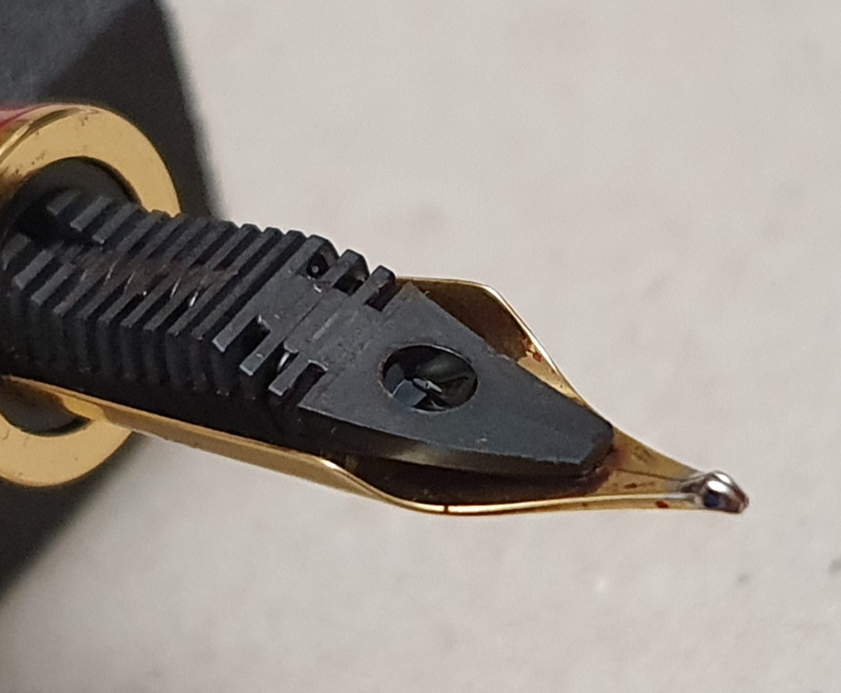
The nib has another rabbit motif and a plastic feed. The tipping is rather special. It is not a flat, architect type grind but rather, presents a curved edge to the paper so that the pen may write smoothly however steeply you hold it to the paper. This is similar to the principle of Pilot’s Waverley nib, except that the curved writing surface is formed by the shape of the Iridium tipping material, rather than by having Pilot’s gentle upward curve to the tines.
The pleasing quality continues with the metal collar to support a cartridge or converter (the latter being included in the pen) and a rubber O-ring to help seal the pen against leaks and to give the barrel a more secure hold, when screwed in place. The threads inside the barrel are also metal.

The writing experience.
Very smooth. I inked the pen initially with Montblanc Corn Poppy Red, which was quite pleasing but changed it the following day for Diamine’s Pelham Blue. The ink flow was just right, giving a nicely lubricated writing surface. On my Stalogy notebook paper, it writes very well although on Basildon Bond’s writing paper, the nib struggled with the smooth paper and skipped a lot.

The line width, although I do not have an accurate means of measuring it, appears to be around 0.6 mm on the cross stroke, at my usual writing angle. This is not a nib designed to write lines of different thickness according to how steeply you hold the pen (as with Sailor’s Zoom nib for example) but rather, seems intended to write smoothly to accommodate different ways the pen might be held.
Weights and measures.
The pen, capped is around 141mm long. Uncapped it is 122mm. I do not like to post this cap, for fear of damaging either the cap threads or the barrel engraving. It does not post very deeply or securely and I have not pushed it. It weighs a decent 35g, being 21g uncapped and 14g for the cap alone. That is a good optimum weight for a pen in my opinion.

Conclusions.
I am glad to have found this pen, with its attractive appearance and unusual tipping. I enjoy writing with it. It serves as a lovely smooth broad nib and at a modest price. The rabbit is a symbol of good luck, prosperity, happiness and serenity in Chinese culture. Certainly, I feel lucky right now. I am lucky to have so much pleasure from the fountain pen hobby. I am lucky to have this blog and today’s post is the 250th.

This is my first Hongdian pen. I wonder whether they may bring out a new edition for each Chinese New Year. This could be a slippery slope.