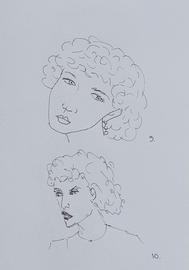
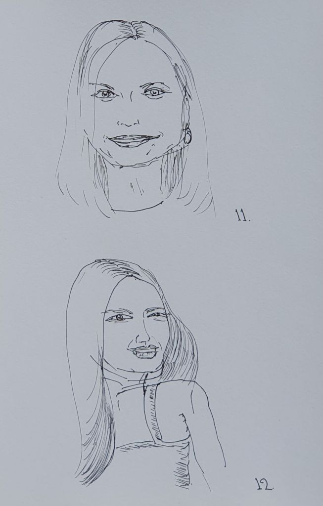
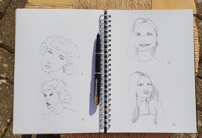
I learned of this challenge from Writing at Large. The idea is to complete 100 sketches of people in a week, from 3 to 7 March inclusive. The challenge runs every year in the first week of March.
Although I am not usually one for these online challenges, I was intrigued enough by this one, to have a go. I thought the practice would be beneficial, which it has been.
I gathered that there were few rules on how to go about this. You can use any sketching media. Then post your work using the hashtag #OneWeek100People.
Even the target of completing 100 pictures in 5 days is not essential. That is just as well, as I find myself woefully behind with just 12 pictures in three days.
Also my pictures have all been copied from photos, rather than drawn from life, as an urban sketcher would.
Having since looked at other people’s work, I now see that my sketches are far too fussy, when I should have worked loosely and quickly.
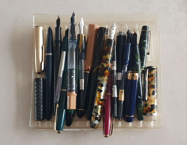
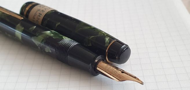
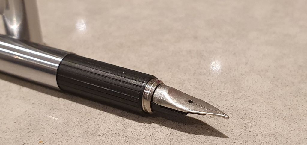
But here are my attempts so far. All were drawn with a vintage Parker 17 Lady fountain pen with Parker Quink black ink in a Rymans A5 sketch book, with no prior pencil work. Going straight to ink builds confidence! I quickly learned that trying to produce pictures that are recognisably human is challenge enough: to get a likeness is a whole lot harder.
In blogs which promote fountain pens, I think it is good to inspire the use of these wonderful instruments, and not only their acquisition.
Well, this is embarrassing. I had pencilled in a post for this week, intending to call it a pen show recap, as “my haul” would not work on a “no-buy”. But as it turns out, the “no-buy” promptly went out of the window as soon I got through the gates. Another generous interpretation from one of my pen club friends, is that purchases during a pen show do not count in a no-buy.
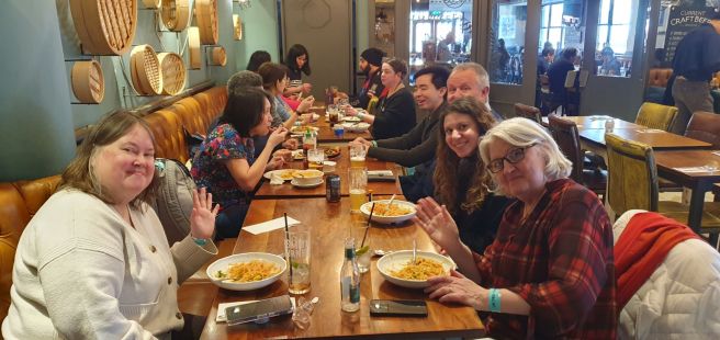
Anyhow, I had a brilliant day at the show as always, running into many friends. As most of our pen club (The London Fountaineers) had arranged to meet up nearby at Latymers for a pub lunch during the show, I decided to go for the 9.00am early bird admission, to compensate for the lunchtime erosion of shopping time. This worked out perfectly and it was lovely to sit down and catch up with friends over a delicious Thai meal and share what each of us had found.
Pen club lunch at Latymers.
Over the course of the day, I acquired nine pens. I know that this sounds like a lot but none of them was terribly expensive and many folk spent more than my total on a single pen.
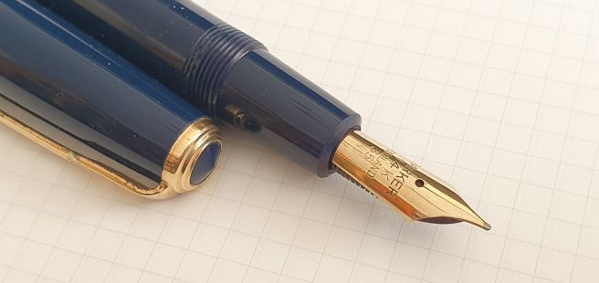
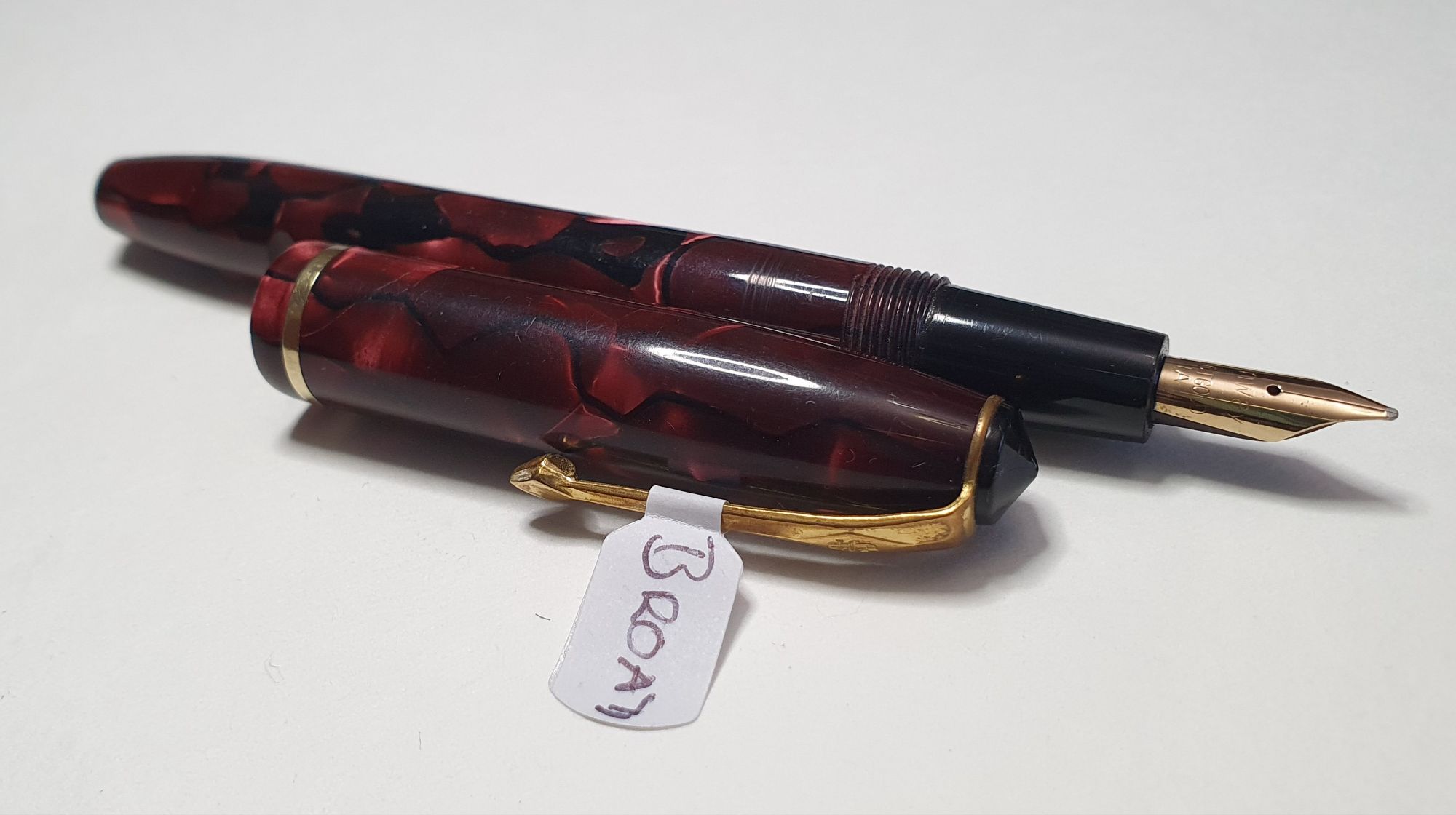
The only pen that I had specifically hunted for, was a Parker Duofold Senior, in blue. I found that the typical prices of these old Duofolds rise as you progress through the seven different sizes. The “Senior” (with a #35 nib), is the second largest of these and I paid £80.00 for a very nice example. The largest one was called the Maxima (#50 nib).
Parker Duofold Senior (#35 nib)
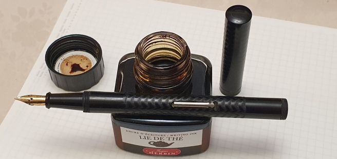
One of my earliest finds was a “Ty-phoo Tea” pen, a lovely old (1930’s?) lever filler, in black etched with a wave pattern, flat ended and clipless and a small, 14k gold nib. This would have been acquired as an offer in return for coupons from packets of tea. It is said to be “British Made” although the maker is not specified. I have since read on FPN that there were several such models made for Ty-phoo Tea over the years, likely to have been supplied by Swan, Wyvern or Conway Stewart. With a sudden brainwave, I have paired it with Jacques Herbin Lie de Thé.
Typhoo-Tea pen with aptly chosen ink
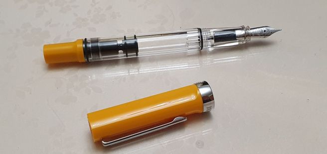
I picked up a TWSBI “Eco T” in Saffron with a lovely EF nib. Admittedly, I thought that I was buying a standard Eco, but later discovered it to be an Eco T, which has three, softly rounded facets on the grip section and a triangular cap and piston knob – a model that I had not been aware of, but still a pleasing buy with summery vibes.
A TWSBI ECO T, Saffron with EF nib.
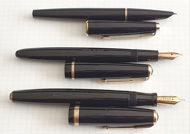
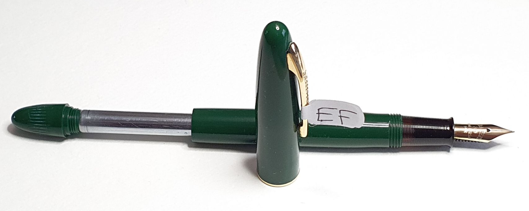
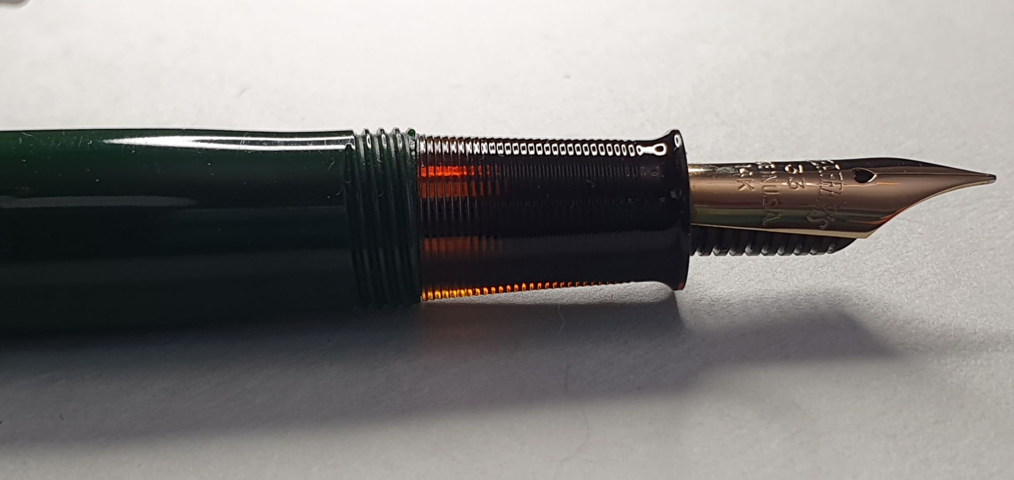
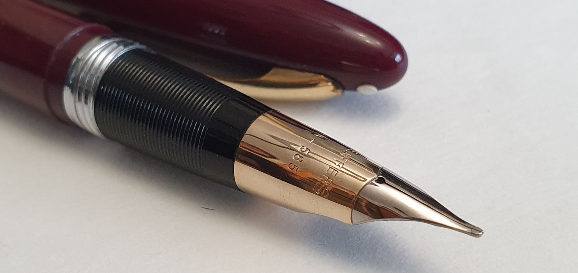
I had a successful run of buying three vintage Parkers, all in glossy black with gold trim, each from different vendors. First, a Duofold button filler (1940’s?), the first button filler I have owned, from Heritage Collectables. Next a Duofold Junior, with a Fine nib which, amazingly, was in near mint condition with original chalk marks and an aero filler which appeared never to have been inked. This was from Justin Janse van Vuuren. Finally, a gorgeously cute irresistible Parker 17 Lady (Fine), which posts beautifully to become a really delightful pocket pen, sold by Carneil Pens. I have been using this for sketching, with Parker Quink Black.
Three vintage Parkers.
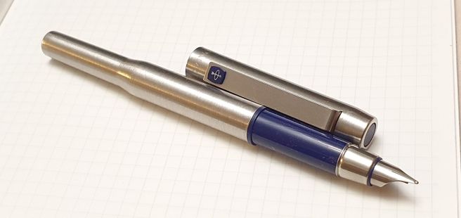
I also bought my first Parker 25! I had never much liked the oddly industrial brushed steel tapered barrel and so had refrained from buying one when they were part of Parker’s range. But having learned that they were designed by Sir Kenneth Grange, also responsible for designing the Inter-City 125 train, I felt it was high time I tried one. There were several to chose from at the show and so I could examine their nibs with a loupe. In the hand, the pen is more comfortable than it looks and the cap posts beautifully, flush with the barrel, whereupon the tapering barrel makes sense.
Parker 25.
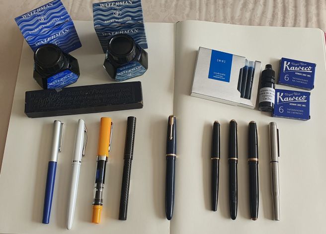
Otherwise, my pen-buying flurry included a Pelikan Jazz and a Sailor High Ace neo, each offered at just £5.00 from Cult Pens. I also stocked up on ink, finding bottles of new old stock Waterman Florida Blue and Waterman Blue Black, plus a luxurious box of 6 Pilot Iroshizuko kon-peki cartridges and a couple of boxes of the Kaweco Royal Blue cartridges.
Another suitcase, another haul.
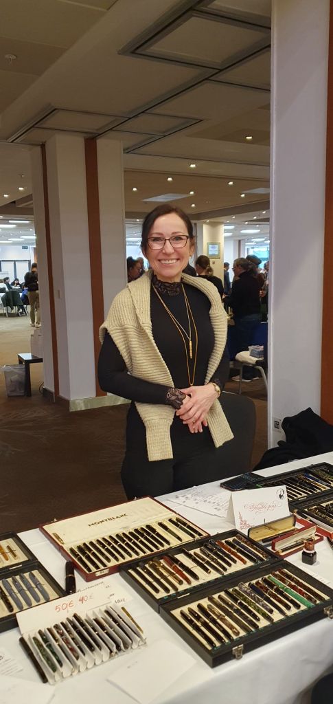
The day was punctuated by lots of lovely conversations with friendly dealers including Jeremy Collingbridge, John Hall, Kirit Dal, Ray Walters, John Foye, Sarj Minas, Kasia Stier, Justin Janse van Vuuren, my good friend Jon of Pensharing and many others. On the train home, I also tried to list all the friends I had seen and this came to more than 20.
Kasia Stier of PenSpa.
For anyone serious about being on a no-buy, the London Pen Show is not the place to go. As a recent retiree, I discovered that I am still at heart, a child who wants a new toy a little too often. But I am thrilled with my acquisitions which I am sure will punch well above their weight in providing joy for years to come. Thanks, as always, to all the organisers, dealers and the fountain pen community. See you all next time!
Inky Pursuits is my occasional series of posts on topics which individually might not be quite blogworthy, but hopefully when combined together may be greater than the sum of their parts.
Thoughts on completing the WES Pen Repair Course.
This month saw our group complete the third and final module of the Pen Repair Course, available to members of The Writing Equipment Society. I was one of a friendly group of four attendees for the London classes, held at the Harrow Arts Centre and led by Ray Walters. Details of the course, topics covered and joining instructions are on the WES website (the Services tab) or via the link here.
The course had been highly recommended to me by a pen club friend who had attended the previous year. I am very glad I joined. Ray, who is also a regular vendor at pen shows, is an excellent tutor. On my arrival for the first module back in November, Ray had already laid out his tools and equipment including a large green canvas roll containing dozens of implements from section pliers, bionic pliers, hammer and drifts, to dental picks and pieces of bicycle tyre inner tube for gripping. The table resembled a field hospital.
During the course, which was very much hands-on throughout, we were shown how to assess a pen, refurbish its filling system and deal with bodywork issues. But aside from the specific techniques needed for various types of vintage pen, Ray’s general wisdom and his advice about the tools and how to use them correctly, was equally useful. By watching, listening and doing, we were soon able to service some of our own fountain pens and gain practical experience and confidence.
In particular, I was thrilled to return home after my first day, with two very elderly fountain pens, bought in a sorry state from a local antiques shop with no sacs and badly bent nibs – now back in full and joyous working order. The course had already paid for itself!
Both pens were lever fillers, from around the 1930’s. Their rubber sacs had long since perished and crumbled to dust. These pens proved to be an ideal example of how to go about a sac replacement. As for their nibs, Ray possessed an impressively heavy and shiny block of steel with tapering semi-circular ridges and channels, for burnishing nibs into shape. After watching Ray tackle one of my nibs, it was my turn to do the other one.
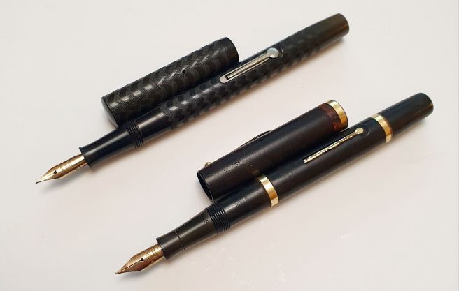
A Pitman College pen (top) and Swan Mabie Todd SF2 (below)
After lever fillers, we moved on to button fillers, Parker vacumatics and aerometrics and then Sheaffer touchdown fillers and “snorkel” fillers. Although Ray showed us how to disassemble and service these, I got the impression that snorkel repairs are best avoided if possible. They just do not seem to have been made with ease of servicing in mind.
In the final module we covered other filling systems including Onoto, Conklin, Montblanc and Pelikan. I had brought along my Montblanc Meisterstuck 146, a present from my wife 28 years ago. Although I cherished it, it had mostly stayed in its box as the piston was very tight and awkward to use. But with Ray’s Montblanc nib and piston removal wrench, I was finally able to introduce some silicone grease to the piston which made a world of difference. The pen is now filled and in daily use.
The whole course was very enjoyable and worthwhile. One caveat though: the new temptation to buy more tools opens up a whole new rabbit hole.
One Month One Pen.
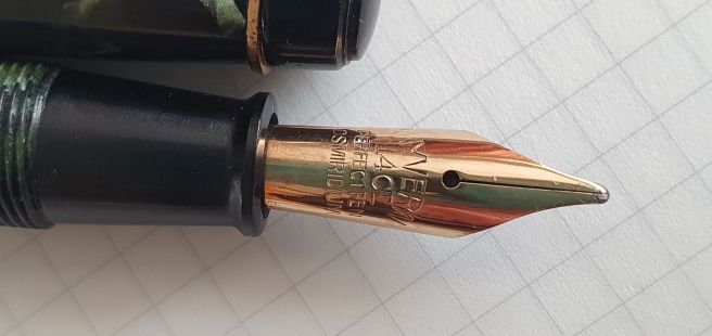
In my previous post A new month, a new plan, I wrote of my intention to use just one fountain pen for the month of February. So, how is that going? The pen I chose was a Wing Sung 699, an inexpensive Chinese vac filler bought over five years ago. I wanted to remind myself what it was like to have only one fountain pen, to see whether I was content with this or whether I still craved other pens.
Wing Sung 699 partly disassembled for cleaning.
Overall, I think the exercise has been a success. I flushed out a whole bunch of pens. I enjoy using the Wing Sung very much. Used daily, I am a little more conscious of the need to unscrew the blind cap a little to raise the plunger, otherwise the pen ceases to write once the ink in the front end is exhausted – but this is no hardship. I find the pen very comfortable. I like the way it writes, with its firm, steel Fine nib, adjusted slightly to increase flow. Filling the pen with one downward push of the plunger, is always exciting to see.
One issue to be aware of is that the section of the Wing Sung 699 can be unscrewed for cleaning. That is a good thing. But you do need to ensure that it remains tightly done up when the pen is inked! A few days ago I found ink on my fingers and realised that the section had loosened slightly. This required me to empty the pen, clean it and grease the threads (as well as the main ink reservoir) and refill it. Another lesson that I learned is that the gold ring between the barrel and section will slip off without you noticing whilst you are bathing the pen in the wash basin. Luckily I spotted it gleaming in the water, before pulling the plug.
I have enjoyed this more concentrated spell of using the Wing Sung. I could probably use it exclusively if I had to. However, I have cheated a bit over the month with a few extra pens creeping into use. First there was the Montblanc that I serviced in the repair class and then filled. (My teacher made me do it). I have enjoyed having this special pen inked again. Then there was a Cleo Skribent Classic, with a steel nib that I had an urge to tune. Having done so successfully, I could not resist filling the pen and adding it to the pen cup.
This week, I received a surprise gift of an Ellington Nautilus fountain pen in the post from my brother, with an extra fine nib. I filled it up right away and it writes beautifully.
Ellington Nautilus fountain pen.
A 2025 no-buy.
This was another intention, voiced in my last post. It is too early to judge whether this will be a success or not. I am qualifying this to say that it relates only to fountain pens, as I have already bought several gel pens and notebooks as well as other stationery supplies.
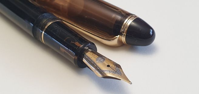
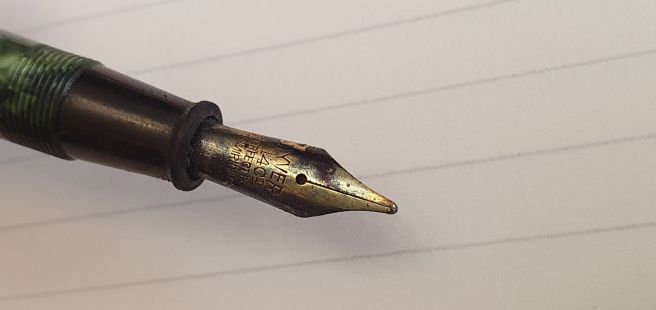
As for fountain pens, I have not purchased any since buying the perfect pen on 4 December 2024. No, I do not mean that it was so perfect that I ended my pen-buying journey. Rather, it was a vintage pen called the “Wyvern 81 Perfect Pen.”
The 14k gold nib of the Wyvern 81 Perfect Pen
But having said that, I have still struggled with the usual temptations to buy other pens. Since meeting up with my good friend Jon of Pensharing.com, his Majohn P139 has played on my mind. This is a chunky, black and orange, piston filling fountain pen, a homage to the Montblanc writers’ limited edition Ernest Hemingway of 1992. The Majohn costs only around £52 with a number 8 nib, but I am bravely resisting for now.
I have received unexpected life-lines. A generous friend in Australia recently sent me three interesting vintage Parker fountain pens, which he had found in charity shops there. I have dip-tested them all but not yet put them into use and am looking forward to doing so. And then there was the lovely surprise gift from my brother too.
Parker 45 Insignia. One of three Parkers from my friend in Australia.
I am not expecting my will-power to survive the onslaught of the coming London Pen Show. The best I can strive for is sensible moderation and to hold tightly to my Wing Sung.
One of the joys of the fountain pen hobby is finding combinations of pen, ink and paper that work together really well. You find yourself writing with a pen that is supremely comfortable, with a nib that glides along the paper smoothly but with just the right amount of feedback, laying down an attractive line of ink that is neither too wet nor too dry.
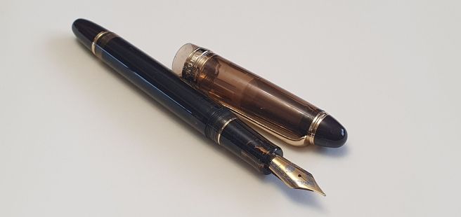
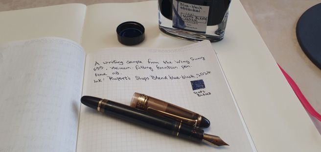
In recent years, it has been my practice to pick a different pen and ink combination to use each month, for my daily A5 journal entry. I am using a Ryman A5 page a day diary. For January, I enjoyed writing with a Wing Sung 699, vacuum filling fountain pen with a fine nib. The ink was my own “Slops Blend blue black 2024” representing a mix of inks that I had flushed out of pens cleaned over the course of last year.
Wing Sung 699 vacuum fill fountain pen.
The slops blend experiment is somewhat reckless and goes against the usual advice not to mix inks. The risk is that different inks may clash to form a gunge that clogs pens. When mixing ink it is not only the colour that changes but also other features such as the viscosity, drying time and water resistance. But I have enjoyed recycling ink in this way and have been fortunate not to have any problems. It is a gamble, adding a few drops of ink to the bottle, shaking it up and testing the colour. I was lucky to find that my left-overs had produced a pleasing blue-black, that kept its tone and did not fade to a teal colour, as some do. The trick then is to avoid going too far and spoiling the mix.
My unique blue black recycled dregs.
My Wing Sung 699 seemed to like my slops blend ink. It produced a nice dark blue-black with attractive shading and a nice lubricating quality and did not suffer from the fading and colour changes.
As well as my Ryman diary, this combination was particularly nice on my Stalogy notebook paper. I found myself thinking that I would continue with the same pen and ink for the month of February too. It also crossed my mind that the combination was so enjoyable that perhaps I did not need any other fountain pens and could use this one for everything.
Such thoughts have often arisen but this time, I decided to act upon it and put my money where my mouth is. No, I have not sold or given away all my other pens! But I thought it may be an interesting exercise to simulate having only one fountain pen. I flushed out about a dozen inked pens, keeping out just the Wing Sung. (I have cheated slightly as I did not throw out half used cartridges or syringe out the remaining ink. Instead I have just put aside my inked cartridge pens, in a separate pen cup, for the time being).
The aftermath of a pen cleaning session.
I thought that this might give me an opportunity to spend a longer time using the Wing Sung vac filler pen, for diary, journaling, letter-writing, notetaking and EDC. It may be interesting to see whether there are any other fountain pens that I particularly miss, over the month. For example, I recall a holiday abroad some years ago when I badly missed my Parker Sonnet. Then there was an occasion when I was absent from work for a few months due to ill-health. The pen that I missed most was the Cross Bailey Light, in royal blue with Cross Blue ink, that I kept in the office.
Other potential benefits of this little scheme, are that I was able to bring down the number of currently inked pens considerably, when this had been hovering well over 30 a few weeks ago. Also, I have already started to compile a new batch of Slops Blend ink, that I shall call my 2025 crop.
Perhaps this exercise is indicative of a wish to simplify life a bit. I bought around 50 fountain pens last year (mostly not expensive, with about half that number being vintage pens from eBay or pen shows). I, (or more accurately, my wife) decided that this pen buying needs to stop. I am therefore having a 2025 No Buy. The same goes for notebooks and ink, as well as other writing instruments such as ball points, roller balls, gel pens, mechanical and wood case pencils.
The very pleasing nib of my Wing Sung 699
I bought no fountain pens in January! Admittedly that is only one month. I will be very surprised if I can keep this up for long but thought I would make public my intentions as a contemporaneous record not only for myself but for readers to witness as well.
Again, I have already cheated slightly, in the impulse purchase of a rather lovely black and gold Cross Coventry ball pen. I have also added a few notebooks to my stash, just in case there is a siege in London. You can’t be too careful.
As mentioned in my recent posts, I have been attending a practical course on fountain pen repair. Although very much a beginner, it has been fascinating to learn the correct ways to use the various tools involved and very satisfying to restore a vintage pen to life, when it goes well.
In between the sessions we are encouraged to “practice, practice, practice.” It is sensible not to go straight in with a valuable pen as there is a risk, or even a likelihood, of making mistakes and breaking your pen.
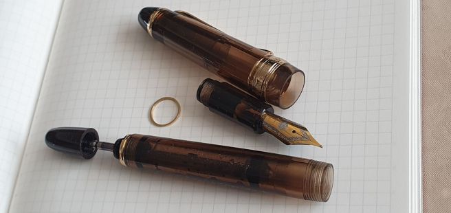
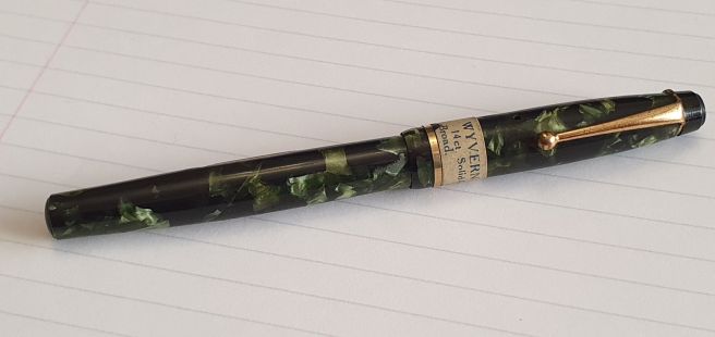
One of my recent early practice exercises was a Wyvern fountain pen, bought on eBay at a modest sum, advertised as for spare parts or repair. The pen was not in working order and the seller had been unable to remove the barrel. Nevertheless, it was an attractive pen in marbled green celluloid (I think), a lever filler with a 14k gold nib. Also, what was especially appealing was that the pen still bore its original paper price band stating “Wyvern No.81, 14ct Solid Gold Nib, Broad” and the price, including tax, of 22 shillings, 7 and a half pence. As a reminder for younger or overseas readers, there were 12 pennies to a shilling, and 20 shillings to a pound (therefore, 240 pennies to a pound). This pen therefore sold for roughly £1.13 when new. We switched to decimal currency on 15 February 1971.
Wyvern 81 “Perfect Pen” complete with price tag.
This is my first Wyvern fountain pen. I was aware that this was a British brand, beginning in 1896 and lasting until 1955. From brief searches online, I believe that my pen may date from around the late 1930’s.
When the pen arrived, the body appeared to be in good condition with no apparent cracks. The barrel imprint (always pleasing to find!) was still clear. The nib was caked in dried ink but on cleaning this in water with a soft toothbrush, it came up gleaming.
I am a sucker for a pen that needs cleaning.Wyvern nib, after a good bath.
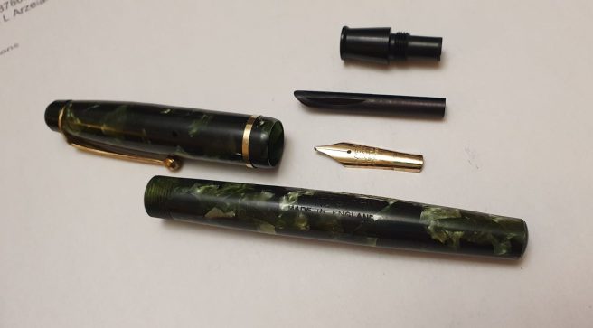
The lever for the filling mechanism would not move, suggesting that the sac had perished and hardened inside the barrel. Fortunately, I was able to remove the barrel, by gripping it with pliers, with the jaws shielded by rubber (from a bicycle tyre inner tube). On this pen, the barrel unscrews from the section.
I was expecting to find the rubber sac hardened and cracked into loose debris, to be shaken out of the barrel. To my surprise, very little debris did come out initially. I could see hardened sac material stuck to the inside of the barrel, at the opening. The challenge was how to get this out as it was stuck hard to the barrel.
With nib, feed and section removed.
After establishing from a pen club friend that the barrel was not made of Casein (which must not be soaked in water as it will disintegrate), I was then confident to leave the barrel to soak in a jar of water overnight. I then tried scraping out the rubber residue, using a straightened out giant paper clip (carefully avoiding the pressure bar). Some fragments of rubber then started to come away. Patiently, I left the barrel to soak again for another night, before resuming my scraping. As well as tiny fragments and dust, a few larger bits of solidified rubber eventually came out, to my immense satisfaction.
Eventually, I was satisfied that I had removed all vestiges of the rubber. Inserting a brush, I was able to rotate this and clean the inside of the barrel nicely.
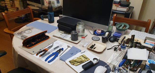
I had ordered a selection of replacement ink sacs, from The Pendragons. I also bought from them, some rubber-jawed section pliers, a pair of barrel-cleaning brushes and a nib knock-out block!
The dining table in workshop mode.
Fitting a new sac is a fairly straightforward but very satisfying task, for a beginner like me. Sometimes, removing the barrel is the trickiest part and soaking and/or heat is required. This was only my fourth such repair. Identifying the best size sac, if you have a few different sizes, is most easily done by introducing the sac to the barrel to find the largest diameter sac that fits, touching the sides lightly but without resistance. The length then needs to be trimmed, measuring from the sac nipple, to the end of the barrel, then shortening it a bit to allow some clearance at the back. To attach the sac, you apply shellac adhesive around the sac nipple. You also need French Chalk, (talcum powder) in which to roll the sac before it goes in the barrel, to prevent it from sticking to the sides.
However, before attaching the sac, there was another factor to bear in mind. As I said, the barrel was threaded, not friction fit. This meant that there was a risk of the sac being caught and twisted by the barrel. To avoid this, the nib and feed are removed from the section before fitting the sac. Assuming that the nib and feed cannot easily be pulled out, they are knocked out with a hammer and drift, using the knock-out block, having soaked the section in water first.
This leaves the section open whilst you attach the sac. You can then insert a rod (something not sharp) through the section and up into the sac, to keep it from twisting as you screw the section back into the barrel.
With the nib, feed and grip section separated, these can be cleaned. It is useful to floss the nib with a brass shim at this stage and check that the tine gap is as you like and the tines are level.
I was worried that the nib and feed would be difficult to push in, since they had been so tight to remove. I applied a little silicone grease to the outside of the feed, whilst trying to avoid any grease blocking the feed channel. It was still a tight fit to get the nib and feed back in, but all went well. Finally, I heat-set the nib and feed, dipping them in freshly boiled water for about a minute, squeezing them together for about half a minute and then cooling in cold water.
I was then finally able to test nib and fill the pen. I had deliberately refrained from writing with the nib beforehand, saving this treat until the new sac was installed and the pen ready for use.
I was surprised to find that the nib was much firmer than I expected and also that the line was not broad, but closer to a medium. However, the pen writes well, with a distinctive pencil-like feedback.
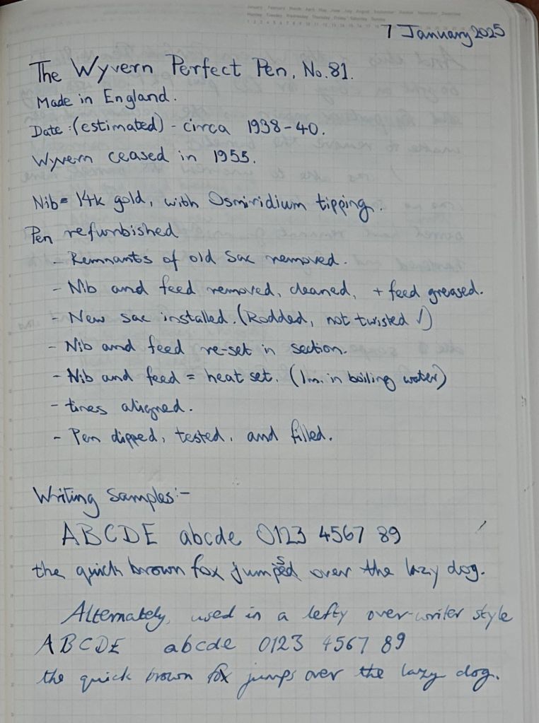
Writing sample, Wyvern 81 with Waterman Serenity Blue on Stalogy paper.
With every successful repair, one gains experience and confidence. I wish I knew more about this pen’s life and owners, during the last 80 years or so. I suspect that it had not been doing very much as the nib and sac could both be original. This will remain a mystery but I am happy to have the pen in use once again.
I have been meaning to post a round-up of my fountain pen activities over the past year and had better get on with it, before January is over. This tardiness is in no way indicative of any waning of my passion for fountain pens, which remains as strong as ever.
Pen acquisitions.
Let me begin by ‘fessing up to my annual spend on fountain pens. A look back at my handy Memento database app of pen acquisitions, shows a total of 52 arrivals last year, of which three were gifted to me. One of my purchases, a Parker 51 demi “Cocoa” fountain pen and pencil set was sold on to a lady in our pen club who had asked for help in finding one. Deducting this, I am left with 51 arrivals and a total cost of £1,828, which is up on the previous year.
However the total cost includes one grail pen namely my Scribo Write Here Africa, with its juicy broad 18k nib, purchased from the Write Here shop in Shrewsbury. This accounted for £440.00 of my annual total. If I deduct this, the total spend drops to £1,388 and 50 pens averaging just around £27 each and an average monthly outlay of around £115. This might not sound a lot to a fellow pen enthusiast, to spend on a hobby but I am mindful that I began the year (as I do this year), with a genuine intention to acquire fewer pens, not more!
Approximately one half of my pen acquisitions were vintage, which explains the modest average cost.
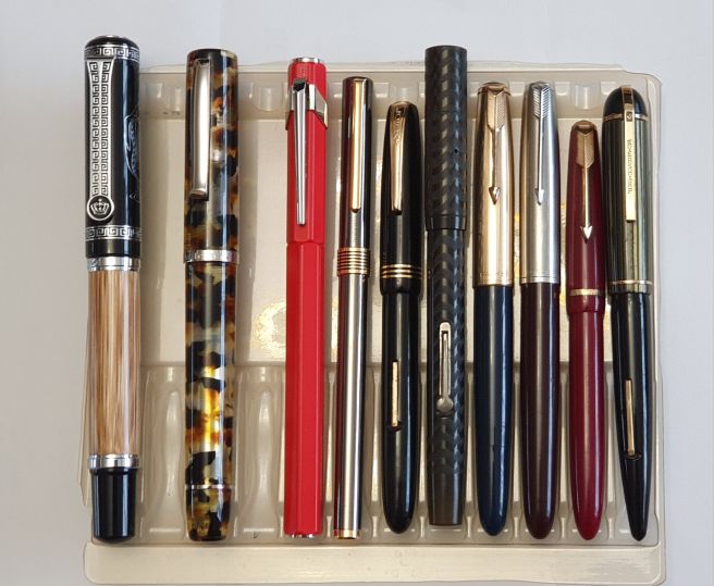
It is difficult to pick favourites, but here in no particular order are 10 of my pen purchases from 2024, which have given the most enjoyment. These are, from left to right: 1. Duke 551 Confucius bamboo fude nib sketching pen; 2. Scribo Write Here Africa; 3. Caran d’Ache 849; 4. Aurora Marco Polo; 5. Burnham 61; 6. Pitman College lever filler; 7. Parker 51 vacumatic; 8. Parker 51 aerometric; 9. Parker Slimfold; 10. Eversharp Skyline.
My top ten from 2024.
Other pen-related activites.
Aside from acquiring pens, my year has been punctuated by numerous events, including the London and Birmingham pen shows, the Pelikan Hub and our monthly pen club meets. Then there are the daily solitary hours spent in journaling, pen, ink and paper sampling, pen cleaning and tinkering, letter-writing, screen-time in following the global pen community online, reading blogs and “researching” pens on YouTube, eBay, Amazon and various online pen dealers.
As for this Fountain pen blog, WordPress informs me that in 2024 I added just 24 posts, writing 25,800 words, generating 270 likes and 252 comments. The all-time stats show a total of 276 posts (not including this one), and all-time views of 777,452. (Come on, let’s get this to a million!). I continue to be amazed at the reach of this blog, which arose in 2016 from and continues to be an extension of an innocent hobby. I do value the online interactions that it brings.
It is hard to list all the pen-related activities that one enjoys, without them sounding like a list of symptoms of an obsession. Perhaps it is. But I do have others as well, such as reading and listening to (and making) music. Having retired from work in 2024, I am wondering how I ever had time for it.
Towards the end of last year, I began the Pen Repair Course, organised by the Writing Equipment Society (WES) and led by the excellent Ray Walters, whom many will know as a dealer at pen shows. I have enjoyed his classes immensely and have one more session to attend, next month. Thus I have added pen repairing to my leisure activities and find this very satisfying and rewarding. There is a risk that the acquisition of some necessary tools can lead to marital friction. Buying a heat gun took a little bit of persuasion. But it keeps me out of mischief.
As always, I thank everyone for reading. Special thankyous go to The Pen Addict, The Gentleman Stationer and The Well-Appointed Desk who often include links to my posts in their weekly round-ups, giving my viewing figures a welcome boost. I wish you all much penjoyment in 2025 and beyond.
It’s time to wake up this blog for another year and, where better to start than with a brief review of the diary that I plan to use?
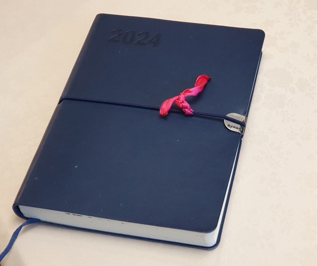
For 2024, I used a Ryman A5, soft cover, flexi, Page A Day diary for my daily journaling, summarising what I did with the previous day. Occasionally, this might include a list of things I am grateful for (if I can be unselfish enough for a few moments, to remember). My post on the new year diary, 2024 can be re-read here.
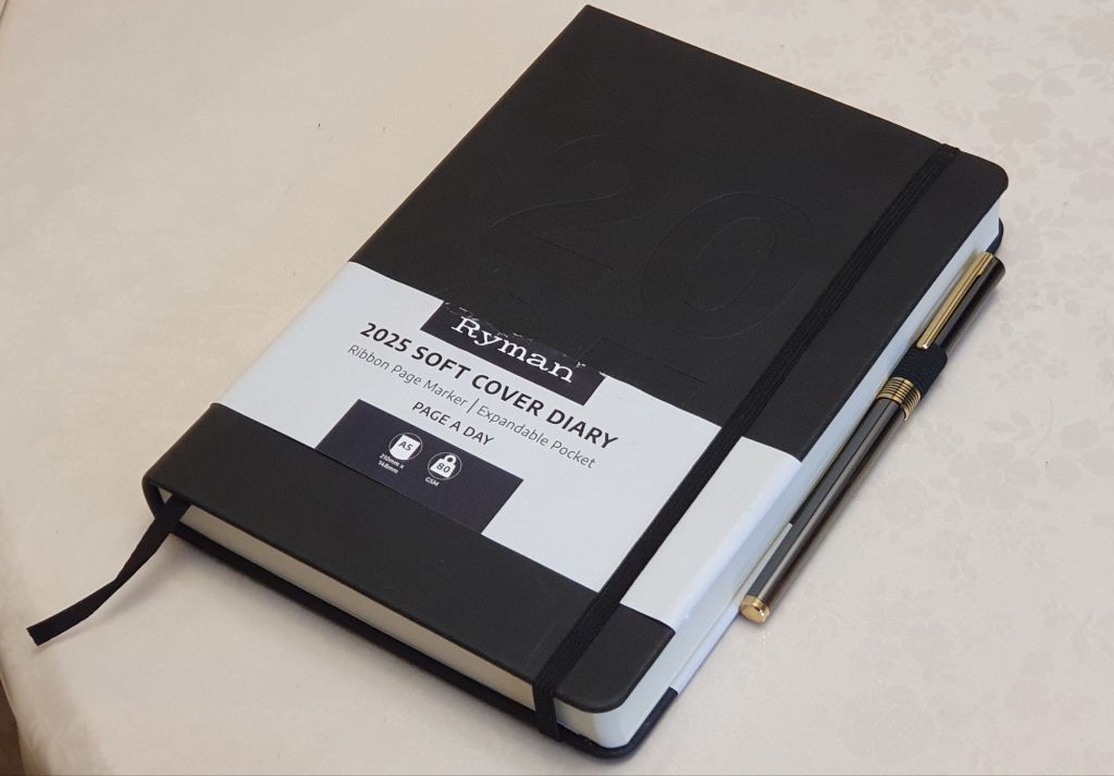
This year, I went for the closest equivalent that I could find, which was again from my local Ryman stationers. Whilst seemingly much like last years, I was glad to notice several subtle improvements have been introduced. These are as follows:-
Instead of last year’s horizontal thin elastic closure, we now have a more conventional, vertical ribbon elastic closure. I disliked the old style, since with short finger nails, it was fiddly to lift the elastic to open the book – an issue for which I designed a simple hack, namely tying a piece of pink ribbon to the elastic.
Whilst retaining the same soft texture of the covers, last year’s flexible cover has been replaced with a stiffer cover, which I like. It also does away with the need for the little metal reinforcement tab on the edge of the front cover to protect it from being worn by the elastic. Over the year, that piece of metal had lifted, leaving a sharp edge which was a danger to adjacent books.
A Pen loop has been added, to the back cover. I don’t actually use it (other than for this photo) but it could be useful.
Something that I have only today noticed, the row height has been increased very slightly from 7.6mm to 7.9mm. I must admit, I was assuming that they were both 8mm until I checked.
Best of all, the 2025 edition now includes a Page A Day for Saturdays and Sundays, whereas last year they shared a page.
Otherwise, the two editions are much the same, with a ribbon page marker, cream paper which is fountain pen friendly and with sewn binding, to open flat without damage.
This suits my needs very nicely. For longer entries, such as holiday journaling, I use a separate Leuchtturm A5 notebook, with either plain paper or dot grid. Day to day pen and ink sampling and therapeutic pen time is done in a Stalogy A5 Editor Series 4mm grid, 365 page note book, a product which I have now used and enjoyed for several years.
For bullet-journaling, I upgraded my old Ryman A4 notebook to a WHSmiths Moderna Ruled A4 Leather Notebook, with 96 ivory sheets of 100gsm paper. I have set this up with monthly spreads, for the years 2024 to 2029 inclusive. It is very useful to log dates which are a year or more in advance, such as car and house insurance renewals, guarantee expiry dates, or investment product maturity dates. As well as these grown-up uses, I also like to include books read, albums listened to, trips to the gym and other day to day life admin.
So there you have it. Here’s wishing everyone a Happy New Year and hoping for happy events to plan and record in our diaries for 2025!
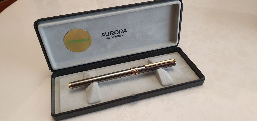
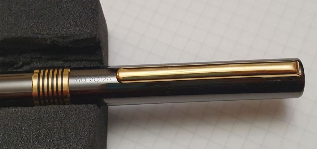
I am enjoying a run of good luck in my fountain pen acquisitions. Hot on the heels of my “four countries and six new pens in a week” cruise ship holiday, I stumbled across a vintage Aurora in an antiques market.
This happened in Spitalfields Market, where my wife and I had come to buy her a hat. Actually, she may have spotted the pens before I did. There, on a shelf, displayed in its Aurora box, was a fountain pen that I was unfamiliar with.
The sticker is from E.E. Ercolessi, a shop in Milan.
This was a slim, cylindrical pen with a glossy gun-metal finish and a gold-coloured pocket clip, cap-band and barrel end. Pulling off the snap-cap revealed a black section and a gold-coloured nib, flat topped with bends at the sides, a bit like a Lamy Safari nib but with no visible imprint. A generous blob of tipping and the condition of the body all suggested that the pen had seen little use.
Like new.
Generally speaking, I do not gravitate towards slim pens. However, for a vintage Aurora I was prepared to make an exception. It was mine for £20.00.
Aurora Marco Polo fountain pen.
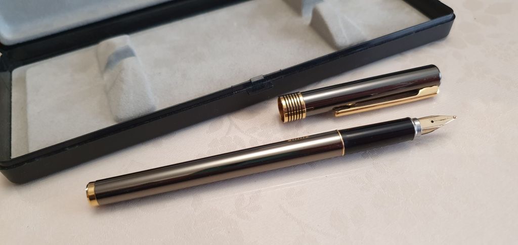
With no papers in the box, I tried to think of the pen’s name. The name “Profil” kept coming to mind but no, that was a Lamy range. Then I remembered the name Hastil. Was it a Hastil perhaps? For a brief time, I thought it was.
Examining my purchase at home, I found the only bit of branding, the name AURORA in tiny letters on the cap but, unusually, printed in line with the pocket clip and barely noticeable on a casual inspection. I also discovered that the cap was cleverly designed to post, with a satisfying click, to add a bit of heft and length, making a very comfortable unit.
Subtle branding
I flushed the section and then pushed in a brown Aurora cartridge, from a box which I had fortuitously bought at a recent pen show. It wrote beautifully, with a nice medium line, good flow, no skipping, no hard-starts, no scratchiness. I was delighted.
Also, I surprised myself in finding that I took so well to such a slim pen. This was a revelation rather like when, as a teenager, I discovered that I did like strawberries after all.
Some research on the internet and in old Aurora catalogues, revealed that my pen was not the Hastil. From a similar pen being sold on eBay, I gathered that mine was the Aurora Marco Polo. (Marco Polo, c. 1254-1324, Venetian merchant, explorer and writer). I did read up about the Hastil, and learned that it was designed by Marco Zanuso, and introduced in 1970. The slim, cylindrical metal design was so novel and successful that the Hastil became the first fountain pen to be exhibited in the permanent collection of The Museum of Modern Art, New York.
I gather that my pen came later, and whilst sharing some superficial similarities to the Hastil, it did not have the Hastil’s gold nib (in a distinctive, scoop shape) nor the cap which was flush with the barrel – yet postable due to a barely perceptible tapering of the barrel. The Hastil also had a special recessed pocket clip feature.
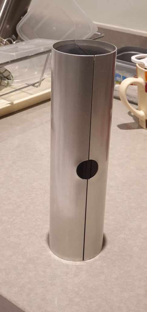
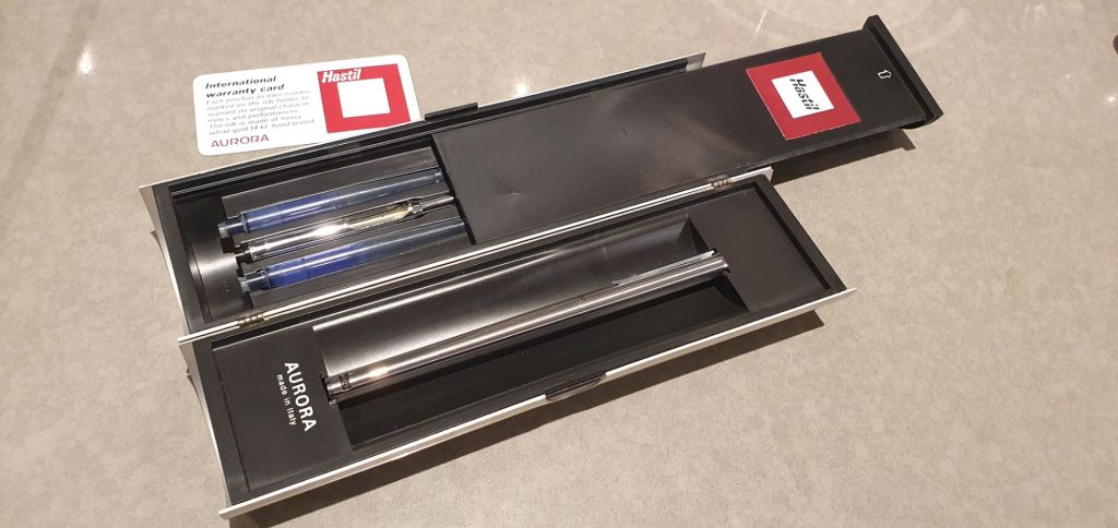
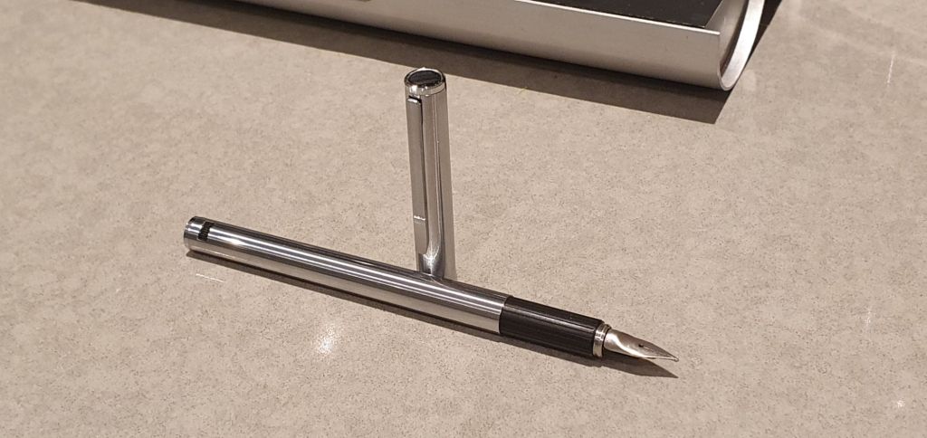
I had not seen an Aurora Hastil in the flesh. But then by a strange coincidence, we were visiting a friend in north London, just a few days after my purchase of the Aurora. Knowing of my interest in pens, she went to dig out a few old pens to show me. Imagine my surprise, when one of these was an Aurora Hastil, complete with its original, extraordinary, metal cylinder box, with papers, a pair of unused Aurora cartridges (from which the ink had almost entirely evaporated) and the accompanying converter, called the Trik-Trak. Our friend could shed no light whatsoever on how she came to have this pen. I suspect that it had been purchased by or gifted to her husband, long since deceased.
The not-so-subtle Aurora Hastil canister. Unboxing: the sliding cover reveals the cartridges and converter.
Having spent the previous few evenings gleaning information on the internet, I was thrilled to see an actual Aurora Hastil and took a few photos of it. These are not vintage pens that you come across very often. Fortunately, our friend’s son is a fountain pen enthusiast who will appreciate its worth.
Aurora Hastil fountain pen (c.1970’s).The distinctive 14k gold nib of the Aurora Hastil.
Finally, my lucky streak did not end here: with my Pen Repair Course approaching, I had popped into a local antiques shop to ask whether they had any old pens, as I needed some to work on. The proprietor rummaged in a box, in a dimly lit corner of his cluttered shop piled high with furniture and all manner of bric-a-brac. He then emerged with a bundle of five fountain pens, namely a Parker 51 aerometric, a Parker Slimfold, two lever-fillers: – a ‘Swan’ Mabie Todd SF2 and a Pitman College and finally a black plastic “Marksman” Chinese pen. He would not sell them separately but only as a job lot. I bought the lot, and got them all clean and working again. I have been having a great time with them but will save this for another post.
This month, I was fortunate enough to spend a week on a cruise ship, the MSC Preziosa. From Southampton, the trip would take us to Hamburg, Rotterdam, Zeebrugge and Le Havre. Four countries in a week!
The MSC Preziosa
I had been looking forward to the holiday, not only the shore visits but the time at sea, relaxing on the ship and the copious amounts of food and entertainment on board. In particular, I was looking forward to some pen time, writing up my journal in the cabin or any of the comfortable lounges and dining areas when time allowed.
I took four vintage fountain pens. These were a Conway Stewart 15, a Burnham 61, another Conway 15 and an Eversharp Skyline. All are lever-fillers and freshly filled with Waterman inks: Intense black, Serenity blue, Audacious red and Harmonious green, respectively. My plan was to rotate these four pens, writing with a different one each day. For journaling, I brought a Leuchtturm A5 dot grid hardback notebook.
This system worked well. Each day’s entry was written in a different colour from the day before. In practice there was some overlap, when I wrote some more about the previous day but would already be on a new colour.
Another benefit would be the ease of measuring the page capacity of each pen (all recent acquisitions), by counting the pages written in each colour. However none of them has yet run dry and so this test is still in progress.
Another holiday pursuit, was seeking out fountain pen shops wherever we travelled. I had long been telling myself (and my wife tells me too) that I do not need more fountain pens, but I take it that such rules do not apply when outside the UK jurisdiction. At the very least, they are less rigorously enforced.
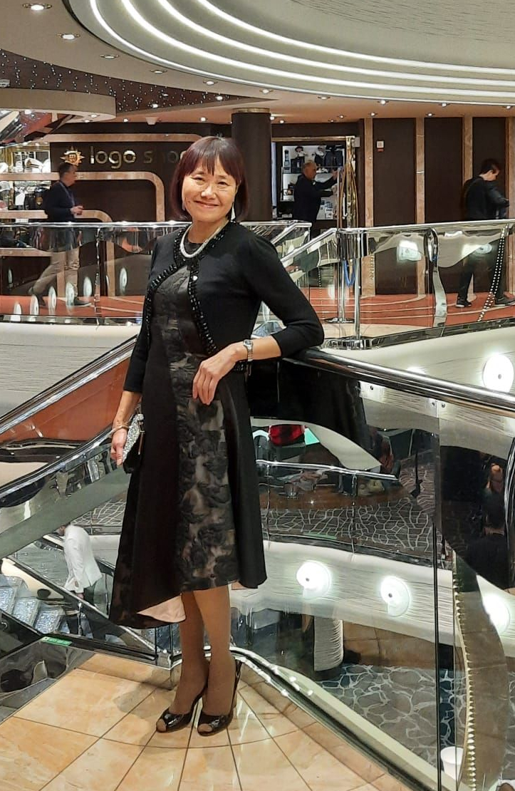
Ling, fully on board for Gala Night.
Over the course of the week, I managed to buy six fountain pens! These were all modest purchases, ranging in cost from three Euros, up to 60 Euros at most, all cartridge-converter pens and all with steel nibs. Nevertheless, finding and buying each of these brought me a great deal of pleasure and they continue to make me happy, long after the cruise is over. Here is an account of the new pens that came home with me.
Hamburg.
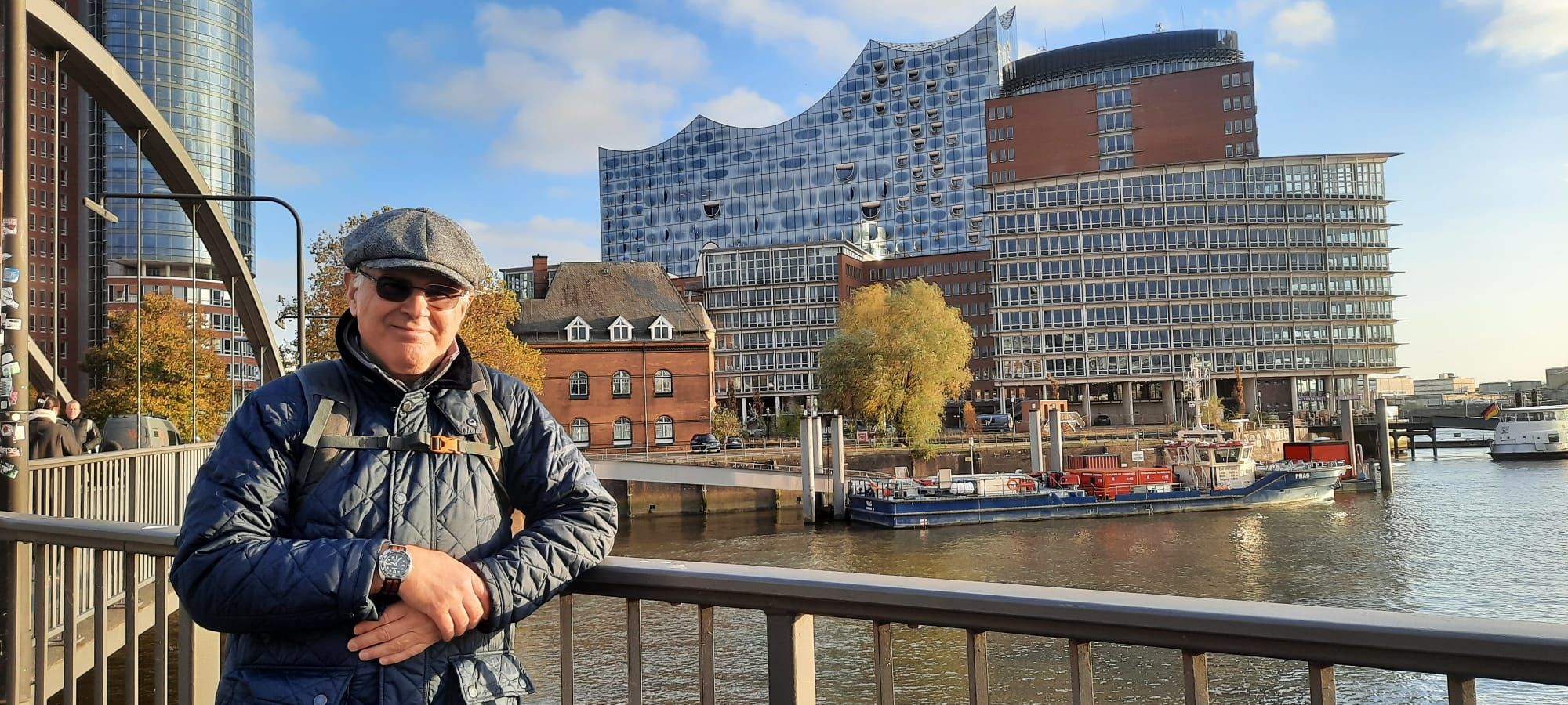
Despite its proximity to the UK, this was only my first time in Germany. A well-travelled friend had once told me that the pharmacy chain Mullers, often sold school pens, from brands such as Online. Our taxi dropped us near the splendid City Hall and from there we walked almost seven miles with our tourist map, taking in the main sites including churches, the concert hall, and the historic dockland warehouses.
Trying to blend in. In the background, is the Elbphilharmonie, Hamburg.
I did not come across a Mullers but we did briefly visit a modern shopping mall, Europa Passage where I had a quick look for any pen shops. I found a hobby craft shop called idee, where a helpful assistant showed me a small selection of Lamy Safaris. One of these, in a new “light rose” with matching clip and finial, appealed to me. I was surprised to find that all the Safari fountain pens were inked and could be tested before purchase. This pink one wrote very nicely (as expected with Lamy) and this became my souvenir from Germany.
Rotterdam.
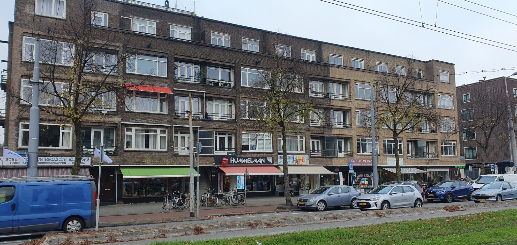
I had Googled for fountain pen shops in Rotterdam and the top result was Hummelman. After a nice walk across the bridge from the cruise terminal and along the waterfront and a visit to a few of the main attractions in the city centre, such as the market, the cube houses and City Hall, I took a walk to find Hummelman. This turned out to be a couple of miles from the centre but was well worth the visit.
Hummelman pen shop, Rotterdam.
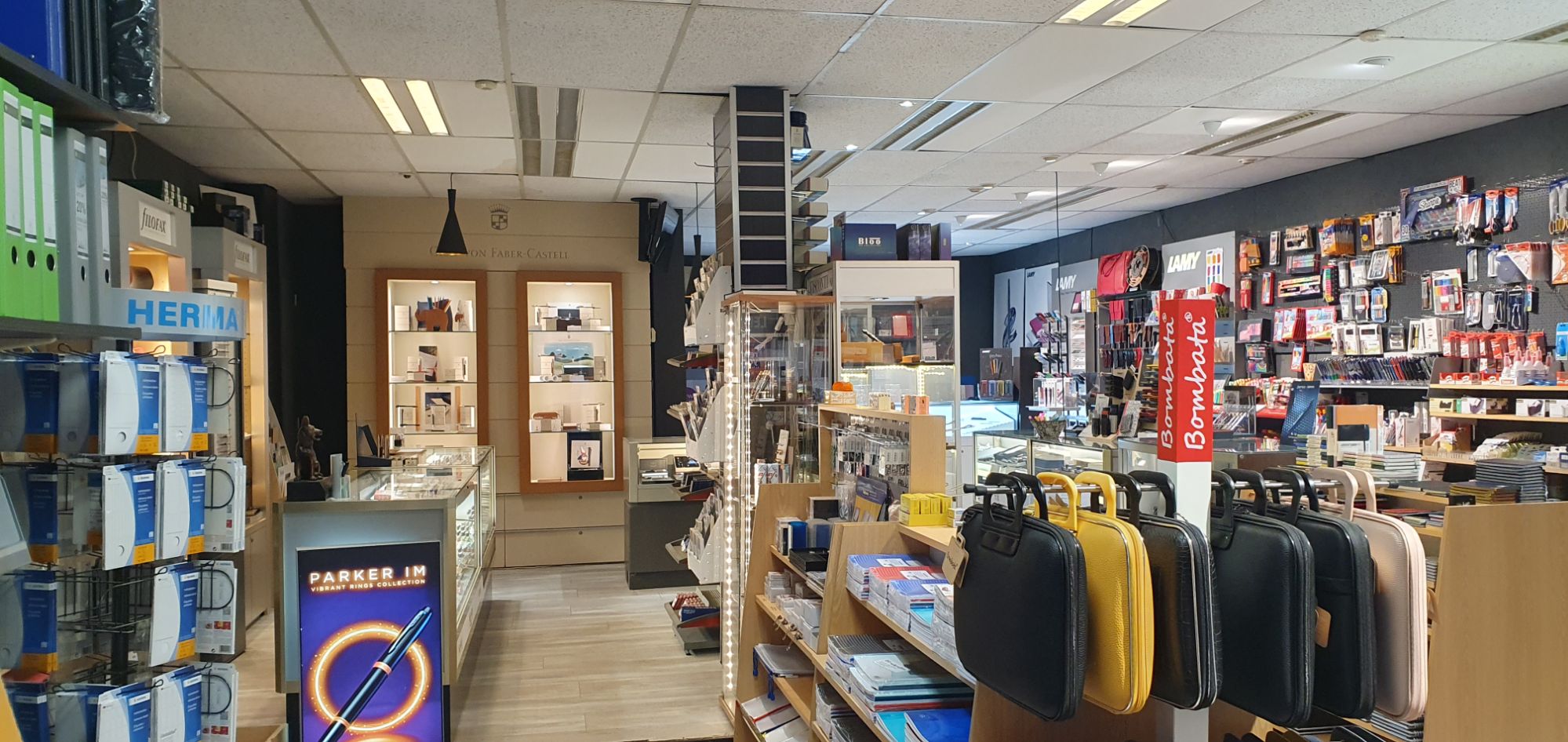
I learned that this family-run shop had been established in the 1930’s and now run by the third generation of the family. The genial proprietor, Vincent, kindly allowed me to take some photos and to take my time having a long browse around the displays. It was such a treat to find a bricks and mortar store with such a wide selection of brands and models and an enthusiastic and knowledgeable owner. I chose a green Monteverde Ritma – a large and hefty metal pen with a glossy gunmetal magnetic cap, and a blue Faber-Castell Essentio (or Basic), which was also in metal. Previously I had seen only plastic barrelled version with rubber grip section. Both of these pens were available in various colours and nib widths.
Stepping into Hummelman.
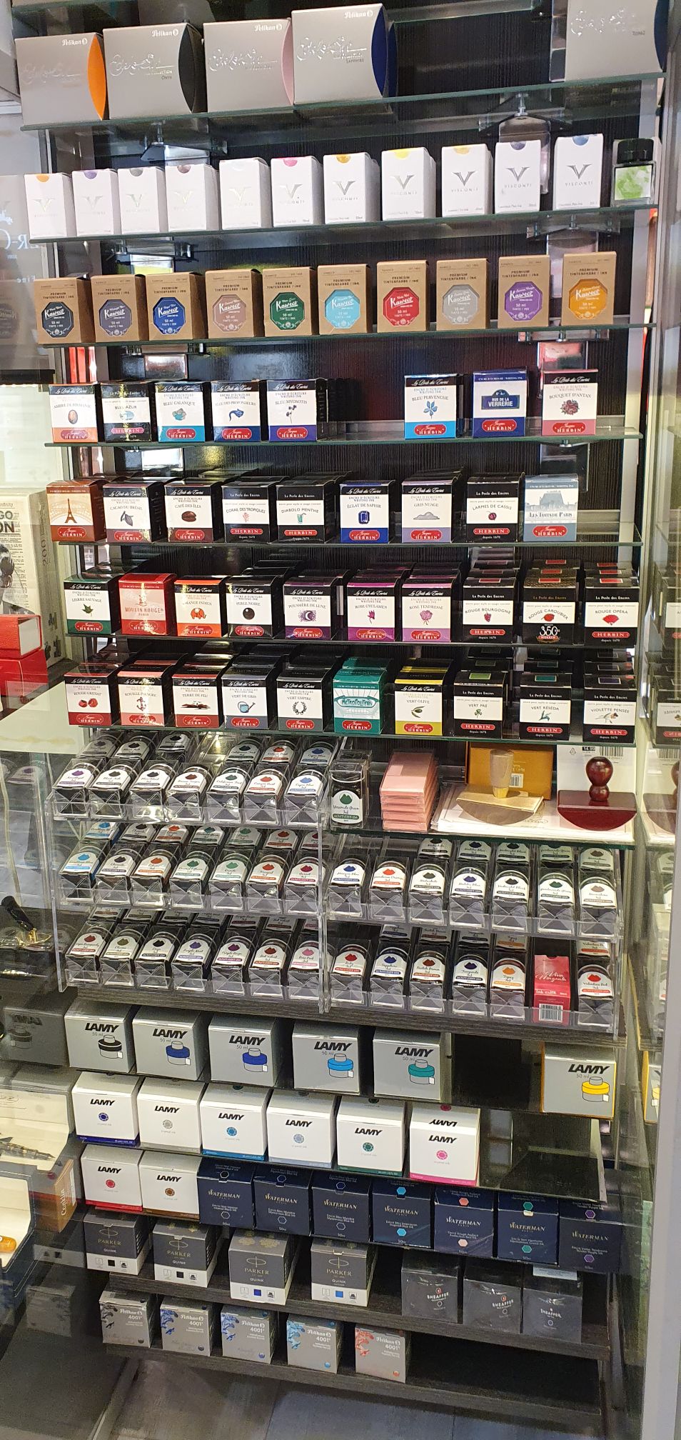
Vincent saw me studying his vast display of inks, which reached from floor to ceiling and referred me to his helpful book of ink swatch cards, carefully made by hand and grouped by brand. He told me that his father does the swatches. I chose a Jacques Herbin Lie de thé.
Just some of the fountain pen inks at Hummelman.
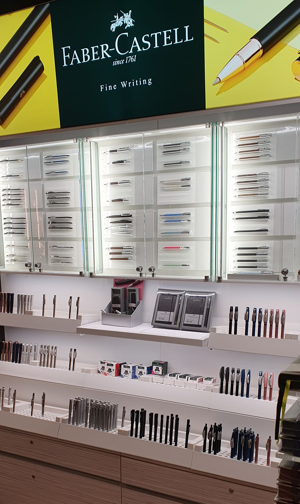
Of these two pens, I am finding the Faber-Castell to be easier. The fine nib is a joy: firm but smooth and effortless. The body and finish definitely feels like an upgrade from the plastic and rubber versions I had used before. As for the Monteverde, the glossy polished metal section is slippy, as I might have known. The magnetic cap works well and leaps into place with a click to fit flush with the barrel, whether on capping the pen or posting the cap. On my model, the stealthy black fine nib needed some smoothing and this, coupled with the insecure grip, makes the pen a bit tricky to use, but it is a handsome and weighty beast.
Great selections of Faber-Castell models and nib choices.
Zeebrugge.
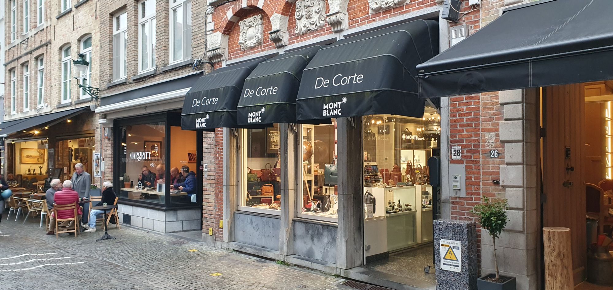
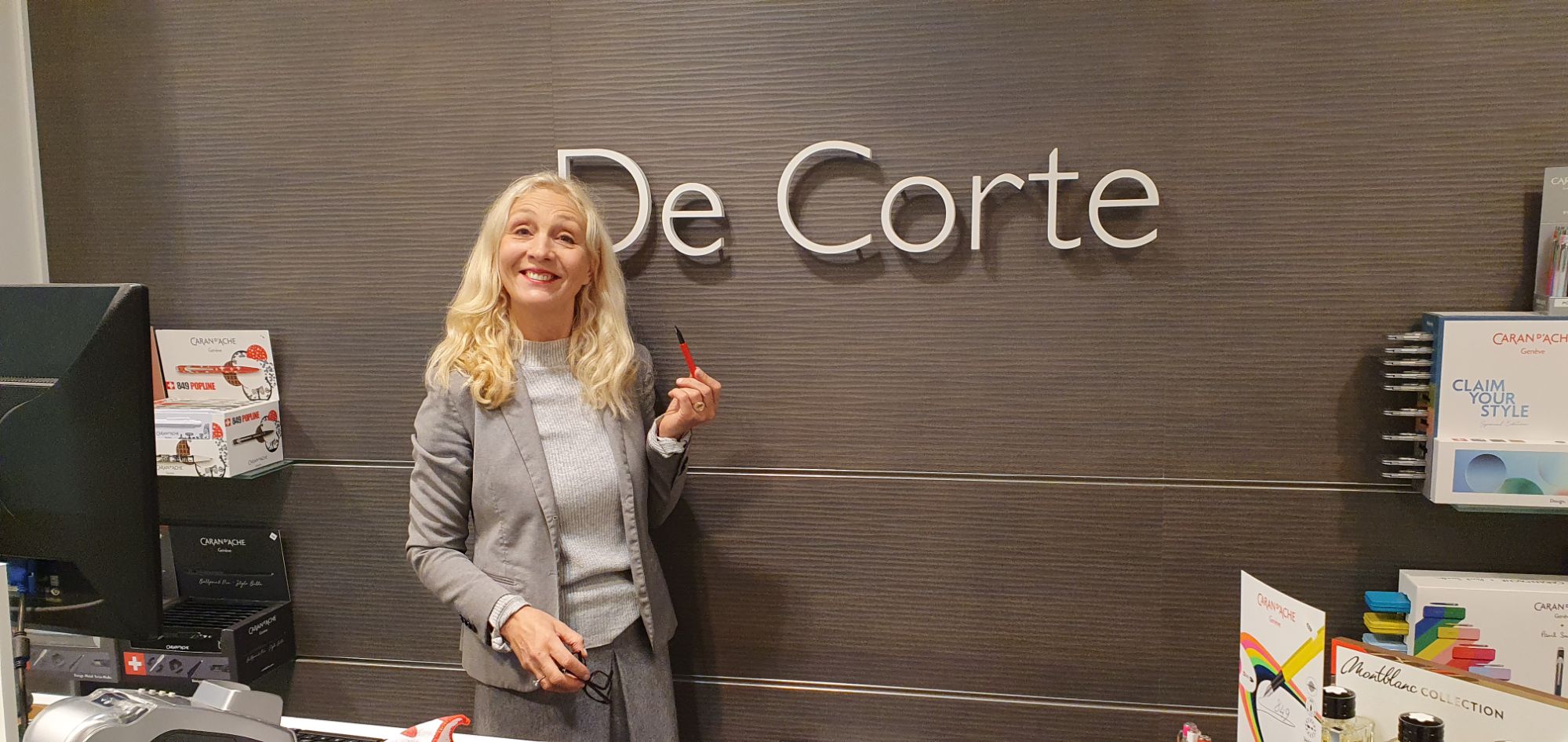
This is the port for the stunningly beautiful medieval town of Bruges, about 30 mins drive inland. When I was there last, in 2016, I had sought out a pen shop that I found online, named De Corte. This is another shop now owned by the third generation of the family, having started in the 1920’s. I have fond memories of finding the shop but having to peer at the window as the shop was closed. Fortunately the proprietor, Iris de Corte spotted me and allowed me to come inside and look around, as she was taking product photos for a proposed website.
The delightful De Corte pen shop, plus stationery and leather goods.
This time, the shop was open and I was happy to find Iris again, serving a customer. When I reminded her of my last visit of 8 years ago, she laughed and said that she had still not set up the website! She far prefers to meet customers face to face and to enable them to try a pen before buying. She told me that the number of such fountain pen shops is now very small. When I mentioned Hummelman’s in Rotterdam, she told me that she knew them! It is a very small world.
Ms Iris De Corte
Of course, I wished to buy a pen from Iris. I chose a Caran d’Ache 849 in red – the colour of Caran d’Ache and of the Swiss flag. As the joke goes, “You could say a lot of bad things about Switzerland but their flag is a big plus.” When I had first tried one of these pens, several years ago, I had dismissed it as being too slim and having an uncomfortable step down from barrel to section. However in practice, having spent time using the pen, neither of these points is an issue for me. I enjoy its pencil-like hexagonal cap and barrel, the satisfying click on capping the pen and the neat way the cap can be posted, flush with the barrel. It also writes very well.
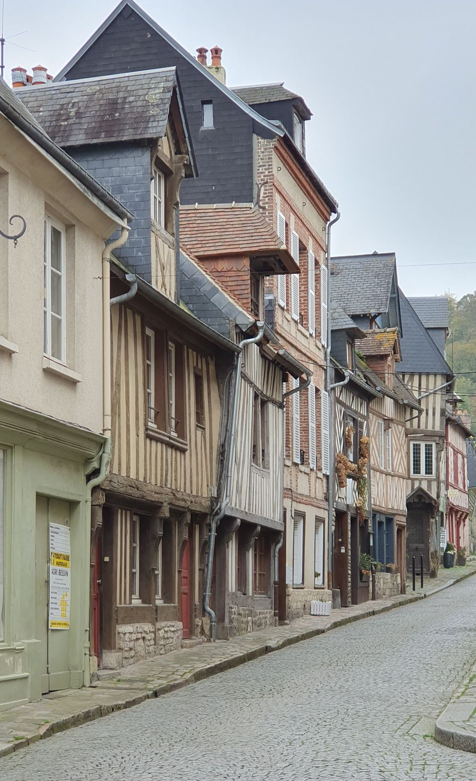
Le Havre.
My wife and I had booked an excursion from the port of Le Havre, to visit Honfleur. This is a picture-postcard town of pretty timber-framed houses, picturesque streets of shops and art galleries and interesting churches and waterfront places to explore: an absolute gem.
A street scene in Honfleur.
Before getting immersed in this historic town, I popped into a supermarket for a quick look for a stationery aisle. I found one and could not resist buying a fountain pen for three Euros, including two cartridges. It had no brand name other than the name of the shop, “Casino, stylo plume” on the blister pack. Back outside, I loaded a cartridge, putting the second one in the barrel as a spare. After the pen had sat in my pocket for a few minutes, I tried it out in my notebook. To my surprise, it wrote immediately and with a lovely smooth flow. If only all pens were this good!
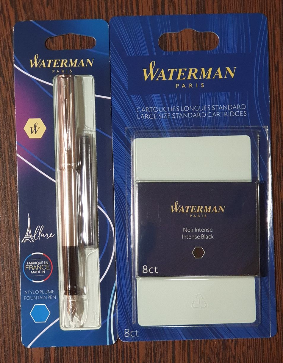
My final pen purchase of the trip came at the end of the day, back in Le Havre. Again, it was a supermarket in the city centre where I found an ideal souvenir: a Waterman Allure, made in France, in brushed stainless steel and with an improved plastic grip area. When I had bought an Allure previously, I disliked the grip section with a surface that defied gripping. In frustration, I had gouged grooves in it to stop the pen sliding around in my hand. Thankfully, this problem has been fixed, at least on the stainless steel versions now sold in Le Havre!
Again, this Waterman wrote beautifully, straight out of the box and makes a great EDC pen, encased in steel and with its large capacity Waterman cartridge.
Waterman Allure, brushed stainless steel.
The following day, our cruise ended and we disembarked at Southampton, tired but happy. I was pleased with my purchases. Returning with six additional pens inked will delay the emptying of my four vintage pens but this is a small price to pay for the joys of the holiday haul.
The four vintage pens on the right. The six new arrivals on the left.
Here in London, our Autumn pen show took place on 13 October. As always, I had a wonderful day, meeting dozens of friends and acquaintances in the fountain pen community, both punters like myself, and dealers. Unfortunately, I failed completely to take any photos but am sure that others will have this covered.
This year, the show seemed bigger and better than ever. My wife and I did not arrive until mid-morning, when the show was in full swing, but it was clear that there were many more sellers than in recent years, including many from overseas, such that two large halls at the Novotel, Hammersmith were filled, with rows of tables, crowds of enthusiasts and a happy buzz of buying and selling. From what I heard, there was a long queue for the early-bird admission, for those eager for a first bite at the cherry.
Also, this show was different for me as I now find myself drawn increasingly to vintage pens rather than modern (although not entirely). I recently enrolled for the Pen Repair course, starting in November and available to WES (Writing Equipment Society) members. In preparation for this we had been advised to gather a few examples of certain pens to practice upon in the classes. My wife was better at keeping me on track to steer me towards the vintage tables, whereas left to my unaccompanied state, I have a tendency to be distracted and excited by every table.
The browsing was soon interrupted by a most enjoyable lunch with many from our pen club, at the nearby pub and restaurant, Latymers, where we gathered to refuel and see each others’ acquisitions.
We returned to the show after lunch. Despite spending less time in the show than I would have liked, I still came away with eight pens. However, for my first time at a pen show, these were all vintage pens. I bought no modern pens, notebooks or inks, not that I needed any!
Such was the fervour of my shopping spree that it was not until I got home that I could take stock of what I had bought, from whom, and what I had spent. The final tally was that my eight pens had cost a total of exactly £300.00, off-set by another pen which I sold for £100.00, to leave a net outlay of £200.00. I was content with that. Also, none of the pens had cost more than £60.00.
So without further ado, here are my purchases:
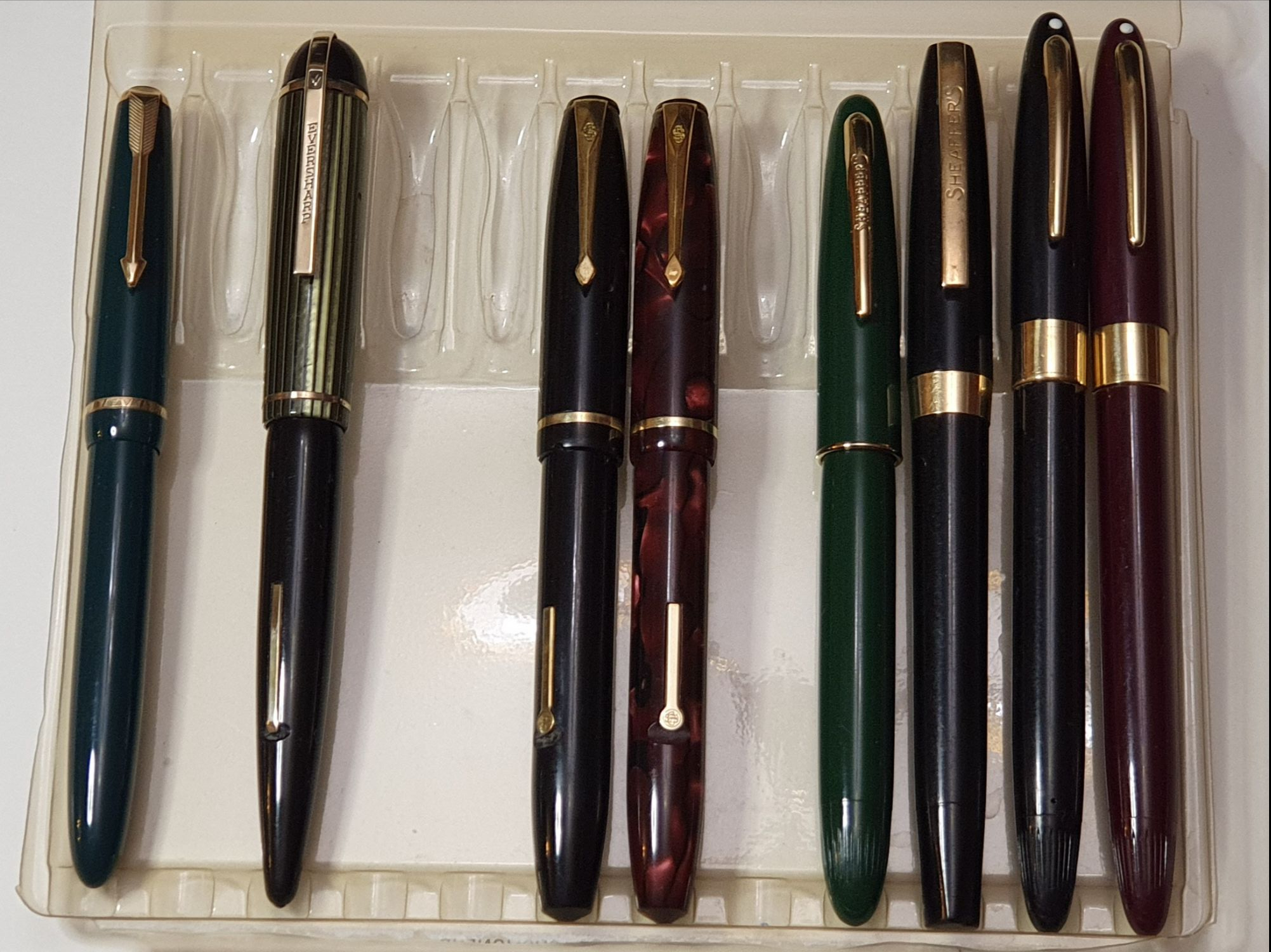
My vintage haul.
Parker Slimfold, green; 14k gold No. 5 nib;
Eversharp Skyline, green and black: 14k gold nib; (very excited with this one);
Sheaffer, black, (model not yet identified) Touchdown filler; two-tone steel nib; made in Australia;
Sheaffer Clipper Statesmen, Snorkel filler, black, stainless steel nib (needing repair), made in USA; (see update)
Sheaffer Clipper Valiant, Snorkel filler, Burgundy, 14k two tone nib, made in USA. (see update)
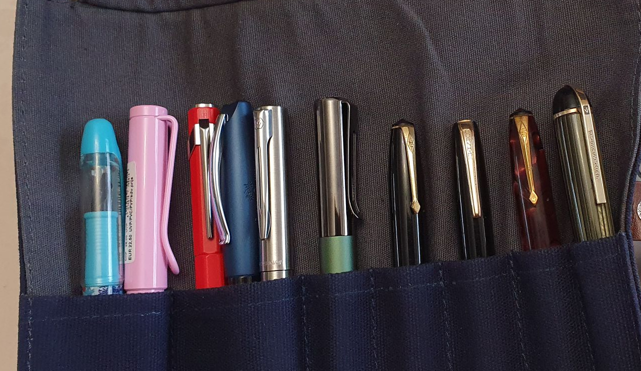
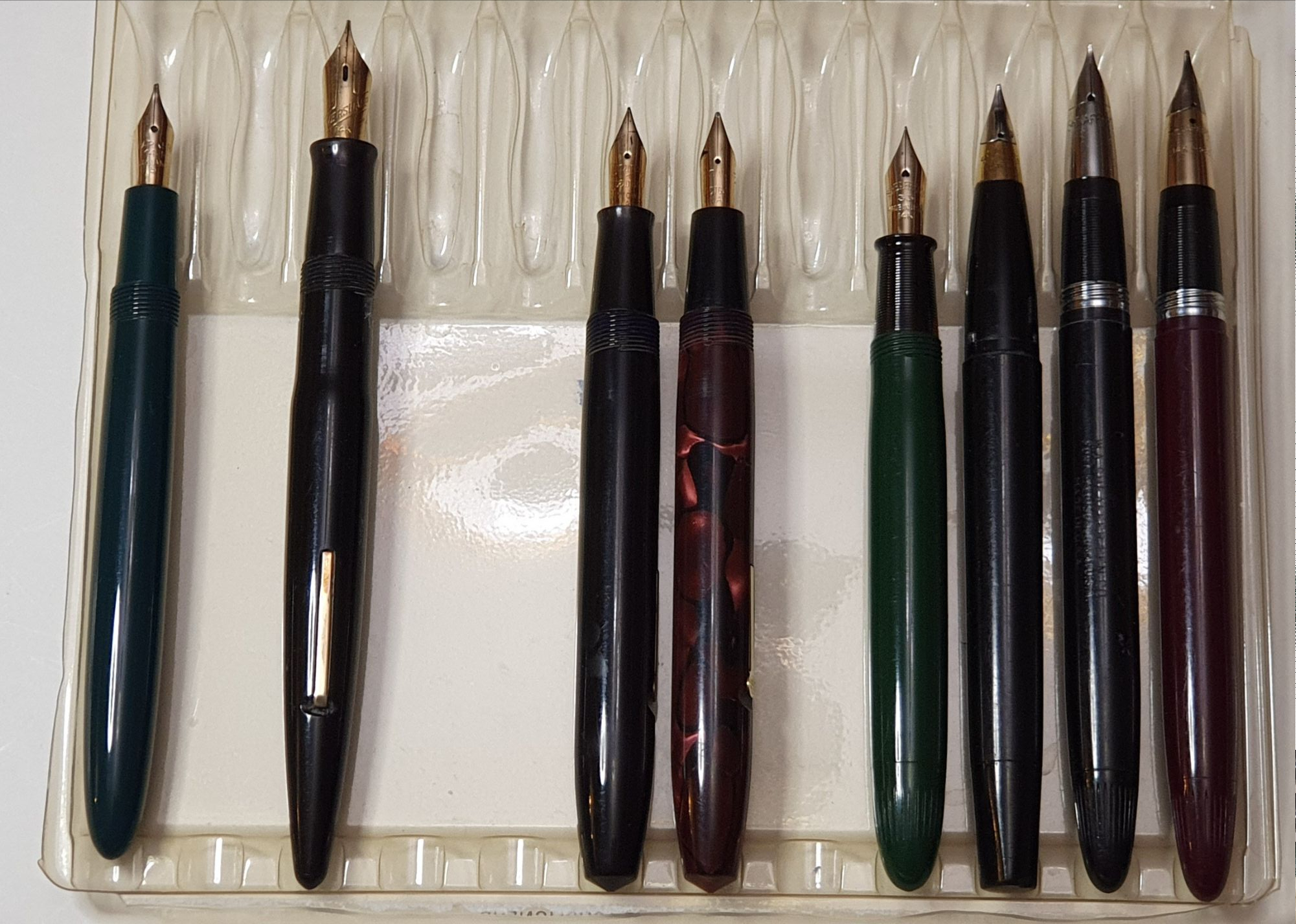
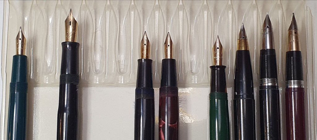
Grouped and uncapped:- Parker; Eversharp; Conway Stewart; Sheaffer.
I spent a happy evening, inking and testing half of these. The remainder, minus the one that is for repair, I inked and tested the following day. There are a variety of nib widths. The Parker has the usual squeeze bar filler. The rest are all lever fillers, Touchdowns or Snorkels.
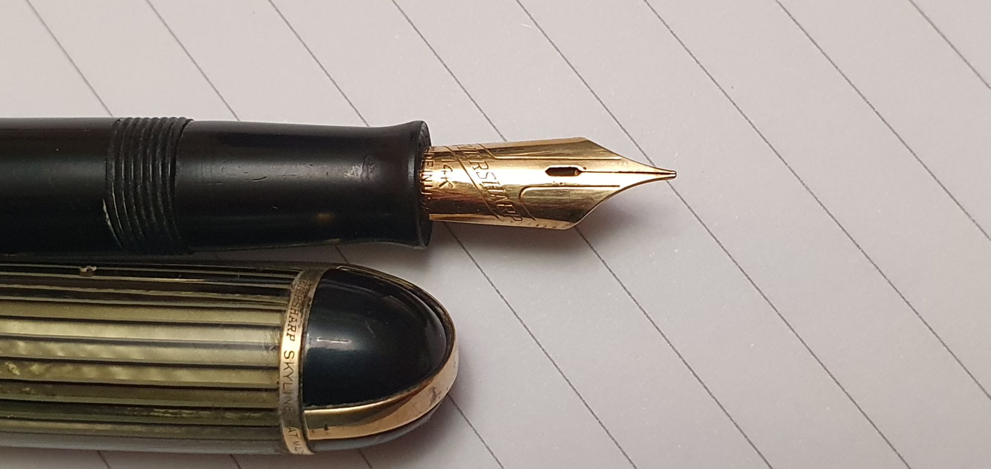
The Eversharp Skyline is the first that I have owned. The seller, Heritage Collectables, had several to choose from but the green striped cap was calling to me! It writes with a lovely smooth effortless flow.
My first Eversharp Skyline.
I did not appreciate until I got home that my two Conway Stewarts were both 15s, although the red one is marked “Conway” and the black one “Conway Stewart.” One is a fine and the other broad and I am delighted with them both. (A recent eBay purchase, a black lever fill Burnham 61, which is very similar in size to the Conway Stewart 15, was a surprise success and now one of my favourite pens).
The Conway 15, lever filler.
Of the four Sheaffers, the smaller, green Sheaffer is, I believe, a Craftsman, Touchdown filler and has a dreamy, 14k gold EF nib. I am always thrilled at how enjoyable these vintage pens can be, for so little outlay.
Sheaffer Craftsman Touchdown, Extra Fine. An ink window in the Sheaffer Craftsman.
There is a black, steel nibbed Sheaffer from Australia, a Touchdown filler but a model that I have not yet identified. It was rescued from a bin of jumbled pens, each only £20.00 yet seems to be working well and with a decent smooth nib, but having a loose clip.
Finally, there are the two Sheaffer Snorkels, which I think are the Clipper model but I am not yet certain. Of these, the Burgundy model is functioning well, whereas the black one needs attention and was purchased cheaply to practice upon.
Update edit, 14 October 2024: I have since learned that there were some 13 different named versions of the Sheaffer Snorkel filler, which can be identified according to whether or not there is a white dot on the cap, whether the nib is open or a “Triumph” style, conical nib, whether the nib is made of Gold or a Palladium/Silver alloy (sometimes marked PdAg), and whether the cap is of plastic or metal. From this, I now think that my Burgundy snorkel is the Valiant, whilst the black snorkel is a Statesman, but I may be wrong! The nib of my black snorkel is a Triumph style, monotone silver-coloured but the imprint consists only of SHEAFFER’S, with no hallmark.
I have not yet got used to knowingly buying pens for repair, but am looking forward to learning new skills and gaining confidence on the coming Pen Repair course. Even just enrolling for the course has improved my confidence! I have worked on four pens recently with my newly-acquired tools. I did not manage to buy many pens for repairs at the show, although a few dealers did have some. I may need to resort to eBay for more to practice on.
Word went around at the show that from next Autumn, the London Pen Show will be held over two days instead of one and this is a good sign for the future of the hobby and its wonderful community.