As the year draws to a close, it is time to reflect on some of the year’s highlights of my fountain pen hobby. In what was a busy and eventful year, this is a continuing source of relaxation and enjoyment. I include in this, not only using fountain pens but all the related activity of filling, cleaning and general tinkering with pens; hours of pen, ink and paper sampling; reading and writing about new pens, photographing them and shopping for pens and supplies.
Before writing this, I looked at my end of year review from 2016. During that year I had bought 40 new pens for myself and concluded that in 2017, I expected to buy a lot less. Oh dear. Let me admit right away that this did not happen.
I have kept a record of pen acquisitions. In 2017, the gross number acquired, was 52 (gasp). That sounds like one every week. I can imagine detectives in an incident room, huddled around a map and predicting when and where I am likely to strike next.
Well, it wasn’t quite like that. Two were for bought for other people. Another, a Visconti, I returned the following day as I decided that I was not suited to it, and so that doesn’t count. Then towards the end of the year, while on holiday in China I was given two pens by a cousin and eight, mostly Heroes, from an uncle who was a retired teacher, who insisted that he did not need them anymore. So that brings it down to 39.
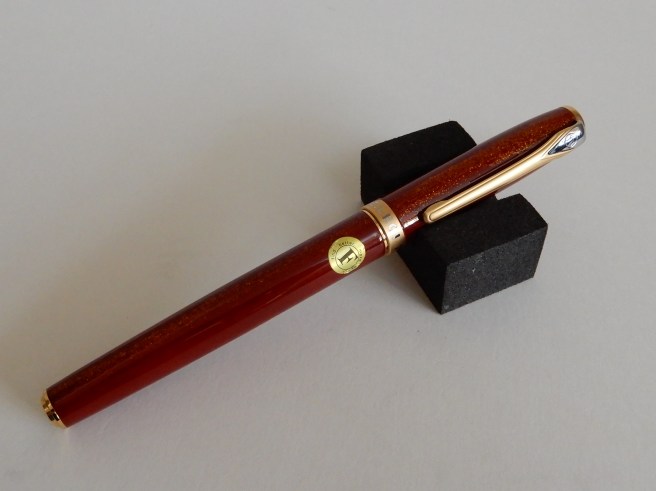
And of these, only three (the ones with gold nibs) cost over £100.00 and the most expensive was £159. These were the vintage Pelikan M400, Sailor Magellan Lapis Lazuli and the Cleo Skribent Classic Gold. My total pen spend came to around £1,300.00. Many of the pens cost little more than a trip to a cinema or a meal out and have given me hours of enjoyment. Some were in sales at irresistible prices.
Anyway, without further excuses, here are some highlights, in no particular order.
New Pens
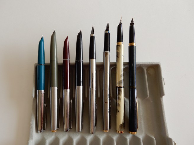
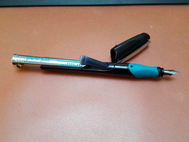
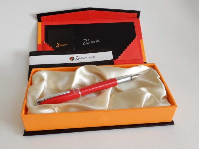
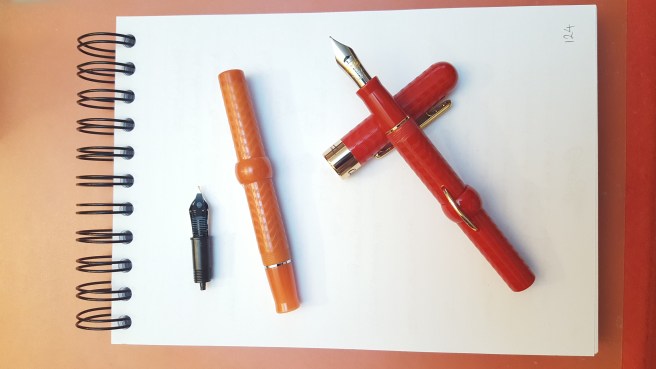
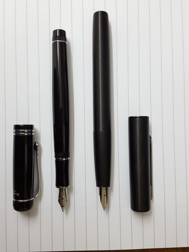
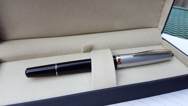
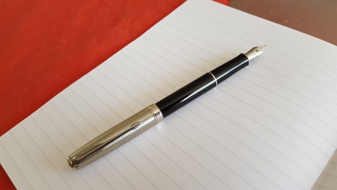
In view of the number, I am not going to post one photograph showing them all. It would be a bit like seeing all the food I have eaten in a year.
To summarise the main acquisitions by brand, these are:
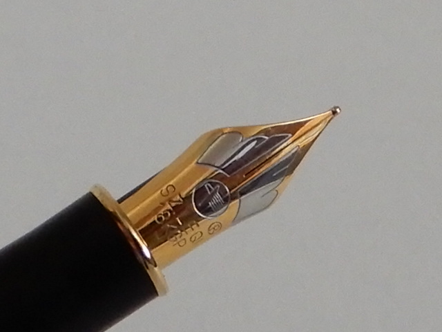
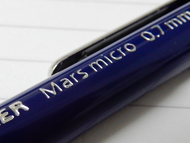
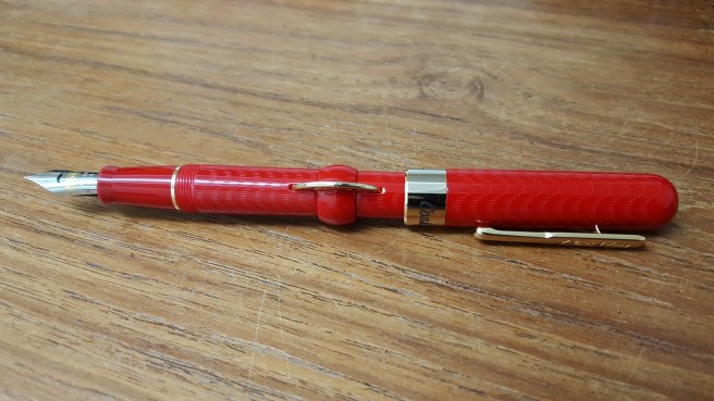
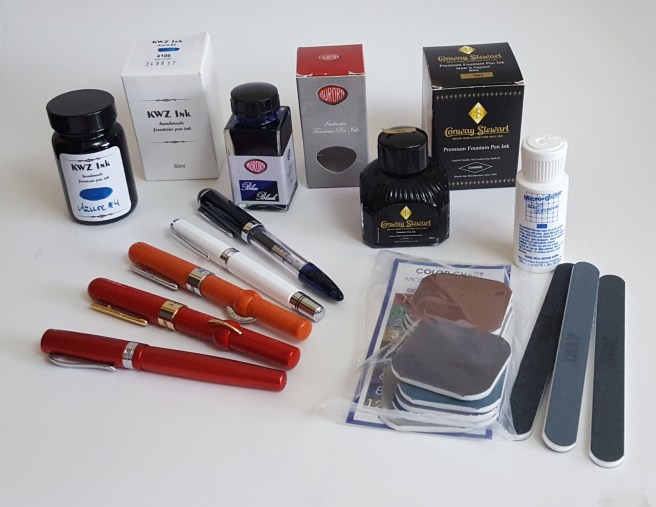
- Cleo Skribent: (2) – Classic Metal and Classic Gold. I am delighted with them both. The nibs, whether steel or gold, are wonderful.
-
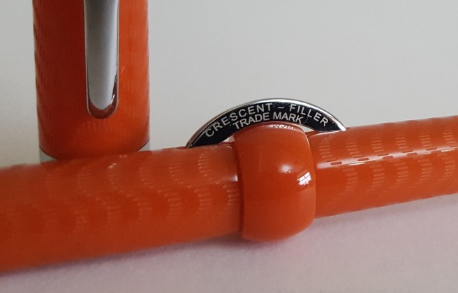
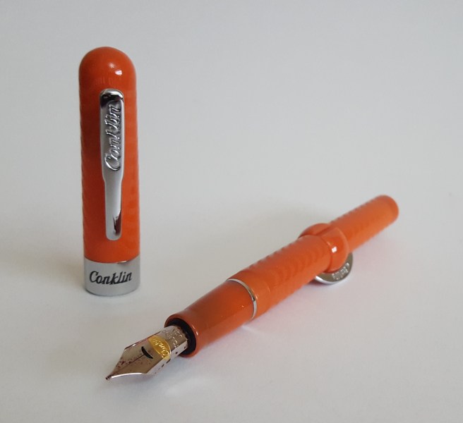
Cleo Skribent Classic Metal piston filler. - Conklin: (2) – Mark Twain Crescent Fillers, in coral chase and red chase, from the London pen show. Lovely to use and to fill.
-
Conklin Mark Twain crescent filler, in red chase. - Faber Castell: (2) a pair of cheap school pens, one red and one blue, with good nibs.
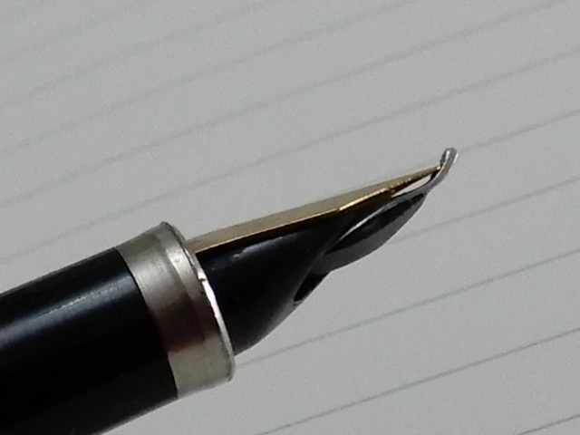
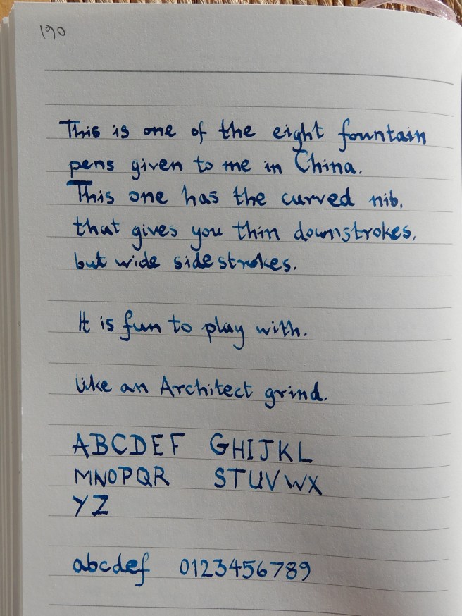
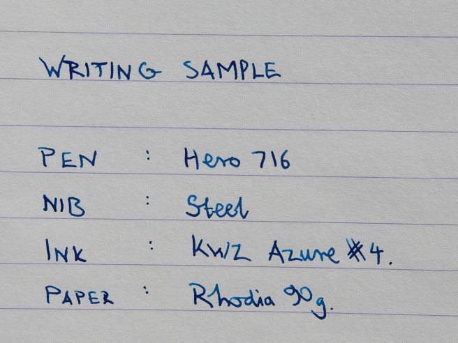
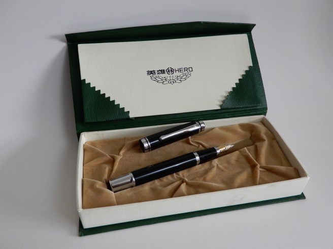
- Hero (9): either bought or given to me while in China.
- Kaweco (5): I bought the Allrounder, the Dia2, two of the newly released Perkeos and one Sport Skyline Mint. Of these, the Dia2 is my favourite and one of the most comfortable and reliable pens I have, at any price. The Perkeos have grown on me, as I like the length and the slightly bouncy nibs. The aluminium Allrounder is well made and solid, but for just slightly more money, I would still prefer the Dia2.
-
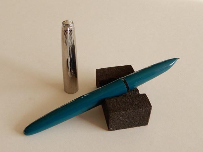
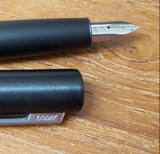
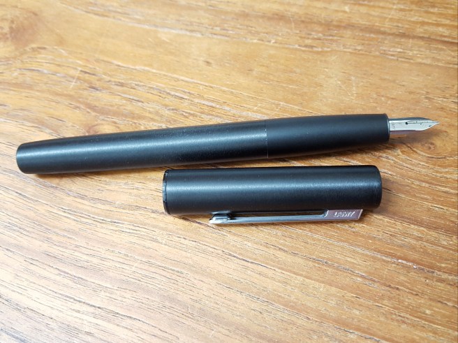
Kaweco Dia2. Pretty much the ideal pen for me and a firm favourite of 2017. - Lamy (5): I picked up the new 2017 special edition Safari in Petrol and AL-Star in Pacific Blue. Both came with a pack of matching cartridges. I was more thrilled with the Petrol (dark teal) with its lovely shading and closely matched pen and ink, although in practice, I did not use it very much. The Aion was a journey; I read and watched lots of online reviews, deliberated over the grip and then succumbed. I posted some thoughts on it at the time. I do like it but find that it needs a different way of writing; you need to “let go” and not grip too firmly as the surface won’t let you.
- Parker (4): I bought three Sonnets, because they were greatly reduced in a Rymans sale. I got one in red and gold, one in black and one in brushed stainless steel. I rather like using the black one with the cap from the brushed stainless steel one. Then in November I picked up a simple, blue plastic Parker Reflex which writes effortlessly. I read that the caps are prone to cracking in time but I am not worried as I have already found several other pen caps which would fit if need be (such as a Kaweco Sport).
-
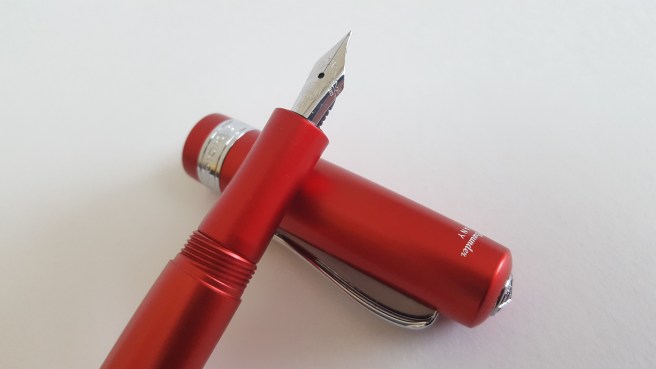
Black Parker Sonnet, with the cap from the brushed stainless steel model. “Let me not to the marriage of two pens, admit impediments.” - Sheaffer (4): I bought a Sheaffer 100 with Translucent Blue barrel and steel cap, which I think looks stunning and has a good nib. It looks more attractive than its modest £35.00 cost would suggest. I also bought another Sagaris (medium) in black, since I like my burgundy one so much. Then I spotted the Sheaffer Pop in blister packs, reduced to half price and bought two.
-
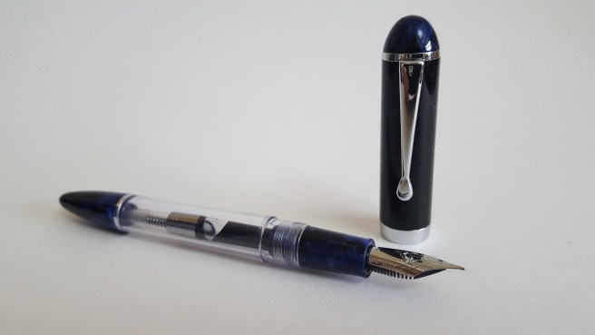
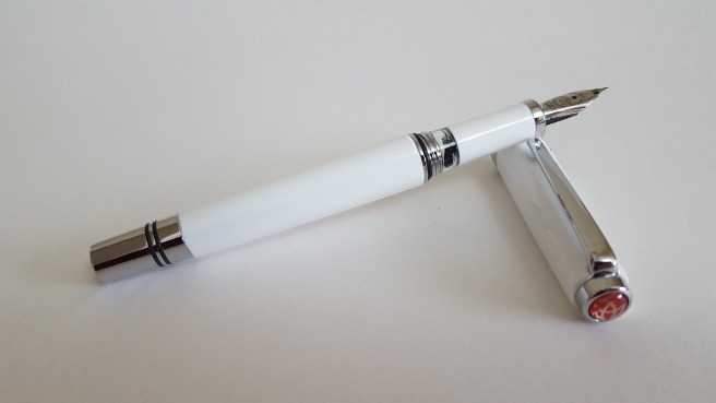
Sheaffer 100 translucent blue. That nib though! - TWSBI (2): I bought an Eco with a fine nib and a new Classic in white with medium nib. These are both great, as low-cost, high-capacity piston fillers and both perform well. I now have four different TWSBIs in all.
So, in number, Hero were the pens that I got the most of this year, although many were gifts. Of my purchases, Kaweco and Lamy were the brands that I bought the most of (with five of each) closely followed by Parker and Sheaffer both on four.
New old pens
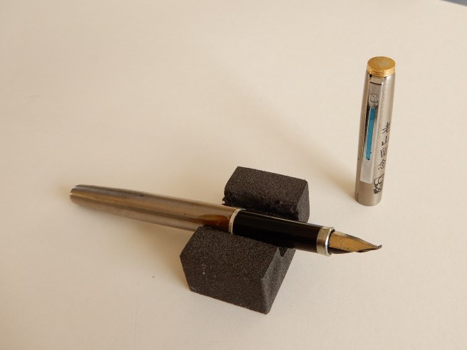
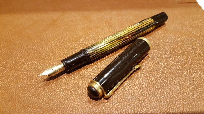
I bought a vintage Pelikan M400 tortoise at auction, with a fine and rather flexy 14k gold Rover nib. I enjoyed cleaning this and was thrilled when after a night’s soaking in water, I was able to unscrew the nib and ebonite feed. At the same auction, buoyed by my newfound bidding success, I went on rather impulsively to bid for a Sailor Magellan Lapis Lazuli, limited edition, with a 21k zoom nib.
Writing
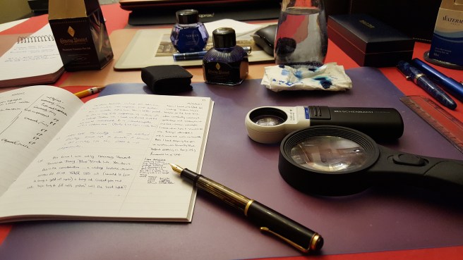
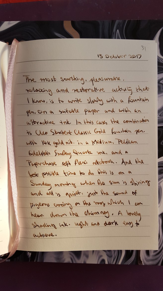
I have kept a diary for years. This year, I used an A5 page a day diary from Rymans. I find that the best time for me to write is early in the morning, to write up my record of the previous day. I used my Pelikan M800, with Graf von Faber-Castell Cobalt Blue, a favourite combination. I also finished writing up a volume of memories, purely for my own amusement, of being at boarding school in England in the 1970’s. For this I used a selection of different pens and inks over the year, really as a writing exercise and at the same time, to try out pens and inks for longer writing sessions with some sort of purpose, rather than writing “The quick brown fox jumps over the lazy dog.” I also enjoy writing letters and picking up whatever pen I fancy from the pen cup.
One pen, one ink, one hour
I have struggled all year with the dilemma of having too many fountain pens inked at once. Do you keep them all in use until you write them dry, or strive for an impressively minimal number of pens in the cup at the expense of flushing away good ink ? I am now less fussy than I was, about washing pens half full of ink but even so, I think my pen cup occupancy peaked at around thirty at one point. Part of me longed for the days when I possessed only one pen and one ink. As a break from having too many pens to hand, I made up an activity which I cleverly named “One pen, one ink, one hour” which involves retreating, generally to a coffee shop and then writing more or less continuously in a notebook for an hour, with one pen. It is a good test of how a pen feels, whether the shape or the weight make your hand ache, how the feed keeps up and how you like the nib and the ink. You can write about anything, the pen itself, the fellow customers or whatever you like. No one is going to read it, thankfully.
Giving pens and advice
I mentioned that I bought a couple of pens for other people. One was a Kaweco Dia2, for my neice’s birthday. I had bought one for myself earlier and was so utterly delighted with it that I wanted to spread the joy. It is one of my favourite new pens of the year, along with the two Cleo Skribents and Conklin Crescent fillers. Another pen bought for someone else, was a Manuscript Clarity, requested by a reader of my blog, living in Vietnam.
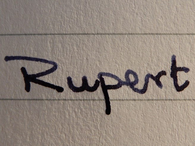
In the summer I was flattered to be asked secretly by a cousin, to advise her on buying a fountain pen for her husband on their wedding anniversary. That would be my dream question in an exam. I sent back rather a long reply but narrowed it down to about three suggestions, based on the budget. In the end, she ordered a Pelikan M600 in blue with a fine nib. Later she sent me the most beautifully written thank you note, in her cursive italic handwriting, written with the pen that she had chosen and which was a great success.
Fountain pen blog
This blog celebrated its first birthday on 5 November 2017. Born in a few hours of playing on the WordPress web site, it was a bold step into the unknown. I had aimed loosely to post about once a week, just writing about whatever pen-related topic interested me. Now, I have just passed 50 posts. The number of followers gradually grew, roughly in tandem with the number of posts. I find the whole experience, of writing and publishing posts and getting feedback from readers, most enjoyable. This week the total views nudged past 7,000 and from over 80 countries, which I find astonishing. I am not trying to boast here as I am sure many reading this have far higher numbers, but I am genuinely amazed at this exposure. In the summer, I published two posts about the newly released Kaweco Perkeo and these have between them been viewed over 900 times, largely because someone on FPN kindly put a link to my post in his.
Meeting people
It is easy to spend too long online reading about pens, what with WordPress, Instagram, YouTube and various online pen shops, such as Cult Pens and The Writing Desk. So it is particularly nice when the opportunity arises to meet pen people. This year, I attended my first Pelikan Hub event in September, which I enjoyed, closely followed by the London Writing Equipment Show in October when I came away with five new pens. Then in November, I met some of the same people at the monthly gathering of the London UK Fountain Pen Club.
Travelling with ink
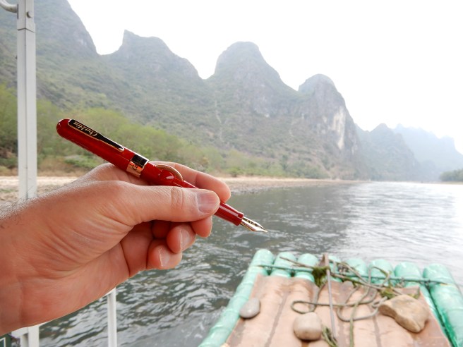
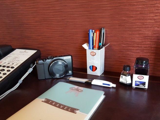
When the opportunity arises, I enjoy looking in stationery shops overseas to see a different range of pens. I was interested to shop in China while on a holiday earlier this month, as covered in my most recent posts.
Conclusions
For me, this is the continuation and escalation of a hobby that began when I was about ten years old. The fountain pen community, I find, are very decent and not judgmental of others. Perhaps we are our own fiercest critics and there is a lot of self-guilt which goes with buying too many pens. Our favourite pen, when asked, is often “the next one”. It is addictively enjoyable, when it goes well. But I am reminded of lines in the song Beauty for brokenness (Graham Kendrick), which read “Lord end our madness, carelessness, greed; make us content with the things that we need.” I am aware that my accumulation of pens (I haven’t mentioned the thirty or more new notebooks that I have “in stock” and the drawer full of ink) is hard to justify, even to myself. Indeed there are times when I would prefer to have fewer and appreciate them more, as in my coffee shop exercise. For 2018, I will simply repeat 2017’s resolution, to aim to buy a lot less pens and use and appreciate those that I have, all the more. Wish me luck, everybody.
Happy New Year to all and thanks for reading.