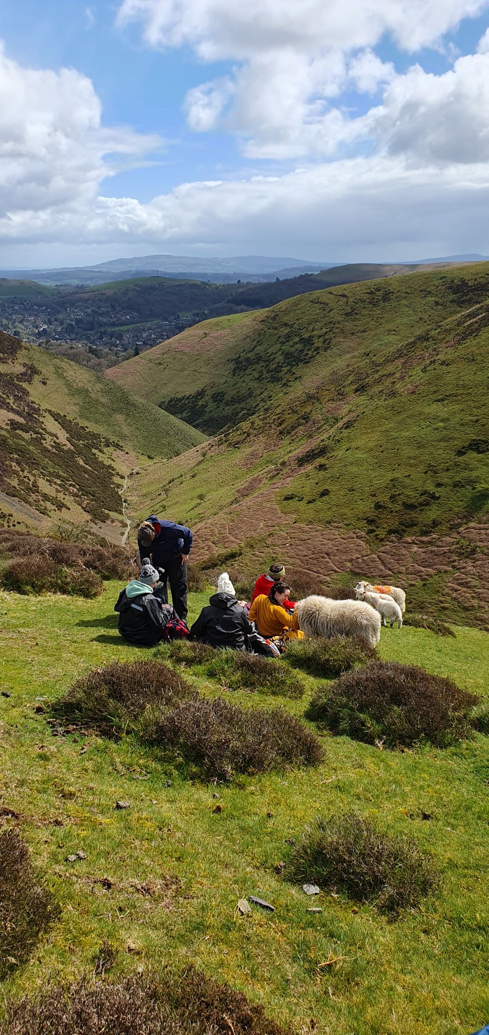
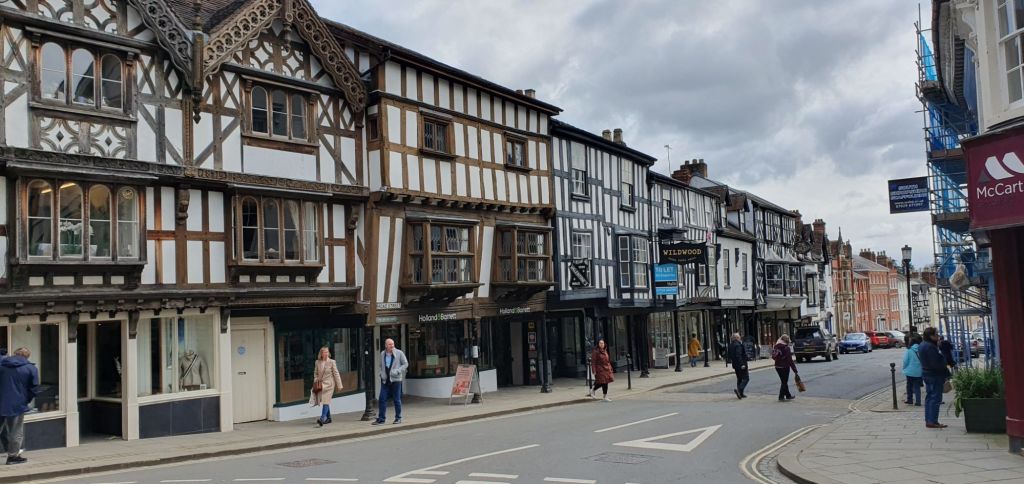
In April I spent a delightful week in Shropshire on the Netley Hall Estate, a few miles south of Shrewsbury. The Shropshire Hills National Landscape is a beautiful region. We enjoyed visiting nearby towns, with streets lined with picturesque half-timbered buildings dating from Tudor times.
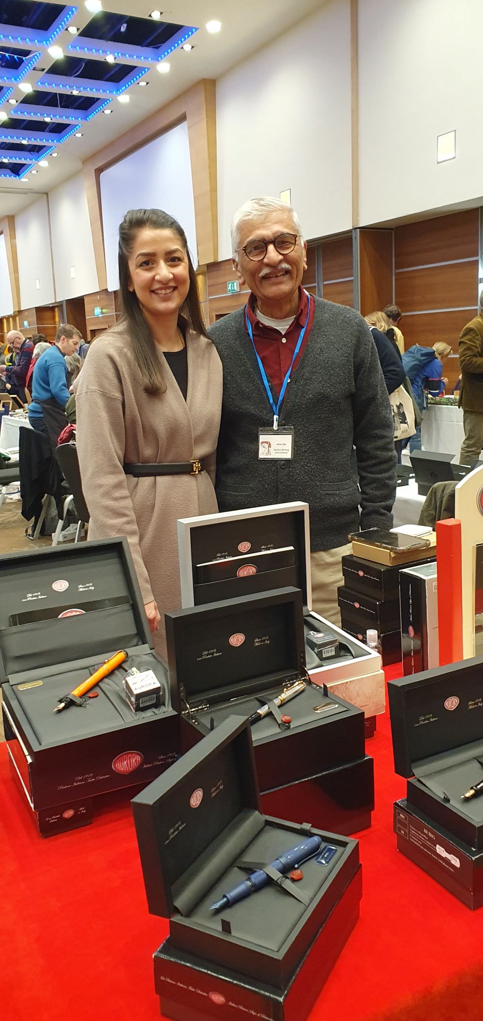
I was eager to visit Write Here, the superb independent fountain pen shop in the heart of Shrewsbury. This was my first time in the town and I had hoped to visit ever since learning of this shop and meeting John Hall regularly at pen shows.
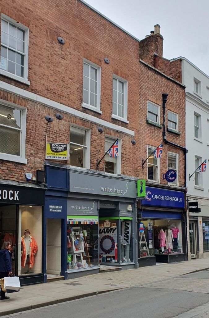
The shop was everything I had expected, and more! I could have spent hours browsing the fountain pen displays. It was just as well that I was constrained by the two hours maximum stay where I had parked my car, plus the knowledge that my wife and mother-in-law were meeting me in a nearby coffee shop.
In the preceding days, I had formed a desire to buy a Scribo, a grail pen at the outer-limits of my spending comfort zone, although quite which version and with which nib, I had not decided. I had tactfully asked my wife whether there were any rules that I needed to know before visiting the shop. “Only buy one pen” she replied. Right. Better make it a good one then.
In the shop John asked whether there was anything in particular that I would like to look at. I asked to see two Scribos: one being the Write Here “Africa” and the other, a Feel “Blu Califfo.” (The Blue Caliph is a variety of fig and the pen is a lovely deep dark blue with small bursts of orange in the resin).
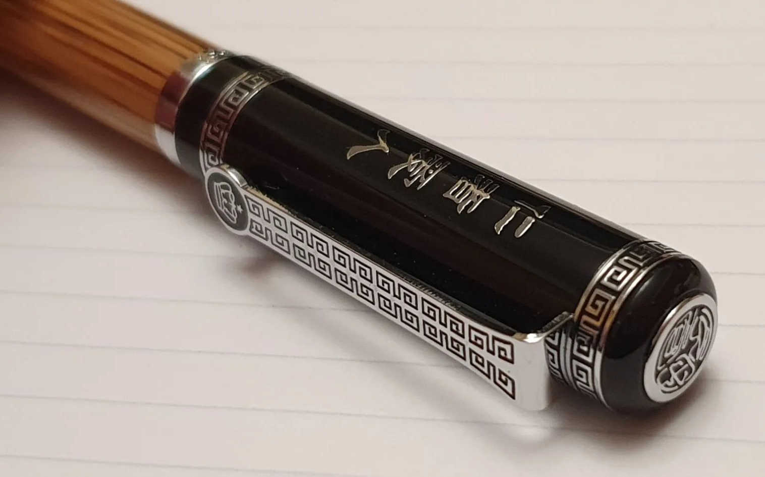
The Scribo Write Here pens are produced for Write Here in annual limited editions of just fifty numbered pieces, the “Africa” being the current version. Previous edition colours were (1) grey with lime green, the Write Here shop colours; (2) Cardinal red and Noble green (the only year in which the fifty pens were split between two colours); (3) Blue; (4) Tropea (named after a type of red onion); and (5) Mariana Deep Blue.
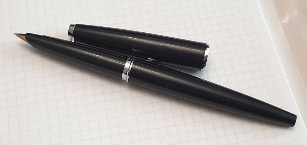
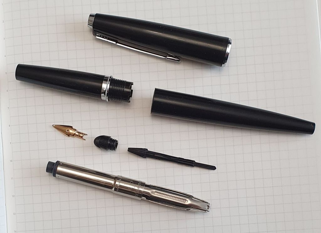
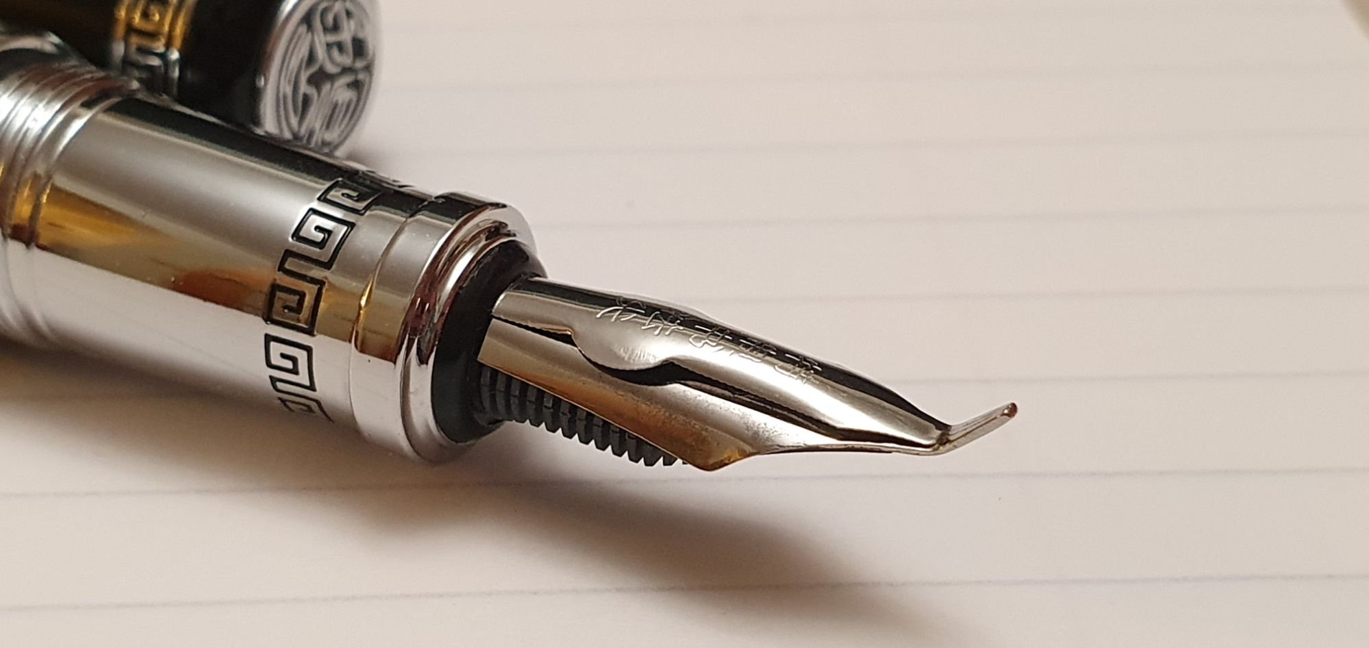
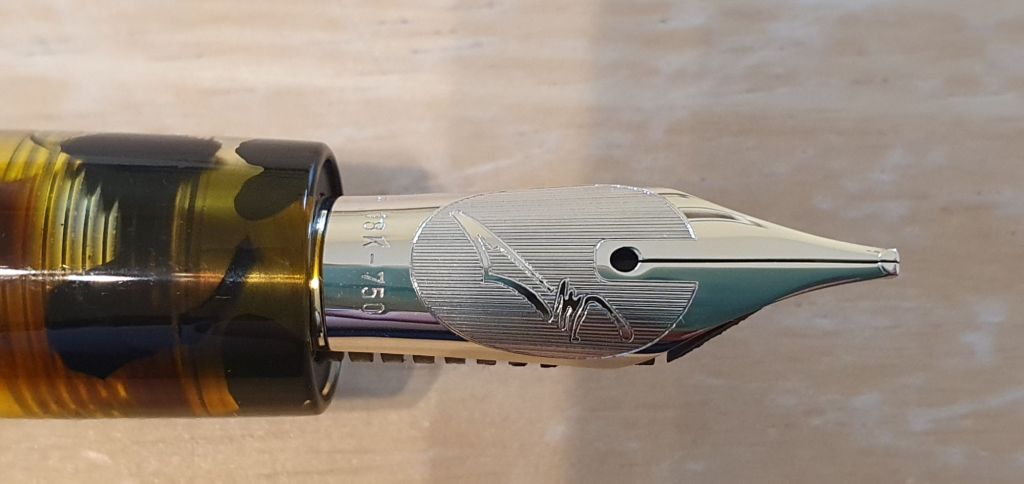
Like the Scribo Feel but without its faceted body or bulbous barrel, the Scribo Write Here editions are also piston fillers and have the same renowned gold nibs and ebonite feeds, in 14k (extra flessible) or 18k gold, with Rhodium plating. Others have already reviewed the Scribo Write Here fountain pens, including UK Fountain Pens, SBRE Brown, The Pencil Case Blog and Dapprman. What follows is the tale of my own purchase and getting acquainted with the pen, rather than another review.
Scribo was formed by employees of the former Omas pen company and produces nibs with the same tools and to the same specification as Omas. I have never owned an Omas pen but it is common knowledge that the Scribo Feel and Write Here models have very desirable nibs which are just like the Omas OM81 nibs of old.
Back to my decision-making. John provided a table and ink and anticipated that I may wish to use my own paper. I produced my Stalogy A5 notebook and had a blissful time trying both the Feel Blu Califfo and the Write Here Africa. I soon decided that I would not go home without buying one of them!
To narrow down the options, I ruled out the 14k Extra Flessible nibs as these can be difficult to use for a lefty-overwriter and easy to spring. That still left a range of beautiful nibs in 18k gold. I tried the Africa with a fine nib. John then swapped in a new broad nib for me to try. In the Blu Califfo I tried an extra fine, which I also liked. I did not need to try the extra extra fine.
I was struggling to chose between the Africa and the Blu Califfo as I liked elements from both. The Blu Califfo was a gorgeous blue, my favourite colour and very slightly longer. I liked its faceted body but not so much the aesthetics of the bulbous barrel meeting the straight section, although admittedly, very comfortable to hold.
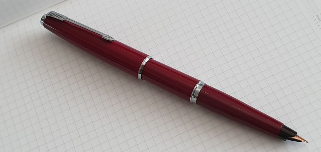
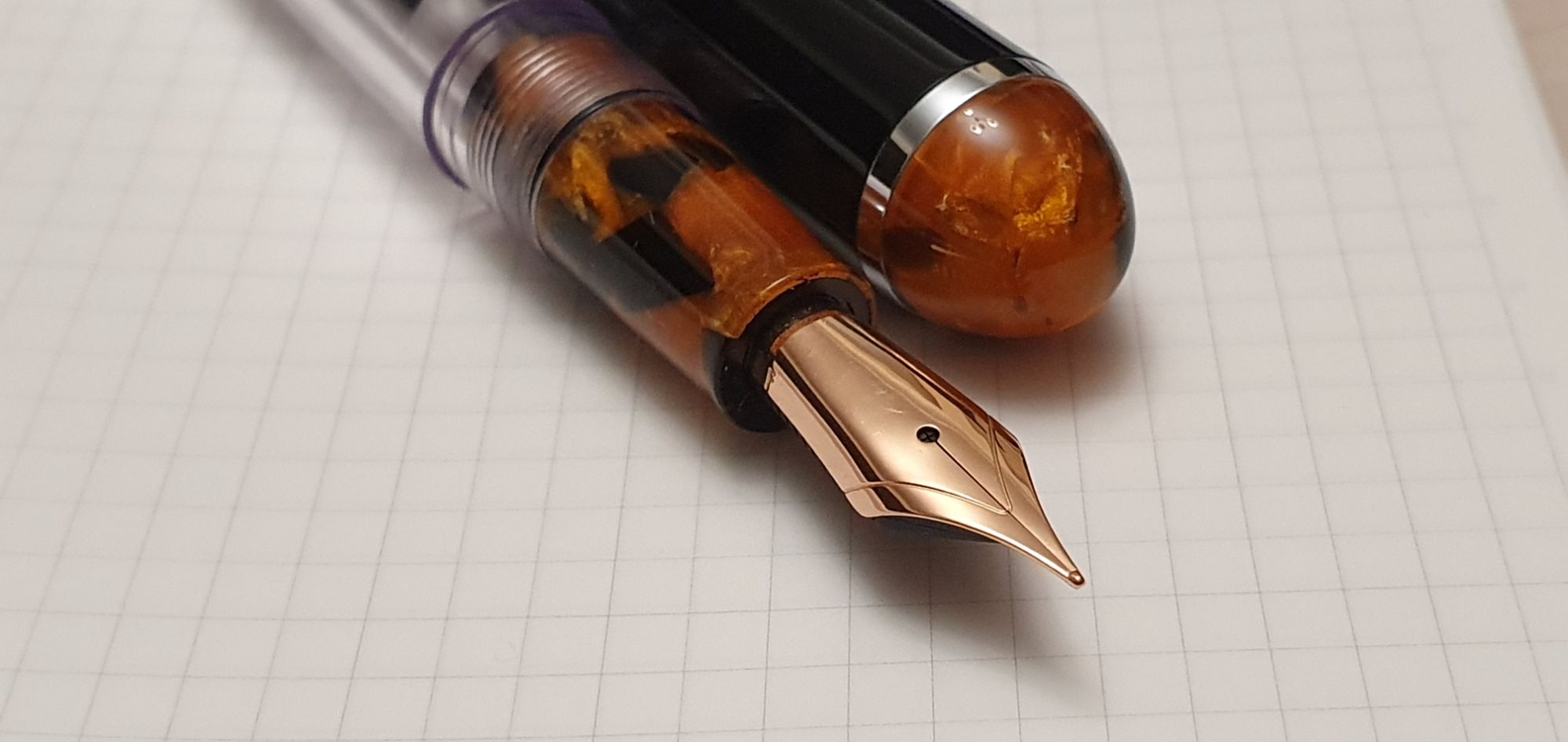
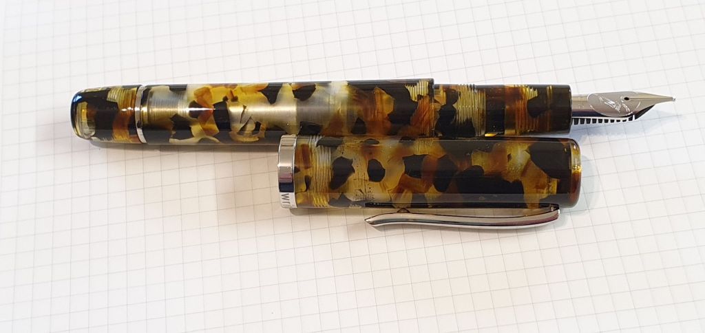
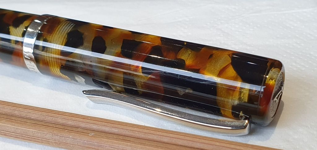
The Africa however, was like a vintage tortoiseshell colouring but more hardcore, like a leopard and with patches of clear acrylic resin. This had one advantage, namely that you could see the ink level between the black and golden-brown flecks of colour.
To help with my deliberations, John suggested showing me something completely different. I then enjoyed his personal guided tour of all the pen displays, including Pilot, Sailor, TWSBI, Conway Stewart and a generous range of Leonardo pens, with his comments on the various merits of them all. This was refreshing and I saw several pens that I had not seen in the flesh before. As John said, most pens look better in real life than in photographs.
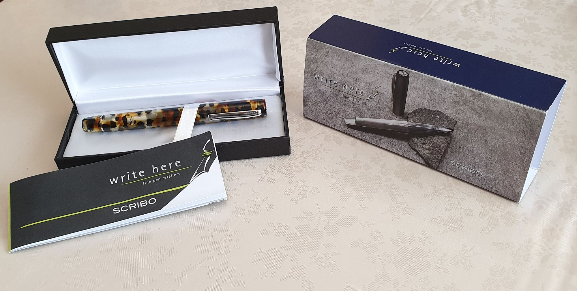
Returning to the table, I weighed up the two Scribos again. As I felt that I would be happy either way, I chose the Africa on the grounds that you could see the ink level, it did not have the bulbous barrel or metal ring at the end of the section and was also the lower priced of the two.
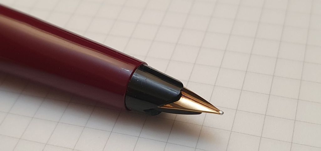
As for nibs, I already had a good number of pens with medium and fine gold nibs but fewer with broad nibs, especially a stubby broad. John added, perceptively, that I had looked the most comfortable whilst trying the broad nib. This clinched it and so I became the happy owner of the Scribo Write Here Africa, number 25/50, with an 18k broad nib.
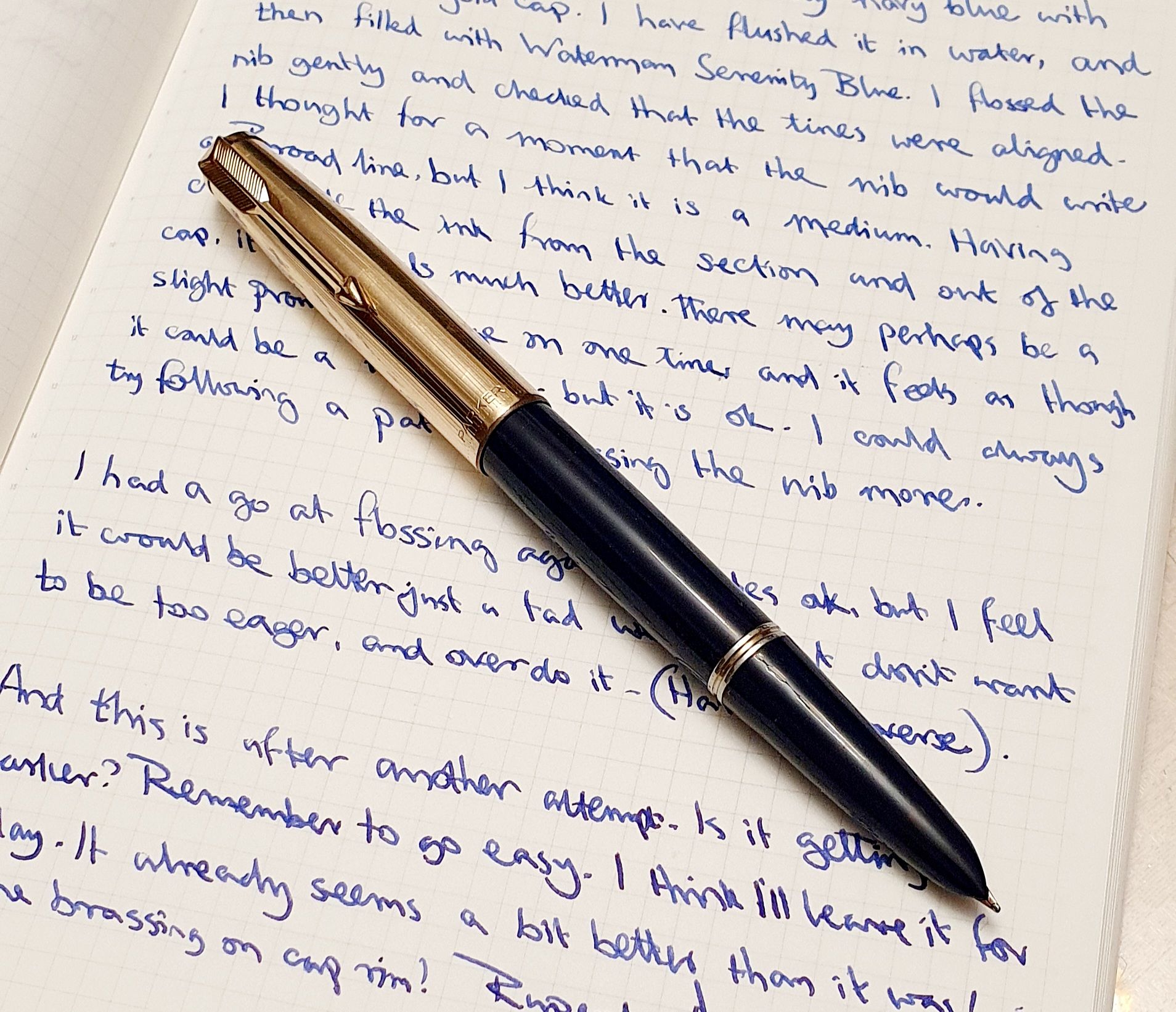
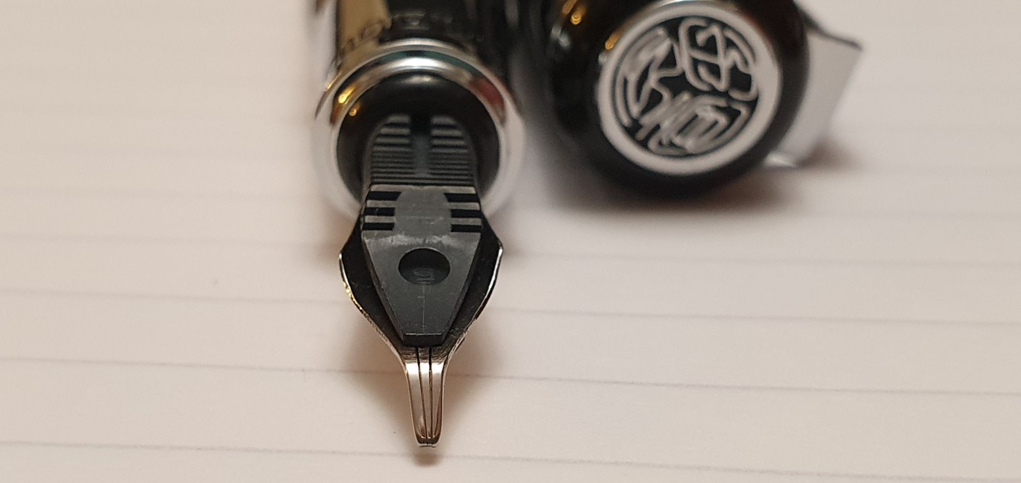
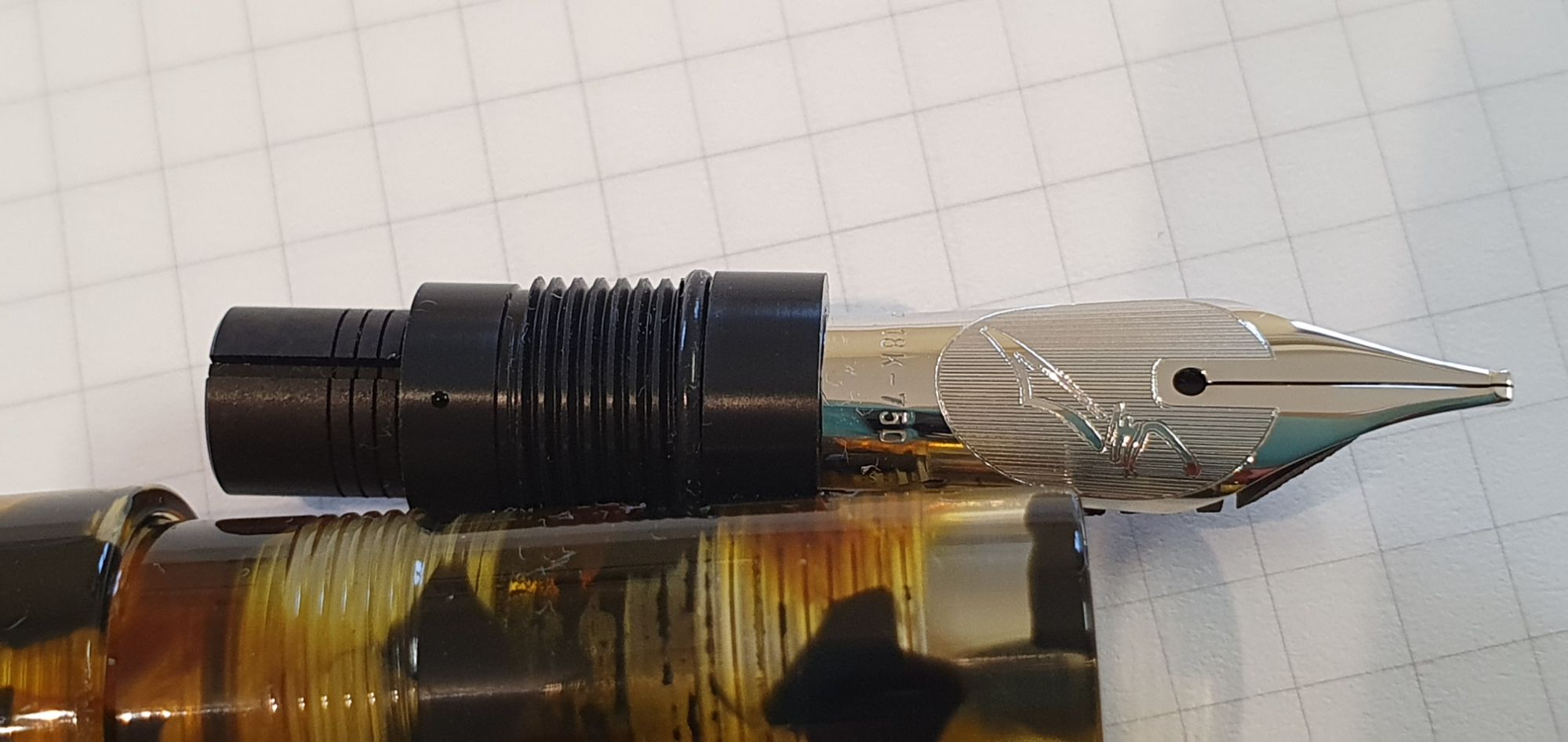
I would like to say that I took it home and all ended happily ever after. I should have filled the pen and just got on with it, allowing it to run in, but could not stop myself from tinkering with the nib. On close examination, I felt that the nib was not quite centred over the feed. Foolishly, I tried to adjust this by twisting the nib in situ, as though it were a steel Jinhao. This might have moved the nib by the tiny amount needed, but put the tines out of alignment. This required some further tweaking, until the tines and the tipping were level again. Another problem then manifested itself, in that the tines rubbed and clicked against each other whenever I put pen to paper, which I hate. I managed to cure this by flossing the tines with my thinnest gauge of brass shim, checking that the tines were still level. But this may have added to what was already a generous ink flow.
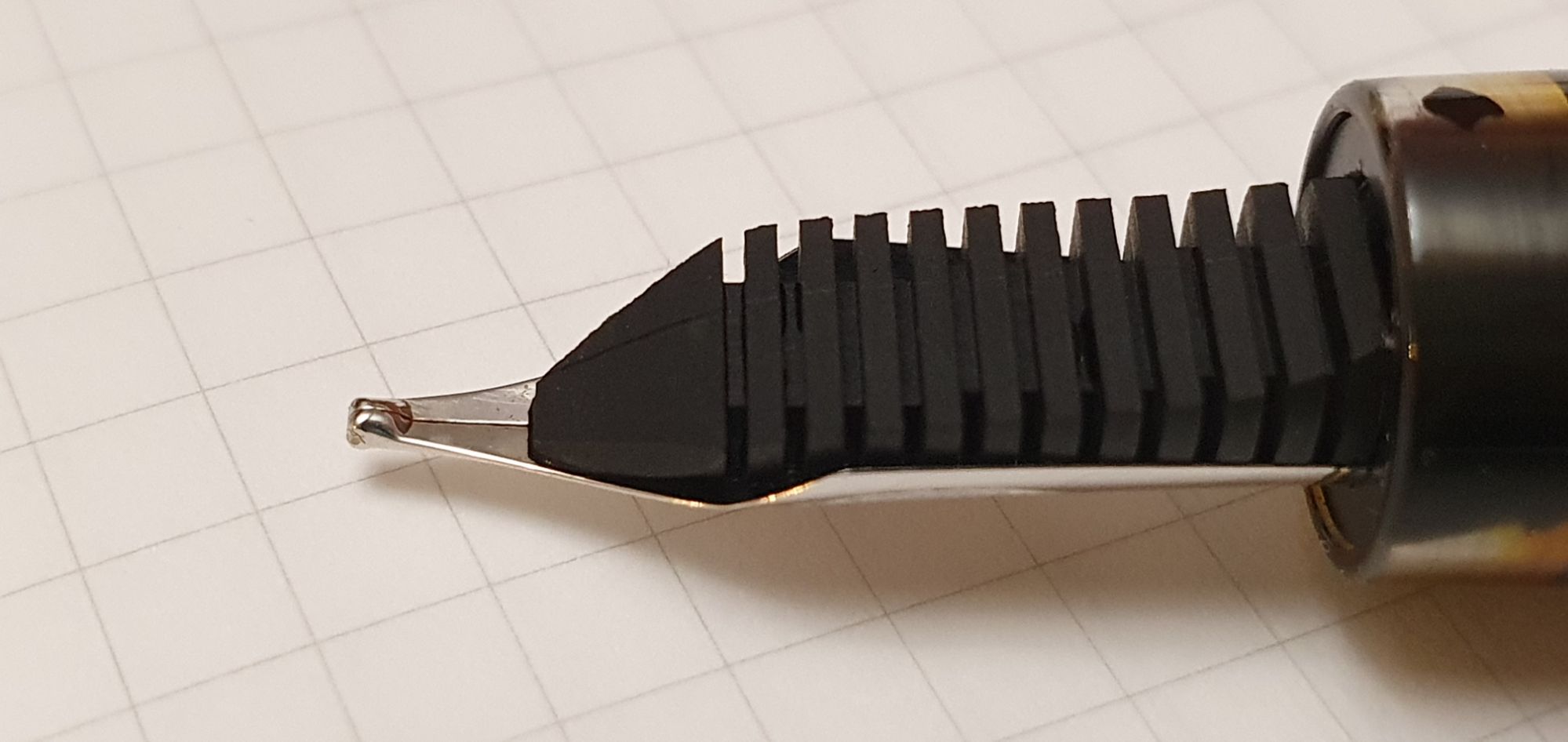
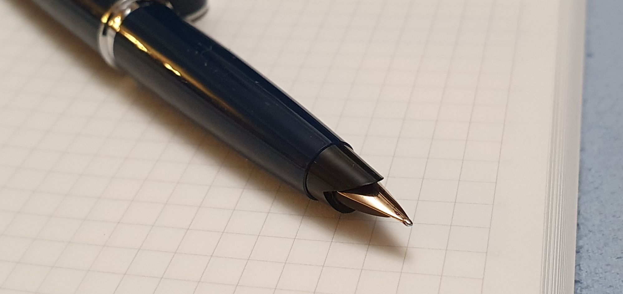
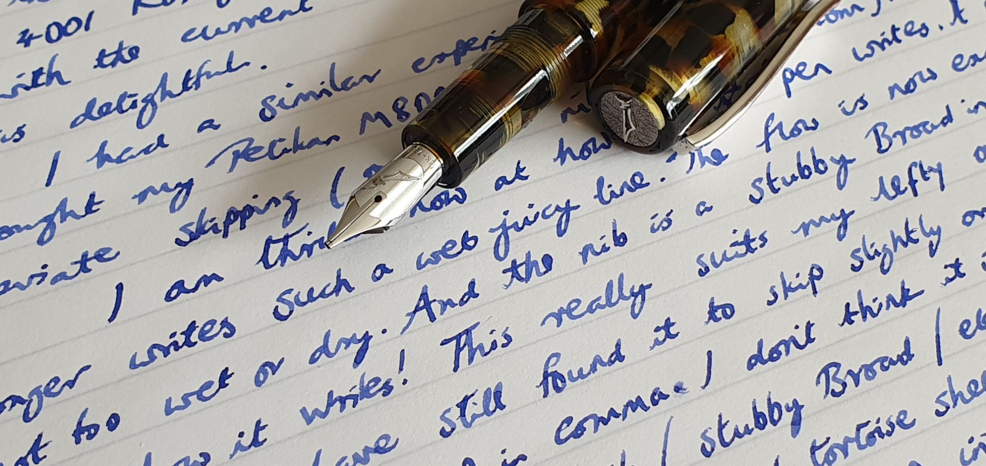
The writing experience of this beautifully crafted nib was initially marred by skipping and overly wet ink flow. For the first two weeks, I probably tinkered with the nib every day, trying to get it to be as good as it could possibly be. The tipping was super-smooth and gave a juicy broad down stroke and a fine cross stroke. By holding the pen vertical, a double broad effect was achievable. By turning the pen over, the tipping allowed a stubby fine line, which was useful but scratchy.
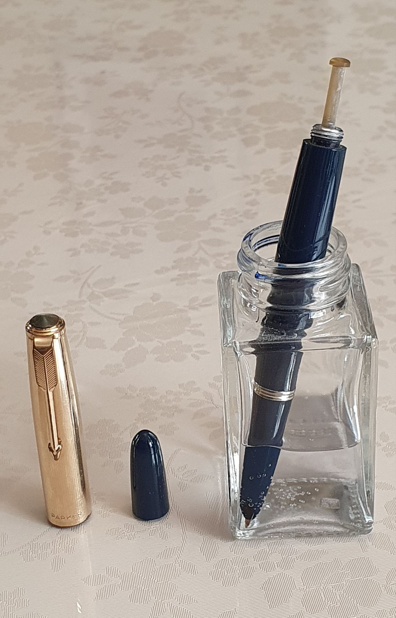
I also changed inks every couple of days and am already on my fifth ink. I wondered whether, in view of my nib tuning efforts, I should heat-set the nib and ebonite feed. I read a few different and conflicting guides on this. Using hot water to heat the feed is safer than a flame. One account warned that hot water might discolour the ebonite. But after holding back for a few days, I could no longer resist trying the hot water technique. I unscrewed the nib housing, extracted the nib and feed carefully, checked symmetry over the feed and pushed them back in their housing. I boiled some water, poured it into an egg cup and then dipped the nib and feed in the water for 30 seconds. I then withdrew them from the water and pinched them together for 20 seconds.

The result is that all now looks good again. The nib is still super-smooth and prefers paper with a bit of texture. It skips at the beginning of words sometimes, which I think may be due to “baby’s bottom” but this is improving and should continue to do so. It still writes very wet but I am reluctant to try narrowing the tine gap in case I reintroduce the tine-clicking issue, or put a bend in the tines.
Notwithstanding these self-induced tribulations, I love using the pen. I still cannot walk past it without picking it up to write a few lines or more. The feel of this nib on paper, its bounce and the line that it produces are addictive and the pen is like nothing else in my collection.
Rather than this being a pen nib that needed taming, it may be truer to say that it was I, who should have shown a bit more patience before subjecting it to my nib-tuning experiments. But I am confident now that the pen will be great if I can allow it to settle down.
I am thrilled to own a Scribo at last and am most grateful to John Hall at Write Here for giving me so much of his time on my visit.