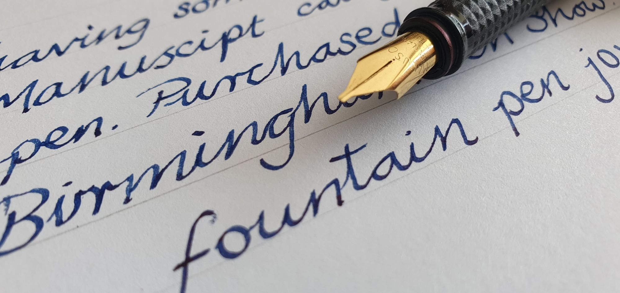
Last week, I enjoyed a week’s holiday in the heart of the Lincolnshire Wolds, a rural landscape in the east of England. We had rented a cottage which was formerly a blacksmith’s forge, in a tiny village.
We had been advised to visit the Hemswell Antiques Centre, said to be Europe’s largest antiques centre, occupying a former bomber airbase (of which there are many in Lincolnshire). Spread over four large buildings, each with many rooms of antiques of all descriptions, particularly furniture, there was a lot to explore.
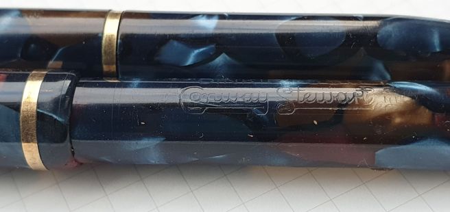
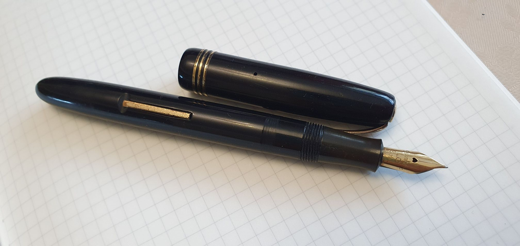
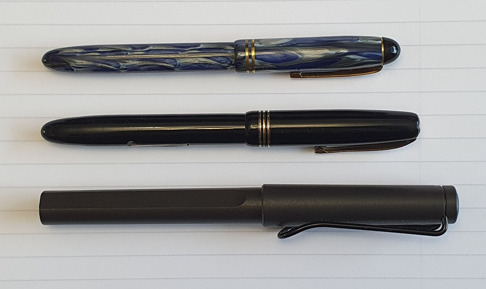
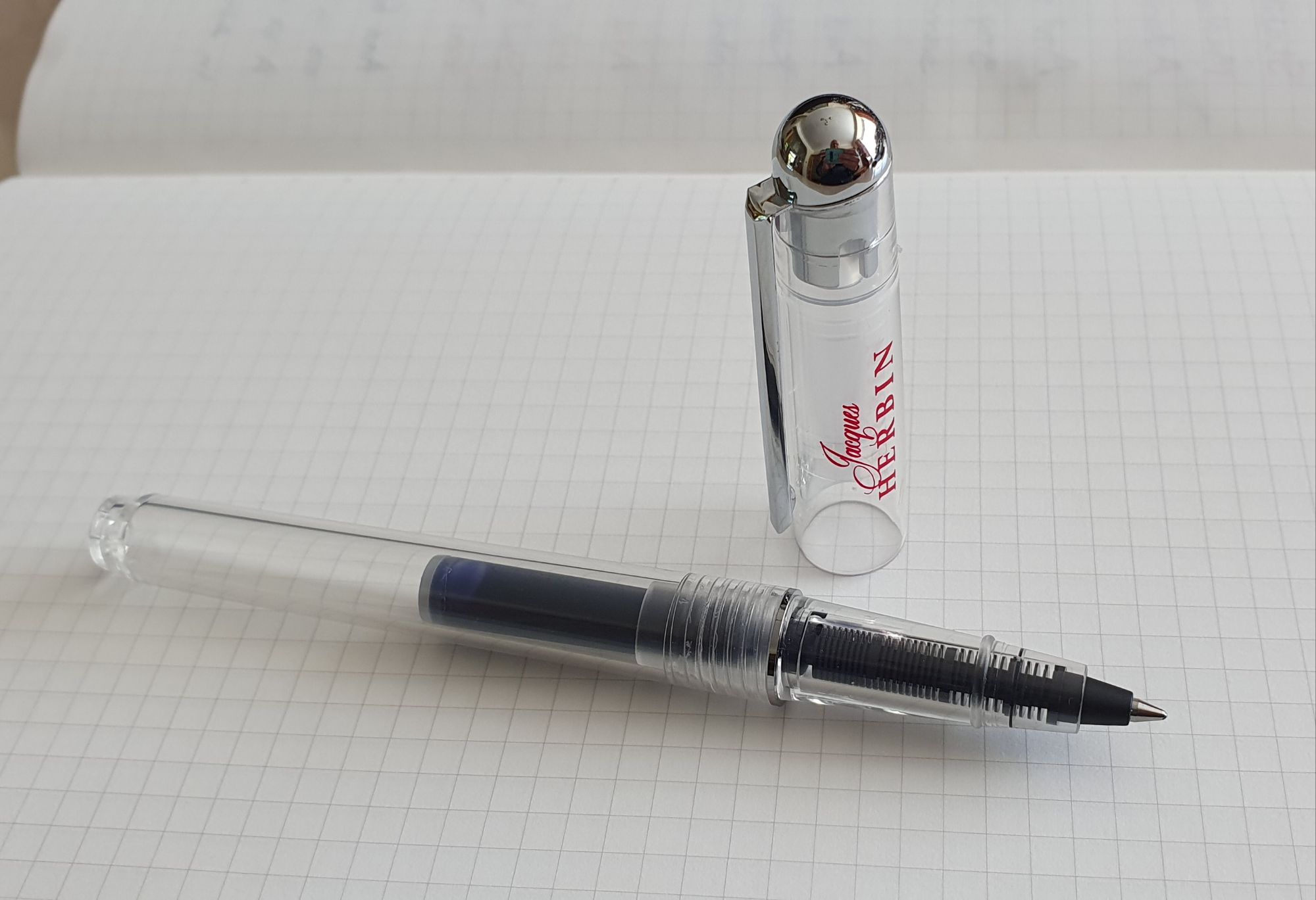
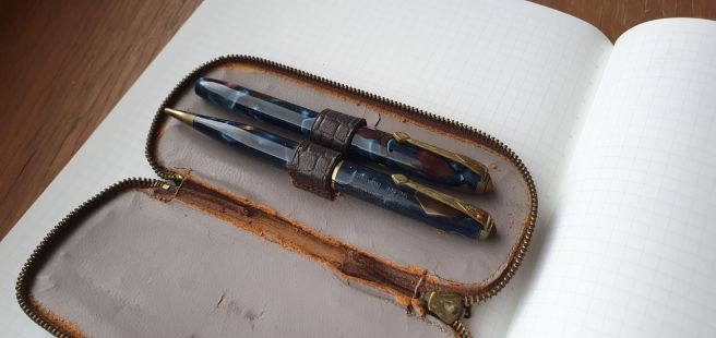
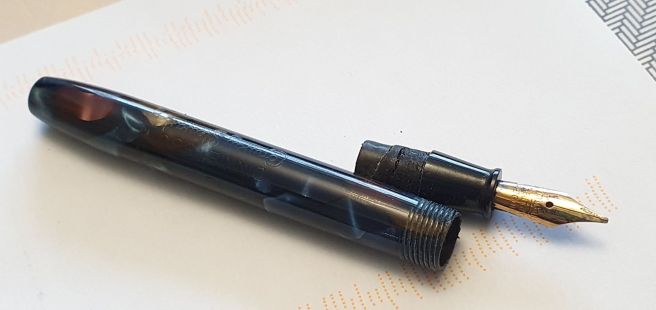
A quick google search beforehand, had indicated a few vintage fountain pens for sale, including a Conway Stewart fountain pen and pencil set, which looked tempting. Once I had tracked it down, I found it to be a “Dinkie” 550 lever filler, barely four inches long, with a matching “Conway” No. 25 mechanical pencil. The Centre sells items from around 400 vendors and, unlike at a pen show, they are not on hand to answer questions. Whether rightly or wrongly, I made a hasty decision to buy the set. (This was only one search away from being an impulse buy).
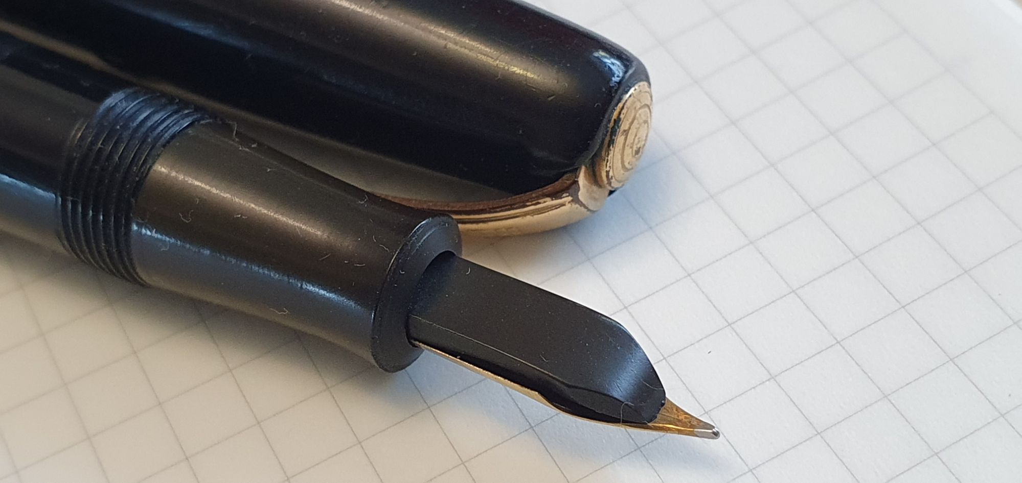
After making payment, I was able to inspect the items at more length. I am ashamed to say that, in my excitement I had looked only at the body of the pen and the nib. I had not even thought to try operating the lever. When I did so, I found that it could only be raised to about 30 degrees from the barrel. Also, the barrel could not easily be removed to see what was going on inside. I had purchased a “project.”
A friend from our pen club kindly offered to replace the sac for me, having undertaken the WES (Writing Equipment Society’s) Pen Repair course and advised me not to try doing it myself. But, as she was about to go on holiday, I decided to have a go myself. I watched a video or two and read up on the procedure. Basically, you take off the barrel, take out the old sac, fit a new one and put the barrel back on. What could possibly go wrong?
First, removing the barrel was not as easy as on a Lamy Safari. I assumed (wrongly as it turned out) that the barrel was on screw threads but glued with shellac, requiring gentle heat to soften the adhesive. I borrowed my wife’s hair dryer, with a nozzle attachment to warm the barrel slowly, where I assumed the threads and the glue would be. I paused frequently to twist and pull the barrel off, conscious of the need to apply enough force to get it off but not so much as to crack the barrel.
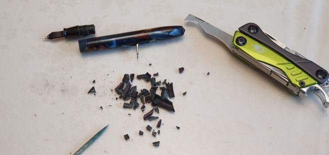
Once the barrel started coming away it was evident that it was not threaded, but friction fit. With a bit more warming and pulling, the barrel was off! This felt like a major milestone.
The existing sac had become hard and brittle. I tipped out the contents of the barrel, forming a sorry pile of black dust and debris. I poked inside the barrel with a tooth-pick to get out any residue.
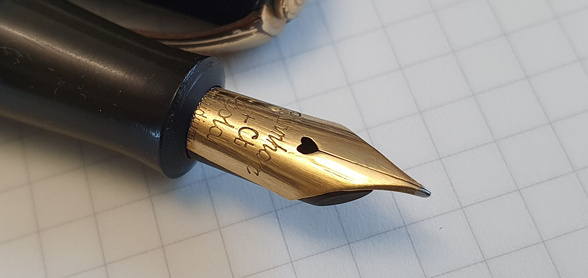
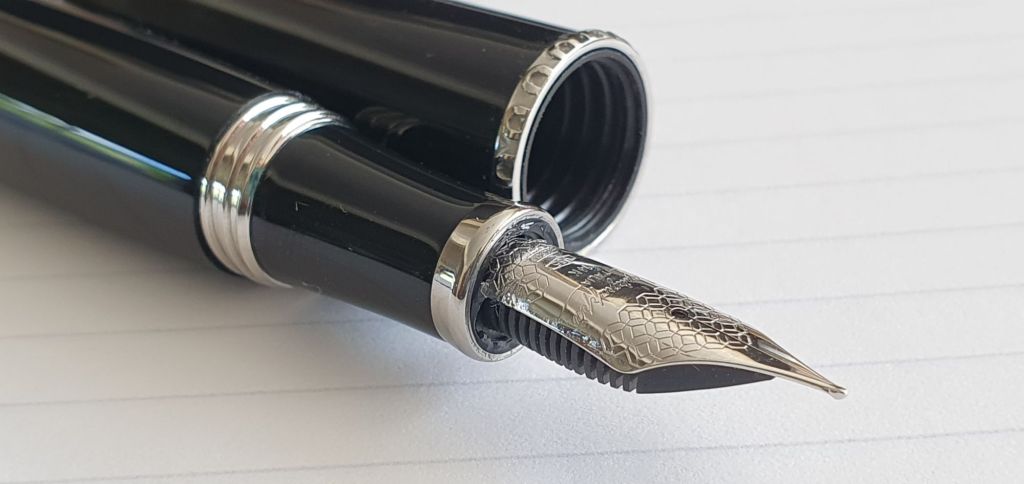
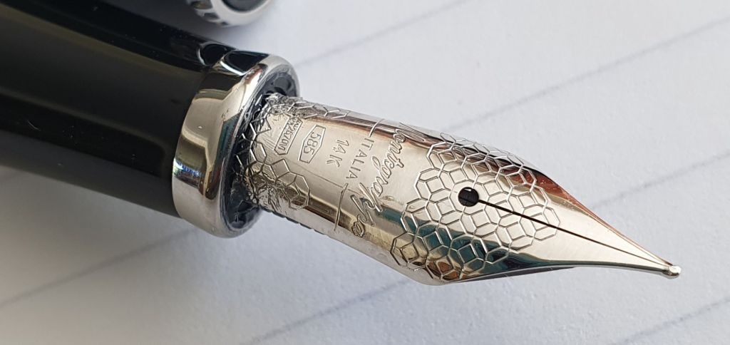
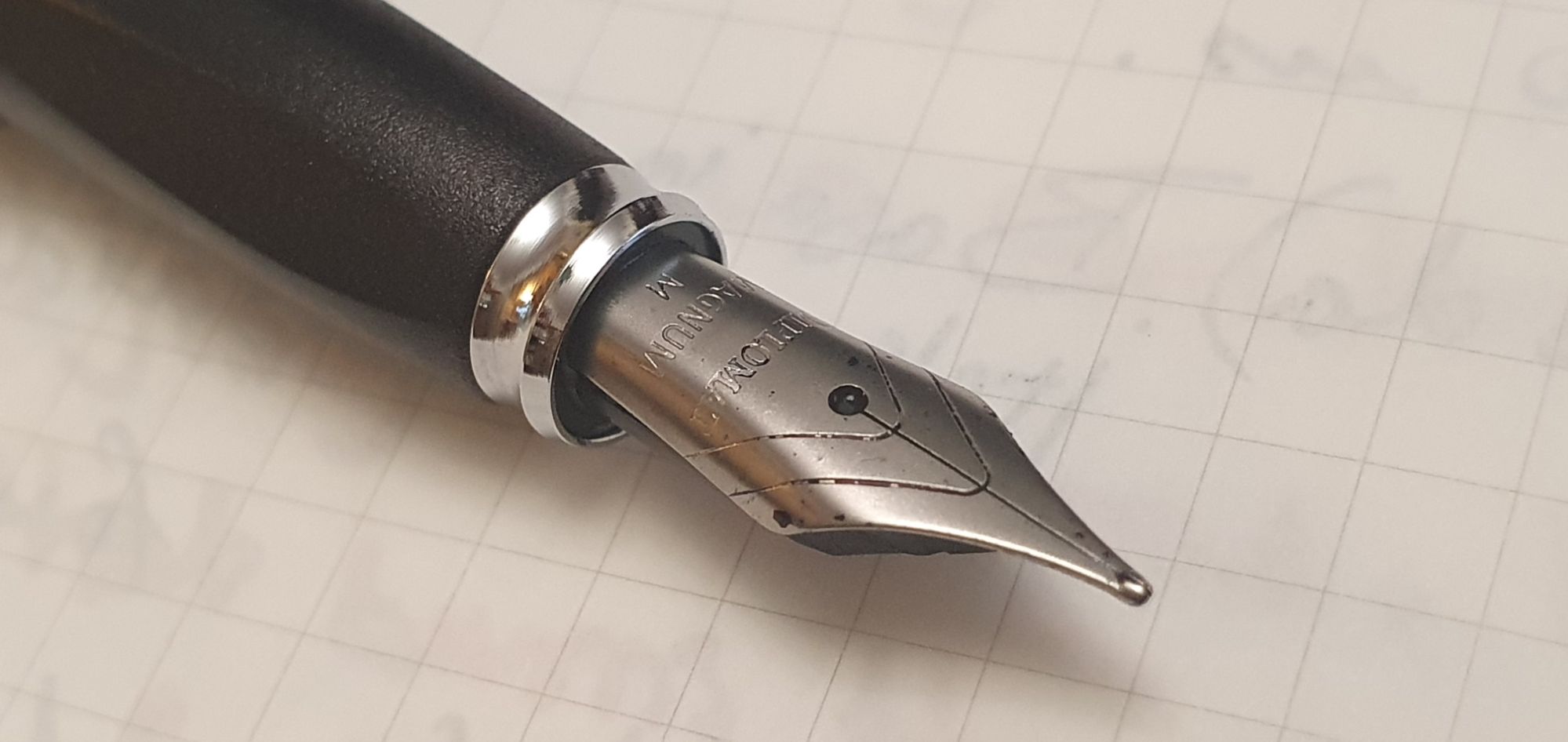
The good news, was that the lever mechanism then moved freely, through 90 degrees and I could see the pressure bar being lowered and raised again. This looked promising. I washed the nib and feed section and cleaned up the 14k gold nib with an old toothbrush.
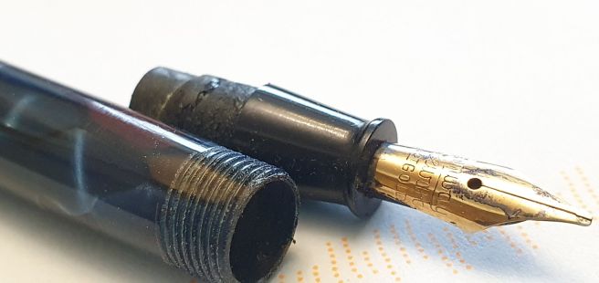
I was then able to measure the diameter of the sac peg, the lower step of the section, on which the sac fits. From information I found online, I would need a size 15 sac.
I ordered the latex sac and a small bag of pure French Chalk, to dust the sac after fitting to help it slide into the barrel and stop it from sticking. The sacs came in packets of two, 8cm long and to be cut to length as required. They arrived a couple of days later, from The Pendragons Partnership. They had a slight dusting of French Chalk already but it was good to add more.
I measured that I needed the sac to be about 5cm long and so cut off the excess. I then practiced pulling it over the sac peg. This was fiddly and awkward to do by hand. I believe you are supposed to use reverse needle-nose pliers to open the sac but in the absence of these, I simply held one side the sac against the peg with my thumb nail, whilst pulling at the other side of the sac to stretch it and pull it over the peg. Several times, it jumped off. Also, the opening of the sac became ragged such that I had to trim a bit more off.
Once I had practiced this, I applied some shellac to the sac peg. I managed to get the sac on the peg, but the leading edge had rolled inwards over itself. Being unable to unpick this, I decided to roll the whole sac a bit further up the pen and then slice off the excess, back to the start of the sac peg, using a craft knife. This worked and I hoped that there had still been sufficient shellac on the peg to secure the sac. A little more wriggling of the sac had been needed, to line it up straight. I then let it sit for almost 24 hours for the shellac to set fully.
The following day, I was ready to replace the barrel. This stage was also difficult! The sac (now a little shorter than I had intended) went into the barrel easily but the barrel was a very tight fit over the sac peg. I had not wanted to glue the barrel on but it was clear that this would not be necessary. With the aid of some French Chalk for lubrication, I eventually managed to push the tiny barrel all the way home, all the time afraid that it would break under the strain. Perhaps I should have filed down the sac a little, before replacing the barrel, although this would risk puncturing it.
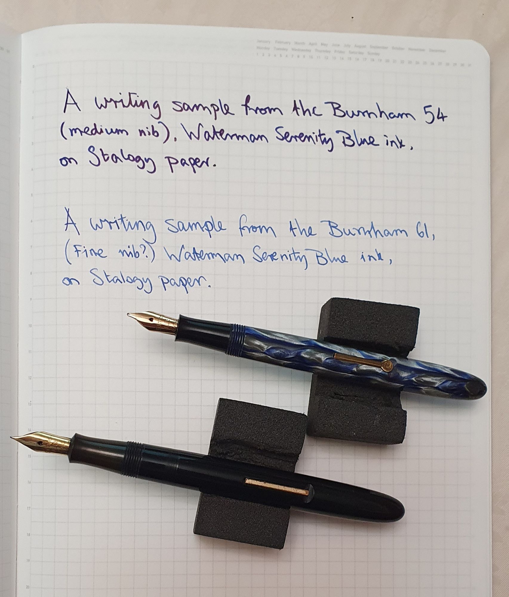
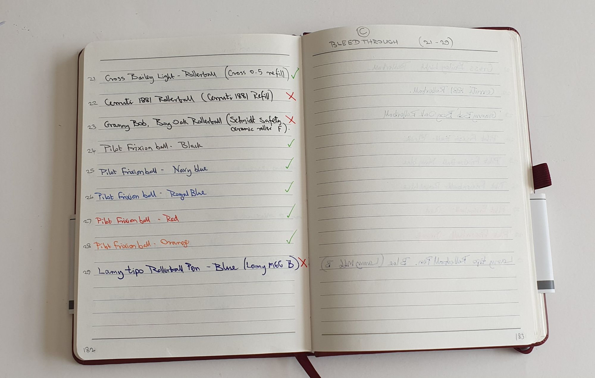
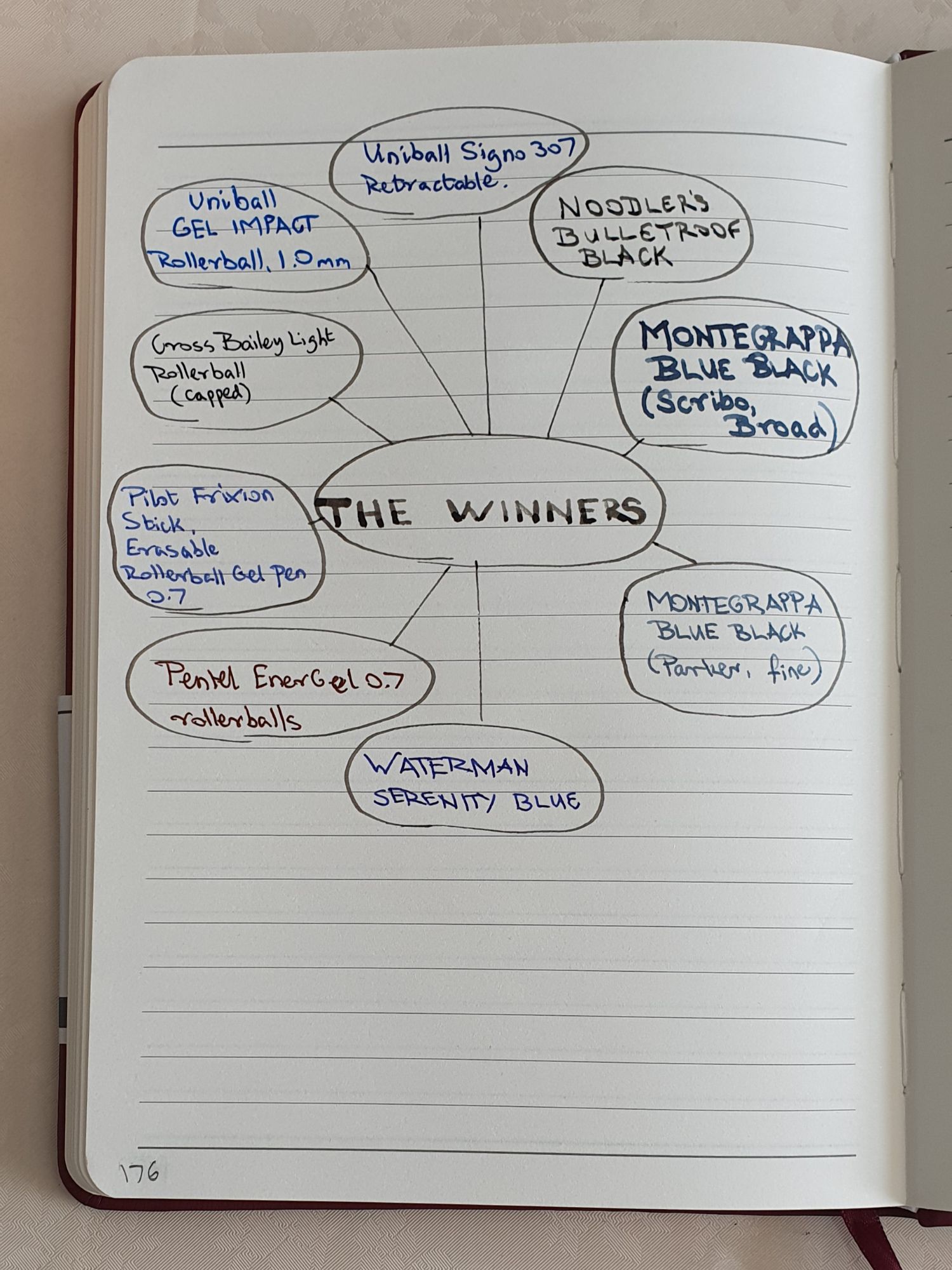
Once reassembled, I could at last fill the pen. I chose Waterman Serenity Blue. I decanted some into an ink miser so that I could check that the pen was filling. To my relief, the pen drew up ink nicely. When I expelled the ink again a couple of times, I found that it amounted to only about 11 drops of ink. But to be fair, this is similar to the capacity of a Sailor converter.
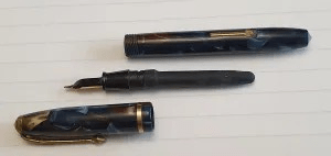
It was exciting to have carried out my first sac replacement and to have got this vintage pen working again. It now writes smoothly and, luckily is not a gusher.
I suspect that I made many mistakes, both in the buying and restoring process although, perhaps with some beginner’s luck, it worked out all right in the end. However, I have since enrolled for the WES Pen Repair course starting in November and look forward to finding out how it should be done.