
Having time at home now, I have enjoyed looking back through the many pen photos stored on my computer and my list of previous posts in this blog. I was surprised to find that I had not yet written about the Lamy 2000.
This is probably because I never really got on with it all that well. Perhaps, it was from a feeling of “If you have nothing nice to say, it’s better to say nothing at all.” Well, it’s not that bad. There are lots of features that I like about it, except that mine never wrote as effortlessly and enjoyably as I had hoped for.
I remember buying my Lamy 2000, in May of 2014. It was in a lovely pen shop in Brighton, called Websters, sadly not there any more. After having a good look around the display cases and having bought a couple of bottles of Watermans ink and a Lamy Logo fountain pen, I had strong urge to take home a Lamy 2000. At £175.00 it may have then been my most expensive pen purchase to date and requiring of spousal approval, which was duly sought and granted.
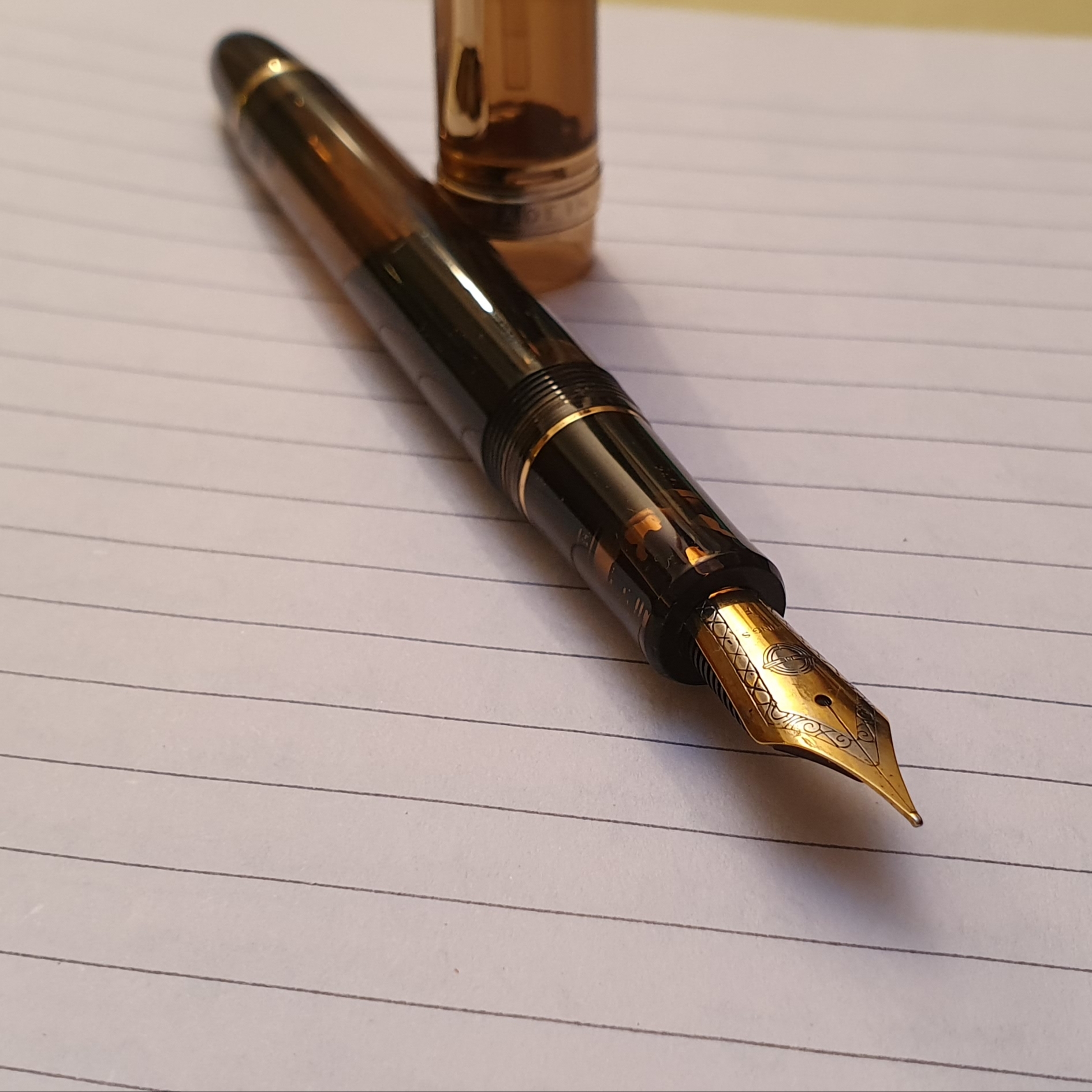
The pen came with a medium nib. There were no other options at the point of sale. The packaging was simple and modest. I admired the pen in the train on our way home to London that evening and was excited to try it out.
I should add here, that the brushed metal Lamy Logo fountain pen that I also bought that day, with its Safari-style steel nib, proved to be buttery smooth. At almost six times the price, I had high hopes for the gold nibbed Lamy 2000.
Unfortunately writing with the 2000 was frustrating. The medium nib was smooth but dry and needed constant effort to write. Over the following weeks, I tried several different inks, flushed the nib and feed numerous times and tried different papers. I wrote pages and pages and drew spoked wheels to see in what direction the driest lines were occurring. Being a lefty overwriter, I need a wetter nib as the pen does more pushing forwards and sideways and not many downstrokes to recharge the nib.

I did not want to take a chance on adjusting the gold nib myself. To cut a long story short, I eventually gave up on the pen and put it away. I had others that wrote better.
However, some six months later, something prompted me to get in touch with Lamy and I sent them an email to ask if anything could be done. They replied and invited me to send the pen back to them in Germany, which I did, with a note requesting an adjustment to my nib, or else a replacement nib, perhaps a broad.
To their great credit, notwithstanding the passage of several months since purchase, Lamy returned my pen a few days later, free of charge with a new nib. And this time it was a stubby broad.

Once again I went through the process of filling the pen, trying it on different papers and writing pages and pages. It was better than before! I liked the line produced by the broad nib. Yet, it still suffered from the problem of needing pressure to make it write, to get ink to flow but of course this pressure caused friction and resistance as the pen moved across the paper. All in all it was hard work and not enjoyable. What’s more, the nib literally squeaked on the paper.
From time to time over the years I would get it out again, thinking that a different ink would make the difference. But always I would end up flushing the ink and putting the pen away again and so for almost six years the pen has been unfulfilled and largely unused. Yet, even now as I write this, I am tempted to give it another try. Maybe it just needs the nib tweaked to open up the tines more. How hard can that be? Whereas in the past I was not brave enough to try it, I think I may have reached the “past caring” point at which I am prepared to take the risk. And if all else fails, I could get it done by an experienced nibmeister.
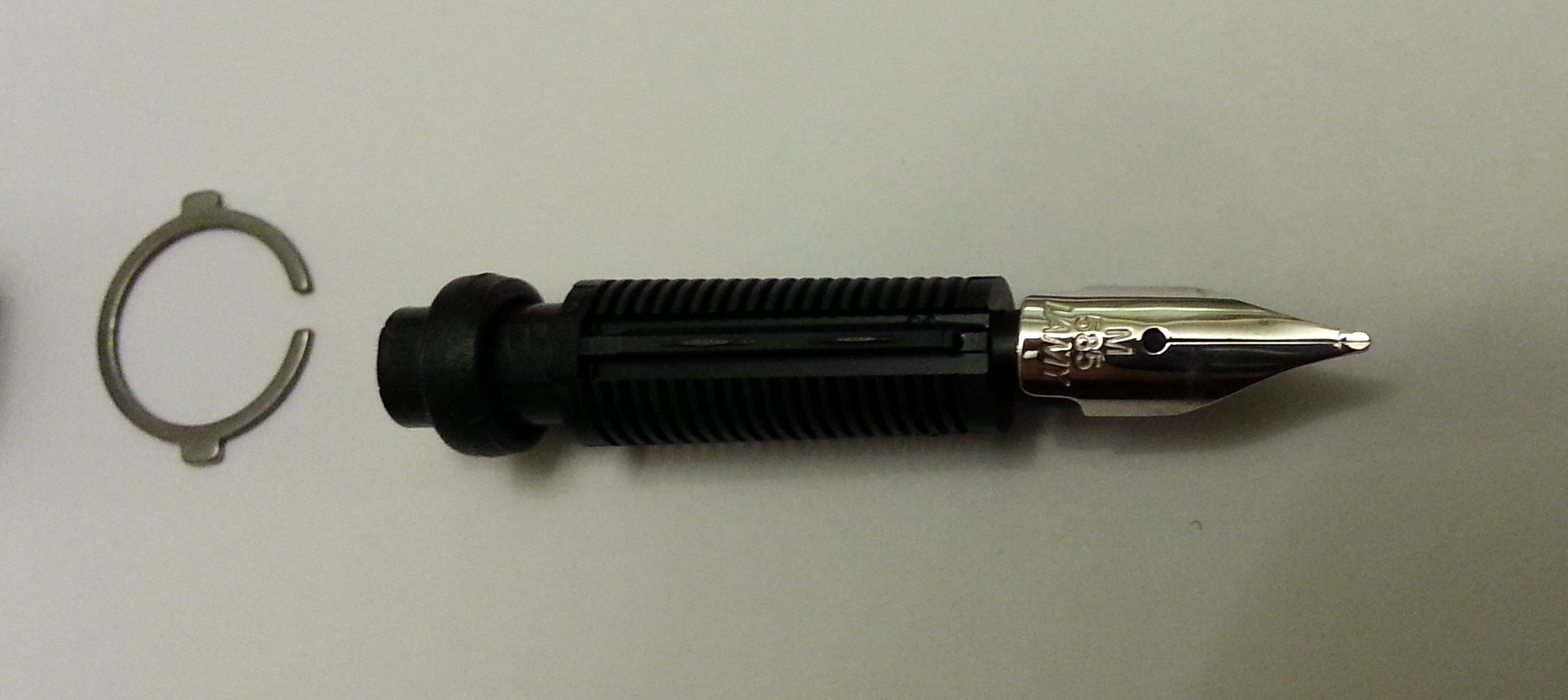
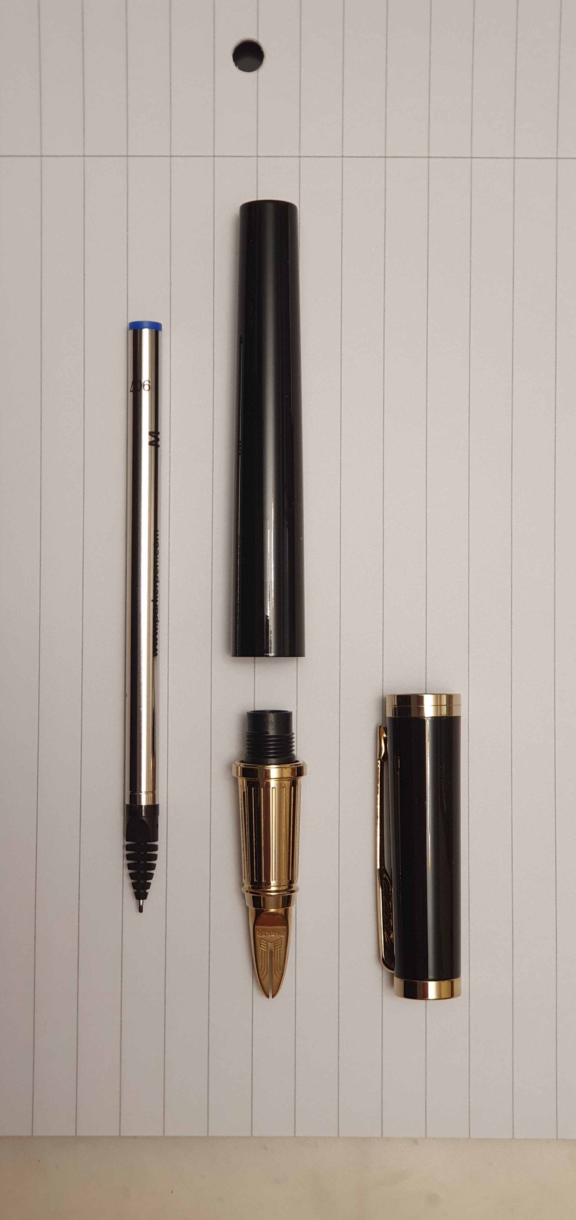
I know that so many enthusiasts speak highly of their L2K’s and I want a part of that enjoyment. I do admire the minimalist, understated design; the barely visible seam where the piston knob meets the barrel; the clever mechanism for the push-on cap; the free-floating nib which can be so easily removed for cleaning; the unique finish of the Makrolon body and the clean juxtaposition with the brushed stainless steel section and the subtle, platinum coated gold nib. I also know that I am not alone and that others have found the pen hard to use.
Yet, the design wins me over every time and makes me want to give it another chance. We will see how this turns out.

Update, 9 April 2020:
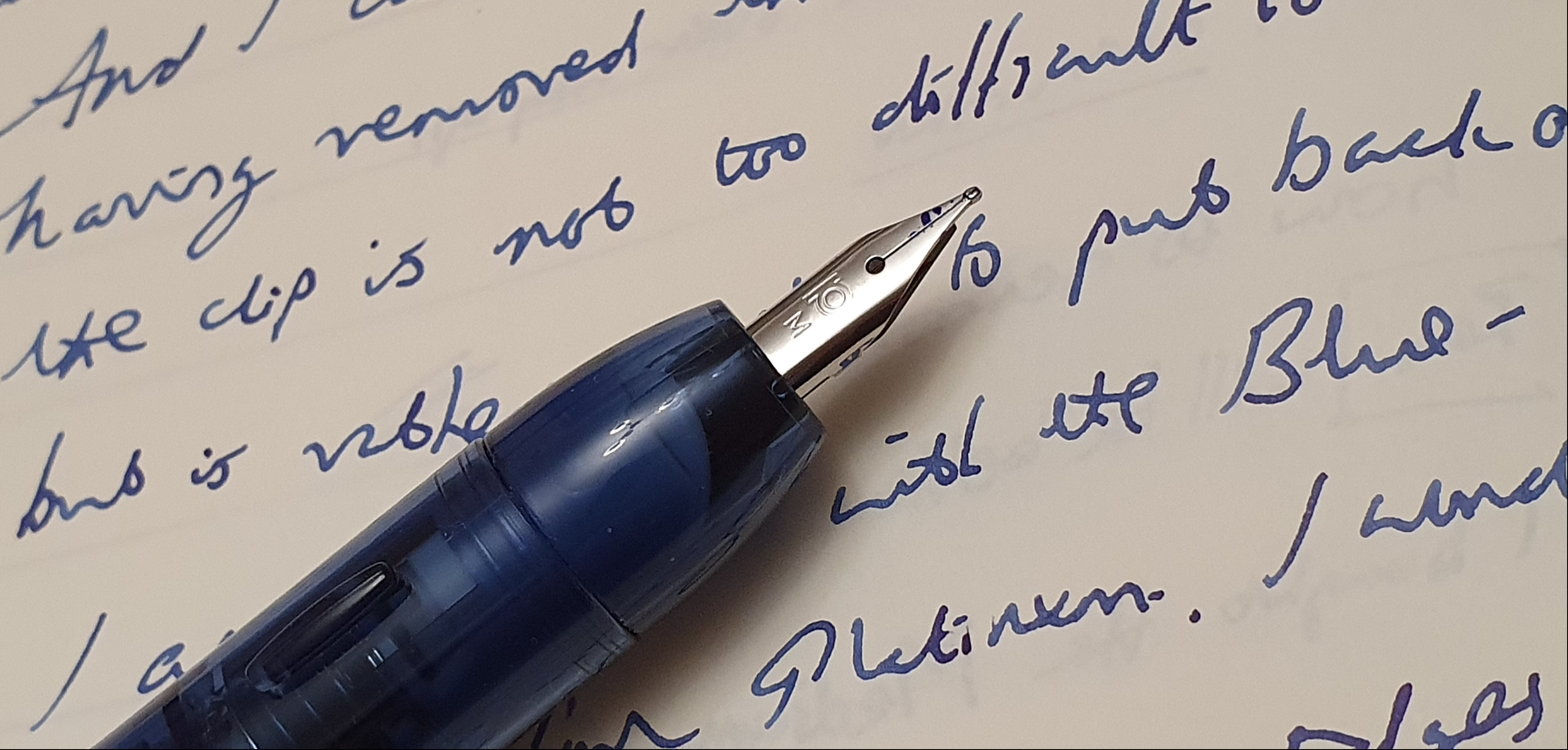
The exercise of writing this post had the effect of focusing my mind on the problem with my nib. This morning, I awoke with a resolve to try to adjust the nib myself, with some very simple tine spreading.
I examined the nib again under the loupe to remind myself of the problem. I then pushed the nib downwards against my thumb nail, in a few very gentle, controlled presses, and examined the nib again. Within moments, the tines had opened up. I thought that I might have overdone it and flipped the pen over and tried pushing again to close the gap. I found that it was easier to open the gap than to close it.
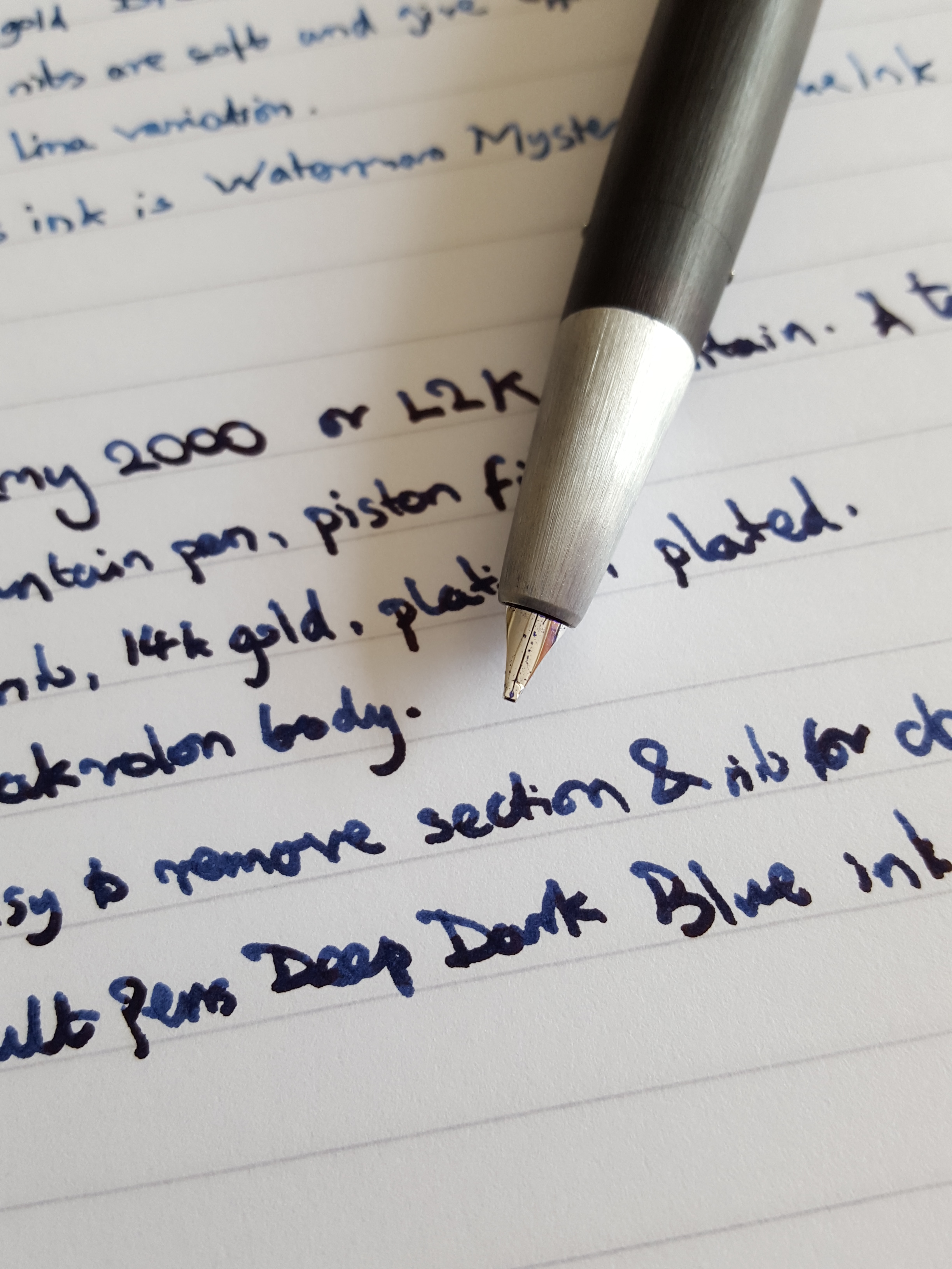
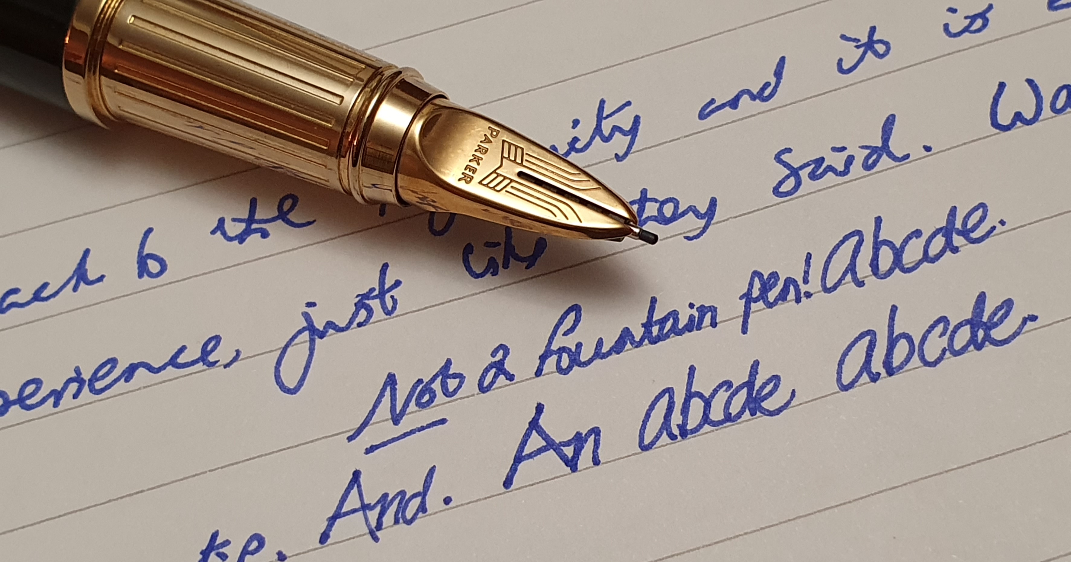
I tried dipping the pen in ink and wrote a few lines. All indications were that it was still writing smoothly, with the tines level, but that the wetness would be increased. I then filled the pen properly, with Waterman Serenity Blue and enjoyed writing for a page or so of A4. I tried a few different notebooks and found marked differences in absorbency between different types of paper.

The nib and feed kept up without problems for a full page. The nib still squeaks and needs careful handling to keep to the sweet spot. But it is now wetter and better lubricated than before and this will be a much needed improvement for my style of writing.


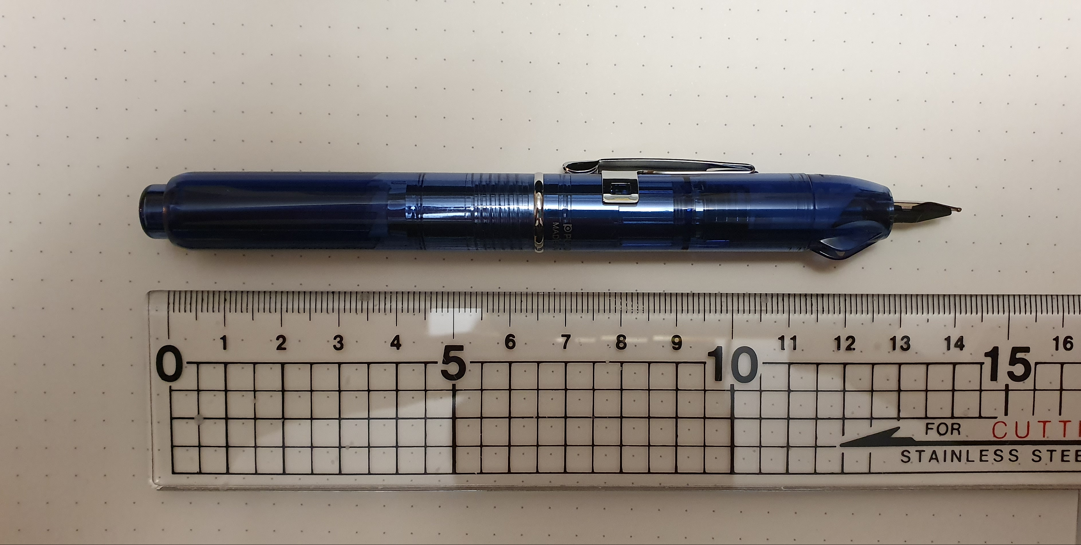

 Wing Sung 699 fountain pen.
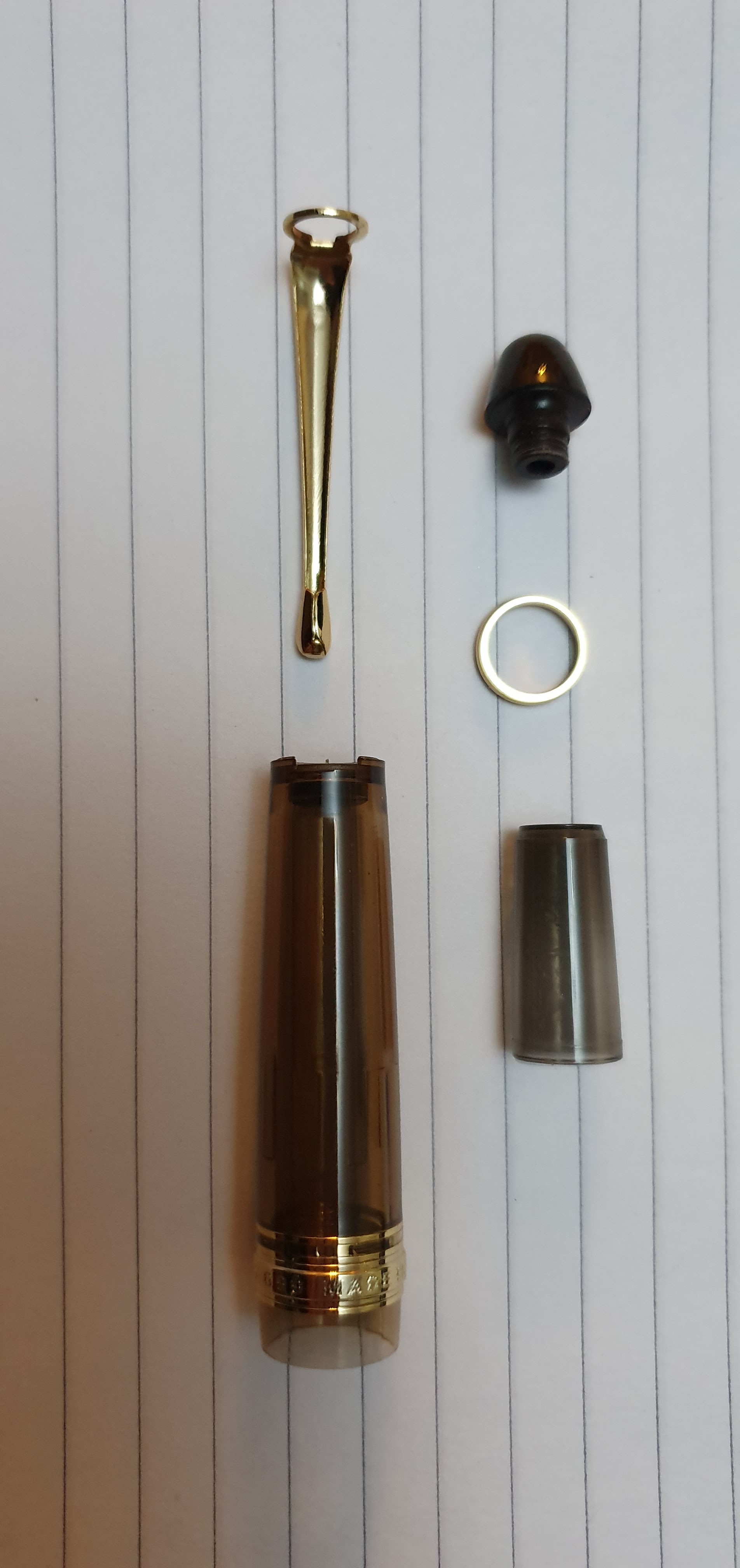
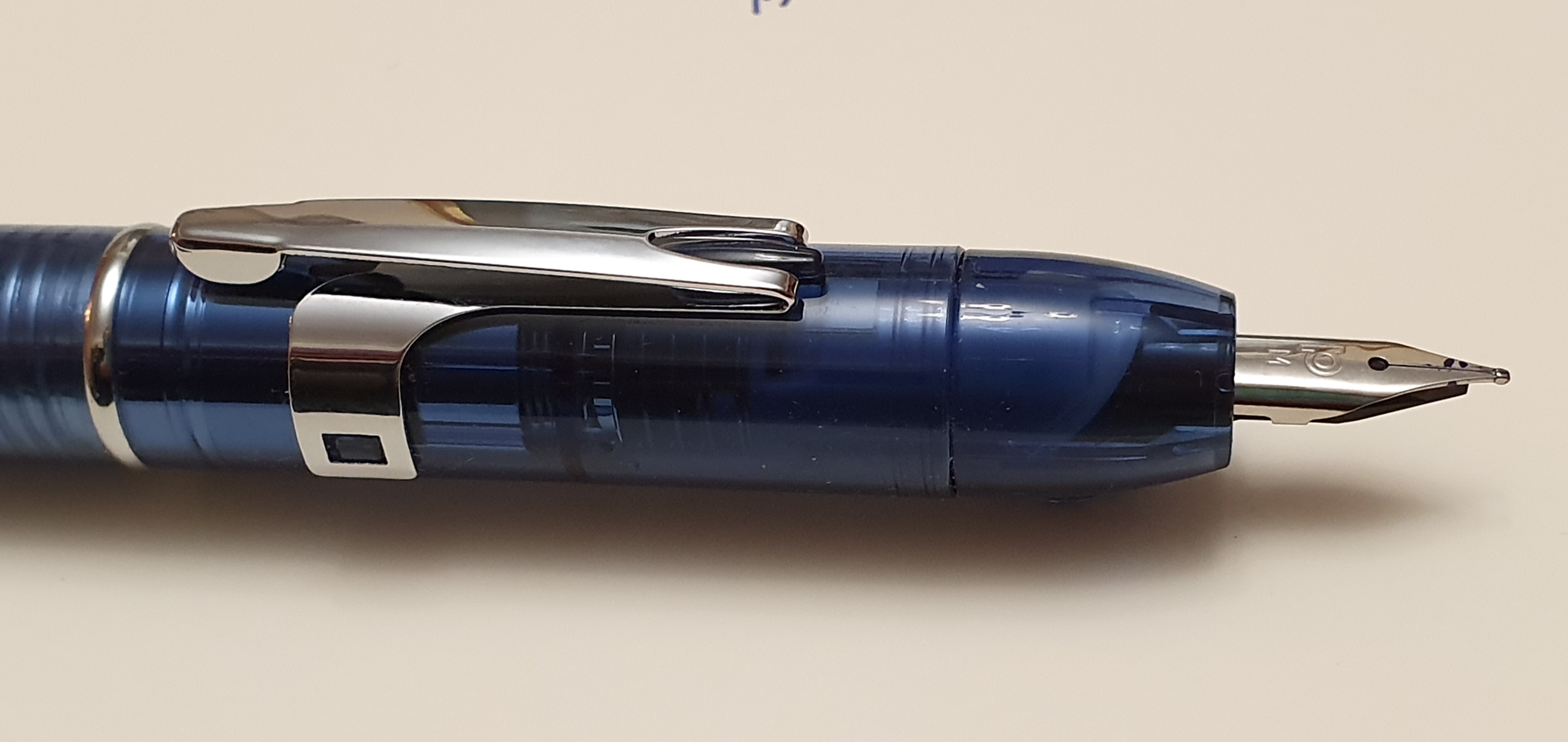
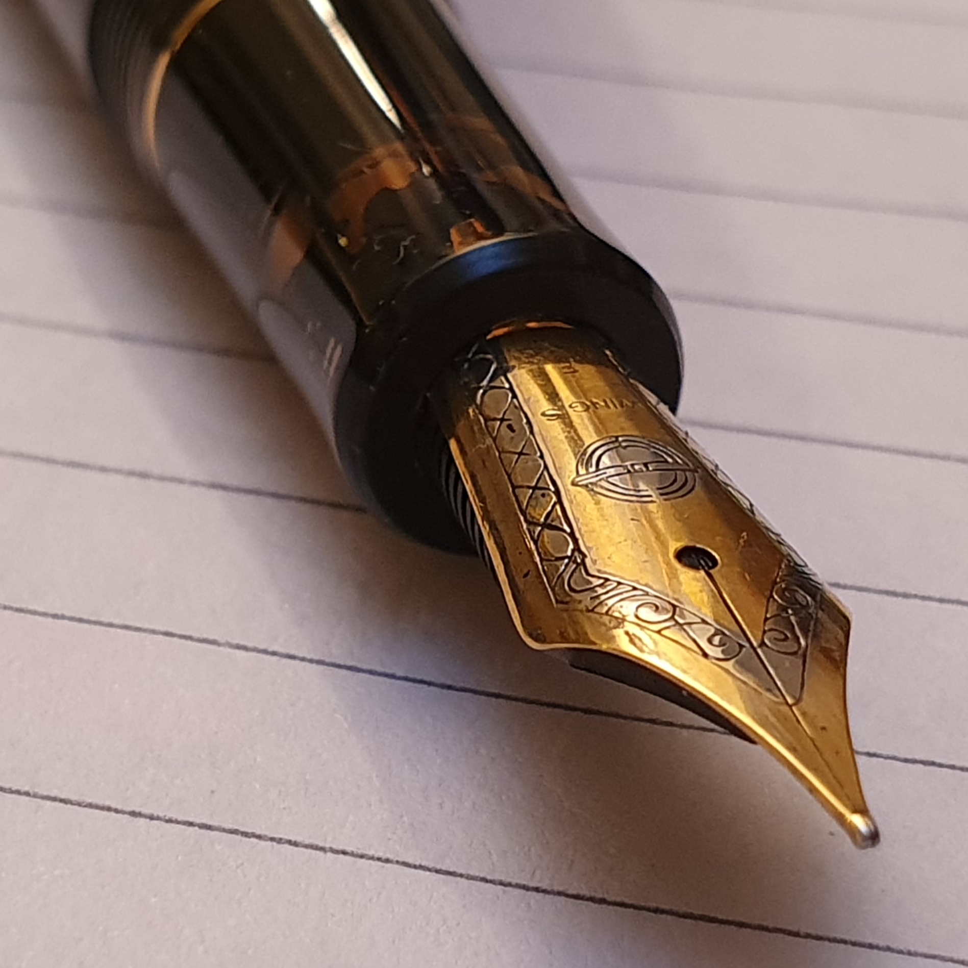 Bicolour steel nib in a Fine.
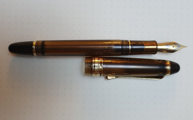
 Wing Sung 699 (right), alongside a Pilot Custom 823.
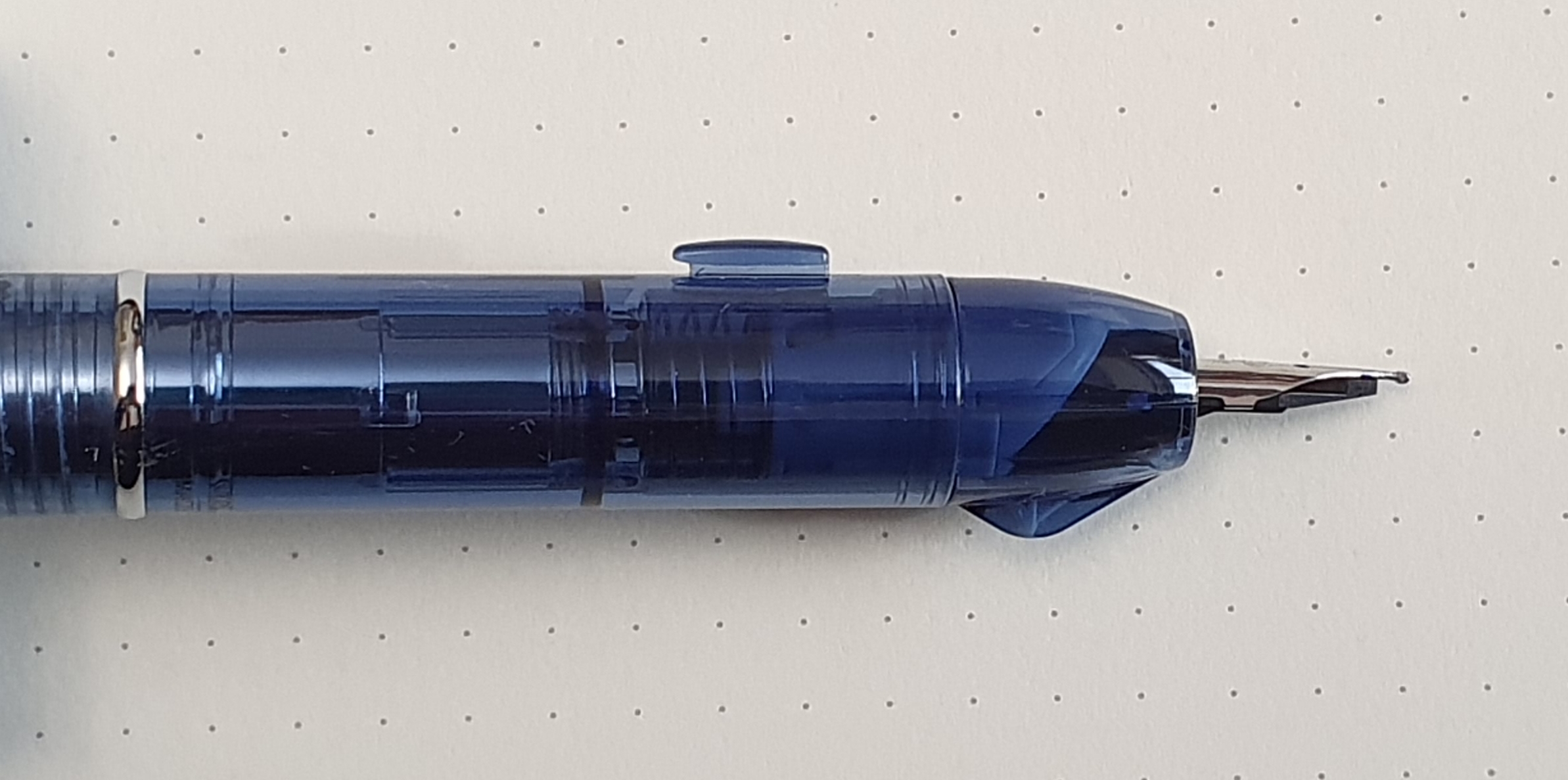
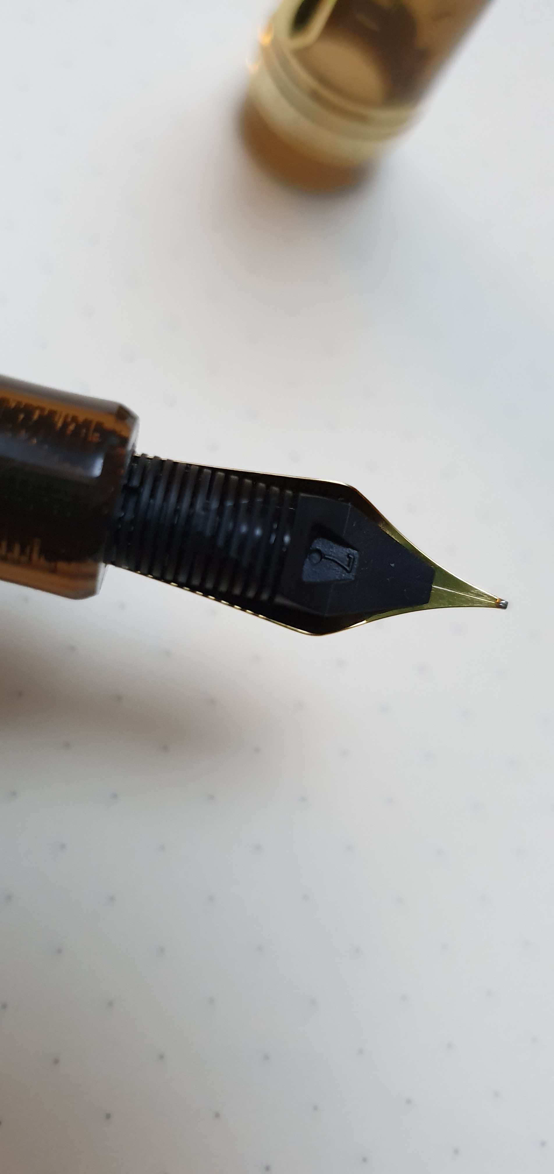 Nib and feed.
 A lovely specimen and unbelievably great value.