I noticed recently, a glaring omission in my Index of Pen Posts: more than 9 years into this blog, I had yet to write a post about the Parker 51. For a fountain pen blog, not having featured what is arguably the most famous, recognisable, respected and iconic models of the last century, seems remiss. It is time to correct that.
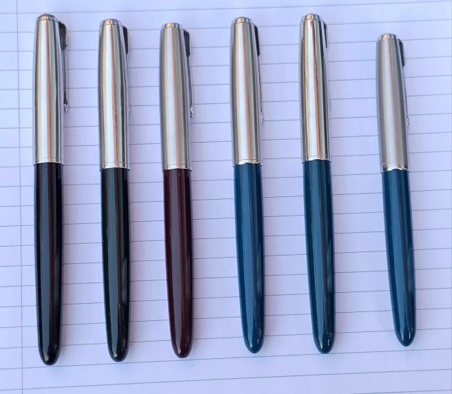
Shortly after our recent London Spring Pen Show, my friend Monica asked me whether I had any Parker 51’s that I was looking to sell. She was after a Parker 51 with a medium or a fine nib since her model, in grey with a broad nib was just too broad for her. I had shared a table at the pen show and sold a number of my modern pens but had not brought along any of my vintage Parkers as I had not envisaged selling these. However, a subsequent check of my Parker stash, revealed that I was sitting on six Parker 51 Aerometrics, and so I thought I could probably be of help. I also have one Parker 51 Vacumatic.
This is not intended to be a treatise on the history of Parker or the 51 in particular. For that I would recommend the excellent website parkerpens.net run by Tony Fischier which provides a very useful illustrated account of all the pens produced by Parker and their many variations and also a bibliography for the numerous books written on the subject. Rather, this present post is a shameless exercise in parading my own modest accumulation of 51’s. After Monica’s enquiry, I took the opportunity to get them all out, ink them all with Waterman Serenity Blue and spend a happy week or two reminding myself of how they wrote. Also the recent nice weather has enabled me to take a few photos of them in natural light.
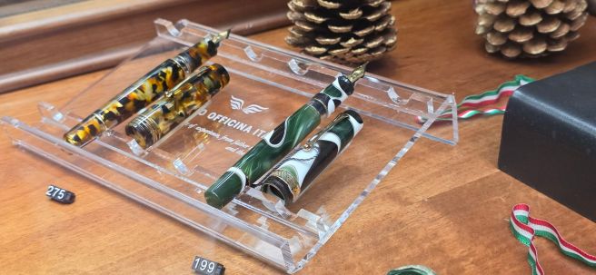
A team photo of my Parker 51 aerometrics. The 51 Special and the 51 Demi are 5th and 6th from the left.
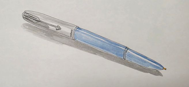
The Parker 51 was first produced in 1940, after many years of development and boasted many new features. Probably the most iconic of these was the hooded nib. Most of the nib area is hidden beneath the shell and this was in order to reduce ink evaporation and hard starts.
The Aerometric fillers have a sac housed in a metal protective cover, with a squeeze bar to fill the pen from a bottle of ink. It is remarkable that the material used for the sac, which claimed to be good for 30 years, is still going strong today and I have yet to come across a Parker 51 in which the ink sac has perished.
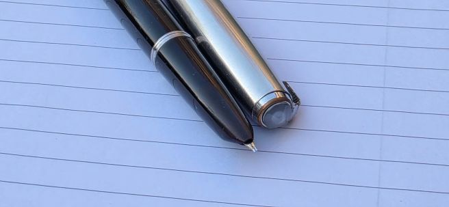
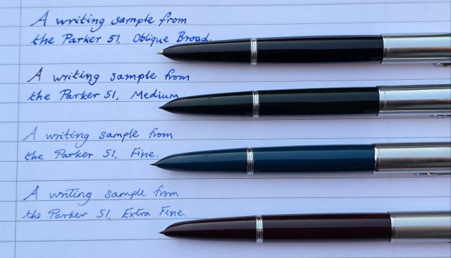
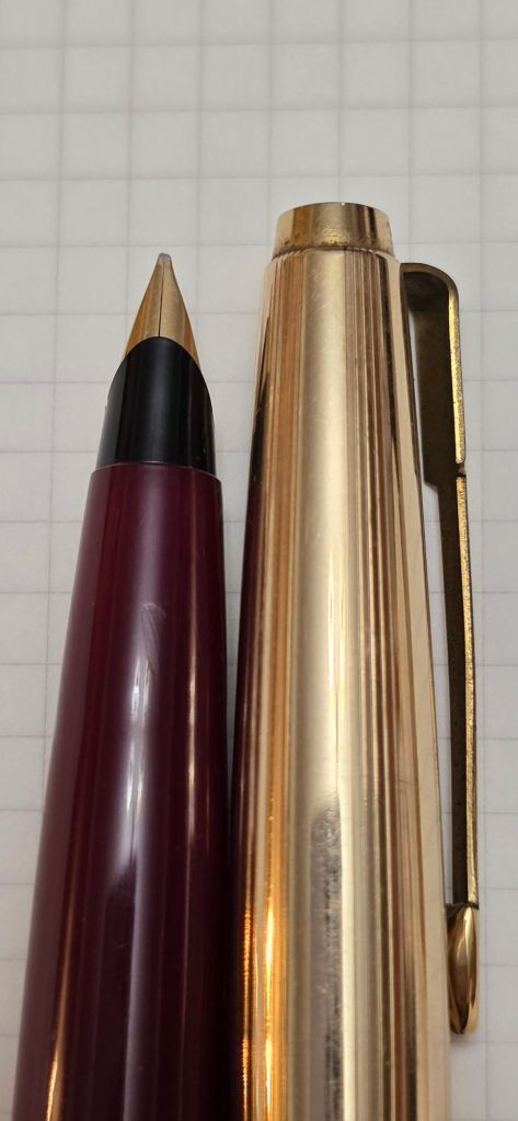
Receiving a Parker 51 is a memorable occasion. I still remember getting each of mine. The first was a cedar blue model, purchased from Mr Graham Jasper at a pen show. He has a large number of vintage Parkers and it can be difficult to pick one from trays of numerous similar-looking models. I recall him testing the ink sac by putting the pen to his ear and squeezing the filler bar, to check for a small puff of air (pro-tip)! The barrel imprint reads Made in USA 9, with the digit 9 being the date code. The nib on this one writes a fine line. With all the Parker 51’s there is no visible marking of the nib width.
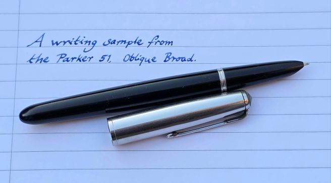
My black Parker 51 was an eBay purchase and is my only one with an oblique nib, probably an oblique broad. This suits my lefty-overwriter handwriting style nicely. It also writes well if used in a more conventional underwriter style. The barrel imprint reads “Made in England 4”. The nibs may give further indications of the year of production but I have not disassembled them. It was missing the cap finial but I was able to buy a replacement from Mark Catley’s Vintage Fountain Pens tables, at the pen show.
Oblique Broad nib. The cap jewel was a replacement. Writing sample, Oblique Broad.
The model with a burgundy barrel (which I think may be called Cordovan Brown) was bought in a job lot of five vintage pens from a local antique seller in Childs Hill, North London. It had likely come to the seller as part of a house clearance. I wish I knew more of the past lives of these pens and their owners. This one writes an extra fine line and also has a date code of 4.
My forest green edition is I think a less common colour. It writes a medium line and bears a date code of 2. This was another of my pen show finds.
Finally, these next two pens were a surprise gift received in the post from my friend in Melbourne, Australia. The Parker 51 demi is slightly smaller than the regular 51. It was made in the USA and this has a date code of 8, putting the year at 1948. It writes a medium line.
Size comparison of the Parker 51 Demi (top) and a regular model.
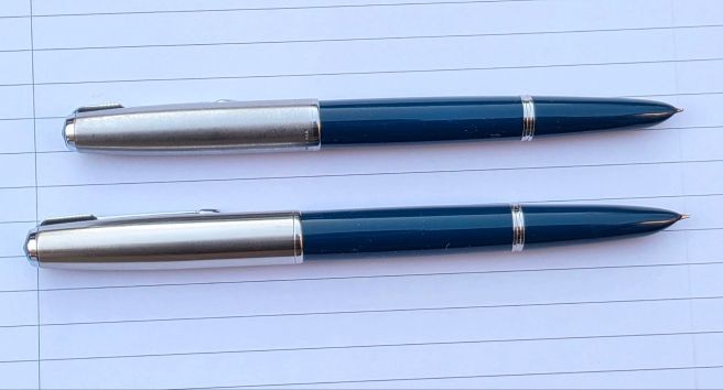
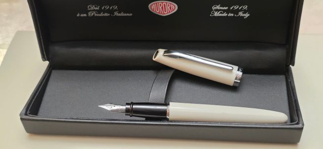
Lastly, in a blue-green colour, I have the Parker 51 “Special”. This differed from the regular 51 models in several respects. The nib was of an eight metal alloy called “Octanium” instead of the usual gold. The aerometic style filler leaves the rear half of the sac exposed under a U-bar (rather than the more fully enclosed metal sac covers in the regular model). For some reason, mine smells of gun oil. Also the cap was a brighter, polished chrome finish rather than the usual “Lustraloy” satin finish caps and has a black plastic jewel in the finial. Mine writes a medium line. There is no date code but I believe this one dates from between 1950 and 1956 (as the filler case still refers to Superchrome ink, a reference which was removed around 1956).
Comparing nib widths.
It is remarkable that these pens all perform perfectly and still look modern, after all these years: a triumph of design that perhaps not even Parker could have predicted.
On Sunday, 1 March 2026 the London Spring Pen Show was held, once again at the Novotel London West, Hammersmith. It was a great day as always but this year, my experience was very different: I attended as a vendor for the first time. So rather than posting about my haul, (which was nil), this post will be to share a few reflections from a first time vendor.
The suggestion of booking a table was floated at our pen club, sometime last year. It seemed a good idea and an opportunity for me to sell some pens instead of constantly buying more. In the event, four of us chose to book a table to share. Doing this together immediately made it seem a lot less daunting.
In an initial burst of efficiency, I purchased a card reader device, to take payments at the show. But for the following few months, I thought only intermittently, about which of my pens I might try to sell. Being a hoarder and fountain pens being a prime hobby, I found it difficult to contemplate parting with my pens. Each had been acquired with no intention of selling. But I must have anticipated that they would be passed on to someone eventually as I had also hoarded most of their boxes.
It made sense to prune my accumulation of pens, even by a little. I was leaving it until nearer the time, to decide which to sell.
Putting a sale price on a pen, was harder than I had thought. I expected to sell most at a loss. I had a very loose formula, thinking how much I had paid for the pen; factoring in what its current replacement cost might be; and allowing a discount for it being a used (or pre-loved) pen. I could then adjust the resulting figure up or down to reflect how I felt. As well as my wish to hold on to my pens, I was also a bit despondent about losing money on them. But, as my wife cleverly pointed out, if you are not using the pens, you have already lost money on them.
As the show drew closer, I looked over my entire pen accumulation, and made a draft list of those that I might sell. I focused on the modern pens, as opposed to vintage. The majority of my vintage pens are Parkers from recent pen shows or eBay and I was not intending to sell those.
Seeing the pens listed was a good start. Conveniently the number was around 48. These could all be carried in two zip pen cases, each holding 24 pens. Over a few days, I wrote down my provisional sale prices.
How to decide which pens to sell? One way is to ask yourself whether you have used it in the past year, or even two years, and whether you are likely to use it again. I had quite a few in this category, but that did not always mean I wanted to sell them. A few of these pens caused me to feel quite sad whenever I remembered that they were on the sale list. Of course I could simply withdraw them from the sale, or adjust the price upwards a little, or keep them in the sale and hope that no-one bought them!
With pens listed and prices set, I put the pens in the zip cases. I then needed to write the prices on tags. I envisaged writing the prices and a few words of description such as nib size on the tags and to thread the strings through the pocket clip. The pens could be transported and displayed in the zip cases, but I feared that on opening them, I would find the price tags all tangled together. Alternatively I could bring the tags separately and attach them on arrival. No, I did not want to do that either. Then it dawned on me that I could type up a price list instead of labels. This seemed a much better option.
The next task was to gather all the available pen boxes. I had them for about 30 of the pens I was selling. In some of them, I found the purchase receipts and some of these dated back to the 90’s, 80’s or even 70’s. The boxes would conveniently fit into a small wheeled suitcase. With my suitcase of boxes and a ruck sack for the pens and other bits and pieces I could use public transport to get to the show and back.
I had made a checklist of items to bring. This included a bottle of ink and paper for people to try the pens; a jar for water and some kitchen roll to clean nibs after dipping; a large magnifying glass and a small loupe; the card reader, USB charging pack, calculator – and sandwiches for lunch.
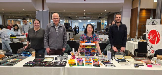
On the big day, I arrived at the hotel soon after 07.30am. I was welcomed by Michael, one of the organisers who showed me into the hall where vendors were setting up. Our table was in a great location on a main thoroughfare but it soon became apparent that one table, shared between four of us, would leave each of us very limited room to display our stuff. Michael had anticipated this and offered to move us to a different spot where we could have more space. As luck would have it, he was able to move us up to an excellent nearby neighbouring position.
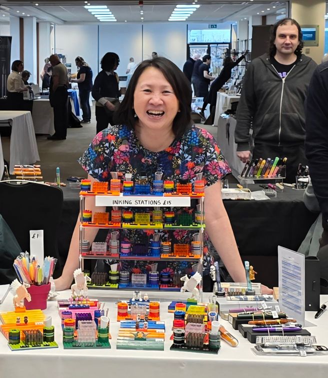
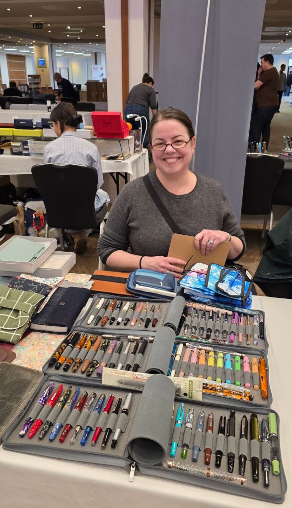
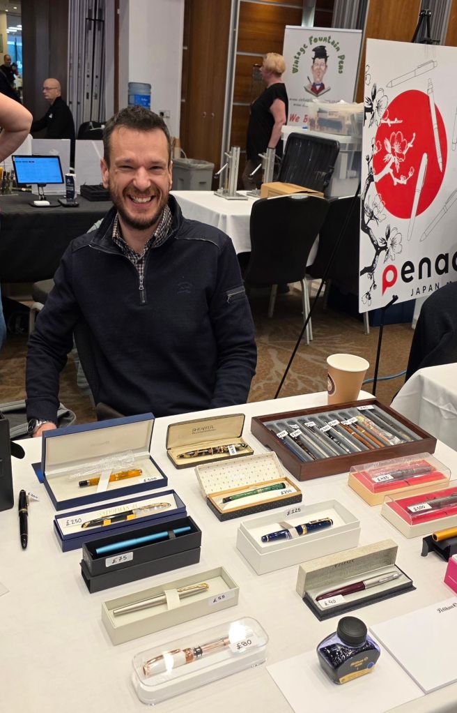
My three friends arrived and we set out our wares. Kee had brought a number of inking stations that she had created from Lego, in various attractive colours, as well as some pen trays and various pens. Elizabeth had a good selection of her modern pens, plus some leather journal covers. João had brought a selection of pens, both modern and vintage.
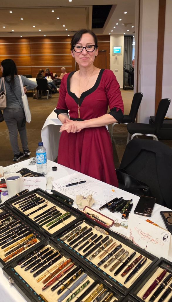
Elizabeth, me, Kee and João behind our tables.
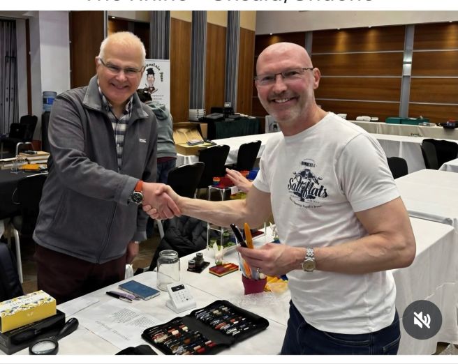
My good friend Jon of Pensharing was setting up his table nearby and came to say hello. He spotted two Leonardo pens that I was selling and promptly bought them both. My first pen show sales! This was also the first payment I had taken with my card reader device, which performed well all day. Jon also offered me some useful advice about pricing. In my eagerness not to overcharge, I had priced a few pens on the low side, a rookie error, and Jon suggested checking prices with eBay Sold listings.
Making my first sale – to Jon of Pensharing.
Soon after this, my Cross Peerless also sold. It was lovely to see familiar friendly faces and always nice when people stopped by our table to say hi. Before the show I had been a little apprehensive, being a novice, at the prospect of possibly up to 900 or so people passing by our table. However, in the event, although there were plenty of people about, at no time were we overwhelmed by the numbers.
Early bird entrants started to circulate at 9am. I was told that there had been a long queue of them, waiting to be admitted. Then at 10am, the standard entry visitors came in and the numbers started to build up.
Having the company of three friends on our two tables, was such a plus. Between the four of us, we had quite a varied selection of goods to sell without displaying too much to take in. Also it meant that if one of us was away for a moment, the others could watch his or her table.
Kee’s inking stations were very popular.
With a regular stream of visitors to our tables, including numerous people whom we knew, the time passed quickly. I had been fortunate to have a flurry of good sales in the morning. Before I knew it, mid-day was upon us. I had not budged from the table. Some of our pen club friends were meeting for a pub lunch nearby but we all had to forego this as it would have meant too much time away from our tables. I did take a short break around mid-afternoon to talk to Kirit Dal on his Aurora tables. He had helped me to chose an Aurora for a friend in Australia at the last show in October, and asked me how he had liked it. Kirit showed me some special new pens that he had created himself, from wood or Ultem in which he had installed Aurora nibs, having obtained Aurora’s blessing to do so, which must be a rare honour.
Elizabeth with her pens and notebook covers.
As time went on, I sold my Aurora Optima rossa with an oblique broad nib. This had been one of the hardest pens to decide to sell. A red Waterman Carene and a Sailor Pro-Gear also went, along with some lower value Lamys. It was particularly enjoyable to be able to sell a pen to someone new to fountain pens, to help them pick out something suitable and give them a few tips to help them get started.
I had taken a photo of my Auroras, just in case the Optima rossa was sold.
By the time the show drew to a close around 4.00pm, I had sold a total of 14 pens (five to people I knew), ranging from a Lamy Safari to a Montblanc Heritage 1912. I was very satisfied with that. I had a new respect for the regular pro’s who carry such large numbers of pens to sell and those sellers who create such enticing table displays of pens, inks, notebooks and other ephemera. My own set up had not required much more effort than unzipping and opening my two pen cases.
João, with his modern and vintage pens for sale.
After the show, the four of us adjourned to the hotel bar to relax over a drink before journeying to our respective homes. We had all had fun and agreed that it would be worth doing this again some time!
My only regret was that I had missed out on browsing all the other tables at the pen show and talking to the vendors. I had been too intent with tunnel vision, on minding my own table and not wanting to miss a sale. However I think that if I did this again, I would relax enough to do at least one lap of the tables at some point in the day and it was a shame not to have done so.
At the end of the day, I reflected on all the people who had come to see us and tried to list the names of all those I knew. It was a lot of conversations for one day and no wonder my brain was exhausted.
So that is over for now. It was a great and memorable experience and I can see why some people do this regularly. Both of my grandfathers were shopkeepers and so perhaps it is in my blood. I was happy to have made some sales. And for those pens that did not sell, I was happy to bring them home again to make another go of our relationship. It is a win-win situation. My thanks go to the organisers UK Pen Shows, to Michael for the extra table, to my co-sellers on our shared tables and to all those who came to see us and buy from our tables.
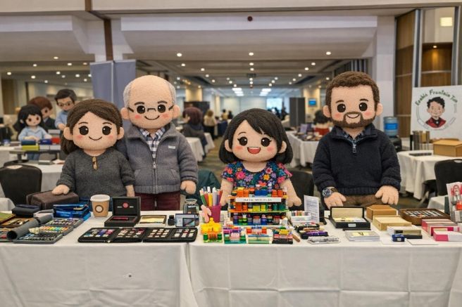
Here we are immortalised as Plushies (photo courtesy of Kee Armstong, made by AI).
I have been conscious for a little while that this little blog was approaching a milestone. Having launched with tentative steps in November 2016, this is my three hundredth post. The name “Fountain pen blog” was only meant as a working title whilst setting it up, but went live before I had thought of a better one and I kept it.
To mark the occasion, I thought that it may now be a suitable moment to share where I am in this hobby, or journey. Like many of us, I have always had an interest in fountain pens, which I can trace back to the age of about 9 or 10 years, when we started to use them at school, instead of dip pens. At that time, I remember using Osmiroid or Platignum pens, available from my local stationery shop. Parker pens were out of my league.
At the time of my entrance examination for a secondary school in 1970, I was using an Osmiroid lever-fill fountain pen. I remember this because (and I have told this story before), prior to the exam another boy to whom I was talking, picked up my capped pen and played with the lever. I discovered this when the exam commenced, as I uncapped the pen and poured ink all over the exam paper. We both got into the school and remained friends for many years.
For my new school, my mother took me to buy a Parker fountain pen. I no longer have it (it got lost or stolen) but it was dark green with gold trim and a nib in 14k gold: my first gold nib. I think the pen was a Parker Duofold Lady. I still get a bit nostalgic when I see them at pen shows. Soon after this acquisition, I remember being fascinated by magazine advertisements for the Parker 45 Flighter, in brushed stainless steel. My parents did once again indulge me and bought me one. I was desperately homesick for the first month at boarding school, but adapted to it eventually.
Throughout my school days I remained loyal to Parker and used Parker 45 cartridge-converter pens. Buying a new one was a rare treat.
For the next 30 years or so, my use and enjoyment of fountain pens continued, at a wholesome level, insofar as I mostly bought a new pen only when I needed one. While in college I used the Sheaffer NoNonsense cartridge-converter pens, but did go through about half a dozen of these in three years, as the tipping would wear down from taking notes in lectures. I also liked a change of pen colour from time to time.
Around the 1980’s I did buy a few other pens – always imagining that it would be a life-long companion. I remember buying a Parker 75 Laque, a Sheaffer with a stainless steel inlaid nib, and a Sheaffer Connaisseur, (all of which, at the time of writing, I still have). These were all steps along the journey of trying new things. But finding a “pen for life” is not straightforward and quite likely doomed to failure as (1) we might not know what design we like until we try; (2) our tastes and needs may change as we get older and so the goal-posts are moving and (3) there is no perfect pen for all occasions.
One of the most successful pen purchases that I ever made, was the Waterman Expert. I chose the marbled blue barrel and it was a favourite for many years, early in my working life. I later added a black one and a red one. More recently, I bought one in the lovely l’essence du bleu range. So, my little fountain pen stash was expanding slightly. I did not yet have or need, any system to keep a record of fountain pen acquisitions.
At some point, I started to desire a Montblanc although this would have represented a considerable jump in price from my usual buys. Eventually, my wife surprised me with a lovely Montblanc Meisterstuck 146, from Heathrow Airport’s duty free shopping. This was in 1997 at a time when the price was £187.00, which was still a lot of money then.
It was with the arrival of the internet and the rise of the online stationery community, that my interest (call it obsession if you like) really took off. I recall discovering SBRE Brown’s YouTube reviews and others. My favourite pen blog was Fountain Pen Follies, by Laura Solon, which I loved to read for the entertaining, informative and thorough pen and ink reviews and also for its humour and great writing. Another early influence for his inspiring, attractive pen photography was Vaibhav Mehandiratta (@mehandiratta on Instagram).
At some stage, the hobby snowballed. I cannot tell you how many pens I have bought since the mid 2010’s and I am not even sure myself, but it escalated into the hundreds. I discovered pen shows, the Pelikan Hub and my first pen club and found the friendly fountain pen community – both in real life here in London and online all over the globe. And with this, came the never-ending discovery of exciting pen brands, inks to acquire and an addiction to buying notebooks.
I have been attending the London Pen Show for over 10 years. I think my first may have been in 2014, when I bought a TWSBI Vac 700 (still a great pen!) from The Writing Desk, and immersed myself in disassembly videos.
My horizons were broadened and I began to discover pens from overseas brands: Japan’s Platinum, Sailor and Pilot; Italy’s Aurora, Montegrappa and Visconti, plus Leonardo and Tibaldi and now Radius, and dozens of other brands.
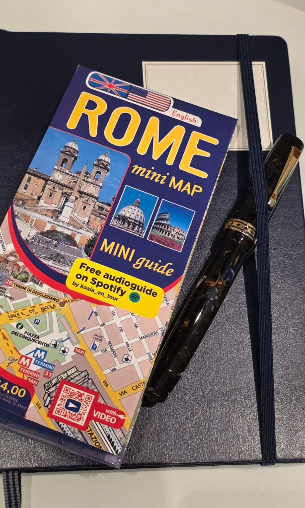
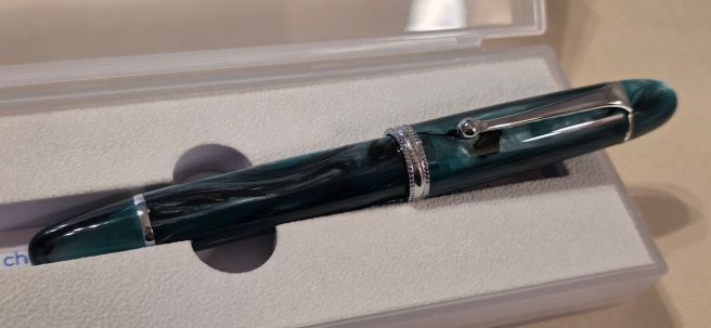
One of my most recent purchases, a souvenir from a trip to Rome last month, was the Radius Settimo, which I love and now use every day. Although made in the same workshops as Leonardo, the pen is a bit simpler and less ornate than Leonardo’s Momento Zero, but somehow I prefer it. In the shop (Novelli) I was struck by the subtle colours in the resin: the pen appears almost black at first glance but under bright lights or sunlight, the resin comes alive with marbled flecks of blue, white, brown and gold. The nib is a steel extra fine and is firm but writes smoothly with a consistent, even, reliable ink flow. I soon discovered that it is not suitable to carry upright in a pocket as it then hardstarts, but I have other pens to use for that. I am perfectly happy to accommodate this slight weakness, although that term seems harsh. The beauty of the Radius for me, is that it writes well, is extremely comfortable, is reliable, and attractive without being flashy. Above all, I can pick it up and write without being distracted by it.
The Radius Settimo Roccia Marina (sea rock).
Lately I have often found myself using a fountain pen and thinking, “This pen is so good, I could use this all the time and it could be my only pen.” Last year, I used an inexpensive WingSung 699 vac filler, for my diary (A5, page a day) and so wrote with it for the whole year. Also I have been introduced, through my pen club, to the Chinese brand Asvine. Their V800 model is an oversize vac filler with a number 8 nib – which is well made and great value.
Another stage in my fountain pen journey is that I now find myself drawn more to vintage pens than modern ones when visiting pen shows. Pens such as the Parker 45 from my school days, or the Duofold models in the various sizes, can be found in good condition with 14k gold nibs and can prove to be excellent value.
Here our Spring London Pen Show takes place on 1st March 2026. For the first time, I will attend as a vendor with the aim of moving on some of my lesser-used pens. I am sharing Table 82 with a few friends from my pen club and look forward to seeing the pen show from the other side of the table! Parting with some of my pre-loved pens will be bitter-sweet. It makes sense to release them back into the wild if they are not being used, yet I will be sorry to see some of them go. I think of myself as a user rather than a collector, but realistically, no-one can use several hundred fountain pens as they should be used.
If you are visiting the London Pen Show, come and say hello!
In my previous post (Italy, Part I, Rome), I listed the six fountain pen shops that I came across, during a recent short break in the city.
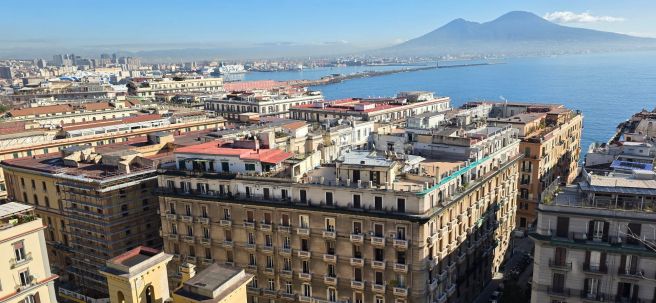
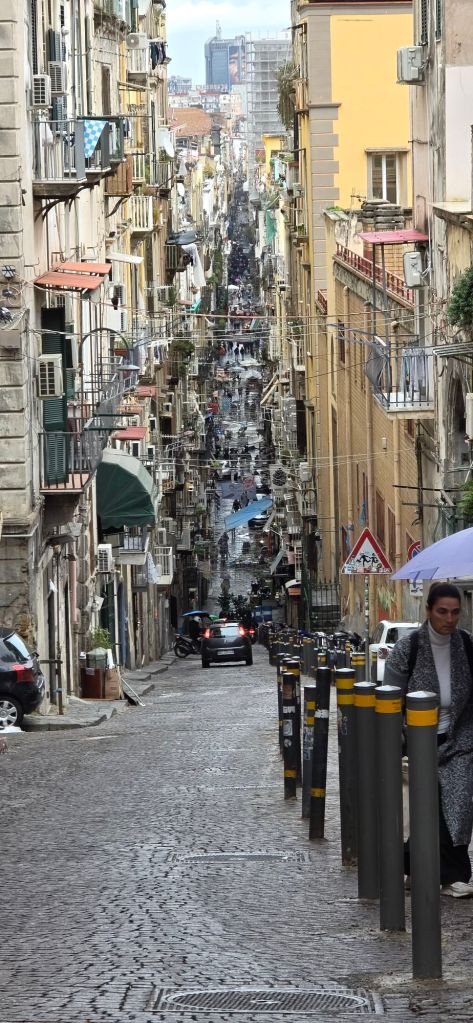
After Rome, my wife and I journeyed on to Naples by train. It was our first visit there. We stayed in a B&B on the third floor of an elegant building on the via Chiatamone, close to the sea front. I later read that the via Chiatamone used to be the coast road until the late 19th century when a new road was built on reclaimed land, now comprising waterfront hotels and restaurants.
Near one end of our road was an entrance to a tunnel through the cliffs giving a fast route across the city to the docks. At the other end, an elevator ride takes you to Monte Echia, the cliff with a viewing terrace, giving spectacular panoramic views over the city and the bay.
Cliff-top view across the Bay of Naples.
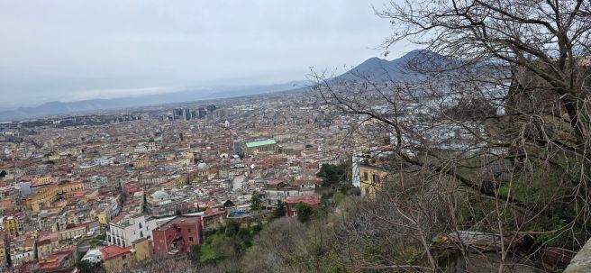
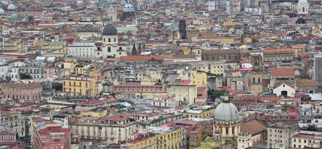
Another very scenic spot can be reached by a funicular railway ride, to the Castel Sant’Elmo. From there you get a wonderful view of the city and in particular the Spanish Quarter and the old town. We took the scenic walk back down, on a 14th century pedestrian pathway with over 400 steps, the via Pedamentina a San Martino, which zig-zags down the hill.
A view of Naples from Castel Sant’Elmo. Mount Vesuvius in the distance. Zooming in.
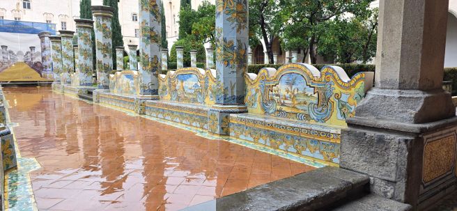
We had three nights in Naples, although it seemed longer and we walked constantly. There are numerous quiet churches which can be visited. One particularly memorable oasis of calm was the Santa Chiara Cloister, a monastery in the city centre with a large church and an adjoining garden with colourfully decorated tiled columns. In the adjoining museum, I read that the church had been bombed in 1943 and burned for six days. A lot of treasures were destroyed but it was restored and re-opened in 1953.
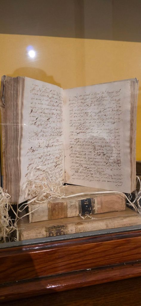
Gardens at the cloister of Santa Chiara.Some penmanship in the monastery’s museum.
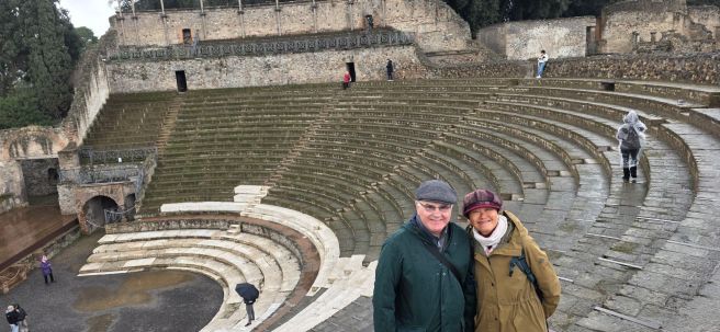
Whilst in Naples, we could not miss visiting nearby Pompeii, a Roman city destroyed in the eruption of Mt Vesuvius in AD 79. Thousands of residents died from a sudden thermal shock. The city was buried under about 4 – 6 metres of volcanic ash which hardened over the centuries. Modern excavations (which are ongoing) have revealed a vast, well preserved site. Our archaeologist tour guide Anna, gave us a fascinating insight into day to day life in Roman times.
An amphitheatre in Pompeii. Some chiselled seat numbers can still be seen in places.
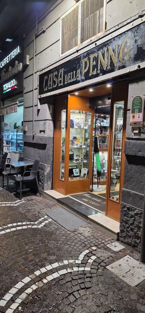
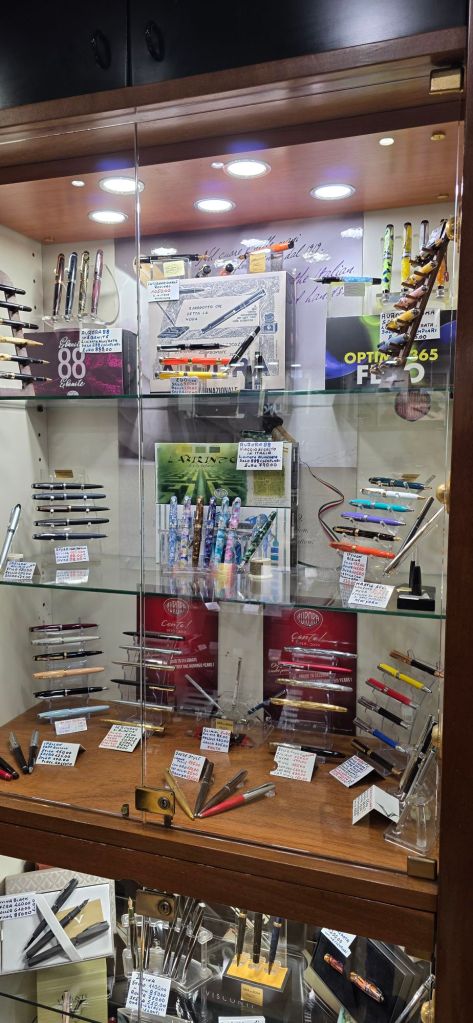
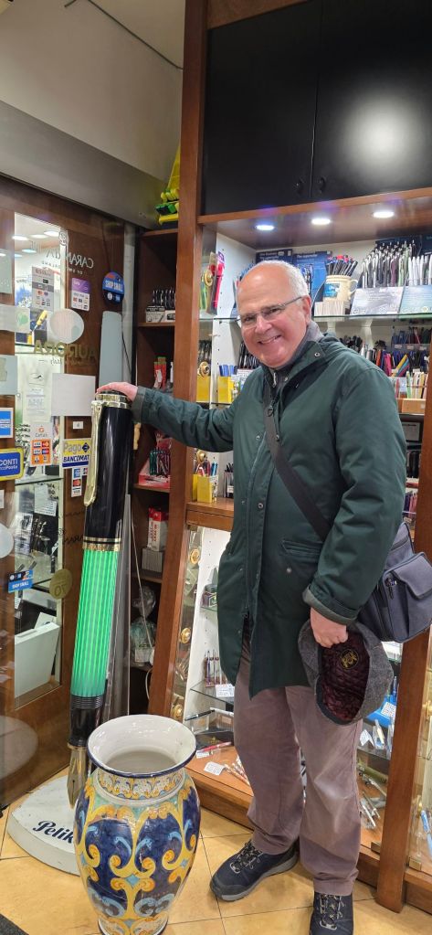
I did visit one delightful fountain pen shop in Naples, Casa della Penna at C.so Umberto I, 88, 80138 Naples, dating from 1937. The friendly proprietor was happy for me to take photographs of his attractive display cabinets, and also switched on the illumination in a giant green Pelikan pen which stood at the entrance. I mentioned that I was visiting from London and had found his shop on an internet search. Whilst there I bought two more boxes of cartridges for my Aurora Style pen – as these are hard to come by at home. He kindly gave me a gift of a 2026 calendar and an accompanying ball pen both bearing the shop’s name.
Casa Della Penna, Naples.Too many pens to absorb, so I had to take photos of each cabinet.Me with an oversized Pelikan and possibly an inkwell.
As with Rome, there was a lot to see in Naples and we did our best to see a representative sample of the sights in the time available. A visit to the region is highly recommended.
Buying a gelato from Venchi in Rome, liquid chocolate is first applied around the inside before it is filled with chopped nuts. These are then poured out: the nuts that remain stuck in the chocolate are yours. In a similar way, visiting fountain pen shops in Italy carries a risk that some pens may stick to you, as I was to discover.
In January, visiting Rome for the first time I was keen to see the famous sights and get to know the city a little. For some holiday journaling I brought a Leuchtturm A5 journal and a couple of fountain pens: a large Asvine V800 vac filler and an even larger Junlai 930, piston filler. Both were newly filled and unlikely to run dry but I brought along a bottle of Robert Oster “Aqua” ink just in case.
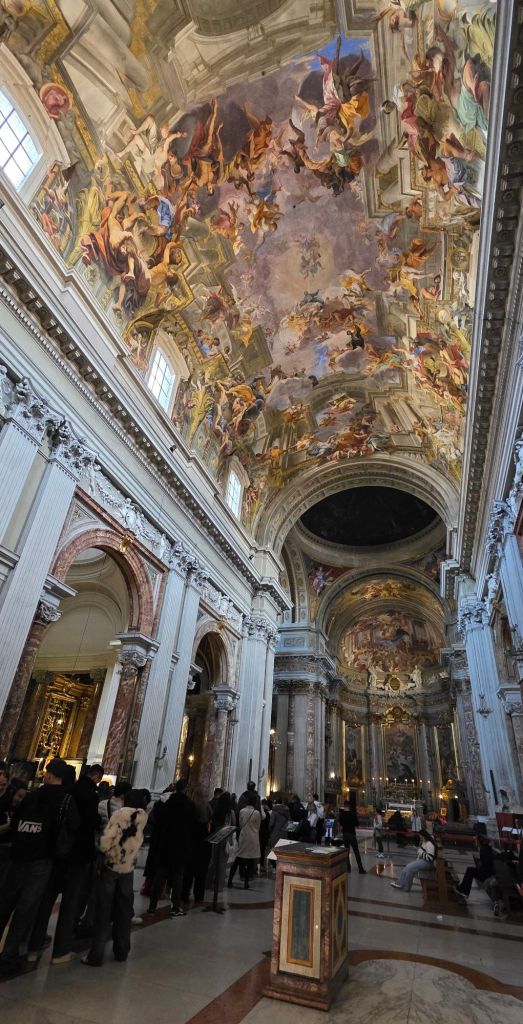
The Junlai 930 was my last pen purchase of 2025 and I had opted for the white version with the name of the previous Pope “JORGE MARIO BERGOGLIO, 1936 – 2025” inscribed on the barrel. It therefore seemed fitting to carry this pen during a tour of the Vatican to see the museums, the Sistine Chapel and St Peter’s Basilica.
Showing off my Junlai 930 in the Vatican museums.
In addition to the “must see” sights, I had hoped to spot a few fountain pen shops while out and about. In the course of our five-night stay in Rome, I managed to come across six pen shops. There are others that I missed but this was enough, without trying my wife’s patience too much. These are the ones that I visited:
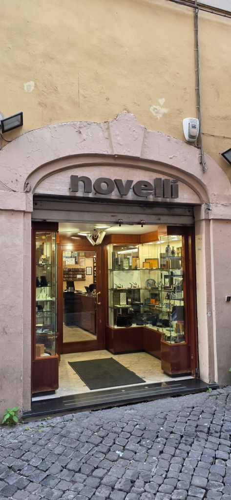
Novelli Penne e Pipe: via di S. Marcello 21, 00187 Roma
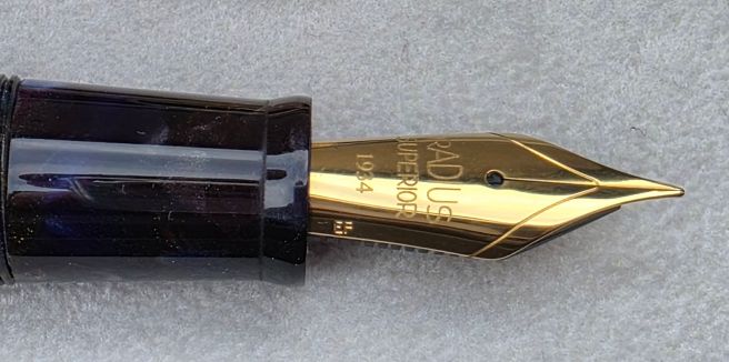
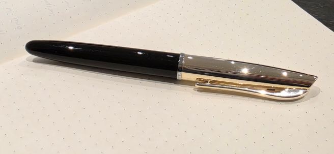
Located a couple of minutes walk south from the Trevi Fountains, we reached Novelli just twenty minutes or so before it was due to close for lunch. I had time for a quick browse of the display cases and was drawn to a fountain pen from Radius 1934, in a black marbled resin. I had seen a Radius pen only once before, in a solid black resin, while visiting Write Here in Shrewsbury. This one however, had flakes of blue, brown, white and gold which sparkled under bright lights and I was smitten. I decided to buy it, whereupon the proprietor kindly gave me a generous discount (without my asking), before advising me how to reclaim the tax at the airport.
Novelli, where I bought a Radius Settimo.
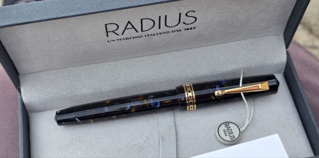
I later learned that the pen’s full name is the Radius Settimo, roccia marina, meaning “seventh” and “sea rock.” It came with a screw fit converter and I later filled it with my Aqua ink to test it out. It is a very comfortable pen for me and the steel nib writes smoothly, with a fine/medium line. On the box is a statement “Produced in Italy in the Leonardo workshops.” I am delighted with the pen and the only negative I found is that the cap rim is sharp to the touch without any chamfer. This might be uncomfortable for someone who posts caps but does not worry me. Also I found that the pen would hard-start after being carried around clipped upright in my shirt pocket. I suppose that this is just gravity doing its thing, but it seems that this pen is happier being kept on its side.
Radius Settimo, roccia marina.
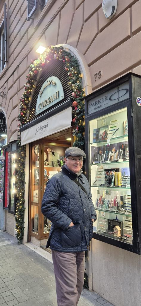
Stilograph Corsani: via Ottaviano 79, 00192 Roma.
During a morning tour of the Vatican, I got a photo-opportunity with the Junlai 930. Needless to say, the area is amazing and it was fabulous to see the painted ceiling of the Sistine Chapel.
After the tour, we strolled up the via Ottaviano and found Stilograph Corsani. I had met the proprietor Stefano Corsani before, some years ago at the London Pen Show. It was good to see him again on his home turf. The shop is compact and our visit coincided with a delivery and so the walkway was obstructed with boxes but Stefano and team were most friendly and welcoming.
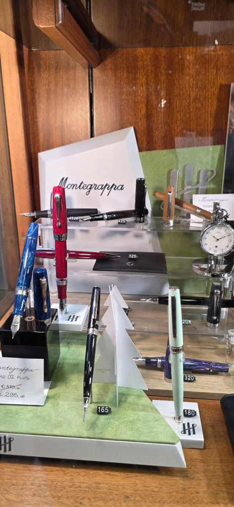
Tempting displays at Corsani.Visiting Stilograph Corsani.
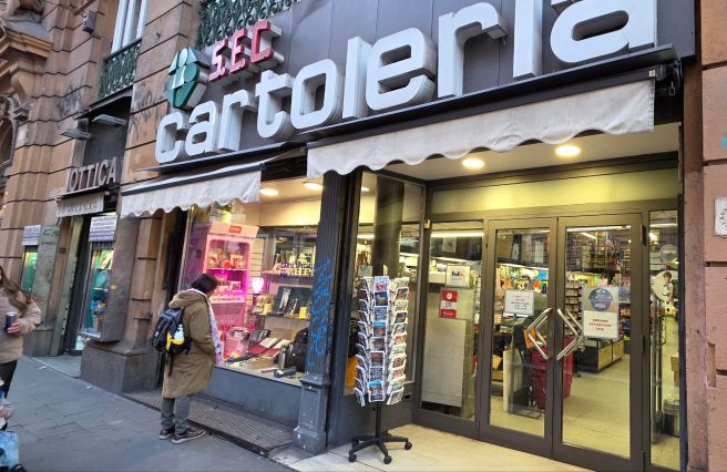
S.E.C. Cartoleria: via Arenula 85, 00186 Roma
Cartoleria. Auroras in the wild, on our doorstep.
Our accommodation was in the via Arenula, close to the river and opposite a government building, the Ministry of Justice. Just up the road from our accommodation, I found this large stationery shop, a bit like our Rymans but with a greater selection of fountain pens, many of which we do not find in shops in the UK. As well as Lamys and Kawecos, there were pens from Stabilo, (a display of the Grow pens in oak, cherry or beech), Rhodia (a hexagonal pen), Pelikan, Recife and others. However, the displays that most caught my eye were the Auroras, mainly the Style and Ipsilon models but in a wide range of colours. I already have one Aurora Style in white resin and had thought about buying another in the pale pastel blue if I found one. They did have it, but also an elegant Aurora Style Metal, (black resin barrel and a gold plated cap). I have since learned that there are numerous versions of the Style, but I was particularly enamoured with this combination: the cap and pocket clip are a very pale gold colour, just making a subtle contrast with a chrome cap ring. I decided to take this one home with me. The shop was not set up for tax reclaims but did kindly give me a box of Aurora cartridges as a present. How nice, to be able to walk into a shop, hand over some money and walk out with a new Aurora fountain pen!
Display tables at Cartoleria A few of the entry-level Auroras.
The Aurora now lives in my shirt pocket, follows me everywhere and does not suffer from the hard start issue that the Radius has.
The Aurora Style Metal that I chose.
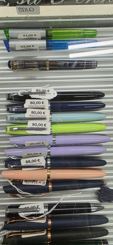
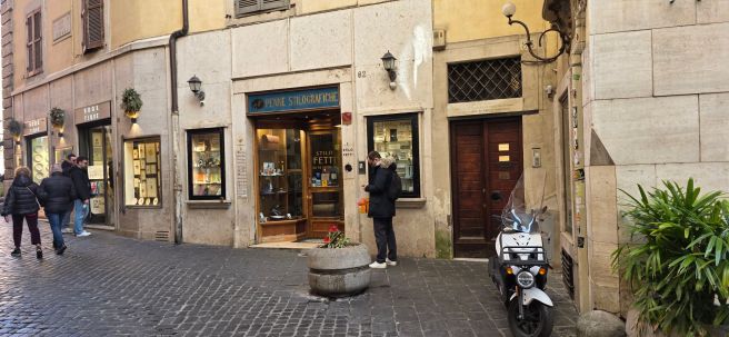
Stilo Fetti Penne: via degli Orfani 82, 00186 Roma
Stilo Fetti.
This is another traditional, elegant pen shop with glass panelled displays. It is in a central location, close to the Pantheon. I had time for only a brief browse of the cabinets and of the inks which were in the back portion of the shop. The prices were not particularly cheap compared to the UK. For example, a bottle of Pilot Iroshizuku ink was 31 euros, but there is a good selection of pens and inks that we do not have at home and you may be able to reclaim the tax on departure.
Some Leonardo pens at Stilo Fetti
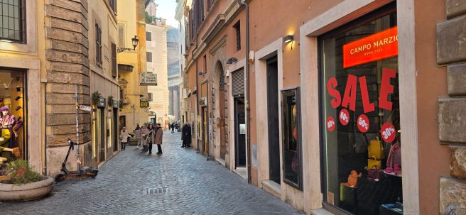
Campo Marzio: via di Campo Marzio 41, 00186 Roma
Campo Marzio, Rome.
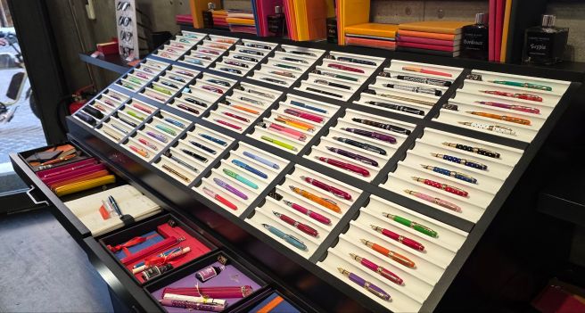
I recalled that the Campo Marzio shop in Piccadilly, took its name from the Rome street where it originated. The Piccadilly branch has since gone and I used to enjoy its colourful displays of pens and inks and stationery. I am still using some 30ml inks that I bought there, and especially fond of their “Tabacco” brown.
Colourful displays.
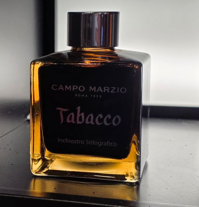
In Rome, I happened to pass the store, also near the Pantheon on a busy pedestrian artery. I had an opportunity to buy a whopping 150ml bottle of Campo Marzio Tabacco ink and for just 22 euros. Reluctantly I passed it up, as we had very limited luggage capacity. It was probably just as well as this would have been enough to last even Leonardo di Vinci for several years.
Campo Marzio ink, 150ml.
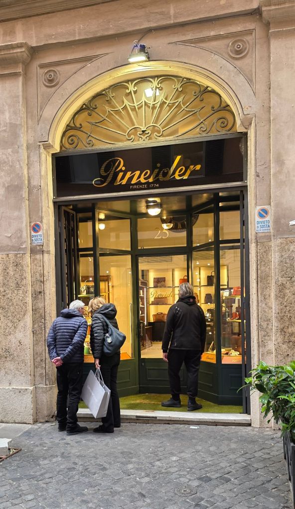
Pineider: via del Leoncino 25, 00187 Roma
Pineider, for leather goods, stationery and pens.
Another chance discovery was the Pineider shop, located not far from a main shopping street via Corso. I had gone to the area to find the tax reclaim office. I enjoyed a browse of the pens, amongst the leather goods and stationery. A couple of colours of their model called Rock, blue or brown, were in a sale and I had to restrain myself.
Rome has so much to see and can largely be explored on foot. I left with many photos and memories, tired feet and two new fountain pens. After Rome, we moved on to Naples by train but I will save that trip for a separate post.
With the year almost over, it is time for the customary recap, or what some streaming services call “Your 2025 wrapped.”
Pen acquisitions.
Starting the year with a noble intention of a “no-buy” was hopeless for me as my will power is not up to the task. However, to be fair, my pen-acquiring was somewhat more moderate than last year’s, with 35 pens incoming, (down from 52). And of those, I was fortunate to receive seven as gifts, so I bought only 28. My spend on fountain pens was £1,426.
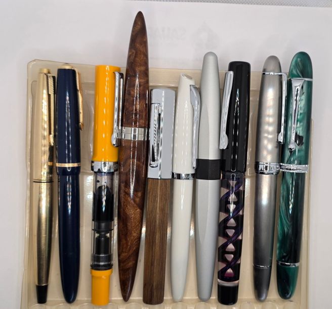
Picking a favourite from the 2025 crop is too difficult but here is an attempt to show a possible top 10 (in no particular order):
I have continued to enjoy posting to this blog about twice a month when the inspiration strikes me. In November, the blog reached nine years old – a bloggiversary that I missed. As always, I feel enriched by the interactions that the blog has brought me over the years. The WordPress stats page tells me that my number of published posts currently stands at 296 (not counting this one) and the all time number of views is at 934,000. (“Not bad for a kid from Ickenham, who dared to dream”…cue music, etc…). Again I am grateful to those who read, like and comment on my musings. Thanks again to The Pen Addict, The Gentleman Stationer and The Well-Appointed Desk who each include links to my posts in their weekly round-ups, from time to time.
The London Pen Show.
This year the only pen shows that I have attended have been my local ones in London. These are twice a year, in March and October. Also, the October show was held over two days, a first for us Brits. I attended only on the first day but apparently it was well received. The pen show is a highlight of the year – seeing an overwhelming number of friendly enthusiasts and vendors. Looking back at my list of pen purchases, I have just realised that I bought nine fountain pens at the Spring show and another nine at the Autumn show. Those were clearly my purchasing peaks. I came home with an exciting mix of pens, both new and vintage. The pen show is my happy place!
Pen club.
Throughout the year I have attended the monthly meets of our pen club (“the Fountaineers”) in a London pub where we typically have a dozen or so folks at our regular reserved tables. The shared enthusiasm is infectious. Many of us gathered for lunch as a half-time break at the London Pen Shows. The monthly meets following the shows were an opportunity for “show and tell” of our new acquisitions. It was through the meets that I came to hear of the Asvine J16 brushed titanium piston fill fountain pen and the Asvine V800 vac filler with #8 nib – which were two of my successful acquisitions this year.
On one of our meets, I was pleased to be able to carry out a sac replacement operation on a friend’s vintage Parker button filler, one of the skills acquired on the WES pen repair course that I completed earlier this year.
The Pelikan Hub.
Once again this year, the Pelikan Hub event was masterfully hub-mastered by members of our pen club and held in the same pub at which we meet during the year. This year well over 100 people registered for the event. The evening’s events included a free raffle for a chance to win one of a number of donated prizes. As luck would have it, a star prize and the final draw was won by yours truly and was a most generous donation, namely a fountain pen from Sunil of The Good Blue, called the R615 – along with three bottles of ink. The pen is all metal, a long torpedo shape with a facet on the barrel and cap which serves to keep the pen from rolling. Happily the facets all align when the pen is re-assembled.
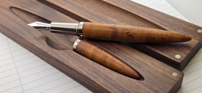
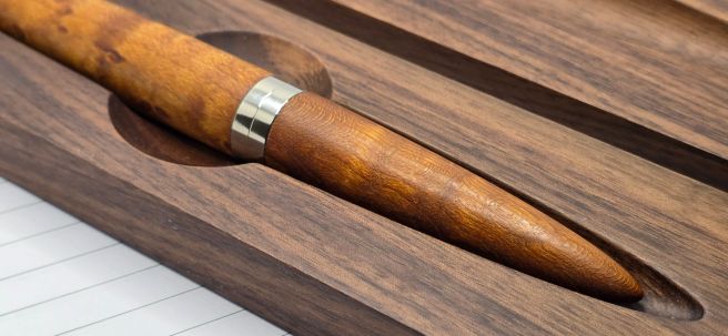
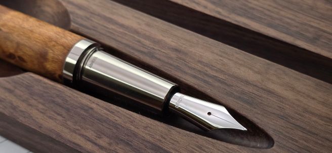
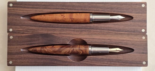
The Ashera Aeon.
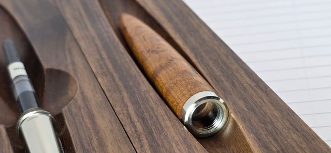
Early this year I accepted an invitation from Ashera to receive one of their fountain pens for review and return. Ashera agreed to provide a 20% discount for anyone purchasing the pen via a special link given in the blog post, as well as a modest commission for me. Such a venture was new for me. When the time came to return the pen to them, I found I was too attached to part with it. Instead I arranged to buy it from Ashera, with their generous discount. The pen with its long ellipsoid body dominates in the photo above. It features an elm burl wood cap and barrel, (lacquered, dried and polished eight times, by hand) titanium grip section (engraved with my name) and a 14k gold Fine nib. Even with the discount it was easily the costliest and most luxurious acquisition of my year but one that I could not pass up.
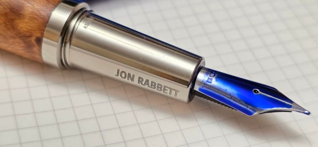
Ashera got in touch with me again several months later, offering to send another pen for review, as they had brought out a new version of the Aeon but with an oiled wood finish instead of lacquered and called the Aeon Oleatus. This time, they invited me to keep the pen as a thank you. I happily accepted but could not justify having two such special pens and so requested that this time it be inscribed with the name of a good friend in the pen community, Jon Rabbett of Pensharing, to whom I passed on the pen recently after publishing the review.
Daily journaling.
For another year I have kept up an A5 page a day diary. This year I used just one pen and ink for my diary, for the whole year. The pen was the humble Wing Sung 699 (a Chinese homage to the Pilot Custom 823 vac filler) and the ink was an even more humble blue black created from flushing pens during 2024, and which I call “Slops Blend”. I know that mixing inks is not recommended as bad reactions can occur but thankfully, none did in this case and I am working through a 50ml bottle of my unique mix.
Correspondence.
Apart from keeping a diary, one of my main outlets for using my pens is in corresponding with pen friends in the UK and abroad. One friend in Melbourne generously sent me a surprise gift of three vintage Parkers, which he had rescued from a local charity shop. These included the rolled-gold Parker 45 Insignia pictured above. Another unexpected gift was an Ellington Pens, Nautilus, kindly sent by my brother who is a fan of theirs. Finally, a friend in Seattle visited Japan on holiday and posted a Pilot Prera in teal, which he had bought for me there. Another happy mail day, as you can imagine.
NaNoWriMo.
The organisation which had hosted this annual challenge, to write a 50,000 word novel in November – finally ceased operating in 2025. This does not stop anyone having a go, of course, and it need not necessarily be a novel. An objective is just to get people writing and to hit a target of 1,667 words a day. I had never taken part before but when I saw a mention of the challenge, just at the end of October, I was excited to have a go. I had a nice new notebook which would fit the required word count: I had pen cups bristling with inked pens that I was keen to test out in longer writing sessions. And I had time: to allocate a couple of hours a day to sitting with a fountain pen every day for a month was no hardship!
I thoroughly enjoyed this exercise, picking a topic each day from a set of headings that I had written earlier as writing prompts. I used fountain pens throughout, choosing a different one each day (except for the Asvine V800, a recent arrival which I used for 5 days in a row). I finished the challenge on 30 November 2025 and from a rough estimate, hit well over 60,000 words.
Asvine V800 vac filler.
Looking ahead to 2026.
As I type this, grateful for all that I have, I do not currently crave any more pens, (although I am awaiting delivery of a Yongsheng 930 in ivory white any day now). In fact I need to reduce my accumulation and I have arranged to share a table at the London Spring Pen Show to sell a few pens.
I have my 2026 page a day diary ready for next year. I look forward to sharing more inky adventures with friends online and IRL. Come November I might even repeat the NaNoWriMo challenge. Thanks to all, for reading and a Happy New Year.
Back in February, Ashera invited me to review their Aeon fountain pen. My review can be seen here. It was sent to me on loan but I became so attached to the pen that I arranged to buy it, with a generous discount. It is one of my most special pens and the only one with my name engraved on it.
Ashera GmbH are based in Grünwald, near Munich. The team comprises creator Marius Visser and his co-founders Hans and Claudia Harenberg. Their website ashera-design.com shows that the brand has a strong commitment to sustainability and specialises in producing high quality pens turned from wood.
This autumn, Marius got in touch with me again, offering to send me a new version called the Aeon Oleatus to try out and review, but this time to keep as a “thank you.” This was most generous and unexpected. As before, I was able to select the wood type, the nib material and width from the various menu options for the pen, and finally, the engraving to appear on the titanium grip section.
However, I decided that I could not justify owning two such luxurious fountain pens, beautiful though they are, and instead requested that the pen be inscribed for a good friend in the fountain pen community, Jon Rabbett, founder of Pensharing, to whom I would pass it on after my review.
The Oleatus can be supplied in a choice of eight different woods. I selected the attractive Birdseye Maple. For the nib, given that my existing Ashera Aeon has the 14k gold nib in a fine, I wished to try something different this time and chose a platinum 950 nib in a medium.
Much of what I have written before about the design of the pen, its size, shape and weight and the stunning box that it comes in, applies equally to the Oleatus. The main difference is that whereas the Aeon’s wood cap and barrel are finished with eight coats of lacquer, each layer being dried and polished before applying the next in a painstaking process, the Oleatus instead has an unlacquered, oiled finish. Oleatus, AI tells me, means “oiled” or “moistened with oil” (from the Latin oleum (oil), but AI has already picked up that the term “also names a luxury fountain pen, (AEON Oleatus) from Ashera Design, known for its craftsmanship and wood/titanium build.”
Unboxing
I was very excited to unwrap the new pen when it arrived. The website advises that there may be a wait of around four to six weeks for the pen to be assembled and finished.
Ashera Aeon Oleatus.
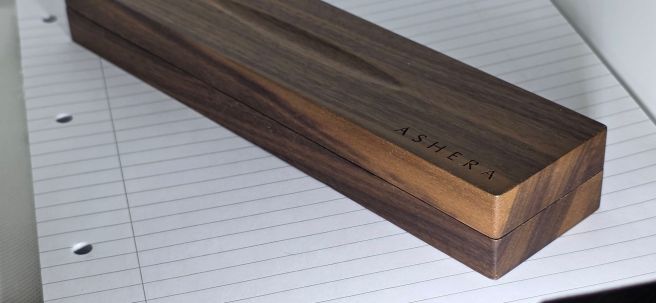
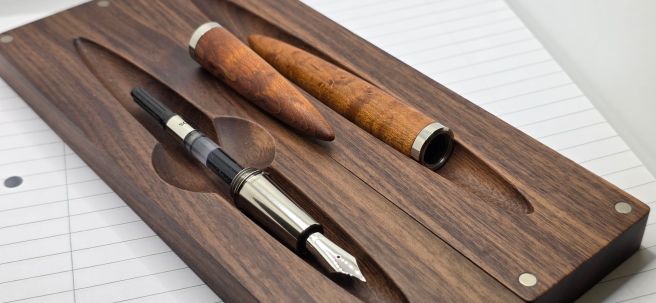
As before, the pen arrived in a box which is solid walnut, cut into two slats with the pen nestled inside. You can see that it is made from a single piece as the grain aligns although alignment is not always perfectly continuous from piece to piece, partly down to natural variation. The box is beautiful, with a silky smooth matte finish, the name ASHERA engraved in one corner and a shallow recess on the top should you wish to place a pen on the lid. However a safer way to rest the pen is to use the deeper, shaped cutaway inside the box. A second pen can be placed in the similar cutaway in the upturned lid. Each half of the box can serve on its own as a desk pen rest. When closing the box, the two slats jump together with a satisfying “clack” and are held together firmly with pairs of magnets in each corner.
Ashera’s goal was to avoid the usual throwaway box and instead create something sustainable that meaningfully complements the pen. Of all the pen boxes I have owned, this is the most impressive, tactile and practical and the most likely to be afforded desk space.
Accompanying box in solid walnut.
First impressions
Picking up the Oleatus fountain pen for the first time, I had expected it to feel slightly waxy, from the “oiled wood” description, but it does not feel waxy or oily at all. On the contrary, the wood feels cool and smooth. I was thrilled with my choice of Birdseye Maple. It is stunning and has a chatoyancy, not apparent from photographs. If you hold the pen horizontal and then tilt it up and down to change viewing angles, the patterns appear to shift and to have a 3D effect. I read that this is caused by the denser, wavy wood fibres reflecting light differently from the softer areas. Figured Maple is particularly known for this and the effect is enhanced by the oiled finish.
Birdseye Maple, with titanium furniture.
The cap and barrel are flush and there is no interruption to the long, ellipsoid form except the titanium rings where they meet. There is no pocket clip or roll stop. The pen is a certain roll-risk, whether capped or uncapped and a pen rest should be used at all times.
The cap unscrews on a very short travel of just one third of a rotation. The grip section is in solid titanium. Whilst I am usually not a fan of shiny metal grip sections finding them slippery, I had no such issue with the Aeon or Oleatus. The titanium is polished, not plated. The metal section means the pen is nicely front-weighted, despite its very generous length. Whilst it may feel a little unfamiliar at first, like a precision tool, I soon found it a pleasure to use.
Polished titanium section and platinum nib.
An engraved name appears on the section, each side of the nib, visible whether held left or right handed. The section also has the only occurrence of the brand name on the pen, with ASHERA laser-etched in small capital letters just below the cap threads. I should mention that the cap threads, titanium on titanium, are likely to cause micro scratches to the grip section, as has occurred on my pen even after a few months’ careful use. However the threads are not uncomfortable unless you deliberately seek them out and rub them. The titanium rim of the cap is sharp to the touch. The cap should most certainly not be posted, but given that the pen measures about 154mm uncapped, there is no need to.
The Oleatus in Birdseye Maple (top) with my Aeon in Elm burl, (below).
The nib is of polished platinum and has no decoration to interrupt the simple beauty of the metal, other than the imprint “PLATIN 950.” This denotes 950 parts per 1,000 or 95% pure platinum. This maintains a bright, silvery-white lustre without needing to be plated. It does not tarnish. The remaining 5% is an alloy to add strength. The nib is mounted with a plastic feed. I understand that Ashera’s nibs are sourced from Peter Bock GmbH, now a subsidiary of Schneider.
The barrel threads are also titanium, for durability and precision. They can feel coarse and squeaky but do settle down with use. The pen takes standard international cartridges or a converter which is included.
Titanium threads throughout.
Initial trials
After a happy time spent admiring and photographing the pen, I was finally ready to ink it up and try it out. In particular I was keen to compare the feel of the platinum nib with my gold one and also to see the difference between my fine and this new medium nib.
Dipped!
I would like to report at this stage that everything was plain sailing, but I did encounter some teething problems, all of which I was soon able to resolve myself. First, the nib was slightly scratchy. I examined it closely under a loupe and could not see any obvious cause. I therefore deduced that it was simply a small burr or a proud edge on the tipping that would resolve itself in normal use from writing with the pen. However, I was impatient to remove the roughness and a very light smoothing on a fine micromesh pad soon solved the problem, after which the nib wrote beautifully. I am assured that every nib is hand-tested and polished.
Secondly, at one stage I somehow managed to get the barrel jammed on the section threads. I must have accidentally started to screw it on cross-threaded. The titanium-on-titanium threads are unforgiving and do require careful alignment. Fortunately with some gentle wriggling I was able to release the barrel. I then spent a little time in twisting the barrel back and forth on the section threads, starting from different points along the travel, with some gentle pressure either pushing or pulling. A few minutes of this seems to have smoothed out a few rough spots and I had no further problems.
The titanium threads are built to last.
Finally, I ran into ink-starvation problems, as the pen would gradually dry up and then stop writing after a few pages. This occurred a few times, whether I used a cartridge or a converter. After trying different inks, flushing and refilling the pen each time, including from a fresh bottle of Waterman Serenity Blue that I knew would not be to blame, the problem was at last resolved. Several times, I had cleaned and refilled the pen, releasing three drops of ink back into the bottle so as not to leave the feed saturated and air channels clogged, whilst at all times being extra careful not to get ink on my fingers which might then get transferred to the beautiful Maple body of the pen.
I was relieved when after several attempts, the issue disappeared and I was able to write non-stop for over an hour, covering six pages of an A5 notebook without the ink starvation problem returning and with no priming, shaking or tapping from me. From this I deduce that it most probably was simply a blockage or perhaps some residual grease on the nib or feed, which was eventually flushed away by the repeat filling. Ashera have since tightened their final inspection and flushing processes.
Platinum nib
As to the platinum nib, which is the first such nib I have ever used, I found it very firm. It feels more firm than the gold nib on my Aeon. I am not aware that a platinum nib offers any writing advantage over a gold nib. It does feel stiffer than gold, but its appeal lies more in the preciousness of the material, its durability and its visual harmony with the titanium section and fittings. Personally I have no objection to the pairing of the 14k gold nib with the titanium section.
Although Jon’s pen has a medium nib and mine is a fine, the difference between these two particular examples was minimal. I think both could be classed as fine-mediums.
Conclusion
The new, oiled wood version is a most welcome addition to Ashera’s line-up, bringing a new selection of woods, a luxurious satin finish and also a steel nib option. A gold or platinum nib of course adds a special value, but given that they are both firm nibs, there is perhaps less difference in the writing experience than if you were to opt for the steel nib. A well-tuned steel nib can provide an equally smooth and pleasant feel to precious metals. It is the final polishing, testing and quality control which is important.
I am most grateful to Marius and his team in gifting the pen to me and in answering the questions that I raised in correspondence with him. Regarding the oiled finish, I am told that ink generally can be wiped off without staining, since the wood has been treated with linseed oil. I have not dared try this but it is good to know. However, if the surface is exposed to strong solvents or cleaning sprays that degrease, it may lose its protective layer. In that case, lightly re-oiling with boiled, linseed oil and wiping off the excess after a few hours, will reseal the surface. Routine re-oiling is not strictly necessary and the oiled wood finish does not require any special maintenance.
As with the lacquered Aeon that I reviewed previously, Ashera has generously agreed to provide a 20% discount to readers of this blog, purchasing the Oleatus via this link and I receive a modest commission on such sales. The discount is applied automatically on adding to basket.
In my previous post I talked about starting the NaNoWriMo challenge, as well as reviewing the notebook that I was using. Today the challenge ended and I thought I would check in here to share my thoughts on it.
To recap, this was the National Novel Writing Month, an annual event which was launched back in 1999. The basic idea was for participants to write a novel, of not less than 50,000 words, in the month of November. I had never taken part and only when looking into it this year, did I learn that it had closed down in 2025.
Nevertheless, I decided to take up the challenge to write 50,000 words in a month, without signing up to any online community. It would be NaNoWriMo ByMoSelf. Also, I was not going to write a novel (never having written any fiction and not having any plot in mind). That would have to wait for another year. Instead I would be a “rebel” and write on 30 daily topics from a list of writing prompts that I made. These were loosely biographical on such topics as parents, grandparents, holiday memories, childhood tv, hobbies and so on. I had a nice new notebook at the ready. I had pen cups full of eager fountain pens. A headful of memories. I just needed a writing project like this to put them all together.
This can be done by anyone at any time, of course. November seems a good month. It is getting cold and dark (in my hemisphere). Starting at the beginning of a 30 day month makes it convenient to always know how many days you have done and how many you have left.
Today I reached the end. I had kept it up each day, although once or twice I had a couple of pages left to complete from the day before. I got to the end of my notebook today. I had allowed eight pages per day of the B5 notebook until about half way through the month when I adjusted this to seven pages. Being handwritten, I do not have a word-count, but it is certainly over 50,000. From a few sample pages I have counted and averaged, I think the total is around 63,500.
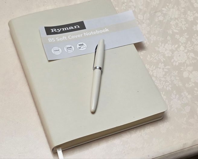
I can recommend the notebook that I used – the Ryman, B5 Soft Cover Notebook (although I appreciate that this is not helpful if you are outside the UK). I liked the texture of the paper, (especially when low, wintry sunlight fell on the page, showing up the texture). The cream coloured paper was easy on the eye and the 8mm row height suits my preference.
Most of all, it has been a real joy to have this self-imposed task to complete each day and to spend some structured time with my fountain pens. For me, writing with a fountain pen was a big part of the draw. Thinking about which pen I would use, gets me out of bed in the morning!
Would I recommend the challenge? Yes, definitely – if you are like me. That is, if you are someone who likes:
Fountain pens; spending a solid couple of hours using a pen to see how it feels and performs and how well the ink flows; seeing filled pages at the end of the session.
Working on your handwriting;
Dipping into and exploring your memories;
Practising (or finding and developing) your writing style.
The NaNoWriMo challenge enables you to indulge all of these simultaneously.
I found that I am a morning person for all of this. Much has been written about the benefits of journaling or “morning pages” to free up the mind for the day ahead. Writing to a specific topic gives a basic starting point and theme although I often found myself digressing. I have not read it back yet and may wait a while before doing so!
I think also that this practice, as well as being a valuable habit to nurture, also meets a need to communicate. As a recently retired person, no longer having the society of my office colleagues, a notebook can take the place of someone else’s ears.
Finally, a word about the pens. I usually picked a different one from my pen cup each day, except for the new Asvine V800 vacuum filler, that I filled and used for five days in a row. Several of the pens used, and which were already filled, were also recent acquisitions such as my Arclayer double helix, eye-dropper, three vintage Parkers and the Aurora Style from the October pen show. One pen that I particular enjoyed using was the Faber-Castell Ondoro with smoked oak barrel that I bought in September. One of the beauties of fountain pens is that they are all different: picking up a different one each day was one of the pleasures of this exercise.
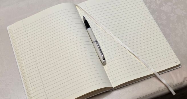
In September, a reader’s comment alerted me to a new Ryman notebook with 100gsm paper which was supposedly, fountain pen friendly. I was already familiar with their 70 gsm notebooks and have several of them in A5 in various colours in my stash. However I was keen to visit my local Rymans to check out their 100gsm version.
On 1st October, I paid a visit and found a shelf of these new notebooks in various sizes. The available colours were limited to “pink, mint or stone”. I opted for a B5 size in the stone, which is a very light grey. The book contained 240 pages of cream, 100gsm paper, ruled at 8mm row height (my favourite) and with 27 rows to a page. The cover has a smooth pleasant feel and offers some protection to the pages, but is a flexible, bendy cover, (not a hard-back like the versions with 70gsm paper). Crucially, the pages are stitched for open-flat use and the line spacing and the smooth soft feel of the paper are just as I like.
Ryman B5 Soft Cover Notebook. Pagination and margins added by me.
Other features of the notebook are rounded page corners, an expandable pocket inside the back cover and a single, white ribbon page marker. There are no page numbers (I added my own), no elastic closure and nothing to distinguish the front of the book from the back, unless you have a bit of the ribbon marker showing at the bottom.
The B5 size was £7.99, which I calculated gives a cost of just 3.33 pence for each of the 240 pages. I do not usually go for the B5 size, which falls between A5 and A4 (ideal for people who cannot decide which of those two sizes they prefer).
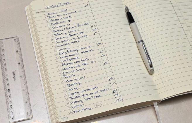
At home I tested the paper for fountain pens by writing with a Faber Castell Ondoro, medium nib inked with Graf von Faber-Castell Cobalt Blue. My note reads “Feels smooth but with some pleasant feedback. Lovely.” There was no bleed-through or feathering. I was delighted with the notebook and started using a few pages, starting from the back, to write various lists, including one list of some writing prompts that I had created and saved alphabetically in the app ColorNote.
Example of some writing prompts. The pen is an Aurora Style.
In October, after the London Pen Show my pen cups were full with inked pens. It was obvious even to me that I did not need any more pens, inks or notebooks for a while! What I needed was a writing project. I hadn’t undertaken a writing project as such, for a few years since I finished transcribing Marcus Aurelius’ Meditations.
And then, just at the right time at the end of October, I read in a blog about the NaNoWriMo challenge. I had never taken part in this before. The objective is to write 50,000 words, the first draft of a novel, in November. I understood that participants could register, and once signed up, receive some tips and support as part of the NaNoWriMo (National Novel Writing Month) community. However, I planned to tag along quietly on my own without signing up. This was just as well as I then learned that NaNoWriMo was no longer running, having closed down in April 2025.
Nevertheless, I really liked the idea of the challenge. The point of it, I think, is to get people writing regularly and to establish a writing habit. The emphasis is on completing 50,000 words, that is, on quantity rather than the quality. It is only a first draft.
I did not have an idea for a novel in mind and had never written any fiction. Instead, I decided to utilise the biographical writing prompts that I had already entered in my new B5 notebook and to use that notebook for the challenge. I would write every day with a fountain pen.
A few back-of-an-envelope calculations soon told me that 50,000 words in 30 days = 1,666 words a day. I had already written on the last 20 of my 240 pages, and allowing the first 2 pages as a frontispiece, I would have 218 pages available for the challenge and so need to average 230 words per page. The daily word count of 1666 words, at 230 words per page would mean writing for an average of 7.25 pages a day.
As of today, I have kept up. I have passed the one third point. I am really enjoying the writing exercise and like to start first thing in the morning, and so my NaNoWriMo is also a bit like doing Morning Pages. I pick a topic each day from my writing prompts list, and also pick a fountain pen. The idea then is to have a topic on which I can write continuously, rather than if I were copying from a book and needing to pause to look up and down all the time.
This challenge, apart from being satisfying day by day, has multiple other benefits. Just sitting to write with a nice pen and ink is a joy in itself. It is a way to practice and improve one’s handwriting. It is a way to test a fountain pen over an extended chunk of time (typically about two hours per day) and to check that the pen keeps up with the ink demand and is drawing ink down from the reservoir. You can spend time with a pen to remind yourself of why you like (or dislike) it. You write a pen dry in a few days and can then clean the pen with a clear conscience or else re-ink it if desired. It is a good mental discipline, the brain generating thoughts and words and the hand and eye keeping up with the flow of ideas. And I am getting to tell my little stories.
I am also enjoying the Ryman B5 notebook for this purpose. It is just the right length for the NaNoWriMo challenge. I have been using my lefty-underwriter (upright) style of handwriting whereby the book is level (not rotated) and so I do not have the problem of having to reach too far away from my body to use the right hand page: this might be a problem if I were to use my lefty over-writer style when I rotate the paper to the left: the left-hand page can then become smudged or creased. I found this to be a problem with A4 notebooks, whereas A5 notebooks are small enough to rotate without causing such an issue.
In conclusion I can recommend Rymans’ 100gsm paper notebooks. For my part, I am enjoying at least the spirit of the NaNoWriMo November writing challenge, in my own way.
As I am surrounded by pens that came home with me from the recent pen show, it seems timely to share my haul in a post.
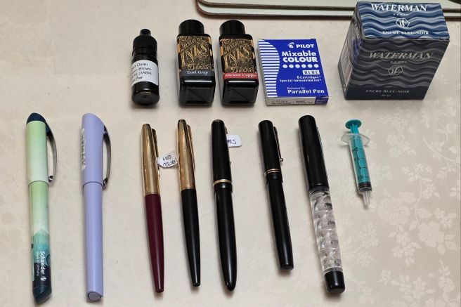
I am embarrassed once again to be talking of a “haul” when I genuinely thought I did not need any more pens. And yet, here we are! This comes of blurring the distinction between needing and wanting. I ended the day with eight additional pens for myself, albeit of relatively modest cost. Only one of them (a lovely vintage Swan Self Filler) topped a little over £100.00.
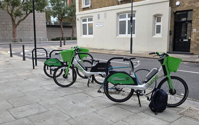
First though, I had to haul myself to the Novotel, Hammersmith. Owing to anticipated travel disruption on the tube and overground railways, I decided to take an e-bike. This was both more enjoyable and quicker door to door, than public transport. The 10km journey took 45 minutes, including numerous stops at red lights (which I noticed, many cyclists ignore).
My ride.
On arriving in good time for the 10 o’clock standard admission, my first stop was to visit Mr Kirit Dal’s Aurora tables, to enlist his help in finding a suitable pen for my good friend in Melbourne. He had requested that I find him an Aurora, steel nibbed model as he was keen to try one and they are hard to find in Australia. I always enjoy browsing Kirit’s tables. He had a few steel nibbed pens from the Ipsilon and Style range, as well as a Duo-Cart. I settled on an Aurora Ipsilon in dark green resin and an Aurora Style in cream-white for my friend, with three packs of Aurora cartridges.
Next I looked at several tables of vintage Parkers. I had a thought of looking for a Parker Maxima Duofold, the largest of the Duofold range with its #50 gold nib with Parker arrow emblem. I did spot a couple of these but the prices seemed a bit high for their condition so I passed these by. Bear in mind that these are likely to be some 60 years’ old and to have seen some regular use.
Then at Mark Catley’s Vintage Fountain Pens’ tables, I chose a Parker 45 Custom (the Custom is the version with the rolled gold cap) in Burgundy with an unusual Right Oblique nib. I then dithered over whether to include a £5 bottle of NOS Waterman Blue Black ink. I already have a bottle of this opened from the last pen show. I decided (you’ve guessed) that I would buy the ink too. Mark kindly added it with the pen for no extra cost.
Parker 45 Custom with right oblique nib.
At the tables of Justin Janse van Vuuren (Van Vuuren Antiques) I then found another lovely Parker 45 Custom, this time in black with what turned out to be a superb 14k gold Medium nib. I have bought from Justin a few times now and it is always a pleasure.
Parker 45 Custom in black.
To complete a trio of vintage Parkers, I picked up a smart Parker Senior Duofold (#35 nib) in black; a classic if ever there was one. This one was from Carneil Pens and on dip-testing the pen, we agreed the nib to be “on the fine side of medium”, or vice versa. I do have a soft spot for Parkers, which still take me back to my school days in the 1970’s, especially when I find myself sitting in front of a pad of Basildon Bond letter writing paper.
Parker Senior Duofold, #35 nib.
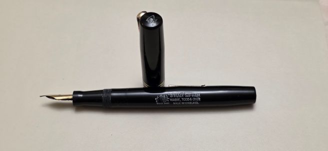
Another enjoyable purchase was from Ms Kasia Stier (Pen-spa) where I picked out a Swan Self Filler from her table. The moment is captured on a reel on her Instagram @kasia.stier_penspa. I saw later that she had been able to buy a good stash of vintage pens for herself, to restore and put back into circulation.
Ms Kasia Stier at the LPS. Swan Self-Filler fountain pen. (circa 1940’s?)
My pen club friends had arranged to meet up for a Thai meal at lunchtime at the nearby pub. This was a good opportunity to take a break, re-focus, compare notes and share our enthusiasm at what we had picked up thus far. Several were tempted by the 40% discounts from Joost, of Appelboom, over from the Netherlands.
My other purchases were a Pilot Parallel 1.5mm calligraphy pen and inks, a couple of 30ml bottles of Diamine ink in Ancient Copper and Earl Grey (which I had long wanted to try) from Cult Pens, and a pair of Schneider cartridge pens from a selection of designs and colours, priced irresistibly at £5.00 and £2.00, firmly within my “no-brainer” category.
My haul, group shot.
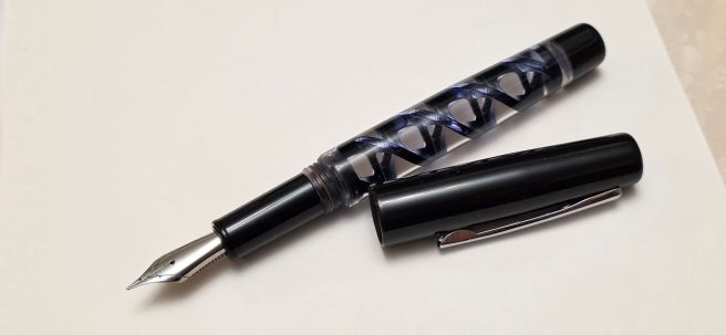
My shopping was almost over, or so I thought, when I sat for a chat with Christine, a keen journaler from our pen club, who showed me a beautiful pen that she had just bought: an Arclayer, 3D printed, eye-dropper filler with an intriguing demonstrator barrel showing a double-helix “DNA” ink reservoir. I had seen these at a distance, on the table of Arclayer, from India, but after closer inspection, I was overcome with FOMO! There was still time to bag one and I chose the clear demonstrator/double helix, DNA version. (There was also a ribbon spiral version and one with an hour-glass ink reservoir, narrowing in the middle, available in a clear, green or blue demonstrator versions). I was able to choose what nib I wanted and opted for an Extra Fine. The pen comes in an unusual cylindrical box, which I assume may also be 3D printed. The pen stands upright in the threaded, bolt-like base. The threaded lid can be placed on top of the base and released to spin down under its own weight.
Arclayer 3D printed pen, double-helix, now inked.
I later found that five of our pen club had bought one of these! I predict that Arclayer will do well.
So, another successful pen show concluded. This year for the first time, the London Autumn Pen Show took place over a whole weekend. It was expected that most would come on the Saturday and that Sunday would be quieter. I chose to go on Saturday only and apparently, the daily number attending hit a record. As always, my thanks are due to the organisers and all the stall-holders whose work makes the show so enjoyable for the rest of us.
Swan nib pic.
Finally as a post-script to this post: my friend in Melbourne unexpectedly gifted me the Aurora Style which I had picked out for him, whilst the Aurora Ipsilon is now on its way to him in Australia.