My pen of the week: the Burnham 61 lever filler.

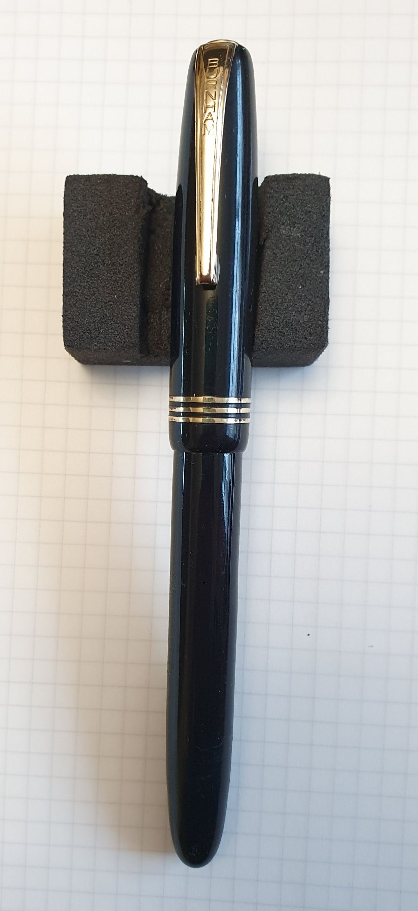
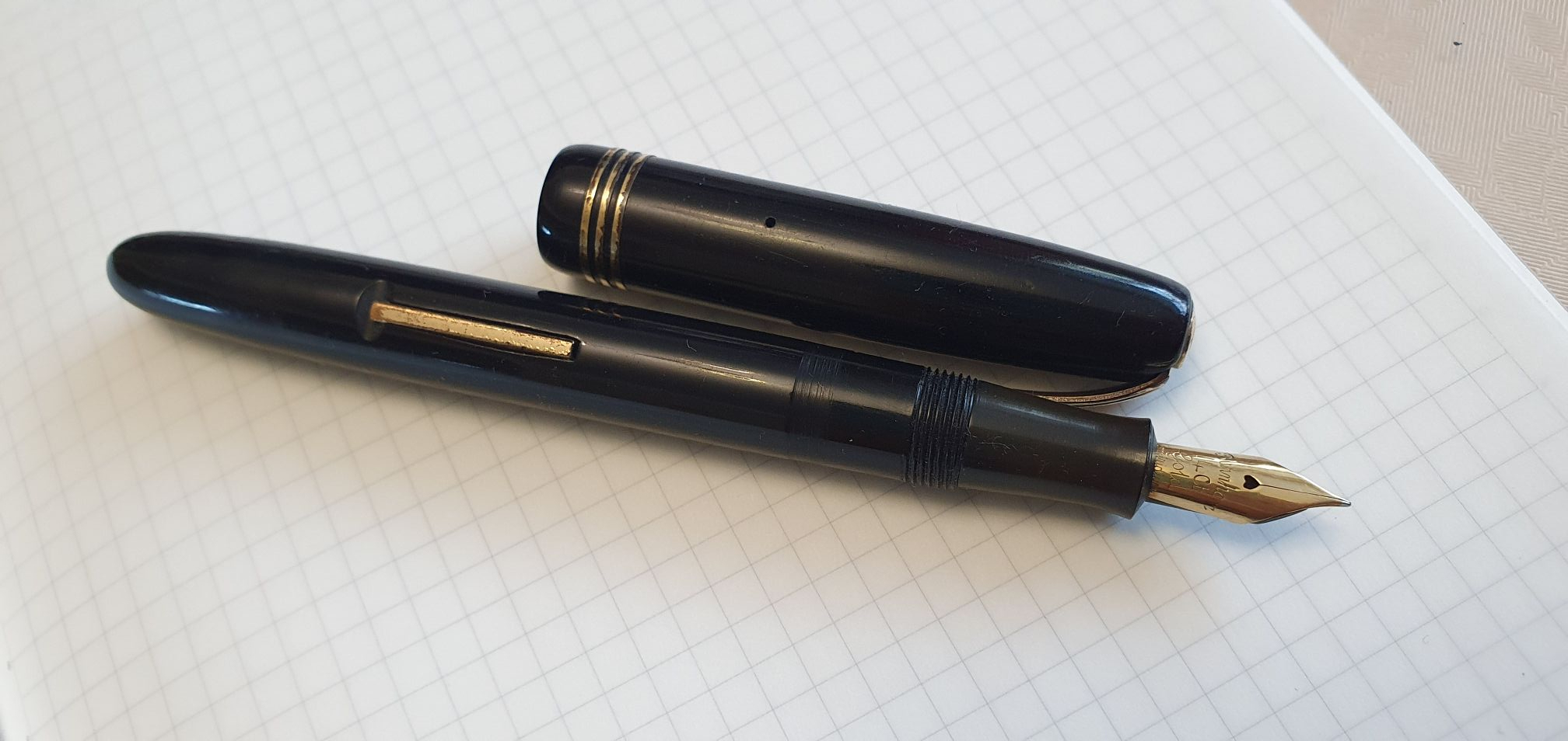
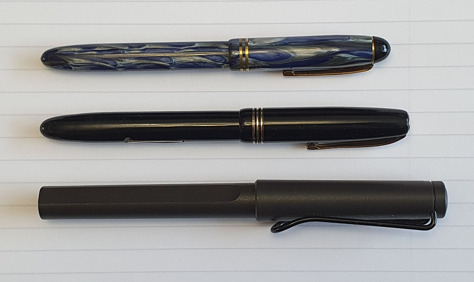
The latest fountain pen to arrive on my doormat has been this lovely vintage Burnham 61, which I found on eBay.

Burnham No.61

The backstory to this purchase, is that I had first bought a Burnham, a number 54, in March this year and had been delighted with it. Some photos and information on that pen appeared in my post Finding joy in small things: the Burnham 54 fountain pen back in April. That pen was much smaller than I had expected but the soft, 14k gold nib made the pen such a pleasure to use that I soon adjusted to its size.

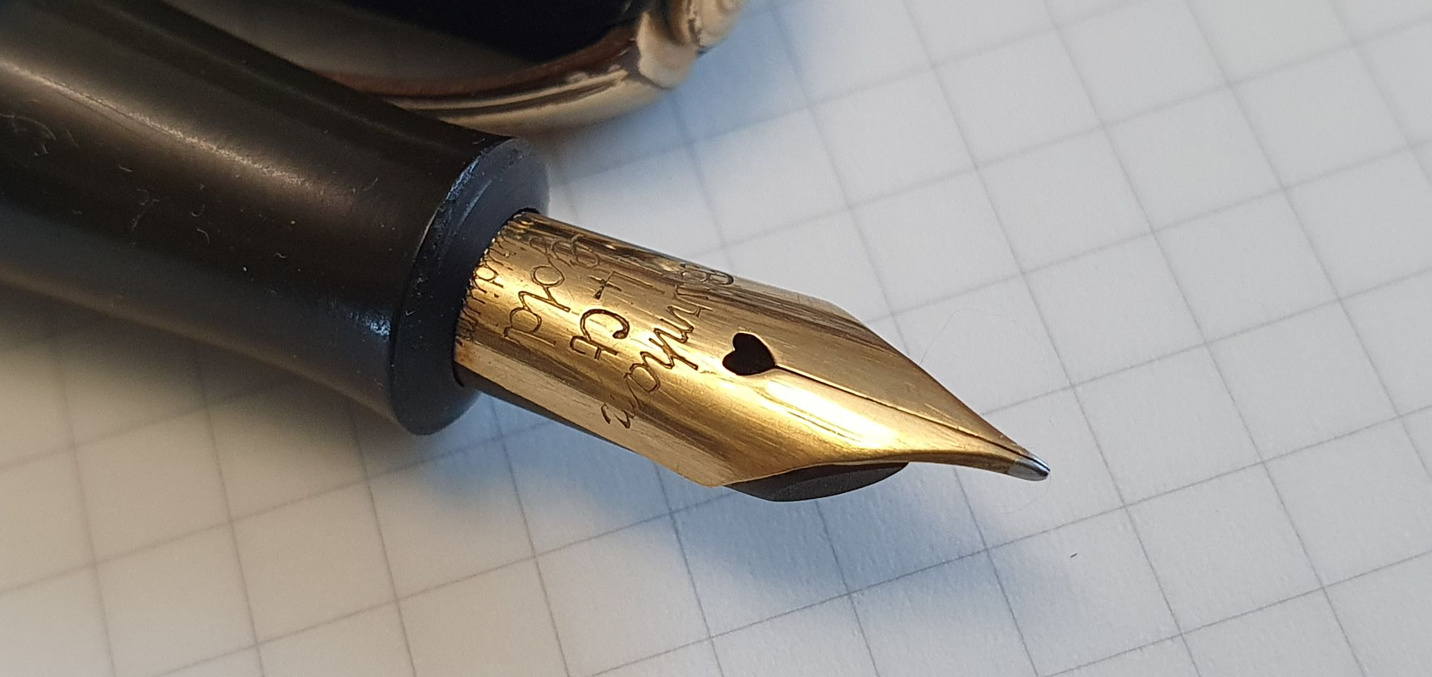
I have been warned by a close relative in my household, to stop looking at pens on eBay as the temptation there is never ending. This, I can confirm, is true. Nevertheless, a decent interval having elapsed since my last transgression, I ventured back to the site and, sure enough, spotted this black Burnham 61 which was offered for immediate purchase. The description stated that the sac had been replaced and that the pen was in good condition for its age. The seller’s photograph of the nib proved too much for me and I was smitten.

Got to love the heart-shape!
The grip section is of a lighter colour than the barrel and cap.

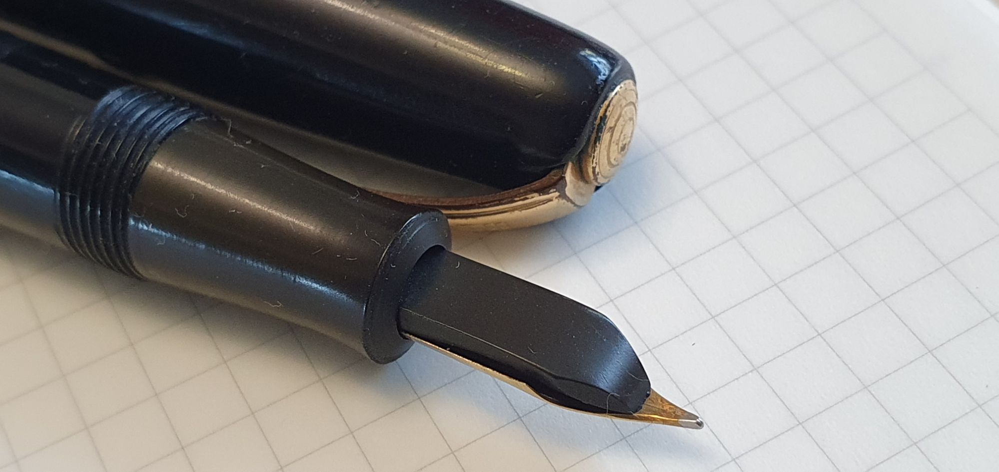
Once again, I had made the mistake of expecting the pen to be bigger! Although larger all round than my Burnham 54, it is still a small pen by modern standards. With vintage pens, I avoid posting the cap in case of damaging the cap rim. An alternative is to find a cap from a modern pen to post, to add length. In this case, I found that a cap from a Speedball calligraphy pen worked very well, but I found it preferable, at least for short writing sessions, to get accustomed to holding the pen unposted.

Size comparison: Top: Burnham 54; Middle: Burnham 61 and Bottom: Lamy Safari.

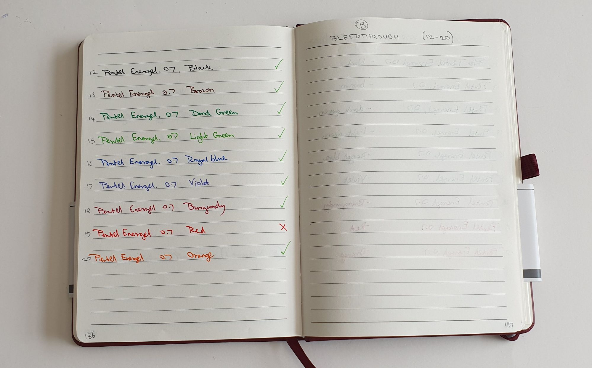
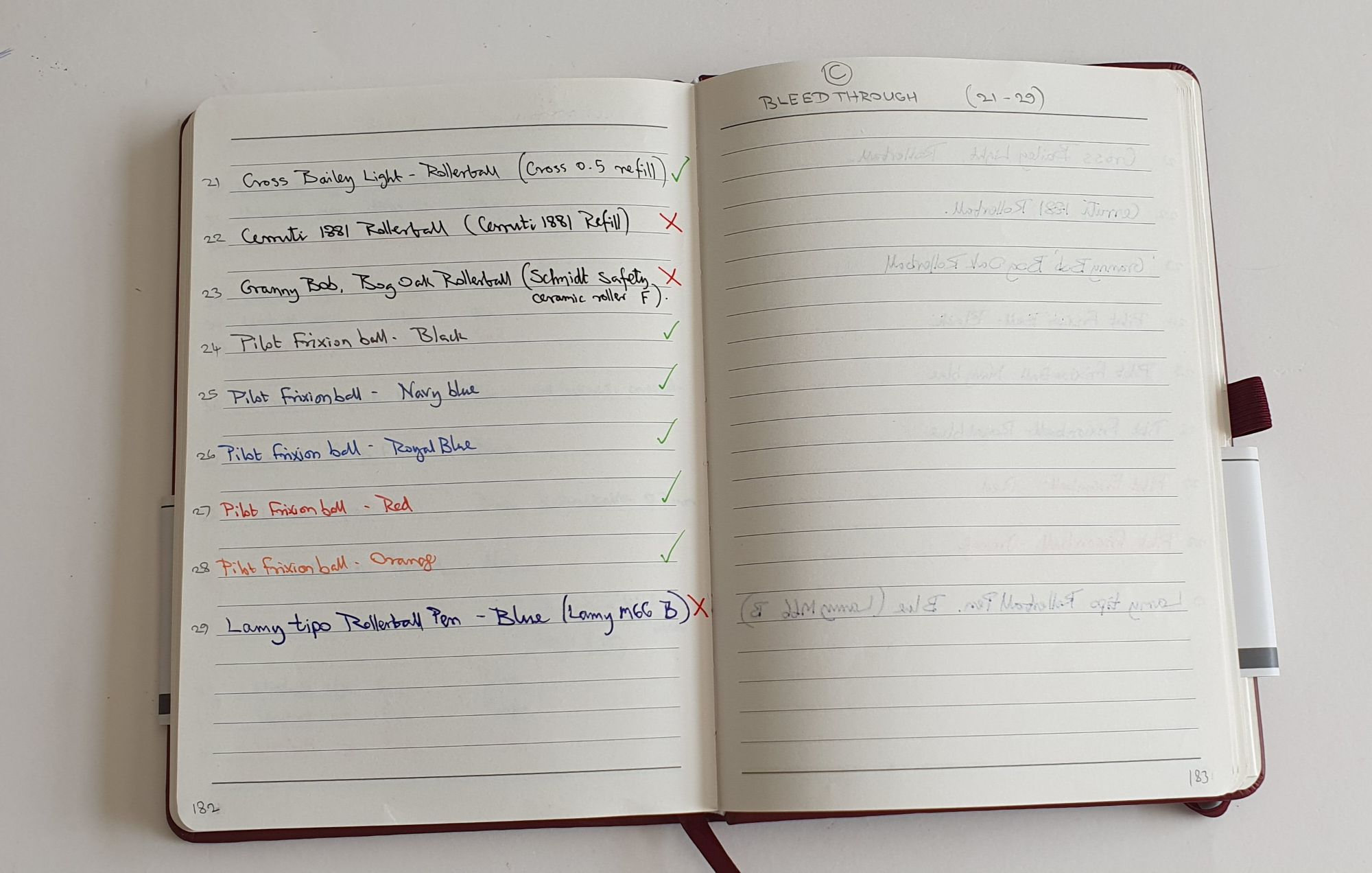
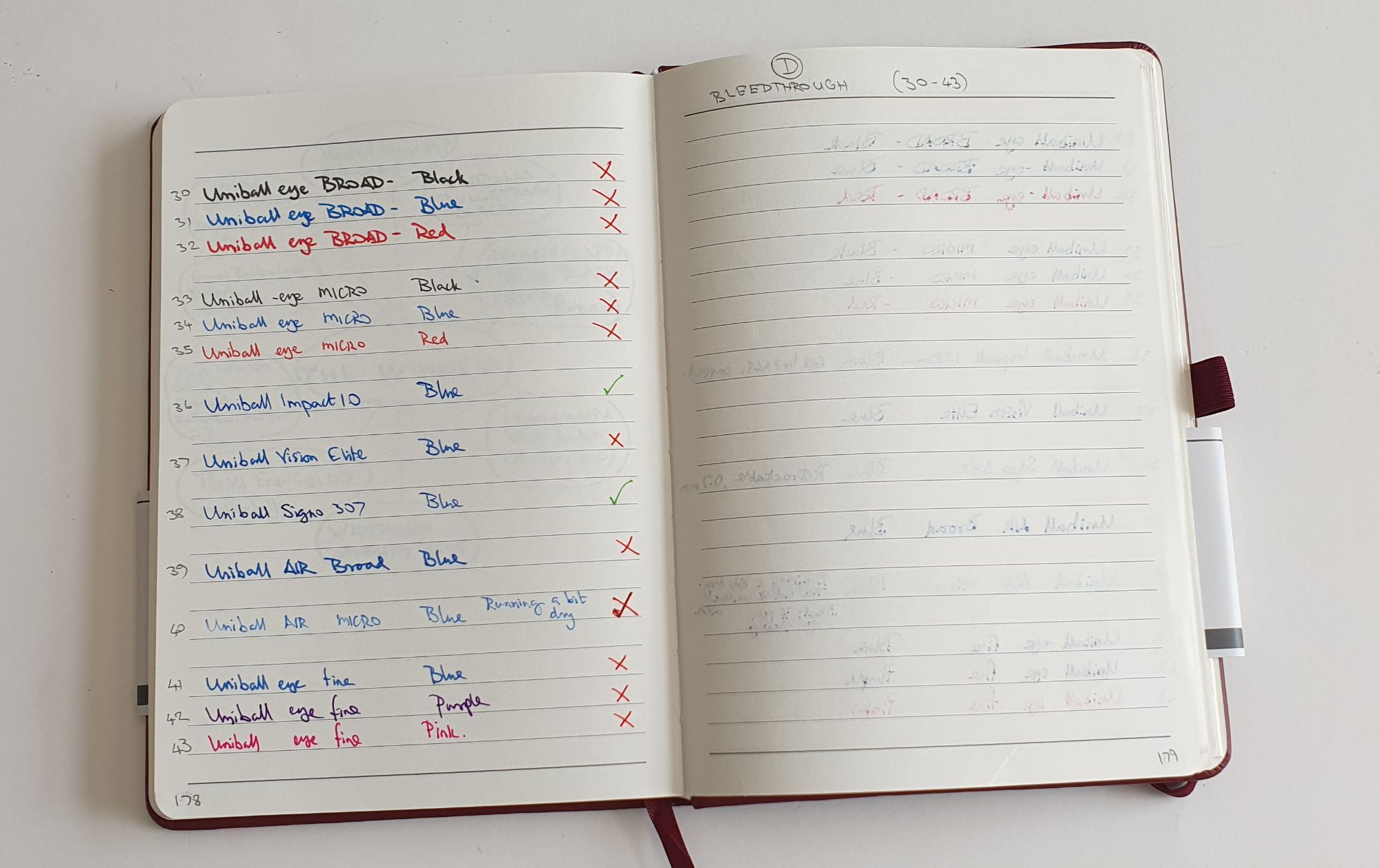
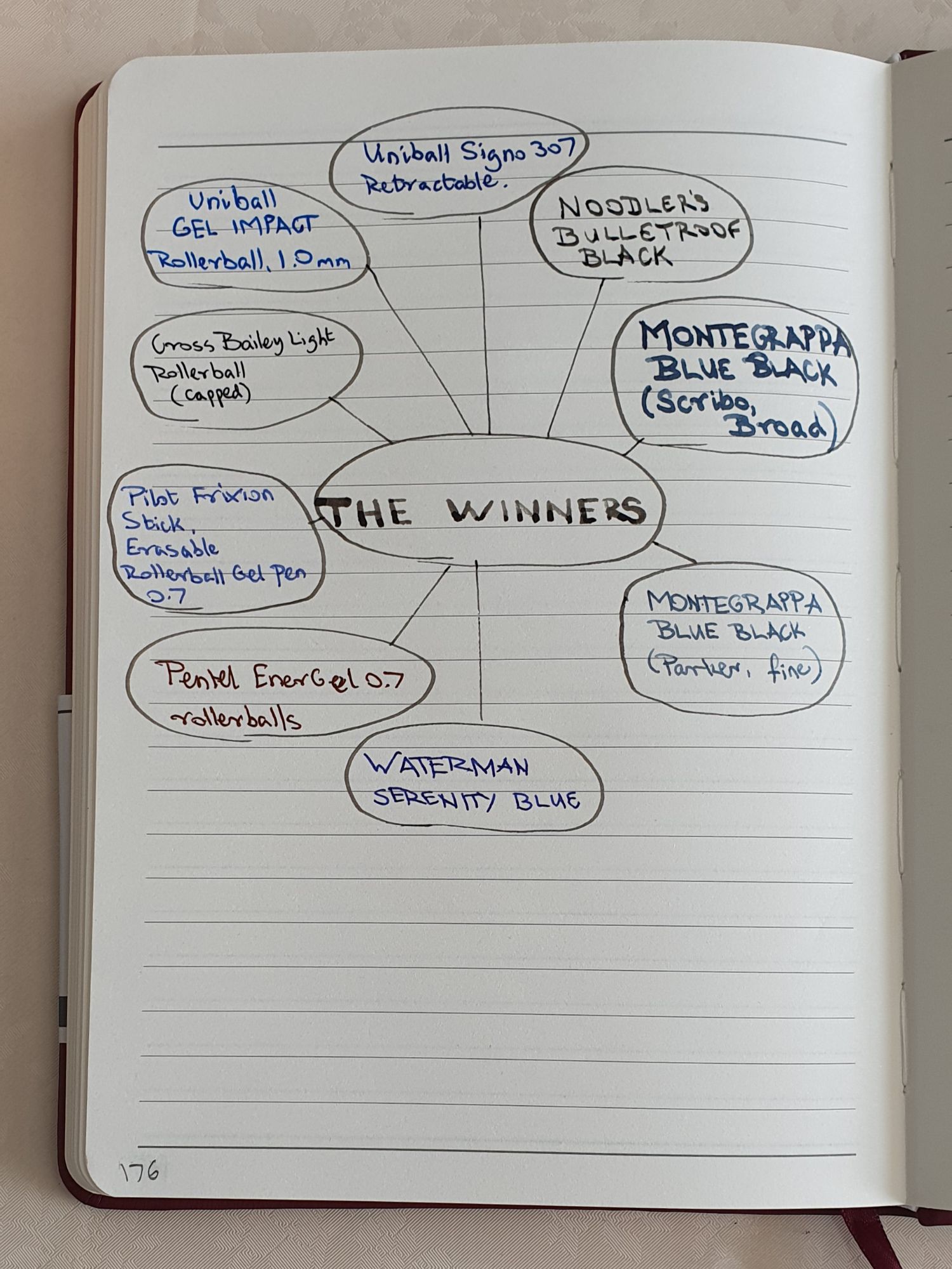
I flushed the pen a few times in warm water and then filled it with Waterman Serenity Blue. The pen filled well. There is no ink window of course, but if you wish to measure how much ink a lever filler draws up, you may empty it slowly and count the drops. Alternatively, for a more immediate assurance, you may decant some ink into an ink-miser with a narrow diameter, which will better show the ink level sinking, as ink is drawn into the sac. I use the plastic insert from a TWSBI Diamond 580 ink well for this.

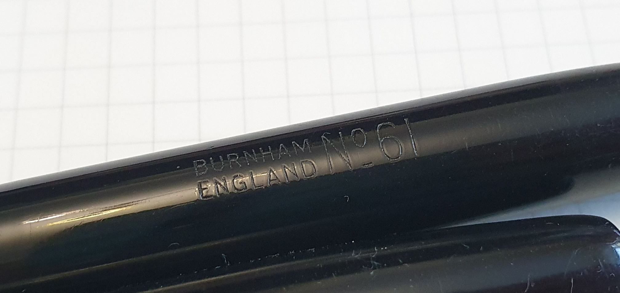
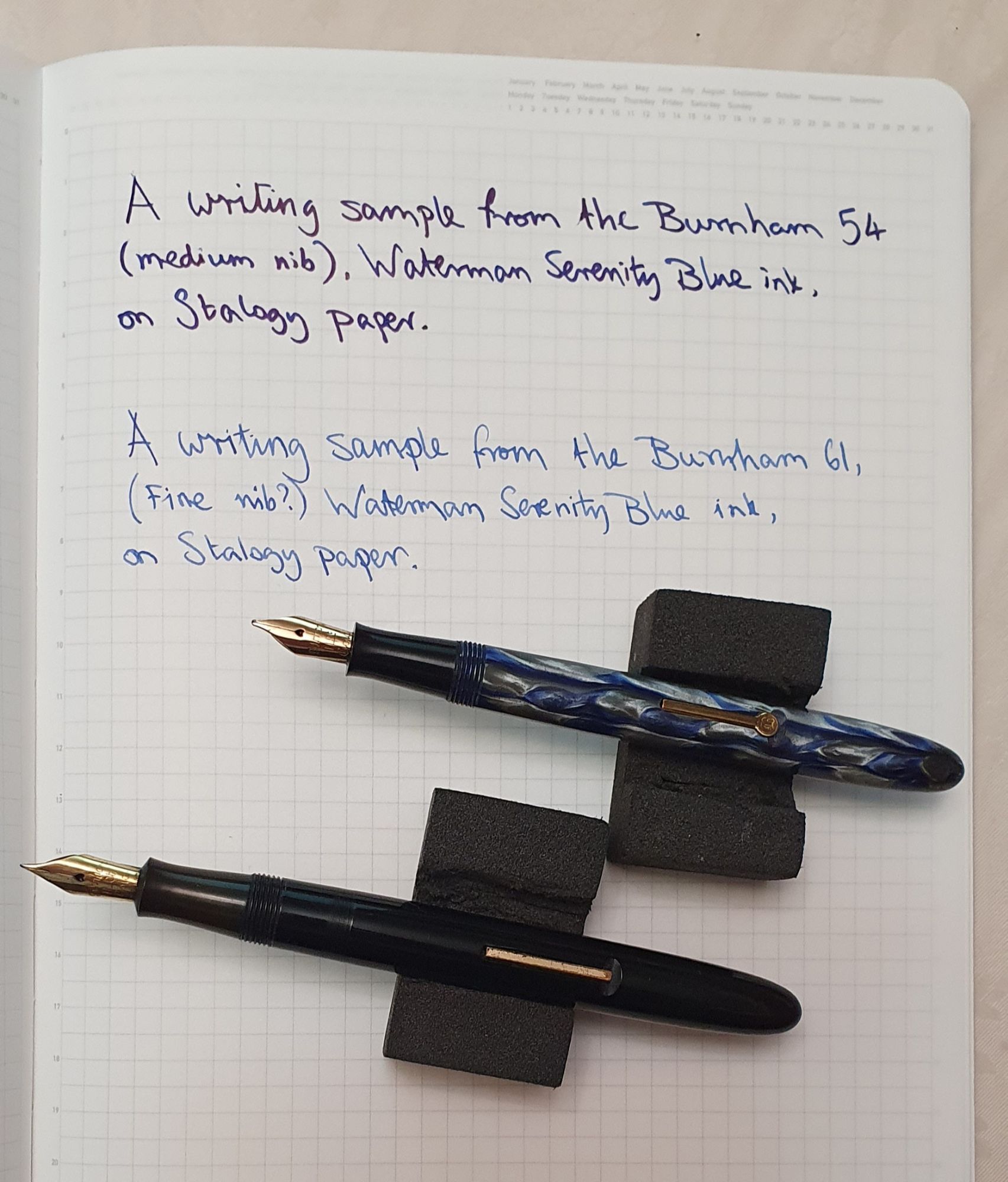
And so to the writing. The pen wrote superbly. The nib grade is not shown but I presume it to be a Fine or Extra Fine. The nib imprint reads “Burnham 14Ct Gold Osmiridium.”

Barrel imprint

I would have been happy if this pen had simply written the same as my Burnham 54, but the fact that it wrote with a lovely precise fine line, was a bonus. Once again, the nib felt smooth on my Stalogy notebook paper, but there was a distinct feedback, hard to explain yet exquisitely enjoyable!

Imagine your own handwriting here.

Burnham pens do not seem to garner very much attention in the fountain pen community. I am probably not helping myself by raving about them here, with the London Pen Show just a few weeks away, but I hope to see a few Burnhams at the show. As I now have a collection of two Burnham lever filler fountain pens, (each costing me less than a Lamy AL-Star) I can attest that these can make a very satisfying buy. With some high-end, steel-nibbed pens costing around £200.00, a vintage Burnham offers a gold nib at a fraction of this amount and with a wealth of character with which a modern pen cannot compete. My advice, if a Burnham should catch your eye at the show, would be to (1) ask whether the sac has been replaced; (2) inspect the nib and if possible, try a dip test to see how it writes, and (3) save some for me.

Small but perfectly formed.

Ryman Medium Soft Cover Notebook review.

I am a sucker for a new notebook. I love buying a new one, removing the cellophane, sampling pens and inks on the back page and then paginating it in pencil. The next pleasure is choosing what to use it for. Never mind that I have about 20 new ones already (a conservative estimate: I daren’t get them all out to count them: and that is just the A5’s).

There is a crowded market for A5 journals, perhaps typified and made famous by the Moleskine books with their expandable pocket in the back cover and the elastic closure. I learned only recently that the Moleskine enterprise began partly in response to a mention by the late author Bruce Chatwin, in his book The Songlines (published in 1987). He recounts a conversation when he is about to take notes and pulls from his pocket, “a black, oilcloth-covered notebook, its pages held in place with an elastic band.” The interviewee comments “Nice notebook” to which he responds “I used to get them in Paris, but now they don’t make them anymore.” The origin story of Moleskine can be found on its official website.

Presumably to fit into a pocket, the Moleskine notebook is narrower than A5. Rymans, the stationery store chain, sell their own brand notebooks, for the budget-conscious. When I bought one a couple of years ago, it followed the same, narrower, Moleskine format and also had lines ruled at 7mm row height. I wished that they were A5 width and with a line spacing of 8mm.

Rymans’ new A5 notebook with the narrower old style version for comparison.

Well, on a recent visit to my local Rymans, I was very pleased to see that their 2024 range of own brand notebooks now have both of these two changes. They also come in a new variety of attractive colours, whether your preference is for a traditional navy blue, dark green, Burgundy or tan – or a more playful pastel shade.

Such was my excitement that I bought two, one in Burgundy and the other in a pretty pastel colour described as Wisteria. Interestingly, Rymans do not include the term “A5” in the description, instead simply describing it as “Medium.” However, the belly-band indicates the paper size as 210mm x 148mm.

Burgundy and Wisteria – two of the many colours available.

They have a hardback cover (although described as “soft cover” by reason of its soft-to-the-touch, leather-like texture). Other features include 192 pages, stitched, open-flat binding, 70gsm cream paper, an expandable pocket, and elastic closure and pen loop and rounded corners. At £7.99 these are well below half the price of a Leuchtturm or Moleskine notebook. All good so far.

Unfortunately, for those wishing to use fountain pens, I found the paper a bit hit and miss. The surface is pleasant to write on but pen and ink combinations need to be chosen with care. On the back page, I tried a selection of fountain pens from my pen cups, hoping that none would bleed through the paper. Most did bleed through, with a few surprising exceptions.

Fountain pen ink bleedthrough test combinations with results on the facing page. Those that bled through are marked with a red cross. Those that this did not, marked with a green tick.

For example, my broadest and wettest fountain pen, my Scribo Write Here Africa with its 18k gold broad nib, currently filled with Montegrappa blue black, was one that did not bleed through. This led me to conclude that it is not so much the amount of ink laid down, but its type. I was pleased that at least I could use my Scribo in this book. I immediately filled a Parker Vector XL (fine nib) with the same, Montegrappa ink. [Unfortunately, this ink seems no longer available].

Juicy broad Scribo with Montegrappa Blue Black.

Another ink to avoid bleed through, was Noodler’s bulletproof black – even when applied with a 4mm long fude nib.

I felt that some more extensive pen and ink sampling was required for this book and set about filling up some pages. Starting at the last page of the book, I had tried 11 different pens. I copied this out again two pages back, leaving the facing page blank to view the bleed through. I then repeated this exercise with some Pentel Energel rollerballs, my Pilot Frixion stick rollerballs, a few other rollerballs from Cross, Cerruti and Lamy and finally a page full of Uniball rollerballs of differing colours and widths, from Uniball’s Air, Eye, Impact, Signo and Vision Elite. I had 43 samples.

Pentel Energels – mostly avoid bleedthrough.

My bleedthrough test results on the new Ryman notebook, surprised me. For example, the Pentel Energel 0.7 rollerballs were all ok, (with the possible exception of the red, which was a bit borderline). Likewise the Cross Bailey Light rollerball (a favourite) with its Cross 0.5 refill, and the Pilot Frixion stick pens were all ok to use. But the Lamy tipo with a blue, Lamy M66 B refill – a lovely smooth writer – did bleed through and had a high degree of show-through, rendering it unsuitable for double-sided writing in this book.

More rollerballs, with bleedthrough on facing page.

Finally, the Uniball rollerballs mostly failed my test with the notable exception of the Signo 307 retractable 0.7mm, in blue. But perhaps the biggest surprise of all was the Uniball Gel Impact 1.0mm, in blue. This is a lovely smooth, broad, wet, vibrant writer with a snap on cap, metal nose cone and comfortable rubber grip section. I very much doubted that this would go well on the Rymans book yet it showed no trace of bleedthrough and very little show through.

Uniball family. The Gel Impact was best at avoiding bleedthrough

I concluded my sampling with a Winners page, the pen and ink equivalent of a victory parade. As can be seen, this handy summary shows that I am left with plenty of usable pen and ink combinations for this book.

Summary of the winning pen and ink combinations for the Ryman notebook.

To summarise, I find this new version Ryman Medium notebook good for its full width A5 pages, 8mm row height and value for money. As for the fountain pen and rollerball user, my results were mixed and some experimentation is required. However I believe that most stationery hoarders will find at least a few suitable combinations in their stash and, if like me, will have fun trying. What I need next, is not another notebook but a writing project.

Uniball Gel Impact ink handled well by the Rymans’ paper.