Early thoughts on the Duke 551 Confucius bamboo fude nib pen.

As early thoughts go, today’s are even earlier than usual as this lovely pen has been with me for barely 24 hours. However, my first impressions are very favourable: the quality and finish and the sheer fun that you can have with it, exceeded my expectations.

Duke 551 Confucius, bamboo fude nib pen.

This model has been around for several years now and I am informed by artist Terry Christopherson (Instagram @theTravelSketcher) and of peninkandpaint.com that it is big in the urban sketching community. I was already familiar with another model that I reviewed previously called the Duke 552, also featuring a natural bamboo barrel. I had imagined that the 551 would be similar, but with a fude nib and a more decorated cap. It turns out that they are quite a bit different.

Although the 551 is similar in length and has a similar look of bamboo barrel, black cap with silvertone furniture, it is girthier, heavier, has a much bigger nib and a section which is longer and made of metal. The differences are apparent when the two models are seen side by side.

Duke 551 fude (right) with Duke 552 (left)

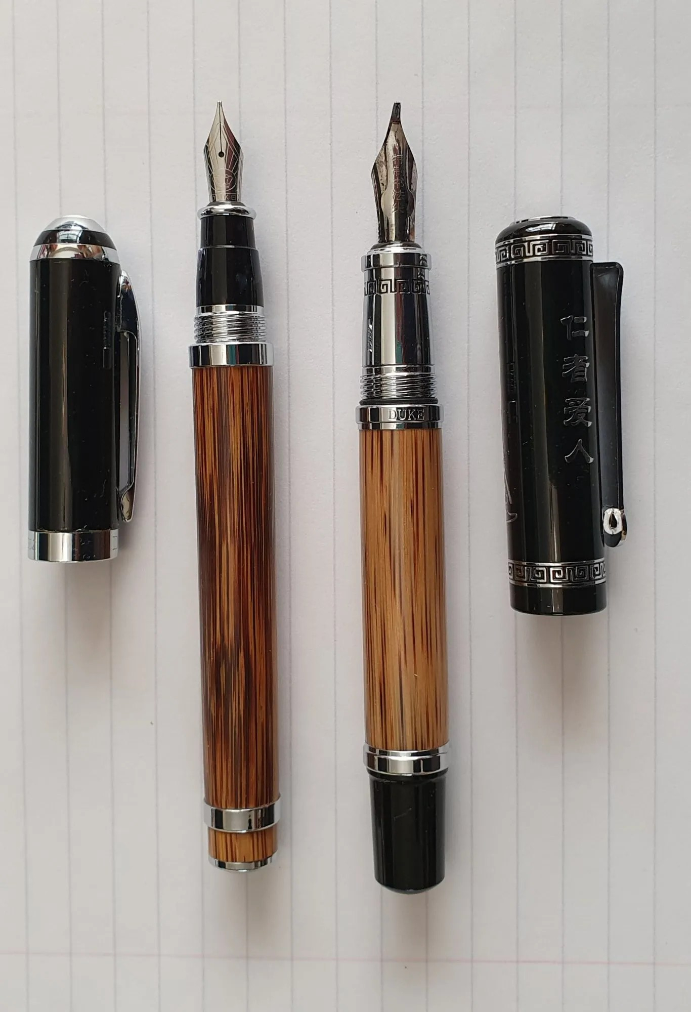
However, the main difference and reason to buy the 551, is for its amazing, steel fude nib. The nib looks quite alarming at first to anyone not expecting it. The tip is angled upwards, at about 45 degrees and presents a flat surface approximately 4mm long, to the paper.

The three tine, steel fude nib with fitted ink reservoir for when dipping.

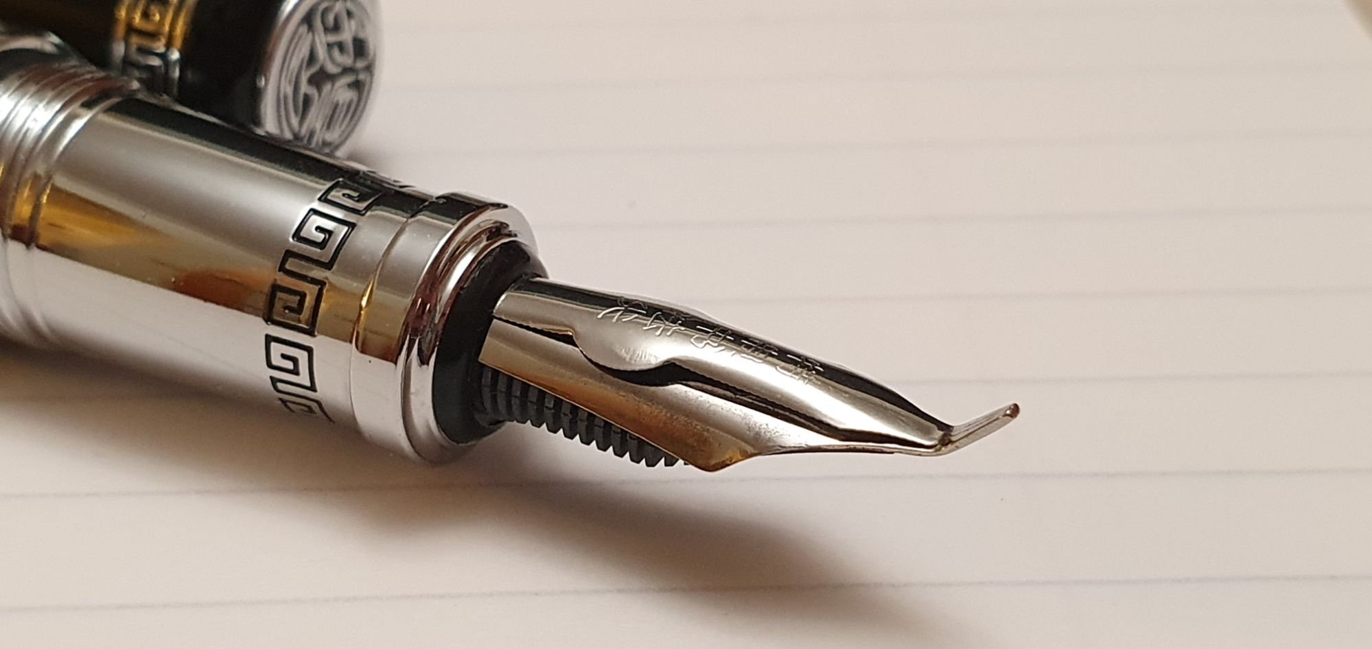
What I had not fully appreciated before the pen arrived, were two other special features of this fude nib, namely that it has two slits for improved ink delivery and an ink reservoir on top of the nib, so that when used as a dip pen, it needs dipping far less frequently. There are some Chinese characters on the nib, which my wife translated as “special calligraphy nib.”

Smooth nib with three tines, like some music nibs.

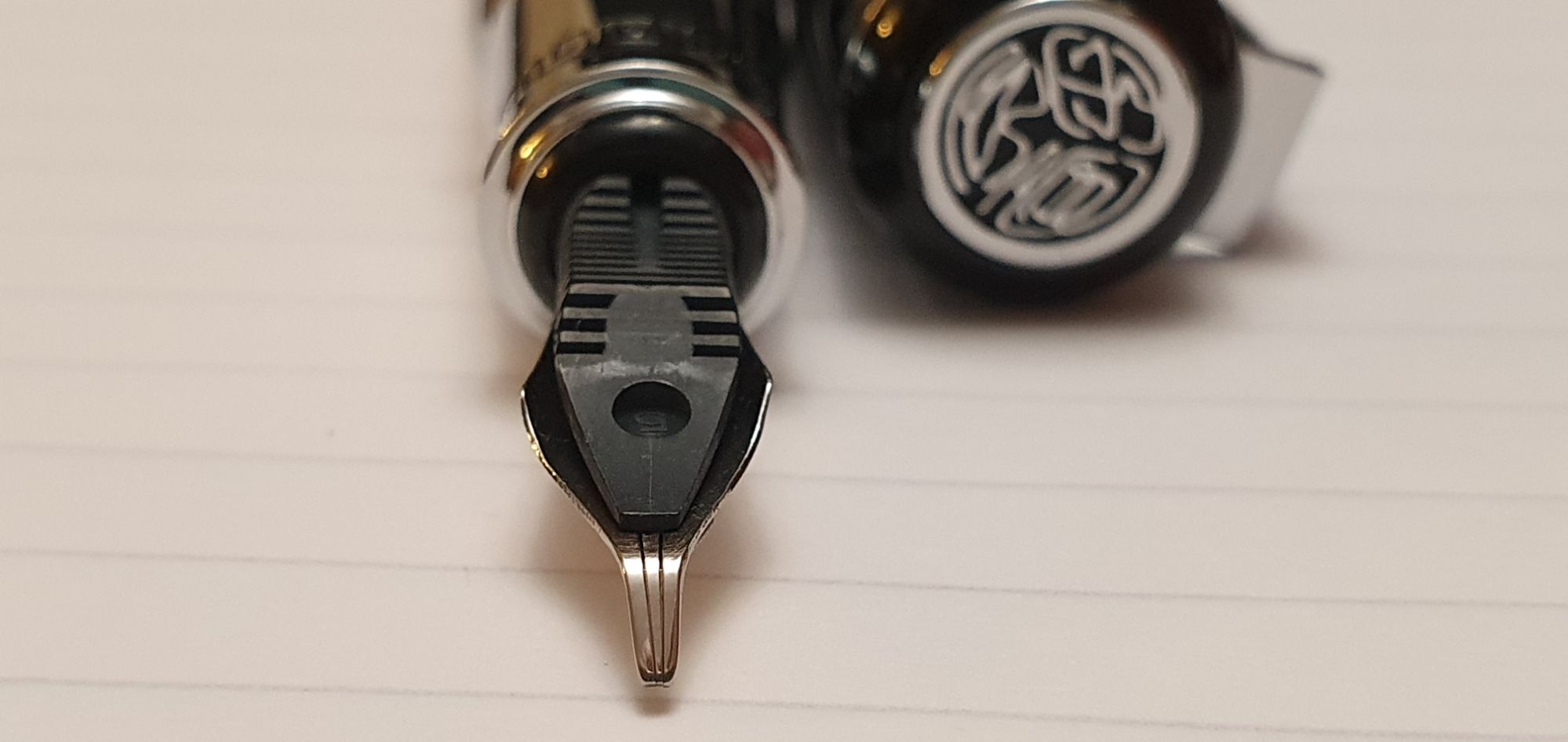
As well as its dip pen suitability, it is also a cartridge-converter filler and is supplied with a push-in converter. This contains a small coil of metal to serve as an ink agitator, which can be useful. However I saw in a YouTube video review by @chrisrap52 that this little spring does make it harder to flush the converter thoroughly when changing ink colours and he prefers to remove the spring, by unscrewing the metal collar of the converter.

A Duke branded converter is included.

The cap features an engraving of Chinese philosopher Confucius on one side and more Chinese text on the other side. My wife translated this, approximately, as “A kind person loves everybody” which is part of a Chinese saying which continues “and everbody loves him.” There is a nicely decorated finial, a very stiff and strong pocket clip culminating in the Duke crown emblem and decorated metal rings at both top and bottom of the cap.

The cap unscrews in just over one full turn. When screwed on, it meets a rubber O ring, giving a reassuring tightness to the cap. It also makes for a good seal and, from other reviews I have read on Amazon’s site, the nib does not suffer from drying out although I have not had my pen long enough to put this to the test.

Lots going on with the cap too.

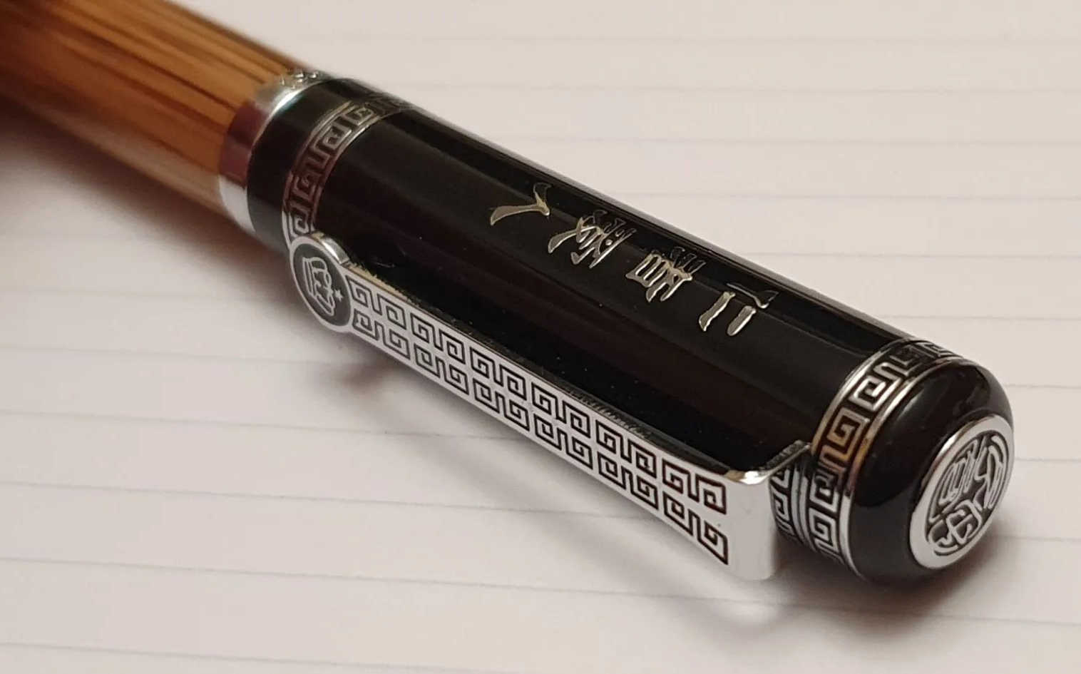
I very much like the natural bamboo of the barrel. I think the inside of the barrel may be lined in metal here, and it feels heavier than the Golden Stripe Bamboo barrel of my Duke 552 (23.5 grams as opposed to 16.5 grams).

I do not generally get on with shiny chrome sections, as they can be slippery to hold. However this one is of a substantial size. It tapers slightly towards the nib where there is some engraved ornamentation and then a step up at the end, to stop your fingers sliding onto the nib.

From my initial trials with this pen, I have not found the section to cause difficulty in holding the pen securely. I can keep my thumb on the bamboo barrel for better control. However, I am finding that where the pen rests on my middle finger, the step does feel a little uncomfortable and so it is necessary to draw your finger back from it slightly.

So how does it write? I was very excited to find out. After flushing the nib and feed and the converter, I filled the pen with Noodlers Black, a water resistant ink that would allow me to paint over the ink, once dry, with watercolours without the ink smudging.

The nib is very smooth, as I have read in other reviews. The twin slits, like a music nib, provide a more generous flow of ink to the nib, which is needed when making side strokes with that long fude nib. It covers large areas at a single stroke. It would be great as a redacting pen, for hiding confidential text from a document before disclosure.

The fude nib is designed for calligraphy, allowing for fine lines to be drawn with the tip or very broad strokes with the flat part. It is not a “zoom” nib and there is not an easy way to get a medium width line between these two extremes.

In the right hands, the pen would be great for sketching, as the line width extreme variation, and ease of blocking in areas of colour, are a real benefit. Mine are not the right hands to demonstrate this properly but I enjoyed trying.

My man bag: Duke 551 fude, Noodlers Black ink and watercolours.

As for normal writing with this pen, it is possible but in order to get a fine line, the pen needs to be held upright at a steep angle, as you would for a ball pen. If the pen is allowed to lay back towards a more typical fountain pen angle, the line will be much broader and, with a 4mm line, you would need to write very large letters to avoid all the loops being filled.

It is very early days but already I am enjoying my experiments with the fude nib. It will get through a converter of ink quicker than most pens, particular if used for drawing and blocking in large areas. Before refilling it, I am keen to test out its built-in nib reservoir in dip mode.

Duke 551 Specifications:

  • Length capped: 147mm
  • Length uncapped: 132mm (I am very happy with this)
  • Length posted: 182mm
  • Weight (total) 64 grams (compared to 40 grams for the Duke 552)
  • Weight uncapped: 37.5g
  • Weight, cap only: 26.5 grams

Well, so much for my New Year pen-buying abstinence once again. I made it all the way to 18 January 2024 this time. But then this pen is quite an exceptional piece of kit and I am unrepentant.

Off topic: a brief romance with a Lorus automatic wristwatch.

This blog is generally about fountain pens as the name suggests, but I write to relate a recent tale in the world of watches. My excuse for this digression is that many people who enjoy fountain pens feel the same way about mechanical watches.

Whilst I have more than my fair share of high quality fountain pens, I do also enjoy seeing how good a writing experience can be had for minimal outlay. I regularly use a Cross Bailey Light which cost about £20.00 and various inexpensive pens from China. To a lesser extent, this curiosity sometimes spills over to watches.

Having owned several high-end watches I thought I knew a reasonable amount about automatics. It turns out that there were some glaring gaps in my knowledge.

First of all, I had looked down rather snobbishly on the brand Lorus, but learned only recently that the brand was formed by the Seiko Watch Corporation, the mighty Japanese giant and introduced in Europe in 1982. They are aimed at the lower end of the market for people seeking quality watches at affordable prices.

On a recent stay in Chichester, I was strolling the high street when I came across a display of Lorus automatics, in H Samuels. The one that caught my eye was the black dial, military-style watch with a day/date window. Given that Seiko automatics now start at around £260.00, a Lorus at £129.99 is one of the cheapest entry level options. Furthermore, H Samuel were offering 20% off, bring the price of this model to around £103.00. I walked on.

A Lorus military style automatic, reduced to £103.99.

A week or so later, back home in London I visited my local H Samuel branch hoping to take a closer look at this model. Alas, they told me that they no longer sold Lorus watches in their branch but only online. That particular model was (and still is) available on the H Samuel website but I did not pursue it. The price was certainly attractive but I was deterred by the day and the date window, envisaging that for a watch worn only occasionally, I would be forever resetting these.

A little later, whilst in John Lewis and enjoying my customary look at their watch displays, I saw a cabinet marked “Clearance”, in which I noticed a Lorus automatic watch, with a silvery white textured dial and hands in a style reminiscent of a grandfather clock. Remarkably, it was just £43.50. John Lewis is currently having its January sales, with large red signs urging shoppers to “Succumb to the sale.” This watch had a price ticket of £72.50 previously but was reduced by 40%. It had been put out just that day.

And a more dressy version for £43.50.

It was not the military style field watch that I had seen, but nonetheless I quite liked the whitish face, the vintage hands, and large size (42mm diameter case). There was no luminescence and there was still the issue of the day and date hassle. I asked to have a look at it.

Handling the watch, the finish and quality looked and felt impressive, with its highly polished plated steel case and a black leather strap. There was even an exhibition window in the screw-down back, showing the automatic movement and the swinging rotor, on which “TWENTY-ONE JEWELS” was stamped. For a mere £43.50, it was one sixth of the price of the nearest Seiko automatic, and I felt it was a fun purchase and in need of a home.

A glass back gives a view of the Lorus Y676 automatic, 21 jewel movement.

Even the packaging was quite decent and appropriate: a small cardboard lidded box and the watch strapped around a soft brown pillow. The instructions and two year guarantee documents were below.

I was pleasantly surprised that the initial setting up of the day and date was no trouble at all and took only a minute: pull out the crown to the first click, turn it one way to advance the date and the other way to advance the day. Set them to the previous day, then pull out the crown to the second click, and advance the hour and minute hands to the correct time, (remembering to go past 12 o’clock twice if it is after mid-day).

Still a lot of watch for a little money.

However, what was not so easy was then getting the watch to start. Having no power at all, it was necessary to wind it sufficiently to start working before putting it on and allowing the automatic movement to keep the watch wound through the movement of the wrist. I tried to wind the watch manually but felt no resistance from the crown. Peering in at the movement, I began to fear that the mainspring was broken. I had wound the crown perhaps a hundred times and the second hand had not budged.

The instruction leaflet did not mention winding the watch with the crown but suggested that the watch be swung back and forth, horizontally, for 30 seconds. In practice, it needed considerably longer than 30 seconds but did start eventually and the second hand came to life, in the joyous way that mechanical watches do.

I looked online for some reviews of the watch. I found one at benswatchclub.com, for a similar model where it was stated that the movement appeared to be the same as that used in the Seiko 5 models. He states “To my understanding, the mechanism labelled as a ‘Y676C’ is a rebadged Seiko 7S26C, identical to that in most last-gen Seiko 5 watches” and “If you’re familiar with the 7S26, you’ll know that this movement is durable but rudimentary, with no hacking or hand-winding capabilities. You’ll have to rotate the watch to get it going manually.”

This was a revelation. The good news was that my mainspring was not broken. But here was the second big gap in my knowledge: I am embarrassed to say that I did not know that some automatic watches could not be wound by hand.

I also learned that “hacking” refers to the ability to stop the second hand by pulling out the winding crown, necessary for military watches in order that they could be synchronised. Mine did not have that facility either.

Whilst I admired the intricate design and finish of the watch and obviously its price, (the leather strap alone must be worth half of this), I was put off by the lack of a manual winding option.

I am sad to say that ultimately the watch and I agreed that each of us was not what the other wanted. I wanted an automatic, but one which I could wind up quickly for occasional use. I like to wear a different watch at weekends from the one I wear on weekdays.

The watch, on the other hand, wanted an owner for whom it was his only watch, perhaps his first ever grown-up watch, and to be worn every day so that the absence of a manual wind option was immaterial. It did not want an owner who would compare it unfavourably and unreasonably with other, vastly more costly timepieces but would enjoy it for its own merits, not only for its cheapness.

And so, with some regret, I returned the watch to John Lewis for a refund early the next day, still a little sad to see it go but having learnt from the experience. This turned out to be a “catch and release” or as my late father used to say “easy come, easy go.”

The new year diary, 2024.

Last year, my daily journaling was done in a page a day, Moleskine 18 month volume. I bought it too late to make use of the pages for July to December 2022, but was happy to have them as a sort of bonus notebook.

I persevered with the book although it was not particularly enjoyable to use. This was not, as you might think, due to paper quality which was actually quite pleasant and fountain pen friendly, but rather because I did not like the line spacing of only 6mm row height. Added to this, I found the width of the pages, at 130mm, a bit narrow. An A5 page is 148mm wide and losing 18mm makes a big difference, particularly on days when I wished to use a balloon diagram, to confer some retrospective order on the previous day’s events.

For 2024, I have gone back to my more usual Ryman A5 Page a Day diary. This does not suffer from either of my two complaints above: the row height is 7.6mm and the page width is the full A5, 148mm size. These two features make it more comfortable for me to use. However, it is not perfect. On removing the cellophane at the start of the year, my first discovery was that the covers were thin and bendy and not stiff as I had been used to. To be fair, the description on the belly band states “2024 Soft Cover Flexi Diary, Page a Day”. The word “Soft” refers to the texture which is like a faux leather, whilst “Flexi” means “bendy”, rather than “versatile“.

Whilst on the subject of the description, the words “Page a Day” apply only to Monday to Friday. Saturdays and Sundays have to share a page, which is always a pity. Rather than add the words “but only Half a Page a Day at Weekends!”, Ryman has instead chosen silently to include an image of a double-page spread with a Friday, Saturday and Sunday in view if you look closely.

New Ryman A5 diary for 2024, alongside last year’s Moleskine book.

Other than that, there is not much to add. The Ryman paper is a cream colour, 80gsm with a pleasant texture and fountain pen friendly. The binding is sewn to help the book open flat and there is an elastic closure. Given the rather insubstantial cover, there is a metal reinforcement at the edge, to prevent the elastic from wearing away at the cover. But (a) the metal is not stuck down on the front and so leaves a sharp edge, and (b) there is no metal reinforcement for the back cover. I would have preferred that there be a hardback cover so that reinforcement is not necessary.

This will be used for my daily journal, usually written up after breakfast, recalling the events of the previous day. This is an opportunity to enjoy a few minutes with a fountain pen, as well as a memory exercise.

It has also been a recent custom of mine to stick to one fountain pen and ink per month for my diary entries. For January I have started with the Parker 45 (14k gold, medium nib) with Waterman Serenity Blue that I wrote about rather gushingly in my previous post.

A Page a Day is for Mondays to Fridays only.

Aside from the diary, I write on most days, in a Stalogy 018 Editor’s Series 365 Days Notebook A5 size. I love the paper in these. I carry this to pen club meets and when out and about, in a stiff leather cover with elastic closure. The cover is a very simple single board, not quite A5 in width and is so stiff that it wants to slam closed all the time. I liked the fact that it did not have any pen loop, credit card pockets or other features, as I found that these make for a lumpy surface if you are writing with the book open inside the cover. However, in practice I found that the cover works much better for me, with my notebook tucked in the other way around, purely to protect it and keep it closed in transit.

My backwards “traveller notebook” set-up.

Writing with a nice fountain pen in a Stalogy notebook, is one of my favourite things to do. I use it for all sorts of things, although mostly for enjoying my pens and inks for the sheer fun of it and not for writing anything profound. This is an inexpensive form of relaxation and we all need one of those.

I do also have an A4 Ryman notebook which serves as a bullet journal, or bujo. This is a simple book of lined pages, 37 rows per page, on which I have listed dates for a month down each left-hand page, leaving the right-hand page clear for notes, often divided into two columns. This had enough pages for 2020 to 2025 inclusive, although after four years the cover is getting a bit tatty and flaky now. I find the bujo very useful for diarising dates that are far ahead, such as insurance renewals, road tax and car MOT and service due dates and a few others. Having six years at 24 pages per year, required 144 pages. As the book has 192 pages, this left plenty of double page spreads for lists, such as books read (or to be read), albums to listen to, TV episodes to watch, monthly steps counted and so forth. The possibilities are endless. I have not adorned it with washi tape or ink stamps like the photogenic ones we see on Instagram, but each to his own. I may however create a page for “Fountain pen wish list 2024”, although what I really need to do is to practice not wanting more things. As always, we shall see.

2023: some of my fountain pen highlights.

I usually start this exercise by looking at how many pens I acquired over the year and how much I spent on the hobby. 2023 saw me acquire 39 fountain pens, of which four were gifts for others, so 35 for me. The total spent was £1,676.19: not too terrible.

A strong theme throughout the year was vintage Parkers, mostly bought on eBay plus a small number at the London Pen Shows.

Always late to the party, this was really the first year in which I started looking for and buying vintage pens on eBay. Of the pens acquired in 2023, 15 were vintage Parkers and the remaining 24 a mix of other brands. I would search a make and model, say “Parker 17 fountain pen,” for example. This might find several hundred listings, which I would whittle down by filtering the results to UK only and then sorting them in order of auctions ending soonest.

Occasionally, a special item would come up, such as a Burgundy red Parker 17 Super Duofold with the early “beak” nib, which I would set my heart on winning. In the days leading up to the auction, I repeatedly checked how the bids were going and always stopped to look at the close-up photographs, particularly of the nib, front and back. Happily I was successful and that pen is now mine.

After buying a number of Parker 17s, with their 14 carat gold hooded nibs and hooped squeeze-bar fillers, I moved on to the Parker 61. Again with so many for sale I decided to be choosy and ignored any with the inlaid arrow missing from the section. By the end of the year, I had acquired four Parker 61s. Two were the early, capillary fillers, with one of these being the “Heirloom” (with two-tone rolled gold cap also called the rainbow cap). Two were cartridge or converter fillers; one was a Flighter; one was Made in USA and the others all Made in England; so, a good cross-section.

I was thrilled when a Parker 51 with an oblique nib came up and again when I found a Parker 45 with an oblique medium nib. Both are great for me to use in lefty-overwriter mode.

Some of my 2023 vintage Parker finds.

Eventually, my wife expressed concern that my buying of Parkers on eBay was getting “out of control,” and that temptations would be never-ending, since hundreds more pens come on the market every day. True. We agreed that a recent, lovely teal Parker 61 would be my last. 

It was about this time that I happened to spot a black Parker 45, with a 14 carat gold Medium nib, in great condition. I zoomed in on the close-up nib photos and made screenshots of them. It was only £24.99 “buy now or best offer”. I held out bravely for a few days but then received a thoughtful notification from eBay that the seller had dropped the price to £19.99! This was too much to bear. I knew from the photos that the pen would write like a dream. A vintage Parker, with a pristine gold nib at less than the price of a new Parker Jotter or Lamy Safari. I could not not buy it. Then a solution came to me: I would buy the pen, but as a gift for someone else!

The pen duly arrived. As it was to be a gift, I had to check it first, flush it and test it out. The nib was as wonderful as I had imagined and needed only a light flossing with a brass shim and a rinse. I separated the nib and feed to clean and photograph them. The sac puffed out air bubbles into the water and all looked well. I dried the pen and filled it with Waterman Serenity Blue. It was a joy to write with. Ink flow was ideal, once I had ejected about three or four drops of ink.

I decided to “test” the pen over a few days. Big mistake. This pen was exceptionally enjoyable and I bonded with it. With Serenity Blue, it wrote like my Pelikan M800. There was no way I could part with it. Instead, I gave the intended recipient a lovely new fountain pen of equivalent price.

Of the remaining brands represented in my 2023 acquisitions, these included a flurry of Jinhaos, first the X159 and later the 9019 and 82 models. After trying these, the most enduringly successful seem to be the blue demonstrator version 9019 with an EF nib and filled with Diamine Tavy blue black and the 82 in Caribbean Sea Blue with gold trim, F nib and the same ink. Both start immediately after long intervals and write smoothly with good flow.

I greatly enjoyed the London Pen Shows in March and October. These are always joyous days, running into numerous friends from the online fountain pen community and talking to the sellers. Some of my favourite buys of 2023 were:

  • Montegrappa “Monte Grappa”, in black with 14 carat gold M nib: possibly John Hall’s last one as Write Here of Shrewsbury was to end links with this brand;
  • A Cleo Skribent Classic, cartridge-converter filler version in Burgundy red with 14k Broad nib (also purchased from John Hall);
  • An Aurora Duo-Cart, sold by Kirit Dal from his ex-samples tray at a generous discount; he kindly sent me a branded Aurora converter for it afterwards and a box of cartridges.
  • A Benu Euphoria Bourbon, with a broad nib, from Stonecott Fine Writing Supplies Ltd: the perfect vehicle for Diamine’s Caramel Sparkle ink.

My last and quite possibly most special fountain pen arrival of the year was a gift from my aforementioned wife, bought whilst on her trip to Hong Kong in November. It is the Pilot Custom Heritage 912 with a 14 carat gold Waverly (upturned) nib. I use it every day and it is a wonderful pen, with an element of Unobtainium about it, since they are not readily available in the UK. The WA nib is great for me as a lefty who uses both over and under-writer styles.

I have enjoyed attending our monthly pen club meets, (The London Fountaineers) whenever I can. Also, there have been daily interactions with a host of fellow enthusiasts online, via WordPress and Instagram and in correspondence from the UK and beyond.

As I do every year (and usually fail), I will endeavour once again to buy less pens, ink and notebooks and to make more use of what I already have. Thank you for reading and I wish everyone a Happy New Year.

Some of The London Fountaineers at our Christmas meet. I am the one with the bunny ears.