
I have put off doing a post about this pen because, frankly, I did not know quite what it was. I bought it on a bit of an impulse, during a live auction in January without having inspected it. It is not a current model.
I did know that Sailor fountain pens and nibs are very well regarded. I have not owned one before, but had a brief look at a new Sailor Pro Gear at the London Pen Show in October and was very taken with the 21k gold nib.
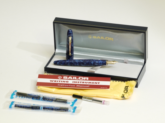
There was brief description of the pen on the auction web site and a few photos. It was described as a limited edition, number 114 of 150, with a 21k gold nib. The pen was boxed, with original Sailor cleaning cloth, two packets of two cartridges and the Instruction Manual. It included a converter and was said to be inked, which was a worry but also rather appealing to someone who loves to clean pens.
Having successfully bid for the pen at auction, I went to Hampstead Auctions the following day to collect it. At the same auction I had bought the lovely 1950’s Pelikan M400 tortoise and over the following days it was the Pelikan that got more of my attention.
The Sailor was in a good condition, save that the nib and feed were encrusted in dried ink and the converter almost cemented into the section. However, with a bit of soaking, the 21k gold nib cleaned up spectacularly, like new. I was also able to get the converter out and give it a good clean, as it still had remnants of blue ink inside. I was not familiar with the Sailor converter which has an unusually large opening, like the proprietary Sailor cartridges.
The cap, section and barrel are all of a mottled light and dark blue resin. The number 114/150 is stamped on the barrel. The cap band reads “Sailor Japan founded 1911.” The barrel does screw on very securely to the section, as a result of an O ring and so there is no danger of it coming unscrewed in your pocket. The pocket clip ends in a large ball, which gives a bit of a clue in this case, as to what you find at the tip of the nib.
The nib, bearing the Sailor name and anchor emblem and “21K” has a “Z”on the side although I confess that at first I thought this might be an “N” the other way up. Clearly, the nib looked to be very broad, with a giant blob of tipping material. I assumed it to be a Japanese double broad or similar.
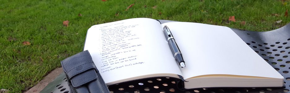
I filled the pen with Diamine Oxblood and gave it a go. Immediate impressions were that the nib was (a) extremely smooth and (b) extremely broad. In fact it was too broad to use for my usual smallish handwriting but well suited to writing headings in capital letters. Apart from trying it out a bit, I did not put the pen into regular use and instead, cleaned it again and returned it to its box.
I was keen to try to find out what model it was and how old it was. The Instruction Manual was generic for a range of different writing implements. It did have a number in the corner, 99-3027-000 which I guessed might perhaps indicate that it was issued in 1999.
Revisiting the pen earlier this week, I googled “How to identify a Sailor fountain pen” and was taken to a thread on Fountain Pen Network. Following the trail I was thrilled to find an entry from 22 June 2005 by “The Noble Savage” with photos of the same model, described as a Sailor Lapis Lazuli Limited Editions, bearing number 127/150! I understand that it is based on the Sailor Magellan but with a different colour and name. It is unclear when it was introduced but I read opinions that it was in the mid 1990’s or early 2000’s.
I was also interested to discover (and you probably knew this already) that the nib, with the “Z” mark, is called a Zoom. Rather like a zoom lens gives you a range of options, this nib has multiple surfaces which give differing line widths. It has a large blob of tipping material and the main writing surface on the underside, is in a triangular shape and slightly convex, with the apex of the triangle at the tip of the nib. Thus, if you hold the pen towards the vertical as you write, there is a narrower surface touching the paper whereas if you lay the pen down low, there is a very wide surface area of tipping material in contact with the paper, giving you a very broad line.
Naturally, as soon as I read this, I could not wait to ink the pen again and try this out for myself. This time I went for the familiar Waterman Serenity Blue. The serene sailor.
Well, it certainly works. What you have is a gadget, a handy multi-purpose nib that you can use to create a range of lines from fine to double or triple broad. I found that using the reverse side of the nib gave a nice fine line for general purpose writing whilst the normal writing position gave a broad line, which can be made even more broad by lowering the back of the pen towards the paper. It is fun to try.

FPN-ers had varying experiences with this. Some did not get on with it and preferred to exchange the nib. Others compared it to a music nib, such as is available from another Japanese pen company, Platinum, but which has two slits and gives a wide, crisp line one way or a very narrow line the other way.
I can see that it has its uses. Perhaps it is more suited to writing Japanese characters or for being held upright like a calligraphy ink brush.
Whilst they had not appeared on my radar until now, I see that Sailor Zoom nibs are still available although the Sailor Magellan is no longer made. I gather that it was sold with the option of a Titanium nib or 14k or 21k gold. Like a music nib, the Zoom nib is good for blocking in large areas of ink quickly if drawing but is rather a specialised tool and not ideally suited to normal writing unless you happen to have huge hand writing and like a double broad line.
I would be interested to hear your comments if anyone can provide more information on this model or share their experiences of the Sailor Zoom nib.


I didn’t have the skill to take advantage of the Sailor zoom nib myself, but I admire those who do.
I also admire anyone who likes to clean pens. 🙂
LikeLiked by 2 people
Well, I own a Sailor pen with a zoom nib as well. Back then I was eager to try it out and I consequently bought it. It turned out that I also wondered about the many faces it has and I still don’t how this tip-cut leads to the different line-widths (dependent on the angel you hold the pen), but actually it lost its fascination after a while. Of course, I am sure that this is me who does not really know how to use it (and mainly to which purpose this nib-type is created). Well, thousands of words just to say: no clue at all …
LikeLike
You can experiment with it to see what different line widths it can produce. But held in a normal fashion mine produces a very broad line and is super smooth.
LikeLiked by 1 person
Actually, I have a further comment to the zoom-nib: at least on the pen I own, the nib “kills” somewhat the shading of the ink. This is something which I deslike most!
LikeLike
Mine does give nice shading with Waterman Serenity Blue ink. It is 21k nib but quite firm.
LikeLike
Yes, actually you are right! I was a bit too strict with my comment. Not always this nib is prone to inhibit shading.
LikeLike