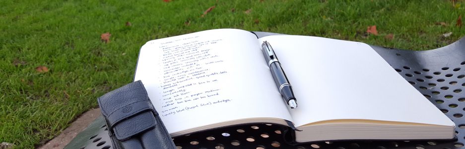
Not so much a review today, but rather an excuse to air some photos of this lovely pen, that would otherwise remain buried in my computer.

Last summer seems a long time ago now, in the care-free days before the coronavirus pandemic. Now, at home in partial lockdown, I took the opportunity to look back through my hundreds of pen photos to try to tidy up the folders a bit.
It was at a meet up of the London fountain pen club, last June, that I acquired this pen. Its provenance is that it belonged to Penultimate Dave, the pen collector, prolific Instagrammer and YouTube pen reviewer formerly known as Visconti Dave. He was offering this pen and a few others from his collection, for sale. I did not have a Van Gogh. I had admired them in Selfridges and thought that the Starry Night was the one to have but had not stretched to buying one. This was the perfect time to rectify that.
The Van Gogh pens come in a variety of colours, each based upon the palette of a different famous painting, named on the cap ring. Hence, Starry Night is predominantly a rich dark blue, with splashes of yellow and whisps of white. Each pen is unique as the distribution of colours comes out slightly differently. There are over a dozen different paintings to choose from and some enthusiasts collect the whole set.
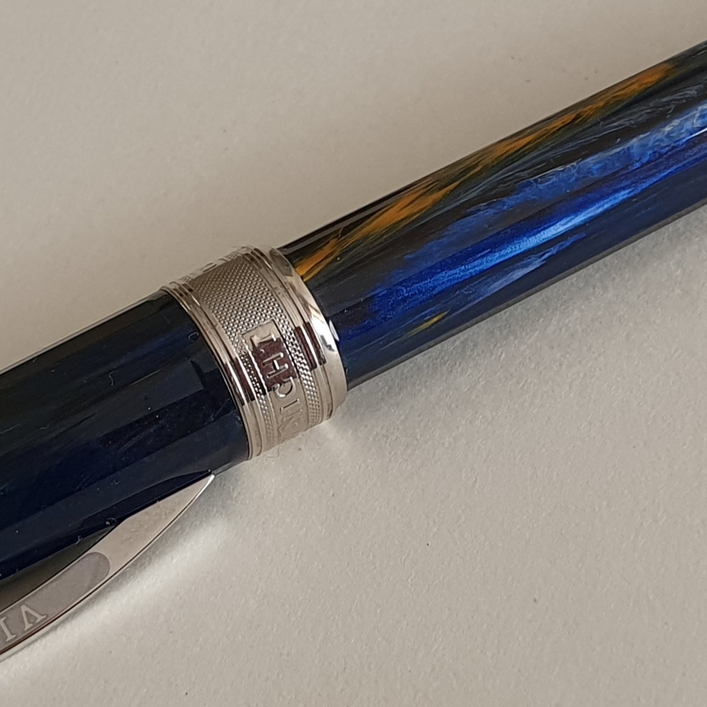
The pen has a sprung metal pocket clip, (bow shaped, like the arches of the Ponte Vecchio in Florence) and a removable magnetic metal cap finial that can be replaced with a jeweled one or with your initials, although I have not done so.

The cap and barrel are multi faceted. The cap snaps shut by means of a magnet inside the cap and so there are no cap threads to interfere with your grip. Nor is there any significant step from the barrel to the section, where you might grip the pen and so it is smooth to hold. Fun fact: the magnetic cap can be used to pick up spent staples from your desk.

The grip section is metal with shiny plating. This looks attractive, and photogenic, particularly in contrast to the dark blue swirls of the barrel. It also gives the pen some heft at the front end. The down side, for some, is that it makes for rather a slippy surface to grip but I hold the pen just above this and am therefore able to anchor the pen with my thumb and forefinger on the barrel to keep the nib at the sweet spot. I find the pen very comfortable and balanced whether unposted (for short notes) or posted, for longer writing sessions.

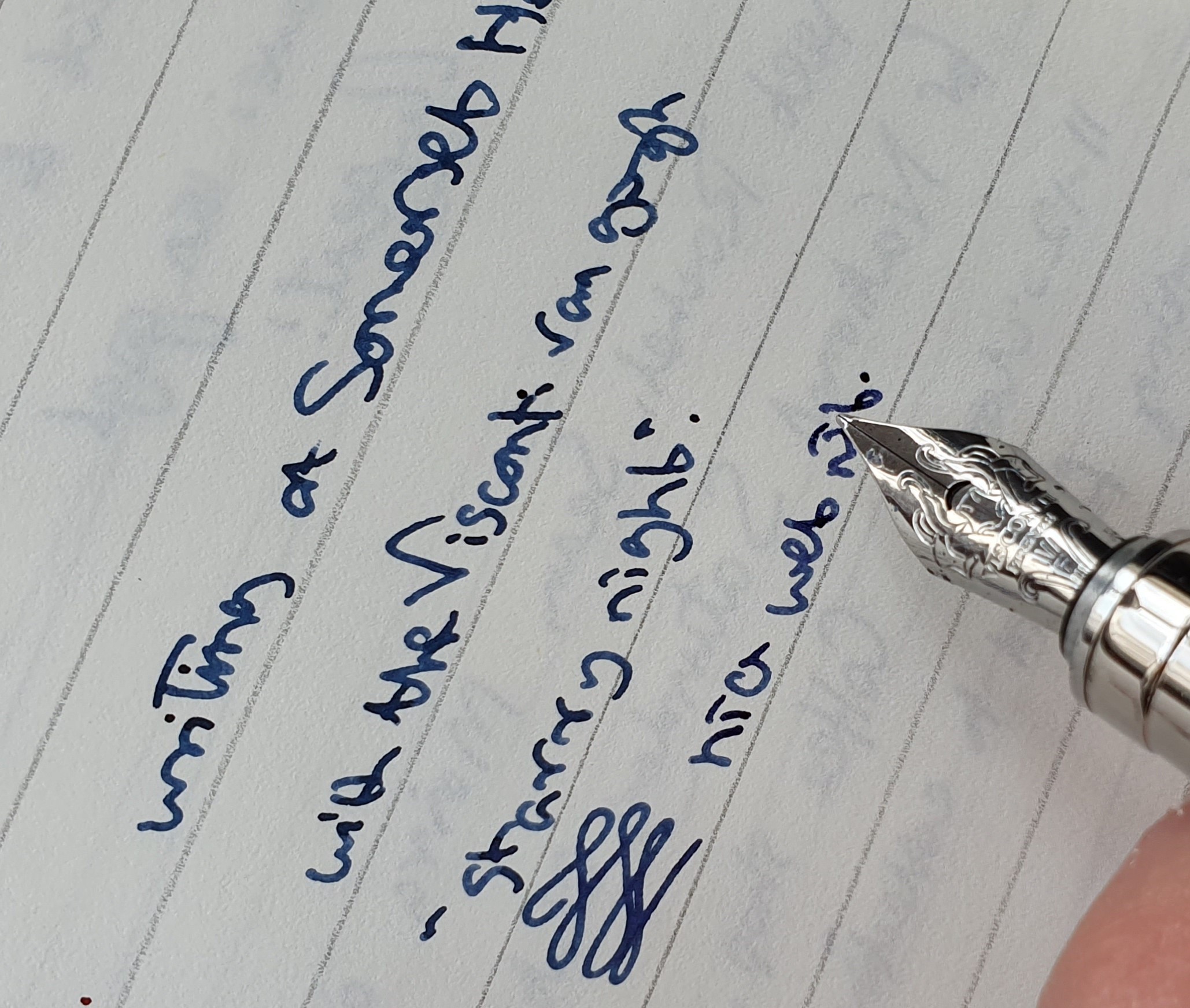
The nib is steel, (mine is a fine), plated and with some fancy scroll work, rather more elaborate than on my Visconti Rembrandt. It is firm nib but beautifully smooth and with good flow and lubrication. I should add that it was not quite as wet when I first got it. After using it for a few days I decided to open up the tines just a little to improve flow (which I had also done on my Visconti Rembrandt, to good effect), to better suit my lefty-overwriter style.

I employed a trick learned from an SBRE Brown video, whereby you place your thumb on the middle of the nib, place the tip of the nib on the nail of your other thumb, then push downwards on the nib, very carefully, but just enough to start bending the tines upwards away from the feed. As you do this, it has the effect of widening the gap between the tines and increasing ink flow. You should go very carefully when bending this, or any nib. The aim is only to open up the tines a fraction and not to leave the nib looking like a ski jump. Check the results constantly with a loupe and by writing with the pen and do not overdo it. Also, as Stephen Brown said, “You will get ink on your fingers, but that is ok because you’re helping your pen.”
The pen takes standard international cartridges, or a converter. There are metal threads on the inside of the barrel.

When I received the pen, Dave had it inked with a dark blue ink with an amazing red sheen. Once this was exhausted, I flushed it and refilled it with Waterman Serenity blue, which I like to use when getting to know a new pen and also to chase away any residue from more persistent inks. (This is another trick I have learned, this time from Laura of Fountain Pen Follies).

Looking back at my notebook from that time, I filled about twelve pages with the Van Gogh, in conversation with myself (Van Gogh would approve) as to how the pen wrote and whether or not to tamper with the nib. I felt that my Rembrandt was smoother, but then that was a medium nib, not a fine.
Later that summer, I travelled to northern Italy for a holiday on Lake Garda. I brought the Van Gogh with me. I thought it would like that. I paired it with Graf von Faber-Castell Cobalt blue cartridges. In the event, I did not use it all that much as I got distracted by another pen that I bought on holiday. This is often the way of things when you keep buying more pens.
Recently I inked it up, with Conway Stewart Tavy, by Diamine which is an old favourite blue black. This suits it very well. After this I tried the pen on a handful of different notebooks. It was particularly enjoyable on a thick, 100gsm paper from an A4 wire-bound notepad called Concord, premium writing paper.
The Van Gogh feels rather superior to the Rembrandt, as is reflected in the higher price tag. It is faceted, whereas the Rembrandt is not but otherwise the size and features are very similar. They compliment each other well. Both are probably regarded as near entry level Viscontis, in comparison to the various Homo Sapiens, Divinas and Opera Masters of the Visconti catalogue, none of which I own. But they are still very commendable pens in their own right with Italian flair and lofty artistic associations, albeit that the nib might need tweaking.


So pretty. I have always liked the looks of the Van Gogh range. However, my brief time owning a Rambrandt proved to me that a) I prefer metal pens to resin ones and b) even Visconti’s finest and lowest quality nibs still run wetter than my tastes prefer. So now I appreciate the pens on an artistic level but know they aren’t something I aspire to own.
LikeLiked by 1 person
Thank you for reading. Getting to know what you like is half the battle. I use a whole mix of pens, in a variety of materials, shapes and sizes and nibs, and it’s good to enjoy them all for their own merits but being comfortable to use is clearly a benefit.
LikeLike
Thank you for an interesting review of a rather underated pen.
I have several (including the same colour as the one you are discussing). Generally I find they are better made with better nibs than the Rembrandt. My finest example of this series is the Michelangelo Van Gogh (deep blue with rose gold trimmings) which I found by chance while on a business trip to the US- that has been a flawless and smooth writer for many years. Apart from this one, I very much enjoy using my Sunflowers and Irises versions of the Van Gogh series.
The new Van Gogh line is attractive but I wish Visconti would revive the old Van Gogh series that preceded these: these were issued in the early 2000s and are girthier than the later versions. They have wonderful 14 carat gold nibs and some also use the 23 carat Palladium nib.
LikeLike
Thank you very much for your interesting comments. I would be interested to see your versions, when things return to normality.
LikeLike
Yes, once we are “released” we must organise a giant pen meet- to catch up on each other’s news and to reveal which pens we have bought to cheer ourselves up during the lockdown!
LikeLiked by 1 person
They are beautiful. Wondering if there is any thought to a workshop. I have always enjoyed blown glass art. In recent years I have taken classes and while calling them “art” may be abusive to the word, I enjoy my small creations. Is there any similar opportunity to create one’s own pen with a master-teacher that you’re aware of. What a great experience it would be for a collector
LikeLike
Thankyou. I am not aware of any pen makers who offer customers a hands-on opportunity to make their own pen. However there are custom pen makers who offer a range of options, so that customers can select a combination of features from the options and ‘design’ their own pen.
LikeLike
Love this pen… Got an eye-catching VG “Dr Gachet” (teals, green, yellow, blue, white swirls…). First nib skipped/flowed terribly… replaced by (well known Dutch) supplier and now very happy. One of my few pens that’s always inked up. Hesitated for years due much-publicised nib issues… and was annoyingly caught out. I’ve even coined the phrase “inkubo”. (In Italian “incubo” is “nightmare”!)
LikeLiked by 2 people
Yes, these are great pens so long as you get one with a good nib.Mine writes beautifully now and the Starry Night colours make for a lovely finish.
LikeLike