This iconic beauty had been on my wish list for six months, although I was not actively looking for one and was deterred by the price. Then my interest was reawakened recently on reading “A day with a Duofold” on Anthony’s blog “UK fountain pens.” I was particularly interested in his comments on the similarity between the Duofold International and the Kaweco Dia2, as the latter is one of my most comfortable pens.
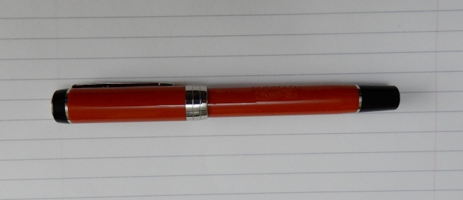
I could not believe my luck when browsing in John Lewis’ pen department, in London’s Oxford Street. A new Duofold, in Big Red colours, was reduced to less than half price to clear. A black model with gold furniture was still at full price.
It was not clear to me at the time, whether it was a Centennial or an International since there was nothing to compare it with. In fact I had forgotten again which was which. (The Centennial is the bigger of the two versions). There was no help from the packaging. I was amused to notice that where the words “Duofold Red FP” had been written on the outer box, someone had crossed out “Red” and written “Orange”. Bless.
Notwithstanding this question, I decided to snap it up. I had looked at the nib with my loupe and the indications were that it would be smooth and reasonably wet. This was confirmed when I dipped it, but a dipped nib is not representative of how a pen will write when filled normally. I could not wait to get it home and try it out.

Appearance and design
This is an acrylic pen, not very much changed in overall appearance since it was introduced in 1921, although there have been many changes, such as to the finial, the cap bands, the nib scroll work and the barrel text. The shape and proportions are as classic as they come. The cap has a black crown to it with an inset metal finial bearing the name Duofold and the shape of an ace of spades in fancy scroll work. Then there is the classic 1920’s Parker arrow clip. The current model Duofold has a single, wide cap band with the Parker name and logo.
The cap screws off in just over two full rotations. The threads have a reassuring grip at the end and so there is no worry of the cap coming lose. The barrel is of the same orange acrylic, reminiscent of the red lacquer original of the twenties, then made of a supposedly indestructible material called Permanite. A nice feature, dating from the original is the engraved text on the barrel, now reading DUOFOLD Geo. S. Parker, Fountain pen, and in a little banner, Parker Pen . There is a black grip section and black end cap, although only for decoration, this now being a cartridge-converter pen.
Unscrewing the barrel, I was pleased to spot what appears to be a serial number, 16210079, FRANCE on the metal holder for the converter. I believe this pen to be the 2016 edition. Apart from this number, I have not found the usual Parker date code anywhere.
The nib
My pen came with a medium nib, in 18k gold with bi-colour finish. The text says Duofold, Parker 18k 750. The tines looked to be very nicely set up. It has a huge blob of tipping material, particularly for a medium nib and so looked to be built to last. The plastic feed has an unusually slim profile and is smooth, with no fins visible.


Filling
The pen was supplied with a very superior, Parker branded converter with a smoked grey ink reservoir, knurled black plastic turning knob and knurled metal collar. The plunger had a nice tight feel to it and the black plunger has a red O ring in it. I have not had any leaks from it.

Weights and measurements
When I got home, I looked at the specifications given for the Centennial and the International, on The Writing Desk web site. This is how I found out that my pen is the International. It is 132mm long capped, 124.5mm uncapped, and has a barrel diameter of 11.8mm. Posted, it is 164.6mm. The visible part of the nib is 20mm long. It weighs around 23g of which about 8g is the cap.
Personally, I find it just a little too short to use unposted. Also, if I do hold it unposted, it means that I hold it around the section which is a bit too narrow. So instead, I post the cap and then hold it a bit higher up, around the cap threads, with the section resting on my second finger. This, I find comfortable for longer writing sessions and is how I use my Kaweco Dia2. Incidentally, to those who say that the nib of the Dia2 is disproportionately small, the Duofold might be what you are looking for!

Although the Duofold’s cap does post securely, it only just covers the black end piece and ring. It does not go on very deeply. It does leave the pen looking rather long and if you were to hold it lower down than I do, you would probably find it too unbalanced and top heavy.
Writing performance and conclusions
There was no way I was going home without this. In use, I filled it the first couple of times with Parker Quink blue-black, which flowed well. I know that people say that when filling a pen, you should turn the the piston back a little at the end to release a drop of ink back into the bottle, and then wind it up again so that you do not have a saturated feed. I tend not to bother. However with this pen, you will get a very saturated feed and it does then write very wet for the first couple of pages. In fact, this has suited my purposes well because the nib was otherwise a bit skippy at first. I remember the advice that I read on buying my Pelikan M800, that you do need to let it wear in, by using it for a few weeks or a month to get rid of any “baby’s bottom”. It is already improving and the nib is now settling down nicely.
I now have it inked with Conway Stewart Tavy, by Diamine and rather prefer this darker blue-black to the Parker version.
I am very much enjoying the pen. Although smooth, it has a distinctive feedback which can be heard on my Leuchtturm paper. It is very firm with very little flex. I have had several hour-long sessions, filling pages with it just for the pleasure of feeling and watching the words go down on the page in glistening new ink.
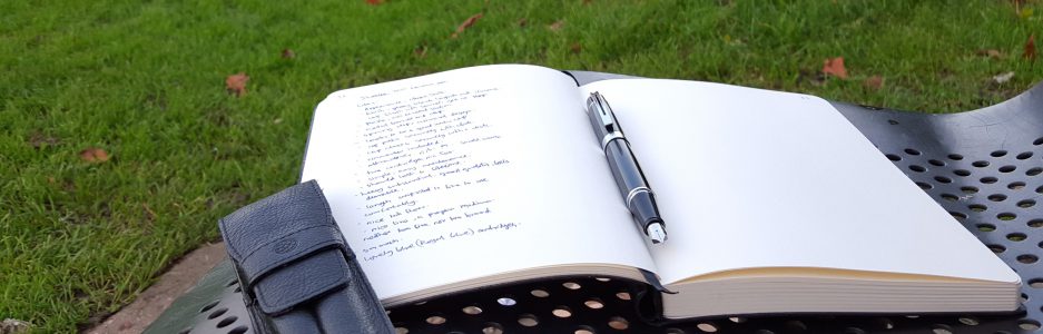
I have also enjoyed looking at the old advertisements for the 1920’s Duofolds. You can spend an entertaining evening Googling “Parker Duofold Advertisements.” I also learned that it was the most expensive pen of its day, at $7.00 back then. So confident were Parker of their nib (the tip of which involved over twenty separate operations) that they offered the pen with a 25 year guarantee. The tip was supposedly three times harder than the usual, and three times more expensive, so that you could lend the pen without any qualms. I lap up all this stuff. (As a ten year old, I once wrote off to Parker, to ask for some more information about the Leonardo da Vinci Vitruvian man image that they were using in their magazine advertisements for the Parker Jotter at the time. But enough about me). Here is the pen again.

Great review, and I still love the Big Red colour scheme! If you’d walked away with a Centennial I would officially have popped from envy…
The nib really is a nail, isn’t it?
It’s interesting what you say about a break-in period. I definitely found that with my Pelikan nibs. Maybe I’ll ink up the Duofold again and give it another scribble to see if it improves for me.
One final question: have you noticed yours drying out quite quickly when left capped? I think the vent hole under the clip is the culprit.
LikeLike
Thanks Anthony! Yes, it is a stiff nib. Stephen Brown mentions it being intended for writing with carbon copies through two layers of paper hence the name Duofold. I have not read that anywhere else to corroborate.
I think it may need a while to run in, like a Pelikan.
No, I have not had any issue with drying out when capped. My cap is airtight (I tried blowing in it!) and does not have the anti-choking vent hole under the pocket clip.
LikeLike
I guess that’s one more change they made over the years!
Thanks for the info about the name — it makes sense even if not corroborated!
LikeLike
If you have a vent hole issue you could try covering it with Sellotape.
LikeLike
Love that subtle feedback sound and feel of pen on paper! great review, I didn’t know parker made nibs like these (my memory of them is them being a little short and stubby)
LikeLiked by 1 person
Thankyou! Yes, isn’t that feedback just the best thing ever?! This has a very firm nib but I have been using it quite a lot and find it pleasant.
LikeLiked by 1 person
Great review thank you! I’ve had my eye on one of these in Canada for a while, but – like yourself – the price has me hesitating. Maybe there will be one at the Toronto Pen Show at the end of the month.
LikeLiked by 1 person
Thank you! It is a handsome pen and I am enjoying mine. It is advisable to try before you buy, to see if you find the size comfortable, whether you are a poster or otherwise. I was very fortunate to find one at such a reduced price.
LikeLiked by 1 person