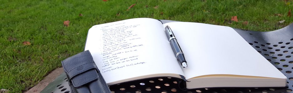
After attending our monthly pen club meet in London recently, I took myself off to Harrods to have a browse around The Great Writing Room. It is wonderful to see their large selection of luxury fountain pens from so many leading brands.
A new name to me, was Pineider, an Italian brand established in 1774, whose pens and stationery were displayed in a corner of the large room. Under the glass counter, one pen was shown in a gift box which immediately caught my eye as it opened like a miniature writing desk. I asked to see the pen, with an attractive green marbled body and a silver section. However, it had an 18k gold nib and was five hundred and something pounds and so I hastily handed it back.
But next to this pen was a display of, what I now know to be the Pineider Avatar fountain pens, in their four available colour options of saffron yellow, pacific blue, lipstick red and coal grey. These looked very striking, particularly the yellow and the red versions.

I must say, I am generally wary of pens with shiny metal sections as they can be slippery to hold. The salesman got the red one out to show me and produced some ink and paper. I fell in love with it pretty much instantly.
As this is a relatively new pen on the market and there do not seem to be all that many reviews or photographs online I will attempt an FPN-style review, save for giving marks out of ten.
First impressions, appearance and design.
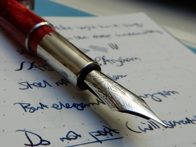
This is a stunning-looking pen. The highly polished, bright red marbled resin with contrasting silver coloured clip and cap band, with rounded ends, make the pen a joy to hold and to look at. The resin has light and dark shades which give a beautiful chatoyance as you turn the pen in your hands.
The pocket clip (in marine steel) is long and slender, engraved to suggest a quill. It is bowed in the middle and is sprung, giving a good reach to clip onto thicker material if needed although the spring tension is not very firm.

A surprise awaits when you come to remove the cap. It is a pull-off cap, but secured by a magnet inside the cap which meets a metal ring around the barrel. When you cap the pen, offering it up slowly as it nears the barrel, it jumps into place with a little click. The magnetic power is enough to keep the cap in place. Removing the cap requires perhaps rather less force than you might be used to and I would not be overly confident about carrying the pen in a suit pocket for fear that the pen may slip out of the cap.
Another lovely feature is the cap band, which features the name Pineider above a stylised engraving of the Florence skyline recalling to mind the many domes and towers of that beautiful city.

Under the cap, you have a long, sleek, elegantly shaped nib and some attractive engraving, which includes on closer inspection, the name Pineider in capital letters, written normally along one edge of the nib and in mirror image along the other edge. Put like that, it might sound off-putting but it is only noticeable when examined under a magnifying glass.
The section is of a shiny metal finish, and gives the front end of the pen a pleasant weight, which you notice and appreciate as soon as the cap is removed. The metal section tapers slightly save for the last five millimetres or so where it straightens, to give a barely visible but effective, curved, finger rest, when the pen is held in the writing position.
Construction and Quality.
The pen seems very nicely made and I have no complaints with my model. The resin barrel screws firmly onto the metal threads of the section. Everything fits together well. If looking for faults, you could say that the rim of the cap band is a little sharp to the touch, but this has not been noticeable in normal use. The pocket clip, whilst attractive, looks rather delicate (compared, for example to the mighty and barely lift-able clip on my Montegrappa Fortuna), but this is not a problem for me as I carry the pen in a leather pen case, not a pocket.
Weight and dimensions (approximate).
Capped: 142mm
Uncapped: 130mm
Posted: 161mm
The pen weighs around 27.5g, capped or posted. Uncapped, it is about 17g and the cap alone weighs 10.5g. These weights are ideal, being neither too heavy nor too light.
The uncapped length of 130mm makes this about the same as a Lamy Safari. But whilst I find the Safari comfortable to use unposted, I much prefer to use the Avatar with the cap posted. Perhaps this is because I hold it higher up, (due to the shiny section) or due to the fact that the barrel tapers slightly, but it feels very comfortable posted. It is long, but the cap is light and does not upset the balance. I worried a little at first about whether posting the cap with its magnet inside, would leave scratches on the barrel. However, I found the pen so much more comfortable when posted and soon decided not to worry about this. The pen is meant to be used. I think it does actually cause some scratches but they are only visible under a loupe.
Nib and Performance.
I love this nib! It is Rhodium plated steel, with no breather hole and having a very polished finish that matches the section. The long sweeping curves look stylish. Mine is a medium. A fine is also available. I had tried the pen before buying and was delighted that it wrote so smoothly. It is on the finer side of medium and ideal for me. Flow is wet, but not gushy. Overall, it provides a really pleasant writing experience with some feedback. There is some softness or flex available to give some pleasing line variation in normal writing, and this suits me nicely as my handwriting style is not compatible with more flexible nibs. I like that the nib is steel and not gold as this keeps the cost down.

Filling system and maintenance.
This is a cartridge converter pen taking standard international cartridges, or bottled ink from the Pineider branded, push-fit converter that is included. Cleaning of such pens is straightforward: you just run water through the section until it comes clear, or leave the whole section, with nib and feed inside, to soak in water overnight if needed before rinsing again.
I have not tried going any further, removing the nib from the section. The fins on the underside of the feed look quite fine and delicate and I would be worried about damaging them or upsetting the nib alignment.
Cost and value.
The price in Harrods was £148.00, which I thought was fair. I was thrilled to learn that it came in the same type of gift box as the much more expensive model. A converter is inside, but the box also includes a sample of Pineider’s famous stationery – a set of six cards with matching envelopes. It is probably towards the top end of what you would want to pay for a steel nibbed pen before moving up to a gold nib.

Conclusion.
This pen was an impulse buy from a brand that was unknown to me, and therefore bought entirely on its own merits and on the basis of what I learned in the store. This absence of homework is not always recommended but on this occasion I am really pleased with the pen. Trying the nib in the shop makes a big difference in lowering the risk.
I have since learned a little bit more about the company behind the pen. The Pineider company was founded in Florence in 1774, and for many years was known for its high quality stationery, which it supplied to the Vatican and to royalty. Luciano Pavarotti was also a customer. The company also sold luxury leather goods, but was not noted for its pens. However, Dante Del Vecchio, pen designer of Italian brand Visconti left that company and moved to Pineider where for the last year, he has set about making the fountain pen line more prominent. Thus it is no accident that the Avatar bears similarities to the Visconti Rembrandt. There are some differences too, and whilst I do not have experience of the Rembrandt, I rather preferred the Avatar’s overall flair.
I am greatly enjoying the pen. There are few pens that actually make you want to get up in the morning, to write with. This one is a keeper and I look forward to writing with it for many years to come.

That’s a nice-looking pen! Very luxurious, and I love the red color.
LikeLiked by 1 person
Thankyou! The writing experience is a joy with this one. Yes, the colour is lovely too. “Lipstick red” sounds a bit girlie but it is a good description.
LikeLiked by 1 person
Very smart elegant pen. Love the gift box with the stationery. When it pans out like you show in your photo it almost takes the shape of a miniature writing desk. I wonder if that’s intentional.
LikeLiked by 1 person
Thank you. Yes, I am sure it is intentional. The stationery is a nice touch.
LikeLike
Oooh. Like the engraving on the ring!
LikeLiked by 1 person
Yes, it is pretty! Actually the photo was taken a little too close and it looks better from a more normal distance of about 10 inches away.
LikeLiked by 1 person
In my humble opinion a top drawer fountain pen has a gold nib; not a steel nib.
LikeLike
Thank you. Gold has its benefits, in its colour, in resisting corrosion, providing softness or flex (in some cases) and adding value, as well as cost. But it would be incorrect to say that any pen with a gold nib is better than a pen with a steel nib. I have used many pens with excellent steel nibs, for example from Diplomat, Onoto and Otto Hutt, which in my opinion have been equally good, if not better, than some gold nibs.
LikeLike