For the past two weeks I have enjoyed getting acquainted with this pen, bought new at the Cambridge pen show.
If you are new to the Pilot Falcon, as I was, there are a few things that might cause some initial confusion, as follows:-
- This the Pilot Falcon. In the past, they were branded as the Namiki Falcon (Namiki being Pilot’s brand for its high-end pens).
- The Falcon can be found in either resin or a metal body with lacquer finish.
- The nib on the Falcon is a semi-flex nib, with the markings SEF, SF, SM or SB (for soft extra fine, soft fine, soft medium of soft broad), also denoted by a removable silver sticker on the barrel. However, when people refer to the “Falcon nib” they may instead mean an entirely different shaped nib, with distinctive cut-aways on the sides to help it flex, with the markings FA and which is not found on the Falcon pen at all but on a different Pilot pen.
- The nib called the Falcon (FA) nib, is more soft (flexy) than the soft nibs made for the Pilot Falcon.
See what I mean? Anyhow, the model that I have is the Pilot metal Falcon, in black with a Soft Fine (SF) nib, which is 14k gold, rhodium plated. The pens branded as Pilot are clearly identified by the name Pilot stamped on the nib and on the cap, just above the shiny plain cap band.
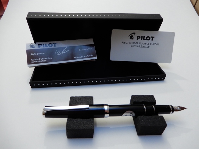
There have been other modifcations too, such as the change from a resin to a metal finial and barrel end cap and the addition of another metal ring, so that there are now two rhodium plated rings on the grip section and a third on the barrel, just after the cap threads. These do give this smart but ordinary looking Pilot’s uniform a bit of panache, rather like the rings on the sleeves of an airline pilot’s jacket.
The nib
When I chose my Falcon, there was a Soft Fine or Soft Medium nib available. Both looked nicely finished, under a loupe but I chose the Soft Fine as I have come to appreciate Fine nibs more, in the past year or so and because I have relatively few of them, compared to the number of pens with medium nibs.

I had read that Pilot nibs had a good reputation for being well made and for great performance straight out of the box, which is always a delight. This one lived up to expectations.
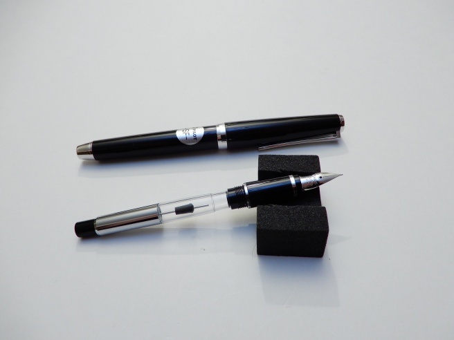
The unique nib of the Pilot Falcon, is the main draw for this pen. Shaped more like a nib that you might find for a dip pen, it is long and slender with a bulge half way down, as if the nib had been pushed into a wall and had buckled. It is rare nowadays to find a new pen sold with a flexy nib. This is not a “full flex” nib but has more softness to it than most. In the right hands, this can be used to apply a little downward pressure to the nib on the down stroke, to open up the tines a little and create some thicker lines, for attractive line variation.
I say “in the right hands” as (a) it does take some skill and practice to achieve this and (b) it is more difficult for left handers, particularly lefty overwriters, (such as myself) as the nib does not like to have pressure applied when being pushed forward, but only when being pulled backward. Indeed, you have to be careful on the upstroke to keep a light touch and avoid the nib jabbing into the paper.
In this regard, possibly a medium or broad nib might have been a more sensible and forgiving option for me if buying a flexy nib. However the fine nib certainly does have its advantages. It is not necessary to flex the nib and the pen can be used to write quite normally, without any downward pressure. The remarkable thing is that the pen requires no pressure at all and the tines are so responsive, that the pen will write as soon as the pen touches the paper – and with no skipping. Smooth paper is preferred.
Because the nib is so soft, it takes only the slightest touch to paper, to open the tines and lay down ink. I have found that it is important to keep the nib flat to the paper (rather than rotated left or right), so that both tines remain level on the paper. If the pen is tilted, one tine will lift higher than the other, causing the inner edge of the other to catch on the paper and make the nib feel scratchy.
I have also read that the nib needs to “break in” and become softer and more flexy in time. Meanwhile I have been careful not to push it too far for fear of springing the nib, bending it past the point of no return.
One of my favourite discoveries with the nib, was to find that the numbers in the lower right corner, and barely readable with the naked eye, denote the date of production of the nib. Mine is 917, that is September 2017. I have since looked at pictures of numerous others online to compare when they were made. I do enjoy it when pens can be dated.

Filling mechanism. The pros and cons of the CON 70
The Falcon (be it the Pilot or Namiki) is a cartridge – converter pen but has evolved through several filling systems. I understand that originally, the pen had the CON 20 press-bar converter, unpopular for its small ink capacity which soon ran out especially if one was doing much flexing of nib for broader strokes. The next generation had the CON 50 piston converter. Both are now discontinued according to Cult Pens. The current metal Falcon has the CON 70 push button converter, which is relatively large capacity, efficient and fun to operate.
I have not yet fully grasped how this works. The converter has a button at one end. Inside, you can see a thin metal rod, with a rubber plug at the end, but which does not reach the open end of the converter and which can slide up and down the metal rod.
To fill your pen, with converter attached to the section, you simply place the nib in the ink, give the button a quick press and release, and ink is drawn into the reservoir. Repeat a few times and each time, the ink reaches a higher level. Within about four quick presses, you have a full reservoir.
From watching a Brian Goulet video on this converter, I gathered that pressing the button pushes the rubber plug downwards; air is expelled and the plug seals off the opening so that a vacuum is created. With the nib immersed in ink, the vacuum then draws ink up into the pen. It is all over very quickly.

On close inspection, it can be seen that the metal shaft inside the reservoir is a hollow tube. I have not yet deduced whether it is this tube through which air is expelled or ink is drawn in. But it works.
There are some issues to be aware of , with this design of converter. (a) It is rather a faff to clean if you are changing ink colours. You can try pushing the button repeatedly to fill and empty the pen with clean water. Or it is quicker to remove the converter and squirt water into the opening with a syringe or pipette. I have read that ink can lodge inside the metal tubular rod and that this can contaminate inks of a different colour, if you fill the pen before cleaning the converter thoroughly. (b) Also the action seems to make the ink go bubbly so that you are left with lots of tiny bubbles sticking to the inside of the converter, stopping you from seeing the new ink sloshing around from end to end with a single air bubble like a spirit level. The bubbles or tiny air pockets disperse a day or two after filling.

In use
The pen is very comfortable to hold, being a good medium sized pen with a nice weight to it. It weighs around 33g (20g uncapped, and 13g for the cap).I prefer to use it with the cap posted, although at 126mm unposted, many people would find it long enough without posting. One criticism that was made of the resin version, was that it felt too light. This is no longer an issue in the metal Falcon. Also, there was criticism of the small ink capacity converter but the CON 70 resolves this.
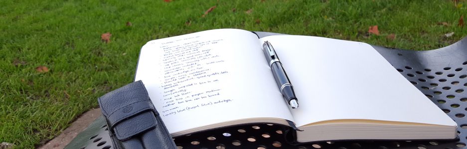
A few days after buying the pen, I had the opportunity to use it to take notes at a full day of training lectures. At the time it was filled with Pilot Iroshizuku Yama-budo which I was sure it would like. The fine nib proved very good for annotating typed hand-outs and marginal notes. It can be used for fast writing so long as you remember to avoid pressure on the nib. Sitting with the pen uncapped, it did stop writing on me a couple of times during the day, but this could just have been due to the ink drying in the nib while uncapped, rather than any issues with the feed. I have read that when used a lot for flex writing, the nib can railroad and also stop writing if the nib is flexed upwards away from the feed for too long, which is hardly surprising. I have not found any such difficulties in normal use.
In conclusion, the Pilot Falcon might not suit everyone, due to its softer nib but is a great quality, well finished precision writing tool, for those who enjoy pens with an extremely light touch for effortless writing , having the option of some flex writing if desired.


That’s a great review, and very useful and timely for me… I have opted not to pursue the Falcon at the moment. After trying one recently, and reading your review and others, I’m not sure that soft nib is for me. But it looks like you have it tamed nicely!
LikeLiked by 1 person
Thankyou. For line variation, I find an italic or stub is a lot easier to handle than a soft flex nib.
LikeLike
It is certainly a good idea to try before you buy, if you can.
LikeLiked by 1 person
Very thorough thoughts on the pen, thank you!
LikeLiked by 1 person
Thank you for reading!
LikeLiked by 1 person
Thanks – a very thorough review. Not sure I’m entirely persuaded, though. I have a Custom 91 with a soft fine nib, which doesn’t see much action. I also have issues with the Con-70 converter. I can fill it OK, but it’s a nightmare to clean and all too easy to get ink behind the piston. Converters seem to be a real Achilles’ heel for Pilot.
LikeLiked by 1 person
Thankyou! It is still early days for my Falcon. It has its plus points but I may find myself reaching more for other pens for general use.
LikeLiked by 1 person
I bought the Metal Falcon with SM nib a few weeks back, here in the UK. There is no arguing that it is an expensive pen, however I believe it is a fair price when compared with something like a Lamy 2000. Choosing between SF and SM took a fair amount of research but I made the right decision. I use it for everyday writing rather than line variation, and the springiness and smoothness of the nib makes for a very pleasurable writing experience. Mine is filled with Waterman Serenity Blue and used on Oxford Optik and Clairefontaine Triomphe paper. In short, I am very happy with my purchase.
LikeLiked by 1 person
Thank you. It sounds like your preparation paid off and you made a smart choice. Once you discover a successful combination of pen, ink and paper you can really enjoy the writing experience.
LikeLike